#i am not an artist by any means but i know how to use photoshop and thats everyone elses problem
Explore tagged Tumblr posts
Text
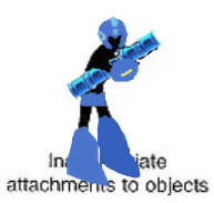
get your big ass boots out of the damn caption
#based off the inappropriate attachments to objects image#this was a joke but i do like to think about a robot experiencing attachment to inanimate objects#megaman#i am not an artist by any means but i know how to use photoshop and thats everyone elses problem#i didnt intend to obscure the caption but once i realized how little room there was i decided it was funnier this way#i wouldve colored in the light parts of his body suit but i figured everything would bleed together and make it hard to see
23 notes
·
View notes
Note
I am in love with your art style. I love all your jjk art, it’s like stitching back the pieces of my shattered heart. Your art is so soothing and has such a warm feel, I love it. Also if you don’t mind me asking what program do you use for your art, and do you have any tips? I strive to someday create art that gives the same feeling of comfort as yours. Thank you <3
Thank you so much for the kind message! I'm actually in the middle of making another jjk piece but it's been a while so I've been trying to remember and consolidate my process. This ask came at a great time hehe
I use photoshop for most of my art pieces but I think there are a lot of cheaper alternatives (procreate on Ipad, clipstudio paint, medibang etc) that would work just as well. As for tips, I have a technical and an emotional one:
My technical tip would be to use references!! Especially if you're just starting out, it's SO IMPORTANT imo for catching mistakes especially with anatomy, lighting and perspective. And by reference I mean real life photos. I think you can be inspired by other artists' work, but there is the danger of picking up their bad habits if you only use their work for reference. I would recommend sticking mainly to real life and looking to other artists only for resolving specific stylistic details once you have a solid grasp of your fundamentals.


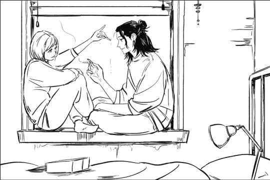
I would start with a rough sketch first of whatever you want to draw and then look for refs that match the mood and tone you want to go for. Get the idea down first and draw from the heart. Then the refs come in to help with the specifics (ex. what a window looks like, how someone would hold a cigarette) The jump from the rough to the clean line version is an amalgamation of all the little things you learn along the way. For example, on one day, I learned that clothing folds usually start at one point and spread out. Then another day, I learned how to do 1 point perspective and so on and so forth. Then all those tidbits slowly add up to help you get better and better.
2. My second tip would be to understand what you want to convey with your artwork. If it's fanart, what about the media that you're interacting with draws you in? It doesn't always need to be a complex answer, sometimes you just want to draw a character because you think they're hot and that's totally valid imo.
I occasionally tutor very young artists and oftentimes, they will tell me that they want to draw like X artist or X painting/piece of media. I always try to encourage them to go deeper. What about that drawing resonates with them and what specifics are occurring in the picture to make them feel that way? For example, I recently realized I love environment heavy drawings not for the background itself but because they ground the characters and seeing them do mundane things makes them feel more real to me.
For the example below, the whole set was to explore friendship and mental health. Sometimes just having someone there who listens and is willing to talk with you can make a huge difference.


Once you know the purpose of your art, then I think it makes the decision making for the rest of the process much easier. What type of lighting scenario conveys support and comfort? I went with dusk. Then I started searching up references for dusk lighting. Couldn't find the ref I actually used for colour but a quick google will show you lots of similar options.
What kind of poses feel in character for Shoko vs Geto? What is the focus of the picture? As much as I love details, I think sometimes they can actually take away from the main message. For example, if I had rendered the lamp on the right a lot more, it would've distracted from the main point of the picture so I tried to keep that and the background in general simple (still something I need to improve on haha).
Then those extra technical things (value structure, cool vs warm light, reflective lighting, connotations behind colours) you pick up along the way are all there to help you better communicate what you want to convey with your art.
Okay I lied one more tip, be patient and learn to appreciate the process. Like with any skill, there are a lot of technical aspects that you have to study and practice. I think because the end result is so visual and easily accessible in comparison to other hobbies/jobs, it really cripples beginners. Even with writing, you won't realize a book is good until you learn how to read. With art, you can resonate with a painting without having drawn a single line yourself.
I think beginners and even professionals see a lot of beautiful finished artwork and get enticed by that only to be discouraged when they find their process/finished work didn't end up the way they wanted it to look. Treat it like you would learning how to write. The fundamentals can be tedious and do take time to drill into your head, but learning them will help you SO MUCH with the creative fun parts. You can't write a poem without first taking the time to learn the alphabet, spelling and grammar. You're also probably going to write a bunch of shitty poems before you write that one good one, but that's okay because each piece lets you experiment and exercise your voice. Art is the same thing, don't rush it! Enjoy the process and celebrate your improvements.
#omg i typed way too much but i have a lot to say!!#thank you for the ask this was actually so therapeutic lmao#ask#my last advice...is to be selective about who you take advice from#so you can just ignore all this or cherry pick what resonates with you and your process
79 notes
·
View notes
Note
i know you have probably been asked this so many times �� but what brushes do you typically use? any helpful videos i can reference to get portraits and overall realism sketching down, maybe ones that you used starting out? or just.. tips overall?
artists like you and m0cktails really inspire me to try and pursue a different route with my art, one that was totally unexpected but pleasantly rewarding when i tried it out!!! you have a great eye for features and overall composition of a piece, i started being a fan due to your ghostsoap art but i honestly think ive started to like seeing your OCs too haha
please don’t feel pressured to answer i know i kind of asked a lot!!
Hey there! I've briefly reviewed some of the brushes I use in some posts here and here! For the most part, I stick to one standard brush, as well as the airbrush and some other 'effect' brushes as I need them. I'm a photoshop devotee, unfortunately 😔, so a lot of my process is futzing around with their admittedly stellar editing tools
Truthfully, I don't have any concrete tips or videos for this sort of thing. I started out as a pencil artist, doing more and more realistic portraits the better I got, and then eventually turned to digital art (a bit reluctantly) So a lot of that was just self-taught; finding my own way how to implement certain techniques, and amassing a foundation that would allow me to draw all the stuff in my brain, lol
As for advice--I'd say to learn how to evolve out of your comfort zone. It's good to know what type of style or subject matter you feel you're best at--this is a natural inclination most artists have, and it informs the pieces your mind wants to create. But try pushing the limits of what you think might be 'too tedious' or 'too advanced'. More often than not, the thing holding your art back is that gut instinct of 'I can't do this, so why bother trying'. I used to feel this way about hands (enemy of the state, confirmed) And yeah, the easy cop-out is to just shove them all in pockets or behind backs etc. But in learning how to overcome that obvious challenge, I grew to really appreciate the way a hand can shape a composition. In fact, I have to hand it to--💥 ✋
Anyway! My next bit of 'advice' would be to go absolutely bonkers nuts with references. Don't listen to any fraud or fool who says using references is cheating !!!!! They lie!!!!! I swear, my art only looks the way it does because I am a reference hound who spends hours and hours on google/pinterest/stock sites for the perfect angle of the perfect pose, just so I can relate it to the image I have in my head.
For realism--look at real stuff! This sounds dumb, but it helps. Start paying closer attention to people around you; their faces, the way the light accents certain things, unique features, etc. I'd suggest figure studies if that's something you're into (I don't do studies, personally, because I just jump into massive pieces and can't do anything simple 😅 welp) but it does help immensely to study humans in real life and try to translate that onto the page
So yeah. Tbh, the best method for improving art is to simply DO IT. And the fact that you're seeking out further advice and tips means that you have some motivation--so use it! Hope this helps <3
28 notes
·
View notes
Text
ok slow day on the blog so im about to get all soppy and artsy. Because a) this man drives me insane and i continously try to figure out why slash justify it to myself and b) i am so obsessed right now with that one leg muscle that kinda goes flat when you sit but also is a key part of how to structure the leg when drawing. Blah blah blah hockey butts yeah great but what if... hockey inner thigh....
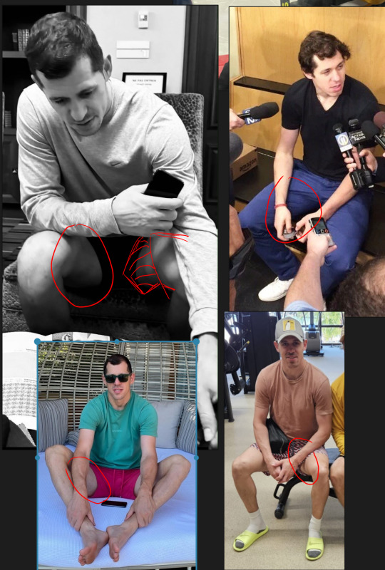
Ughhhhhhh kill me now.
Anyway im gonna adress a trend i have noticed in the pens fandom mostly displayed through passive aggression towards me or other creators...and that's the use of references. There seems to be this idea that using references is lazy or cheating or means that this person isn't making 'real' art. And im gonna call some bullshit. Every single artist since someone decided to paint their hand and try to recreate a cow on a cave wall with their thumb has used references. Talk to real commercial artists and they use WAY more references than you can imagine. My current job is super stylized and unique. But back when i worked in hyper realism on C*ll of Dooty and superheroes and stuff? Never not once did the illustrators not utilize references. Often us 3D artists were given a photo with a posed actor, which we used to pose the 3D model, which then was illustrated on top of directly by the illustrator. Those artists had to churn out hundreds of illustrations a month. They did not have time to get precious about it.
And lets talk about 'sourcing'. Yes, if you copy a photo directly almost pixel for pixel an artist should probably reveal their source. But so rarely is this the case. If you put any kind of spin on it - your own style, change the colors, add or subtract the background - that is YOUR art and there is no need to link to or include the damn 'source'. It's not a 'source' at that point. That would be like asking the amazing folks who photoshop artistic 'edits' together using photos and brushes to link to the original photos at the bottom of all their posts. This is just silly.
You want to know what commercial artists did before the internet? My old friend here has a studio from the 70s-2000s that has an entire wall full of neatly organized stacked drawers of printed references, a lot of it clipped from magazines and books. Each of them labeled by subject matter. And this artist worked in some of the most famous advertizing studios during that era.
So, coming back around to hockey thighs, because I know there are certain folks in the pe*ns fandom that get annoyed and angry at my daily drawings (which is so sad by the way, get a life). I have to admit this is the first time this has ever happened in a fandom so it threw me for a loop. But I also know there are younger artists out there who follow me so I want to explain my process a little. Most of my daily doodles are studies - its one of the reasons its been easier to do them during my illness than any more serious creative work. When i doodle i am looking at references and trying to recreate that as i see it. The key point being 'as i see it'. I am usually trying to learn things like: in this photo what about the lighting is compelling, and how can i make it more so? Or what is the focus of the drawing and how can i let the rest of it fade? Or whats the main gesture and how do i exaggerate that? And always, always im trying to study anatomy from new angles. For me its not enough to learn what a 'knee' looks like because the shape of the knee and the muscles around it change depending on how it's posed. And it is often those changes that make it so beautiful. Or in this case that beautiful sexy stretch of thigh between geno's knee and groin.
Often times if i imagine a 'pose' in my head, i will then go pull as many references as i can where the body's limbs are roughly arranged how i want it and then draw those over and over until i feel like i have enough of a grasp on that anatomy to recreate it for myself. So please, dont listen to the haters, use those references or dont use them freely. the haters are idiots who are projecting their own fear of inadequacy and learning to be creative onto you. <3
In my next essay i will discuss how baffled and humbled i am by the way my love for geno's face has utterly transformed my artistic eye...
#Wip#I never actually enjoyed *realism* until i started looking at photos of geno#Hes...just...so...perfect...???????.....#Also if your putting this post together with the santa wearing shorts reference post yes youre connecting the dots
11 notes
·
View notes
Note
elriels and bryciels are paying for fanarts with AI 💀💀 this is so fucked up
I mean... do we actually know for sure that's what's happening? The software that's used to determine whether things are AI generated or not is often incorrect because it's...also AI.
As someone who uses Adobe Illustrator, Photoshop, and Lightroom with a lot of familiarity, I can tell you for sure that there are features that use AI. (i.e., using generative AI to remove unwanted background items like cars, coffee cups, etc. from photoshoots.) I understand that generative AI can and does steal from real artists. But let's not be so ignorant to pretend that it doesn't also help artists create their work.
I know of artists who use AI-based tools or features in these programs to help them create color palettes or figure out shading in backgrounds when they're stuck creatively. I don't think they're any less of an artist for using an existing tool to make their art. They're still creating art, just using AI in the way it was initially intended to be used--helping people create what they love more easily.
I'm a college student, and I took an AI class, so I'm not really the best person to try and use for a collective, overwhelming AI witchhunt. It's advanced software that uses machine learning and perception to differentiate itself from standard algorithms as well as function closer to the same way the human mind does (though it does use algorithms, too).
Do you know what else uses algorithms or could be considered AI? Spellcheck. Is every fanfiction that uses spellcheck now "using AI" in the way you're trying weaponize? I imagine not.
I may not like these ships or have had bad interactions (as many people on different sides have) with certain shippers, but I'd rather you not just come into my inbox trying to stir up shit as an excuse to shame artists and shippers commissioning them. I am not the one, respectfully.
The best way to protect people from job displacement or having their work stolen from them by other people using AI is to actually understand what is and is not unethical uses of AI and how it works. Otherwise, we're totally in the dark and wrongly accusing innocent artists.
Let people do what they want and commission who they want for whatever ships they want. I do not care.
#answered#fandom wank#acotar#acotar art#ai#ai discourse#elriel#bryceriel#like please dont do this#regardless of any ships i am always pro artists
9 notes
·
View notes
Text
Blog No.003🍊 24年5月10日
「Let's Talk About Coloring+Rendering!!」
~ The Chaos of Akehhh-style Layering w/ Colors & Values ~
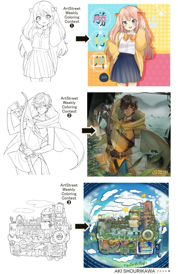
ArtStreet recently released some weekly coloring contests and as someone who likes joining 'em + colorwork being the absolute joyous part in drawing for me, I got really into it!! One of them somehow won and I still have the raw .mdp file of it with most of the layers unmerged... so, I thought there might be some value in sharing my chaotic coloring progress with it. There may never be an opportunity like this again...
CONTENTS:
Preface・・・・・・・・・
The Linework・・・・・・
Composition + Planning・
The Render・・・・・・・
Additional FX Tips・・・・
The Layers of Dread・・・
1. Preface
I use the free software MediBang Paint, which is made by the same folks who made the aforementioned art-sharing website, Artstreet. Although its file type extension is .mdp, it can also save as and open .psd files all the same.
If interested, you can download it on their website here! I believe it's available in both PC, Apple, iOs, and Android (also on the PlayStore). ☞And here is my google drive link of my fully rendered entry's raw .mdp file. I also included a .psd version that should be accessible with most other softwares like Photoshop, Clipstudio, etc.
NOTE: Not sure how some layer effects will be displayed apart from MediBang though (either in name or function) . But I think "multiply" and "overlay" is fair game on most drawing/photo-editing softwares with layer systems.
Either way, ↑this is just a bonus thing if you wish to see for yourself how much my MediBang cries everytime I work on something, since visuals of the rough step-by-step will be provided here as well!
At the end of this post, all of the layers' purposes will be explained...y-you'll see...
■And just as a disclaimer: I'm an instinctively self-taught illustrator who is a heavy visual learner, so there are certain methods I do that I cannot readily explain with back-up studies on color theories or formally taught techniques in art schools and the like/certain made-up terminologies that may or may not exist as something else. I mostly operate on instinct, observation, subjective preferences, and vibes, so this would just be me trying to verbalize my process (with visual aid) as a means of share-rambling, rather than actually directly "teaching" anything, I think haha You can take it as a cautionary tale too, honestly-
※I will also be going through this with the assumption that the reader has some background knowledge on digital illustration and general drawing basics + lingo. If you have any questions or needed clarifications, please feel free to let me know!
Although art can be fundamentally "wrong" when it comes to achieving certain specific styles, structures (especially when involving realism as the standard), or general executions of intentions/themes, I am of belief that there is generally no wrong or right 'way' for drawing anything; or for doing ANY type of artistic endeavor for that matter. This might be perceived as a "bad anatomy defender" / "no need to improve, then" stance on my part, but it is absolutely not the case! An artwork is never finished, there's always room for improvementsーa galaxy's size of a room especially for myselfーbut I just think anything at all that brings you an expressive or creative outlet, joy, or peace of mind is worth pursuing, regardless of your own skill or tact and there's no shame in that. I do not wish anyone, especially people starting out with drawing to be discouraged for having their own different approaches in comparison to other people's works by misconception of, "oh, am I doing it wrong?". Sometimes having different or an uncommon worldview is not always a 'bad' thing, I think. Heaven forbid artists actually start getting creative and unique―
What I will be presenting here is simply my one way out of thousands of thousands of different possibilities. So, let's start★
2. The Linework
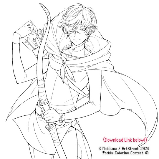
Equally lengthy talk of lineart is probably for a later discussion, but here is the template provided by ArtStreet for the contest + what will be colored in for today.
☞The contest has since ended, but you can still download the lineart template here if you'd like!
3. Composition + Planning
The contest rules said it's "OK to draw backgrounds", so let's go!!
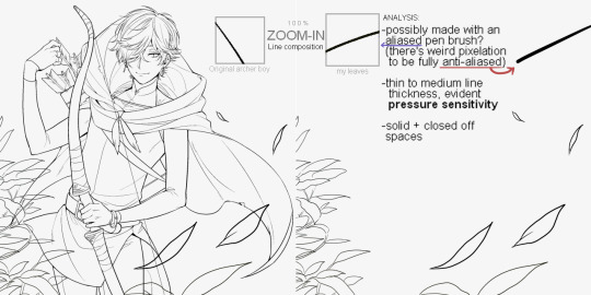
I had already decided on how I want to color it early on: It will be more scenic in nature, rather than stylistic. So, there will be more focus on looking 'real' than 'aesthetically stylish'! Just so it doesn't look disconnected or too out of place, I tried to draw my additions similarly to how Mr. archerman's linework looked as much as possible.
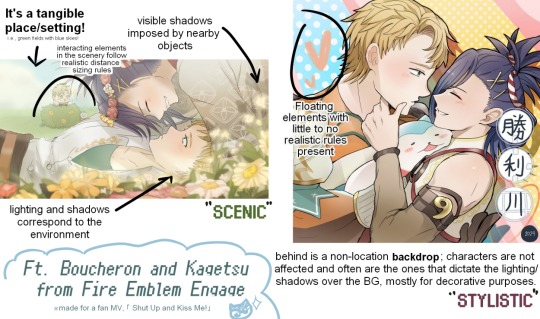
This how I visually define "scenic" VS "stylistic" illustrations (in my head)
I like experimenting and mixing different rendering techniques with varying linework styles and tend to think about my approach with the rendering long before the coloring process, even waaay before I line my final sketch, usually. But for this, I'm simply working with what was given to me.
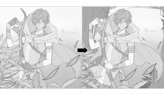
At first, I just wanted a "cool breeze w/ leaves flying away ahhhh refreshing~~" mood, but the space at the side of his head looked rather empty as is, even with Nessie. So I thought about putting him inside a vague...darkly-lit abandoned ruins-setting to eat up some of that space.
And with that, it's time for colors.
4. The Render
My coloring process is the lengthiest and often makes people who see me color in real-time scream in horror, but I think it's actually fairly simple and can be summarized into three nutshelled stages:
①Fill in the colors with a finalized palette of your choice,
②cry Continuously render until your arms fall off you're satisfied.
③ cry even HARDER (optional) Adjust accordingly to fit in better with other elements of the illustration, such as with the focus/subject to background. *will be explained later.
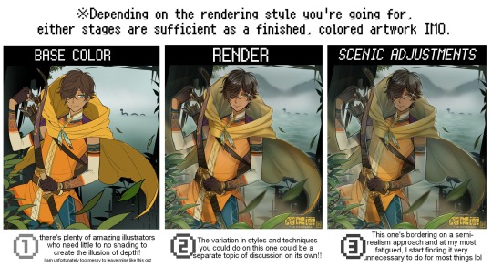
oh and btw, the usage of the words 'render(ing)' tends to be confusing with its association with other mediums like 3D models, but when it comes to drawing I like to think of it this way:
🎨Coloring is the planned/intentional selection of your color range, tints, tones, and palette to use in a drawing, ☀Rendering is the act (or product) of the set of techniques (including effects, filters, etc.) you use with the colors/values to create the illusions of depth, shadows and light, movement, warmth/cold atmospheres, etc in a 2D illustration.
But that's just how I define it with my own step-by-steps. Otherwise, I think either term is pretty much interchangeable.
Anyhoo, what do you think should this man's hair, skin, eye, and clothing's colors be?
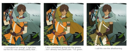
here are some of the variations on the color picks of his outfit that rotted my brain for about 3 hours straight, like it's a 2000s dress-and-match flash game
The many submissions for the contest had many fun color combinations and interesting interpretations I personally think should've won. I saw a lot of blonde archer-princes wearing greens, browns, and blues, as a lot also went for the "forest hunter boi" vibe. But I was saddened by the lack of my favorite colors being used as the primary colorーorange and yellow. So, let's use those!!
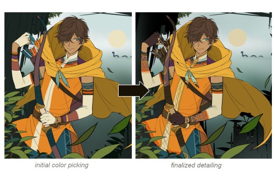
The start of my coloring/rendering journey is never at Layer '1'.........
―Starting with what I've always referred to as "environment prep":
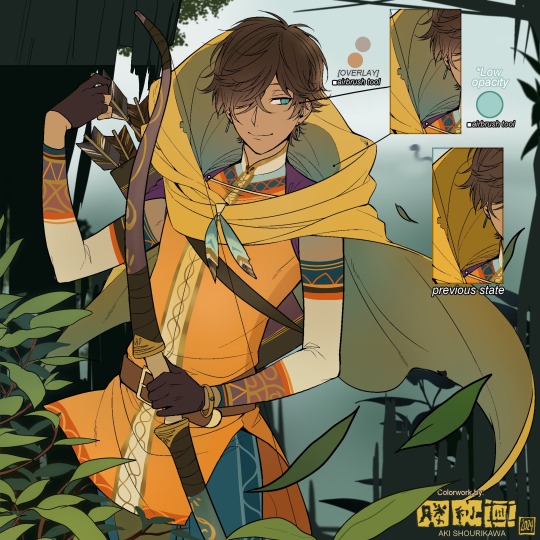
The purpose here is to 'set' the base colors so they match with the environment or general atmosphere. Get ready to see this over and over
This could mean adjusting the saturation, or spraying gradients of the BG's most prominent color on parts that...gives me anxiety the most-
As someone who tends to work with very, very bright color schemes with character designs, trying to blend in when the illustration is meant to be scenic or 'serious' in tone without it being a distracting eyesore can be a challenge. So, this is what I do to counter it.
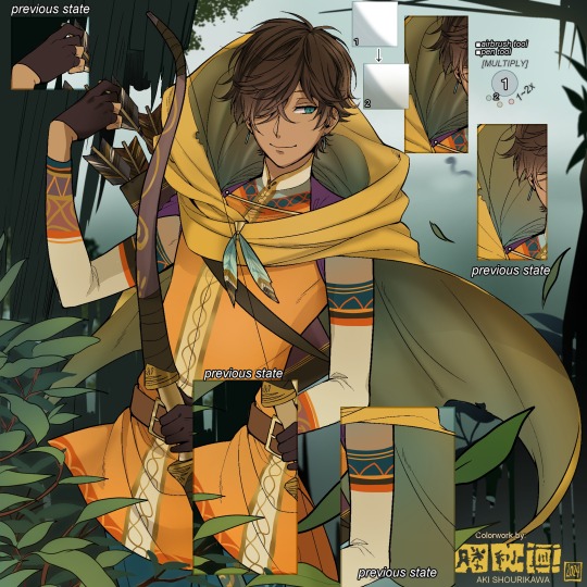
Shading is usually an early step for me as well, even though I think it's a lot of other artists' near-to-final step. I tend to lean towards an abomination mix of soft shade and cel shadeーthe strokes are sharp enough to trace where the shadows start and end, but softened around the edges for effect.
I also tend to apply an additional spray of subtly darker shade on top of the first one? It's usually on spots where I think the light source won't be hitting as much. I wouldn't do this for simple styles (stylized illustrations like with a chibi style), but for scenic illustrations I find it's necessary to achieve that depth against a fully-rendered environment.
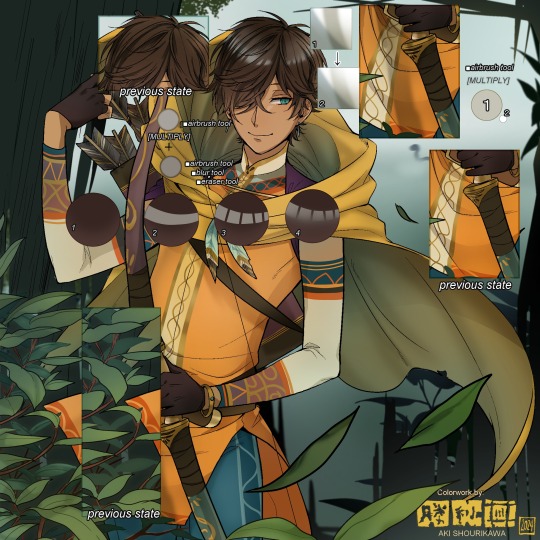
※Just a side note: You may see multiple things changing around, but in real time I'm most definitely working on one part at a time lol. These visual aids were ripped off the raw .mdp by hiding some of the layers, so that's why different areas seem to progress together all at once, even if that's a bit idealistic in actuality.
Apart from the previous adding of shades with a multiply-mode layer for the preliminary shadows, I add one more layer of shadow on there for objects or other characters that can cast distinct shadows on the subject. In here, it's the bow and the hovering strap across his chest.
Lighting is also starting to be added as well.
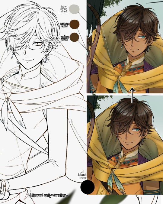
One direct alteration I did with the lineart template was change the line's colors. I find it really softens them to mix better with their filled-in colors + as well as not stand out too harshly against a light-colored scenic background.
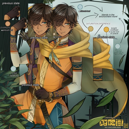
I think you now have a good idea over my hyperfixation on making sure colors are 'vibing' well against the BG lol A lot of these steps are basically just doing the same thing over and over with new layers for the sake of this purpose, really.
And after that, just repeating all the stuff we did with the character onto everything else (background, foreground, objects, etc.) until you're satisfied with it!
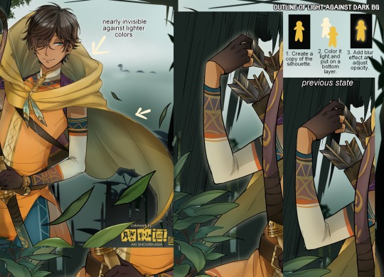
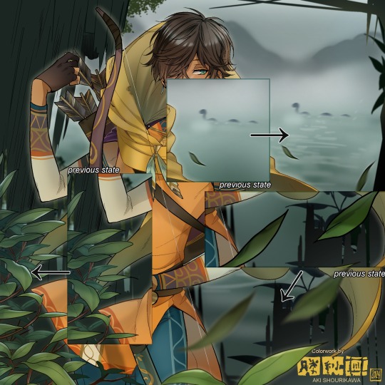
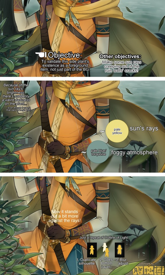
A lot of these changes are very subtle on their own, but makes all the difference in the bigger picture, I think!
Just maybe some additional finishing touches for some boom shakalaka and...that's pretty much it! You will notice that throughout the entire process, there's a lot of random little things that suddenly appear or change with seemingly not much purpose or meaning on its own. I unfortunately have always drawn in this sort of vague, quickly impulsive, directionless way since I was a child and I don't think even I will ever understand it, logically. It's mostly a... continuous string of instinctive feelings of "HEY let's do it this way, if not there's like 10 other things we can try next", is the closest I can get to an explanation of how it feels.
I don't know if it's common for other artists to think or function this way, but I do know for a fact that many people seem to be surprised and confused when they see me drawing in real time this way. Everytime I get asked 'how' I draw certain things, I say things like 'I turn my brain off and vibe with many, many layers with a broken back.' and people think it's just a dismissive joke. I-it's really not, it's literally what happens, I don't have any secret shortcuts for you-
Hopefully this very lengthy post + visual aids can help demystify some misconceptions on what "really" goes on when I'm drawing! It's also a bit of an update of my tutorials made for friendos starting out with digital drawing back in 2015!
Anyway, the rendering stage is where the simplified steps ② and optional step ③ branch out like a fork in the road for me; I don't think one is any "better" than the other, I think doing either is simply a matter of personal preference and artistic choice;
➋being leaving all that 100++ layers rendering that we just did alone and calling it a day,
➌being a little bit more extra w/ additional shadows/lighting that corresponds with the environment the character is in.
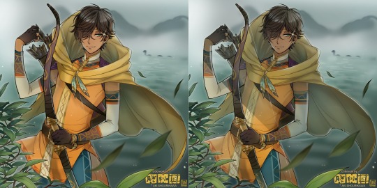
I removed the walls to see the whole figure better in a side-by-side comparison. I like the unadjusted (L) without the wall, but with the walls in the final illustration, I think adjusted (R) felt 'right'. What do you think?
There are some things, although realistic, don't look that good as a visual aesthetic and are just downright excessive/unnecessary to add to certain types of illustrations.
Then there's things that aren't possible in real life, but artistically? Looks really dang cool. Being biased for either ends of the hyperrealism and hyperstylized spectrums of styles is fine; only as long as no discrimination is involved towards people who don't share your opinions, in my opinion-
and to conclude this section, I say,
『 You go render however you wantーhellーno colors even necessary if you wish!
Simple ≠ laziness, just as much as complexity ≠ skill。』
I will never stop yapping about how a lot of minimalist styles require so much more amounts of planning and effort to make sure everything is nice and clean, especially compared to mindless rendering loops like these. Mine's a maximalist hell and I wouldn't have it any other way, but I greatly envy minimalist artists that can render with just something like my step ① with so much grace and tact; not a single stray or wasted stroke!! Anyone who dismisses these types as "lazy" I will violently stuff inside a couchーwithout any potato snacks to snack on!!!
5. Additional FX Tips
Just a shorter section for some optional finishing touches tips'n'tricks used in this I frequently (ab)use☆
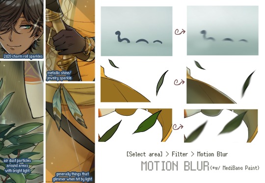
◆ From the very beginning, even before I understood how to draw, it's always been a tradition to doodle around sparkles all around the place. I usually do it with MediBang's sparkle brush if I want it to look polished, or simply draw it manually using either the pen or airbrush tool for a cruder charm.
◆ Motion blur is great, and MediBang in particular also has different types of blur effects like Gaussian and regular blurs. If your software doesn't have these effects / if you're working traditionally but still want to achieve the illusion of motion in a still drawing, you can still achieve the same effect through your linework! Try looking into incorporating action lines (commonly seen in manga and comics) into it. Otherwise, purposefully drawing something blurily to begin with oughta work as well.
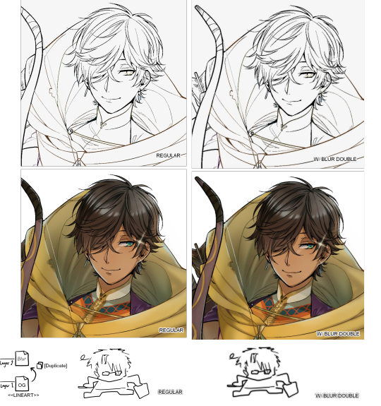
◆ Apart from changing the lineart's colors, there's also this little effect that is achieved by duplicating the lineart and blurring it. It gives something like a...'dreamy' quality to it? The higher the blurred copy's opacity is, the more emphasized it makes everything look.
6. The Layers of Dread
At long last we've arrived... at my MediBang's repeating demise for all of eternity...
Here's a preview of what the .mdp/.psd file of this colored entry's unhingedmerged layers looks like + how I try to validate their existence. When I work on full-sized illustrations, I tend to merge layers as I go, so this is probably one of the rare times I can show something like this without either mine or your PC dying. If you'd like to see, play around with, and toggle them for yourself in all of its............glory, feel free to download it here.
Yes
we're starting at Layer 611. Enjoy.
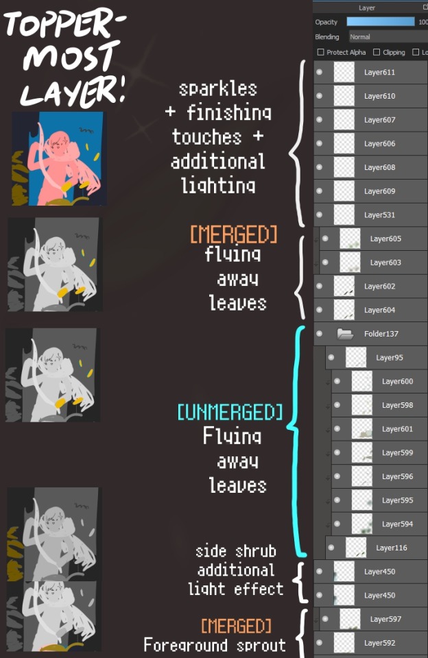
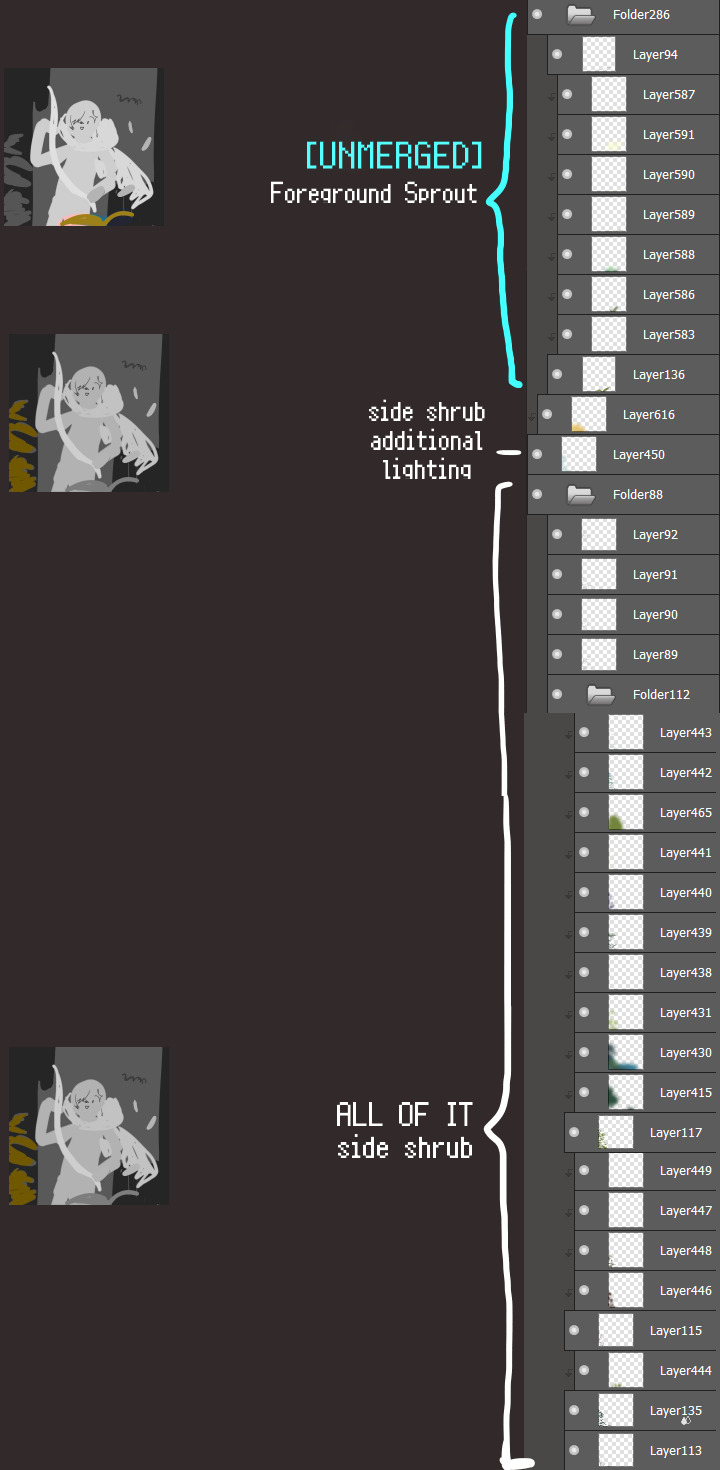
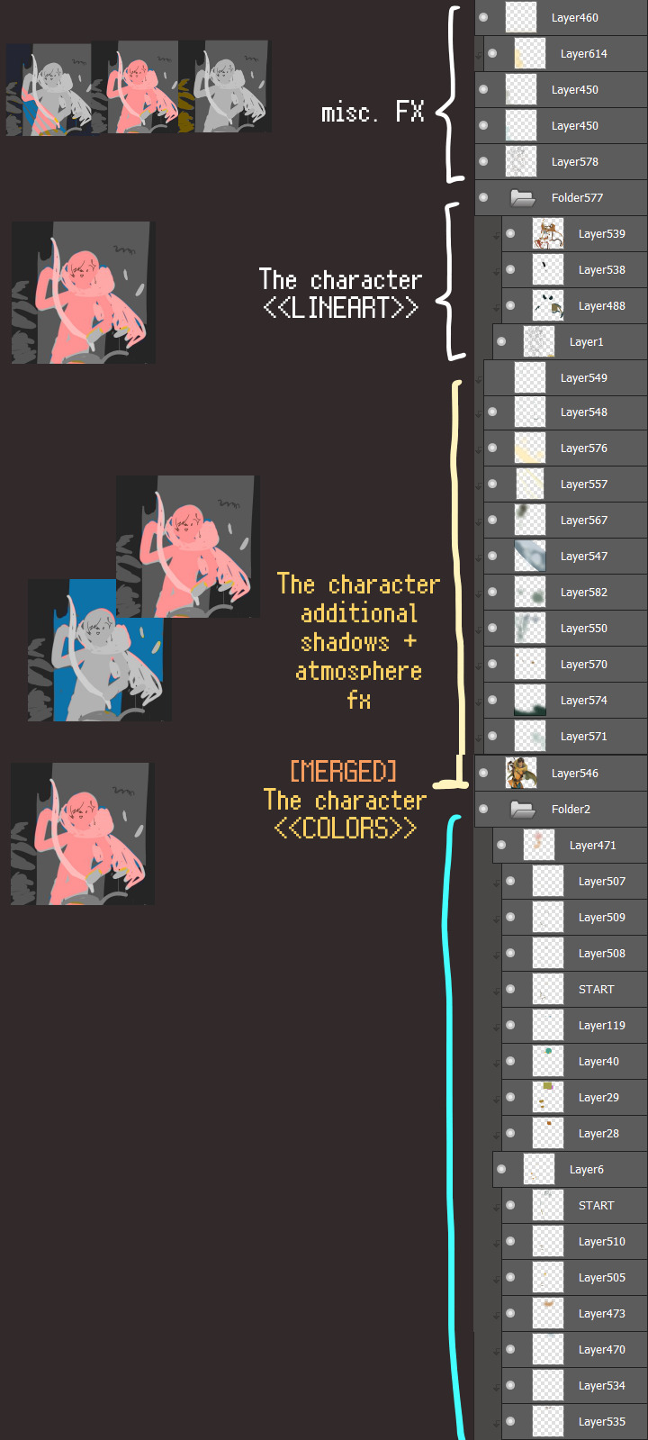
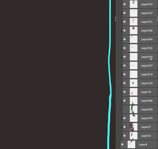
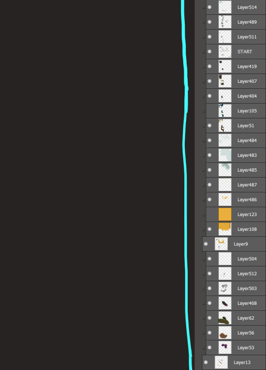
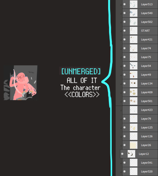
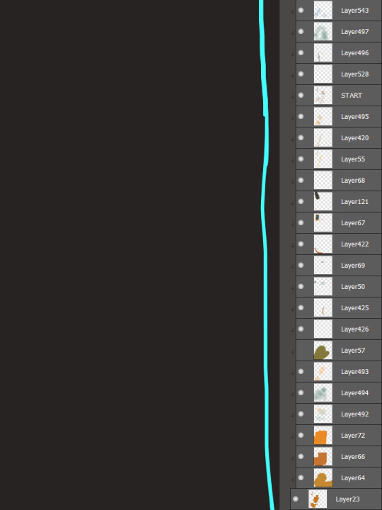
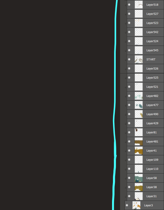
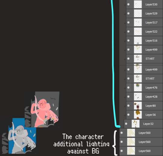
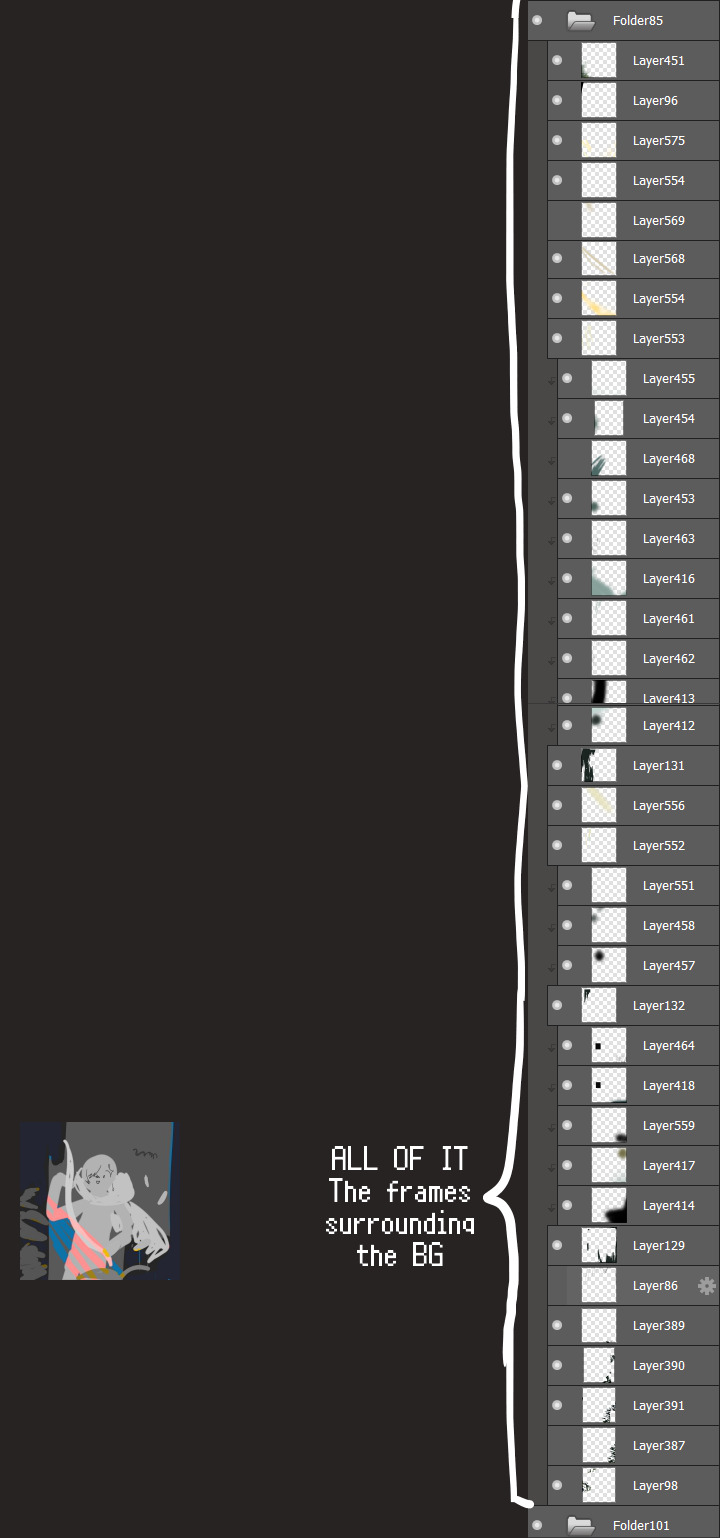
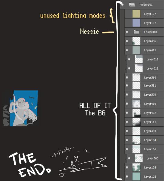
I will now delete my PC's copy because jfc that's one too many MBs ...and it's still eons lighter than what I usually work with on my own full illustrations from sketch to finish......。 (;´༎ຶٹ༎ຶ`) thank you for reading this far and making it out alive, goodbye for now...
・・・ホームページALL LINKS・・・
・Art Gallery・Commission Info・Ko-fi shop・
#art blog#long post#coloring#coloring tutorial#art tips#art tutorial#digital art#digital illustration#digital drawing#digital art tips#digital art tutorials#medibang#drawing journal#drawing process#illustration#coloring practice#nessie#the loch ness monster
20 notes
·
View notes
Text
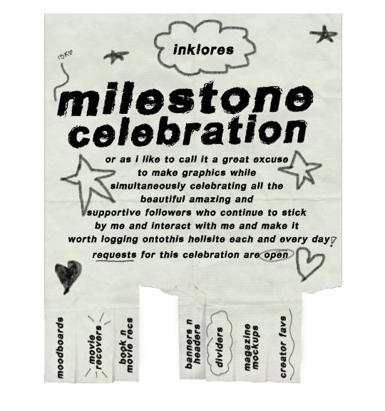

i know i say this every time i reach a milestone, hell anytime i get a new follower that isn't a blank blog or bot, but i can't believe you guys are still here! still supporting me! still putting up with my chaos! i mean it each time i get all sappy about how grateful i am for each and every one of you and how i lucked out with you beautiful souls occupying this space with me. if i could send you all a little cupcake and a forehead kiss i would <3.
but since i can't do that let's have a little celebration instead!
like the flyer above states this celebration will focus solely on graphics and ya girl putting that photoshop to work and brushing off some of my old graphic and creative skills.


★ THE RULES.
you do not have to be following me to send something in unless something is specifically labeled 'mutuals only' then, unless we are mutuals, you cannot send anything from that section.
you can send in as many requests from whatever section as you want, there is no limit. but please refrain from sending requests for animated projects.
this celebration does not have an end date so unless the above image says 'closed' then send things in whenever you wish!
blank blogs and ageless blogs as well as minors please refrain from sending things in, respectfully.
do not steal or claim any of the graphics i make as your own.


♡ MUTUALS ONLY.
moodboards...i'll make you a personalized moodboard / aesthetic. ➥ a 'your vibe' moodboard aka i'll go off of the vibes and aesthetics you give off to me or a character + trope + scenario moodboard
gif requests...i'll make a gifset of whatever character you ask for. ➥ can be a certain scene, from a certain movie, what have you. but please note the list of characters + movies from the actors down below are more likely to give me the most inspo to make something from. but please feel free to ask me for someone not on the list because chances are i'll do it unless i truly dislike the actor or character.
ship edit...i'll make a little edit of a character i ship you with. ➥ i may include some extra things in the graphic because i can't just be simple with things, so you can give me a small list of your favs, your vibes, your likes, and dislikes, if you so wish.

✩ FREE FOR ALL.
movie recovers...i'll make you a movie poster. ➥ this goes for tv shows + some artists + character posters as well.
book + movie recs...ask me to rec some things. ➥ 'your favorite movies' + 'movies you suggest people who like [insert something here] watch' + 'underrated shows' + 'books with this vibe' + 'songs that remind you of this character' are all requests that are applicable plus so so much more, please be as creative and detailed as you wish.
banners...request a banner for whatever you wish to use it for. ➥ these are not personal which means anyone can use them not just you. can be for navigations, masterlists, etc. gifs are not applicable.
headers...just like the above but for mobile headers. ➥ same rules apply as the above section. shows, movies + characters, vibes + aesthetics all applicable.
dividers...i'll make you a set of fancy dividers. ➥ again these are not personal and for everyone to use and enjoy.
magazine designs...i'll make a little magazine-esk outtake for a movie, show, or character.
personal favorites...ask me my favorite anything and i'll make a cute little something to showcase it.

♥︎ CHARACTERS, SHOWS, MOVIES, ACTORS APPLICABLE. ➥ actors + their characters: adam driver, pedro pascal, oscar isaac, jodie comer, will poulter, aaron taylor johnson, thomas doherty, tgm cast but no tc. ➥ movies: scream franchise, any spooky movie, john wick, twilight. ➥ shows: killing eve, hemlock grove. ➥ etc characters: finnick odair, bruce wayne (except affleck and bale).
this list is only for the gif requests so disregard it for everything else or use it as inspo for your requests if you want. also please note that the gifs will be posted on either three of my gif accounts.

here you can find my graphics board on pinterest of past graphics i have made over the years + some inspo if you need it for requesting.
#if you have any questions about anything just message me#i suck at explaining things and i feel like this is all over the place lmasdkojd#also if i made a spelling mistake anywhere it was on purpose ignore it#15k celebration <3
87 notes
·
View notes
Note
Hey ryuichi, as an artist, how do you feel about Ai art? Do you think that Ai is going to replace artists? Do you think that Ai artists are real artists?
I'm curious to know your opinion on this matter.
Sorry for the late reply, Anon! I wanted to give you a more or less nuanced reply, so it took me some time to think about this topic.
I’ll start with the easy one: no, AI art isn’t going to replace all artists and it’s not going to completely eradicate art as we know it, because art doesn’t exist solely for the practical purposes. As long as people enjoy and feel passionate about making art, art is going to exist in one form or another. But that’s just stating the obvious.
And while there are people who are better or worse at coming up with prompts for the AI, as long as they don’t do any additional work based on the AI-generated image, I don’t consider it being art. I think art is about skill, taste and personality, and this simply isn’t it.
Are people going to lose jobs because of AI art? Unfortunately, it already happens, but it also doesn’t mean that artists are doomed and this is some kind of apocalypse. It’s very important to consider the scale of things, the possible developments, etc. Here are some points to consider…
First of all, if we’re talking about personal commissions and clients that opt to use AI instead of commissioning an artist for their project (or personal use), I wouldn’t say that it’s too much of a loss. I feel like this is exactly the type of clients who don’t tend to appreciate artists’ work and pay them fairly anyway, otherwise they wouldn’t even consider AI as an option. Many of these “clients” would never commission an artist anyway, so they’re not even a part of this client pool. I know that money is money, and some artists would gladly take even a low-paying job from a customer that often doesn’t treat them well (I’ve been there and speak from my personal experience back when I started to offer my commission services), but I am an idealist and think that we shouldn’t spend our time and energy on someone who doesn’t see any value in our work anyway. Not everyone has the luxury of throwing away people who pay you at least something, of course, these artists still need to eat, so that last statement remains an idealistic take from me, keep that in mind.
And if we’re talking about corporations that use AI instead of hiring artists, while it is a problem, I also feel like it’s going to backfire somehow – it kinda does already. Not necessarily in terms of the company getting backlash, but in terms of the lack of quality control over the AI art (if you don’t have any actual artists on board, how are you going to know if the art works or not?) and some other unexpected reasons that are definitely going to pop up.
AI is definitely going to transform the way we think about art and art-related jobs in general. Some jobs might get lost forever, but it happens all the time – there are other brand-new types of art-jobs that are going to start emerging out of thin air. Just like photography and Photoshop influenced the market and art in general, AI is going to do just that.
I’ll note that I don’t think companies are going to stop using AI altogether at any point of the near future though; it’s a very powerful and cost-effective tool, there is no way they are letting it go. AI is absolutely here to stay, and it’s going to evolve and become better and better, scarily better. But this is how I think we should approach it:
People whose work is used for the AI’s learning pool should abso-fucking-lutely give their consent to their work being used, or even better, be compensated for their participation. If there is a new AI that makes a point out of the participation in the learning process being voluntary and well-paid, I think it’d change the dynamic between artists and AI – so far it’s just stealing from them.
Ideally, AI should be used as a base and not the final product. Actual artists could get inspired by it during the brainstorming stage or work over it.
Whoever posts, produces or distributes content that was created with the help of an AI, should absolutely mark it accordingly. In my perfect world, there’re going to be laws about this lol In general, the whole thing needs to be reflected in law, so far it’s way too easy to abuse.
Not only marked, AI generated images should be banned from being sold lol You can press that button and type all the key words all you want, but the result is just a free image that anyone can use and cannot be monetized. I believe this final point would make the majority of AI users just abandon their desire to use it in general – if there’s no profit for them, they’ll drop out, and AI art can be used as a tool like it’s supposed to be.
As you can see, I have avoided saying that people who use AI art are “artists” because I don’t consider them artists. If they don’t transform anything and don’t bring anything new to the table, I, the most important person on this planet, will refuse to give them that title lol
As far as I know, actors and writers have achieved some guarantees against the use of AI during their strike..? I haven’t looked into it, so I don’t know. Also please, keep in mind that I’m mostly talking about illustrations, because this is what I do. AI affects other types of art too, and there might be nuance there that I’m not mentioning here.
In general, I don’t want to demonize AI, because I feel like it’s not a problem on itself, it’s the way people use it that’s brings problems for all of us. This is a very new technology, and we don’t know how to handle it just yet mostly because for the lack of the law system regulating it, this is why there are so many opportunities to abuse it.
Also also, when the novelty of the AI art wears off, we might end up with the resurgence of appreciation for “real human art” or something. We are waaaaay too prone to nostalgia not to go “god I miss it when actual people designed logos” one day, and believe me, whenever it happens, the companies are going to market their stuff as the REAL HUMAN ART by the REAL HUMAN PEOPLE so much that we’re going to get sick of it in 5 minutes lol. But hey, maybe it’ll end up being a reason to pay artists more.
Thank you for reading such a long reply! I don’t want for my blog to turn into a discussion board, so sorry in advance if you address this topic in future asks to give me links or examples and I won’t reply to you, but it depends on the number of asks. I’ll look through everything on my own.
31 notes
·
View notes
Note
Can you give a few tips on digital art? I'd love to get into it but I'm not sure how to start, what equipment/apps do you use? Thank youu 💞
♡ 𝑫𝒊𝒈𝒊𝒕𝒂𝒍 𝑨𝒓𝒕 𝑻𝒊𝒑𝒔 ♡
Of course! I would love to give some digital art tips! My first tip is to just have fun! If you are drawing for yourself and just want to have fun, then draw however you want that makes it the most fun experience for you! ଘ( ・ω・)_/゚・:*:・。☆ 𝑬𝒒𝒖𝒊𝒑𝒎𝒆𝒏𝒕 𝒂𝒏𝒅 𝒂𝒑𝒑𝒍𝒊𝒄𝒂𝒕𝒊𝒐𝒏𝒔
I use Clip Studio Paint, for most of my digital paintings. Though I started off using Photoshop. I used to only use photoshop but I would not recommend it for beginners as it is expensive and difficult to learn. I would definitely recommend Clip Studio Paint as it's much cheaper and easier to learn.
I use the Huion Kamvas 13 drawing tablet. That is the link to the exact one I got from Amazon. It's a lot cheaper than Wacom tablets and it works just as good. I've been using this one for years and it's been great!
𝑯𝒐𝒘 𝒕𝒐 𝒔𝒕𝒂𝒓𝒕
I would recommend starting by drawing what you see. What I mean by that, is look up photos of things and try to replicate them as much as you can. I did this for a long time (probably too long) but it helped me immensely. Because everything we draw is based on what we see, so if you can replicate that then you can draw anything.
For example, if you know you want to get really good at drawing Gyutaro, I would look up male bodies and draw them. (Real bodies, not drawings or cartoons).
𝑨𝒓𝒕 𝑺𝒕𝒚𝒍𝒆
This may be controversial, but personal art styles don't really exist. This is the first thing I learned in art school and I think it was one of the most important things I learned.
What I mean by this, is that no one owns any particular art style. An art style is developed in many ways but it mostly emerges from combining other art styles or stems from another art style.
People worry way too much about "finding their art style". Don't do this, it's a waste of time. After time each artist develops a way of drawing that comes naturally to them but that comes over many years, so don't try to force it to happen. And when it does happen, don't stick to one art style!
I would say it is most beneficial to teach yourself multiple art styles. Every time I start a new drawing I try to figure out what art style I want to draw in. I do this by going through the art I've saved on Pinterest. I'll see something I like and make a set of rules that I have to follow while drawing in order to replicate that specific art style.
Not only is it more fun being able to draw in multiple art styles, but it's necessary if you want a career in art. (By career I don't mean doing commissions, I mean being hired by a company to make art. Like a concept artist for example.)
If you're worried about what art styles to try, just try any one that catches your eye! Or you can start by trying to draw realism. That's what I did, and it's very difficult and time consuming but if you can master realism then you can succeed at almost any art style a lot easier.
𝑹𝒆𝒇𝒆𝒓𝒆𝒏𝒄𝒆𝒔
I cannot stress how important references are! If you do not use references when drawing then you are setting yourself up for failure.
References are photos you use to look at as a guide when drawing. For example, let's say I want to draw Gyutaro swimming in a pool. I'd look up photos (references) of Gyutaro so when I'm drawing him I can look back at them to make sure I am drawing him correctly. I would also look up photo's of a guy swimming, I would use this photo to guide me when drawing the pose and also when drawing the water etc.
So always use references!! And don't be afraid to copy poses either, it saves lots of time and is very helpful for learning how to draw anatomy. Don't be afraid to use yourself as a reference either.
For example, when I drew Gyutaro having a pillow fight I couldn't find a good reference for the pose that I had in mind. So I just took a photo of myself in that pose! I look nothing like Gyutaro, but a body is a body. I used my photo as a reference to draw the skeleton and then changed the body shape to match Gyutaro's.
𝑴𝒂𝒌𝒆 𝒈𝒖𝒊𝒅𝒆𝒔 !!
My biggest tip for anyone, but especially beginners is to make guides before you draw any piece! Here is an example of one that I did for an assignment in my Manga Art class in college.

I wanted to do an art style similar to Death Note but I also wanted it to have a retro vibe too. So I made this Art style/Reference guide. I compiled images that represented the art style I was going for and took notes for things that I thought would be important to keep in mind when drawing.
I still do this a lot when drawing, especially if I'm trying out a new art style I'm not very familiar with.
𝑴𝒂𝒌𝒊𝒏𝒈 𝑨𝒄𝒄𝒖𝒓𝒂𝒕𝒆 𝑭𝒂𝒏𝒂𝒓𝒕
People always ask me how do I draw Gyutaro so accurately. Well, I'm about to tell you how!
I draw him all the time, so lot's of practice. But there is a certain thing I find really helps when trying to accurately draw a character's face.
We'll use Gyutaro as an example
Find a photo of Gyutaro's face that you want to practice with (not fanart, it must be either from the anime or the manga).
Look at the photo closely, and try to draw it as accurately as you can.
Now, on a new canvas, try to draw the same photo of Gyutaro again but without looking at the reference. (Just using your memory) And give yourself a time limit too, no longer than 5 minutes.
Compare your drawing to the photo. How accurate is it? Probably not very accurate yet, but that's ok! Look closely at your drawing and compare it to the original. What is wrong with it? Are the eyes too small? Is the mouth placed too high?
Figure out what is wrong and fix it next time. Repeat these steps until you are able to draw Gyutaro's face accurately without looking at the reference photo.
If you are still struggling after a while try tracing over the original image a few times. This can help you memorize the structure of his face.
It may take a while but eventually you'll get to the point where you are able to draw Gyutaro's face accurately without looking at the reference photo!
This tip works for everything by the way, not just character's faces. I use it for everything! I used to suck at drawing hands, so I did these steps but with a photo of a hand, and now I can draw hands! Use these steps for anything you feel is difficult for you to draw accurately. It's great for learning anatomy.

Here's an example of the final results when I did these steps. The drawing on the right is what I was able to do at the end just from memory.
゚+*:ꔫ:*﹤ 𝓣𝓱𝓪𝓷𝓴 𝓨𝓸𝓾 ﹥*:ꔫ:*+゚
I know I wrote a lot, but I hope these tips helped someone! And if you have any questions about anything I mentioned here, feel free to ask! (ɔ◔‿◔)ɔ ♥
47 notes
·
View notes
Text
Signalis Doom - 5
Not much today either, it was mostly a mix of overcoming issues with 3d models in doom and figuring out some workflows.
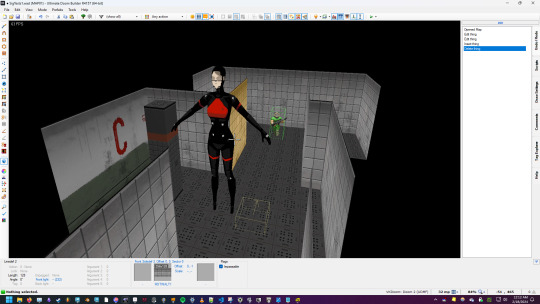
3d models are still considered sprites, so to get models to display properly, it involves a degree of pointing the engine to look at invisible dummy sprites and then swapping those with the model. Odd stuff. There's better formats than this one and i'm going to look into those. That being said, i'm unsure how much i'm gonna commit to 3d, right now it's just experimentation. what I'll prob end up doing is spending a day banging out a buncha mockup sprites to approximate some chars and start mapping. Just enough to get the idea. tbh i could be doing way more mapping to establish a level language than i am, i'm kinda putting it off to play with textures and i gotta diversify.

I'm considering commissioning some artists for some spritework, either on specific characters or UI elements or such. I know i'll want something done for the opening splash. Most of my time today, and the next few days, is going to be spent reacquainting myself with a host of tools. I've been doing gamedev for years, i went to school for 3d animation, and i've spent a great deal of time in alot of art tools. However, i tend to forget how they work very easily. I realized i'm not gonna get anything done unless i take the time to remember how the following tools work; 1. Maya for core animation(could be a problem, iqm is the newest doom format and the community pipeline is best setup for blender, but we'll see how it goes) 2,. Blender for import/export/better compability with some aspects of gzdoom 3. Photoshop for photo manipulation of the existing textures and as a means of either creating new textures, or givng more nuance to ones i create elsewhere. 4. Aesperite for core pixel art. Signalis is a mix of low rez painted works and pixel art, and knowing when to deploy each is a good idea. 5. I'll need to get a proper toolkit up for the model to 2d pipeline, i have options but they need to be tested. 6. FL studio for audio manipulation. 7. and imma be real i don't know how spreadsheets work and i'm gonna need a hell of a spritesheet to organize what assets i'll need to recreate. That sounds like a lot but i've used them all before, and i'd need to more or less do the same thing for any real production anyway.
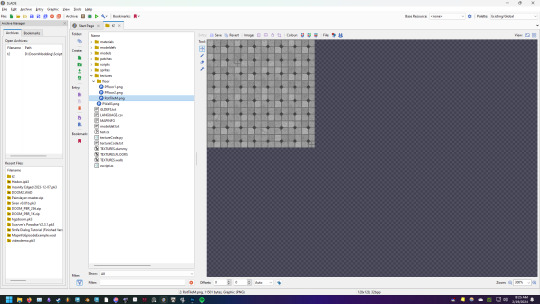
On the plus side, i think i've figured out how to do the floors. i'll just take elements of the original textures, and build a larger one out of them with built-in variation for tiles and color variation. I'll add more variation as needed in-editor.
I'm realizing i'm spending alot of time in odd spots. To be honest, i've never done a fan project like this before, much less one working with OG textures. I'm having a tough time getting my head around not only the unique nature of doom modding (releasing contnet packs taht can slot into any game) with full game production (Og maps, mechanics, story with bespoke stuff) ontop of fanworks (fanfiction, recontexualization of original assets). part of me wonders if my focus on getting og textures working is a mistake, as it's putting me in a mindset that's not the most useful for my project. But we'll see, I'll get my priorities straightned out, this ain't getting done overnight either way.
10 notes
·
View notes
Text
How to make accents for Flight Rising
Hi folks! I was asked how I make accents on Flight Rising, so I figured I'd give a step by step guide on some aspects of it to make it clearer to any new FR skin and accent artists how some things work.
Full disclosure, I usually work on Photoshop for skins and accents even though I do most of my art in Clip Studio Paint. There might be differences in other programs that I can't explain since I do not have experience with them.
Alright, first things first, let's look at how the layers in the template files for each dragon and gender combo is set up, by starting with a female spiral file:

There are two folders - the base folder (named Skin Parts) that serves as reference, and the accent/skin area itself (folder named Accent Parts). The Skin Parts folder consists of a basic silhouette layer (called Flats), and a few details on top of it (such as the lines, which go on top of the shadows, which go on top of specific subarea layers, like the wings and belly).
So usually, what is supposed to happen according to the tutorial, is using the Skin parts as reference, you draw your actual accent or skin on the layer called "Accent goes here", which I've marked with a red star in the following image:

You'll notice that the shadows and lines layer on the accent folder is "clipped" (that little arrow going down from Clip lines and the clip shadows pointing down that I've circled in the next image). This means that whatever is on the "clipped layers", will only show up that layer's art on the areas that have been drawn in the layer it has been clipped to.
Another Tip
Here's another tip, which is how I generally make my accents. You don't have to only draw on one layer like a single painting.
What I do is make a separate folder I often just call "Accent", and use different layers there to create overlap effects. I'll deconstruct part of one of my accents to show you how I use different layers. I'm going to use my accent Sunset Astros

This is what my accent folder looks like for it:
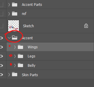
It consists of three subfolders: the wings, the legs, and the belly. This is to keep things organized so that I know what I'm editing at a time.
The legs subfolder consists of a few layers that overlap with each other:
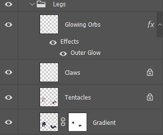
The base layer, named "Gradient", is just a flat purple that has been edited to fade out at certain points:

On top of it, I painted a layer with "tentacle" swirls that I named, appropriately, "Tentacles":

On top of the tentacles, I added the light golden claws as a detail and name the layer "Claws". It's on a separate layer so I can play with different shades of gold to see what I like best:

Finally, I add "glowing orbs", using Photoshop's layer effect outer glow:
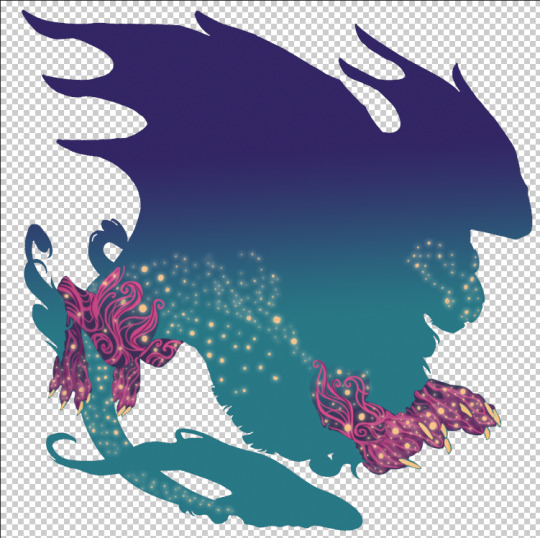
Building up on each layer, I finally have something nicer to look at. I do something similar for the other body parts until I build up something I'm satisfied with, drawing, or in the case of the belly, painting within the silhouette and belly area.
Once I finish the basics of the accent, which I've been working on without the lines and shadows on top of it, because those are in the "Accent Parts" folder, I have something that looks like this:

Once I like how it looks, I copy or duplicate the "Accent" folder, and then merge all the layers in the copied folder into a single flat layer. In my experience, you right click the folder in the drawing software and then find the option to merge or flatten that specific folder. Not sure how it will be in your software.
Once that is done, I move the new "Accent" single layer into the "Accent Part" folder, underneath the "Accent goes here" layer. Then I delete the "Accent goes here" layer, which also automatically unclips the shadow and lines layers above, making them show all over, not just where the accent is:

This is wrong, so what I do is right click the shadows layer, and click on "Create clipping mask". Then I repeat that process for the lines layer. That's when I am almost at my end result.

From there on, it's coloring the shadows and lines. For fun I'll share what my unclipped shadow layer looks like to show you how I change color for specific part of the accent. In this case, I have moved the layer setting from "Multiply" to "Normal" so you can see the colors but otherwise that layer always stays in Multiply. Make sure your layer is always on Multiply so that the shadows work well.

This is where I make sure to turn off and thus make invisible the "skin parts" folder (which in this case I had colored in that gradient of teal to darker blue-almost-purple). Then I have my end result:
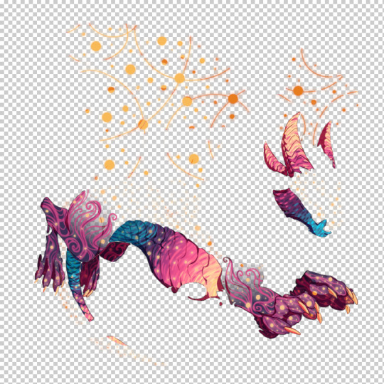
I save it then, and then resize it to 350x350 pixels, save as a transparent png, and voila, I am ready to submit the skin/accent! I also make sure to also undo the resize in the Photoshop/non-png file so I don't accidentally save a smaller version in case I decide to make changes.
Erasing outside pixels
You might have stray pixels - pixels that are outside the lines. I do two things to erase those: I create a layer that I put at the bottom of the layers. I then fill it with a color that stands out against the other colors I've used in the accent so they stand out and are easier to see and erase. I also use the wand tool, go to the layer of "Flats", and select outside the actual silhouette of the dragon, and then just erase everything outside it - which isn't perfect, but will help you get most of the outside pixels. You want to have as few pixels outside as possible.
Hope this helps! If you have any questions let me know!
#flight rising#flight rising accents#flight rising skins#flight rising skins and accents#Raire's Accents#tutorial#fr skins and accents#fr accents#fr skins
42 notes
·
View notes
Text
Use of AI in my patterns
I've got a comment on my latest post that I want to address properly:
"Please dont use image generators. They use a lot of water and power and just. Its disrespectful to us artists who had our works scraped and thrown into the sludge maker."
Thank you @cats-n-witchcraft for voicing your concerns in a friendly and respectful way.
I've thought about this a lot and also had a long talk with a friend to dive into the topic a bit more and mull everything over. Since it is a long answer, it's under the cut! There is also a poll at the end of the text.
The use of AI-generated images is a very divisive topic with extreme opinions on both ends, some pleading against and some for the use of AI. I do not have an extreme opinion but I am somewhere in the middle of the spectrum. Maybe it has to do something with my age or my personality type in that I always try to see things from different perspectives and like to find a middle ground in a lot of things. I understand both sides and think that both sides have some valid arguments pro and contra AI.
I definitely think AI use should be regulated and artist's work should be protected. But I also see merit in AI as a tool and in a way to enable creativity in people who aren't artists in the traditional sense with talent, years of practice, or formal training.
What I find horrible is people abusing AI to make fast money, image resource sites getting flooded with the stuff, people not disclosing the use of AI and just showing general scammy behavior. That's just not acceptable. I also think that AI companies have a huge responsibility to reinvest money in environmental projects to make up for the large use of resources. If this is not viable, then the whole business model should definitely be thought over.
Governments should step in and make clear rules regarding AI.
I will happily lend my signature to any ongoing petitions regarding this (feel free to link some in the comments if you have some).
I have always been a curious person and I like to try out new technologies. But I will now stop more often and think "do I need to use AI for this?" I might occasionally use it but I am by no means a power user. AI images are bad quality-wise and it takes work to make them usable or presentable and it does clash with my sense of perfectionism anyway. I only use two different AI image generators, the free Chatgpt with Dall-E 3 that comes integrated into Bing Copilot, and Photoshop's Firefly AI which Adobe claims was not trained on copyrighted materials (hopefully it's true). So far there are only a few occasions I've used them for. They include generating an avatar for a website, a few plumbob images, and a few bizarre Sims 4 caricatures because I was surprised that the AI knew the concept of Sims. I also thought that experiencing that and knowing how such images tend to look helps to spot them "in the wild" so you know what's AI and what isn't.
When I first tried AI, I was enticed by the novelty of making these unique images that I had not seen before anywhere else and was enveloped by the "wonder" of it (that has since worn off).
TBH it is super frustrating to have ideas but not to be able to execute them. I love making patterns for the Sims 3 but I really suck at making them from scratch, I tried a lot but I dislike the outcome of the majority of them and I do not seem to have the skills nor the patience to get to the level of surface pattern design skill required that would be acceptable quality for my perfectionistic brain. So figuring out this way of creating patterns without having to fear copyright strikes because I modified some assets (which is a really big thing in Germany where I live and people get made to pay a shitton of money for copyright infringement) was like a drug for my brain. It is hard to resist its satisfying pull.
I will try harder to find other ways that do not involve AI before considering AI as an option.
I'm sure lots of people try out something they are curious about and that is not really good for you, and we do not make good choices in our lives all the time. Maybe your personal questionable choice is in another department, but there are and will always be people who have different opinions and condemn our way of life in favor of another. I try to make choices that benefit the planet and environment and do not hurt people, but I am not 100% consistent, just like 99,9% of people on this planet, but I try and I care. Generally, I feel sad that we tend to accuse individuals of their behavior instead of accusing the big corporations and governments that are the real cause of the problems.
It can lower our self-esteem and make us feel inadequate because We can see so many areas in which we are not living up to someone else's standard. We have to choose our battles. Generally, I think we should not shame others for picking different battles or having different opinions. We never know the whole picture or reasons for other's opinions and behavior, especially of people we interact with online. We can engage in dialogue to foster understanding though and this is the way to go, and it is why I wrote this long wall of text. Thank you for reading my wall of text!
I want to close with a poll about what you think about the use of AI-generated images in my patterns.
Whenever I may use AI-generated assets/images in my patterns or other CCI will disclose this in the pattern download (if I know they are made by AI). In any case, I would only sporadically make use of AI!
6 notes
·
View notes
Text
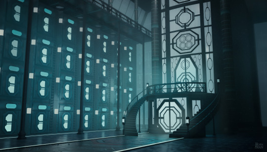
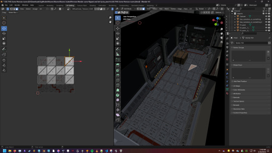
A test task I've done right when I got sick, four days ago, so it feels a bit like a fever dream, how I was maniacally drawing, modelling and texturing 3 days in a row. And the final piece has this feverish vibe, I think x) So, the theme was a retrofuturistic dieselpunk+atompunk bomb shelter's atrium leading to living rooms. I didn't know there is a whole genre called atompunk, but apparently good old Fallout series is a part of it. And also it was told that the main focus would be the wall, ceiling, floor and railings design. You have 3 days to make it using any medium. I've decided to use my 2D-concept art skills + modest 3D Blender somewhat skills + aaaaaaaaaaaaaaaaaaand my new passion, making procedural textures in Substance Designer, which I've started to learn and use about a 1,5 month now. I thought, let's mix useful and pleasurable, shall we? The best way to learn something is learning it on the field. Come on, I've learned Photoshop while drawing my first picture book in uni, it works.
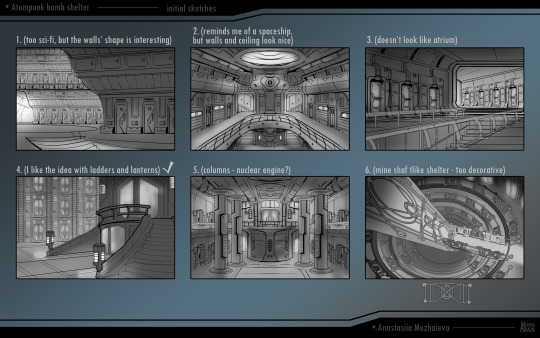
First thing first is to find the whole vibe. I'm by far not an architecture expert, most of my life I've been drawing characters, but the thing I've learned about it that there should be a pleasing repeated pattern of shapes to look at. As it doesn't suppose to look natural\organic, there should be a decent amount of straight lines, so it will look manmade. And it's freakin' hard to find this fine line between atompunk and regular sci-fi and I don't think I've managed it. But that's the thing with test tasks, what matters is: • the amount and diversity of variations you provide • your desicion making to show what you as a professional think works best • your ability to turn any variation into a project • your determination to finish it Even if your choice might not fit the project one employer has in their mind, other potential employers will see your work too and might find it fitting for their projects.
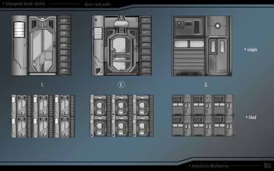
My idea was to create a wall of doors that will also be a tileable wall texture that I'd do in Substance Designer. I was so thrilled about it as I was so inspired by so many tutorials on Youtube and Artstation how it would be fun to do my first sci-fi panel...

...and oh my friggin' gosh it took me 6h in one sit to make it. I was so focused I think I've rarely breathed, my shoulder was aching and burning form tension, it was about 01:00 am and I was slightly panicking if I could finish everything else. It was the end of a day 2, I've spent 1.5 day on concept arts and this door. But still I was determined, as having a clear idea what to do (concept-art) and a tile that will cover 1\3 of the final piece (doors) is already a lot. Everything else can be improvised on the go. I've tested my door texture in Blender, was relieved it works and went to sleep. And I was also getting slightly cold and coughing a little, but I haven't thought about it.
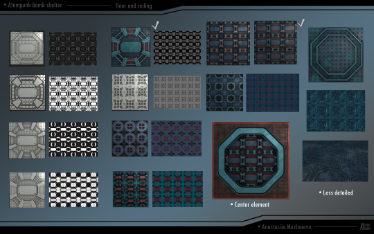
When I have a goal, I even wake earlier than usual. It's a day 3, I must put everything in it. So after a really challenging for a texture novice like me door creating a floor tiles was like walk in the park. It was fun, not painful and done before the noon, so I was confident in myself. And I've began my blocking in Blender. It is not by any mean a sophisticated 3d-modelling as a true 3d-artist would do. If any professional 3d-artist looks inside my Blender kitchen, their hair would turn grey. I do the same when I model my scenes for Deciphering comic: if it looks right, than it works for me. In game development production it's also the case that concept artist's models are only a reference for 3d-artists, so if you are a concept artist you can just don't bother about how technically disasterous and wrong in terms of wireframe and polygons your models could be.
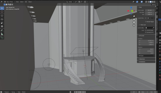
Slightly unreasonable tangent: Blender, why are you such a bitch when it comes to spiral stairs?! WHY? Why, you caprisous shmack, what the matter with you, why can't you do a decent spiral stairs in the first try?! Why every time I'm doing the spiral stairs I have to pull my hair from the head, dance with drums and shout curses at you, and you still do it through you digital asshole?! So... yeah. My initial idea with a solid staircase went to the trashbin as I couldn't handle mine and Blender's temper and there've been not so much time left, it was around 8 pm. So I was thinking on my foot how I could turn it into something that looks like a designer desicion and not rushed last minute one, but yeah, I've failed it. I've also find out that I got sick and had a high body temperature. Yay!


By the way, stained glass looking texture on walls was an accident. When I was testing my door texture, I've made a mistake an applied it on the whole bloking area. It stretched across everything in an ugly way, but... this screen pattern looked good. Surprisingly good. It would be a crazy idea to have a glass walls in the suposed bomb shelter, but... damn it looked interesting. So I've created a new texture just for this part. Yeah, design over functionality, that's how it gets born, that's how it goes. Just some happy accidents.


Then I've figured it would be a right time to do a fast concepts for railings... but my tablet decided to not respond. I've tried to install new drivers, checked eveything, lost an hour on it and decided: f*ck it, I'll finish it with my mouse if I must. Luckily I still had my Samsung Galaxy tablet so I quickly doodle some designes for railings. But composing the final concept art was still going to be done by mouse.
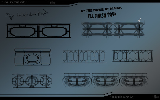
This is when I've accepted that this is more a steampunk-ish train station with a bit of 60s than a bomb shelter and let it go. We have high ceilings? Let's have polls to the roof. No, let's also have a balcony under the roof. Let's have an elevator with glass and metal ornaments. Let it be more retro than futuristic! Can you hear I had a high temperature and feverish determination? I've made several Eevee shots as they were fast to render and compose.
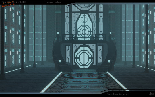
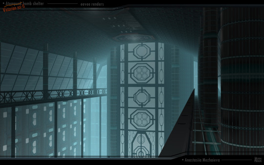
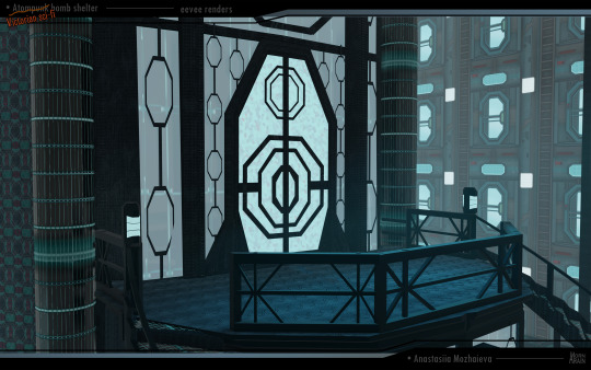
And a Cycles engine one for a better presentation. As my tablet died, there wasn't much I could paint over it, but I've tried to hide a couple of rendering mistakes. Mostly it was just about composing rendering maps, masks and filters in Photoshop - and I also was close to my limits as it was 02:30 am when I've finished it.

It looks a bit as this whole location is underwater, but it's fine. Brings some mystery to it. Next morning I've send and still haven't received any answer. But it's alright, if they don't find it fitting, and decline. It's actually happened to me several times, when my test tasks for one company is liked by other one. That's not the main case I'm talking about. Every now and then an artist should do some kind of challenge, as only challenging yourself you learn something new. It's a never-ending journey and that's the beauty of art, it's not just a job, it's a way of life. And gee I've learned several things during this one! It may look like a screenshots from 2000s oldschool videogame, but hella I love old school videogames. It may not lead me to a new job in a short run, but in the long one it feels like a one of a millions steps in my art journey and I'm strangely inspired to create more of this obscure kind of environments.
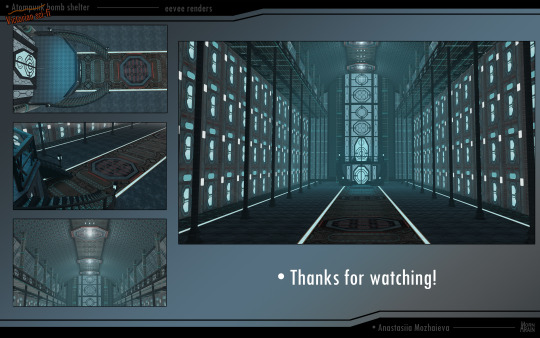
And thanks for reading!
#my art#my post#scifi#science fiction#retro science fiction#retro scifi#retro futuristic#concept art#environment concept#game concept art#atompunk#steampunk#blender#substance designer#interior design#futuristic#environment concept art#atrium#arainmorn's art
15 notes
·
View notes
Note
Hello hello, I’ve been in the Beatles fandom since early 2018 (February if I recall correctly!) and before that briefly recalled seeing a lot of Beatles Cartoon posts in 2017! I was mostly into the cartoon from 2018-2021 but since 2022-Present have been really into beatle history in general. I would consider it a special interest because of how much I come back to the Beatles and their related media lol! But my question lies here: what was the tumblr side of the beatles/beatles cartoon fandom like? I’ve long since wondered since the cartoons boom of popularity seems to have come from here (on tumblr I mean!) I’ve even seen a few posts from a select few artists who have drawn fanart for it as early as mid-late 2016! I just think it’s very cool! I know you yourself have “lore” for what you posted back then?? Please tell me everything you know…I really am interested! I’m sending this anonymously for now, but if you’d like to chat I can shoot you a message on here or on discord (if you’ve got it!).
Thank you for the ask! I discovered and only participated in The Beatles Cartoon Lore from August 2017 to February 2022 (this being the main timeframe for me). I very rarely ever participated early on due to social anxiety, but became more active during its decline on tumblr sometime late 2018.
I don't have a say in the Cartoon and Larger fandom as a whole because as I discovered the cartoon back in 2017, then saw the lore and became so interested in it and focused on it more than the band and normal cartoon.
There where a few lore discord servers to my knowledge, but I never joined any except for the one I made sometime late 2018 left in 2020 and came back to it officially this year.
I have been trying to document lore posts for a while now on @beatlescartoonlore-info-archive but has been hard due people deleting their blogs and how infrequent i search
While I have no idea how the lore started, the general consensus is you find cryptids in the Cartoon from weird in-between frames, animation errors, or other video oddities ect. and give them a name, lore, and how they interact with the world and with other cryptids. I have been trying to write my lore for my cryptids dispite taking a partial break from it since 2022 to earlier this year. I've made a non beatle cryptid before. It's a spongebob cryptid who's seemingly always at every gate letting people in and out.
My blog for that is the story is @stolencryingsouls
I have a few cryptids. My most recognizable in the lore are @psychic-john and @eaternoid. Psyon being my first and Eater Noid coming from a conversation on said discord server. I mostly use a crow who wears a train engineer hat to represent myself in the lore and i often just photoshop it.
I do have discord, but I mostly use it to play games with my siblings now a days
0 notes
Text
Day 738
When I was in university, I used to make item art as a hobby and to earn some bit of virtual currency on a site called Gaia Online. I have always had a fascination with item art, this is probably a leftover from my years on Neopets (which has flared up with Santae these days). I’m not by nature a person who is really into drawing, though I seem to dabble in it more since I started journaling.
Back then, Adobe Photoshop reigned supreme as far as art programs went, and it wasn’t subscription based when I was in school. So I had a copy of it on my laptop. Since I only used a mouse touchpad I had to learn how to use the vector tool, and masking for shading purposes. I also taught myself how to use the different layers and even learnt a bit of colour theory to try and give my shading more depth. Even though all I did were potions and teacups I was very proud of the sort of things I made, because it was a lot of work to do it by touchpad and I taught myself.
My first roommate happened to have been behind me one day as my room also had the washer and dryer, and she was doing laundry. She happened to see me working on a handleless teacup, and she asked me what I was doing. I had told her I was shading a teacup. She took a closer look at it, and said something to the effect of, “The computer did a really good job.”
To be clear, she was (and still is) a long time friend of mine. Never at any point did I think she meant anything bad by it, in fact I’m pretty sure she meant it as a compliment, because she didn’t know what I was doing. The only other artsy person she knew of at the time was her sister who did traditional art, whereas I was familiar with digital art through my sister, which was how I could do that research in the first place.
But here is the thing, it is not uncommon for a general audience, who might not be well acquainted with a particular type of art to downplay (or dismiss entirely) the work the creator has done. Most digital artists have experienced this at least once during their artistic endeavors. It’s also not limited to digital artists. The joke about a five year old being able to create the same art piece found in a museum are often made by those missing context about brushstrokes, shapes or colour theory that had caused that piece to be chosen.
Or a person who has never experienced a photograph taken by a professional photographer might dismiss their work because all they do is ‘press a button’. Let me tell you, the best photos of my cat are done by my photographer sister, using only her phone and her knowledge of composition and lighting. I am envious of this ability.
By the way, to further prove my point, my father is completely enamored with my sister’s ability to take photographs that he says looks alive. The reason he feels this way, isn’t just because this is his daughter he is talking about. My father is an amateur photographer, which means he has the background knowledge to appreciate what my sister does for a living.
I think about this a lot when I think about generative AI and what that means for a society. Especially with people who truly believe that this technology can write stories, paint pictures, create art. There’s a reason why AI causes such a gut reaction among the creator community. It isn’t the fear that AI will replace them, we know AI can never do exactly what a creator with a specific intent can do. No, it’s the fear that society will look to AI and dismiss a living creator’s experience and skill as nothing because they don’t have the context to know better.
1 note
·
View note
Text
Statement
Having a grandfather who was the chief photographer for the New Zealand Herald, I grew up with a firm belief that the media and more specifically, the photograph, were undeniable manifestations of the truth. Being young and naive, we tend to believe what we are told and accept what we see. However, as we grow older and begin to make our own political choices and pick and choose what media we wish to consume and believe, we have no choice but to wonder if there is any fabrication to what we are seeing. My Grandfather is gone and so are the days of trusting what we see, read, and hear which begs the question, where does the photographer fit in all this?
In the first half of this semester, we explored the history of manipulation in image making and photography considering the role of a photographer in a modern post-truth society. In my first project, I explored surrealism in photo manipulation as a means for expression as I found that surrealist imagery like the common use of the eye was a powerful vessel for expressing one's desire to reside in a dream-like world. For this project, I wanted to stick with surrealism but with a more grounded approach. My project “The Glass Woman” speaks to how we as humans try to hide and change what makes us feel insecure in search of confidence and comfort. In my photo series, I am trying to show that no matter how you try to hide or change what you look like and how you are perceived, the projected facade is seen through and will never change who you are.
In the early stages of this project, I was heavily inspired by Dora Maar. Dora was one of the early pioneers of the surrealism movement as she created manipulated compositions through analogue collage methods cutting together different images to create seamless and realistic compositions. Although this may seem like standard procedure for anyone who knows the arts, in the 40s, Dora’s work was extremely influential and has certainly left an impact on surrealism and photography as a whole. Evidence of Dora’s impact can still be seen in the current day with the likes of Kensuke Koike. Koike, like Dora, works mostly in analog using antique imagery to create surrealist portrait compositions. In my opinion, Kensuke’s most successful works are the ones that feature a human portrait that has been manipulated to resemble 3D geometric shapes. It is these works that most informed my outcome in this project, “The Glass Woman,” with Kensuke's work pushing me to explore portraiture as a vessel to tell my surrealist story.
Though both Kensuke and Dora use photo manipulation as a vessel for artistic expression, this is sadly not the case with many practitioners and media outlets in our modern post-truth society. This is something that Jonas Bendikson explored in his book, “The Book of Veles.” Bendikson used computer graphics to generate 3D characters that he then manipulated into his images to tell a fabricated story about the city of Veles. Though Bendikson hid clues in the book about its fraudulent imagery and had no intention of selling it as truth, he was shocked to find that no one questioned its validity due to his reputation as a photojournalist.
Though I struggled with finding my footing in the second project, I found my calling with portrait photography shooting digitally to allow for a quick import into Photoshop which is a comfortable space for me to manipulate images. Though I am proud of my outcome and think I have done a good job using portraiture to express my chosen message about our glass personas, I would’ve liked to shoot in the studio with the studio camera equipment but as I did not have the time for this assignment, I will look forward to doing it next time.
In my three compositions, I explore small and common ways that we as humans may alter ourselves to change the way we are perceived. Though the gestures I have chosen to capture in the work; wearing glasses, applying lip gloss, and covering the face are all small and inconsequential, they are symbolic of a wider human need to control and protect our self-image and the way we are perceived. In the surrealism genre, they envision a dream-like world created from the subconscious. In a modern society, we too dream of a world where we can protect ourselves from the pain of judgment, so we manipulate our self-image. However, this projection of our persona is not a factual representation of who we are. We are all made of glass.
0 notes