#i also want all their character designs to easily translate to paper cut outs because i am heavily considering doing it in that media
Explore tagged Tumblr posts
Text


been pissed off for a while how 3 of my characters have sameface so i redesigned 2 of them
#i want to redesign a lot of the characters rn because they arent the right style / level of exaggeration that they should be!!!!!!!#i really want OU to be more reminiscent of cheap/experimental 50s animation (like UPA or something)#i also want all their character designs to easily translate to paper cut outs because i am heavily considering doing it in that media#i want it to be reminiscent of 50s cartoons because in USA culture the style is very ingrained with the image of conformity#and patriotism UGH#and i want to contrast those themes with.... THE EPIC HORROR?#plus the art style is pretty cool and surreal lookin lol#oregon ultimatum
21 notes
·
View notes
Text
My top 10 list for who I WANT as DLC in Smash
We’re reaching the end of an era. Smash Ultimate’s DLC is going to end eventually, with four more characters to be announced. They could release some kind of ‘Echo Pack’ in the future, which I would be hyped about (They didn’t really do much with the echo fighter mechanic), But I have a feeling that after this, there won’t be any more. So I wanted to post my list of who I, specifically, would like to see in the game.
This is not based off of likelihood, as some of these characters probably don’t even have a chance of making it in. I just think they would be neat.
Full list under the cut, counting up from #10
- Papyrus (UNDERTALE)
Okay, so hear me out.
We got the Sans mii skin, and that was by far one of the most popular mii skins since Geno, probably. People were more excited for the Sans mii skin than Terry Bogard and maybe even Banjo. They probably made a lot more money than expected from it. So why not try it again?
And while Sans is the popular character, he definitely is not a fighter. He’s a lazy, laid back character that just wants to have fun, but he’s far too weak to go into an all-out battle without risking his own safety.
HOWEVER!
Sans’s brother, Papyrus, is the polar opposite. He’s dedicated, hardworking, and can take quite a few hits. He’s got plenty of moveset opportunity. And it would be another indie rep, which is really really good for someone like me, who wants to go into game design.
Another thing: When we got the Cuphead mii skin, we also got Cuphead Spirits. They could have easily done that with Undertale, there’s enough characters. So maybe they’re saving it for a DLC Spirit board? I don’t know, just a theory.
He would be primarily a ground-based fighter, with projectiles that could crawl across the stage like that one sparky item. He could also use his blue attack, which could be good for an easy spike on airborne characters. And, who knows, maybe for his final smash we could finally see his special attack.
I really enjoy Undertale, and seeing Sans as a mii skin made me super happy. Getting a whole fighter from the series would be even cooler.
- Paper Mario (Super Paper Mario)
Nintendo, we’ve got three whole Links in this game, but only two Marios? Preposterous!
With that being said, Super Paper Mario was one of my favorite Wii games (Although I didn’t play it until very recently) And it’s a very popular series. He’s essentially his own character separate from Mario at this point. The games have so much lore put into them, and we already have a Paper Mario Stage in the game, so maybe we could get Dimentio’s dimension, or the Origami Palace or something.
He’s been in enough games and done enough crazy things to earn a pretty diverse kit for himself. He could use Pixils, the 1000-Fold arms, or even summon Paper Bowser, Peach and Luigi for some attacks.
I think he would be super fun to play. I’m terrible at vanilla Mario, but I think Paper Mario would be a good fit for the game AND be a super good-feeling character. However, this comes from a G&W main, so take from that what you will.
- King Boo (Luigi’s Mansion)
I 👏 want 👏 more 👏 villains 👏 in 👏 Smash! 👏
King Boo is a staple of the Luigi’s Mansion series as well as being an enemy for Mario in some games like Sunshine. He’s the Big Bad Evil Guy for Luigi.
And I DEFINITELY want him in this game.
It’s not so much the character himself, although King Boo is really good, I want him in for his kit. Think about it. A large character but with floaty jumps like Jigglypuff and an aerial based moveset AND a teleport? He’d be ruthless. And really fun. And that’s what I’m looking for in a character.
- BOTW Zelda (Hyrule Warriors: Age of Calamity)
Yes, I know. “But Worm, the Zelda we have now is annoying and awful, and you say you want ANOTHER one?!?!?” Well, you’re half right.
Yes, Zelda is known for her darkness-sealing powers in BOTW, BUT, in the recent Age of Calamity game, her moveset for almost have the game revolves around the Sheikah Slate. She uses it creatively, hopping around on ice and whirling metal slabs around with a magnet. And I think that would be a SUPER cool moveset for Smash Bros.
And who knows, maybe they would call back to older games and allow her to switch to using her powers, like Zelda used to change into Sheik.
She would be very technical, with her attacks being powerful but with some startup, almost similar to Snake of all characters. And for her final smash she could use a Weak Point Smash or they could bring back Bow of Light (Which was MUCH more fair than the current one, by the way). She’d be fun, and that’s what I want.
- Maxwell (Scribblenauts)
Maxwell is from Scribblenauts, a game where you have to solve puzzles by writing words in a notebook and those words coming to life. So he’s work in the same way in Smash, although much more randomized.
For his neutral special, maybe he could write a random item and it shows up in his hand. That would be funny AND cool, and it’s possible (because Peach does the same thing with Turnips!). He could use projectiles but also have plenty of close range options, and for a Final Smash he could use the Meteor, which in the game clears the screen of living things. Brutal! He also uses Adjectives on both his creations AND himself, so maybe for some moves he could effect the other opponent with a poison or freeze effect.
Would he be banned in competitive play? Yes. Would he still be fun? Definitely!
- Jibanyan (Yo-Kai Watch)
I may be in the minority here, but I REALLY liked Yo-Kai Watch as a game. It may seem like a cheap Pokemon ripoff, but the gameplay is nothing like it at all. You’re given a map to explore and various objectives within the map, and the battle system is really creative and fun. It’s actually the inspiration for some of my own games. Yo-Kai watch deserved more credit than it got.
Jibanyan is the poster boy for the series (and also has the saddest backstory of any cat-based character ever), and mainly attacks with both his paws and fire attacks. He could have fire-based moves and would almost play similar to Pichu. His final smash could be Paws of Fury, his soultimate move, that would hit like Donkey Kong’s final smash as a flurry of blows.
This series is really well made and thought out, and it deserves more than it got. So please put my boy in Smash, I’m begging you.
- Specter Knight (Shovel Knight: Specter of Torment)
Okay, yes. I know Shovel Knight is the main character of this series. But again, hear me out.
Specter Knight is either the first or second boss you encounter in the main Shovel Knight game, and he’s already got some moveset potential from that alone. However, he also had his own story mode, Specter of Torment, ad let me say, that is a phenomenal game. I’d go so far as to say it’s better than the main Shovel Knight game itself. His controls are quick and easy to pick up. And he has a whole bunch of special abilities you can get as the game progresses, such as a boomerang or even a shadow clone.
His smash moveset would pull most of the specials from the unlockable items he can get, leaving room for an incredible spacing game as well as a good aerial defense, as Specter Knight can both float and do a Dash Slash through enemies for some extra air time.
Shovel Knight is the main character, but Specter Knight obviously has the most soul put into him (Pun not intended). And, again, he’d be fun to control.
- Master Hand / Fighter Hand (Super Smash Bros. Series)
This is mostly me just being mad at the game for giving us a playable Master Hand, but only once. We couldn’t have even gotten a Master Mode in extras, huh?
Yes, yes, I know Master Hand is the staple boss character for Smash Bros. He’s been in every game, for crying out loud! I’m honestly surprised it took them this long to give us a playable Master Hand. But this leads into my idea:
A new hand, made specifically to fight in Smash Bros, called Fighter Hand.
Yes, it’s cheesy. Yes, it’s stupid. But hey, it would be fun.
He would have scaled-down versions of Master Hand’s moves, with mainly projectile-based specials and tilts. He would be floaty, although introducing a flying character would be interesting to see how they balance it. For a final smash, maybe they could bring back Master Core from Smash 4 for a Giga Bowser-esque punch.
- The Knight (Hollow Knight)
Hollow Knight is an Indie Game that I never finished (I’m working on it, okay?) that’s kind of like Metroid in the way it’s played. It's also a very popular game, and I like bugs, so they get the number two spot because I like him.
And the special Soul moves you unlock translate well into Specials. Platformers always translate well into Smash, so he would work very well in the game. I don’t know what their moveset would be (as I haven’t finished the game yet), but I know they would be a small, fast character that mainly uses their nail to attack like a sword.
And my most wanted character in Super Smash Brothers: Ultimate is...
- Beatrix LeBeau (Slime Rancher)

Okay, look. I’m aware this has zero chance of happening. Slime Rancher was never the most popular game, and Nintendo has never mentioned it ever. But it’s one of my favorite games, and I just think Beatrix would be an incredible character in Smash Bros.
She would use her jetpack to recover, she would shoot plorts as projectiles, use he vacpac to suck up both fighters and projectiles, and maybe shoot a boom slime as an explosive and unpredictable bouncing hazard. Her smash attacks and aerials would use the various slimes you can vacuum up and feed in the game, like the Rad Slime and Rock Slimes. She would be really good offstage and onstage with her weakness being her speed.
She could bring a LOT to this series, and it would be another inspirational indie rep. And, hey, Minecraft Steve got in. Who knows at this point.
Anyway, there’s my list. Feel free to argue with me or explain why Geno should be on my list (I will not care) in the comments or reblogs, this list is not changing unless I play some new game that I feel should be represented.
#smash bros#super smash bros#super Smash Bros ultimate#super Smash Bros dlc#Smash Bros dlc#ssbu#papyrus#undertale#paper mario#king boo#luigi's mansion#zelda#BOTW zelda#BOTW#age of calamity#maxwell#scribblenauts#jibanyan#yo-kai watch#specter knight#shovel knight#specter of torment#master hand#hollow knight#Beatrix lebeau#slime rancher#ultimate dlc#ssbu dlc
27 notes
·
View notes
Note
Do you have any tips considering fanfics with original characters as protagonists? Specific issues to look out for? I admire your writing and your writing advice, you put everything so well into words. Perhaps you've thought about this in more detail as well. I feel like fanfics with original characters are difficult to make intriguing or worthwhile for readers.
yeah, i have thought about it, and i wish i had some kind of sagely, concise answer to give you. this is going to be another long post, sorry. i mulled it over for a few days and i’ve got a lot on my mind.
i don’t know if i could tell you anything from a prose standpoint about “how to write better fanfic with OC protagonists.” i think writing a fan character is, with a few exceptions, pretty much the same as writing a canon character. they have to talk and behave like a real person. they have to be consistent, or have a good reason for it when they’re not. they have to go through events in the story that challenge them. basically, they have to be flesh and blood. if you can find the spark of life in a canon character you love, you can put one in an OC, too.
the only material difference is that they belong to you, and because of that, there’s no “bible” of canon content to refer to. you’re on your own for things like their character arc and dialogue voice. sure, there might be people who are skeptical of them based on their preconceptions about OC fic. but that’s not something you have any control over, so if you ask me, it’s not something that should sway your writing decisions.
on the flipside, a lot of the “issues” i could tell you to “look out for” could just as easily apply to an original fic. “have a cohesive plot arc with conflict, rising action, and a conclusion that makes sense?” that’s every story. “make the premise interesting?” that means three different things to three different people. there’s not much, at least to my eye, that’s only relevant when you’re introducing an OC into a canon universe.
so, when it comes down to it, i feel like writing OC fic is less about how you do it and more about your attitude toward it. it’s not an undertaking where you can bring your shame to the table. every writing project i’ve done, most of all fanfic, has started out with me planning not to tell anyone about it. i always go, “this is ridiculous, i can’t admit i made this OC,” or “i’ll write one passage to get it out of my system, but i won’t publish it.” once i’m in, the fun takes over, and i peel off those layers of embarrassment as i grow more and more fond of the premise and characters. there’s prudence, of course, and good taste, but at the risk of sounding corny… at some point, you just have to let your enthusiasm lead the way.
so, that said:
is there another side to the story/world that interests you enough to explore?
is there a side character you think has untapped potential? was there a mission or episode detail you wanted to explore in more depth? did you ever wonder how the big, heroic main plot might have affected people and places that you didn’t see? if you want to write about big pairings and big, popular subjects and your OC is just the lens the reader sees it all through, great! but if something else grabs you, pursue it, because nobody else is going to have a take on it that’s exactly like yours.
if the story is good, it won’t matter whether an OC or a canon character is the protagonist. it’s just a good story, full stop. if someone won’t take a chance on it because it has an OC lead, it goes back to what i said earlier - that’s on them, not you.
are you writing from a place that is emotionally meaningful to you?
you don’t have to lift something whole-cloth from your own experience. i know it’s annoying to hear people say that you do, and with many fandoms, it’d be impossible. i mean, who among us has fought aliens? but what do you feel strongly about? what emotions have you been through? is there a kind of character or relationship you really want to see? what’s the small, glowing grain of truth within the character that’s going to take them from being a puppet to “a real boy?”
some people will tell you to keep your main characters at arm’s length in case you have to do something nasty to them down the line. i don’t. i always fling myself into it. i’ve talked about that before. does it hurt more when people don’t like them? sure it does, but it forces me to be a more compassionate writer, and i feel the results are worth it. irina, jo, sabrael, marcus and livia, everyone else - i carved a piece of my guts into all of them, and now i’ve served it to you. gross!
and lastly, but most importantly:
do you love the character?
of course you love your character! what kind of a question is that?
and if you don’t, then… why not? i’m not judging, just asking. are they new, and you haven’t had time to get to know them yet? do they come with baggage because you’re worried about them being “cringe?” [if so, cut it out. remember what i said about shame.]
or maybe you just haven’t found the key that will open the locked door of “knowledge of how to write them, and the fondness that comes with it.” every character, to me, starts out with that door, and the key is different every time - a personality trait, an item of clothing, their dialogue voice, something that happened in their backstory, etc. for some characters, the key is much harder to find than others. i don’t know why. but if you haven’t found it yet, don’t worry. keep looking.
here’s the theory that i like: people can tell when you care. if you’ve made something with love, that shines through, regardless of your skill level. if you get excited when you think of a new idea for their story, write it with the same amount of glee you get from envisioning it. if you’ve had the character for so long that it’s become a fictional companion to you, those nuances you’ve learned about them will show up in the writing, just like a real old friend.
sadly, i can’t promise you that doing all that will result in a huge reader turnout or tons of feedback. i wish it did. it doesn’t always. you can work hard and do your best, and it still might not translate to a high level of engagement. but just because the internet is weird, fickle, and cruel doesn’t mean you won’t end up with a cool story that you should be proud of. i’m not saying that should be enough to satisfy you. we all want people to read what we write. we’d be lying if we said we didn’t. i’m just saying that if you write an OC fic from start to finish, you will have achieved something. don’t think it being fanwork diminishes it.
some extra parting thoughts:
for what it’s worth, i’m glad to see the mary sue thing is - at least in places - in its death throes. because, honestly, it’s 2019. it’s time for us to move on. and, look, i’m not a fool. i’ve been engaging with fan content since i was a preteen. i’ve seen OCs where i didn’t buy what the creator was selling me. maybe their visual design didn’t mesh with the main cast. maybe they were a weird choice for their canon-character love interest. maybe they were handed too much, or maybe they lost too much, or anything else from that grab bag of mary sue mortal sins that really live or die on the execution, not the concept.
did i get invested in their stories? no. is that a problem? of course not. i still hoped they had fun and kept working with them, because fun leads to practice, and practice - eventually - leads to skill. brushing all that off as “lol its a mary sue it sux” is intellectually lazy, and also beside the point. the point was for the creator to have fun with a piece of media they enjoy. if they did that, my opinion that an angel vampire with natural pink eyes might be a strange match for sherlock isn’t worth the paper it’s printed on.
26 notes
·
View notes
Text
Smokey brand Movie Reviews: Anger Issues
First proper movie of the year, and it’s Birds of Prey and the Fantabulous Emancipation of One Harley Quinn. Look, the DCEU is a dumpster fire, so much so that the WB has basically given up on it. They’ve started doing stand alone films as a way to recuperate their image and it’s kind of working. Shazam was fun as f*ck and Joker is rightfully getting so much buzz, it’s ridiculous. Even Aquaman was decent once it was released from the grimdark Snyder vision. Birds of Prey is not that. It is, at it’s core, a DCEU film. This thing might as well be called Suicide Squad but with chicks. It’s that ridiculous. But is it as bad as that? Let’s get into it.
The Great
The very best thing about this movie is f*cking Huntress. Bro, i LOVED Helena Bertinelli in this movie! Mary Elizabeth Winstead owned this part, one hundred percent! She was the MVP of this whole goddamn sh*t show but she sure as f*ck ain’t get MVP minutes! Huntress is in this thing for a grand total of ten minutes, man. It might be more, it might be less, but it definitely ain’t enough because she has NO time to shine! What little she gets, though, she kills! Talk about burying the lead, man. I understand that certain cuts needed to made in order to give the top-biller in Harley the god shots, but f*ck, dude. You can’t tease me with so much awesome and then just snatch it all away! F*ck you for that, movie. F*ck You!
The Good
This thing was cast incredibly well. I was on the fence with some of the announcements during development, but it came together nicely. There aren’t many weak performances and, overall, you can tell that everyone was having fun. There’s a lot of great chemistry among this group and i can see myself giving a proper BoP sequel a chance.
Margot Robbie is Harley Quinn. She embodies this chick like Ryan Reynolds embodies Deadpool, for the most part. She was my first pick going into SKWAD and it felt right seeing her in those hot pants. There were some issues i had with that character, mostly the vanishing accent, but she’s gotten much better since then an that growth shows here. It’s unfortunate that her character doesn’t grow in this two hour run time, especially considering how much time Harley gets onscreen.
Jurnee Smollet-Bell is probably the best Dinah Lance we’re going to get for a while. he was surprisingly adept at the part, even if everyone is butt-hurt that she was race-bent. Her Canary Cry was absolute sh*t but that was more the effects fault. Them sh*ts is cheap! Jurnee did a fantastic job as Black Canary and i wasn’t even mad she wasn’t rocking the fishnets while doing it. She kicks high.
Rosie Perez was an interesting choice for Renee Montoya but i knew she could be fantastic in the role if they gave her room to breathe. Perez could have brought that Puerto Rican heat to the role, and she did a few times, but not enough to make an impression. Again, that’s because this ain’t a Birds of Prey vehicle so all of the Birds had to kind of curtail their time in the camera, and overall character development, in order to make sure Harley got her face time with the audience. It’s kind of f*cked up and makes the movie less for it.
Black Mask was a goddamn spectacle! He’s smarmy, and arrogant, and flamboyant, and campy, and generally just brilliant. He’s one of the best villains of the DCEU, which ain’t saying much, but i can say just SO much about Ewan McGregor’s performance as Roman Sionis. His mask is stupid though. And he’s definitely Black Mask in name only. Still, for what this version is, McGregor delivers. If you’re curious what a closer interpretation of the comic character can be, check out Batman: Under The Red Hood. That’s a far more accurate representation of what Sidonis is supposed to be but I’m not mad what we got here.
Chris Messina as Victor Zsasz is okay. In the book, he’s out of his mine and ludicrously violent. Like, textbook psychopath crazy. In this, he’s still pretty f*cking nuts but he’s also wildly jealous and crazy possessive? I think that’s because of the insinuated relationship between he and Black Mask but you gotta read real heavy into that relationship to even broach that subject. Like, I‘m reaching with that statement but, for the most part, Messina does an admirable job of bringing this character to life.
The action scenes, outside of the awesome that is Huntress, is the real draw of this movie. Harley’s story is cliche and the Birds don’t get much time to develop so they’re kind of inconsequential but the action is superb. It’s, legit, John Wick levels of awesome most of the time. There is a lot of buzz about that jailhouse scene and it’s totally worth all the talk. That motherf*cker was spectacular!
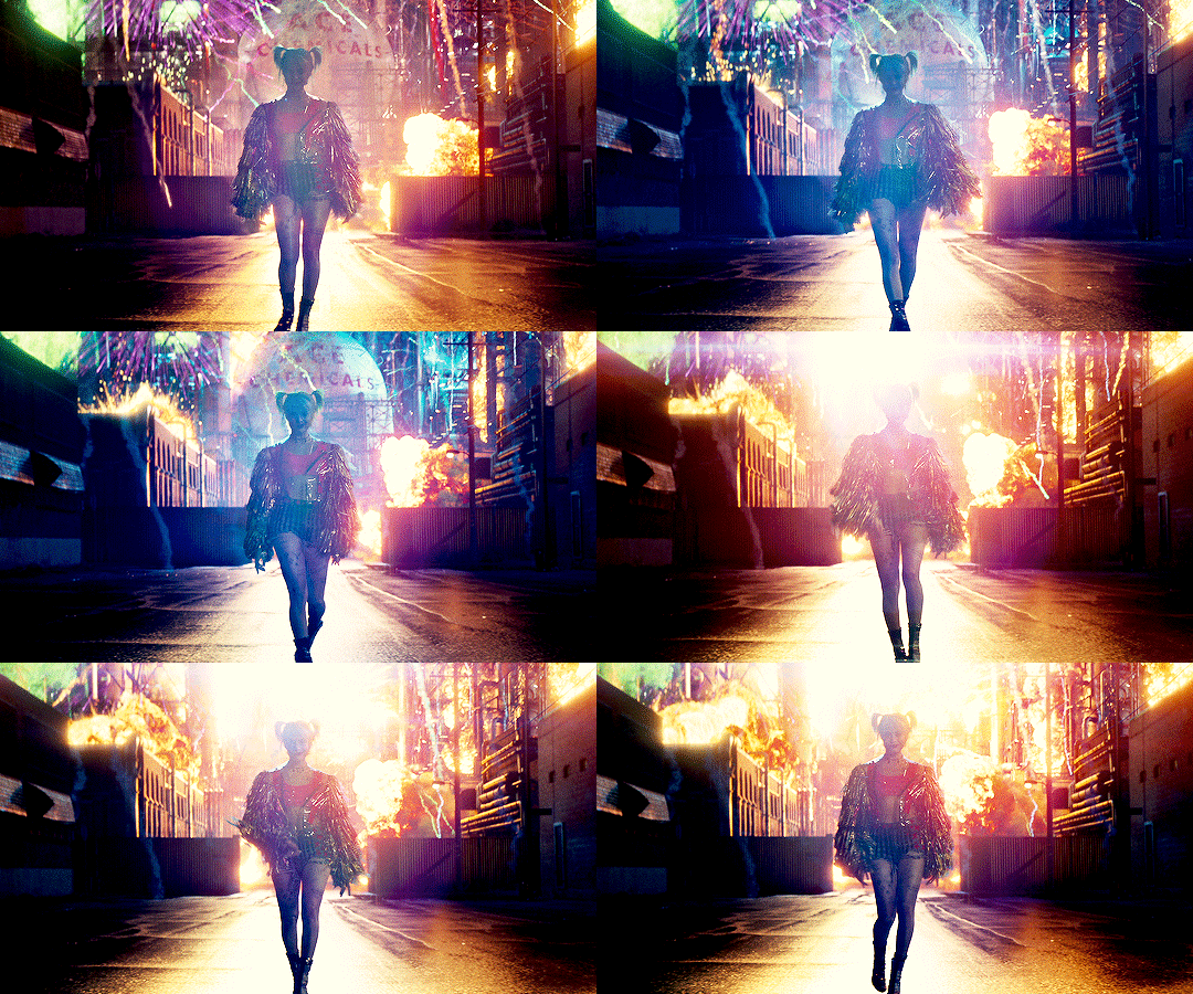
The art direction is pretty amazing in here. This looks like how i think SKWAD wanted to look, but couldn’t because of Snyder grimdark nonsense. Like, if that trailer house had full reign to actually film that movie, BoP is what we might have gotten and it is a much better look for the type of movie these things are. Certain sets, like the funhouse and Sinonis’ club were awesome and the little flairs for characters were on point. The confetti beanbags were absolutely genius!
I would be remiss if i didn’t mention the costumes. Harley had a ton of costume changes, so much so a character mentions it in the middle of a fight, but i wasn’t mad. They all reflect her character and Margot Robbie is a helluva a Barbie to play dress-up with but so was Black Mask apparently. He had almost as many costume changes as Quinn and they were all amazing. I liked what they had Canary in, even if it wasn’t comic accurate and i absolutely adored what Huntress rocked in the beginning. All in all, pretty legit costuming, i must say.
Another one where the sound design is worth mentioning. The direction didn’t elevate this assblast of a movie but the sound design sure as sh*t did. There are a ton of punctuating songs and effects that give otherwise flaccid scenes, that extra Viagra boost to get them rock hard! It’s amazing what music can do for anything really. Throw a dope ass soundtrack behind constipation and you have a serenade that eases things up to drop that deuce. I say that because that’s how it feels watching this goddamn movie.
The Meh
Ella Jay Basco is probably the weakest part of this movie. She does an admirable job as Cassandra Cain for being so young but there are certain instance where you can tell this is her first big gig. She isn’t terrible by any means, there aren’t any terrible performances at all in this thing, but she was easily the weakest of the lot.
The liberties taken with the characters in this movie are interesting. I’m curious as to see where this version of Gotham can go and what these particular interpretations of such iconic Bat-Characters can go. I don’t think they are great as a direct representations, f*cking Cassandra Cain is a particular sore spot for me because i adore her in the books, but i can give her chance. I can give all of these characters a chance. I rather adored this version of Huntress. Ma might be my favorite one! Well, almost. I’m pretty partial to Helena Wayne but i digress. While i don’t particularly care for how these awesome women are represented in this flick, i can see the potential. There is a unique vision here that is worth seeing through.
The writing is so-so. I can’t say it’s bad because there is a lot of good in there, tons of interesting ideas, but the execution is real poor. Most of these scenes feel like, on paper, they were dope as f*ck. On screen, though? Just underwhelming. It’s like they couldn’t translate what they wanted or needed to film for one reason or another. I feel like that might have more to do with the direction, I’m getting to that, but the core of a flick is the writing. If you’re script ain’t on point, you’re movie can’t be and i can see how dull them pages were to begin with.
The direction in this thing is mediocre. Cathy Yan did a “meh” job with this thing. A lot of that might have been due to the script but a great director can elevate straight schlock. Look at James Cameron. Avatar is an ass of a film that rips of f*cking Ferngully but his vision got it Oscars and the number one, highest grossing, spot on the all-time list until Endgame murdered that sh*t. Yan did not elevate this schlock. They had to go back to reshoots and have Chad Stahleski touch up some stuff. Like, the best parts of this thing, the action scenes, weren’t even directed by Yan. I mean, they were at first, but this thing got screened by the execs ad all of that sh*t was tossed out. Stahleski made them things pop! No telling what else he touched up, or f*cked up, on his way out.
The Bad
This is not a Birds of Prey movie. This is a Harley Quinn vehicle with a Birds of Prey cameo. I can see what they wanted to do with this thing, backdoor origin story for one of Batman’s strongest supplementary teams, but with no Barbara Gordon as Oracle, it feels hollow. Especially considering that the Birds, themselves, have next to no screen time. I get that Harley is the money maker but this should have been a Gotham City Sirens film.
The continuity of this sh*t is dubious. It takes place in the old DCEU. It’s legit a sequel to Suicide Squad. Harley references that sh*t twice. I don’t know what that means going forward, but this Gotham ain’t that Gotham at all. It’s weird to see because you spend a good amount of time within the GCPD and no Bullock or Gordon; The latter of which we’ve seen already. It’s awkward the way WB has decided to play fast and loose with what sticks and what doesn’t. Joker is a stand alone and so is Shazam. The Batman is going to be a stand alone or it’s own franchise. Aquaman and Wondy are still in the DCEU continuity but i don’t know how long they will be, especially considering Wonder Woman’s solos are all prequels that have no ties to that Snyder depression exercise. It’s nothing to just pluck her out and add her to a much better executed cinematic universe. With Flashpoint all but confirmed, It feels like none of this matters. This one, for sure, doesn’t.
The plot is still stupid. The McGuffin is better since the reshoots because dick pics? Really? But the writing is still stupid. The whole center of the conflict is ridiculous and the resolution is just blergh.
The only thing worse than the plot is the pacing. This motherf*cker drags! There are entire scenes where nothing f*cking happens and it’s stupid. Most of the time, it’s the scenes with Harley. Her arc is just so f*cking pedestrian. It’s well acted, i said as much above, but it’s SO dumb and i kind of hate it.
This movie really hates dudes. Like, i get it, right? Respect. Recognition. Women deserve all of everything. Equality, feminism, yadda-yadda. I get it. There are ways to execute that perspective which are good. A decent writer would convey that by actually writing decent scenes, not just turning all of the men in the film into juvenile caricatures of chauvinism. I personally don’t care, I’m not a neckbeard typing with one hand while breathing heavily on my monitor in my ma’s basement, but i had to mention it because everyone is mentioning it and they have a point. This is glorified misandry at it’s finest but, you know, patriarchy or whatever. I don’t care. It didn’t take me out of the movie, the sh*tty plot did that, but it was interesting to see in person. It’s hard to justify this bullsh*t when Atomic Blonde exists.
So the gay-baiting. Like, really, dude? If you’re going to do it, go all the way. I read somewhere that Black Mask was supposed to have a homosexual relationship with Victor Zsasz but nah. None of that is expressed in any capacity. There might have been a line referencing it, maybe, but that could have been in regards to the violent outburst in the club the night before. Ambiguous because you gotta sell this thing in China! Renee Montoya is legit gay in the books and, other than a passing line early on, it never comes up again. I think that might be because of the distinct lack of characterization for literally all the Birds in their own f*cking movie, but still. That’s massive part of her character and no one talks about it. No one talks about any of the LBGTQ bullsh*t they pushed in the promotion.
All of this controversy does this flick a disservice. It doesn’t deserve all the hate it’s getting and it definitely doesn’t deserve all of the praise. This is not some super “GRRRL power”, kickass, gay-loving, action flick. It’s a mediocre break-up story that happens to have some interesting action set pieces but, ultimately, is inconsequential in the greater scheme of things. This is the Ant-Man of the DCEU. I spoke about this at length a few days ago and the nonsense that I was afraid was going to happen, is happening. No one wants to sh*t on this flick because of “Muh representation”. It’s a female lead, female directed, piece of sh*t. It is. But it’s a fun piece of sh*t and easily the best, of the worst, of the DCEU but it’s still a piece of sh*t. It’s not changing cinema, it’s not some great step forward in representation, and it’s not doing women in the industry a great service. It’s a quirky, violent, nonsense of a movie and should be judged as such. Again, Atomic Blonde is a much better example of ho to “GRRRL power” your way in the box office. Go watch that instead.
The ending to this thing feels rushed and super anticlimactic. I felt bad about it. Seriously. The way this movie resolves, after everything that took place, is just whack, man. It leaves you wanting, especially after how charismatic Black Mask turned out to be more than that, there’s no resolution. No one grows. Everyone is exactly where they were at the start of this f*cking thing. Like, what was the f*cking point? I can tell they wanted me to think that these chicks had grown into something more but did they really? Did we really see any growth out of any one of them not name Harley? Hell, even Harley is still the same motherf*cker! Like, for real, dude? Someone read that script and thought, “Okey-Dokey, this is good enough!” I just wanted to punch this movie in it’s face when it was over. Like, f*ck you, movie.
The Verdict
Birds of Prey is a bad movie. It’s gorgeous to look at, the costumes are amazing, and most of the performances are super strong. However, the plot is stupid, the pacing is on drugs, and the best parts of this flick get, like, no screen time to breathe. The Birds are guest stars in what, very obviously, is not their movie. This really should have been called “Harley Quinn and The Tiniest Bit of an Origin Story For The Birds of Prey” because that’s what it is. Technically, this should have been Gotham City Sirens to begin with but i ranted about that before. Margot Robbie is bad at picking movies to produce and she definitely produced this one. Got her unfortunate and inexperienced fingerprints all over it. Kind of doesn’t matter what should have been, though, this is what we got and this is a sh*t time, for sure. But, it can be fun at times. There is about as much to like as there is to hate especially if you’re open to being blue-balled when it counts. If that sounds like a party to you, check this thing out. If not, you can pass on it. That’s how meaningless this thing feels.
1 note
·
View note
Text
Various Donghua Reviews
I watched or tried to watch a whole bunch of donghua in the past few weeks, and since I see little discourse on this type of animation, I decided to compile them into a list with my short opinions attached. If you are toying with the idea of watching this or that Chinese animation, check out below for both recommendations and a couple of no-no series ^.^”
First things first, some notes. “Wuxia” is a popular genre in Chinese media, based off martial arts, and most often it strays into fantasy territory (from what I’ve seen, at least). It comes with a set of already established tropes and world building details. Think about Western fantasy - when you see elves in it, you don’t have to be told what they are. There are variations, but generally elves = pointed ears + beautiful + magical, and everybody knows that. Wuxia has similar things that do not get explained in every story, so it might feel overwhelming at first, though many translators do try to explain them in the notes. Just for the sake of those who want to know before starting watching, here’s what might make your life easier:
Cultivators - people a little like mages, except they have flying swords and generally are well-versed in martial arts. Usually their purpose is to battle evil supernatural beings. In some stories they are ageless (as in, they don’t grow old) and very hard to kill, in others it’s toned down. Above a certain level, they often train by remote meditation.
Golden Core/Core Formation - sth like the source of their power?... Not exactly, but they have to form it through training if they want to use advanced techniques. It’s situated somewhere between chest and belly, I suck at anatomy, don’t kill me.
Paper talismans - rectangular pieces of paper that are amazingly easy to toss at your enemies. Used for casting spells, easy to understand just by watching. Also if they seem to be glued to sth, then they usually serve as a seal of some kind.
Various demons/spirits/other magical beings - gosh, there’s a ton. TBH I don’t even know if some aren’t completely made-up by the authors for the sake of their stories. Generally be ready that a new demon/beast/something can jump out from every corner, and the characters are going to know what it is, while you don’t. Resentful energy seems to often be tied to them, as in, it’s what often fuels them.
All right, without further ado, here’s what I’ve tried already. The list is more or less in the order of recommendation, aka from those I liked best to those that I didn’t like at all.
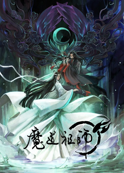
Title: Mo Dao Zu Shi / The Grandmanster of Demonic Cultivation
Throughline: The supposed villain of the cultivators’ world gets reincarnated into an adult’s body 13 years after his death. Things escalate from there.
My take:
+ my entry point into donghua.
+ I was hesitant to watch because of the BL tag, but there really is no need to get scared by it. There’s plot proper, well-developed characters, both main and side, and overall this clearly is a fantasy series with a romance rather than a romance with fantasy setting.
+ beautiful art and great animation with only sparse moments when CGI looks kinda clanky.
+ wonderful music, too.
+ honestly though, I’ve been on a low when I came across it and was brought back to life. It’s been a long, long time since I fangirled over a series so much.
+ if you follow my blog you must’ve already seen about it.
+ Just give it a try, OK?
- some things in the beginning are not clearly explained and many names get tossed in at once; especially if you don’t know any Chinese, they might all sound the same. The characters also all have long black hair and bishe faces. I recommend first checking them online and memorizing at least the main casts, it really makes watching it much easier - focus on the bangs and clothes, and try to remember their names. Or you can always rewatch the beginning after you get better at recognizing who is who.
- the cut to flashbacks is confusing, as it happens at the very end of episode 2. Then episodes 3 to 14.5 take place in the past - another thing that’s not super clear and worth keeping in mind.
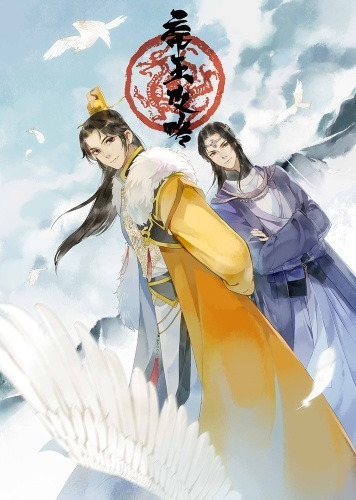
Title: Di Wang Gong Lue / The Emperor’s Strategy
Throughline: The Emperor and his loyal noble ally take on many problems that befall the country.
My take:
+ This is the closest series to “Mo Dao Zu Shi” I found so far, though there aren’t that many specific similarities. Only the overall ‘feel’ is similar.
+ Also tagged BL, but TBH, if I didn’t know about it before watching, I still wouldn’t know it.
+ The relationship between the two main characters is like, funny and cute at the same time.
+ Politics and fantasy intertwined.
+ Also a lot of interesting side characters, though maybe they could’ve been given more screen time.
+ great character designs and music.
- animation. It looks like anime from around the year 2000, even though the series came out in 2018.
- some flashback stuff seems really cheesy. There’s not a lot of it, thankfully.
- the first three or four episodes aren’t very engaging. I got invested around episode 5, though as you see, the beginning isn’t so terrible that you can’t wade through it.

Title: Mi Yu Xing Zhe / Uncharted Walker
Throughline: A group of people are put on a tropical island, forced to play an escape game under extreme circumstances.
My take:
+ an interesting set of characters with various backgrounds, most of them likable or at least understandable.
+ despite the setup, it’s not as bloody as many similar series. Characters can die, but they don’t die that often, which really builds tension and keeps you on the edge of the seat, because when there’s a close-to-death moment, you never know if it’s one when the character will really die or when they get rescued last-minute.
+ there is a very strong “game” feeling to this, where characters generally have to figure out how to use their resources to overcome various obstacles.
+ some psychological stuff here and there.
+ very good animation and designs.
-/+ there are borderline supernatural elements, though generally playing pretend at scientific. I personally don’t mind it, but some people might be put off or disappointed.
- it turns much more creepy in the last 3 or so episodes, to the point that it becomes more of a horror than a survival and mystery story. Even worse, the horror stuff comes in a setup that’s pretty realistic, so I have flashback ‘till this day (I don’t like horrors, and being realistic makes it much worse). TBH if I knew, I’d probably resign from watching, because as much as I enjoyed everything up until that part, the creeps aren’t worth it... However, perhaps you like horrors better than I do.
- a HUGE cliffhanger at the end. But like, HUUUUUGE HUGE.
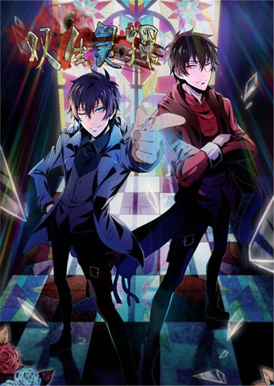
Title: Shuangsheng Lingtan / Twin Spirit Detectives
Throughline: Twin brothers take on cases of supposed supernatural phenomena, bent on proving that they are not real - only that one of them appears to be a ghost himself...
My take:
+ interesting setup.
+ detective stuff - I have a soft spot for mysteries.
+ likable main characters and a few well-developed side characters, too.
+ animation is overall quite good.
+ has a solid arc, though with an open ending and kinda a cliffhanger about a side character at the end.
-/+ bordering on the supernatural territory again.
- horror elements, but thankfully, this time they aren’t that realistic.
- some things in the first few episodes feel rushed or not properly developed (apparently the issue is with the donghua adaptation, and the original manhua had a slower beginning).
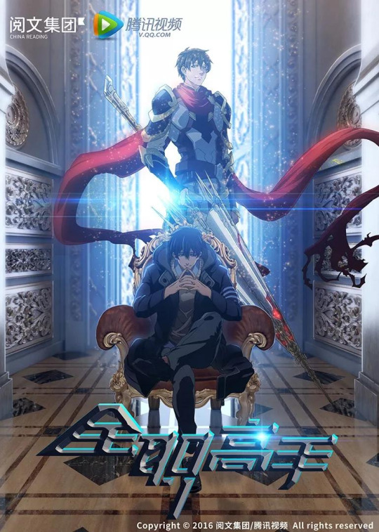
Title: Quan Zhi Gao Shou / The King’s Avatar
Throughline: The top player of “Glory” is forced to give up his account and retire for a year. What will he do now?
My take:
+ a decent setup, though it gets old quickly.
+ a large cast of interesting character with various strengths and weaknesses and strongly-defined personalities.
+ great art style and characters’ design.
+ great animation during fights.
- the main character. Just. I’ve rarely encountered such a Gary Stue, I really wish I could see him lose for real. Like, I’m OK with him beating noobs, that’s realistic, but he doesn’t stop even after other pros come into play.
- the plot seems generally directionless so far, and gets tiring easily.
- originally I was supposed to binge-watch it with friends as a series none of us knew beforehand, but we gave up after 6 episodes and I switched it to MDZS instead. I finished it alone later, and mostly for the sake of the side characters and animation.
- it is generally watchable, but like, far from best.
This point marks the end of series I watched whole. The following are series I dropped after 5-6 episodes (which I consider a fair amount).
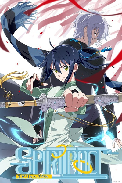
Title: Ling Qi / Spritpact
Throughline: A guy dies and is given an ultimatum - to pass away or become a spirit companion of a demon-battling, Korean priest.
My take:
+ setup and world building. This seems just like the kind of fantasy that fits my taste.
+ ...character design is not terrible, I guess?
+ apparently the animation gets better in season 2.
+ the demon-battling priest seems like a character archetype I might like.
+/- TBH this series wasn’t tragic, I may still go back to it one day, if I really feel like it. The idea has potential and the plot probably gets better later, I just wasn’t able to prevail until then.
- animation in the first season is kinda meh. Could be worse, but it still doesn’t please. Don’t let the marvelous poster above deceive you!
- the main character. He’s so whiny, I was unable to stand him. He’s the main reason I dropped this, and I honestly have no idea if he gets any better later.

Title: Quanzhi Fashi / Full-Time Magister
Throughline: Three months after a guy gets transported into a magic-filled alternative reality, he struggles to get into magic school to become the best mage and get a lot of money for his family.
My take:
+ setup/world building again hit a soft spot in my fantasy-loving heart.
+ ...I’ve seen some fragments from season 2, apparently animation is good there.
- I hated the MC of QZGS, but he at least had half a reason to be so unrealistically OP. This guy here... he’s a new low... Basically “How to Write a Gary Stu?” example. Like. C’mon. You can have an OP cool protagonist without making them a GS.
- despite the potentially interesting premise, this is as simplistic as it could be. The MC is ridiculed, but he turns out to be super powerful with talent for not just one, but two most rare elemental magics. He gets bullied - then he shows off how much better he is than the bully during magic exams, stunning everybody. One of the Big Bad Rich Guys tries to recruit him - he flat-out refuses in a infuriatingly arrogant manner. Etc. etc.
- Characters are as deep as a puddle during drought.
- Look, there’s a set of tropes that are generally laughed at in this type of premise, like the MC having an OP secret power, getting put down by everybody to an unrealistic degree etc. Here they are played painfully straight, and there’s nothing more to the story. Absolutely nothing, not a single interesting character or plot thread. I kept watching for so long hoping that something would turn up, but it didn’t.
- animation in season 1 is pretty bad.
That would be all for my donghua experience so far. I had many ups, though I guess some salt pits were unavoidable +_+
#mo dao zu shi#di wang gong lue#mi yu xing zhe#shuangsheng lingtan#quan zhi gao shou#ling qi#quanzhi fashi#review#opinion#recommendations#stuff
215 notes
·
View notes
Text
Comic City Spark 12 #4 - using your brochure and event etiquette
Ok - this is the final post I’m going to write on CCS12, and I want to talk about how to get the most out of your brochure and how to have the most fun possible (i.e. avoid ruining other peoples’ days) at the event. If you missed the rest of this series you can find part #1, part #2 and part #3 here.
First, let’s talk about how to use your brochure to plan your day. Remember in Part #2 when I talked about one of the circles I planned to visit? The info that I wrote down from their Twitter page during my online prep was:
東1ホール シ30b
Ok - let’s cross-reference this information with the brochure. First things first - find the page with the matching hall number:
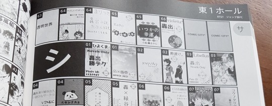
In the top right you can see it says 東1ホール - so far so good! Next, we need to check the row number. For this circle, it’s the kana character シ. Flick through the 東1ホール section til you find it. Here it is! ^
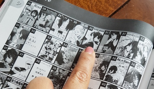
Next up, find your circle. I wanted to visit NEGRO MANIA who was due to be at table 30b. Here they are. Although it doesn’t specifically say “a” or “b”, you can see there are 2 entries with the number “30″ - as you can guess, since NEGRO MANIA is the second of the two, they will be at side b (right side) of the table.
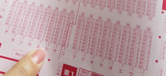
Next, to find them on the map. The brochure maps are the only ones printed on pink paper, and they’re perforated so you can rip them out. Here’s the シ row.
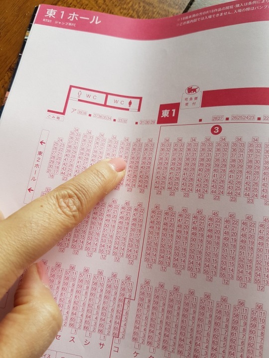
And that’s where table 30 is! It’s right at the back of the room, and way over on the far side from where we came in between halls 7 & 8 (that’s where the queue was). Draw a circle around it so you can find it easily later. Rinse and repeat for any other circles you’re interested in, and then rip out the map for easy reference on the move.
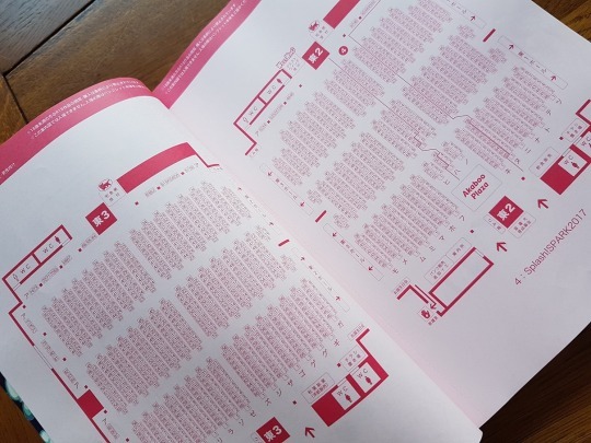
Now, you may be wondering why we’ve spent all this time checking the circle’s information in the brochure when we’ve already got the details written down from their Pixiv / Twitter as outlined in part #2. Good question. Honestly, it’s not essential for you to go through the rigmarole of looking them up in the circle list each time - you can skip straight to the map to mark them if you’re confident enough in your note-taking and cross-referencing. Me, I personally liked sense-checking my research against the image/name of the circle in the list, just so I know for sure I’m headed for the right place. Plus I had a couple of hours to kill in the queue so...
As I previously mentioned, halls 1-3 are all in the same massive room and there are no physical dividers separating them. Here’s a map of TBS to give you a better idea:
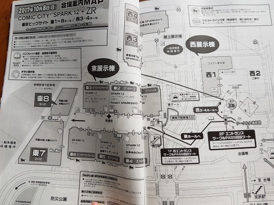
(You can see here how far apart the East and West wings are. It takes maybe 10 mins to walk between them on that zig-zaggy raised walkway in the middle).
On the map, 東3, 東2 and 東1 look like 3 separate rooms next to each other. They aren’t. They are 1 big, big room. Keep an eye out for signs high up on the walls showing you roughly where each “hall” begins and ends.
How to find your circle in the hall (assuming you’ve been good and highlighted them on your map):
Check which part of the hall you’re in. There are massive numbered signs high up on the wall showing which part of the hall you’re in - check this against your map.
Check the row number. The first table in the row (whichever end you approach from) has an A4 sign stuck to the edge of it showing which row it is. You may need to peek through participants to see it. Note that there can be a single table stuck on the end of each row - this table may not have the sign, so if you can’t see it check the next one along. Your map will show the order the rows come in so you know how far you have to go.
Check the table number. This will be on a small sign on the edge of every table, so again you may have to peer through people to find it. Many circles also have a pop-up banner behind the table with their artwork and name on it, which is handy. If there is a massive queue in front of the table you think you want, check and see if they have a queue marker (scroll down for more about these).
Now for the last leg of this post series - event etiquette. There’s a bunch of stuff that I realised as I was going along that I wish I had known before I went, and although no-one was mean about it I felt bad not knowing what I should be doing - so I really do recommend spending a bit of time learning how to work best with your fellow participants to get the most out of your day.
Probably the best thing you can do is to read Akaboo’s site (translate it using Google or something) before you go to learn about what is and isn’t acceptable. If you find yourself in the queue having forgotten to do this, there’s a pretty simple comic in the brochure which explains how you should behave. It’s pretty obvious stuff; in a nutshell, being a nuisance (including distracting the circles/doujinkas, asking them to sign things, getting in the way/blocking access, not having small value notes/coins etc) is not cool. Neither is running or pushing/line-cutting, buying R18 doujins when underage (”young people” - I guess as in children/highschoolers - are not allowed in the event, period), any photography outside of the cosplay room, bringing large / bulky luggage or bags, and bringing pets.
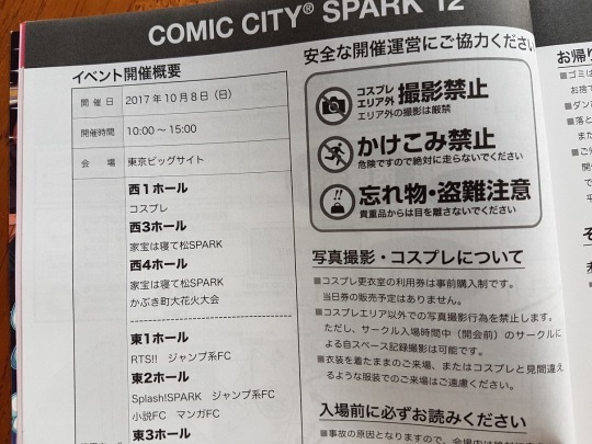
On the topic of cosplay; it can be tempting to want to come along dressed up as your favourite character. Be aware that some events do not allow cosplay because it disrupts the flow of the event - think people with big props blocking the narrow space between rows of tables and you get the idea. Check on Akaboo’s site that cosplay is permitted before dressing up, and that there are no other rules to follow. Also, anything that’s going to make you uncomfortable during the queue or walking around the halls (heels etc), or fill up your hands, just isn’t worth it. There is a cloakroom where you can stash your stuff (and presumably change), but I have no experience of that so I can’t really tell you anymore.
Let me talk a little bit about queuing - I know, I know, sounds boring, right? Bear with me as this is actually pretty cool!
Many of the smaller circles don’t have much of a queue (or at least, they didn’t when I turned up at opening time), so you can immediately buy the books you want. Just check first to make sure you’re not accidentally queue-jumping - making eye contact with the doujinka is usually a good way to tell!
More popular circles though (you can usually tell as they will be on the outsides of the room rather than in the long rows, to make space for queuing customers) will often have a queuing route marked out on the floor. It will be cleverly designed to create spaces for people to get past without going through the queue. Arrows show you which direction the queue should go in; a straight line shows where to stop to create a through-fare gap. A long queue may be divided into several blocks along a designated route. Also, they will have a queue marker - aka a small, handheld sign showing where the back of the queue is. You can see it in the picture below:
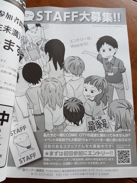
See the girl at the back holding the “ あ-18″ sign? That’s the queue marker. It’s held by the last person in the queue, and they have to display it so people can see where to join the line (or where other people in separate blocks of the same queue need to go next). When someone else joins the queue they take it off the original person, and so on - in other words, the marker is always right at the back. As it can be hard to tell which queue is for which table (particularly if two circles are sharing and the lines are long), this is a neat concept. If a queue is particularly long and divided up into different blocks there will be more than one queue marker, so you can tell which queues are part of yours and which aren’t.
If you join a queue in which someone is holding the marker: politely get the attention of the person holding it (”sumimasen?”), hold out your hand for the sign, and then hold it up above your head (making sure it’s facing the right way so people can read it!). Chances are you won’t have it long! Make sure you say thank you (”arigatougozaimasu”) when someone takes it off you - good manners cost nothing, after all.
Finally, in places where there is a long queue you will usually line up in pairs, so make sure you don’t disrupt the structure of the line by creating a single-file line - other participants may be reluctant to appear to be pushing in front of you by filling in the gaps, and it will cause an uncomfortable situation. All I did was follow the lead of everyone around me and it was a breeze.
So, how did I find the event? I loved every second of it. The order, the efficiency of how it all worked…I got in just after the 10am opening time (the huge queue flowed in in a matter of minutes) and left just before 11.30am with every book on my list. Seriously, I couldn’t have been happier. The process of pointing out the books/quantities I wanted, handing over the cash (all the books have a price label clearly visible so you can add it all up as you’re waiting, and most are around 400-500JPY each), sliding them into my trusty tote and then scurrying to the next table…it was all so seamless and speedy. If you’re the kind of person that likes to browse more leisurely at relaxed pace I kind of suspect that you’re going to enjoy yourself quite as much, as those local doujin fans know what they want and there’s no messing around. The beauty of an event like this is that you can plan ahead and get in and out with minimum of stress - window-shopping doesn’t really fit into that concept. That being said, there’s no reason why you can’t do it - just be aware of other participants who might be on a personal mission to buy a stack of doujins and who won’t appreciate your getting in the way for no good reason.
The longest queues I stood in were for LEGO! and Abaraya - even those were no more than 10-15 minutes each. I think I must have been lucky as there were some circles with queues that must have been 20+ minutes long…but even so it wasn’t even a fraction of the pain I thought I would have to endure.
(Incidentally, the latest LEGO! book is absolutely magnificent - the closest a doujin has ever brought me to tears. Buy it. Buy it now.)
And, of course, here’s a pic of what I got:
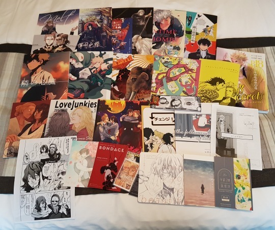
The beauty of attending the event is that you can meet your doujin heroines - plus you can pick up exclusive free “papers”, freebies like badges and postcards, and non-consigned books. See that white doujin with Present Mic on the right (”Closet”)? That’s not going to be sold at stores. Go me!
Would I do it again? Hell yes. Whether or not I would brave the half-million attendees of an event like Comiket is another question, but I would certainly do CCS again in a heartbeat.
And that’s it! I hope this is helpful, or at least a bit interesting. Let me know if you’re planning to attend any big comic events yourself!
16 notes
·
View notes
Text
Smokey brand Movie Reviews: Anger Issues
First proper movie of the year, and it’s Birds of Prey and the Fantabulous Emancipation of One Harley Quinn. Look, the DCEU is a dumpster fire, so much so that the WB has basically given up on it. They’ve started doing stand alone films as a way to recuperate their image and it’s kind of working. Shazam was fun as f*ck and Joker is rightfully getting so much buzz, it’s ridiculous. Even Aquaman was decent once it was released from the grimdark Snyder vision. Birds of Prey is not that. It is, at it’s core, a DCEU film. This thing might as well be called Suicide Squad but with chicks. It’s that ridiculous. But is it as bad as that? Let’s get into it.
The Great
The very best thing about this movie is f*cking Huntress. Bro, i LOVED Helena Bertinelli in this movie! Mary Elizabeth Winstead owned this part, one hundred percent! She was the MVP of this whole goddamn sh*t show but she sure as f*ck ain’t get MVP minutes! Huntress is in this thing for a grand total of ten minutes, man. It might be more, it might be less, but it definitely ain’t enough because she has NO time to shine! What little she gets, though, she kills! Talk about burying the lead, man. I understand that certain cuts needed to made in order to give the top-biller in Harley the god shots, but f*ck, dude. You can’t tease me with so much awesome and then just snatch it all away! F*ck you for that, movie. F*ck You!
The Good
This thing was cast incredibly well. I was on the fence with some of the announcements during development, but it came together nicely. There aren’t many weak performances and, overall, you can tell that everyone was having fun. There’s a lot of great chemistry among this group and i can see myself giving a proper BoP sequel a chance.
Margot Robbie is Harley Quinn. She embodies this chick like Ryan Reynolds embodies Deadpool, for the most part. She was my first pick going into SKWAD and it felt right seeing her in those hot pants. There were some issues i had with that character, mostly the vanishing accent, but she’s gotten much better since then an that growth shows here. It’s unfortunate that her character doesn’t grow in this two hour run time, especially considering how much time Harley gets onscreen.
Jurnee Smollet-Bell is probably the best Dinah Lance we’re going to get for a while. he was surprisingly adept at the part, even if everyone is butt-hurt that she was race-bent. Her Canary Cry was absolute sh*t but that was more the effects fault. Them sh*ts is cheap! Jurnee did a fantastic job as Black Canary and i wasn’t even mad she wasn’t rocking the fishnets while doing it. She kicks high.
Rosie Perez was an interesting choice for Renee Montoya but i knew she could be fantastic in the role if they gave her room to breathe. Perez could have brought that Puerto Rican heat to the role, and she did a few times, but not enough to make an impression. Again, that’s because this ain’t a Birds of Prey vehicle so all of the Birds had to kind of curtail their time in the camera, and overall character development, in order to make sure Harley got her face time with the audience. It’s kind of f*cked up and makes the movie less for it.
Black Mask was a goddamn spectacle! He’s smarmy, and arrogant, and flamboyant, and campy, and generally just brilliant. He’s one of the best villains of the DCEU, which ain’t saying much, but i can say just SO much about Ewan McGregor’s performance as Roman Sionis. His mask is stupid though. And he’s definitely Black Mask in name only. Still, for what this version is, McGregor delivers. If you’re curious what a closer interpretation of the comic character can be, check out Batman: Under The Red Hood. That’s a far more accurate representation of what Sidonis is supposed to be but I’m not mad what we got here.
Chris Messina as Victor Zsasz is okay. In the book, he’s out of his mine and ludicrously violent. Like, textbook psychopath crazy. In this, he’s still pretty f*cking nuts but he’s also wildly jealous and crazy possessive? I think that’s because of the insinuated relationship between he and Black Mask but you gotta read real heavy into that relationship to even broach that subject. Like, I‘m reaching with that statement but, for the most part, Messina does an admirable job of bringing this character to life.
The action scenes, outside of the awesome that is Huntress, is the real draw of this movie. Harley’s story is cliche and the Birds don’t get much time to develop so they’re kind of inconsequential but the action is superb. It’s, legit, John Wick levels of awesome most of the time. There is a lot of buzz about that jailhouse scene and it’s totally worth all the talk. That motherf*cker was spectacular!
The art direction is pretty amazing in here. This looks like how i think SKWAD wanted to look, but couldn’t because of Snyder grimdark nonsense. Like, if that trailer house had full reign to actually film that movie, BoP is what we might have gotten and it is a much better look for the type of movie these things are. Certain sets, like the funhouse and Sinonis’ club were awesome and the little flairs for characters were on point. The confetti beanbags were absolutely genius!
I would be remiss if i didn’t mention the costumes. Harley had a ton of costume changes, so much so a character mentions it in the middle of a fight, but i wasn’t mad. They all reflect her character and Margot Robbie is a helluva a Barbie to play dress-up with but so was Black Mask apparently. He had almost as many costume changes as Quinn and they were all amazing. I liked what they had Canary in, even if it wasn’t comic accurate and i absolutely adored what Huntress rocked in the beginning. All in all, pretty legit costuming, i must say.
Another one where the sound design is worth mentioning. The direction didn’t elevate this assblast of a movie but the sound design sure as sh*t did. There are a ton of punctuating songs and effects that give otherwise flaccid scenes, that extra Viagra boost to get them rock hard! It’s amazing what music can do for anything really. Throw a dope ass soundtrack behind constipation and you have a serenade that eases things up to drop that deuce. I say that because that’s how it feels watching this goddamn movie.
The Meh
Ella Jay Basco is probably the weakest part of this movie. She does an admirable job as Cassandra Cain for being so young but there are certain instance where you can tell this is her first big gig. She isn’t terrible by any means, there aren’t any terrible performances at all in this thing, but she was easily the weakest of the lot.
The liberties taken with the characters in this movie are interesting. I’m curious as to see where this version of Gotham can go and what these particular interpretations of such iconic Bat-Characters can go. I don’t think they are great as a direct representations, f*cking Cassandra Cain is a particular sore spot for me because i adore her in the books, but i can give her chance. I can give all of these characters a chance. I rather adored this version of Huntress. Ma might be my favorite one! Well, almost. I’m pretty partial to Helena Wayne but i digress. While i don’t particularly care for how these awesome women are represented in this flick, i can see the potential. There is a unique vision here that is worth seeing through.
The writing is so-so. I can’t say it’s bad because there is a lot of good in there, tons of interesting ideas, but the execution is real poor. Most of these scenes feel like, on paper, they were dope as f*ck. On screen, though? Just underwhelming. It’s like they couldn’t translate what they wanted or needed to film for one reason or another. I feel like that might have more to do with the direction, I’m getting to that, but the core of a flick is the writing. If you’re script ain’t on point, you’re movie can’t be and i can see how dull them pages were to begin with.
The direction in this thing is mediocre. Cathy Yan did a “meh” job with this thing. A lot of that might have been due to the script but a great director can elevate straight schlock. Look at James Cameron. Avatar is an ass of a film that rips of f*cking Ferngully but his vision got it Oscars and the number one, highest grossing, spot on the all-time list until Endgame murdered that sh*t. Yan did not elevate this schlock. They had to go back to reshoots and have Chad Stahleski touch up some stuff. Like, the best parts of this thing, the action scenes, weren’t even directed by Yan. I mean, they were at first, but this thing got screened by the execs ad all of that sh*t was tossed out. Stahleski made them things pop! No telling what else he touched up, or f*cked up, on his way out.
The Bad
This is not a Birds of Prey movie. This is a Harley Quinn vehicle with a Birds of Prey cameo. I can see what they wanted to do with this thing, backdoor origin story for one of Batman’s strongest supplementary teams, but with no Barbara Gordon as Oracle, it feels hollow. Especially considering that the Birds, themselves, have next to no screen time. I get that Harley is the money maker but this should have been a Gotham City Sirens film.
The continuity of this sh*t is dubious. It takes place in the old DCEU. It’s legit a sequel to Suicide Squad. Harley references that sh*t twice. I don’t know what that means going forward, but this Gotham ain’t that Gotham at all. It’s weird to see because you spend a good amount of time within the GCPD and no Bullock or Gordon; The latter of which we’ve seen already. It’s awkward the way WB has decided to play fast and loose with what sticks and what doesn’t. Joker is a stand alone and so is Shazam. The Batman is going to be a stand alone or it’s own franchise. Aquaman and Wondy are still in the DCEU continuity but i don’t know how long they will be, especially considering Wonder Woman’s solos are all prequels that have no ties to that Snyder depression exercise. It’s nothing to just pluck her out and add her to a much better executed cinematic universe. With Flashpoint all but confirmed, It feels like none of this matters. This one, for sure, doesn’t.
The plot is still stupid. The McGuffin is better since the reshoots because dick pics? Really? But the writing is still stupid. The whole center of the conflict is ridiculous and the resolution is just blergh.
The only thing worse than the plot is the pacing. This motherf*cker drags! There are entire scenes where nothing f*cking happens and it’s stupid. Most of the time, it’s the scenes with Harley. Her arc is just so f*cking pedestrian. It’s well acted, i said as much above, but it’s SO dumb and i kind of hate it.
This movie really hates dudes. Like, i get it, right? Respect. Recognition. Women deserve all of everything. Equality, feminism, yadda-yadda. I get it. There are ways to execute that perspective which are good. A decent writer would convey that by actually writing decent scenes, not just turning all of the men in the film into juvenile caricatures of chauvinism. I personally don’t care, I’m not a neckbeard typing with one hand while breathing heavily on my monitor in my ma’s basement, but i had to mention it because everyone is mentioning it and they have a point. This is glorified misandry at it’s finest but, you know, patriarchy or whatever. I don’t care. It didn’t take me out of the movie, the sh*tty plot did that, but it was interesting to see in person. It’s hard to justify this bullsh*t when Atomic Blonde exists.
So the gay-baiting. Like, really, dude? If you’re going to do it, go all the way. I read somewhere that Black Mask was supposed to have a homosexual relationship with Victor Zsasz but nah. None of that is expressed in any capacity. There might have been a line referencing it, maybe, but that could have been in regards to the violent outburst in the club the night before. Ambiguous because you gotta sell this thing in China! Renee Montoya is legit gay in the books and, other than a passing line early on, it never comes up again. I think that might be because of the distinct lack of characterization for literally all the Birds in their own f*cking movie, but still. That’s massive part of her character and no one talks about it. No one talks about any of the LBGTQ bullsh*t they pushed in the promotion.
All of this controversy does this flick a disservice. It doesn’t deserve all the hate it’s getting and it definitely doesn’t deserve all of the praise. This is not some super “GRRRL power”, kickass, gay-loving, action flick. It’s a mediocre break-up story that happens to have some interesting action set pieces but, ultimately, is inconsequential in the greater scheme of things. This is the Ant-Man of the DCEU. I spoke about this at length a few days ago and the nonsense that I was afraid was going to happen, is happening. No one wants to sh*t on this flick because of “Muh representation”. It’s a female lead, female directed, piece of sh*t. It is. But it’s a fun piece of sh*t and easily the best, of the worst, of the DCEU but it’s still a piece of sh*t. It’s not changing cinema, it’s not some great step forward in representation, and it’s not doing women in the industry a great service. It’s a quirky, violent, nonsense of a movie and should be judged as such. Again, Atomic Blonde is a much better example of ho to “GRRRL power” your way in the box office. Go watch that instead.
The ending to this thing feels rushed and super anticlimactic. I felt bad about it. Seriously. The way this movie resolves, after everything that took place, is just whack, man. It leaves you wanting, especially after how charismatic Black Mask turned out to be more than that, there’s no resolution. No one grows. Everyone is exactly where they were at the start of this f*cking thing. Like, what was the f*cking point? I can tell they wanted me to think that these chicks had grown into something more but did they really? Did we really see any growth out of any one of them not name Harley? Hell, even Harley is still the same motherf*cker! Like, for real, dude? Someone read that script and thought, “Okey-Dokey, this is good enough!” I just wanted to punch this movie in it’s face when it was over. Like, f*ck you, movie.
The Verdict
Birds of Prey is a bad movie. It’s gorgeous to look at, the costumes are amazing, and most of the performances are super strong. However, the plot is stupid, the pacing is on drugs, and the best parts of this flick get, like, no screen time to breathe. The Birds are guest stars in what, very obviously, is not their movie. This really should have been called “Harley Quinn and The Tiniest Bit of an Origin Story For The Birds of Prey” because that’s what it is. Technically, this should have been Gotham City Sirens to begin with but i ranted about that before. Margot Robbie is bad at picking movies to produce and she definitely produced this one. Got her unfortunate and inexperienced fingerprints all over it. Kind of doesn’t matter what should have been, though, this is what we got and this is a sh*t time, for sure. But, it can be fun at times. There is about as much to like as there is to hate especially if you’re open to being blue-balled when it counts. If that sounds like a party to you, check this thing out. If not, you can pass on it. That’s how meaningless this thing feels.

0 notes
Note
Yooo for the detailed headcanon meme would u mind doing like... all the ones ure able to for Hanschen? Like feel free to skip as many as u want but itd be cool to hear ur thoughts on my Best Boy
Um? Little Hansy Rilow? Jackass Extraordinaire? Love of my life? Ofc I’ll do as many as I can!! Thanks so much for sending these! I hope you like them and I’m sorry they took me so long! (Also I answered these out of order and towards the end I was running a bit low on steam so there are some answers that are Not So Good mixed in there, sorry)
Under the cut or on Ao3 here :)
1. What does their bedroom look like?
I think for the most part it would be tidy. Bed made, desk (mostly) clear, etc. He’s got some laundry on the floor, a couple of books lying about, and his jacket as well as his school things are never put away but everything else is in it’s place.
His desk is by the window so he can make good use of natural light and It’s usually got assignments for school on it as well as whatever books might go along with them when he’s not using it.
He keeps a small collection of books in his room- his favourites. Whatever he’s currently reading is kept on his bedside table and everything else is stacked by his desk but they should be on the shelf in the living room.
He’s a nerd.
2. Do they have any daily rituals?
I don’t think he would, not outside what he needs to do (school). Not unless you count him monologuing while he masturbates as a ritual, I have a feeling that’s a daily thing.
3. Do they exercise, and if so, what do they do? How often?
He does not, he would much rather lounge somewhere comfy with something he finds enjoyable. A book, a person, a puzzle, etc.
4. What would they do if they needed to make dinner but the kitchen was busy?
I can see him being like “Everybody, get out of my way” (This is meant to be read in John Mulaney’s voice from the thing where he followed this with something like “I’m just here to feed my birds”) but I can also see him just clearing enough space for himself and getting to work. I guess it depends on who’s in the kitchen making what and what he’s going to be making. He’s not going to be interrupting someone that’s making cake or pastries just so he can cut vegetables in peace.
5. Cleanliness habits (personal, workspace, etc.)
His parents/governess were somewhat strict about cleanliness when he was a child so he makes an effort to keep himself well groomed, especially when adults are present. No dirt under his fingernails, his clothes and hair are neat etc. He’s less concerned about it when he’s with the other boys and even less when he’s relaxing, either by himself or with Ernst, but he still somewhat pays attention to how much dirt he’s getting on himself or how much work it will take him to make himself look properly presentable before he finds himself around adults again.
I think I got into workspace okay with his bedroom? He’s mostly tidy because he has to be, any disorder in his room can easily be taken care of.
6. Eating habits and sample daily menu
I think he would love sweet things (candy, fruit, berries, etc) and he’s always a slut for baked goods. I have no idea what kind of things ppl usually ate in 1890′s Germany.
7. Favorite way to waste time and feelings surrounding wasting time
He only really considers time wasted if he’s not spending it on something he likes to do or needs to do. So he has no favourite way to waste time, he only feels as though he’s wasting time if he’s bored out of his mind for no good reason.
8. Favorite indulgence and feelings surrounding indulging
Ernst. It really isn’t safe for him to be smooshing booties in a vineyard with another boy but? He’s doing it. And being all poetic about it too ofc, he really likes Ernst.
If he can indulge he will, he loves it. Life’s too short to deny himself pleasure, so long as said pleasure doesn’t harm him and/or get in the way of him becoming a millionaire.
9. Makeup?
None. I can see him maybe trying, or at least wanting to try makeup at some point? Never with anyone around or if there was a chance of someone catching him though. (I’m a sucker for boys in makeup tho and I think modern Hanschen would enjoy makeup. If u want to hear a bit more abt that u know how 2 contact me)
10. Neuroses? Do they recognize them as such?
Neurotypical Hans™
11. Intellectual pursuits?
Literature and languages. He loves reading, loves diving into a book and analyzing characters, plot, symbolism, all of it. He loves talking about them as well, he could talk for hours about his favourites. He’s fascinated by other languages and speaks a handful rather fluently as an adult. He probably also enjoys reading the same book but translated into different languages because no translation is exact and it’s always interesting to see a slightly different take on things.
I can also see him having interest in biology? Because science is fascinating and it’s amazing how diverse and intricately designed living things can be.
12. Favorite book genre?
He talks about the books he likes when he’s jerking off so I don’t think I really need to get into that lmao
13. Sexual Orientation? And, regardless of own orientation, thoughts on sexual orientation in general?
Multisexual. Bi/pan/ply/whatever. A pretty person is a pretty person & all that.
I think he might see the idea of sexual orientation as a little silly or perhaps performative? He understands that he’s expected to only like women and knows that once he’s older he’ll be expected to marry one, to have children etc etc. So for the most part he keeps his attraction to men to himself (Ernst being a very obvious exception, likely not the only one but it’s not something he would ever reveal lightly) and he thinks that most people are doing the same in order to avoid being judged negatively by their community.
Something along the lines of “everyone is only acting like they’re exclusively attracted to the opposite sex because it’s what’s seen as normal. They don’t want everyone else to point fingers at them calling them sinners and sexual deviants and condemning them to hell so they deny themselves half the beauty the world has to offer. For this same reason, they’re quick to attack anyone around them who might be revealed as queer. They’re so focused on keeping their own secret safe that they never realize everyone around them is keeping exactly the same one.”
14. Physical abnormalities? (Both visible and not, including injuries/disabilities, long-term illnesses, food-intolerances, etc.)
¯\_(ツ)_/¯
15. Biggest and smallest short term goal?
¯\_(ツ)_/¯
16. Biggest and smallest long term goal?
Biggest: “When I am amillionaire”Smallest: I don’t think he has any small goals tbh ?
17. Preferred mode of dress and rituals surrounding dress
I’m not rly sure what this one’s asking tbh?? He likes looking nice tho.
18. Favorite beverage?
Hot chocolate
19. What do they think about before falling asleep at night?
Have you prayed tonight, Desdemona?
(I think a recurring theme would be his future- what he wants, what he can get, how he can get it etc.)
20. Childhood illnesses? Any interesting stories behind them?
¯\_(ツ)_/¯
21. Turn-ons? Turn-offs?
I’m stickin 2 sex ones bc otherwise it’s Too Vague and stresses me tf out tbh
Turn-ons: hair pulling, necking (he loves hickies but he’s strict about not having any that might be visible), being straddled, nice thighs, a good ass, little gasps and moans, begging
Turn-offs: bad kissing, poor hygiene, not listening to/paying attention to his feedback, going too fast (Mr. “half-closed eyes, half-open mouths, and turkish draperies” would Def love foreplay and teasing,, trying to skip right over it is? A no.)
22. Given a blank piece of paper, a pencil, and nothing to do, what would happen?
¯\_(ツ)_/¯
23. How organized are they? How does this organization/disorganization manifest in their everyday life?
See 1
24. Is there one subject of study that they excel at? Or do they even care about intellectual pursuits at all?
See 11 (he’s pretty good at everything tho)
25. How do they see themselves 5 years from today?
Long dead because it’s 2017, but 5 years from the show he probably sees himself in university.
26. Do they have any plans for the future? Any contingency plans if things don’t workout?
I don’t know what his plans would be but I’m sure he’s got some cushy career in mind that he wants to work towards. He’s a Rilow, he doesn’t need a backup plan.
27. What is their biggest regret?
¯\_(ツ)_/¯
28. Who do they see as their best friend? Their worst enemy?
Ernst. His worst enemy is probably whoever is second in the class rankings, if you go by the play. Melchior in the musical. Little Hans is In It To Win It.
29. Reaction to sudden extrapersonal disaster (eg The house is on fire! What do they do?)
His brain shuts down for a minute and then he realizes that yes, this is happening and oh dear god I need to get out of here. He tries (and fails) to give the impression that he is calm, cool, and collected but he’s doing pretty good for someone who is screaming internally as loudly as he is.
30. Reaction to sudden intrapersonal disaster (eg close family member suddenly dies)
He just keeps going. He tries to act like everything is fine, to show that he’s strong. The second he’s alone he deflates. He’s depressed af but does everything he can to hide it.
31. Most prized possession?
I’m not sure what exactly, but it’s something fancy and adult that makes him feel sophisticated. He won’t admit how much he loves it though.
32. Thoughts on material possessions in general?
👌👀👌👀👌👀👌👀👌👀 good shit go౦ԁ sHit👌 thats ✔ some good👌👌shit right👌👌there👌👌👌 right✔there ✔✔if i do ƽaү so my self 💯 i say so 💯 thats what im talking about right there right there (chorus: ʳᶦᵍʰᵗ ᵗʰᵉʳᵉ) mMMMMᎷМ💯 👌👌 👌НO0ОଠOOOOOОଠଠOoooᵒᵒᵒᵒᵒᵒᵒᵒᵒ👌 👌👌 👌 💯 👌 👀 👀 👀 👌👌Good shit
33. Concept of home and family?
He thinks of it as faintly ridiculous.
“Why are these people somehow more important than others simply because you share blood? Shouldn’t the value of your relationship with someone have more to do with how well you get along and care for each other? What’s the point of marriage, you put on a show so you can have children as you’re expected to and this absurd cycle repeats with your children and so on.”
34. Thoughts on privacy? (Are they a private person, or are they prone to ‘TMI’?)
He greatly values his privacy, he usually only shares exactly as much information as is necessary. Unless he trusts you, in which case he doesn’t s hut the fu ck u p
35. What activities do they enjoy, but consider to be a waste of time?
See 7
36. What makes them feel guilty?
¯\_(ツ)_/¯
37. Are they more analytical or more emotional in their decision-making?
Analytical for the most part. He knows what he wants out of life and what he needs to do to put him on the path to getting it. I feel like he operates with a mindset a bit like “people can leave you but things are forever” and so he’s pretty okay with making decisions that hurt people (himself included) if it will benefit him financially, academically, raise his social status etc.
38. Would they consider themselves a Type A or Type B personality?
A? I don’t know tbh, my knowledge about this is limited to the 30 seconds I spent skimming the wiki article
39. What recharges them when they’re feeling drained?
Peace and quiet, being alone. Bonus points if he’s somewhere pretty and/or rly comfortable.
40. Would you say that they have a superiority-complex? Inferiority-complex? Neither?
I don’t feel I know enough about either to say lmao
41. How misanthropic are they?
He thinks people are ridiculous, h
ryan sent me a post abt dragon dicks which got me rambling abt this one furry i follow and. lowkey shattered my train of thought, I don’t remember what i was planing 2 say here and I’m too tired to start the Thought Translation Process over again lmao
42. Hobbies?
Reading, puzzles, Ernst, calligraphy,
43. How far did they get in formal education? What are their views on formal education vs self-education?
He completed university. The only real difference between formal education and self-education is if you have a diploma people will believe you when you say you know what you’re talking about.
44. Religion?
He’s whatever everyone else is. I don’t what religion everyone is in the show,, I don’t know shit abt religion tbh. But he believes in god, though he’s not as devout as everyone else.
45. Superstitions or views on the occult?
Foolish. Ridiculous. Absurd. Childish. He believes in them.
46. Do they express their thoughts through words or deeds?
Words mostly. He’s excellent with them and loves to talk and talk and talk.
47. If they were to fall in love, who (or what) is their ideal?
Ernst, probably. I don’t doubt that Hans loves him dearly but I don’t think he’s in love.
48. How do they express love?
He talks about milk.
I can’t think of anything lmao
49. If this person were to get into a fist fight, what is their fighting style like?
Tbh I can’t imagine him fighting. He probably just says something that pisses someone off and then gets knocked flat on his ass.
50. Is this person afraid of dying? Why or why not?
I don’t think so, I think he feels almost like. I don’t think invincible would be the right word, but he sees no reason to fear it at his age. Yes, Wendla and Moritz died, but he has no plans to kill himself and he can’t get pregnant so a botched abortion isn’t a threat to him. He’s in good health and he’s got his wits about him. What is there for him to be afraid of? He can worry about dying later.
#anon#answered#hc#hanschen#my writing#also tell me if i left something blank or dropped off mid sentence somewhere i think i finished all of them but im rly tired#but i might have missed something
22 notes
·
View notes
Text
The Good, The Bad, and The Ugly of Polygon Faces
Sometimes we just have to be honest with ourselves. There is an undeniable charm to many games from the early 3D era. While often unrefined, a style developed that now breeds nostalgia in the way blocky, squat pixel mascots did in a generation prior. Pushing polygons rather than sprites was a new art form, and not many had a clear vision as to how it should go. Many made the push toward photo realism, and in doing so, ended up drowning us in a new surreal, a limbo of concrete and abstract representation. I have a deep fondness for the 32/64 bit generation because it gave way to a new visual language for video games, but like I said before, we have to be honest with ourselves. Sometimes the language being spoken with those ground breaking graphics was unintelligible. Sometimes the results were downright unsettling.
Let’s start with this police officer from Parasite Eve II.
All things considered, this police officer really doesn’t look too bad. He’s got some nice shading and some real definition to his features. This being a 1999 release, it’s pretty clear that Squaresoft had made some real improvements over their earlier forays into 3D gaming:
(Ahem.)
The problem with the officer isn't so much in the level of detail, but really the content of those details, specifically his eyes. With Aya approaching him, his gaze seems to be aimed at nowhere in particular. Given that this game features no voice acting, it isn’t really odd that he would have a neutral expression, but neutral is not really an appropriate description. He looks eerily absent, as unresponsive as a mannequin. Compare that to the beautiful pre-rendered cutscenes that pepper the game and you have yourself quite the disconnect.
Obviously, no Playstation game is going to be rendering characters that look as good as that on the fly, but even compared to Aya’s in game face, the officer looks odd.
This closeup reveals a hint of determination, but also a sense of calm, similar to how she was characterized in the cutscene above. The officer, on the other hand, looks as though he’s never experienced stimulus of any kind.
(There’s just nothing going on in there.)
Parasite Eve II is one of the more technically impressive Playstation games, and as such, its crimes against humanity barely even register. There are modern games that can’t get characters to emote, and their faces can actually move. By that measurement, Officer No Soul is a crowning achievement. Let’s take a look at a game in the same genre and released the same year. Capcom’s Dino Crisis featured a female protagonist, Regina, with the same kind of gun totin’ sex appeal that Aya Brea brought to Squaresoft’s character lineup. For reference, when we thought about Regina, this is what Capcom would have preferred we have in mind:
The unnaturally red hair seems geared at portraying Regina as a fiery, adventurous type. Her look is pointedly alluring, which doesn’t complement the theme of the game in any way, shape or form, but was par for the course after the debut of Lara Croft. Let’s see how well this dinosaur murdering seductress translated into the actual game.
(Oh, god!)
The “come hither” look from the cover seems to have melted like a wax figure. Similar to the officer from Parasite Eve II, Regina lacks any meaningful expression on her face. The texture mapping is slightly misaligned as well, making it so her lips appear to be sliding off to the side of her mouth. What’s most disappointing has to be the way her hair is rendered. This was long before things like cloth physics or individually animated feather blowing in the breeze. I’m empathetic to the constraints of the platform, but I can’t help but feel discontent when I’m teased with distinguished hair strands and am instead given a rust colored crescent moon with some highlights capping her skull.
By 1999, the Playstation had been on the market in Japan for five years. Dino Crisis and Parasite Eve II were games developed and published by big players in the industry. While it’s all well and good to poke fun at their badness now, they were still among the most advanced graphics that could be achieved on the platform. While looking quite dated by the dawn of Sega’s Dreamcast, in the same year as these releases, they managed to hold their own. Results from games much earlier in the system’s library tell a very different tale.
This is from King’s Field, released in North America in 1995. You may have noticed that this man here has no face. There’s an extra polygon showing for his nose, but other than that, we are just staring into the void. Bad faces are unsettling, sure, but no faces is the stuff of nightmares. This game is technically the second in the King’s Field series. The first game, confusingly also just called King’s Field in Japan, released early on in the Playstation’s life, December of 1994.
While many of the established studios were busy mixing pre-rendered backgrounds with polygonal character models in order to maximize the amount of detail they could squeeze out of each scene, From Software decided to go all in on 3D right from the beginning. Nearly everything in this game is built using polygons. Even more impressive, the game continuously streams data from the disc, meaning load times are practically nonexistent once play begins. In order to accomplish that, corners had to be cut. A lot of those corners were in the details department. Most objects are made of simple shapes with little or no texturing. Edges are sharp in a way that feels unnatural. This extends to every face in the game, and is the biggest barrier to buying into the game’s world.
There is something inherently unpleasant about holding conversations with people sans mouth. It was bad enough when characters couldn’t move their lips, but to not have a visual reference for where the speech is supposed to be produced from puts the player in a tough spot. On the one hand, there is plenty of space for the player’s imagination to take over. They can create any character they want due to the faces being literal blank slates. On the other hand, of course, the inability to visually relay more detailed information about its characters through facial expressions means King’s Field has to work harder at the language that’s used when NPCs communicate directly with the player. Overall, the trade off of having a large, fully 3D world at the expense of detail was risky. Given what we know about texture mapping in the ‘90s, I’d say From Software made the right call, even though it meant talking to no faced monstrosities.
I wanted to point out a few bad examples of polygonal faces in order to demonstrate that some games took a completely different approach to the whole 3D thing: mainly, they tried to maximize their capacity to convey information visually by only including the most vital information. In Mega Man Legends, the characters are incredibly blocky. The basic shapes and sharp edges make it so that it looks as though everything was a paper cutout. When looking straight on at a character’s face, all you see is a flat surface with everything simply drawn on top of it. It may not be the most technically impressive, but it allows for a great deal more emotion. Mega Man expresses more with his face in one scene than any of the previously mentioned character do throughout their entire adventures.
Here, Mega Man shows some clear confusion. The simple frown and solid coloring gives him a great deal of personality.
In this shot, Mega Man’s sense of fulfillment is very clear, and all it took was a different mouth texture over the same facial structure. Sure, he doesn’t have the lips and his hair looks poised to pop any balloons that might be floating by, but the anime style art design allows for visual storytelling in a way that many early 3D games just couldn’t pull off.
Another great benefit to Mega Man Legend’s art style is that it has prevented the game from appearing as old as many of its contemporaries. Dino Crisis may have looked really good when it came out in 1999, but when magnified and displayed at resolutions above those that would have been possible on TVs of the time, it’s very obvious what era of video games it was made in. Games with pre-rendered backgrounds look especially bad at higher resolutions because character models and the environments don’t scale together. A character might upres quite well, but then clash horrifically against the blurry, pixelated mess of a backdrop. For anyone playing on the original hardware hooked up to a television of the era, these issues are lessened, or even non-existent thanks to the resolutions and adaptability of CRT technology. When played by more modern means, say on a Playstation 3 via the Playstation Store connected to a nice LCD screen, you can get some very unfortunate results.
Mega Man Legends’ visuals may not hold up perfectly in the modern era, but they can be blown up significantly and still maintain most of their quality. The techniques of simplifying visuals would pay off big for Nintendo just a few years later with The Legend of Zelda: The Wind Waker for Gamecube. Basic shapes combined with newly developed cell shading techniques allowed the game’s visuals to be expressive in ways even modern games struggle to match. When played at modern resolutions, The Wind Waker hardly skips a beat.
(That is a look of some serious, and easily distinguishable distaste.)
The increased processing capabilities of the Gamecube meant that visuals for its games would automatically outpace the Playstation, but visual techniques pioneered on that platform gave 3D games a way to circumvent the inherent limitations of the era and technology available to them so that they would have lasting power. It’s important for games to push the boundaries when it comes to visuals, and a cartoonish style certainly isn’t appropriate for every title, but I can’t help but wonder how many times this cycle will repeat. Games developed for the Playstation 3 are already starting to show significant visual age when compared to the newest released on PC, so much so that I almost prefer the abstract horror of bad face texture mapping to settling in the uncanny valley. Graphical fidelity never felt as important as artistic design, a reality that feels more true now probably than ever before.
1 note
·
View note
Text
Marty Mcfly Silhouette Screen Print
Leading on from my silhouette research and my frame analysis I wanted to start to explore some developments within the film ‘Back to the future’. I wanted to start to look at different ways in which I can translate iconic characters to the traditional silhouette process but take it further.

‘THE GOOD. THE BAD. AND THE UGLY.’ (Alexander Dickerman)
This poster above is a prime example as to the style of work I hope to complete today but using a more traditional print based method instead of Dickerman using Adobe Illustrator in this design. Using a more traditional print based method instead of just digital will keep those textures and opaque qualities you can achieve when using print.
I decided to go back to print to explore this as I was happy with the way my primary sketched prints turned out. I set out to explore the iconic character of Marty Mcfly in my screen prints and his iconic outfit within the film. By printing out in multiple colours and the silhouette of his iconic outfit I can start to explore the different ways of taking the traditional silhouette further.
I started out by trying to find a clear image of the main protagonist in the film ‘Back to the future’ and then setting out to translate this image into a silhouette format that people will recognise.

I chose this image to try and replicate as people will recognise his outfit throughout the film as for this time period he stands out compared to the rest of the people in the film therefore making him easily recognisable. Now I wanted to cut a stencil from this image to lay onto my screen; but I recognised I had to cut separate stencils if I were to represent each colour within his outfit. As well as cutting out separate stencils I would have to layer each stencil on top of each other and in an accurate manner to truly get a good representation of the protagonist. I decided to use the printed out copies of the image as the stencil as it would eliminate the process of transferring it to newsprint and make the process much more easier for me. As I was going to use different layers that would highlight various parts of the image I had to print and photo copy the image for different stencils.

Now have the stencils set out I had to complete various prints for each part of the image; then waiting for the prints to dry and print over the top. This was a long process of repetition but the outcomes were worth it in the end result.
Again I decided to use screen print as the paint used would dry the fastest therefore allowing me to layer up the various parts of the image. Now having my stencils set out it was time to find the various colours of the image. Most of the colours I found in the print room but I had to make up the brown from a dark orange and a slight tint of black in the pot. As well as having the colours mixed I decided to use more solution so it would make the colours a bit more lighter and more opaque therefore leaving some room for layering. Something else I had to consider when creating these prints was the way I positioned the paper underneath the screen because if I were to layer another colour onto top of another it had to be in the exact spot as before otherwise the print would be distorted.

This was a simple process to complete as I have experimented with screen print in a development before this; however I wanted to refine my printing skills by improving my flooding skills so the next print comes out cleaner. Printing hasn't been a significant process for my throughout the year so completing these developments has allowed me to expand my knowledge on various printing methods.
I didn't run into many problems when completing this method apart from the sense of repetition and it taking a longer time to complete due to the various layers. This waiting was worth the outcome because I was able to gather a range of experiments exploring a way I can take my silhouette research further than just sticking to the original cut out head portraits.

I was extremely pleased with the various outcomes I was able to complete using my silhouette research and the experience I gained from creating screen prints from my primary sketches before. These outcomes were all clean and I think I was able to really capture the iconic silhouette of the protagonist Marty Mcfly from the 80s science-ficiton film ‘Back to the Future’. I think this is a film I want to focus experiments on due to its iconic relevance even in todays cinema.

This was my most successful print due to its clean outcome but still keeping the texture and even some tone on the edges within the shapes. The shapes presented clearly represent the character for the audience to explore; the audience will be able to clearly recognise that the silhouette within this image is Marty Mcfly.
I think removing the features from the character makes the design more relatable as the audience can put there face and point of view into the protagonist of the film. This is something that is quite important when exploring the various audiences in my developments as I want to attract the older audience who would like to see these films for some nostalgia. As well as the younger audience who haven't had a chance to appreciate these films that have cemented the genre in todays age.
Something that was the most successful in these prints is the way I was able to keep the shape of the character even when I had to go back and print over. I think I have improved my screen printing skills because these prints are much more cleaner than the other prints in my developments before. Now having these prints I want to take them into a digital format and see how these will translate to a more digitally edited composition.
An aspect I would complete differently next time would be to experiment with various background colours to see if I could change the tone of the character looking at more colour theory based themes. This is something I can development when taking these prints into digital programs.
Altogether, this development was a massive success as I was able to create a series of prints that clearly show influence from my research and even taking it further. I was able to improve my printing skills in the experiments and create an interesting set of outcomes which I can development even further in a more digital format. Another skill I have learnt in this development was being able to translate a simple image into just shape and using these shapes to present a more minimalist format to the original image.
What Next? Moving on from this session I now want to take these prints into a more digital format and try to explore ways in which I can maximise the tones and textures within the image. I also want to start to explore more than just characters within iconic films; looking at important objects, scenery or even symbols in the 80s science-ficiton films. As well as looking at different development ideas I think looking at audience and who exactly I want to aim these designs at will help me to establish more of a context when experimenting with various designs.
0 notes
Text

To meet the brief for this project, we had to bring a TED talk to life in the form of a piece of editorial design, considering type hierarchy, such as titles, subheads and pull quotes, and creating our own imagery from the content of the talk. In researching editorial design, I was inspired by the design and made sense of conventions used to then display my chosen talk as a printed document. I looked at both primary and secondary sources to gather inspiration from, both looking at publications and magazines online as well as using the AUB Library to look at physical magazines and printed documents. One thing I noticed in both of these was the amount of white space used on pages and spreads. This gives space to the design and makes it so that the spreads don’t look too busy or packed and this is something that I think I have done effectively in my editorial design. A lot of my research was also based on how colours are used in editorial, looking at what effect contrasting colours has over complementary colours. I wanted to create a piece of design in which the different spreads were in sync with one another and although my original ideas and design didn’t do this very well, I feel that my final outcome has achieved this.
When I started designing my editorial spreads for this project, I had a clear vision that I wanted to use blocks of colour and digitally line drawn illustrations as I thought that this would make my design look bold and modern. After creating these spreads, I decided that using a different colour on every page did not make my spreads flow very well. I also felt that my simple black line drawings felt a bit plain and did not shout the message out or draw the viewer in. Through further research I realised that I could hand draw my illustrations and use other techniques to make my imagery bolder and more enticing. I think that my paper-cut and fineliner illustrations draw the viewer in because they are so unusual and surreal, with the faces not looking lifelike at all. I also decided that the coloured boxes were very restrictive to the layouts of the spreads, by removing these, I gave myself a more open space to position my titles, pull quotes, body copy and imagery and therefore my spreads have more white space which is more inviting to the viewer.
I think I managed my time fairly well during this project as I met the mini ‘deadlines’ and aims I set myself in the run up to both tutorials and the final critique. I also left myself enough time so that I had all of my content, imagery and the styles I had put them into on the paper, meaning that I could play around with perfecting and editing my layout.
As I attended all tutorials with the tutors, I was given a lot of feedback and ideas that I could work with for my spreads. One of the main things that I discussed in these tutorials was the deletion of the coloured boxes, which I had kept in for a while but I completely understood and took on board this criticism realising how much space it gave me when these were removed. Another thing that I had discussed with the tutors and my peers were my illustrations. I had had my papercuts inside a black box before, but we discussed taking them out and having them as individual icons and illustrations with no background. After doing this I was able to place each ‘object’ wherever I wanted and freeing up the space and creating a more dynamic composition of elements on the page.
Comparing my finished TED talk editorial to the research I had previously done, I personally think I still have quite a way to go in handling both text and imagery and their positioning in editorial spreads. However, I think that this will be something that comes with practise and exposure to this kind of design.
In this project I have learnt technical skills in the use of the programme Adobe InDesign; for example creating character and paragraph styles so any type design in editorial runs from one page to the next and can therefore be easily changed. I have also learnt more about the aesthetics of this type of design and the importance of white space; this being both in my research process as well as the designing process. One last thing I have learnt and am still learning is improving my confidence in this type of work, knowing that if I am confident in my ideas, I am more than likely able to make them happen. I think I have always been a bit of a messy worker and I have learnt that this ‘madness’ can be translated into design work like this.
On reflection, I think that I could have improved my final outcome, but this is purely because I feel that I am still learning as I go and comparing myself to other designers and comparing my editorial to other pieces of editorial that I used for my research and inspiration. A lot of what I am doubting and what I feel I need to improve is my layout skills and perfecting this so that different objects sit in harmony on the page. Having said that I do think that my editorial spreads look effective and meet the brief.
0 notes
Text
The Making of Paperverse – The Art-Style That Binds R2G
Creating an art-style that fits various games from different genres and settings can be a hard task – here developer Thing Trunk explains how they approached this process to finally come up with a coherent paper art-style that just works perfectly.
By Marciej Biedrzycki
On 28 July 2018 we revealed »Book of Demons«, a mid-core hack & slash game, the first title in our upcoming »Return 2 Games«-series (R2G in short). That was a big deal for us, as we were finally showing to the world what we’ve been working on for the last four years. To our surprise, a lot of people have been complimenting and asking us about the paper art-style we adopted. This was a bit of a surprise, as we never thought about it as the main feature of the game. Especially among all the gameplay innovations such as deck building. But it feels great because we put a lot of effort into making everything the way it looks now and the road to getting here was a really bumpy one. My role on the project was two-fold. I was co-art-directing (together with Filip Starzynski) and I was also doing a lot of 2D post-processing work. This was mostly making sure that all the graphics delivered to us by different designers, artist and contractors fit nicely together and form one coherent style.
Why have an Art-Style at all?
Developing the paper art-style for R2G took us almost two years, so one might ask, why the need for an art-style at all? Why didn’t we just make »normal« realistic graphics and be done with it? And why did it take so long? And was it worth it in the end? We decided we needed a strong art-style very early in the production. It was a natural consequence of the idea we had. The idea was to build a series of mid-core games inspired by the classic PC hits from the 1990’s. The games would be of different genres and themes, so we really needed for them to have a common aesthetic ground. Otherwise, they wouldn’t be perceived as a series. We wanted R2G to have an iconic look, and be adaptable to various themes. Think about how well it works in Lego (figure 1). This is something we were aiming for.
Why Paper?
The other part of our idea was about the crossover nature of the games. This meant that the art-style should be appealing to both hardcore and casual gamer audiences. This constraint helped us rule out some of the most exotic ideas, like making everything out of macaroni, voxels, or mono-color pixel art. Such ideas were quickly scrapped. For a brief moment, we considered taking a safe route and adopting a 2D cartoon style (think of »Plants vs. Zombies«) or a 3D cartoon style (think of »Clash of Clans«). But this would go against our desire to make something unique, and we also feared that such style which is very popular in the mobile market would not look good enough in a big PC title. We’ve already announced that Book of Demons will be coming to Xbox One, and we’re planning to go for mobile, so the style had to be universal. Still, PC is our primary platform and PC gamers are our core audience. Identifying this helped us rule out more options, especially ones that might look too childish.
A concept of Book of Demons in a »Disney cartoon«-like style.
One day someone said, why don’t we make each game in the series a book, and place the action inside a world of pop-up paper cutouts. Everyone on the team was instantly sold on the idea, as it solved all of our problems. Paper is a very flexible material, so we could really do whatever we wanted with it, take it into any direction we wanted. We could easily have paper dragons and paper spaceships. Even better, paper is symbolic, and that meant we could easily have paper gore (like blood and guts) and it would still be acceptable to the casual audience (think of cruel and scary fairy-tales).
What makes an Art-Style?
As it quickly occurred to us, choosing the right medium for the art-style was only the first step, and the really hard part was still ahead. Paper is so flexible that there are literally hundreds of ways to structure it, fold it, texture it, light it, animate it. Asking google images for »paper characters« reveals a myriad of different possibilities and artistic choices that are possible. On one side there can be flat cutouts, on the other, realistic spatial models. The shapes can be open or closed, round or boxy. You can have detailed textures on the paper, or no textures at all, like in origami. And there’s everything in between. Hell, you could even mix those things and come up with new ones. Paper is just a medium and a tool. A canvas so to speak. Without artistic guidelines, it does not make an art-style, yet. So we were still at square one because we still had no clue how the games would actually look. How do we represent characters? How do we represent water, fire and smoke? How do we represent GUI elements such as windows, cursors, and icons? What palette of colors are we using? How do the objects move? And how does the style differ from game to game? We had to answer all those questions and there was no way around it other than start experimenting.
Early Results
Early results were very … mixed. Over the next year, we worked with multiple freelance designers and we did so many tests, that it would be impossible to cover all of them here. First, we worked on 2D, vector style images with little hints of paper (figure 2).
They would later serve as prototypes for the finished screens in the game. We focused on the general mood, what we wanted to show and how much screen space each element should take. Although we’ve been simultaneously working on three games at this time, I can only show mockups from one of them (Book of Demons). This is because the next games in the series haven’t been announced, yet, and I really don’t want to spoil the surprise. But remember that we were working on the art-style for the whole series, so we wanted to test how different ideas translate between themes and moods from the very beginning.
But mocking up screens in vector graphics could only get us so far. When we were happy with the basic layouts, we started looking for a way to make them more realistic in terms of paper styling. The first thing we tried was the simplest thing we could do – we printed the mockups and made cutouts (figure 3).
Figure 4: Paper-style graphics in 3D are quite simple to create as tests showed.
This was quick and quite effective and would make for a great and simple production pipeline – especially if would be done in 3D. Figure 4 shows one of such tests. It showed that it is quite simple to get a paper feel in 3D, even without simulating all of the details characteristic to paper cutouts (like imperfect cuts, texture washes on the borders, paper waving, etc.). Unfortunately, we couldn’t have gone this way as we made a decision that the in-dungeon part of the game will be isometric. The game we were building was supposed to be a tribute to »Diablo«, and we just couldn’t get the idea to work without having a proper, isometric dungeon. So we started experimenting with paper dungeons.
Figure 5 is the first paper dungeon attempt that seemed to work. It wasn’t as good as wanted the end result to be, but it was promising and we knew we were on the right track. This is what we had in May 2013. At this stage, we were still very early in the process, as each answered question seemed to spawn two more. For example, the characters above are very simple and could work well when miniaturized in the dungeon, but what if we had a characters face close-up on the whole screen?
One way would be to adapt the level of detail with each frame, preserving the most important details, like the face of a character for instance (figure 6). This could technically work, but it would have two major drawbacks. First, it would be a lot of work as each character and object in the game would have to be re-built from scratch for every level of camera zoom. Also, it would be hard or impossible to do smooth zooming.
Figure 7: One example of a user interface that did not fit the graphic style of the game.
Second, it would also make the art-style eclectic. If you think about Lego blocks, the character details and proportions don’t change depending on camera zoom and it all works in games and movies. How about the user interface, how should it look?
Well, certainly not like in figure 7. To give you a sense of how much effort went into finding the right ways, figure 8 shows a few versions of the Book of Demons cathedral that we had made.
Help from the Big Guns
So we had some bits and pieces that started to work, but nothing final. We had equally as many questions as we had answers. Each of the designers we worked with was able to sort some stuff out, produce some nice details, but no one was able to approach the art-style as a whole (instead of a sum of its parts) and propose a concise, working set of rules encompassing everything from characters to GUI, from shapes to textures. Seeing that we were starting to go around in circles and not moving forward, we had to make some drastic changes to our art-style development methodology. We decided we needed outside help and we figured the best way to do it, would be to run a contest. The idea was to hire a few visual agencies, experienced in game graphics and see whose take on the subject would be best.
So the contest idea was quite simple: Let’s take three R2G games (we already had three working prototypes back then), create two screen mockups for each and let the participants propose the final look of the games as a visualization. Six screen mockups in total. Simple as it was, creating the job description for the contest turned out to be a herculean task of its own. Would you believe me if I told you that we created 99 pages of documentation with 19,713 words in it? After working on the art style on our own for over a year now, we now had a lot to tell. We didn’t want to just list the requirements but we wanted to explain what we already knew that would work, and what would not. We feared that otherwise the agencies would waste time figuring what we already did figure.
Figure 9: This template mockup was provided for the contest by the developers.
Working with big companies can be tough for an Indie studio, especially financially wise, so we had to do a lot of searching and negotiations. In July 2013 we started the contest, with two high-profile companies participating – the Shanghai-based Virtuos, and US-based Supergenius Studio. What shouldn’t be surprising at this point, the whole process turned out to be complex. It involved writing hundreds of emails to each studio, mostly giving detailed feedback on the materials we were receiving. I’ll use just one mockup from the contest as an example. Figure 9 shows one of the template mockups we provided. It was a pixel-perfect mockup for the dungeon screen of Book of Demons.
Figure 10 is the end proposal that Virtuos did send in, while figure 11 shows the same from Supergenius Studio. If you’ve seen screenshots from Book of Demons, you already know that we went with Supergenius. This might be surprising from the two screens above, but note that we weren’t judging only the quality of screens but the quality of the entire collaboration. While Virtuos presented us with many high-quality screens for each of the three games, their results weren’t really coherent and we couldn’t see any common ground between them. However, Supergenius sent us detailed explanations of the reasoning behind every decision and even sketched examples how the style would differ from game to game.
Figure 12: Supergenius not only sent in screens showing the final art-style ingame but also delivered detailed sketches on how the art-style might differ from game to game.
Figure 12 is an example of one of those studies. On the right we have a skeleton from Book of Demons (the theme here is dark fantasy) and on the left is a skeleton from another fantasy game, but this time the mood is lighter, more fairy-tale like. This was exactly the result we were hoping for. We quickly ended the contest and contracted Supergenius to develop all six screens and all the details of the art-style. It was a tiresome process for both parties, and involved even more emails bouncing back and forth. There were some hiccups, but in the end, everything turned out fine. We were happy with the results. Over a couple of months, the dungeon screen went from what you could see earlier, to figure 13 and the town screen went from figure 14 to figure 15.
Figure 16 is a sneak-peek from mockups for some of the other R2G games. Those titles weren’t announced, yet, so I hope I’m not spoiling too much. I’d lie if I said that in the end we had everything figured out (we still weren’t satisfied with the GUI part), but we knew a lot, and most importantly, we had developed a lot of rules about paper thickness, texturing, shapes for the particular games. Figure 17 shows one of the studies we did – visualizing a tree and a brick wall in three R2G games.
But does it work?
When we felt we had a good grip on the art-style, we wanted to give it a test drive. Something like in the Lego examples from the beginning of this article. Basically, we wanted to see if our art-style could handle some heavy lifting. To this end, we selected three iconic movie scenes and then had them recreated in our paper style. This was done by the talented artist Piotr Lisek, who at this time had already worked with us as our in-house lead artist. Luckily, he got such a good grip on the art-style, that he created most of the subsequent designs and artworks in Book of Demons. I think the results of this test shown in figure 18 speak for themselves. Ok, now is the time for a disclaimer. The images in figure 18 are not part of our games! They are simply fan-arts that we created for internal tests and to proof our art-style. Having said that, they make great wallpapers!
The Pipeline
I’m sure that you noticed that most of the graphics shown here are CGI renders and not actual paper models. This was due to practical reasons. We did a lot of paper models to learn how paper works and feels, but in the end, it just wouldn’t be practical for us to have everything created and animated in real life. It’s fun when you need to do a single model, but when you need 70 different, animated monsters, divided into individual sprites with transparency, or pixel perfect isometric tiles to make the dungeons and whole sceneries it just gets out of your reach very quickly. Having said that, we did make some models, even some real life ones, and figure 19 is a proof.
Figure 19: A real life model of a character made out of paper.
A few Words about GUI
Even with all the art-related tasks that we completed, designing paper GUI for Book of Demons turned out to be a complicated task for us. It was something we couldn’t get right and required many, many attempts. The version on the bottom of figure 20 is final – an actual screenshot from the running game. All others are various attempts we tested at various stages of development. With an element such as this – one which the player sees constantly all throughout the game – we wouldn’t stop until we were completely satisfied with the result.
Figure 20: Various versions of the GUI from different stages of development, the one on the bottom is the final result.
In fact, this part was also tackled via a contest. I guess this type of solving most problematic cases worked quite well for us. We had a rough version done by Supergenius (top row), then we had three takes by independent designers we worked with (both in-house and external). The most promising version was selected as a team vote (second from the bottom) and it was developed into the final state over several intense sessions. But as you can see, all the versions did contribute something to the final result, so we weren’t complaining that we took the time to explore all those possibilities. All important elements went through a similar development pipeline, and all GUI elements evolved more or less simultaneously. Every time something would not feel right, we would introduce someone else into the workflow to do his or her take and introduce new blood.
Paperverse in Action
Figure 21 is a gallery of some of the final (or near final, we’re getting close to internal beta) screenshots from the game, that show the R2G paper art-style in action in Book of Demons. But before you jump into those examples, I feel that I need to make one more important comment. You see, even with all the hassle and effort that went into the development, the paper style we use was never intended to be a major selling point of the games. It’s nice and all, but it’s only a tool that lets us realize our goals of gameplay and design. So if something doesn’t work in paper (fog? glass? fire?), then we’re not afraid to bend the art-style rules. We’re not slaves of the style we developed and it’s the style that serves the games, not the other way round.
If you visit our website (www.return2games.com) you can view a trailer of the game and see how it all looks in action. For example, the screens can’t show the type of animation we went with. In fact, we went with very subtle animations, as we wanted our games to have a very symbolic feel, similar to a real board game. We hope that this way players will get to use more of their imagination, and that’s a nod to all the great games from the 1990’s that managed to keep us glued to the screens with the very few pixels they operated on.
The »Archive of Awesome« is the menu where all the different games will be available as books to fit the paper style.
One interesting thing about the trailer is that if you look closely it mixes realistic graphics (the gate) with paper graphics (everything else). This is deliberate, although it doesn’t work as well in the trailer as it does in the game. In the game, the first location the player sees is what we call the »Archive of Awesome«. This is a place where all the books/games in the Return 2 Games are stored. When the player selects a book, it magically lifts, opens and shows all the nice paper popups. The camera flies inside the book and we are suddenly inside the paper worlds (which we call »Paperverse« by the way) surrounded by paper objects and characters.
This was important to us, as it symbolically marks the transition from the real world, represented by realistic graphics, to the games’ paper world. It also gives the player a sense of place. The player knows he’s literally inside a popup book because we’ve just shown it. If we made a jarring transition from the desktop straight into the paper world it might have been a bit abstract and disorienting at first. The way we do it is smoother, gentler, and in our opinion helps build the suspense of disbelief.
Closing Words
When preparing materials for this article, I was shocked at the amount of test, mockups and studies we produced or had produced. We have so many materials, that this article could go on and on and on. I feel that I just scratched the surface and had to simplify and skip entire parts. For example, a making-of the animated key art with the Archdemon (you can see it on our website at www.return2games.com) could easily be a topic for a separate article. Hopefully, you will find something interesting in the description of our process, or even get inspired by it. My team has done many games before, but before working on Book of Demons we mostly did casual games, and we never had so much fun and trouble at the same time developing an art-style for a game. Knowing what we know now, would probably let us shave a year off development, but realistically speaking I don’t know how we could make all those decisions without trying so many things out in the process.
If everything goes well, Book of Demons will be completed this year and the next games from the R2G series will soon follow. All of the work on the art style we did was part of the pre-production of the entire series. Sure it took a lot of time and effort, but we hope that what we developed and all the guidelines we have now in place will all contribute to making our production easier in the future.
About the Author
Maciej Biedrzycki is Founder and Chief Game Architect at Thing Trunk, a pretty small game development studio behind »Book of Demons« – a deck-building hack and slash, where it’s the player who decides the length of quests. Book of Demons is also the first title from the »Return 2 Games«-series, a series of unique mid-core games, inspired by the early golden days of PC gaming.
The post The Making of Paperverse – The Art-Style That Binds R2G appeared first on Making Games.
The Making of Paperverse – The Art-Style That Binds R2G published first on http://ift.tt/2uBXet3
0 notes