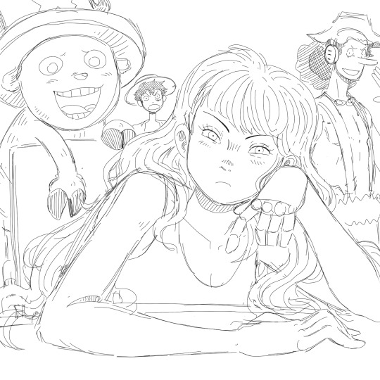
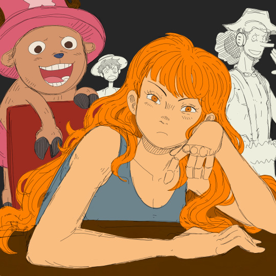
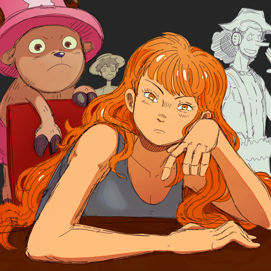
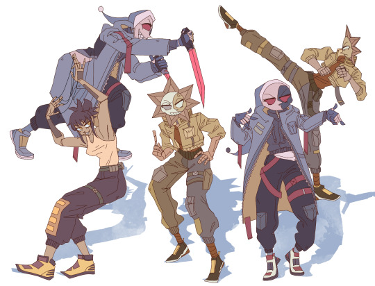
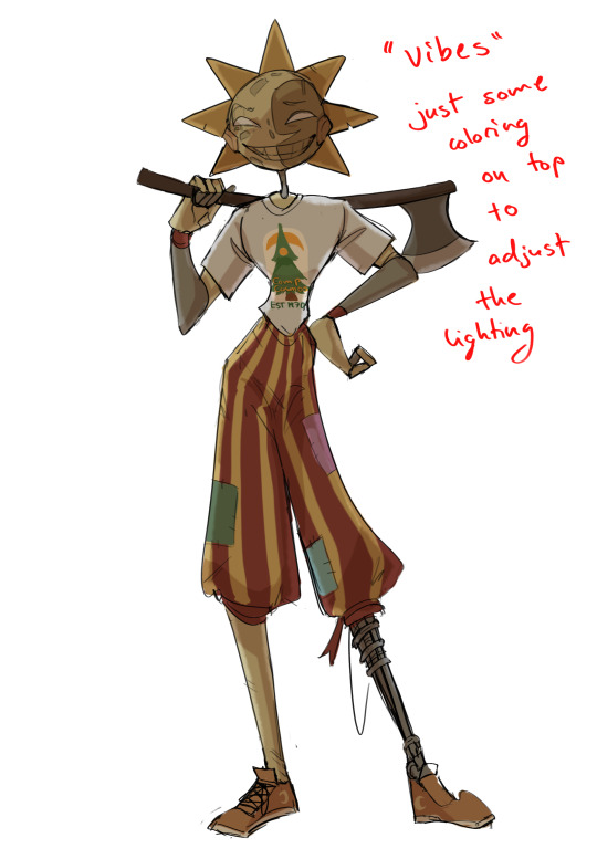
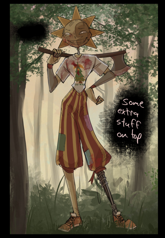
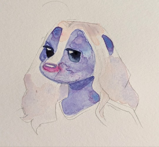
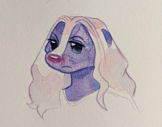
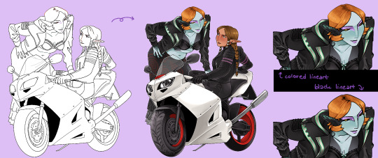
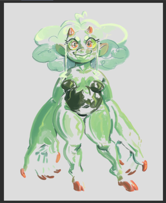
#i also kind of like how the coloring looks with this lineart
Explore tagged Tumblr posts
Visit Tumblr Blog
Explore Tumblr blogs with no restrictions, modern design and the best experience.
Last Seen Tumblr Blogs


Fun Fact
Tumblr has a low social media market share in South America.
Text
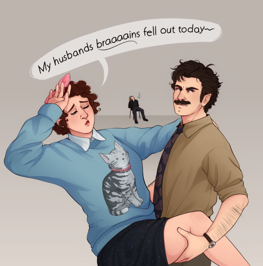
yeah, and who do ya think knocked em out
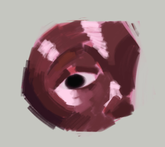
#Can't think of a good caption- and i didn't wanna quote the whole thing 😔#but also i cant leave it without a caption! or it looks naked! lOlol#I messed with the saturation on this one a bit because i'm too aware of how pale my art is once i see it on another screen OTL#so now im just hoping its not /too/ saturated#but i guess i'll just die on this hill for now#tgwdlm#the guy who didn’t like musicals#ted spankoffski#charlotte sweetly#Sam sweetly#kind of#does that tiny speck of him count?#also this is another case where i feel like i should have just left it as line art#i think my lineart always looks better then the finished thing grr#but i cannot stop myself from coloring ever#its like a curse
889 notes
·
View notes
Text


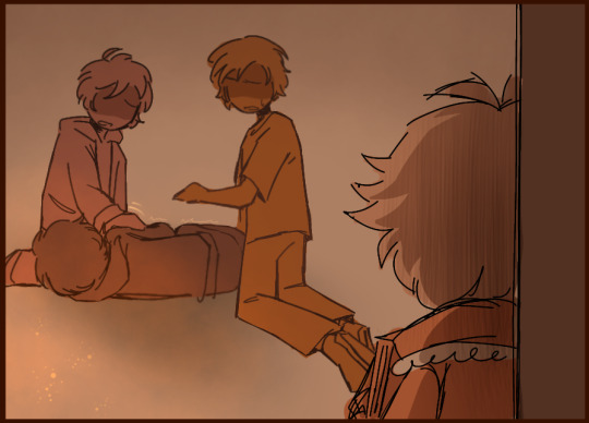
What have you done?
based on an idea @username8746489 had where sylvie discovered nightmare fuel for the first time on accident while getting bullied by some older kids (and pushing him further into social isolation now that he's known as "that scary kid who could summon someone's worst fear")
#♦️charlie's art#epithet erased#sylvester ashling#sylvie ashling#ok i have a lot to yap about here hold on#this was a challenge to make since i was imagining it with no dialogue and limited colors i hope i pulled it off#because of those two things something i had to think a lot about was how the color progression changes the mood#I wasn't originally gonna add that last panel with the aftermath but un suggested the idea of the bullies being vague shadowy figures#initially until sylvie realizes what he did and is forced to see that “that was a real person with their own fears and insecurities”#so then they're drawn more detailed#sylvie and the bullies also aren't in the same panels together until the last one because he's just so below them that he isnt worthy of#sharing equal space with them. these kids are highschoolers. if sylvie wants to look at them he'll always have to look up#and also because i was struggling with their height difference#i hope the second page doesn't make it look too much like sylvie summoned a fire 😭 it kinda helps with the mood but what he summoned is#supposed to be ambiguous and i dont want it to look like i was born yesterday and think nightmare fuel ONLY summone fire#but its hard to make it NOT look like fire when i can only work with orange#the lineart starts out clean and gets messier as the conflict progresses to represent a lack of control#and also it creates kind of a shakey/unstable effect which emphasizes sylvie's fear#also unintentional but i think the second page having detailed shading emphasizes the mood changes. this just got SERIOUS#oh also i used the mizu5 untrained as a color reference thats fun#ALSO SYLVIE DIDN'T KILL ANYONE im just realizing the one curled up in the last panel could be interpreted that way#that's not what i was going for#this might be unrealistic...... but we also know so little about sylvie's backstory that who's to say for sure IDK LET ME MAKE MY FAV SUFFER
133 notes
·
View notes
Text
Another quick drawing from last night
#keese draws#eternal gales#oc posting#oc#ocs#oc art#experimented a lil bit with giving her some more visible dark fur#I think I like it but Im gonna have to draw her a few more times to make sure I think#my main concern is that it might make her look a lil too similar to mason pattern wise#which is already smth Ive struggled with in the past lol#also yeah I <3 using brushes incorrectly#idc what the creators of any given brush intended if I can use it for funky lineart I Will use it for lineart#also yeah Ive been grabbing a bunch of free brush packs lately so thats why Im actually drawing shit again lol#tbf the glory drawing was me wanting to use a base procreate brush Ive been meaning to mess around with but I used some texture brushes too#with all my new texture brushes making bullshit backgrounds will be a breeze 👍#oh also Ive been trying to use those dumb layer filter mode thingies for the first time lately with my shading#idk how Im feeling abt them tho tbh multiply is nice ig but I kind of dont like how it dulls out the colors sometimes#like I know it makes the shading more coherent but idk sometimes I like the more grading shading#idk can yall even tell the different dndmdkdndh#I might just be being too picky with my colors or smth I always tend to assume the worst abt my colors#anyways sceduled and now eepy time from the past and good morning future me
11 notes
·
View notes
Text
gonna show u guys a little opalescent highlight hack i threw together today
rainbow gradient above your main figure (i usually have all my main figure folders/layers in one big folder, so i can clip gradient maps + adjustments to it!). liquify tool to push the colors around a bit. STAY WITH ME I KNOW IT LOOKS STUPID RN I'M GOING SOMEWHERE WITH THIS
THEN: set it to add/glow (or the equivalent in ur drawing program), lower the opacity a bit, and apply a layer mask. then u can edit the mask with whatever tools you like to create rainbow highlights!!
in this case i'm mostly using the lasso fill tool to chip out little facets, but i've also done some soft airbrushing to bring in larger rainbow swirls in some areas. it's pretty subtle here, but you can see it better when i remove the gradient map that's above everything, since below i'm working in greyscale:
more granular rambling beneath the cut!
u could also just do this with a brush that has color jitter, but what i like about using layer masks for highlight/shading layers is how simple and reversible it makes everything. i can use whatever brushes i want, and erasing/redoing things is super low stakes, which is great when i often approach this stuff with a super trial-and-error approach.
example: have u ever thrown a gradient w multiple colors over an entire piece, set it to multiply etc, and then tried to erase it away to carve out shadows/highlights? it's super frustrating, bc it looks really good, but if u erase something and then change ur mind later, u basically would have to like. recreate the gradient in the area u want to cover up again. that's how i used to do things before figuring out layer masks!! but masking basically creates a version of this with INFINITE undo bc u can erase/re-place the base layer whenever u want.
anyway, back to rambling about this specific method:
i actually have TWO of these layers on this piece (one with the liquified swirls shown above, and another that's just a normal concentric circle gradient with much broader stripes) so i can vary the highlights easily as needed.
since i've basically hidden the rainbow pattern from myself, the colors in each brushstroke i make will kind of be a surprise, which isn't always great -- but easily fixable! for example, if i carve out a highlight and it turns out the rainbow pattern in that area is way too stripey, i can just switch from editing the mask to editing the main layer and blur that spot a bit.
also, this isn't a full explanation of the overall transparency effect in these screencaps! there's other layer stuff happening below the rainbow highlights, but the short version is i have all this character's body parts in different folders, each with their own lineart and background fill, and then the fill opacity is lowered and there's multiply layers clipped to that -- blah blah it's a whole thing. maybe i'll have a whole rundown on this on patreon later. uhhh i think that's it tho! i hope u get something useful out of this extremely specific thing i did lmao
12K notes
·
View notes
Text
Can we talk about chapter 60? I'd like to talk about chapter 60: A Place I Belong.
I specifically want to talk about the sections with the tightrope. It's one of my favorite parts of Wind Breaker and I could praise it for ages. I know it's a kind of common metaphor for struggles and isn't anything too special, but I really do adore it.
And whoever decided to add that anime only scene to the start of the first episode? Absolute genius and I love them for it. It works beautifully without it in the manga, but I think it's going to add a little extra something to the anime!
But for the tightrope section in the manga? It's so good and so well executed!! I absolutely love the way the style changes throughout the chapter!!
We start with white lineart on a black background. The lines are messy, sketchy, and even the boxes don't have clean lines.
I also want to point out how the only clean lines we get from this section are from the adults in his life, as well as the wind chime and the sprout pushing out from the ground.
The wind chime and the sprout clearly allude to Furin and the way both Furin and the rest of the town have shown that he, too, can be loved and accepted as he is.
The wind chime is also the thing that seems to be the transition to Sakura going from walking along the tightrope to considering that there might be another path for him.
I'm going to be real here and say that I don't have a lot to say about the other adults also having clean lineart. I'm sure there's someone out there who'd have something really smart to say about it, though. If I were to say something about it, it'd be that I think it might represent his shaky sense of self, compared to other people who have it figured out.
After that we get to the middle section, with Sakura in the "real world" again and with the rest of the class. I won't focus on the dialogue itself too much, but I'd like to talk about the way we go between the tightrope and reality.
I really like how the panels with the tightrope are woven in. They show us what's going on inside his head while also showing us how it looks like in reality. We see visual representation of how this feels like to him.
It's shown in how before he speaks, as he's gathering the courage for it, we can see him changing his stance on the rope. We get shown the way this is him preparing for that leap. He also mirrors himself with the way he's clenching his hands both in reality and around the tightrope.
A little later, as he's talking, we can see him directly mirror himself in both realities.
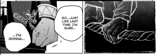
We see the way he's holding on preparing for that leap, as well as the way his face is split in two here. It doesn't directly match up, but it doesn't have to, because it already works so well here. I'd maybe even argue that I prefer it this way around as opposed to if this was a direct split of his face.
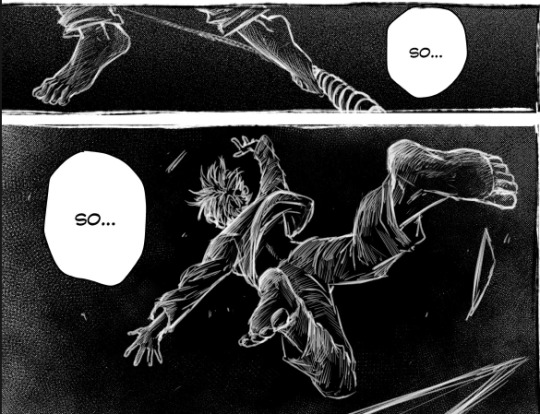
And then we see the leap itself, the way he throws himself into the unknown.
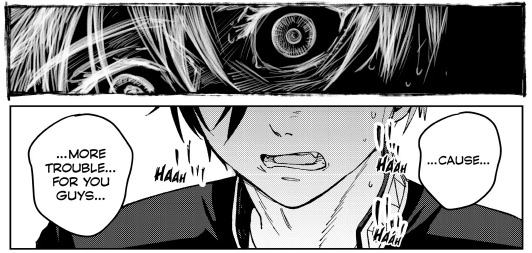
And then he gets called out on his bullshit, gets told that he's insane for thinking they'd cast him out. That they love him as he is and that they want him around. They actually want him. For maybe the first time in his life, he's wanted, appreciated, and needed.
And it's just this "Oh." moment for him. You can see the way it just clicks for him.

And after this we get to an absolutely beautiful scene, the part that makes me love this chapter so much.
We see that it all isn't so terrible after all, that there is hope. The tightrope isn't a drop to certain death, just a drop.
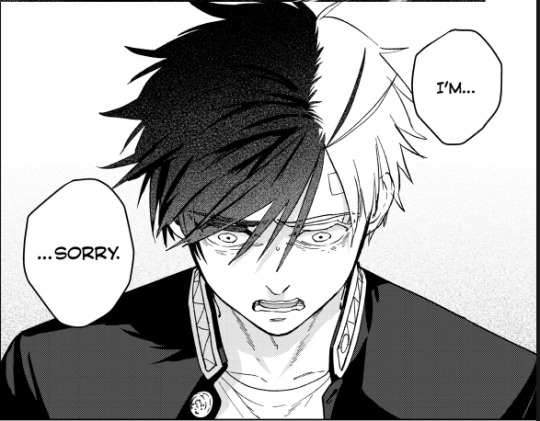
The colors have changed and we're now looking at Sakura on a white background with black lineart. Though at this point Sakura himself is the only part of the scene with messy lineart. The field of flowers and grass, as well as the edges of the panels, are all cleanly lined. Except for Sakura. Even if it's still messy, I'd say it's definitely a little cleaner than it was before.
You can see the way he's a little more faint, a little less solid than the rest of the lineart.
And then we see Bofurin, the rest of his class specifically. They're all there and they're all cleanly lined. And as Sakura reaches out to grab the hand he's offered, his lineart becomes clean. His lineart is no longer messy, it's no longer a sketch. This is him finding and accepting himself.
And as he grabs that hand, his clothes also change. Before all he was wearing was a plain shirt with plain pants, nothing remarkable, just plain clothes. But as soon as he takes that hand, his clothes change to a Furin uniform.
This entire chapter is so beautiful and I cannot wait to see it animated. I really hope the anime does it justice. From the lineart to the colors swapping around to the dialogue, it's an amazing chapter overall. I know I didn't really talk about the dialogue, but it's also good :)! I don't have much to say about it, though.
Moral of the story is that I really love this chapter and just wrote around 900 words about it.
#this chapter is so so good and i almost cried at some point lmaooo#i thought about the last part of it a little too hard and teared up while making this#the colors.. the lineart.. the composition.. its all so good#i looove the way the wind chime also kind of . breaks it up . its in between panels#its just such a good chapter i love love love it#i absolutely lost it the first time i realised his clothes change#wind breaker#sakura haruka#laauranenn
304 notes
·
View notes
Note
How to draw like you no borax
Good question!
I'd warn against following my process (at least if you want to learn), but I'll be honest and show you, lol. (Heads up: this is just how I do FAN art. When having fun, I generally care less about the fundamentals.)
1. I slap down super rough sketches, jotting lines/expressions like bullet points of my idea. Pretty much stick figures with just enough detail to remember who's who later. Not shown here, I also move, resize, and add details to express the intended composition if I'm planning something larger. You may notice a lot of curved lines / haphazard circles.
2. I refine the sketch by drawing it with more intention and build structure with slightly blockier shapes. If I'm really struggling with a pose, this is also where I'll find references or look at myself for bits and pieces to fill in the gaps. (When practicing, I would highly recommend using a reference from the start so all your limbs are an appropriate length and you don't need to say things like "that's passable" right before posting. If you're a perfectionist you'll leave that thought with the rough sketch.)
3. I'll decide around here whether or not to leave the sketch as is or commit to lineart (not likely). I guess I'd say I "shape the lines" here by going over some to add thickness/weight, and by adding basic sort-of-shading to break things up a little. Then I'll just fill in space if the page looks empty. (Usually this is where I incorporate the borax, but I hear baking soda works nicely if you're worried.)

4. Onto coloring. I don't feel confident enough to pretend I know what I'm doing here, lol. I just choose my base colors, imagine the general direction of the light source, then add minor gradients to the light and dark layers so they don't look flat. Then I just add some BS highlights and outline them. I've only recently found the motivation to properly practice coloring and just go with the flow tbh.

You may notice that Nami's forearm is too long, her hand looks like a pancake and Chopper has no joints! My kind sibling explained to me once that my anatomy is poor, but cohesive enough that nothing stands out too bad, lol. That's why it is important to use references!! And if you're me, practice all parts of anatomy at the same time with full bodies so that even when you're at a loss, your hands aren't that much better than your feet.
All in all, to draw like me, just have a very hedonistic approach to art, ha. Draw what you want, avoid getting burnt out on any single piece (sometimes that happens when you try to perfect drawings one at a time), and follow my personal motto:
Make fun, not masterpieces.
Idk how helpful this was, but there you have it!
490 notes
·
View notes
Note
Looked at art FAQ and I hope this isn't too similar to the brush setting question óvò. But one thing I admire is how smooth and confident your lines are!! :0 They're so smooth!! Do you have any advice on how to practice or general tips? Do you utilize the stabilization tool? I've tried to use it here and there but I'm worried about relying on it too much. Also honestly using stabilization makes drawing feel "slower" and off.
i dont actually draw with stabilization on (very much at least. i think ive got it set to like 12%, so it imitates the drag drawing on real paper might have)
personally for learning smoother lineart other than the general rule of 'move fast, make swooping motions, redo it as many times as you need to get a broad stroke' is to draw traditionally in pen!
so like no sketch or anything underneath just Draw in pen. if u mess up either keep going or start over. this gradually kind of forces you to gain a confidence to your lines bc you got no eraser and no undo button.
additionally, i think this is part of why i really dislike youtube sketchbook tours... pretty frequently those sketchbooks are full of really beautiful clean pieces, and no mockups or swatches anywhere! nothing wrong with that ofc but i think culutrally as artists its given everyone a really twisted idea of what a sketchbook is for. theyre meant to be places where you practice and get loose! i sometimes draw the same thing three times on the same page if i mess up.
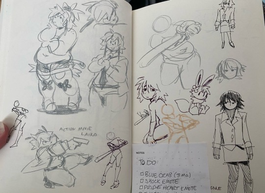
for example, these are some sketchbook pages of mine ^_^ i draw in colored pencil too bc i like the texture and you cant erase it easy + it doesnt smudge
627 notes
·
View notes
Note
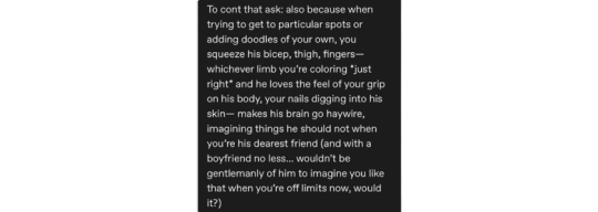
Imagine Sunarin having those b&w lineart only tattoos and never getting them colored because he likes watching you use his body as your coloring book whenever you’re bored 😭🥺😩

ft. bsf!suna rintarou. f!reader, slight suggestive, overall just fluff. wc ~ 500
hey …. HEY ?? HEY SO :DD is this payback for all the narumi posts/replies i made … :’) u got me Thinking™️ about this god help me
imagining him laying down on his back, shirtless with you just beside him, splayed over his bare torso (kind of like how a mermaid would lounge on a rock lol idk how to desc it) as you spread your creativity on the canvas of his inked skin.
suna stares down at you, one hand beneath his head and the other casually resting on the soft dip of your waist as he drinks in the sight of you like this; so cute and so sweet, looking so focused with those furrowed eyebrows and a little frown on your kissable lips.
his pretty, pretty girl.
not that he’d ever mention any of those thoughts aloud anyway. you’re just his best friend, after all.
suna allows himself to savour the feeling of your nails biting into the skin of his shoulder instead of the strange sensation of the yellow marker dragging across the top of his arm, filling in the empty space between the dark swirls with that bright sunny shade.
“ouch,” he jokingly say, pouting slightly when your hand seems like it’s not going to lessen the grip anytime soon.
you bring your attention away from your art piece, glancing up at suna with a questioning look. “want me to stop?” you ask.
“no.” it’s almost pitiful how immediate his response is.
you give him an almost haughty look before turning back to your work. “then don’t complain, rin,” you sweetly shoot back, grabbing another coloured marker from your collection.
with a dazed smile on his face, he answers, “yes, ma’am.”
suna once again drowns himself in your presence; the familiar heat from your body, the softness of your skin against his, the smell of that subtle note of your perfume, the faint sting of your nails on him.
he wonders if he’d ever get the chance to feel those same nails digging into his back instead.
based on this art. also inspired by a tiktok vid i saw in passing
©🅁🅈🄴🅂🄲🄰🄿🄰🄳🄴🅂. do not steal, translate or repost my work anywhere else !
#happy birthday to him ig .. rolls eyes#(also heart eyes)#wait this can actually be apart of my 1k event bcs of the dialogue lol#ALSO nyx if u ever see this#imagine this as endo ^_^#danyl you’re cruel for this btw#i see how u wanna play .. i See#🤍 rye moots#🕊️ rye inbox#luvr ; danyl 🖇️#hq x reader#suna rintaro x reader#suna x reader#suna fluff#suna rintarou x reader#suna rintaro fluff#rintarou suna x reader#rintaro suna x reader#haikyuu x reader#haikyuu fluff#hq fluff#rye.exe 🪄
216 notes
·
View notes
Note
You mentioned how DU Drow‘s quite superficial a few times, and seeing as he’s fashionable (I think) what’s a fashion ‘piece/trend’ that he just hates if there is one?
Also, I LOVE absolutely adore ur lineart, it’s crisp and I just…want to eat it 🥲
Anyway have a good day 💪
That's a bit of a tough one, because to be honest... He doesn't UNDERSTAND fashion, that's for sure. He knows what quality material looks like, and he also knows when he does or doesn't like the look of something, but he doesn't give the reason behind it much thought despite having such strong reactions about most things at a glance.
Generally speaking, I think he likes things that are nice, pretty, but not overly elaborate or overbearing. Ironically, if it seems like it takes more than two minutes to take it off/put it on (armor exempt) he probably won't like it. This means he's not particularly into overly ornamental dresses, suits, things that have layers-upon-layers to them - things that significantly alter a person's silhouette like certain high-class fashions (if we are basing this world's trends off of our own fashion history) or "detract attention from the individual wearing it", as he would probably put it.
He also doesn't like things that are overly dark - or overly colorful. He's big into the look of whites, blues and silvers for the every-day, and reds and golds if it suits the occasion.
In truth, I think there is NOTHING he hates more than someone who seems over-dressed for the gig; If you're sacrificing practicality, comfort, and common-sense alike only to show off. That's an immediate turn-off for him.
It's much easier to list what he does like: things that are a nice mix of flowy and figure-hugging, that seem and feel light, that compliment a person and seem to have been lovingly crafted to suit them rather than to just look expensive.
(And like any asshole worthy of his title, he loves femininity but hates high-heels. He's more of a dogs-out kind of guy, if you catch my meaning. )
And of course, this is all applicable to others but not necessarily himself.
Thank you for the question and for your kind words! I'm surprised at how much this one made me Contemplate The Man and his dumb little brain LOL
157 notes
·
View notes
Note
Oh uh forgot to ask in the previous ask (the one with the digital piece of candy and scurrying and stuff)
How do you draw art so good
Like
Is there a method you use or is that just the style you've gotten over time?
you've activated my trap card
I'm just gonna preface that this tutorial is from someone who was not professionally trained and didn't have a lot of free time for art, so a lot of the tips I have is short cuts I use to get the best results quickly
If you genuinely want to get better at art then please look at references and practice that is always the best
However if you are like me and only really do art for fun but want to go faster then these are for you pfppt
Overall I'd say my style is influenced by speedpaints I would watch when I was younger, I like analyzing how people do things and what makes something look "good" to me
I always recommend watching them because they will often have techniques you've never seen before or do things a certain way that you can try out yourself
I consume good art, it feeds me
but seriously it can be super helpful when developing your own methodology, or just generally trying something new
Usually it starts with me pulling some references from artists I really admire and sort of sketching out how they do the things I like
For example 8um8le has like super good anatomy and poses so I focused on trying to replicate how they do that
venemous-qwille is super good at color and pulling focus so that's what I focused on in my study of them
In general I'd say my process is sketch -> silhouette -> color -> shading -> render
I really don't like doing lineart lol

I'd say for the sketch the most important part is using references and just kind of fudging it until it looks correct anatomically/physically
General rule of thumb is spend time on areas of interest, and keep non important areas light (like the stitching on his pants)
I don't do lineart because I think its unnecessary for most paintings I do
I naturally tend to put more time and focus on areas of interest (like hands and feet) and if you use a brush with opacity for the sketch, those areas are naturally going to be darker in the final sketch
Of course this is gonna be different for everyone but it's what works for me
Sometimes I do a really really sketchy layer underneath my sketch/lineart, just so I know where everything is going
Use thumbnails! They are great to help figure out the general layout of things and what pose I wanna do
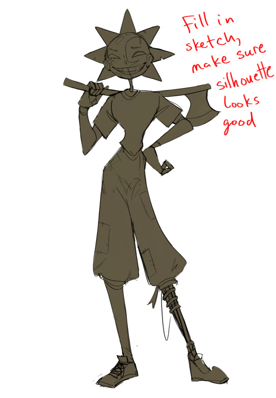
Next is what I call the "silhouette" layer
This is super important for me cause it helps me refine the figure and make sure the pose/anatomy looks correct, also depending on what color I choose for the silhouette helps guide what colors I'm going to use on top
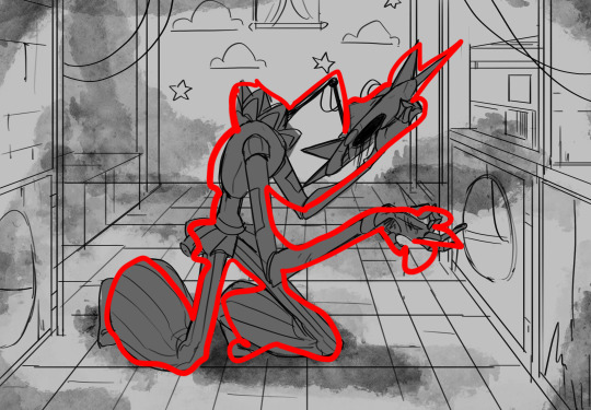
This piece is a good example of how it works. The silhouette shows me how the figure interacts with the background, how the pose looks and if its any good
The silhouette layer doesn't have to be super clean, as long as it follows the sketch decently well and shows where the figure is then its fine
I also sometimes make the silhouette layer multiple colors to help guide shading and vibe
Next is the coloring layer. I usually make this a clipping layer on top of the silhouette layer, or I change the silhouette layer to alpha lock, either way it saves me time on coloring everything in

Sometimes I am super rough with the coloring too, using like an airbrush or my fav watercolor brush just to generically block in color where I want it
Works out cause most objects have like a bounce light to them from surrounding objects, so this is sort of a cheat I use to get that effect without all the work lol
Also don't be afraid to have the lower silhouette layer shining through, having multiple colors sort of subtly shining through the piece helps lots
Next is the shading layer, this is usually another clipping layer, usually set to "multiply"
The colors I pick here is usually within this range, any color works, just depends on the piece and vibes.
Since this piece is set in a sunset forest I choose a more desaturated orange for the shading layer
I know there's a whole thing about multiply layer being a crutch (and it kind of it) but it is a useful tool when you just want some darker values across the piece but don't want to go through the process of color picking every single darker shade
Also in my opinion it looks better than picking a darker color and setting it to a lower opacity, idk I just think the color has more "depth"
Next is the hardest to explain, sort of the vibes layer
Usually its just a layer of more concentrated color on top of the normal color and I fudge with the settings and values until I get a result I like
Next is the longest step, is the "extra" or the render stage.
Usually I add a background before this step so that if I need to merge the figure better with the background I can
If I render with a white background but he's supposed to be in a dark forest, its going to mess with the lighting severely
Also this is when I add more "vibe" layers on top to get the figure to match the background better
Backgrounds in general I recommend checking out @/derekdomnicdsouza on instagram he's got lots of great tutorials for breaking down backgrounds simply

I'd say general rule for the rendering layer is to focus on the areas of interest and spend less time on areas you don't care about
I even blur stuff out on the edges I don't want people to see, partially to save time on fixing mistakes in areas I dont care about (oop), but mainly to help draw the eye to the areas I do want people to focus on

Theoretically parts of the background should like mesh with the characters, parrallel lines are a no no unless they are directing a viewer to look somewhere, things that are perpendicular help bring things together
tbh I'm still not the best at layout and probably need more practice, but overall this is what I like doing
Overall this is what my layer set up ends up being
Sort of a sandwich with the lineart/sketch as the "meat" lol
Color and basic shading below the sketch, clean-up and rendering on top
I like this method cause it's super flexible if I ever want to try something different or try to replicate someone's style
I can make each step less or more messy depending on the end result and can add a lineart layer if need be. Also if there's a part that is straight up not working or needs to be removed its super easy to do cause I can just paint over it on the "extras" layer, color picking from the surrounding area to get the same vibe
Generally rule of thumb for my style is: get the initial layout of colors, form and shading to look good, then the rendering should be smooth sailing
Really the best advice I can give to get better at art is to enjoy what you're doing and become very very obsessed with drawing a silly little guy
You'll eventually get very good at drawing them pfptpf
#sundrop#moondrop#long post#art tutorial#fnaf sun#fnaf moon#I draw them way too much holy guac#ask#this is for you asker#idk if anyone else is interested in this kind of stuff#i apologize for ranting lol#also me struggling to spell silhouette like 15 times
117 notes
·
View notes
Text

Finally, someplace quiet.
(Technically a part two to this drawing)
Full disclosure... this drawing is unfinished. Idk why but I just don't care to finish it. I've been kind of having an art block recently, and I really like how this looks right now, so I don't want to touch it. Sometimes that's just the way it is.
I tried a different process for this drawing, where I tried sketching with a smaller pencil (I normally use a much bigger one), and then I went straight to blocking in some color first using the paint tool, which I also almost never use. I was going to add more detail to the background, but like... this is THEIR moment, not the tree's moment, why should I render the bark of the tree? (excuses). And then I decided that this would probably look worse with lineart so I was like "I guess this is where the journey ends".
And you know what? I like this piece a lot. I don't think art is just about how polished it is, it's about the emotion. Also I draw for fun, so if I know that I'm not going to have fun finishing the rendering or doing the lineart, what's the point?
Artists should be able to do whatever they want, and I want to draw some sappy unfinished yaoi. Send post
92 notes
·
View notes
Text
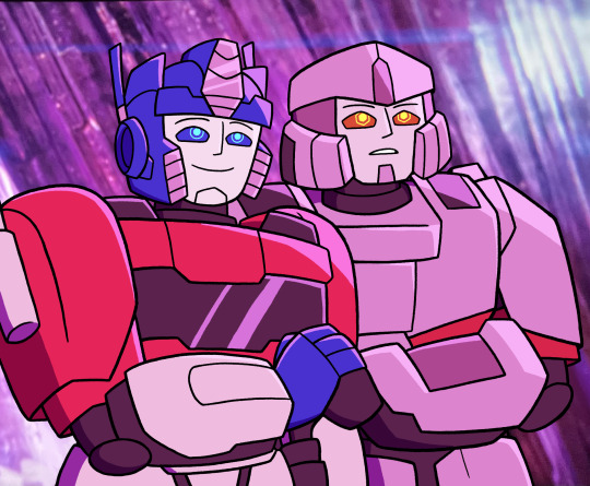
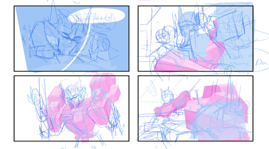
So uh, I drew this tonight
It was just based on me seeing this post on Twitter about how these two characters from Godzilla x Kong are basically Orion Pax and D-16 in another universe, and then me saying someone should redraw the characters in the screenshot as them

And you know, since I can draw, I might as well do it myself
But then I immediately forgot that it was specifically dpax I was meant to be drawing, and drew their final Optimus and Megatron forms instead. Oh well
I haven’t seen Godzilla x Kong, so I have no clue who these original characters are or how much they fit. But I do know Brian Tyree Henry plays one of them and this is the movie that his quote “I’M GONNA KISS YOU ON THE MOUTH” comes from, so I have to assume it works. I also have no context on this scene I’m redrawing itself
I’m mixed on how the art turned out honestly. On one hand, I think someone absolutely could have done a better job, and probably a better version would have the two more closely resemble the original characters, like wearing similar clothes and/or making them human. I’m aware I’m only decent at drawing Transformers at best (outside of when I try really hard, which is rare) and I’m aware I probably misinterpreted the vision, I just did it because I thought someone should, even though I don’t think I got it
But like, I still kind of enjoy how the final product came out, I think it was pretty good by my standards. I still don’t know how to draw the TF One bots very well and I think yet again, Megatron ended up looking the worse, but I still think it turned out reasonably well. I also liked giving them those bright colors in the Overlay, Screen and Multiply layers; I wanted it to be colorful and it was (even if the colors are I think wrong, they’re supposed to be more orange/red)
It also wasn’t all that bad having a canvas size and having to draw a lot bigger than I usually do, I feel like the lineart in particular got to shine because of that. I also used my Marker Pen here, for no real reason other than I haven’t used it in a fair bit
But uh yeah, this thing I made. Hopefully in this universe they are not doomed
Edit: I did a little bit of modification on the art, namely fixing a bit more of the background (best I could), and changing the blending of the pupils to make them brighter, since I remembered they’re supposed to be lights, so they should shine
#there’s little things I keep noticing I missed as I look at this#but whatever I can edit later if I feel like it#the coloring’s also really flat sorry about that#I’m not very good at proper shading at least with solid thick black lineart#I tend to stay very flat in those circumstances#someone could probably do this better than me#but like for my standards I think it turned out pretty good#I feel like I’ve complained a lot about it but that is my overall takeaway#granted I’m more positive on it here posting it than I am quoting the original tweet with it#probably because it’s just me showing a thing I did#and not me trying to deliver on a thing I said and probably failing miserably#oh well#sorry about my negativity#transformers#transformers one#optimus prime#Megatron#godzilla x kong: the new empire#screenshot redraw#redraw#my art#megop
119 notes
·
View notes
Text
watercolor paper experimenting with doodles
Id like to start incorporating watercolor into trad gifts and comms I send to others... but theres a difference in how different watercolor paper take watercolor vs how they take colored pencil, and I like to incorporate both...
Ive drawn cupid smunkers (named such because of the paint color name) on 4 paper types I have (but only showing 3), to try and figure it out. Specifically chose this paint color because its very granulating, and i wanted to see how colored pencil goes over it.
Arches cold press....is very good for laying paint. But not very good for colored pencil at all. I usually incorporate colored pencil into the colored areas, but I didn't dare do so, knowing it would just look as rough as the lineart here does. (This is the laziest cupid smunker i drew LOL i like the chaotic effect that came from doing it quickly) Perhaps this would be ok if im able to master watercolor, so i only incorporate colored pencil in the form of lineart, but right now I really like and almost Need to blend the 2.
canson mixed media paper takes the paint ok-ly. I heart hard watercolor edge! The colored pencil for the lines is Ok, I Suppose, but the texture is far too evident when adding colored pencil to the colored areas....one would have to cover the entire area with it (seen here) because it looks too off and obviously out of place if you just want to add colored pencil to one area....

Arches hot press....i was too scared to play with the granulation here because this paper scares me. This one is arguably the best of the 3 shown but i get Scared to put the paint down because i fight for my life with hot press, and bizarrely enough colored pencil feels strange here too...where cold press grips and doesnt let go, hot press has me struggling to keep line direction and a fine point. You can also see in the arms that adding the colored pencil to a full area still looks....off...! I guess im going to have to keep experimenting.
The paper example im NOT showing is baohong academy. The smunker came out too ugly LMAO. I LOOOOOOVE how paint looks on it. Incredibly bad for colored pencil though, even just for lines, same as arches. Would be better for ink-and-washes but as of right now i am not really an ink-and-watercolor kind of guy
-----
This is the paper from my watercolor sketchbook which is also good-bad but my favorite overall, compromise wise. It handles paint ok-ly, kinda like hot press, but it takes my colored pencils well. It still looks "rough" but its an equal roughness that blends into each other texture wise, while still accepting colored pencil without much fight.
(For example, the top on the jinx stoat is paint only, but the texture matches the areas that have more colored pencil. Cat has limited colored pencil but the texture is all around the same, and the sea smunker here actually only has colored pencil for outlines in various areas, but still has texture, which is usually what makes watercolor paper struggle with colored pencil. You can also see the texture in the watercolor swatch squares, which are completely untouched by pencil. I hope this makes sense)
Maybe i just need to get loose sheets of this paper... Even if it does also piss me off in several ways LMFAO its the only one that really lets me balance both....
80 notes
·
View notes
Note
The way you do your lineart is so 🫰🎀💪👉👈🎉🎈🥳🎂🪻🌸💫⭐🌟💥💥💥💥💥💥💥🤠🫨🫨🫨🙌👌👌👌👌👏👏👏👏👏 I NEED to know how you do it. Even tho there's very little line variation from what I can see, it looks sooo 3d and amazing (probably because of your colouring) so.. here's your free pass to yap about your work process!! ^^ I love your art so much
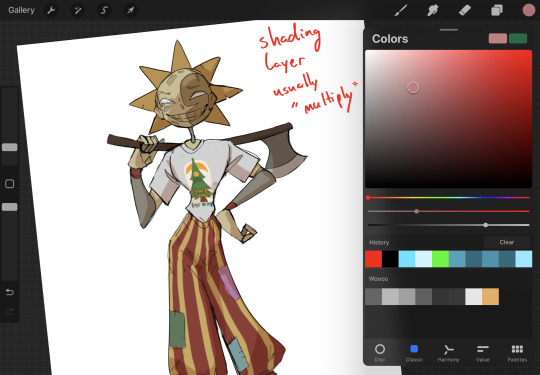
Hiiiii snail ^_^ this one’s a bit though to answer because lineart is the thing I put less thought into LOL I don’t really think there’s much to it so I’m sorry if my answer disappoints
Uhmmm first thing I can think of that might be interesting (and something that some other ppl have asked about b4) is that my lineart varies heavily from piece to piece because I rotate the brushes I use for it
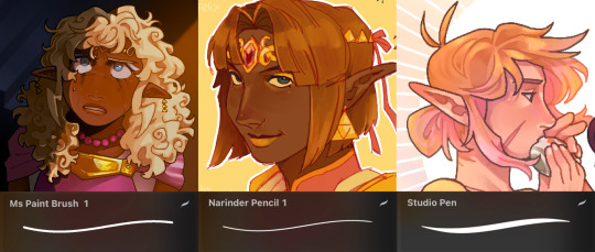
The examples don’t make it super clear but these 3 are my ultimate go to's !!! (A slightly modified) Narinder Pencil is also what I doodle and sketch in, Studio Pencil is for like when I try to actually put effort into a piece, while Ms Pain Brush (which I got from Google) is usually for just having fun with ideas and colors if that makes sense (unless it’s like, a low effort doodle or something…..)
Looking at it there is basically no weight to my lineart, it’s just lines ??,, the shading does the whole work, the only thing that comes to mind would be that I pretty much always color my lineart, you’d find me dead before I leave it black
There’s some lineweight and variation but it’s so small that it’s hard to notice I think
That is everything I can think of that might be interesting to know??? Sorry I know nothing ever forever
Thanks for the ask and the kind words 🧡🧡
63 notes
·
View notes
Note
Hii, I saw your latest post and your art style is so pretty?? What?? I have a question though. How do you do the paint one? Or rendering in general. Like genuinely, I have a problem with rendering and I can't seem to quite understand it on my own. Do you just start with flat colors? Do you do lineart or colors right after the sketch? Is the "lineart" just added later? Painted over? Erased to give thinner and thicker lines?? I'm really curious!!
hi! im not the best painter tbh! though i do have a background in painting but ill try my best to explain
diff artists have different approaches to how they paint but generally yes, you would start out with big shapes first and then go into the details - work big picture first. like, if you squint and the drawing makes sense in terms of value and colour and shape, youre on the right path.
i can kinda show this with a warmup in-class speedpaint exercise we did a couple weeks ago where we were tasked with painting an eye in about 30 minutes (i was late and only had 20 lol)

luckily ive got the layers for this. i start of with a base layer, kind of like a underpaint layer since that's how i personally learned to paint traditionally. i did have a sketch before laying down this base layer under it but i ended up using it for final rendering details lol
after that i started laying down the big blocks of colour. i wasn't necessarily aiming for complete colour accuracy here, i just wanted to match the value. i chose a pink underlayer to influence my colour choices because the underlayer will peak through the blocks of colour i paint over it
and then (forgive me if this seems like "draw the rest of the owl" in terms of progression) but this is where i started going in with finer detail. i did the rest of the render on the sketch layer i had so you can see some of the lines from the sketch here
here's the layers completely seperate from each other


even for the flat colour version of my character, i had an underpaint layer! i used yellow and orange since i wanted her colours to be warm and used a semi-opaque brush to put her colours in rather than using a completely opaque brush
when i wanted to do the painted version, i put the lineart on multiply and reduced the opacity and brushed in some some quick shadows on seperate layer on hard light mode to give me a good base to start painting with

and then i did all the rendering and details on a new layer ontop of everything. i keep the lineart light so i can paint over it easily and also colour pick from it when i want a more distinct line to seperate certain shapes. i unfortunately dont know how to explain this part because a lot of this is intuitive to me and i'm still learning. but you gotta make use of different types of "edges" in painting, and you would generally have more contrast in the focal point of your painting than in other places to draw the eye to that point. i suggest researching the use of edges in painting if you really wanna learn more - because im a terrible teacher haha
for fun here's what the rendering layer for this one looks like on its own and the finished thing for comparison

there's other things you need to learn too, like bounce light, atmospheric perspective, ambient occlusion... and colour theory is always important! i could go on for a long time. there's a lot of pieces to the puzzle and it may seem overwhelming but there's tons of resources online and it will all become second nature to you as you keep practicing
uhh hope that helps!
76 notes
·
View notes
Note
hiii!!! loving your locket comics!!!!!! just wanted to ask a few questions about your process, if you dont mind :D
whats your general process like?
do you do thumbnails, how do they look like?
roughly how long does it take you to complete a comic panel or page?
how detailed are your sketches? do you do multiple?
do you have any specific techniques for lineart?
do you typically use references for your comics?
generally, how much effort and focus do you put into your comics?
do you have any advice for drawing comics?
sorry for for the absolute bombardment of questions, lmao. just really enjoy your art and comics and very interested in the behind the scenes!! feel free to skip any questions (or this whole ask) well wishes and salutations!!! :D
Hello! I'm so glad you enjoy my comics, and I totally don't mind breaking down the process!
For a normal comic page, I would likely actually write a script since it's much easier to keep track of dialogue and actions. But since these are short, I just write it into my thumbnails.
Step 1: Thumbnails. Easily one of my favorite parts, since I get to throw all my ideas down. I do these comics on a 2-panel grid, so I don't have to worry about actual paneling, and it allows me to focus more on the setup of each shot. Think of it like storyboarding!

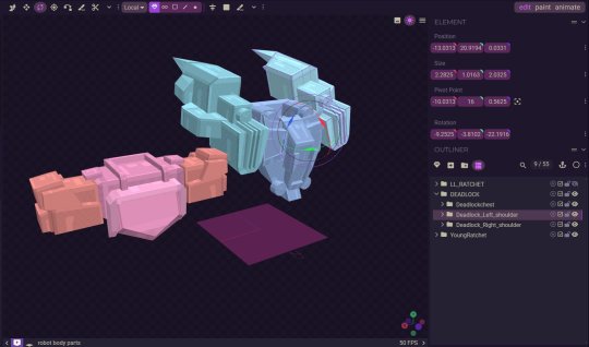
Step 2: Add cleaner thumbs if needed. I actually made 3D models of Deadlock and Ratchet's chest in Blockbench, so I often trace them to save myself some time! (It might look insane, but I promise, for me, it's not.)
Step 3: Lettering! I actually like to get the lettering out of the way right away since it can take a while. Ever since I started treating lettering as its own form of art, my skills have gotten better, but it also takes much longer.

Step 4: Clean sketch! I'm just now finding out that people think I’m doing lineart for these? I am not… these are all just clean sketches. Maybe doing the blackwork gives the illusion of lineart?

Step 5: Color! Most of these comics are in black and white to save time, but it also lets me focus on values and shot framing again. I add my glow overlay to the eyes, and boom, done!

Roughly how long does it take you to complete a comic panel or page?
It really depends on how complicated the panels are. I like to step out of my comfort zone. I know the Grimlock and Misfire one took longer because of how many panels there were and the fact that I was drawing characters I’d never drawn before, but I’d say it usually takes around 5-8 hours for a whole page.
Do you typically use references for your comics?
I'm literally the reference GOD- we all know this. But yes, I love using references and doing character studies. I have yet to do a study on LL Drift, but I have a few references of him that I’ve made.

Generally, how much effort and focus do you put into your comics?
I mean, I wouldn't say I don't put in a lot of effort? I put in enough. I don't know… there's a point in the clean sketch process where you can kind of just turn off your brain. I'm passionate about comics, but we can all agree there's a point in a drawing where you just zone out.
Do you have any advice for drawing comics?
I think being able to balance dialogue and visuals is super important. I don't know if you guys have picked up a graphic novel from Barnes & Noble recently, but if you open a page, you'll see a character sitting with the biggest bubble you've ever seen, filled with paragraphs of text. While I get it—being a novel as much as it's graphic—I personally like to visualize emotions more. If it means adding two more panels to make an interesting dialogue setup, I don't mind doing it. Another thing to remember is that not all panels need to have details or 100% effort. Sometimes you need to simplify and move on, and that's okay! Those two extra panels that are giving you a better stage setup might be the ones that need fewer details and less time. I would consider my comic page work and my 4-panel work very different. One is about paneling, setup, and visuals, while the other is very much like storyboarding. Both are skills you learn with practice and study.
131 notes
·
View notes