#how to use tilt-shift blur in photoshop
Explore tagged Tumblr posts
Note
hi!! feel free to ignore this if you'd rather not answer it but i'm just wondering how you edit your backgrounds because they are breathtaking! there is just so much motion in your edits and i love them so much, you are so skilled <333
hi! i’m sorry it took me a bit to answer this, i kept forgetting 😭 but thank you for the kind words, i adore your editing so it means a lot coming from you! ANYWAY! i’ll get into it the best i can down below
when it comes to my edits, it really depends on the screenshot. but i’ll use my makoa edit for an example!
so, this is the original unedited screenshot. i’ll be basing my background off the horizon/ocean behind him. (also keep in mind i do this all with photoshop!)
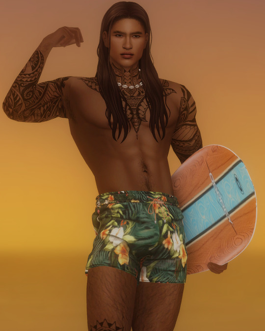
first thing i’ll do is separate makoa from the background. (do this is whatever way works best for you, for me i use quick selection or pen tool depending on my mood) when he is selected, i'll press ctrl+j and he'll appear cut out in a new layer. it should look like this.

pressing ctrl, hover over your cut out sim layer, and click it. this will active the selection again. now, navigate to your original background layer. with the selection still active, go to select > modify > expand. expand this selection by about 15-20px. press okay! your selection will grow. now go to edit > content aware fill press okay. your original background should be filled now. (hide your cut out sim and wooo there ya go) it'll look something like this.
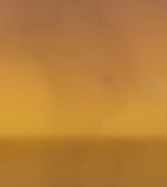
looks a bit funky now, but once we get into laying down the ocean/sky it'll come together in time. SO! first thing i do is grab the ocean texture i've made/edited for personal use. i'll match this the best i can to the in game ocean/adjust it to my liking. it'll look something like this.
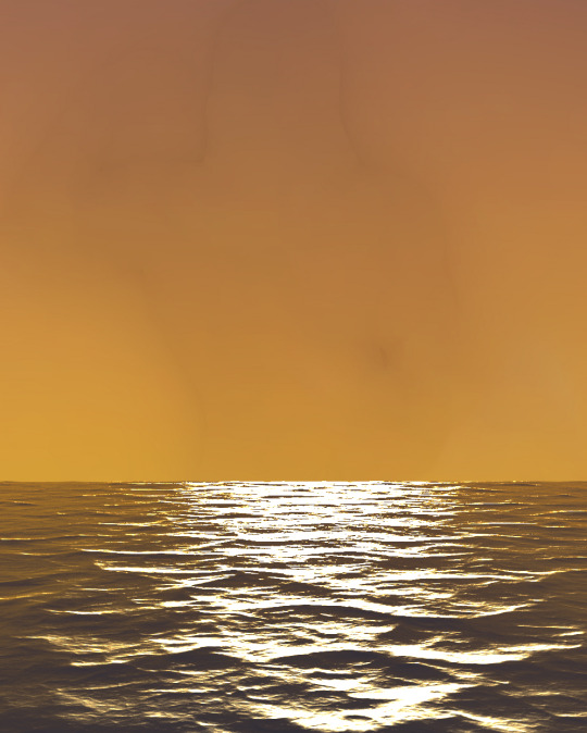
now, i use my beloved sky replacement tool in photoshop to add in a sunset! if you don't know where it is just go to edit>sky replacement. choose a sky you like, and mess around with the settings until you get it to your liking. mine looks like this now.

now we've got our almost finished background. here i'll run some topaz/sharpen actions i have, and blur it using tilt shift.

now you can go in and add whatever you'd like. i usually don't finish my background off until i'm almost done editing, since i place everything around my sim. but here i added in the sun, some lighting, birds!

and then it'll come together in the end after shading/highlighting and color adjustments like so.

i really hope this was semi helpful?! i suck so bad at explaining things lol ;-;
32 notes
·
View notes
Text
You don’t need a shift tilt lens. The original image was probably not taken with a tilt shift lens. It's probably digital.
It’s extremely easy to replicate the feel in Photoshop or another photo editing program. It does work better if you take the photo from a top down angle, but then you essentially pick a strip of the image to remain in focus and use lens blur to blur everything else. Photoshop has actually had a filter specifically for this for almost a decade.
See some of my examples:
Kinda starting to work, but the subject is really too close to the camera.
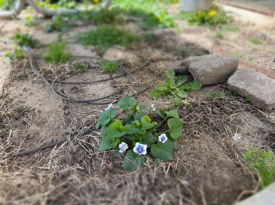
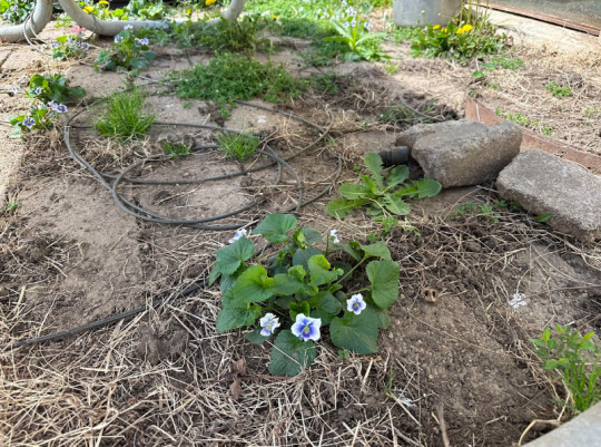
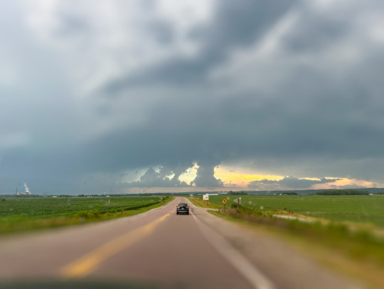
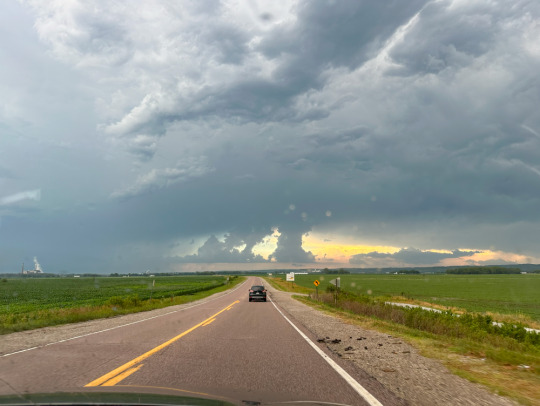
Better, but it would really work if I was at more of a 45 degree angle to the horizon line vs straight at it.
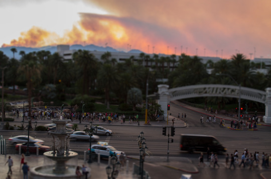
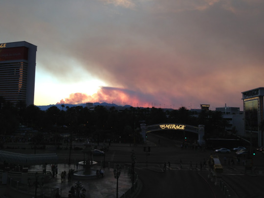
Best. Actually I don't think the original is quite the same photo as the edited one, but it would have been in the same batch so you can get what the original looked like before I added the blur to tilt shift. (I processed this image in 2012 so IDK where all of the raw files are for these.)
The discovery of tilt shift seems to comes in waves. It was super sexy and people where writing tutorials for how to achieve it digitally in like 2011-2012. Tilt-shift lenses are expensive AF. Digital editing software also expensive AF but more versatile expense.


The short answer is... a tilt-shift lens.
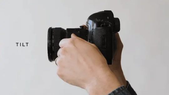
The slightly more complicated answer is... Mister Rogers.
Depth of field is the area in front and behind your chosen focus point that remains in focus and then slowly gets blurry as you get farther away.
Shallow depth of field only has a narrow slice of the image in focus and gets blurry super quick. This is caused by a large lens aperture and being close to the subject.

Deep depth of field can extend through the entire picture if your aperture is small and you are super far away.
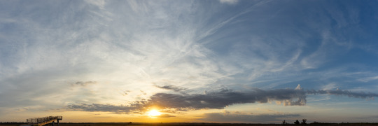
Usually the depth of field lines up with the image sensor of your camera. So if it is tilted forward, the plane of focus matches.
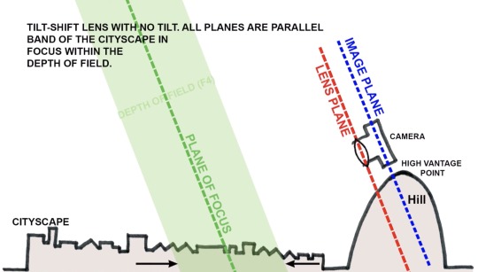
The stuff outside the green area would be blurry. The edges of the green would be slightly blurry. And the dashed green line would be the sharpest area of the photo.
But the tilt-shift lens allows you to create chaos with your plane of focus. In most cases, you would use this to flatten the depth of field so you can get a 2D plane entirely in focus.
If you were to use a normal lens, the bottom left and top right would be blurry.
But with a tilt-shift lens you can do this.
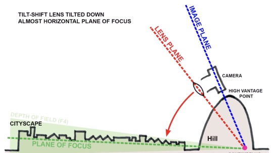
The green area is taking a little nap on the floor.
However, there is an unintended side effect created by this lens. (The "Scheimpflug intersection" if you want to go down the rabbit hole.) You can choose absolutely wacky planes of focus that create a very narrow depth of field over a geographically large area.
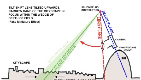
Believe it or not, this is when psychology comes into play.
And possibly Mister Rogers.
youtube
Our only reference for such a large area having a shallow depth of field is our memories of miniatures on TV. So Mister Rogers and Thomas the Tank Engine trained our brains to see this effect as... small.
Depth of field shrinks the closer you are to something. And when filming miniatures, you are placing the lens close to the scene. But the scene represents something big in our minds. We buy the effect, but not 100%. That blurriness wouldn't be there at a regular scale. So our subconscious remembers we are watching small things pretending to be big. It just files that away in the back of our mind.
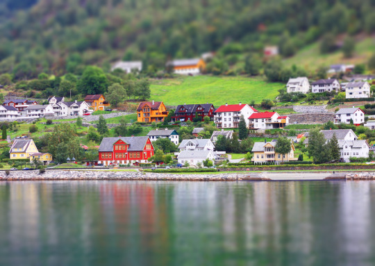
And then when we see something like this...
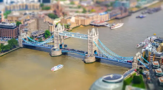
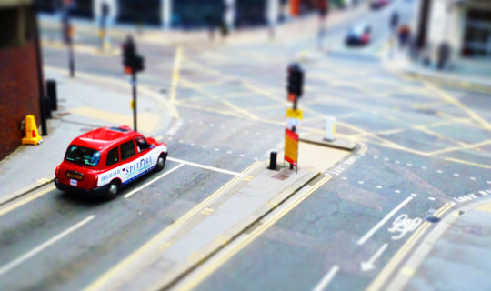
Our brain is all, "Look at all that tiny shit!"
Without Mister Rogers, our brains may have never made these connections and tilt-shift photography may just make us wonder why everything is all blurry. That connection to past experience is vital for this effect to be convincing.
Brains are neat.
25K notes
·
View notes
Text
30 Tutorials for Creating Stunning Photo Effects in Photoshop – Speckyboy
New Post has been published on https://thedigitalinsider.com/30-tutorials-for-creating-stunning-photo-effects-in-photoshop-speckyboy/
30 Tutorials for Creating Stunning Photo Effects in Photoshop – Speckyboy
Photoshop is a powerful tool for creating a range of stunning photo effects that can take your images to the next level. With the help of these tutorials, you will learn how to recreate various effects, including glitch, sepia tone, watercolor, tilt-shift, HDR, cinematic, bokeh, sketch, and many more.
By mastering these techniques, you can add an artistic touch to your photos and make them truly memorable. Whether you’re a professional photographer, graphic designer, or just someone looking to improve their photo editing skills, learning how to create these photo effects in Photoshop can be a valuable asset.
Exploring the world of Photoshops and experimenting with different photo effects can be a lot of fun. With a bit of practice and creativity, you will soon be creating stunning results that are sure to impress.
So why not start learning to recreate these photo effects in Photoshop today? With dedication and a little time, you can become a master of photo editing in Photoshop in no time.
If you prefer a different application, we also have collections of tutorials for Lightroom, Procreate, and Figma.
The Top Photo Effect Photoshop Tutorials
Analog Effect in Photoshop
The analog photography effect mimics the look and feel of old film photographs. This aesthetic can be achieved by adding grain, light leaks, and desaturated colors in Photoshop. This tutorial takes you through the steps to re-create the effect, giving your photos a nostalgic charm and artistic touch.
Analog Effect Photoshop Action
Black & White Conversion Effect in Photoshop
The black and white photography effect is a classic style that emphasizes contrast and texture, creating a timeless and elegant look. This Photoshop video tutorial will teach you how to create stunning black and white images in Photoshop.
Black & White Effect Photoshop Actions
Bokeh Effect in Photoshop
Bokeh is a photography technique that creates a blur in the background of a photo, emphasizing the subject and adding a dreamy, romantic feel. This Photoshop tutorial will guide you through the steps to add the bokeh effect to your photos.
Bokeh Effect Photoshop Actions
Cinematic Effect in Photoshop
The cinematic photography effect is a dramatic and moody style that mimics the look and feel of movie stills, with deep shadows, rich colors, and a cinematic aspect ratio. This tutorial will show you how to re-create the cinematic effect, giving your photos a professional and cinematic flair.
Cinematic Effect Photoshop Actions
Color Grading Effect in Photoshop
Color grading involves adjusting the colors in a photo to create a specific mood or atmosphere. Using Curves and Hue/Saturation adjustments, this Photoshop tutorial takes you through the steps of adding stunning color grading effects to your photos.
Color Grading Effect Photoshop Actions
Comic Effect in Photoshop
The comic effect is a fun and playful style that mimics the look and feel of comic book illustrations, with bold outlines, vibrant colors, and halftone patterns. This Photoshop video tutorial will teach you how to create stunning comic effects, giving your photos a creative and whimsical vibe.
Comic Effect Photoshop Actions
Cross-Processing Effect in Photoshop
Cross-Processing is a photography technique that involves developing film in the wrong chemicals to create unexpected and artistic color shifts. This Photoshop tutorial will take you through the steps to add cross-processing effects to your photos, giving them a retro feel.
Cross-Processing Photoshop Actions
Dispersion Effect in Photoshop
The Dispersion effect is a creative and dynamic style that creates the illusion of a shattered or fragmented subject, with particles or fragments dispersed across the photo. This effect can be achieved in Photoshop using various tools, such as the Liquify filter and layer masks. This tutorial will show you how.
Dispersion Effect Photoshop Actions
Double Exposure Effect in Photoshop
The Double Exposure effect blends two or more images together, creating a dreamy and surreal composition. Using layer masks and blend modes, this tutorial guides you through the process of creating stunning double exposure effects in Photoshop.
Double Exposure Effect Photoshop Actions
Duotone Effect in Photoshop
The Duotone effect is a creative technique that uses two contrasting colors to create a bold and striking final image. It is often created using gradient maps, curves, and color balance in Photoshop. This tutorial will show you how to add this unique effect to your photos.
Duotone Effect Photoshop Actions
Glitch Effect in Photoshop
The Glitch effect mimics the look of digital errors and glitches, creating a distorted and fragmented image. This Photoshop video tutorial will show you how to create fantastic glitch effects, allowing you to add an edgy vibe to your photos.
Glitch Effect Photoshop Actions
Grain Effect in Photoshop
The Grain effect is a timeless technique that adds a film-like texture and grain to digital images, creating a vintage and nostalgic look. This Photoshop tutorial will take you through the steps to re-create the effect in your photos.
Grain Effect Photoshop Actions
Grunge Effect in Photoshop
The Grunge effect is an edgy style that creates a raw and distressed look in photos, often with scratches, stains, and grungy textures. This effect can be easily achieved in Photoshop, using various techniques like brushes, textures, and blend modes.
Grunge Effect Photoshop Actions
HDR Effect in Photoshop
The HDR (High Dynamic Range) photography effect is a popular technique that combines multiple exposures to create a more detailed and dynamic image. This tutorial guides you through the steps to create the HDR effect using Photoshop tools like merging and tone mapping.
HDR Effect Photoshop Actions
High Contrast Effect in Photoshop
The High Contrast effect is a striking style that emphasizes the difference between dark and light areas in a photo. Photoshop can achieve this effect using various adjustments, such as levels and curves, and this tutorial will show you how.
High Contrast Effect Photoshop Actions
Infrared Effect in Photoshop
Infrared photography is a surreal style that creates a false-color effect in photos. Using channel swapping and color balance, this Photoshop tutorial guides you through the process of re-creating the effect.
Infrared Effect Photoshop Actions
Lens Flare Effect in Photoshop
The Lens Flare effect is a dynamic technique that adds a burst of light to an image, often simulating the look of the sun or other light sources. Learn how to add lens flares to your photos in this Photoshop tutorial, giving you a dramatic and cinematic touch.
Lens Flare Effect Photoshop Overlays
Light Leak Effect in Photoshop
The light leak effect simulates the look of light leaking into a camera, creating a dreamy and, at times, nostalgic look. This easy-to-follow Photoshop tutorial will show you how to add stunning light leaks to your photos.
Light Leak Effect Photoshop Overlays
Lomo Effect in Photoshop
The Lomo (Lomography) effect is a creative photography technique that mimics the look of photos taken with a Lomo camera, with bold colors, high contrast, and vignetting. This Photoshop tutorial will guide you through creating your own Lomo effects.
Lomo Effect Photoshop Actions
Motion Blur Effect in Photoshop
The Motion Blur effect is a popular technique used to convey motion and speed by blurring moving objects. This Photoshop video tutorial will show you how to create stunning motion blur effects in your photos, adding a sense of dynamism and energy.
Motion Blur Effect Photoshop Actions
Oil Painting Effect in Photoshop
The oil painting effect is an artistic photography style that mimics oil paintings by applying filters to a photo giving it a textured, brushstroke look and feel. This Photoshop video tutorial will show you how to do it yourself.
Oil Painting Effect Photoshop Actions
Posterize Effect in Photoshop
Posterize is a photography effect that reduces the number of colors in an image, creating a bold and simplified look to create a poster-like appearance. Learn how to create stunning posterize effects in this Photoshop tutorial.
Posterize Effect Photoshop Actions
Selective Color Effect in Photoshop
The selective color effect allows you to highlight or change the colors of specific parts of an image and convert the rest to black and white (or desaturated). This Photoshop video tutorial will show you how to create your own selective color effects.
Selective Color Effect Photoshop Actions
Sepia Tone Effect in Photoshop
The sepia tone effect is a photography technique that adds a warm and vintage look to digital images, giving them an aged, antique look. This Photoshop tutorial will take you through the steps to add sepia tones to your own shots.
Sepia Tone Effect Photoshop Actions
Sketch Effect in Photoshop
The Sketch effect is an artistic technique that mimics the look of a hand-drawn sketch, with lines, strokes, and shading. Following this sketch effect Photoshop tutorial, you can add a personal touch to your photos.
Sketch Effect Photoshop Actions
Solarize Effect in Photoshop
The Solarize effect converts the colors in a photo to create a high-contrast, surreal effect. This video tutorial will show you how to add this unique and bold effect to your photos.
Solarize Effect Photoshop Actions
Tilt-Shift Effect in Photoshop
The tilt-shift effect is a creative photography style that simulates the look of a miniature world by blurring parts of an image. This easy-to-follow Photoshop tutorial will show you how to add the effect to your photos.
Tilt-Shift Effect Photoshop Actions
Vintage & Retro Effects in Photoshop
Vintage and retro effects are a timeless photography style that adds a nostalgic and old-fashioned look to digital images. This Photoshop video tutorial will guide you through the steps so that you can add your own vintage and retro style to your photos.
Vintage & Retro Effect Photoshop Actions
Vignette Effect in Photoshop
The Vignette effect is a versatile technique that’s achieved by darkening the edges of a photo to draw attention to the center. This Photoshop tutorial will take you through the steps to create your own vignettes.
Vignette Effect Photoshop Actions
Watercolor Effect in Photoshop
The watercolor effect is an artistic technique that mimics the look and feel of watercolor paintings, with soft colors, blurred edges, and brush strokes. This Photoshop tutorial will guide you through creating your own watercolor effects.
Watercolor Effect Photoshop Actions
Photo Effect Tutorial FAQs
What are photo effect Photoshop tutorials?
These tutorials guide you through various techniques to apply creative and artistic effects to photos using Photoshop. They range from basic editing to advanced manipulation.
Can beginners use these photo effect tutorials effectively?
Absolutely! Most tutorials are tailored for beginners, breaking down complex effects into simple steps. As skills develop, more advanced tutorials can be tackled.
What kinds of effects can I learn from these tutorials?
You can learn a wide array of effects, like turning photos into paintings, creating vintage looks, adding dramatic lighting effects, and much more.
Do I need the newest version of Photoshop to follow these tutorials?
While some may use newer features, many tutorials are applicable to older versions of Photoshop as they rely on fundamental tools and techniques.
How long does it usually take to complete one of these tutorials?
It varies based on the complexity of the photo effect. Some can be completed in minutes, while others might take longer to fully grasp and apply.
Can practicing these tutorials improve my overall Photoshop skills?
Yes, working through these tutorials not only teaches specific effects but also improves your overall understanding and proficiency in Photoshop.
Learning New Photo Effects
Learning new effects in Photoshop is not only fun but can also be a valuable skill. By mastering the art of photo editing, you can offer your clients unique and visually stunning imagery that will set you apart from the competition.
By diving into these photo effect tutorials, you will, of course, learn valuable new skills, but you will undoubtedly unleash your creativity as well!
More Photoshop Tutorial Collections
Related Topics
#ADD#amp#analog#Art#atmosphere#attention#background#blur#Bokeh Effect#book#change#channel#chemicals#Collections#Color#colors#competition#complexity#Composition#course#creativity#Dark#Design#Difference Between#diving#do it yourself#double#Duotone Effect#easy#Editing
0 notes
Text
How I edit my Sims' shadow in Photoshop
as requested by @adelarsims
& based on this tutorial.
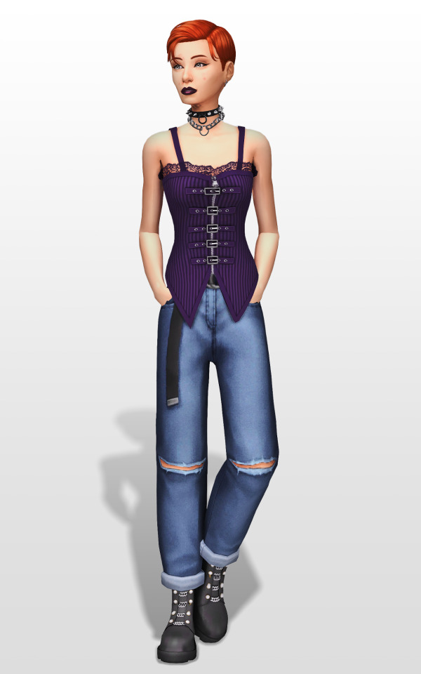
━━━━━━ ・❪ ☾ ❫ ・ ━━━━━━
1. Taking a screenshot
First of all take a screenshot of the Sim - I always do CAS but in-game works too ofc.
I take mine in front of a background that loosely matches the color of the background of my edit, in this case white. If you have a fancy CAS background, I recommend this CC by @sonyasimscc to easily get a simple background for screenshots.
I also use this tutorial by @katverse to get really good screenshots, I use 4000x3000px resolution, and this tutorial by @vyxated to not have a CAS UI in your screenshot if you use a reshade like me.
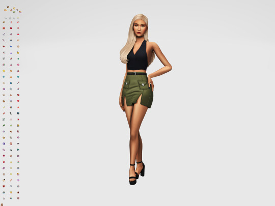
━━━━━━ ・❪ ☾ ❫ ・ ━━━━━━
2. Setting up the Photoshop file
Now in Photoshop create a file, I use 1250x2000 px.
I made a few guidelines, pink being the middle of the image and dark blue guidelines for my shadow editing.

I have a usually white background and a slight Curves adjustment layer with a gradient layer mask so it gets slightly darker at the bottom, completely optional ofc.
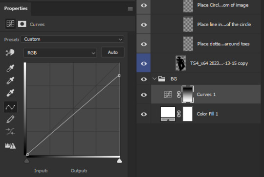
━━━━━━ ・❪ ☾ ❫ ・ ━━━━━━
3. Removing the original background
Import the screenshot and place it however you want. I try to align the Sim in the middle and make it as big as possible.
Then select the layer and go to Select - Subject.

This will usually do a decent job.
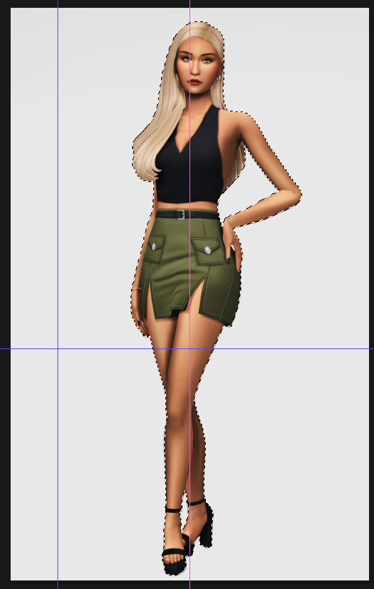
If there are some leftover unselected areas (like on her left hand on the hip) you can either add them to the selection now or edit the layer mask later.
Then create a layer mask.
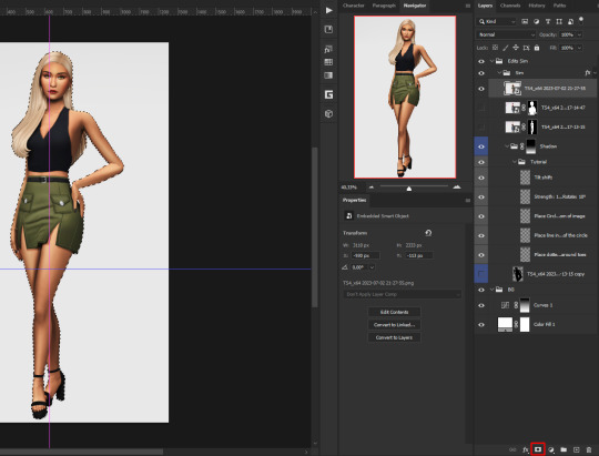
Since the screenshot has a similar background, it shouldn't show too much if it is not perfect.
━━━━━━ ・❪ ☾ ❫ ・ ━━━━━━
4. Creating the shadow
First duplicate the Sims' layer (Shortcut: Ctrl + J).

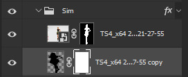
The layer is probably a Smart Object, so you need to rasterize it and right click the layer mask to apply the layer mask.
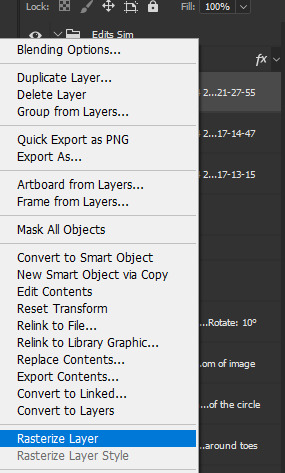
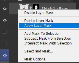
Now lock transparent pixels and paint the layer black.
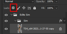
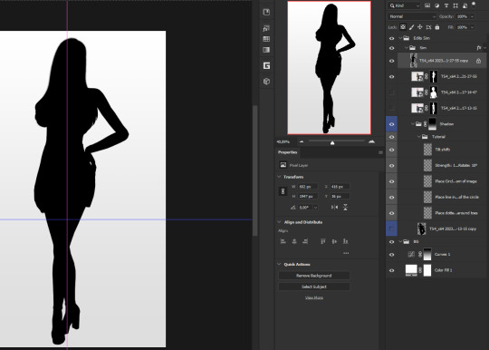
Next unlock the transparent pixels again and move the black layer below the actual Sim. Leave it selected.
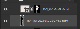
Now you will need the Perspective Warp tool.
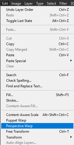
Draw the grid over the Sim, it doesn't have to be perfect, but make sure every part of your Sim is in the grid and nothing pokes out.
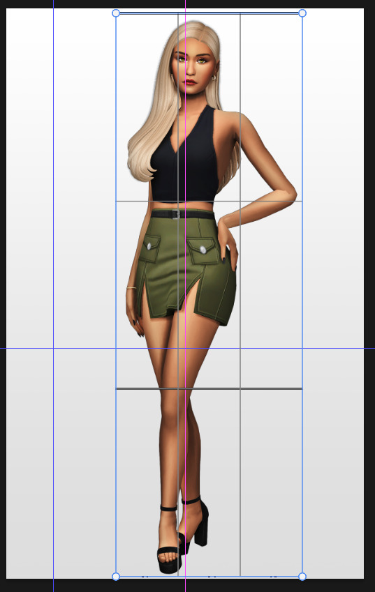
Press enter.
Now you want to drag the upper 2 corners separately wherever you want the shadow to be. I always put mine to the left and around the upper thigh area. I also try to match how slanted the left and right side are.
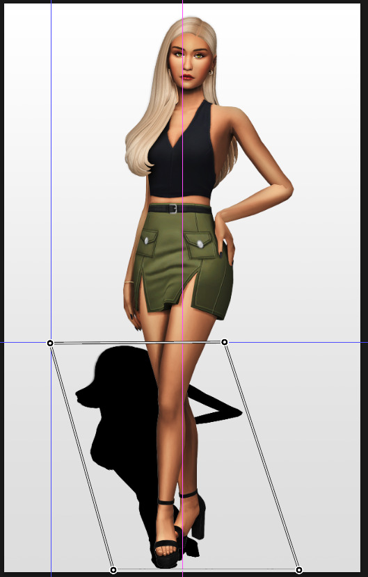
Now move the bottom 2 corners to try and match the shadow with the Sims' feet kinda. It won't work perfectly and you will need to fix it by hand after.
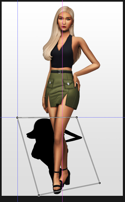
Press enter again.
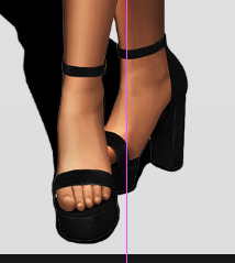
Now go in by hand and fix the shadow around the feet.
Simply paint with black on the same layer and erase parts if necessary.
━━━━━━ ・❪ ☾ ❫ ・ ━━━━━━
5. Making the shadow look nice
I like to change the layer opacity to 35%, but it depends how strong you want the shadow to be.
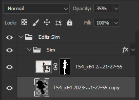
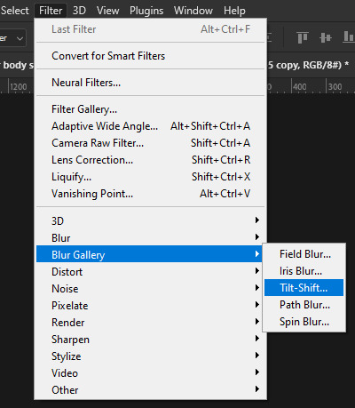
Next I apply a tilt shift blur, unlike in the video.
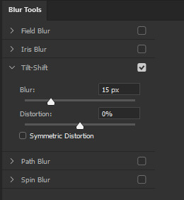
I use a blur of 15px.
Move the circle at the edge of the image basically or a bit below by dragging the middle of it. Then rotate it on the bottom line by around 10°.
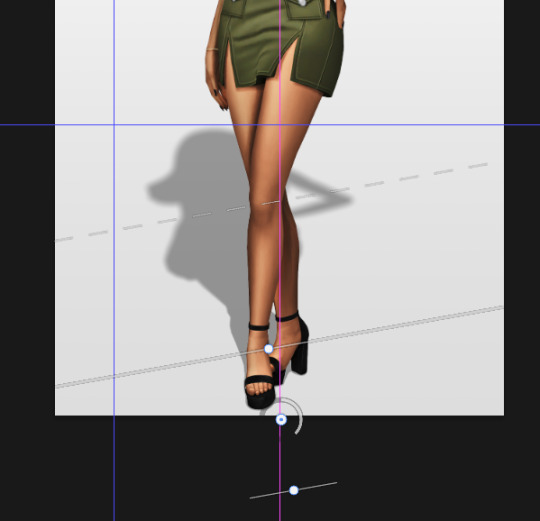
Next move the solid line to the middle of the circle and the dashed line around the ankles.

Then press OK at the top.

━━━━━━ ・❪ ☾ ❫ ・ ━━━━━━
6. Optional: Gradient layer mask
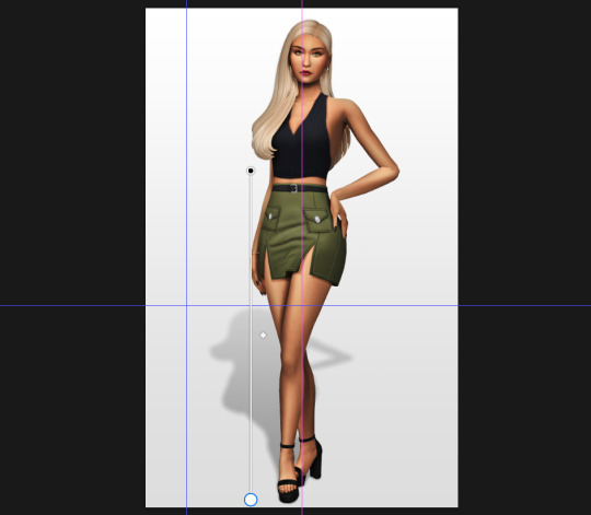
Lastly I like to make the shadow fade out a bit towards the top.
Apply a layer mask to the shadow.
Then get your gradient tool and the default black to white gradient.
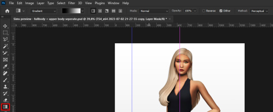
Hold shift to make a straight line and drag the gradient down.
This is how I roughly place mine so it's not too strong.
━━━━━━ ・❪ ☾ ❫ ・ ━━━━━━
And that's it!
If you have any questions, let me know~
99 notes
·
View notes
Text
Nothing was indexical
Rosalind Krauss's "Notes on the Index" (which comes in parts one and two, like an Isley Brothers single) dates from 1976 and 1977, which was maybe the heyday of an idea that has become another "modernist myth": that of the self-evident evidentiary nature of photography, that a photograph is a "message without a code," an "index" of some physical presence. "Undoubtedly the photograph implies a certain displacement of the scene (cropping, reduction, flattening)," Krauss concedes, "but this passage is not a transformation (as an encoding must be)."
With that understanding of photography in place — that it simply appropriates reality and represents it without any space for transformative manipulation on the part of the photographer — Krauss argues that painting in the 1970s moved toward the indexical, presenting itself as a kind of evidence in a way, as a mode of cropping reality or isolating it to caption it, rather than as a moment of transcendent truth torn from the eternal now of Real Art (à la Michael Fried circa "Art and Objecthood"). It's as though art no longer needed to aspire to evoking "presence" because photography made that mundane, tedious, too easy.
Here's how Krauss's sums up this shift:
Internal division (drawing) is converted from its formal status of encoding reality to one of imprinting it. The edge of the work is redirected from its condition as closure (the establishment of a limit in response to the internal meaning of the work) and given the role of selection (gathering a visually intelligible sample of the underlying continuum). The flatness of the support is deprived of its various formal functions (as the constraint against which illusion is established and tested; as the source of conventional coherence ) and is used instead as the repository of evidence. (Since this is no longer a matter of convention but merely of convenience, the support for the index could obviously take any configuration, two- or three-dimensional.) Each of these transformations operates in the direction of photography as a functional model.
Now it would be hard to take seriously the proposition that photographs are indexical or that they are "messages without code" — they are now commonly understood as digital artifacts made entirely of code and highly subject to all sorts of manipulations and filtering. The suite of tools in Photoshop (not to mention Instagram or TikTok) offer a new range of ways to reconceive visual media and "pictorial conventions" far beyond cropping and captioning. One could probably examine all forms of visual art since Photoshop in these terms (I'm sure many have): as a kind of rendering, as subject to the default settings of standardized operations, as varying levels of deepfakery. "Gaussian blur" and tilt-shift parameters as ways of seeing, and so on.
The discourses around postmodernism often grappled with the idea that objective truth was not straightforwardly representable, that no evidence transcended interpretation, that presence was a metaphysical fiction, a failed grand narrative. Another way to look at those thematics is in terms of the gradual disillusionment with photography, which could no longer be seen as neutral or transparent, or even as a metaphor for "transparency" or "neutrality" or a blank, unbiased way of seeing. The camera itself is no longer a camera but an engine, a producer of images that are not representations but separate realities in their own right.
8 notes
·
View notes
Note
hi beauty! hope ur doing ok. I wanted to ask how do you add the glowy white speckles on your pictures? Ex) on Sarai's rings in her birthday post. Thank you in advance!
If you use photoshop, duplicate the picture, go to blur gallery, then tilt shift, pull the eye all the way down and play with the light Bokeh and you did it :)
6 notes
·
View notes
Text
Free Photoshop Brushes For Mac
Free Photoshop Brush Sets
Free Brushes For Photoshop Cc
Free Photoshop Cc Brushes For Mac
Download Free Photoshop Brushes For Mac
331+ FREE GRAPHIC Templates - Download Now Microsoft Word (DOC), Adobe Photoshop (PSD), Adobe InDesign (INDD & IDML), Apple (MAC) Pages, HTML5, Microsoft Publisher, Adobe Illustrator (AI) 4+ Free Astonishing Eyelashes Photoshop Brushes. Brushes For Photoshop Cs6 Free Download Mac Os El Capitan Jun 30, 2016 They are being increasingly used in post-photography processing and web designing. Installing brushes to the Photoshop program (CS 3, CS 5, CS 6, Version 7) on your Mac (OS X and higher) is simple and can be done in a few quick steps: Step 1: Download brushes.
Photoshop CS6 is a software solution by Adobe to edit photos and images. The software is available worldwide for Windows-based computer systems and Mac both. However, professionals will more easily handle the software due to its powerful design and tools but new users can also use the software to make fixes to their images with simple adjustments but for more intricate and complex use, they would need to go through the relevant tutorials available on the internet. And no one can deny the fact that practice makes perfect. So with some guidance and tutorials, even the new users can master its features. The enhancements and new tools included in the CS6 version include an array of features and benefits that are discussed in this article.
Free download photoshop brushes 2013 - 2020, custom shapes, different textures, abr - PS brushes from Sakimichan, Denis Loebner, Loish,Greg Rutkowski, Darek Zabrocki, Levi Peterffy, Deharme, Houston Sharp and many more. Download the newest great collection of Adobe Photoshop brush tools. Aug 12, 2015 Today, I show how to download Photoshop CS6 free full verssion for Mac. Photoshop CS 6 Macbook full version Adobe Photoshop give you many language when you install Photoshop. Our advanced search feature makes it easier than ever to discover the perfect Photoshop brush, style or gradient or texture for your project, or you can browse by category. Most of our files are free for both personal and commercial use, so there’s no need to hold back – let your imagination run wild and see what you can create!
Photoshop cc Free Brushes, Free Fonts 2018, Photoshop Fonts, Brushes 2018, Brushes cs6, Fonts 2018, Free photoshop cc, New Brushes. Raster fans – you asked for it, and here it is! The MegaPack combines all three of my best-selling brush sets (Ultimate Set 1, Ultimate Set 2, and Ultimate Drawing Set) into one all-powerful pixel crushing. Free Photoshop Brushes, photoshop Brushes, free PS Brushes. 30th August 2009: This is the latest set featuring seven very large (1.61meg) Aged Rivet Heads.These new Photoshop Brushes have great textures and some also have peeling paint, great for adding a grunge style to an image. In this collection of free Photoshop brushes, you will find brushes imitating watercolor, ink, pencil, markers, charcoal, paint, dust, spray splatter, a burned effect, and many more. The brushes are compatible with Photoshop CS6+ and are for personal.
Adobe Mercury Graphics Engine
The Mercury Graphic Engine helps the users to work faster on Windows and Mac both.
Content-Aware Move
This tool enables the users to move and extend elements that will change the composition most suitable. The extended facility of Content-Aware Move enables the users to draw around the specific object and then users can move it to a different part of the image. The content awareness facility of CS6 fills in the background intelligently to diminish any possibility of elements that can keep the image from looking natural and real.
Blur Gallery filters
The new Blur gallery filters help the users to create the custom blurs including field blur, tilt-shift blur or iris blur.
License and compatibility
If you need to download Adobe Photoshop CS6, the first thing you have to know is the compatibility and license. CS6 comes under the license of shareware so users can share it by acquiring the license. Photoshop CS6 compatible works with Windows OS out or graphic editors. During the trial period, users can also make trial with this version. All in all, Photoshop CS6 is a software that can be freely downloaded and is available to all users who want to edit their photos and images with it.
Extension Program
The extension program is another very strong feature of PhotoShop CS6. The software offers enhanced text handling due to the extension program. When we compare the text handling of this version from the previous ones, it will come into notice that the text handling now shows the font rendering going sharper and less pixilated than the previous ones. Therefore, it is recommended that whenever users download PhotoShop CS6, they should use the extension programs for better text handling in their web designs.
Minimalist Design
Photoshop Brushes Free
Free Photoshop Brush Sets
The feature of minimalist design is added in version CS6 of Adobe Photoshop. The feature enables the users to utilize the learning curve to avoid any kind of stress that is caused by the iteration. Users can also optimize help on the internet that can be accessed at Adobe.com. This will empower the users to run the best and most effective photo editing task through most convenient to use software supported by minimalist design. This will result in making the users capable of spreading their web marketing to a greater extent.
Streamline Usage
Streamlined usage is a notable feature of Adobe Photoshop CS6. The improved design of the CS6 version will enable the users to operate streamlined usage. It would be easier for the old users of Adobe PhotoShop who are familiar with CS3 and CS4 versions of PhotoShop.
Support for the 64-bit operating system
Remarkable improvement has also been made to the Adobe Photoshop in terms of the support it provides to a 64-bit Operating system. This takes away the users’ worries if they want to edit their photos in their 64-bit operating system as they will be able to download PhotoShop CS6 on their systems for free.
Revamped interface
The interface of this version is totally revamped where the most part of it can be considered as the cosmetic effect. The environment is much darker than the previous versions which give a smarter and sleeker look to the whole interface. But the point to be really considered as an additional perk is the array of functional enhancements. The new interface makes it easier to do cropping tasks and every property panel flies out. There are many other optimization tools scattered around the layout. The liquify interface is undoubtedly more simplified in the CS6 version.
Layer enhancements
Layer enhancements done in the CS6 PhotoShop includes Vector layers instead of Shape Layers of the previous versions. Vector layer allows a stroke and also gives different types of fillings entailing solid colour, gradients and patterned fills.
New blur options
The new options of features related to the task of blurring is incorporated in this version including Iris, Field and Tilt-Shift which help the users to adjust their depth of field. Users can decide on their own that precisely which parts of the picture they want to blur. Moreover, all this can be done with the convenience of on-image controls so a full size preview of the result can be seen.
More enhancements
A wide range of enhancements are done all around the software in CS6 version such as the easier use of Adobe Camera Raw 7.0 which now provides new highlight and shadow controls. The tool of Adaptive Wide Angle is another enhancement which provides better control on lens corrections. A more intelligent auto corrections, faster rewritten 3D engine and the new painting tools with more erodible brushes complete Adobe PhotoShop CS6 with great flourish. The other features like Background Save, Auto-recovery, crop tool and much more makes it a powerful and complete tool for photo editing
All in all, it can be conveniently concluded that Adobe Photoshop CS6 is good enough software to support the users in creating exotic graphics effectively, efficiently and conveniently due to the loads of enhancements and additions made in the version. Through PhotoShop CS6 users can also increase their web marketing with the help of catchy graphics. It is an all in one photo editing tool that any photo editor can want for his or her efficient editing performance.
Features
Free Brushes For Photoshop Cc
You can now change the theme color of photoshop to light or dark.
The autosave time is customizable, easily can change to change it.
Layers management is more enhanced.
More color options can be used now.
The crop tool is enhanced.
Added patch tool, and content-aware tool, which is used to remove objects.
You can set the hotkey for the shortcut.
New text tools are introduced.
Lorem ipsum text added.
More magic into image editing also.
Fixed bugs.
The Mercury Graphics Engine is implemented that is one of the powerful engines to perform.
Retouch photos with more precision.
For the image editors, the new blur options introduced that are best for photo editors.
Adobe Camera Raw 7.0 enhances.
You can increase and decrease Light effects in the image.
Video editing management also implemented in CS6.
3D objects make like the other 3D software applications.
Liquify tool is amazing also.
Face detection is also introduced.
Photoshop Brushes Free Download Cc
Adobe Photoshop CS6 mac dmg free download full version. Complete setup Adobe Photoshop CS6 offline installer for mac OS with direct link.
Photoshop Brushes Free Download Cs6 Mac Os
Description Adobe Photoshop CS6 For Mac + Overview
Adobe makes certain prominent changes on every retail version they release. The 13th update for Adobe Photoshop CS6 is currently available on the Adobe website, and any licensed Adobe user may get the update officially for free. However, the new CS6 version features powerful improvements and impressive changes on the photo editing techniques offered by Adobe. the essential algorithm is Adobe Mercury Graphics Engine on Photoshop CS6. Every operation will now keep it up like a breeze, unless the Pc Adobe Photoshop CS is simply too under-powered, the users aren’t alleged to feel any glitch.
Free Photoshop Cc Brushes For Mac
The new algorithm has been optimized for both Mac OS and Windows platforms to supply the utmost level of comfort and ease. specializing in the creative part is important instead of being bothered about the software requirements, and that’s what Adobe has through with the Photoshop CS6. Plugins support make it very easy to reinforce the photos. Edit the raster designs and work on vector images also as process RAW photos. the application comes with complete support for enhancing the photos also as fix images with minimum efforts in Adobe CS6 Mac.
Another very useful feature Adobe has added is that the auto recovery option. Computers could still freeze even in any case these improvements, or unwanted scenarios like breakdown or anything might occur. If Adobe Photoshop CS closes improperly thanks to any reason while an editing task was happening , the modifications are saved on a recovered version and also the users can continue where they left off when Photoshop is launched future time.
Certainly a lifesaving feature for many! Some essential tools are upgraded or revamped so as to be more useful from now. Content-Aware Move Tool now moves the weather more precisely, Crop tool lets the users change the form without much workaround. The Blur tool has been heavily re-imagined with the addition of a brand new gallery of blur filet. Making an inspired photo takes much less time on the Adobe Photoshop CS6. Change the color of the pictures also as adjust different settings to boost the photos. Change the background and other details with minimum efforts also as use different brushes and other tools to reinforce the digital photos.It’s an entire application to edit and enhance the digital images with minimum efforts. You can also download Adobe Lightroom Mac CC.
Photoshop CS6 Mac Features Full Version
Some interesting features of adobe photoshop for macbook pro listed below that you experienced after download dmg of Adobe Photoshop CS6 for mac.
Simple and intuitive user interface with a wide range of powerful tools
Plugins support to enhance the functionality of the application
Provides over 65 features and capabilities
Change the background and color of the images
Remix tool and use 3D option with trimming features
Pixels bending features and quality adjustments
Apply different filters and effects to the videos
Sliders to make different adjustments
Work with state-of-the-art photography tools
Intuitively create movies and video content
Composite images with advanced features
Save time with user-inspired improvements
Adobe Photoshop CS6 Dmg Setup Details
Photoshop Brushes Deviantart
Download Free Photoshop Brushes For Mac
Product: Adobe_Photoshop_CS6_mac.zip Dmg
Size of App: 987 MB
Dmg Version: CS6
Setup Extension: zip
Tools for dmg needed: Zip Extractor
Developers: Adobe Inc
System Requirements of Adobe Photoshop CS6 for Mac OS X
Must read listed system requirement for your Apple mac book before download this app.
Photoshop Brushes Free Download Cs6 Mac For Windows 10
Operating System: OS X 10.7 or later
Ram (Memory): 2 GB Minimum required for this dmg.
Disk Space: 2 GB free space needed for this app.
System Processor: Intel Core 2 Duo or later (Core i3, Core i5).
Photoshop Brushes Free Download Cs6 Mac Free
Download Free Adobe Photoshop CS6 Mac Dmg
Photoshop Brushes Free Download Cs6 Mac Torrent
Click on the button below to start downloading Adobe Photoshop CS6 for mac OS X. We are here to provide to clean and fast download for Adobe photoshop software for mac. This link is resume able within 24 hours. Keep visiting themacgo the world of dmgs.
1 note
·
View note
Text
Photography-An art to excel
Over the recent months we’ve been presenting various showcases of photography – while many readers hated the showcases, most readers found them inspirational and perfect for a lousy workday’s morning. However, what we should have done in the inspirational posts is not just provide you with some inspiration for your work, but also present useful photographic techniqueswhich can help you to achieve optimal pictures for your designs. And as requested by many of you, now it’s time to correct our mistake.
Over the recent months we’ve been presenting various showcases of photography – while many readers hated the showcases, most readers found them inspirational and perfect for a lousy workday’s morning. However, what we should have done in the inspirational posts is not just provide you with some inspiration for your work, but also present useful photography techniques and photo tutorials which can help you to achieve optimal pictures for your designs. And as requested by many of you, now it’s time to correct our mistake.
In this post we present useful photographic techniques, tutorials and resources for various kinds of photography. You’ll learn how to set up the perfect environment and what techniques, principles and rules of thumbs you should consider when shooting your next perfect photo. This round-up isn’t supposed to be the ultimate one – please feel free to suggest more useful articles in the comments to this post.
You may want to take a look at the following related posts:
Among other things, we cover high-speed photography, tilt-shift photography, black and white photography, motion blur, infrared, night, smoke photography, macro photography, HDR, panoramic photography, RAW processing and others. Hopefully, you’ll find many of the listed tutorials and how-tos useful for your regular work.
With so many people working from home, we thought we would bring our Smashing Workshops from our home offices to yours. Meet online front-end & UX workshops, with practical takeaways, interactive exercises, recordings and a friendly Q&A.Check upcoming workshops ↬
1. High Speed Photography Celebration Of High-Speed Photography This post is supposed to provide you with some inspiration of what can be done with high-speed photography. It also showcases some truly stunning slow-motion videos. Home-Made High Speed Photography (PDF) Pictures of high-speed events such as popping balloons, breaking glass, and splashing liquids reveal interesting structures not visible to the naked eye. With this guide you can take your own high-speed photos to captures these ephemeral events. A very detailed tutorial. photography techniques 2. Tilt-Shift Photography Tilt-shift photography refers to the use of camera movements on small- and medium-format cameras; it usually requires the use of special lenses. Tilt-shift actually encompasses two different types of movements: rotation of the lens relative to the image plane, called tilt, and movement of the lens parallel to the image plane, called shift. Tilt is used to control the orientation of the plane of focus (PoF), and hence the part of an image that appears sharp; it makes use of the Scheimpflug principle. Shift is used to change the line of sight while avoiding the convergence of parallel lines, as when photographing tall buildings. Another, less cost-intensive technique called tilt-shift miniature faking is a process in which a photograph of a life-sized location or object is manipulated so that it looks like a photograph of a miniature-scale model. 50 Beautiful Examples Of Tilt-Shift Photography Tilt-Shift Photography Photoshop Tutorial This tutorial was produced using Photoshop CS2 on a PC. photography techniques 3. Black And White Photography Beautiful Black and White Photography One of the most beautiful inspirational posts on Smashing Magazine, featuring over 50 brilliant works from photographers across the globe. Black and White Photography Techniques 5 Black and White Photography Tips A short, but useful article by by Darren Rowse, featuring shoot in RAW, low ISO and other techniques. You may also consider reading the articles Key Ingredients for Black and White Images Black and White Photography Guide This photography technique starts before the shot is even taken. In this article you’ll find some quick tips on what to look for to ensure the perfect black and white landscape – e.g. camera settings for black and white photography and what filters are good for black and white landscapes. Digital Black and White This site features professional photography articles written by Keith Cooper. It covers black/white-photography-techniques, image manipulation techniques, tools, articles and camera reviews. The Top 5 Black & White Photography Tips Five handy tips to get you going in the right direction: practice, focus on contrast, focus on texture, use color filters and more. If you want to learn more about the actual black and white conversion process in Photoshop, see the article 12 Ways to Make a Black & White Photo as well. Motion Blur Bridge smoke 4. Motion Blur Photography 45 Beautiful Motion Blur Photos A showcase of motion blur photos. Motion blur is frequently used to show a sense of speed. You can artificially achieve this effect in a usual scene using cameras with a slow shutter speed. Also Adobe Photoshop can be used for this purpose, though sometimes images may look unnatural and unprofessional. How to Capture Motion Blur in PhotographyCapturing movement in images
1 note
·
View note
Text
فیلتر tilt-shift blur فتوشاپ - tilt-shift blur
پست جدیدی در وبسایت گرافیشا منتشر شد.
فیلتر tilt-shift blur فتوشاپ - tilt-shift blur
با استفاده از فیلتر tilt-shift blur فتوشاپ ، می توانیم جاهای دلخواهی از تصویر را بلوری کنیم. این فیلتر، امکان تنظیم مقدار بلور، محلی که بلور قرار می گیرد و جاه��یی که می خواهیم بلور نشوند را می دهد.
انتخاب فیلتر tilt-shift blur
از Filter->Blur->tilt-shift blur را انتخاب می کنیم. با انتخاب آن، در سمت راست، دو پنل باز می شود. یکی blur tool و دیگری blur effects. در پنل blur tool، 3 نوع blur نمایان می شود که می توانیم یکی از آن ها را انتخاب کنیم. این کار با کلیک کردن بر روی تیک کنار آن ها امکان پذیر است، سپس هر نوع بلور را که خواستیم را بر روی عکس اعمال می کنیم. این 3 نوع بلور، عبارت اند از:
field blur
Iris blur
tilt-shift blur
نکته ای که در اعمال هر یک از این 3 بلور باید دقت کنیم، این است که نمی توانیم ابتدا لایه را به smart object تبدیل کنیم و سپس بلور را به عنوان یک smart filter بر روی آن اعمال کنیم. پس مطمئن شوید که در ابتدای کار با استفاده از ctrl+j، یک کپی از لایه بگیرید.
نکته ی دیگری که باید دقت کنیم، این است که یکبار ctrl+z بعد از اعمال یکی از این فیلترها مجاز است. اگر یکی از این فیترها را اعمال کردیم و سپس ctrl+z زدیم تا آن را برداریم. می توانیم بار دیگر، از من��ی Filter، اولین گزینه را انتخاب کنیم تا فیلتر با همان تنظیماتی که قبلا ایجاد کرده بودیم، دوباره اعمال شود.
بررسی فیلتر tilt-shift blur
در وسط عکس، یک دایره وجود دارد، که با جابه جا کردن آن، می توانیم ناحیه ای که بلور می شود را مشخص را جابه جا کنیم.
دور آن، یک کنترل دیگر وجود دارد که با کم و زیاد کردن آن، مقدار بلور افزایش یا کاهش می یابد.
کلا 5 ناحیه در شکل می بینیم:
دو ناحیه ی بالا و پایین که کاملا بلور شده اند.
دو ناحیه ی وسط که تا حدودی بلور شده اند.
یک ناحیه ی وسط، که اصلا بلور نشده است. می توانیم بر حسب نیاز، خطوط مرزی را جابه جا کنیم تا اندازه ی این ناحیه ها تغییر کند.
اضافه کردن tilt-shift blurهای بیشتر
به هر تعداد از این نقاط، که مایل باشیم، می توانیم اضافه کنیم؛ کافی است که در هر جای دلخواه از تصویر، کلیک کنیم.
ویژگی های دیگری که برای فیلتر tilt-shift blur در پنل blur tools در سمت راست می توانیم اعمال کنیم
ویژگی distortion: شکل انحراف را برای بلور اعمال شده تعیین می کند.
ویژگی symmetric distortion: فعال بودن این گزینه، باعث می شود که انحراف از هر دو سمت به یک اندازه اعمال شود.
مثالی از فیلتر tilt-shift blur فتوشاپ در بالا آمده است. مشاهده می کنیم که چطور بعضی قسمت های تصویر، بلور شده اند و بعضی دیگر، دست نخورده باقی مانده اند.
مرجع کامل فیلترهای فتوشاپ در سایت گرافیشا.
#blur fitlers in photoshop#how blur an image#how to blur an image in photoshop#how to use blur filters in photoshop#how to use tilt-shift blur in photoshop#photoshop blur filters#photoshop tilt-shift blur#tilt-shift blur#tilt-shift blur filter in photoshop#using photoshop blur filters#آموزش استفاده از tilt-shift blur#آموزش استفاده از فیلتر tilt-shift blur در فتوشاپ#آموزش بلوری کردن تصویر#آموزش بلوری کردن تصویر در فتوشاپ#استفاده از فیلترهای بلور در فتوشاپ#بلوری کردن تصویر در فتوشاپ#چطور از فیلترهای بخش بلور فتوشاپ استفاده کنیم#چطور در فتوشاپ، تصویر را بلوری کنیم#روش های بلوری کردن تصویر در فتوشاپ#فیلتر tilt-shift blur#فیلتر tilt-shift blur فتوشاپ
0 notes
Text
Week 1 Edit Your First Photo
download the exercise file here.

Enhance the Photo
Open a photo
File -> Open -> Locate your photo file
Mac: Cmd + O; Windows: Ctrl + O
Start Pane ->Open
Locate your photo file, and drag it onto the start pane
If you have some other open files, drag to the document tab
2. Crop a photo
C for crop
Ratio
Straighten
Uncheck delete cropped pixels
3. Improve your lighting and color by adjustment layers
Add additional layers to adjust the photo instead of just editing itself.
On the layer panel, click the adjustment layer. It is active when it is highlighted.
The adjustment layer will influence all the layers below it.
To apply the adjustment layer only on one layer instead of all the layers below it, Hold the Opt (M) or Alt (W) and move your cursor between those two layers to clip it in.
To reopen the property panel of the smart filter, double-click the thumbnail of the smart filter layer
To delete a smart filter layer
Activate the layer and hit backspace/delete
Drag it to the trash bin icon at the bottom right corner of the layer panel
Some commonly used adjustment layers:
Solid Color
Brightness / Contrast
Hue / Saturation
Levels
Gradient Map
Selective Color
4. Add a layer mask on an adjustment layer
Using a Layer mask is a non-disruptive way of concealing contents
White: 100% reveals the adjustment
Black: 0% conceal the adjustment
Select the layer mask
Select the Brush Tool
Pick black or gray depending on the percentage you’d like to remove
Brush on the area you’d like to remove
5. Color Picker
Foreground color
Background color
Set back to default: D
Swap foreground and background: X
Increase brush size: ]
Decrease brush size: [
6. Compare the before & after
Show and hide layers
Click the “eye” icon to show and hide layers
To only show one layer:
Hold (M) Opt
Hold (W) Alt
And click on the “eye” icon of the original layer
7. Save a file
File->Save, or Save as
Or Mac: cmd + S; Window: Ctrl + S
Save as a psd file
Choose a destination
Make sure “layer” is checked
---------------------------------------------------
Remove Unwanted Contents
Adding a new layer
Add a new layer with the new layer panel:
(M) Cmd Shift N -> Name it -> Ok
(W) Ctrl Shift N -> Name it -> Ok
Add a new layer and skip naming
(M) Cmd Opt Shift N
(W) Cmd Alt Shift N
Click the + icon at the bottom right corner
Layer - > New
2. Spot Healing Tool
Create a new layer to make sure the editing is nondisruptive
Select Content-aware
Content-aware will sense the content around the brushed area and autofill the brushed area with similar contents
Check “Sample all layers”
If unchecked, the spot healing tool will apply to the layer right beneath the new layer.
If checked, the spot healing tool will sense all layers beneath the new layer
3. Undo
(M) Cmd Z
(W) Ctrl Z
4. Patch Tool
Create a new layer
Select Content-aware in the patch menu
Check “sample all layers”
Click and drag to make a rough selection. Make sure the selected area is slightly larger than the unwanted item
Move your cursor inside the selection and drag the selection to somewhere that you want photoshop to patch.
Deselect the area
Select -> deselect
(M) Cmd D
(W) Ctrl D
Structure: how many details you want to preserve
Color: how much color blending you want
--------------------------------------------------------------
Miniature Effect - Tilt-Shift Blur
Tilt-Shift
Tilt-shift is a blur effect that gives your photo a miniature feeling by adding depth of field.
Activate the smart layer
Filter -> Blur Gallery -> Tilt-Shift
To reposition the filter: drag the black and white pin
To control the blur strength -> blur slider on the Tilt-Shift panel
To control the size of the focused area: drag one of the solid lines up and down
To control the size of the blurry areas: drag one of the dashed lines up and down
To rotate the focused area, drag one of the white circles
Once you finish, click OK on the control panel.
To edit again, double-click the filter name to reopen it.
To conceal some areas of this filter, paint black or gray on the smart filter layer mask
To delete the smart filter, drag it to the trash bin icon
-------------------------------------------------------------
Color Adjustment
Black and White
Activate your smart object
Click the half-black and half-white circle at the bottom of the layer panel -> choose black and white
To add more contrast to the image, drag the sliders. Drag left -> darker; drag right -> lighter
2. Add a tint
On the black and white property panel, check “tint”
Click the square next to “tint”, and pick a color you want
To reopen the property panel, double-click the thumbnail of the smart filter layer
0 notes
Note
could u describe ur process of digital painting? i noticed that u first paint it in greyscale, then u put colors. how does it work, how do you work around it?
Hii! Oh my God I never thought I’d have anyone asking drawing advice from me 👉🏻👈🏻 I draw for fun and because formula one is taking 90% of my brain space nowadays and I never went to art school to back up my drawing advice so don’t take it at face value. I’ll just describe how I usually do it 👉🏻👈🏻
So basically;
Searching for references (muse photos, paintings, ambience, colours) for rough conceptualisation
Super rough intelligible sketch 🤣
Normal sketch
Line art (I love linearts because I grew up reading Marvel and I thought they’re beautiful. When people do hyperrealism painting I notice they’d delete the sketch lines later but I don’t)
Grayscale painting, this is important for me to understand the value of every colour and pinpoint the light source for the artwork. If it looks good black and white then it’d loom good coloured 👌🏻 (don’t know who said this but some professional artist I heard somewhere maybe)
Colouring! This is where I just play around with the setting of the layers in photoshop. I usually use a combination of overlay, mutiply, lighten and colour dodge.
And then final touches: Level, Curve, Colour grading, Filters (I mainly use camera raw and tilt shift blur)
That’s it! I hope hope it helps!!
#sbr.asks#answered#but to be honest#90% of the time when I’m painting I don’t know what I’m doing#don’t take my advice at face value#🥲
0 notes
Text
VeryUtils Online Image Editor
VeryUtils Online Image Editor is an online graphics editing tool using HTML5. VeryUtils Online Image Editor works in all modern browsers that support HTML5. VeryUtils Online Image Editor lets you create, edit, enhance images using HTML5 technologies on Windows, Mac, Linux, iOS, Android, etc. systems. You can embed it into your Web, Desktop and mobile applications easily.
https://veryutils.com/image-editor
VeryUtils Online Image Editor is an online painting application. You can do all the paint related works using this app. VeryUtils Online Image Editor operates directly in the web browser. You can create images, paste from the clipboard (ctrl+v) or upload from the computer (using menu or drag & drop). Nothing will be sent to any server. Everything stays in your web browser.
VeryUtils Online Image Editor is the best online image editor using HTML5. Edit, adjust your images, add effects online in your browser without installing anything.
License Types:
* One Time Purchase for Source Code License (You can install and run it on your own servers) Personal License -- USD$59.95 Commercial License -- USD$299.95 One Year Maintenance Service (Optional) -- (+USD$599.95)
* Subscribe to Our Cloud Service (We are provide FREE Maintenance Service forever)
USD$19.95 per month
USD$199.95 per year
Key Features: layers, transparency, offline graphics editing, filters, HTML5, Photoshop alternative General Features: open, edit, save images, various drawing tools like Magic Wand tool, Clone tool, erase, fill, color picker, colour selector, layers, pencil, brush, shapes, trim, flip, rotate, resize, transparency, zoom, grid, EXIF data, crop, export/import layers data, paste from clipboard, 30 various filters including blur, Tilt Shift, perspective, denoise, vignette, auto colorize, auto adjust colors, decrease color deapth, histogram, gradients, Hermite resample.
Browser Support: * Chrome * Firefox * Opera * Edge * Safari * IE 9/10 and later versions
VeryUtils Image Editor Highlight Features: * Files: open images, directories, URL, data URL, drag and drop, save (PNG, JPG, BMP, WEBP, animated GIF, TIFF, JSON (layers data), print. * Edit: Undo, cut, copy, paste, selection, paste from clipboard. * Image: information, EXIF, trim, zoom, resize (Hermite resample, default resize), rotate, flip, color corrections (brightness, contrast, hue, saturation, luminance), auto adjust colors, grid, histogram, negative. * Layers: multiple layers system, differences, merge, flatten, Transparency support. * Effects: Black and White, Blur (box, Gaussian, stack, zoom), Bulge/Pinch, Denoise, Desaturate, Dither, Dot Screen, Edge, Emboss, Enrich, Gamma, Grains, GrayScale, Heatmap, JPG Compression, Mosaic, Oil, Sepia, Sharpen, Solarize, Tilt Shift, Vignette, Vibrance, Vintage, Blueprint, Night Vision, Pencil, also Instagram Filters: 1977, Aden, Clarendon, Gingham, Inkwell, Lo-fi, Toaster, Valencia, X-Pro II. * Tools: pencil, brush, magic wand, erase, fill, color picker, letters, crop, blur, sharpen, desaturate, clone, borders, sprites, key-points, color zoom, replace color, restore alpha, content fill. * Help: keyboard shortcuts, translations.
How to embed VeryUtils Online Image Editor into your web page?
-- To embed this app in the other page, use this HTML code:
[iframe style="width:100%; height:1000px;" id="VeryUtilsImageEditor" src="https://veryutils.com/app/image-editor/" allow="camera"][/iframe]
-- Enable VeryUtils Online Image Editor to open an online image file automatically,
https://veryutils.com/app/image-editor/?url=https://veryutils.com/images/picture.jpg
[iframe style="width:100%; height:1000px;" id="VeryUtilsImageEditor" src="https://veryutils.com/app/image-editor/?url=https://veryutils.com/images/picture.jpg" allow="camera"][/iframe]
-- Enable VeryUtils Online Image Editor to open an online template file automatically,
https://veryutils.com/app/image-editor/?url=https://veryutils.com/app/image-editor/images/test-collection.json
[iframe style="width:100%; height:1000px;" id="VeryUtilsImageEditor" src="https://veryutils.com/app/image-editor/?url=https://veryutils.com/app/image-editor/images/test-collection.json" allow="camera"][/iframe]
0 notes
Text
Download analog efex pro full

#Download analog efex pro full pro#
Lens vignettes are a powerful tool for recreating the look of old lenses and for concentrating attention on the center of the frame. This one is pretty subtle and barely noticeable on its own, but it does add to the atmosphere and effect of the preset as a whole. You can change the Strength setting and also move the light leak effect around the image using an on-screen gadget. You can see from the Light Leaks panel that there are a lot to choose from. Light leak effects are very popular for creating an atmospheric analog image with an evocative haziness or a deliberate ‘leaky camera’ look, where light has got in at the back and fogged the film. This preset does also use a light leak effect… 4. It looks a little like a light leak but different at the same time. This image gets its ethereal effect from the second exposure, its position and its blurring/blending effect. You can use the on-screen gadget to position the second exposure, adjust its Exposure and its Exposure Balance with the original, and its Zoom Strength and Rotate Strength. It effectively copies the main image, distorts it and blends it back in with the original. The Double Exposure panel is the key to this set of effects. This rolls the dice randomly on this set of filters, so it’s a great way to see countless variations and without getting exactly the same one twice. If you look at the bottom of the sidebar you’ll see a Vary button. All the Double Exposure presets use this set of filters, but that’s not to say they use all of them. That’s because the filter is enabled for this preset but not used. You’ll see from the panel, though, that the Blur Strength is set to zero. You can create a circular blur towards the edges of the picture, which is what’s used here, or a horizontal blur to create a tilt-shift ‘miniature’ effect.
#Download analog efex pro full pro#
It’s not strictly the same thing, but Analog Efex Pro uses ‘bokeh’ to describe its controlled blur/defocus effects. You can use Control Points to mask the effect in parts of the image you want left unaltered. At the bottom you’ll see and expandable Control Points section. This combines a kind of HDR and structure effect to bring out details in the shadows and make objects stand out clearly. The Detail Extraction slider at the top is interesting, though. You use it to tune the basics: Brightness, Contrast and Saturation. This panel is standard in just about all Analog Efex Pro presets. I’ll explain each one individually, how it works and the effect it has on the photo. These tools and their settings are in the right sidebar. It’s applied to the image with a single click, but this preset actually uses several Analog Efex Pro tools in combination. The one I’ve chosen for this walkthrough is ‘Double Exposure 2’. If you select this you’ll see a list of preset double exposure effects in the sidebar. In the left sidebar you’ll see a choice of different ‘Cameras’, and one of these is ‘Double Exposure’. You can launch Analog Efex Pro as a standalone program, as an external editor for Capture One and other programs, or as a plug-in for Lightroom or Photoshop.

0 notes
Text
On1 effects current version

ON1 EFFECTS CURRENT VERSION SKIN
ON1 EFFECTS CURRENT VERSION PORTABLE
ON1 EFFECTS CURRENT VERSION PORTABLE
Preview any look or effect instantly What’s New in ON1 Effects Portable
ON1 EFFECTS CURRENT VERSION SKIN
Like placing filters on the end of your camera, just easierĮasily retouch using filters specific to skin tonesĮasily save and organize your own looks and presets Quickly preview the effects and how the look appears on your photoĪI technology detects your subject matter and automatically creates a maskīlend photos together for exposure or create vignettes and graduated filter looksĪdd common adjustments to only a portion of your photoĬrop, content-aware fill, clone, refine, chisel, and blur are perfect for touching up photosĬreate luminosity masks based on the image to automatically protect the highlights or shadows Includes hundreds of built-in photo effects, filters, LUTs, borders, textures, and presets Non-destructive, stackable, and re-editable photo filters and presets The collection of tools in ON1 Effects Portable are perfect for selectively applying effects and cleaning up your photos. The world’s best effects for finishing your photos. You can dial in every setting to your taste with instant previews! You’re in complete control of every edit you make. Once you’ve made your adjustments, you can save your own preset for quick access later on. Filters and presets are easy to find and apply. We’ve made sure that your slider adjustments won’t stick, giving you a fast and smooth editing experience. Every effect can be brushed in or out in just seconds. Use the easy-to-use yet powerful tools to target your effects to specific areas of your photo. Includes 27 stackable filters and hundreds of presets, borders, and textures. You’re going to love experimenting with all the unique and beautiful effects you’ll be able to add to your photos with just a few clicks - the creative possibilities are limitless!Ĭombine multiple effects to create any possible look. Popular looks include B&W, HDR Look, Dynamic Contrast, Lens Blur (tilt-shift), Glows, Film Looks, Split Tone, Textures, Borders and more. ON1 Effects Portable includes hundreds of built-in presets, filters, LUTs, textures and borders that you can combine, blend, and customize to your style. Instantly stylize your photos and create any look you want. The Ultimate Collection of Photo Effects, Filters, LUTs, and Presets. ON1 Effects Portable works on Mac and Windows and can be used as a standalone application or as a plug-in to Adobe Lightroom and Photoshop. Our team of experts curated the trendiest looks with amazing new one-click presets. With ON1 Effects Portable, you get professional results in seconds without having to do any complex edits. We’ve curated hundreds of the most popular looks and styles seen throughout the industry.

0 notes
Text
Download pixelmator pro free online

Download pixelmator pro free online update#
Download pixelmator pro free online skin#
Download pixelmator pro free online full#
Download pixelmator pro free online pro#
What if we had bigger pointers for larger brush sizes? Maybe a crosshair for more precise sizes? How about a unique pointer shape for the pixel brush tool, which also has pointer snapping to each pixel for even more precision? So many possibilities to make this a really unique experience for the iPad. There’s also some keyboard functionality missing like being able to select multiple layers/objects on the canvas with Shift or Command.Ī nice little bonus would be to have enhanced pointer shapes with brushes, erasers, etc. Would love to have a tool sidebar kind of like the desktop Pixelmator app! The keyboard shortcuts make this a lot easier, but I don’t always have access to a keyboard (like when I’m drawing with Apple Pencil). Thanks for fixing the issues with selection editing with the keyboard too!Īs some of the other reviews mentioned, the UI is definitely a little clunky especially on big iPad screens-especially the two modal screens you have to go through to choose a specific brush or selection type.
Download pixelmator pro free online pro#
Really love the new keyboard and trackpad support-really makes it feel like a pro app.
Download pixelmator pro free online update#
New update is awesome, but still a few missing things
Download pixelmator pro free online full#
Designed to take full advantage of powerful iOS features and technologies and engineered to leverage the full power of 64-bit architecture, Metal, Core Image, and Core Animation, Pixelmator delivers state-of-the-art performance and real-time responsiveness. Pixelmator is meticulously thought through and created from the ground up for iOS 14.
Instantly publish your images to social platforms like Flickr, Twitter, and Facebook.
Share your artwork with friends and family via email.
Create, edit, and keep all your images up to date on all your devices thanks to iCloud support.
Store and access images in iCloud Drive.
Save your images directly to your Photos app.
Open and save images using PSD, JPEG, PNG, and many other popular formats.
Open, edit, and save Photoshop images with layers.
Easily remove image background or cut and paste objects from one image to another.
Crop, arrange, and rotate objects and layers with pixel-perfect precision.
Use precise selection tools to edit areas of an image.
Blend layers, shapes, and text using any of the 32 blending modes.
Easily add, combine, and customize shapes.
Add text and make it look beautiful with a full set of text-styling settings.
Insert, group, merge, and blend layers of an image.
Apply non-destructive layer styles like shadows, outlines, gradient fills, and more.
Combine words, shapes, and images to create breathtaking artwork right on your iPhone.
Enjoy perfectly seamless painting thanks to the Pixelmator Paint Engine.
Paint more naturally than ever with the Apple Pencil on your iPad Pro, featuring palm rejection, pressure, tilt, and acceleration sensitivity.
Use layers to isolate and blend elements of your painting.
Instantly choose colors right from your image with the Eyedropper.
Easily select and fine-tune colors with a full-featured Color Picker.
Vary the speed of your stroke to change brush thickness of some of the brushes.
Smudge colors of an image for smooth color blends.
Paint with incredible detail thanks to the double texture brush technology.
Create stunning pixel art images with the custom-designed Pixel brush.
Paint with near-natural wetness effect of watercolor and crayon brushes.
Choose from more than 100 artist-designed brushes and numerous painting techniques.
Paint stunning images right on your iPhone and iPad.
Open and edit images of up to 100 megapixels.
Choose from dozens of breathtaking effects to subtly improve or completely change the look of an image.
Blur, sharpen, lighten, or darken areas of an image.
Pinch, bump, twirl, or warp areas of an image with powerful, Metal-based Distort tools.
Duplicate areas of your image with the easy-to-use Clone tool.
Download pixelmator pro free online skin#
Wipe away image imperfections, skin blemishes, and unwanted objects with the Repair tool.Easily remove color casts and set the right white balance.Take full control over the tonal range of your image with levels and curves.Instantly improve your photos with single-tap color correction presets.Get started with dozens of beautifully designed templates.Pixelmator has everything you need - whether you’re a mobile photographer, mobile painter, or mobile graphic designer - all in one easy-to-use app.ĭesigned exclusively for iOS, Pixelmator takes full advantage of the latest iOS 14 features and technologies, giving you innovative, fast, and powerful tools. Pixelmator is a powerful, full-featured, layer-based image editor that lets you touch up and enhance images, sketch, and paint, as well as create advanced image compositions on iPad and iPhone alike.

0 notes
Text
Adobe photoshop elements 11 transparent background

#ADOBE PHOTOSHOP ELEMENTS 11 TRANSPARENT BACKGROUND INSTALL#
The ACR 7.1 dialog allows you to choose the latest process ver. Process Version 2012 Additional control To the top To the top Sharpen tool Move tool Color Picker Color Replacement tool Refine edges tool To the top To the top The Adobe Camera Raw 7.1 (ACR 7.1) converter introduces Process Version 2012, a newer form of deciphering the raw file format. Panel bar Photoshop Elements has been reworked to present the working spaces. User interface Guided edits Panel shortcuts Quick mode toolbar Create menu Panels To the top To the top Photoshop Elements in Expert mode A. Applying the lens blur filter (Filter > Blur > Lens Blur) creates an effect simi. Lens Blur filter To the top Exposure Vibrance To the top Original image (left), and image after applying the Graphic Novel filter (right) Simulate the blur created by a camera lens, by blurring certain objects in an image, while retaining the clarity of the rest. Enhance a portrait by darkening the peripheral areas, and automatically drawing attention to the center of the ph. Vignette To the top Comic Filter Pen and Ink filter Graphic Novel Filter Picture before applying the tilt-shift effect (left), and after (right) Pictures that have vignetting tend to have a brighter central region, and a dark periphery. What's new To the top High key Low key Tilt-shift Guided Edits Filters Exposure and Vibrance (Quick edit mode) Usability Enhancements Actions Panel Adobe Camera Raw (ACR) 7.1 Photo service provider for users in Europe - CEWE Color Tool enhancements Online Content Effects and Styles Preferences Guided Edits Adobe Photoshop Elements Editor 11 in. To the top To the top Is there a way I can mark or tag people in photos ? How can I add information about places in my photos ? In photos of birthdays and other events, can I add event information ? Editing and compositing Can I make quick fixes in the Organizer workspace? How can I open Photoshop Elements Editor from the Organizer workspace and wo.
#ADOBE PHOTOSHOP ELEMENTS 11 TRANSPARENT BACKGROUND INSTALL#
Follow any instructions that appear on the computer to install drivers a. Here are some guidelines that are good to follow: Read the documentation that came with your device. Getting started tutorials To the top To the top Knowing your devices You can take photos or videos with a variety of devices and bring them into Elements. Selecting a region changes the language and/or content on E ® P HO T OSHOP ® ELEMENT S Help a nd tu t orial s. However, keep in mind that hard-edged transparency can cause jagged edges in the image. Use hard-edged transparency when you don’t know the background color of a web page, or when the web page background contains a texture or pattern. When working with GIF or PNG‑8 files, you can create hard-edged transparency: all pixels that are more than 50% transparent in the original image are fully transparent in the optimized image, and all pixels that are more than 50% opaque in the original image are fully opaque in the optimized image. You can create transparency when you create a new layer or use the Background Eraser or Magic Eraser. To create background transparency or background matting in the optimized image, you must start with an image that contains transparency. Background matting works best if the web page background is a solid color and if you know what that color is. Keys for showing or hiding panels (expert mode)īackground matting, supported by the GIF, PNG, and JPEG formats, simulates transparency by filling or blending transparent pixels with a matte color that matches the web page background.Optimizing images for the PNG-24 format.Optimizing images for the GIF or PNG-8 format.Smooth selection edges with anti-aliasing and feathering.Add blur, replace colors, and clone image areas.Scratch disks, plug‑ins, and application updates.System requirements | Photoshop Elements.

0 notes