#how to design small spaces
Explore tagged Tumblr posts
Text
The Healing Power of Nature: Why Spending Time Outdoors is Good for Your Health
Imagine walking through a forest, surrounded by towering trees and lush greenery. The only sounds you can hear are the birds chirping and the wind rustling through the leaves. You feel a sense of peace and calm wash over you. This is the power of nature.
Spending time in nature has been shown to have several health benefits, both physical and mental. Nature has been called "the best medicine.”
""Nature has a profound impact on our well-being. Spending time in nature can help to reduce stress, improve mood, boost cognitive function, and lower blood pressure. It can also help us to feel more grounded and connected to something larger than ourselves." " -- Richard Louv
Here are some of the specific ways that spending time in nature benefits our wellness:
Reduces stress. Spending time in nature has been shown to reduce cortisol levels, the stress hormone. This can lead to several health benefits, including improved sleep, a stronger immune system, and a reduced risk of heart disease.
Improves mood. Nature can also help to improve mood and reduce symptoms of depression and anxiety. Studies have shown that people who spend time in nature are happier and more optimistic.
Boosts cognitive function. Nature can also help to boost cognitive function and improve memory. Studies have shown that people who spend time in nature perform better on cognitive tests.
Lowers blood pressure. Spending time in nature can also help to lower blood pressure and improve cardiovascular health. Studies have shown that people who spend time in nature have a lower risk of heart disease and stroke.
Promotes physical activity. Spending time in nature often involves physical activity like hiking, biking, or swimming. Physical activity is essential for good physical and mental health.
Enhances social interaction. Spending time in nature can also provide opportunities for social interaction. For example, you can walk with a friend or family or join a hiking group. Social interaction is essential for our overall well-being.
In addition to these specific benefits, spending time in nature can also help to improve our overall sense of well-being. Nature can help us to feel more grounded and connected to something larger than ourselves. It can also help us to appreciate the beauty of the world around us.
If you're looking for ways to improve your wellness, I encourage you to spend more time in nature. Even a short walk in the park can make a big difference. It certainly does for me!
Here are a few tips for connecting with nature:
Find a place in nature where you feel comfortable and relaxed. This could be a park, a forest, a beach, or even your backyard.
Spend time in nature without any distractions. This means turning off your phone and putting away any other devices.
Be present and mindful of your surroundings. Pay attention to nature's sights, sounds, smells, and textures.
Take deep breaths and relax. Focus on the feeling of the air coming in and out of your lungs.
Enjoy the beauty of nature. Appreciate the plants, animals, and landscapes around you.
Another way to connect with nature is to bring it into your home. Using natural materials, such as wood, stone, and bamboo, often characterizes botanical design. It may also incorporate botanical elements such as plants, flowers, and leaves. Botanical design can create various looks, from rustic to modern.
There are many ways to add botanical design to your home interior. Here are a few ideas:
Add potted plants to your home. Potted plants are a great way to bring nature indoors and add a touch of green to any room. Choose plants that are easy to care for and fit your available space.
Hang botanical prints on your walls. Botanical prints are a beautiful and elegant way to add nature to your walls. You can find botanical prints in various styles, from vintage to modern.
Use botanical wallpaper or fabric in your home decor. Botanical wallpaper, murals, and fabric can add a touch of botanical design to any room in your home. Use them to create an accent wall in your living room or to upholster a chair or sofa.
Create a terrarium or kokedama. Terrariums and kokedamas are small, enclosed gardens perfect for adding a touch of nature to your home. They are also relatively easy to care for.
Add fresh flowers to your home regularly. Fresh flowers are a beautiful and affordable way to add natural elements to your home. Place them in a vase on your coffee or dining table, or give them to a friend.
Plant an herb garden in your kitchen. Herb gardens are a great way to add fresh herbs to your cooking and a touch of botanical design to your kitchen. You can plant herbs in pots on your windowsill or in a raised bed in your backyard.
Grow a vertical garden on your wall. Vertical gardens are a great way to add botanical design to small spaces. They can be created using various materials, such as wooden pallets or PVC pipes.
Create a living wall in your home. Living walls are extensive, vertical gardens that can add a touch of biophilic design to any room in your home. They are typically created using a variety of plants, mosses, and other materials.
Add a water feature to your home, such as a fountain or birdbath. Water features add a touch of tranquility and natural beauty to any home. They can also be used to attract birds and other wildlife.
Use natural materials in your home decor, such as wood, stone, and bamboo. Natural materials can help to create a warm and inviting atmosphere in your home. They can also add a touch of botanical design to your decor.
Bring the outdoors in with large windows and skylights. Large windows and skylights allow you to enjoy natural light and views of the outdoors from inside your home. This can help create a connection to nature and enhance your home.
Use natural light to your advantage when decorating your home. Natural light can help to make your home feel more spacious and airy. It can also highlight the botanical design elements in your home.
Use colors in your home to enhance wellness. For more information about the connection between Color Psychology and Wellness, click my blog to read more.
""Returning home is the most difficult part of long-distance hiking. You have grown outside the puzzle and your piece no longer fits." " -- Antonymous
No matter the season, you can always find beauty in nature. The healing power of nature is simply magical.
Hiking in the Northeastern part of the United States always brings me joy, especially in Autumn.
"“A walk in nature walks the soul back home.”" -- Mary Davis
Nature is home to the soul.
No matter where you live, you can always find beauty in your surroundings. This lovely path brought me down to the gorgeous Indian Ocean off the shores of Perth, Australia.
Nature can help us realize that we are part of something much larger than ourselves and that our problems are not as big as we may think. This can help us to feel more grounded and at peace.
Nature can also make us feel like the whole world is ours. When the beauty of nature surrounds us, we can't help but feel a sense of wonder and awe. We can do anything, and anything is possible.
If you want to improve your wellness, I encourage you to spend more time in nature. Even a short walk in the park can make a big difference. You can also bring nature into your home by adding plants, fresh flowers, or natural materials to your decor.
Nature is our gift, and it is there for us to enjoy. So, please make time for nature today and see how it feels. You may be surprised at how much it can benefit your health and well-being. Spending Time Outdoors is Good for Your Health.
"May your home be a place where friends meet, family gathers, and love grows. " -- Anonymous
As with everything I post on my blogs, please feel free to comment, or if you have any questions, please email me through my contact page. I welcome it anytime!
Design with your heart™️
Happy designing, my friends!
Mary
#Small space interior design#how to design small spaces#how to style small spaces#how to decorate small spaces#how or style a small space like a pro#Interior design tips and tricks small space#Small spaces design#small space design tips and tricks#Style your small space like a professional interior designers#small spaces design broken down into simple steps#Color psychology#color wellness psychology#wellness interiors#wellness and colors#wellness color psychology#colors behind wellness#which colors influence color#What is color psychology#wellness interior design#interior design wellness#healthy Colors#colors that bring wellness into the home#which colors bring in wellness into your home#Wellness and color psychology#Why Spending Time Outdoors Is Good for Your Health#Spending time in nature#why spending time in nature is good for your health#nature is good for your health#things you can do to spend time in nature#the healing power of nature
0 notes
Text



Ask and you shall receive (a sneak peak of what's to come)
#poorly drawn mdzs#mdzs#wei wuxian#lan wangji#mdzs au#homestuck#I genuinely do have troll designs for the major characters of mdzs adn thoughts pertaining to their hemospectrum#I honestly thought ppl would start throwing holy salt at me at the mention of homestuck but the enthusiasm is super motivating!#With that said; Thank you all so much for the support with the hollow knight crossover#Even people who have never heard of hollow knight have been so kind (go buy and play hollow knight; the aesthetic and story are amazing)#More bug doodles and comic are ahead! I'll try and space them out between comic updates.#More thoughts will come later but for now...allow me to leave you with this:#Non-homestucks may see the blue and red and go 'aw blue-red ship how cute' while those who know might realize exactly what im putting down#namely that this version of wwx is *very* interested and persistent about getting lwj to spend time with him.#Lwj lives in a very insular indigo colony and isn't fully aware of the differences in life span between hemocasts (yet).#But wwx is. So he's driven to live life to the fullest! This would also drive him to be way more self-sacrificing.#Since his life is so small compared to everyone else he loves anyways. That purple isn't just aesthetic either.
335 notes
·
View notes
Text
thank god for indie devs making like tiny little maximum 10 megabyte freeware games on itchio keeping the art of filesize optimization alive. ASSET REUSE FOREVER!!!!!!!!!!!!!!!!!!!!!!!!!!
#im watching a video about wario land music -> 'the bizarre music and sound design of wario land 4' by geno7#good video so far! i like this guys stuff. he talked a bit about how they did some of the sound effects for warios voice#a very like. chopped and remixed sample style of doing his vocal lines. which is very cool 1) because it saves a bit of#precious space on that gba cartridge BUT ALSO 2) it just sounds cool and interesting stylistically#and man sometimes trying to keep a file size down really does give way for some really interesting stuff#on my own personal interests in games i ADORE rpg makers rtp and how people can find creative uses for it#i love that a bunch of games can draw from the same asset pool as one install on ur computer#no bloating your hardrive with a bunch of copies of the same assets - its just already here!#and from a developers perspective i love when they reuse old assets from other games in new weird ways#some small visual novel companies will reuse backgrounds and other assets#altho i dont mind a bit of bloat with VNs since a big draw can be the big pretty images and big pretty sounds#but its still cool when people find ways to get creative with space saving. and from a players perspective its also nice#space is cheap nowadays. but its not Free. we can swallow terabytes whole with micro sds and everything#but a lot of players dont get the chance or ability to upgrade their internal memory that often. so i think being considerate of filesize i#very important. and thats not even getting into the download bandwidth limits - a lot of people all across north america can only get like#internet from 1 provider and that 1 provider often likes to upcharge and limit shit because they can#we might live in a future where a lot of powerful technology exists. but access to that tech is another story#so remember the filesize. remember the filesize.#dies in your arms
14 notes
·
View notes
Text


Gggiga
#think I just secured my first apartment?? it’s pricey as fuck but hey oh well oh well#it’s doable (so far) with how much I’m making n how many hours I’ll be working at my new job#place has a pool which is nice imo n the community seems small but nice#do wanna try seeing if one of my homies does wanna live with me one day n share the space#in that case we can then divide up rent even further n plus me n her use to talk about living together so maybe that’s still on the table?#idk idk but woagga gonna be moving soon#art#my art#drawing#draw#monster#creature#doodles#doodle#sketchbook#digital#digital art#sona#G#monster design#monsterboy#shapeshifter
10 notes
·
View notes
Text
the crew of the Red Hot renaming themselves to The Wurst is exactly like martin crieff naming his company Icarus Removals
#‘so you’ve deliberately named your company after the first bad pilot in history?’#‘you do know what happened to icarus don’t you?’#ahahaha#it’s exactly the same#crossover we didn’t know we needed: My Jet Now and The Wurst team up to solve space’s silliest problems#Dropout#dimension 20#starstruck: a space odyssey#bbc#John finnemore#Cabin Pressure#martin crieff#i feel like martin crieff and gunnie miggles-rashbax are the same person on opposite ends of a spectrum#i don’t know what that spectrum is#but they’re on it together#douglas and barry syx would have A Time#arthur and sundry sidney are bonding over not understanding sarcasm super well#arthur thinks the wurst is brilliant#carolyn bonds with raymond zam over how hard it is to run your own small company#the jib-jobbers help her design a new brochure for free bc they like her so much
18 notes
·
View notes
Photo
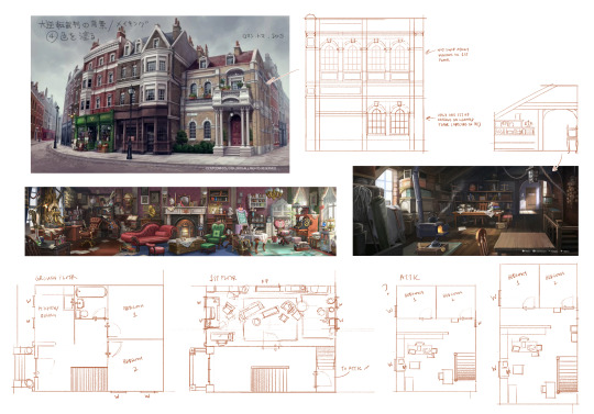
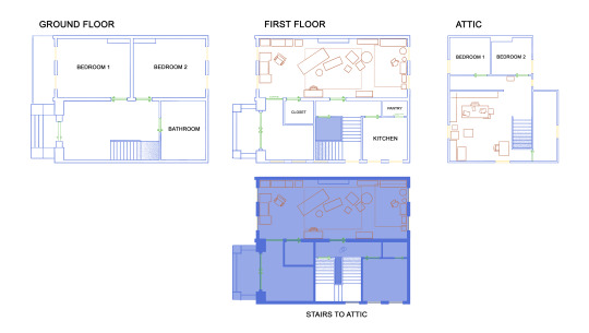

attempting to map out 221b
#not confident about the ground floor other than the kitchen and bathroom are next to each other cause plumbing#there might be a small window in bedroom 1 ground floor cause the wall seems to not be blocked on the outside#yea bedroom 2 ground floor is noisy af cause street lvl windows and double staircase foot traffic lol#originally I was going to shove the bathroom under the staircase lol#yeah so idk where to put the attic staircase#also the attic interior is way too long to fit in the roof#unless the attic is the mf tardis#anyway do not hold me to this lol#lmao updated commentary ->#changed up the layout based on new info and some comments I got on the first/rough version#it's still not 1:1 to the canon designs but I've tried to place things in a way that make sense and fit into the building (sorta)#the interior only makes sense if the building was way bigger than it's depicted as#also I wanted to put the attic access in the closet but it didn't fit right#been treating the windows on the side of the building fast and loose cause man idk I don't get paid to do this#the only way it makes sense that there's light coming through from both the back and front windows is if there's an open enough space behind#maybe the building behind 221b is like.. long and narrow. or L shaped or something idk#still don't know how I feel about the main and attic stairs placement and layout but they work(?)#reference#ref
71 notes
·
View notes
Text
NAMI NEEDS TO GO UP THERE AND FIGHT BIG MOM I AM SO SERIOUS!!! THIS IS A BATTLE FOR THE ROMANCE DOWN TRIO!! SANJI DO NOT DARE TAKE HER SPOT!!!
#big mom just giving birth here on the battlefield.....#do i comment on the incestuous relationship between clouds made of the same soul??? no?? okay...#oh jesus.... goodbye kid and killer.... nami needs to get up there and take control of zeus and i am so serious#HER SKILL IS SO POWERFUL AND SO PERFECT FOR THIS FIGHT AGAINST BIG MOM BUT BECAUSE SHE IS NOT PART OF THE STRONG TRIO SHE GETS STUCK WITH#THE B LIST VILLAINS!!!! LKKE WHY DOES SHE NEED TO FIGHT ULTI?? OKAY THAT WAS MEANINGFUL BUT THAT COULD END THERE!!!!#SANJI GO FIGHT PAGE ONE!!! SOMEONE TAKE CARE OF ULTI AND LET LUFFY ZORO AND NAMI TAKE CARE OF KAIDO AND BIG MOM!!! I AM SERIOUS!!!#big mom is inside the castle.... maybe i will get my wish granted (kinda...)#kid and nami against big mom.... maybe sanji can join... i can see it so clearly.... come on now.....#if namo knew armor haki she would have gone up there and taken zeus and dealt with prometheus and his sister wife. let the others w/ big mom#fucking hawkins... end him killer.... calling him domesticated lmao... end his pathetic ass#using conqueror's haki on the weapons..... also zoro having it too.... the flower petals symbolism..... OHHHHHHHHH#nani indeed...... BREAK THAT MACE!!!! YEAAHHH!!!! law is completely baffled#KAIDO GOT SENT BACK!!!! LETSGOOOOO AND THE OG INTRO MUSIC QUICKS IN!!!! law just saw god again....#he said fuck off i got this.... omg.... he is either gonna nearly die and doesn't want them to follow or doesn't want to worry about them#while he fights and they try to defend him.... no other explaination (apart for 4 the plot reasons)#talking tag#watching one piece#episode 1028#luffy king of everything that was such a slay#they changed luffy chiquito's design....#i was gonna say luffy swimming...... but he can't yet akdhajsj#yasopp taking care of everyones children but his own...... i see how it is....#WHY WOULD SHANKS STAY IN GOA IF NOT TO TALK WITH GARP WHO LIVES THERE!!! I AM TELLING YOU SHANKS IS IN KAHOOTS WITH THE MARINES!!!!#i was thinking about shanks scar... and thought it might be from buggy with his three knives in between his fingers you know#but it is too small... like the knives would take more space.... but maybei might be reaching and it is from buggy and not like a little paw#or little hand.... however much distrubing you want to paint it....#shanks is testing little luffy's intelligence... he knows his weak spot already akdhjasj#uta calling herself a diva.... ajshaksn might this be the reason luffy was so inclined to having a musician since the start???#episode 1029#that was like a perfectly realistic relationship between an older smartass girl and a younger boy lmao it was spot on
10 notes
·
View notes
Text
M*uthwashing was good, the only things i didn't enjoy lie in the area of writing (but so do some things i enjoyed the most!) - but I expected more from it? kinda?
#putting this into tags because spoilers ->#like ok let me get this out of the way. the only woman on the crew is the doctor and has problems related to pregnancy. groundbreaking.#but i have no problems with the rest of the cast. swansea's monologue was top notch#and you can see that everyone loved the cast because 90% of posts in the tags is JIMMY MUST DIE#so whatever.#my biggest gripe is that one delusional asshole is basically the root of all evil in the story#it makes the story not about how people deal with a horrific situation but about one man ruining everyone's lives. that seems flatter to me#so up until The Reveal the game is stellar to me#it would be so much tastier to me if it was curly after all. life sucks so much for everyone that the captain#decides to commit murder suicide - and then doesn't even die and condemns them all to a slow painful death#but instead it's ''a violent man with inferiority issues cracks under pressure and betrays everyone'' which. okay now that i've typed it out#doesn't sound too boring but still#my commentary#also since i'm here#watched another small sci-fi game about an au soviet 70s? space station manned by an AI and it reminded me how much i love sci fi#it's a 2001 a space odyssey-inspired game where you are woken up from cryogenic sleep on a space station#but it turns out that the station ai used alien mold to clone you and your coworker and thus circumvent the 3d(?) law of robotics#because neither of you is strictly speaking human anymore#the point was that the ai was like a child (and the mc who is a female psychologist in charge of working with the ai who had developed this#kinda mother-daughter relationship with the ai OF COURSE#anyway aside from the visuals and vibes/design the game is mid#but it made me crave a story where the ai is a child simply because it is easier to make a simpler ai and then to teach it instead of making#a full grown human-like intelligence#but then it does behave like a child. make a mess on accident and does its best to hide it. a staff member dies and it clones them to fix it#a chain of unfortunate events that happen only because this god child put in charge of the station wants its caretakers to not be upset#that would be mwah#i will need to check this wall fo text for spelling when i get home!
2 notes
·
View notes
Text
i really really love procreate dreams and what its capable of but i gotta say that so far i have some major gripes with the UI </3
#shush slinky#i want to love this app so bad!!!!!! but there are no pen pressure settings#that i can find because there... is no settings button#the flipbook is huge and you cannot scale it#pen resolution scales to match the zoom on the window?? which is. bizzare.#you cannot move around brushes at all. im fine with not being able to make or edit them i guess bc you can easy import from the other app#even tho so many of the default ones have unbearable streamline on and you cant change it#there are no undo and redo buttons even though there is... clearly space for some#theres even no action button like the other app#the timeline view makes the actual image super small on my device model because its older and clearly smaller than was designed for#and you cant scale that either it takes up half the screen whether u like it or not#theres NO LASSO TOOL... the fill tolerance is extreme and you cannot change it to my knowledge...#the verdict so far is that it is a very good editing tool at the expense of frame-by-frame; which procreate itself is better for#and its pretty unintuitive to me which i was suprised by because of how used to procreate i am
16 notes
·
View notes
Text


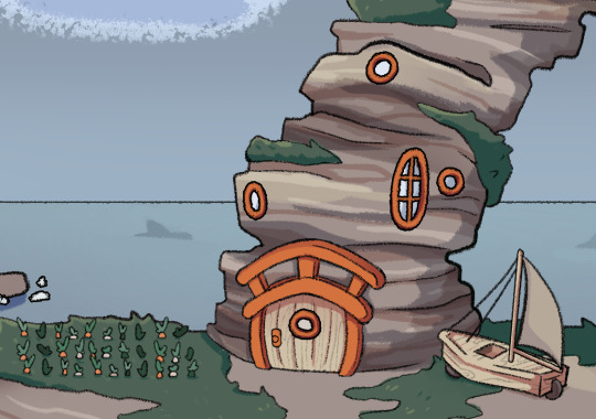
Bea's house! I'm not 100% happy with how it finished up, however it really did help the energy I'm trying to capture here.
I don't think I've mentioned it before, but I've always wanted for the series is a wide array of unique backdrops and landmarks; so getting better at buildings and prop design is an absolute must for me.
#illustration#magical school girls#msg#bea#background#set design#farm#land boat#chickens#I think the two big overall issues with this are perspective#and also emptiness#I'm not sure HOW empty I want it all to be because. well.#she lives on the edge of society#under a rock#so there should be open space#but I also need a “foresty” area#and a small “seaside” village#her house being a sea arch tho? that is non negotiable
16 notes
·
View notes
Text
everyone keeps saying the new dash is supposed to be more accessible but. was it ever inaccessible to begin with?? i never saw anyone complaining about hard navigation for things like The Inbox or Activity Page, it's not hard to click them and see where they go as a new user..... the one thing that needs updated is probably the fact that settings and blog settings and account settings are all completely different. i can see navigation problems there. the things on the horizontal bar were very easy to get to and understand tho
#i find it a lot harder to get to individual blog pages of mine now#since when you open the menu for one it pushed other stuff out of the way#maybe opening the menu for a blog should be more similar to the activity dropdown#but idk im not into UI design i just think it looks bad#too much blank space to the sides and the posts are too small but zooming makes everything cramped#and also it's OVERWHELMING!!! some menus have buttons on buttons in BOTH sidebars#i just dont understand how it's MORE accessible like this#maybe just. condense your menu options in a more sensible way#instead of having them all laid out at once. and also multiple buttons that do the same thing...#chat
15 notes
·
View notes
Text
i already do not like brutalist architecture but now i dislike it even more out of grumpiness after i saw a frankly kinda pretentious and self aggrandising post chain that acted like brutalism is THE Leftist Architectural Style(tm), that ornamentation is for the bourgeoisie, and that a preference for older or ancient architecture is absolutely a capitalist and/or neo nazi red flag/dogwhistle
#*deep space noises*#i mean the last thing isnt untrue unfortunately but mates.......... like many things it isnt as black and white as that#i cant fault brutalism for its practicality and i respect ppl who can see the beauty in it#but it just makes me depressed to look at#it unfortunately combines 1. my dislike of flat uninterrupted space 2. a lack of organic shapes#and 3. my hatred of concrete#blease give me vernacular architecture!!#especially beams or rough n chunky stone bricks#but ya i love how architecture can reflect the environment that its built in and the culture of the people who built it#its beautiful!!!!!#like mum and i have played enough uk geoguessr that we can now p reliably pinpoint the region of the country#just by the architectural style#and we're just one small island#if everything everywhere had the same design principle no amount of assertions of functionality#would make me feel less sad
3 notes
·
View notes
Text
I tried to build Justin's house/farm in the Sims last night and I regret to announce its mental image in my head breaks the laws of physics and therefore it cannot be visualized
#Look. I just want the outside walls of both floors to be precisely on top of each other even though the downstairs hallway#and landing upstairs are right on top of each other#yet the rooms attached to them are deeper on the ground floor than on the first floor#also the entry downstairs is as deep as the bedroom right beside it which is also about three times as deep as the entry hope that helps#and the basic shape of the house is one large rectangle on both floors even though the backside of the house on the top floors has nothing#there and is practically unreachable#could I fix this by looking up some floorplans online and revising my idea? Yes. Do I want to? Ehhhhhh#I also have this problem with the camper they use to get around throughout parts 2 and 3 because I keep forgetting that Brenda and Chuck#excluded no one in this story is nearly as small as I am so I keep underestimating how much space they'll need#Technically I took care of it by putting little narrow bunks over the twin bed in the back of the camper and adding in an extra backseat#(making the camper quite long but fine)#and it already had convertible driver's and passenger's seats plus one of those foldable sleeping areas up top#but this is a recurring problem#I'm gonna build the WCKD facilities from part 4 after I solve the farm problem that's gonna be fun#I would love to build the house they all live in after everything's over but it relies on attic space and custom-design beds which the sims#is simply not capable of doing justice to#so. I guess I'll practice some drawing skills though I don't think that's a project I'll finish in the near future
2 notes
·
View notes
Text
we've found it folks: mcmansion heaven
Hello everyone. It is my pleasure to bring you the greatest house I have ever seen. The house of a true visionary. A real ad-hocist. A genuine pioneer of fenestration. This house is in Alabama. It was built in 1980 and costs around $5 million. It is worth every penny. Perhaps more.
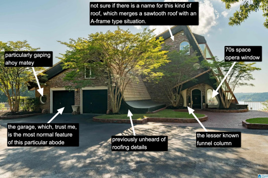
Now, I know what you're thinking: "Come on, Kate, that's a little kooky, but certainly it's not McMansion Heaven. This is very much a house in the earthly realm. Purgatory. McMansion Purgatory." Well, let me now play Beatrice to your Dante, young Pilgrim. Welcome. Welcome, welcome, welcome.

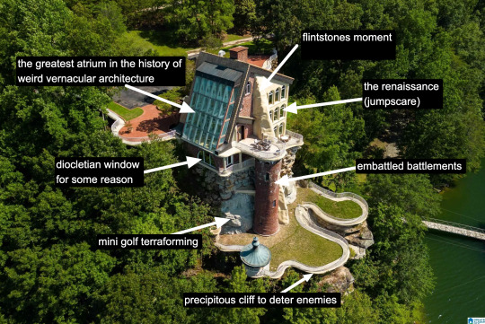
It is rare to find a house that has everything. A house that wills itself into Postmodernism yet remains unable to let go of the kookiest moments of the prior zeitgeist, the Bruce Goffs and Earthships, the commune houses built from car windshields, the seventies moments of psychedelic hippie fracture. It is everything. It has everything. It is theme park, it is High Tech. It is Renaissance (in the San Antonio Riverwalk sense of the word.) It is medieval. It is maybe the greatest pastiche to sucker itself to the side of a mountain, perilously overlooking a large body of water. Look at it. Just look.
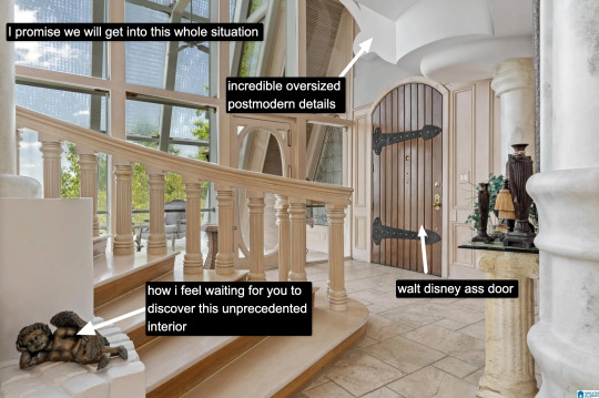
The inside is white. This makes it dreamlike, almost benevolent. It is bright because this is McMansion Heaven and Gray is for McMansion Hell. There is an overbearing sheen of 80s optimism. In this house, the credit default swap has not yet been invented, but could be.
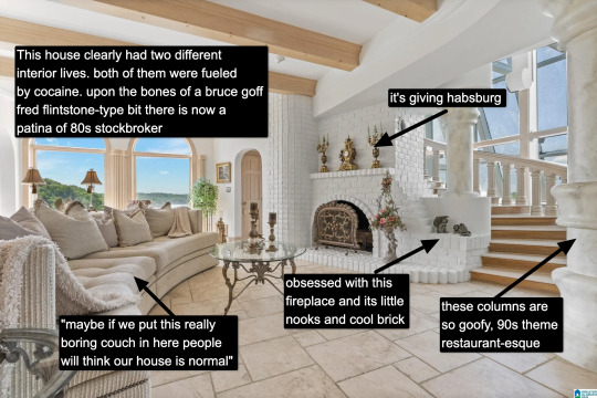
It takes a lot for me to drop the cocaine word because I think it's a cheap joke. But there's something about this example that makes it plausible, not in a derogatory way, but in a liberatory one, a sensuous one. Someone created this house to have a particular experience, a particular feeling. It possesses an element of true fantasy, the thematic. Its rooms are not meant to be one cohesive composition, but rather a series of scenes, of vastly different spatial moments, compressed, expanded, bright, close.
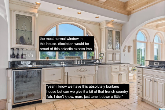
And then there's this kitchen for some reason. Or so you think. Everything the interior design tries to hide, namely how unceasingly peculiar the house is, it is not entirely able to because the choices made here remain decadent, indulgent, albeit in a more familiar way.

Rare is it to discover an interior wherein one truly must wear sunglasses. The environment created in service to transparency has to somewhat prevent the elements from penetrating too deep while retaining their desirable qualities. I don't think an architect designed this house. An architect would have had access to specifically engineered products for this purpose. Whoever built this house had certain access to architectural catalogues but not those used in the highest end or most structurally complex projects. The customization here lies in the assemblage of materials and in doing so stretches them to the height of their imaginative capacity. To borrow from Charles Jencks, ad-hoc is a perfect description. It is an architecture of availability and of adventure.
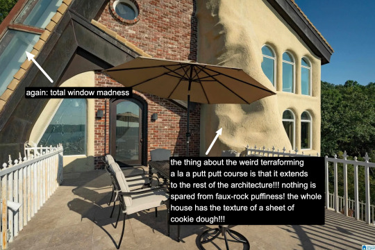
A small interlude. We are outside. There is no rear exterior view of this house because it would be impossible to get one from the scrawny lawn that lies at its depths. This space is intended to serve the same purpose, which is to look upon the house itself as much as gaze from the house to the world beyond.
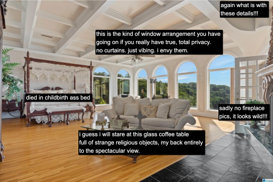
Living in a city, I often think about exhibitionism. Living in a city is inherently exhibitionist. A house is a permeable visible surface; it is entirely possible that someone will catch a glimpse of me they're not supposed to when I rush to the living room in only a t-shirt to turn out the light before bed. But this is a space that is only exhibitionist in the sense that it is an architecture of exposure, and yet this exposure would not be possible without the protection of the site, of the distance from every other pair of eyes. In this respect, a double freedom is secured. The window intimates the potential of seeing. But no one sees.
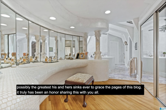
At the heart of this house lies a strange mix of concepts. Postmodern classicist columns of the Disney World set. The unpolished edge of the vernacular. There is also an organicist bent to the whole thing, something more Goff than Gaudí, and here we see some of the house's most organic forms, the monolith- or shell-like vanity mixed with the luminous artifice of mirrors and white. A backlit cave, primitive and performative at the same time, which is, in essence, the dialectic of the luxury bathroom.
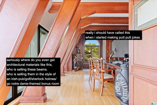
And yet our McMansion Heaven is still a McMansion. It is still an accumulation of deliberate signifiers of wealth, very much a construction with the secondary purpose of invoking envy, a palatial residence designed without much cohesion. The presence of golf, of wood, of masculine and patriarchal symbolism with an undercurrent of luxury drives that point home. The McMansion can aspire to an art form, but there are still many levels to ascend before one gets to where God's sitting.
If you like this post and want more like it, support McMansion Hell on Patreon for as little as $1/month for access to great bonus content including a discord server, extra posts, and livestreams.
Not into recurring payments? Try the tip jar! Student loans just started back up!
42K notes
·
View notes
Text
Homemaking, gardening, and self-sufficiency resources that won't radicalize you into a hate group

It seems like self-sufficiency and homemaking skills are blowing up right now. With the COVID-19 pandemic and the current economic crisis, a lot of folks, especially young people, are looking to develop skills that will help them be a little bit less dependent on our consumerist economy. And I think that's generally a good thing. I think more of us should know how to cook a meal from scratch, grow our own vegetables, and mend our own clothes. Those are good skills to have.
Unfortunately, these "self-sufficiency" skills are often used as a recruiting tactic by white supremacists, TERFs, and other hate groups. They become a way to reconnect to or relive the "good old days," a romanticized (false) past before modern society and civil rights. And for a lot of people, these skills are inseparably connected to their politics and may even be used as a tool to indoctrinate new people.
In the spirit of building safe communities, here's a complete list of the safe resources I've found for learning homemaking, gardening, and related skills. Safe for me means queer- and trans-friendly, inclusive of different races and cultures, does not contain Christian preaching, and does not contain white supremacist or TERF dog whistles.
Homemaking/Housekeeping/Caring for your home:
Making It by Kelly Coyne and Erik Knutzen [book] (The big crunchy household DIY book; includes every level of self-sufficiency from making your own toothpaste and laundry soap to setting up raised beds to butchering a chicken. Authors are explicitly left-leaning.)
Safe and Sound: A Renter-Friendly Guide to Home Repair by Mercury Stardust [book] (A guide to simple home repair tasks, written with rentals in mind; very compassionate and accessible language.)
How To Keep House While Drowning by KC Davis [book] (The book about cleaning and housework for people who get overwhelmed by cleaning and housework, based on the premise that messiness is not a moral failing; disability and neurodivergence friendly; genuinely changed how I approach cleaning tasks.)
Gardening
Rebel Gardening by Alessandro Vitale [book] (Really great introduction to urban gardening; explicitly discusses renter-friendly garden designs in small spaces; lots of DIY solutions using recycled materials; note that the author lives in England, so check if plants are invasive in your area before putting them in the ground.)
Country/Rural Living:
Woodsqueer by Gretchen Legler [book] (Memoir of a lesbian who lives and works on a rural farm in Maine with her wife; does a good job of showing what it's like to be queer in a rural space; CW for mentions of domestic violence, infidelity/cheating, and internalized homophobia)
"Debunking the Off-Grid Fantasy" by Maggie Mae Fish [video essay] (Deconstructs the off-grid lifestyle and the myth of self-reliance)
Sewing/Mending:
Annika Victoria [YouTube channel] (No longer active, but their videos are still a great resource for anyone learning to sew; check out the beginner project playlist to start. This is where I learned a lot of what I know about sewing.)
Make, Sew, and Mend by Bernadette Banner [book] (A very thorough written introduction to hand-sewing, written by a clothing historian; lots of fun garment history facts; explicitly inclusive of BIPOC, queer, and trans sewists.)
Sustainability/Land Stewardship
Braiding Sweetgrass by Robin Wall Kimmerer [book] (Most of you have probably already read this one or had it recommended to you, but it really is that good; excellent example of how traditional animist beliefs -- in this case, indigenous American beliefs -- can exist in healthy symbiosis with science; more philosophy than how-to, but a great foundational resource.)
Wild Witchcraft by Rebecca Beyer [book] (This one is for my fellow witches; one of my favorite witchcraft books, and an excellent example of a place-based practice deeply rooted in the land.)
Avoiding the "Crunchy to Alt Right Pipeline"
Note: the "crunchy to alt-right pipeline" is a term used to describe how white supremacists and other far right groups use "crunchy" spaces (i.e., spaces dedicated to farming, homemaking, alternative medicine, simple living/slow living, etc.) to recruit and indoctrinate people into their movements. Knowing how this recruitment works can help you recognize it when you do encounter it and avoid being influenced by it.
"The Crunchy-to-Alt-Right Pipeline" by Kathleen Belew [magazine article] (Good, short introduction to this issue and its history.)
Sisters in Hate by Seyward Darby (I feel like I need to give a content warning: this book contains explicit descriptions of racism, white supremacy, and Neo Nazis, and it's a very difficult read, but it really is a great, in-depth breakdown of the role women play in the alt-right; also explicitly addresses the crunchy to alt-right pipeline.)
These are just the resources I've personally found helpful, so if anyone else has any they want to add, please, please do!
#homemaking#homemaking resources#gardening#urban gardening#self sufficiency#self sufficient living#sustainability#sustainable living#homesteading#nontrad homemaker#nontrad housewife#urban homesteading#solarpunk#cottagecore#kitchen witch#kitchen witchcraft#crunchy to alt right pipeline#book rec#book recommendations#resource#long post#mine#racism tw#racism mention#transphobia tw#transphobia mention
26K notes
·
View notes
Text
"With “green corridors” that mimic the natural forest, the Colombian city is driving down temperatures — and could become five degrees cooler over the next few decades.
In the face of a rapidly heating planet, the City of Eternal Spring — nicknamed so thanks to its year-round temperate climate — has found a way to keep its cool.
Previously, Medellín had undergone years of rapid urban expansion, which led to a severe urban heat island effect — raising temperatures in the city to significantly higher than in the surrounding suburban and rural areas. Roads and other concrete infrastructure absorb and maintain the sun’s heat for much longer than green infrastructure.
“Medellín grew at the expense of green spaces and vegetation,” says Pilar Vargas, a forest engineer working for City Hall. “We built and built and built. There wasn’t a lot of thought about the impact on the climate. It became obvious that had to change.”
Efforts began in 2016 under Medellín’s then mayor, Federico Gutiérrez (who, after completing one term in 2019, was re-elected at the end of 2023). The city launched a new approach to its urban development — one that focused on people and plants.
The $16.3 million initiative led to the creation of 30 Green Corridors along the city’s roads and waterways, improving or producing more than 70 hectares of green space, which includes 20 kilometers of shaded routes with cycle lanes and pedestrian paths.
These plant and tree-filled spaces — which connect all sorts of green areas such as the curb strips, squares, parks, vertical gardens, sidewalks, and even some of the seven hills that surround the city — produce fresh, cooling air in the face of urban heat. The corridors are also designed to mimic a natural forest with levels of low, medium and high plants, including native and tropical plants, bamboo grasses and palm trees.
Heat-trapping infrastructure like metro stations and bridges has also been greened as part of the project and government buildings have been adorned with green roofs and vertical gardens to beat the heat. The first of those was installed at Medellín’s City Hall, where nearly 100,000 plants and 12 species span the 1,810 square meter surface.
“It’s like urban acupuncture,” says Paula Zapata, advisor for Medellín at C40 Cities, a global network of about 100 of the world’s leading mayors. “The city is making these small interventions that together act to make a big impact.”
At the launch of the project, 120,000 individual plants and 12,500 trees were added to roads and parks across the city. By 2021, the figure had reached 2.5 million plants and 880,000 trees. Each has been carefully chosen to maximize their impact.
“The technical team thought a lot about the species used. They selected endemic ones that have a functional use,” explains Zapata.
The 72 species of plants and trees selected provide food for wildlife, help biodiversity to spread and fight air pollution. A study, for example, identified Mangifera indica as the best among six plant species found in Medellín at absorbing PM2.5 pollution — particulate matter that can cause asthma, bronchitis and heart disease — and surviving in polluted areas due to its “biochemical and biological mechanisms.”
And the urban planting continues to this day.
The groundwork is carried out by 150 citizen-gardeners like Pineda, who come from disadvantaged and minority backgrounds, with the support of 15 specialized forest engineers. Pineda is now the leader of a team of seven other gardeners who attend to corridors all across the city, shifting depending on the current priorities...
“I’m completely in favor of the corridors,” says [Victoria Perez, another citizen-gardener], who grew up in a poor suburb in the city of 2.5 million people. “It really improves the quality of life here.”
Wilmar Jesus, a 48-year-old Afro-Colombian farmer on his first day of the job, is pleased about the project’s possibilities for his own future. “I want to learn more and become better,” he says. “This gives me the opportunity to advance myself.”
The project’s wider impacts are like a breath of fresh air. Medellín’s temperatures fell by 2°C in the first three years of the program, and officials expect a further decrease of 4 to 5C over the next few decades, even taking into account climate change. In turn, City Hall says this will minimize the need for energy-intensive air conditioning...
In addition, the project has had a significant impact on air pollution. Between 2016 and 2019, the level of PM2.5 fell significantly, and in turn the city’s morbidity rate from acute respiratory infections decreased from 159.8 to 95.3 per 1,000 people [Note: That means the city's rate of people getting sick with lung/throat/respiratory infections.]
There’s also been a 34.6 percent rise in cycling in the city, likely due to the new bike paths built for the project, and biodiversity studies show that wildlife is coming back — one sample of five Green Corridors identified 30 different species of butterfly.
Other cities are already taking note. Bogotá and Barranquilla have adopted similar plans, among other Colombian cities, and last year São Paulo, Brazil, the largest city in South America, began expanding its corridors after launching them in 2022.
“For sure, Green Corridors could work in many other places,” says Zapata."
-via Reasons to Be Cheerful, March 4, 2024
#colombia#brazil#urban#urban landscape#urban planning#cities#civil engineering#green architecture#green spaces#urban heat#urban heat island effect#weather#meteorology#global warming#climate change#climate hope#climate optimism#climate emergency#climate action#environment#environmental news#city architecture#bicycling#native plants#biodiversity#good news#hope#solarpunk#ecopunk#hopepunk
17K notes
·
View notes