#house designs images download
Explore tagged Tumblr posts
Text
Happy Simblreen!!!!!

English Stone Townhouse, circa 1890-ish!
Finally, I'm sharing one of my builds for the very first time! This house was designed for Finchwick in Henford on Bagley and took inspiration from buildings in Downton Abbey and All Creatures Great and Small (heavy on the All Creatures) as well as many, many images from Google (particularly this one). It is furnished for the late 1880's and early 1890's for an upper/middle class family.
The house has two bedrooms, one bathroom, and a study upstairs, and an entryway, parlor, dining room, kitchen, and mudroom downstairs. It is historically accurate in my heart and very very slightly game tested.


I have decided to share both a shell and a fully furnished version. I use a lot of custom content and wanted to make it as easy for you to download without violating creators TOU so please read:
Build items - all linked in the sheet below with the exception of one arch, which is included in the CC folder for both downloads
Buy items - all sets are linked in the sheet below
Shell - download includes tray files and a CC folder with two files in it which I didn’t like because they were buried in large CC dumps by the creator (I got confused and gave up)
Furnished - download includes tray files and a CC folder with most of the individual objects used in the build. My policy was to throw in the pieces that were loose in my mods folder and not part of a larger set (or were paywalled ❌❌❌). I decided I’d rather play with fire than painstakingly hunt down every obscure piece of CC I used in this build.
A few items were part of bigger sets that I downloaded merged, but are also available unmerged. I did my best to specify in the CC list which items I used in my build in case you don’t want to download the whole set (but I recommend you do!)
Download here (Patreon)
( Alt download - SFS: Shell or Furnished )
CC Linked Here
Lmk if anything is funky or not linked properly! I didn't double check anything because that's not my speed (sorry).
#ts4#s4 decades#sims 4#sims 4 decades#the sims 4#sims 4 build#my builds#1890s#1890s house#download#simblreen#simblreen 2024#s4 build
188 notes
·
View notes
Text
LasAbarcas Base Game Save File 1.0
My Base Game Save File is complete!!! Download it here!
UPDATED VERSION AS OF 3/18:
OLD VERSION:
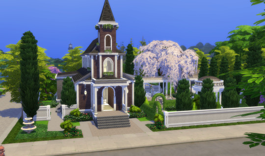
My goal with this save was to make the base game feel super ALIVE and full of personality - basically what we all wanted the base game to be originally. This save is full of lore: each household has a story (some inspired by iconic Sims lore, others original), each Sim has relationships outside their home, each world has a description and each neighborhood within each world is built with a very specific vibe that draws particular Sims to live there, all community lots (and some residential lots) have descriptions, and even the graves (and ghosts) at the Willow Creek church graveyard tell a story. There are TONS of community lots in this save that all feel different from one another and are designed with different kinds of Sims (personalities, career types, ages, etc.) in mind to give everyone multiple things to do outside the house.
All lots were built using only the base game (disclaimer: occasionally my game adds pack-specific items, like a kind of food, during playtesting, so it might say there is a pack-specific item on a lot but it's not meant to be there!), but many lots were built with other packs in mind. For example, the save has restaurants, a boba shop/thrift story, a cafe/retail space, a community garden, a high school, and so on that are base game only. So, if you only have the base game or limited packs, it should feel like you have more to do than the base game provides and open up your gameplay with a little imagination.
If you do have more packs, the lots should easily convert to their intended lot type to allow more functionality. You should also find things that come in other packs available in the save. For example, many Sims have university degrees, all Sims have cold/hot weather clothes, there are loads of clubs for Sims to be in (each with a description - MORE LORE hah!), and the calendar is filled with holidays/events.
Here's a little tour of the Save:
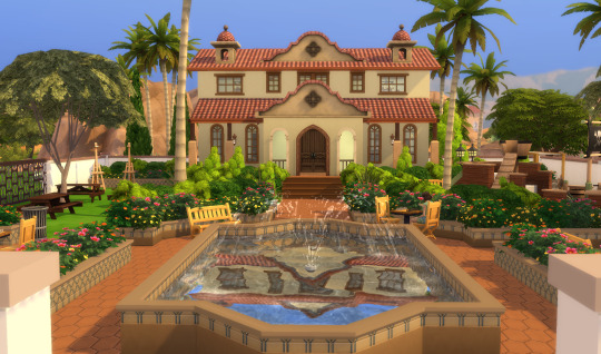
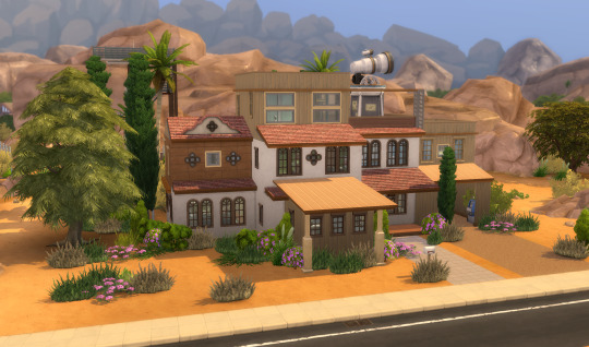
WILLOW CREEK:
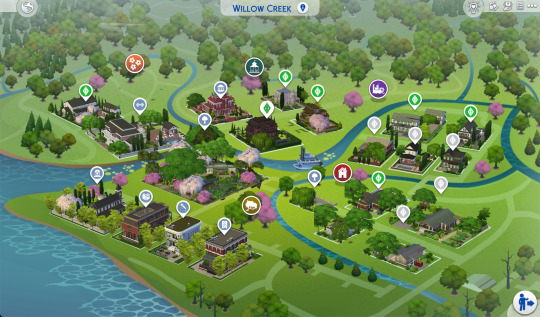
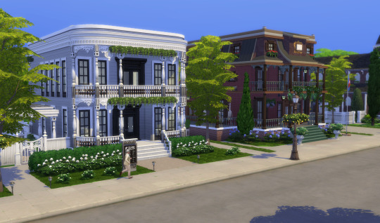
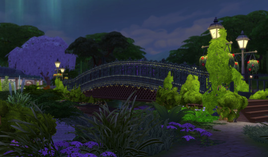
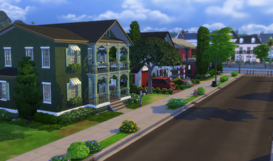
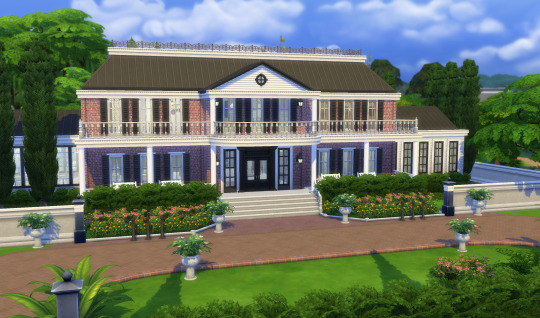
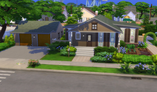
Most families in Willow Creek have lived here for generations. These families strongly value their roots and create such a strong sense of Willow Creek identity that the transplant families have taken on this identity as well, leaving the town full of people who proudly work to preserve and celebrate the town’s vibrant history and traditions. Families in Willow Creek tend to have a more traditional approach to family life/dynamics and care about the family’s image/status within Willow Creek.



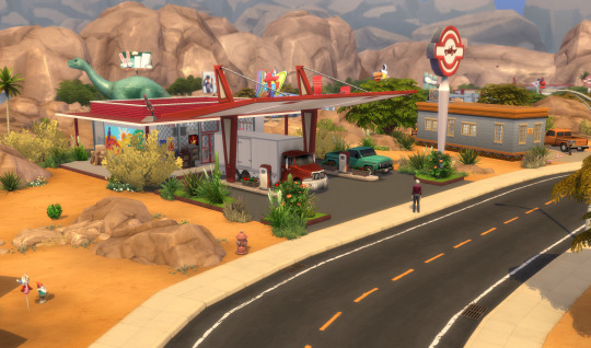
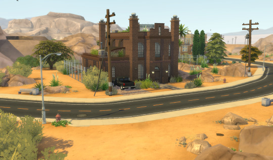
OASIS SPRINGS:
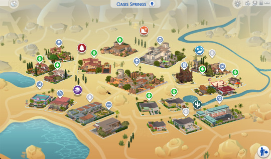
Oasis Springs had its heyday several decades ago when its space exploration industry was booming, but when the industry fizzled out, the town lost a lot of business, wealth, and residents. However, those that remain take pride in their retro desert town and clearly see what remains: a beautiful, unique, special place to call home. Families in Oasis Springs tend to be a bit quirkier, care little about what other people think about them, and focus more everyday happiness than career success.

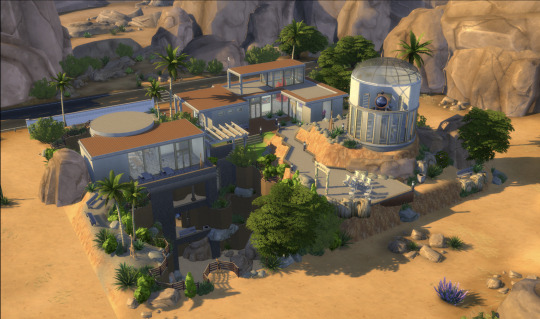
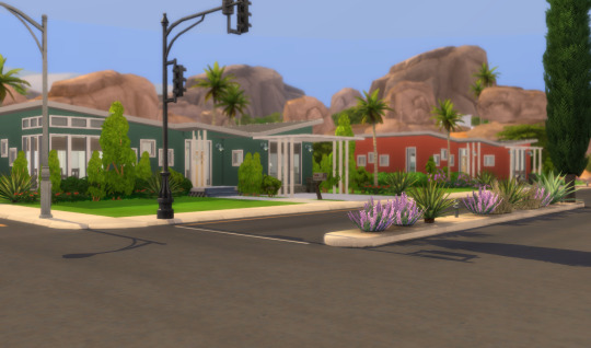

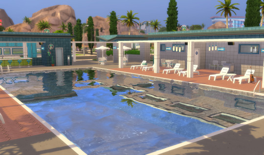
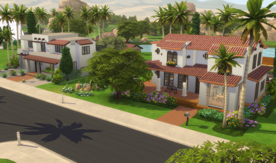
NEWCREST:
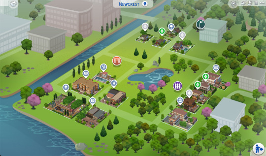
Newcrest is a very family-friendly neighborhood filled with fun for all ages. Families here tend to be a bit more laidback – they are willing to go with the flow and enjoy the messiness that comes with growing up. The Newcrest residents are a supportive bunch of people who enjoy each other’s company and have a healthy balance between careers/school, hobbies, and spending time with family and friends.
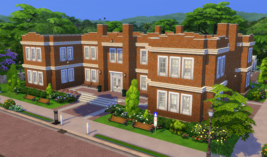
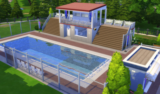
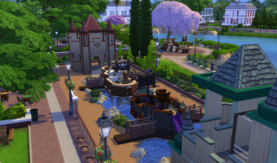

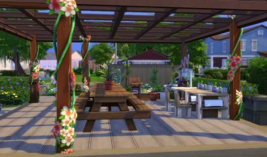
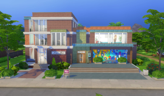
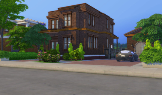
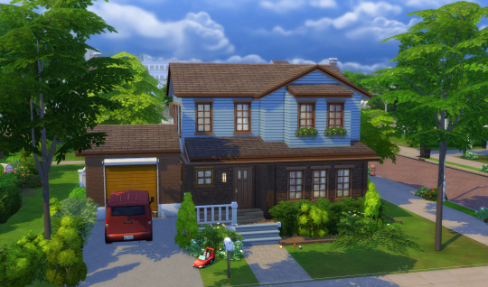
I will also be releasing a Limited Packs Save with version one containing updates to Copperdale and Strangerville coming soon, as well as a No Limits Save down the line.
I hope you all download and enjoy!! Please let me know what you think and if you notice anything that needs updating.
Thanks!
#sims 4#sims 4 build#sims 4 simblr#the sims community#sims 4 screenshots#ts4#ts4 simblr#simblr#newcrest#willow creek#oasis springs#sims save file
596 notes
·
View notes
Note
Looking at your recent commissions, those backgrounds are soo pretty!! Do you have any tips for backgrounds? I always struggle with them :>
aAA many many thanks!!
backgrounds can absolutely be a struggle but they don't have to be! they just require a little more creative planning~!
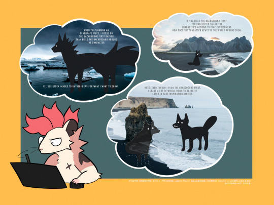
whether it be a commission or a personal drawing, if I'm building an elaborate art piece i focus on establishing the background First.
the background is the stage for your character! planning the background first will make it easier to tailor the character's actions and how they interact with the environment around them.
planning the background first can be the difference between your character standing awkwardly front and center with the setting going on behind them, or actually participating in their environment.

if i'm super stumped for background ideas, i browse stock image sites to get inspiration. sometimes it helps to doodle on an image to generate some ideas - kinda like you're playing with JPEGs like dolls.
that said - while i'm pinpointing WHAT i want to draw, i keep the ideas loose. i don't want to focus on the itty-bitty details until i've got the overall aesthetic and layout in mind, as i might get inspired to add something in later!
THUMBNAILING
if you're planning a big piece it can be helpful to break it down into something bite-sized before you go all in and start lining or painting. these are "thumbnails" - fast little sketches that establish the scene in a way that doesn't consume a lot of time or effort. it's also great as a little perspective exercise as a treat.
here i decided i want to draw a character walking home in a back alley street. with these photo references in mind, i can plan a layout and how the character will act in the scene. is this a candid shot? are they posing cutely? are they looking down at us in a tense way? there are many ideas to be had!
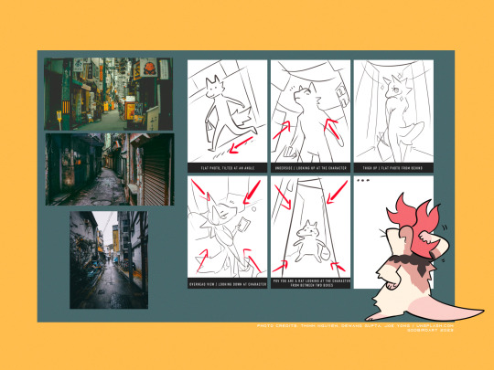
after you've chosen the layout / vibe for your idea, you can scale up your thumbnail to your preferred canvas size and start fleshing out the details. be sure to keep referring to your reference images to get additional ideas, such as storefronts, items, props etc!
3D MODELS
If you're trying to create a unique environment that photo references simply cannot help you visualize, 3D models exist! This gives you that ability to rotate / scale things for better visualization. Clip Studio has a vast catalogue of 3D models to download For Free that you can fiddle around with. i know there are many 3D builder sites out there as well, though i've never made use of them so i'm afraid i cannot recommend any off the top of my head. hell, you can even use the Sims game to design a setting and go from there!
also if anyone is going to come into my house and say 3D models are cheating: they are not. using a 3D model to better grasp an angle or get a better idea for perspective is not cheating. using 3D models to help plan the environment in your art is not cheating. they are no different than brushes; these are tools made to HELP YOU. use them!
PERSPECTIVE
perspective and angles can make a HUGE difference in the art piece. there's nothing wrong with static long shots! if that's what you want to draw, do it!! there's no right and wrong here!
but if you're finding your work to be a little robotic and stiff, slap an angle in there. consider an overhead view. these same techniques are applied to photography and film! nothing wrong with wide shots, but every once in a while it can help to throw in a dutch angle.
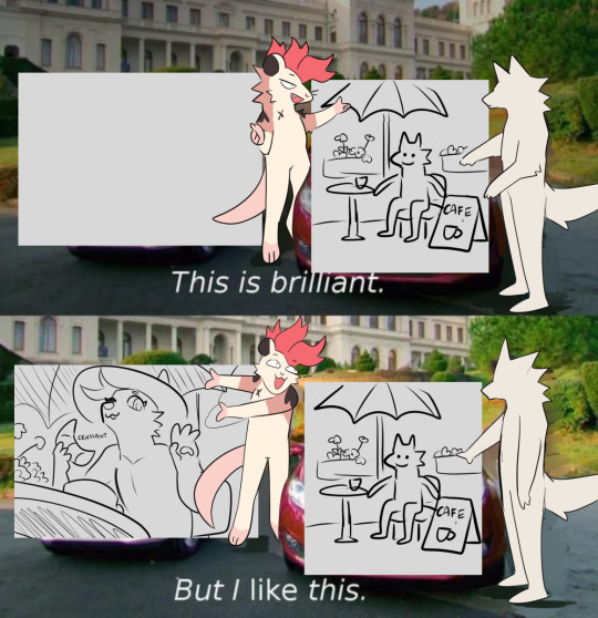
if there is one note i'd like to leave off on, it's that your backgrounds do not have to be 100% accurate-to-life to be Good. unless realism is something you're really striving for in your style, don't feel compelled to nitpick every brick and leaf in your art. us artists can tend to over-prune our work until our art looks a little bare and soulless. flaws can give your work character, and that's often a lot more appealing than how accurate the scale ratio between background building A and building B are [again, unless you WANT to go for that realistic look then you can fuss over those details all you like].
i hope this helped a little! MY APOLOGIES FOR MAKING IT SO LONG AH
625 notes
·
View notes
Text
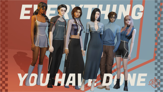
🧡March Collection: Everything you have done 🏁🧡
F1 season just began!
A lot of designers have taken inspiration from racing, designers like Tommy Hilfiger and DKNY have done amazing collections in the past years, so I wanted to hop on that train, and the month of March was perfect for this, EYHD is a collection full of color and sports attire, with a lot of stylish lines and numbers.
Now what better than house music while driving, so this collection is called after Meduza’s song Everything you have done.
EYHD brings you:
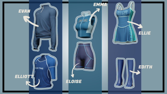
9 Total pieces 3 Exclusive ones (Tier TL) *attach to a different font*
2 M. Top/ 1 F. Top / 1 F. Short / 1 Dress / 1 Boots
Exclusive: 1 Dress / 1 Top / 1 Skirt
You can download everything in this post (next image show which piece is by the name)
TY & LY
Note: Is my first time doing shoes, I hope you like them :)
❤❤
¡La temporada de F1 acaba de comenzar!
Muchos diseñadores se han inspirado en el deporte, diseñadores como Tommy Hilfiger y DKNY han hecho colecciones increíbles en los últimos años, asimismo queria ser parte de esto y el mes de marzo fue perfecto, EYHD es una colección llena de color y vestimenta deportiva, con muchas líneas y números elegantes.
Ahora bien, qué mejor que música house mientras conduce, por eso esta colección lleva el nombre de la canción de Meduza - Everything you have done.
EYHD incluye:
9 piezas en total 3 exclusivas (Nivel TL) *adjuntar a una fuente diferente*
2 M. Top/ 1 F. Top / 1 F. Short / 1 Vestido / 1 Botas
Exclusivo: 1 Vestido / 1 Top / 1 Falda
You can download everything in this post (Patreon)
TY & LY
Nota: Es la primera vez que hago zapatos, espero que les gusten :)
Puedes descargar todo en esta publicación (Patreon)
Patreon Full Collection

#sims4cc#sims4#ts4cc#sims4mods#sims4ccfinds#alphacc#sims4clothing#sims4ccblog#sims4cccreator#sims#s4cc#the sims#create a sim#the sims cc#sims 4#male sims#the sims resource#my cc#ts4 simblr#sims 4 download
200 notes
·
View notes
Text
Across the Street | CC-Free Sims 2 Lot | Create-a-town
Here is the next lot in my series of small-town community buildings for your game. These lots are unique from a lot of user-created content that you can find out there because they are designed for decorators to have fun with. They are unfinished on purpose. 😊

This set of shops has a lot of visual diversity that will fit in in just about any small-town. Like the previous lot in the series, some of these shops are lightly furnished downstairs, but most are empty upstairs. This is done on purpose to give you the enjoyment of changing things up and decorating them to your heart’s content! 🥰

Since things are kind of hard to see in the main image, here are a few pictures of the shops. I’ve put some suggested use titles on them, but you are welcome to change them up. These are all built on the same lot.
Small grocery store:

Cozy ��hole in the wall” restaurant:

Appliance or computer shop:

Middle-eastern restaurant:

Spa/hair salon:

Consulting/Legal offices, and bus stop:

Here’s the floor layout so you can see what you’ve got to work with:
1st floor:

2nd floor: The podium in the building to the far right is a career reward. You can download a mod that makes them buyable over at MTS. It is not included in this file.

Basement: Yes, this lot has a basement for storage too! Only one set of stairs go down to it though since the lot is pretty narrow front to back.

Across the Street: MF | STS
CC-Free, but all EPs and SPs are required.
I’ve run this lot through the Lot Compressor so any random references to sims that aren’t there should be removed. I have also run it through the Lot Cleaner to remove any bits of buggy code. This lot comes with a shiny custom thumbnail so it has even more curb appeal in your Lots and Houses bin! 😄
I ALWAYS recommend using the Sims 2 Pack Clean installer to install lot files.
The rest of the shops in this series: Main Street Shops The Next Street Over Around the Corner Further Down the Street At the Office Small Shopping Center
#kirlicuessimlots#create-a-town lots#cc-free lot download#community lot#nocc#ts2#ts2 cc#sims2#s2build#ts2 build#sims 2 lot#sims 2 lots#lot download#sims 2 house#ts2 screenshots#sims 2 build#ts2 download#sims 2 download#the sims 2#thesims2#lot
36 notes
·
View notes
Text
I Really Want To Stay At Your House...

for these to work, you need to place the teleporter in the middle of the sink, facing away from the wall/tap (faucet). i designed this for the Bureau Sink (as pictured), but i reckon it could work with others/if you just want the faces the images can always be cropped.
Requires 1 sim (teen+)
Requires 2 sims (teen+)
Requires 2 sims (teen+)
Requires 2 sims (teen+)
download here.
name/song inspo
if anyone is wondering, this was 100% inspired by the fact that my partner just told me about the romantic hangout interactions in cyberpunk 2077 and i immediately became obsessed and cranked this out in a few hours. the name is a reference to the song played during the romantic hangouts in the game if you choose to dance! i'm debating whether or not to learn how to make animations in order to recreate the iconic other interaction in this sequence (iykyk). anyway, if you use this pleaseeeee tag me somehow/someway, i'd love to see your sims (especially if johnny silverhand is involved...).
#ts4#simblr#ts4poses#ts4cc#ts4 simblr#the sims 4#the sims 4 poses#the sims 4 cc#the sims 4 custom content#sims 4 cc#sims 4#sims 4 poses#sims 4 custom content#sparrow couple pose#sparrow two pose#Spotify
21 notes
·
View notes
Text


...
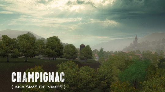
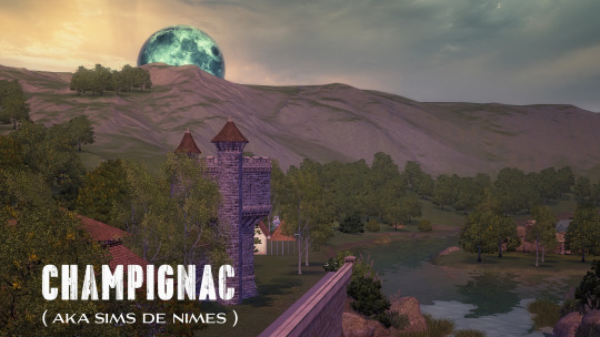
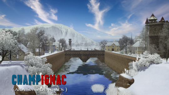
CHAMPIGNAC World ( aka Sims de Nimes ) is coming in few days ;)
If we put the fantastic gameplay apart, ALL Sims 3 Worlds are about AMBIANCE ... and good Sims 3 Worlds are more about ambiance than everything else ;) It's a quest which doesn't end :D
Champignac ( codename : Sims de Nimes ) is a project we began a long ago ( 2018 ) and left rest in a corner of our CAW files. Paused, but never forgotten. Frankly, it was long due and time to finish.
Champignac is a French true suburbia living world based on Champs-les-Sims but cleaned up of its vacation stuff ... So you will get everything of a Maxis standard World ( the ice cream truck, the university guy ) and of course the ability to go to every vacation world ( including Champs-les-Sims )
We redid almost everything : the grass textures, the pavement and road textures, etc ... We added richness to this world with singular and very interesting stuff ...
80 lots are available. Both community and residential. We redid the native lots almost from the ground and used them for something else, except Place des Oliviers which kept its initial function and placement.
We used Votenga @ MTS who converted many things from Sims Medieval such as old castle tower we used a lot or the fantastic St Gall Monastery from efolger997 @ MTS we transformed a bit to get an incredible Winery lot ( yes, there is a Winery ... gosh, this is France after all ) ;)
We used lots from Sims 3 creators and we made many others with great care and as low as possible cheating build options ... We are not bold at Sims houses creation but we tried to make as diverse as possible in our constructions, but always staying in the guide of specific South of France style and design. Anyway, this will be to you to add your own vision and architectural art to Champignac ! ;)
ALL 80 lots are French flavored ( red terracotta roofs, white stone ) to get a unique style for a unique world :)
Nestled in the heart of the charming South of France, Champignac is a town adorned with the alluring flair of Mediterranean culture. As the Sims step into this picturesque town, they are immediately enveloped by the warmth of the sun, and the vibrant colors that paint the streets ...
No false antic stuff here. No false image from the 60's ... It is a fully contemporary world but with its own old stuff. Champignac boasts a unique blend of history and modernity all together :)
The ambiance is one of relaxation and leisure, inspired by the leisurely lifestyle of the South of France. Here, residents take the time to savor the pleasures of life, indulging in delicious cuisine, delightful conversations under the shade of trees. The town's bustling markets offer an array of fresh produce, colorful fabrics, enticing the Sims to immerse themselves in the lively atmosphere.
With its unique blend of history, culture, and natural beauty, Champignac offers the Sims a captivating and enriching experience. From the stunning architecture to the delectable cuisine, every aspect of this town reflects the South of France's intoxicating charm.
Many more details to come with the coming download post ...
So ... Stay tuned ;) ( and always safe )
blackgryffin
#k hippie#sims 3 world#sims 3 build#the sims 3#sims 3#sims 3 gameplay#sims 3 cc#sims 3 worlds#sims 3 custom content#champignac#sims de nimes#champs les sims
276 notes
·
View notes
Photo

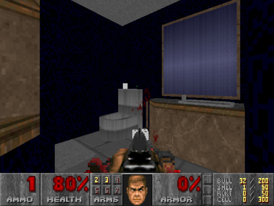

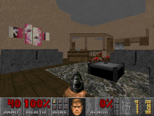

MyHouse.wad
On March 2 2023, a user called Veddge posted this thread in the WADs and Mods Doomworld forum:
MyHouse
Excited to finally release this tribute map. Last August I lost a good childhood friend of mine and took it pretty hard. When I was visiting my hometown for his funeral, I connected with his parents who shared with me some of his old belongings. Among them was a copy of an old map of his backed up on a 3.5” floppy from high school. Thomas and I were into amateur Doom mapping in the early 00s but I had never seen this map of his prior to uncovering it on one of the old floppy discs. As a way of paying tribute to him and all the great memories we had together, I took the plunge and installed Doom Builder in order to polish up his map and add a few modern amenities just for convenience sake.
I haven’t touched an editor in over 15 years so it was quite a surprise to find out how easy mapping has become. I may have gotten a little carried away with these new UDMF features and, as such, the map is designed for GZDoom. From the text file:
Doom 2 - GZDoom, hardware renderer
1 map: Not much of a challenge and roughly 10 minutes of play time. All difficulty settings implemented.
Jumping & crouching disabled, freelook is fine
Lots of Doomcute!
Making maps of your house was all the rage back-in-the-day, but I feel like this is a pretty adorable and detailed tribute to my friend and a great way to share something of him with a community we loved. Miss you, Tom.
Download myhouse.wad
Contained within is a link to a Google Drive folder containing myhouse.wad—a DOOM map of a normal 20th century suburban house where you mow down baddies and collect a blue, yellow, and red keycard to reach the exit—photos, text files, screenshots, and some images of a sketchbook.
There is also another version of the mod in a different format: myhouse.pk3. Opening this file to start a new game shows the map exactly the same as myhouse.wad ... until it isn’t.
Read Vegge’s original post, poke around in the GDrive, don’t look up anything else if you can help it, and give this a go. If you’re stumped, you might need to get some fresh air outside. General content warnings in the tags; spoiler cws under the cut. Obviously there is much more to this map than it seems ...
general content warnings for myhouse.pk3: blood, gore, violence, guns, weapons, pov, monsters, zombies, demons, flashing lights, eye strain
spoilery content warnings for myhouse.pk3: liminal spaces, the backrooms, unreality, substance abuse, alternate reality, enclosed spaces, open spaces, animal death, mirrors, mirror world, spiders, fire ... please ask me to tag anything i missed! this is still a very new puzzlebox of a game and it’s possible there’s still more to discover ...
#fps#gaming#DOOM#DOOM mod#DOOM WAD#myhouse.wad#myhouse.pk3#blood#gore#violence#guns#weapons#pov#monsters#zombies#demons#flashing lights#eye strain#ask to tag
442 notes
·
View notes
Text
now that I've been running this blog for nearly a year and it's starting to wind down, I think I can have little a self promotion as a treat
first, this blog will most likely start back up again if tumblr is still around whenever the next AC game comes out. what tournaments I run and how I run them will depend on what new stuff is added, but I at the very least want to do the new villagers, since the villager tournament was really the main thing of this blog
@isitinacnh was a blog I ran that compared the furniture catalogue from NL with NH to see how many items were cut or changed, but in the new year I think I'll repurpose it to show how items have evolved through all the games. don't expect to see new posts coming out of it for a good while though, because the most efficient way for me to make the posts would frontload it with all the interesting stuff, so I want to get a pretty big backlog started so I can shuffle the queue up before it starts posting. I have all the images downloaded to my computer already, I just need to post them
@villagerdetails gave in depth looks at all the villager models and expressions, mostly for the purpose of art refs. again if tumblr is still here when the next AC game comes out, I'll start this back up with the new villagers if I am able to. there is a good chance this might need to wait for like new amiibos to get released or something idk we'll see
@angiestown and @angiestownart are my main and art blogs respectively. angiestownart is just my art, usually with some extra commentary that I didn't want attached to the main post. angiestown is a personal blog, but I post all my art and a lot of the cakes I decorate at work and other dessert things I make. I'm also hoping to maybe next year on my main blog design and post screenshots of every single house in happy home paradise, just like I did with happy home designer in 2019. seems like a good time to do it since nintendo appears to be winding down the switch and I doubt any games I care about will come out for a good while
also if you guys wanted to reblog this post specifically that would be very niceys sorry it is long lmao
103 notes
·
View notes
Text
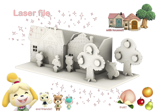
Animal Crossing laser cut pen holder
I made a pen holder for my twin @frogtowns and thought I'd share the files here as well. It's Merry and Maple's houses with characters Isabelle, Lily, Maple, and Marshal. Two trees and some fruit.
The files and full instructions are here, it's free and nothing weird. Feel free to use and modify the files, however please do not make profit off of them. More photos and text under cut <3
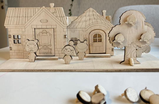
Here's a photo of my print! It's the first version and I've fixed things, such as the tree bases. The fruits that come with are peaches, pears, apples, and oranges. I have glued together the houses and walls, but I haven't glued anything to the baseplate. The fruits aren't glued either, they hang by the little studs on the back.
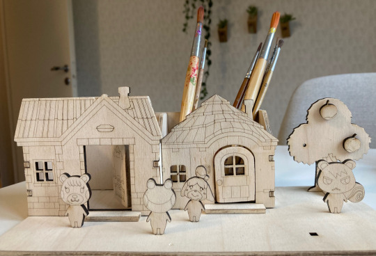
Here I put some brushes in it to show scale, also removed one of the trees so you can see better. I cut the doors and put hinges on them so they open but that is obviously not necessary. :)
Also the door to Maple's houes (on the right) is a bit messed up because I sanded it down way too much to fit my stupid hinge. The file is not crooked, it's me hi I'm the problem :S
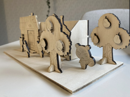
And a little side view. I sanded down many sides and the fronts and backs because the laser I use stains a bit, but I found out that the charred sides are easily sealed with some clear glue!!
Happy printing and as I said, feel free to edit the files however you'd like. Give it edges to make out of cardboard. I don't care. I just hyperfixated on this instead of doing my work and would love it if anyone else found any use of it. Just please don't make profit off of it just like that because that's a bit rude :(
Details:
Printed size: Baseplate: 25x12 cm (X,Y) Merry's house: 10x7x7 cm (X,Y,Z) Maple's house: 8x5x7 xm (X,Y,Z) Trees: 7x8 (X,Z) Figures: 3-4 cm (Z)
Total material use: 60x30 cm (X,Y), however this is not optimised.
Material: 4 mm plywood
Print time: Less than 30 min for me. I used an Epilog Legend EXT 75 Watts 36x24 laser.
Scale for pdf: A2, 1:1
Units for CAD files: mm
Everything is in the Drive folder, download it and read the README instructions and use the files :) If you need it in another file format, just let me know. I won't redraw anything for you but I can resave it to another file format such as sketchup or an earlier Rhino version for you if you want :)
ok bye xoxo
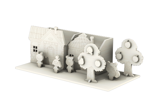
the render image without my graphic design is my passion glitter additions on it
#animal crossing#acnl#animal crossing new horizons#animal crossing villagers#lily#maple#marshal#isabelle#laser file#laser printing#ac#diy#art#hello its me the adhd hyperfocus that made this instead of my master thesis work thihi
13 notes
·
View notes
Photo


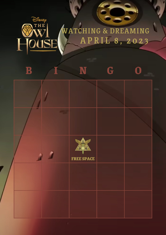


We’re a little over one week away from the finale! I made a set of Owl House bingo cards for For The Future, which airs this Saturday, April 8 at 9:25 PM ET on Disney Channel.
How to play: Download the picture and fill the blanks with theories, headcanons, and general predictions you hope will come true. I would recommend using a free design app like Canva to fill these out. (If anyone is looking for specifics, the dimensions are 8.5 x 11 in and I used the font Grenze.) Then, download your image and post it on Tumblr.
I would love to see everyone’s predictions, so please like or reblog this post if you’re planning to use any of these, and I’ll keep on eye on the tag “TOH Bingo” to see how people have filled them out. Additionally, if your bingo card includes references to potential spoilers or leaks, please tag them accordingly.
#watching and dreaming#the owl house#the owl house season 3#toh#toh bingo#toh spoilers#the owl house spoilers#luz noceda#amity blight#willow park#gus porter#hunter wittebane#camila noceda#the collector#king clawthorne#eda clawthorne#lilith clawthorne#raine whispers#emperor belos
291 notes
·
View notes
Photo

2023 May 8
The Spanish Dancer Spiral Galaxy Image Credit: ESA, NASA, Hubble; Processing: Detlev Odenthal
Explanation: If not perfect, then this spiral galaxy is at least one of the most photogenic. An island universe containing billions of stars and situated about 40 million light-years away toward the constellation of the Dolphinfish (Dorado), NGC 1566 presents a gorgeous face-on view. Classified as a grand design spiral, NGC 1566 shows two prominent and graceful spiral arms that are traced by bright blue star clusters and dark cosmic dust lanes. Numerous Hubble Space Telescope images of NGC 1566 have been taken to study star formation, supernovas, and the spiral's unusually active center. Some of these images, stored online in the Hubble Legacy Archive, were freely downloaded, combined, and digitally processed by an industrious amateur to create the featured image. NGC 1566's flaring center makes the spiral one of the closest and brightest Seyfert galaxies, likely housing a central supermassive black hole wreaking havoc on surrounding stars and gas.
∞ Source: apod.nasa.gov/apod/ap230508.html
112 notes
·
View notes
Text
Do you ship it?


Context: Togek is actually an acronym, That One Guy Everyone Knows, because trust me, you know a guy who looks and acts like this. Its always the extra short buzz cut, hairline an inch above the nape of his neck, the beard, let himself go quite a lot, yknow?
And, of course, he always has an ABSOLUTELY FUCKING BULLSHIT story for everything.
"Wait... you don't believe in marriage and don't wanna spend the money??? But me and my wife got married at 18, the entire ceremony including the dress and ring you see in the pictures were $3.99, we were homeless and living in our car together for two years and then bought our first house at age 20 back in 2018, how can you not afford it???? All I did was believe in love!!" fucking pussy
"You're struggling to get a job? But I graduated with two degrees in gender studies and engineering (only cost me half a million dollars btw, anyone can afford that), then the day after graduation I sent out ten job applications and got offers for all of them within a week and was earning 6 figures by age 22, how are you struggling to find work???? Its easy-peasy!" stupid latte-swilling ponce
"No way, you don't have the money for dating??? But I downloaded tinder on my 18th birthday, didn't spend a penny, and within a year I was married with a house and three kids, you're just an incel loser who is probably gay and can't get girls and doesn't believe in the magic of love and power of self belief like I do!" Oh, don't blink or you might miss your nose breaking, you utter lying dirtbag.
Soooo... why Lorenzo? Because he's a debt collector. And I think Togek and his absolute horse of a mrs would be a perfect match for a debt collector, if you know what I mean.
Lets talk about Togek in the comments, and tell me about someone like that who you know, if you want.
#poll time#shitpost#my polls#tumblr polls#crossover#shipping poll#polls#rarepair#crackship#shipping#original character
6 notes
·
View notes
Text
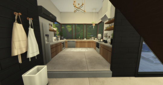
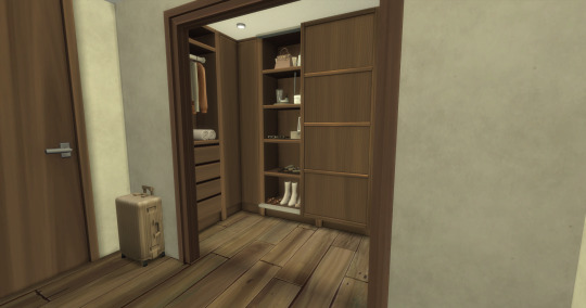
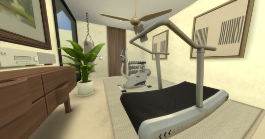
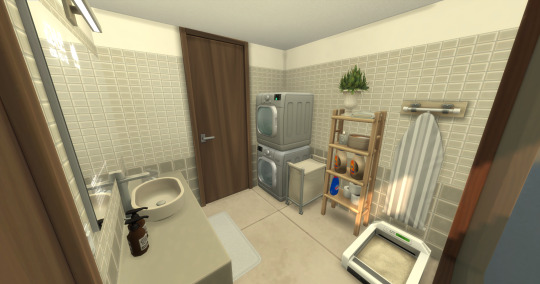
2-4-2 Wakabamori (RENO) Part 1
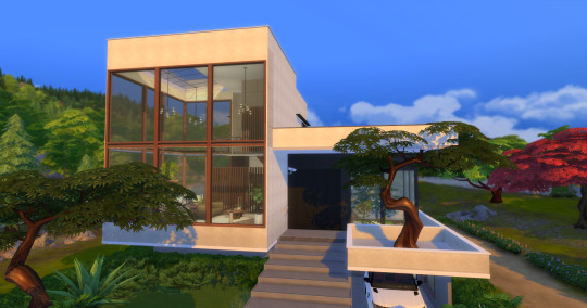
Hey Simmers,
I was inspired to rebuild the Yume household from Ashwarrplays "Yume Series". Please note I AM NOT THE ORIGINAL CREATOR OF THIS BUILD. I just took the time to find all the CC used for this build :)
All credit goes to these following creators:
House Shell Creator: EA - Alexasimi
Interior Creator: @Ashwarrplays TikTok
Sims 4 Pack's required for this lot: Snowy Escape, Cat & Dogs, Desert Lux Kit, Island Living, Bathroom Clutter Kit, Laundry Day Pack, Jungle Adventures, Seasons, Cool Kitchen, Spa Day, Bust the Dust Kit, Eco lifestyle, Growing Together.
You can find the build on my EA Name: zencreatorplays
MODS:
Grannies Cookbook - [04-06-2024 ] | Patreon
CC List:
Downloads — House of Harlix (Download ALL)
precious promises - collab with pierisim: download | Patreon
Small Spaces: Laundry Room (CC Pack for The Sims 4) | Patreon
The Sims 4 Chic Bathroom Stuff Pack | Patreon
𝓓𝓪𝓷𝓭𝔂 𝓓𝓲𝓪𝓻𝔂 part I | Patreon
𝓓𝓪𝓷𝓭𝔂 𝓓𝓲𝓪𝓻𝔂 part II | Patreon
Windex CC (located on shelf in laundry room) by mod creator has been removed from their Tumblr. I suggest Google a different cc pack for "cleaning supply cc" to replace this CC item.
windex leo-sim - Search Images (bing.com)
Simsational Designs: Hudson Bathroom - Collection of 31 New Items (Download ALL)
[DOWNLOAD] Fitness set | Patreon
DOWNLOAD - Wave Living | Patreon
(1) TINY STEREOS LIBERATED BY STEFIZZI Simfileshare (mirror) – @stefizzi on Tumblr
MCM House part 1 | Patreon
MCM House part 2 | Patreon
MCM House part 3 | Patreon
MCM House part 4 | Patreon
MCM House part 5 | Patreon
CEPZID Fitness Pack: https://www.patreon.com/file?h=68907168&i=11246635
OAK HOUSE part.1 - download link | Patreon
OAK HOUSE part.2 - download link | Patreon
OAK HOUSE part.3 - download link | Patreon
OAK HOUSE part.4 - download link | Patreon
OAK HOUSE Part5 - download link | Patreon
OAK HOUSE part.6 - download link 1/2 - updated | Patreon
OAK HOUSE part.6 - download link 2/2 | Patreon
[DOWNLOAD] Crossfit Reborn set | Patreon
Fitness cc sims 4 - Syboulette Custom Content for The Sims 4
Myshunosun - Dawn Living Set (Paintings) : https://www.patreon.com/file?h=61950933&i=10219795
• boho living stuff pack • | Patreon (Download ALL)
Jules bedroom set | Patreon
November 2021 Set (2) - Animal Lovers | Patreon ($ PAYWALL $)
Cluttercat CC (lilritualplate) Smudge Bowl w/ Sage : Sim File Share - Filehosting for Simmers
The Sims Resource - Advent 2022 - Lilies vase
Auntie Vera's Bathroom | Patreon
The Sims Resource - Retro Vibe Hanging Coat
The Sims Resource - Winter Choices - Ice skating boots
BABY BOO | Patreon
The Kerv Collection - Part 1 | greenllamas | Patreon
The Kerv Collection - Part 2 | greenllamas | Patreon
Domaine du Clos - part 1 | Patreon
Domaine du Clos - part 2 | Patreon
Domaine du Clos - part 3 | Patreon
Domaine du Clos - part 4 | Patreon
Rollers & Ice skates + Decorative Rinks & Skates at In a bad Romance » Sims 4 Updates
Hermès Kelly Bag - Decor - 9 colors - Find it... | S L Y D (retired) (tumblr.com)
Sierra The Simmer's CC Finds — bergdorfverse: Chanel 19 Bag & Round CC Sunglasses... (tumblr.com)
Bergdorfverse - Dior Street Chic Bag Hey everyone, here is a... (tumblr.com) ($ PAYWELL $)
Woody Tote Bag | Patreon ($ PAYWALL $)
Deauville Bag | Patreon ($ PAYWALL $)
Bergdorfverse - Versace Virtus Bucket Bag Hey guys, the Versace... (tumblr.com) ($ PAYWALL $) (use this to replace in game Versace bag that is inside the walk-in closet in bedroom)
soak - stuff pack: overview | Patreon
Master bedroom pack | Patreon
🧡Oran-Sandals 🧡(Deco) | Patreon ($ PAYWALL $) (Hermes slides that are at foot of bed in game & in walk-in closet)
(3) Balenciaga Bergarcia Set feat. Clepto by Cleo – @bergdorfverse on Tumblr ($ PAYWALL $)
lavish - stuff pack: download | Patreon
[DOWNLOAD] Agnes set (remastered cc) | Patreon
5# Simple Live Collection - Bathroom(10/6/23 Update) | Patreon
E N I O S T A . — tine. 45 new meshes. free. download (tumblr.com)
WINTER GARDEN | Patreon
WINTER GARDEN part 2 | Patreon
10 notes
·
View notes
Text
Sims 4 house -a high standard decoration modern mansion

Modern & Minimalist & Fashionable
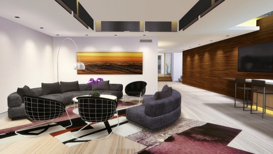
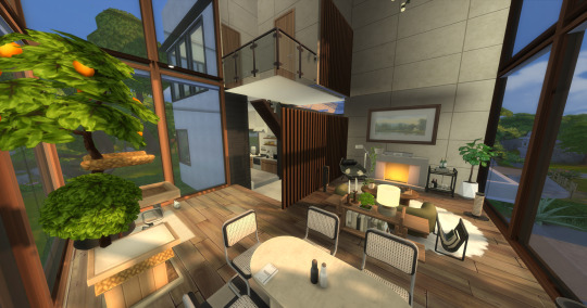
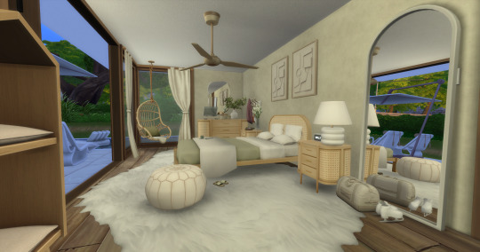
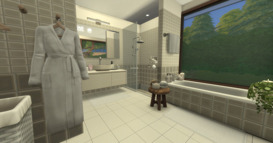
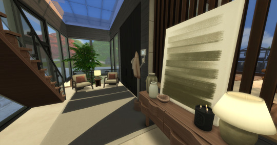
The 1307 Sierra Mansion is a modern luxury home with a unified style of ceiling decoration(The first person perspective of the ceiling is visible,and the third person perspective is not blocking the view), building materials, furniture, and decorative items specially crafted.
The vast majority of building materials, furniture, and decorative items in houses are meticulously modeled and tuned.They are both textured and fully functional, and are placed in the perfect position of the house,creating a modern spatial design that is very beautiful, exquisite, and fashionable.

Housing configuration

House Features:
Will not prompt for lost furniture items, what you see is what you get.
The exterior and interior decoration of the building are quite modern and fashionable, with textured furniture and specially designed ceilings. The first person perspective is visible, while the third person perspective is not.
The entire house has almost no overlapping objects putting, causing flickering of object textures.
The second floor of the building has two flowing water features. If a simulated citizen passes through this area, they will Walk on stone slabs, which will not create a strange water walking scene,and so on.
The interaction of furniture functions is very complete and will not block simulated citizens, resulting in inability to interact.
Almost anywhere you go to the house, you won't get stuck.
The elevator lobby can be conveniently and quickly moved between the third floor, saving a lot of time.
The basketball court theme can be modified in construction mode, providing 30 themes.
The vast majority of furniture has storage and placement function, and hangers can hang clothes.
Basketball Court
More styles

The floor texture, walls, and ceiling treatment here are excellent, and the lighting design has a sense of layering, creating a good sports atmosphere.
The house offers 30 basketball court themes that can be customized in construction mode.
Take A Look
More HD images of the house

Usage Information
Game version
Your game needs to be version 1.77.131.1030 or higher.
Packs
The house uses the following combination packages to ensure the integrity of the decoration effect.

For Windows only
This house only supports Windows systems.The usage of this house is the same as using a house in daily gaming, with a Mods folder and a Tray folder, it just the cc files of this house has been encrypted, and once unlocked with one click using the files unlocking tool, the house can be used.
House file size
1.87GB
Lot
64 x 64, recommended for placement inWindenburg
Download
Because the house file is a little large, so the house is stored in TearBox, which is a network disk service for free,using TearBox to achieve extremely fast downloads.
click here to download the whole house
Download
House Video
Here are my two YouTube videos of the house , one about the design of the space and one about simulating people interacting with the house.
youtube
youtube

#thesims4#sims4house#sims4housebuild#sims4cc#sims4ccfinds#sims4#sims4mods#sims4mansion#sims4modernhouse#sims4building#ts4#ts4cc#ts4 mods#Youtube#ts4 house
21 notes
·
View notes
Text
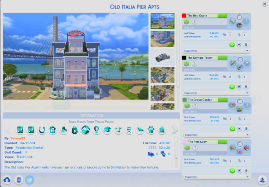
Old Italia Pier Apartments - (Anchorpoint Wharf - San Sequoia)
Residential Rental - 4 Multi-story Apartments + Shared Ground floor amenities.
"The Old Italia Pier Apartments have seen generations of people come to SimNation to make their fortune. Originally built to house an influx of Sims from the Old Country, it has played host to families from across the world. The final residents left knowing their former homes would tell their stories. The previously commercial ground floor was repurposed and now boasts a laundromat, pool complex, gym and hobby centre."
Sims 4 Gallery: https://www.ea.com/en-gb/games/the-sims/the-sims-4/pc/gallery/7ADA558610F54770BC00977979535727?category=all&searchtype=ea_origin_id&sortby=downloads&time=all&searchquery=Simmy93&max=50&maxis=false
A Tour of the Lot
The Exterior:
Designed to preserve the exterior design of the original property, the four apartments are accessed by two dedicated yards with trash access. The 'main street' of the now quiet pier was once host to hundreds of sims a day but is now a shared space for the tenants to enjoy some outdoor time together. The name 'Old Italia' is inspired by the patriotic paintjob left by the original inhabitants way back when the Pier was still an active fish market.


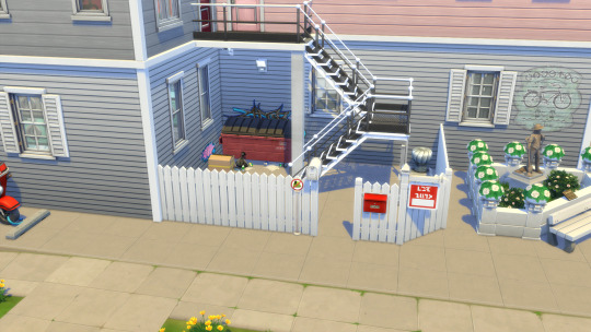
The Communal Spaces:
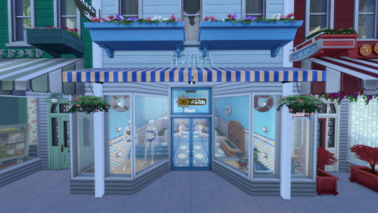
Although the outside of the former shops and services have remained unchanged, the interiors could not have changed more. Unlike the upstairs homes, the commercial property had no prospect of enduring and has since been repurposed for truly luxurious living.
Long Game Gym / Formerly Granny Beth's Bits n' Bobs
Once owned by the final inhabitant of the apartment above, Granny Beth's Bits n' Bobs was once the one stop shop for anything craft related in the local area. After a lucrative creative career Elizabeth 'Beth' McCann set about spreading her pink vision of the world. Unfortunately her rival and neighbour would have the last laugh as her grandson bought out the craft shop and replaced it with a gym inspired by his grandmother's domino aesthetic.


Adriatic Laundry Services / Formerly The Red Crane
Renowned as the best Asian cuisine this side of the Simissippi, the Red Crane was once the favourite spot of celebrities far and wide. Despite the fame, the owner never took advantage and became well known for his fair prices and wholesome family image.
Once attached to the apartments above, the Red Crane's kitchen still exists in the private residence and aspiring Chefs from across the country bid to stay for as long as they can, hoping they absorb some of that magic.
Now however, the once booming restaurant is providing services which removes grease from clothes, rather than contributing to it!


The Green Dragon / Formerly Bountiful Bouquets
Few people know, but San Sequoia used to be the source of many flower imports into SimNation, and no where else could the freshest and most exotic flora be found. Taking advantage of this luck was Bountiful Bouquets who it is said created the bouquets for a Royal Wedding!
Nowadays the shop has been converted into a community hobby centre; chess, painting, archaeology, woodwork and of course, flower arranging are available to any resident.


The Hidden Oasis / Formerly Giuseppe's Fishmonger
The heartbeat of the local economy was appropriately nestled in the middle of the main street trading in the best that came off the fishing boats. It was the only commercial endeavour that saw the start of the pier, and the end.
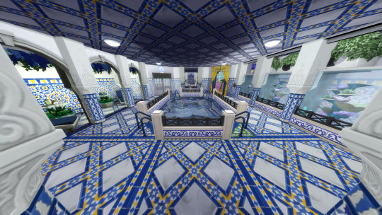
Afterwards it underwent the largest renovation of the four properties and was developed into a community pool. Decadence awaits you as you descend into a desert oasis amongst the busy suburban life. Equipped with pool, adult hot tub area and even a kids activity room, every member of the family can enjoy their day hiding from the desert sun.



The Apartments:
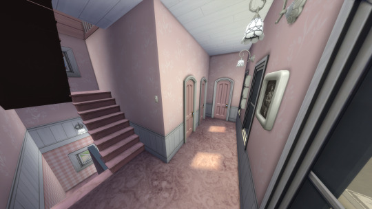
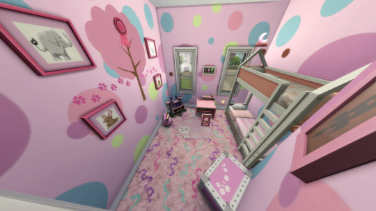
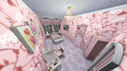
The Pink Lady - 2 bed, 1 bath. Unit Value: §75,628
One half of the most famous duo to be residents at the Old Italia Pier was Elizabeth 'Beth' McCann, a woman who it can safely be said, enjoyed pink. After a glittering career with her sister in the silent era of film she made the transition to the talkies, and then to colour films unlike her sister who seemed to be unable to keep up.
This lifelong resentment led to a bitter rivalry between the siblings, although most of it was aimed at Beth who for all intents and purposes was living her best life. Never marrying, Beth would adopt a son with her long time partner though they would later part ways causing scandal in the tabloids.
Tragedy would touch the McCann household despite Beth's happy disposition and she would end up raising her grandchildren after the death of her son and his wife necessitating some remodelling to accommodate such a lofty task.
No longer able to tread the boards or walk the red carpet, Beth consolidated her royalties and opened her 'Granny Beth's Bits n' Bobs' craft store and settled in for a quiet life.
The home has seen a lot of love, a lot of tears and a lot of knitting. It is perfect for an elder sim, or a small family of comfortable means.





#sims 4#sims 4 gallery#sims 4 residential rental#sims 4 resident#ts4 lots#sims 4 lot#ts4 simblr#the sims community
7 notes
·
View notes