#hiragana typography
Explore tagged Tumblr posts
Visit Tumblr Blog
Explore Tumblr blogs with no restrictions, modern design and the best experience.
Last Seen Tumblr Blogs


Fun Fact
The total number of visits Tumblr.com received during January 2021 is 327 million.
Text

多摩美術大学「オープンキャンパス」雑誌広告 A4変型
Magazine advertisement Tama Art University “OPEN CANPUS 2024”
#design#graphic design#graphicdesign#graphic#advertising#japanese design#japanese graphic design#japanese#japan#japan design#typography#japanese typography#kanji typography#kanji#hiragana typography#hiragana#black and white
4 notes
·
View notes
Text

January 13.
[1月 じゅう三日]
19 notes
·
View notes
Text
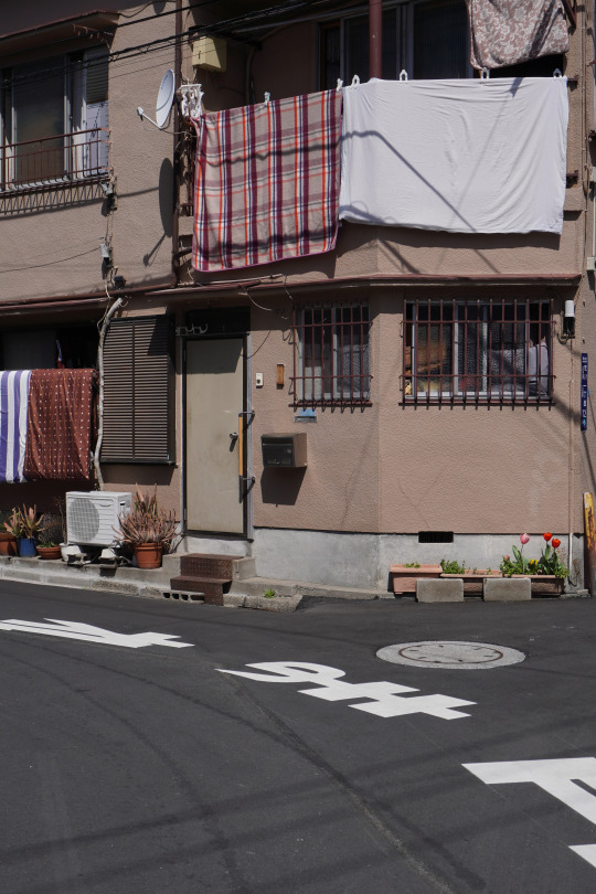
#architecture#japan#street#building#street photography#urban photography#urban#city#tokyo#urban landscape#facade#house#home#design#laundry#sunny#typography#signage#kanji#hiragana#streets#streetscape#street scene#city streets#cityscape#buildings#streetshot#urban life#urban exploration#東京
39 notes
·
View notes
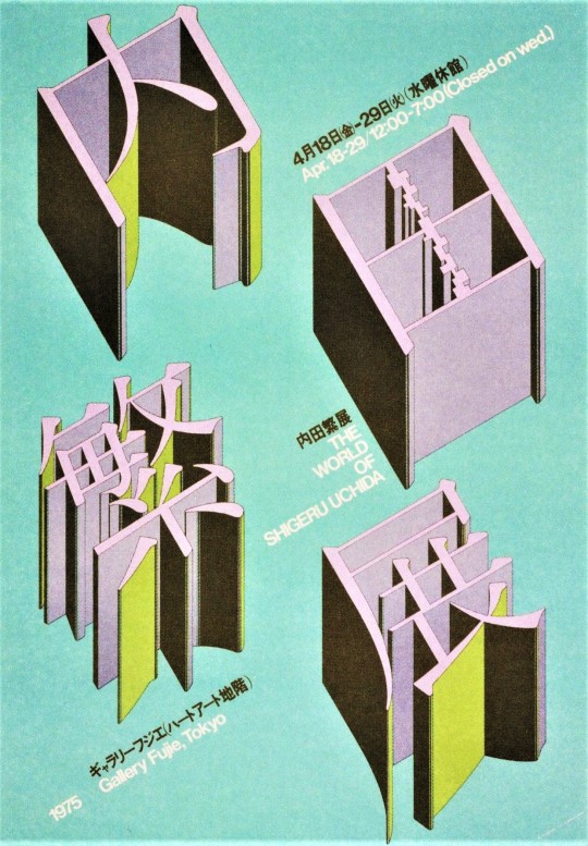
Text

ドウニデモナレ (Whatever)
1 note
·
View note
Photo


Typography Tuesday
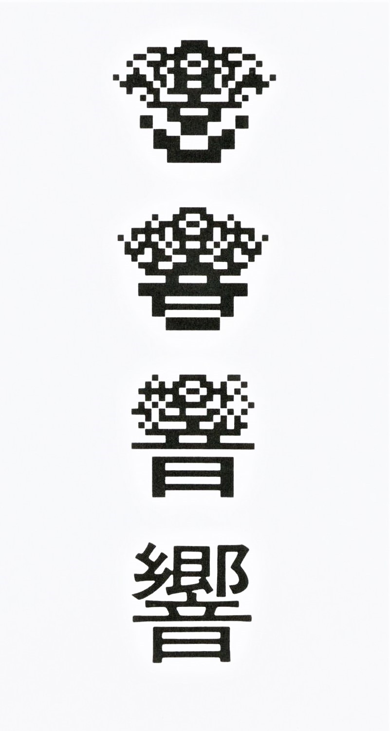
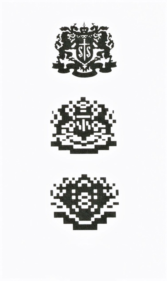
Japanese Dimensional Type
The Japanese sculptor and graphic designer Takenobu Igarachi is well-noted for his axonometric type designs. Igarachi is particularly fond of Roman letter forms, but today we are only showing designs based on Japanese characters from his book Takenobu Igarashi A-Z, published in London by Thames & Hudson in 2020.
The Japanese use four different kinds of characters: kanji imported from China; katakana and hiragana invented by the Japanese; romaji, the Roman alphabet from the West. Kanji are ideographs that use about 7000 characters on average. Hiragana are phonetic symbols devised by women of high society around the 7th to 9th centuries consisting of 50 letters. Katagana, a phonetic alphabet of 50 characters, was invented by Buddhist monks for reading sutra and is made of parts of kanji in simplified form. Comparatively, romaji, or Roman letters used for the Japanese language, is far more simple in shape and structure. In the first two images, Igarachi presents a variety of dimensional Japanese character's.
The last set of images are visualizations of the kanji character hibiki, derived from the Chinese character which means sound, resonance, or echo, representing the corporate philosophy of Igarachi’s client, the Japanese brewing and distilling company Suntory Limited. Working through various morphings of the kanji character, he arrived at what became the Suntory corporate logo. Later, Igarachi made a 3D version utilizing the arch, which was made into a sculpture that adorns the Suntory hall entrance.
View another post from Takenobu Igarashi A-Z.
View more posts on dimensional letters.
View our other Typography Tuesday posts.
#Typography Tuesday#typetuesday#Typography Tuesday#Asian American Pacific Islander Heritage Month#AAPI Heritage Month#Takenobu Igarachi#Takenobu Igarashi A-Z#Thames & Hudson#Japanese letters#Japanese type#kanji#Suntory#dimensional letters#dimensional typography#Asian American and Pacific Islander Heritage Month
43 notes
·
View notes
Text

Something I think that made this poster successful is the typography as well as the grunge texture on the font it self. The font is very unique, not too sure if that's hiragana or katakana or something else but the text seems squished which isn't a bad thing because from a non-Japanese person perspective it looks like a unique design.
1 note
·
View note
Text

This project was inspired by an interest to learn more about their families immigration history.
“Inari is a display typeface based on modular systems from non-digital mediums, such as tricot and embroidery,” Caio explains, showing respect for tradition and attention to tactility through an attentive consideration “to the ink flow they would have if written traditionally.” The modular typeface is written in kana, a Japanese hiragana and katakana phonetic alphabet and has a direct correlation to Japanese typography in its inspiration and form, cementing their “studies into practice,” and almost becoming a manifesto to return to in the development of their practice.
0 notes
Text
Dirtybarn Interviews Kenichi Kuromaru: Distinctive Approach with Shape, Detail and Typography

As Dirtybarn, we constantly search for great works, artists, and techniques. We love hearing about their experiences, stories, backgrounds because it gets easier to understand there is no definitive, single way to be a successful designer. Every designer, every creative has a different journey until they reach a certain recognition. We want to champion this idea and support whoever we can, we'll be pursuing a short interview series. Hope you will find something interesting for you in them. Our first guest is Kenichi Kuromaru. We enjoyed our conversation with him and hoped you would feel the same way! What is your background and how do you describe your progress so far? Kenichi Kuromaru: I was born in Morioka City, Iwate Prefecture, Japan, in 1985. When I was a student, I was positively affected by Shigeo FUKUDA who was one of the leading Japanese graphic designers. He uses a trick of the eye in most of his works. They are seemed to be configured simply, however, I think that we can enjoy his expression deeply due to it. After graduating from junior college, where I learned about graphic design, I started to work as a graphic designer in 2006. Now, I’ve been a member of homesickdesign LCC since 2018. I’m good at making a design with typography expression. One of my favorite expressions is mixing the Japanese letters and the Roman alphabet. As you know, Japanese letters consist of three letters such as Chinese characters, Hiragana, and Katakana. In addition, we use the Roman alphabet in our daily life. So, you may think that the culture of Japanese letters is complex. Based on this premise, I have tried to make a new impression with these Japanese letters. Furthermore, I have skills in geometric expressions and I have tried to make the volumetric representation with a 3D rendering application. I wanted to find a method to coexist with new and analog textures in advanced 3D expression. How do you find your own way to express yourself? And why do you choose this typographic vision in your designs? Kenichi Kuromaru: I think that most of my expressions are based on some ideas accumulated over the ages which have disappeared in the process of making one certain design at that time. After a while, I felt those rejected ideas were so fresh and better than the last time I saw them. In other words, I’m influenced by my own ideas when I make designs. The reason why I chose typographic visions in my designs is because I always hope people who saw them will be excited and stimulated through my works. To give an example, I try to focus consciously on both of clarity and ambiguity when I make typography expressions. In other words, I ask myself, “Do you intend to let someone read these letters as letters or as one figure?” In this way, I distinguish them and use effective ones depending on the projects. What are your priorities while working? Kenichi Kuromaru: In terms of making designs, I put my emphasis on the first impression. I mean that I often put my priority on simple ideas before planning certain concept works such as some keywords and sentences to describe that project. What is your primary source of inspiration? Kenichi Kuromaru: My primary source of inspiration is my commuting time in the morning, maybe. I use my car as transportation, so I look forward to passing a mountain path every weekday morning :) In addition, I think it is also important to have time so I can feel free to think or not think about something. In my opinion, however, this time doesn’t affect my work directly. What are your plans for the future? What is the next achievement you set for yourself? Kenichi Kuromaru: First, I hope to improve my skills in making 3D expressions and motion graphics. Secondly, I’d like to explore the measure of AI-powered design. At all. Thanks.

Poster, Arts Live Iwate 2021 Read the full article
0 notes
Video
高塚第一ビル por Fabian Reus
#Tokyo#Kameido#Japan#��戸#東京#Kanji#Hiragana#Katakana#Typography#Sign#Japanese#Japanisch#Fuji#Fujifilm#Finepix#X100
15 notes
·
View notes
Text
Anyone know typography that what's to talk about how to translate the typography design to japanese and chinese characters? It seems so restrictive
1 note
·
View note
Text


『Tokyo TDC Vol.35』本文デザイン
I designed the works page for “Tokyo TDC Vol.35.” If you see it in a bookstore, please take a look!
TDC年鑑の本文、作品ページのデザインを担当しました。
東京タイプディレクターズクラブによるタイポグラフィの国際コンペティション「東京TDC賞」。その入選作品を掲載した書籍です。
アートディレクションと表紙周りのデザインは立花文穂さん(かっこいい…)。
デザイン年鑑にしては小さな判型ですが、立花さんのディレクションのもと、文字も図版も大きくレイアウトし、良い仕上がりになっていると思います。
本の詳細はこちらをご覧ください LINK
また、昨年の年鑑『Tokyo TDC Vol.34』もお手伝いしていますので、あわせてご覧ください LINK
#design#graphic design#graphicdesign#graphic#advertising#japanese design#japanese graphic design#japanese#japan#japan design#typography#japanese typography#kanji typography#kanji#hiragana typography#tokyo tdc
2 notes
·
View notes
Text

January 20 [January はつか]
14 notes
·
View notes
Text

#architecture#japan#street#building#street photography#urban photography#urban#city#tokyo#urban landscape#kanji#typography#hiragana#signs#signage#house#facade#home#japanese architecture#architettura#architectural#streetscape#street scene#city streets#streetshot#cityscape#buildings#urban life#urban fantasy#city life
28 notes
·
View notes

Photo


A tshirt to be sold to raise awareness of the plastic pollution in oceans. All proceeds would go to an appropriate charity.
#urban#fashion#streetwear#tshirt#raising awareness#octopus#squid#kanji#hiragana#gfx#charity#photoshop#illustrator#typography#protect the reef#plastic ocean
1 note
·
View note
Photo

2 notes
·
View notes