#heibon punch magazine
Explore tagged Tumblr posts
Text
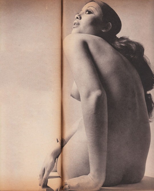
Yoshihiro Tatsuki - Mari Atsumi (Heibon Punch 1970)
#yoshihiro tatsuki#mari atsumi#heibon punch magazine#photography#vintage photography#vintage#retro#aesthetic#beauty#cheesecake#seventies#70s#70s model#1970s#pin up#pinup#pinup model#actress#editorial
1K notes
·
View notes
Text

Meiko Kaji (梶芽衣子) on the set of Battles Without Honor And Humanity: Deadly Fight In Hiroshima (仁義なき戦い 広島死闘篇), 1973, directed by Kinji Fukasaku (深作欣二) .
Scanned from Heibon Punch (平凡パンチ), April 30, 1973.
#Meiko Kaji#梶芽衣子#Kinji Fukasaku#Battles Without Honor and Humanity#Deadly Fight In Hiroshima#Yakuza Papers#仁義なき戦い 広島死闘篇#深作欣二#Heibon Punch#平凡パンチ#behind the scenes#scanned by me#magazine#close up
23 notes
·
View notes
Text
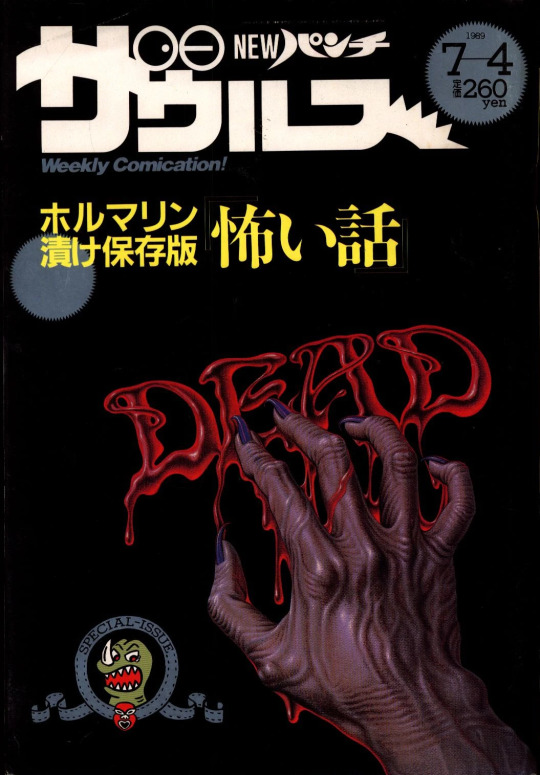
NEW Punch Zaurus (NEWパンチザウルス) / Magazine House (マガジンハウス) / 4th Jul 1989 issue
#vintage manga#seinen manga#80s manga#heibon punch#magazine house#issue month: july#NEWパンチザウルス#マガジンハウス
38 notes
·
View notes
Text
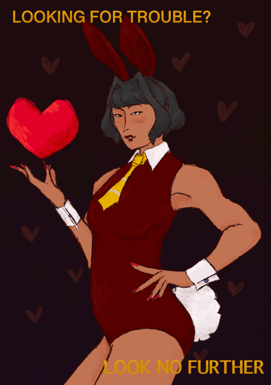
Valentine’s Day means I get to be cheeky and post ONE pinup
Refs and inspo below the cut (one of them is genuine riské so you’ve been warned
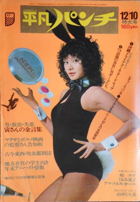
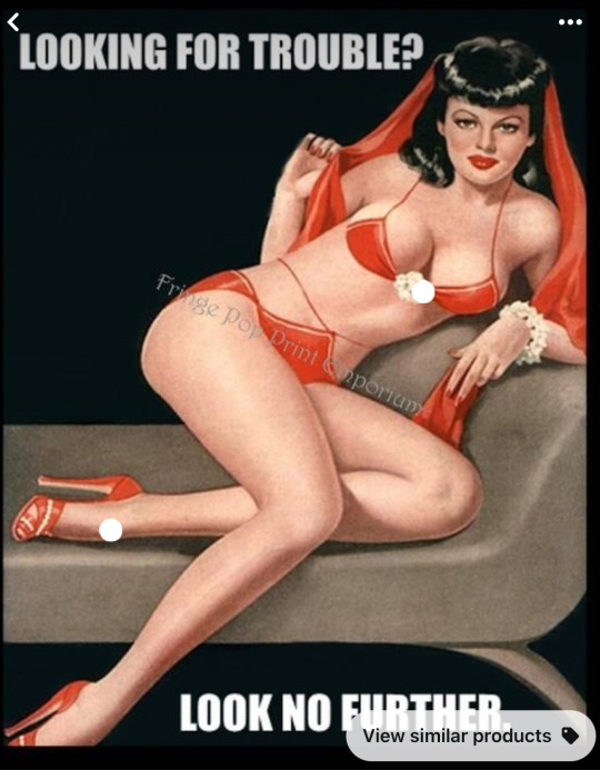
Both ripped from Pinterest but from what I can find
Bunny pic is from the magazine Heibon Punch and the December 10th, 1973/ No 448 issue
And
Text pic is an edited photo of a magazine cover called Beauty Parade (the world’s loveliest girls)
8 notes
·
View notes
Text
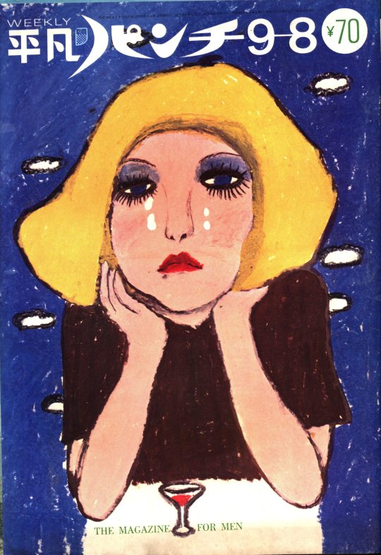
The signs as Heibon Punch magazine covers
Aries
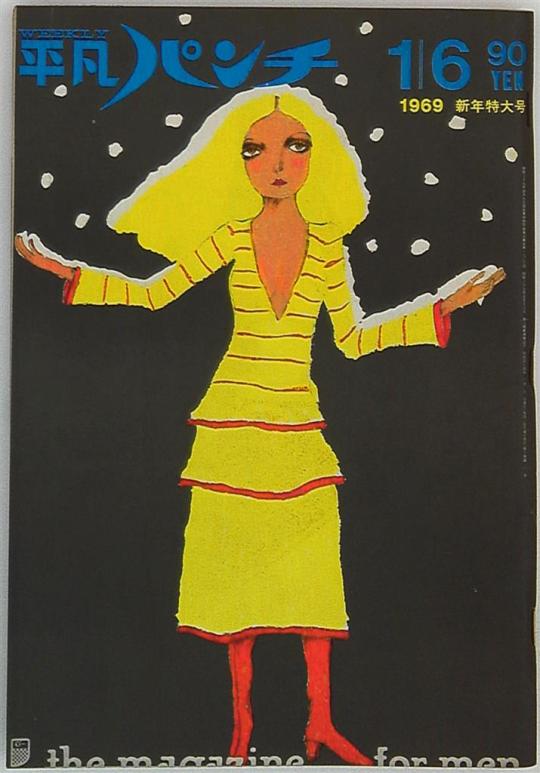
Taurus
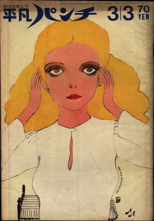
Gemini
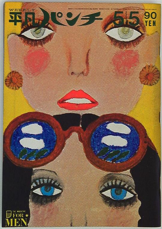
Cancer
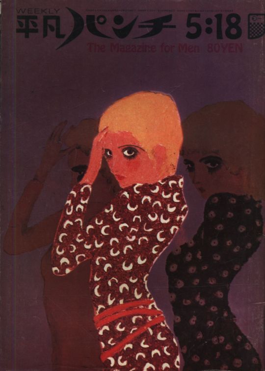
Leo
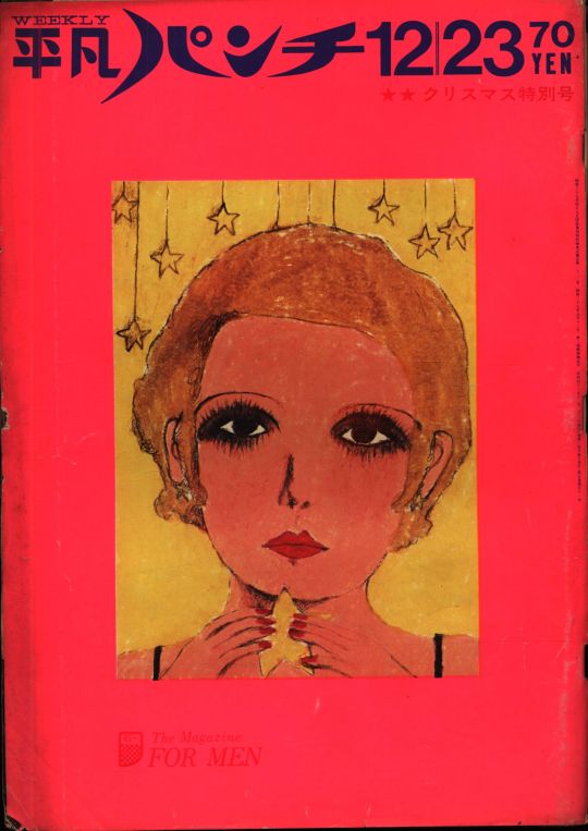
Virgo
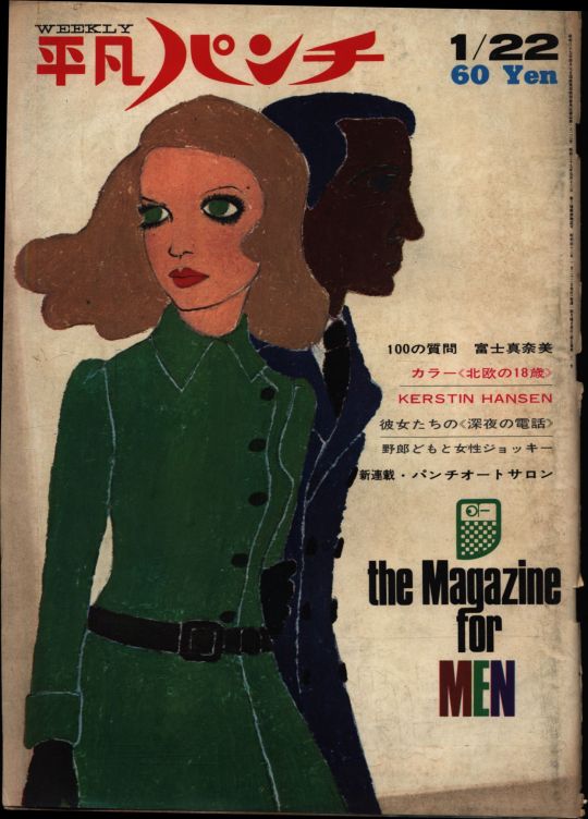
Libra
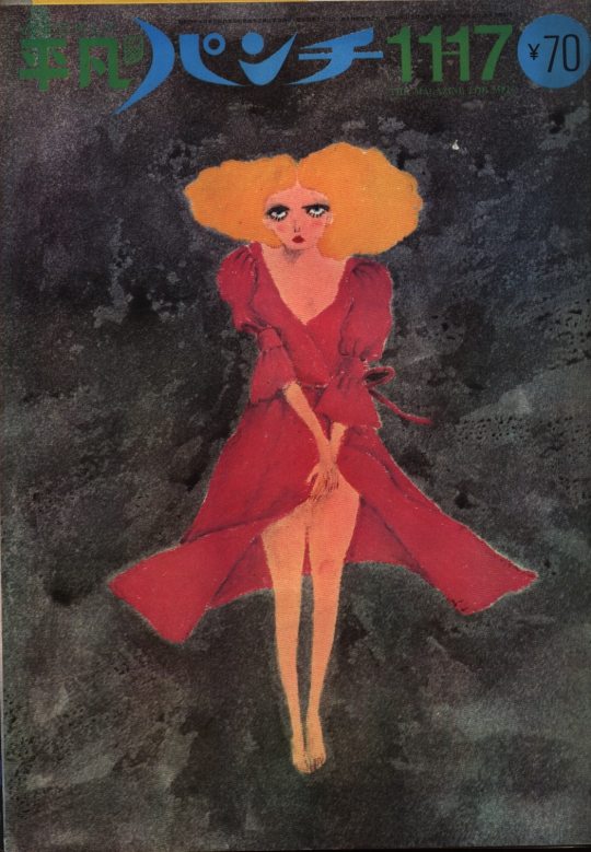
Scorpio
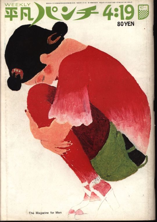
Sagittarius
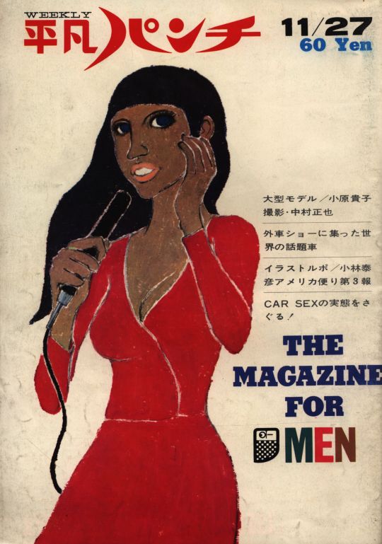
Capricorn
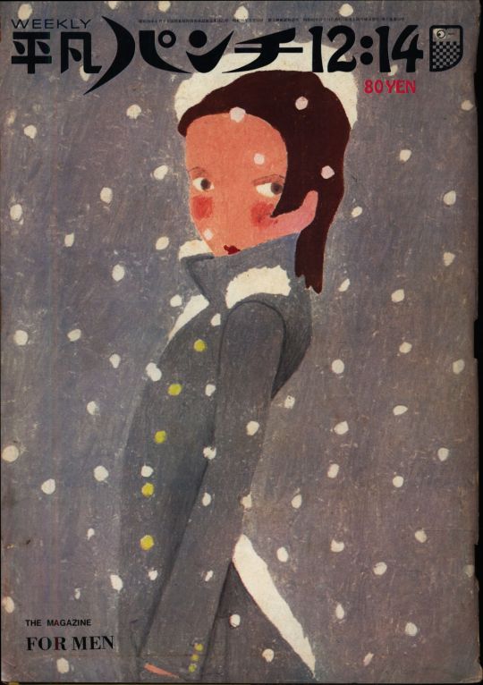
Aquarius
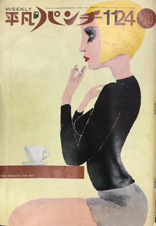
Pisces
13 notes
·
View notes
Text
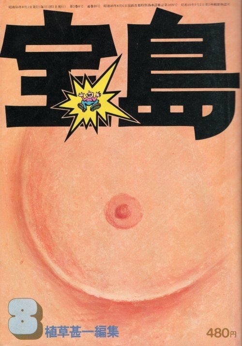
there is no more bra
Ayumu Ohashi - cover artist
Takarajima 1975 September Issue
“Ayumi Ōhashi (b. 1940) — née Kumiko Ōhashi — grew up in Mie Prefecture and moved to Tokyo to attend prestigious Tama Art University. A pupil of the cartoon illustrator Jun Kawahara, Ōhashi started to experiment with crayon pastels to draw young men in stylish clothing. After showing her work to Shōsuke Ishizu at VAN Jacket, Ōhashi contributed to Men’s Club for several issues under her real name Kumiko Ōhashi.”
“Her big break, however, came in 1964 when she was tapped to draw the cover each week of new tabloid for young men Heibon Punch. In consultation with the editors at Punch, Ōhashi decided to go with the gender-neutral “Ayumi” as a pen name.”
“Ōhashi changed her signature style in the late 1960s but continued to make some of the most memorable illustrations in the Japanese magazine market. She drew the covers of underground magazine Takarajima, even parodying her early Punch work with a post-hippie mustached update.”
-
0 notes
Text

Etsuko Shihomi cover of Heibon Punch #640
#刊平凡パンチ#Heibon Punch#Etsuko Shihomi#志穂美 悦子#japanese movies#japanese magazine#japanese magazine cover#magazine cover#japan action club#jac#sister street fighter#japanese martial arts#japanese cinema
18 notes
·
View notes
Photo


#ametora#japan#menswear#ivy league#miyuki-zoku#art#illustration#design#fashion#subculture#americana#60s#vintage advertising#princeton#japanese#heibon punch magazine#heibon#ayumi ohashi#modculture
7 notes
·
View notes
Text


Toshio Saeki's JAPON INTIME is the fourth book of Saeki Toshio published in 1990年 by Albin Michel.
In 1990 Saeki-san became more and more popular in Japan because his drawings can be seen in many underground magazines like SM sniper, Heibon punch .... Saeki-san became known in France because Romain Slocombe (who love Saeki artworks) work with Albin Michel and published « japon intime » .« Japon intime » was the first Saeki’s book published outside japan. This fourth book is coming 18 years after is third book ( Akai Hako) which was quite long ! The content of this book is different from the 3 first ones. We can clearly see the evolution in his work, he improved his style a lot.
Here the first Edition, Hardcover book. French language. Size: 22×30 cm. Total 94pages. Colored illustrations.
Condition : good condition.
Price : €200 + shipping.
30 notes
·
View notes
Photo

Tokyo fashion stylist and late night 1970s club goddess Miro Horikiri 堀切ミロ here in Heibon Punch magazine 1971.
14 notes
·
View notes
Photo
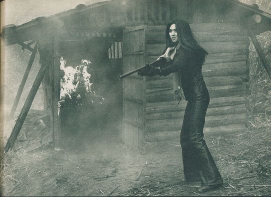
Meiko Kaji (梶芽衣子) in Jeans Blues: No Future (ジーンズブルース 明日なき無頼派), 1974, directed by Sadao Nakajima (中島貞夫).
Scanned from Heibon Punch (平凡パンチ), April 1st, 1974 .
#Meiko Kaji#梶芽衣子#Jeans Blues: No Future#Sadao Nakajima#Jeans Blues#Heibon Punch#ジーンズブルース 明日なき無頼派#中島貞夫#平凡パンチ#scanned by me#press photo#jeans gun#magazine
238 notes
·
View notes
Text
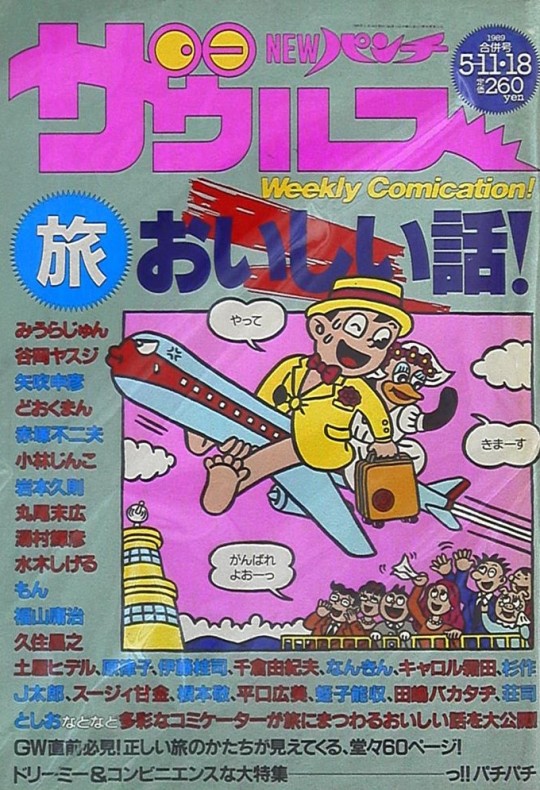
NEW Punch Zaurus (NEWパンチザウルス) / Magazine House (マガジンハウス) / 11th May 1989 issue
#vintage manga#seinen manga#alternative manga#80s manga#magazine house#heibon punch#NEWパンチザウルス#マガジンハウス#issue month: may
19 notes
·
View notes
Photo


フランシス・F・コッポラ vs 五木寛之 平凡パンチ 1980年 3月3日号
FRANCIS FORD COPPOLA vs HIROYUKI ITSUKI on HEIBON PUNCH MAGAZIN 800 3.3 1980年
1 note
·
View note
Text
The Popeye Revolution (Part 1)
Launched in 1976, male fashion magazine "Popeye" changed urban fashion forever, helped turn Tokyo into a global city, and put "city boys" in Japanese publishing history.
How US Counterculture Changed Japanese Fashion (Part 1)
How US Counterculture Changed Japanese Fashion (Part 2)
Jiro Ishikawa and Yoshihisa Kinameri consolidated their names in the publishing industry after their stint as editors of the highly-influential young men’s weekly Heibon Punch.
Punch was launched in 1964 and became a phenomenon right out of the gate. Still, due to a changing landscape and increased competition, it suffered a significant drop in circulation by the next decade.
Trying to avert a crisis, Heibon Shuppan, the editorial house, decided to overhaul the title and renew its editorial team. As a consequence, Ishikawa and Kinameri left to pursue freelancing gigs. But, after the massive success of their fashion and lifestyle mooks, “Ski Life” and the seminal “Made in U.S.A. Catalog,” both were welcomed back with open arms. And a sweetheart deal: total creative control to develop their fashion and lifestyle publication for Heibon.
The resulting project is their most enduring legacy in publishing: men’s fashion and lifestyle magazine Popeye. Launched in 1976, Popeye is still in print and remains an influential and highly-regarded publication.
Over its 45-year existence, Popeye has sparked numerous trends and has played a direct role in shaping Japanese fashion history. While its editorial guidelines have occasionally shifted to keep pace with changing times, the original vision of the founding team has proven timeless, and Popeye consistently returns to its initial concept: serving as a guide for "city boys."
The City Boys
In the Japanese fashion media industry, it's not uncommon for rival publications to draw direct inspiration from each other. For instance, JJ popularized and massified the "newtra" style, but AnAn first identified the trend and coined the name. Likewise, the "city boy" concept is linked to Popeye magazine, which was launched with the "magazine for city boys" slogan. But it was actually the counterculture title Takarajima that first introduced that term.
Takarajima relaunched itself with “The Manual for Cityboys” slogan in its January 1975 issue. The “city boy,” as defined by the magazine, is someone born and bred in the big city. It is also someone who is “indirectly good at shopping,” meaning someone who doesn’t produce the goods but simply spends money to acquire them.
The concept was a perfect fit for Ishikawa and Kinameri’s vision. Building on the success of their “Made in U.S.A.” mook, they aimed to use their new publication to keep influencing Japanese youth fashion and lifestyle choices. But, instead of deep America, they opted to focus on urban life for their current project. The U.S., however, was still their primary source of inspiration.
Starting with the magazine name, a homage to the iconic American cartoon character. Ishikawa wanted to call the publication “City Boys.” The idea was nixed because the term was already prominently on the cover of Takarajima. Kinameri suggested “Popeye” because he loved how the word split into “pop eye.” Keeping an “eye” on what’s “pop” was one of the magazine’s goals. Ishikawa thought it was a silly idea, but Kinameri successfully negotiated the rights with the American copyright holders. In June 1976, the first issue of “Popeye,” the “Magazine for City Boys,” hit stores across Japan with its namesake character illustrating the initial issue’s cover.
Interestingly, the appearance of the "city boys" branding on a rival publication did not seem to bother the Takarajima team. Both magazines' editorial teams were part of the same media clique, and several of their writers and editors would eventually collaborate with Popeye. However, fundamental differences emerged between the two publications, first evident in their respective interpretations of the "Whole Earth Catalog." While the Popeye team created the "Made in U.S.A. Catalog," the Takarajima crew authored the philosophical "Zen Toshi Catalog."
Moreover, the 1970s version of Takarajima magazine took an anti-establishment stance, covering counterculture topics and criticizing imperialism and capitalism. In contrast, Popeye focused entirely on shopping and lifestyle, with capitalism at its core. While its editors and writers were critical of American politics, most of the magazine's preferred way of life was directly inspired by the United States.
In many ways, Popeye and the confrontational Takarajima embodied a common contradiction among a segment of Japanese urban youth at the time: a critical perspective on the USA combined with an intense admiration for its culture.
There was no running away from Uncle Sam.
The Catalog Format
One of the key factors contributing to the tremendous success of the “Made in U.S.A. Catalog” was its innovative format, which emulated a traditional American mail-order catalog. This layout was well-received by the public and was adopted by every Japanese fashion magazine. Even today, the catalog-style design, featuring pages filled with products displayed side by side along with their prices and shop listings, remains an integral element of visually-rich fashion publications.
As two of the minds behind the “Made in U.S.A.” boom, Kinameri and Ishikawa are considered the pioneers of what became known as the “catalog magazine” format. And, of course, the style was present in Popeye from its inception. A segment Heibon Shuppan was heavily courting loved it: advertisers.
During this period, Heibon Shuppan, the publishing company, had only recently become receptive to advertising. Its founder and honorary chairman, Tatsuo Shimizu, had previously regarded advertisements as a nuisance and likened it to prostitution. He believed profits should come solely from sales.
However, Shimizu was compelled to reconsider his stance after the launch of AnAn, a women's fashion and lifestyle publication. AnAn required additional funding to support its larger format, costly editorials, and high-quality paper. Before that, Heibon Shuppan considered relying on ad money a foreign, Western model. But AnAn was, after all, initially inspired by a Western title: French Elle.
AnAn established that a fashion magazine needed ads and that they made a significant contribution to profit margins. Plus, why shun publicity money when the goal of a fashion magazine is to ultimately fuel sales of fashion goods?
Stimulating materialism was something that Popeye was successful in doing, asserting itself as a very influential publication. It's intriguing to reflect on the fact that the origins of everything it encompassed— "Made in U.S.A.," the catalog magazine format, and Popeye itself— can be traced back to the anti-materialism ethos of the "Whole Earth Catalog."
In January, W. David Marx, who had already explored the subject in his book “Ametora,” wrote about the impact of the “Whole Earth Catalog” on Japanese fashion magazine design and rampant materialism for a newsletter. The article reached Stewart Brand, the visionary behind the iconic magazine-catalog hybrid. Brand wrote an e-mail to the founding editor of WIRED Magazine, shared by the editor of its Japanese version:
Knew what I was doing, I did. Know what it might foster, I didn’t. —Stewart Brand
It was his way of saying that, while he was confident in his mission, there was no way he could predict or control how his idea and messaging would be received.
The West Coast Boom
Like other fashion titles, Popeye was criticized for fetishizing consumerism and indoctrinating the youth with thoughtless materialism. It was, after all, a “catalog magazine.”
However, to be fair, early Popeye transcended mere catalog status. While material goods were everywhere on its pages, the magazine delved extensively into contemporary culture. Like the "Made in U.S.A. Catalog," the editorial team painstakingly documented every aspect of the lifestyles associated with the featured products.
The first spotlighted lifestyle in Popeye was intimately connected to the editors' personal interests: the so-called "American outdoor boom." During their visits to the United States in the early 1970s, the Popeye team observed how Americans were embracing healthier living, engaging in new physical activities, and connecting with nature. These observations were the driving force behind both "Ski Life" and the "Made in U.S.A. Catalog." For the debut issue of Popeye, they decided to explore what they believed to be the epicenter of this outdoor lifestyle: the West Coast. They embarked on a 50-day journey to thoroughly explore and research California.
“In Los Angeles, people looked happy and cheerful,” recalled Kinameri to the L.A. Times four decades later. “It was magical; it was like heaven.”
Popeye’s editors believed that, while there was darkness in America, still recovering from the Vietnam War and Watergate, youth culture stood as a unique source of hope. L.A. youth culture, in particular, exuded energy, vitality, and health. In contrast, young people in Japan seemed to be adrift, filling their lives with tobacco and alcohol.
In Popeye’s opening note, Kinameri wrote that he wanted to introduce his country to a more health-conscious lifestyle. He shared his belief that all free time should be used on sports.
As a result, sports are prominently featured throughout the magazine's inaugural issue. This included the introduction of a novel form of exercise, "jogging," which had captivated Americans but was relatively unknown in Japan. The magazine not only provided a step-by-step guide on how to jog but also offered a detailed introduction to the running shoes favored by Americans, particularly Nike sneakers, a brand not yet available in Japan. The Nike Oregon waffle sole model was featured, sparking immediate interest in the brand.
Continuing with the catalog-style pages, Popeye's debut issue included a "West Coast Skateboard Catalog" feature, showcasing 31 skateboards. The magazine also featured an interview with the legendary Jeff Ho, owner of the Zephyr store, and photographed numerous young Californian men showcasing various styles and skateboards akin to a street snap feature.
The All-Japan Skateboard Association points to Popeye’s coverage as a historical turning point for the sport in the country. The skateboard became a must-have accessory for trend-conscious young men, and skating parks multiplied nationwide. Besides jogging and skateboarding, hand-gliding was the other highlighted sport.
The first issue also extensively covered life at what was then considered the most traditional university in California, UCLA. Popeye dedicated 27 pages to detailing students' fashion, dorm rooms, and various aspects of campus life in Los Angeles. This coverage sparked a UCLA craze in Japan, with anything bearing the university logo, from sweatshirts to T-shirts and shoes, becoming highly coveted. For years, the campus store had Japanese signage and interpreters to accommodate the influx of Japanese tourists.
Fashion-wise, Popeye spotlighted polo shirts as fashionable items, challenging the perception of these shirts in Japan, where they were primarily associated with middle-aged golfers. The editors presented a different pitch, emphasizing their popularity among West Coast college students. This shift in perception transformed the Lacoste alligator logo into a symbol with an entirely new meaning for trend-conscious Japanese youths.
Other features on the West Coast-themed edition included pictures of beautiful and stylish sunkissed California girls and pages focused on the L.A. Lakers and the city of Santa Barbara. Yasushiko Kobayashi collaborated with an illustrated California Report, sketches of Californian fashion and architecture, and a detailed map of Westwood Village, the primary shopping and leisure district in Westwood, where UCLA is situated.
Growing Pains
While the inaugural issue of Popeye left a lasting impact, it didn't achieve significant sales success. In fact, it experienced quite the opposite: half of the initial 160,000 copies were returned by retailers. The relatively high price tag likely played a role, as it retailed for 740 yen, nearly double the cost of an average fashion magazine then. Heibon Publishing might have drawn encouragement from the fact that the "Made in U.S.A. Catalog" sold out its initial printing despite an even higher price (1,300 yen). However, "Made in U.S.A. Catalog" had a clear and straightforward concept, marketed as a "mook." In contrast, Popeye was a fashion magazine with a title inspired by a cartoon featuring said character on the cover.
Nonetheless, Popeye's launch was successful in many respects. It introduced a format that pleased advertisers and catalyzed trends, directly influencing people's fashion preferences. In essence, it fulfilled all the expectations of a fashion magazine. Moreover, although its initial readership was relatively small, the publication attracted a valuable demographic: affluent teenagers. These rich teens not only had the means to travel abroad but often played a pivotal role in setting fashion trends.
Popeye's editors experimented with the magazine's format during its initial volumes. They published only three seasonal issues (Summer, Spring, and Winter). The second issue, which featured a more affordable saddle binding as opposed to the wireless binding of its debut, was priced at 380 yen, much closer to the average magazine price. This issue promoted a more mature style, highlighting trends and showcasing stylish New York and Paris boutiques. It also introduced the iconic "Pop Eye" general news feature.
The Winter edition was even more affordable: 240 yen, which would become the magazine's standard price in its first few years. It featured the New Balance sneaker, which would become a staple in Japan and was the top choice for running, as determined by Runner's World Magazine. An interview with Gianni Versace, who was visiting Japan and was photographed wearing a Lacoste polo, was also included. Under the "Popeye Fashion Labo segment," fashion editor Katsuhiko Kitamura proposed a style defined as "WILD-CHIC," a chic way to wear American outdoor wear/heavy-duty fashion. The opening picture shows a model wearing a Ralph Lauren tweed suit underneath a Woolrich mountain parka, which left a significant impression on fashion-conscious young men.
By 1977, Popeye had demonstrated its commercial viability and transitioned to a bi-weekly publication. It achieved its sales goal of 300,000 copies by the 55th issue. As the 1980s dawned, its circulation surpassed 500,000 copies.
U.S. Psy-op
In its first six years, Popeye's idealized lifestyle revolved around sports and stylish city boys. The magazine provided tips on where to dine, shop, and socialize in iconic cities such as Paris, California, New York, Milan, London, and, of course, Tokyo. It placed a strong emphasis on sports, including baseball, surfing, tennis, skiing, motocross, hockey, American football, jogging, and frisbee.
Moreover, Popeye was committed to explaining what to buy and why. It delved into the technical details of products such as Nike, Adidas, or Converse sneakers, Levi's denim, leather flight jackets, sweaters, and mountain parkas. Unlike some mainstream women's fashion magazines that often followed fleeting trends, men's publications like Popeye greatly emphasized understanding the historical context of fashion trends. The quality and materials of fashion items were analyzed in-depth, setting a high standard for fashion coverage.
Above all else, Popeye was infatuated with the United States. It dedicated entire issues to exploring various facets of American culture. There were issues focused on “the other West Coast” (Seattle, Portland, and Oregon); how to best enjoy Hawaii or Guam; Gibson guitars; American sci-fi; the dancing and club culture in N.Y.C.; the technologically advanced amusement parks around the U.S.; U.S. road trips, the American campus culture. It reported on what the cool American kids were listening to, what movies they were watching, what cars they were driving, and what sports they were playing. Because yes, even the sports coverage was very tied to the U.S.A.: hockey, American football, motocross, frisbee, jogging, and U.S. baseball.
The fixation on the U.S. was reflected in the ads. A 1977 advertorial for Puma sneakers, a German brand, highlighted its West German technology in small letters while prominently proclaiming, "Puma is taking over America." Nothing was more important than the approval of the American youth. A 1978 ad for the traditional American menswear brand J Press had no image of clothes. Instead, it had a striking picture of coffee splashing out of a cup, with the copywriting noting that a diluted coffee can not be called an Americano. Thus, the ad emphasized the retailer's authentic American roots and took a jab at its local Ivy fashion competitors. (Curiously, J Press has been a Japanese-owned brand since 1986 when its Japanese licensee, Onward Group, acquired it from its American owners.)
All this fervor for the U.S. led some to speculate: Was Popeye receiving funding from the C.I.A.? Was it part of a "psyop" operation to counteract Japan's negative perception of the U.S. and contain the Marxist tendencies among Tokyo's youth? Popeye's debut issue even credited "the support of the American Embassy of Tokyo United States Travel Service," fueling years of conjecture and debate. Speculation ran rampant, even within the magazine's own staff. Some pointed to Popeye's predecessor, the "Made in U.S.A. Catalog," published by Yomiuri and owned by media mogul Matsutaro Shoriki, who was alleged to have worked as a C.I.A. operative and used his newspaper as a conduit for the organization's messaging.
Still, by the time “Made in U.S.A. Catalog” was published, Shoriki had been dead for over five years. And both Ishikawa and Kinameri have always denied interference of any kind. The U.S. Embassy did give logistical support for the magazine staff’s travels. But the bills were footed by airlines and trading companies hoping the features would motivate Japanese youth to travel abroad or buy imported goods domestically.
The magazine definitely had a role in improving the U.S. image in Japan. But the CIA probably didn’t need to get involved because the editors had a genuine passion for the vibrancy of U.S. culture at that time. Kinameri came of age during the American occupation of Japan. As a young teen, he’d pass in front of the soldiers stationed in Shinjuku and admire how cool they looked. They had neat clothes, and their helmets and weapons were shiny and impressive. “There’s no way we could win that war against them,” he’d think. His passion deepened when he discovered jazz and other imported music.
And when he traveled to the U.S., the stylish, health-conscious youth stood in contrast to Japanese teens. In Japan, he perceived young people as having a narrow outlook on life, dressing in a boring way, and spending all their time drinking and smoking. Ishikawa agreed, often saying, “Let’s all just become Americans!”.
But Japan didn’t become America. And it doesn’t want to. In 2022, Japanese people generally hold a positive view of the U.S. and consider it an ally. Right-wing neoliberal ideals are widely accepted in society. Therefore, the C.I.A. likely has no cause for concern in this regard.
Conversely, the local population no longer views the U.S. as a stylish paradise or a place where they aspire to live. Quite the opposite: interest in international culture has waned in recent decades, with Japanese people increasingly turning inward. Even those with a more cosmopolitan outlook do not necessarily believe traveling abroad is essential to experience the latest trends. While there remains a level of admiration for the U.S., it is no longer solely perceived as the "land of prosperity" or "cool fashion," but also as a place with issues such as mass shootings, violence, and significant inequality.
Plus, Japan made American and European fashion their own, and Tokyo is now accepted as one of the trendiest cities on the planet. Anything a trend-conscious Japanese can wish to buy or taste can be found there.
In many ways, Popeye furthered VAN’s original mission. The pioneer of Japanese Ivy fashion used American fashion to create a local, highly influential style. Tsuneo Uchikasa, scouted by VAN’s public relations office before joining Popeye’s staff, claims the magazine went a step further. It uses American fashion, goods, and lifestyle to create its own culture. A culture that is, after all, Japanese.
Today, Tokyo has surpassed every other major international city as the perfect playground for city boys (and girls). And Popeye was an essential element for that to happen.
Record of Youth
Popeye and its predecessor, "Made in U.S.A. Catalog," owe much of their inspiration to the "Whole Earth Catalog." Despite their distinct characteristics, all three publications shared a common objective: chronicling their era. In the late 70s, Popeye took its mission very seriously, even referring to its past issues as a "record of youth," a way to keep track of what was cool and desirable. So while material goods were everywhere in the magazine, it also had issues centered on the biggest movie of its time ("Star Wars") and musical icons (Mick Jagger, Bob Dylan).
Before the advent of the internet, Popeye served as an invaluable source for understanding global youth culture. Despite the limited resources and language barriers of the time, the editors had a remarkable talent for identifying international trends in real-time. They frequently traveled, navigated unfamiliar cities using the Yellow Pages, and enlisted locals, typically young individuals with some proficiency in Japanese, as guides.
Popeye also filled its team with young staffers, often still in university. It was a way to certify the magazine reflected the language and outlook of young people.
And speaking of language, editors encouraged writers to be creative and bold to catch the reader’s attention. One memorable example is when, in the mid-80s, freelance editor Toshiyuki Sai wrote that, in terms of softness, New Balance 1300 sneakers, newly launched in Japan, were equivalent to “Momoe’s lips.” Momoe Yamaguchi was the most iconic idol singer of the 1970s, known for her plump, beautiful lips. That description made an impact and is cited as one of the fuels of New Balance’s explosive popularity in Japan.
Finally, another impactful aspect of Popeye was its art direction, which, like AnAn, was under the responsibility of the legendary Seiichi Horiuchi. Horiuchi's layouts and designs have proven to be timeless. Although he passed away in 1987, Popeye, like all the other Heibon magazines he visually curated, has retained Horiuchi's signature style, logos, and minimalist cover designs. The publications from this publishing house are regarded as reference points in contemporary magazine design. Maintaining the essence of its 1970s layout while still being considered "contemporary" is a testament to the enduring quality of his work.
Horiuchi, Ishikawa, Kinameri, and the rest of the staff fulfilled the mission of creating a “record of youth.” They were so successful that, by the end of the 70s, direct competition began to emerge…
Next: Part 2
15 notes
·
View notes
Photo

Japanese band Blues Creation in 1971. From the magazine Heibon Punch and their Who’s Who of Japanese Rock issue. The band were managed by Yuya Uchida.
16 notes
·
View notes
