#had a lot of fun with the panel layout and overlap in this one
Explore tagged Tumblr posts
Text

Poisoned Memories, Chapter 10 - The Ares scientist Garu Orochi introduces Kioku Kyuurei to his daughter, but Kioku's not too thrilled about the whole thing.
#garu's daughter reveal!!!!#had a lot of fun with the panel layout and overlap in this one#drawing#artists on tumblr#drawings#manga#anime#artist#mangaka#original character#rkgk#original character art#oc#ocs#original characters#oc art#kioku kyuurei#garu orochi#takano meyden#myrios illustration project#myrios series#poisoned memories#book illustration
9 notes
·
View notes
Note
For comics, what is your work process like? How do you get from idea to a finished comic?
HELLOOOO OAAA omg this is a tough nut to crack as im a pretty chaotic writer in that way...... i think it depends whether i'm creating longform or shortform, i actually recently talked abt this elsewhere so i can bring an example based on the sylvanian discourse comic as shortform! long post with sketch pages and thumbnails etc ahead, ill put it under a cut! 🧡🧡
usually i start by jotting down really loose ideas which i do in my native language; ill translate it for you but i sent myself a mad scientist-esque message that went like: "kohaku giggling at his phone, rinne asking what's so funny and kohaku tells them that love assigned them sylvanian families creatures, and shows them. niki's is obvious, everyone agrees. same with kohaku's, plus rinne does pleading face emoji at how cute it is. rinne's critter could get criticism on being uncool? google. himeru's reaction to his own is no way.. himeru is this one and shows a pic on his phone to which everyone is like ..:3 himeru we didn't know you'd thought about this already but himeru just demands everyone to agree with his choice more than aira's. aira later gets a text from kohaku that himeru didn't agree and aira is PISSED"
sdfsdfdklhs so this was my script, as you see the story changed a little while thumbnailing bc i figured out a funnier way to write it; + i cut the scene change for pacing reasons and constrained the ending into one panel with texts on a screen...! then i had to start finding the critters to assign them, i presented my assignments to friends to check if im accurate or out sailing:D:D mwah mwah thank you to my council of love


next step was writing dialogue which i did while sketching the pages super loosely as little thumbnails, i like to get my layouts solidified when thumbnailing too and i usually do my cleanups straight on the scaled up thumbnails. when i write longform i usually thumbnail out more than 6 pages at once to see how the pages flow and write loose mad scientist type scripts chapter by chapter. i rly do miss working on longform comics 😭😭😭 (my webcomic FLFR became abandoned bc i deleted my twitter years ago and realized later that my only way of accessing my webtoons account was thru twitter. customer support said its gone forever so 🇫.)


as you see in this example i rly like to have my text flow and kind of lead the reader's eye thru the action... i think all comic artists have different approaches to certain things but i like loose and dynamic paneling very much; it's so much fun to play around with!! i'm also so so pleased that people noticed in the comic how kohaku was becoming more and more excited and confident with every showing, it was a little difficult to figure out how to make a repetitive and essentially very boring action (someone holding up their phone) work in comic format without feeling copypasted or trite. more thumbnail examples from my sketchbook for the rinniki comic (i like that i wrote notes for myself on top of drawings, like "üldine" to refer to the panel being a wide shot:DD wonderful overlap of storyboarding and comic work!!):

overall i like writing comics since you can add endless details. what makes comics work for me is giving up on being a perfectionist or you will never finish a comic. one finished comic is better than the perfect comic in your head because you'll have the experience and free space in your head to write another comic, instead of the first one stewing in your mind. :D and so on!! be bold, don't be scared to draw ugly, and draw bad comics. and definitely write it with an audience in mind, except the audience is 50 versions of you and what you enjoy/like most!!
i started my first longform comic in high school and idk how but i managed to finish it, it's not a great comic, but i'm proud that it's done and it taught me a lot. same for FLFR which i hope i can rewrite/redraw some day since it's a story i still want to tell and the characters are rly near and dear to my heart, but i think i totally got burnt out from juggling work, comics and things going on in my life at the time :( surprisingly i also enjoyed working on a comic project where the client wrote the script and had character designs ready but mainly because the client's script writing style was similar to mine which at times was like "idk they fight and something funny happens here"
thank you for this ask!! everyone start drawing comics NOWW 👊💥
#answered#anonymous#long post under readmore... i talk a LOT about comics and show process pics!! i love teaching i guess...
18 notes
·
View notes
Note
hi! I love your art so much?? you’ve really reignited a love for the x-men that I haven’t had since I was a kid <3 I wanted to ask if you had any advice for making comics? have a nice day!!
ah!!! ty!
when i make comics on my own (most of the single page stuff i post on here) i have a different process than when i make comics with other people. i usually start with a couple of strong visuals i have in mind, then i’ll break down what i want to be conveyed by the paneling (basically: what are the main beats i want to hit?), and then i finally do dialogue. i sometimes put in placeholder dialogue to remind me of information that absolutely has to be conveyed in the layouts/pencils stage, but most dialogue only gets added in after a page is completely done, colors and all. this is the most intuitive way to do comics for me, and i think that’s my first piece of advice, which is find a workflow that makes sense for how your brain conceives of scenes. anyway bc thats my process all of my advice is basically about drawing comics.
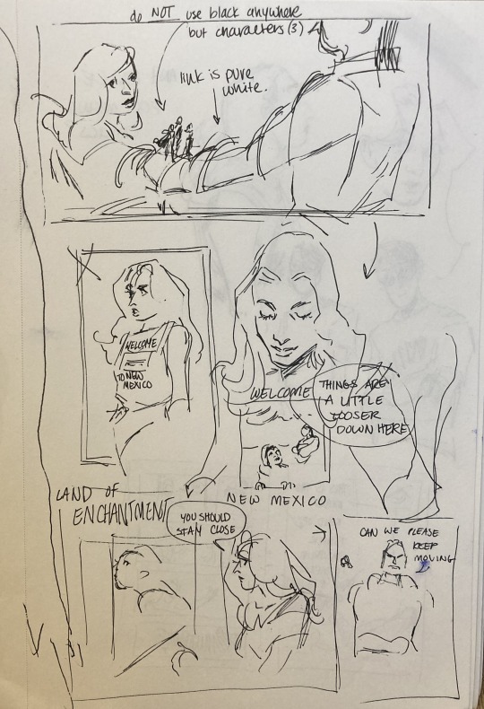
(this is the 'coming up with visuals' stage for a comic i'm working on currently. you can see that i'm basically just throwing anything at the wall to see if it works, and leaving a couple words/notes for myself so i know whats going on. its not even really a layout, the panels are not arranged how they would be on a final page.)
my other piece of advice is to pick apart paneling and comics you love? don’t just redraw them (though that can help too), but study what the paneling and composition conveys, and how that accentuates the story (which it often does!). i’ve done this w watchmen, a couple of moon knight runs, and some x-stuff, and i find it really helps me learn a lot about pacing, how time works, and how to economically convey information (bc you have a lot less room on a page than you think!). as a part of that: an exercise i think is a lot of fun/really helpful is to take pages/scenes you like and recompose them. use different paneling to convey the same scene and see how the meaning changes! do it intentionally, planning on pulling focus to something the original scene slides by. you can do this with your own stuff too:
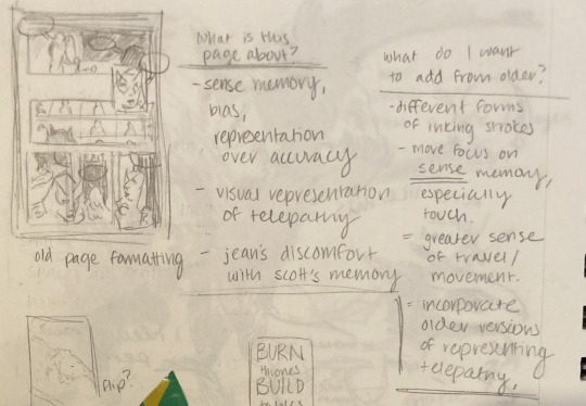
(this is me picking apart a redraw i wanted to do of a comic i posted on here a couple of years ago. first i redrew the comic in the left corner so i could see the composition, then i made notes to myself about what the original comic was supposed to be about, and what i wanted to add to it to improve it. sorry for how blurry it is, the pencil smudged.)
here’s some rapid fire stuff i like to keep in mind while making comics: time does not exist in comics the way it exists in movies or in prose. the gutter? anything can happen there. it is potentially literally any amount of time. its up to you to convey via panel content and composition how much time has passed (which can be very little!) same deal with space. things happen in between panels, and people move, but also panels overlap, or squish, or disregard scenery. that said! this has to be done intentionally. how panels are organized, their size, their relationship to one another, all convey information to your reader. my point is the sky's the limit here. so yknow. have fun w it.
finally i think you just need to do it a lot. i have a ton of comic layouts or pencils that i never posted bc they honestly just aren’t that competent, but i learned nevertheless. there’s other stuff that never made it past the layout or sketch stage bc i was just doing it to practice, so there was never any need to ink or color it. making comics like any other drawing is about continuously assessing intention and communication.
hope that was helpful in some way!! i like making comics a lot, and i have a lot of fun thinking about paneling and the like. i hope you have fun making comics too <3
#idk if this is what you were looking for or if you wanted more like. definitive technical advice#but i hope this was helpful in some way#w.ask
56 notes
·
View notes
Text
RQG 142
I used up all my delayed gratification avoid spoilers and not listening to a season a day; so in an act of optimism over evidence I am going to listen before bed instead of waiting for my lunch break at work. Come on dead!Shoin! It would be the perfect punchline to Zolf refusing to play, if Yoshida was killed by his own trap. I think I was wrong about Zolf's spell sobering up Skraak but we've got to be nearing the 24 hour mark in the next couple episodes. They have to sleep sometime. Eep! Streaming promo! Rusty Towers has to be doing well if they can branch out, good for them! What can I say I like rituals? Thank yous followed by the theme and intros make my brain light up. Alex went 3rd person over the stress of the series being up to 142? Time to poke the corpse. Exploding 20s sound fun but a pain to plan for. Body is in a state of disrepair. Panel open in the room indicates the bolt came from a trap Body is gross Adventurer not Shoin? We can't search the corpse? Not even for Alex's traditional wallet of backstory? Can't picture the layout (ETA Babs you are amazing, and your map is my RQG post for tomorrow.) Explanation for this area having power, I just like hearing Cel talk. Locker by each door. No Alex, we don't trust them to be normal lockers. Fire ax, weird wrench, box. Box contains: Solvent, glue, a dead potion, means of applying glue/solvent Cel sounds like they are consoling themself for this not being a puzzle Zolf is not a public speaker, but I think I got the gist of it. Take the tool kits: we will need them whether this is a puzzle or not. Another dead trap. Thanks for the careful wording, Alex *Foul water pool surrounded by a walk way *2 dead kobolds :( *Killed by acid in the face from a creature I am tempted to mark the turnings but given the weird layout I don't think I could track it right even if I could juggle my MP3 player, this post, a pen and paper. Once again just going to trust them to spell out what's important. Yeah they would check for traps at every door. Ooh active trap. Its a well balanced team, nice to hear them give eachother credit for their respective strengths so readily. Dark hall way of options They are honest, and admit they are probably not checking for traps as they walk. Oh good Zolf doesn't actually have a Thing about Dancing Lights. It really was just a "could we not make it easier for people to shoot us?" coupled with a possibly IC trouble relating to how much moving around in the dark stinks without Dark Vision. Ha they immediately spot a tripwire they would have missed if they just had Zolf & Azu lead them in the dark. Chalk marking, ensuing discussion of what it means. Is that Zolf or Ben who is losing it over the puzzles? Cel, do you need a variation on the "a live dog is better than a dead lion" speech I nearly wrote when Hamid went after that ooze? Because dead scientists can't write up their findings. Love ya both, if you have to die, please not to something you could have just walked away from. Of course Zolf is going to indulge them; he took to Cel fast as Sasha and Cel is less squishy than L1 Sasha. Oh darn I have to be fair, learning what the symbols mean could be life saving later on. The glaive really is a 10ft pole, I was joking when I asked that. I hate the word "seemingly". Alex, don't break Ben. Hmm, this is actually pulpy fun. Getting us back to base levels after really intense beginning of the season or being readied for more emotional content? Most of the beats I'm expecting can't hit until they get off the island; could be the answers to the what's going on around here are intense. Final bets on it being Mr. Ceiling mark 1? Weird room with weirder floor. Clearly another puzzle. Once again how rich is this guy? That's a lot of money to go "I'm smarter than you are". Genre savvy is rewarded Dead wizard "I'm giving you this for free" is Alex implying that other info given without rolls has a price normally? Other room is completely flooded? Zolf suggests we mark the door. Kinky Azu. Hamid switches mark to clearly writing the issue. This team backs a play, so its now a Rosetta Stone of warnings Partially flooded room but no real danger? Ah Zolf catches that we could lose our path back if we keep doing letting water out. Flooded & trashed lab Speakers burst to life Break time Its Yoshida, arguing with himself. Cel is a delight. Azu is "going to shake" Yoshida Swimming sounds like a bad idea. Oh, caught that tone from Zolf, does he think Poseidon would mess with them? Worrying since Alex keeps tossing water related potions at them. Zolf and Hamid are making decisions as equals. Hamid no longer sounds nervous and Zolf still isn't pulling rank crap. Even Skraak is worried about Zolf. Oh right, better is a relative term. Still pretty depressed (mechanicaly grief stricken). Ok not to get to into it, but Zolf's mental health arc is really good. Like no show is perfect but Zolf going from the Paris breakdown to clearly putting the work in on changing how he talks about himself and relates to the team, but it not being a cure all? All while still being a fully contributing member of the team? Pretty damn good to see. Back to first room. Cel does not understand where Zolf is coming from. Cel, Azu, and Zolf have a brief conversation about Zolf's mood. Have I mentioned how great Azu is lately? Player vs Character thing? Because even without Alex lamp-shading it, Lydia doesn't strike me as the "you must be chipper" type. Zolf and Cel interaction. Zolf wants to put a pin in this and have a proper conversation later. Not sure how I feel about promising to "keep a lid on it". On the other hand its hard to balance expressing the emotion vs ramping yourself up vs the needs of the rest of the team. So much for me not getting into it. Flip-side: hey, turns out I can acknowledge an actual flaw in Cel while still thinking they are awesome overall. Crates of potions, including the stuff from the syringe spears. wanna grab a sample this time? Because I'm thinking the stuff in the spears is the stuff that makes the Kobolds so docile and may be a prototype for the alchemical side of the blue veins. That sounds cathartic for Zolf. (looting the place then letting Zolf smash the rest) Azu smashes too. Good for both of them. Ah point Cel, stuff could have airborne effects. Point Zolf, 2 way street, Cel should let people know that kind of thing. Speakers, what is up with Shoin? Assuming this isn't a pre-programmed contingency (which I wouldn't have thought possible until watching Alex), why is he using the script from the puzzle party while half of the traps are broken? Getting meta again Well maintained nasty trap with really obscure poison 2nd trap?! Isn't going to kill anyone, thank Alex. What in the Magnus Archives? Dancing mannequin room with weird heavy gas? Going to crawl on the conveyor belt. Its trapped too. Acid damage to Azu. Into initiative.
Skraak got a nat 20
Azu was hit with a syringe arrow of acid.
Azu backs out past Hamid & Skraak
A second trip wire drops a grate! Hamid and Skraak are trapped on the conveyor; everyone else is back in the room.
Zolf sees Cel dithering and directs them to deal with the grate. No effect
Azu takes 7 damage
Hamid uses acid splash on the grate.
Oh cool, there is an actual rule for how long it takes to get armor on and off. It makes sense too, the better the armor is the longer it takes. From what I picked up, better armor would have more straps for better fit and have more thick overlapping bits rather than gaps
All Zolf can do is a heal check and help Azu get her armor off.
Cel offers the antidote potion, but we don't know what it does.
Hamid reassures Skraak, continues to splash grate
Cel can't really do anything
More damage to Azu
Sweet out of initiative
Zolf cleans Azu off, Azu takes a couple healing potions and that’s dealt with. The acid splashes didn't do anything to the grate. Lift the grate attempt one. Ah "come on Skraak, we're going to help" so wholesome Zolf wacks it with his glaive, it has some effect but not a viable plan Speakers again, Cel points out they might need to meet Hamid on the other side. ...long story short lever attempt has no chance of working. Zolf: Hamid, mate, you're on your own Hamid: I've got Skraak. (winks at Skraak, Skraak blinks at him) Is it having little brothers? He is good with Skraak! Zolf: chin up, don't die on the conveyor belt. Hamid: yup gonna try Zolf: cool anything we can give you? Hamid: I'm pretty well equipped I think. Zolf: all right well we'll see you on the other side. Azu: Yeah, we'll meet you there alright. We'll see you soon Hamid: yeah Azu: alright Hamid: stay safe Azu & Zolf: you too And the end of the episode out takes are always fun
5 notes
·
View notes
Link
With the Creature Collection for Scarred Lands 5e Kickstarter funded and scuttling along, and the Deviant: The Renegades Kickstarter starting this Thursday, we will actually have two KSs running at once for most of their duration.
To be fair, the Creature Collection KS is being run by our friends at Handiworks Games (who also created this gorgeous book of monsters), but it is on our new KS site. Deviant will be run on our long-time KS site with my name on it, and ably run by our own Kickstarter Concierge, James Bell.
As to the whys and wherefores, well, for a while we’ve struggled with a limitation that we can’t run more than one campaign at a time on a single KS site. There’ve been times that we had two very different sorts of projects that we didn’t think would overlap much audience-wise, but one had to wait for the other. So I started looking for options.
Aeon Aexpansion art by Grzegorz Pedrycz
One direction – that we’re still looking at – is to go with a different crowd-funding site. The biggest drawback? They aren’t Kickstarter, so our established audience would need to jump to the new platform. Additionally, we too would have to adapt and adopt a new platform’s processes and quirks.
So we keep looking.
(Another option is to move to pre-orders, which we as a company have not dabbled in, but which I am all too aware of since the many years of White Wolf pre-orders and other traditional sales methods. They work, but I sure feel like we’d be losing a lot of the fun that a KS brings to our interactions with our community. Might give one a try, though).
Meanwhile, I set up a new KS account specifically designed as Onyx Path‘s account, not mine. I gotta tell you, with all the internet harassment out there, I’ve gotten a fair bit just by having my name and picture and bio on that site. Plus, with our delightful KS Concierge James Bell running them now, it can get a tad confusing as to who folks are talking to.
We’re still expecting that it’ll be a longer road to get folks used to the Rich Thomas KS account over to the Onyx Path one – but I think it’s a shorter road than trying to get folks to jump to another whole platform. Plus, the original Scarred Lands Players Guides KS wasn’t run by us anyway, it was run by the late Stewart Wieck as his company and Onyx Path co-owned Scarred Lands at that time.
My thinking was that we were going to have to ask that earlier group of backers to find a new site anyway, why not have them go to our new one and give it a try?
Dark Eras2 art by Brian LeBlanc
Like I mentioned above, we’re also looking at two very different projects. Creature Collection is a great monster book overall, but very much geared to the fantasy genre, Scarred Lands, and 5e with all the twenty-sided rolls to hit and all.
Deviant: The Renegades is the very latest Chronicles of Darkness game line, a gritty world where you seek revenge on those who made you into something… else. It uses the 10-sided dice pool system all of the Chronicles of Darkness lines do, and is a complete game unto itself.
Of course, we’d love it if our audience would completely overlap both these and pledge for them both – that’d be great! But our expectation is that there won’t be much of a mix and one part of our Many Worlds, One Path community will back one KS, and another will back the other.
Creature Collection is also set up to have a different KS experience, with the biggest chunk of the book already finished – I mean laid out and everything – but one of the fun parts of the KS is to have backers pledge for rewards that allow them to add monsters, and for monsters to be added after Stretch Goals are achieved. So more pledges, bigger book!
Deviant is set up as most of our recent KSs have been, and backers can expect to have the full text released to them as the weeks go by. Art and layout are still mostly in the future, but everyone can see exactly what this new game is all about by the end of the KS. Stretch Goals will be mostly for new projects to add to the fun of playing Deviant!
So c’mon and check them out – in their own ways, each is a really excellent book, with a fun KS to get it started!
VtR2 Spilled Blood art by Michele Giorgi
In the Monday Meeting today, we also talked about a new project that is being offered for free on DTRPG. No, it’s not one of ours, it’s Consent in Gaming from Monte Cook Games, written by Shanna Germain and Sean K. Reynolds. https://www.drivethrurpg.com/product/288535 Basically, it’s a book of advice on how to make sure that scary, disturbing, or freaky events during TTRPG sessions don’t actually mess up the players.
That’s it.
Part of the advice is a handy worksheet that has lists of possible things that might cause issues with the players that each player can go through and check off, with blank spaces to fill in things that you might have a hard time dealing with personally that aren’t on the pre-printed lists. The sheets are tools to be used, like several others like the X-Card that are now available for groups to use for their sessions if they choose to use them.
Judging by the commentary where this product is being discussed, Monte Cook is going to personally come to your group’s gaming session and put a gun the the heads of your gaming friends, and force everyone to fill out these forms. Nope. That’s obviously not going to happen, nor is anyone being forced to implement this tool, or any of the others, around their group’s table.
At the end of the day, these sorts of tools are designed to help players have better gaming experiences, and can be really helpful in assisting players who have previously had bad experiences to come back and give our hobby another chance. We want more people enjoying our hobby, contributing to it, and from my perspective, buying more books and games and stuff so that our creators can make more books and games and stuff.
Let’s not protest things designed to bring more people to our:
Many Worlds, One Path!
BLURBS!
Kickstarter!
Our Creature Collection Kickstarter for Scarred Lands 5e went live last week, funded, and is advancing on creepy-crawly legs towards the first Stretch Goal to add more monsters – that the backers vote on – to the book! This book was designed with amazing art by our friends at Handiwork Games, and they’ll be running the Kickstarter for us on our brand-new Onyx Path Kickstarter page!
And, of course, our next Kickstarter is:
The Deviant: The Renegades Kickstarter launches this Thursday the 19th at 12 noon US Eastern time!
Onyx Path Media!
This Friday’s Onyx Pathcast features a recording of our What’s Up With Onyx Path Community Content panel from Gen Con, as well as the usual banter and tomfoolery with the Trio! Go to https://onyxpathcast.podbean.com/ or to your favorite podcast venue!
The Onyx Path News had another live broadcast today, where Matthew spoke about the Creature Collection, Deviant: The Renegades, Canis Minor, the Slarecian Vault, the Storypath Nexus, You are not Alone, V5 Cults of the Blood Gods, and more, right here: https://youtu.be/98UQKnD_lSY
Please follow our Twitch channel if you haven’t already done so! Our schedule is filled with games including Vampire, Scarred Lands, TC: Aberrant, Pugmire, Scion, Mage: The Awakening, and Hunter: The Vigil! Visit www.twitch.tv/theonyxpath and give us a follow, and if you have an Amazon Prime membership and haven’t already subscribed to a Twitch channel for free using it, just type Amazon Prime Twitch into Google and please use it on our channel!
Remember, if you miss any content on our Twitch channel, some of it finds its way to our YouTube channel here: www.youtube.com/user/theonyxpath Don’t forget though, that some of that content is Twitch exclusive or belongs to the Storytellers running their games, so don’t miss out and remember to follow us!
The Botch Pit continue their actual play of Geist: The Sin-Eaters 2E, with their chronicle “Twice Shy” listenable right here: https://www.youtube.com/channel/UCQfcGvYILEV1vznP5__bOWg
Occultists Anonymous appears on our Twitch channel with their Mage: The Awakening 2E chronicle, but if you’re after a breakdown of episodes, here’s 43 and 44: Episode 43: At the Round Table With Lynnewood Hall scoped out, the cabal rallies with their allies. Seers in Philadelphia must be confronted and the question of … booty is broached.https://youtu.be/r7OdSvwQvE4
Episode 44: Scooby-Doo Routine The cabal infiltrates the lair of the Seers, Lynnewood Hall, and come up against various magical and mundane defenses in search of their stolen Grimoire.https://youtu.be/RqBYdJzZTjQ
The Story Told Podcast have made an episode devoted to how they go about preparing for and running Exalted right here: http://thestorytold.libsyn.com/fall-of-jiara-episode-14-planning-a-campaign-with-terry-robinson
Plus, the ENnie award winning Red Moon Roleplaying continue their actual play of The Sacrifice, from V5 Chicago by Night, with Klara Herbol as the Storyteller and Matthew Dawkins as a player! Please check them out on www.redmoonroleplaying.com
Drop Matthew a message via the contact button on matthewdawkins.com if you have actual plays, reviews, or game overviews you want us to profile on the blog!
Please check any of these out and let us know if you find or produce any actual plays of our games!
Electronic Gaming!
As we find ways to enable our community to more easily play our games, the Onyx Dice Rolling App is live! Our dev team has been doing updates since we launched based on the excellent use-case comments by our community, and this thing is awesome! (Seriously, you need to roll 100 dice for Exalted? This app has you covered.)
On Amazon and Barnes & Noble!
You can now read our fiction from the comfort and convenience of your Kindle (from Amazon) and Nook (from Barnes & Noble).
If you enjoy these or any other of our books, please help us by writing reviews on the site of the sales venue from which you bought it. Reviews really, really help us get folks interested in our amazing fiction!
Our selection includes these fiction books:
Our Sales Partners!
We’re working with Studio2 to get Pugmire and Monarchies of Mau out into stores, as well as to individuals through their online store. You can pick up the traditionally printed main book, the screen, and the official Pugmire dice through our friends there! https://studio2publishing.com/search?q=pugmire
We’ve added Prince’s Gambit to our Studio2 catalog: https://studio2publishing.com/products/prince-s-gambit-card-game
Now, we’ve added Changeling: The Lost 2nd Edition products to Studio2‘s store! See them here: https://studio2publishing.com/collections/all-products/changeling-the-lost
Scarred Lands (Pathfinder) books are also on sale at Studio2, and they have the 5e version, supplements, and dice as well!: https://studio2publishing.com/collections/scarred-lands
Scion 2e books and other products are available now at Studio2: https://studio2publishing.com/blogs/new-releases/scion-second-edition-book-one-origin-now-available-at-your-local-retailer-or-online
Looking for our Deluxe or Prestige Edition books? Try this link! http://www.indiepressrevolution.com/xcart/Onyx-Path-Publishing/
And you can order Pugmire, Monarchies of Mau, Cavaliers of Mars, and Changeling: The Lost 2e at the same link! And NOW Scion Origin and Scion Hero are available to order!
As always, you can find most of Onyx Path’s titles at DriveThruRPG.com!
On Sale This Week!
This Wednesday, we’re offering Pugmire character journals and stickers on our RedBubble store!
Conventions!
Save Against Fear: October 12th – 14th GameHoleCon: October 31st – November 3rd PAX Unplugged: December 6th – 8th 2020: Midwinter: January 9th – 12th
And now, the new project status updates!
DEVELOPMENT STATUS FROM EDDY WEBB (projects in bold have changed status since last week):
First Draft (The first phase of a project that is about the work being done by writers, not dev prep)
M20 Victorian Mage (Mage: the Ascension 20th Anniversary Edition)
Exalted Essay Collection (Exalted)
Dragon-Blooded Novella #2 (Exalted 3rd Edition)
Exigents (Exalted 3rd Edition)
Many-Faced Strangers – Lunars Companion (Exalted 3rd Edition)
Contagion Chronicle: Global Outbreaks (Chronicles of Darkness)
Player’s Guide to the Contagion Chronicle (Chronicles of Darkness)
Contagion Chronicle Jumpstart (Chronicles of Darkness)
N!ternational Wrestling Entertainment (Trinity Continuum: Aberrant)
Creating in the Realms of Pugmire (Realms of Pugmire)
Redlines
Tales of Aquatic Terror (They Came From Beneath the Sea!)
Kith and Kin (Changeling: The Lost 2e)
Crucible of Legends (Exalted 3rd Edition)
Lunars Novella (Rosenberg) (Exalted 3rd Edition)
Second Draft
Tales of Good Dogs – Pugmire Fiction Anthology (Pugmire)
Across the Eight Directions (Exalted 3rd Edition)
One Foot in the Grave Jumpstart (Geist: The Sin-Eaters 2e)
Scion: Demigod (Scion 2nd Edition)
Trinity Continuum Jumpstart (Trinity Continuum Core)
Terra Firma (Trinity Continuum: Aeon)
Monsters of the Deep (They Came From Beneath the Sea!)
Wraith20 Fiction Anthology (Wraith: The Oblivion 20th Anniversary Edition)
Yugman’s Guide to Ghelspad (Scarred Lands)
Vigil Watch (Scarred Lands)
Pirates of Pugmire KS-Added Adventure (Realms of Pugmire)
Development
M20 The Technocracy Reloaded (Mage: the Ascension 20th Anniversary Edition)
Creatures of the World Bestiary (Scion 2nd Edition)
Heirs to the Shogunate (Exalted 3rd Edition)
City of the Towered Tombs (Cavaliers of Mars)
TC: Aeon Jumpstart (Trinity Continuum: Aeon)
Mummy: The Curse 2nd Edition core rulebook (Mummy: The Curse 2nd Edition)
Masks of the Mythos (Scion 2nd Edition)
TC: Aberrant Reference Screen (Trinity Continuum: Aberrant)
Titanomachy (Scion 2nd Edition)
Manuscript Approval
Creatures of the World Bestiary (Scion 2nd Edition)
Scion: Dragon (Scion 2nd Edition)
Scion Companion: Mysteries of the World (Scion 2nd Edition)
Legendlore core book (Legendlore)
Post-Approval Development
Trinity Continuum: Aberrant (Trinity Continuum: Aberrant)
V5 Chicago Screen (Vampire: The Masquerade 5th Edition)
Deviant: The Renegades (Deviant: The Renegades)
WoD Ghost Hunters (World of Darkness)
Scion LARP Rules (Scion)
Cults of the Blood Gods (Vampire: The Masquerade 5th Edition)
Editing
Night Horrors: Nameless and Accursed (Mage: the Awakening Second Edition)
Lunars: Fangs at the Gate (Exalted 3rd Edition)
Hunter: The Vigil 2e core (Hunter: The Vigil 2nd Edition)
City of the Towered Tombs (Cavaliers of Mars)
Let the Streets Run Red (Vampire: The Masquerade 5th Edition)
W20 Shattered Dreams Gift Cards (Werewolf: The Apocalypse 20th)
Geist 2e Fiction Anthology (Geist: The Sin-Eaters 2nd Edition)
Oak, Ash, and Thorn: Changeling: The Lost 2nd Companion (Changeling: The Lost 2nd)
Dragon-Blooded Novella #1 (Exalted 3rd Edition)
Post-Editing Development
Chicago Folio/Dossier (Vampire: The Masquerade 5th Edition)
TC: Aeon Ready-Made Characters (Trinity Continuum: Aeon)
W20 Art Book (Werewolf: The Apocalypse 20th)
Indexing
Geist 2e (Geist: The Sin-Eaters 2nd Edition)
Dystopia Rising: Evolution core (Dystopia Rising: Evolution)
ART DIRECTION FROM MIKE CHANEY!
In Art Direction
Contagion Chronicle
Trinity Continuum: Aberrant
Hunter: The Vigil 2e – Sam on the fulls.
Ex3 Lunars – Contracted. More sketches coming in.
TCfBtS!: Heroic Land Dwellers – LeBlanc on this.
Night Horrors: Nameless and Accursed
Ex3 Monthly Stuff
Trinity RMCs – Contracted.
Cults of the Blood God (KS) – Contracted.
Chicago Folio – Getting some art notes out.
Mummy 2 (KS) – Characters being worked on, fulls next.
Memento Mori – Contracted.
City of the Towered Tombs – Contracted.
In Layout
They Came from Beneath the Sea!
Dark Eras 2 – Files with Aileen
Trinity Continuum Aeon: Distant Worlds
VtR Spilled Blood – In progress.
DR:E Threat Guide – Helnau’s Guide to Wasteland Beasties
Proofing
C20 Cup of Dreams
Signs of Sorcery – Prepping PoD files.
M20 Book of the Fallen – Josh inputting first round of corrections.
DR:E Jumpstart – Sent to Eschaton for approval.
CoM – Witch Queen of the Shadowed Citadel – With Rose for final approval.
At Press
Trinity Core Screen – At Studio2.
TC Aeon Screen – At Studio2.
Trinity: In Media Res – PoD proofs coming.
Trinity Core – Printing. PoD proofs ordered.
Trinity Aeon – Printing. PoD proofs ordered.
V5: Chicago – Files sent to printer.
Aeon Aexpansion – Backer PDFs out, errata.
Today’s Reason to Celebrate!
Eight years ago today, Vampire 20th Anniversary Edition was released at the Grand Masquerade in New Orleans! Wow, a lot of stuff has happened since then with Vampire! Not to mention the rest of the White Wolf game lines, as well as this little not-so-old company of ours. Why it seems simultaneously both yesterday and a million years ago since I sat in the auditorium signing copies of V20 as the line stretched around the room and out of the door.
2 notes
·
View notes
Photo

For the week of 25 March 2019
Quick Bits:
Action Comics #1009 takes a moment to assess the damage caused by Leviathan as Superman, Lois, Jimmy, and Waller try to put the pieces together in the Fortress of Solitude. More inventive use of Superman’s x-ray vision from Steve Epting and Brad Anderson.
| Published by DC Comics

Amazing Spider-Man #18 continues “Hunted” unveiling the Kraven-bots and plan for rich folks to hunt the animal-themed villains (and Spider-Man), but not exactly why. This one also falls into the clichéd trap of bringing back obscure z-list characters only to kill them in order to show the stakes. I’m kind of getting tired of that, but otherwise this is still entertaining. Great art from Humberto Ramos, Victor Olazaba, Edgar Delgado, and Erick Arciniega.
| Published by Marvel
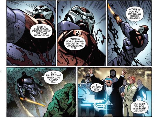
Avengers: No Road Home #7 takes us inside Spectrum’s worries and fears about what she’s becoming as the team tries to prevent Nyx from reclaiming the shards. It really feels like the entire creative team have been stepping up their game these past few issues, but as Paco Medina and Jesus Aburtov take over the art reins again this issue, it feels like the bar has been raised again. Beautiful artwork.
| Published by Marvel
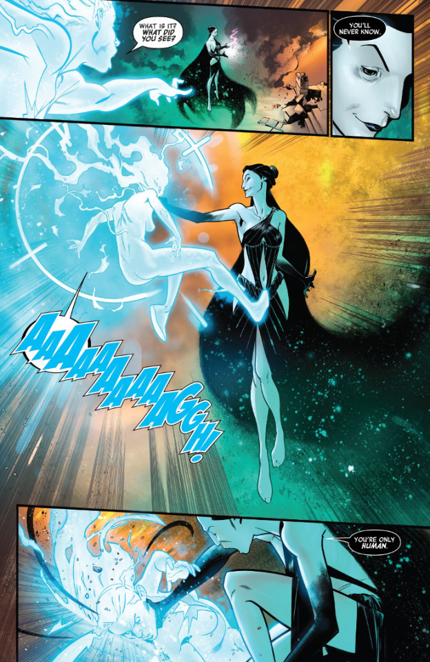
Bad Luck Chuck #1 is an entertaining and unique debut from Lela Gwenn, Matthew Dow Smith, Kelly Fitzpatrick, and Frank Cvetkovic. It stars Charlene Manchester, a seeming walking disaster, who has started up a business for the chaos her mere presence causes. It’s different, there’s some nice incidental humour and a hook for a broader story involving an insurance investigator tailing her, all with some wonderful art from Smith and Fitzpatrick.
| Published by Dark Horse
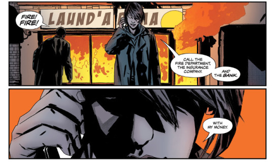
Batgirl #33 is pretty heavy as Babs deals with James being released. Great work all around from Mairghread Scott, Elena Casagrande, Scott Godlewski, John Kalisz, and Andworld Design really delivering on the heightened emotions Babs is going through with the release of her serial killer brother. Particularly the switch between blue and red washes Kalisz uses when Babs confronts her father.
| Published by DC Comics
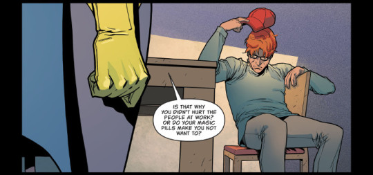
Black Hammer: Age of Doom #9 continues through this bleak new world where almost everyone has forgotten who they were and there’s apparently a lot of gay panic, on Earth and Mars. It’s rather disturbing. Dean Ormston and Dave Stewart deliver some great moody art.
| Published by Dark Horse

Black Science #39 gives us a heartfelt and humorous reunion, possibly one of the final good moments before the series is going to pivot to the end. I get the feeling that Rick Remender, Matteo Scalera, Moreno Dinisio, and Rus Wooton are going to put us through hell reading the final arc, so this bit of happiness with some funny stories and at least a bit of retribution, is great to see.
| Published by Image / Giant Generator
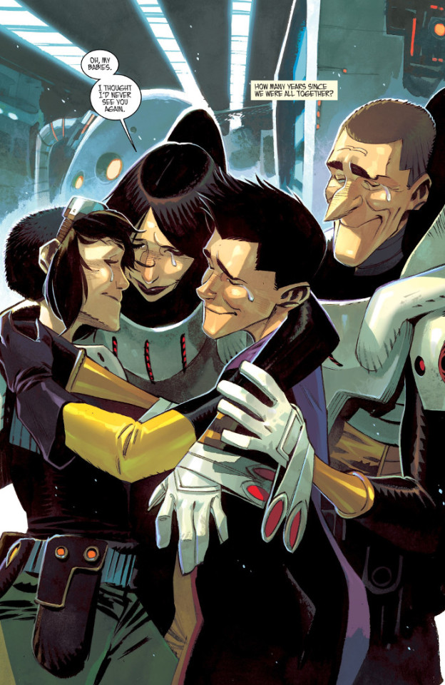
Coda #10 is huge as Si Spurrier, Matías Bergara, Michael Doig, and Jim Campbell work through some of the truth of what’s been driving this entire story. It’s damn good, with some of the best storytelling in comics right now.
| Published by BOOM! Studios
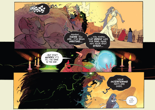
Crimson Lotus #5 is one of two finales this week for a Hellboy universe mini-series, seeing the end to John Arcudi, Mindy Lee, Michelle Madsen, and Clem Robins’ tale of Crimson Lotus’ early days. I’ve loved the set up for Dai and Shengli in this series and definitely would not be averse to seeing more, there’s a nice feel of pulp action and mystery from a different perspective than what we’ve seen in Lobster Johnson. Also, there’s a great surprise appearance.
| Published by Dark Horse

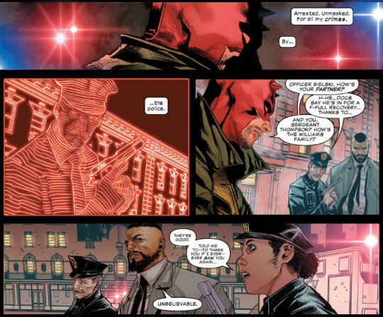
Daredevil #3 is proving that Chip Zdarsky, Marco Checchetto, Sunny Gho, and Clayton Cowles’ excellent first two issues are no fluke, “Know Fear” is easily shaping up to be one of the best Daredevil stories in decades. There’s a wonderful depth and complexity to the characters, the tension of a broken and beaten Daredevil coming into conflict with the police is taut, there are some amazing surprises, and the art is phenomenal.
| Published by Marvel
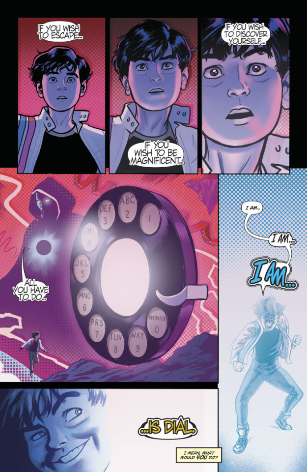
Dial H for Hero #1 is some ridiculous fun from Sam Humphries, Joe Quinones, and Dave Sharpe. We’re introduced to the new guardian of the H Dial, Miguel, an average boy forced to work his Uncle’s Mayo Madness food truck after what’s possibly the death of his parents (it’s not made explicit, so something else could have happened), searching for another thrill after being saved by Superman. Quinones’ art is one of the main drawing factors, with an incredible shift in style during the hero portion, both he and Humphries do an incredible job poking fun at the approach.
| Published by DC Comics / Wonder Comics
Doctor Strange #12 reunites Mark Waid and Barry Kitson for part one of “Herald Supreme” as a pushy, obnoxious alien steamrolls Strange in an attempt to stop Galactus from destroying his homeworld. It’s weird to see Strange brought low again so soon after the first arc, along with the destruction of all of the magic his artifacts house, but it is an interesting predicament he finds himself in struggling to stop Galactus from devouring the mystic planes.
| Published by Marvel

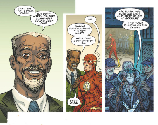
The Flash #67 builds off of last issue’s Rogues spotlight on the Trickster and the previous sub-plot of Commander Cold’s investigation as Joshua Williamson, Scott Kolins, Luis Guerrero, and Steve Wands kick off part one of “The Greatest Trick of All”. Kolins reminds us why he’s one of the best Flash artists of the past few decades amidst a story that is bizarrely happy.
| Published by DC Comics
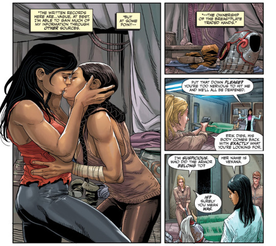
The Forgotten Queen #2 reveals more of War-Monger’s history, as she navigates the possibility of feelings of love for what seems to be the first time. Really intriguing character-building here from Tini Howard, Amilcar Pinna, Ulises Arreola, and Jeff Powell.
| Published by Valiant
Friendo #5 concludes with what feels like one of the weirdest interpretations of Fear and Loathing in Las Vegas I’ve ever read. The horror story of rampant consumerism mixed with reality television comes to a head as Leo finally gets his Action Joe action figure in possibly the most extreme way. Alex Paknadel, Martin Simmonds, Dee Cunniffe, and Taylor Esposito end this wild ride on a high note.
| Published by Vault
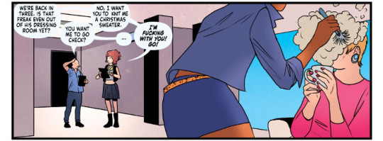
Go-Bots #5 is the incredible end to what has been an excellent series reinterpreting the Go-Bots by Tom Scioli. It started as a relatively normal interpretation of the property, working well with nostalgia while still presenting a unique rumination on free will and robot ethics, then elevated into all out insanity pushing the Go-Bots in new and frightening directions as the bots took over. This final issue explores that post-apocalypse further and cleverly seeds the idea that the Go-Bots were the progenitors to the Transformers.
| Published by IDW

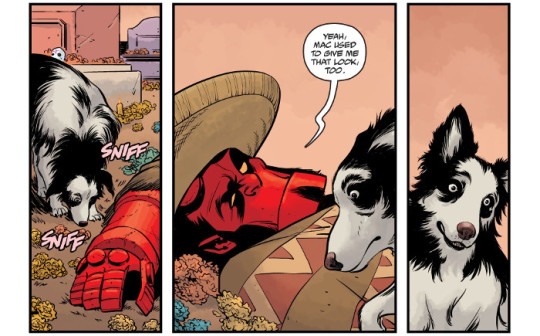
Hellboy and the BPRD: 1956 #5 is the other conclusion in the Hellboy universe this week, detailing a bit more of Hellboy’s time in Mexico, particular after Esteban’s death and he was filming wrestling movies. There’s some wonderful character moments as he laments Esteban’s loss and the even more personal loss of his best friend and dog, Mac. It also underlines Bruttenholm’s lack of soft skills and empathy, not noticing either Margaret and Archie’s romance or how bad Hellboy is hurting emotionally right now. Great work from Mike Mignola, Chris Roberson, Mike Norton, Michael Avon Oeming, Yishan Li, Dave Stewart, and Clem Robins.
| Published by Dark Horse
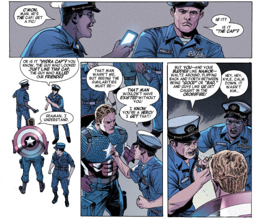
Invaders #3 adds more fuel to the fire with an uncaring American military moving forward on a perceived and actual threat from Atlantis and more questions about Namor’s past and possible mental instability. Chip Zdarsky is doing some very interesting things with plot threads spilling out of Secret Empire and acting as essentially a bridge between Avengers and Captain America.
| Published by Marvel
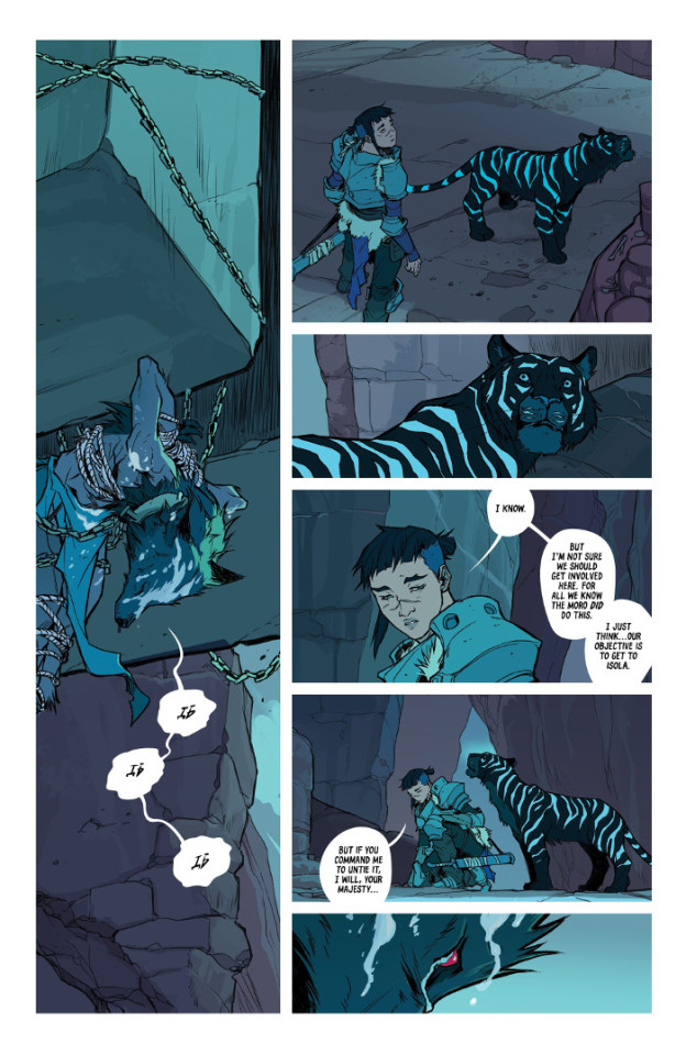
Isola #7 sees our duo come across a quarry town full of women who’ve had their children and men snatched up by the war or worse. It’s an interesting development of the real human cost of war, but it also opens up a mystery as to what or who is really taking the kids, and what they’re possibly becoming. Brenden Fletcher, Karl Kerschl, Msassyk, and Aditya Bidikar continue to produce one of the most beautiful, intriguing, and entertaining comics on the shelves right now.
| Published by Image
The Lollipop Kids #4 has some absolutely stunning artwork from Diego Yapur and DC Alonso. Previous issues have been incredibly impressive, but some of the compositions in this one take it to a whole other level.
| Published by AfterShock

Peter Cannon: Thunderbolt #3 reveals just how thoroughly insane the Ozymandias-styled, world-“saving”, alternate Cannon is as Kieron Gillen, Caspar Wijngaard, Mary Safro, and Hassan Otsmane-Elhaou continue to push this story in intriguing directions. It’s funny, because the conflict, the superhero battles, feel like window-dressing for something else still. Especially as the “good” Cannon traverses panels.
| Published by Dynamite
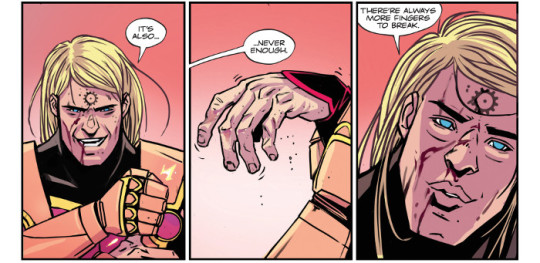
Sabrina the Teenage Witch #1 is another entertaining debut under the new “Archie Forever” initiative, from Kelly Thompson, Veronica Fish, Andy Fish, and Jack Morelli. Like the previous titles, it appears as though there isn’t a lot (or possibly any) of overlap with the other series, introducing us to this rebooted Sabrina’s family. It’s off to a good start, familiar faces in play, humour abounding, Salem being a little bellend, and the mystery of a wendigo.
| Published by Archie

Sharkey: The Bounty Hunter #2 is worth it for Simone Bianchi’s gorgeous artwork alone. Bianchi has always been an interesting artist, with inventive layouts and character designs, rich colour choices, and a beautiful soft-focus, painted style, all of that on display here for this story.
| Published by Image
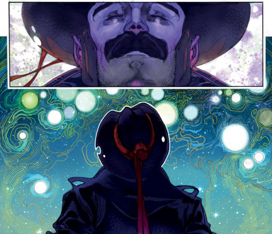
The Silencer #15 is a bit bittersweet since we know that it’s ending now, I would have hoped given how tied to Leviathan that it is that the series would at least see a tie-in to the forthcoming Event Leviathan, but sadly no. In the mean time, we’re still getting an excellent action comic from Dan Abnett, V. Ken Marion, Sandu Florea, Mike Spicer, and Tom Napolitano.
| Published by DC Comics

Star Wars: Vader - Dark Visions #2 is another excellent self-contained story exploring Darth Vader’s effect on others, from Dennis Hallum, Brian Level, Jordan Boyd, and Joe Caramagna. This one takes a look at the desperation and recklessness that fear of Vader’s wrath can have on someone. The layouts from Level are phenomenal.
| Published by Marvel
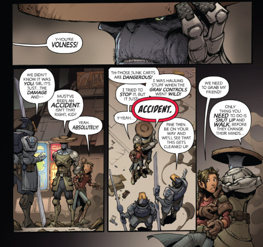
Stone Star #1 is a great digital original debut from Jim Zub, Max Dunbar, Espen Grundetjern, and Marshall Dillon. It introduces us to a pair of scavengers on a planet being visited by a travelling battle arena ship, kind of taking its cue from hero shooters like Overwatch and more traditional fighting games like Mortal Kombat. There’s an interesting hook of human (or alien) trafficking to go along with the coming-of-age tale that’s set up as one of the scavengers, Dail, is offered a chance to possibly study and train with the gladiators. Great art and character designs from Dunbar and Grundetjern.
| Published by Swords & Sassery
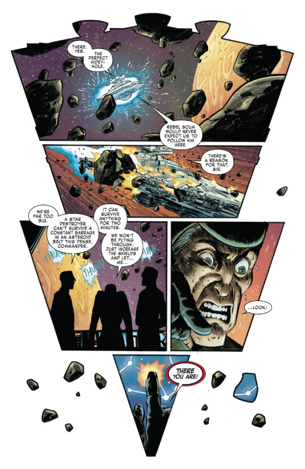
Transformers #2 engaged me a bit more than the first issue. It’s still very methodical and slow in its pacing and revelations, but there are some interesting hooks in the mystery of who murdered Brainstorm and in who was taking potshots at the Ascenticon rally. The mix of politics and self-determination through will to power is certainly an interesting concept from Brian Ruckley.
| Published by IDW

William Gibson’s Alien 3 #5 concludes what has been an excellent adaptation of Gibson’s screenplay by Johnnie Christmas, Tamra Bonvillain, and Nate Piekos. This final chapter ramps up the action and the stakes as the remaining survivors try to flee the station before blowing it and the aliens inside up. Tons of great horrific art from Christmas and Bonvillain.
| Published by Dark Horse

Wonder Woman #67 continues “Giants War”, with G. Willow Wilson doing a decent job of further rehabilitating Giganta. Also some interesting developments regarding the titans that may not be titans.
| Published by DC Comics
Other Highlights: 30 Days of Night 100 Page Giant, The Avant-Guards #3, Beyonders #5, Black Panther #10, Black Widow #3, Bone Parish #8, Books of Magic #6, Breakneck #4, Cinema Purgatorio #17, Detective Comics #1000, DuckTales #19, Fantastic Four #8, Femme Magnifique: 10 Magnificent Women who Changed the World, Fight Club 3 #3, Freedom Fighters #4, GI Joe: Sierra Muerte #2, GLOW #1, Goddess Mode #4, Hardcore #4, Hex Wives #6, Ice Cream Man #11, Invader Zim #41, Ironheart #4, Jim Henson’s Beneath the Dark Crystal #8, Jim Henson’s Labyrinth: Coronation #12, Jughead: The Hunger #13, Justice League Odyssey #7, The League of Extraordinary Gentlemen: Tempest #5, Martian Manhunter #4, Marvel Comics Presents #3, Marvel Rising #1, Mera: Tidebreaker, Mighty Morphin Power Rangers #37, Moon Girl and Devil Dinosaur #41, Outcast #40, Punks Not Dead: London Calling #2, Quincredible #5, The Realm #12, Rick & Morty #48, Rick & Morty vs. Dungeons & Dragons: Director’s Cut #1, Sabrina: The Teenage Witch #1, These Savage Shores #1 - Black & White Edition, Spawn #295, Spider-Man/Deadpool #48, Star Wars: Doctor Aphra #30, Star Wars Adventures #19, Super Sons: The Polarshield Project, Superior Spider-Man #4, TMNT: Urban Legends #11, The Umbrella Academy: Hotel Oblivion #5, Viking Queen, Wasted Space #8
Recommended Collections: Animosity: Evolution - Volume 2: Lex Machina, Asgardians of the Galaxy - Volume 1: Infinity Armada, The Ballad of Sang, Barrier - Limited Edition Slipcase Set, Charlie’s Angels - Volume 1, Cloak & Dagger: Negative Exposure, Coda - Volume 1, Flash - Volume 9: Reckoning of the Forces, Mind MGMT Omnibus - Volume 1, Ms. Marvel - Volume 10: Time and Again, Regression - Volume 3, Sheena: Queen of the Jungle - Volume 2, TMNT: Rise of the TMNT - Volume 1, War Bears

d. emerson eddy is just a worthless liar. He is just an imbecile. He will only complicate you. Trust in him and fall as well.
3 notes
·
View notes
Text
Snotgirl - read 1

Yes, this graphic novel is called Snotgirl, and it’s fantastic. I was at the library and I saw the bright colors on the front and the sophisticated and clean art style and was immediately drawn to it. It’s a very modern story line, about a girl who is a fashion blogger who has “friends” that she doesn't really like. It sort of is a satirical take on today’s instagram society. The elements that make it not so clean cut is that she has major allergies that cause her to get really messy, as in way too much snot comes out of her nose. Its very weird and something that I have never read before. Kinda reminds me of superhero themes? I have only read the first issue so far so my take on the novel is not of the series! Overall, I would give it a 7/10. Here’s why.
Things I liked:
1. The art style.
This art style is heavenly. It felt realistic but also very anime? The colors were either bright, like the cover, or very soft and pastel like this page...

I just really really loved how beautiful everything was. The facial expressions would show very clear whatever emotion the character was feeling with the eye shape, eyebrow, and mouth. Things like adding blush and sweat were also commonly used!
2. The inner monologue
Any book that uses first person writing is my favorite. I love being able to read as if I am in the characters’ head. It just adds so much to the story for me. We see everything through Snotgirl’s perspective. Not sure what else to say because this is just a personal preference of me. This feels like a strategy for the theme as again, they are able to showcase the snooty, Cali-girl personality through Lottie’s thoughts and reactions to people. It does make you not like her as much so it is definitely effective.
Things I didn’t like:
1. Confusing layouts
The page of a graphic novel has panels. When you are reading a novel, you look at the layout and placement of the panels for the order. Some sections of this book felt really jumbled. The panels would be overlapping, but not in way that felt cohesive, like in some Watchmen bleeds, this felt almost unintended. There would be some pages with no outlines whatsoever and you had to decide where the trail was to follow. Usually, if there is no outline on a panel, it could signal an important of significant part in the story. But with this novel, again, they felt ill-advised. I almost got sick of it. It felt like the writers were trying to be artsy or unique but it just left me, a reader, over it.
2. Unlikable characters
Before I really go into this, I want to say that I realize its probably an intentional move. It it trying to tell people that having a million likes on instagram does not mean someone has a good life or good friends or even a good personality. So I think it adds to the theme of the novel. But, it didn't make for a fun read. When you are reading something and there isn't one character you like, it makes it impossible to fly through it. The main girl, while I don’t hate her, I also just don’t like her either. All of her friends are annoying as well. The only characters I somewhat liked were Caroline and Lottie (aka Snotgirl)’s assistant.
3. Seemingly unlinked story lines
Something I can say with certainty is that by the end of the first issue, I felt lost. I don’t want to use spoilers in any of these reviews so I am going to avoid them. Things that I don’t consider spoilers are the different story lines in this book, we have Snotgirl and her allergy problem, her relationship with her doctor, her circle of friends, her relationship with her blog, her ex-boyfriend, and one more big one that would be spoiling. But what I can say is this last story line felt SO unrelated to everything else. Like I felt so confused whenever we would see that character and the apparent feelings towards Lottie? All I can say is what was that?
One of the last things I want to include in this review is a short list of common graphic novel terms and methods that were used:
✰ narrative boxes + text boxes
✰ splash panels + use of bleeding
✰ borderless panels
✰ lots of scene-to-scene transitions
If you are into very easy, pretty reads I would recommend it! While it’s not my favorite graphic novel ever, it is very good. The first issue is even online. I linked it at the beginning of this post. (thats where all of the images came from! so check it out, its free!!!)

#snotgirl#book review#comic#comics#graphic novel#book#books#book community#comic review#graphic novel review#sofi reads#sofireads
0 notes
Text
After Effects: revisiting feature requests from 2008
June 2008 seems like a long time ago now. Adobe had only just released After Effects CS3 and I was mostly working on a G5 PowerMac. Four gigabytes of RAM seemed like an awful lot. George W Bush was the US President and the Apple iPhone was only 1 year old – a month later in July Apple would release the iPhone 3G, but that was still a secret.
Just a quick reminder about June 2008… After Effects came in a box, the iPhone was at version 1, and the US President was George W Bush.
What Apple did announce in June 2008 was the name of their next operating system – “Snow Leopard”. At the Apple Worldwide Developer Conference a few details trickled out – most significantly, the announcement that Snow Leopard wouldn’t introduce any major new features, but rather focus on performance and “under the hood” improvements.
When I read the various Apple news reports I started to wonder – what if Adobe took the same approach with After Effects? What if the next release skipped any major new features and instead focused on performance and small improvements? I thought it was worth daydreaming about.
Just for fun, I posted the idea on the After Effects email list, and asked for suggestions for minor feature requests that would make everyday work faster and easier. I remember finding the responses interesting, as there were several things I had never thought of. It was a good reminder that After Effects is used by lots of different people in lots of different situations. After a week or two, I compiled the suggestions together and emailed the list to Adobe, and received a thank-you email from Michael Coleran, the After Effects product manager at the time.
It’s not quite 10 years later, but last week Adobe announced the latest releases of their major CC apps, including After Effects. As usual with such a major update, it takes time to go through all the new features and work out what’s new and what’s changed. There are videos to watch, blogs to read, twitter posts to examine and so on. Right now, I’m not even sure what it’s called. Is it After Effects CC 2018? The update appeared on my Windows machine as just After Effects CC…
Whatever the name, how does the latest version of After Effects stack up against the list of feature requests I sent to Adobe almost 10 years ago? Let’s go through the list and see. Bear in mind that this is a list of suggestions from a range of different people, so there’s some overlap and a little ambiguity. I’ve loosely grouped them together according to the part of After Effects they apply to.
Interface:
Moving/dragging interface tabs around can be “undone”
I used to think this looked better than the current After Effects interface. I was wrong. So very, very wrong.
It’s hard to remember, but After Effects didn’t always look the way it did. Adobe gave AE a major interface revamp with version 7, but many users – myself included – initially hated the radical change and resisted the upgrade.
Eventually After Effects CS3 was released which prompted us to upgrade and grapple with the new look and feel, and it really was a big leap from the old floating-windows of After Effects 6.5. But while it now seems 2nd nature, dragging those tabs and palettes around took a bit of getting used to. It was easy to accidentally drag something to a new place, or close a panel you didn’t mean to, or basically just click in the wrong spot and find your workspace layout had become all messed up. Unlike changes to the timeline, these changes to the interface layout couldn’t be fixed with an “undo”.
Nearly ten years later it’s still easy to accidentally mess up your favourite workspace with an errant click, but can you “undo” workspace layout changes in the latest version of After Effects? Still no.
Verdict: Still waiting…
a colour swatch palette
It’s fair to say that we got more than we asked for! The Photoshop swatches palette is on the left, the Kuler panel in After Effects on the right also includes tools to create colour schemes.
In 2008, the majority of the work I was doing involved motion graphics for large corporate clients with strict brand guidelines. Clients generally had a small, rigidly defined colour palette to work from, but After Effects had no way of saving colours for easy and repeated selection, in the way that Photoshop and Illustrator did. With CC 2014, Adobe introduced the Kuler panel, which finally gave users a color swatch panel but also much, much more. While the Kuler panel is above and beyond the expectations of any AE user who just wanted the same swatch panel that Photoshop had, it’s unfortunate that Adobe hid this awesome new feature away in the “Extensions” sub-menu, so many users are probably unaware it’s there.
Verdict: We got it, but they’ve done their best to hide it from us…
colour labels for composition tabs…
After Effects used to be monochrome, but colour – and colour labels – slowly crept in over time. The lower image is from a time where layers could be given a colour label, but not the actual composition.
Using colour labels has become an essential part of my workflow, but if you go back far enough there was a time when the entire AE interface was monochrome. At some point, After Effects included colour labels for layers in a composition, but presumably there was a period where you couldn’t assign a colour label to the composition itself. But AFAIK, compositions have been able to have colour labels for some time now…
Verdict: Yes thanks!
colour labels for effects
…but there’s no way to assign a colour label to an effect. If you don’t use colour labels to organize your projects then this is probably pretty meaningless to you – but to those of us who do, they are an essential organizational tool. The “Select label group” function is one of those powerful workflow features that isn’t immediately obvious but can save an enormous amount of time and frustration. Perhaps a future version of AE will allow individual effects to have colour labels – but so far it’s a no go.
Verdict: No, not yet.
Plugins & Effects:
a list of favourite effects
While After Effects has allowed you to save your own presets for many years, the plugins themselves are always listed in same groups in the “Effects” menu. In the same way that many applications keep a track of recent documents opened, and After Effects keeps a track of recently imported footage, it would be nice to have a list of recently used effects. So far, however, that’s yet to appear.
Verdict: Still waiting…
Make obsolete plugins (eg Basic 3D) an optional install. Weed out older, redundant and inferior plugins. For example- why is there a CC Toner AND a Tritone? Do we still need a fast blur AND a Gaussian blur? The CC Power Pin is much better than the older Corner Pin, the “Hue/Saturation” effect is miles better than the “Colour Balance (HLS)” effect etc
Over the years, Adobe has bought software from other companies (or just bought the company) and also licensed existing plugins from 3rd parties so they come included with the basic install. Along the way, some older plugins have been superseded and others have duplicate functionality. In recent years, Adobe HAVE started to address this issue, by introducing the “Obsolete” menu. And while there is the potential to do more with the way duplicate functions are handled – and they confused a lot of people by changing the Gaussian Blur and Fast Blur effects recently – they seem to at least be aware of the problem. Verdict: Well I guess they’ve made a start.
a button to move a layer to the centre of the composition
While After Effects has had an “align” panel for a long time, it was overhauled with CS 5 and gained the ability to align layers relative to the composition. Technically, to centre a layer you have to click twice – once for the horizontal and once for the vertical axis – but we’ll give Adobe a tick for this one.
Verdict: Yes thanks Adobe!
a button to reset the anchor point of a layer to the centre
a button to add a keyframe from within the effects palette
These requests are perfect examples of the types of workflow enhancements I was looking for, when I made the analogy between Apple’s approach to Snow Leopard and what I thought Adobe could do with After Effects. They sound so simple yet so useful – but so far neither of these features has been added.
Verdict: No, not yet. But check AEscripts…
a histogram in the “curves” effect
A lot of After Effects users – myself included – complained about the “old” curves effect. It wasn’t that great, and when benchmarked against the “levels” effect it was incredibly slow. In a rare move, Adobe publically announced they were going to completely overhaul the Curves effect and even asked for suggestions as to how it could be better. The “new” curves effect is fast, has a great scalable interface, and is generally much easier to use. While it doesn’t have all of the features everyone may have asked for, it’s vastly improved over the old one. I use it every day. But does it have a histogram? No, no it doesn’t…
Verdict: Still waiting… if they haven’t done it now, they’ll probably never do it. I’ll just keep on using the levels effect after the curves effect just for the histogram…
give all plugins a consistent edge crop and blend-with-original option (like the way all Tinderbox plugins do)
Tinderbox was one of the first 3rd party plugins I owned, but they were sadly bought by GenArts and then discontinued (I assume some of the technology made its way into Sapphire, GenArts existing plugin range). One feature that helped make the Tinderbox plugins feel professional was the way every plugin had identical controls to crop edges, resize the layer if needed, and to blend with the original image. While some After Effects plugins have some of these features, it was the consistency across all Tinderbox plugins which helped them feel like a high-end tool.
Compositing options – I love them!
Adobe addressed this with the CC 2014 release – which gave all effects a “compositing option” to fade the strength of the effect, and also the ability to use masks to isolate where an effect was applied to an image.
In CC 2017, Adobe went one step further and now every plugin that references another layer can now be controlled to see the layer either before or after effects have been applied.
Verdict: Yes thank you! The “compositing options” are very powerful and the improvements to compound effects in CC 2017 were an unexpected bonus.
a depth shadow effect (not sure what this means, maybe an extruded shadow, not a drop shadow?)
Remembering that this list is a bunch of suggestions from several people, I’m not actually sure what the person who suggested “depth shadow” really meant. But since After Effects introduced Layer Styles from Photoshop, which offer more options for shadows (as well as bevels and all the other layer style goodness) I’m going to assume that’s what they meant.
Verdict: Well we got layer styles, which are pretty cool. I guess that’s what you meant?
Fonts & Type:
a reset button on the character palette (but please don’t reset the font, it’s annoying)
If you’re jumping between different motion graphics projects, it’s common to be working with many different fonts, and many different character settings. Font size, leading, tracking and so on can be radically different between projects and when changing to another project it can be easy to miss settings in the character palette that should have been adjusted. Maybe (just hypothetically… it happened to a friend of mine) you’ve spent hours working on an awesome typography layout only to realize that all the text is superscript… or faux bold… or set to 110% wide. A quick button to reset the character palette would help avoid these sorts of issues.
While there isn’t a clickable button to reset all of the parameters in the character panel, you can choose reset from the character palette’s contextual menu. I’m not sure if this has always been there, but it’s good to know. The fact that the person who requested this specifically asked for the reset button not to reset the font suggests they knew about the menu option but really, really wanted a button to press.
Verdict: There’s a reset option in the contextual menu, but whoever suggested this really wanted a button.
keyframable text palette parameters
Animating text is one of the core uses for After Effects, and so it stands to reason that the text animation tools are incredibly powerful. The problem is that they are SO powerful that even basic text animation can be complicated, or just plain overwhelming. Common text treatments such as animated tracking require the user to manually add a text animator and potentially deal with selecting ranges and so on. Wouldn’t it be nice to be able to animate simple parameters like font size, leading and tracking without having to dive into the world of text animators? To date, Adobe hasn’t agreed.
Verdict: Still waiting…
make the default kerning optical (PLEASE! At least an option in preferences…)
In my experience, optical kerning nearly always looks better.
Verdict: Still waiting…
include fonts with the “collect files” function
Such a common and obvious request, and I can only assume that the reason it hasn’t been done is to do with legal issues surrounding the distribution of fonts. It’s also possible that Adobe’s push to the Creative Cloud TypeKit means they see that as a solution for font problems.
Verdict: Still waiting…
put all fonts used in a project at the top of the font list (as well as in alphabetical order)
Seriously Adobe, frickin’ accountants using frickin’ spreadsheets had it better than us for years!
This is something that Microsoft Office products have done for years, and it’s great. Especially for those of us who spend weeks at a time working with the same font, or sets of fonts, it’s amazing that an application that is used so heavily for text animation has lacked an easy way to identify which fonts are being used in the current project.
Verdict: Hooray! Thanks Adobe, they’ve overhauled fonts and the font menu with the latest release.
Masks
keyframable/ trackable mask axis
While Adobe have continued to add features to masks since it was released, it’s been up to 3rd party scripts to fill various voids and enable new ways to manipulate or work with masks. While there was a time when you could only have one mask per layer, the most recent release of After Effects now provides access to individual path points on a mask through expressions.
Verdict: Yes thanks Adobe! Christmas came early this year.
per-vertex mask feather
This powerful feature was added in CS 6. My own personal observation, however, is that lots of people asked for it but when it finally arrived not so many people actually used it. When you need it, though, it’s invaluable.
Verdict: Yes thanks Adobe! It’s there for when we need it.
Animation
separate X,Y & Z position keyframes
Verdict: Yes thanks Adobe!
adjust and save your own “ease” settings as keyframe assistants
The velocity of keyframes is what gives animation its personality. You could say that the “design” in motion graphics design comes down to velocity curves. While the default “easy ease” helps make animations smoother with the press of a button (I press F9 many time a day…) the default values can make your animations feel a bit generic. Being able to set and save presets for your own favourite “ease” settings would be a huge bonus, and if you have a project where the overall “feel” comes from using specific velocity curve values, it would save lots of tedious clicking and typing.
Verdict: Still waiting…
solids have their colour keyframable without using the fill effect
At first glance this might seem like a flippant request, but remember that this list was made in 2008 and After Effects CS3 was a lot more restrictive than it is now in terms of rendering order and the way compound effects worked (and see above for the compositing options now available). But in 2008 there would have been cases where changing the colour of a solid without having to use an effect would have been very useful. So while it’s clear that this feature hasn’t been implemented, other more significant features to the After Effects rendering pipeline have possibly made this request redundant.
Verdict: Still waiting, but we’ll give Adobe a pass on this one
Preferences
user-defined keyboard shortcuts
With so many apps offering this feature there’s little to add except to note how long it’s taken to arrive. The very latest release, CC 2018, finally brings keyboard mapping to After Effects.
Verdict: Yes thanks Adobe! Christmas came early this year.
adding a preference for the level of detail used by pixelmotion, so you can adjust the quality of time-remapped footage without resorting to using Timewarp.
This is an interesting suggestion, but it will need some explanation. When Adobe licensed the technology behind The Foundry’s “Kronos” plugin and introduced it to After Effects, they also introduced a level of ambiguity and misunderstanding with their terminology. Firstly, there’s the “timewarp” effect, applied to a layer from the effects menu. But there’s also the term “pixelmotion”, which is enabled by cycling through the frame-blending options in the timeline window. Behind the scenes, they’re doing the same thing – you can think of “pixelmotion” as the timewarp effect, but instead of being applied as an effect and being controlled by the parameters in the effects palette, it’s automatically and invisibly enabled by setting the frame-blending button to the appropriate setting.
But as anyone who has ever used pixelmotion/timewarp can tell you – the results aren’t always perfect. But if a layer isn’t rendering quite right with pixelmotion, the next step is to jump into the full-blown timewarp effect and play around with all the parameters. Wouldn’t it be nice and easy if there was a simple way of adjusting some of the pixelmotion settings globally, in the preferences panel, so that the user has a basic level of control over pixel motion. That way, minor artefacts can be fixed without having to change to the timewarp effect.
Verdict: Still waiting…
re-ordering queued items in the render queue when the current render is paused
Once you hit that “render” button, After Effects effectively locks you out of doing anything else until it’s finished. If you have lots of long, intensive compositions queued up then this can mean leaving your machine running for hours, or even overnight. Unfortunately, if your priorities change after you’ve started rendering and you want to change the order that compositions are rendered, you have to stop the whole process in order to be able to move items in the queue. It would save a lot of frustration if you could change the order of queued up renders without having to stop the current one.
Verdict: Still waiting…
saving or locking old render queue information
The render queue isn’t just a blue bar that shows how long you’ve got to watch cats on YouTube before you can get back to work. It’s also a record of what you’ve rendered, where you’ve rendered it to, and when you did it. Looking through the render queue panel can solve the mystery of how to fill in your timesheets, where to find that file you’ve lost, or whether “final final” came before or after “final master fixed”. Being able to save the render queue information or even lock it (locking in file paths for compositions would be very useful) allows this valuable data to be saved for future reference.
Verdict: Still waiting…
overhaul the “Pre-compose” function, at the very least to include options for the behaviors which are currently only available through scripts
If it wasn’t for AEscripts, I would be insane by now…
Pre-composing can be a necessary evil in After Effects, but for such a fundamental workflow tool the options were always limited. With many 3rd party scripts available to add more power and functionality to After Effects’ basic functionality, Adobe added a trim feature to CC 2014, but nothing more. Luckily, there are all sorts of 3rd party scripts out there to help you pre-compose exactly as you want to.
Verdict: Still waiting… best to head over to AEscripts.
an integrated scripting/ expressions environment
Expressions – love them or hate them, they’re essential to many people. But despite their power, you’re still stuck with a simple text box that’s not even easy to resize. If you move up to scripting, at least you have the Adobe ExtendScript toolkit app to help things feel more professional – but it’s hardly integrated with After Effects itself. Many users find expressions and scripting hard enough without being restricted to a tiny text box that has basic problems with copying & pasting text. It could be better…
Verdict: Still waiting for it to be easier to write expressions. The ExtendScript Toolkit is OK for scripters, but not exactly integrated.
3D reflections
Difficult to comment on this one. On one hand, obviously Adobe hasn’t given us 3D reflections inside the After Effects timeline. As After Effects is basically a 2D transformation engine, it’s unlikely they ever will. But they have given us increasingly powerful Cinema 4D integration, and bundled the lite version with the basic AE install. So if you think of Cinema 4D as the solution to this feature request, then Adobe have delivered it with bells on.
Verdict: I’ll just say a big thank you for the Cinema 4D integration.
real time scopes in Synthetic Aperture
Color Finesse is awesome but its integration with After Effects has never felt completely seamless. But the real problem with this request is that it depends on what you mean by “real time”. After Effects isn’t a real-time app, although there’s RAM previews. I do use Colour Finesse a bit and from what I can see, the scopes do update when you play clips within the colour finesse interface – but the playback itself is hardly what you would call real-time. But maybe that in itself is an improvement from 2008. I just don’t know.
However when Adobe released CC 2017 they included Lumetri, a new colour correction tool ported over from Premiere that brings scopes to the regular AE interface. Hooray! I’m going to guess that Lumetri is the future…
Verdict: I don’t know about Colour Finesse, but we got Lumetri. Close enough?
dynamic project structure system, with project folders linked to the file system
This is one of those power-features that makes perfect sense to one group of users, but probably has others scratching their head. Basically, this request means that instead of each user manually organizing their After Effects project by creating and naming folders, importing assets etc etc, After Effects would do this all automatically by copying the folder structure and files from somewhere on your computer. If you’re working on a network drive and someone adds a new folder or a new render on the network, everyone’s After Effects project would automatically (dynamically) update and maintain sync with the master folder. If this sounds useful then let Adobe know, because they haven’t implemented this yet.
Verdict: Still waiting…
And finally…
LAYER GROUPS
Yeah. Ha. Well somehow I’ve written 3,000 words on all these feature requests to date, and I could easily write another 3,000 just on layer groups alone. But let’s just say – they’re still not here. Let’s hope it’s not another 8 years before we finally get them.
The more things change, the more things stay the same.
So it’s approaching ten years since that list was emailed to Adobe and much has changed since then. The integration with Premiere has created entire new workflows for some users, and the integration with Cinema 4D has had – and will continue to have – a major impact on the motion graphics industry. And in 2008 who thought VR would become a thing?
But there’s still plenty of room for improvement. Sometimes, those of us who rely on After Effects every working day don’t need or even want the next big headline feature. We just want a few little tweaks to the sorts of inefficient things that we continue to do every day, to help make our lives easier. And layer groups. We really want them.
I’ll dive into CC 2018 over the next few weeks and no doubt I’ll notice many improvements and new features. But there’s always room to go back to the very basics of how After Effects works and make those little tweaks. Are you listening, Adobe?
The post After Effects: revisiting feature requests from 2008 appeared first on ProVideo Coalition.
First Found At: After Effects: revisiting feature requests from 2008
2 notes
·
View notes
Photo

Illustrated Tapes ✕ Shake Bristol Curated by Max Kemp 1 February 2019
➔ spoti.fi/2S0fnwd Listening in order recommended
Shake Bristol is some kinda ‘art fair’ and magazine based in... well you guessed it, Bristol! We linked up with head honcho and illustrator Max Kemp in our first special edition.
What’s up Max! At the end of last year we asked you to put together a mixtape using tracks selected by each of December’s Shake exhibitors - how’d you get on?
I’ve loved it! It was a bit tougher than the usual playlist as I asked each of the December event’s artists to put forward a few songs each, which i then trawled through, choose one from everyone and then put together a playlist. The eclectic mix represents Shake well i think!
What’s the story behind Shake?
I grew up in Cornwall, but i don’t drink and I’m not hugely into the very British idea of getting drunk to make friends and meet people (there’s not much to do in Cornwall during winter). So i decided to try and make a platform for people like me, that wanted to be creative and make things. The kind of people who tend to spend a lot of time at their desks, in their rooms or studios. Basically a way to get all kinds of likeminded creative people together in person. The result was the Baby Teeth: Art Fair & Gathering, which ran for like two years, and built a good community with a solid local following. But when i moved to Bristol back in 2013 i decided i wanted to work on a better version, and make something which was entirely illustration based with a focus on community, accessibility and personality, and not just some people sitting behind tables in a room selling things. After being in Bristol for a year I made a list of all of the southwest illustrators I knew and reached out, explaining the idea. The first Shake happened in July 2014 above the Stag & Hounds pub in a small function room using whatever tables we had. Lize from Sad Ghost Club was a part of Shake at the beginning too, so it was a result of us both putting our heads together. It went down well, we did a few more together, but Sad Ghost Club picked up and turned into a full time job for her!

Since then I’ve tried to create exciting events and projects with Shake, as well as using it to try to nurture the creative scene and help out people as best I can! I really like community, and consider everyone involved with every event or publication to be a part of Shake.
What’s the creative scene like on the westside?
A huge part of why i moved is due to Bristol was that it’s an exciting and inspiring place for creativity. The fact that it’s location is pretty central, it has an airport with good connections and has a great university with really good creative courses is a saving grace for constant change and new creative people constantly coming through. I’m constantly finding artists that inspire me through Shake, both local and from further afield.
Shake seems to have a great community vibe and is very organic and down-to-earth, which isn’t the case for all art fairs, do you think the location has a part to play in that?
I think you’re right! I Try my very best to make sure everything is thought of and everyone is ok in the build-up, during and after the event. But I think the main reason it’s like this is due to the general good vibe from most Bristol creatives. There’s a huge student population, and a whole lot of lovely humble people that i’m constantly grateful for being surrounded by.

Be it stalling, helping me with posters, doing a social media post, coming along on the day and spending their last tenner, or even just liking a picture on Instagram. I like to try and get stallers who will be fun and get what Shake’s about, and I even go as far as to carefully sit people next to each other who i think might get along! But what I think has made shake what it is, is the southwests attitude, comfort, respect, and community.

Do you have any plans for 2019?
For 2019 there’s the February 10th and April 7th illustration fairs at Rough Trade, and April’s will be the last until October. But there’ll hopefully be a collaboration event in may with BRICKS magazine also. I also really want to start putting on the ‘Shake Social’ again, which is a drink and draw event. Basically it’s Shake without the tables, so everyone can just meet and do some drawing together.

I might start working on the next issue of the magazine later in the year too! The last one was so much work for me and my friend matt (he helps with the mag layout and graphic design side) that I decided to give it a while before the next. Also the Shaketober stuff went down well, so I’ll be doing that again for sure.

I might even work on some kind of online Shake drawing club kinda thing as after Shaketober - I kept getting requests to make it more regular. I’d like to do some more events outside of bristol again sometime too!
And do you have any idea about where you want to Shake to go long term? Or are you playing it by ear?
I’ve got a bunch of ideas, but it’s all about natural progression for me. I like to plan the events and then slowly work on all of the other little ideas and projects in the gaps.
Bristol seems to have a great music scene as well. Do you find a lot of overlap between the two communities?
There tends to be a lot of musicians, promoters, and venue staff that stall or come down to Shake! Adrian from Rough Trade and Spectres has always been a huge help and always super encouraging too, so shout out to him!
We love the illustrations you produce for the Shake branding. How did you go about the artwork for the mixtape?
Thanks - stoked you’re into it! For this piece I was freakin’ out, as I find it easy to work with commissions or the random Shake stuff, but with this I was like “ITS GOTTA BE SHAKE, BUT SOMETHING A BIT DIFFERENT!” I guess in a similar way to when I work on each event poster, it has to be obviously Shake but then I dont want any poster to be too similar! So I’ve kinda done it like a comic strip panel with a close up of a guy wired from drawing, haha. Side note: I was listening to the playlist as I worked on this!
What’s your favourite arty spot in Bristol?
I mostly watch movies, skate and draw at home when I’m not working either job or doing Shake stuff, so most spots I go to are dark rooms or concrete areas haha, so this is a tough one to be honest! Bristol’s a place covered in graffiti, and I like looking out for solid colour and type. A few people I keep my eyes open for are: Mr Penfold, RICHT, 45RPM and Kid Crayon. So yeah, My favourite arty spot is just a few underpasses and some walls here and there.
Favourite place to hang out? In the cinema with my phone turned off!
And your favourite Bristol munchies?
Oowee Vegan for their Cluckin Fries, Marling for the vegan Chinese, Fi Real for Caribbean food and Dangun for Korean food. I like to eat basically.
What’s happening in your own creative world at the moment?
I do posters for shows at The Hope & Ruin, Sticky Mike’s Frog Bar in Brighton and Elsewhere in Margate. Most of my creative energy and time goes into making all of the shake branding and planning but I’m trying to work on my sketchbook most days too to keep it going. I grew up doing show posters so that’s the thing I mostly love to do! Oh I just did a tee for BRIGHTR recently too, he’s great and we’ve worked together for a while now on his merch and record covers.
Thanks Max, looking forward to more Shakey stuff in 2019!
Cheers for chattin to me, this has been a fun little project and I like what you’re doing! P.S. thanks to all of the artists who put in songs for the playlist!
Where can we find you?
shakebristol.co.uk instagram.com/shakebristol twitter.com/shakebristol facebook.com/shakebristol maxkdesign.co.uk instagram.com/maxkdesign
0 notes
Text
So here’s the thing, I really want Retro Invasion to succeed. I love the idea behind it, the philosophy and more importantly, I love that it’s practically in my backyard. It’s one exit down from my office and the easiest drive I’ve ever had to a convention.
That’s one heck of a preface isn’t it?
When I entered the hotel this year I was shocked. Remember how last time The convention space was so packed with the tables that you couldn’t even walk between them? This time around things went the opposite direction… The room was still under blocked that I literally walked in looked around and walked out and asked if there was a second vendor‘s room because this One was so empty… It looked like less than 20 tables, including the guests scared of around a very large room… I’m surprised, because this room really would only take about 10 or 15 minutes to walk through and yet there wasn’t an enormous amount of programming going on either. To put it simply, there simply wasn’t a whole lot to do. Add that to the fact that they were once again going up against a mammoth convention competitor happening in the same market – I have absolutely no doubt that Akron Comicon was siphoning away potential attendees.
Being familiar with the layout from last time I managed to find my way upstairs to the movie room in time for a screening of Night of the Creeps. I’m pleased to see that they’ve marked the rooms this time so it’s a little clearer that these spaces are being used for convention functions. However, that didn’t stop them from having confused patrons and I found myself giving directions and pointing people to the correct rooms on a surprising number of occasions.
I don’t know if the screening for the movie was late or if somebody had simply misestimated the running time, but the film was just getting into the third act when it was time for the Night of the Creeps panel. This overlap is a real drag, because you had to choose between watching the movie and listening to the actors – something that would’ve been complimentary to each other if they’ve been scheduled back to back instead of one cutting the other off. I slipped out of the screening about six minutes early to make it to the panel room.
It was empty.
The lights in the room were dimmed, and I was confused – I checked the schedule and the panel was indeed scheduled to start in the next five minutes but no one, not even the moderators, had arrived yet. I decided to make a quick pit stop in the bathroom to kill some time and started heading back to the movie room when I bumped into a couple of young women in spooky clothing and bright hair. They asked me where the panel room was and I showed them, only to discover that these were the moderators and that they were arriving mere moments before the talk was scheduled to start. I probably could’ve caught an additional 10 minutes of my movie.
Jill Whitlow has a very convention friendly personality, she is polite and likes to see her friends but it’s still very much a convention kind of persona. Jason Lively on the other hand is completely cracked. He’s got very much a surfer dude bro personality, and is fun and engaging. He was a delight to hang out with, and while I was waiting in Whitlow’s line to have her sign my Night of the Creeps poster he kept getting bored at his table and running over to me to show me pictures from last time he was at a con. We chatted about Spooky Empire and Chiller and Jean Claude Van Damme movies. It was so much fun. He occasionally check in with Jill and play with her as well, Lively is very hyperactive, especially for somebody who had had as many beers as he’d already had that evening! The stars of Night of the Creeps are both charging $30 for an autograph with an extra $10 up charge if you wanted a photograph with them. I really hate this sort of pricing, and ended up only getting the autographs. After all, the only person from that film who still looks the same as they did back then is Tom Atkins (and I already have a photo with him)! The guys from The Warriors were just flat out charging $40. It’s kind of a drag and really pushing me away from collecting autographs. There was a time when I would’ve grabbed something from everybody in that room, but not with what they’re charging these days.
The panel was good, and I enjoyed what little I get to see of Night of the Creeps, but overall, Retro just doesn’t have enough to do. The convention really can’t keep you occupied for more than a couple of hours and I feel bad for the dude that was in front of me in line who had driven down from Michigan just for this event. This is Retro’s second try at getting the convention formula right and I don’t think they’ve done that yet. It’s my hope that they’ll still give it one more try and get it right, but at this point the goodwill and patience of the con community has got to be fading fast and I’m genuinely not sure if I’ll be back. Guess we’ll wait and see what happens!
Retro Invasion take two So here’s the thing, I really want Retro Invasion to succeed. I love the idea behind it, the philosophy and more importantly, I love that it’s practically in my backyard.
0 notes
Text
Greenhouse 1.0, part 1
Background: We had a 10′ x 12′ shed on the property where I am starting a micro-farm. In 2017, I tried starting seedlings but quickly realized there was no safe place to put them... everything got eaten by birds and rodents almost immediately because I set the trays outside in the sun to germinate. Also, due to all the temperature fluctuations and relative cold, everything germinated very slowly.
I wanted a better way to start and protect seedlings, I didn’t want to spend much money, and my father was clearing out his garage. He gave me over a dozen old windows of two types (8-pane and 2-pane) and similar dimensions. The shed is oriented north-south. I decided to build a glass greenhouse, reusing these old windows, on the eastern side of the shed. Hank, my partner, helped enormously through all stages of construction (he is the other part of “we”).

This is a “before” picture of the shed. It is towards the back (south) of the property, with grape vines on the right. It was in pretty good condition except for the east side of the roof which had several missing sections and a bit of water damage (mostly stayed dry inside though).
The main alternative to this style of greenhouse on my property is a plastic hoophouse. I have worked in some of these structures, and they can be absolutely amazingly functional. However, I didn’t like the idea of needing to purchase new plastic every 3-5 years (and disposing of the old), I had a fair amount of materials to go towards a glass house, and Hank is a mason by trade. The (free) in-house construction expertise was invaluable.
Finally, the farm is in an urban, residential area--so I’m trying to keep everything as aesthetically pleasing as possible. I felt that the glass greenhouse would be more charming than a hoophouse, which would head off complaints. Also, it just seemed like a fun project. For me, farming is as much about how I want to live as it is about producing food, so that’s an important consideration.
The greenhouse was to be attached directly to the shed and supported on the other side by three 4″x4″ posts sunk into concrete. We were very careful in this stage of the process to lay out the posts on square.

To do this, we used batter boards. From Wikipedia: “Batter boards [...] are temporary frames, set beyond the corners of a planned foundation at precise elevations [...] to hold layout lines (construction twine) to indicate the limits (edges and corners) of the foundation.”
Then we poured cement for the posts, using sauna tubes (the cardboard tubes in the ground in the above photo) to limit the amount of concrete we needed and to make a precise column. We were able to use only one long tube cut into three segments of about 16″ each. The frost line is 2′6″ but we were not too concerned about shifting. On Day 1, we set the posts in the concrete and then allowed for the concrete to cure.
The next phase was framing. We added two vertical posts attached to the shed in line with the posts. Making sure the main columns were in line with the shed really speeded up the framing process. The vent frame in the center of the back wall also came from my dad’s garage. My plan is to leave it open in summer, but use greenhouse plastic to cover in winter/colder weather.


Here is another view.
It is important to note that in framing we measured every window specifically. We had two main types of windows, with one style being slightly taller and narrower than the other. Since they were old used windows that had been removed during the demo phase of a big renovation, the window frame margins were slightly different on each.

The next aspect of framing was the roof. We used 12′ 2x4′s set up 24″ apart on center. We ended up doubling up the rafters around the center post for added stability and symmetry. We tied in the rafters using rafter ties (a thin metal bracket) connected to the top brace of the frame.
To attach the rafters to the shed, we removed the top line of shingle panels on that section of the roof and then H used a circular saw adjusted to have a very shallow cutting depth to cut away the plywood roof sheathing. Finally we screwed the new rafters into the rafters of the shed.
Putting on the roof was a very time-consuming process. Basically we removed the rest of the shingles from the roof section that would be covered by the greenhouse roof and reused those on the first 2′ or so of the new greenhouse roof (nails and everything--we were careful).
Obviously you want a greenhouse roof to let light in, so we went to Nolt’s in PA and bought (3) 4x8′ polycarbonate panels for the bulk of the roof (96 square feet). They were by far the cheapest source for the panels themselves, and since we were able to pick them up in person, we saved shipping costs (refilling the truck was expensive but still less than shipping at the next cheapest place). The total cost for the roof panels was $124.80. To install them, you need rubber-backed washers and deck screws, which were $7.50 and $15.10 respectively.

The polycarbonate panels are super simple to install. The important thing is framing up accurately so you have a solid edge to screw into. We had to add a few extra pieces of wood onto the rafters in a few spots for adequate support, but we were able to use scrap wood for that.
The more complicated part of the roof was figuring out how to join the three parts of roof--the old shed roof, the new plywood and shingle section of the greenhouse roof, and the polycarbonate. In the photo above, you can see that we have the polycarbonate installed and the old roof removed. We just needed to close that gap.
We ended up using a strip of metal flashing to prevent leaks between the old shed roof and new shingle section, and put the last line of shingles overlapping the (very narrow) joint between the plywood and the polycarbonate panels of the greenhouse. We cut the plywood to fit between the rafters of the old shed so there is also some overlap in the layers of plywood.

At this point we had the roof figured out, had a plan for the rectangular sides, and just needed to figure out the “triangular” end sections. On the far (south) side, we used leftover greenhouse plastic given to me by a friend redoing his greenhouse (the plastic was less than a year old but had some abuse). On this side (pictured) we used thin plywood leftover from the roof to fill the space, since it never receives a ton of sunlight.
Below we have the greenhouse as we left it before we went to Colombia for a month. The shed was due for a fresh coat of paint, so we repainted the whole thing. In this photo, the blue part is finished (top coat) but the white areas are just primed. We didn’t have enough warm enough days to finish painting before we went away.

At this point we had $678.25 sunk into the project which covered a lot of 2x4′s, 2x12′s, plywood, concrete for the footing, polycarbonate panels, and some hardware. The windows (including the window we used for the door) were free, as were the roofing shingles (already on the shed).
In part 2 I will cover some of the finishing details. As of the writing of this post (3/20/2018), the greenhouse is in use but still not fully painted because we have not had warm enough weather!
I’m writing this up partly so we remember what we did and also to provide some ideas for anyone interested in doing something similar. However, I would stress that it was NOT a quick process to retrofit the shed. The fastest parts of the process were pouring the concrete anchors and framing (new construction)--everything that involved joining the greenhouse to the shed was more complicated and time-consuming. I’ll go into the economics of the design more in a future post.
0 notes
Text
2018 Mitsubishi Outlander Sport SEL First Test: Refreshed but Lacking
Straight to the point: I don’t care much for the 2018 Mitsubishi Outlander Sport. It simply is outclassed by most of its rivals—and in a few months, Mitsubishi will have a better, similarly priced sibling on the same showroom floor. Although Mitsubishi has updated the Outlander Sport for the 2018 model year with new technology—the subcompact’s strongest point—the rest of this crossover has more clouds than silver linings.
Aesthetically, the Outlander Sport received an updated front grille, a new rear fascia and chrome garnish, and a new center console design and shift lever. New technology includes a standard 7.0-inch center touchscreen with Bluetooth phone and audio streaming and optional Apple CarPlay and Android Auto for smartphone connectivity. The 2018 Outlander Sport also now offers a new Touring package for the top SEL trim. It consists of new driver-assist features such as emergency automatic braking, lane departure warning, automatic high-beams, and niceties such as the panoramic glass roof (not a moonroof) and the Rockford Fosgate premium audio system.
It’s refreshing to see emergency automatic braking added to the Outlander Sport. Some automakers overlook this safety feature on some of their entry-level models (the Honda HR-V, Buick Encore, and Audi Q3, for instance). Fortunately, I never witnessed this feature in action, but in Insurance Institute for Highway Safety tests, the system avoided both a 12- and 25-mph frontal collision, earning the highest rating of Superior. The new lane departure warning system operated appropriately during my observations.
The resolution on the 7.0-inch touchscreen display is sharp but attracts a lot of glare. However, you might forgive that flaw because the infotainment system, equipped with Apple CarPlay and Android Auto, is quick and works well. If your smartphone has Siri, the system defaults to that for voice commands instead of the less accurate factory one. Unfortunately, when using Bluetooth calling or voice commands, the audio only comes from the front passenger-side speaker and at a low volume, hard to hear when driving sometimes. The nine-speaker Rockford Fosgate audio system is welcomed and provides plenty of thump, but the big subwoofer reduces cargo space by about 1.6 cubic feet.
Another area where the Outlander Sport performed well was at the track, thanks in part to its 2.4-liter I-4, which produces adequate power, 168 hp and 167 lb-ft of torque. The Outlander Sport is quicker than rivals such as the Honda HR-V and Jeep Renegade in both 0–60 and quarter-mile times, and it brakes shorter from 60 mph, as well (118 feet). The good throttle response makes it feel quicker than the 8.5-second 0–60 mph suggests, but the crossover slows at speed, something associate road test editor Erick Ayapana noted. Braking distance and feel are good, but according to Ayapana, “The Outlander seemed to pull to the right under hard braking. Not sure if that’s specific to this tester or endemic of all Outlander Sports. Otherwise solid brake feel.” When put on our figure-eight handling course, the Outlander Sport was about even with the other two subcompacts, but road test editor Chris Walton didn’t have an easy time around the course. “This is one of those vehicles that wants to do only one thing at a time: Brake, corner, or accelerate, but never a combination of those three,” he said. Walton also noted slow and vague steering feel but was happy with the well-controlled body roll and quick-responding CVT.
A lot of what happened on the track translates to the street. The 2018 Outlander Sport has plenty of grunt off the line, but at highway speeds I found myself having to go wide-open throttle when merging or passing vehicles. Due to the nature of the CVT and not enough sound deadening, wide-open throttle is loud and harsh, adding a lot more NVH than most would want. Activating Sport mode through the shifter only makes things louder and harsher and doesn’t even improve acceleration time. If you hit a twisty stretch of road, expect the handling dynamics to be that of your average crossover, not that bad but not fun. Ride comfort is good considering the short wheelbase, but large road undulations really upset the small crossover. Braking feel and power is good.
Subcompacts aren’t known for their cargo and passenger room, and the Outlander Sport is no exception, offering 21.7 cubic feet of cargo space with the rear seats up and 49.5 cubic feet with the seats down. That’s less than the HR-V’s 23.2 and 57.6 cubic feet, respectively, and slightly less than the Renegade’s 50.8 cubic feet of maximum cargo space. Passenger volume is also less than the above rivals, up to 97.5 cubic feet in the Outlander Sport (95.6 with the glass roof) and up to 100.1 cubic feet for both the HR-V (higher trims have 96.1) and the Renegade (with the standard roof). The differences, though, are quite minimal—a subcompact is called a subcompact for a reason.
The Outlander Sport performs OK in crash test safety scores, earning a four-star overall safety rating out of five stars from the NHTSA. The Mitsubishi fared better in IIHS testing, receiving the highest rating of Good in four crash tests and the second-highest rating of Acceptable in the small-overlap front crash test. The HR-V received the highest five-star rating from the NHTSA and scored the same as the Outlander Sport in IIHS crash testing. The Jeep Renegade also had a four-star overall safety rating and scored the same results in IIHS crash testing, with the exception of the head restraints and seats test, which was not conducted. The Outlander Sport’s Superior rating for front crash prevention topped both rivals.
In the case of these subcompacts, fuel economy ratings have a correlation with power output. The most powerful of the three is the 180-hp Renegade, but the Jeep delivers the lowest EPA mpg rating, 21/29 mpg city/highway. The 168-hp Outlander Sport is rated at 23/28 mpg, and the least powerful 141-hp Honda HR-V has the best fuel economy rating of 27/31 mpg out of the three (comparing all-wheel-drive models). The total EPA driving range (when driving 45 percent highway, 55 percent city) is almost identical for the Outlander Sport and HR-V at 395 and 383 miles, respectively. The Renegade’s total driving range is significantly shorter at 305 miles, mostly due to the smaller gas tank.
Inside, the Outlander Sport loses a lot of points. At first glance it looks like your average crossover, but once you start poking and prodding the materials, trims, switches, and other components, you start to realize how cheap they feel and how aged they look. At about 6 feet tall, I had plenty of room, but I had a hard time finding a comfortable driving position (a first for me in a crossover); the steering wheel didn’t telescope out enough. The build quality—at least in our tester—was also subpar. A rattle from the steering wheel column cover sounded over every rough patch of road, and the driver’s seat had a slight rock to it, noticeable when adjusting yourself in the seat. More sound deadening is needed, as road, wind, and engine noise is quite loud. After hearing a constant clicking sound coming from the engine compartment, my wife asked me if something was wrong with the crossover. I told her not to worry—it was the sound of the A/C compressor working away.
Still, our loaded $29,110 SEL tester came well-equipped with premium features including power-folding and heated side-view mirrors, the panoramic glass roof that lights up, HID headlights, 18-inch two-tone alloy wheels, an eight-way adjustable driver’s seat, leather upholstery, heated front seats, the aforementioned 7.0-inch touchscreen display, automatic climate control, a quick entry system with a push-start ignition, and a soft-touch upper instrument panel, door trim, and center console knee padding. One of my favorite features is the selectable AWD system, which converts from front-wheel-drive to AWD and vice versa with the hit of a button on the center console. Outside, the Outlander Sport looks stylish and attractive for the segment, not trying too hard like others.
The Outlander Sport’s starting price of $21,235 puts it just above the HR-V’s ($20,645) and well above the Renegade’s starting price ($19,540). Our loaded tester still equals the price of its rivals when similarly equipped, making it difficult to recommend, especially when you consider that the crossover hasn’t changed much since its release in 2011. If you’re set on a Mitsubishi, consider waiting until March when the automaker’s all-new and similarly sized Eclipse Cross goes on sale. I have driven it, and it’s by far a superior vehicle.
2018 Mitsubishi Outlander Sport SEL BASE PRICE $26,835 PRICE AS TESTED $29,110 VEHICLE LAYOUT Front-engine, AWD, 5-pass, 4-door SUV ENGINE 2.4L/168-hp/167-lb-ft DOHC 16-valve I-4 TRANSMISSION Cont variable auto CURB WEIGHT (F/R DIST) 3,375 lb (58/42%) WHEELBASE 105.1 in LENGTH x WIDTH x HEIGHT 171.5 x 71.3 x 64.8 in 0-60 MPH 8.5 sec QUARTER MILE 16.5 sec @ 84.6 mph BRAKING, 60-0 MPH 118 ft LATERAL ACCELERATION 0.79 g (avg) MT FIGURE EIGHT 28.0 sec @ 0.59 g (avg) REAL MPG, CITY/HWY/COMB 23.0/32.0/26.4 mpg EPA CITY/HWY/COMB FUEL ECON 22/27/24 mpg ENERGY CONS, CITY/HWY 153/125 kW-hrs/100 miles CO2 EMISSIONS, COMB 0.81 lb/mile
The post 2018 Mitsubishi Outlander Sport SEL First Test: Refreshed but Lacking appeared first on Motor Trend.
from PerformanceJunk WP Feed 3 http://ift.tt/2CZyMmh via IFTTT
0 notes
Photo

For the week of 3 September 2018
Quick Bits:
Ant Man & The Wasp #5 concludes what has been a fun series from Mark Waid, Javier Garrón, Israel Silva, and Joe Caramagna. The artwork from Garrón and Silva has been excellent and this final issue allows them to show off some more incredible and strange ideas.
| Published by Marvel


Asgardians of the Galaxy #1 adds another fun little wrinkle to the current expansion and exploration of Marvel’s Asgardian characters, spinning out of the current Thor series, the Infinity Wars crossover, and other reclaimed threads from the past few years. You needn’t have read any of that, though, as this still serves as a good introduction on its own, the rest just adds flavour. Cullen Bunn adds some nice touches of humour to the story, while a large part of this story rests in the action depicted by Matteo Lolli and Federico Blee. This is off to a good start.
| Published by Marvel


Avengers #7 is a single issue story expanding upon the first Ghost Rider from Jason Aaron, Sara Pichelli, Elisabetta D’Amico, Justin Ponsor, and Cory Petit. I like the 1 Million BC Avengers, so this is a welcome exploration, especially when coupled with this beautiful art.
| Published by Marvel


Black Science #38 gives a very interesting perspective on the book’s reality, and the purpose of all of the different realities, as we reach the prime reality. Phenomenal art as always from Matteo Scalera and Moreno Dinisio.
| Published by Image / Giant Generator


Bully Wars #1 isn’t a bad debut, filling in a similar-but not quite as extreme-humour place as Skottie Young’s recently concluded I Hate Fairyland. Nice art from Aaron Conley and Jean-Francois Beaulieu.
| Published by Image

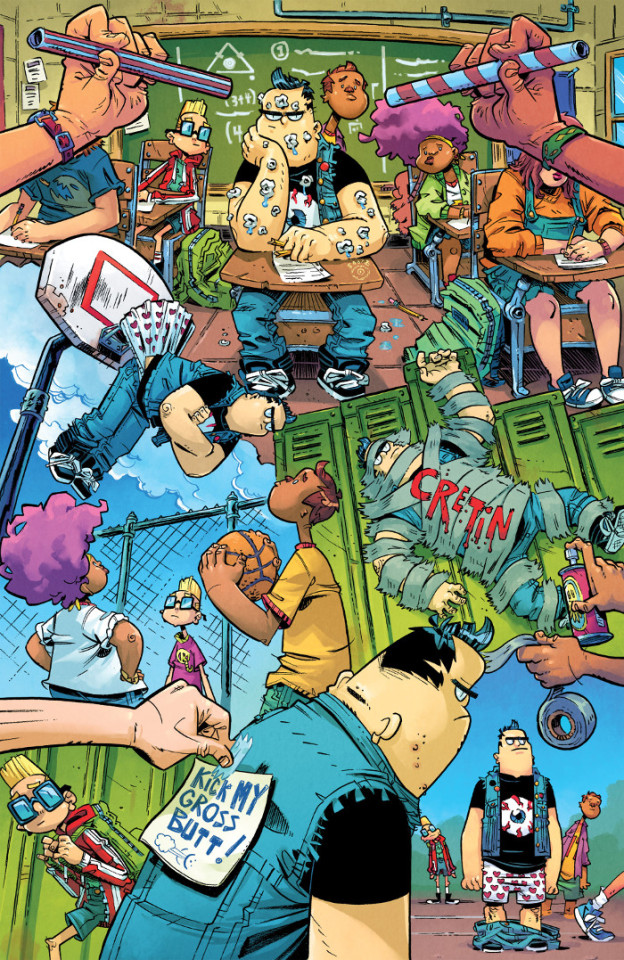

Call of Duty: Zombies 2 #1 serves as a prequel to the forthcoming co-op portion of Activision/Treyarch’s Black Ops 4 video game, introducing some of the characters who will be featured in that story. It’s very much a kind of Indiana Jones pseudoarchaeology type story so far, but it’s good. Nice work from Justin Jordan, Andres Ponce, Mauro Vargas, Dan Jackson, and Nate Piekos.
| Published by Dark Horse


Captain America #3 teases out a bit more of the conspiracy of a group behind the Nuke terrorists and an attempt to take control of America in the void left by Hydra’s demise. It continues to be a slowburn, with Ta-Nehisi Coates leaving a lot of the moral and ethical decisions up to the readers themselves as to whether or not what’s occurring is a “good” thing, even if being a byproduct of potentially nefarious ends.
| Published by Marvel


Clankillers #3 is more gorgeous artwork from Antonio Fuso and Stefano Simeone as they bring the darker aspects of Irish mythology to life. I quite enjoy how Sean Lewis is constructing how incredibly messed up this family has become.
| Published by AfterShock

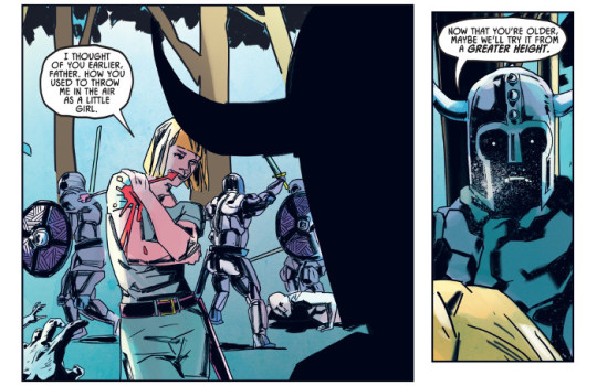

Cloak & Dagger #4 starts pushing us closer towards the endgame as Ty goes on the offensive to find and rescue Tandy. Marvel’s digital originals have really been delivering some high quality stories lately and this one from Dennis Hopeless, David Messina, Elisabetta D’Amico, Giada Marchisio, and Travis Lanham has helped lead the charge. I know this one’s only supposed to be a limited series, with a couple more issue left, but the story and art have been top notch and I’d really like to see more.
| Published by Marvel

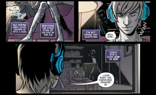

Cosmic Ghost Rider #3 brings the ultraviolence as Donny Cates, Dylan Burnett, Antonio Fabela, and Clayton Cowles give us what amounts to an issue long battle between our time-spun, deranged Frank Castle and a seemingly infinite army of Guardians of the Galaxy led by Cable. It’s fun.
| Published by Marvel


Dark Ark #10 concludes this arc in fairly spectacular fashion, including a very impressive double-page spread from Juan Doe of the confrontation with Echidna.
| Published by AfterShock


The Dead Hand #6 is the conclusion to the first arc in this series and it is rather good. It ties up the events throughout the series so far and gives us a very interesting change to what happens next. I can’t say it’s unexpected because pretty much every issue has given us a surprise revelation or twist in the story, but it’s very well done. Kyle Higgins, Stephen Mooney, Jordie Bellaire, and Clayton Cowles have told a very compelling story of intrigue and spycraft here.
| Published by Image


Deadpool #4 is a fun single issue story dropping Deadpool into Weirdworld and just kind of running wild with it. It allows Scott Hepburn (with colours by Ian Herring) to really cut loose with some of the designs and layouts, and taps into the zany, bizarre humour and fantasy that Skottie Young has become known for.
| Published by Marvel


Death of the Inhumans #3 continues the slow, surgical excision of the Inhumans and much of their supporting cast from the cosmic Marvel scene. There’s some fight left in them, but I wonder if Donny Cates is setting us up for disappointment. I really quite like what he’s carving out for himself with this, Cosmic Ghost Rider, and Thanos Legacy. Also, beautiful artwork from Ariel Olivetti and Jordie Bellaire.
| Published by Marvel


Eclipse #10 makes me really quite appreciate Giovanni Timpano’s artwork more, especially finding out that he’s developing the layouts and panel progressions himself. Not only are they visually interesting, but it elevates the level of collaborative storytelling that he and Zack Kaplan are accomplishing here.
| Published by Image / Top Cow


Giant Days #42 complicates things a bit between Ed and Esther, continuing to navigate the tricky relationships between the characters. The humour and heart are at an all time high this issue.
| Published by Boom Entertainment / Boom! Box


Immortal Hulk #5 gets pretty heavy as the issue drops a few bombs in regards to Sasquatch and on whatever it is that keeps bringing the Hulk back to life. Five issues in and this is already on part to me with much of Peter David’s run, particularly the Dale Keown, Liam Sharp, and Gary Frank eras that I greatly cherish. Al Ewing, Joe Bennett, Ruy José, Paul Mounts, and Cory Petit are crafting an enthralling horror story, while greatly developing and embellishing upon Banner’s history. This is damn good.
| Published by Marvel

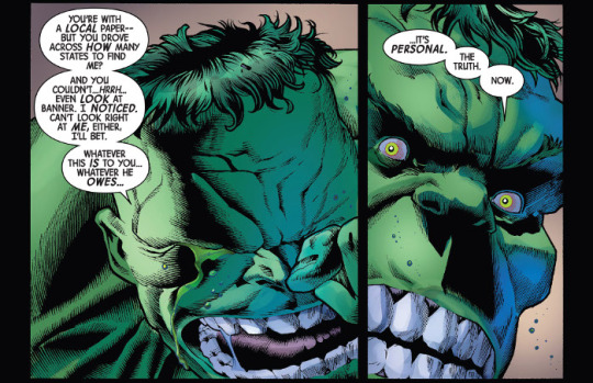

James Bond: Origin #1 is quite good, spotlighting a young James Bond, still in school, set during World War 2. It’s pretty straightforward in its action, but the artwork from Bob Q is quite a draw. He’s got a style that reminds me a bit of Peter Gross and Patrick Olliffe and it works really well for this kind of story.
| Published by Dynamite


The Last Siege #4 attempts to shift fates again this issue as Lady Cathryn and the stranger try to free themselves from Feist. The intrigue and shifting tension to the story are palpable, with Landry Q. Walker and Justin Greenwood keeping us on the edge of our seat with the action.
| Published by Image

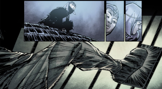

Leviathan #2 is not quite as over-the-top insane as the first issue, as it starts to fill in the details of what’s going on, but it still tries really hard to throw as many crazy ideas at you at once. Especially Hollow Earth dinosaurs in addition to the rest of the madness going on. Another satisfying outing from John Layman, Nick Pitarra, and Michael Garland.
| Published by Image

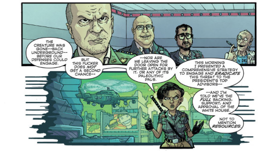

Old Man Logan Annual #1 introduces us to the Punisher of the wastelands, with two stories centring around Old Man Frank. The lead from Ed Brisson, Simone Di Meo, Dono Sánchez-Almara, and Cory Petit is an interesting story about legacy, actions and consequences, as interpreted through the lens of this destroyed and crumbling world. After the start of the new Hillbilly mini, it’s nice to see Di Meo’s art again here.
The back-up goes further in to developing Old Man Frank himself with a “Punisher Wastelands Journal” story from Ryan Cady, Hayden Sherman, Dono Sánchez-Almara, and Cory Petit. I want more of this story.
| Published by Marvel


Optimus Prime #23 is a bit scattered, delivering overlapping narrative points of view, while a larger conflict erupts on Earth between two factions of Cybertronians and a contingent of GI Joe operatives. It’s chaotic, which is part of the point, but it’s made more so in that you’re probably going to need to read it a couple of times to get the most out of who’s presenting what at any given time.
| Published by IDW

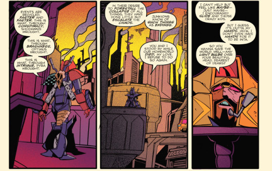

Outpost Zero #3 really starts to turn things up as interpersonal conflicts start coming to the fore and the colonists being politicking amongst themselves in the face of oncoming doom. I quite like it. Sean McKeever has really fleshed out the characters’ motivations and voices, engaging you to see how the pieces fit into the overall narrative.
| Published Image / Skybound


Paradiso #7 gives more insight into the dwellers underground, Jack, and the city itself, but as it does so more and more questions are raised. It’s very interesting how this story is being constructed and embellished, the world-building doesn’t ever seem to stop in favour of just following a singular narrative path.
| Published by Image

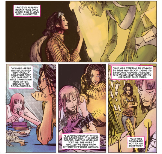

Pestilence: A Story of Satan #4 delivers a few revelations and some more nasty twists for our valiant knights. As usual, the artwork from Oleg Okunev (with colours this issue by Guy Major) really makes the series shine. The designs for the advanced stages of the plague are very impressive.
| Published by AfterShock


Predator: Hunters II #2 has some really nice artwork from Agustin Padilla and Neeraj Menon. It’s interesting how Chris Warner is weaving some of the geopolitical strife in Afghanistan into the story and how it colours the Hunters’ hunt.
| Published by Dark Horse


Project Superpowers #2 is good. I’m sure that if I had read more than the original Alex Ross/Jim Krueger series, I’d get more depth out of this, but Rob Williams is making this story enjoyable for those of us that haven’t been following the broader story all along. Great art from Sergio Davila and Felideus.
| Published by Dynamite


Quicksilver: No Surrender #5 leaves us a fairly interesting place after this character study, and quasi-redemption arc, of Pietro. While I’m really interested to see where this goes next, this has been an excellent series from Saladin Ahmed, Eric Nguyen, Rico Renzi, and Clayton Cowles. I’ve really enjoyed how this series has used colour to enhance the storytelling and this issue is no different.
| Published by Marvel


Relay #3 gets weirder. I’m getting even more David Cronenberg and Philip K. Dick vibes off of the story now, as it shifts even further into the mystery of the nature of the Relay and what exactly is going on with reality. There are some very interesting sci-fi ideas being played with here.
| Published by AfterShock


Shadow Roads #3 is another wonderful issue, giving us a bit of Henry’s history, and a lot of action. AC & Carlos Zamudio are really doing a great job with the artwork.
| Published by Oni Press


Silver Surfer Annual #1 is a pretty straightforward morality tale about the conflict the Surfer has with fulfilling his role as Galactus’ herald and the hidden beauty and value of worlds that he’s serving up to his master. It’s a decent story, but what really elevates it is the beautiful artwork from André Lima Araújo and Chris O’Halloran. It’s unsurprising that this issue was dedicated to Moebius, because that who I immediately thought of when I saw this book.
| Published by Marvel


Spawn #289 lays out some of the steps in Spawn’s plans to stop the shadowy evil elements seeking to control humanity, incorporating some old characters and plot ideas back into the overall story. It’s kind of what you’d expect from a Todd McFarlane-penned story and it is fairly entertaining, especially for longtime readers, even if a bit stilted at times. What takes it a peg above the norm, though, is still the artwork from Jason Shawn Alexander (with colours from McFarlane, Brian Haberlin, and Lee Loughridge).
| Published by Image


Star Wars: Doctor Aphra Annual #2 is easily one of the best Star Wars stories I’ve read this year, telling a humorous and exciting archaeological adventure story of Winloss and Nokk attempting to capture a legendary beast. Si Spurrier is great at humour, subtle winks to deadpan black humour, and it comes off in spades throughout the dialogue here. Winloss and Nokk’s banter is just perfect. To add to that, we’ve got Caspar Wijngaard’s first interiors for Marvel and he just knocks it out of the park. His creator owned work is phenomenal, beautiful, atmospheric art and he brings all that care, attention, and wonder to Star Wars. This is a great comic.
| Published by Marvel


Thanos Legacy #1 serves as a capstone to the recent Thanos series from Donny Cates and Geoff Shaw, while also being a companion piece to Cosmic Ghost Rider and being enmeshed in the current goings-on with Infinity Wars. The lead story written by Cates, with great art from Brian Level and Jordan Boyd gives Thanos’ perspective for the Infinity Wars events and is fairly essential in what looks like is coming next in Marvel’s cosmic realm. Like his work on the recent Avengers: Back to Basics digital original series, Level’s panel compositions, transitions, and page layouts are phenomenal. The craft that goes into his storytelling is impeccable.
There’s also a silent back-up from Gerry Duggan, Cory Smith, and Ruth Redmond of Thanos training Gamora that highlights his sadism.
| Published by Marvel


Transformers: Lost Light #23 continues to tie up threads and drop huge revelations as we approach the end. James Roberts, Jack Lawrence, Joana Lafuente, and Tom B. Long are going out on a high note.
| Published by IDW


Transformers: Unicron #4 continues the systematic destruction of IDW’s Hasbroverse. It’s never looked so good with stunning art from Alex Milne, Sebastian Cheng, and David Garcia Cruz.
| Published by IDW


War Bears #1 is an interesting comic from Margaret Atwood and Ken Steacy, blending World War 2 working conditions, Canadian comics history, and propaganda comics into this tale. Great art from Steacy, especially as he incorporates the in-story comics pages into the work. I love when comics do that.
| Published by Dark Horse


Other Highlights: Aphrodite IX: Ares #1, Astonishing X-Men #15, Breathless #4, Come Into Me #3, Ghostbusters: Crossing Over #6, Invader Zim #34, The Long Con #2, Noble #11, Paper Girls #24, Secret Agent Deadpool #1, Spider-Man/Deadpool #38, Star Wars #53, Thief of Thieves #40, TMNT: Urban Legends #5, Unnatural #3, Vampironica #3, Venom: First Host #2, Weapon X #23
Recommended Collections: Brigands - Volume 2: Ruin of Thieves, Fear Agent - Volume 3, The Fix - Volume 3, The Further Adventures of Nick Wilson - Volume 1, Monstress - Volume 3, Monstro Mechanica - Volume 1, Old Man Logan - Volume 8: To Kill For, Prism Stalker, TMNT - Volume 20: Kingdom of Rats, Twisted Romance, X-Men Red - Volume 1: Hate Machine

d. emerson eddy does not have a brain slug attached to his skull. Why do you ask?
0 notes