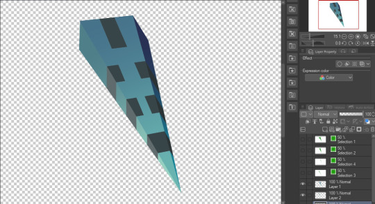
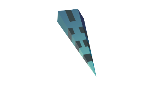
#grey 2d boxes
Explore tagged Tumblr posts
Visit Tumblr Blog
Explore Tumblr blogs with no restrictions, modern design and the best experience.
Last Seen Tumblr Blogs


Fun Fact
Tumblr has a 66 index score for customer satisfaction in the US.
Text
0 notes
Text
So, to go off of the Fast Food AU, I got an idea from a comment by @livmightlive about a headcanon. What car does each Link drive and what state are they in? So, this is that post.
Photos included of each car.
|Time|
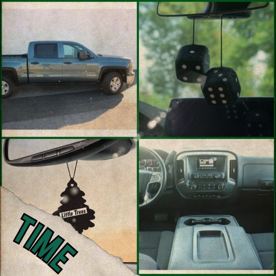
A Crisp 2014 Chevy Silverado 1500
Color: Blue Granite Metallic
- This truck is his baby
- It's been reliable for many years, and he's always fixed it himself.
- His knowledge of cars is standard Dad™ knowledge so he calls up Four when he doesn't know something
- He keeps it clean most of the time.
- He'll sometimes have trash in the passenger seat or on the floor of the passenger seat, but he'll grab it when he's getting out of the car to go into the store to throw in the outside trash cans.
- The bed of the truck has seen better days, but it's not in terrible shape.
- Some of the paint on the bed door is chipping off, but you can only see it if you get close enough.
- Loves taking it through the car wash
- He has those little dice that hang off of the rear view mirror.
- There's occasionally dirt caked on the bottom, but it doesn't stay there long
- The smell is nice because its from the Black Ice air freshener Malon buys and reminds Time to put in there.
- He likes it and has tried to buy other air fresheners but he likes the Black Ice one the best.
|Twilight|
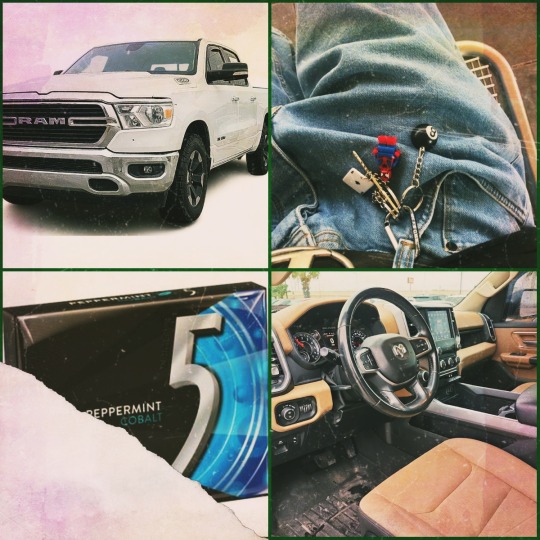
A muddy 2019 Ram 1500
Color: White
- Loves this truck
- Jfc clean this poor thing(on the outside)
- The picture looks clean but in reality, the truck is muddy and it's because he always forgets to take it through the car wash or goddesses forbid he takes the hose to it.
- On the inside, it's a little dirty on the floorboards, but nothing too bad. A little shake should do them some good.
- He keeps it pretty free of trash because he likes to make sure it looks nice despite his baffling logic for the exterior.
- He definitely has a carabiner keychain that he clips to his pants everywhere he goes.
- It's no longer a thought, he just clicks that hoe on the second he takes them keys out.
- He's that shift lead that you can identify right as he comes through the door. *keychain clicking together* Bro has a precussion anthem each time he decides to move
- Carries gum with him wherever he goes.
- Perfers 5 gum but will get whatever he can grab
- Definitely sits in his trucks on his breaks
- He'd rather people not have feet on his dash
- Can parallel park as easily as a chicken can fly
- His car smells like a mix of mint and lawn clippings.
|Sky|
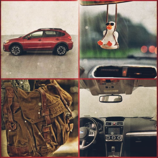
2019 Subaru Crosstrek
Color: Maroon Red
- This is the family car that he got as a hand me down
- It's reliable
- Sometimes, it makes a funny sound, but Sky likes to ignore it
- The aux cord is always Sky's
- It's a little dirty
- Some candy wrappers here and there
- The back seat has some books in a box that will move between the back seat and the truck back and forth
- It smells like bird feathers and some mysteriously vague cologne
- He loves bird imagery so its literally all over his car with ornaments, stickers, etc.
- Will sometimes bring his bird in the car with him(It's an african grey named Chloe who likes to sing September. He also hadls a cockatiel named Issac)
- The car's seats are ripped in places by his birds picking at them
- There's a mark on the driver side dash from when Legend let Sky smoke for the first time and he ended up wiping some of the ash off on the dash and now its just there
- Legend thinks it's hilarious
- Sky finds it embarrassing
- "Do NOT put your feet up on the dash!"
- Has slept in his car on break and will do it again
- Very comfy
|Wars|
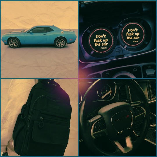
A very well cared for 2016 Dodge Challenger 2D
Color: Baby Blue
- The love of his life
- He found this car in a used car lot and HAD to get it
- Wasn't cheap
- Likes to remind the others that it wasn't cheap when they make fun of him for it.
- He is BIG on decorating his car
- Not as much as Legend is, but he likes his car to feel nice
- Smells DIVINE(Like a really high end cologne, but just enough to not be too much)
- Has a work backpack that stays in the car
- Likes funny little things like the cupholder coasters
- Please be nice to the car
- He does drive like a maniac if he's given the chance to.
- Has constantly asked Wild to race him.
- Doesn't hang out in it on breaks
- Keeps it clean and tidy
- I'm talking he wipes down the car twice a week on the interior and takes it through a car wash once a week, two if needed
- is really proud of his car
- There's some chips and a small dent in the back bumper, but its barely noticable
- he might cry if you call it ugly
- Rarely eats in his car
- The main reason why he likes it so much is because of how the exterior looks. Its satisfying.
|Wild|
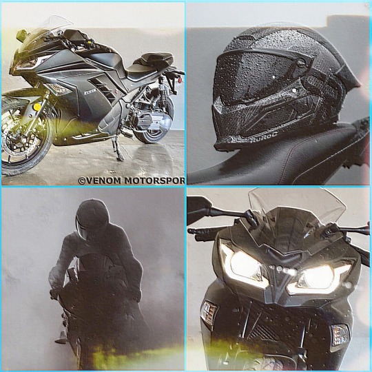
Venom x22GT 250cc
Color: Midnight Black
- Motorcycle homie 🤙
- Someone always asks who's motorcycle it is
- He's proud of it
- He loves how fast it goes and how free he feels
- He gets pulled over pretty often, but is usually apologetic
- Gets scared around bigger vehicles
- Hates being beside 18 wheelers
- Parks it where he can see it from the back door
- Is paranoid about it being stolen
- doesn't race people
- Has a bit of an ego about it
- Loves finding stickers he can put on it
- the little keychains that fit on the little bits and don't get in the way? OH! Loves em
- Overall, pretty chill about it but will try to impress someone and likely fail if they show interest in him or wanting a ride on it
|Legend|
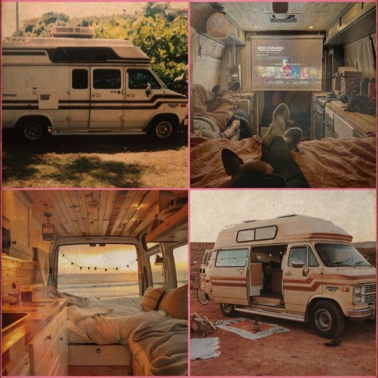
1985 Coachman Camper(Modified)
Color: Beige and Brown
- Van lifer
- He loves being on the road, freely going where he wants, and doing what he wants
- He will camp out in the back area of his work since it's mostly a dirt area no one is using
- Will walk around to nearby areas if its a nice day because he loves exploring
- Finding new things is a hobby
- He will hang out at Warriors or Time's place if he really needs people around him.
- Loves to decorate seasonally
- Hoarder
- No literally, dude hoards so much shit that he has to give it to Ravio to keep at his place cause he doesn't want to get rid of it but has no place in the van
- I originally thought he'd have a concrete place, but I felt like it would be better this way because it fits his vibe.
- I imagine he was really closed off and stayed in the van for a long time after he lost Marin, but Warriors really helped him out by letting him crash at his place
- He decided he was going to go to van life as a change of pace after losing Marin and Ravio happened to show up just as he was about to end his lease.
- He lost Marin early in the year that he bought the van, hoping for a van life because they talked about how fun it could. He crashed with Warriors later that year.
- Ravio stayed in the place and signed the lease and now Legend is living his best life
- Will only ever invite people in if he trusts them
- Spotify 24/7
- Somehow, everyone is surprised when they find out.
|Hyrule|
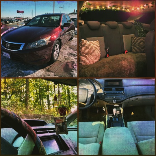
A dying 2010 Honda Accord LX-P
Color: Auburn Brown
- Has been in the family since 2010
- Ol' Reliable
- Shudders when he starts it up
- Loves it anyway
- Comfortable asf
- Him decorating it in fairy aesthetic just makes so much sense to me
- It fits and he loves it and he's not ashamed
- He makes a lot of friends off of his decorating choices
- Has a satchel that he carries that has everything anyone could need.
- Pain meds? Got em. Allergy meds? He's a walking pharmacy.
- Want some acid?
- Experimental
- Hippie coded
- Like Legend is on one end of the hippie spectrum and Hyrule is on the complete opposite side
- Bro will sleep in his car and come back as if he had a moment with Hylia
- Scares him to hell and back when it starts making funny sounds
- Will go to Four as soon as he knows something is wrong.
- It's his baby 🥹 He likes the vibes he has with the car
- "I'll give up on her when she gives up on me."
- Ride or die fr
|Four|
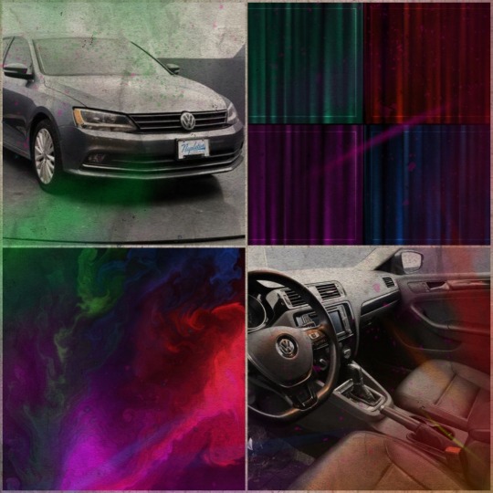
2016 Volkswagen Jetta
Color: Pure White(the site said it and I have doubts)
- A gift
- The mechanic of the group
- He's fixed his car multiple times so he usually fixes the others cars or tells them whats wrong and how to fix it/where to go to get the best price
- Helps Time with stuff he doesn't know.
- He doesn't really decorate it cause he can never decide HOW to
- He keeps it clean though and likes to go to those car wash vaccum places
- Is a safe driver
- Not 100% of the time
- Does not like being in his car more than he has to.
- He'll eat in his car if he's really hungry
- Overall, not too crazy about his car to really do much to it.
- Is usually a good person to call if you need a last minute pick up
- The Sane One™
- Aux cord is an option
- He's a radio kind of guy
- Will hang out with Legend in his van if he just wants to destress
- HATES driving in the snow
- HATES other drivers
That's pretty much it :3
I TOTALLY didn't forget to put the name on each one like I did with Time's :D
BAAAAHHHHYYYYEEEEE!♡
#lu#linked universe time#linked universe wild#linked universe au#link#linked universe wind#linked universe#linked universe twilight#linked universe legend#linked universe sky#linked universe four#linked universe hyrule#linked universe warriors#linked universe headcanons
59 notes
·
View notes
Note
how would u recommend a beginner get into blender? Ima 2D art student but want to fill out my portfolio and it looks super fun and cool!
Yay I'm so glad you want to learn Blender!
Since you're studying 2D, you probably have a lot to learn and practice already. So I'll try to answer in a way that could benefit you the most in both practices.
You probably already heard Blender has a tool called "grease pencil" - it's a 3d object, but they also built it so that if you want to do regular 2D illustration or animation, you can do that too.
Learning grease pencil first could be a good way to familiarize yourself with Blender's interface. And because a lot of the toolsets share how they operate (for instance, adding modifiers to the stack is the same no matter if you're using a grease pencil object, curve, or 3D mesh), you can more easily move to different parts of the program later, like poly modeling or sculpting.
One really great tutorial for 2D Blender is this one by Kevandram - https://www.youtube.com/watch?v=nZyB30-xZFs
From there you can move into tutorials that combine 3D and 2D - or just start with this if you're really excited to learn 3D modeling. Again Kevandram has a really great tutorial for that - https://www.youtube.com/watch?v=ftBFjGy5z08
Something you'll wanna watch out for with Blender tutorials is the version they're using. If your version of Blender is newer, then maybe a button or menu a tutorial tells you to use might have moved. Or some functionality may have changed. Luckily since Blender is open source, they make all versions available to you here: https://download.blender.org/release/
Once you get more familiar with Blender, jumping between versions is easier. But for the sake of learning, if you find a really great tutorial that's using an older version, you can just use that version. You can have multiple Blender versions installed - right now I have 4.4, 4.1, 4.0, and 2.79. So for instance in Kevandram's Bakery Shop tutorial, he's using Blender 3.0 which you can get here - https://download.blender.org/release/Blender3.0/
If you're not interested in grease pencil, or just want to jump straight to 3d, this is a great beginner modeling tutorial from SouthernShotty - https://www.youtube.com/watch?v=C1CFWDWTamo
It mostly sticks to modeling and then gets into basic material stuff. A simplified order to learn things in 3d would be:
Poly/mesh modeling
Modeling with curves
Adding materials/using the shader editor
Unwrapping 3d objects / learning the UV Editor
Texture painting / Painting texture maps (using that unwrapped map from 4) in Blender or some other program (Krita if you want to paint on the 2d map itself. Procreate if you want to paint directly on the model although that'll require a tablet).
A lot of beginner tutorials will take you through steps 1-3 usually, and maybe throw in some basic animation, camera setup, lighting, and rendering. More intermediate/advanced topics would be rigging, animating rigged models, physics simulations, and geometry nodes.
To bring it back to how this could benefit you the most as a 2d artist - something I see a lot of people do is prototype in 3d, and use that 3d render as a base to paint over. Some people strictly use grey boxes, and some people actually model/texture/light certain things and then render that out in layers to use in their painting program later. You can use as much or as little 3d as you want to help 2d painting.
Here's a couple videos showcasing that type of workflow: https://www.youtube.com/watch?v=CHIZtZ2JU3A https://www.youtube.com/watch?v=W5GSyytbABo https://www.youtube.com/watch?v=r5ZyW7K_yP8
Those use Blender's cameras and lights, which you'll pick up as you do modeling/texturing tutorials. Later you can get more advanced with those as well as the different rendering engines within Blender.
This was a lot, but I hope it helps clarify where you can start, and ultimately what you could get out of using 3d!
31 notes
·
View notes
Text
Trinket Poll Game
this seems so fun :) tagged by @virgo-dream and @carnelianmeluha, thanks!
tag game: pick stuff from your room and have people vote on which one they want to take home.
have at it! haha i tag: @issylra @seiya-starsniper @dreeeam-diary @beatnikfreakiswriting @five-and-dimes @tj-dragonblade
#tag game#polls#i like weird art#there's so much more i could have listed haha#edit: whoops i didnt mean to make it 24 hours#oh well!
20 notes
·
View notes
Text
Well I drew the MOGAI-flag themed one first to demonstrate 3D vs 2D characters, then I was like "Well I may as well make a base while I listen to this audiobook" so then I made the base for a cube. Then I made the little gold and green one.
They both still need names and pronouns. I think it would be funny to call the first one Mo Guy. Yes. It's punny and I love puns.
Help me pick some pronouns and gender(s) for Mo Guy.
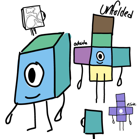
[ID: A digital drawing of a cube character who has a single round eye on a blue face, with a small smile under it. The character is shown from different angles, and unfolded showing both the outside, and inside. The inside is solid purple, with white where the eye and mouth are. The outside version shows the blue face, a yellow bottom, a purple and teal sides, a green top, and a brown back. On drawing in the upper corner shows the side transparent, with simple grey blobs inside showing the internal organs. End ID.]

[ID: A black and white drawing template showing a cube from two different angles, and then unfolded into six boxes connected at the sides. End ID.]
and this one still needs a name, pronouns, and gender(s).
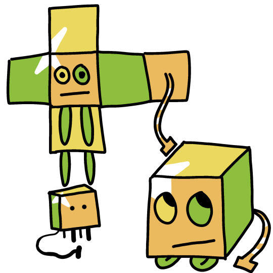
[ID: The template drawing from above, now showing a cube character with alternating sides of orange, gold, and yellow-green. The character has two eyes, one gold and one green, on an orange face. On the upper part of the face is a white triangle mark that forms part of a three-pointed star birthmark. The character has four simple green legs, and a tail that is orange with white stripes, and ends in a flat rectangle shape. The character is drawn standing, lying with legs tucked under like a cat, and with the legs hanging limply down in the "unfolded" version. End ID.]
The template is free to use, I'll edit a link here when I've uploaded it, and these, to the Internet Archive :) both these characters are public domain :)
#Rjalker does art#public domain characters#spacelanders#Flatland#Spaceland#Mo Guy#and unnamed#described images#public domain#public domain art
8 notes
·
View notes
Text
'Tis it season to talk about last year's Christmas Shark Gift (and share a brief tutorial).
So I have a sibling who loves sharks. Like, they have like ten or so shark plushies in their bed alone.
Last year there was a trend on TikTok where someone showed the sharks they made out of old cardboard, and other people started posting theirs and tutorials on how to make them. They were usually wall-mounted and looked VERY cool.
I was doing handmade presents only last year, so naturally, this would be the perfect present for my sibling.
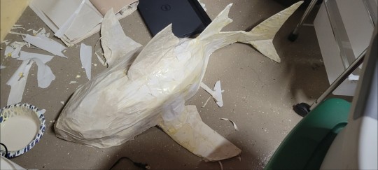
I started by taking a bunch of cardboard boxes from work. Then I found a 3D tiger shark model and got to work.
First up was the "skeleton". I drew a silhouette of the bottom of the shark onto a large piece of cardboard, then used a box cutter to cut it out. Then I cut another half-oval that would serve as a sort of spine that guided the shape of the shark, extending beyond the bottom of the shark into what would become the tail. The bottom of the second piece of cardboard was then hot-glued along the center of the first.
After that, I cut out the tail and fins, hot gluing them on in a similar manner. I then cut long, thin strips of cardboard and glued the bottom of each strip to the edge of the shark's silhouette, and then adjusted the length appropriately and glued the top of them to the top of the spine. I then glued on some going the opposite way for some additional structure.
At this point, the shark looked like this:
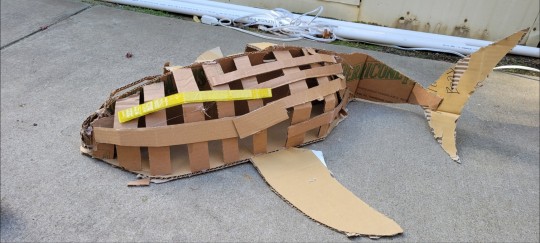
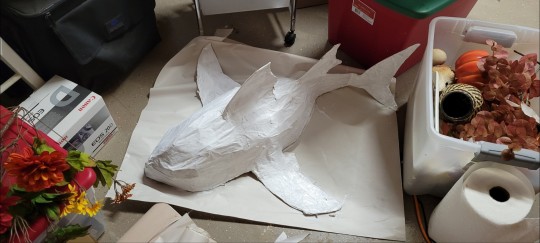
Next came the top fin, which was glued in place and then secured by a couple additional scraps of cardboard, followed by masking tape. Additional cardboard was added to make the fins slope into the shark slightly.
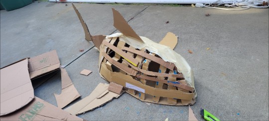
Then the taping (some of which you can see above) began.
I covered the entire shark in a layer of masking tape, using this to smooth it and secure it further, as well as provide a base for the paper mache that would come next.
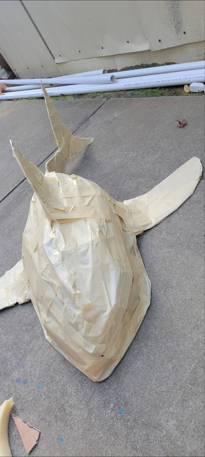
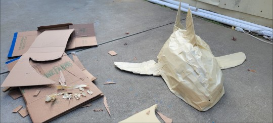
Once the shark was covered, I started the paper mache. Using wood glue and the paper they sell for packing things, I covered the shark in a thick layer of paper mache.
Once that was dry, painting came next. Using the 3D model as reference, I began with a base of light grey and white paint.
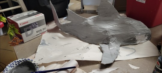
Once that was dry, I started adding shading, marks, etc. In order to make the eyes feel less 2D, I used hot glue to make two dots, which I then painted black and attached to the shark.
When it was done, I had this shark:
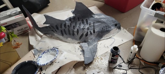
It was then sealed with modge-podge.
The shark was about four feet long and took me somewhere around 20 hours of work. I literally finished it Christmas Eve.
This meant wrapping it somewhat last-minute. This presented an... interesting challenge.
I didn't have a big enough box to wrap it in (the box I had planned to use just barely didn't fit the tail), and since it was Christmas Eve, I didn't have time to find a bigger one.
So I had to get... creative.
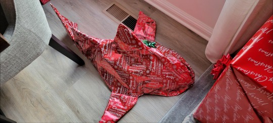
Wrapping it took about 20 minutes, and carrying it into the living room raised a few questions. But with that, the Christmas Shark was ready to be presented to my shark-loving sibling.
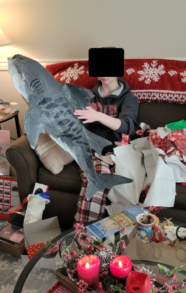
They did not like it and it has been sitting in the living room corner all year. It has never once made it to their room
#sharing this because the shark is cool#and it might make someone else want to make one#anyways#tags:#personal#shark#sharks#tiger shark#crafting#crafts#diy#christmas#long post
4 notes
·
View notes
Text
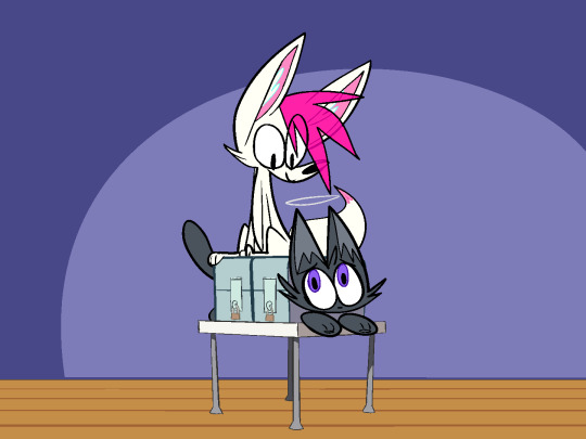
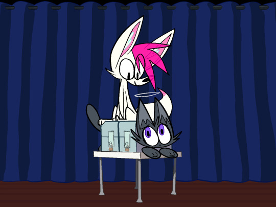
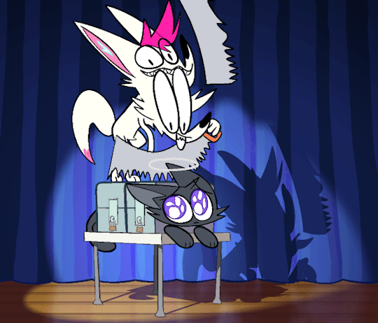
how i did the shadows in MAGIC SHOW
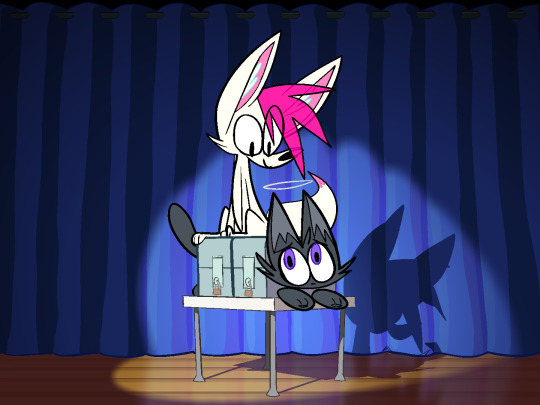
I thought it might be fun to write a little breakdown of how I made the shadows in my animation!
so. magic show! i made this animation very quickly! it was a gift for @xxacidnekoxx, and in total i worked on it for about 2 weeks.
there wasn't an animatic stage, and i drew all of the final frames as i went. i didn't even know it was going to have shadows at all until I finished coloring it and realized the whole thing looked a lot more flat than i had anticipated.
oops!
luckily, getting the animation from this to its shaded state only took a few hours.
so let's break it all down!
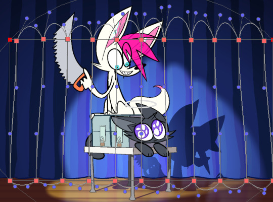
Part One: Some Basics
it's worth noting that the animation software I used for this is toon boom harmony. a lot of what i'll be talking about is harmony specific, although you could certainly apply similar techniques in other programs.
Masking
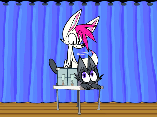
the idea is simple. you have three images. the first two images are the same image, but with different palettes. the third image, known as the mask, is grayscale, and defines which areas use which palette.
when combined, the black areas use the first palette, and the white areas use the second palette. grey areas mix between the two.
in harmony this is easily accomplished with just a few nodes.
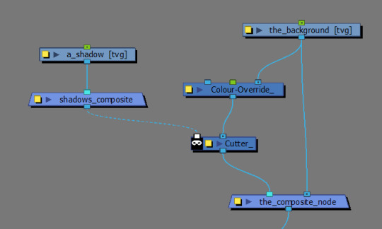
the unlit background is layered on the bottom. the lit version is masked by the cutter, and layered on top of the unlit background.
this kind of setup will likely work for most cases. however...
by default, cutter nodes will only use the alpha channel of whatever is plugged into the matte to determine which areas to mask, ignoring the actual brightness values of our mask.
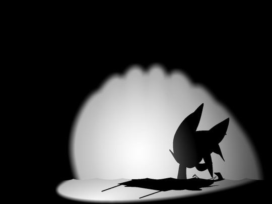
this causes some issues for us! our lighting has layers. we want our spotlight to make the background lighter, and we want our characters to cast shadows on top of the spotlight.
luckily, we can force harmony to use the matte input's brightness values to determine the mask instead by inserting a greyscale node before the cutter and ticking the "matte output" box.
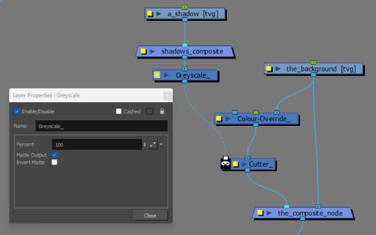
(btw, if you need a layer or matte to become a solid color, you can plug it into a Matte Blur node and pick which color you want there. very handy in combination with the greyscale node's matte output!)
Color Overrides
the easiest way to make alternate palettes in toon boom is to right click on the palette in your palettes list, and click "Clone..."
this makes a copy of your palette where all of the colors are linked to their respective counterparts in the original palette.
with cloned palettes, harmony uses whatever palette is highest in the list (or whatever palette is currently selected) to determine which version of the palette it uses in the scene. you can override any layer's palette priorities by plugging it into a Colour Override node and adding the new palette you want as a whole palette override.
Apply Peg Transformations
the Apply Peg Transformation node is simple. normally peg transformations occur before the drawing node. this means every instance of the drawing will share the same transformations. but this node lets you apply them after the drawing node.
this allows you to insert multiple instances of your drawing, each with unique transformations!
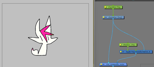
perfect for our shadows!
that's the basic gist of it! combining these elements gets you most of the way there.
Part Two: Getting The Rest Of The Way There
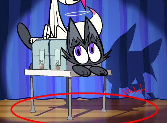
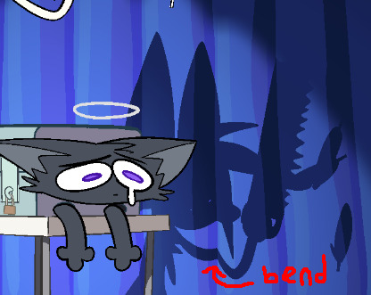
unfortunately, our table looks like it is floating at the moment.
this technique is very efficient, but the results are far from perfect.
shadows are what happen when an object blocks light from hitting another object. generally these objects are "three dimensional" and have "volume", which, in combination with the position and angle of the light source, changes the shape of the shadows they project.
the truth is that reusing flattened 2d artwork of characters to create shadows can only get you so far. the effect looks better when the light source is coming from a similar position and angle to the camera, but looks worse when the difference is greater.
in our case, the light source is close enough to look convincing on the curtains, but the shadow doesn't line up with the table's feet on the floor, absolutely shattering the illusion.
so how do we fix this?
Color Overrides Again
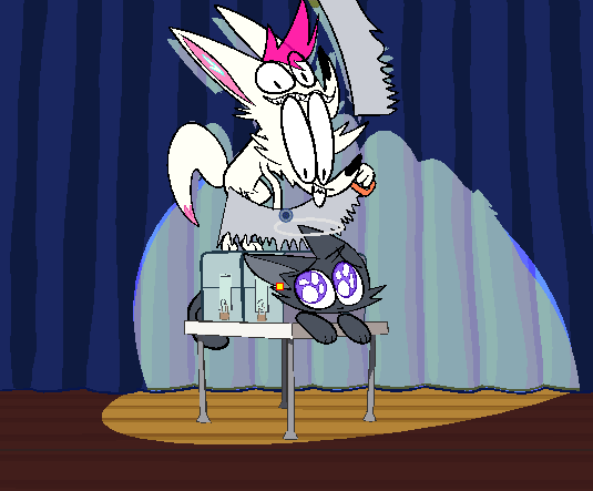
the Colour Override node also lets you non-destructively remove specified colors from a layer.
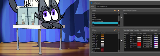
here i've "deleted" the table's shadow by using a Colour Override node to replace all of the table's colors with 0 alpha colors.
this is a very efficient method of removing objects from a lot of frames at once!
cutter nodes can be used to further mask away any remaining parts of a shadow that you don't want. example:
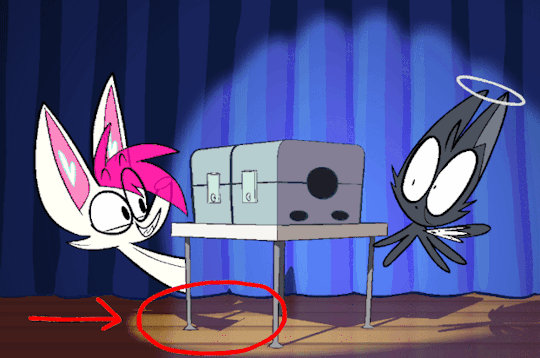
Manually Adding The Shadow Back In
no node fuckery here. i simply made a new layer and drew the table's shadow by hand for each frame and included it in my shadow composite.
this little bit of manual shadow animation really ties everything together and sells the effect in my opinion.
Part Three: Finishing Touches
these aren't necessary, but they add a little bit of polish
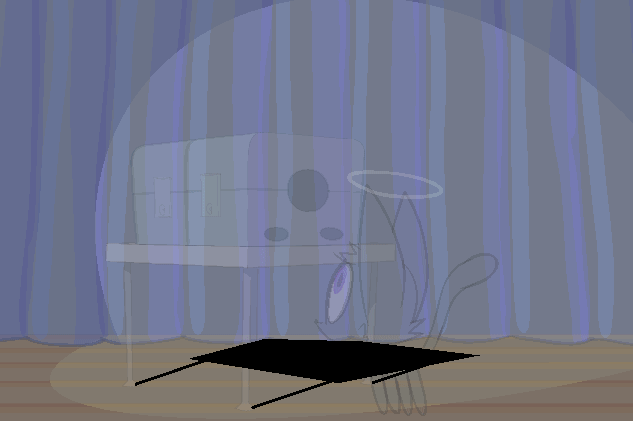
Mesh Warping To Add Form
the shadows subtly wrap around the curtains as if they were a little bit round. just gotta run the shadows through an Apply Peg Transformation node connected to a Mesh Warp node. be warned that the bezier handles on this thing are a lot more finicky than the other bezier handles in harmony and sometimes they bite you.
Blurring Spotlight Edges
in the real world, shadows get blurrier the further away they are from the object that's casting them. it probably would've been a lil more realistic if i slightly blurred the shadows that the characters cast on the curtains as well, but i thought they looked better sharp here. realism doesn't actually matter just do whatever looks Good Enough.
Floor Reflection
i used an Apply Peg Transformation node along with a simple peg to layer a flipped instance of the curtain's Lit shading on top of the floor. blur it (more vertically than horizontally,) set the blending mode to add, and lower the opacity. done!
that's about all i can think of right now. thanks for reading if you got this far!
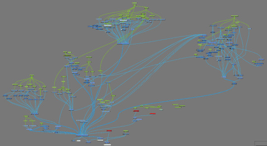
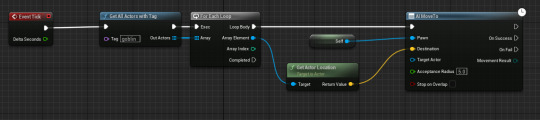
as a bonus here is what the whole node tree for this animation looks like. most of the shadow & background stuff is happening over in the upper right cluster.
43 notes
·
View notes
Text
When I was just a wee goblin pup, the box art of the Game of the Year Edition of Homeworld (1999) caught my eye in the electronics aisle of the local Walmart. The yellow and red striped Taiidan Heavy Cruiser on the cover was probably the first space ship I'd ever seen that wasn't a boring military grey. I bought the game and fell in love with it's music, it's lonely atmosphere, and it's inspired art direction. I later learned that the striped look of it's enemy faction was inspired by the prolific sci-fi covers of Chris Foss, and I spent my teen years collecting many coffee table books that show cased his art. As I attempt my dream of indie game dev, it naturally made sense to allow myself to be inspired by these titans of imagination. To make my art of space ships and backgrounds fit in with my cute and toony Goblin girls, I use 2D art programs to paint over my blender models. First I start with the completed model.
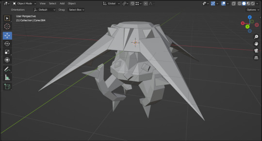
Then, with the help of the Freestyle Add-on, I use it's Free Style Edgemarks to set up the desired patterns.
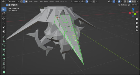
Render, while also exporting to .SVG thanks to another Blender add on.
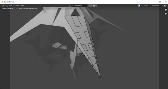
Then I use the recent new breakthrough in later editions of Inkscape, it's excellent Shape Builder tool, to mark out the various areas with basic colors.
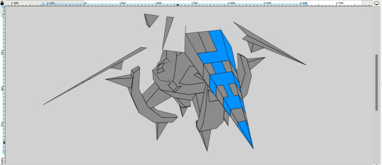
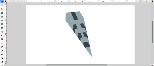
Then it's into Clip Studio Paint for final colors, gradients, and if needed, the application of textures.
Which gives us a nice 2D image great for use with cartoon goblins. And furry, dog-earred toon Barghests in the future.
#my art#Britney's Art#solo dev#indie game dev#blender#3d art#inkscape#clip studio paint#ttrpg#indie ttrpg
4 notes
·
View notes
Text
"the reason why you're so let down by your own art is because you have expectations for it," my ceramics teacher told me, senior year of highschool, where i was trying to make something and i was getting frustrated because i didn't have the skills to build it. with that, she'd essentially made me stop crying on the spot— i was sobbing, because i wasn't sure about anything in my future, and we were nearing the end of the year and i couldn't even make one stupid ceramic piece.
at the time, contextually, life was getting hard.
i was practicing 5 hours a day for solo-ensemble; 2 hours during school and 3 hours after, while trying to pass my graduate-required classes, unmedicated with terrible ADHD. i was exhausted. i'd lost a friend group because they didn't like that i was putting music before them, because i wouldn't see them in the mornings because i was busy in the practice rooms with the pianist working on beethoven, of all things, showing up nearly an hour before school opened for classes because i was so unsatisfied...
and idk. the weight just kind of got to me. i won't lie, being 17-18 was hard. it's too much. and i was just having such a bad time, trying to make something in the one class that actually felt like fun, as opposed to singing that had taken over quite literally my whole life. (it dominated. i couldn't do anything. prospects of going professional; of going to a school specifically for music, because i've done it my whole life, played so many instruments and sang for so long, i even had a dream for three months of becoming an opera singer, because there was a local school that practically everyone who was in this section of my hs got shipped off to after they graduated.) so when i couldn't make a simple rectangular prism out of clay, i just started sobbing. full on tears. i couldn't even breathe.
i think i was having a panic attack.
i remember my ceramics teacher so well, how she was one of those old women who drank green and blue smoothies for breakfast and had expressive, abstract acrylic earrings. her art room was a mess, and it was always made worse by just how she lost everything all the time. you couldn't tell if it was grey hair or clay. she had the smallest, narrowest glasses you've ever seen, full of clay on them, too. all she wore was denim overalls, or flightsuits, and it looked nice on her. i think they fit her really well, and hid that she was skinnier than a normal spine.
she just sat me down—- i don't know how she saw me over the stack of massive sketchbooks on her table, the ones that she was grading them for her 2d drawing class—- and told me that.
"the reason why you're so let down by your own art is because you have expectations for it."
god, i was so embarrassed, crying in the middle of class. it was horrible. humiliating. i couldn't stop myself from crying from embarrassment.
i remember asking her, "isn't that the point?" because this was for a grade, i needed points, i needed all As in my classes because that was the only way in to get to the college that i wanted.
"you're being graded on intention, not the actual box. and you're having too much expectation of yourself to make a perfect box and it's hurting you. it doesn't need to be a perfect box. who are you making?"
she was so smart. she'd clocked immediately that i wasn't just making a random box, but rather a way-too-specific design. i told her that i was creating a character of mine.
"he doesn't need to be perfect. i hope he isn't perfect." she kept repeating that over and over again while i broke down in tears again. with one look at my sketchbook, she went: "oh. you don't even need to make a box. if the box isn't working, try making a hotpocket shape. show me that you're having fun. don't spend so much time trying to fix it."
i still have the ceramic i made. i've been digging through my drawers today looking for a notepad when i found him and i got shotblasted back into the past. it's not bad. it's a little broken, because there was always a girl who loved making things to break in the kiln, so some pieces are missing. my box can't even stand on it's own, either, because it tips forward from the weight (and causes it to break more).
i'm glad i made him, anyway. he's really important to me.
13 notes
·
View notes
Note
Because the excuse to infodump about storytelling is the best thing in the world.....
Here's your excuse to infodump anything and everything, or something really specific and small, about your story :)
Excellent, thank you so much!
I have several, but the most OC-centric one is Artopia. It's a world largely comprised of craft materials, with various different groups coexisting mostly by not paying attention to each other. The idea actually started off as an in-universe kids show for one of my other worlds, but it just sorta... expanded beyond that, heh
Most of the central action takes place in Artopia, which is full of paint- and ink-based designs- Inknatius and his partner Paintricia, Al Crylic, and the Elders (a pair of watercolour paint pucks) are all local to the area. Additionally, there is Pascel the Pastel, who doesn't talk much and is from a different kingdom (and is also frequently the subject of the main character's whirlwind of chaos), and Pencelope, who is more talkative but also from elsewhere
The neighbouring kingdom is the Shadelands, a grey place largely empty of life as the Artopians know it. Nonetheless, it thrives in its own way- Coalette is one of its few inhabitants, tending to the plants on the far side of the kingdom. At the nearer edge is Monochromopolis, home to Lord Blanq- the former antagonist, current in-the-midst-of-a-rewrite-agonist of the show. He erected the Chroma Dome around the city, in an attempt to keep it relatively undisturbed, but our main characters (as children's show protagonists) keep winding him up and causing havoc.
To that end, and his former villainous role, we have his three henchmen - Commander Scrubb, and Turp & Tine. Scrubb is the competent one of the three, but always gets reamed out for taking things too far; Turp & Tune, meanwhile, always end up accidentally foiling Scrubb's plans through their own hijinks
These aren't the only folks in the world, though- Flatpack Box Canyon house the Kardbolds, small 2d stickpin creatures with a fondness for self-decorating; the Sonorous Seas have the Sondifex, a species of living sounds wrapped in cartoony bodies, and Clutter Keep has all kinds of strange and unusual folks. But, the show being as it was these would be short visit locations, likely for an episode or two. Now that I'm re-evaluating it all, though, they can be more fleshed out!
Thanks again for sending this ask- in the process of writing this I came up with several more ideas! This was really helpful!
7 notes
·
View notes
Text
🕯️ Doll Room APK – A Chilling Journey into the Haunted Unknown
If you're a fan of atmospheric horror and mysterious puzzles, Doll Room APK is a game that will crawl under your skin—in the best way possible. This indie psychological horror game immerses you in a dark and twisted room filled with eerie dolls, cryptic clues, and secrets waiting to be unraveled. More than just a scare-fest, Doll Room offers a hauntingly beautiful experience that combines suspenseful storytelling with clever brainteasers.
🎮 What is Doll Room?
Doll Room is a single-player horror puzzle game set entirely within a dimly lit room full of antique furniture, old toys, and—most notably—strange, unsettling dolls. You, the player, awaken in this mysterious space with no memory of how you got there. As you explore the room, you must solve puzzles, find hidden objects, and piece together fragments of a tragic story.
This game doesn't rely on loud jump scares. Instead, it builds tension through its disturbing atmosphere, eerie audio design, and clever environmental storytelling. Every doll has a story. Every shadow hides a secret.
🧩 Gameplay Features
Point-and-Click Mechanics Tap around the room to interact with objects, examine furniture, or investigate unusual markings. Look closer—many items hide clues within.
Challenging Puzzles From locked boxes to coded drawers, each puzzle you solve brings you one step closer to uncovering the truth. The game encourages logic, observation, and attention to detail.
Atmospheric Sound Design The unsettling creak of floorboards, the soft whisper of wind, and the distant laughter of a doll create an immersive horror experience.
Mysterious Narrative As you interact with the environment, the story unfolds bit by bit. Who locked you here? Why are the dolls watching you? What happened in this room?
🎨 Visuals & Art Style
The graphics in Doll Room APK are both beautiful and creepy. The developers use a muted color palette—mostly greys, browns, and soft lighting—to build a mood of quiet dread. The dolls are highly detailed, with cracked porcelain faces, old-fashioned clothing, and glassy eyes that seem to follow your every move.
The room itself feels like a character, filled with relics of a forgotten time. Each object tells part of the story, and nothing is placed randomly.
🧠 Who Will Enjoy This Game?
Fans of horror games like Fran Bow, Detention, or The Room
Puzzle lovers who enjoy challenging riddles wrapped in a dark atmosphere
Gamers who prefer psychological horror over action-based survival horror
Players looking for a short, story-driven mystery with immersive storytelling
⚙️ Technical Details
Platform: Android (APK)
Game Type: Offline, Single-player
Genre: Horror, Puzzle, Psychological Thriller
Language: English and other languages (depending on version)
Graphics: 2D with interactive elements
Control: Touch-based point-and-click
💡 What Makes Doll Room Stand Out?
Unlike many mobile horror games that rely on cheap thrills, Doll Room offers a slow-burning mystery wrapped in a compact, immersive experience. Its emotional tone, paired with smart design and minimalist horror, leaves a lasting impression on players. You’re not just solving puzzles—you’re uncovering a dark, forgotten tale hidden behind glass eyes and porcelain smiles.
🌌 Final Thoughts
Doll Room APK is a perfect blend of horror aesthetics and puzzle-solving gameplay. It’s not just about being scared—it's about being curious. Every creaky step, every eerie whisper, every mysterious doll adds to the intrigue. Whether you're in it for the mystery, the puzzles, or the atmosphere, Doll Room delivers an experience that's both haunting and unforgettable.
Are you brave enough to uncover the truth behind the dolls?
0 notes
Text
Differences between the first trailer for P3 and the final game.
Opening part 1
The Atlus logo is more saturated.


All the 2d cutscenes have no interlacing. Relatedly, they're also at a higher framerate.
The aspect ratio is taller in the final. Mostly, you can see more of the images.
The tower rotates in the background differently. It seems to be the same model, just offset a bit.

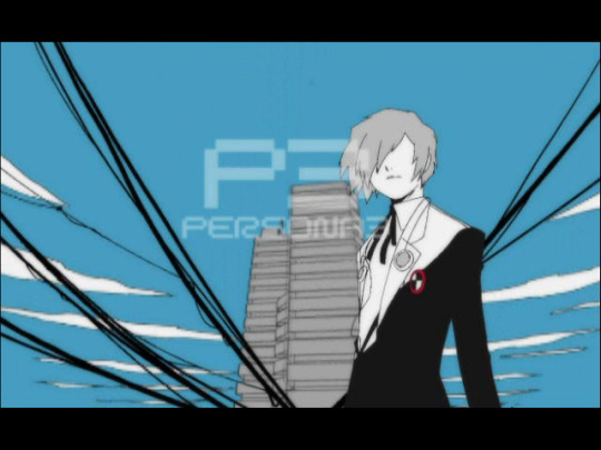
The text elaborating on Memento Mori doesn't slide in until Memento Mori has. The grey box also isn't starting to disappear.


The road has more detail instead of being a grey smudge.


This cut is hard instead of a fade. There's also two ms in sum.


The butterfly actually has a few less frames before the cut.


The afterimage of the text is slightly different.


The afterimage of this text doesn't mirror how the background is segmented.


The screen flashes before turning dark. In the final, it stays dark for both frames.

The Persona and Shadow words are different.


This scene ends later: the red line folds in on itself, instead of ending as a square.


The red dots are bigger, meaning that there are less of them and they're placed differently. They become the same when the tear arrives, meaning that they also must zoom in slower.


Aigis isn't properly alligned with the cuts in the screen, which got fixed in the final.


It stays on this shot for only about 2 frames, while the final lingers for about 6.

#persona 3#get ready#only the first 2 are actual screenshots of the game the rest are the raw sfds since i need the right frame#so the aspect ratio of all of them is different but you can still tell the finals are taller because they have more of the image in them#yes i am going through this frame by frame its really interesting#im not counting colour differences because it might just be recording/compression on both sides#plus you can see them yourself
1 note
·
View note
Text
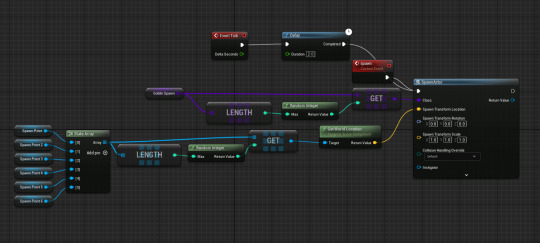
My Skills that I have accumulated while at the College
I have made a Mind Map of all the things and skills I have done and gotten in each project so far.

During the 2D Project I had to move the Camera perpendicular to where the player was facing and going. There was also a Score system which was a skill I later reused in the Arcade Project, as well as Playtesting which wasn't possible in the 3D First Person Project because I didn't even have a completed game to test. There was also a Win and Loss state, so far it's the only project that has one. This was activated with Collision Boxes and Progress Bars.
On Photoshop I made Sprites, Sprite Sheets to make Animations for my game and looking back on them they weren't that bad.
For my 3D First Person Project In Unreal I used the Landscaping tool to make hills and crash my GPU 60 times. While Grey Boxing the environment. And for the more important models like the Bike my character was going to ride on, but more importantly my Bag (my chest for K9 digital).

For this to look like a Bag I needed to make its UV Map and Export into Quixel Mixer another Software I had to use.

Then for My Arcade Project all of my artwork was made in Photoshop the Background and the Buttons. And all of the coding was done in a Blueprint Widget. This was because it was a question game, there wasn't any other assets that needed code.
My Skills: I can model pretty well, know a lot about Widgets and Buttons.
What needs some help: my Photoshopping Skills aren't the best, I can't remember most of the Code
What I have no clue about: How to export Models into Quixel Mixer, How to make a UV Map, how to Code something from scratch.
0 notes
Text
Idea Generation 2 - Contextual Research
Alexandre Martin - The North Face
Because I want to create a snowy environment for this project I found it fitting to take a look at someone else's snow environment that they have made. I took a look on Artstation and found an incredible looking snow environment that is focused around a tall mountain.
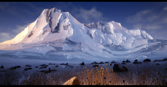
(creds: https://www.artstation.com/artwork/aRq0zR)
As you can see here the visuals are beautiful and a big inspiration. I love the lighting and the way one side of the mountain is gleaming due to the sun light and the other side is dark and gloomy, this would really suite the look I am going for with my environment. I will definitely use this for some design inspiration if I choose this idea.
Loïs Mistrot--Dauzères
Loïs Mistrot--Dauzères is a 2D concept artist and 3D generalist, she focuses on world-building and narrative design which I can relate to as I am passionate about world-building. I will be looking at a recent work of hers in which she has created an abandoned alien temple as a personal showcase of her skills and what she had learnt throughout her studies at e-artsup.
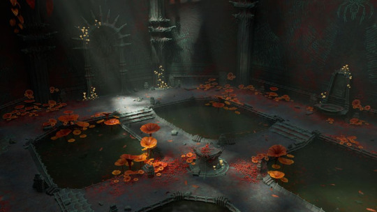
(creds: https://discover.therookies.co/2024/04/06/game-ready-environment-unreal-engine-5/)
Here you can see an aerial shot of a open cavern full of mysterious plants and strange architecture that would be expected of an alien building. The walls have incredible detail as well as the pillars, floor, doors and doorway, altar in the middle and the excellent lighting that is beaming through the ceiling into the cavern highlighting all of the detail within the environment.
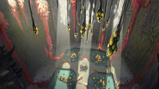
Here is some concept art that she created during production to gather an idea of how the environment would turn out and to understand the processes she would need to go through.
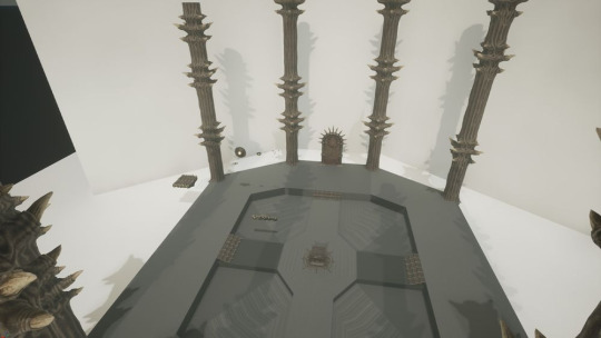
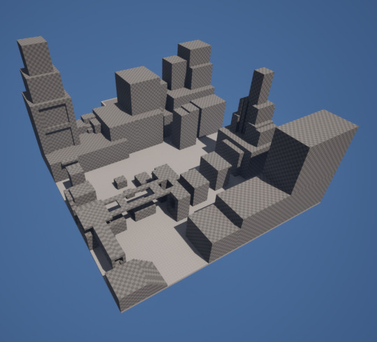
She also grey boxed the level which is a really useful technique as it allows you test out the layout of the environment, for games this would be to test gameplay but for cinematic shots of the environment like she has done it is good for understanding where things will need to be placed to get the best results for the shots.
She also created a mood board, this is quite useful and something that I do for all of my projects. It shows where and how you gained ideas for what you are developing and gives you inspiration for your work.
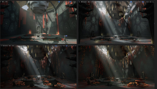
This is a screenshot of her level art process, it shows how the level really comes together throughout development and once everything has been added to the level.
She is a really big inspiration for me as I have a similar interest in world-building and creating cool and unique environments such as the alien temple. I will make sure to take some tips from her workflow such as the level concept art as well as the grey boxing process, for testing playability though so different to what she used it for.
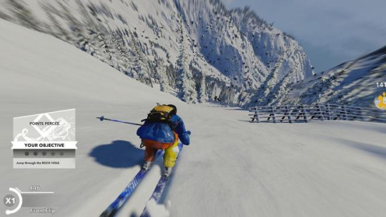
STEEP
(creds: https://www.news.com.au/technology/home-entertainment/gaming/ubisofts-steep-is-the-worlds-most-extreme-snow-sports-simulator/news-story/03e9e0866319cfdc5bb11b56464829fd)
STEEP is a sports video game based in the Alps, in which players can play several winter and action sports for example, skiing, snowboarding, paragliding and wingsuit flying.
The main reason I am looking into this game is the environment/world that the player is in, it is based upon a real-life mountain range called the Alps. The snowy mountains, trees, snow and ice lakes all make up the world and are all associated with a snowy environment. This tells me that I would need to include these things in my game if I choose this idea.
The game is quite expansive and full of things to do such as racing in different mountain sports and also just exploring. I would love to do something like this for this idea however I would not have the time for it or the ability to as I have never attempted something like that.
It is a good reference point for if I choose this project and start on designing the environment so I would use this for inspiration for sure.
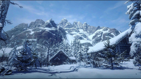
RDR2
(creds: https://www.reddit.com/r/reddeadredemption/comments/d3wytm/i_feel_that_the_snowy_areas_of_the_maps_are_so/)
Red Dead Redemption 2 is an incredibly popular action-adventure game in which the player plays as a character called Arthur Morgan who must deal with the decline of the Wild West while attempting to survive against government forces, rival gangs, and other adversaries.
RDR2 is very diverse and full of different biomes throughout the world, such as snowy mountains, grasslands and deserts. I am only looking at the snowy areas due to the focus on snow environments for this idea, hence why I chose the above picture. I feel like this picture shows off the incredible scenery in the game and how well the snowy environments have been done. The main thing that catches my eye and what I will most likely be using for inspiration from this is the snow-topped mountains. The intricate details and the way there is snow in the crevices in the mountain adds to the detail and immersion. I think if I used the mountains as inspiration and based the ones I plan to include in the game on RDR2's snowy mountains it would make the environment seem very realistic.
Metro Exodus
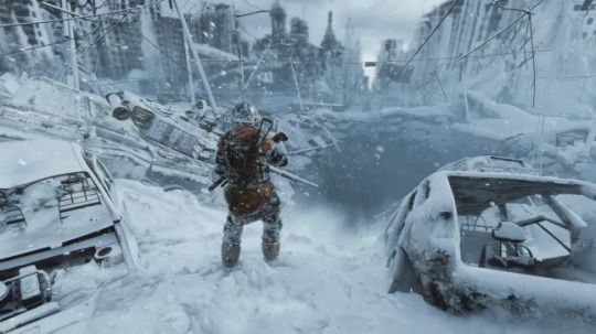
(creds: https://metro.co.uk/2019/02/13/metro-exodus-review-russian-fallout-8612553/)
Metro Exodus is a first-person shooter game following the protagonist Artyom and his crew as they flee the Moscow Metro and travel through Russia and Kazakhstan on a train called the Aurora.
Although the environments in this game are snowy they are not what I would want to develop for my game, what I am going for is a natural environment with no human interruptions set in a mountainous area. This does contrast this game as it is set in built-up areas of Russia. I wanted to look at this game though as I find the snow coverage and physics to be very interesting and inspiring. I like the way the player can interact with the snow on the floor and how all of the abandoned objects in the world are snow topped to show how long they have been abandoned for.
Even if I do not use it for inspiration for my environment design I will take inspiration from the snow coverage in the world, such as the differing depths of snow on different things to show how long it has been since they have moved.
0 notes
Text
skills i have so far
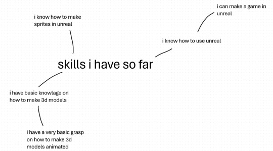
I have gained these skills on my previous projects where I mostly made games and did a bit of 3d modeling I think that the main skills that I could apply to my FMP is being able to make a game as I feel very confident and know how to make a simple game I do not have the most amount of confidence in my 3d modeling skills but I want to apply my limited 3d modeling skills to my FMP and hopefully improve that aspect of my skill set
my specialist practices
coding in unreal engine
3d modeling in Maya
making sprites in photo shop
creating maps and gray boxing in unreal
making basic AI in unreal
coding in unreal engine
in my 2d project and my arcade project I have learned a lot about unreal and how to make things using it such as in the arcade project where I learned how to make spawner and figured out how to make all the collisions work
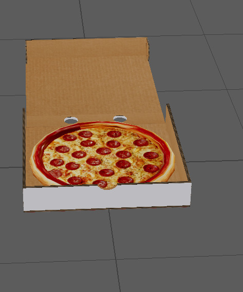
3d modeling in Maya
I do know how to make basic models and use the modeling tools in Maya I know this because I have made models in Maya for my 3d project such as a pizza box and a compass I do know how to use magica voxel but I much prefer to use Maya and I'm a lot more confident in using Maya
making sprites in photoshop
I have made sprites on photoshop and ported them into unreal for about every project I have done so far so I am very confident in my ability to create sprites and port them into unreal and animate them to do different things with code as well
creating maps and grey boxing in unreal
I definitely know how to make maps in unreal as I have made multiple maps both 2d and 3d in unreal and I can also use unreal to change levels I have definitely improved on my map design skills as my first couple were very bear bones and bland to where I really change the level around the movement and ability's of the player and making it flow a lot better
making basic AI in unreal
I recently learned during the last project how to ad more complicated AI in unreal to make my games more dynamic although I am still new to creating AI I do have a basic understanding of how to create and use it in my games without it causing problems or not working and I could improve on that aspect of my skill set
0 notes
Text
Censored Poster #1
As mentioned previously, I initially worked with text for my 2D poster. How I quickly realized the concept and execution wasn't strong enough.
Therefore, I transitioned to portraits (as seen in the previous post). However, during the critique on Monday, it became clear that the portraits themselves were also not strong enough. They failed to convey the message of censored information, leaning more towards distortion. Hence, following my peers' recommendations, I experimented with black bars—a graphic tool that obscures "sensitive" information or images with black, grey, or white rectangular boxes.
Following are quick gifs I created using this new tool.
0 notes