
A compound eye of crustaceans, anthropods, and other invertebrates. Comprises numerous small units called ommatidia.
Don't wanna be here? Send us removal request.
Statistics
We looked inside some of the posts by ommateum and here's what we found interesting.
Average Info
Notes Per Post
18
Likes Per Post
10
Reblog Per Post
0
Reply Per Post
8
Time Between Posts
15 hours
Number of Posts By Type
Text
17
Last Seen Tumblr Blogs


Fun Fact
The Tumblr app for Google Glass was released on May 16, 2013.
Text
Writing Initiative #7
What have you learned about yourself?
I’ve learned that I really rely on structure, deadlines, and especially direction. Going into this class, I already knew I would probably struggle a bit with the self-directed format, but I wanted to give it a go and see where it would take me. I figured being uncomfortable might be a good thing for growth, and it definitely was. While the openness of the assignment allowed for a lot of creativity, it also left me second-guessing a lot of my decisions. I realized I tend to wait until I’m totally sure of an idea before starting, which can hold me back. This course pushed me to start experimenting earlier, even when things felt uncertain, and to trust that something could emerge through the process itself.
What did you find to be the most difficult aspect?
Translating my word (which was mainly scientific based) into a visual and conceptual direction was probably the biggest struggle. It took me a while to figure out how to move beyond the literal definition and find something I could expand on meaningfully. I spent the better part of 3 to 4 weeks working through critiques, research, word maps, and small experiments before landing on the idea of censorship. Once I made that connection, everything started to fall into place, but getting to that point was definitely a challenge.
What did you enjoy about this opportunity?
This was really different from anything I’ve done before. Most of my courses at OCAD have been much more structured or rigid in terms of expectations. Assignments are usually predefined and we’re often working within a set framework (which I do sometimes like, to be fair haha). I wasn’t sure if I’d take thesis, so I saw this course as a bit of a trial run. I really appreciated the opportunity to explore something in my own way. I doubt I’ll get this kind of creative freedom again; definitely not in another class, and probably not after school, either. Not only could I take the concept in any direction I wanted, but I could also approach the execution however I wanted (in terms of material, aesthetic, or even format).
How would you rate your performance over the course of the semester?
I think I did pretty well overall (like a 8/10 maybe). I persevered and kept pushing through, even when things didn’t go to plan. I continually experimented and tested new ideas, and I made sure to show up to critique every week with something to present. Of course, the pieces could always be more polished or better crafted, but considering my engagements outside of this course, I feel like I gave it a solid try.
Hindsight is 20/20, what would you do differently?
If I could do things differently, I’d start planning earlier and give myself more time to develop the later projects. I think my outcomes could have been more fully realized if I had considered how they would build on one another right from the beginning instead of focusing so heavily on the 2D. Honestly, throughout the semester, I kept getting stuck in the brainstorming and ideation phase. I was anxious about making the wrong decision or messing something up, but in the end, the real mistake was not doing anything at all.
Thanks again for the amazing semester!! Have a nice summer!!
1 note
·
View note
Text
Reflective


A circular book made of cardstock and vellum, bound with a Chicago screw. Composed of distorted images, the book reflects on pauses, authorship, and the act of shaping meaning through absence.
4 notes
·
View notes
Text
4D


(+ the screen)
An altered LCD screen viewable only through polarizing filters, exploring access and control of information using archival footage on house flies. The hexagonal filters reference the structure of compound eyes, while the polarization connects to how some insects perceive polarized light (a spectrum invisible to humans).
3 notes
·
View notes
Text
3D


A series of Rubik’s cubes that scramble and obscure quotes on censorship from George Orwell, reflecting the distortion and control of information. Visually resembles the pixelated nature of compound eyes.
2 notes
·
View notes
Text
2D


A lenticular poster that reveals and conceals a portrait depending on the viewing angle, playing with fragmented and distorted perception shaped by limited access to information.
1 note
·
View note


Text
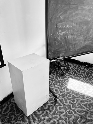
Plinth Secured
I’ve officially secured a plinth for the final setup!! It was a hassle, but I think it'll definitely be worth it!
1 note
·
View note


Text
Vellum Printing Issue
I printed the vellum pages at home as usual. Last time, I had issues with the pages bending (from the amount of ink), so this time, I lowered the opacity of the images to avoid that. It did help with the warping, but it gave the ink a strange greenish hue that didn’t look good next to the solid black pages. I ended up reprinting them at a higher opacity for better contrast. I’ll keep you updated!
(it doesn't show very well on tumblr bc of the b&w...)
1 note
·
View note
Text
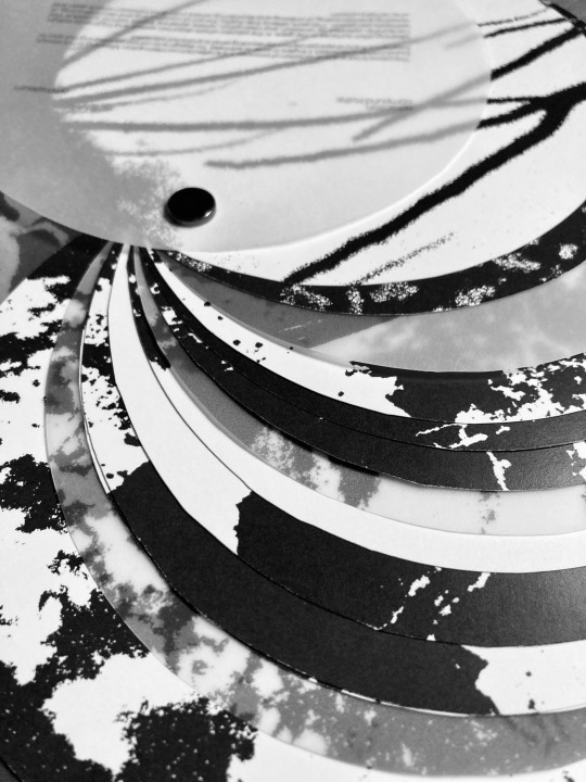
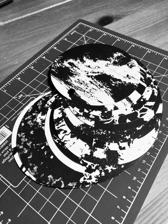
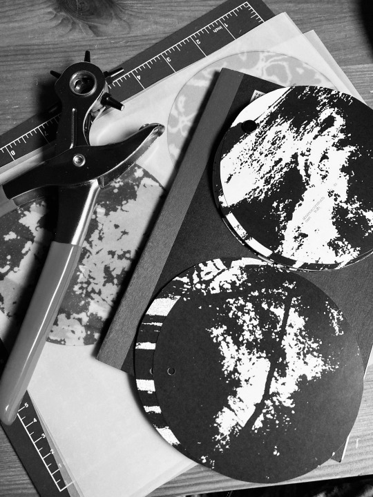
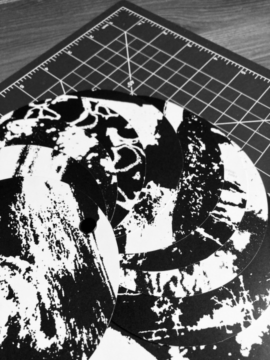
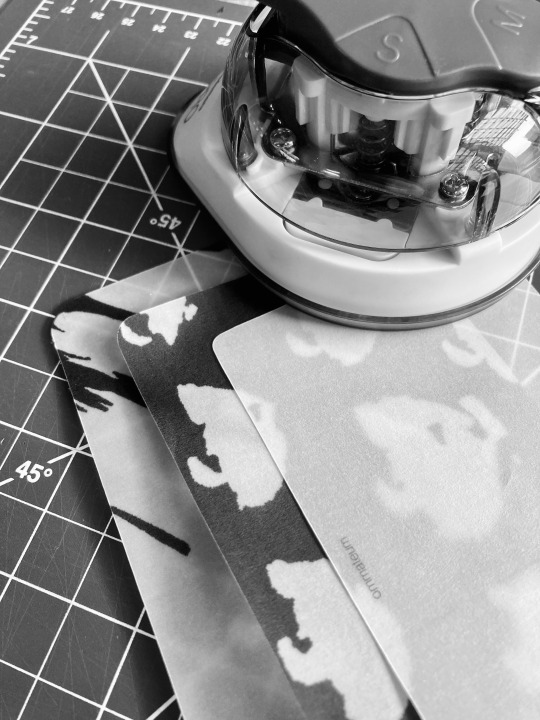
Circle Reflective
For the last one-on-one critique with Paul, I brought in a draft of the rectangular version of my reflective book. While the concept itself was working, he felt that the rectangular shape didn’t quite connect with the rest of my work. My other projects all relied on symmetrical or “perfect” forms (like cubes and hexagons), so the rectangle felt out of place.
He suggested switching to a circular format, to better align with ommateum.
I revised the layout to fit a 5 x 5 inch circle, adjusted the images accordingly, added a few more spreads, and sent two versions to the print shop (anticipating some cutting issues). Once printed, I tested different ways to cut the pages:
protractor circle cutter (thanks Mandy!)
scissors
olfa knife
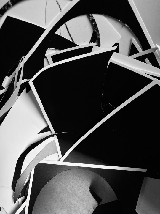
Each method had its problems. Some pages ripped; others didn’t cut all the way through; and the black backs made every flaw more visible.
Eventually, I used a pair of scissors with a circular guide (an old Wii Just Dance disc haha) which worked decently. It is still far from perfect, but it was the best result I could get with the tools and time I had.
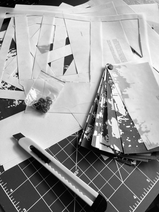
For the hole punching, Olivia lent me a leather hole punch with adjustable sizes, which worked really well. I used a paper guide to align each page and the results were much cleaner!

0 notes
Text
3x3 Rubiks Again
I ended up remaking the 3x3 cube... Not because anything was wrong with the first version, but just because I had extra stickers and wanted to try a slightly cleaner application. This time, I focused on placing the letters more precisely to better cover the underlying colours.
It’s a small improvement, but I think it helps the overall finish look a bit more intentional.

0 notes
Text
Reflective Process
I printed a draft version at home using regular bond paper just to get a sense of scale and binding mechanics. But… turns out I misread the screw post listing (the 8mm measurement was for the top of the screw, not the post itself). Soooo the hole I punched is way too big. Right now, I’ve tried hacking together a washer for the back of the book to hold things together, but it’s not really working (and honestly, it looks bad). I’m considering switching the binding method — maybe a simple binder clip or even a C-ring? I’ll ask for feedback on that.
Another issue: since the paper I used is thin bond paper, there aren’t enough pages to properly fill the screw post. I’m hoping that using heavier paper weight from the print shop will fix this, but if not, I might add a couple more pages just to give the binding more tension.
Alsooo… I ran into an issue with the hexagon pattern on the backs of the pages. I forgot to flip the design symmetrically when printing, so the fade progression is out of order.
Finally, I’ve tested three different corner round sizes on scrap sheets and I’ll be asking for feedback on which one works best.
0 notes
Text
Reflective Concept
I’ve been working on the reflective piece, which explores the idea of design as both authorship and redaction. Throughout this semester, I’ve realized that I wasn’t just constructing meaning; I was also controlling and fragmenting it by deciding what to show and what to withhold.
Text:
At the very beginning, the book starts with a short intro text on the cover. Layered throughout the book are short, fragmented quotes that explore authorship, perception, and control.
Format/Images:
The piece takes the form of a small, screw-bound book (~5.75 x 2.75”) where the primary focus is on full-bleed images that have been intentionally distorted and abstracted. These images are sourced from my weekly walks; moments where I stepped away from making to pause and reflect. These walks acted as a form of interruption in my creative process, mirroring the themes of absence and incompleteness that run through the piece.
Interspersed between the full-bleed image spreads are a few vellum pages that feature process images from my previous projects this semester.
Process Example:

0 notes