#green color website templates
Explore tagged Tumblr posts
Visit Tumblr Blog
Explore Tumblr blogs with no restrictions, modern design and the best experience.
Last Seen Tumblr Blogs


Fun Fact
The “We are the 99%” Tumblr blog became the slogan for the Occupy Wall Street movement.
Text
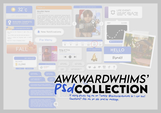
In celebration of reaching 900 followers!
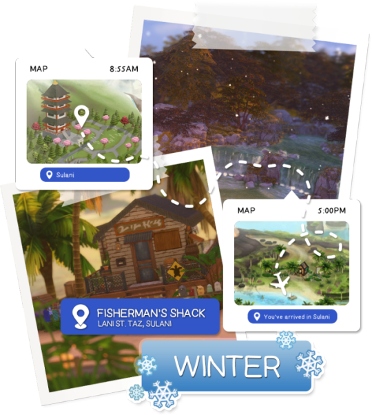
Ever since I started playing the Globetrotter challenge by @moonfi; I've been creating a collection of UI Widget style templates. This collection includes 20(ish) different templates for you to use in your gameplay screenshots. I'm hoping I did my best to make this as user-friendly as possible; but if you have any questions or notice something off - don't hesitate to message me or send an ask!
[Terms of Use] Do: Use & edit as much as you want and/or know how to. Don't: Reupload & claim as your own. Do: Link back to this post if asked where they're from.
[You Need] Fonts: April | Lemonmilk | Kids Handmade TS4 Icons: deathbypufferfish | w-sims | TheSimKid (I've had L'Universims' icons before they were hacked but as far as I know they've moved to a new website so download from there at your own risk.)
DOWNLOAD (SFS) 66.3mb **FIXED** (Missing moodlet)
ALT DOWNLOAD (Mediafire)
[Tips & Hints]
Open the awkwardwhims psd collection file in Photoshop, then drag & drop the folder or group of templates onto your image.
The photo album template was inspired by @folkbreeze (definitely check out their resources, they're all so nice!) & other various examples I saw online.
Resize the template by selecting the folder as a whole; resizing individual layers may makes things unaligned.
Feel free to change background colors/fonts/etc as much as you want.
The text message template has 3 styles: sender, green receiver & blue receiver. There are also reaction icons & a separate reaction bar.
For the to-do list template I didn't include every aspiration icon (I was trying to keep this file as small as possible) but you can download this pack by @deathbypufferfish that has all the aspiration icons you'll need. However, it may be missing some of the newer aspiratons.
When adding photos (album cover/recent photos/etc) use a clipping mask.
The weather template includes all the different weather icons, so be sure to hide/unhide the one that applies.
For the new transaction template, make sure to only change the number of the price otherwise the Simoleon symbol will get changed to Times New Roman.
The notification message template is for life events, bad events & default game notifications (ie: legacy player, etc).
DOWNLOAD (SFS) 66.3mb **FIXED** (Missing moodlet)
ALT DOWNLOAD (Mediafire)
@alwaysfreecc @maxismatchccworld
2K notes
·
View notes
Text
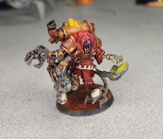
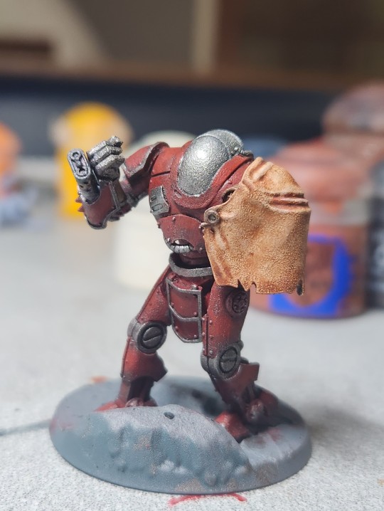
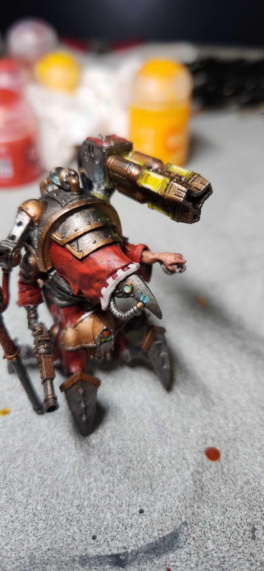
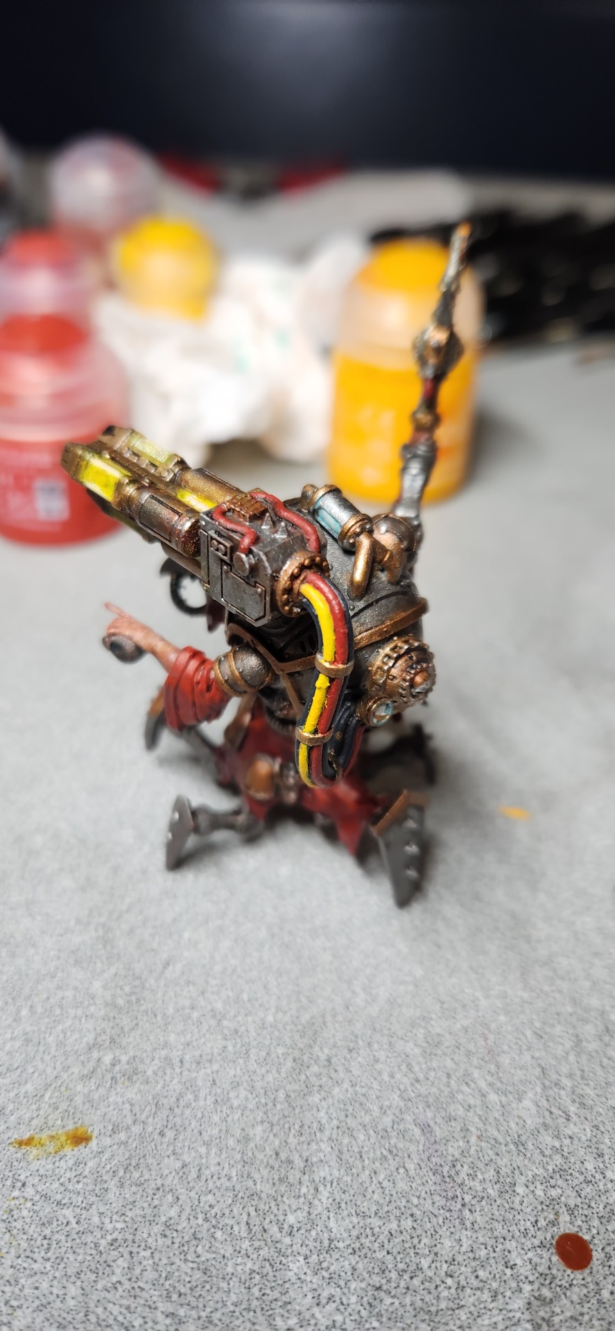
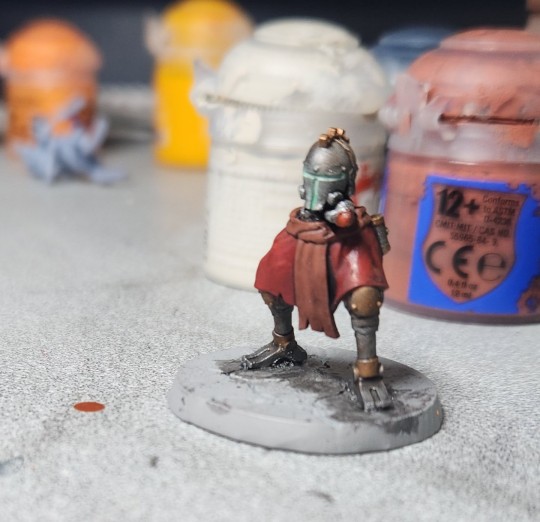
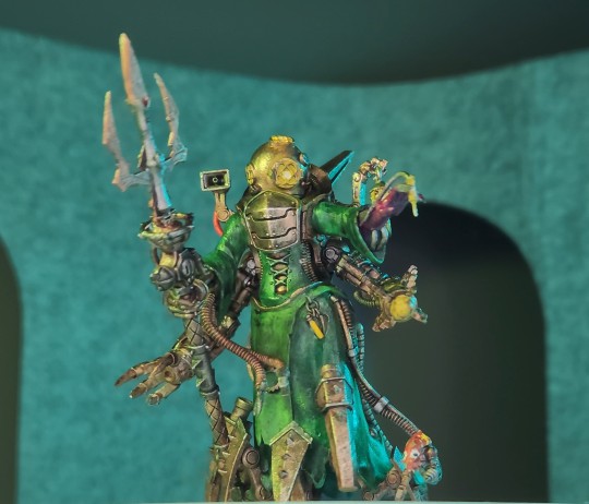
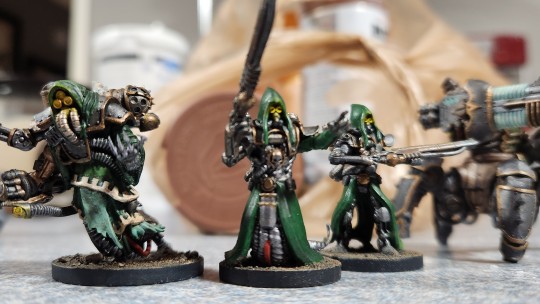
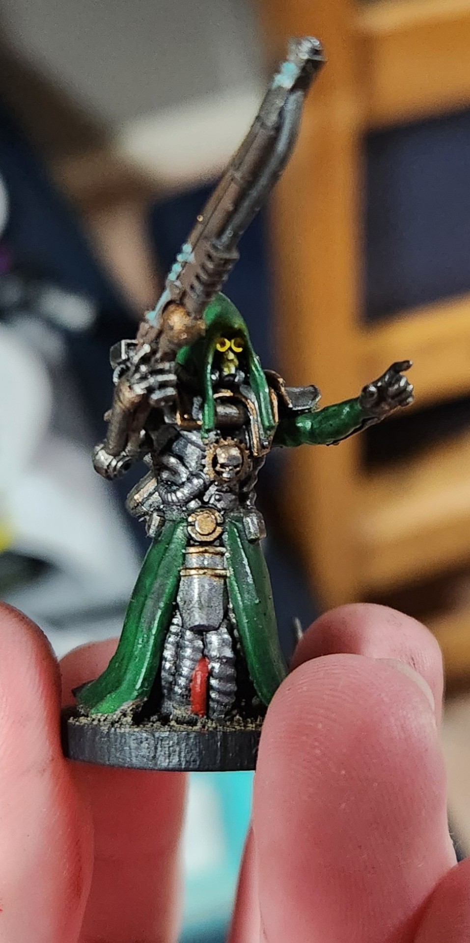
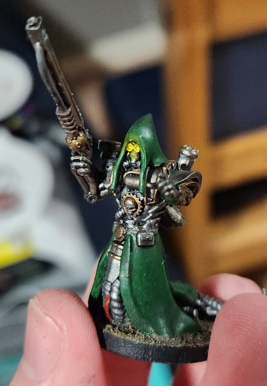
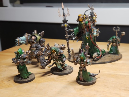
Skit's Mini Painting Journey Pt. 3
The Admech one.
C'mon, you all saw this one coming.


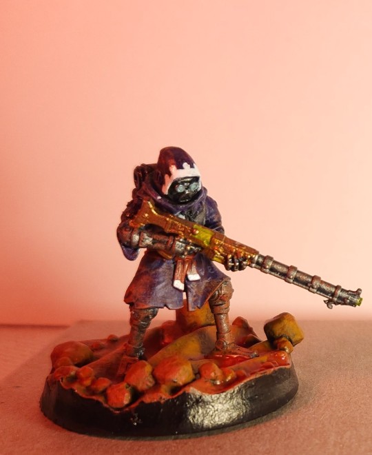
Back when I was painting my nurgles purple, I wanted to do a similar color scheme for my Admech army. I slowly moved away from it however, as I didn't quite like the way it turned out. The green and purple look took to Nurgle well, but purple Admech on desert planets didn't make a whole lot of sense. Didn't stop me from trying though, and while they certainly didn't look bad, I'm glad I didn't stick with it.

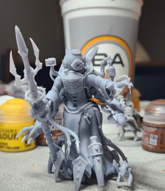
The Mars Pattern Family

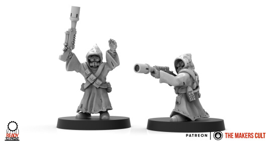
This little fella may look familiar! Here was my first attempt at a more traditional mars pattern skit, and a jawa-esque one to boot! This was a kitbash of a proper galvanic rifle and backpack being added to The Makers Cult's Lil' Recruit.
I mean, Jawa admech is so amazing, but I had to have my little guy properly equipped!

Continuing the Mars linage is a technopriest and engiseer, both TMC printed minis. I love the way these two look. The face-shield on the technopriest looks amazing, and I'm incredibly proud of the reflection on it. The OSL on the hand isn't very visible in the picture, but it also looks really good.
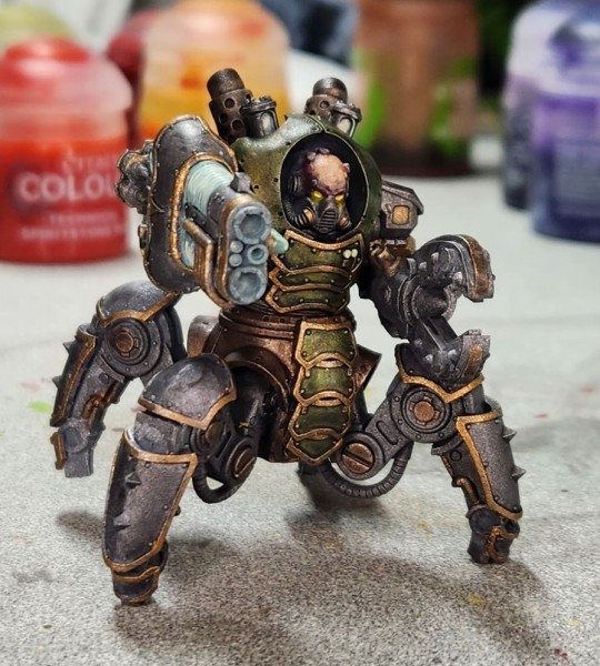
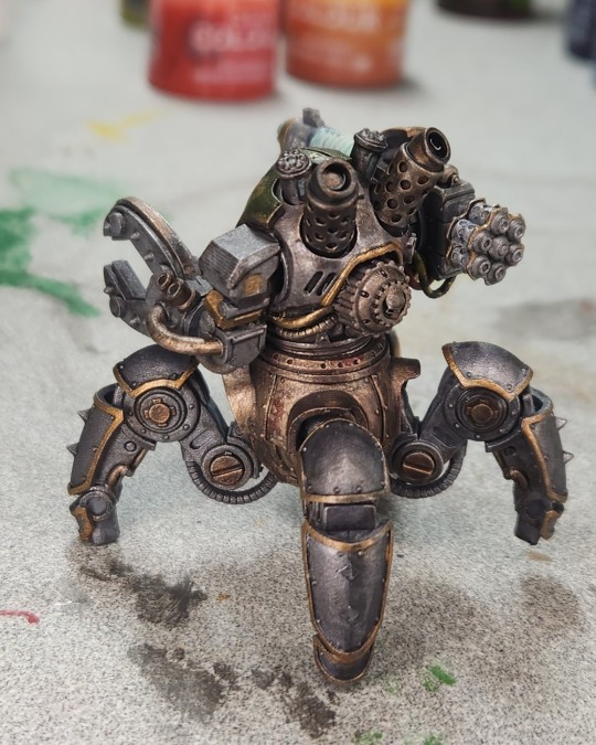
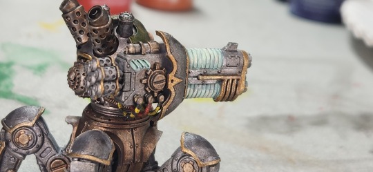
This Thallax bot was supposed to be a Kastellan Bot for @elnubnub, however I got the two mixed up and picked the smaller one. I'm going to eventually remedy that, but he still looks good nonetheless.


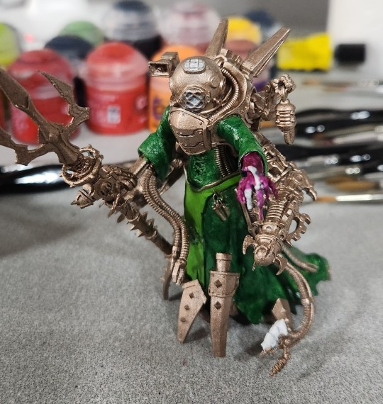
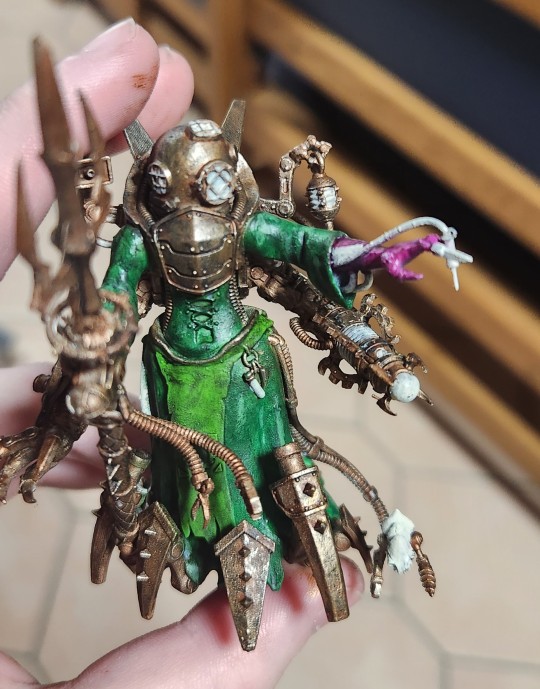
This is by and large one of my best pieces in my opinion. Back when @cannibalcaprine had a bird face, this model was more applicable. Dominus Hera has so much soul and time put into her I don't know if I'll ever be able to replicate the state of mind I was in that let me get this mini to look this good. The cloth effects are fantastic, the OSL from the gun is fantastic, the molten axe is fantastic, the color choices and layout is fantastic, the cables are fantastic; I don't know who painted this mini, but it certainly wasn't me. It couldn't have been.
And the most important member of the Mars Pattern Family, the fan favorite: Goober. A kitbash gone wrong gone right. A broken mini finally becoming whole. The legend himself. What more is there to say?
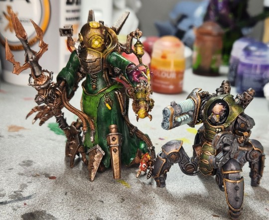
Finally: The Submechanicum
Penelope, the Ocean Queen. My first model I painted for the Submechanicus. I'd love to say that this is my magnum opus, considering I made a whole video about her and everything...
However, I must rip the band aid off and say that this is the first version of Penelope...
Because what immediately followed her was this beast. This is the Krabaphron, another contender for one of my best models. This sucker was so genre defining, that it set a new standard for the rest of my Submechanicus army and would cause me to re-do my color-scheme and paint job planning going forward.

I based all of my future Submechanicus models off of it, using it as a template. The Skits and Techpriest both got the same treatment and I've got to say, I'm in love with the way it looks. I've continued using this style so far and I haven't had to make many modifications.
As such, Penelope... didn't quite fit the bill anymore. She stood out from the rest of the models.
So... after a livestream of planning and base layering...


She was finally given the paint job she deserved.
And that's just were our story begins fair traveler... With the rise of the Depth Guard, a proper protector of the Submechanicus will be needed to combat the forces of Nurgle... And coming late April, there will be such a machine surfacing, with a video to present it.

Of course, this is quite an older photo. It's far more painted than that. I've teased photos of it so far, however I'm saving the proper display of it for the video, so be on the look out if you want to see the completed product!
And that's about it! Hope you've enjoyed this little walk down memory lane and gallery of my mini painting endeavors! I'll be making a website for easier viewing once I've gone through and gotten some more professional looking pictures done. Thank you for reading and viewing!
-Jerry
#adeptus mechanicus#admech#skitarii#40k#warhammer#warhammer 40k#warhammer 40000#miniature painting#mini painting#skitposting#photo dump
193 notes
·
View notes
Text
No one remembers Anime Spiral
What do kids even do on the internet? I'm genuinely asking. Everything revolves around social media and that's fine but what do they do. Are their cool things they can do anymore?
There used to be websites and you would just wander the internet on the family computer. Newgrounds. Gaia Online. Neopets. Yahoo Games. Quizzila. Live Journal... I'm not saying they were all great but they were something to do and... no i'll commit, they were great. I wasn't worried about posting pictures of myself when i was busy watching a flash animation of Dragonball Z that someone put painstaking hours into.
A lot of younger kids and teens don't know how to download something and save it to a particular folder on their computer because they've never used a computer. Meanwhile we were somehow... coding our Myspace pages to have a particular background. When did we acquire that knowledge?
In 2004/2005 i went looking for Inuyasha pictures, as one did, and i stumbled upon a site of people posting fanfiction? Sign me up... Anime Spiral was the wild west of chaos fanfic writers. People would make banners for their work that would sit in their summary sections. God help you, but those seizure inducing flashing colors were going to get your attention.
People would write anything, stories, poems, lyrics. People would post art and open commissions for people to ask for things in the comments, and the OP would just do it... There were frantic collaborations. Some were really good. Some were really bad.
There were chaotic originally stories with random anime characters thrown in for fun because who was going to tell them they couldn't? Some people just ranted to anime characters and i will always remember Ask Sesshomaru where you'd ask Sesshomaru a question in the comments and the next chapter he would answer every.single.question. The fact that it was probably a 16 year old girl writing that just didn't matter.
Some people just posted picture of anime characters. They did all the internet searches so you didn't have to! They were harder to find then.
The comment/response section to this day... was the best format i've seen on a fanfic site (imo). It was so easy. I miss it! I miss going to my word processing class and pulling up that site and chatting with people in the freaking comments of whatever...terrible story i'd posted at the time. I was probably so proud of it then but yikes...
The notification system was good and it was easy to talk to people without it feeling intrusive.
Maybe Anime Spiral was Tumblr before Tumblr.
I met two strangers on Anime Spiral a week apart. Internet dangers weren't as obvious then as they seem now. Those two strangers became two of my best friends. It's been nearly twenty years and they are still so prevalent in my life.
I met my best friend on that site. That seems so impossible to me now. We never would have met otherwise and i can't imagine my life without them. We were so upset when Anime Spiral went down. We missed the ugly green and mustard yellow template to this day.
It wasn't a great site, it had it's problems... It had a lot of problems but at the same time, it was a great site. It's hard to find people who even remember Anime Spiral anymore. Going to FF .net or Fiction Press afterwards felt like... a downgrade somehow. The systems overly complicated and it lacked...something.
I do enjoy the hell out of AO3, it actually checks all the boxes for a great writing site, but i'll always remember the chaotic nostalgia of Anime Spiral.
What do kids do on the internet now? Is it safe? Is it just selfies, gossip, and bullying? Do you have a little dragon you can take care of? Neopets could take up a lot of their attention. I don't think 2024 Neopets is the same as 2005 Neopets and that's a shame.
I have no idea. I feel old.
22 notes
·
View notes
Text
I was poking around the pages of Welcome Home’s website again (when am I not) and I just realized something. For everyone’s neighborhood entries, their names are all the same color and wiggle in an alternating pattern. But our entry,

Is built different. The letters wiggle together, but they look off-level; that U is at an acute angle for gods sakes Lmao
And the letters all all different colors! And then I recognized that shade of green. Which lead me to compiling 3 names


I think Wally couldn’t make any new assets for our name tag, so he just took them from the neighborhood and slapped ‘em into the template! And I think it’s especially cute that out of all of the options he had for the first letter (Sally, Howdy, could have taken another letter from Poppy,) he chose the one in Barnaby’s name. I can just imagine him kicking his feet and making his collage like “Ah yes, I can use part of my best friend’s name for this! To make my second best friend @:)”
#welcome home#welcome home theory#he’s such a smart little guy!! good job Wally#just realized he could have taken the O from Howdy too. is that intentional too?
144 notes
·
View notes
Text

#outro. // a free psd coloring.
Outro is a people of color friendly psd. The coloring also works on animated scenes and manhwas. This psd coloring makes all colors pastel and some white. Reds, browns, and blacks are the only non pastel colors. Greens may look cyan or pastel blue with this coloring.
Please like or reblog if you plan on using this psd. If you do reblog this post, it will show more people my content. If you use this psd coloring please credit me on your blog or website. You can either link to this post / this blog or link to the deviant art post / profile and that counts as giving me credit. Or you can tag this blog and that counts as well.
deviant art download. // the color swatch template i used.
#mine#my psd coloring#my coloring psd#icon psd#psd#psd colorings#psd coloring#coloring psd#coloring psds#poc friendly psd#free roleplay resources#free rp resources#rp resources#roleplay resources#my free resources#my free roleplay resources#red psd#cyan psd#blue psd
6 notes
·
View notes
Note
How do you make your templates?
Here’s what you gotta do!
The Internetoverdosed Method (patent pending)
1. Gather what you need
You’ll need an image-hosting website, editing software, and a gif-editing website.
I personally use postimages.org (imgur used to be good, but they’re starting to delete accounts when they’re not active), Clip Studio Paint, and ezgif.com. But you can use whatever!
For image hosting in particular, I can also recommend imgbox.com for image hosting that doesn’t require an account.
I also use Pinterest for inspiration, as well as to gather assets for editing~
2. Find an image you want to use
This image should have a very strong color palette! This color palette can be anything, though, really…
3. Edit the image
As much or as little to your liking! I typically clip my images onto a shape. Like a star or heart.
4. Find small pixel art pieces that match your color palette
I use tumblr for this! I search the tags “#favicon(s)’, ‘#decome’ and ‘#pixel(s)’. But there are lots of carrds, Neocities sites and rentries that gather a ton of pixel art pieces in one place, too!
If the pixel art doesn’t exactly match your main image, throw it in your editing or gif editing tool and edit it to match better!
5. Set it all up!
Rentry’s ‘how’ tab is a great place to start if you’re confused on how anything works!
As for the contents of your site, I personally always include names, pronouns, age and race. Plus room for other misc labels, whether that be LGBT+ labels, diagnoses or other such things. But you can put whatever you see fit!
Lastly, here are some general
Tips!
Accessibility over aesthetics ALWAYS!! People moved from rentry to carrd because rentry is easier to read… So making your rentry hard to read defeats the point!! In the words of Dieter Rams, “Good design is as little design as possible.” In this vein: don’t skimp out on alt text either!
Check how your rentry looks on mobile. And in dark vs light mode too!
The limited amount of colored text you can use (blue and pink text, yellow highlights and blue, green, yellow and red spaces) is great if it matches your color palette!
You can also use text deco to fancy it up even more. (Just make sure it doesn’t turn into an emoji on mobile!) I don’t use a particular website for this. I just Google it! BUT don’t use those fancy fonts! Screenreaders can’t read those, and what did we just say about accessibility?
CREDIT YOUR ARTISTS! You can link to someone via an image.
There are lots of places that host small LGBT+ pride flags and other such things for your rentries! In fact… I’m an admin on one! /pixelflags is a super extensive LGBT+ flag-hosting resource and has a even requesting form.
Similarly, /madpride is another rentry resource that I admin! It hosts disability and disorder pride flags / symbols, and also has a requesting form.
Happy rentry-making!
84 notes
·
View notes
Text
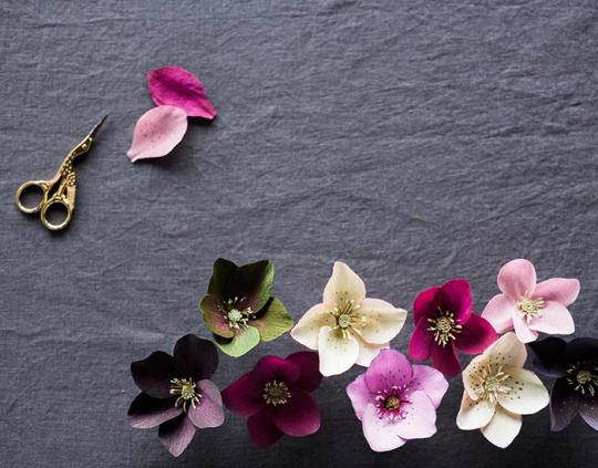
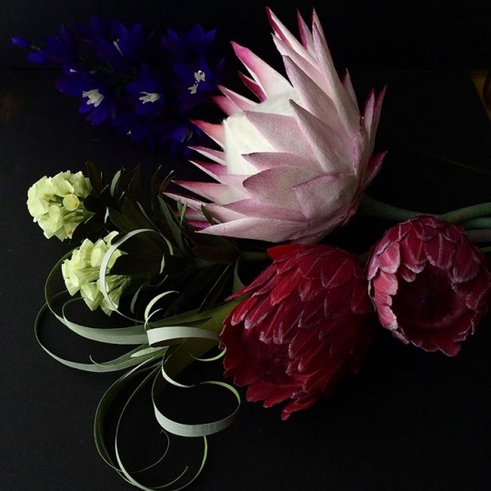
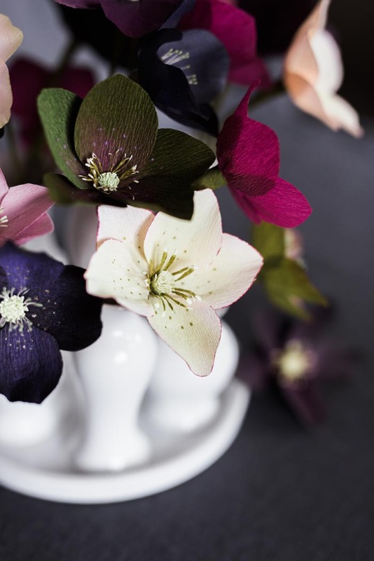
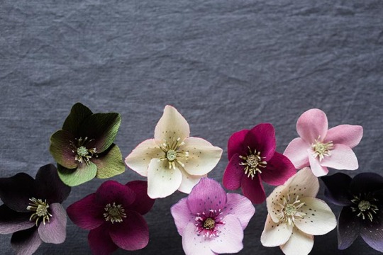
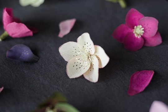
DIY Paper Hellebore

Project by Kate Alarcón:
When I had the opportunity to prepare a flower-making workshop for a Carpe Diem Collective event in Seattle, I knew the hellebore would be perfect. It grows beautifully in the Pacific Northwest, but still feels a little bit exotic and unexpected. Its subtle yet rich colors seem sophisticated in a way that struck me as ideal for the design-savvy makers whom I knew would be attending. But what was most exciting to me were the opportunities the hellebore presented to play with color and pattern. Rather than prescribing one specific variety for everyone to make, I taught several techniques, and everyone played with variations. As the new flower-makers worked, I found myself continually surprised and delighted by the varieties that sprung to life around the table.
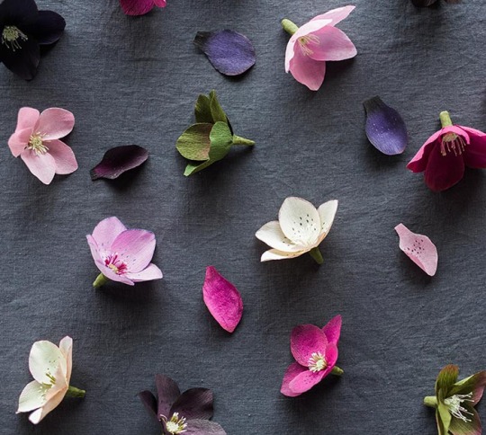
In that spirit, the instructions that follow demonstrate techniques for construction and for adding color and detail. I hope you’ll spend some time observing the hellebores blooming around you right now (or on Pinterest!) and combine these techniques to please your own artist’s eye. And special thanks to the women who attended the hellebore workshop and whose creativity inspired the hellebores I’ve made here. —Kate
Photos and styling by Grace Kim
About Kate: Kate Alarcón makes delicate and unusual paper plants and flowers just outside Seattle. Kate chose the cobra lily — a carnivorous plant native to the West Coast — as her business name and spirit “animal” because she finds so much inspiration in its eccentric, otherworldly beauty. She takes custom orders via her website, and teaches flower-making workshops in the Pacific Northwest. You can see her newest work on Instagram @cobralilyshop.
About Grace: Grace Kim is dedicated to capturing and creating beauty and helping people live life to the fullest. You can find her work at GH Kim Photography and Carpe Diem Collective. Follow her on Instagram @graceperdiem.
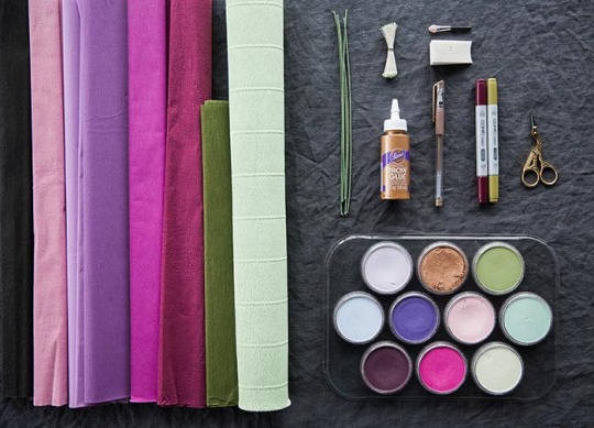
Supplies
For flower construction:
• hellebore templates (download here) • Aleene’s Original Tacky Glue • fine or doublette crepe paper (black, white, dark red, pinks, violets, and greens are all suitable) plus olive green to wrap the stem • pale green or yellow florist crepe for the flower center • 1 10-inch length of 18-gauge, cloth-covered stem wire • paper scissors • optional: small green or yellow millinery stamens
For adding color and detail:
• Copic Sketch or Ciao Markers. I find the following colors especially nice for hellebores: RV69, V15, V12, V91, YG95, and YG03, G20, 0. • PanPastels. If I were to buy just one color for this project, it would be 430.5 Magenta, which creates a very rich, deep pink when swiped over black crepe paper. Other nice additions would be: 470.5 Violet, 930.5 Bronze, 430.1 Magenta Extra Dark, 680.3 Bright Yellow Green Shade, 640.8 Permanent Green Tint, , 340.8 Permanent Red Tint, 220.8 Hansa Yellow Tint, 520.8 Ultramarine Blue Tint, 470.8 Violet Tint • cosmetic wedge sponge • eye-shadow brush with a sponge-tip applicator or cotton swab • gold gel pen
Creating the center:
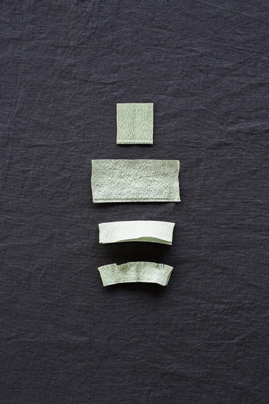
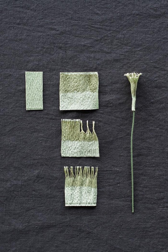
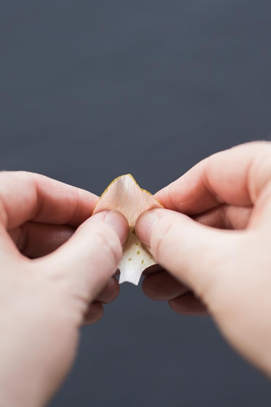
Image above: Each piece represents one step in the process of making the hellebore center.
Using template A, cut out a rectangle from the pale green crepe.
Stretch this piece against the grain, pulling out all the tiny folds so that you have a long rectangle. Fold the rectangle in half lengthwise.
Create a short fringe along the fold by making a row of small cuts very close together (roughly 1/16th of an inch apart).
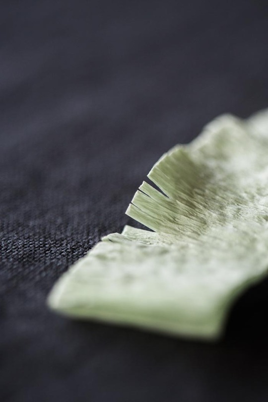
Image above: The short fringe along the fold of the rectangle.

Image above: Rolling the center around the stem.
Using template B as a guide, cut the folded rectangle so that it tapers toward one end of the rectangle. (This will help create a smooth transition between the flower center and the stem.) Dot glue inside the fold along the whole length of the rectangle, just below the fringe. Insert the tip of your stem wire into the fold on the wider end of the rectangle just below the fringe, and use your finger to press the fold closed. Let this dry for a minute.
Then dot glue along one side of the rectangle beneath the fringe, and roll the rectangle up around the wire. The fringes should be even, creating a flat, circular plane at the top of your center.
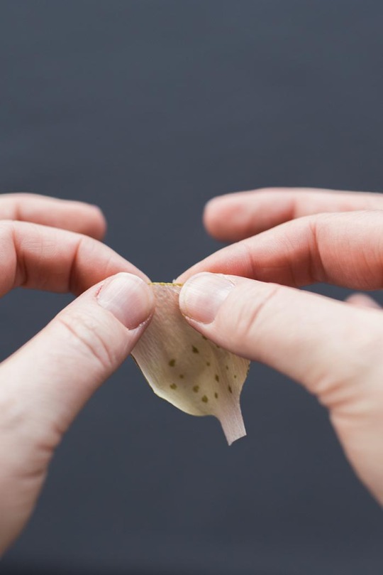
Adding stamens:
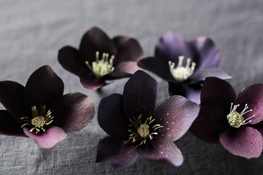
Image above: The flower on the right has millinery stamens; the middle and left, DIY paper stamens.
You can purchase double-headed millinery stamens from Castle in the Air or Rose Mille (see suppliers below). To attach, you just fold or cut them in half and glue them around your center, so that the stamen tip extends about a half inch beyond the top of your fringed center. You don’t need to be too precise about the number of stamens you add to each flower — some variation will look more natural.
To make your own paper stamens, use template C to cut a small rectangle from the pale green crepe. Stretch this rectangle all the way out across the grain. Use a green marker (Copic YG 95 is perfect, but almost any type of marker is suitable for this step) to color in a very wide stripe about 1/8th inch from the top to about an inch from the bottom. If you find that the uncolored strip across the top is too wide, just trim it with your scissors.
Create a fringe across the grain by making a series of ¾ inch cuts very close together. Then, working in small sections, gently but firmly twist these stamens together in one direction and then in the other.
Untwist all the stamens and use your fingers to straighten them. If they resist finger-straightening, use your scissors to very gently scrape the length of the stamens on one side and then the other.
Finally, scrape the tips of the stamens between your thumb and scissor blade to curl them slightly.
Dot glue in a zigzag along the lower half of this strip of stamens, and then wrap it around the green center, so that the tips of the stamens extend about ½ inch past the top of the center. (If you’d like a fuller set of stamens, use the whole strip, which should wrap around twice. For a wispier set, snip the strip of stamens after you’ve wrapped the center once, and save the other half for another flower.)
Insert your finger into the middle of the stamens and very gently press them outward so that they slightly lean away from the center. Gently separate any stamens that are sticking together, and touch up your curled ends if necessary. Let this center dry while you cut and color your petals.
For the petals:
A note about grain:
The grain of the crepe paper runs parallel to the roll or fold. Crepe paper stretches horizontally, but not vertically, so you will almost always cut petals with the grain, placing the template so that the tiny wrinkles in the paper run up and down the template, not across.
Use any of the petal templates to cut out five petals for each flower. I’ve included three templates so you have the option to create some variation among your hellebores, but you’ll only use one template to cut all five of the petals for each flower.
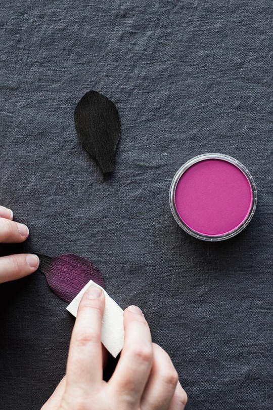
Image above: Applying a “wash” of PanPastel.
The PanPastels can add details like darkened petal edges or gradient color, but I like them best for adding a “wash” of color to the whole petal, which helps to recreate the hellebore’s subtle, complex coloring. I find that an inexpensive cosmetic wedge sponge works fine for this. A cotton swab or eye shadow brush is also suitable for finer detail, like a colored edge.
To create the very dark hellebores, use black crepe for the petals and then gently swipe on a layer of any of the darker, richer colors. My favorite is the 430.5 Magenta.
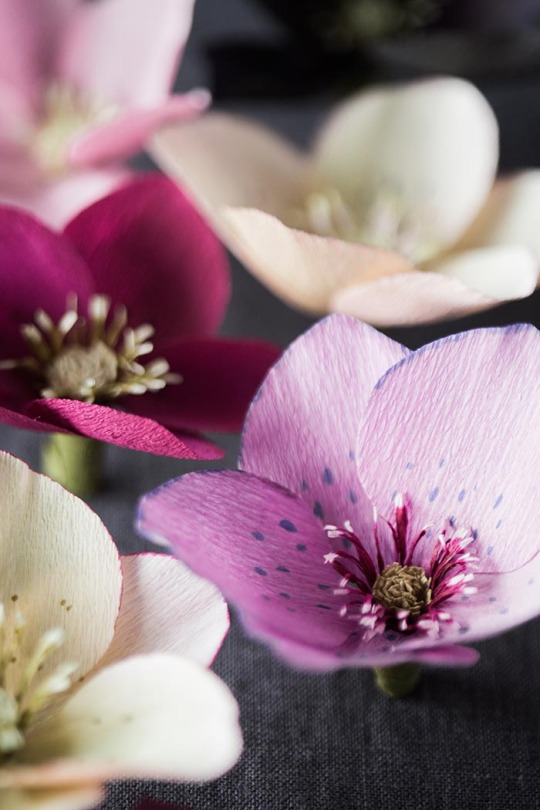
Image above: The PanPastels can add some subtlety to crepe paper colors that are a little too pure and bright to be suitable for a hellebore. Here, I’ve used a soft pink to tone down a bright violet.
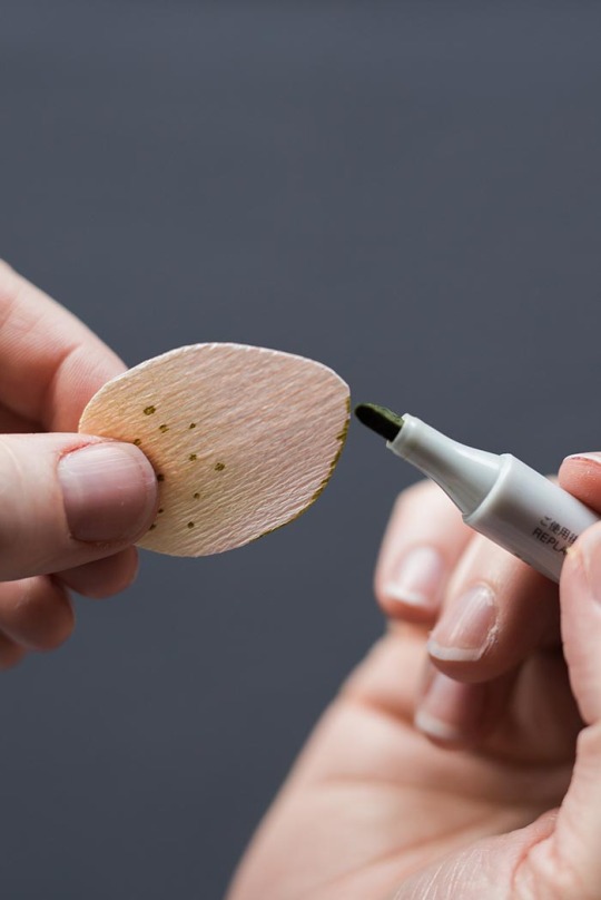
The Copic markers can be used to add color to an entire petal, to create speckles near the petal’s base, or to darken its outer edge. You can also use multiple markers that are the same hue but different intensities to create a gradient effect, beginning with the darkest color at the base of the petal and ending with the lightest at the top edge. The colorless blender can help to blend any hard lines between the different colors.
For dots, just barely touch the fine tip of the marker to the petal, lifting immediately. If the dots look too stark, a very light layer of PanPastel over the top can help them “sink in” to the petal and look more natural.
To color the edges, barely touch the broad tip of the marker to the very edge of the petal, rather than trying to draw a very thin line on the front of the petal.
Gel pens: I use a gold gel pen to add speckles to my black hellebores — I like how they add a subtle twinkle.

Image above: Steps for two sample petal variations.
For the deep magenta petal, first swipe the 430.5 Magenta PanPastel over the entire black petal. Next, use a small makeup brush or cotton swab to apply 470.5 Violet PanPastel just along the edge of the petal. Then, use the gold gel pen to add dots on the bottom third of the petal.
For the pink petal, swipe 220.8 Hansa Yellow Tint PanPastel over the bottom third of the petal. Next, use the fine tip of Copic YG95 to add dots along the bottom of the petal. Then, use the square tip of this same marker to add color to the edge of the petal.
I’ve included nine other hellebore petal “recipes” at the end of the tutorial.
Shaping the petals:
To make the petals more lifelike, you can gently cup them near the base, curl them slightly by scraping them gently between your thumb and the edge of a pair of scissors, and stretch the petal edge gently to create a slight frill. Before you accidentally tear your beautifully decorated petals, practice on some blank petals to get a feel for the point at which the paper rips. It doesn’t take much shaping to mimic a hellebore petal, so you can afford to be gentle.
To cup the base of the hellebore petal, hold it gently with two hands, thumbs in front, and gently stretch by pushing your thumbs slightly forward and pulling back and outward with your index fingers. Hellebore petals don’t require very deep cups.
Frill your edge slightly by gently stretching it.
Building the flower:
Place the base of the petal between your thumb and the blade of your scissors, and gently scrape the underside of the bottom of the petal, so that it curls slightly. This will help the petals to lie flat, rather than standing up and covering your center.
Dot a small amount of glue on the base of a petal and press it against the edge of your stamen-covered center. Then do the same with the next petal, placing it to the left of and slightly behind the first petal.
Directly across from the point where the first two petals overlap, place your third petal.
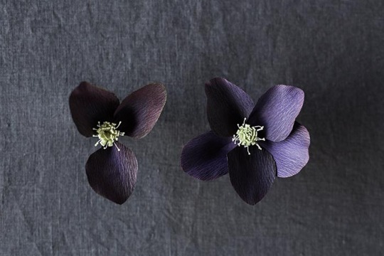
Image above: The flower on the left shows placement of the first three petals. The gaps on either side are where you’ll place your remaining two petals.
Now you’ll have a space on either side of this last petal. In the space between this petal and your first petal, place your fourth petal. In the remaining space, place your final petal.
Let the glue dry completely.
Finishing the flower:
Cut an 8-inch-long and 1/3” wide strip of olive green fine crepe across the grain. Apply very small dots of glue along the length of this strip and attach it to the part of the wire that is covered by the base of your petals. With your left hand, hold the strip at a 45-degree angle to the wire and gently stretch as you twirl the wire with your right hand.

Wrap to the bottom of the wire, and snip the excess strip. Gently adjust the petals and stamens if needed. But there’s no need to be too fussy — paper hellebores are at their most charming when they’re allowed to be a little bit quirky.
Additional hellebore recipes:
Row 1: 1. Black fine crepe, a wash of 430.5 Magenta PanPastel, 930.5 Bronze PanPastel edges, gold dots, and millinery stamens. 2. Black fine crepe, a wash of 430.1 Magenta Extra Dark PanPastel, a 470.5 Violet PanPastel edge, gold dots, and paper stamens 3. Deep olive doublette crepe, 430.5 Magenta PanPastel on the bottom third of the petal, and paper stamens
Row 2: 1. Lavender doublette crepe, Copic BV01 dots and petal edging, and paper stamens (for these I used Copic RV69 to make the stamens maroon instead of green.) 2. Sangria fine crepe, 430.5 Magenta PanPastel on the bottom third of the petals, gold dots, and millinery stamens 3. Cherry fine crepe, 430.5 Magenta PanPastel on the bottom third of the petals, gold dots, and paper stamens.
Row 3: 1. Pink fine crepe, a wash of 340.8 Permanent Red Tint PanPastel, and millinery stamens 2. Pink doublette crepe, 220.8 Hansa Yellow Tint PanPastel, Copic RV69 dots, dark maroon PanPastel on the edges, and paper stamens (for these stamens, I just colored the tips with a pale yellow.) 3. White fine crape, a wash of 680.3 Bright Yellow Green Shade PanPastel, and millinery stamens.
Sources for supplies:
Castle in the Air: crepe paper, stem wire, stamens
Rose Mille: crepe paper, stamens
Dick Blick Art Materials: PanPastels
Aaron Brothers: PanPastels
Michaels Craft Stores: 18 gauge floral wire
Impress Cards and Crafts: If you live in the Seattle area, Impress has crepe paper in three different weights, Aleene’s glue, and a great selection of Copic Markers and gel pens.

17 notes
·
View notes
Text
Thank you for the tag @casualya <3
Template link
Technically, I've already done this for my 'official canon' version of Syanna (as a durge) here, but fun fact, she initially started out as a regular Tav that I got attached to so I recreated her for my durge run and I ended up loving her even more then (and that version of her became my main OC and who I use for all my runs now). In any case, I thought it'd be fun to do this for that initial version of her as well and see how and what the differences between them are ^^ Or hell, maybe this could be an AU version of her, why not.

Color: once again, forest green, although for different reasons this time - she likes being outdoors and around nature and animals. Being from and living in Baldur's Gate prior to the game's events, she'd spend a lot of time in the city parks, with the occasional venture out into the woods outside of the city . (and I still maintain the superficial reason of 'I like the way she looks in green')
Flower: Camelia, because I think it reflects her thoughts on being with Astarion. According to a website I found that goes over flower language, they can mean the following: pink ones - longing for you, red ones - you’re a flame in my heart, white ones - you’re adorable. To be fair though, they can also apply to durge!syanna as well (same goes for the red tulips I chose for her, they go well with tav!syanna too I think)
Animal: cat, once again, although not a black one this time. Oh no, think along the lines of chaotic orange cat that can and will be a menace when the opportunity arises (it's silliness. mostly.)
Scent: Gaultier Divine from Jean Paul Gaultier - another perfume I really love the smell of and feel would suit this version of Syanna. There's a sweetness to it, but it still has a certain strength and intensity to it as well. Again, I like to headcanon that Astarion creates the scent for her. Also, fun fact, one of the notes in it (and in Black Orchid, which I chose for durge!syanna) is bergamot ^^
Song: Syanna - Marcin Przybyłowicz (like I said before, easy and obvious choice for this one)
Feeling: playfulness/mischievousness - tav!syanna is definitely a lot more playful around those she gets along with than durge!syanna (although she can also be that way when the mood strikes her, particularly with Scratch and the owlbear cub), and can also be a little bit chaotic and up to no good (in a silly way, while durge!syanna can lean more towards sarcasm or pettiness in some cases - although I like to think that in time, she becomes sillier and a bit more carefree).
And, really, the way she bullshits her way past guards is telling them she's been hired to search for a prized pig named Lulabelle and no, she cannot go into more detail than that, as she has piglets depending on her, so that's what we're working with (I love that this is an actual dialog option and all recreations of Syanna use this when the opportunity appears because it's just too good).
No pressure tags: @astarionposting @wilteddreamsofbaldursgate @roguishcat and anyone who wants to join in! ^^
3 notes
·
View notes
Text


Genderjedi template | Gendersith template
[ID: Two pride flags, each with nine horizontal stripes. The stripes are equal in size except for the double-thick middle stripe. They are arranged in a single row as a pair.
The first flag's stripes from top to bottom are as follows: Light blue, light green, cream, medium-light gray, off-white (cream-tinted), medium-light gray, medium gray, dark gray, and black.
The second flag's stripes from top to bottom are as follows: Black, plum purple, red, white, off-black (purple-tinted), white, light gray, medium gray, and dark gray. ID end]
Remaking all my original coining posts due to some issues that I can no longer edit from the original ones because Tumblr is a functional website /s
Genderjedi - A gender related to being a Jedi of [blank]/a [blank] Jedi. These genders are connected to [blank] aesthetics, Jedi aesthetics, Light Side aesthetics, being a Jedi, and the Light Side of the Force. The suffix for genderjedi terms is -jedi (example: femmejedi).
Gendersith - A gender related to being a Sith of [blank]/a [blank] Sith. These genders are connected to [blank] aesthetics, Sith aesthetics, Dark Side aesthetics, being a Sith, and the Dark Side of the Force. The suffix for gendersith terms is -sith (example: femmesith).
These terms are subsets of starwarsgender and either jedigender or sithgender (definitions here). While it is possible the original coiner of the latter two terms may have been a troll, the definitions are solid enough, and I doubt I'm the only one who may feel a connection to them.
The only consistent flag colors are the top three stripes (light blue, light green, and cream for genderjedi; black, plum purple, and red for gendersith) and the double-thick middle stripe (cream-tinted off-white for genderjedi, purple-tinted off-black for gendersith). The other stripes were left so these could easily be used as templates. The top three stripes for each flag are derived from colors I associate with either the Jedi or the Sith: for the Jedi, blue and green are the most common lightsaber colors, and they typically wear cream (or brown); for the Sith, they typically wear black, use red lightsabers with bleeding Kyber crystals, and the purple stands for passion. The middle stripes on each flag represent the Light and Dark Sides of the Force.
There is no inherent gender alignment or morality assigned to these terms.
#gender system#role system#genderjedi#gendersith#-jedi#-sith#role gender system#mogai#mogai term#mogai flag#flag template
21 notes
·
View notes
Note
:o how did uu make the userboxes for ur agere bloggie??!! do you happen to has a template we could use?? -toms (🐾)
Oki heres what we did (Using barbara to show how to do it!)!!

Step 1: Go onto pinterest, find a picture, and copy/save it!


Step 2: Use remove.bg to remove the background of it (if needed!) Then download it!
Step 2/12: Use the erase tool to make it perfect!

Step 3: Make a private/public tumblr post to put the image in!

Step 4: Go to https://www.yerich.net/userbox/, and put this: <.img src="[url]" height=45 width=45.> (without those periods!) in the top box!


Step 5: Copy the image link and replace the "[url]" with the image!

Step 6: Write out the message in the second box.

Step 7: Choose the colors you want to use for the userbox and put in their hex codes! We use this website to choose colors: https://coolors.co/ffffff


Step 8: Now you're finished! Use raw HTML for you code output, and copy the code!

Step 9: Open the website: https://www.w3schools.com/html/tryit.asp?filename=tryhtml_intro and paste the code into the left box! Then press the green run box!


Step 10: Zoom in as close as you can! You can shrink the left text box if the userbox doesn't fit in the screen.

Take a picture of your image, crop it, and boom! You have a userbox!!
2 notes
·
View notes
Note
I love your OC art and I was wondering how you're able to make them. Is there a website you use or a template you follow? I'd love to make my own OC's but don't know how/where to start
Hey there Anon! So sorry for the lag in the response, I wanted to be sure I could give you an in depth answer! It’s gonna be long, so I’ll put a Read More here~ if you have any questions, feel free to dm me!
Lemme start by saying, Thank you so much! You’re so sweet! 😭😭 it seriously makes my day to hear that, you don’t even know 😭🖤
Secondly, as for Remi and Levi, both characters started out as roleplay characters that @thekinkyleopard and I came up with about 10 years ago! The characters themselves have evolved over the years as we’ve done a hundred different storylines and bounced ideas off of each other. Draeko, on the other hand, was created less than 6 months ago, so he’s not as in depth of a character.
Now, I’ve been doing art for as long as I can remember, and creating characters has always been something I love doing. But everyone creates an OC differently. Personally, I always start with the visualization of a new character, first.
Like for instance, for Draeko, I started with just a color pallet, (ie, pastel pink, white, pastel mint green, and pink plaid). And because I’m a furry, most of my OC’s usually have an attachment of some kind to an animal (shifters, or my Hellhound), plus I wanted more of a complex character since Remi was so plain.
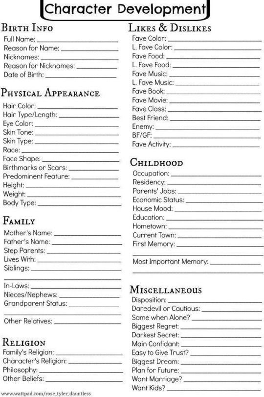
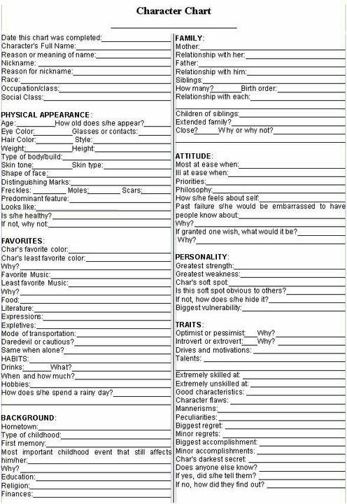
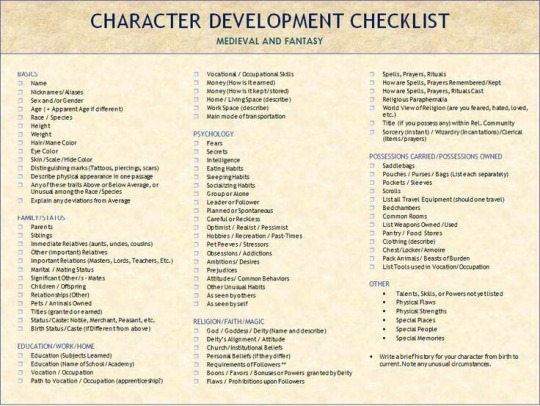
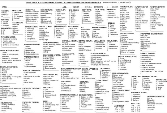
I started drawing a reference sheet for him, which is pretty much a large, informational sheet with your OC in a bunch of different angles, along with key information, accessories, or whatever you want people to know about your character. Here’s some examples of reference sheets I’ve done for our OCs:
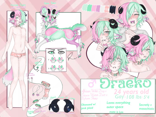
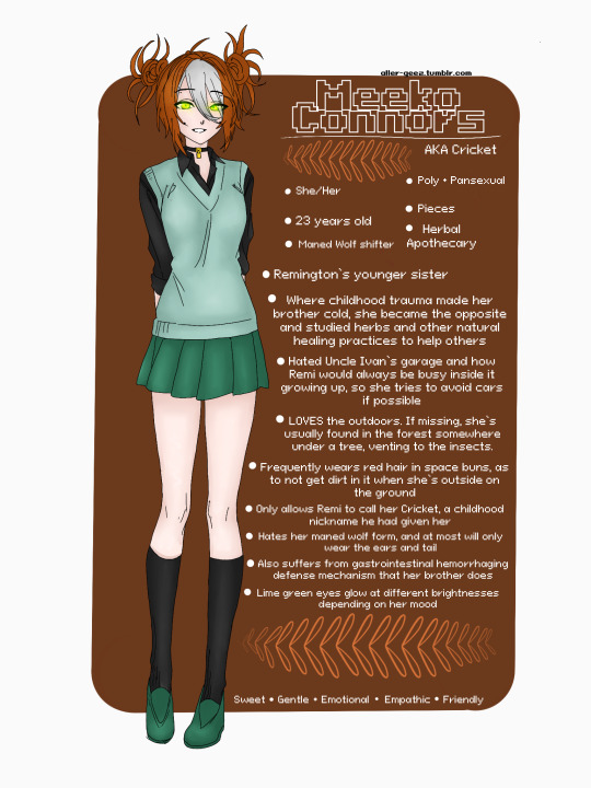
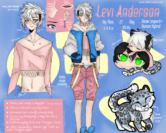
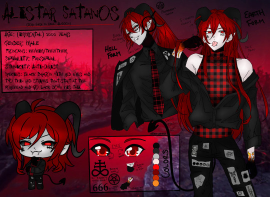
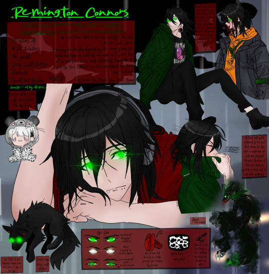
I usually start with the full body view first, coming up with details to add as I go.
(Most of my OC’s started out as fursonas, so they already had their animal form, I just would need to design a human form that matched it.)
I then come up with their personality as I’m adding details, and accessories, and naming them. And very last, I come up the details for their backstory, as well as any lore I can come up with.
HOWEVER
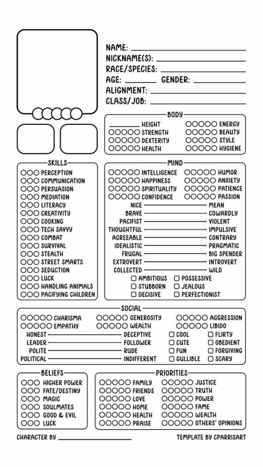
Everyone creates differently, and if you’re someone without much art experience or just don’t have a want to create art, OR if that just seems backwards to you,
An easy, pain free way to create your own in depth character that can just always live in your head, or one that you commission another artist to bring to life for you, they have these AMAZING character development type sheets that you can fill out, essentially making a written Reference Sheet so someone else can imagine (or bring to life) your character accurately. Here’s just a few I found in Pinterest by looking up “character development sheet”
As for how I create my art, I use an iPad and Apple Pencil, along with the program Procreate to freehand draw (or I also use bases or pose references from Pinterest!) all of my art from scratch!
Sorry if this is way longer of an answer than you were hoping for/expecting, but I wanted to cover as many points as I possibly could!
Like I said at the top of the post though, if this doesn’t make sense or if you have any other questions about it, shoot me a dm! I promise I don’t bite, I just suck at replying to messages (:
11 notes
·
View notes
Text
How to make a travel website design
how to design a successful travel website, combining best practices and essential considerations:
Planning Phase
Define Your Niche: What kind of travel will you focus on? Luxury, adventure, budget, specific destinations, or a blend? This clarity will guide your design choices.
Target Audience: Understand your ideal customers – their age, preferences, and how they like to research trips. Your design should resonate with them.
Competitive Analysis: Examine other successful travel websites. Note what you like, dislike, and where you can offer an improved experience.
>>>>Please click hare Fiverr<<<<
Design Fundamentals
Simple, Intuitive Navigation: Visitors should find what they need fast. Use clear menus, breadcrumbs, and a strong search function.
Responsive Design: Your site must adapt flawlessly to all devices (desktops, tablets, smartphones). Travel planning happens everywhere.
Visual Impact: Stunning, high-quality images and videos of destinations and experiences are key to inspiring wanderlust.
Compelling Content: Engage with well-written descriptions, travel tips, and blog posts to boost interest and SEO.
Social Proof: Include testimonials, reviews, and social media integration to build trust and credibility.
>>>>Please click hare Fiverr<<<<
Essential Features
Robust Search Functionality: Allow searches by destination, activity, date ranges, and budget. Include advanced filters to refine results.
Detailed Listings: Provide comprehensive information on hotels, tours, flights, etc., including photos, descriptions, pricing, availability, and amenities.
Secure Booking Engine: Integrate a reliable, user-friendly booking system that supports multiple payment methods.
Personalized Recommendations: Use data and AI to suggest trips that align with individual user preferences.
Maps Integration: Use Google Maps or similar to visually display destinations and travel routes.
Trip Planning Tools: Allow users to save itineraries, create wishlists, and compare options.
Customer Support: Provide accessible contact options (live chat, email, phone) for resolving queries.
>>>>Please click hare Fiverr<<<<
Technical Considerations
Website Builder vs. Custom Development:
Website Builders (Wix, Squarespace, WordPress): Offer ease of use and templates but may have limitations in customization.
Custom Development: Provides maximum flexibility but requires coding skills or hiring a developer.
Hosting: Select a reliable host with sufficient bandwidth to handle traffic and ensure a fast-loading website.
Content Management System (CMS): A CMS like WordPress makes managing your content easier.
Design Execution
Color Palette: Choose colors evoking travel (blues for oceans, greens for nature, etc.). Maintain a balanced and visually appealing scheme.
Typography: Use clear, readable fonts. A hierarchy for headings and body text improves scannability.
White Space: Avoid cluttering. White space allows information to breathe and enhances the design.
Call-to-Actions: Place prominent "Book Now", "Learn More" buttons to guide users through the booking process.
Testing and Launch
Thorough Testing: Test on various devices and browsers. Ask friends and colleagues for feedback.
Launch: Once you're confident, launch your site!
>>>>Please click hare Fiverr<<<<
Promotion and Maintenance
Marketing: Utilize SEO, social media, content marketing, and potentially paid advertising to drive traffic.
Updates: Keep content fresh, add new destinations, and enhance features based on user feedback.
>>>>Please click hare Fiverr<<<<
Let me know if you'd like a deeper dive into any of these aspects, or help choosing a website builder or CMS!
Thank you
#websitedesign#ecommerce website builder#wordpress website#web design#web development#wordpress development#ecommerce website templates#wordpresswebsitedevelopment
2 notes
·
View notes
Text
Template Designing Company in New York
Best Template Designing Company in New York Are you looking for reliable and creative template designing services in New York? If extremely you have come to the right place! A well-Layout template plays a decisive role in constructing a strong online presence. Whether you take templates for websites emails presentations or whatever digital happy amp professionally crafted plan Improves exploiter get and boosts engagement.

At lds engineers we specialize in creating high-quality bespoke guide Layouts for Customers over the American Britain commonwealth Australia Bharat and different countries. With years of Encounter and a dedicated team of experts, we ensure that every template we lay out meets industry standards and fulfills your business needs. Why Choose Us for Template Lay outing? Expert Lay outers & Developers our team consists of highly skilled web layouts and HTML/CSS coders who understand the Check trends in web Layouts.
We do good making templates—we trade Encounters that raise your mark identity. Custom & alone Layouts we trust inch originality. Every template we Make is tailored to your specific requirements. Whether you take amp joint face associate in nursing aesthetic affect or amp contemporary and minimalistic way we have got you covered. Responsive & SEO-friendly templates in today's digital man having amp mobile-friendly and SEo-improved guide is important.
Our Layouts are fully responsive ensuring they look great on any device from desktops to smart phones. Operator-Friendly & Easy to Customize We lay out templates with flexibility in mind. Our templates are light to cut and update then you does take advance abstract cognition to get changes. Whether you want to update images change text or modify colors our templates allow you to do it effortlessly. Affordable Pricing with High-Quality Service We offer competitive pricing without compromising on quality. Our end is to render top-notch Layouts astatine associate in nursing cheaply be then that businesses of complete sizes get the benefit.
Our guide plan services we bid amp comprehensive run of guide Layout services including website templates: bespoke hypertext markup language and CSS templates for businesses' e-commerce portfolios and blogs email templates: professionally organized e-mail templates for selling campaigns newsletters and joint communication presentation templates: visually sympathetic Power Pointt Google slip templates for line and intimate use landing varlet templates: high-converting landing place varlet Layouts to raise your gross sales and run generation custom guide development: if you bear amp alone demand our squad get a plan amp bespoke root bespoke to your needs our allegiance to excellence We read plume inch our power to be close with Customers and bear templates that top expectations.
Every project we handle is Round with attention to detail ensuring a polished and professional outcome. We point to reducing the plan work spell maintaining the ultimate character standards. Get Inch Effect with us if you are searching for the trump guide Layout Party inch green house of York face nobelium foster than lds engineers.
Our Encountered team is ready to bring your vision to life with stunning Operator-friendly and responsive templates. Contact us today to discuss your requirements and get an custom-layout template that Improves ybrand'srand digital presence!
bigcommerce development, bigcommerce design development, bigcommerce development services, bigcommerce development in us, bigcommerce development in India, bigcommerce web development, bigcommerce development company.
#bigcommerce development#bigcommerce design development#bigcommerce development services#bigcommerce development in us#bigcommerce development in india#bigcommerce web development#bigcommerce development company
0 notes
Text
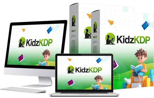
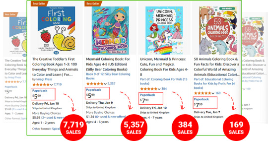
KidzKDP Review – Create & Publish Kids Coloring Books in Minutes
Welcome to my KidzKDP Review. In today’s competitive self-publishing market, finding tools that streamline the process of creating, publishing, and ranking books is invaluable. One niche that continues to grow in popularity is children’s literature, especially coloring books, puzzles, and activity books.
However, creating and publishing these types of books requires significant effort in terms of research, design, content creation, and marketing. Enter KidzKDP, an innovative AI-powered platform designed to make the process of researching, creating, and publishing kids’ books simpler, faster, and more efficient.
In this comprehensive review, we’ll explore how KidzKDP works, its features, benefits, how it works, user feedback, pricing, pros, cons, and why it might be the game-changing tool that helps you dominate the low-competition niches of Amazon Kindle Direct Publishing (KDP).
What Is KidzKDP?
KidzKDP is an all-in-one AI writer-research tool for creating and self-publishing children’s books on topics in low competition keywords on Amazon. Whether you have written books before or you are a green horn, this tool will help you focus on writing and create interesting and marketable books and at the same time, make you save some time and money as it will help you get more earnings.
The use of the advanced AI algorithms enables the software to not only conduct market analysis, write book content, and even design for the Amazon KDP. The primary specialisation of this publishing group is children’s books. From low competition niche selections, KidzKDP help authors to publish books that gain rankings and drive organic traffic.
KidzKDP Review: Overview of Product
Product Creator: Seun Ogundele
Product Name: KidzKDP
Launch Date: 2025-Jan-15
Launch Time: 10:00 EST
Front-End Price: $17 (One-time payment)
Official Site: Click Here To Visit Official Salespage
Product Type: Tools and Software
Support: Effective Response
Discount: Get The Best Discount Right Here!
Recommended: Highly Recommended
Bonuses: YES, Huge Bonuses
Skill Level Required: All Levels
Discount Coupon: Use Code “KDP5OFF” To Get $5 (Full Funnel)
Refund: YES, 30 Days Money-Back Guarantee
KidzKDP Review: About Authors

Meet Seun Ogundele, the brilliant inventor of KidzKDP. Seun’s innovative spirit and forward-thinking attitude to technology have transformed the area of software development with his pioneering work. Seun has created a sophisticated platform that enables users to easily build high-authority websites using the power of artificial intelligence.
Check out some of his previous successful projects, including AzonKDP, Qai App, HeyBooks, AI Gigz Hub, GamPAL, WP Genie, Artisia, AvaTalk, RoboCHAT, ZapAI, Kustomizee, GoBuildr, FlowCart, AI Assist, SendALL, ScribAI, and SwipeFunnel, and many others.
KidzKDP Review: Key Features of KidzKDP
✍ AI-Powered Keyword Research
KidzKDP uses advanced AI to instantly research profitable keywords that give your books the best chance of ranking on Amazon. It taps into data that’s not publicly available, ensuring you target the most lucrative niches.
✍ Niche Category Finder
Finding the right category is key to becoming a best-seller. KidzKDP analyzes Amazon’s entire category database, including hidden ones, to place your book in a low-competition, high-demand niche for maximum visibility.
✍ Kids’ Low Content Book Maker
Create low-content kids’ books like coloring books, activity books, and puzzles in minutes. Just upload your ideas or use our templates, and your book is ready to publish.
✍ Puzzle Book Creator
Create fun, engaging puzzle books for kids, from word searches to crosswords and mazes. This tool is designed for quick and easy creation, ensuring your puzzle books are both fun and educational.
✍ Activity Book Creator
Build interactive activity books for children, including games, exercises, and learning activities. Perfect for parents and educators looking for fun and educational content.
✍ Coloring Book Creator
Effortlessly create high-quality coloring books for kids, featuring unique designs and fun themes. This tool helps you build engaging coloring books that kids love and parents buy.
✍ KidzKDP Quick View Tool
Quickly analyze Amazon search results and see which kids’ books are performing best. Find low-competition opportunities and profitable niches with one click.
✍ Book Price Suggestion Tool
Receive optimal pricing suggestions for your kids’ books based on market trends, competitor analysis, and royalty considerations. Ensure your books are priced to sell.
✍ KDP Royalty Calculator
Calculate how much money you’ll make on each book sale, considering factors like Amazon’s royalty rates, pricing, and costs. Make informed decisions about your pricing strategy.
✍ AI-Powered Cover Design
Create stunning, professional- grade covers in seconds with KidzKDP’s AI-powered cover designer. No need to hire expensive designers or learn complex tools—just choose from beautiful, customizable templates and watch your book stand out on Amazon.
✍ Automated AI Publishing
KidzKDP automatically formats your book to meet Amazon’s publishing standards, saving you hours of technical headaches. With one click, you can publish your book to Amazon KDP, Apple Books, Google Books, and more.
✍ Competitor Analysis
Stay ahead of the competition. KidzKDP’s competitor analysis tool scans the market to show how well competing books are performing, what keywords they’re using, and how you can outshine them.
✍ Multi-Language Support
Want to reach a global audience? KidzKDP allows you to create and publish ebooks in over 100+ languages, ensuring your content is accessible to readers worldwide.
✍ Multi-Platform Publishing
KidzKDP doesn’t stop at Amazon. With just a few clicks, you can publish your ebook to Amazon KDP, Apple Books, Google Play, Etsy, eBay, Kobo, JVZoo, and more, maximizing your sales potential.
✍ AI SEO-Optimizer
Not just for Amazon, KidzKDP helps you create content that’s optimized for search engines like Google, giving your book even more visibility and driving organic traffic.
✍ Built-in Media Library
KidzKDP comes with access to a library of 2+ million stock images, videos, and vectors to personalize your ebook with professional- quality visuals.
✍ Real-Time Market Trends Hunter
KidzKDP stays updated with the latest Amazon market trends, showing you which categories and keywords are trending right now. You can use this feature to stay ahead of the curve and adapt to market changes instantly.
✍ One-Click Book Translation
With KidzKDP, translating your ebook into multiple languages is easy and fast. Reach global audiences by instantly translating your books into any of 100+ languages.
✍ Built-In Traffic System
KidzKDP taps directly into Amazon’s massive reader base, so you never have to worry about driving traffic to your content. Every day, millions of readers search for new material on Amazon, and KidzKDP ensures your content is seen by the right people.
KidzKDP Review: How Does It Work?
Get An Amazon Kindle Best-Seller in Just 3 Easy Steps!
Step #1: Access
Click the button below to get instant access to KidzKDP.
Step #2: Ask Your Amazon AI Assistant
Watch as KidzKDP’s AI helps you easily create, format, and publish your kids’ books. Whether it’s a fun coloring book or an engaging puzzle book, the process is fast, simple, and done for you!
Step #3: Sit Back & Profit!
That’s it! Once your content is live, Sit back and watch the income roll in.
KidzKDP Review: Benefits of KidzKDP
1-Click Amazon AI Assistant Instantly Research, Create, and Publish Best-Selling No-Content Kids’ Books Like Coloring Books, Activity Books, in Seconds-No Writing Required!
KidzKDP is your ultimate tool for dominating the world of kids’ book publishing-effortlessly research profitable keywords, discover hidden niches, analyze competitors, and publish best-sellers in record time to create a consistent income stream!
Create Coloring Books, Activity Books, Puzzles, Storybooks, Educational Books, Picture Books, and more with just a few clicks.
Tap into the $237 Billion Children’s Book Industry with KidzKDP!
ZERO Audience required-Reach over 6 million parents for FREE.
Amazon Does All the Hard Work – Your content is automatically placed in front of 310 million readers on Amazon’s global platform.
No Writing Required – The AI assistant does all the content creation for you-no typing, no experience, and no design skills needed.
Scale to Unlimited Income – Publish Children’s books effortlessly with KidzKDP, and earn passive income every time someone reads your book.
100% Passive Income – The more books you publish, the more you earn, with minimal effort.
100% Free Traffic – No ads, no SEO, no social media marketing. All traffic comes from Amazon’s built-in audience.
No Hidden Costs – Profit without paying for ads, traffic, or SEO-everything is included.
Complete Automation – Just a few clicks, and KidzKDP takes care of the entire publishing process for you.
No Monthly Fees – Pay once and keep 100% of your profits
No Tech Skills Needed – Set up in 60 seconds and watch the AI do the work for you.
100% Legal & Ethical – No hidden fees, no extra expenses-just easy publishing and profits.
Rest Easy with Our 30-Day Money-Back Guarantee – We’ve Got You Covered!
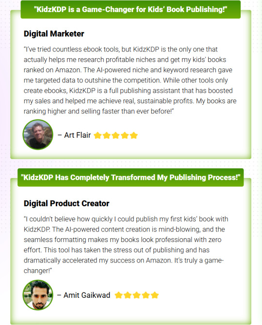
Verify Users Say About KidzKDP
KidzKDP Review: Who Should Use It?
Self-Published Author
Entrepreneur
Business Owner
Digital Marketer
Freelancer
Ghostwriter
Affiliate Marketer
Parent
Part-Time Worker
Teacher
Educator
And Many Others
KidzKDP Review: OTO’s And Pricing
Add My Bundle Coupon Code “KDP20OFF″ – For 20% Off Any Funnel OTO Below
Front End Price: KidzKDP FE ($17)
OTO1: KidzKDP Unlimited ($47)
OTO2: KidzKDP Done For You ($197)
OTO3: KidzKDP Automation ($27)
OTO4: KidzKDP Income Booster ($27)
OTO5: KidzKDP Limitless Traffic ($77)
OTO6: KidzKDP Automated $10k Profits ($47)
OTO7: KidzKDP Mobile Payday ($27)
OTO8: KidzKDP Reseller ($197)
OTO9: KidzKDP DFY Profit Site ($47)
KidzKDP Review: Money Back Guarantee
Try Out KidzKDP RISK FREE For 180 Days With Our Money Back Guarantee
If you’re still confused after seeing all KidzKDP can accomplish, I’m not sure what more I can do. So, I’m going to eliminate all of the dangers on your end. I’ll offer you a full 180 days to try KidzKDP risk-free. If you don’t like it for any reason, just contact us and we will return your money in full, no questions asked. That implies you can’t lose here. We bear full responsibility for the risks.
KidzKDP Review: Pros and Cons
Pros:
Comprehensive tools for niche research, book creation, and publishing.
Easy-to-use interface suitable for beginners.
Cost-effective solution compared to hiring professionals.
Targets low-competition niches for higher ranking potential.
Time-saving automation tools.
Affordable pricing options
Cons:
Requires a one-time Payment.
Requires an active Amazon KDP account to publish.
Requires stable internet connection.
Nothing wrong with it, it works perfectly!
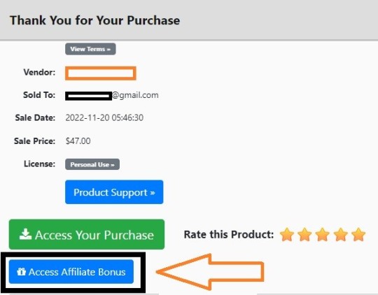
My Own Customized Exclusive VIP Bonus Bundle
***How To Claim These Bonuses***
Step #1:
Complete your purchase of the KidzKDP: My Special Unique Bonus Bundle will be visible on your access page as an Affiliate Bonus Button on WarriorPlus immediately after purchase. And before ending my honest KidzKDP Review, I told you that I would give you my very own unique PFTSES formula for Free.
Step #2:
Send the proof of purchase to my e-mail “[email protected]” (Then I’ll manually Deliver it for you in 24 HOURS).
KidzKDP Free Premium Bonuses

Frequently Asked Questions (FAQ’s)
Q. What is KidzKDP?
KidzKDP is the world’s first AI-powered publishing assistant that leverages the combined power of Google and Microsoft AI, designed to help you dominate Amazon Kindle Publishing. From keyword research to content creation and formatting, KidzKDP does it all—giving you a massive advantage in the self-publishing world.
Q. What if KidzKDP doesn’t meet my expectations?
We’re confident you’ll love KidzKDP! But if for any reason you don’t, we offer a 180-day money-back guarantee. Simply reach out to us, and we’ll refund your full investment—no questions asked.
Q. What if I need help using KidzKDP?
Don’t worry—we’ve got you covered! We provide a full library of step-by-step video tutorials to guide you through every aspect of the platform, so you’ll never feel lost.
Q. Do I need to be tech-savvy to use KidzKDP?
Not at all! KidzKDP is built for everyone, whether you’re a complete beginner or an experienced author. Its intuitive dashboard makes it incredibly easy to use, so you can publish your books effortlessly without any technical know-how.
Q. Are there any hidden fees?
Not! Your one-time investment gives you lifetime access to KidzKDP with no additional fees, ensuring you get unlimited use of all its powerful features.
Q. Can I use KidzKDP on any device?
Yes! KidzKDP works seamlessly across PC, Mac, Android, and iOS devices, allowing you to manage your publishing tasks from anywhere.
Q. How can I secure my exclusive KidzKDP discount?
Simply click the button below to lock in your special discount and get access to KidzKDP at the lowest price available. Don’t miss your chance to transform your publishing game with this AI revolution!
My Recommendation
KidzKDP comes highly recommended for anybody interested in making money in the large market of children’s books on Amazon. From the use of artificial intelligence to its intuitive design and focus on low competition categories, there is no platform that can better serve both novices and professional publishers.
There could be a few pros and cons, but the former definitely outweigh the latter making it a worthy investment for those interested in self-publishing. No matter whether you are working on colouring books, puzzle books, activity books or other forms of easy readers KidzKDP offers all the information required to enter a highly competitive market successfully.
>>> Click Here To Get Instant Access KidzKDP Now <<<
Check Out My Previous Reviews: AzonKDP Review, Revio Review, Voice Magik Review, Kadjo App Review, and TalkFlow AI Review.
Thank for reading my “KidzKDP Review” till the end. Hope it will help you to make purchase decision perfectly.
#kidzkdp#kidzkdpreview#kidzkdpcoupon#kidzkdphonestreview#kidzkdpfeatures#kidzkdpworks#whatiskidzkdp#kidzkdpreviews#buykidzkdp#kidzkdpprice#kidzkdpdiscount#kidzkdpfe#kidzkdpoto#getkidzkdp#kidzkdpbenefits#kidzkdpbonus#howtokidzkdpworks#kidzkdpsoftware#kidzkdpsoftwarereview#kidzkdpFunnels#marketingprofitmedia#kidzkdpUpsell#kidzkdpinfo#purchasekidzkdp#kidzkdpwebsite#software#traffic#kidzkdpexample#kidzkdpworthgorbuying#ai
0 notes
Text

#daisy bones. // a free psd coloring.
Daisy Bones is a psd coloring inspired by Daisy Wick from the television series Bones. This psd focues heavily on yellows, blues, dark reds, blacks, browns, and whites. Reds, magentas, and blues are darkened with this psd. Greens, cyans, and yellows are lightened. Oranges may look yellow. This coloring is people of color friendly. It may also work on animated characters and manhwas - with the proper adjustments.
Please like or reblog if you plan on using this psd. If you do reblog this post, it will show more people my content. If you use this psd coloring please credit me on your blog or website. You can either link to this post / this blog or link to the deviant art post / profile and that counts as giving me credit. Or you can tag this blog and that counts as well.
deviant art download. // the color swatch template i used.
#mine#my psd coloring#my coloring psd#psd coloring#psd colorings#icon psd#psd#coloring psd#coloring psds#poc friendly psd#yellow psd#blue psd#brown psd#black psd#white psd#dark psd#my resources#my roleplay resources#rp resources#roleplay resources#my free roleplay resources#free roleplay resources#resources#free rp resources
3 notes
·
View notes
Text
Luzuna Review : Trading Edge or a SCAM
Luzuna proudly calls itself Trading Edge. You know, lately, there’s been a surge of these heroes proudly calling themselves the best in the industry. However, we’re not particularly inclined to believe in such bold claims. So, we’re going to check right now whether this project can be trusted and whether it might turn out to be a scam. Well, let’s get started with our review.
Registration and Client Portal Review
Luzuna has opted for a rather peculiar official website. In particular, we find the color scheme quite baffling. A completely dark background with an acid-green logo. Well, it doesn’t seem aesthetically pleasing, does it? Besides the unattractive appearance, like many of its competitors, here, we encounter typical issues. Firstly, it’s a template. We can immediately name several similar websites. Secondly, as always, there are concerns about the content. We fail to understand what’s so difficult about dedicating more attention to the company itself and providing at least some information about its history, managers, and team members. And no, as usual, there’s a plethora of self-promotion and pointless self-praise. Well, at least the documents seem to be in order.

Although Luzuna’s website is entirely presented in English, the registration form turned out to be in French. Not quite logical… Well, at least it’s still intuitively understandable. As usual, you will need to provide your contact details, including your full address and postal code. However, don’t get ahead of yourself. In reality, accessing the personal account is not as simple as it seems. No matter what data you enter, the broker won’t allow you to register. What the problem is here, we don’t know. Perhaps a promo code is required. Or maybe you need to contact the managers beforehand and get their approval. Whatever the case, it’s not very reassuring.
The situation raises concerns. Requiring additional steps complicates the registration process without clear justification. This lack of transparency and straightforwardness may deter potential users and raise suspicions about Luzuna’s intentions or the legitimacy of their operations.
Luzuna Trading Conditions It’s time to take a look at the trading conditions and understand why Luzuna calls itself Trading Edge. Perhaps this company is exaggerating its services a bit?
Account Types Review During the review of Luzuna’s website, we noticed that the promotional image depicts LUNA being converted into BUSD, which is quite intriguing given the recent events involving BUSD. However, the fact that LUNA itself is portrayed may not be worth mentioning. Hopefully, this isn’t their main trading pair. Moving on, the platform offers a total of 6 accounts, with no demo accounts available for traders. This absence of a demo account option is disadvantageous as it deprives traders of the opportunity to practice and familiarize themselves with the platform before investing real funds.
The other account types left us with numerous questions, particularly because they differ from each other by only 1-2 services, while the minimum deposits vary significantly. For instance, the Beginner account requires a deposit of $500. Despite this, traders can only expect services like No Extra Fees, One Click Trading, Mobile Apps, and Free Education. On the other hand, the Basic account requires a deposit of $5,000, yet the services offered are not significantly different; they include Basic Market Access, No Extra Fees, One Click Trading, Free Education, and Market Updates.
It’s only the VIP account that offers a completely different set of services, including Access to New Features, Best Execution & Pricing, Priority Support, Exclusive Events & Promotions, and a VIP Account Manager. However, the price for these services is a staggering $1 million minimum deposit. It’s clear that these services do not justify such a high minimum deposit, and traders should carefully consider whether they are worth the investment.
Trading Platform Luzuna offers a rather mysterious trading platform. In fact, it does not disclose who developed this software. It is implied that the broker did it themselves. Well, in reality, who knows? The thing is, the company offers to download the application for PC, as well as its mobile versions and even a version for tablets. However, you won’t be able to view anything. And downloading it is out of the question, too. Everything is only accessible from the client’s cabinet. We don’t understand what these restrictions are about. Hint: all reputable brokers do not hide their platforms.
Luzuna — Deposit and Withdrawal of Funds According to the client agreement, Luzuna accepts funds through credit and debit cards, bank transfers, select payment systems, and even cryptocurrency. However, you know what’s most interesting? Deposit processing time takes about 1 day. However, withdrawals may take up to five days. Luzuna explains this by citing potential delays from payment systems. But if any internal delays occur within the company, it promises to inform clients. Just inform, that’s it. Additionally, the broker may impose limits on fund withdrawals. How about that?
Verification To ensure compliance with regulatory requirements and enhance security measures, Luzuna implements a verification process for all its users. The verification process involves submitting certain documents to confirm the identity and address of the account holder.
Users are typically required to submit a government-issued identification document such as a passport, national ID card, or driver’s license. The document must be valid and include a clear photo, full name, and date of birth.
Also, traders need to provide a document verifying their residential address. Acceptable documents may include utility bills (electricity, water, gas), bank statements, or official government documents. The document should display the user’s name and address, and it should be recent (usually within the last three months).
Additional Options Luzuna boasts an array of supplementary features and services. Among these are a plethora of trading signals, aimed at assisting traders in making informed decisions. Furthermore, the platform offers educational resources, including tutorials and webinars, along with personalized support from account managers. However, despite the extensive list of offerings, there remains a critical lack of verifiable information regarding the proficiency and track record of these managers and analysts.
Absent any tangible evidence or credentials on the official website to substantiate their expertise, one is left to question the validity and effectiveness of these services. Moreover, considering the absence of transparency surrounding the qualifications of these individuals, there arises a concern regarding the potential overvaluation of these supplementary services.
Is Luzuna a Scam? Luzuna doesn’t strike us as a particularly attractive broker. However, let’s continue our exploration. There are still a couple of very important points we need to clarify.
Legal Information and License So, Luzuna claims to be registered in Saint Lucia. The choice of this offshore as a jurisdiction for registration may not be favorable for traders due to several reasons:
Saint Lucia may not have stringent regulatory oversight compared to more established financial centers. This could potentially expose traders to higher risks, including fraud and malpractice, as there may be fewer protections in place. In case of disputes or issues with the broker, traders may find it challenging to seek legal recourse or protection under Saint Lucian laws, especially if the broker operates internationally and the trader is located elsewhere. In general, Saint Lucia does not license forex brokers. Therefore, Luzuna operates without regulatory supervision.
Luzuna.com Domain Info We are very interested in the broker’s operating period. Luzuna itself does not disclose this information, but we suspect that it’s not favorable. After analyzing trader reviews, we noticed that they all appeared in late 2023. The domain registration date indicates that it was registered back in 2020. However, there is no data available in the web archive for previous years. Therefore, we conclude that the actual operating period of this project is very short.
Contacts Review Luzuna provides almost complete contact information, including a phone number and email address. However, there is no physical address listed, suggesting that the company doesn’t have an office, at least not one located on land.
1 note
·
View note