#graphics update 7.0
Explore tagged Tumblr posts
Text

making new retainers and gotta say the way Au Ra can use black limbal rings to get the warmest brown eyes makes me kinda jealous
#ffxiv#dawntrail#graphics update 7.0#i know some au ra players arent happy but imo they look gorgeous#face 3 femra especially is so lovely
8 notes
·
View notes
Text


I took all those new screenies of Moni's FC room, got an idea, and immediately had to revamp the whole space ¯\_(ツ)_/¯
(Balmung | Goblet | Ward 25 | Plot 8 | Room 4)
66 notes
·
View notes
Text
Spoiler Free 7.0 Graphics Update Showcase (Character and Gear)
Interior Graphics Update
#ffxiv#ffxiv fanfest#ff14#ffxiv 7.0#ff14 7.0#graphics update#final fantasy 14 fanfest#final fantasy xiv fan fest#ff14fanfest#7.0 update#ffxiv gpose#gposers#gpose#ff14 gpose#ffxiv screenshots#dawntrail#ffxiv dawntrail#ff14 dawntrail#fanfest 2023
199 notes
·
View notes
Text


short king with his tall af boyfriend <3
#ffxiv#ffxiv gpose#gposers#warrior of light#gpose#final fantasy xiv#male viera#wol#g'raha tia#g'raha tia x wol#short king#short king and his tall boyfriend#7.0 glowup#ffxiv 7.0#ffxiv dawntrail#ff14#ffxiv graphics update
16 notes
·
View notes
Text
FFXIV x FFXV - A Nocturne for Heroes | Noctis & Luna ↳ Part 1
Noctis: …My purpose? That's a tough one. I guess you could say…it's keeping a promise. [LUNA plays] Noctis: But I can't do that while I'm here. I have to get back to my own world. Noctis: Somehow…
#this is after the 7.0 graphical update. but tumblr killed the quality#i didn't expect noct to say this ;A;#lunoct#noctluna#lyna plays ffxiv#ffxv x ffxiv#ffxv vids#ffxiv vids#my vids#noctis lucis caelum#final fantasy xiv#yes ik this event is old idc
8 notes
·
View notes
Text
Alrightyyyyyyy! I need some help from my lovely FFXIV community members!
I've finally finished up my feedback about the face changes in the graphical update, but I can't post them on the official FFXIV forums myself because of that pesky old profanity permaban. I'll post it all here, so if one of you beautiful and wonderful people could copy and paste it over to the thread I'll link below I would really, really, really appreciate it.
It's been about 8 years since I could post there so I don't know the situation for posting images, but if you need me to host them someplace so you can use the necessary html, just let me know!
This was the thread I was hoping to post my feedback in, but if you see more that it would be helpful to add parts of it to or a different one you feel it's better suited for, feel free to paste it there as well!:
Add whatever note you want at the front to clarify that this is just a post made on behalf of another player! My own character info is: Nozomi Kei on the Balmung server, Crystal DC, NA
Feedback starts under the cut~
I'm going to try to cover everything I can find wrong and pray that at least the biggest issues are addressed, otherwise I may have to retire the character I've played for almost a decade. I will be talking primarily about face 2 male Duskwight Elezen, as that is what I play. Some of these issues might be present in all Melezen faces or isolated to face 2, but I wouldn't know unless one of you here has talked about it.

First, an issue several others have mentioned: Face 2 Duskwight suddenly having the textures of a Wildwood; eyebags being especially noticable and unwanted. I chose my character to be Duskwight specifically because I didn't want the eyebags.

Actually something seems off with all of the textures on face 2 Duskwight? My previously powder-smooth, even-toned skin now has a mottled, almost artifacted appearance, same with the skin on the lips which have both mottling and oddly darkened edges on the lower lip especially. The eyelid textures seem to have just straight up been placed wrong, with part of the weights snagging a section of the eyebrow down and leaving a notch during blinks. The eyebrows also look like maaaybe they were misplaced and that's why they're thicker for some of us, because they're being stretched over a different area than intended that is bigger than their previous real estate.

The obvious texture stretching aside, the new eyelid has removed my faint eyeliner, and changed the gently pink lid to the same jaundiced beige as areas like the forehead. Eyelids are naturally pinker in real life because of the thin skin amd abundant blood vessels. This ties into the larger observation I've made about the changes to face skin textures for 7.0, which is that their color now looks unnaturally one-toned and even more lacking in the natural hue variation of living skin than the current faces.
A note on the eyebrows and lips that is more of a suspicion than confirmed, but I'm starting to feel like these features have just been outright homogenized? Perhaps in order to make applying morphs easier? Several people have made mention of their brows being straightened out and/or thickened. The elderly faced gentleman on page 12 posted by Cio had his magnificent, shapely brows reduced to mundanity. A lot of unique lip shapes are being changed in a consistent direction. The 'standard' shape is a strong cupid's bow on top with very pointed peaks, color wrapping around the corners of the mouth, a wide and shallowly curved underside to the bottom lip, and less fullness overall. Some are seeing their gently rounded peaks made pointy, others are seeing skinny-in-width bottom lips widened, folks with broad upper lips are being thinned. My little lift in the center underside of my bottom lip was flattened
My lips are also now weirdly dark by default, and trying to colorcorrect the unattractive mauvish beige leaves me looking like I'm wearing heavy lipstick. I think part of this is the change in how lips handle lighting, and part is the bad texture that was swapped in, plus the harsher edges to the liplines where previously there was a gentle, natural transition.

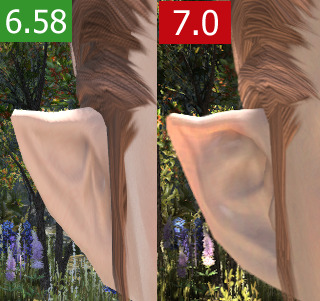
At first I thought I was imagining it before I imported my current settings, but now I am sure when I say my cute and small triangular ears whose shape added to the sharpness of my face have been made bigger and rounder. I made the smallest, most Tolkien elf ears I could because I wanted them to be subtle and elegant. This reshaping has added to the myriad changes that mean my character no longer looks like the same person.

While I can see changes to my beloved hook nose I will concede that at least in profile the shape is nearly identical. Like others observed there has generally been a lessening of the details that made the nose unique. Raised ridge, bigger septum, nostril shortening.

I'm going to try to list things out, starring the things that I think are issues that especially need to be changed/fixed because they are errors rather than just somewhat expected (if unwanted) differences caused by increased poly count and modelling changes.
☆☆• Face 2 Duskwight face textures have been swapped for Wildwood textures?
☆• Lips have been reshaped
☆• Eyebrows have been thickened
• Ears have been made bigger and more rounded in the middle and lobe regions
☆• Lips are darker by default which causes issues with lipstick
• The edges of lips have a hard edge instead of the previous gentle transition
☆• The bizarre 'milk mustache' above the upper lip
• My chin has been made bigger and more round in profile
• My lower lip has been plumped.
☆• Mottled skin textures, especially on my cheeks
• Very flat lip lighting/sheen
☆• Elongated dark smudges about 2cm long on either side of my mouth?
☆☆• Texture issues in eyelid region (very visible during blink animation)
• Harsher, darker eyelashes (not thicker from above though??)
• Lack of eyeshine and dark upper iris making my lids appear lower and changing my default expression
• Angular facial geometry in cheeks seems smoothed which changes the harsher look of the race (possibly just the faulty benchmark lighting)
• Hair lighting has changed; seems more matte, less hue variation between lit and shadowed areas
___
Changes I've seen in other players:
• Face skintone now seems very one-note and unalive
• Waxiness
• Harsher eye makeup that appears too dark or stark
• Removal of texture detail that was unique to individual faces, especially in eye regions
☆• Moon Miqo fangs drastically shortened
___
In seeing all of this unfold I've been dismayed to notice a lot of the unique charm of faces across the board being airbrushed away, from subtle shading in eye areas on various viera faces, to expressive and quirky default expressions being toned down and made more average in Elezen girls and Miqo girls, to wrinkles disappearing from older faces, to facial topology that created personality via cast shadows being rounded and smoothed and lightened into nonexistence. The result is consistently a more calm, mature, generic look. A lot of female characters' makeup has turned weirdly harsh, sharp-edged, and dark so that it more closely resembles stage makeup, both eye and lip. Then the awkwardly single-toned skin tops things off with me left feeling that very few looks are 'upgrades' even when the owner is happy with the result.
A couple side notes: Something odd is happening to the hairline on this style near the middle? Looks like an error. My racial gear necklaces have changed from a visible leather texture to some unidentifiable line-y texture?
#ffxiv#ffxiv graphical update#7.0 graphical update#dawntrail graphical update#ffxiv graphical update feedback#my writing#my character#feel free to translate and post in the other language forums!#the more reach#the better#we know they're listening and I appreciate that
8 notes
·
View notes
Text

Come on now SE, you're still doing the dark-skinned characters dirty even after the graphics update? I thought we were over this! Do the new lighting settings not apply to old content?
...At least his hair still looks pretty.
#final fantasy xiv#ffxiv graphical update#graphical update#7.0 graphical update#dawntrail#also yeah he's a SAM here#because I got the ill-advised idea to grind towards the amaro mount#surprise! I'm still terrible at melee
2 notes
·
View notes
Text
The graphical update did my lady so nice. He hair and eyes and lips~ So pretty!! (im also glad my laptop can still play the game LOLOL) Now she doesnt look like shes giving a death glare all the time now lolol Here is the before and after! Top is before update and bottom pic is after :)


I had to edit Keian a bit though cuz he looked like a sleepy cat instead of his stern looking self. I'll get a comparison pic later
#ffxiv#ffxiv 7.0#graphics update ffxiv#14kuponuts#terai luxer#my screenies#final fantasy xiv#ffxiv hyur#hyur
3 notes
·
View notes
Text


I already got everything I needed from the live letter thank you very much
#ffxiv#dawntrail spoilers#7.0 spoilers#my wifeeeeeeeeee#sir you look so good with the new graphics I'm blowing you a kiss#maybe the update was worth it after all#matry plays ffxiv#soon
6 notes
·
View notes
Text

yeah, so there's this game that came out in 2013- yeah, compatible for ps3
#graphics update#dawntrail#7.0#holy shit they did all of this while at the same time dishing out the magnitude of content that comes with a new expansion release#i can't overstate how grateful I am for all the hard work they've done
3 notes
·
View notes
Text
dont mind me just staring at wet cobblestone


4 notes
·
View notes
Text

Time passes, friendships fade, but Fran's cute little bunny nose is always
#storm plays ffxiv#i love the work the devs have done for the 7.0 graphics update#but my one hope is that they roll back on the decision to take away the little bunny nose highlight#it is pivotal... necessary...#ok now I sleep for real
3 notes
·
View notes
Text
They hadn't hung out in months

and what with all these feathers and birds and lvl 93 spoilers.
With apologies to Lamaty'i. There is only one main tank to tank for Hylnyan should he show up. Logging out here for the nice background and letting them catch up a bit

I do be wanting Zoraal Ja as DPS just to see how he moves in battle. and yes. G'raha is there is spirit.

On a mildly unrelated note. Did GNB Thancred in HW glam shaved post graphics update? Support in Dead Ends. Would add on the one from the trail when I go do it This is now just a glamour. Unfortunately I ran into a spoiler regarding trust glams

From the lvl 93 trial

His Antitower Rogue self looks the same

Obligatory spam
On a certain level I was thinking that Thancred is judging Koana based on whether or not he would leave his sister behind at various spots of the competition. The first one was around the kidnapping. The second one is brib-snek fight. He's utterly professional but I do be thinking he has his standards.
Most of the smile shot happen in low light so far

Obligatory dramatic leaping entrance as per his contract. Did he had one in EW? The texture on his coat dangit.


Hylnyan attempting to look mean

Yes sir. He do be hyping up his boy too. Had me a little worried when Alisaie and the battle spouts got caught in AOE. Leaving them to hangout here until I get back from work.

Have to do a note later. since Thancred is mentoring Koana. And Krile is definitely trying to do her best for Hylnyan who is mentoring both Wuk Lamat and her. While Alisaie is doing a lot of observation things.
Like with Ryne in ShB - Your answers can shoot Wuk Lamat down, Hype her up (see the way Sareel Ja speaks) or be moderate so that things won't go to her head..
Ryne was the more obvious mentoring job to me(she was filling in for Ardbert and Minfilia). While Deftarm and M'zhat was less so because you'll only run into them during sidequest and it looks less obvious.
#Book 7 - Dawntrail#7.0 spoilers#duty support#graphice update#Vacationing godslayer as mentor#uwu senpai and much fangirling even though there is a crowd of people. Have you no sense of urgency and propriety?#Tracking Hylnyan
1 note
·
View note
Text
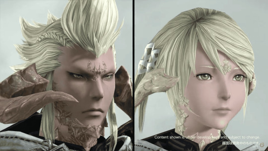
Images of 7.0's graphical update have been released, and they're impressive.


See More: Final Fantasy XIV's 7.0 Graphical Update Preview Brings Realistic Grass to the Game
0 notes
Photo


in the bored build-up to another half-patch and waiting the three weeks until I can buy the final tomestone weapon and thus rework a glam to fit around it unless the ultimate EW relic bow is nice (50% track record on those). So going in a different direction than normal, more armored. At first I hated the Euphrosyne Raid armor (minus the usefulness of the Caster/Healer arms to have a non-tattoo version of the sleeve-shortening trick) because of how much it was undyeable and that it’s continuing the Saint Seiya meets Amano. But the Ranged chestpiece is the length I like and doesn’t look too bad on Roes. Like Aglaia’s Tank, it’s the one job with the semi-transparent drapery. And the textures are nicely varied- the different cloth, leather, metal, and even the gems/crystals.
Let’s face it, it’s the most ‘Warrior of Light’ glam that I’ve put Deni in and it matches the Scions
Final photo is the normal (dark inn room) lightning to show off how much the ensemble glows.
#in eorzea#i really wanted the crafted glowy version of this bow#hopefully 6.5#...yeah this will work for MSQ cutscenes#tweaked the shade of blue on the arms/legs after i took photos but not bothering to retake pics#you bet i'm excited for the 7.0 graphics update
0 notes
Text


Example of upcoming graphical update coming in 7.0
1K notes
·
View notes