#graphicdesigntip
Explore tagged Tumblr posts
Text
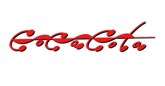
Guys I tried making a corporate rebrand of coke but it actually looks kind of cool??
#artists on tumblr#digital art#concept art#my art#graphic tee#my graphics#graphic design#graphicdesigntips#diet coke#cherry coke#coke zero#coke and mentos bloat#coca cola#sprite#creative logo#logomaker#logo#logo design#logo redesign
7 notes
·
View notes
Text
Watch only if your name start with Letter B - Logo Tutorial
Hey there, logo lovers whose names start with B! 👋 "Design Logos Like a Pro With This One Weird Trick" - sounds cool, right? Well, if your name begins with B, you're in for a treat! I've got a super simple trick that'll have you whipping up awesome logos faster than you can say "Branding"! 🚀
It's so easy, you'll wonder why you didn't think of it before. Ready to level up your design game? Let's dive in and make some Beautiful logo magic happen! ✨🎨
Trust me, your clients will be blown away by your newfound skills!
logodesigner #logodesign #graphicdesign #letterblogodesign #letterblogo #logodesigners #logodesignersclub #logodesigning #logodesignlove #logodesignservices #logodesignershub #logodesignerclub #logodesignlovers #logodesignprocess #logodesigninspiration #logodesignerforhire #logodesigncompany #logodesignph #logodesignservice
letter B logo,logo design,logo tutorial,personalized logo design,branding,graphic design,unique logos,logo inspiration,design tips,typography logo,Adobe Illustrator,professional logo,custom logo design,initial logo design,creative letter logos,how to design a letter B logo,logo design for beginners,personalized branding,unique logo ideas,letter logo tutorial, branding with logo design,unique logo design ideas,how to design a letter logo,creating a logo in Adobe Illustrator,logo design for small businesses, how to make a logo with your initials, b letter logo design illustrator, how to make alphabet logo in illustrator, how to design a logo with letters, how to create alphabet logo in illustrator
#quicklogotutorial#logodesigns#logotype#logo#graphic design#creative logo#brand identity#logo design#tutorial#logodesigner#brandingmadeeasy#branding#personal brand#business#sales#corporatelogodesign#logomockup#mockup#minimalist#graphic art#design#creative#graphicdesigntricks#graphicdesigntips
2 notes
·
View notes
Photo
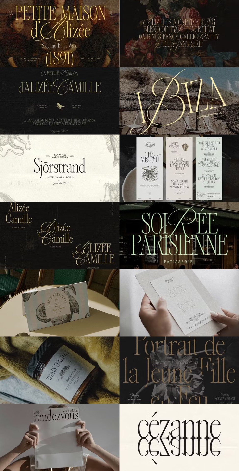
Alizée is a unique blend of calligraphy and serif fonts with vintage charm, perfect for branding, editorial designs, and social media content, offering versatility through three styles: Regular, Petite, and Grande.
Link: https://l.dailyfont.com/I2RSo
#aff#Love#Typography#DesignInspiration#Calligraphy#VintageVibes#FontLovers#CreativeCommunity#SocialMediaGraphics#BrandingIdeas#EditorialDesign#ContentCreation#GraphicDesignTips#FontsForFun#DigitalArtistry#VisualStorytelling#TextualTemptation
3 notes
·
View notes
Text
Eye Color Change in Photoshop cc Tutorial
#designtips#designtipsandtricks#designtools#fonts#design#designer#logodesigner#logo#graphicdesigner#graphicdesignblg#graphicdesigntips#illustratortips#adobe illustrator#illustrator#graphic art#adobe design#illustratortutorial#creative
3 notes
·
View notes
Text
THE 6 FREE MARKETING TOOLS EVERY MARKETER NEEDS TO USE
Are you aware of the top marketing tools out there that not only help you get your job done better, but are completely FREE? There are a number of excellent free marketing tools, and we’ve compiled some of the top in the categories that help you master your marketing. Whether you add all or a few to your marketing toolbox, you’ll reap the benefits of these resources right away and work smarter, not harder.
Project Management: Trello
Lead Generation: Hubspot
Design: Canva
Content: Answer the Public
SEO: Google Free Business Profile and Google Analytics
Social Media Management: Buffer
PROJECT MANAGEMENT: TRELLO
This highly visual organization tool is a master at project management. It lays everything out intuitively on “boards” reminiscent of an old-school desk blotter and designed to manage projects, workflows, and tasks, from the big picture down to the finest detail. With the free version of Trello, you can create unlimited boards that contain a project or process, lists encompassing all tasks and divided into “To Do,” “Doing,” and “Done” (or your own custom process), and smaller, movable “cards” with the information you need to accomplish these tasks, tied to deadlines and assigned doers.
Trello helps you boost your productivity. It keeps everyone moving, with spaces to comment on the cards, and add files and checklists. It also integrates with Slack, Dropbox, Outlook, Gmail, Salesforce, and more, with “power-ups,” or plug-ins, that expand your capabilities. The free version gets you unlimited cards, built-in automation, due dates, mobile and desktop apps, unlimited activity logs, templates, and unlimited power-ups. Then if you find you’re needing more, it’s a reasonable jump in monthly rate for more robust options.
LEAD GENERATION: HUBSPOT
Hubspot is known for many things to many marketers. It’s a robust CRM platform with highly effective marketing, sales, and service tools. The software is king at lead generation. It helps marketers attract potential visitors and leads through inbound marketing, ushering them through the buyer’s journey, and converting them into customers.
While HubSpot’s capabilities are wide-ranging and complex, you can take advantage of its CRM tools in a free suite that includes email marketing, live chat, forms, pop-ups, ads, landing pages, reports, and more. This version has some very helpful features; marketers can add more information about incoming leads with data gleaned from the internet, populating charts with social profiles, job titles, where they came from online, and what they viewed before they filled out their form. You’ll be able to track these potential customers when they return to your site as well, and since each action is mapped, you can track timing too. The free version of HubSpot also provides analytics so you know which of your pages, offers, and traffic sources are pulling the highest conversions. You’ll see the number of visits before customers buy and identify other trends in site navigation so you can optimize your site.
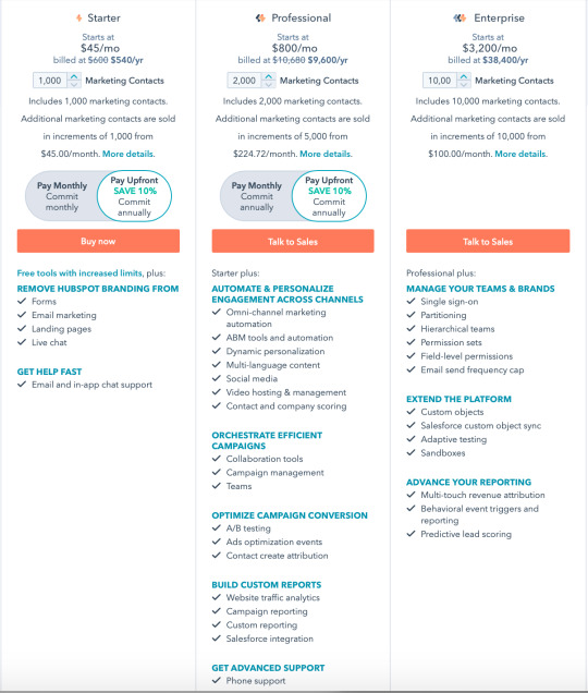
Hubspot also offers paid subscriptions, but these free capabilities are highly effective, so you can always add on later if you’d like:
DESIGN: CANVA
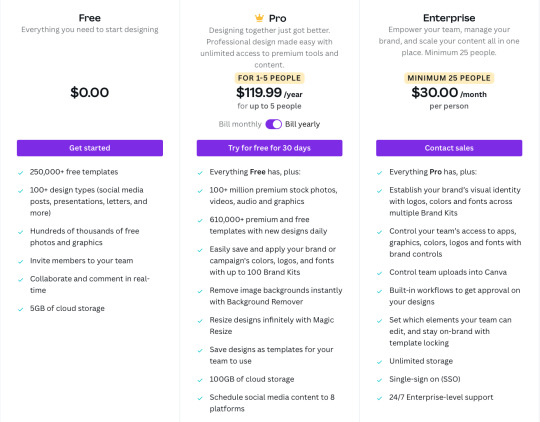
In the way that self-publishing content through social media has revolutionized the media industry, Canva has similarly given people a free platform with which to create beautiful brochures, business cards, banners, infographics, cards, logos, designs for promotional items, social media images, posters, newsletters, videos and so much more. Started in 2013, the platform offers many tools for free, including 250,000+ templates, 100+ design types (social media posts, presentations, letters, and more), free photos and graphics, additional team members, and 5GB of cloud storage, plus access to easy tutorials and other great resources, including a robust blog for marketing, design, and branding. You can level up to Pro and Enterprise for more features, which are free for classrooms and nonprofits.
Canva offers excellent tools for laying out and designing professional-looking pieces even if you’re not a professional designer. With this design tool, you can create postcards for your upcoming sale, Instagram images for branding, or a flyer with your services. Its intuitive interface has made good design more accessible for all of us.
CONTENT: ANSWER THE PUBLIC
This content-generating tool is so simple that you’ll want to play with it for hours. It makes a great party game too, especially since it’s powered by a perky robot. The premise is simple: just enter the topic you’re interested in covering for your content strategy, and it will (within seconds), deliver an elegantly charted image containing more search terms than you can possibly use. The way it works is by collecting the autocomplete data from the 3 billion+ daily Google searches and mapping them out into “what,” “how,” “where,” and more.
You get an unfiltered look into the minds of searchers, to learn the information that they’re really seeking—and sometimes it’s surprising. You can leverage this content to create the next headlines and search terms for your blogs and social media posts. If your audience feels like you’re reading their minds, it’s because you pretty much are.
With Answer the Public’s free version, you can conduct more than 500,000 searches a month; if you need more you can also upgrade to their other plans:
SEO: GOOGLE BUSINESS PROFILE AND GOOGLE ANALYTICS
THE GOOGLE FREE BUSINESS PROFILE
The Google Free Business Profile is a no-brainer. If you have not yet completed this one-time task, head there right now and get your business set up. This tool will direct all users who find you on Google to the critical information they seek: your phone number, website, address, hours, ratings, description, posts, health and safety measures, women-owned/Black-owned/veteran-owned and other status, and more. It includes a map so users can see your location at a glance and a spot for product and services photos. You can create offers, respond to reviews, send and receive direct messages, and post FAQ answers. Since people will be looking for you on their phones and other devices, this first impression is crucial—and it’s 100% free.
GOOGLE ANALYTICS
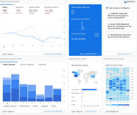
To track how well your website is performing, Google Analytics is an excellent tool. It measures real-time traffic and lets you set custom goals like purchases or signups. You can delve into revenue, return on investment (ROI) and return on ad spend (ROAS). When you link it to Google Ads, you can track ad performance and use their advanced machine learning capabilities to optimize advertising campaigns, based on cost per acquisition (CPA), ROI, or ROAS. With this information, you’ll learn which channels are performing best, see where your customers are coming from (devices and geographically), and use this information to optimize your site. Not bad for a free tool!
Related: 6 Metrics Your Boss Actually Cares About
SOCIAL MEDIA MANAGEMENT: BUFFER
Who has the time to continually post on social media? You do, now that you have a free tool that does it for you! With Buffer, you can schedule your social media posts across social sites in advance, so they’re set.
Their free option gives you up to three channels and their profiles, with ten social posts per queue (and no monthly or yearly limit), basic publishing tools, and a landing page builder for you to send leads to. They even shorten links automatically to save you characters. Buffer is a great way to manage the posts you’ve been meaning to post but haven’t gotten around to yet. It’s your social media assistant, automated.
If you like working with Buffer (and you will), you can opt for their next available plan, which lets you look at analytics, use their engagement tools, build a shopping landing page, and integrate with other apps:
These free marketing tools are all so helpful, and their paid versions often include even more helpful capabilities. We recommend trying them for free and if you find they’re really working for you, they may be worth an additional investment since they’re providing a strong return. Check them out and let us know how you do!
And if you need help integrating any of these tools or would like more marketing muscle in your toolbox, reach out to our team. We’re suckers for time-saving tools, and we love to help make marketing easier, smarter, and of course, better.
#socialmediamanagement#marketingtips#graphicdesigntips#chatgpt#socialmediamarketing#socialmediamarketing101#captionsforinsta#graphicdesigndaily#instagramcaptions#aitools#midjourney#ai#artificialintelligence#graphicdesigncommunity#canva#graphicdesigns#captionideas#marketing#digitalmarketing#photoshoptutorials#socialmediatip
19 notes
·
View notes
Text
Crafting designs that inspire and strategies that deliver results. Let's build greatness together. 🌟💻
#LogoDesign#BrandingDesign#UIUXDesign#MinimalDesign#InfographicDesign#MotionGraphics#PackagingDesign#GraphicDesign#GraphicDesigner#DesignInspiration#CreativeDesign#ModernDesign#GraphicDesignTips#DesignLovers#MyDesign#DailyDesign#DesignOfTheDay#CreativeArtwork#DesignShowcase#VisualDesign#DigitalDesign
1 note
·
View note
Text
The Art of Graphic Designing: A Core Service by Buzz Creators Digital Media
Title: The Art of Graphic Designing: A Core Service by Buzz Creators Digital Media
The ability to capture attention, communicate a message, and leave a lasting impression all begins with stunning graphics. This is where BuzzCreatorsDigitalMedia excels. As a leading digital marketing agency, we understand the significance of graphic design in building brand identity, enhancing user engagement, and driving business growth. In this blog post, we’ll explore the art of graphic designing and how Buzz Creators Digital Media helps businesses bring their vision to life.
What is Graphic Design?
Graphicdesign is a creative process that combines art and technology to communicate ideas visually. It involves the use of images, colors, typography, and layouts to convey messages, tell stories, and promote products or services. Whether it’s a logo, website, social media post, or advertisement, graphic design plays a crucial role in shaping how a brand is perceived by its audience.
Why is Graphic Design Important?
In the digital age, people are bombarded with information every second. This makes it essential for brands to stand out with visually appealing and meaningful designs. Here are a few reasons why graphic design is a vital component of digital marketing:
First Impressions Matter: Your audience’s first interaction with your brand often comes through visual elements like your logo, website, or social media graphics. A well-designed graphic can grab attention and convey professionalism.
Enhances Brand Identity: Consistent use of design elements such as colors, fonts, and imagery helps create a unique identity for your brand. This consistency builds trust and makes your brand easily recognizable.
Boosts Engagement: Eye-catching visuals are more likely to be shared on social media, increasing your brand’s reach. Creative graphics can also encourage users to engage more with your content.
Improves Communication: Graphics are a great way to communicate complex ideas quickly. Infographics, for example, can simplify data and present it in an easy-to-understand format.
Services Offered by Buzz Creators Digital Media
At Buzz Creators Digital Media, we offer a wide range of graphic design services tailored to meet the unique needs of our clients. Our team of experienced designers combines creativity with strategy to produce designs that not only look great but also serve a purpose. Here are some of the key graphic design services we provide:
Website Graphics: We design engaging visuals for websites, including banners, icons, and user interface elements, to enhance the overall user experience.
Social Media Graphics: From posts and stories to advertisements and cover photos, we create designs that captivate your audience and drive engagement on platforms like Facebook, Instagram, and LinkedIn.
Brochures and Flyers: Traditional marketing materials still have their place. We design brochures, flyers, and other printed materials that convey your message effectively.
Infographics: Simplify complex information and data with visually appealing infographics that are easy to understand and share.
Branding and Visual Identity: Beyond just a logo, we help create a cohesive visual identity that spans all your brand touchpoints, from business cards to digital assets.
Our Approach to Graphic Designing
At Buzz Creators Digital Media, our approach to graphic design is client-centric. We believe in understanding our clients’ needs, goals, and audience before we start the design process. Here’s a glimpse of our design process:
Concept Development: Based on the insights gathered, our team develops creative concepts that match your brand's personality. We present multiple design options for you to choose from.
Design & Feedback: After selecting a concept, our designers work on refining the design. We encourage client feedback to ensure the final design meets their expectations.
Finalization: Once the design is approved, we deliver the final files in the required formats, ready for use across various platforms.
Why Choose Buzz Creators Digital Media?
Experienced Team: Our designers are skilled professionals who bring creativity, knowledge, and experience to the table. They stay updated with the latest design trends to ensure your brand stays relevant.
Customized Solutions: We understand that every business is different, and so are their design needs. Our solutions are tailored to fit your specific requirements and goals.
Timely Delivery: We value your time and ensure that all projects are delivered on time without compromising on quality.
Affordable Pricing: High-quality graphic design doesn’t have to break the bank. We offer competitive pricing to ensure our clients get the best value for their investment.
Conclusion
Graphic design is an integral part of any digital marketing strategy. It helps brands communicate their message, connect with their audience, and stand out from the competition. At Buzz Creators Digital Media, we take pride in offering creative and innovative design solutions that help our clients succeed. Whether you need a new logo, a fresh social media campaign, or a complete visual overhaul, we are here to bring your ideas to life.
If you’re ready to take your brand’s visual identity to the next level, contact Buzz Creators Digital Media today! Let’s create something amazing together.
0 notes
Text
Easy Tutorials
#youtube#branding#designtrends#designtutorial#creativedesign#creativeprocess#illustratortips#visualdesign#artdirection#brandidentity#graphicdesign#designtips#photoshoptutorials#designinspiration#designskills#digitalart#designtools#logodesign#typography#designideas#designcommunity#graphicdesigntips#creativethinking#art
0 notes
Text
Understanding A4 Size in Canvas: A Design Essential
1. How to print A4 size?
Printing documents in A4 size requires attention to detail and proper configuration of printer settings. To begin, it is crucial to ensure that the printer settings are correctly set to the desired paper size. Open the document that needs to be printed and select the "Print" option. In the printing preferences menu, choose A4 as the paper size and make any necessary adjustments to orientation, color, and print quality. Confirm that the printer tray is loaded with A4 size paper and adjust the paper guides as needed to prevent any potential paper jams. Double-check all settings before hitting the "Print" button to avoid errors or misprints, ensuring a smooth and efficient printing process. By following these steps meticulously and paying attention to the finer details, you can achieve professional results when printing in A4 size. Attention to detail is key in the printing process, as even small oversights in settings or paper handling can lead to undesirable outcomes. With proper configuration and a thorough check of the settings, you can confidently print your documents in A4 size, knowing that the result will meet the standards of professionalism and accuracy. Taking the time to set up your printer correctly and confirm all settings beforehand will save you time and resources in the long run, ensuring that your printed materials are of the highest quality.
2. What is A4 size in Canvas?
In Canvas, the A4 size is a well-established standard paper format that is commonly employed for a variety of purposes such as creating documents, flyers, and marketing materials. The dimensions of an A4 size in Canvas are 210mm x 297mm or 8.27 inches x 11.69 inches, making it a versatile and widely recognized format in the design and printing world. This size is favored by individuals and businesses alike, as it offers a balance between being compact enough to be easily handled yet spacious enough to accommodate content effectively. When utilizing Canvas for your design projects, selecting the A4 size ensures that your creations are seamlessly formatted for both digital sharing and physical printing. By adhering to the A4 dimensions within Canvas, you can produce professional-grade materials that are not only visually appealing but also consistent and user-friendly for your intended audience. Embracing the A4 size in Canvas guarantees that your designs maintain a polished and standardized appearance, enhancing the overall impact of your communication efforts.
3. What is a Z fold brochure?
A Z fold brochure is a highly versatile and impactful marketing tool that offers a unique format for presenting information in a structured and visually appealing manner. With its distinctive Z-shaped folding pattern, this type of brochure provides six panels for content, allowing for a seamless flow of information from the front cover to the back cover. The design of a Z fold brochure lends itself well to showcasing products, services, or events, as each panel can be strategically utilized to highlight key features and benefits. This layout enables businesses to engage their target audience effectively by presenting a coherent narrative that guides them through the content in a logical sequence. One of the key advantages of Z fold brochures is their ability to captivate the reader's attention compelling visuals and concise messaging. By leveraging the multiple panels available, companies can create a dynamic and engaging presentation that conveys their message effectively. Whether used at trade shows, conferences, or promotional events, Z fold brochures serve as an excellent medium for communicating important information and promoting brand awareness. Their compact size and professional appearance make them an ideal choice for distributing essential details about products or services to potential customers. In conclusion, Z fold brochures are a powerful marketing tool that can help businesses effectively communicate their key messages and drive engagement with their target audience.
4. How to write a brochure in PDF?
When embarking on the creation of a brochure in PDF format, it is crucial to prioritize clarity and conciseness in the information presented. Commence by delineating the fundamental points that need to be communicated to your target audience, ensuring a structured and logical flow of content. Employ a design that is both sophisticated and visually captivating to captivate and engage the reader from the outset. Integrate high-resolution images and graphics to not only enhance the aesthetic appeal but also to bolster the overall impact of the brochure. It is imperative to include pertinent contact information and a compelling call to action to prompt interaction and response from the audience. Lastly, conduct a thorough proofreading of the content to eliminate errors and ensure a polished and professional final product. By adhering to these principles, you can craft a refined and impactful brochure in PDF format that leaves a lasting impression on your intended recipients. The successful creation of a brochure in PDF format hinges on meticulous attention to detail and a commitment to excellence. Prioritize the clarity and succinctness of the information being conveyed by meticulously outlining key points that align with your communication objectives. opt for a design that exudes professionalism and visual allure, beckoning the reader to delve deeper into the content. Leveraging high-quality images and graphics can elevate the brochure's visual appeal and contribute to a more engaging reader experience. Remember to incorporate essential contact details and a compelling call to action to foster audience engagement and encourage meaningful interactions. Finally, meticulously review and proofread the content to ensure accuracy and professionalism, thereby guaranteeing a polished and impactful final product. By adhering to these guidelines, you can create a sophisticated and effective brochure in PDF format that resonates with your audience and leaves a lasting impression.
5. What are the 5 parts of a brochure?
A brochure serves as a pivotal marketing tool, offering businesses a means to effectively communicate essential information about their products or services to potential customers. Comprising five crucial components, a well-structured brochure includes the front cover, inside panels, back cover, headers, and footers. The front cover plays a pivotal role in setting the tone for the entire brochure, serving as the initial impression that captures the reader's attention. With its visually appealing design and captivating content, the front cover aims to entice the audience to delve deeper into the brochure's contents. The inside panels of a brochure contain detailed and comprehensive information about the product or service being promoted. This section serves as the core of the brochure, offering a deeper dive into the features, benefits, and unique selling points of the offering. Meanwhile, the back cover typically features contact information or a compelling call to action, encouraging readers to take the next step towards engaging with the business. Headers and footers throughout the brochure provide a structured layout, enhancing readability and ensuring consistency in design elements. By incorporating these essential components, a well-crafted brochure can effectively convey its message and captivate the target audience, ultimately driving engagement and conversion.
https://visualsculptors.com/our-portfolio/
0 notes
Text
Essential Tips for Stunning Christmas Photography
🎄 Struggling to capture the magic of Christmas with your camera? 📸 We know that holiday moments can slip away if the perfect shot doesn't happen.
But don’t worry! With the right tips and techniques, you can turn those fleeting moments into cherished memories. Our extensive guide on Christmas photography will help you master the art of capturing lights, joy, and warmth that the season brings.
✨ Don’t miss out on preserving your favorite memories! Discover top-notch tips that will elevate your photography game this festive season.
Get ready to snap photos that tell your family's story! 🥰
0 notes
Text
10 Ways to Design the most Eye-Catching Book Covers
An eye-catching book cover is key when marketing a book. It does more than show the title and author. It sets the mood for what's inside and grabs attention with its design. A creative, memorable cover is crucial for attracting readers and selling books. This article will share ten ways to make your book cover stand out. Quick Recommendation: Click here to Boost Your Self-Publishing Success with Book Bolt! This is an awesome tool for creating and selling low content books. The puzzle generation component alone is worth the price of a pro subscription. Key Takeaways - Book cover design plays a critical role in attracting readers and encouraging them to pick up the book. - Designers create eye-catching and attractive designs that reflect the essence of the book's content and the author's style. - Clean and simple designs can be highly effective in catching a potential reader's eye. - Color choice is crucial in evoking the right emotions and setting the tone for the book. - Learning from successful book covers within a genre can serve as a starting point for designing covers in that genre.
Importance of Eye-Catching Book Covers
A book's cover is the first thing people see and the gateway to the story. It's key in marketing the book and drawing in readers. An eye-catching book cover can stand out in a crowded market, making people want to know more about the story. It should show the story's essence, hinting at the tone, genre, and themes. Role in Marketing and Attracting Readers A well-made book cover is crucial for marketing. People often choose books by how they look. A bad cover can make people doubt the book's quality. The cover should show the book's genre, target audience, and theme to grab attention. Visual Representation of the Story's Essence The cover should capture the story's heart, setting the right mood for readers. Giving clear instructions to designers helps get the look you want. Looking at other covers in your genre can also spark ideas. Many authors have seen big sales boosts after getting new covers. For instance, R.L. Mathewson's sales jumped to over a thousand after her cover was redesigned. Whether you design it yourself or hire a pro, aim for an eye-catching book cover that reflects the story. With the right design and focus, you can make a cover that really pops and boosts sales.
Key Elements of an Eye-Catching Book Cover
Creating an eye-catching book cover takes skill and focus on key elements. The right color scheme and bold typography are crucial. They help grab readers' attention and share the story's essence. Color Scheme Suited to the Genre Colors can stir feelings and set the mood for a book. It's key to pick a color scheme that fits the genre. Different genres have their own color associations. Mysteries often use dark colors, while romances use softer ones. Using vibrant colors can highlight important design parts and make the cover pop. Bold and Edgy Typography Typography is key in making a book cover look great. The right font can change everything, showing the book's character and setting the design's mood. Modern fonts and artistic lettering add a cool, professional touch, grabbing readers' attention. Creative Composition and Visual Storytelling The way a book cover is put together is crucial for its appeal. Graphics and images make a cover stand out and be remembered. A thoughtful layout that tells a story can draw in readers and make them curious about what's inside. Mastering these book cover design elements helps create a cover that's not just noticed but also reflects your book's true nature. It also draws in your target audience. https://www.youtube.com/watch?v=s6qeM1aDaRo YouTube Video by Abbie Emmons
Focus on a Captivating Focal Point
Designing an eye-catching book cover means having a strong focal point. This element should grab the reader's attention right away. It should show what the story is about. This could be an interesting character, a mysterious object, or beautiful scenery. Putting the focal point in the center of your cover design adds emotion and interest. It makes readers curious about your story. This can make them want to read your book. The focal point should be eye-catching and match your story's themes and genre. A good choice can make your cover stand out. It will show off the essence of your story. - Identify the most captivating element of your story and make it the center of attention on your cover. - Experiment with different compositions to find the most impactful placement of your focal point. - Enhance the focal point through the use of color, contrast, and other design techniques. - Ensure the focal point aligns with your genre and reflects the tone and mood of your narrative. - Test your design with beta readers or focus groups to gauge the effectiveness of your focal point. With a captivating focal point, your book cover will be visually striking and emotionally powerful. It will grab readers and leave a lasting impression.
Create Depth and Texture Through Design
Designing eye-catching book covers means adding depth and texture. Using shadows, gradients, and highlights can make your cover look three-dimensional. This makes your book stand out and grabs readers' attention. Use of Shadows, Gradients, and Highlights Adding shadows, gradients, and highlights to your cover design adds depth. Shadows highlight certain parts, gradients make it look like there's depth, and highlights focus the reader's eye. This makes the cover more interesting and dramatic. Illusion of Tactile Surfaces Creating the illusion of texture on your cover is another way to engage readers. Techniques like embossed or debossed elements, matte finishes, or textures make the cover feel real. This makes readers want to touch the book, adding to its appeal. Mastering depth and texture in your design makes your cover stand out. It attracts readers, shares the story's essence, and boosts sales.
Incorporate Vintage and Nostalgic Elements
Designing eye-catching book covers can be a game-changer with vintage or nostalgic elements. These touches add a unique flair that touches readers' hearts. Using vintage book covers, nostalgic book covers, and retro book cover design can make your covers stand out. Research shows that vintage-inspired book covers are 35% more likely to be chosen by readers looking for a classic feel in mystery novels. Also, designs inspired by successful covers can boost sales by 28%. This shows that using proven designs can help your marketing in the publishing world. Soft pastel colors are great for cozy and romantic books or memoirs with a nostalgic feel. Nature-inspired designs are also popular for many genres like historical, romance, and fantasy books. Mixed media collages and bold colors can make your book covers pop. Typography can also turn a simple cover into something special. Vintage-inspired designs bring charm and nostalgia to books, attracting readers with their timeless look. Monochromatic covers have a classic, simple style that grabs attention. Symbolic images can also make readers curious, making them want to read more. By using vintage book covers, nostalgic book covers, and retro book cover design, your covers will stand out. They'll connect with your audience. Embrace timeless aesthetics to captivate readers with your unique designs. Quick Recommendation: Click here to Boost Your Self-Publishing Success with Book Bolt! This is an awesome tool for creating and selling low content books. The puzzle generation component alone is worth the price of a pro subscription.
10 Ways to Design Eye-Catching Book Covers
Creating an eye-catching book cover can really grab potential readers' attention. You can use bold typography and striking images. Also, adding depth and texture with design elements can make your cover stand out. - Choose a Color Scheme Suited to the Genre: Pick colors that match your book's genre. Bright colors work well for exciting stories, while soft colors are better for deeper themes. - Use Bold and Edgy Typography: Make your title and author name pop with unique fonts. Try different styles and sizes to catch the eye. - Engage in Creative Composition and Visual Storytelling: Arrange your cover's elements to tell a story. Use size and placement to guide the reader's gaze. - Focus on a Captivating Focal Point: Highlight the most interesting part of your book. This could be an image, a bold font, or a mix that draws the reader in. - Add Depth and Texture Through Design: Use shadows, gradients, and highlights to give your cover depth. This makes it more interesting and unique. - Include Vintage and Nostalgic Elements: Vintage or nostalgic designs can add a timeless feel. They appeal to readers who like a classic look. - Use Contrast for Visual Impact: Mix different colors, textures, and fonts for drama. This makes your cover more memorable. - Ensure Consistency with Author Branding: If you have a brand, make sure your cover fits with it. This helps readers recognize your work and connect with it better. - Consider Adding a Subtitle: A good subtitle adds more context and interest. It can draw readers in and give them a better idea of what your book is about. - Hire a Professional Book Cover Designer: A pro designer can create a cover that captures your book's essence. This can make your book stand out. Using these 10 strategies can help you make eye-catching covers. These covers will attract readers and help your book stand out.
Design TechniqueImpact on Book Cover EffectivenessBold TypographyMakes the title more noticeable and memorable.Creative CompositionTells a story and engages potential readers.Depth and TextureAdds interest and a sense of touch, making the cover more appealing.Contrasting ElementsCreates drama and grabs attention.Professional DesignUses expertise in storytelling and design for a big impact. By mastering these 10 ways to design eye-catching book covers, authors and designers can make covers that catch readers' attention. They also follow book cover design best practices and use proven book cover design techniques.
Using Contrast for Visual Impact
Designing an eye-catching book cover can be a big win with contrast. Try mixing different colors, textures, and fonts. This adds depth and makes key parts of the design pop, catching the reader's eye. Contrasting Colors Using bright colors with softer or matching ones can make a cover pop. Recent studies show designers look at Dribbble and Pinterest for color ideas. The right mix of colors can show off the book's theme and draw in readers. Contrasting Textures Adding different textures to your cover can boost its look. Mix glossy with rough or embossed textures for depth. This mix makes your cover stand out and makes readers want to look closer. Contrasting Typography Choosing fonts with a big difference can also make a statement. A bold font with a delicate one creates a nice contrast. Designers try out different font mixes to make sure the title and author's name are clear. Using contrast wisely can make your book cover stand out. Whether it's through bold colors, interesting textures, or striking fonts, contrast is key. It's a great way to grab your audience's attention.
Consistency with Author Branding
As an author, it's key to keep your book covers looking the same. This helps build a strong brand. Use the same colors, fonts, or images to make your covers look good together. This makes your style clear and draws in readers. A study found that 78% of readers like it when a series looks the same. They're more likely to check out new books by you. Also, covers that look good and match the book's theme get 45% more interest from readers. To keep your brand strong, try these tips: - Choose colors that fit your book's theme and style. - Stick to one main font to make your brand easy to recognize. - Add a special image or pattern to all your covers. - Keep your cover designs similar in layout and look. - Try out different designs and ask readers what they think to improve your covers. Focus on making your book covers consistent to connect better with readers. A strong brand makes your work more visible. A good brand is a big help in your writing career.
Consider Adding a Subtitle
When designing a book cover, don't forget about the subtitle. A short, to-the-point subtitle can add context and grab readers' attention. It helps them understand what the book is about. Subtitles work well with the main title, giving a quick summary. They're great for sharing details about the book's genre or what makes it special. This way, they don't take away from the main title. Adding a subtitle can make your book cover up to 40% more appealing to readers. This shows how subtitles are a strong tool in making your cover stand out. When making a subtitle, aim for something short, informative, and engaging. Make sure it matches the book's style and content. This makes the cover look complete and attractive. - Provide a concise overview of the book's content or theme - Communicate the book's genre or subject matter - Highlight unique selling points or key features - Enhance the main title with additional context - Ensure the subtitle is visually balanced and harmonious with the cover design Thinking about adding a subtitle can make your book cover more effective. It improves the information hierarchy and book cover additional context. This leads to a more engaging book cover subtitle that speaks to your audience. Using a well-thought-out subtitle is a smart move for a catchy book cover. It shares important info and boosts the cover's look, drawing in potential readers.
Hire a Professional Book Cover Designer
Designing a book cover yourself can save money, but hiring a professional book cover designer is a better choice. These experts have the skills to make your cover look amazing. They know about typography, color, and visual storytelling. This means they can make covers that grab readers right away. Expertise in Visual Storytelling and Design Principles A pro book cover designer knows all about visual storytelling. They know how to use colors, fonts, and layout to tell your book's story. They turn your ideas into a cover that speaks to your readers. Reedsy says the cost for a pro book cover designer is about $500-$800. Prices change based on the designer's experience and the design's complexity. Simple covers from new designers might be cheaper, but complex ones from top designers could be more. Getting a pro to design your book cover is a must for selling your book. A good cover adds a lot of marketing value. A study by Ebook Launch showed that email worked well for them. Designers sent out initial ideas, then made changes based on what the author liked. When picking a professional book cover designer, look at their portfolio, how fast they respond, and if they match your genre and style. They should have examples that look good in your book's style.
Conclusion
Creating an eye-catching book cover is key to marketing your book and drawing in readers. By using a color scheme that fits your genre, trying out bold typography, and making a focal point, you can make covers that grab attention. Getting a professional book cover designer can also be smart, as they know how to make your vision look stunning and impactful. The key takeaways for eye-catching book covers are simple. They include knowing how important your cover is for marketing and looks, mastering design elements like color and typography, and focusing on a strong focal point. Keeping a consistent look across your books is also important. By following these book cover design tips, you can make your book seem more valuable, draw in more readers, and increase your sales. Your book cover is what first catches a potential reader's eye. So, it's vital to make a strong impression. With the right strategies and creativity, you can design covers that truly capture your story and engage your audience. Quick Recommendation: Click here to Boost Your Self-Publishing Success with Book Bolt! This is an awesome tool for creating and selling low content books. The puzzle generation component alone is worth the price of a pro subscription.
FAQ
What is the role of an eye-catching book cover in marketing and attracting readers? A book cover is the first thing readers see. It's key in marketing and drawing in readers. A cover that grabs attention can stand out in a crowded market, making readers want to dive into the story. How can a book cover visually represent the essence of the narrative? The cover should show the story's essence. It should hint at the tone, genre, and themes. This sets the reader's expectations. What are some key elements for designing an eye-catching book cover? For an eye-catching cover, use a chosen color scheme, bold typography, and a creative composition. These elements tell a story and grab attention. Why is establishing a strong focal point essential for an eye-catching book cover? A strong focal point is crucial. It should be something that catches the eye, like an intriguing character or scenery. This draws the reader in and shares the story's main idea. How can design elements create depth and texture on a book cover? Use shadows, gradients, and highlights for depth. Techniques that mimic textures make the cover more engaging. How can incorporating vintage or nostalgic elements add a unique flair to a book cover? Vintage textures and colors can add a timeless feel. When done right, they make the cover look classic yet modern. How can using contrast effectively create visual impact on a book cover? Contrasting colors and textures add depth and interest. A bold illustration or striking font against a subtle background grabs attention. Why is maintaining consistency across a series of book covers important? Consistent design elements create a cohesive look. This reinforces the author's style and attracts loyal readers. Read the full article
#Bookcoverdesign#Creativebookcoverinspiration#Designtrendsforbookcovers#Eye-catchingbookcoverideas#Graphicdesigntips
0 notes
Text
Scope Computers
Graphic Design Training in Jodhpur
Join Now (Limited Admission)
Contact Us: +91 85600 00535
#GraphicDesignTraining#DesignSkills#GraphicDesignCourse#LearnGraphicDesign#GraphicDesignClass#DesignEducation#GraphicDesignWorkshop#GraphicDesignTutorial#DesignLearning#CreativeTraining#DesignCourse#GraphicDesignTips#DesignTutorial#DigitalDesignTraining#GraphicDesignSkills#DesignSchool#DesignLessons#GraphicDesignOnline#DesignCommunity#GraphicDesignInspiration#DesignMentor#DesignPractice#DesignStudent#GraphicDesignHelp#DesignInstructor#GraphicDesignBasics#GraphicDesignLife#DesignEducationOnline#DesignCourseOnline#CreativeSkills
0 notes
Text
instagram
Unlock Pro-Level Skills for Designing an M Cloud Logo It's easier than you think to create a standout Cloud Letter M logo! Our tutorial covers everything from creative processes to advanced techniques in Adobe Illustrator and Firefly. Whether you're branding your company or crafting unique initials, these tips will transform your design journey into something extraordinary. Let's turn your ideas into branding gold!
#cloudlogo#lettermlogo#3dlogo#adobefirefly#adobeillustrator#creativeprocess#logodesigntips#typographylogo#LogoTutorial#SketchToVector#AdvancedDesign#SmallBusinessBranding#InitialsLogo#LogosWithM#DesignYourLogo#ProLevelDesign#GraphicDesignTips#IllustratorTips#BrandingStrategy#DesignInspiration#firefly#fireflytips#Instagram
0 notes
Photo
Strong and bold, Black Fearnest exudes an urban vibe, perfect for projects that demand attention-grabbing typography.
Link: https://l.dailyfont.com/j5P9Y
#aff#Love#FollowMe#InstaGood#BestOfTheDay#DesignInspiration#TypographyLovers#FontFrenzy#UrbanVibes#AttentionGrabber#BoldAndBeautiful#SocialMediaMarketing#GraphicDesignTips#TypeAndTypography#DesignCommunity#CreativeInspiration#ArtisticExpression
0 notes
Text
Graphic T-shirt
If you are looking for an Amazing and Trendy Graphic T-shirt, so here you are in the right place!
I'm an expert T-shirt designer with over 6+ years of experience. I can design a T-shirt for any of your POD (PRINT ON DEMAND platforms. I can do research and design your art which becomes viral and give you more sales.
Contact me click here https://bit.ly/3wAWPb7
#graphicdesign#graphicdesigner#freelancegraphicdesigner#graphicdesigntips#graphicdesigntrends2023#graphic#graphicdesignbasics
1 note
·
View note
Text
youtube
how to create blending shapes using the blend tool. Follow our step-by-step instructions and learn easy tips and tricks to create impressive blend shapes like a pro!
#adobeillustratortutorial#illustratortutorial#blendshapes#blending#createlogo#blendshapesinillustrator#graphicdesigner#graphicdesigntips#graphicdesigntrends2024#Youtube
1 note
·
View note