#google pixel 7 specifications
Explore tagged Tumblr posts
Text
Google pixel Black Friday deal 2022,
Google pixel 7 Black Friday 2022,
Google pixel 7 vs samsung s22,
Google pixel 7 deals
Is a google pixel worth it?
Here are some of the benefits a pixel has :
Pixel's very own powerhouse. Google's new custom-built chip helps keep your phone fast, your games rich and your personal info safe
A battery that you'll actually love. The all-day battery charges fast, adapts to you and saves power for apps you use the most[1]
A bigger and better camera. Capture more details and richer colours with the advanced 50-megapixel rear camera that captures up to 150% more light[2]
Your protection, built into Pixel. The next-gen Titan M2 chip and five years of security updates help protect you, your stuff and your privacy[3]
Switching is simple. It only takes a few steps to move messages, contacts and photos from your old mobile phone and get going on Pixel[4]
Check out the link here and some reviews


#google pixel#black friday#google pixel 7 series#google pixel 7 ultra#google pixel 7 specifications#google pixel 7 features#google pixel 7 review
1 note
·
View note
Text
Pixel 8: A Game-Changer in the World of Smartphones
v
#1. Pixel 8 smartphone#2. Pixel 8 features#3. Pixel 8 display quality#4. Pixel 8 camera capabilities#5. Pixel 8 performance#6. Snapdragon processor in Pixel 8#7. Android 13 on Pixel 8#8. Pixel 8 software updates#9. Pixel 8 battery life#10. 5G connectivity in Pixel 8#11. Google Pixel 8 review#12. Pixel 8 specifications#13. Pixel 8 release date#14. Pixel 8 price#15. Best Android smartphones 2023#pixel art#iphone12#iphone
0 notes
Link
0 notes
Note
id be interested in seeing you rank plane emojis from different platforms (by their livery, or by whatever else) just for fun, if you want!
You're right. I WILL do this for fun, because this is fun. Not based on livery, since they're mostly white with blue wings - just how much I like them. I'll be adding a rating out of 10 for each one because I think that's the tradition for this sort of thing.
Apple - 4/10

I mean, because I have an iPhone this is my default conception of an airplane emoji - I think it's fine, I just find it a bit offputting how they model the individual flaps and cockpit windows but the rest of it is a white airbrushed tube. It's a weird contrast.
It's fine, I think. Acceptable. I maybe think emojis by default aren't the most aesthetically pleasing.
Google Noto Color Emoji - 4.5/10

I think this is a slight improvement over the Apple version because of the more consistent stylization. It's also a little more contemporary, since most airliners that are flying now have two engines. I like that they added a few windows and highlights to keep the cabin interesting, and I think it's a bit...something that they took off the flaps but added flap track fairings. Cockpit windows look awful though.
Samsung - 2/10

This is a bit more of a realistic shape for an airplane but for some reason I don't like it. Maybe it's the fact that you can barely recognize that there's a tailfin at all, or the cockpit window looking weirdly...shiny? I think what gets me the most, though, is that those engines look like Super Mario pipes.
Microsoft - 1/10

She's a little...phallic somehow. I just think a top-down view of an airplane is almost always going to look worse if you make it super round and blobby. On the bright side, it's still recognizable as a plane.
WhatsApp - 7.5/10

I really like the way this one is red. Way to stand out in a crowd. It's also quite realistic without giving up on being stylized. My one issue is with the cockpit windows, which look a bit out-of-place and weird. This seems to be a common point of failure for this sort of emoji. Also, I'm unsure if this is meant to be a two-engined 747, but if it is points off for those not existing.
Twitter - 6/10

I hate to ever hand it to Twitter but this is just solid. That's an airplane, just a very simplified and round one. Even the cockpit windows on this one look okay.
Facebook - 3.5/10

Maybe airplane emojis with airbrush shading just look bad to me. There's nothing fundamentally wrong with the shape of this but I don't think they differentiated the tailfin from the fuselage enough. It looks like a stub. Also, what is up with that miserably short wing chord?
Telegram - 7/10

I mean, it looks like a 3D version of the Apple one, but it's surprising how much making it 3D improves it. Plus, gotta hand it to them deciding their emoji was being flown by Tex Johnston. I admire that sort of verve.
Microsoft Teams - 0/10

On the flipside, animating this one and making it 3D makes it so much worse! It looks like it was made right when people just figured out that 3D animation was a thing that was possible to do, back in the 50s or something. And boy are those pixels crunchy - I wouldn't mind this if it weren't already heinous. Seriously, how is that tailfin even attached?
Skype - 10/10

Now this I really like. Most of these are impossible to assign a model to but this distinctly looks to me like one of the earlier, stubbier 737s, just really short with a pointy nose, and she's waving at you. Crisp, nice smooth animation, just fantastic.
Twitter Emoji Stickers - 0/10

Looks bad. One of the few of these which are very easy to recognize as a specific model of airplane - this is clearly a 747, based on the inclusion of the hump. There is a reason basically none of the others are trying to be a 747. Adding a weird lump to the front of your emoji doesn't really make it any less weird-looking, and rendering a plane from above tends to be weird-looking already. It looks like she was stung by a bee.
JoyPixels - 6.5/10

As with the WhatsApp red, I appreciate anything setting itself aside in color, so I have to compliment the choice of this sort of toothpastey green. This is one of the better simplified airplanes we've gone over today, and the only thing I really dislike is that it has the same issues with the tailfin Facebook does.
Toss Face - 0/10

I can barely tell this is supposed to be an airplane. It makes me want to, excuse the mental image, toss face.
JoyPixels Animations - 10/10

Now THIS is what I'm talking about! Just a nice little pixel aircraft, doing the same sort of smooth wriggling as the Skype airplane - no criticisms.
Sony PlayStation - small/10

Adequate, but too small to really assess further - but the fact that I don't dislike anything about it is honestly a credit at this point.
Noto Emoji Font - 3.5/10

This just looks like the Samsung emoji but rendered with plain lines. Removing detail from these tends to improve them.
OpenMoji - 0/10

Oh, no, I take it back! Too few details! It's like a torpedo with wings awkwardly stapled on. A really phallic one at that.
emojidex - what the hell/10

I think this more or less looks fine, and the livery it has also looks fine, but I'm so thrown off by the fact that I don't think this is a real airplane. I am obviously not an authority on every model of airplane ever built but I'm reasonably sure this isn't a real one. It most resembles a BAe 146/Avro RJ, the only four-engined t-tail plane intended for passengers rather than heavy cargo. But the 146/RJ has high wings, located above the cabin windows, so...what is this airplane? What does emojidex know that they're not telling us?
Messenger - 7/10

While not ugly per se, it's a bit futuristic for my taste. Still, the choice to model it from a position other than directly from the top avoids a lot of the pitfalls that make many of these so bad to look at.
LG - 4/10

Boring? Yeah, without question. But this is just a good representation of an airplane, and at this point I'll accept that. Does the tail thing, though.
HTC - 3/10

Something about the way this is shaped makes this look more like a rocketship than an airplane. Or a Convair Pogo.
SoftBank - 5/10

A decent pictoral representation of an airplane. See: LG. Fixes the tail thing.
Docomo - 5.5/10

Also a decent pictoral representation of an airplane, but I think rendering it in silhouette gets rid of many of the pitfalls associated with airplane emojis. No details to mess up, just the shape of an airplane. Why do the majority of these have four engines? Seriously, there are only three four-engine airliners in passenger service right now. Have the people designing these not flown since the early aughts?
au by KDDI - 2.5/10

Okay, I know I've been saying being a good representation of an airplane is good enough but this is just simplifying too far. This isn't an emoji, it's a unicode character.
Mozilla - 1/10

Why pointy but only sometimes? Why does the tail pinch in like that? It's ugly, Mozilla, you made an ugly one.
482 notes
·
View notes
Text
wait imagine this
sometime between island and s2 ep27 of action, (probably on his time at playa de losers), ezekiel gets his grubby little farmer boy hands on the internet.
specifically, youtube.
now this motherfucker is absolutely mindblown because "oh wow! people post stuff here and people watch it!!!"
long story short, he makes a youtube channel.
and calls it therealEzekielMiller

(i swear this isn't an advertisement [as far as i know] the channel doesn't exsit)
so. it doesn't do too well. my guy has like the shittest camera quality and doesn't even know how to change his pfp.
also, all his titles sound like clickbait. like imagine seeing this title as your scrolling.
(REAL) SNEAK PEAKS AT PLAYA DE LOSERS!!! (Courtney freakout!?!?) 😨😨😨
yeah...
however, no matter how grainy and pixelated the footage is, it soon becomes important.
because that's some of the last footage of him.
we all know what happened to zeke in world tour. and if you for some reason don't, please don't look it up if you haven't seen it yet. watch the show. (now ill admit that's advertising).
so, ezekiel's feral, he goes missing, and this youtube channel is throughly investigated to try and find any potentially helpful footage.
the most they found was courtney freaking out. and izzy taking the camera like 5 times. pretty much everything else was about this "brilliant invention" called harmonica rap.
but anyway, a bit after RR, they finally find ezekiel.
and he immediately gets sent to a hospital because HOLY SHIT IS HE GREEN???
the doctors conclude that zeke should eventually be able to return to (almost) completely sanity. so, while he goes through this longggg healing process, the media hears his story.
and that old youtube channel? yeah it EXPLODED
and what does ezekiel do with this new found fanbase?
he gets scared and avoids the internet.
i mean can you blame him??? he went from having NO FANS to HUNDREDS OF THOUSANDS, and the only memories he has are blurry ones where he's green and growling at people.
but he couldn't avoid it forever.
and for the first time in over 7 years, ezekiel posts another video.
and it BLOWS UP
THE WHOLE CHANNEL DOES
but deep down our boy ezekiel is still a sheltered farm boy. he had to google how to change his youtube pfp.
so just imagine this scrawy, slightly green, teenager/early adult in front of a camera, rambling nonsense and throwing "yo" or "eh" into pretty much every sentence.
just IMAGINE THAT
"get ready with me to get a rabies shot"
"guys what does lol mean?"
"storytime: i went feral in a cargo hold"
"reading my old rap songs"
"riding a horse after 7 years"
"what does gay mean?"
"get ready with me to see my ma and pa again"
anyway yeah in conclusion give farm boy internet access.
#shitpost#might turn this into an au if I get bored#or if people like this#td ezekiel#ezekiel td#total drama ezekiel#ezekiel total drama#ezekiel miller#give farm boy internet access#idk what im doing#idk what else to tag
80 notes
·
View notes
Text


Red-Legged Grasshopper - Melanoplus femurrubrum
The posts that will be uploaded over the next few weeks will highlight some of the recently overlooked insect orders on this blog. Specifically, the orders of Diptera and (today's subject) Orthoptera.
Today, we get another look at a familiar insect specie who spends its days vaulting itself across grass and diving into plants. Although I've seen individuals throughout the years, I still have let to find one devouring the front yard's plants. On a nature walk, however, I was able to find one individual eating goldenrod flowers. They're otherwise always hopping away at the first sign of trouble. As some of these pictures indicate, they may be attempting a bit of cryptic camouflage. Conifer needles look like a good hiding spot (depending on the colors), but they do not offer much in terms of food. If they're still enough or quick enough, it could be very easy to lose a Grasshopper among the long grasses or beneath a plant's shadows if discovered. In my yard, they may hide but they always return to the open eventually. Summer has only just arrived, so it's too early in my area to search for adults. Generally, I've found Grasshoppers a few weeks after Cicadas make themselves heard, and then the former remain active until the approach of autumn (they are active earlier in more southern regions). That said, the smaller, wingless Melanoplus nymphs might be on the rise soon. They will be shared here as soon as they can be found and photographed between each skittish hop and turn.
Pictures were taken on August 3 and 22, September 5 and October 7, 2021 with a Google Pixel 4.
#jonny’s insect catalogue#ontario insect#grasshopper#red legged grasshopper#orthoptera#insect#toronto#august2021#september2021#october2021#2021#entomology#nature#invertebrates#arthropods#photography#animals
16 notes
·
View notes
Text

waycase.co.uk
iPhone Charging Cable Type-C to Type-C
High-Speed USB-C to USB-C Braided Charging Cable! Upgrade your charging experience with our premium USB-C to USB-C braided charging cable. Designed for durability and speed, this cable is perfect for all your USB-C devices. The robust braided design not only looks sleek but also ensures longevity, resisting tangles and fraying. Whether you're at home, in the office, or on the go, our USB-C to USB-C cable is the perfect companion for fast, reliable charging and data transfer.
Key Features:
High-Speed Charging and Data Transfer: Supports up to 100W power delivery, ensuring your devices charge quickly. Also capable of high-speed data transfer up to 480 Mbps.
Durable Braided Design: The tough nylon braided exterior adds extra protection to prevent damage and wear, extending the cable's life.
Universal Compatibility: Perfectly compatible with all USB-C devices, including smartphones, tablets, laptops, and more.
Reversible Connector: Easily connect the cable without worrying about the orientation of the plug.
Compatible Models:
iPhone 15, iPhone 15 Plus, iPhone 15 Pro, iPhone 15 Pro Max
Other compatible devices:
Smartphones:
Samsung Galaxy S21, S21+, S21 Ultra, S20, S20+, S20 Ultra, Note 20, Note 20 Ultra, Note 10, Note 10+
Google Pixel 6, 6 Pro, 5, 4, 4 XL, 3, 3 XL
OnePlus 9, 9 Pro, 8, 8 Pro, 7, 7 Pro
Xiaomi Mi 11, 11 Ultra, 10, 10 Pro
Huawei P40, P40 Pro, Mate 40, Mate 40 Pro
Tablets:
iPad Pro (2018 and later models)
Samsung Galaxy Tab S7, S7+, S6, S6 Lite
Lenovo Tab P11, P11 Pro
Laptops:
MacBook Pro (2016 and later models)
MacBook Air (2018 and later models)
Dell XPS 13, XPS 15
HP Spectre x360, Envy x360
Lenovo ThinkPad X1, Yoga
Microsoft Surface Book 2, Surface Go
Other Devices:
Nintendo Switch
External Hard Drives with USB-C ports
USB-C hubs and adapters
Product Specifications:
Length: 1m (3.3ft)
Material: Nylon braided exterior, aluminium alloy connectors
Power Delivery: Up to 100W
Data Transfer Speed: Up to 480 Mbps
Package includes:
1 x USB-C to USB-C Braided Charging Cable
3 notes
·
View notes
Text
Rendering in a PS1 style
This post is more of a technical overview of how I use blender to create 3D renders resembling a PS1 style. It’s both for myself to have a self-guide to various techniques in case I forget about them both for other people interested in developing this style.


The PS1 style is not the same as a low-poy style or an N64 style. All the different 1990s and 2000s consoles have different hardware limitations and glitches, which makes each graphic style unique in its own merit.

The theory has been taken mostly from this article, while the blender tips are from various sources, which I point out at the end of the post.
What defines a PS1 Style in 3D Graphics? The main components that come to mind are the low-poly models, the pixelated textures and the generally low resolution of the image, but there are several more. David Colson, in his article, points out 7 factors:
Low poly models and low-resolution textures
Polygon jittering
Lack of depth buffer
Warped textures
Popping and jittering texture mapping
Per vertex lighting
Depth cueing fog
His article goes into depth on all of them, while, for the sake of doing it in Blender, we’re going to focus on the first two. You can read the full article and do it if you want to create a full rendering engine based on the PS1 specifications.
Low poly models and low-resolution textures
The low poly models were created due to the hardware limitations of the PS1, mostly of the geometry transformation engine (GTE) not being able to process that many polygons per frame. This Wikipedia article states that the GTE could only process 90,000 polygons per second with texture mapping, lighting and smooth shading, but it depended on the GTE used. Compare it to modern GPUs, which can render millions of polygons per frame, let alone per second, and you start to understand why creating a realistic-looking old 3D model is not as easy as it sounds.
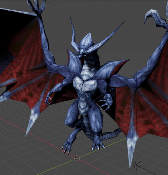
The low-res textures come from a hardware limit as well: 256x256px. And most of them were not even this high. They were created in a plethora of ways: hand painting, reducing the resolution of photos, and a mix of these two ways. Many of them used UV Mapping and Tiling to reduce the stress on the PS1-limited hardware even more.

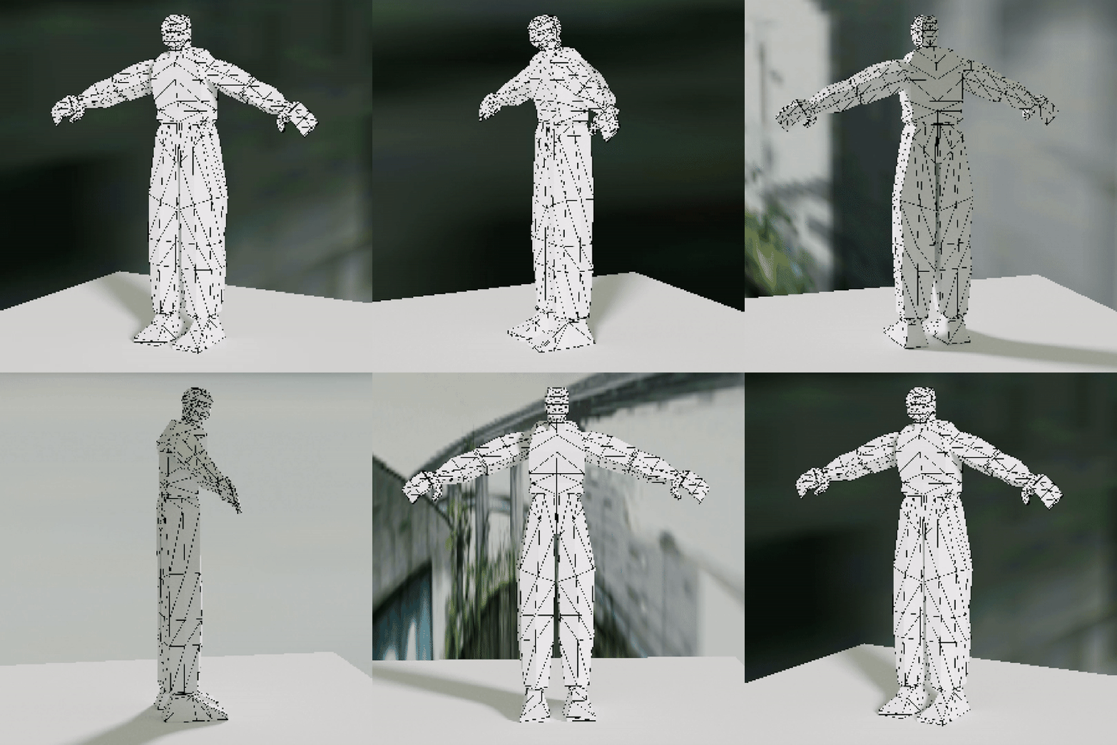
I’ve tried several techniques to create low-poly 3D models of characters and environmental objects. For characters, the easiest way I’ve found is to model them entirely on Blender using a reference image (I’ve used this one for the male) and try to keep the poly count as low as possible. After creating the model, I modified the proportions slightly. I still haven’t tried texturing the model I made, so I think I’m gonna make another blog post just for Texturing and UV Mapping cause it’s a complicated but interesting topic.
For props and environments, I’ve found that there are mainly two ways of operating: the easiest is just to think of everything as simple polygons and planes. For example, a supermarket can be divided into isles, the floor and the ceiling. They can all be simplified into blocks.

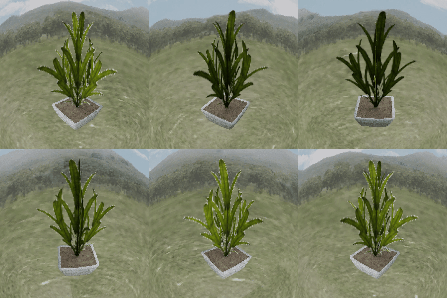
On the other hand, a plant can’t be a block, or it’ll look like Minecraft. That’s why you can intersect two planes, both textured with a png texture of a plant. It’ll look janky, but that’s how PS1 plants were made.

Another way I’ve worked with planes was with a shopping cart. Besides the handle, the model is composed of planes and textured accordingly. This proved to be an interesting way of working, and the result was quite interesting, but it took a lot of time and had a steep learning curve.

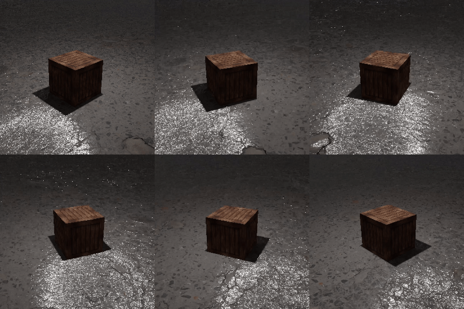
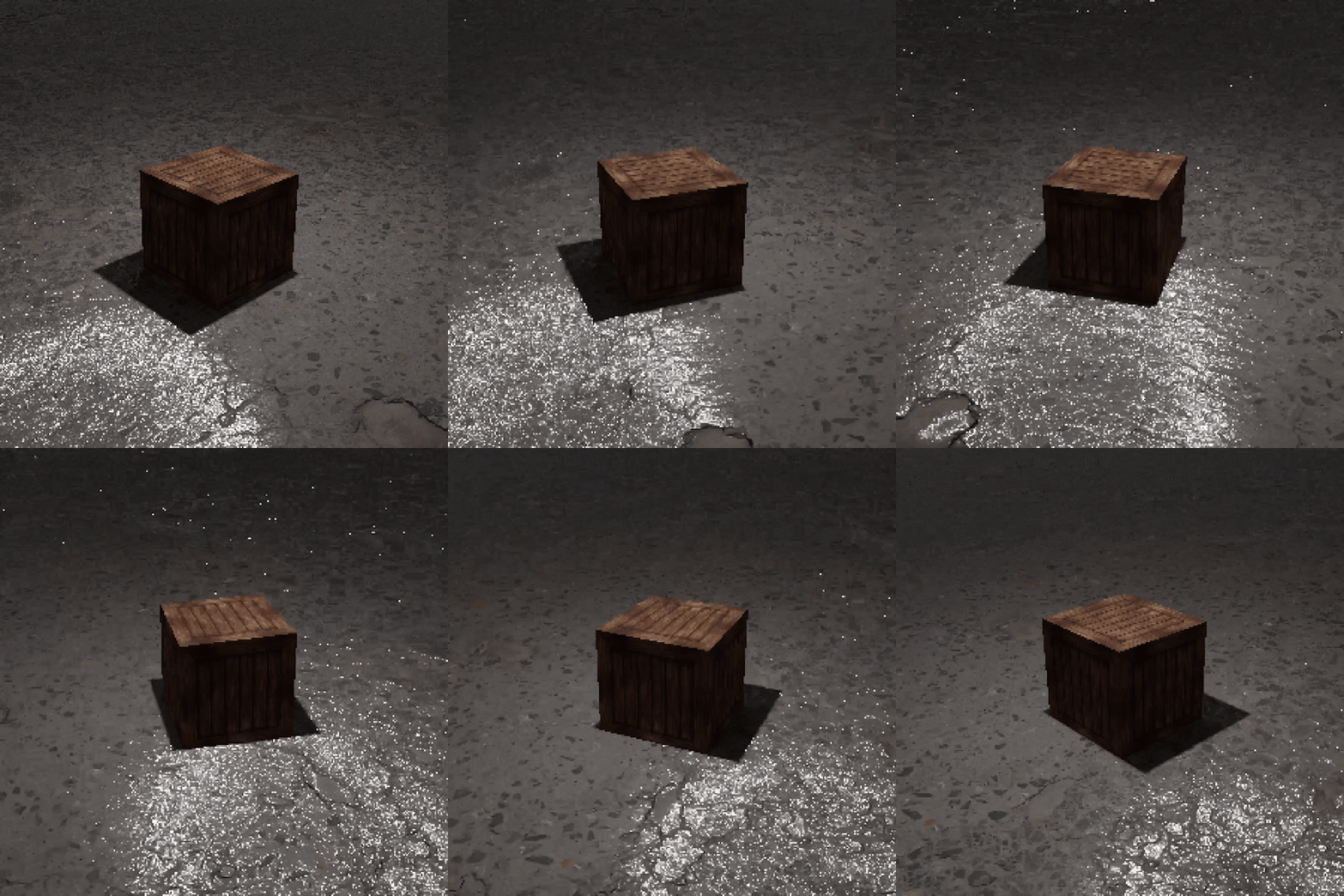
For the textures, I’ve worked mostly on reducing the resolution of high-res textures found on Quixel Megascans and other websites (or even google images) and sometimes retouching them a bit in photoshop. For example, this crate I’ve made comes from a texture found on google images reduced to 128x128px, applied equally to all the sides of the cube. Remember to choose “nearest neighbour” as the interpolation method to keep the image pixelated.



What I’ve found is that on some models, while not exactly true to the PS1 style, inserting a roughness and normal map on the texture leads to visually interesting results. With the crate above, the floor has a normal map, so the reflections of the light show up quite heavily.

Polygon jittering
The jittering and shakiness of the graphics on the PS1 are well-known. On a hardware level, this happens due to a lack of subpixel rasterization and the geometry transformation engine (GTE) having only fixed-point maths. The inexistence of anti-aliasing makes the models and textures, when seen from different points of view, distort, jitter and sometimes change their shapes altogether. To show it, these are two videos that David Colson made.

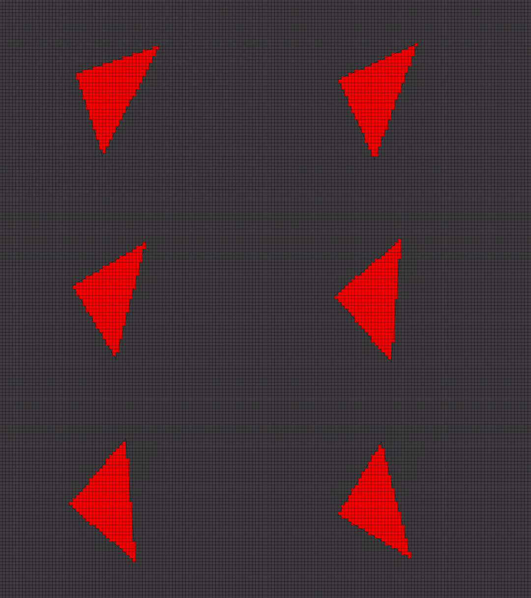
Through a forum post, I've found an incredibly easy way to recreate this effect on Blender. Select the model you want to jitter and add the “displace” modifier. Then change a couple of parameters:

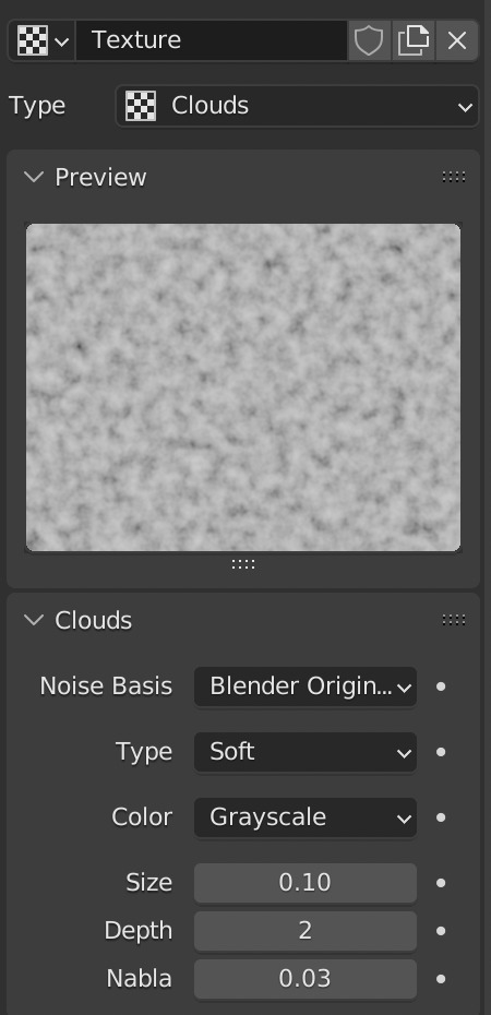
Now the model jitters and modifies as the camera moves. It’s not exactly the same effect used by the PS1, but it’s easy, and in most cases, it’s good enough.
Rendering
Now you have the models and the jitter, but how do you render the scene to create a PS1-looking video? First, as we’ve discussed, it’s imperative to completely remove the anti-aliasing. The pixelated look is defined by this. In Blender, you can do this by going into the render properties > film and changing the filter size to 0.01.


The second step is the resolution. The PS1 outputs 320x240px images, but you can play around with it depending on the use case you need. For the sake of this blog, the videos are rendered at 300x300px. The important factor is that the pixels must be visible. Then you can render your video.


The last step is exporting this low-res video at high-res without ruining the pixelated effect. I’ve found a way to do this through Blender. First, you create a new video editing project; then you import your frames into the timeline. Change all the blender settings on the resolution that you want it to render at, the output and so on. Lastly, go into the “view” bar of the Sequencer tab in Blender and use “Sequence render animation”. Now you have a high-res ps1 style rendering!

Another way of doing it, easier but that requires paid-for software is rendering the original sequence in After Effects into a high-res composition and scaling the frames using the nearest neighbour interpolation method.


And this is the final output video:

This is just the start of the process though: creating PS1 styled images and videos can be as exciting as boring, and the new technologies offer multiple interesting ways to approach them in new and interesting ways. Experiment, try out things, find your own style, because retro-styles are becoming more and more trendy lately, and as such you may get lost in the thousands of sterile “inspiration” images online. Visuals are important, but if they don’t transmit anything they’re completely useless.
Resources used:
How to make PS1 style graphics
PS1 Style Graphics - Green Ranger Model and Texture Time Lapse
How to create accurate ps1 and n64 styled graphics
The Sickly Wizard
World4Jack made some time ago an archive of 2000s textures catalogued in several categories. The archive is now offline, but I’ve managed to find it and I saved on a drive. Access it here.
26 notes
·
View notes
Text
Google Pixel Fold Price In India
Google Pixel Fold Price In India
Google Pixel Fold Price In India Is Expected To Be ₹147,490. Google Pixel Fold Launch Date Is Speculated To Be On September 28, 2023. The Mobile Will Be Available In Multiple Color Variants.
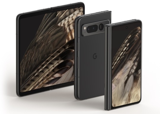
Google Pixel Fold Details
Design, Display, And Security
The Pixel Fold, Google's Most Recent Foldable Creation, Combines Cutting-Edge Design With Exceptional Features. The Phone's Display Incorporates A Book-Like Fold And Open Mechanism. A Punch-Hole Cutout For The Selfie Camera Is Included In The Enormous 7.6-Inch OLED Display Of The Google Pixel Fold. The Smartphone Also Sports A Pixel Density Of 378ppi And A Resolution Of 2208 X 1840 Pixels. The Foldable Smartphone Features A Maximum Brightness Of 1,200 Nits And A Programmable Refresh Rate. The Phone Has A Side-Mounted Fingerprint Sensor And A Face Unlock Function For Security.
Performance, Camera, And UI
Powering The Google Pixel Fold Is The Most Recent Google Tensor G2 CPU. The Newest Chipset Contains Two Cortex X1 Cores, Two Cortex A78 Cores, And Four Cortex A55 Cores. The Phone Has A Mali-G710 MC10 GPU To Handle Graphics-Related Activities. 8GB Of RAM And 128GB Of Internal Storage Are Featured On The Foldable Google Gadget. The Device Features A Triple Camera Arrangement On The Back. A 12MP Ultra-Wide-Angle Lens, A 10MP Telephoto Sensor, And A 64MP Primary Sensor Are All Included In The Pixel Fold. The Phone Has A 10MP Front-Facing Camera For Selfies And Video Calls. The Pixel Fold Is Equipped With A Customised Version Of The Most Recent Android Operating System, Version 12.1, Which Is Designed For Foldable Tablets.
Battery And Connectivity
The 4,821mAh Battery Within The Google Pixel Fold Supports Rapid Charging Using A USB Type-C Connector. Additional Connection Choices Include Dual-SIM, 5G, 4G VoLTE, Infrared Sensor, Wi-Fi, Bluetooth 5.2, GPS With A-GPS, And More.
The Latest Google Pixel Fold News
Pixel Fold Users Complain About Display Issues Within One Day Of Release
Users Of The Google Pixel Fold Have Begun To Express Complaints Regarding Display Problems. These Include Display Flaws Including Dents, Fractures, And Light Scratches.
Google's Top Smartphones The Pixel 7 Pro Vs. IPhone 14 Pro Comparison In The Forever Ad Campaign Promises Both Amusement And Cringe When The Phones Speak.
In Its Most Recent Commercial Campaign, Google Pokes Fun At The IPhone While Still Making Fun Of The Pixel-IPhone Competition. The Business Has Released 5 Brief Commercials.
Price And Details For The Google Pixel Fold Have Been Released.
The Google Pixel Fold Has Been Launched In The US In Two Storage Options. The Base Model Packs 12GB Of RAM And 256GB Of Storage.
Disclaimer: Specifications shown may be different from the actual product. We cannot guarantee that the information provided on this page is 100% correct. Please check with the retailer before purchasing. you have old mobile phone then sell your old google Mobile Phone or any other Smartphone at RecycleDevice for good exchange value.
#google pixel fold#google pixel fold price#google pixel fold phone#google pixel fold launch date in india
2 notes
·
View notes
Note
hi mods ash and row! just wanted to say i rlly like your guys' blog :D it has a really comforting vibe 💖
if you guys still have requests open, could you please make a lil moodboard of star things? objects that have sparkles or stars on them - they can be anything really! if they aren't (the requests), that is okay :) - i hope you both have a wonderful day!
(and if they are open i still hope u both have a wonderful day ☀️)
thank u! i dont really do moodboards perse, but i assume youre refering to the res requests on our pinned? i can do those! though i have to say stars are a bit of a vauge prompt that can go into a number of different aesthetics, i can still give you some materials i have from those different aesthetics tho! hope like, 1 of these is useful lol :3 (also u 2!)
stuff after readmore so i dont flood ppls dashes
TRANSPARENTS
misc (lmk if you want images of the individual stars and whatnot) (the pens are more galaxy then star themed, but i figure you might still like them)




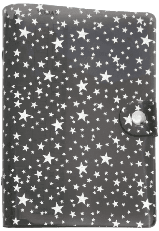
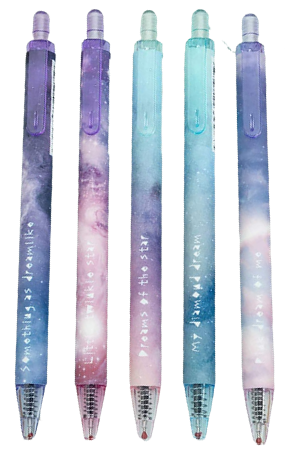


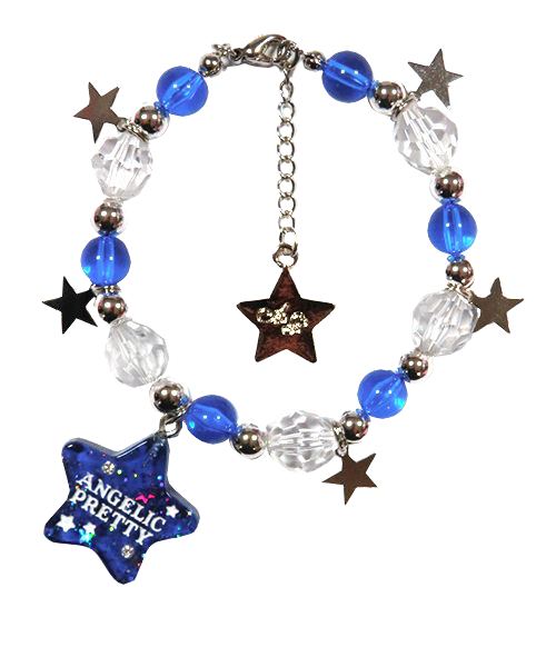
i believe i already posted these? but i made some banners with these little star stickers a while back, i can offer the individual star sticker transparents as well if youd like


PIXELS
theres a firstfear set of pixels i think youd like :3 you can find the original post (pleasepleaselplease save the credit if you use these!) here (1/2) and an archived version here (1/2) as well as a link to her DA here
heres one of them, only one lest i become the thousanth blog to just regurgitate firstfears sozai w/o credit. you can find the rest at the link :3

kingluludeer also has a large collection of star themed pixels! also theyre just a stunning artist that is SOSOSO worth checking out regardless, (link to them here!) i, again wont just regurgitate all of their assets here, i think its better if you go to their page, but i will show you a couple of my favorites :3


TILES
i have also a couple of tiles, these i sadly have no credit for, but if anybody recognizes them PLEASEPLEASEPLEASEEE tell me!




however if youre looking for another lovely sozai maker with tons and tons of cute BG tiles look no farther then whimsical! id seriously reccomend looking at their site even if you dont need anything its absolutely gorgeous and a huge inspo for me, ill show u a few here :3


and last something i made! i made these little colored stars for a server of mine, (they come in alot of colors) in both these high res versions as well as pixel ones! im fine with people using them so long as my credit stays attached and you dont just blindly redistribute them


theres more then these 2, but ill let you download it from google drive so i dont have to attach like 7 million images lol
if youd like to give me a little bit more of a specific aesthetic im sure i could help point you to some places with some web sozai for that specific stuff :3 sense the blog is kinda a mishmash of all the different aesthetics me and ash like lol (i am TRYING my BEST to make the BLOG THEME more COHERENT but it TAKES A WHILE!!!)
#row#! transparent#! misc.#exposure tags ||#req#reqs#request#requests#evature#honestly listen i dont know how to tag this shit#so much stuff in diff aesthetics lol
7 notes
·
View notes
Note
Easter egg list!
1: You got the Line(tm).
2: And the fern.
3: that supposed to be the Companion cube on the bucket. Sorry it's too small.
4: the clock actually reads 4:32.
5: I was not expecting you to get the binary reading "The Stanley Parable". Especially since I covered part of it with the Narrator.
6: The desk is from something called "Stanley Parable Classic" which I think is the original Half-Life mod.
7: Of the three you missed, I was not expecting you to miss the fact there are exactly 8 stars out in the darkness.
8: The pixels on the floor being created are specifically colored to look like Minecraft Bedrock. Only the floor for irony.
9: If you look closely at the leftmost screen that the Narrator is holding, and the only one you can see the front of, it reads "427"
And I guess a bonus 10th Easter egg is the original Stanley Parable has only been out 9 years, and I have 9 Easter eggs.
It was fun drawing this! And it even managed to break my months long creative block. Thank you, and you're welcome.
[[1 & 2: woot
3. Well, same design! A pink heart in a circle. Geez, I even own a companion cube too. >w<
4. Listen. I can definitely read an analog clock, okay? And I had just woken up, okay?
5. You show me a binary string and the FIRST thing I'm gonna do is see if it says something funny.
6. Okay, I googled "Stanley Parable Classic" and it's a little more complicated than that. This is not the 2011 Half-Life 2 mod, it is a fan mod that's in the process of remaking TSP 2013 in Half-Life 1. Confusing? Yes. But it explains why I couldn't find it. I've never heard of this project before. Give 'em a look.
7. I only saw 7! But I see the eight one now, it's behind one of the purple screens!
8. I've never played Minecraft and don't know which block is the bedrock. Ah, so there's Minecraft and Portal, both the games from the 2013 Video Games ending.
9. Thought that was too obvious to count as an easter egg!
Whew, that was fun!]]
6 notes
·
View notes
Note
Saw your Kinich age post and decided to give my two cents. Google is highly unreliable by the way, so always check canon sources instead.
Genshin doesn’t usually give specific ages for their characters, so Kinich’s age is *unconfirmed* as of now. But there’s a lot of canon material to imply he’s an adult. Youngest maybe an older teen.
First off, why the hell would Kinich be 11??? If he’s 11, then how old is Kachina? 5? I don’t think so. Kachina mentioned failing the Pilgrimage MULTIPLE times and unless they’re holding it every week or so, she’s not 5.
(Spoilers for Kinich’s character stories)
Another thing is Kinich is 7 when his dad died, and it’s said he spent a LONG time living alone before Leik managed to get him back into the tribe. Leik also sent him to get trained under a bunch of people, and I highly doubt he’ll be able to learn all of that within a year or two.
For people that want to argue short boy model = kids, ask them to look at Venti/Xiao/Scaramouche etc who’s at least a few thousand. Immortals aside, there’s Kazuha who drank alcohol on screen, Lyney who spoke about drinking alcohol, and Cyno/Tighnari too if I’m not wrong. So that’s that.
All in all there’s no need to get hung up over a fictional character’s age. It’s an arbitrary number for a bunch of pixels on screen. Kinich isn’t even real. If you’re conflicted on engaging with his content because of said arbitrary number, then avoid it. Block button exists for this very reason. Always keep your comfort at top priority.
Hope this helped!
oki doki, thx for clearing it up! i was just really confused cuz it originally started from when i heard somebody on pinterest say he was 11 on an ajawnich post and i was like hold the fuck up, that doesn't add up- but then i went to look it up and that just made the confusion worse. i haven't been able to play genshin yet cuz my dumbass mom won't let me and she controls everything in my life as if I'm a toddler even tho I'm 16, nearly 17, so i don't really know a whole lot about the game or the characters, so thank you very much for clearing this up for me
0 notes
Text
Best Smartwatches of 2024: Unbelievable Features and Specifications

With innovative features and specs, the smartwatch industry is booming as 2024 approaches. Here are some of the top smartwatches of the year, each with special features to suit different needs and tastes:
1. Apple Watch Ultra 2:

Released in October 2023 for $1000, the Apple Watch Ultra 2 is for outdoor enthusiasts. 1.9-inch OLED screen, 49mm titanium body, up to 36 hours battery life. Ruggedly built with blood oxygen monitoring, sleep alerts, temperature sensor and dual frequency GPS. Health tools include ECG, cycle tracking, apnea detector, multisport tracking and customizable compass. Great for athletes and outdoor lovers. Features: Blood oxygen monitoring, ECG, Cycle Tracking, sleep apnea alerts, customizable button, dual speakers.
2. Google Pixel Watch 3:

Launched in August 2024 for $350, the Google Pixel Watch 3 combines Fitbit powered insights with Google’s ecosystem. Health suite includes ECG, SpO2, body fat measurements and “Loss of Pulse Detection” feature that automatically calls emergency services if no pulse is detected. Powered by Harmony OS 4.0, integrates with Google Assistant for hands free tasks. Eco friendly aluminum design for those who want holistic health insights. Features: Fitbit integration, Loss of Pulse Detection, Daily Readiness Score, Google Assistant, 100% recycled aluminum body.
3. Samsung Galaxy Watch 7:

Launched on July 10, 2024 for $350, the Samsung Galaxy Watch 7 has a 5-day battery life, LTE and a rich AMOLED display. Notable for FDA cleared sleep apnea detection, advanced heart rate, ECG and SpO2 tracking. Introduces the “Energy Score” a new metric that combines sleep, heart rate and activity levels for a full health snapshot. AI powered replies and emergency calls during falls and crashes make it a great all-rounder. Features: FDA cleared sleep apnea detection, Energy Score, AI powered Suggested Replies, comprehensive fitness insights.
4. OnePlus Watch 2:

Launched in March 2024 for $300, the OnePlus Watch 2 focuses on battery life with up to 14 days on a single charge in regular use. 1.43-inch AMOLED display, GPS, various sensors for health monitoring (heart rate, SpO2) and Power Saver Mode for extended use. Great for active users who need minimal downtime between charges. Key Features: 14-day battery life, Power Saver Mode, enhanced sports tracking, dual GPS. These smartwatches represent the pinnacle of technology and innovation in 2024, each offering unique features to enhance your daily life. Whether you're an outdoor enthusiast, a fitness buff, or someone looking for comprehensive health tracking, there's a smartwatch out there for you.
0 notes
Text
Top Picks: Best Mobile Phones Under ₹40,000 in India – Unbeatable Value Awaits!
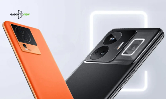
Best Mobile Phones Under ₹40,000
If you’re looking for a smartphone that combines great performance without breaking the bank, you’ve come to the right place. In the sub-₹40,000 range, manufacturers have managed to strike an impressive balance between performance, camera quality, and design. This buying guide will explore the best smartphones in this price bracket, ensuring you get the best value for your hard-earned money. Whether you want flagship-level features or a device primarily for gaming, these phones will definitely catch your eye.
1. iQOO Neo 7 Pro – Power-Packed Performer

For those prioritizing speed and performance, the iQOO Neo 7 Pro is the standout choice under ₹40,000. Powered by the Snapdragon 8+ Gen 1 processor, it excels in both gaming and multitasking, making it one of the best smartphones in this price range.
Specifications:
Price: ₹31,990
Display: 6.78-inch, 1080x2400 pixels
Front Camera: 16MP
Rear Camera: 50MP + 8MP + 2MP
RAM: 8GB, 12GB
Storage: 128GB, 256GB
Battery: 5000mAh
Operating System: Android 13
Launched on July 4, 2023, the iQOO Neo 7 Pro features a stunning 120 Hz refresh rate on its 6.78-inch display. It boasts a triple rear camera setup, including a 64 MP primary sensor, and a 16 MP front camera perfect for selfies. The phone supports dual Nano-SIM cards and offers extensive connectivity options, making it a reliable choice for tech-savvy users.
2. OnePlus Nord 3 – Flagship Features, Affordable Price
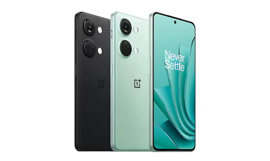
The OnePlus Nord 3 is designed for those who want high-end features at a more accessible price. It boasts a stylish design, robust performance, and smooth software experience, placing it among the best smartphones under ₹40,000.
Specifications:
Price: ₹30,300
Display: 6.74-inch, 1240x2772 pixels
Processor: MediaTek Dimensity 9000
Front Camera: Unspecified
Rear Camera: 50MP + 8MP + 2MP
RAM: 8GB, 16GB
Storage: 128GB, 256GB
Battery: 5000mAh
Operating System: Android
Released in July 2023, this phone features a 120 Hz AMOLED display and offers impressive battery life with fast charging capabilities. Its triple rear camera system includes a 50 MP primary lens, and the device is rated IP54 for dust and water resistance, making it both functional and stylish.
3. Google Pixel 7a – Compact, Clean, and Camera Champion
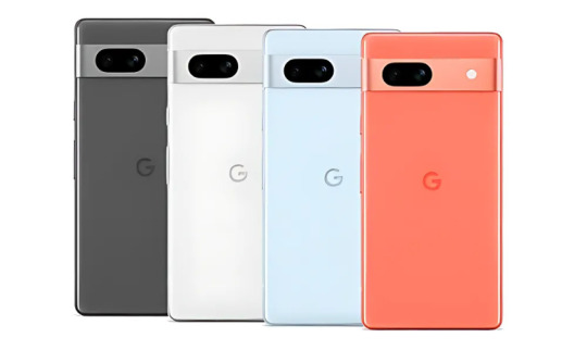
For those seeking a minimalistic design with a powerful camera, the Google Pixel 7a stands out. Renowned for its AI-enhanced camera capabilities, it delivers excellent image quality in various conditions.
Specifications:
Price: ₹39,999
Display: 6.10-inch, 1080x2400 pixels
Processor: Google Tensor G2
Front Camera: 10.8MP
Rear Camera: 64MP + 12MP
RAM: 8GB
Storage: 128GB
Battery: 4385mAh
Operating System: Android 13
The Pixel 7a offers a high refresh rate display and features an IP67 rating for water and dust resistance. With impressive software support, including three years of updates, it’s a reliable choice for photography enthusiasts.
4. Samsung Galaxy A54 5G – Premium Looks with Reliable Performance
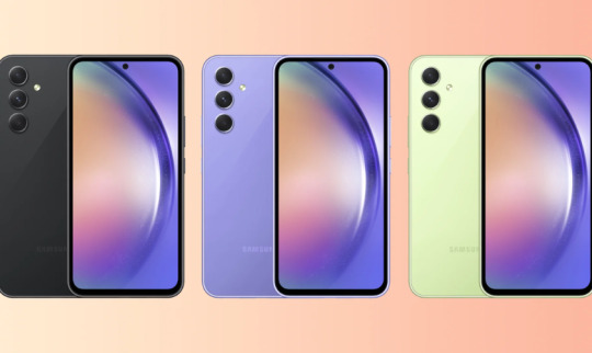
The Samsung Galaxy A54 5G combines a stylish design with robust performance, making it a strong contender in the under-₹40,000 category. Its media consumption capabilities and vibrant display enhance the overall experience.
Specifications:
Price: ₹37,499
Display: 6.40-inch, 2340x1080 pixels
Processor: 2.4 GHz octa-core
Front Camera: 32MP
Rear Camera: 50MP + 12MP + 5MP
RAM: 8GB
Storage: 128GB, 256GB
Battery: 5000mAh
Operating System: Android 13
Released on March 16, 2023, the Galaxy A54 features a 120Hz display and a powerful camera setup, ensuring stunning photos and smooth scrolling. It also offers ample storage options and is rated IP67 for dust and water resistance.
5. Realme GT 3 – Blazing Fast Charging and Bold Design
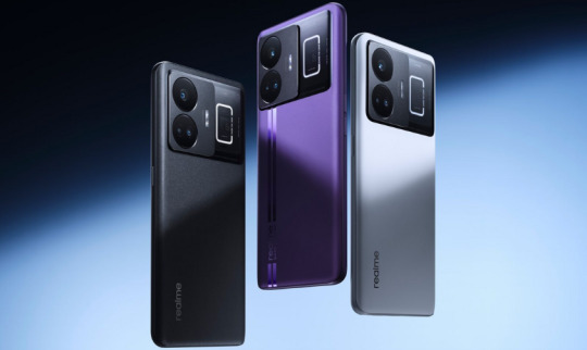
For tech enthusiasts looking for fast charging, the Realme GT 3 is hard to ignore. It offers a high-performance experience coupled with an eye-catching design.
Specifications:
Price: ₹53,500
Display: 6.74-inch, 2340x1080 pixels
Processor: Snapdragon 8+ Gen 1
Front Camera: 32MP
Rear Camera: 50MP + 12MP + 5MP
RAM: 8GB, 12GB, 16GB
Storage: 128GB, 256GB, 512GB
Battery: 4600mAh
Operating System: Android 13
The Realme GT 3 features an impressive 240W fast charging capability, allowing it to recharge in no time. With a vibrant AMOLED display and a solid camera setup, it’s a standout choice for anyone wanting a feature-rich smartphone.
Each of these smartphones offers unique features and performance, catering to various user preferences. Whether you prioritize camera quality, performance, or design, there’s a perfect smartphone waiting for you under ₹40,000 in India.
#BestPhonesUnder40000#TopSmartphones2024#AffordableLuxury#ValueForMoney#MidRangePhones#BestMobilesIndia#SmartphoneGuide#PerformancePhones#PremiumOnBudget
0 notes
Text
Take Advantage of Retargeting Ads
Retargeting ads (also known as remarketing ads) are a powerful way to bring back visitors who have interacted with your website but didn’t complete a desired action, like making a purchase or filling out a lead form. Since most users don’t convert on their first visit—often browsing or researching before making a decision—retargeting keeps your brand in front of potential customers, reminding them of your product or service. click here
Here’s how you can effectively use retargeting ads to boost conversions:
How Retargeting Works
Retargeting uses tracking pixels or cookies that track users when they visit your website. Once they leave without converting, you can show them targeted ads across various platforms like Google Display Network, Facebook, Instagram, or even specific websites they visit later.
For example, if a potential customer views a product page on your website but doesn’t make a purchase, retargeting ads can remind them of the product with a personalized message when they browse other sites. This keeps your brand top of mind and encourages them to return and complete their purchase.
Types of Retargeting Ads
Site Retargeting: This is the most common form of retargeting where users who visit your site are shown ads on other websites. This is effective for nudging them toward the next step in your sales funnel.
Search Retargeting: This involves targeting users based on the keywords they’ve searched for online. If someone searches for a product or service that’s related to what you offer, your ads will be displayed as they browse the web, even if they haven’t visited your site yet.
Social Media Retargeting: Social media platforms like Facebook and Instagram allow you to retarget visitors who have interacted with your content or visited your site. These platforms offer detailed targeting options, making it easy to refine your retargeting strategy.
Email Retargeting: With email retargeting, you can show ads to people who have opened your emails but haven’t yet converted. If someone opens a product email but doesn’t make a purchase, retargeting ads can help reinforce your messaging and bring them back to the site.
Tips for Successful Retargeting Campaigns
Segment Your Audience Not all visitors are the same. Segment your audience based on their behavior. For instance, show one ad to users who added items to their cart but didn’t checkout, and another ad to those who visited your homepage but didn’t click further. This personalization increases relevance and effectiveness.
Use Dynamic Ads Dynamic retargeting ads are personalized based on the exact products or services a user viewed. For example, if someone looked at a particular product, the ad they see will feature that exact product, making it more likely they’ll return to complete the purchase.
Offer Incentives Entice users to come back by offering a discount, free shipping, or an exclusive deal through your retargeting ads. For example, if a user abandons their cart, showing them an ad offering 10% off might convince them to finalize the purchase.
Limit the Frequency Bombarding potential customers with ads can lead to ad fatigue and a negative user experience. Set a frequency cap to avoid overexposure. Ideally, aim to show the ad a limited number of times within a certain period, like 3–5 times over a week.
Rotate Your Creative Use different ad creatives and messaging to avoid making your ads look repetitive. Try rotating between different formats such as carousel ads, videos, and single-image ads to keep things fresh and engaging.
Set Specific Retargeting Windows Customize the time frame in which your retargeting ads appear. For example, you may want to show ads to users who abandoned their shopping cart within the last 7 days, as they're more likely to convert. After 30 days, their interest might have waned, and continuing to retarget them might not yield results.
Conclusion
Retargeting ads are a powerful tool to engage with potential customers who have already shown interest in your brand. By personalizing your ads, setting specific audience segments, and offering incentives, you can significantly boost conversions and make the most of your digital marketing efforts.
Start implementing retargeting in your campaigns today and watch your conversion rates soar!

1 note
·
View note
Text
How to Drive Traffic from Pinterest to Your Website

Pinterest is one of the most powerful yet underutilized platforms for driving traffic to websites. With over 450 million monthly active users, Pinterest has transformed from a simple image-sharing site to a key marketing tool for businesses across industries. If you’re not leveraging Pinterest as part of your digital marketing strategy, you could be missing out on a significant source of traffic.
For brands and businesses looking to grow their online presence, Pinterest is a goldmine. Unlike other social media platforms, Pinterest works like a search engine, allowing users to discover new content based on their interests. Whether you’re an e-commerce store, a blogger, or a service provider, Pinterest can drive highly relevant traffic to your website.
In this comprehensive guide, we’ll explore actionable strategies to help you drive traffic from Pinterest to your website, all while boosting your online visibility and engagement.
Why Pinterest Matters for Your Website
Before diving into the strategies, let’s first understand why Pinterest is such a powerful platform for driving website traffic.
Pinterest Users Are Planners and Buyers: According to Pinterest data, 87% of users report that they have made a purchase after discovering a product on the platform. Users on Pinterest are actively searching for ideas, products, and services—making them highly motivated to engage with brands and make purchases.
Longevity of Pins: Unlike Instagram or Facebook posts, where content has a short lifespan, Pinterest Pins can drive traffic for months and even years. A well-optimized Pin has the potential to remain relevant over a long period, continually bringing visitors to your site.
Search Engine Nature: Pinterest functions as a visual search engine. Users actively search for specific topics or inspiration, and Pins that are well-optimized for keywords can show up in search results repeatedly.
Referral Traffic Potential: Research shows that Pinterest generates more referral traffic than many other social platforms. If you can master the art of Pinterest marketing, it can quickly become one of the largest drivers of traffic to your website.
7 Proven Strategies to Drive Traffic from Pinterest to Your Website
1. Optimize Your Pinterest Profile
Your Pinterest profile is the foundation of your Pinterest marketing strategy. A professional, well-branded profile will help attract followers and encourage users to trust your content. Here’s how to optimize it:
Profile Picture: Use a high-quality logo or headshot that represents your brand.
SEO-Friendly Bio: Write a compelling bio that clearly explains who you are and what your business does. Include relevant keywords such as “Digital marketing course in Tirupur” to improve searchability.
Claim Your Website: Make sure to claim your website on Pinterest. This will allow Pinterest to verify your site, increasing your authority and visibility on the platform.
2. Create High-Quality, Click-Worthy Pins
Creating visually appealing and engaging Pins is the most critical factor in driving traffic from Pinterest to your website. Here are some tips for creating click-worthy Pins:
Vertical Images: Pinterest recommends using vertical images with a 2:3 aspect ratio (600 x 900 pixels) because they perform best.
Strong Headlines: Use eye-catching headlines or text overlays that quickly communicate the value of your Pin.
High-Quality Visuals: Use high-quality, vibrant images that reflect your brand’s aesthetic. Avoid blurry or low-resolution images.
Calls to Action: Encourage users to click through to your website by adding clear and direct calls to action on your Pins, such as “Learn More” or “Shop Now.”
3. Leverage Keywords for Pinterest SEO
Just like on Google, keywords are crucial for Pinterest SEO. By optimizing your Pins, boards, and profile with relevant keywords, you can improve your visibility on the platform. Here’s how to leverage Pinterest SEO:
Use Keywords in Pin Descriptions: Each Pin description should include keywords relevant to your content. For example, if you’re promoting a blog post about a digital marketing course in Tirupur, make sure to naturally incorporate this keyword in your description.
Board Titles and Descriptions: Create specific, keyword-rich board titles. For instance, instead of “Marketing,” you could name a board “Best Digital Marketing Strategies for 2024.”
Hashtags: Use 3-5 relevant hashtags in your Pin descriptions to increase visibility. For example, #DigitalMarketingTips, #SEO, #OnlineCourses.
4. Pin Consistently
Consistency is key to maintaining visibility on Pinterest. Pinning regularly allows your content to stay active in the Pinterest feed and search results. Here’s how you can maintain a consistent Pinning strategy:
Pinning Frequency: Aim to Pin at least 5-10 times per day to stay active on the platform.
Schedule Your Pins: Use scheduling tools like Tailwind to plan and automate your Pins. Scheduling allows you to maintain consistent posting even if you don’t have time to Pin manually every day.
5. Join and Contribute to Group Boards
Pinterest group boards are collaborative boards where multiple users contribute Pins. Joining relevant group boards in your niche can help you expand your reach and drive traffic to your website.
Find Niche Group Boards: Look for group boards in your industry or niche, such as “Digital Marketing Tips” or “Online Business Strategies.”
Contribute Regularly: Share your high-quality Pins on these group boards and contribute valuable content consistently.
Create Your Own Group Board: If you can’t find relevant group boards, consider starting your own. Invite contributors and grow the board’s reach organically.
6. Enable Rich Pins
Rich Pins provide additional context and information on the Pins themselves, making them more clickable and informative. They automatically pull data from your website and display it directly on Pinterest.
Types of Rich Pins:
Article Pins: Show the headline, description, and author of blog posts or articles.
Product Pins: Display real-time pricing, availability, and where to purchase products.
Recipe Pins: Include a list of ingredients, cooking time, and serving size for recipes.
Rich Pins are a great way to increase engagement and click-through rates because they provide more information upfront, enticing users to learn more by clicking through to your website.
7. Create Click-Worthy Blog Content
Pinterest is a visual search engine, but ultimately, the content you’re driving traffic to needs to be valuable and engaging. Here are tips to ensure your website content aligns with Pinterest’s audience:
Focus on Evergreen Content: Create blog posts that provide lasting value and can be shared multiple times. Evergreen content drives consistent traffic over time.
Use Compelling Titles: Craft blog titles that spark curiosity and promise value. For example, instead of “Marketing Tips,” use a title like “10 Proven Digital Marketing Strategies That Drive Real Results.”
Add Pin-Worthy Images to Your Blog: Include Pinterest-optimized images in your blog posts, making it easy for visitors to Pin directly from your site.
8. Analyze Your Pinterest Analytics
Tracking your Pinterest performance will help you understand what’s working and where you need to improve. Pinterest Analytics provides valuable insights into your most popular Pins, the demographics of your audience, and traffic performance.
Monitor Traffic: Track which Pins are driving the most traffic to your website. Use Google Analytics to assess how Pinterest visitors are interacting with your site.
Evaluate Engagement: Look at which types of content (blog posts, products, infographics) are getting the most engagement, and replicate those strategies.
Refine Your Strategy: Based on your analytics, refine your strategy. Focus more on the types of content that resonate with your audience.
Conclusion
Pinterest is a powerful platform that can drive significant traffic to your website if used strategically. By optimizing your profile, creating high-quality Pins, leveraging SEO, and maintaining a consistent posting schedule, you can tap into Pinterest’s massive user base and increase your website’s visibility. Whether you’re a service provider offering a digital marketing course in Tirupur or an e-commerce store, Pinterest provides a unique opportunity to reach a highly engaged audience.
0 notes