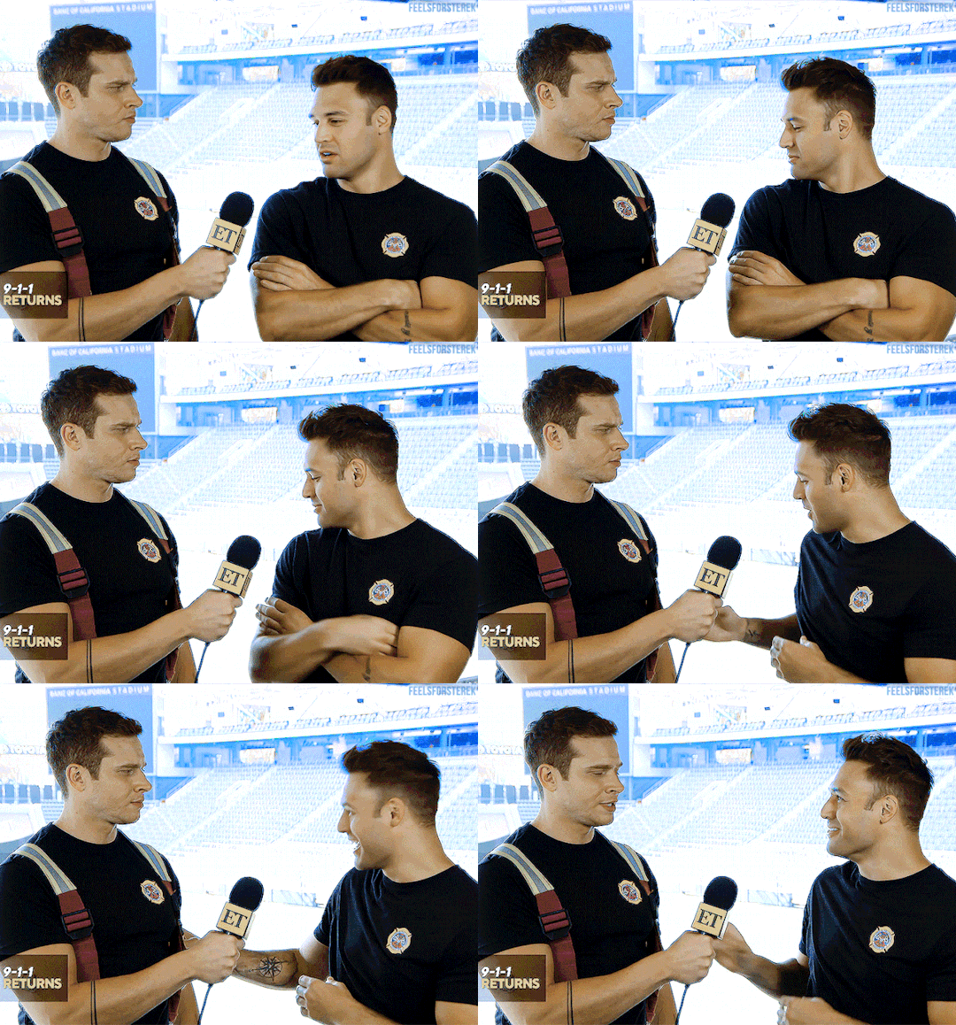
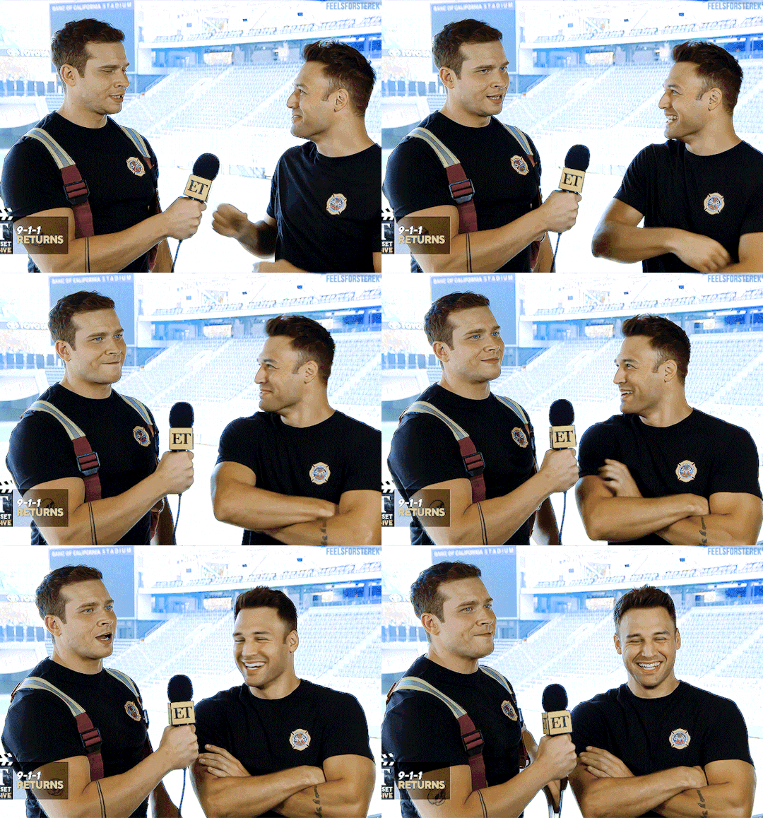
#giffed this in hd in case anyone needed it
Explore tagged Tumblr posts
Text

#oliver stark#ryan guzman#evan buckley#buddie#eddie diaz#911edit#911 abc#buck#911#911 cast#9-1-1#tvedit#eddie diaz gifs#ryliver#ryanguzmanedit#911 on abc#911 fox#911 tv show#911 show#gifs#911verse#eddiediazsource#eddiediazedit#buck x eddie#eddie x buck#buddieedit#giffed this in hd in case anyone needed it#i know i do at least
1K notes
·
View notes
Note
hi! i was wondering if you have any advice/certain programs or anything you use for making gifs, because there’s something i really want to make but i have zero experience 💔💔
hello hello!
ah, yes, I have a TON, let's hope this ADHD girlie can give a somewhat concise description lmao. I will answer this publicly, in case it's useful for anyone else.
Software I use:
To make the screenshots: - for single scenes: KMPlayer 12.22.30 (the newer versions are trash) - for shorter videos, or something you want to get all the screenshots out of Free Video to JPG converter is awesome.
To make the gifs: - Adobe Photoshop 2021 (I don't recommend much later versions, because of the Cloud connection they have)
General gif-maker wisdom: "we spend more time on making sure that something looks serviceable, not pixelated, and good quality, than to get it moving and shit" - Confucius, probably
Useful stuff to make your life easy:
- Squishmoon's action pack for sharpening your screenshots. You can also find their detailed use explained here. - If you are planning to gif Wicked, some scenes are a bit tricky, ngl. But I have two PSDs that you can use, while you're perecting your own craft, and you can edit and update them to make them more "you".
A neutral PSD for mostly indoors and lighter scenes | download

A blue-enhancing PSD for darker scenes | download
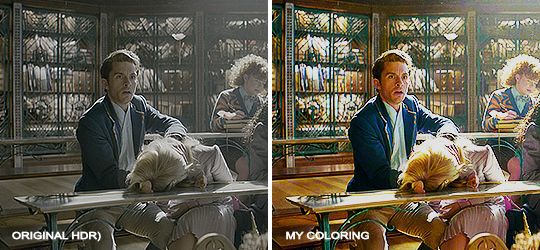
Some info on videos to use: - always, always (ALWAYS) use at least HD videos. Otherwise your gif will look like shit. This should be ideally at least 720p in resolution, but go with 1080p for the best results. Coloring gifs in 1080p is easy, but... - if you want to go pro *rolls eyes*, you could go for HDR (2160p) quality. However HDR is a mf to color properly and I would not recommend it for a beginner. When you extract frames from an HDR video, the image colors will end up being washed out and muddy so you will always have to balance those colors out for it to look decent, however, the quality and number of pixels will be larger. If you ar okay with making small/medium sized images, then stick with 1080p. (Storytime, I spent a lot of time making HDR screenshots, only for me to realize that I really hate working with them, so I'm actually considering going back to 1080p, despite that not being "industry standard" on Tumblr lmao. I'm not sure yet But they take up so much space, and if you have a laptop that is on the slower side, you will suffer.)
See the below example of the image differences, without any effects. You will probably notice, that HDR has some more juicy detail and is a LOT sharper, but well... the color is just a lot different and that's something you will have to calculate in and correct for.

The ✨Process��
Screencaptures
I like to have all screenshots/frames ready for use. So as step one, you need to get the movie file from somewhere. This should definitely be a legal source, and nothing else (jk).
Once I have the movie. I spend a lot of time making and sorting screencaps. Since I mostly work in the Wicked fandom only atm, that means I will only need to make the frames once, and thats awesome, cause this is the most boring part.
For this, I let the Video to JPG Converter run the whole movie while I was aleep, and by morning, it created gorgeous screenshots for me and my laptop almost went up in flames.
You need to make sure you capture every single frame, so my settings looked like this:

Screenshots do take up a lot of space, so unless your computer has a huge brain, I suggest storing the images in an external drive. For Wicked, the entire movie was I think around 200k frames total. I reduced that to about 120k that I will actually use.
And then I spend some time looking through them, deleting the scenes I know I won't do ever (goodbye Boq, I will never gif you, I'm so sorry :((( ) and also, I like to put them into folders by scene. My Wicked folder looks like this:

If you don't want this struggle and you only need a few specific scenes, there is this great tutorial on how to make frames from KMPlayer. Note that some of the info in this tutorial on gif quality requirements and Tumblr's max allowance of size and # of frames are outdated. You are allowed to post a gif that is a maximum of 10 Mb and 120 frames (maybe it can be even more, idk, said the expert) on Tumblr. But the process of screencapturing is accurate. Also ignore the gifmaking process in this tutorial, we have a lot easier process now as well!
Prepping the images
I have a folder called "captures", where I put all of the specific screenshots for a set I want to use. Inside this folder I paste all the shots/scenes I want to work on for my current gifset, and then I create subfolders. I name them 1, 2, 3, etc, I make one folder for each gif file I want to make. Its important that only the frames you want to be in the gif are in the folder. I usually limit the number of images to 100, I don't really like to go above it, and usually aim to go lower, 50-70 frames, but sometimes you just need the 100.
Sidetrack, but: Keep in mind that Tumblr gifs also need to be a specific width, so that they don't get resized, and blurry. (Source) Height is not that important, but witdth is VERY. But since there is a limit on Mb as well, for full width (540px) gifs you will want to go with less frames, than for smaller ones.

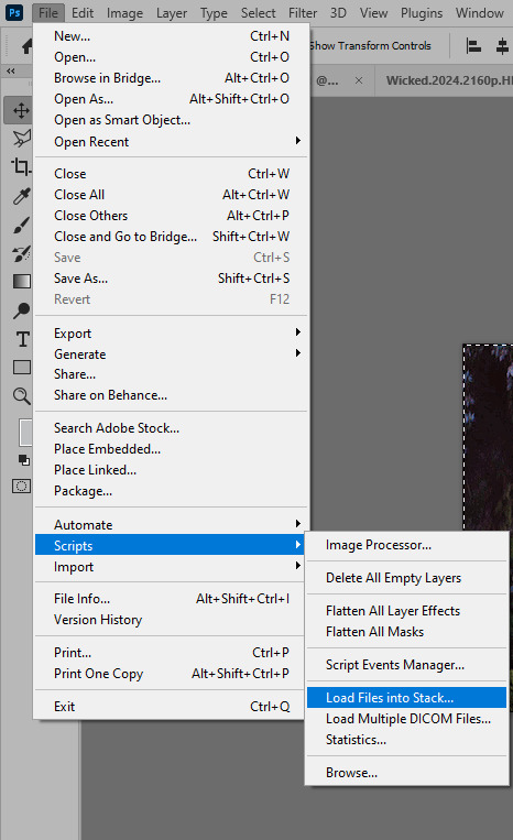
Once you have the frames in folders, you will open Photoshop, and go to: File > Scripts > Load files into stack.
Here you select Folder from the dropdown menu, and then navigate to the folder where you put the frames for your first gif. It will take a moment to load the frames into the window you have open, but it will look like this:

You click "OK" and then it will take anther few moments for Photoshop to load all the frames into a file.
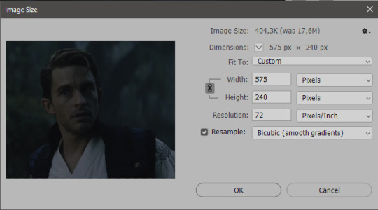
But once that's done, and you have the frames, you next have to resize the image. Go to Image > Image size... When you resize in Photoshop, and save as gif, sometimes you do end up with a light transparent border on the edge that looks bad, so, when you resize, you have to calculate in that you will be cutting off a few pixels at the end. In this example, I want to make a 268px width gif. I usually look at heights first, so lets say I want it to be a close-up, and I will cut off the sides, and it will be more square-ish. So I set height to 240px. Always double check that your width doesn1t run over your desired px numbers, but since 575 is larger than 268 (can you tell I'm awesome at math?), I should be good. I click OK.
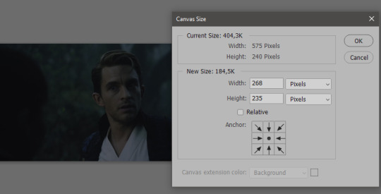
Next, you have to crop the image. Go to Image > Canvas size... At this point we can get rid of those extra pixels we wanted to drop from the bottom as well, so we will make it drop from the height and the width as well. I set the width to 268px, and the height to 235px, because I have OCD, and numbers need to end with 0 or 5, okay?
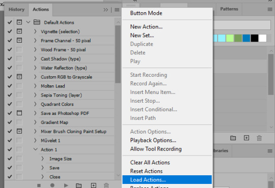
And now, the magic happens! First, go to Window > Actions to have the actions window show up. While you're at it, in the Window menu also select Timeline (this will be your animation timeline at the button) and also Layers. Once you have the Actions window showing up, on the menu in the upper right corner click the three lines menu button, and from the list select "Load Actions". I hope you downloaded the Squishmoon action pack from the start of this post, if not, do it now! So you save that file, and then after you clicked Load, you... well, load it. It will show up in your list like so:
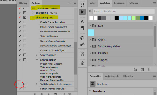
You will want to use the sharpening - HD one, BUT I personally like to go, and remove the tick from the spot I circled above, so leave that empty. This will result in the image having more contrast, which is very much needed for these darker scenes.
When you have that, you select the action itself like so, and click the play button at the bottom. The action will do everything for you, sharpen, increase contrast and also, create the gif and set the frame speed. You won't need to edit anything, just whatever window pops up, click "OK"

Now it should all look like something like this:
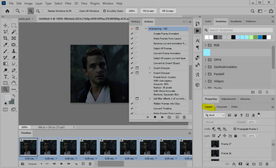
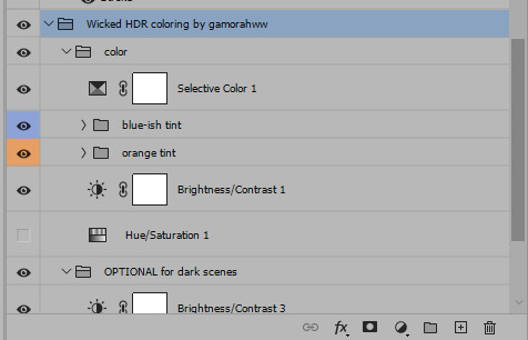
In the Layers window on the side, scroll all the way up to the top. The frame on the top is your last frame. Every effect you want to add to the gif should go to here, otherwise it won't apply to all frames. So at this point I open my PSD for darker scenes, and pull the window of it down, above the gif I'm working on like so:

And then I grab the folder I marked with yellow, left click, hold the click down, and drag that folder over to my current gif. And bamm, it will have the nice effect I wanted! You can click the little play button at the button to see a preview.

Once you have it sorted, now its time to extract it, but first, here's our before and after view:


Now, if you are happy with this, you can just save and close.
If you want to add subtitles, you can do that as well either manually with the text tool (remember, to add as the TOP layer as we did with the coloring) or you can use a pre-set PSD for that as well, here's mine.
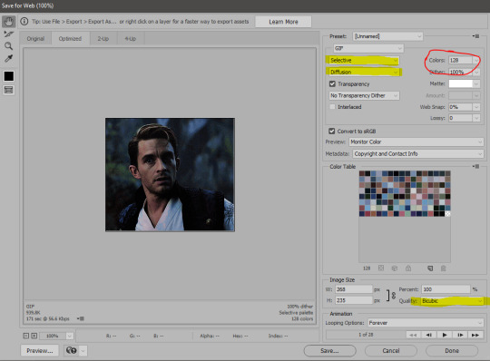
Now, we just need to export it. Go to File > Export > Save for Web (Legacy) and copy my settings here. Others may use other settings, but these are mine, so! I hope you are happy with them :3
In this case, for colors, I picked 128 colors, because on dark sscenes you can get away with using less colors, and the larger that number is, the bigger the filesize. If you use lighter images, you will need to bump that shit up to 256, but that will make your file larger. You can see at the bottom of the screen, how large your file will end up being. So long as you are under 9 Mb, you should be good :3
Conclusion
Look, Gif making and Photoshop in general is a bit scary at first. There are a lot of settings you can mess around on your own, a lot to play with, and also a lot can go wrong. This is a very basic tutorial, and also my current process and preferred coloring. However if you look at "gif psd" or "gif tutorial" or similar tags on Tumblr, you can find a LOT of great resources and steps, for many-many things. Usually people are not too antsy about sharing their methods either. You make 4-5 gifs, and you will have the steps locked down, and then it's all about experimenting.
After you have some muscle memory, your next step should be to explore what is inside a PSD coloring folder that you use. Open them up, try clicking around, click the little eye, to see what happens if they are turned off, and double click them, and play around with the sliders, to see what each does. Most people on Tumblr don't really know what each one does, we all just pressed a few buttons and got really lucky with the results, lol.
If anything is unclear, don't hesitate to ask, I'll gladly help!
Good luck <3
33 notes
·
View notes
Note
Heyy, do you have a tutorial on how you make your gifs? They’re so crisp and beautiful, I wanna start making gifs but idk where to begin
hello!! first of all, thank you kindly!!!! i'm always stunned when someone genuinely appreciates my gifs 😭
second of all, please do!! gifmaking is such a fun hobby, i wish it were a tad more rewarding but truly it's a great creative outlet for hyperfixations.
now, i personally don't have a tutorial but that's only because i myself have learned from a bunch of other ones during my years of trial and error and my technique has nothing that's original to it. i can, however, tell you which tutorials i turn to whenever i need a refresh + some tips i have started implementing on my own!!! i'll put everything below the cut.
the tutorials are this one and this one; the first one is a more general step-by-step one and the second one is for adding noise to gifs when they don't have it naturally, which imo greatly helps with making gifs look more hd.
as for the tips:
whenever possible, and if your pc can handle processing them, try and find files that are at least 1080p. 2160p isn't really necessary unless you're making close-up gifs (though i almost always use it if i can find it), but a 1080p file is only legitimate if the size of it is 1.5gb+. anything below that is not actually hd, no matter the claims.
with videogame footage, i generally record my own gameplay and take screencaps from there. when i want to gif youtube videos or anything i can't download by my usual means, i use 4k video downloader.
i used to take my screencaps with kmplayer, but i've been using mpv over the past few months and i find it works more smoothly. kmplayer did serve me well for years though, and the installation isn't as gimmicky, so go with that if you find it easier!
when it comes to resizing the gif (image > image size), i always leave the mode on bicubic automatic; for a time i used to pick bilinear, but i later learned it was the reason why my gifs didn't look how i wanted them to look.
i generally sharpen my gifs with the same action pack mentioned in the first tutorial i linked, but i do also add an unsharp mask layer to make it extra crisp and detailed. these are my settings for it:

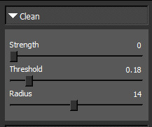
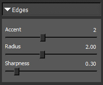
whenever i'm giffing something that is not available in Real HD (like youtube videos), i add a step to my usual sharpening by using a set of plugins from topaz labs; now, i have absolutely no idea how i installed them when i did years ago, and i have no clue how to find them anymore, but i'm sure tumblr has answers somewhere. specifically i use topaz clean. i'm pretty sure you could achieve a similar enough result by adding a gaussian blur level to the sharpening, though; either way, my settings for topaz clean are:

when it comes to coloring, i never use .psds, i make the coloring from scratch for each scene, and most times i use multiple colorings per scene. it will take a little while to find your footing with color correction perhaps, but then again, each gifmaker has their own style and that's what's fun!!! one thing i've taken to doing most times, however, is adding an exposure layer towards the end of my coloring layers and upping both exposure and gamma correction based on how much or how little the gif can tolerate; i find it helps a ton with making gifs look hd on mobile, which is notoriously hard to achieve because mobile hates gifs. also, i have a pretty heavy hand when it comes to contrast and to darkening blacks, because in my experience that also helps with resolution.
when i go to save for web once i've finished making my gif, i tend to pick the combo adaptive+diffusion. very rarely i switch from adaptive to selective, but only if adaptive makes the gif look weird, which is usually not the case.
this should be all, i really always follow the same process and it's pretty automatic by now lmao. forgive me for yapping at length, but i hope this can be helpful to you or anyone who might want to try their hand at gifmaking! i'll update the post with my settings asap. thanks again for the love 💕
13 notes
·
View notes
Photo

Before we start, I want to make it clear this is NOT a giffing tutorial (I offered some guidelines on how to create gifs using these softwares but they’re very basic). This post contains three softwares to make HQ GIFS (I used to have a longer list but I’ve lost it)!! If you are interested in how to go about creating a gif, or where to download HD video files to create gifs, here are two good place to start:
✦ @robertdowneys has a very detailed process on giffing for beginners (this is focused on using photoshop which is the preferred method of giffing) ✦ @kylos has a master post on the best sites to download HD videos files
Now that we get that all sorted out, let’s focus on the softwares now. In no order, here are the softwares:
✦ Photoshop (any version is doable and it works for BOTH PC and MAC; I personally use Photoshop CC 2019. For download links, look through this download tag by @chaoticresources) ✦ GIF Brewery 3 (this is for MAC; you can find it on the app store ! It used to be a paid app but it’s free now I believe, let me know if that is no longer the case) ✦ PhotoScape X (works for both PC and MAC; you can download it at their website )
By now, you’re wondering, how do you make gifs from these softwares, and can you really make HQ gifs from a software other than Photoshop? The answer is yes! While I’m not offering a tutorial (sorry I suck at making them), I’ll give a few guidelines and details on how to use these softwares:
PHOTOSHOP:
✦ For Photoshop, you have two options on how to import your files: ✦ Load files into stack (this is my preferred method which basically means you open the folder where your screenscaps is stored!) ✦ Or import video frames to layers (where you load your video file and trim it down to the length/scene you want to gif). ✦ You can use VLC player, gom player, mpv, kmplayer, and a whole bunch of others! ✦ For how to create the gifs, coloring, etc, check the tutorial I’ve provided above (there are also so many of them on tumblrs, you can easily find them!) ✦ EX of GIF (FROM photshop):

GIF BREWERY 3:
✦ Okay, this one is straightforward. All you need is a video file (you can try a video from YouTube!) ✦ Then you click on open video. After that, resize your video file to 540 (or any other dimensions you want but MAKE SURE there are the acceptable sizes for tumblr or your gifs will look weird). ✦ Please crop the video and don’t force it be your desired dimensions, say 540X400 or it WILL look weird and too tall. ✦ After that, go to the filter tab located above, and color your gif. Please note you can only create simple gifs with GIF Brewery 3. ✦ Next go setting (this is on the right side of the app when you open it) and click “calculate frame count & delay” (the default is by 12 secs, you most likely should change this to 15 secs or it will be too fast) ✦ Now make sure you choose the “optimize gif colors” option and make sure the color count is at 256! This is important! ✦ Also click on the enhanced color optimization! You can see your frames in the left hand corner! ✦ And viola, there you go, you made a gif! ✦ EX of GIF (from Gif Brewery 3):

PHOTOSCAPE X:
✦ You need to take screencaps for this one. Your edits can be simple or advanced (to a degree). For advanced, you have to go to the editor and edit it frame by frame. For example, if you want to create a colorful gif. ✦ Next choose the batch section in the app and load all your screencaps there. ✦ You can then edit, crop, etc as you please. As this is a batch file, your coloring will transfer to all the rest of the screencaps. ✦ After that, save your batch files and then go the create gif section. Here you just load the batch files (the screencaps you edited) and viola, you’ve created a gif. EX of GIF (from Photoscape X):

🌟 I hope this helps! I know this is very basic and doesn’t exactly provide info on how to create gifs. I just thought I should share these in case anyone wants to learn how to make gifs from different softwares. I’m sorry if this is confusing but I really, really tried to make this as simple as I can. I’m not good with these things. I know giffing can be daunting and scary, so if you’re new to giffing and needs some help, I can provide you with some links or help out in any way I can. Thanks, let your inner gifmaker shine! 🌟
#gif resources#itsphotoshop#completeresources#resources#userjessie#userrobin#usercandy#userliliana#underbetelgeuse#arthurpendragonns#usersharon#usertom
258 notes
·
View notes
Note
Can you really determine height and weight and spinal curvature with a foot like Dr. Robotnik claims he did like in the movie?
Great question!
You can determine height, weight, and curvature of the spine by studying a footprint, along with a few other things as well! Lots of forensic anthropologists do this in their line of work. (I do feel the need to make this note: I am an Art Historian and a Cultural Anthropologist, I know the basics of forensic anthropology due to my introduction course to the subject).
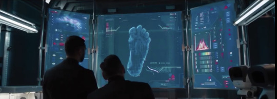
Now, the reason why this question took forever to answer was because I, myself, was trying to figure out Sonic’s height, weight, and spinal curvature.
(These were the best and the most HD/Clear images that I could find of the infrared scan of Sonic’s foot, as well as Sonic himself).
Looking at this, we can determine:

Flat arch in the foot:
The flesh/muscles surrounding the phalanges and metatarsal bones are flat, implying that he runs toe-to-heel first instead of heel-to-toe.
Flat arches in the feet show that a person, or in this case an alien-hedgehog, is on their feet all the time. (We can see from the photo in the introduction).
This also shows that he’s athletic, but we already knew that😅.
When he isn’t running toe-to-heel, he actually stomps his foot instead of allowing the foot to naturally glide and plant firmly into the ground.
(The GIF is my example of him stomping/running in his Gremlin shoes).
When he gets his PUMA Dare shoes, the way that he runs changes to heel-to-toe.
THIS IS BEFORE HE GETS PUMA DARE SHOES, AFTER GETTING THEM HIS RUNNING IMPROVES.
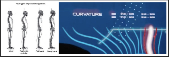
He’s got bad posture:
It’s bad, but not as bad as you think. The white line is his spine, the blue are the other types of spinal curvatures of animals and human beings.
The white is his spine now, but the reds lines are predictions of what his spine COULD be if he doesn’t fix his habit. (That is how I seem to be interpreting it).
He stands with his ankles and his feet as a means of support rather than allowing his spine and legs to support his posture, which can be seen down below:

(Best example that I could find of him full bodied and displaying his stance. If anyone else has a fantastic photo for me to use for this example, please let me know! I will update).
He stands with his knees bent more to keep him upright rather than them being relaxed and standing properly.
He stands with his stomach and his chest puffed out, which makes the spine form into a “Lazy S, close to a C” rather than it being a strong “S” shape.
Very similar to a “sway-like spine.”
Yoga with Pretzel Lady can help him feel better, as well as daily stretching and working with the muscles in his legs.
His feet are, actually, hurting him... could be more than what he lets on to Jojo:

That’s due to the nature of his poorly made Gremlin/Hobo shoes.
Poor conditions of shoes could, and will in the future, lead for foot, ankle, femur, spinal, and hip problems... which is why he stands the way he does in the movie.
When he isn’t running, he really should be wearing compression-based socks, as well as slippers.
(I just wanted to share a photo of his shoes, I love that one has Velcro Straps while the other as shoe laces duct taped down).
Sonic weighs around sixty pounds:
Later on it was confirmed to be exactly sixty-two pounds.
Sonic himself said it in an interview here.
(And he’s a natural blue, but that’s a bit off topic here😂).
Sonic is around 2"5 to 2"7 feet tall:
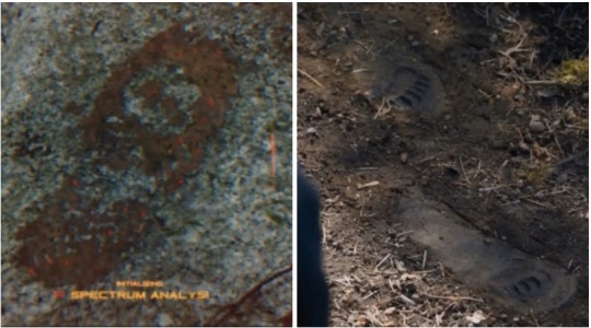
That’s the equivalent to being 0.6 metres tall!
You must measure from largest toe to heel in order to get the height! (Source!)
(This technique in the article that I put in the “Source” tab can also be used to find the shoe size of a kid as they’re growing up).
Another way of measuring his height would be his stride that he takes when he walks. You can measure that from the tip of the toes to the back heel of the foot.
He’s smaller than Modern!Sonic, but taller than Classic!Sonic... SMOL BOY...
(Another note, as of April 2020, there has yet to be any further resources stating his height. I know, I’ve checked several times before making this post).
And that, my friend, is what I have determined from studying his foot characteristics!
Now, if you don’t like the analysis that I’ve presented, I can present you with another idea.
This one involves with us looking at the dog cage that Sonic was placed in when he was unconscious.
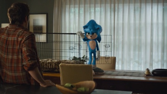
I’m assuming here that Ozzy is between 23-24 inches tall, 26-28 inches long. Normally a dog of that size will need to be in a dog cage that is roughly 28 inches by 30 inches. We can see that Sonic himself is almost 30 to 32 inches tall anyhow. It’s pretty basic, but it gives a visual idea of how tall he is.
Now, I know what you’re gonna ask me: “here’s an idea! Why can’t we just use the baseball bat that Sonic plays with to get his arm length and then calculate his height that way?”
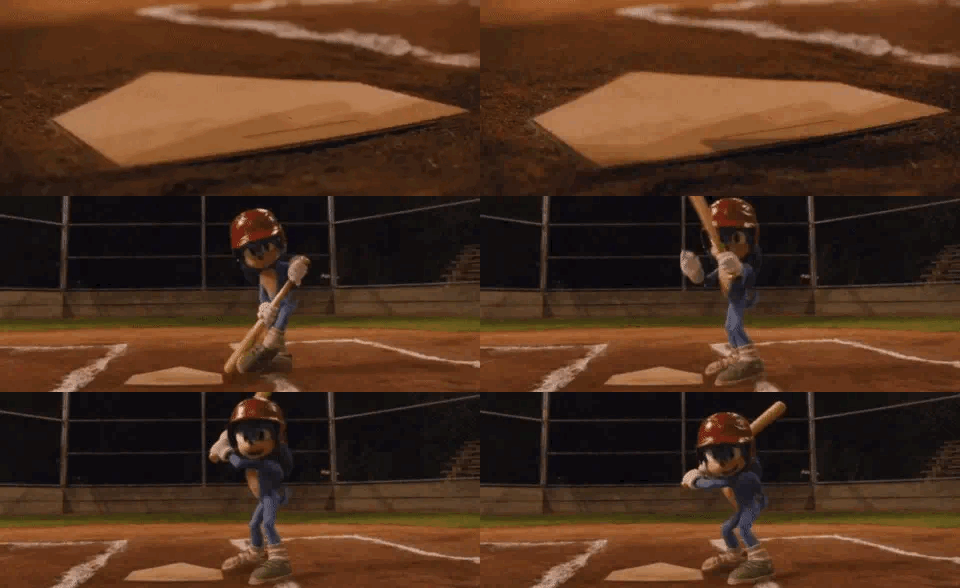
Great question!
In short, you can’t. The kids that play on the team are much taller than him. The human children that play the game are a good couple of feet taller than our lovable space creature.
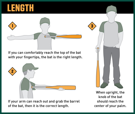
Also, if you look at the baseball bat itself, Sonic struggles a bit to hold onto it. It’s too big for him to play with. In order to find a perfect fitting baseball bat, you measure an arm length from your heart to the tip of your middle finger to find a bat that would be comfortable to play with. Getting a measurement that way wouldn’t work. The bat itself looks to be around for kids between the ages of 10-12 and a height of 4 feet(1.2 metres) to 5 feet (1.5 metres) tall.

So, as always, I hope that this answers your question! This was fun to do!😊
(Thank you @movie-robotnik-positivity and @the-brucest-fan and @indieblitz for supplying me photos and proofreading my stuff! You all are wonderful!❤️).
#Mystery Anon#I'm an art historian and I have a minor in anthropology#You actually learn this in your general anthology class😁#To put bluntly he's baby sized#A little baby that's two feet seven inches tall#Sixty two pounds#And bad posture#😁😂
498 notes
·
View notes
Photo

Wow… OK, I have an idea what this is about. A few weeks ago I called out some fans who are using those “beauty HD filters” on Freddie/Queen photos, which make them look like a completely different person. Both posts can be read here and here.
So, I’m just going to begin from the start: “Your edits aren’t so fucking great!” – You’re right, I agree. You know why that is? It’s because I don’t make ~edits~. I find or scan the photo as it is and just post it. It’s really that simple! I don’t feel the need to remove wrinkles, pimples or facial hair off of Freddie Mercury. I also don’t think I need to make him look younger or completely unrecognizable. He is perfect as he already is in the original photo. “What do you get out of bashing someone else’s creations?” – It was hardly bashing, I was stating my opinion without insulting anyone on a personal level (which is what you just did) and I was glad to learn that a lot of other fans do not approve of filtered Queen photos either. If there’s something I dislike and I’m a part of it, I will speak up. Besides, I am sure I can say whatever I want on my own blog, thank you very much. “Nothing worse than a bully and someone who can’t say it directly to someone because they are afraid of getting their feelings hurt like a little baby…”. – I was pretty direct, I literally stated my own opinion on my own blog. Besides, you do realize you wrote this question as anonymous? So, I don’t think I’m the one afraid of getting my feelings hurt by a random stranger on the internet. “You’re probably ugly, fat, pim ppl led, and dirty sitting behind your computer screen reblogging other people’s things all day. You’re disgusting, have no respect or manners, and are a boring twat.” – Yes, you’re totally right about everything, if it makes you happy… By the way, have you ever heard of ‘Queue’ option? “The band would not approve if they knew you were a keyboard jockey. Say it to their face next time.” – Sorry, this part confuses me. “Go to hell you tiny brained little child.” – Me, a child. No, in fact I’m too old for this. I spent the last 2 days, contemplating if your ugly messages are even worthy of my reply. ⚠️⚠️⚠️⚠️⚠️⚠️⚠️⚠️⚠️⚠️⚠️⚠️⚠️ Here’s the thing about these edits and I will once again post some examples. In the past few months, checking the #freddiemercury tag on Instagram or Tumblr is just painful; when majority of popular posts on Freddie fan pages look like this:


I think you don’t have to be a die-hard Freddie fan to notice that these look nothing like the real Freddie Mercury. And this is what I spoke up about, this current trend I’m seeing everywhere, the trend of “enhancing” old low-quality Queen photos into “HD” which doesn’t really make the photos look HD anyway. What it does is makes the photo completely smooth and unrealistically polished while at the same time the peoples appearance in the photo (in this case Freddie’s) completely changes. I hate these edits because there is nothing creative about them. It’s not a colorful creation or a gif. How I see it, it’s a complete violation – you’re literally changing a persons original appearance and I don’t think it should be happening. Let people be genuine because these kind of edits have nothing to do with reality. I am totally against it and anyone who reads this can feel free to disagree or unfollow. I’ve been running this blog for almost 8 years and I’ve seen a lot of Queen photos, videos, gifs, rare stuff, you name it. I have seen enough to know that this is not what Freddie actually looked like. It’s pointless, unnecessary and just plain disrespectful to him.
To anon: even though I know who you are, I choose not to mention or expose you on my blog. The difference between you and me is that I would never insult someone’s appearance, mentality or intelligence just because they have an opinion. What I wrote here concerns everyone who makes these edits, not just you.
Thanks to everyone who took the time to read this. ✌️
244 notes
·
View notes
Text
(Fluff warning) Why is Xiao Zhan a god-tiered beauty? A deep shallow analysis…
Original Article:https://www.weibo.com/ttarticle/p/show?id=2309404476336126165027#_0 Original Author: 织世靳靳子
(TN: This is a fluff piece, written entirely by a fan to praise his good looks. There is also quite a fair bit of Chinese beauty standards in this. Enjoy the pictures!)
(TN: Also, beauty should be beyond gender boundaries.)
What properties should a god-tiered beauty have?
When you think of a god-tiered beauty, who pops into your mind immediately? Is this adulation, or is Xiao Zhan worthy of this praise?
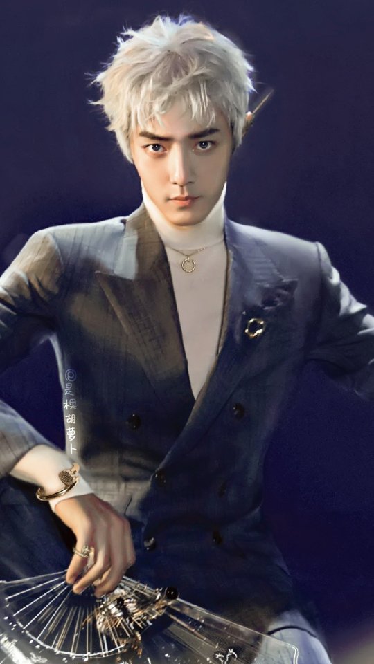
When a person is considered a god-tiered beauty, it usually means that this person is flawless, but is this absolutely politically correct?
I think not.
Beauty comes from imperfection, and they do not need to be hidden, because vividness comes from such imperfections. Audiences can be very sharp – no matter how much “beautiful” labels you attach on a person, these labels will not stay if the person cannot uphold these labels. The entertainment business is full of attractive people, but when you remove the make up and filters, you can really gauge the true physical attractiveness of a person.
I got a lot of surprise studying Xiao Zhan.
When deciding if someone looks good, we do not linger on how big his/her eyes are, or how tall his/her nose is, but instead we look at the proportion and general aesthetic.
If you were to choose the magical touch on Xiao Zhan’s face, which feature will you choose?
I would choose his eyes.
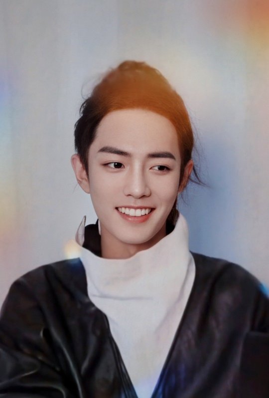
The truth is that in terms of absolute size, Xiao Zhan’s eyes are not very big, but it stands out because of their aesthetically pleasing shape.

The shape of his eyes appears to be almond-shape (but more stunning), with a full lower eyelid and rounded upper eyelid. This gives off a sense of innocence when he looks up. In addition, the the shape of his eyes slant downwards but the outer ends hook up, and with the shadows of his thick lashes, which brings his shape closer to what the Chinese call “Phoenix Eyes”. All in all, the shape of his eyes is one of the rarest eye shape – “Favored Phoenix Eyes”.
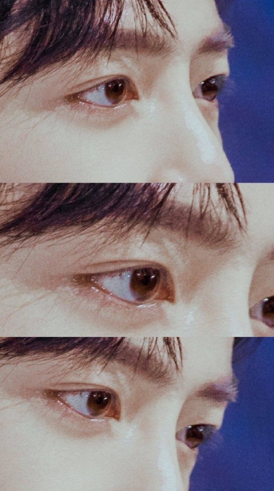
The lines of his eyes have always been aesthetically pleasing, but this is further enhanced once he had learned to control his gaze (see X-Fire competition period). The focus of his face is on his beautiful and lively eyes, which elevates the entire aesthetics.
Inner eye corners are more rounded among the Chinese, but because his eyes are pointed and long, giving off a very oriental appeal.

If you study carefully, you will notice that his eyes follow an “S” line. His inner eye corners are rounded, the outer edges slant gently downwards but quickly end with an upward tilt. This is a very rare type of demure oriental beauty. His usual make up is very light and natural, but if there are additional touches on his outer edges, bringing emphasis onto the lines of his eyes, his aura will switch from harmless and innocent to sharp and aggressive.


You probably cannot stop yourself from imagining dating him
When he is not smiling, you can feel that sharp and aggressiveness off him. He gives off a nobility aura and he can keep up his appearances at any event.

In videos, his eyes are large and energetic, and so alluring, it is almost as though these eyes belong to an anime character or a CGI character. Given that we know that the camera would magnify flaws and moderate the overall aesthetic level, we can only imagine how he looks like behind that camera, and it is probably not that “normal good looking person” like he says he is.

Xiao Zhan does not depend on strong features – his brow bone and nose ridge are not tall.
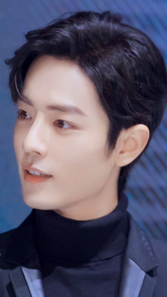
Rounded features, not strong
If I were a famous director, I would be very satisfied with Xiao Zhan as an actor. In my Weibo pinned post, I spoke about how he does not depend on shading make up to sharpen his features, but instead, he depends on simply on lighting. This is evidence of his good bone structure. He does not have the standard issues of sunken temples or broad zygomatic bow (TN: the bone area to the side of the eyes) that are common among Asian faces; his zygomatic bow does not broaden sideways, but instead expands outwards proportionately. This advantageous bone structure shows itself most evidently in period dramas, where an aura of heroism is required. This balances out his soft features.

This is an unedited raw image from a HD camera – his features are simply enhanced just by lighting
This face of his looks good in any lighting. Under paramount lighting, his cheekbones stand out and makes his face even smaller. (TN: Smaller faces are considered more aesthetically pleasing in Chinese culture.) Under rembrandt lighting, his gaze becomes more vivid, and the shadows from his nose and cheeks makes the picture more dramatic.

The Chinese have 4 ways to describe dimensions on facial structure – tall, low, flat and sunken. Most Chinese faces have low nose bridges and sunken structure, and for those who have this, when seen on HDTV, their facial muscle movements can be very obvious. In the case of Xiao Zhan, his facial muscle movements are clean and his facial expressions are especially pleasing, even when expressing extreme emotions. In addition, he does not require special lighting and can even withstand odd lighting.

Looks good even when expressing extreme emotions
This is the true meaning of “no bad angles”.


This is a random screen capture off a HD video. Still beautiful.
Generally, if anyone of us takes a picture from this angle, we probably end up looking like crap, but Xiao Zhan looks as thought he had been touched by Aphrodite. His cheekbones is the olive branch from Cyprus; his lips are the roses from Damascus; his Adam’s apple is the shackles of Prometheus, Mount Kaukasos. From head to toe, he is the real life representation of the sonnets of Shakespeare.
His beauty is breathtaking.
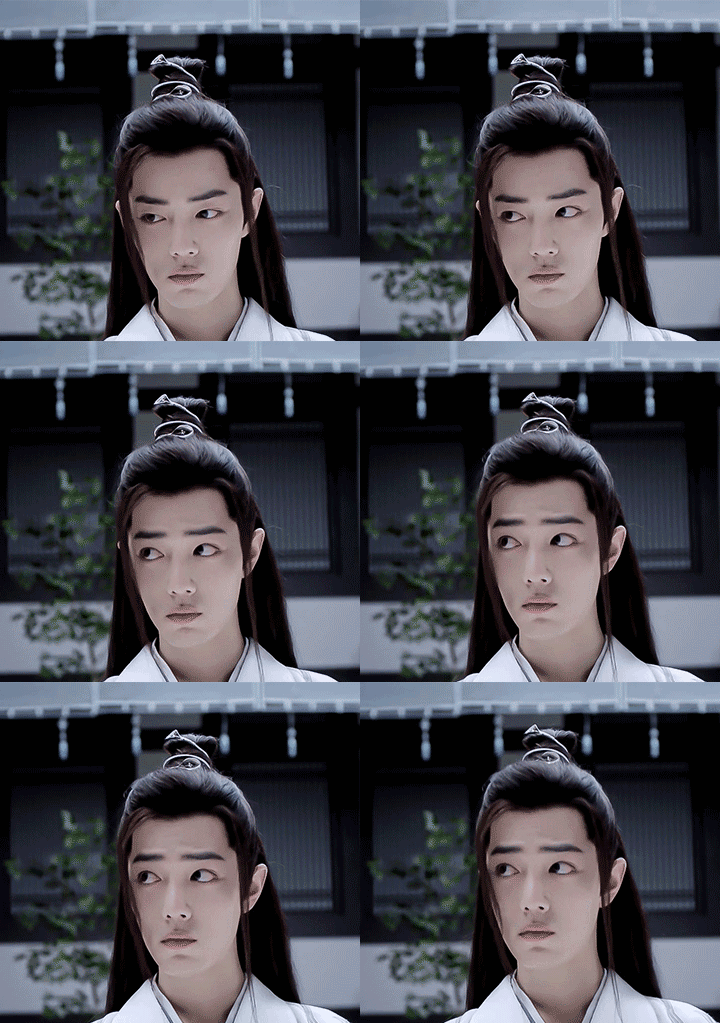
He looks like he descended from anime-land, but yet more vivid than ever
At the same time, Xiao Zhan’s features are tight knitted and his eyes sit lower in his face. This gives him a general youthfulness, hence he seems a lot younger than his actual age. I have often felt that his face looks almost anime-like, and in some instances, his expressions make him seem almost unreal.
If we try to convert some of our favorite anime characters to actual humans, how would they look like? From the side profile, the eyes should be position lower, almost towards the middle of the nose bridge. However, it is very difficult for this to occur while maintaining proper facial proportions.
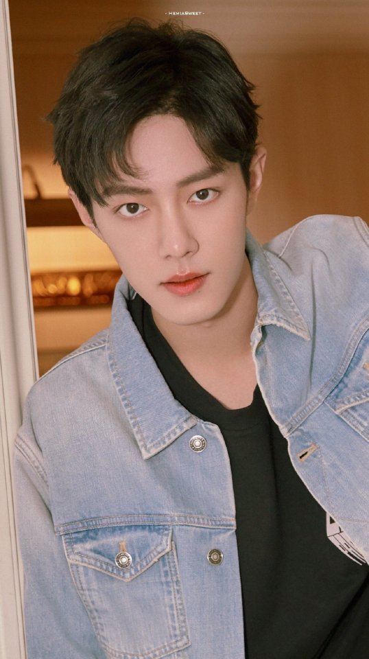
We can immediately see from this picture that the middle section of his face is not too long. A long middle section usually ages a person.

Under further study, you will realize that the mouth-lip area of his face is not too short either. However, his philtrum (the midline groove in the upper lip) is deep and slightly pointed upwards, which moderates the length visually.
The shape of his lips are rounded, but given his sharp eyes and tall nose, the “roundness” and “sharpness” matches in equilibrium, resulting in him looking incredible whenever he smiles.
I am an art student and I am studying his features simply from the angle of an art model, instead of the angle of his fan. The conclusion I have drawn is that his facial features are simply outstanding. Plastic surgery may be able to change the facial features, but will not be able to change proportion; moreover, we know that Xiao Zhan did not go through any of that.
In general, people with good facial proportions will standout in a crowd, more so with Xiao Zhan, who has great features, and these will be especially brilliant after he has good control of his facial expressions.

You cannot hide the smile even if you cover the lower half of his face
Xiao Zhan is an expert in facial expressions control. His smiles can be viewed over and over again, and they are not easy to recreate – I have slowed down GIFs to capture his expression sequence.
When bringing forth a smile, he will move the muscles around this eyes to bring up the outer edges, and this brings the joy onto his face even if you cover the lower half of his face.

He pays attention to the movement of the muscles on this brow and the area around his eyes, such that he is able to pinpoint the emotions in this gaze. This is actually not easy to do such that it looks continuous and natural.

The essence of facial expression control comes from knowing your weaknesses during the training done in front of the mirror, and correcting them. I’m guessing here that he spent a lot of effort in his training, not because he has a lot of weaknesses, but because he has always been very strict with himself.

This is his signature smile. He has a multitude of combinations in his expressions, none of them fixed in any categories but serialized, and recreated in sequence when needed. If not for that fact that he sweats so much, I would have thought that he is an AI, but then again, could AI create this magnificence? I think not.

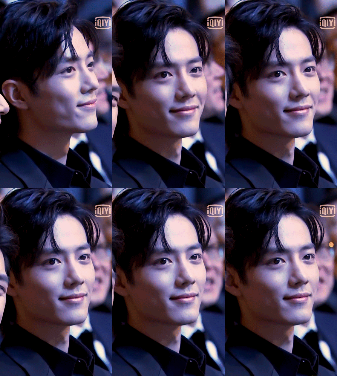
Xiao Zhan’s signature smile is smooth and stunning – it captivates people because of his confidence and ease.
The entertainment business has always been filled with beautiful people, but what makes Xiao Zhan stand out is the purity in him. He stuns people around him his clear eyes and his innocent smiles – and we pray that he will never lose this.
I know this – with his good bone structure, he will remain handsome for at least another 30 years.

Xiao Zhan is not just a “top celebrity” of this area, but he will also become “that god of period dramas” some decades later, and he will continue to shine bright as an icon of this generation.

58 notes
·
View notes
Photo
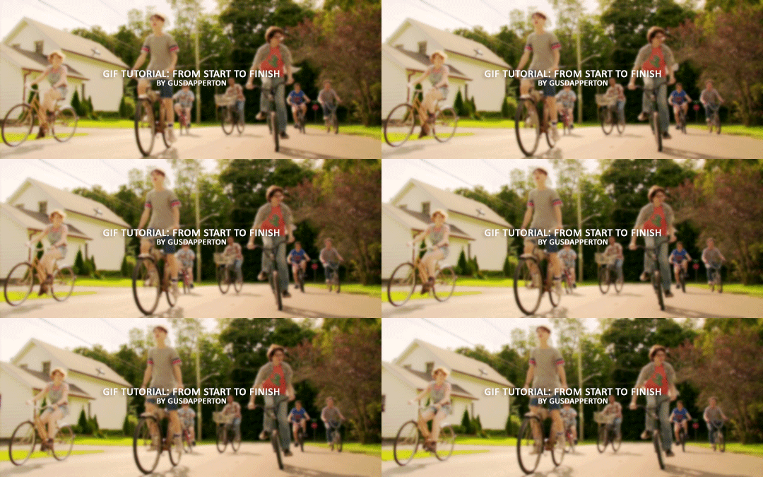
Recently someone asked if I would do a gif making tutorial, so here I am! I’m going to make this as in depth as I can, but if you have remaining questions or problems, feel free to send me them and I will try to help you to the best of my abilities.
Disclaimer: There are many ways to make a gif, but this is the method I’ve been using for years. This tutorial is very long and may make the process seem tedious, but I assure you, once you get the hang of making gifs you could do it in just under a few minutes!
This tutorial includes:
links to all of the sites and programs I use
lots of rambling (w/ pictures)
a short masterlist of my favorite photoshop sources at the end
Links:
Adobe Photoshop CC 2017
PotPlayer (64 bit)
uTorrent
4K Video Download
Photoshop, PotPlayer and uTorrent are the three programs you MUST have for this tutorial. The 4K Downloader is for YouTube/Instagram, which there are other sites you can use for that, but I prefer 4K to make sure I’m getting the best quality I can get. Best part, they’re all free :)
Torrent sites:
PirateBay
yts.lT (favorite)
Nyaa (anime)
These aren’t the only sites that offer torrents (nor are they the only ones I use). When you download torrents, try to be careful; if you think it’s sketchy, go ahead and try to find another. It’s not as scary as it seems, just be aware of what you’re clicking. Some are total duds but I usually have a pretty smooth time finding what I need unless it’s something unpopular or obscure. Whatever site you’re on, try to use the latest links (past hour/day/week) if it’s for a new movie or ongoing show. Also, if there’s the option, download magnet.
PirateBay gives me an ongoing issue with their links, so I try to avoid getting torrents from there if I think I can find it elsewhere. YTS is my favorite site for movies; they’re trustworthy and I’ve never had an issue :)
HD/1080p torrents often start popping up when the BluRay comes out, so don’t depend on any site to have it the day something premieres. Usually you’ll have to wait a few weeks/months. Until then it’ll just be CAMs which no one likes!
For this tutorial I’m going to be making a gif from IT: Chapter Two (link- click 1080p.WEB). Once you’ve gotten your torrent, open up uTorrent. It’ll ask you where you want your download stored, which I always just choose my Downloads folder.

It’s normal for it to take a while. It doesn’t take all day, but 40 min-2 hrs is usually what I have to wait. My laptop is pretty slow, RIP.
After it says it’s downloaded, you’ll have the .mp4 sitting in your Downloads folder (or whatever destination you chose, but Downloads is the default).
Before you close uTorrent, press the torrent file and then delete it (trash can icon above) so you can delete it from your Downloads folder. Otherwise, your computer will tell you the torrent is still open in the program and won’t let you. You won’t need it after you’ve gotten the .mp4.
So now we have the movie! Go ahead and open it up in PotPlayer. Right click > Open file(s) and select the movie. It will start playing automatically.
Note: You need to make folders for the frames to be held in. Its been so long since I’ve set up PotPlayer, I can’t remember if the program made the capture folder that’s in Desktop or if I did... if not, go ahead and make sure you have designated folders. (If you’re making 4 gifs, you need 4 separate folders, and so on.)
Go to the scene you’d like to gif. The scene I chose in this movie is one of the end scenes of the young Losers Club on their bikes (2hr43min).
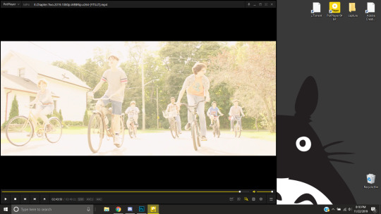
Slide the edge of the program in to minimize the screen a little for the next step.
Now, right click > Video > Video Capture > Capture Consecutive Images
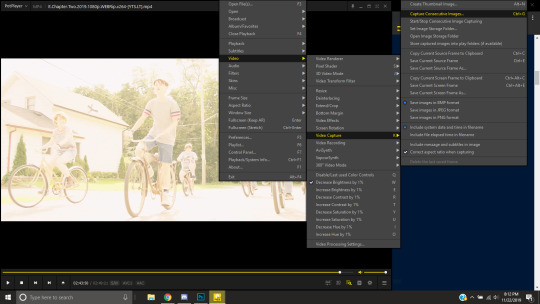
This will pop up:
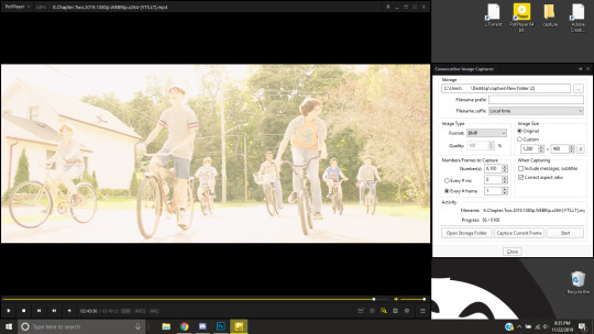
Here is a closer look at the settings:
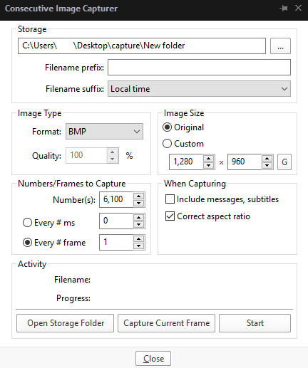
The key things to look at are the Image Type, Image Size, and Numbers/Frame to capture. And of course, make sure you have the right destination chosen in the Storage box because that’s where your frames are going to be. PNG and BMP are the best quality for the type of image. Always choose the original size of the frames. And, make sure you’re saving every frame (Every # frame must be kept at 1).
Make sure to start a few seconds before where you actually want to make a gif. Sometimes (every time lol) the start will lag and you won’t get every single frame you want or thought you were getting. In my case, the screen is fading from white, so I’m going to capture a few frames where the white can still be seen before the full color appears. This way I know I’m getting the most frames I can, and I don’t have to redo it later when I think my gif is too short because I’m missing frames.
While the movie is still paused, press Start in the smaller window, then press Play on your movie. Keep your mouse over the Pause button and end it when you’ve gotten all the frames you wanted. Then, Stop back in the small window.
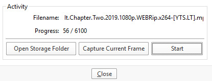
I’ve saved 56 frames to my folder.
The size of the gif you want to make dictates how many frames you’ll be using. Remember the file size needs to be under 3MB. Recently Tumblr increased that size to 8MB, but the quality of the gif will drop drastically, so I ignore it now. (Although, it probably won’t look too different if it’s at like 3.1MB and barely goes over that limit.
540px wide- ~30 frames and under. Because these gifs are so wide, naturally, they’re already going to be a large file.
268px wide- ~50 frames
177px- ~70 & up
These numbers aren’t concrete, though. The taller and/or more contrasting colors in a gif, the bigger the file will be. The shorter and less contrast in colors, the smaller, and more likely you will be able to fit more frames into your gif. These are just what I find to be the case most of the time.
For the gif I’m making now, I’m going to keep it at 30 frames, so I know I’ll be deleting ~26 out of the 56 I saved to that folder.
Tip: I rarely make big changes to the coloring of my gif if I really like the way it looks. If my gif exceeds 3MB, I’d rather delete frames. IMO, nice coloring comes before fitting in as many frames as I can.
Moving on, now that we have the frames we want, go ahead and open up Photoshop. Go to File > Scripts > Load Files into Stack. The drop down that says ‘Files’ I change to ‘Folder’ and simply select wherever your frames are held. For me, they’re here:
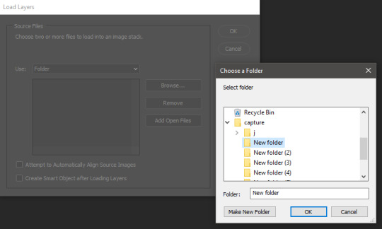
Press OK, let them all load up, then you’ll press OK again in that grey window.
It takes a minute for all of the frames to load up in photoshop. The more you have, the longer it’ll take. Again, my laptop is slow as hell, so maybe it will be really fast for you.
When they’re done loading, go to Window > Animation.
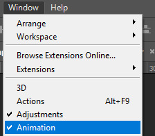
Then, inside the Animation tab, make sure you have Create Frame Animation selected:

Then once you’ve pressed it Create Frame Animation, your first frame will appear. But we need them all, so look over to that four bar icon to the right of the tab and press Make Frames From Layers.
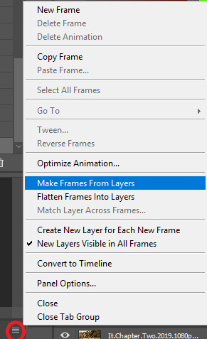
They’ll load all at once, but the gif is backwards. To fix that, simply go back to the same four bar icon and click Reverse Frames.
I’m going to go ahead and delete the frames I don’t want. For me, the beginning frames are unusable because there’s that white fade out in the start of the scene I chose. I’m going to delete those, then go ahead and delete any frame that comes after frame 30.
Here’s where I’m at now:
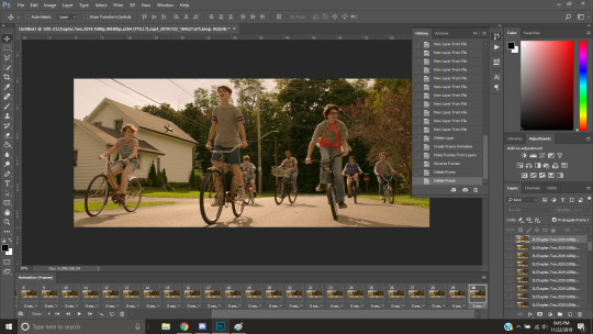
Now to resize it. I like the dimensions it currently has, so I’m not going to use the crop tool at the moment. But once you’ve cropped it to where you like, go to Image > Image Size and a new window will pop up. The widest a gif should be is 540px. How tall it is is up to you. Since I’m keeping the dimensions currently, my gif will resize to 540x225.
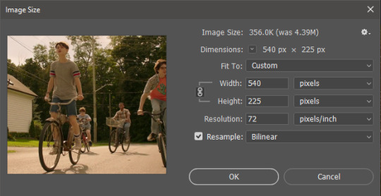
It’s VERY important to note, where it says ‘Resample:’ you need to have Bilinear selected. This effects the borders of your gif. Also, don’t make the mistake of resizing it in centimeters instead of pixels.
Now that it’s resized, you need to set the the frame delay. I choose either .05, .06, or .07. Anything outside of that looks to fast/slow to me (but I know a lot of people who like the way .03 or .04 look. It’s all preference.)
To select all of your frames at once, select the first frame, hold shift, then select your last frame. Then press where it says ‘0 sec.’ > Other > type in however fast you’d like your gif to be. I’m going to use .06. Double check every frame says .06, otherwise it’ll stay at 0 and be way too fast.
Now, again, click that four bar icon and select Convert to Timeline. The Animation tab looks like this now:

For now, look at our Layers Tab, so we can delete every frame that doesn’t show an eye icon next to it (as you can see, my first 5 frames):
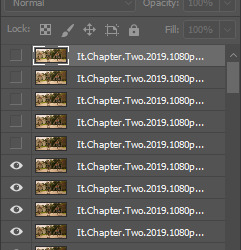
With all of the excess frames gone, select all of the frames you have left (hold shift again) and then right click > Convert to Smart Object
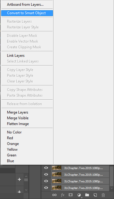
Now, we see this left:
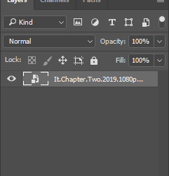

And, technically we’re done with the very basics of making a gif. But you definitely should sharpen and color it for it to look ‘nice’ and aesthetic. I’m going to color my gif now. Personally, I rarely use psds. It takes way too long for me to look through millions of psds, so I make coloring my own for each gif I make. I have two of my own psds, if you’d like to use either of those.
PSD01- this is a super basic psd I use to make any gif look brighter and more vibrant. There are more details in the post on how I use it.
PSD02- I included this psd within another tutorial for how I do color edits.
Both of these are my base psds, but if anyone wants me to do a separate tutorial for how I color gifs on a regular basis, I’ll gladly make one of those too!
Once you’re happy with how the colors look, it’s time to sharpen. Select your gif layer and go up to Filter > Sharpen > Unsharp Mask.
Here are my settings:
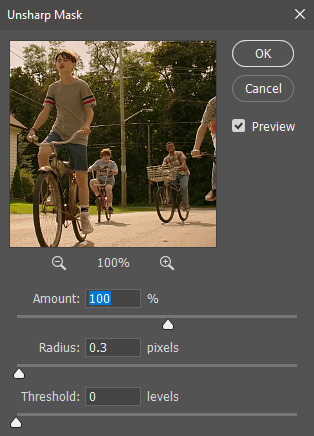
(Amount: 100%, Radius: 0.3px, Threshold: 0 levels)
Now sharpened and colored, here is my final result ready to post:
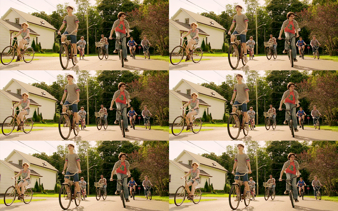
If you’re wondering, this gif is 2.42MB, so I could still make it brighter/more vibrant if I wanted to!
To save, go to File > Export > Save for Web.
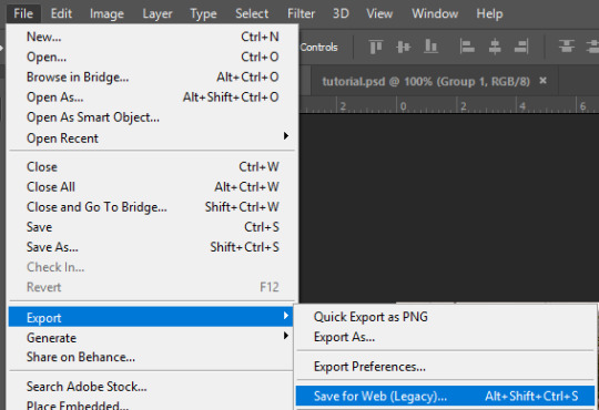
A new window will pop up. There are more settings that you should check to make sure your gif looks as nice as possible, but they’re also up to preference and can range from creator. This is what I prefer:
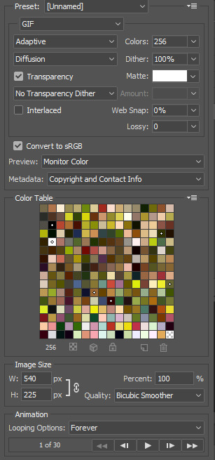
Diffusion is good for bright and/or colorful gifs, but if the gif is dark, I’ll change it to Noise to see if I like that better. Also, always double check you have the loop set to forever, otherwise your gif will only loop once.
And you’re all done!
Here is a short masterlist of resources I recommend checking out and use often:
allscallie (DeviantArt)
Their psds are beautiful, especially if you’re into making moodboards. Everything is very aesthetic!
sttoneds (DeviantArt)
More psds, especially if you’re into gifsets/photosets that are color focused.
BEAPANDA (DeviantArt)
Literally everything they publish is gold. From brushes, textures, psds, renders; they have it all. Their packs are extremely well made, too. I highly recommend bookmarking them. (The renders and brushes look beautiful when you use them in your headers!)
allresources (Tumblr)
There are so many photoshop resource blogs here on tumblr, so to make it easy on you, theirs is the one I recommend the most! The tutorials and resources she makes herself are really great too.
Thank you for reading, and good luck +.゚(*´∀`)b゚+.゚イィ
143 notes
·
View notes
Photo


I know only one queen, the Dragon Queen. Fuck the rest. || Dany!Headers
Tada, my first ever attempt at headers. Huge shoutout to graphictutorials and this tutorial by them, which was super helpful and easy for dumbasses like me to understand. Also, also to overlaygifs, where I got, well, the gif overlays. Anyway, this attempt is 100% caused by pettiness. I discovered that this editing blog I liked hates dany, and even though they made edits and headers and shit for her, like, I just can’t find the stomach to use their headers, etc now, because like, that’s my Queen, so tried making my own, for like me, but anyone can use them. Well, not anyone, please no nazi’s, pedos, or anti-Dany’s, otherwise, sure, whatever. No need to explicitly credit me, just don’t claim that you made it and we good.
Link to drive folder in case tumblr bitches and doesn’t let you download it in HD
#daenerys stormborn#blog headers#headers#gotedit#my edits#clara's edits#mine#gifs#my gifs#gif headers#A Song of Ice and Fire#emilia clarke#game of thrones#game of bullshit#fuck d&d#I'm really proud of these though#most of them turned out really good#if I say so myself#daenerys targaryen#awoiaf#asoiaf
39 notes
·
View notes
Note
How do you make a gif?
What a fantastic question.
This will be a full-blown tutorial, and I’m going to do my best to keep this as beginner-friendly as possible, but if anyone has any questions, feel free to ask via inbox or DMs or whichever way suits you.
You will need Photoshop to be able to follow this tutorial. I will be using this particular gif as an example:
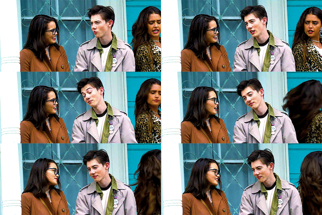
The rest of the tutorial is under the cut.
Step 1. Download
First we download the video we’re going to gif. It always has to be in HD quality, preferably 1080, but sometimes 720 can work too, but no less. Gifs will not look good if the video you’re giffing is in bad quality.
The idea is to use torrent as little as possible because of the consequences, so, depending on what I want to gif, my method of download will vary. If it’s a relatively recent and well-known movie/tv show, then I usually check out this website for movies, and this one for tv shows.
If it’s something more obscure than that - say an old movie - you’ll have to use torrent, unfortunately.
For youtube videos, I use this app.
Step 2. Screencaps
Now that you’ve downloaded your video, you’ll need to make screencaps. The app I use is MPlayer OSX Extended - it works only for Mac. For both Mac and Windows, you can use MPEG Streamclip, but I prefer the former because it can be used for any format, whereas MPEG Streamclip only works with mp4.
I actually don’t have MPEG Streamclip anymore, so this tutorial will only show how I personally make screencaps, so with MPlayer.
The steps are simple:
Open the video
Find the scene you want to capture
Pause the video
Hold ‘command + shift + S’ until the scene ends
Make sure you choose a folder in which you want your screencaps to save (before you start capturing). To do this, while your video is open, go:
Mplayer OSX Extended > Preferences

This window will open:
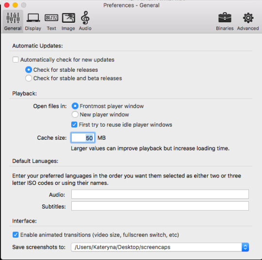
At the bottom, where it says “Save screenshots to”, you can choose your location.
Step 3. Importing Screencaps
Once the screencaps are done, we open Photoshop and go: File > Scripts > Load Files into Stack

Next it’ll open a browsing window, and you find the folder in which you saved your screencaps. At this stage I like to make sure I only upload the shots that will be on my gif, leaving out the extra ones I may have captured (like the beginning of the next scene, for example).
Use Shift to choose a lot of shots at the same time:
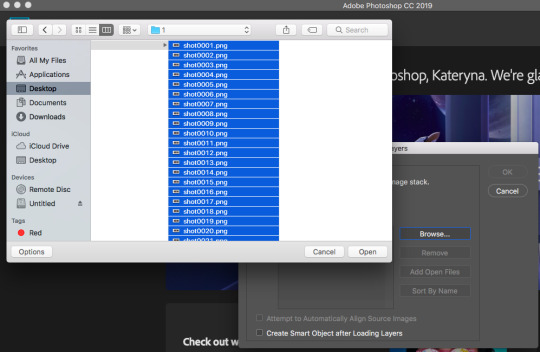
Then click OK.
While they’re uploading to photoshop, make sure you don’t click anywhere until the process is finished because otherwise it might not upload all the shots.
Step 4. Editing
Once your screenshots are in, the first thing you need to do is decide on the size of the gif. There are specific sizes which tumblr supports so that your gifs don’t appear blurred. I’m going to make a list of all possible combinations that I know. This will go from largest possible size a gif can be to the smallest and will show how it will look in gifsets (all the gifsets will be mine, sometimes from sideblogs).
Any number of gifs, one in a row:
540x540 (example)
540x450 (example)
540x320 (example)
540x240 (example)
An even number of gifs, two gifs in a row, side by side:
268x404 (example)
268x350 (example)
268x300 (example)
268x268 (example)
268x220 (example)
268x192 (example)
268x150 (example)
9 gifs:
177x177 for side gifs and 178x177 for the middle gif in each row (example)
In this case, I will be making a standard 540x240 gif.
First we resize the image. Because these are caps from a movie and not a TV show (resolutions are different for TV), the cap is wide but short, that means that I change the size of the image by height. To do this:
Image > Image Size

This window opens:

Where it says “height”, we type in 240 and click OK.
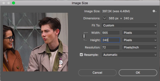
Then we zoom in to a 100%.
Next, we make sure the timeline is open. To do this:
Window > Timeline

Once that’s done, down at the timeline, we click “Create Frame Animation”:
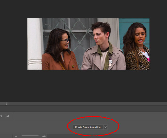
At the right of the timeline, right under the layers, we click on this little thing:
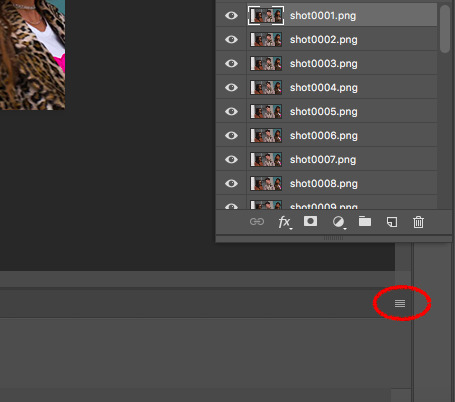
And choose “Make Frames from Layers”

The frames will now be in reversed order because that’s how the layers always upload, so we click on that little four lines thing in the upper right corner of the timeline again and choose “Reverse Frames”:

And now is the time to have a look at your frames and see if you need to delete any. Make sure that if you delete a frame, you delete a corresponding layer as well. The gif will have to be under 3mb for tumblr to display it correctly, so make sure there aren’t too many frames. But this isn’t a huge issue because once you’ve saved the ready gif, you can always reopen it and delete some frames.
In this case I have 36 frames, and I’m going to take it down to 34 just to be safe. This is what the gif looks like at this stage:

Once that’s done, the next step is to set the delay. Every giffer does this according to their personal preferences, but I personally do this. If your gif doesn’t involve any talking - so you won’t be adding text, then set the delay to 0.07. If it involves adding text later, don’t touch the delay at all at the moment, it’ll have to be done later.
Because this gif doesn’t involve adding any text, I’m setting the delay to 0.07. Again, hold Shift to choose all the frames.


The slowed down gif looks like this:
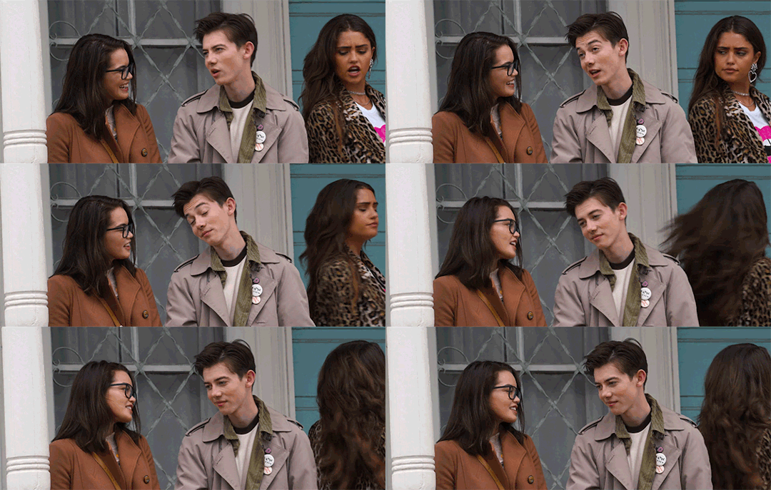
Now it’s time to crop! Choose the cropping tool and type 540x240 where it says “ratio”:
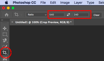
Choose the crop positioning to your liking and press enter.
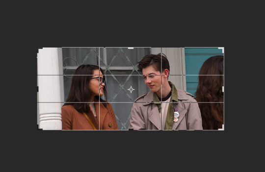
The gif at the moment:

Now we do last preparations before colouring. For this, click at the little four lines again:

And choose “Convert to Video Timeline”.
Then choose all the layers and go Filter > Convert for Smart Filters.

Then go Filter > Sharpen > Smart Sharpen:

Which will open the window for smart sharpening, and here are my settings:
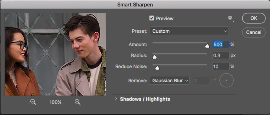
This is another one of those things that is down to each giffer, but what I usually do is, if it’s a really small gif, like 268x150 for example, I set radius to 0.2. If it’s a huge close up to a person’s face or a really big gif, like 540x540, I set the radius to 0.4. For all other gifs I always keep it on 0.3.
Then click OK.
Next, go Filter > Noise > Add Noise. Here are my settings for this:

Then, move the noise layer under the sharpening layer (I don’t know if this changes anything, but I always do it this way lol):
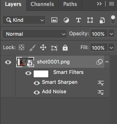
The gif ends up looking like this:

Now the editing is done, and it’s time to colour!
Step 5. Colouring
This is by far the hardest thing a giffer has to do, so if you don’t immediately get the hang of it, don’t be upset. You’ll learn eventually. I’m still learning, personally.
Again, all of this is very much down to each giffer, but here’s the way I do it.
Press the little “fill layer” button and choose Curves:

So the way I use curves is to even out the entire shot’s colouring. So if the scene is too red or too green or too blue or too yellow, it gets rid of the excess of that colouring and brings it down to normal. Can help so much in some cases.
What you do is choose the middle pipette in the window, which is to sample image to set grey point.

There’s also the option to set white point (bottom pipette) or black point (top pipette), but I don’t use those because it screws with your lighting too much.
To choose a point, I usually use the person’s eyebrows or hair. Sounds ridiculous, but it does work. In this case clicking on Dunkleman’s eyebrow makes the image too green:

So what I do instead is click on his hair, where it’s reddish brown, somewhere here.

This makes the image noticeably less red compared to the original:

But also, it made the image less vibrant, so we’re fixing that next. Fill layer > Vibrance:
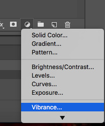
And then I set Vibrance to 100, always. If the image is still not vibrant enough for my liking, I set saturation (in the same window) to 10 or 25 in some cases. And for this gif, I will set saturation to 10.
Here’s how the image ends up looking (just make sure it doesn’t make their faces ridiculously red or something, but if there’s some excess of colour, don’t worry):
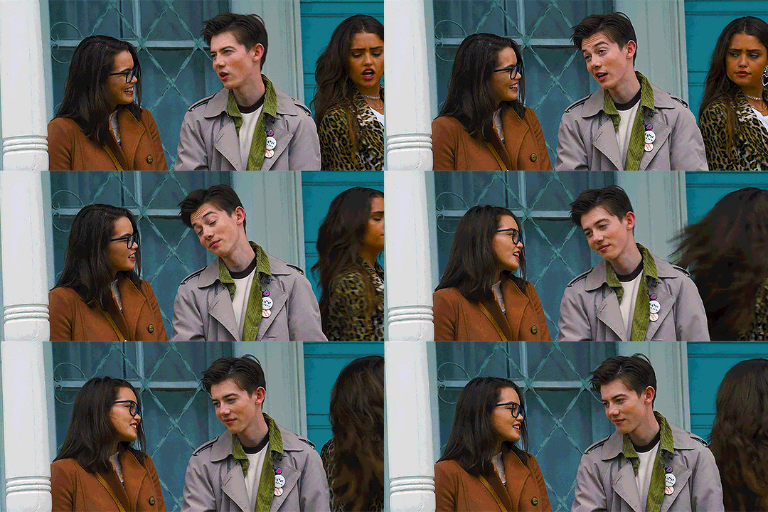
Now go Fill layer > Exposure.

Here are my settings for this gif:
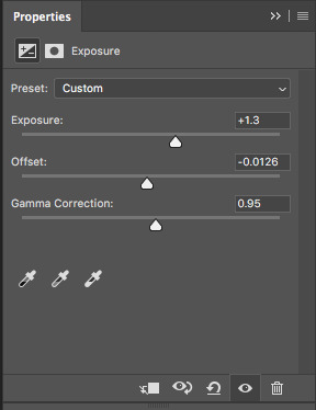
With exposure, it’s just a matter of keeping that balance between lightening it as much as possible but without their faces or bodies looking as bright as a christmas tree, and then adding offset and gamma correction to return normalcy to the picture.
Here’s what the image looks like now:

It’s obvious right now that their faces are a little too red and too yellow, so we’re going to fix that. Go Fill Layer > Selective Colour:
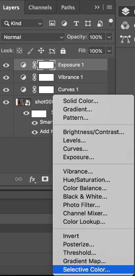
The task here is to make their faces appear as if they’re stood in normal daylight with no other filters. So as close to normal skin colour as possible. Be careful when giffing people of colour so that you don’t whitewash them.
In this case, I’m adding cyan in reds:

And taking down yellow in yellows:
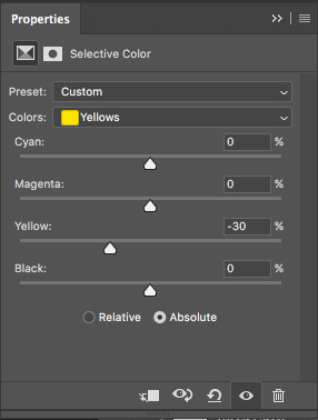
And here’s what the image ends up looking like:
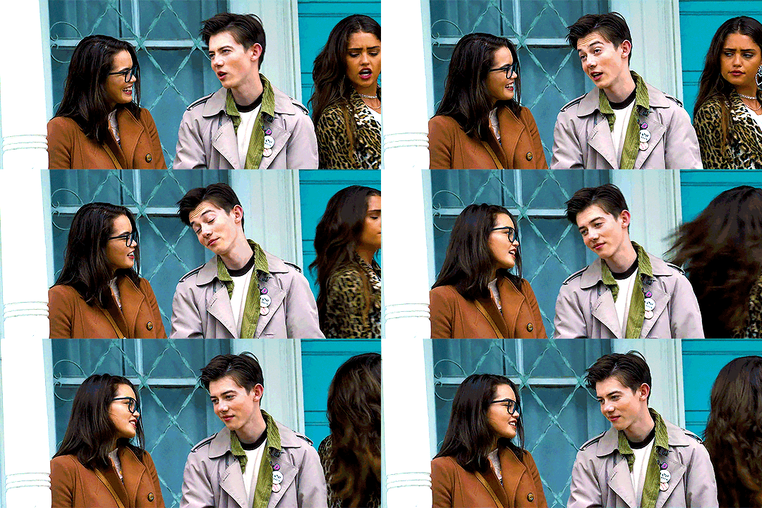
I’m quite satisfied with this result, so I’m going to leave it how it is, but sometimes I will tweak things more and use colour balance and other things.
Step 6. Add Text
Make sure you group your colouring layers at this point and then add your text as the top layer.
Step 7. Save the gif
To save a gif moving, you go File > Export > Save for Web:
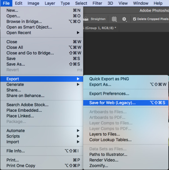
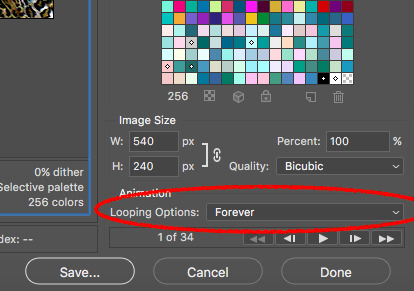
This window opens up, and make sure that in the bottom right corner, where it says “looping options”, it’s set to “forever”:
As the last step, I add dither because it evens out the edited colours in the background. I tend to use “pattern”:

Then we press “save” and our gif is done!

Step 9. Reopen
If you added text to the gif and followed my advice, you wouldn’t have touched the delay back at the beginning. This is because converting to video timeline kicks the delay either into 0.03 (too fast) or into 0.07 (too slow for speaking gifs). So you have to reopen the gif now and set the delay to 0.06 (that’s the speed I like for my gifs where someone’s talking on them).
This is also a good time to delete some frames if your gif is 3mb or over. Remember it won’t move if it’s not under 3mb!
Hope all of this makes sense, and let me know if you have any questions!
146 notes
·
View notes
Text
Tv series tag game
Another tag today brought to you by @angieflynncarsens. Thanks for giving me the excuse to showcase my fandoms! It’s always appreciated.
Rules: attach 10 gifs from 10 of your favorite TV shows and then tag 10 people
1. The Walking Dead

2. Sons of Anarchy

3. Good Omens

4. Z Nation

5. Animal Kingdom

6. Supernatural

7. Sherlock

8. American Horror Story

9. The Handmaids Tale

10. Henry Danger

(This last one is kinda a joke, but then again, not really. In truth I don’t have favorites, HD is just the newest of the kids and needs special attention atm.)
I love these games, but they’re also so hard because I A) forget every show I’ve ever watched, B) suddenly love all of them a ton, & C) don’t like any of them enough to want to show case them, all at once!!
Again, not tagging anyone as I don’t want to bother anyone. But if you feel up to doing this Tag, feel free to jump in and tag me in your response as if I did Tag you.
#multi fandom fangirl#multi fandom blog#fandoms#ask me about my fandoms#fangirl#i love my boys#tv series#tv shows#tag game#fandom tag game
4 notes
·
View notes
Text
(Probably) Last Mass Post on Olympic Technicals
I saw a GIF of Nathan's 3A from his Oly FS. Has he gone back to the toe-pick release, from the skid that Raf was teaching him? (Can't seem to link GIF, sorry! But the Olympic Channel has his FS.)
This is the moment I realized, with mild horror, that I’ve forgotten to DVR any of Nathan’s performances at the OG. And my current Internet connection is so crappy I can’t even get the Olympic channel video to play in full HD. But, yes, I also remember noticing that he went back to the toe pick takeoff for his 3A in the FS. Probably because the skid takeoff sure didn’t work out that well for him in that competition. Let’s wait and see what he chooses to do at Worlds this week.
Hi, I really appreciate your posts! You've made figure skating so much easier to understand with your gifs and explanations. I was wondering something, if you don't mind answering, and it was in concerns to step sequences. I remember hearing somewhere that Nathan Chen got a level 4 during his Long Program at the Olympics while Yuzuru got a level 3? If true, why is that? It doesn't seem like Nathan's is more complex at all. Thank you in advance for reading this inquiry --- @mystictrillium
Hi, it’s true that Nathan got a level 4 for his FS StSq at the OG and Yuzu got a level 3, but it doesn’t necessarily mean that Nathan’s StSq was more complex than Yuzu’s. Yuzu’s planned technical content for the Seimei StSq is highly difficult (more details here) and should be more than enough to earn him the maximum level if everything is executed correctly. The reason why Yuzu lost a level at the OG was because of one mistake that happened to occur during a turn, which, under ISU rules, was crucial for level evaluation purpose. I’ve discussed this here, in case you are interested in the technical details.
Hi Alice! I was wondering, if Yuzuru got a Lv4 on the last spin of his SP from the Olympics (same GOE) would he have broken the WR?
No, a level 4 spin wouldn’t have been enough. He was 1.05 points away from a new WR. The difference between Base Value of a level 3 and a level 4 combination spin is only 0.50 points, and there is no difference in their Scale of Value, so Yuzu wouldn’t have got any extra GOE if he had received a level 4 for that last spin either. He, in fact, received higher GOE for that spin at the OG compared to at Autumn Classic. Well deserved, I’d say, not least because I love that variation he did for the A-spin when he placed his hand flat on his back instead of on his knee as usual:

(Aside from being pretty, this variation also affected his balance and actually made the spin harder to execute. But of course when you are Yuzuru Hanyu, judges hold you to an apparently much higher standard so, despite added difficulty and whatnot, if you miss your rotation by a hair’s breadth, you lose a level, no negotiation allowed).
Hi Alice! This ask is regarding spin. I understand Hanyu got only Lv3 on his last spin for SP for lacking rotation. But then Shoma Uno in his FS' FCCoSp, if I am not mistaken, lacked rotations on both his camel and upright position. So,,, why was that still counted as a lv4 spin? That's 2 basic position lacking rotations. I know counting spin is not my forte, but did I really make that big of a mistake there? Thanks! (also, if it's going to unleash the you-know-what, feel free to not answer)
No I don’t think you are mistaken about Shoma’s spin. At least if you count spin revolutions the same way I do. For a basic camel position, I count from the moment both the skater’s spinning knee and free leg are fully straightened, I stop counting when they start bending their knee to move to the subsequent position:

For a basic upright position, I’d count from when their body is fully upright (duh) and the spinning knee also fully straightened, same principle as camel spin for when to stop:

So, from how I see it, neither of those positions Shoma had was held for 2 full revolutions. As to why the tech panel didn’t invalidate his spin or give him a V sign at least, your guess is as good as mine.
In case anyone is curious, this is how I count the revolutions for Yuzu’s inside to outside edge feature: start when his blade is completely outside, stop when his blade is completely flat:

I remember Shoma said that if he had landed the 4Lo, he could have higher chance of winning, and Yuzuru replied that even if Shoma did land the 4Lo, Yuzu would still have won. Could you calculate/ explain this please?
Wait, when/where did this conversation happen? Just asking because it sounds very out of character for both of them.
But, well, the calculation is not hard to do. The final margin between Yuzu and Shoma was 10.95 points. Shoma got a total of 8.00 points for his 4Lo (fall), if he had landed the jump, and landed it perfectly so that he received the maximum GOE for it (which has never happened, mind you), his total point for that element would have been 12 in BV + 3 GOE = 15 points. So that’s 7 points added to his TES. Now you can also tell me that the fall on the 4Lo affected his PCS, so if it hadn’t happened his PCS would also have gone up, but it order to even the gap with Yuzu, Shoma would need an extra 3.95 points in PCS, which would mean a total PCS of 96.67. Considering that his personal best PCS in international competition is (I think) 94.42 at WC17, 96.67 is extremely unlikely.
So, the summary is, even if Shoma had landed his 4Lo, Yuzu would still have won.
Hi Alice, I have a question about commentators, do you know who were the commentators for the official Olympic broadcast (the ones with the phrase 'liquid gold'😍)? They seemed so lovely and I could hear them clapping after Yuzu's fs, which was just heart warming.
The female commentator (she of the “liquid gold” comment) is Belinda Noonan, former Australian national champion. Thanks to @chibura for the info :) I’m not sure who her partner was. Does anybody have a clue?
Hi Alice! Hope you're doing fine. I've heard people saying a lot that Javi should have got silver instead of Shoma. I haven't watched yet Javi's performance but I've seen a fancam of Shoma's and I've checked their protocols. Shoma's technique is flawed, that much we know, but there were a couple of jumps that were pretty nice. Javi has like 5 points advantage over Shoma in PCS but he popped that 4S and lost a level in one of the spins (besides less one quad). What do you think? Thanks :) --- @puniyo
I also think the Silver should have gone to Javi, mostly because in the FS, Shoma’s 4Lo was clearly under-rotated and he shouldn’t have got the full BV for it. His 4T was borderline UR as well (more details on his 4Lo and 4T here), and as you see above, his flying combination spin was also dubious. Considering the very thin margin between him and Javi, any of those mistakes, if called by the tech panel, could have resulted in a different final standing.
Please excuse me if this question seems silly, but I have not understood fs enough to withstand a debate, that's why I really need your help. I saw on an ask page someone raising questions about Yuzu's 4T in Chopin, so aside from the argument that 4T has an inherent degree of prerotations, how else can I prove that his 4T was not UR? And while Kurt said that it was not quite the 'perfect' landing, how would you describe that landing on average? Thanks a ton
I think you’ve got PR and UR mixed up there :) PR is about whether or not the skater rotates on ice before the takeoff, where as UR is about whether they do that after they land.
So it’s true that a toe loop always has some degrees of PR inherent in it, more than most of the other jump types, because of the way the skater's hip is completely open to the rotational direction. Here’s Yuzu’s 4T takeoff in his SP:

You see there, with the way this jump works (left leg swinging behind for the pick), a skater can’t help but point their toe at an angle for the takeoff, and that’s what causing the inherent pre-rotation. However in Yuzu’s case, he picked and then left the ice with minimal timing delay, so his blade was fully off ice at no more than 90 degrees of PR, which made his takeoff completely valid in scoring terms (in order for a takeoff to be called “cheated”, it has to be done with 180 degrees of PR or more).
As for the landing of that jump, no, it wasn’t perfect. It was slightly under-rotated:
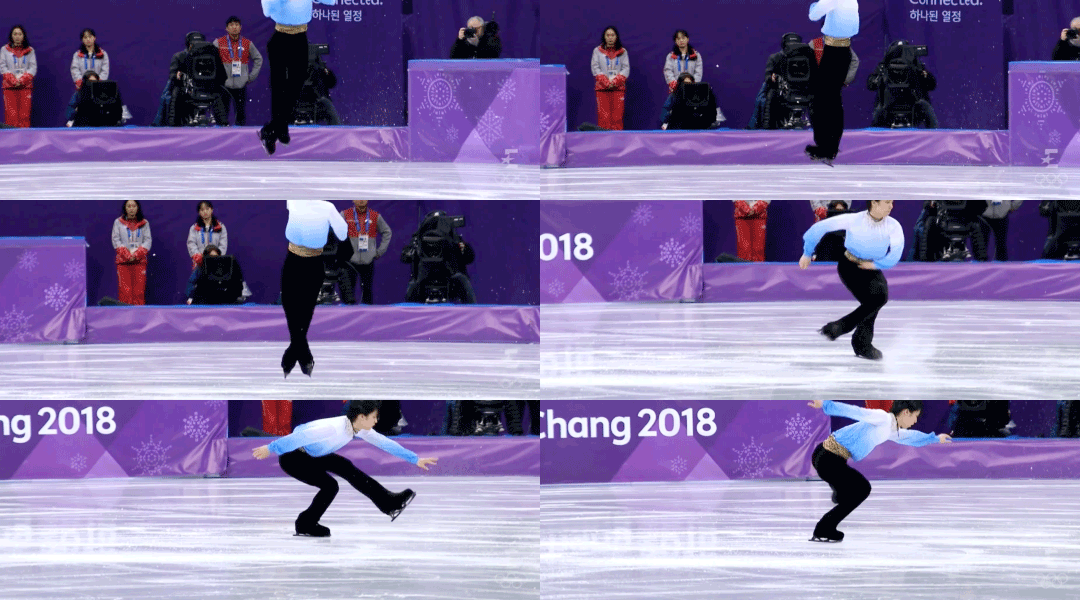
See how he clearly did have to finish his last rotation on ice? It was not called by the technical panel, likely because they deemed the lack of rotation not enough for a call (less than a quarter), but it was reflected somewhat in his GOE. 4 judges out of 9 gave him +2 only for that combo. With him hitting almost, if not all, of the 8 positive GOE bullets for that combo, a +2 can only be justified by the judges taking into consideration the mandatory deduction of -1 for the UR (yes, judges are allowed to, and are supposed to, deduct GOE for jumps lacking rotation even if there is no call from the tech panel).
Here’s how a perfect 4T landing looks, from Yuzu’s FS :)

(Straight up +3 for this one)
Hi Alice! I was wondering on yuzu’s SP (and really the FS as well tbh) when he was jumping his 4T-3T the foot picking the ice as he was jumping wasn’t his usual ‘quick hitting motion’ as I think you put it. Do you think it’s just bc he hadn’t been training his quads until 2 weeks before and he was just getting used to it or it could be something else?
He did put a bit more pressure on the ball of his picking foot for the takeoff of that 4T (as you can see in that gif above), and same goes for his (planned) solo 4T in the FS.

I think it had to do with his right ankle not in its best shape: for a toe loop takeoff, while the majority of the push comes from your picking left foot, you do need to use your right foot’s ankle and knee to stabilize the takeoff. If you have some nagging unease in your mind about your right foot, it can lead to you taking a split second more to fully stabilize the takeoff, and therefore, a split second more of your toe pick being kept on the ice.
Or, he was actually altering his takeoff in that manner as a way to put a certain limit on the size of his toe loop so that it is easier to control, also because he was worrying about his right foot, which plays a crucial role in the landing. This alternative theory of mine came up because I noticed that in the second 4T he did in the FS, he used the usual fast takeoff and ended up with that step out:
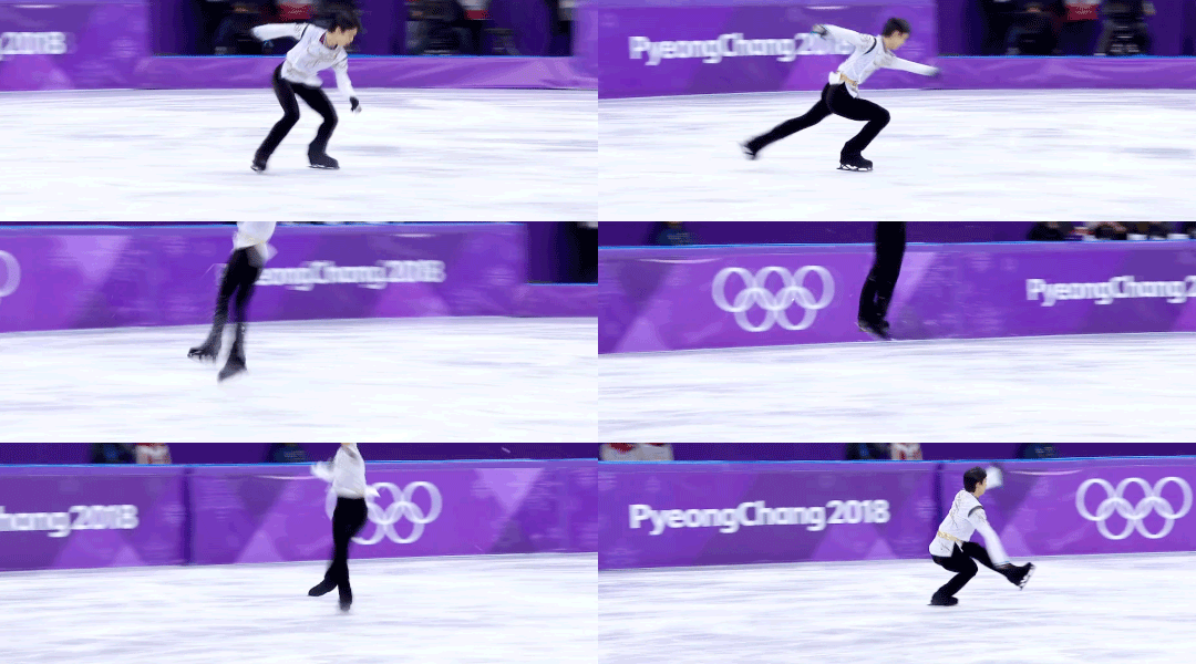
For what it’s worth, his subsequent triple toe loop takeoffs in combos were all picture perfect though, as usual :)

251 notes
·
View notes
Text
Greek Mythology-The Lore of Medusa

I do not own Supernatural*Gif not mine*
This was supposed to be a short drabble story but then I got carried away and whoops its now its ~5500 words
sorta fluff?
This is my second Supernatural Fic, so please leave feedback and comments if you like it!
Warnings: Death, Swearing, Kidnapping, Snakes (I feel like that needs to be a warning), Typical Supernatural killing
Sam Winchester X Reader
Egyptian Lore of Anubis
Masterlist
“So get this,” Sam walked into the Bunker’s conference room, laptop balanced on his hands as he sat across from Dean who was stuffing his face with a burger. Same grimaced at him, “Dude, really?”
Dean frowned, wiping the grease from his chin, “I’m a warrior Sammy, I need my meat. Anyways,” He took a swig from his beer, “What do you have that’s so important.”
Sam shook his head at his brothers antics but got back to his original point. “I think I got us a case. Look here,” He turned the computer so that Dean could see the police report that had caught Sam’s eye, “Victim was found by hikers in the city of Seattle, Washington. Looks like he was turned to stone...literally. Police are saying he was possibly dumped in cement, but autopsy shows no compounds of any regular cement product. And,” Sam raised his finger to emphasize this point, “His eyes were wide open and seemed to be turned into stone as well.”
Dean took another swig of his beer as he pulled the laptop closer. “Hmm, definitely looks like our kind of thing. Any clue about what it might be?”
He glanced up to Sam, who had already stood up and was pulling down lore books from the shelf. “It doesn’t fit any criteria of monsters we’ve seen before. This will be one with a lot of research, I’m certain.”
Dean groaned, “And you know how much I just love research.”
Sam smirked at his older brother, “Well how bout this, you drive and I’ll start looking for something to help us. We’re headed to Seattle.”
*Time Jump*
The winchesters had went straight to the Seattle Police Department Headquarters. After going through the whole FBI introduction, one of the officers led them to the morgue.
“So agents, here he is, the poor bastard.” The overweight officer led the brothers into the morgue, where the body was laid out on a slab.
Sam looked taken aback at the cop’s tone, “Did you know the victim, Officer Mcgowan?”
The officer chuckled as he looped his hands through his belt, “Knew him? Hell every woman within a twenty mile radius knew him. Mr. John Buckley here was a regular womanizer. He was a bit of an asshole, he’s got a list of sexual harassment allegations.”
Sam squirmed a bit as he glanced at Dean. Dean spoke up, as he prodded the stone body, ‘So who found him?”
The officer pulled out his notepad and flipped through a couple pages, “That would be one Miss [y/f/n] [y/l/n]. She was out taking her dog for a hike on one of our more scenic trails when her dog started going nuts. Said he got free and when she found him off the trail, there was John Buckley. Petrified.”
Sam nodded at the officer, “If you don’t mind, we’ll need her address and phone number to contact her. And if we could see those sexual harassment reports as well?”
The officer let out a sigh, his cheeks puffing out making his beard look fuller. “It’s your playground agents. I’ll see that you get all the specifics.” At that he walked out of the morgue.
Sam waited until he was sure that the officer was out of earshot before turning to Dean, who was now poking at the open eyes of the man on the table.
“Dean!”
Dean looked up, “What? I’m just seeing if its actually stone.”
Sam shook his head exasperated as he read through the information on the man. “Well looks like Officer Mcgowan was telling the truth. This Mr. Buckley was known for taking pictures up women's skirts. Pressing advances onto unwilling woman. Stalking them. He really was the neighborhood creep.”
Dean sighed, straightening up, “Which means every woman in this town is a suspect.”
Sam sighed as well, turning on his phone he googled the address of the victim, “Well I say let’s go check out his house, see if there is any clues there and then go speak to the witness.”
Dean walked past his brother, trench coat swinging past his legs as he walked out of the room back to the officer desk to pick up the information.
Soon they were parked in front of the vics house. Sam straightened up as he stepped out of the Impala and whistled, “Wow, for a creep he sure liked to live in style.”
They were in one of the nicer parts of Seattle, close to Pike Place Market. The house they stood in front of was two stories. White marble pillars and what looked to be ivy wrapped around the base.
Dean pushed past Sam to get inside, excitement evident in his body language. “Oh my god! Sammy! He has a HD Flat Screen 55in TV on his wall! And look, look at this,” Dean raced over to the staircase which had paintings on the wall, “This is a rendition of Van Gogh's starry night!”
Sam looked at his brother out of the corner of his eyes, a smirk growing on his face, “And since when were you a collector of the arts?”
Dean brushed his brother off, “Oh stuff it Sam. Let’s check out his bedroom.”
They headed up the staircase and walked down a hallway to what appeared to be the master suite. Dean pulled out his EMF device and nodded to Sam to open the door, who had his gun pulled out. Slowly they walked into the room. There was piles of clothes everywhere. Fancy sport memorabilia on the walls. A king size bed took center stage with a velvet canopy. Dean snorted when he saw that. Same frowned at him and nudged his head at the closet that was on Dean’s right.
Dean looked down at the EMF reader as he pulled open the closet, noticing no signs radiating from it. When he glanced up, his jaw dropped. “Uhh Sam...You need to see this.”
Sam sighed under his breath, and walked over, “What is it De..wow.” He froze next to his brother.
There on the back wall of the empty closet hung hundreds of pictures of women. Some looked to be professional shoots and others looked like they had been taken while hiding in bushes peering into windows.
Sam looked at all of them. ‘Dean...Look at the ones on the bottom.”
Dean paused at his brothers tone before turning his gaze down to where Sam’s eyes were glued. There, on the bottom of the wall were photos of the same woman, over and over again. In different settings. The woman had stylish [h/c] hair and piercing [e/c] eyes that in some pictures could be seen smiling or laughing. Some pictures showed her walking on a trail, the picture taker obviously hiding off on the side of the trail. Others showed the woman sitting on a couch inside a house. Others had the woman in the backyard playing with a black lab dog, the pictures appearing to have been taken from above, as if from a tree or drone.
Dean looked disgusted as he met Sam’s eyes, “I’m glad somebody got that bastard before I did. He was a true monster.”
Sam started to nod before he shook his head, shutting the door to the closet, hiding the secret they had just unearthed, “That may be true Dean, but we still need to find out what did this to him. I looked back through dad’s journal and the lore books and I can’t find anything on people turning to stone.”
Dean walked around the bedroom before stopping at a desk with a laptop on it. Pulling out the chair he fired it up. “What if it’s not something in lore? What if it's something simple like a lake or a buildup of calcium from being under water?”
Sam came to stand behind Dean as he typed in ‘things that can turn people into stone’.
“I don’t think that’s what it is Dean, this guy obviously had a lot of enemies and if anyone knew about that,” Same gestured back to the closet, “Then someone would definitely have it out for him. We should go and chat with the woman, [y/n], who found his body.”
Dean waved him off, “Yeah, why don’t you go talk to her, I’ll dig around a bit more, see what I can find.”
Sam headed towards the door laughing, “This coming from the man who bemoaned the idea of any research.”
Dean shook his head, a smile on his face. “Go Sammy. I’ll walk back to the motel when I’m done here, and when you come back to the motel, bring some Pie.”
Sam shook his head but headed out of the victims house and hopped in the Impala. Pulling out the notepad where he had written the address, he headed towards the market place.
Trying to find parking in one of the most popular places of Seattle was making Sam frustrated. People were parking in the middle of the street because of lack of parking spaces.
Trying to reign in his anger he pulled around the block, seeing an opening in front of a driveway. He swiftly pulled the Impala in before looking up at the modest one story house he had parked in front of.
It was the residence of the witness, luck was with him. Pulling out his FBI badge and putting on his best jacket, he walked up to the door.
Knocking twice, he waited for someone to answer as he look around the block. He noticed a giant weeping willow right beside the house and took notice of how it would provide the perfect angle for someone to take pictures of the inside of the house and the backyard.
He took a step back when he heard barking coming from behind the door followed by a woman’s laugh and stern, “Down Pepsi! Good boy.” The barking stopped as a young woman opened the door.
She still had a slight smile on her face as she tilted her head up to meet Sam’s eyes. But Sam was stuck. It was the same woman from the bottom pictures in Mr. Buckley’s closet. The woman in front of him had the most beautiful face he had ever seen. He was captivated by her [e/c] eyes that seemed to sparkle with laughter.
The woman was also frozen. The man on her doorstep was a giant, with sandy brown hair and the warmest brown eyes she had ever seen. Shaking herself from her stupor she leaned against the door as she felt Pepsi nudge her legs trying to get past. “Can I help you?”
The man seemed to realize he was staring as he pulled a badge out of his pocket, “Special agent Zepplin, Ma’am. I need to ask you a few questions about that body you found a few days ago.”
[y/n] took a step back, smile now gone, as she invited the agent into her house, “FBI, huh, didn’t know you guys looked into this sort of thing.” She walked in front, leading the man into her living room. “Pepsi behave.” She scolded as her dog sniffed the man’s shoes.
“It’s standard procedure. Sometimes life gets a little boring in the office.” He chuckled as he bent to scratch the black lab’s ears. Pepsi seemed satisfied in his examination as he chuffed and then walked over to the fireplace to lay down.
“Can I get you anything? A water? Soda?” [Y/n] fidgeted slightly as the FBI sat on her couch, he shook his head, “Im good. I just have a few questions for you and then I’ll be out of your hair.”
[y/n] took a breath and then sat on the loveseat across from the agent. She ran her hand through her [h/c] hair, missing the look the agent gave her when she did.
Sam coughed, as he pulled out his notebook. “So the day you found the victim, he was not on the trail you were on, correct?”
[y/n] nodded, “Yeah, if Pepsi hadn’t gotten loose from his leash I wouldn’t have found him at all. He was a good ways off the trail, in the middle of the woodlands.”
Sam nodded and continued, “And when you found him, he was already stone?”
[Y/n] nodded again, rubbing her hands on her jeans, “Yeah, I thought it was cement, but then I saw that his eyes were wide open and were stone as well. I don’t know who could’ve done that to John.”
Sam noticed her naming the victim, “So you knew John.”
[Y/n] gave a cynical laugh, “Who didn’t know him? He was a menace. Always starting fights, stalking women. It became dangerous for women to walk anywhere alone. That’s part of the reason I got Pepsi from the shelter.” She smiled at her dog who started wagging his tail at the mention of his name.
Sam smiled, “You rescued him from a shelter?”
He couldn’t help feeling a tug on his heart at her soulful smile and the way her eyes filled with love as she looked at her dog, “Yes, I went in with the idea of getting a mean looking dog to protect me, but as soon as I saw his small little frame shivering in that kennel, I knew I needed to take him home with me.”
Sam reluctantly tore his gaze away from her face as he looked down at his last question, “Do you know anyone who would be motivated enough to do this to John Buckley?”
[Y/n] tore her attention from her dog, “Every woman hated John, but no one in this town would kill him. We reported him to the police enough we figured someone would stop him, I just didn’t think it would be by killing him.”
Sam stood up, walking towards the door. [y/n] followed him. As he stood on the porch he looked back at her, “Thank you for your time [y/n].”
She smiled at the handsome FBI Agent, “Any time agent. If you have any more questions please don’t hesitate to find me. I’d love to spend more time with you.”
Sam flushed a little at her words, while [y/n] silently screamed in her head in mortification for saying them.
Sam let a smile creep onto his face as he handed her a card with his number on it. “Call me if anything else pops up.”
She nodded and closed the door.
Sam let out a breath he wasn’t realizing he was holding. As he walked back to the Impala his phone went off. Digging it out he answered, “Yeah?”
He heard Dean on the other line, “Sam I think I know what we're hunting and you’re not gonna believe it.”
Sam ducked into the Impala, starting her up, “What do you mean? What could we be hunting here?”
He heard the click of a keyboard as Dean answered breathlessly, “I think we're hunting Medusa.”
Sam laughed, “As in the woman with snakes for hair? That’s just a myth Dean.”
Dean let out an exasperated sigh, “Sam our lives are a myth. If demons and Angels exist then why wouldn’t Greek mythology? It says here that Medusa can turn anyone into stone with one glance and that she, wait for it, has a penchant for going after unfaithful and lust filled men.”
Sam started driving back to the motel they were staying at, keeping his brother on the phone, “You really think a Gorgon is behind this?”
Dean was getting excited now, “Yes, and get this, she was banished to an island, Seattle is next to the water, the body was found in the woodlands, I think she is hiding out in a cave.”
Sam sighed, he pulled up in front of the motel. Dean paused, “Hey, how did speaking with that witness go? Find out anything useful?” Sam grumbled as he shut off the engine and walked towards the room. He hung up on Dean as he opened the door and saw him sitting at the small table with his laptop open in front of him.
Dean put down his phone and turned to his brother, “So? How’d it go? And where’s my pie?”
“I don’t have your pie, and, ‘He continued despite Dean’s glare, “The witness knows next to nothing. [y/n] is just a sweet woman who had to handle a pervy man just as well as she could under the circumstances.”
Dean’s glare turned into a smirk as he noticed how uncomfortable Sam looked and how he was fidgeting. “You like this girl, don’t you Sammy boy?”
Sam sputtered, “What? How? No!”
Dean leaned back in his chair, arms crossing triumphantly across his chest, “Sammy has a crush, awwww.”
Sam gave Dean his bitch face, “Cut the crap Dean, go back to explaining how we can kill this thing so we can get back to Kansas.”
Dean, still smirking, pushed his laptop around so that both brothers could see it. “It’s pretty simple, we have to cut off her head.”
Sam peered at the screen, “Yeah, but it says here we can’t look directly at it or else we risk turning to stone. How do you plan to avoid that?”
Dean scratched his head, “I hadn’t planned that far ahead yet. In the myth it says this guy Persues flew on winged sandals to her cave and used his shield as a kind of mirror so that he wasn’t looking right at her when he cut off her head.”
Sam went to his duffel, pulling out his knives and machetes, “Well, I’m fresh out of shoes with wings and I don’t have a shield at the moment, can you think of an alternative?”
Dean typed into the computer looking for answers as he answered his brother, “I’ll find something, don’t worry. I also think I know where her cave is, so we can find her.”
Sam made a noise of agreement, becoming distracted by the thought of [y/n]. His phone started buzzing, snapping him from his trance. He looked quickly at the number and not recognizing it, answered, “Hello?”
“Hello Agent Zepplin, I know it’s a little early to call, as you just left my house, but I remembered something.”
Sam’s voice caught in his throat as soon as he heard that breathy voice on the other end.
“Agent Zepplin? You there?” She let out a nervous laugh at the silence on the other end.
Sam felt a hand on his shoulder and he turned to Dean who now stood behind him mouthing ‘who is it’. Sam put up a finger and cleared his throat, “Not a problem [Y/n].” Dean’s eyes widened, “What did you remember?”
Sam shooed Dean away as he leaned closer to the phone. [Y/n] sounded cautious as she responded, “Well I’m not sure how much help it will be to you, but about a week before John Buckley disappeared and showed up dead, he was seen hanging out with this gorgeous redhead. She always wore a hat and giant sunglasses, but he seemed to be enjoying her attention. She laid herself all over him in very public displays and he would leer at her when she wasn’t looking. Never seen the woman before, and after John showed up dead, it was like she just up and left. Haven’t seen her since.”
Sam gestured at Dean to follow him out to the Impala, grabbing his machete as he went. By now it was near Nine o'clock and it was nearly pitch black outside.“And you’re positive you’ve never seen this woman before then?”
“I’m sure. Pepsi always acted really strange whenever we crossed paths. It was like he was afraid of her. I never got a name, but she always smiled and waved at me when I saw her.”
Dean mouthed at Sam as they got in the Impala ‘Pepsi?”
Sam waved him off again, “[Y/n] I need you to really think, you never saw this woman again?”
[Y/n] chewed her lip. She was sitting on her couch relaxing, Pepsi curled up by her feet as she talked to the handsome agent on the phone. Before she could reply she heard the doorbell ring. Pepsi looked at the door before he suddenly stood up and whimpered, tail between his legs backing away. “ I’m sorry agent, someone is at my door, hold on.”
Sam sucked in a breath, holding his hand over the speaker of his phone he whispered to Dean, “Drive to that address for [Y/n]. I have a bad feeling about this person who just appeared at her door.”
Dean nodded, face hardening in determination as he gunned his Baby to the street. Sam kept his ear pressed to the phone, trying to catch any snippets from the other line.
[Y/n] walked to the door, holding her phone to her chest. She opened it, surprised when she saw the same woman she had been describing to the agent. The woman still had on giant sunglasses, even though the sun had gone down and had a giant hat on her head, only allowing wisps of red curls to be seen.
“Hello [Y/n]. We have a lot to talk about.” And with that the woman lunged forward and [Y/n]’s world went dark.
Back in the Impala Sam heard the line go dead. He slammed his phone on the dash, “Drive Dean! I think the Gorgon just attacked [Y/n]!”
Dean accelerated faster as he glanced at Sam, “Why would it do that? It only attacks men. Not women. “
Sam, now in fear for the woman who managed to produce emotion from him, ran his hand through his hair as he tracked where they were from the window, “I don’t know Dean but if it is the Gorgon we need to stop it before it kills [Y/n]. You weren’t there. She’s the nicest, sweetest person I’ve met and she doesn’t deserve to go out like that.”
Dean knew that now wasn't the time to tease his brother, but his heart lifted at the tone he heard in his brother’s voice. When this was over, he for sure was going to pursue this [y/n] thing Sam had.
In what seemed to be hours later, but was actually just a couple of minutes, they pulled up outside of [Y/n]’s house. Dean looked over at his brother, “So how do you want to go in?”
Sam looked down at his phone in his hand, an idea forming in his head. “Dean turn on your camera on your phone.”
Dean looked confused but did what Sam said, slowly realizing what Sam was thinking. “You want to look through the camera rather than look right at it, that way this Medusa chick can’t turn us to stone!”
Sam nodded, face serious, as he got out of the car and headed to the door. Dean scrambled out and jogged to catch up, “Slow down man, we aren’t going to save her if we just rush in there.”
Sam sighed, but slowed down. Finally they reached the door, Sam gave Dean a look when he saw that the door was slightly opened. Dean nodded at Sam as they both raised their phones so that they could look through them.
Sam led them in, glancing around the living room. He raised his machete when he heard a sound but lowered it as it registered, “Pepsi?” He whispered. In response another whimper was heard and Sam saw the black lab crawl out from under the couch.
Sam crouched down to the dog as Dean kept lookout. “Hey boy. It’s okay. Where’s your owner, huh?” The dog sniffed Sam’s hand and licked it before whimpering again, this time turning to face the kitchen.
Sam looked up at Dean, who had caught the dog’s look. They moved as one as they walked to the entryway to the kitchen. They swung around the corner and saw [Y/n] tied to a chair in the dining room.
Her eyes darted to the boys, filled with fear. Sam raced over and tugged the cloth from her mouth so she could speak. “You have to get out of here. That woman, she…”
Before she could say anymore the woman walked in behind Dean, “Tsk Tsk Tsk [Y/n] I thought you understood me when I said that I was the only one in your life who mattered.”
Dean swung around when he heard her. Phone raised so that he didn’t meet her eyes. Sam stayed crouched down by [Y/n], keeping his eyes on hers.
“What do you want with her? She’s not like that guy you turned to stone before.”
Sam kept his voice level and calm, as he reached for one of [Y/n]’s bound hands, gripping it tight, trying to tell her it was okay with his body language.
The woman laughed, still wearing the sunglasses and hat. “Oh please. I know that. John deary was worthless scum. I did the world a favor by getting rid of him. Did you happen to see his lovely collection of photos? That’s how I discovered lovely [Y/n] here. I stumbled across it by accident after a sleepover at his house. The very next day he was dead.”
The woman’s tone was neutral as if she was discussing the weather. Sam kept tensing up, He looked up at Dean who shook his head.
The woman continued, “No, [Y/n] here is nothing like that worm. She is pure. She is innocent. So I am going to make her into my other.”
Dean frowned, “Other? What do you mean by that?”
The woman laughed, but this time the sound was darker, sinister. She raised a hand up to take off her hat, and sunglasses. Dean choked at the sight he saw through his camera.
Giant red snakes poured from the hat, attached to the woman's head. Her eyes were a piercing yellow, with slits like a snake. Dean shuddered hoping that the Camera thing worked and he wouldn’t turn to stone.
Sam locked eyes with [Y/n]. “Look at me, only me. Don’t look anywhere else.’
She nodded, silent tears rolling down her cheeks.
The woman stayed where she was standing, staring at [Y/n] with something akin to hunger in her eyes, “Yes, my other half. I want to turn her into one of my kind. She will make a perfect Gorgon. Innocent, untouched. She will be one of the best. Men will come pouring to her, to be in her presence. And each one will face the wrath of those scorned by men.”
The woman took a step and Dean raised his knife, “Not another step devil lady. I don’t know much about you Medusa’s but I do know that you can be killed.”
Medusa laughed, with a flick of her wrist, the snakes on her head hissed, turning to face Dean. “Well that’s not something you see everyday.” He muttered as he swung out and cut one of the snakes off her head, making sure to not look anywhere but the phones screen.
The remaining snakes let loose a scream. They surged forward again as Medusa walked closer to where [Y/n] was still tied down, clenching Sam’s hand.
“You will be mine, [Y/n]. You cannot fight the loneliness you feel. You’re almost thirty and you never had a stable relationship. Men are pigs. All men will do is break your heart and scorn you. Once you become one of us you can have your revenge! You can pay them back for all the tears shed, all the fights, all the anger.”
[Y/n] steeled herself, and as if sensing what she was about to do, Sam shook his head and reached up to stop her. But it was too slow. She turned her gaze onto the Gorgon. Sam looked on, shocked, as she didn’t turn to stone.
[Y/n] Glared, defiant. “Yes. I have cried. I have had my share of fights with boyfriends and lovers. But that is not enough of a reason to kill them! I don’t know who made you so cold, but I’d rather see the good in men, and hope for a brighter future than look back on a bleak past.”
Medusa grinned, oil seeping out of every pour as her voice slithered out, “[Y/n]...so sweet. But once I turn you, those feelings will go away. Don’t you worry.”
Sam looked over at his brother. But he was busy trying to evade and kill the snakes from the Gorgon’s head. They seemed to be acting on their own as they focused on Dean and the Gorgon was facing Sam and [Y/n].
Sam gave [Y/n]’s hand a squeeze before whispering, “Do you trust me?”
[Y/n] glanced down at the brown eyed man crouched by her side. Despite only knowing him for a couple hours, and being thrust into something that seemed to be out of a movie, she realized she did trust him. And once this was all over, she was definitely going to ask him out for coffee.
She gave him a tight nod. He smiled slightly at her before he let go of her hand. He stood up and turned fast, Keeping his eyes down. But before he could raise his arm holding his machete, he froze at the sound of a loud growl.
Surprise at the new sound had him raising his head and he watched as Pepsi lunged towards Medusa, pushing her to the ground.
Medusa let out a snake like scream as the black lab continued to attack her and her snakes. Sam ran up to the fallen Gorgon and welding his Machete, sliced her head from her body.
The snakes fell down dead as the head and body turned to stone. Dean was panting as he put his phone back in his pocket, “The dog couldn’t have come help earlier?” He picked up the head, careful to avoid looking at it before placing it in a trash can, tying the bag shut.
Sam grunted at his brother as he returned to where [Y/n] was still tied up. He started undoing the knots in the rope. He looked up at her face and realized she was going into shock. Her body started shaking and her eyes were frozen wide.
Sam finished untying her and pulled her down to him. Keeping her in his lap he started rubbing her back and whispering. He couldn’t bear to see her [e/c] eyes with so much fear in them.
Dean turned and saw what was happening. He fidgeted in awkwardness before muttering about letting the dog out and walked outside with the black lab.
Sam kept up his whispers for a while before he felt [y/n] relax in his arms.
She looked up at him, “What...I mean.. You weren’t surprised… What type of FBI Agent are you?” Sam sighed, letting [Y/n] climb out of his arms and back into the chair. He stood up, running his fingers through his hair. “I’m not an FBI agent, [Y/n].” He paused, catching her eyes. She stayed silent so he continued, “My name is Sam winchester, my brother Dean and I,” He gestured to where Dean had walked off, “We hunt these kind of things...We hunt monsters.”
“Monsters.” [Y/n] deadpanned. “Monsters are real.”
It wasn’t phrased like a question but Sam answered none the less, “Yes, all those fairytales you read when you were younger and all those horror stories about vampires and werewolves, all those things are real. We hunt them down and protect people, like you.”
[Y/n] seemed calm on the outside, but inside she was screaming, “i see. So you’re not Agent Zepplin,” Sam nodded, “Your name is Sam. Okay. I can work with that. Monsters are real. Okay. The world isn’t all candy and cupcakes.”
[Y/n] knew she was rambling but she couldn’t seem to stop herself.
Sam crouched down back to eye level with her and grabbed her hands. She shut up, looking down at their clasped hands before looking back up into those soulful chocolate eyes.
“[Y/n], it’s going to be okay.” He smiled softly at her. ‘As long as my brother and I are around, we’re going to keep hunting those bastards down. We won’t stop until all of them are dead and gone.”
[Y/n] took a deep breath. At that moment, Dean came back into the house and Pepsi ran over to her and nudged her hands free from Sam. She let out a shaky laugh as she ran her hands down Pepsi’s back.
She looked over at the one called Dean, then back at Sam. Then she said something she never thought would come out of her mouth in her lifetime, “I’m coming with you. I’m going to help you hunt these bitches down.”
#supernatural#supernatural imagine#supernatural x reader#dean winchester#sam winchester#sam winchester x reader#sam winchester x you#medusa#greek mythology#gorgon#men of letters#so get this#rose#please give feedback#please give credit#ask me anything#enjoy#love you guys
200 notes
·
View notes
Text
Facebook Messenger Desktop App Mac

A simple app that lets you text, video chat, and stay close with people you care about. Turn off the light in Dark Mode Give your eyes some rest with a sleek new look. We would like to show you a description here but the site won’t allow us.
Facebook Messenger Desktop App Mac Desktop
Facebook Messenger Desktop App Mac Download
Facebook Messenger Desktop App Mac
Facebook Messenger Desktop App Mac Pro

Chances are if you've heard of Facebook, you’ve heard of Messenger. But, if the latter isn’t true, you’ll learn the best of the basics for using the application in this article.
In short, Messenger is the instant messaging extension of Facebook. The app was released in 2011 and has since rivaled the features and functionality of most other similar apps.
The Facebook Messenger app is designed to go well beyond standard text messaging by offering features like HD video calling, voice messaging, and group chat.
Don’t have a Facebook account, you say? No worries.
Aside from its numerous cool features (which we’ll discuss here shortly), what makes Messenger uber-awesome is that you do not need a Facebook account to access or use it. Rather, Messenger is a standalone app that anyone can use. There are many ways to access Facebook Messenger, whether you have Facebook or not or whether you prefer desktop or mobile.
Now for the ins and outs of Facebook’s nifty little messaging app.
How to Set Up Messenger Without Facebook (5 Steps)
Setting up Messenger without Facebook is simple. However, the sign-up process must be completed using the Messenger mobile app. The first step is to download the Messenger app on your mobile device.
To create a Facebook Messenger account:
Open the Messenger app on your mobile device.
Click Not on Facebook? at the bottom of the screen.
Enter your mobile phone number and click Continue.
Enter the code that Messenger sends to the phone number you entered.
Messenger will attempt to read your phone contacts:
To allow the app to access your contacts, click Allow.
To restrict the app from accessing your contacts, click Deny.
How to Access Facebook Messenger from Your Desktop
Once you’ve completed the steps above, you’ll be able to access and use Messenger from your desktop without Facebook. Simply go to Messenger.com and sign in to use the app on your desktop.
Alternatively, an unofficial option would be to download a third-party app called Messenger for Desktop. Keep in mind that this is not an official Facebook app, but it will get the job done.
If you’re already using Facebook and just want to access Messenger from your desktop, the process is similar: go to Messenger.com and log in using your Facebook login credentials.
How to Use Facebook Messenger on Your Desktop
Now for the fun part.
As we noted earlier, Messenger comes with a handful of really cool features.
Quick Note: For those without a Facebook account, you’ll be happy to know that these features are the same as the ones available to Facebook users—so you’re not missing out on anything (trust us, we double-checked).
Let’s take a quick look at each of the features and discuss how you can use them on your desktop.
Use Messenger for Voice and Video Calls
Yes, you read that correctly: Messenger offers both voice call and video call options.
So, depending on what kind of mood you’re in, you can place a standard audio call to your family and friends, or instead, opt for the face-to-face video call option. But perhaps best of all, these calls can be made to anyone in the world.
From Your Desktop
To use Messenger for voice and video calls on your desktop you need to:
Click on the phone icon in the top right corner to place a voice call
Click on the video camera icon in the top right corner to place a video call


Send Text Messages Using Messenger
Facebook introduced the option to send and received SMS text messages in 2016.
With this option, you can—as you may have already guessed—send and receive text messages.
Much like other texting platforms, your texts can include photos and videos.
From Your Desktop
To send a text message using Messenger, you need to:
Click on the settings icon in the upper left corner and click SMS
Enable Default SMS App
Quick Note: SMS messages are different than actual Messenger conversations. These are text messages that are sent and received using the Messenger app. On the other hand, Messenger conversations are just that: Messenger conversations with others who are using Messenger. The former (SMS) requires you to enter the contact’s phone number, the latter (Messenger convo) does not.
Another Note: SMS messages appear in purple. Messenger conversations are shown in blue.
And Lastly: SMS messages can be archived, unarchived, and deleted.
Take Pictures and Videos Using Messenger
Another feature of Messenger is the ability to take pictures and videos.
From Your Desktop
To take pictures and videos using Messenger, you need to:
Open the conversation that you want to add the video or picture
Click on the camera icon
Click the shutter button to take a picture
Hold the shutter button to take a video
Search and Send Stickers, GIFs, and Emoticons
If you like to express your emotions through picture characters and other cute media, consider yourself in luck. Messenger comes chocked full of stickers, GIFs, and emojis for just about any feeling, emotion, or reaction.
From Your Desktop
To search and send stickers, GIFs, and emojis on your desktop, you need to:
Click on the smiley face (☺) icon directly under the icon field
Type something (e.g., food) into the Search icons field to filter stickers, GIFs, and emojis
Send Money via Facebook Messenger
Owe a friend a few dollars? Messenger can handle that too.
Sending money is super simple with Messenger and can be used with the click of one button. Literally.
From Your Desktop
To send money via Messenger on your desktop you need to:
Click on the Send Money button, at which time you can select your recipient, input the amount you want to send, and add an optional memo to accompany the payment.
Start a Group Chat in Messenger
Sometimes the conversation is better when all of your friends are involved.
If that’s the case, you’ll want to take advantage of Messenger’s group chat option.
From Your Desktop
To start a group chat in Messenger, you need to:
Click the pencil-on-paper icon
Select or type the name of each person you want to add to the group chat
Proceed by typing your message
When finished, click Send
Facebook Messenger Desktop App Mac Desktop
Log Out of Messenger

All good things must come to an end, right?
Well, in this case, when you’re ready to logout of Facebook Messenger for the day, you can do so quickly and easily.
From Your Desktop
To log out of Messenger on your desktop, you need to:
Click on the settings icon in the upper left corner and click Log Out
Other Awesome Features
A few more awesome features of Facebook Messenger that deserve our attention include:
Requesting an Uber or Lyft ride (using your existing account)
Sharing your location with others (available on the mobile app only)
Creating reminders (available on mobile app only)
Sharing your custom scan code with others for instant adding
Recording voice messages
Facebook Messenger Desktop App Mac Download
Messenger also lets you know when your messages are seen by the recipient and allows you to play games inside the app—eliminating the need to visit another website.
You’d be hard-pressed to find a better multi-feature messaging app than Messenger, if we may say so ourselves.
And what’s the best way to add Messenger to your daily mix without it disrupting your productivity? With Shift, of course!
Facebook Messenger Desktop App Mac
That’s right, your Shift Advanced account integrates with Messenger.
Facebook Messenger Desktop App Mac Pro
And the end result is quite beautiful. No more logging in and out of Messenger, or switching between multiple tabs. Add it to your Shift Advanced account and call it a day.

0 notes
Text
The Beginners Guide to Whiteboard Animation

Storytelling is the most common and effective way to get connected with the audience whether it’s for personal or business purposes. And when one combines this skill with animation, it’s a cherry on the top.
Although now most of all industries use animation videos and it is more difficult than ever to stand out in the industry. But no worries, the animation industry is growing and innovating and has come up with better ways of telling a story.
The solution is a new style of animation--Whiteboard animation.
What is a Whiteboard Animation? Whiteboard animation is a type of animation video style that uses graphics, moving images, text, and sometimes voiceovers to communicate ideas in an interesting way on the plain whiteboard.
At any point in time, whiteboard animation will outshine and perform better than plain videos.
Whiteboard animation grabs immediate viewer's attention Whiteboard animation is the best and effective way to grab anyone’s attention whether it's a toddler, an adult or old generation. Everyone can resonate with whiteboard animation in some way or another plus it’s fun to watch.
Whiteboard animation is easy to consume and simplify concepts It is estimated that about 85% of all information processed by individuals is obtained through vision and it is a lot more interesting to the human brain to watch an animated video. Whiteboard animation powerfully combines the two great means of human communications – images and text – to convey rich and replete meaning to the viewer.
Whiteboard animation goes viral easily Whiteboard animation is entertaining, interesting, visually alluring, and often educational so it has a tendency to go viral easily. When they’re done watching whiteboard animation, viewers feel self-satisfied and informed. Whiteboard animations are easy to create
Whiteboard animation production process may seem laborious and time-consuming. But it’s not the case, if you love animation then you will fall in love with whiteboard animation and it’s all fun to make interesting to watch too.
There are a number of software programs available nowadays that makes whiteboard animations an easy task. Some of the software programs available are: Videoscribe Video scribe from UK Company Sparkol is one of the leading whiteboard animation software used by all. It is available as a desktop version and an iPad app. Features:
- Quick video templates - Free library of over 7,300 images - A diverse range of hands, pens, erasers & more - Over 190 royalty-free music tracks - Add your own logo watermark - High definition (HD) videos - Add your own images and audio.
Doodly If you don’t have any technical skill to start working on animation, NO worries! Doodly is the first and the only animation software which helps to create beautiful animations without any technical knowledge required. As the name suggests, Doodly is used to create doodle videos. Features:
- Experiment With Board Styles: whiteboard, green board, glass board, and blackboard images. - Unlimited upload of images - Add Free Tracks. - Templates available. - Sharing is compatible with social media platforms and websites. - Different real hand styles and cartoon hand styles
Vyond It is a fully-featured Video Making Software designed to serve Agencies, Enterprises and is an effective tool to make professional animated videos easily with N numbers of professional features available. Features:
- Hundreds of pre-made templates - Expanded Timeline(easy to see the props and effects) - Keyboard Shortcuts(save a lot of time) - Global Editing(allowing you to instantly swap an aspect that appears in multiple scenes of your video) - Create MP4s or animated GIFs - Character lip-sync
Animaker Animaker is a web based and easy to work software on while making animated videos. It can be used for personal as well as business purposes both and one even doesn't need to download the software and can use in online on web.
Features:
- Drag and drop interface - Library of images, characters, audio - Professionally Crafted Templates - Gradient Background(Add up to 5 colours in Background) - Extensive Facial Expressions(over 20 facial expressions) - Auto Lip-Sync - Smart Move(Complex Animations with the click of a button) - Multi-User Collaboration (Work together with teammates to create videos in Real Time!)
Explaindio Explaindio is an online whiteboard software animation tool and is easy and simple to work on.It includes complete package that helps in creating effortless and amazing 2D and 3D animation designs
Features:
- Wide range of built-in transitions - Download footage and royalty-free images from Pixabay - 180+ Pre-Made Text Animations - Over 300+ Fonts Included - 140+ pre-made video, image, doodle objects animations - Import videos in a most popular format like AVI, WMV, FLV, MOV, and MP4
How to create Whiteboard Animation?
Know your mission and goal: The first thing you notice about a whiteboard animation is the images – but that isn’t where you need to start. If you don’t have a clear idea of what you’re trying to say, your audience won’t either. You should define the mission and goals behind the animation video in order to properly evaluate it on a later date. Ask yourself what you want to accomplish with a whiteboard animation. An example could be: ‘I want to increase the conversion rate by 20%.
Understand your audience: Before making a Whiteboard video, you should know who your target audience is and what they actually want.
As you are making animation videos for them and they are the one who will see it. So, make whiteboard animation videos that resonate with your audience.
Try to put yourself into their shoes and imagine how they speak and set your tone accordingly.
Compose the perfect script: Marketing videos, educational videos, presentations, whatever you’re planning, they can all benefit from having a few storytelling elements added- just something your audience can connect with emotionally. You need to add three things in your script: Take one likeable hero: It could be anything a product, a person , a thing Create and satisfy desire: Pose a problem and solve it Create a perfect call-to-action: what you want people to do after watching your video.
Select graphics or make one: Now you have two options- You can use pre-existing images from the image galleries already available in popular whiteboard animation software like in VideoScribe and Doodly.
If you are an artist-You can even turn your illustrations into SVG format.
Things you need to take care while selecting graphics-
The strongest animators use just one type of illustration throughout.
Match the brand elements in your graphics-use your logo.
Stick to one main colour if you can and use other colours to complement the main one.
Find your Font: An expert animator knows that choosing the perfect typeface can strengthen that message and bring all the other visual elements together. It’s best to keep the number of typefaces in your video or scribe to a minimum, using no more than two typefaces per video.
Voice-over/background music: Music is the most emotive and engaging communication skill you can use while making a video. You may want to hire a professional voiceover artist to record your message. However, it’s more than possible to produce a strong voiceover yourself by using softwares like audacity available online.
Storyboard- Lay it all out So, your script has a story, and your story has pictures and music. Now’s the time to lay out your pieces on the storyboard. Just be careful to get a good balance between movements Staying still too long risks making your video look static but too much movement can look over the top.
Share it to the world: Now you have all things ready and one step away from making it viral! What is that one step? The answer is-- SHARE IT! There are tons of other video platforms ready to help you propel your video into the world like youtube, vimeo, Facebook etc.
CONCLUSION: Whiteboard videos are an effective Video marketing tool. It's a style that makes your audience's mind into an entertaining and engaging mood. Use them to introduce your business to your audience and explain how your product and service can save the day and increase your conversions. So this is the ultimate guide to Whiteboard animation for 2021. Hope you found what you were looking for. And learning new skills in this changing world adds value to your business and personality. It's a great time to learn Whiteboard animation from the Best Animation Institute and grow your career and business.
#animation course ahmedabad#graphic design couse ahmedabad#vfx course ahmedabad#game design course ahmedabad
0 notes
Text
Vyond Review 2020: Best Animation Software For Pro-Animators


In 2018 Goanimate Inc. has undergone through few changes and relaunched itself with a new name – Vyond. It’s a cloud-based platform using which you can create animated videos. Here I am writing about Vyond review 2020. If you are in the marketing profession and don’t know how to create animated videos, then you need to check this review post about Vyond one of the best animation software. As a marketer, I know the importance of having a professional animator in your team. However, with Vyond, you don’t need a highly skilled animator.
This tool doesn’t require hardcore animator skills to create animation videos. Anyone can create a dynamic and compelling animation using Vyond animation software. Other than that, if you compare its performance, security, support, and other features. There aren’t many tools that can be Vyond’s competition. With video collaboration, high quality (with resolution 1080), voice-overs, import fonts, and many other useful features, it can be considered as one of the best animation software.
As far as pricing is concerned, Vyond gives a 14-day free trial offer. And after the trial period, you can opt for a monthly/yearly subscription at three different levels of your requirement (Personal, Business, and Enterprise). To learn more about this tool, let’s go through this Vyond review 2020:
Why Use Vyond?
There are many other animation tools in the market. So, why to use Vyond only? You might be having this question in your mind. I have been using this tool for quite some time, and I must say it has all the features to create videos like a professional animator. The best thing about this tool is that anyone can easily create animated videos without having much expertise.

Instead of hiring an animator? That could be a more costly option. Anyone in your team is capable enough to create engaging videos using Vyond. To make you more clear about why to use Vyond, here I have shown some of its top features:
Is Vyond A Free Animation Software?
Although, you can use Vyond animation software for free, but only for its 14 days trial offer. After that, you need to opt for a subscription plan based on your requirements. During this trial period, you can create watermarked videos only, and you can’t export those videos. You can make use of this trial period to learn about how to use this tool most creatively. So, later on, you could be able to create high-quality video stuff.

Features Of Best Animation Software:
Vyond has all the essential video media creating features that make it one of the best animation software in the market. It has a very safe and secure platform for business owners. In 2008, Vyond came live with GoAnimate’s name in the market. And since then, it has grown as one of the most reliable and popular online video creation platforms. Here, I have shown some of the key features of Vyond:
It is a cloud-based video creation tool in which you don’t need to download data on your device. With the cloud-based system, you can access your saved data from anywhere you want.
Vyond provides online training to its users, and you don’t need to learn too logical technical stuff for that. Any individual can use the Vyond, using its eLearning guidance.
This tool has higher norms for data security and privacy concerns. With highly-secured software encryption and configurable password, users don’t need to worry about data leakage issues.
With professional and enterprise subscription plans of Vyond, you have access to make collaborative videos with your team members. In the case of long projects, other members of the team can contribute and make the video creation process easier for you.

With Vyond, you have a massive number of options with templates and characters. With drag and drop feature, you can easily import them in your video and customize the animation according to the audio you have.
Also, there are plenty of audio options available with Vyond. There are some pre-recorded sounds already available, or you can also add voice-overs for your video.
Here you also have the option to share or export your creation on the different video platforms like YouTube, Vimeo, Vzaar, Sproutvideo, and Brightcove, etc.
The best feature of Vyond is its animation capabilities, which make the characters/objects move and bring them to life. You can use your imagination to make your videos more creative and interactive.
How To Create Videos Using Vyond?
With Vyond, the video creation process becomes quite effortless. It has very easy to apply options. You just need to drag and drop templates and characters and then customize the animated movements and actions accordingly. Next, you can overlay text and add voice-overs to bring liveliness in your video.

Video Editor:
Now, if you are ready with the concept and ideas to create videos, you need to learn how to use Vyond’s editor. As you know from above, it is a drag and drop tool in which you can select and manipulate elements with the click and drag of your computer mouse. In between the video, you can add effects, increase/reduce the time length of slides. If you have opted for a professional/enterprise plan, then you can also upload files in audio/image format.

Characters:
With Vyond, you have many options with characters. There you can also create a new character or include a premade one. With intuitive choices given, it’s easier to style characters based on the specifications like face, hair, mouth, ear, etc. While you can also edit the clothing and other accessories of characters.

Audio:
Vyond has the option to record or directly import audio files to your videos. It has a library that contains over 50 audio files. You just need to implement audio and video files in sync to create engaging videos for your viewers.
Export, Share & Save:
If you have opted for the paid version of Vyond, you are eligible to download your created videos. Otherwise, if you are using its trial version, then you can share your videos through Vyond only. There you have the option to download videos in HD quality (720p/1080p).
Here you have the option to create and download animated gifs, as you can use such media for marketing purposes. Though GoAnimate Inc. has no integration with other platforms, it supports sharing to platforms like YouTube, Vzaar, Vimeo, Wista, and Wevideo, etc.

Pricing and Plans Offered By Vyond:
Basically, there are four pricing options you have with Vyond animation creator ( Essential, Premium, Professional, Enterprise).


Essential Plan:
With an essential plan, monthly charges are 49$ per month. And with an annual subscription, there is a discount of 49%, which costs around 299$ per year.
Premium Plan:
In a premium plan option, you have the charges of 89$ per month, and with a 40% discount, it has an offer of 649$ for a year.
The above shown two plans are for individual users. With this, you don’t have access to collaborate your work with others.
Professional Plan:
With a professional plan, you have the option to collab your work with your team. In this, you have a paid plan for each seat in your collab. It has a monthly cost of 159$ per seat, and for an annual subscription, it will cost you 999$ per seat.
Enterprise Plan:
If you aren’t satisfied with the above plans, there is a plan in which you can quote for the custom subscription plan. In which you can ask for the service based on the requirements of your company.
Bottom Line: (GoAnimate review) Vyond review 2020:
Honestly saying, I think that Vyond is one of the best animation software I have used. In terms of reliability, security, privacy, and many other things, I can give full marks to this tool. Other than that, their support also seems to be very active. Overall, I’m pretty satisfied with all its features.
If you are a Vyond user and have anything more to add on this review post, please share them in the comments below.

Originally Published on: SaaS Trac
About the Author:
SaasTrac is one of the trusted places where users can find reviews on different Saas Products, Software, and Platforms. Our major goal is to let users know the detailed and the most helpful information possible about every product — the good, the bad, and the ugly in the SaaS space.
#content marketing#Video Marketing#Vyond review 2020#best animation software#Vyond animation software#create animated videos#Vyond animation software for free#how to use Vyond’s editor
0 notes