#gfx help
Explore tagged Tumblr posts
Text
— 𝐌𝐘 𝐅𝐀𝐕𝐎𝐔𝐑𝐈𝐓𝐄 𝐏𝐒𝐃𝐒
this is a masterlist, of sorts, of all of the psds i have personally used - and wanted to use - over the years. whether it be templates for promos, or the colouring for an avatar i have made, i will list them all && specify if they are free or paid. they will be in alphabetical order, for your convenience.
— 𝐓𝐄𝐌𝐏𝐋𝐀𝐓𝐄𝐒
about tomorrow by apocalypseresources (free)
alicent hightower by mrins4nity (free)
angels and demons by iconholic (paid)
comic book style by niixzee (paid)
concert flyer by niixzee (paid)
cover by 666psds (paid)
dark hemisphere by svintbass (free)
duty by draconicgraphics (paid)
fight for by creationcolor (paid)
game over by jungrainsoul (paid)
graphic template 027 by vc-recourses (paid)
holy mother by kaiserscomms (paid)
hunter by calisources (free)
josephine by cavalierfou (paid)
lady gemma by calisources (free)
lilypads by vileflowers (paid)
melody by apocalyseresources (free)
midnight by kaiserscomms (free)
more than human by rpstars (paid)
murderous by kaiserscomms (paid)
myriad by maplecoded (paid)
nu waves by polarizerps (paid)
paper strips by apocalypseresources (free)
pretence by plutocommissions (paid)
promo template #1 by darkpsds (paid)
protocol by apocalypseresources (free)
shards by iconholic (paid)
snowfall by apocalypseresources (free)
spill the feels by luvsbot (free)
spilled by jessource (free)
template 03 by thisisrawr (paid)
template character by lucegraphic (free)
template promo by faustgraphs (free)
we call him the alpha by calisources (free)
— 𝐂𝐎𝐋𝐎𝐔𝐑𝐈𝐍𝐆𝐒
addicted by tigeredits (free)
devil by tigeredits (free)
disintegration by tigeredits (free)
how not to drown by tigeredits (free)
lightning by tigeredits (free)
starlight by somresources (free)
voidhearted by destinyfaces (free)
wait until dark by somresources (free)
wish by sanctuxryz (free)
#masterlist#rp help#gfx help#psd#roleplay resources#rp resources#rp templates#rp template#rp psd#psds#free psds#paid psds#psd coloring#coloring psd#psd download#psd template#template psd#promo template#promo templates#photoshop#photoshop help
1K notes
·
View notes
Text


So start by saving me... Itadori.
#jjk#jujutsu kaisen#jjkedit#itadori yuuji#fushiguro megumi#hyeahjujutsu#itafushi#jjk spoilers#user.jo#useraki#user.roy#usermica#had sm fun editing this because its been a minute since I edited jjk#I missed them sm your honor#this chapter was so gorgeous jjk 266 my beloved#ALSOO hii I tried a new layout so it was extra fun#big thanks to jo because she helped me sm with finding inspiration augh#when chapter 266 dropped I thought this would be my last jjk edit#BUT SIKEE nobara is here and I missed her sm#edits#gfx#mysongxgfx
728 notes
·
View notes
Note
Hi! Can I ask how you did the double exposure gifs for your merlin set? They're beautiful btw!
heyy, thank you!! of course!
it's actually not very hard, the trick is to find the right shots for this. here's how i did it (reference gifset), under the cut.

for this tutorial i will be: — using photoshop cs5 on windows — assuming you know how to make gifs using the timeline — have basic coloring, sharpening, groups, and layer masks knowledge
I. CHOOSING THE RIGHT SHOTS
the ultimate trick to pull this off is to choose the right image. in order to do the double exposure, you need a silhouette shot that has these:
a defined and dark silhouette with a background that is not too busy
enough contrast between the silhouette and the background
the silhouette should take at least 50% of the space
not too much movement
here are a few examples of why they work and why they won't:
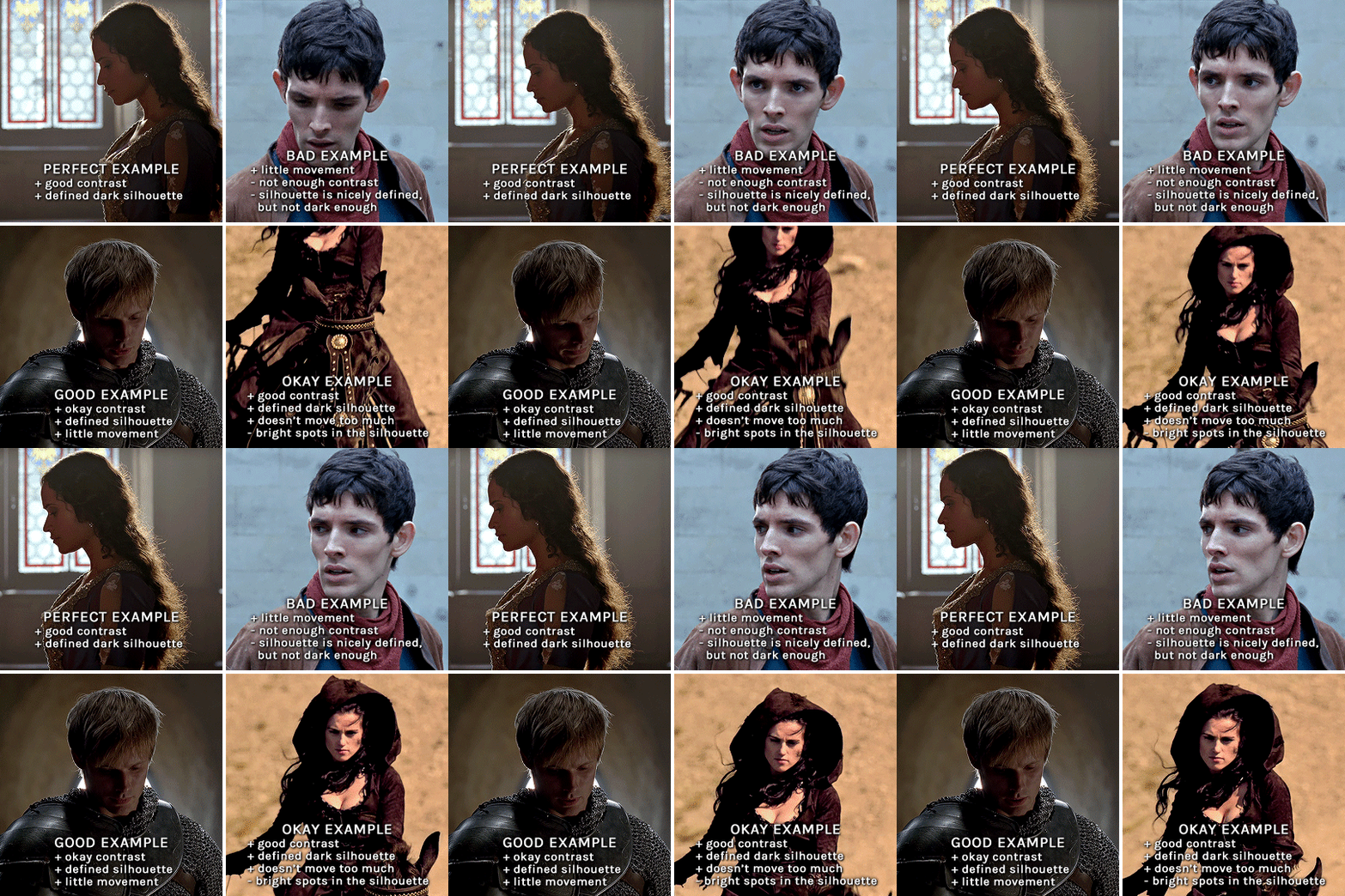
gwen: perfect example since this shot is already quite contrasted with a defined silhouette. there won't be a lot of work needed to make this one work.
merlin: not a great example because even tho there's a somewhat good contrast between him and the background, the silhouette is just too bright, not dark enough.
arthur: another good example, even if there are some bright spots on his face and armor. since he's not moving too much, you can definitely brush some black over him to make his silhouette darker (i'll explain/show later)
morgana: this one could work because the contrast is great, but of course her skintone is very bright against the black clothing. that being said, since the movement is not too bad, it could be possible to brush some black over her and move these layers with keyframes (as mentioned for arthur's example). i haven't tried it tho, but i think it would work well enough.
once you have your silhouette shot, you need another gif for the double exposure. what works best, in my opinion, are:
wide, large shots
shots with no to little camera movement (no pan, zoom, etc), but the subjects in the shot can have little movement of course
pretty cinematography/scenery shots
i find these are easier to find and make it work, it's not as "precise" as with silhouette shots. it's mostly just trial and error to see what works best with the silhouettes.
II. PREPPING THE SILHOUETTE
for the effect to work, we want a silhouette that's dark as possible. i'm gonna use the gwen and arthur shots as examples.
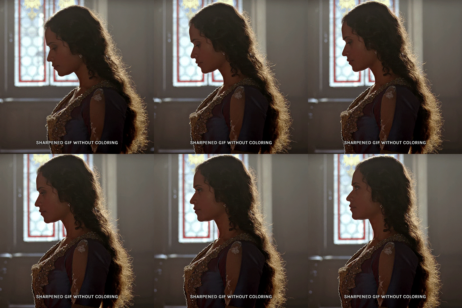
for the gwen gif, i started by sharpening, and then upped the contrast by quite a lot so her silhouette is mostly black, while retaining some nice details. i've used only 3 layers here:

selective color layer: in the blacks tab, playing with the black slider (value: +10)
brightness/contrast layer: added a lot of contrast (+61) and a bit of brightness (+10)
black and white layer: on top, its blending mode set to soft light and at 20% opacity. gives a bit more depth and contrast

then for the arthur example, i've also sharpened it first, and added contrast layers in this order (the skintone looks horrible, but it won't matter soon lol):
levels layer: black slider at 0, grey slider at 0.76, white slider at 104
selective color layer: in the blacks tab, black slider at +10
brightness/contrast layer: brightness at +1-, contrast at +47
black and white layer: on top, its blending mode set to soft light and at 20% opacity. gives a bit more depth and contrast
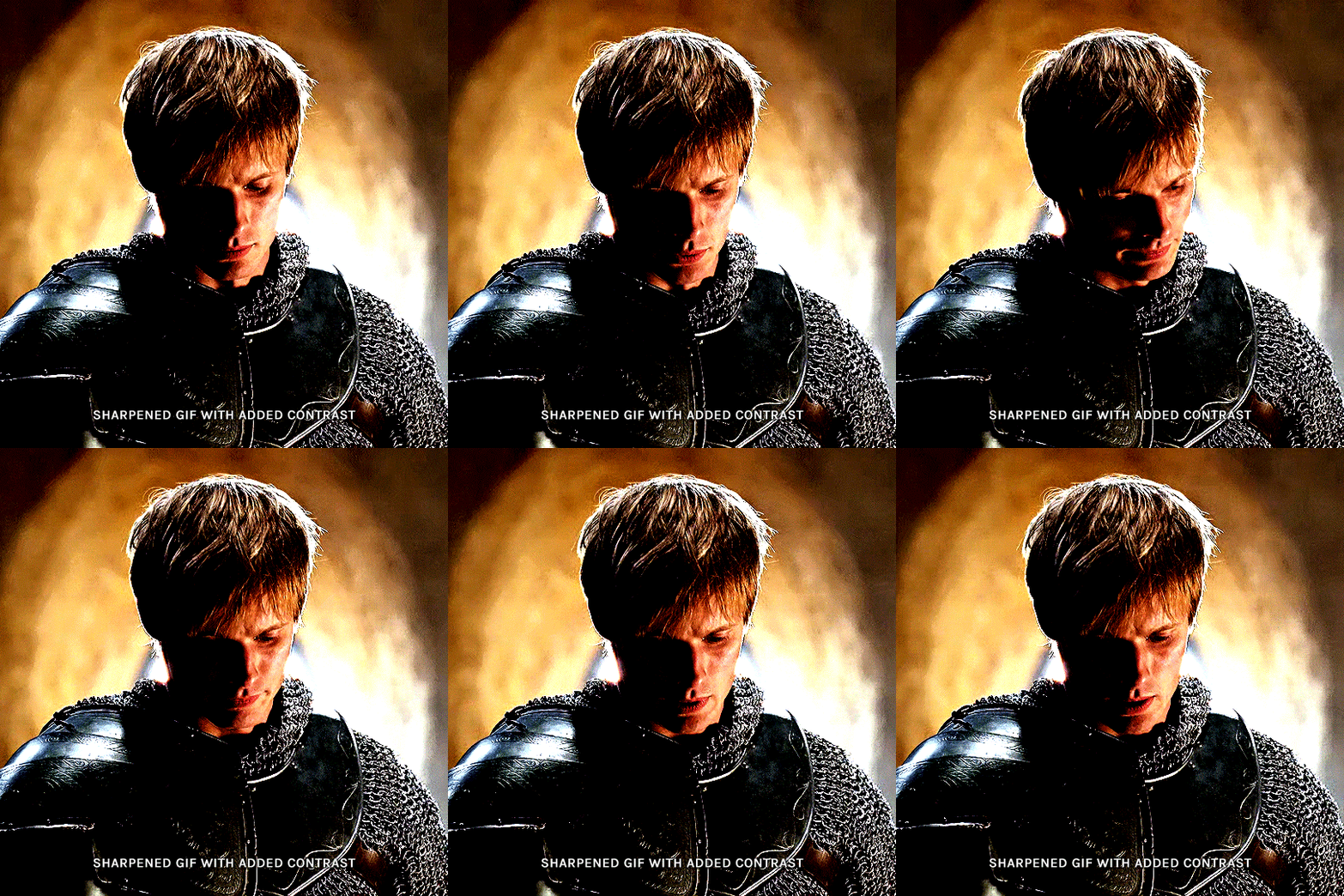
as you can see, half of his face is still quite bright. to correct that, create a new empty layer and put it between the gif and the coloring layers.
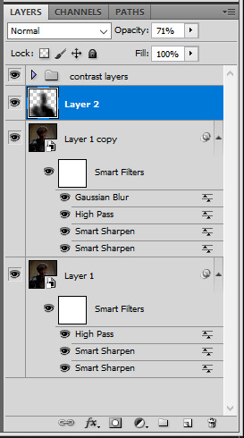
using a really soft brush and the black color, brush some black over his face and body on that new empty layer. you can edit the layer's opacity if you want, i've set mine to 71%. since arthur doesn't move much here, there's no need to keyframe this layer's position. for the morgana example, this is where you'd need to play with keyframes to make it work. here's where i'm at now after this:
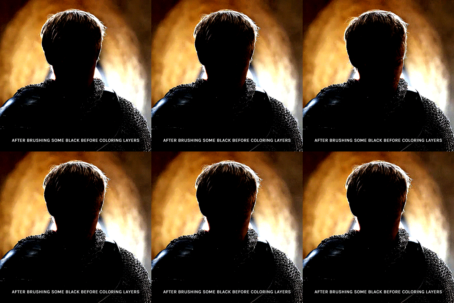
you can always edit this layer later if you need, after doing the double exposure blending.
once the silhouette is all ready, you can put all layers in a group and rename it (i've renamed mine silhouette).
III. BLENDING
now the fun part! import the wide/scenery shot in photoshop, then resize it to the same height of your silhouette gif. make sure the gif is a smart object layer, and sharpen it. finally, bring this gif onto the silhouette canvas (by right clicking the smart object > duplicate layer). once you have both gifs onto your canvas, put the wide shot gif layer in a group, and set this group's blending option to screen.

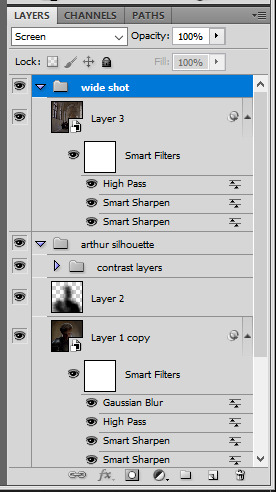
you can then position the wide/scenery gif the way you like it in the canvas. this is how it looks for both examples after i've done that:

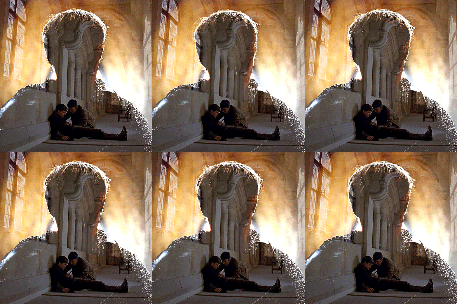
if the blending mode screen doesn't give you the best result, so you can play around with other blending modes (such as lighten and linear dodge in these particular cases), but generally speaking, screen is the real mvp here haha.
IV. COLORING
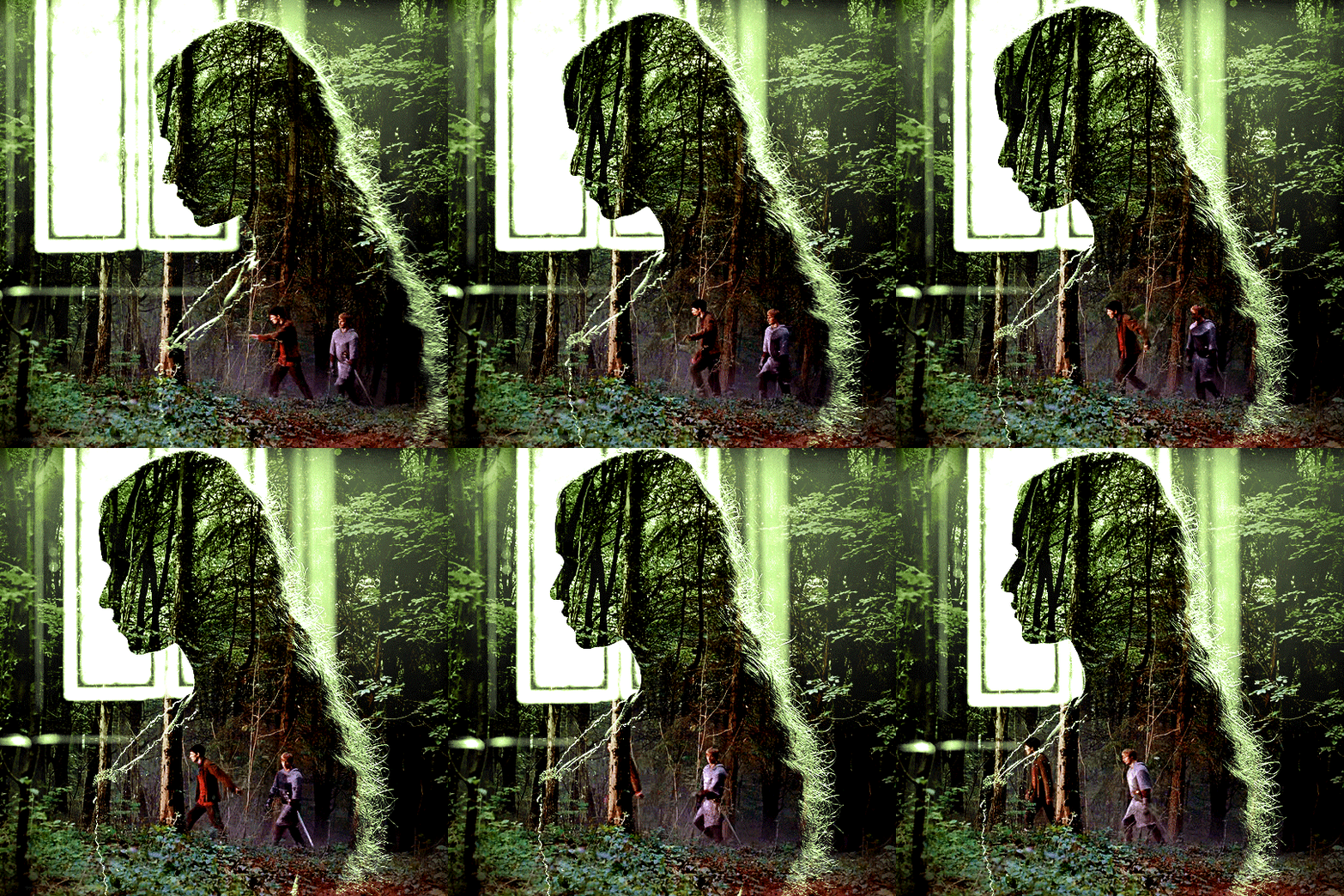
now that the double exposure effect is done, we need to color the gifs to bring them together. i went with simple coloring here, simply enhancing the colors that were already there. just make sure that the coloring layers for each gif are in their respective groups. here's how i've colored both examples:
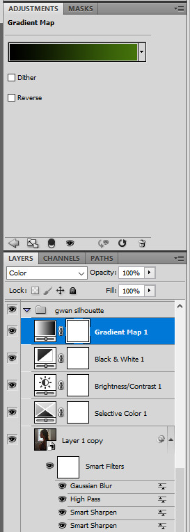
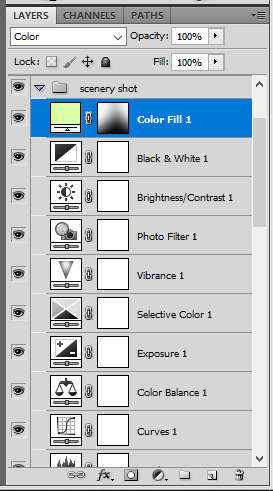
gwen silhouette group: i added a gradient map layer on top of the contrast layers in black to green and set the blending mode to color
scenery shot group: multiple coloring layers, with a green color fill layer (blending mode set to color), with a layer mask so it only affects the top half of the gif
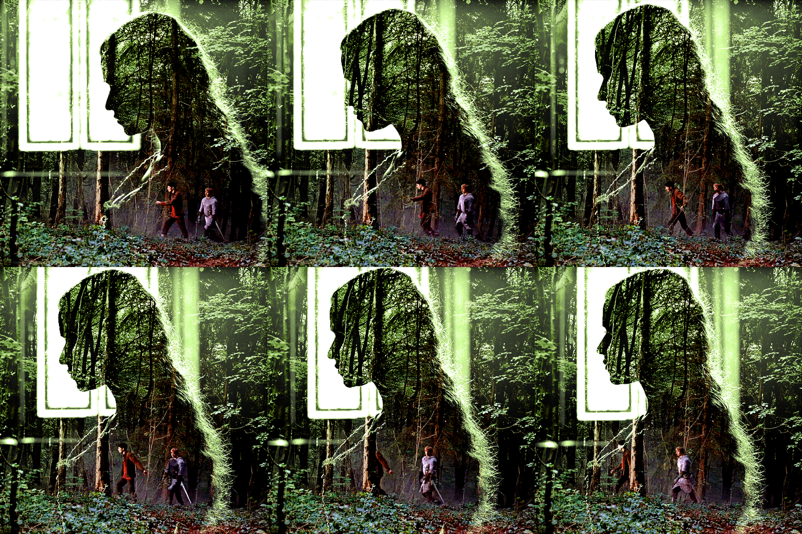
for the arthur gif, i did something very similar but with warmer colors. i didn't use a gradient map for arthur though:
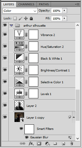
arthur silhouette group: i made the yellow warmer, closer to orange/red, with a hue/saturation layer, and added more vibrance. didn't feel like it needed a gradient map layer here though.
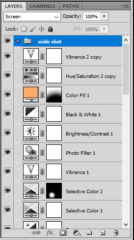
wide shot group: basic coloring layers to enhance colors from the merlin & daegal shot, and an orange color fill layer set to the color blending mode.
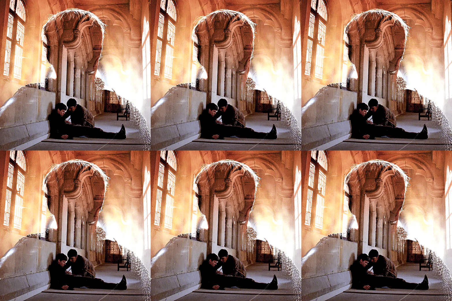
at this point you're pretty much done. just need to add some final touches and typography (if you want).
V. FINAL TOUCHES
a small and completely optional detail, but i wanted to soften the edges of the wide gifs. to do so i've duplicated the smart object gif layer and removed the sharpening filters (right click on smart filter > clear smart filters). put this layer on top of the other smart object layers (but still below the coloring).
then with this same layer still selected, go to filter > blur > gaussian blur... > 10px. this will give you a very blurry gif, but we only want the edges of the canvas to be softer. so add a layer mask to this layer. with a very large and soft brush (mine was at 0% hardness and about 800px size), brush some black onto the layer mask to remove the blur in the middle of the gif.

you can play with this layer's opacity or gaussian blur amount if you want (by double clicking on the gaussian blur smart layer filter). here how both examples look with this gaussian blur layer:

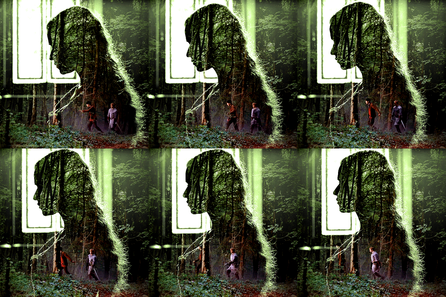
you can also mask some of wide/scenery gifs if you'd prefer, so it shows less outside of the silhouette. just put a layer mask on that whole wide shot group and brush some black or grey on the layer mask. it's what i did for the gwen gif, with a very soft brush and i set the mask density to 72% (i kept the arthur one as is tho):

and that's how i did it! hopefully that was clear enough :)
#alie replies#*ps help#resource#tutorial#allresources#*gfx#usercats#usersmia#userrobin#userfaiths#usertina#usermoonchild#userchibi#uservivaldi#usertreena#userraffa#userriel#userelio#usermadita#usersmblmn
1K notes
·
View notes
Text


#dragon age#dragon age: the veilguard#lace harding#scout harding#videogamewomen#gamingedit#videogameedit#dragonageedit#datvedit#userjule#userazatas#.gfx#borat voice my wife. everyone in this game is my wife unless they're not idc#dragon age wifeguard..... have some mercy on the bisexuals (me)#does she know she's perfect and that i'm in love with her. help#anyway hi i fought for my life to get these under the file size limit TAKE EM#i also love how ferelden her outfit is. her silly little fuzzy shoulder pauldrons#none of her other outfits have the same amount of je nais se quack
123 notes
·
View notes
Text

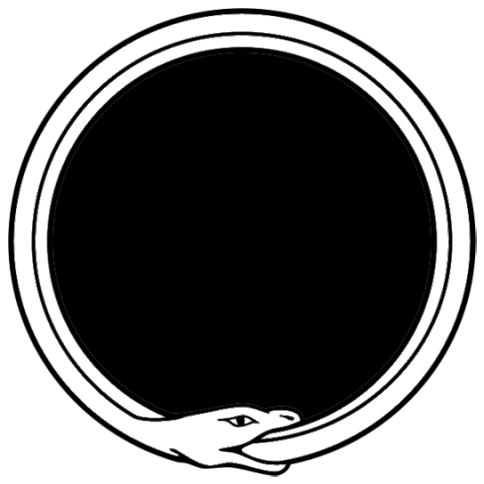


i made some masks for my touchstarved icons so here they are, free to use! no credit needed :) just like/rb pls
&&. includes: ouroboros, bats, gothic crosses, & barbed wire !

#&. antegfx#png#masks#rentry resources#frames#pfp masks#rp template#halloween gfx#gothic gfx#(i couldnt find any masks so im tagging these to help others)
106 notes
·
View notes
Note
Heya nik! could i request the typography for this anidala set? (love the lightsaber in the battle couple one howww??? )
hi shale!! happy to share <3
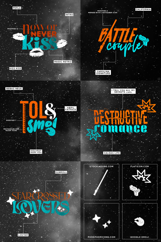
as always, links to the fonts under the cut:
perla
intro
magic retro
kiss kiss
california
carolina signature
bebas neue
abril fatface
holyfat
i tell you all my secrets
caldas life
sunroll
lostar
595 notes
·
View notes
Text
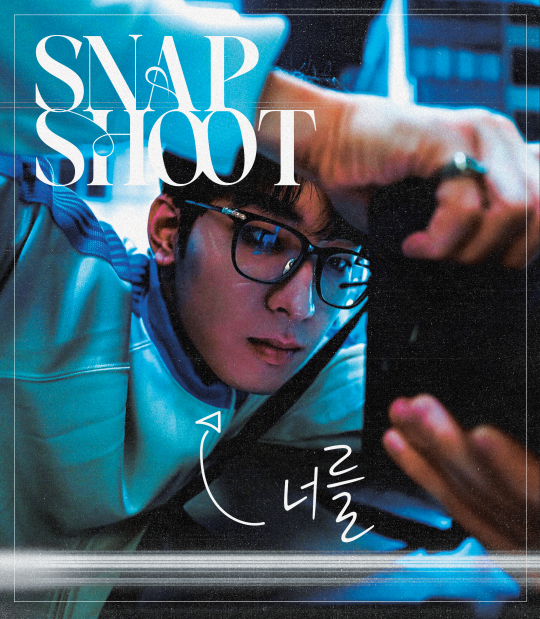
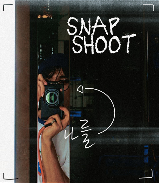
snap shoot, camera lens pointed at you
#did this at 1am#hourlywonwoo#fywonwoo#hourlydk#svt#seventeen#dk#lee dokyeom#lee seokmin#wonwoo#jeon wonwoo#*gfx#*svt#little smth fun#i feel awkward tagging people in gfx help#svtsource
282 notes
·
View notes
Text

hello everyone ! commissions are open , slots are unlimited and will not be closing any time soon or in the future , so you are free to request at any time .
my commission page is here at a new url ! please take a look and if anything interests you , you can either DM me or send in a commission form , as i occasionally miss DMs ( i don't always get notified )
if you're unable to pay right away , you're more than welcome to sign up for my waitlist and reserve a slot for a later date ! to do so , simply send in an ask ! there are no limits , there is no deadline , and you are free to return and submit your commission , or even withdraw it .
you can take a look at all my resources here & here and view all my completed commissions here !

GUIDELINES —
payment MUST come after as i take quite a bit of time due to my hectic irl schedule
prices are in USD
graphics can be entirely unique or you can ask for an already pre - made one and i can customize it to your needs
you're allowed to check in and even direct me if you have specifics in mind, such as size, color, images, etc. if you'd like me to have free range, that is also an option.
do not replicate or redistribute your commission
payment is through cashapp, kofi or paypal. if using paypal, i kindly request you ignore my deadname.
if the tag has no content, do feel free to look at the archived blog in the respective tags listed in the pinned post
you can dm me / send in a form !

payment methods —
cashapp: $yangtbh
paypal & kofi: junkerbeats

40 notes
·
View notes
Text
sometimes I wish I were maybe 2% less neurotic about planning some things
#i may or may not have gotten the smallest push to do a thing 👀#except at that time i was 2 weeks out of surgery and lol No.#however now as i clean up those notes and docs#i am thinking how nice it'd be to start asking around to see if anyone else wants to help#except#Except☝️#i have only finished 90% of the setup#and internally i am like 'oh no this is a mess i should tidy it up first'#i literally have all email communications already drafted all info docs 97% done the schedule worked out and even several gfx done#all of which i had finished... p much 3 weeks ago#except there are like 2 things i havent done and im like ''well i cant ask around yet nothing is ready''#brain u are so dumb#.......i will make an actual post on this but basically: multi fandom postcard exchange for thai dramas#will need some extra mods to help keep things smooth tho 🥺#will make an actual post on this but like this if u wanna be tagged when i do?#*sorry not like- reply so i dont spam anyone just generally interested 😂#or just DM idk
10 notes
·
View notes
Text

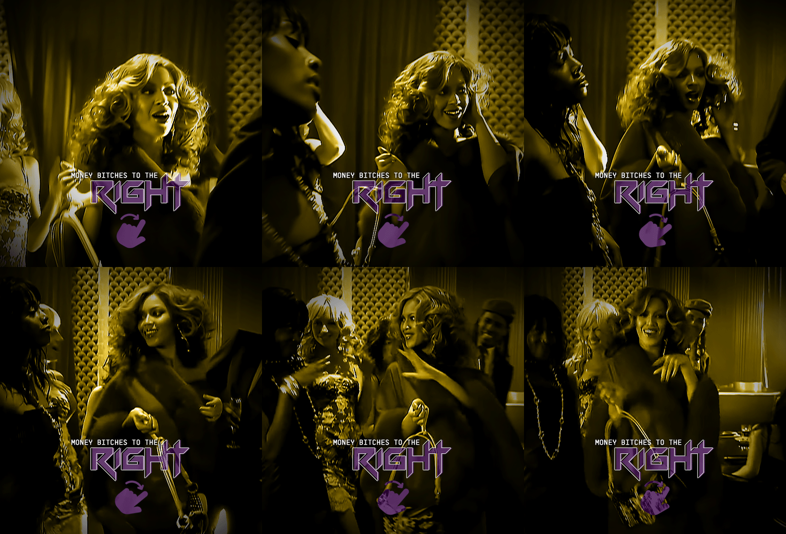

RENAISSANCE 1-YEAR COUNTDOWN act i, track xv: PURE/HONEY
#beyonceedit#usermusic#femaledaily#pscentral#ganjacat#usercee#userwocs#userraffa#tusermimi#dailywomen#dailymusicqueens#flawlessbeautyqueens#renaissance1yr*#beyoncé#*#gif*#gfx*#one more after this and i will finally be free#although ngl making all of these was so much fun#it helped me step out my comfort zone and be more creative which i like
82 notes
·
View notes
Text
am having a tannieful christmas nevertheless 🥰
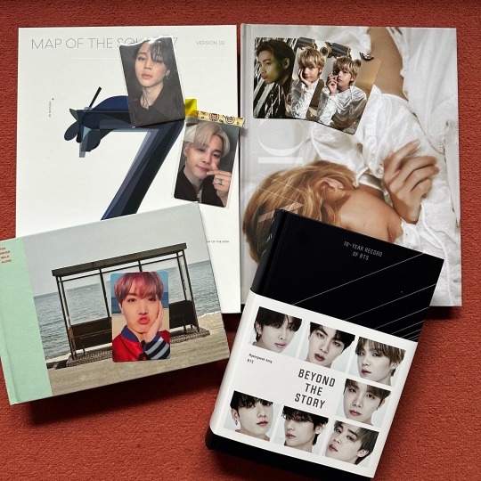
#okay I bought the Vicon and jimin lights pc for myself lmao but STILL#I even wrapped them up it was treat yourself time#so thankful that my family supports my interests#my brother tried super hard to get another jimin pc for me and even asked his colleagues to help 😭#but they were unsuccessful unfortunately#he wrote me an ‘emotional support letter’ instead 😔🤍#the hobi pc comes in the pool for the Christmas Gift Giving!!! 🥰#also absolutely screaming at dicon using the same font in their tae book as I used in an unfinished rainy days gfx lol
18 notes
·
View notes
Note
What's with the sorry dreamy
We all love your work and I especially love it when you spam
I mean life's boring nowadays and you make my day have some meaning
Even when you're not on I scroll your Tumblr page to see if there was something I missed
that is so SWEET of you omgggggg i will use this as motivation to be on more i promiseee
i think interaction is like the biggest motivator to create and be online and i've been such a ghost that ppl probably think i wanna be left alone lmao but i think its that i used to actually get on and engage with ppl like every day and when that died a bit i started to get more easily distracted with other hobbies. but its winter and freezing so why not be online more lmaoo
#drm.ask#onlychristopherbang#i cant help my sorry's i am an apologizer absjnf#maybe i gotta do a gif challenge or make some gfx#get my creative juices flowing again asfngd
9 notes
·
View notes
Text
anyone know how and what to use for watermarking videos?
2 notes
·
View notes
Text


concerned bird....
36 notes
·
View notes
Note
hi can i ask you how you did the typography effect in this edit? it's so cool! post/713510625377189888/happy-birthday-to-the-king-of-tv-pedro-pascal-2
hi! thank you! here's a (hopefully) quick tutorial for this animated text effect under the cut:
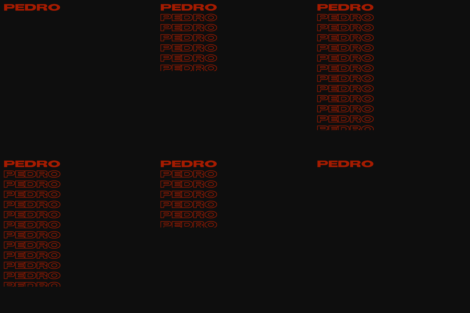
(btw I'm using timeline and keyframes, but this could easily be done frame by frame)
STEP 1: Arrange all your text
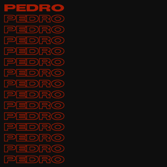
here's another ask I answered on usergif for how to turn any font into its outline which is what I did here!
STEP 2: Put all the outlined text (or whatever text you want to disappear and reappear) in a group by selecting all the layers and using the shortcut Command+G
STEP 3: Put a layer mask on the group and use the rectangular marquee tool to make a box over the text you want to disappear:
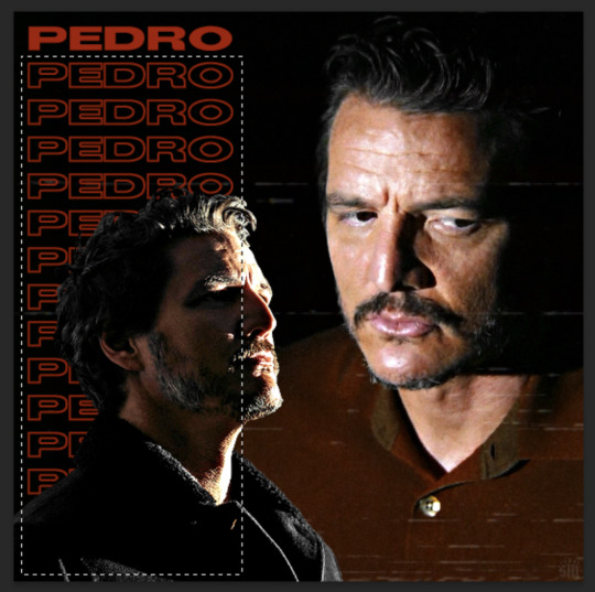
use the paint bucket tool to fill that area on the layer mask with black:

the outlined text should be hidden now
p.s. be sure to UNLINK the layer mask so you can move it with the keyframes (click the chain so it disappears):
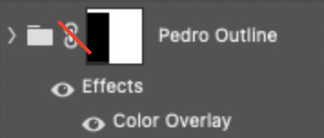
STEP 4: put down 4 keyframes on the "layer mask position" line
(1) text group isn't visible (2) text appears (3) text still visible (4) text disappears:

I placed my keyframes with some buffer space at the beginning and end so the animation wouldn't start right away:
if you're wondering, you need the 3rd keyframe so the text doesn't start disappearing at keyframe 2
STEP 5: select keyframe 2 (it'll be yellow) and move the playhead (red vertical line) over that spot. select your layer mask and move it down until your text is revealed


STEP 6: right-click keyframe 2 and select copy. then select keyframe 3, right-click it, and select paste. keyframe 3 should now have the same layer mask position as 2!

STEP 7: double-check that keyframe 4 has the same position as keyframe 1 (if something went wonky, just copy-paste 1's position onto 4)

and that's it! hope this helps :)

188 notes
·
View notes
