#game typography challenge
Explore tagged Tumblr posts
Visit Tumblr Blog
Explore Tumblr blogs with no restrictions, modern design and the best experience.
Last Seen Tumblr Blogs


Fun Fact
Mobile US users spent an average of 115.8 minutes on Tumblr app monthly.
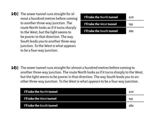
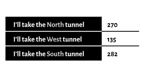
Text
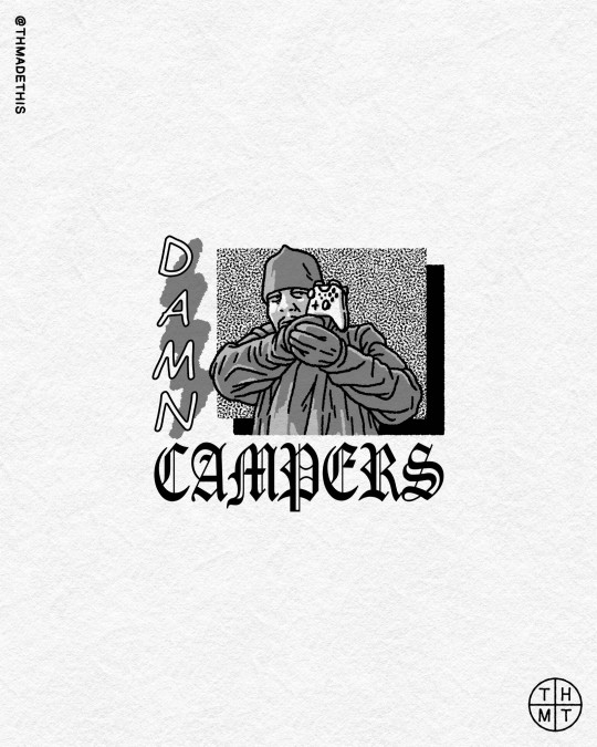
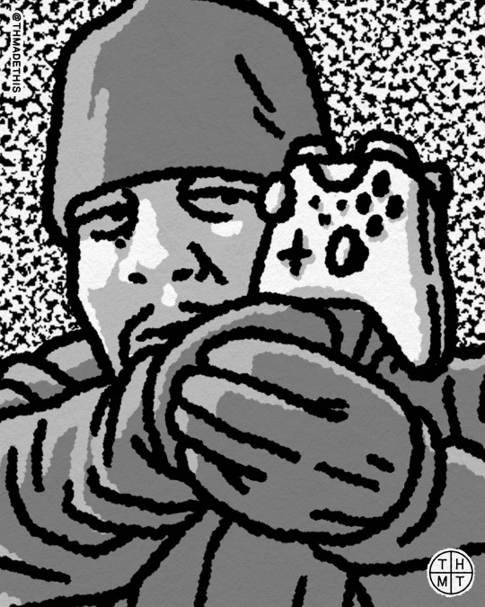
22. Camp
.
He leveled up...
#inktober#inktober 2024#inktober 2024 camp#camp#camper#daily drawing#drawing challenge#illustration ink#digital ink#ice t#rapper#law & order svu#gaming#fps#typography
1 note
·
View note
Text

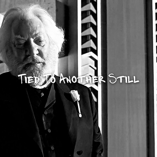
@lgbtqcreators challenge: typography + black & white -> The Hunger Games + "Welcome to the Circus" by Victoria Carbol
#userlgbtq#the hunger games#thg#thgedit#gifhungergames#usergif#filmtvtoday#usertvfilm#cinemapix#cinematv#lyricsongifs#usermaguire#tuserheidi#userahne#tusermira#usergoose#useradds#userrat#echogifs#eyestrain
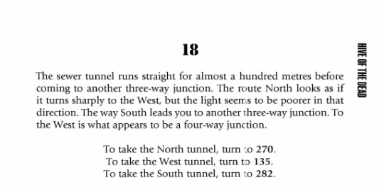
242 notes
·
View notes
Text

Mock Book Cover 10: 'Frankenstien' by Mary Shelley
This book cover design was all about making it feel spooky. I also wanted to have some fun with typography, since it's not what I usually do. I wanted things to feel unbalanced and put together incorrectly. 'Frankenstien-ed' if you will.
The Challenge: Create a book cover in as little time as possible (don't look at me like that I have work and, shockingly, a full roster of commissions. Name of the game is fast or not at all). I am not allowed to make new art or illustrations for the covers, it must all be either old art I've made repurposed, or stock images. I have to make them on Photoshop, using only my trackpad (because I don't want to dig up my mouse from wherever it's hiding). And yes, the weird digital layer is on purpose in hopes of dissuading scrapping. Part 2 is to try to actually edit them into videos for TikTok, wish me luck!
I am the artist! Do not post without permission & credit! Thank you! Come visit me over on: instagram, tiktok or check out my coloring book available now \ („• ֊ •„) /
https://linktr.ee/ellen.artistic
#frankenstein#mary shelley#mockup book cover#book cover#book design#ellenart#ellen artistic#i want to make book covers#cover design
33 notes
·
View notes
Text
I put the simlish audio of the EA Games logo that plays before sims start playing Bustin' Out & SimCity 4 Rush Hour over top of the original quality version of the logo video that came with the base game prior to 2005
the "simlish" version of the logo visuals is that they blurred out "Challenge Everything" but I didn't do that lol
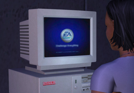
what would be even cooler is if "Challenge Everything" was in simlish, and also the trademark stuff at the bottom which seems to already be so blurry to begin with that they didn't bother blurring it - but I've never done kinetic typography or whatever you call it
25 notes
·
View notes
Text

Kingdom Hearts Missing-Link is missing
We are looking for Kingdom Hearts Missing-Link, as of today it is only 2 years, 4 months and 13 days old, if you find it or know anything about it, please call 20-2022-04-10. (If you found this poster on another day, it is possible that the age of Missing-Link has changed or has already been found, for that, check… As if…)
Deco for your sims home! Don't judge me, @lea-heartscxiv challenged me and I couldn't not do it. Hopefully at TGS they will say something, buuuut until further notice it's still missing. Use of Comic Sans typography in English and Spanish is premeditated, suffer as you suffered in the world of Agrabah! (if you weren't one of them; like me and Lea; Congratulations! then seeing this image won't be the worst thing that happens to you).
❤️ 3 swatches (Simlish, English and Spanish) ❤️ Base game compatible ❤️ writted in Comic Sans! and Simlish Typewriter by ajaysims ❤️ All Maps (Diffuse, Normal and Specular) ❤️ Category: Buy Mode > Decoration > Paintings&Posters. Price: 0 【English Name: Kingdom Hearts Missing-Link is missing | Spanish Name: Kingdom Hearts Missing-Link está desaparecido】 Contain a description in English and Spanish, personalized by me and Lea (@lea_heartscxiv) [Anyone can send me translations of text in their language so that more people can enjoy it in their own language.] ❤️ custom thumbnail ⚠️Known problem: Some people hate Comic Sans typography so they may be apprehensive about this CC with its English and Spanish swatches (/jk).
Download under keep reading ↓
If you download my CC it means your agree with my T.O.U (English/Español/日本語).
~❤️DOWNLOAD LINK❤️~
❤️PATREON or SFS❤️ (Always free, no adf|y)
☆BECOME A PATREON | TIP ME ON KO-FI☆

Let me know if you find any problem. 🙏❣️ Actually I don't care if it has 0 downloads but we will put it in the museum we have of Kingdon Hearts inside the game until is no longer missing. Tho if someone download it, I hope you enjoy it a lot until game its finally released! Call me crazy but what if... October, 4th, 2024 (2024-10-04)
Happy simming! 🍀💛
🛹 You can find me on Patreon | Twitter | Instagram | Pinterest | Ko-Fi | My F.A.Q. 🛹
#ts4 cc#sims4cc#ts4cc#sims 4 cc#type: buy mode#type: decoration#type: poster#theme: videogame#game pack: base compatible#Kingdom Hearts x The Sims 4#Missing-Link#VanS4CC#Van-YangYin#always free cc#manifesting Missing-Link release date for TGS? 🕯️
14 notes
·
View notes
Text
i beat world of goo 2 last weekend. phenomenal experience! absolutely worth the hype and my $30
i took a far-from-exhaustive set of screenshots of some standout times from my playthrough that left me in awe (all relatively spoiler free)


so i'm no video game reviewer, but i'll spill out some thoughts i have. spoiler warning from here on out!
world of goo 2 thoughts
this really doesn't need saying, because it's self-evident, but the game is gorgeous. literally oozing with completely unique and original art on every screen, including all the insane reflections and goo shapes and typography and artstyle shifts. i spent the start of every level just panning around admiring what i was looking at
on top of that, it sounds amazing. the game is about 6 hours if you go quick, but it's set to a score with a combined length of almost 2 hours. the sheer density of music in this game is breathtaking already, and the fact that it's absolutely world-class is the bonus on top
the level design is everything i expected from this team - a series of elegant, concept-driven scenarios that bounce rapidly from mechanic to mechanic without being afraid of underdeveloping any of them, in a way that feels exceptionally hand-crafted and curated. i felt so much care placed in every individual level, even if that meant there weren't so many of them
the emphasis on fluid simulation was especially cool - and i don't mean that in a "oh it's very technical and innovative and etc", as lots of programmer-y graphics-y gameplay elements tend to present themselves. the design does a really really good job at reigning in the inherent chaos of liquid physics and making it do a single, elegant thing that's exactly what you expect in every situation
the story of world of goo 2 is very windy and adventurous, but it's still cohesive! one of my worries going into this was that the story was going to lean more abstract / unresolutive, similar to past tomorrow corporation games, but for this they managed to craft a story arc that makes sense while still being fundamentally unpredictable - you can never tell what will happen next or in what direction things are going
chapter 4 was definitely a risky move! it panned out for me specifically but i can understand people not appreciating the tonal shift and/or the detective noir stuff. i thought the noir levels ran a risk of being too slow-paced relative to the other levels, but the payoff of the chapter finale really sold the whole thing for me - that was extremely cool. (i suspect they actually cut a set of levels from the chapter - ones corresponding to world of goo 6, mentioned in the finale level. now i'm just curious what it was...)
i think calling it "chapter 5" rather than "epilogue" in this game ran a risk of bad expectation setting, where people might be disappointed to see a chapter with only 4 levels, rather than a dozen and a half. i personally saw this coming so i wasn't bothered, although i felt the levels could have stepped it up challenge-wise, to feel like more fitting send-offs
i haven't hunted ocds seriously yet, but i expect to give it a spin sometime! maybe after more people upload videos of their crazy strategies. going for ocds lengthens the runtime of the game significantly - they're not trivial!
excellent sequel overall. it's great if you're going into it expecting exactly what world of goo 1 was, just with different, more 2020s ideas - it doesn't overdeliver or underdeliver compared to that.
6 notes
·
View notes
Text
What I've learned so far on Gamebooks
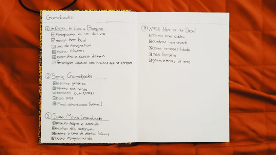
While studying gamebooks I'm taking notes on what works and what doesn't on them so I can build layout directives for future works. I'm learning a lot on what "not to do". What I've noticed so far is that most of them are visually poor: No icons, no graphics. Just text + art.
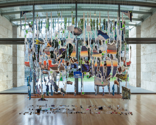
For example this entry of W40k gamebook "Hive of the Dead" (left). If I was to layout it I would propose we set a visual logic to the options, like this one (right). To show it's flexibility, I've set two options: for long entries and short entries.
I would humbly advise the author to change all the entries text to first person form. Instead of "you decide to...", we would go for "I decide to..." Imho it makes much more sense and brings much more immersion to the whole 'you are the hero" idea of gamebooks.
Another interesting thing is the use of shades of grayto bring attention to important stuff. This doesn't raise the print prices a single cent and adds more aesthetic depth to the typography. The shades of gray on details would bring more depth to the illustrations as well.
If I had to list what good game design practices on gamebooks it would go like this
"checkpoints" on a few entries (and permadeath only as a hard difficulty option)
Icons
First person form: "I decide to..."
Usage of "logic/pencil puzzles' (ex.: sudoku, cryptograms, mazes etc)
Flow chart with all the possibilities by the end of the book
Usage of stopwatch timer (as an exception) to uplevel the difficulty on some challenges and bring some pressure.
Random encounters instead of certain ones (ex.: "if you roll 5 or 6 the corpse is a zombie")
More graphics (text+illustration is the bare minimum!)
Map exploration at some point
Thematic character sheet (what's the deal with all these Microsoft Word style sheets on all the books?!)
8 notes
·
View notes
Video
vimeo
TRON Lightcycle Run from GMUNK on Vimeo.
There’s a power, an elegance, and an electric intensity to the TRON Legacy franchise. The narrative of the TRON world itself integrates the tactile human experience with another realm where data, design, stunning architecture, and mood combine for a thrilling ride through a digital plane. There’s a personal connection Munky has to the franchise. He spent a year designing the holographic world of the film, contributed to high-level concepts for the video game, and now the key visual and live-action campaign for the Lightcycle Run attraction at Magic Kingdom.
What was exciting for him is to be there along the whole collaborative and evolutionary arc of the TRON world. A new favorite agency Disney Yellow Shoes wrote a very cool script focused on typography and pacing, and brought Munkowitz into the fold to apply his aesthetic to the entire package. This point in the journey, particularly, really got him excited because it was truly the most cathartic and fully fleshed out manifestation of the story at immense scale and physicality; the characters, the environment, and the concept in an immersive experience that culminated in a total thrill ride.
To see the ride at scale and to strategize how to capture it was a fresh challenge. Combining that with the primary focus of telling the human story behind the experience, achieved through the same lens and focus on the stylistic flair of the existing franchise was an absolute treat to work on.
Credit List
Yellow Shoes Creative Group
Creative Director: Monse Valera Art Directors: Connor King, Jesus Diaz Writer: Frankie Ainsworth Producer: Wes Lagattolla Production Editor: Dan Avola Account Managers: Bridget Fitzgibbons, Ashley Lollar Project Managers: Meghan Brown, Megan Reilly Brand Planning: Jessica Rudis, Emily Zimmer Yellow Shoes Leadership: Helen Pak, Sally Conner, Amy Foster, Jim Real, Toby Myers, Brian Mountain, Cory Stone
Production
Director: GMUNK Production Company: JOJX Director Of Photography: Karina Silva Line Producer: Jason Haymond 1st AD: Bernie Casser Second Unit Camera: Scott Jones
Lifestyle Photography: Ben Christensen Additional Photography: Kent Phillips, Steven Diaz, Abigail Nielson
Park Production Support: Wup Fleming, Boxhouse Productions Park Operations: Gus Castellanos, Taylor Langlas
Post Production
Editorial: Union Lead Editor: Jim Haygood Assistant Editors: Brian Leong, Daniel Luna Producer: Joe Ross
Post-Production: JAMM Visual Executive Producer: Asher Edwards Senior Producer: Ashley Greyson Motion Designers: Toros Kose, Peter Hergert Flame Lead: Alex Snookes Flame Artist: Patrick Munoz CG Artist: Patrick Manning Colorist: Adam Scott Color Assist: Carver Moore Production Coordinator: Jon Lazar
Music: Da House Composer: Lucas Mayer
Sound Design & Mix: Skywalker Sound Lead Sound Design & Mixer: Tim Nielson Sound Editor: Andre Zweers Mix Technician: Kristina Morss
2 notes
·
View notes
Text
Post Modernism

My group mate and I decided to design an ad for Nintendo using retro game styles while also combining some pop art influence. I learned that combining styles like this and gathering influenced styles to create this modern look. I think we could've done more experimentation with more time and resources available, it was an overall fun experience it was intruiging to know that there are more design styles that I can incorporate in my work in the future.

I really liked my friends' work it showcases a keen understanding and application of postmodern principles, resulting in a captivating and innovative design. Exhibiting a distinct postmodern style, evident in various aspects such as the manipulation of typography, use of perspective, and incorporation of vibrant colours. The playful experimentation with type, through unconventional spacing or sizing, reflects a departure from traditional design norms.
I am quite drawn to post-modern styles like Pastiche and Deconstruction. Making me drawn to the Craft Workshop workshop a lot more.
Deconstruction: A technique that involves breaking down traditional design elements and reconstructing them in unconventional or fragmented ways, challenging the viewer's perception of form and function.
Example of Post Modernist artist/designer is:


Sarah Sze
Sarah Sze is a contemporary artist known for her intricate and captivating installations that blur the boundaries between sculpture, architecture, and drawing. Sze's work often involves the deconstruction of everyday objects and materials, reconfiguring them into stretched-out and chaotic compositions that challenge viewers' perceptions of space and scale.
https://www.sarahsze.com/
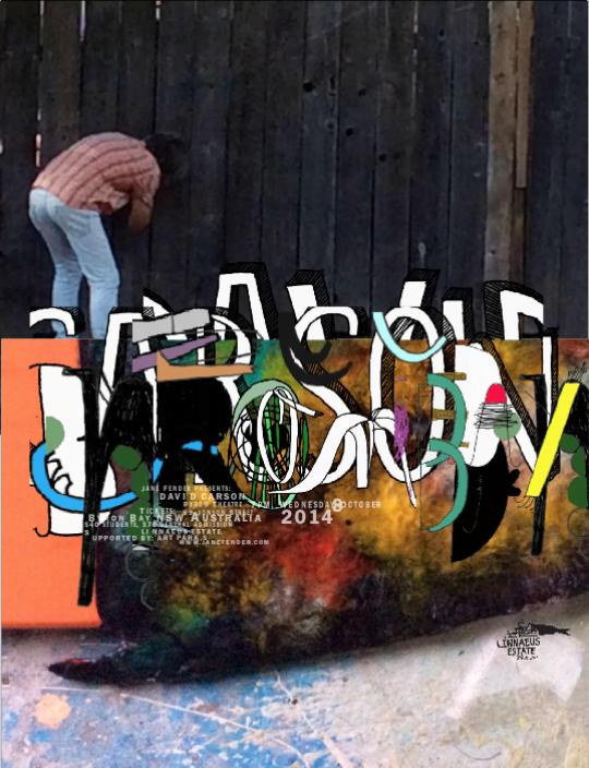
David Carson
David Carson is a graphic designer known for his experimental typography and layout designs. In the 1990s, particularly David Carson's groundbreaking layouts for magazines like Ray Gun, exemplify the postmodern embrace of chaos, fragmentation, and unconventional aesthetics.
https://www.davidcarsondesign.com/t/work/
Word Count: 279
2 notes
·
View notes
Text

“Welcome, to my personal gallery.”
Curated side-blog for FFXIV screenshots. All taken by me, SFW only. Not accepting Asks, DMs and Replies on this account.
For inquiries — main blog: @why-raven, oc blog: @etheirysnoir.
Likes and Reblogs are most welcome. Would greatly appreciate if you reblog my posts with all the literature quotes or lore notes intact.
Feel free to follow this blog, or subscribe to this tag: #xivacademia, to receive updates.

“I curate my own space as I see fit.”
Not spoiler free. To reduce unnecessary clutter, no spoiler tags will be used. Latest patch contents will still follow the general community guideline of a two-week embargo before going live.
All my screenshots are achievable with vanilla gears and emotes in game. However, note that some may contain post-processing edits, ex. filters, typography, etc.
Runs on queue. Updates will be irregular and sporadic. May post manually sometimes on a whim. Next-day reblogs are on shuffle and may not be posted in order. (Currently paused.)
“Terms and conditions apply.”
Do not repost my screenshots and claim them as yours.
Only private use (ex. personal wallpapers) is allowed. Strictly no paid or commercial usage.
Please credit me and Square Enix if you use my photos in your works.
“Where’s the taglist? See below cut.”

ffxiv ― content.
expansion // a realm reborn / heavensward / stormblood / shadowbringers / endwalker / dawntrail
raid; alliance // the shadow of mhach / return to ivalice / yorha: dark apocalypse / myths of the realm
raid; savage // alexander / omega / eden / pandæmonium / arcadion
deep dungeon // palace of the dead / heaven-on-high / eureka orthos
seasonal // heavensturn / valentione’s day / little ladies’ day / hatching-tide / moonfire faire / the rising / all saints’ wake / starlight celebration
location // gold saucer
ffxiv ― race, class, job.
race // viera / au ra / miqo’te / lalafell / elezen / hyur
tank // paladin / warrior / dark knight / gunbreaker
healer // white mage / scholar / astrologian / sage
melee // monk / dragoon / ninja / samurai / reaper
ranged // bard / machinist / dancer
caster // black mage / summoner / red mage / blue mage
hand // carpenter / blacksmith / armorer / goldsmith / leatherworker / weaver / alchemist / culinarian
land // botanist / miner / fisher
community ― prompt, challenge.
race // febhyurary / miqomarch / vierapril / aurapril / lalapril / mayqote / junelezen / vieraugust / auraugust / elftober / hrothober / roevember
general // glamtober / musember
content ― other.
sqex // ffvii / ffviii / ffxii / ffxv / ffxvi / ff tactics / nier automata
cosplay // dc comics / frieren / nasuverse / oshi no ko / rwby / takt op.
misc // monochrome / comics / gifs / academia quotes / masterlist
“Give credit where credit is due.”
“etheiryscape” by isorawrites (@why-raven).
All screenshots and edits by me unless otherwise stated.
Do not claim or repost any part of this blog as your own.
I do not consent to have my screenshots fed to AI.
Please give proper credit to the rightful owners.
Final Fantasy XIV © Square Enix. All Rights Reserved.
All other fandoms belong to their respective copyright holders.
Divider: Neutral Lines by firefly-graphics.
Warning Banner: No AI by vase-of-lilies.
For full disclaimers, please check via the desktop version here.
3 notes
·
View notes
Text
Run The Damn Ball T-Shirt
Introducing the Run The Damn Ball Shirt – a powerful and straightforward fashion statement that encapsulates the essence of determination and perseverance in the world of sports and beyond. This shirt is designed for individuals who believe in the fundamental principle of pushing forward, no matter the obstacles.
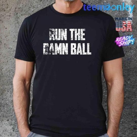
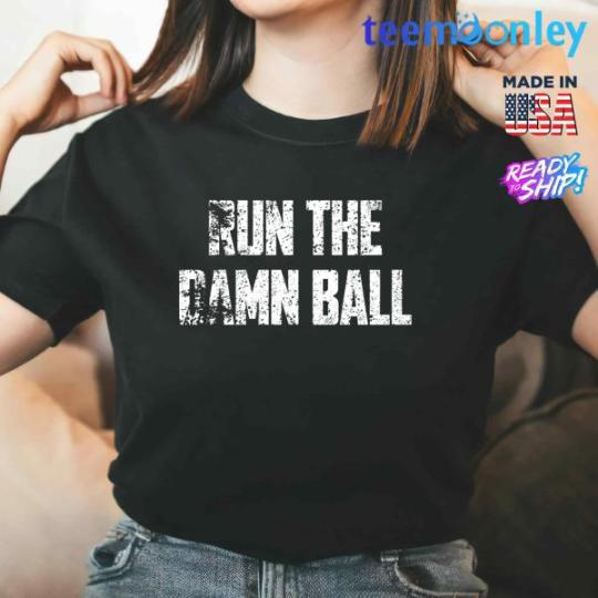
Crafted with high-quality materials, the Run The Damn Ball Shirt offers both comfort and durability, making it perfect for intense workouts, game days, or everyday wear. Its bold typography and minimalist design convey a resounding message that needs no further explanation. The phrase "Run The Damn Ball" is a call to action, an embodiment of the relentless pursuit of goals and objectives, whether on the field, in the gym, or in life. It's a reminder to stay focused, stay determined, and keep moving forward, no matter the challenges that may arise.
Wear this shirt as a badge of determination and as a motivator to yourself and others to stay committed to their pursuits. Whether you're an athlete or simply someone striving for excellence, the Run The Damn Ball Shirt is a powerful symbol of unwavering resolve.
Please see the size chart carefully when placing the order. We also have shirts in a variety of different colors please message us with the color number in our color image to pick your favorite color
View more: Teemoonley.com
1 note
·
View note
Text
Why a Great UI/UX Designing Company Can Transform Your Digital Business?
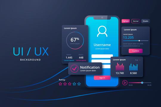
In moment's digital-first world, where druggies are swamped with websites, apps, and platforms, the periphery between success and abandonment frequently lies in the details of design. That’s where a UI/ UX designing company become not just a mate but a strategic necessity. Whether you’re a incipiency with an innovative app idea or a large enterprise revamping your web presence, user experience and affiliate design define how your followership interacts with your product. But what exactly do we mean by UI/ UX? And why does working with a technical company matter so important? Let’s dive deep into what makes UI/ UX design a game- changer for your digital presence — and how the right company can elevate your brand from functional to indelible.
What are UI/ UX Design? Though frequently used interchangeably, UI( user Interface) and UX( user Experience) are distinct yet reciprocal factors of digital design. UX Design is each about the user trip — how intuitive, pleasurable, and flawless it feels when someone interacts with your website or operation. UI Design focuses on the visual and interactive rudiments — buttons, typography, color schemes, layouts, and other graphical factors. Think of UX as the shell and inflow of a structure, and UI as the makeup, cabinetwork, and institutions that make it charming and usable. When both are done right, the result is a digital experience that’s not just seductive but amicable, engaging, and conversion- driven.
Why Businesses Can’t Go to Ignore UI/ UX? Ultra modern druggies anticipate further than functionality — they want delight. A slow- leading website, confusing navigation, or cluttered interface can incontinently drive people down, no matter how good your product or service is.
Why businesses — big or small — should invest in expert UI/ UX design First prints Matter Studies show druggies take lower than 0.1 seconds to form an opinion about your website. Increased transformations Well- optimized UI/ UX can ameliorate conversion rates by over to 200 or further. Reduced Development Costs Fixing design issues beforehand in the process save time and plutocrat latterly. Brand fidelity Good UX builds trust and retention, encouraging druggies to return and recommend. This is why hiring a professional UI/ UX designing company makes sense — it brings strategy, creativity, and exploration together to insure your product meets both user prospects and business pretensions.
What Does a UI/ UX Designing Company Actually Do? Hiring a UI/ UX company is much further than getting enough illustrations. Then a breakdown of the services you should anticipate from a competent establishment
1. user Research & Persona Building Understanding who your druggies are, their actions, challenges, and pretensions is the foundation of UX. Contrivers will use interviews, checks, heat maps, and data analytics to draft accurate user personas and trip charts.
2. Wire framing & Prototyping A wire frame is the blueprint of your digital product, laying out structure and functionality without visual distractions. Prototypes also pretend user commerce for testing and feedback before development.
3. UI Design & Branding Alignment this is where the look and feel comes into play — colors, typography, iconography, and robustness. A top UI/ UX designing company ensure that every element matches your brand identity and user prospects.
4. Usability Testing once mock ups are ready, usability testing helps validate designs by observing real druggies as they interact with the prototype. This step helps identify pain points, confusion, and drop- off pitfalls.
5. Development Hand off The final UI design is handed off to frontal- end inventors with exact specifications, means, and style attendants. The collaboration ensures that the final product matches the original design intent.
Choosing the Right UI/ UX Designing Company The global design request is crowded. So how do you pick a UI/ UX designing company that’s right for your business? Then are crucial factors to consider
Portfolio & Case Studies check whether the company has worked with businesses analogous to yours. Look for variety, creativity, and measurable issues (increased transformations, reduced brio rate, etc.).
User- Centric Approach Design isn’t just about aesthetics. The stylish companies invest time in understanding your druggies, their psychology, and real- world operation scripts.
Cross-Platform moxie whether it’s mobile apps, websites, SaaS dashboards, ore-commerce platforms versatility is a plus.
Collaboration & Communication indeed if you are going faceless or asynchronous, having a structured design process and clear attestation is vital.
Post-Launch Support Design is an ongoing process. Choose a company that offers support, replication, and optimization grounded on user feedback.
Diligence That Benefit From Expert UI/ UX While all businesses profit from better design then are a many that especially need high- position UI/ UX Mobile App Startups – contending for user attention in a crowded app store. E-commerce – Optimizing checkout flows, product discovery, and mobile responsiveness. Fin Tech – Balancing security, trust, and usability for fiscal platforms. Healthcare – Designing HIPAA- biddable, accessible, and case-friendly apps. Ed Tech – Making literacy engaging through intuitive UX for scholars and preceptors likewise. A seasoned UI/ UX designing company understand how to conform the design strategy to each of these sectors.
Trends to Watch in UI/ UX Design (2025 and Beyond) the design geography is evolving fleetly. Then are some trends shaping the unborn AI- Driven Interfaces – Bodying UX grounded on user design patterns. Dark Mode far and wide – Enhancing readability and reducing eye strain. Voice UI (VUI) – Integration of voice navigation in apps and bias. Micro interactions – Small robustness that make relations more pleasurable. Accessible Design – Making products usable by people with disabilities (WCAG compliance). A forward- allowing design company won’t just follow trends — they’ll help you lead them.
A final study Design is Not a Luxury — It's a Necessity In the digital period, good design isn’t a redundant — it’s the foundation. Your website or app is frequently the first and most frequent commerce a client has with your brand. A cluttered UI or a frustrating UX doesn’t just lose a trade — it damages your character. Investing in a dependable UI/ UX designing company means erecting digital products that are beautiful, effective, and mortal- centered. It means reducing churn, adding engagement, and telling your brand story in a way that resonates. Whether you’re launching a new product or revamping an old one, don’t make design an afterthought. Make it your competitive advantage.
Conclusion The success of a digital product depends not just on what it does, but how it feels to the people who use it. That’s why partnering with a professed UI/ UX designing company is one of the smartest moves any business can make moment. From exploration to final rollout, the right design platoon doesn’t just make interfaces — they make designs that convert, delight, and last.
0 notes
Text
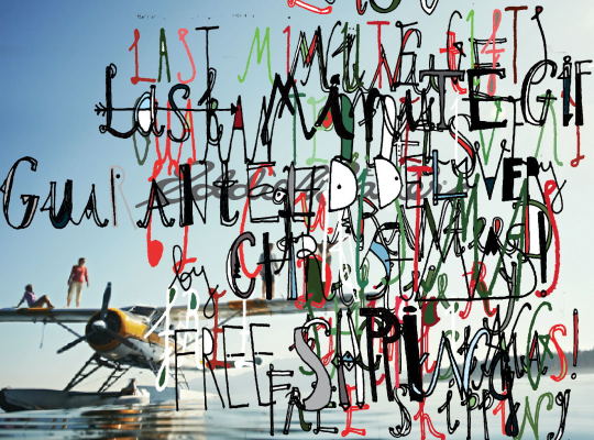
Mock Book Cover 15: 'New Moon' by Stephanie Meyer
Book two in the series, surprise surprise, features a new moon. Anyone remember that weird "cover update" the twilight books got a few years ago with the split typography? That was funny.
The Challenge: Create a book cover in as little time as possible (don't look at me like that I have work and, shockingly, a full roster of commissions. Name of the game is fast or not at all). I am not allowed to make new art or illustrations for the covers, it must all be either old art I've made repurposed, or stock images. I have to make them on Photoshop, using only my trackpad (because I don't want to dig up my mouse from wherever it's hiding). And yes, the weird digital layer is on purpose in hopes of dissuading scrapping. Part 2 is to try to actually edit them into videos for TikTok, wish me luck!
I am the artist! Do not post without permission & credit! Thank you! Come visit me over on: instagram, tiktok or check out my coloring book available now \ („• ֊ •„) /
https://linktr.ee/ellen.artistic
#new moon#stephanie meyer#mockup book cover#book cover#book design#ellenart#ellen artistic#i want to make book covers#cover design
21 notes
·
View notes
Text
Custom Pylon Signs in Philadelphia: A Cost-Effective Marketing Strategy for Local Businesses
Introduction
In the vibrant and competitive commercial landscape of Philadelphia, visibility is more than a matter of convenience—it’s a matter of survival. From bustling shopping centers to industrial parks and suburban highways, businesses of all sizes are looking for high-impact, budget-conscious ways to stand out. One solution continues to prove its worth across industries: custom pylon signs.
Often towering high above buildings, roads, and storefronts, pylon signs in Philadelphia are not just directional tools—they are powerful, long-lasting, and cost-effective marketing investments. Whether you’re a retail chain in Center City, a warehouse in the Northeast, or a hospital in University City, these freestanding signs are strategically designed to grab attention, reinforce brand identity, and guide customers to your door.
In this in-depth article, we explore how custom pylon signs are shaping local marketing strategies for B2B businesses in Philadelphia. We’ll look at design trends, cost benefits, zoning considerations, and what makes these towering signs one of the smartest marketing choices for businesses operating in Philly’s dynamic environment.
1. What Are Pylon Signs and Why Do They Matter?
Pylon signs are freestanding signs mounted on one or more poles. Designed for maximum visibility, they are typically installed near roads, highways, or large parking lots—often in front of shopping plazas, business parks, and medical campuses.
In Philadelphia, where businesses compete for visibility in densely packed corridors like Roosevelt Boulevard, Broad Street, and I-95, pylon signs act as large-scale visual beacons. Unlike building-mounted signs, pylon signs don’t require businesses to be located at street level to get noticed.
For B2B companies, this visibility can be a game-changer. Whether you're a logistics firm, a distributor, or a service provider, your physical presence gains credibility and exposure—two vital elements in client acquisition and business development.
2. Why Philadelphia Businesses Need Pylon Signs
Philadelphia's geography presents a unique challenge for marketers. With neighborhoods like South Philly, Kensington, and Manayunk offering varying degrees of density, signage must adapt to its surroundings. Here’s why pylon signs in Philadelphia are especially valuable:
High Traffic Volume: Philadelphia’s major roads and transit routes bring thousands of drivers past potential signage locations daily.
Mixed Zoning Areas: In zones where industrial, commercial, and residential units coexist, pylon signs offer visibility across diverse customer types.
Limited Storefront Exposure: Not every business has premium frontage. Pylon signs ensure that even businesses located deep within business parks or multi-tenant complexes can still be seen.
3. Customization Options That Amplify Brand Identity
Gone are the days of basic rectangular signs on metal poles. Today’s custom pylon signs offer an incredible range of design elements that reflect your brand’s personality and industry.
a. Brand Integration
Pylon signs can be designed to include your logo, color palette, typography, and taglines—ensuring brand consistency across all platforms.
b. Illumination Options
Backlit or LED-illuminated signs allow 24/7 visibility, a crucial feature in Philadelphia’s busy nightlife districts and during winter months when daylight is limited.
c. Digital Displays
More businesses are turning to digital pylon signs that allow real-time content updates. Ideal for banks, schools, or event venues, digital pylon signs can display changing messages, promotions, or directions.
d. Multi-Tenant Designs
For business parks or strip malls, multi-panel pylon signs offer a way to list several businesses on one structure, reducing individual costs while increasing collective visibility.
4. Cost-Effectiveness of Pylon Signs: Long-Term Value for B2B Companies
When evaluating marketing strategies, B2B companies must consider both upfront investment and long-term returns. While custom pylon signs do involve a higher initial cost than simple wall signage, their ROI is substantial and enduring.
a. One-Time Investment with Long-Term Exposure
Unlike digital ads or billboards with recurring fees, a pylon sign is a one-time investment that provides continual advertising for years, often lasting 10-15 years or more with proper maintenance.
b. Increased Foot and Vehicle Traffic
Businesses situated off main roads benefit greatly from directional pylon signs. These signs capture passing traffic and draw customers directly into hard-to-find locations.
c. Boosts Brand Authority
A large, well-designed pylon sign gives the impression of an established, professional business—important for B2B industries like manufacturing, logistics, and professional services.
d. Cost-Sharing Opportunities
Multi-tenant pylon signs allow landlords and tenants to share installation and maintenance costs, making them even more economical.
5. Philadelphia Zoning and Permitting Considerations
To install pylon signs in Philadelphia, businesses must navigate city zoning laws, permits, and approvals. These regulations dictate the size, placement, illumination, and height of signage.
Working with a local sign partner who understands Philadelphia’s permitting process is key. From historical district restrictions in Old City to visibility concerns along the I-76 corridor, compliance ensures your sign project isn’t delayed or denied.
Here are some common regulations to keep in mind:
Setback Requirements: Signs must be a certain distance from the street, property lines, and other structures.
Height Restrictions: Sign height often depends on location and zoning category.
Illumination Guidelines: In some zones, illuminated signs must be turned off during certain hours or meet specific brightness thresholds.
Permit Applications: All signage installations require permits from the Philadelphia Department of Licenses and Inspections (L&I).
Partnering with experienced professionals in pylon signs Philadelphia ensures that your sign is not only effective but also fully compliant.
6. B2B Case Studies: How Custom Pylon Signs Helped Philly Businesses
a. Logistics Hub in Northeast Philadelphia
A regional transportation firm located in an industrial park installed a large custom pylon sign at the park’s entrance. This not only helped truck drivers navigate to the facility but also positioned the company as a dominant player in the logistics field.
b. Medical Plaza in Roxborough
Multiple health service providers, including a dentist, dermatologist, and physical therapy clinic, shared a multi-tenant pylon sign. It provided instant recognition and convenience for patients, while offering each business a marketing boost without the high cost of individual street-facing signage.
c. Professional Services in Bala Cynwyd
A legal and financial services building used a sleek, illuminated pylon sign to elevate its visibility along City Avenue. The sign reinforced the building’s premium status and attracted higher-end tenants.
Each of these examples illustrates how custom pylon signs can enhance visibility, wayfinding, and brand credibility across various B2B sectors.
7. Trends in Custom Pylon Signs for 2025 and Beyond
As the Philadelphia business scene evolves, so do signage trends. Modern pylon signs are not just about size—they’re about functionality and adaptability.
a. Sustainable Materials
With growing emphasis on eco-friendly practices, many businesses are choosing aluminum, solar lighting, and recycled materials for their signage.
b. Smart Signage Integration
Some businesses are integrating QR codes, NFC chips, and sensors into pylon signs to bridge physical and digital marketing.
c. Architectural Fusion
Designers are increasingly blending signs into surrounding architecture. Pylon signs now come with stone bases, wood trims, and artful landscaping.
d. Modular Signage
These signs allow easy updates to tenant panels or promotional messages—ideal for co-working spaces, evolving campuses, or temporary business listings.
8. Choosing the Right Partner for Pylon Signs in Philadelphia
Not all sign companies are equipped to handle the engineering, compliance, and creative demands of a custom pylon sign. When selecting a signage partner, look for:
Local Experience: Knowledge of Philadelphia’s zoning, permitting, and visual standards.
Design Expertise: A strong portfolio of custom-designed pylon signs.
Engineering and Installation Capabilities: Full-service offerings from fabrication to foundation work.
Responsive Communication: Timely updates, clear timelines, and budget transparency.
The right pylon signs Philadelphia provider should act as a partner—one who understands your industry and translates your business needs into a durable, high-impact visual presence.
9. Enhancing Your Marketing Mix with Pylon Signage
While digital marketing gets a lot of attention, physical branding is still incredibly powerful—especially for B2B organizations with brick-and-mortar presence. Custom pylon signage can complement digital efforts by:
Reinforcing brand recognition after online engagement
Guiding prospects to your location
Providing continual brand exposure that doesn’t rely on algorithms or ad budgets
Combined with branded collateral, a strong website, and customer service, pylon signs round out a holistic, cost-effective marketing strategy.
Conclusion
In a city as competitive and diverse as Philadelphia, standing out is essential for business growth. Whether you're a corporate office, industrial supplier, medical provider, or service-based company, custom pylon signs offer a high-visibility, long-term, and cost-effective way to elevate your brand and attract customers.
By investing in pylon signs in Philadelphia, businesses not only gain a physical marker on the map—they gain a competitive edge in the minds of customers and clients. With the right design, compliance, and strategic placement, a pylon sign becomes more than just a sign—it becomes a silent salesperson working for your business 24/7.
If you're ready to make your mark in Philly, partnering with an experienced sign company that specializes in custom pylon signs is your next best move.
0 notes
Text
Top 10 Plugins for Mobile Game Developers Using Unity

Mobile game development has become one of the most lucrative and competitive sectors in the gaming industry. With millions of apps vying for attention on app stores, Unity developers need every advantage they can get to create standout mobile experiences. The right plugins can transform your development workflow, enhance performance, and add powerful features that would otherwise take months to build from scratch.
Whether you're a seasoned mobile game developer or just starting your journey in Unity, choosing the right tools can make the difference between a successful launch and a forgotten app. In this comprehensive guide, we'll explore the top 10 plugins that every Unity mobile game developer should consider integrating into their projects.
1. Unity Analytics and Unity Ads
Unity's own analytics and monetization suite deserves the top spot for mobile game development. Unity Analytics provides detailed insights into player behavior, retention rates, and revenue metrics, while Unity Ads offers seamless integration for displaying interstitial, rewarded, and banner advertisements.
What makes this plugin essential is its deep integration with Unity's ecosystem. You can track custom events, analyze player funnels, and optimize your monetization strategy without leaving the Unity editor. For mobile developers, understanding how players interact with your game is crucial for long-term success.
2. DOTween Pro
Animation is the soul of engaging mobile games, and DOTween Pro is the industry standard for Unity tweening. This powerful plugin allows developers to create smooth, performant animations with minimal code, which is particularly important for mobile platforms where performance optimization is critical.
DOTween Pro excels in mobile game development because it's lightweight yet feature-rich. You can animate UI elements, game objects, and even complex sequences with just a few lines of code. The visual editor makes it accessible to designers while providing programmers with the flexibility they need.
3. Addressable Asset System
Mobile devices have limited storage and memory, making efficient asset management crucial. Unity's Addressable Asset System revolutionizes how you handle resources in mobile game development. This plugin allows you to load and unload assets dynamically, reducing initial download sizes and memory usage.
For mobile developers, this means you can create content-rich games without worrying about storage limitations. Players can download additional levels, characters, or features as needed, improving the initial user experience and reducing abandonment rates.
4. Unity IAP (In-App Purchases)
Monetization is often the primary concern for mobile game developers, and Unity IAP simplifies the complex process of implementing in-app purchases across different platforms. This plugin handles the intricacies of iOS App Store and Google Play Store integrations, allowing you to focus on creating compelling purchase experiences.
The plugin supports various purchase types including consumables, non-consumables, and subscriptions. It also provides receipt validation and restoration features, ensuring secure transactions across all supported platforms.
5. Cinemachine
Creating dynamic camera systems for mobile games can be challenging, especially when dealing with different screen sizes and orientations. Cinemachine eliminates these headaches by providing a professional-grade camera system that adapts to various mobile scenarios.
This plugin is particularly valuable for mobile game development because it automatically handles camera transitions, follows targets smoothly, and provides tools for creating cinematic sequences. Whether you're developing a 2D platformer or a 3D action game, Cinemachine ensures your camera work looks professional.
6. TextMeshPro
Typography might seem like a minor concern, but readable, attractive text is crucial for mobile games where screen real estate is limited. TextMeshPro has become the standard for text rendering in Unity, offering superior quality and performance compared to the legacy text system.
For mobile developers, TextMeshPro's efficiency is paramount. It reduces draw calls, supports rich text formatting, and scales beautifully across different screen densities. This plugin is essential for creating polished UI experiences that work flawlessly on phones and tablets.
7. Odin Inspector
Mobile game development often involves rapid iteration and testing, making a powerful inspector tool invaluable. Odin Inspector transforms Unity's default inspector into a powerful, customizable interface that accelerates development workflows.
This plugin shines in mobile game development because it allows designers and programmers to create custom editor tools quickly. You can build specialized interfaces for level design, balancing game mechanics, or configuring mobile-specific settings without writing complex editor scripts.
8. Unity Remote Config
Mobile games require frequent updates and balancing adjustments, but submitting app store updates for minor tweaks is inefficient. Unity Remote Config solves this problem by allowing you to modify game parameters remotely without requiring app updates.
This plugin is game-changing for mobile developers because you can adjust difficulty curves, modify reward systems, or run A/B tests in real-time. It's particularly valuable for live service games where player engagement depends on timely content updates and balancing adjustments.
9. Unity Cloud Build
Continuous integration and deployment are essential for modern mobile game development teams. Unity Cloud Build automates the build process, ensuring consistent builds across different platforms and team members.
For mobile developers juggling iOS and Android builds, this plugin eliminates the frustration of platform-specific build issues. It integrates with version control systems and can automatically generate builds for testing, making the development process more efficient and reliable.
10. Performance Profiler and Unity Profiler
Mobile devices have limited processing power and memory, making performance optimization crucial for successful mobile games. Unity's built-in Profiler, enhanced with additional performance analysis tools, helps identify bottlenecks and optimize your game for mobile platforms.
This plugin combination is essential because mobile users expect smooth, responsive gameplay regardless of their device specifications. The profiler helps you identify performance issues early in development, preventing costly optimization phases later in the project.
Choosing the Right Plugins for Your Mobile Game
When selecting plugins for your mobile game development project, consider your specific needs, target platforms, and team expertise. Start with essential plugins like Unity Analytics and DOTween Pro, then add specialized tools based on your game's requirements.
Remember that each plugin adds complexity to your project, so choose wisely. The best approach is to integrate plugins gradually, testing their impact on performance and build times as you go.
Conclusion
The mobile game development landscape is more competitive than ever, but the right Unity plugins can give you a significant advantage. From analytics and monetization to performance optimization and workflow enhancement, these top 10 plugins address the most common challenges faced by mobile game developers.
Success in mobile game development isn't just about having great gameplay ideas—it's about executing those ideas efficiently and effectively. By leveraging these powerful plugins, you'll be better equipped to create engaging, profitable mobile games that stand out in crowded app stores.
Start with the plugins that address your most pressing needs, and gradually build your toolkit as your projects become more complex. With the right combination of plugins and dedication to quality, your Unity mobile games will be positioned for success in the competitive mobile gaming market.
#gaming#mobile game development#multiplayer games#metaverse#blockchain#unity game development#vr games#game#nft
0 notes
Text
Harnessing AI and Nostalgia: How Brands Are Creating Authentic Emotional Connections in 2025

In today’s fast-paced digital world, where consumers are bombarded with endless content and fleeting trends, brands face the challenge of standing out and forming meaningful connections. Imagine scrolling through your favorite app and suddenly being transported back to your childhood, the sights, sounds, and memories flooding back. This is the power of nostalgia, and in 2025, it’s being supercharged by artificial intelligence to create marketing campaigns that resonate more deeply and authentically than ever before.
For marketers looking to master these innovative strategies, enrolling in digital marketing courses in Mumbai can provide the essential skills to leverage AI-driven nostalgia marketing effectively. This article explores the dynamic intersection of AI-driven nostalgia marketing, blending emotional storytelling with cutting-edge technology to foster genuine engagement. From the evolution of nostalgia marketing to the latest AI tools, advanced tactics, and a real-world case study, you’ll gain insights and actionable strategies to captivate your audience.
The Evolution of Nostalgia Marketing: From Warm Sentiment to Precision Strategy
Nostalgia marketing taps into consumers’ sentimental longing for the past, a feeling that evokes comfort, joy, and trust. For decades, marketers have leveraged retro packaging, vintage logos, and throwback ad campaigns to spark these emotions. However, the approach was often broad and speculative, relying on assumptions about what might resonate.
Fast forward to 2025, and nostalgia marketing has been transformed by AI-powered data analytics and behavioral insights. Brands no longer guess which nostalgic elements will connect; they know. AI tools analyze vast amounts of social media chatter, search trends, and purchasing patterns in real time to pinpoint which eras, icons, and aesthetics are capturing attention among specific audience segments.
This transformation underscores why professionals seeking to excel in this space often join a digital marketing training institute in Mumbai that specializes in the latest AI and SEO techniques. Nostalgia marketing is no longer just a sentimental tactic but a strategic, targeted approach backed by data. Campaigns now feel genuinely authentic because they are tailored to what consumers actually crave, not what marketers assume they want.
AI Tools and Trends Shaping Nostalgia Marketing Today
The fusion of AI with nostalgia marketing has birthed innovative features and trends that redefine consumer engagement:
AI-Powered Sentiment Analysis and Trend Forecasting
Advanced AI algorithms scan millions of online conversations to detect emerging nostalgic interests. For example, a spike in 90s pop culture references or early 2000s gaming nostalgia can signal brands to pivot campaigns accordingly. This real-time insight allows marketers to stay ahead of trends and craft timely, relevant content.
Brands looking to capitalize on these trends benefit from enrolling in an SEO and Digital Marketing course in Mumbai, where they learn to integrate AI tools with effective content strategies.
Retro Design Meets AI Customization
Brands are bringing back classic packaging and logos infused with AI-driven personalization. Imagine limited-edition products with vintage typography that changes based on regional preferences or customer purchase history, a blend of old-school charm and modern technology that feels intimate and fresh.
Immersive Nostalgia via AR and Interactive Content
Augmented reality filters and interactive social media stories invite consumers to step inside nostalgic experiences. Whether trying on 80s-inspired fashion virtually or playing pixelated games reminiscent of the 90s, AI personalizes these engagements to maximize emotional impact and user delight.
Nostalgia-Infused Influencer Collaborations
AI also identifies influencers whose audiences share nostalgic affinities, enabling authentic partnerships that amplify reach and credibility. Collaborations like Adidas’s 90s MTV sneaker collection demonstrate how AI insights can drive cross-generational appeal by connecting with cultural icons of the past.
Advanced Tactics for Winning with AI-Driven Nostalgia Marketing
To harness the full potential of AI-powered nostalgia marketing, brands should consider these advanced tactics:
Micro-Target Nostalgia Segments with AI Segment your audience based on specific nostalgic interests, from childhood cartoons to vintage tech, and customize content and offers for each group. This precision boosts relevance and engagement.
Blend Retro Aesthetics with Modern Formats Combine vintage visuals and sounds with trending digital formats like TikTok reels and interactive Instagram stories. This fusion captures attention by feeling both familiar and fresh.
Create Multi-Channel Nostalgia Journeys Orchestrate consistent nostalgia-driven experiences across email, social media, websites, and retail environments. AI can help synchronize messaging and optimize touchpoints for emotional resonance.
Leverage User-Generated Content and Build Community Encourage fans to share their own nostalgic memories related to your brand. Use AI to curate and showcase the most compelling stories, fostering a vibrant community that deepens brand loyalty.
Employ Real-Time AI Optimization Continuously analyze engagement data and adjust visuals, messaging, and offers to maximize impact dynamically. This agile approach ensures campaigns remain authentic and effective.
Professionals aiming to implement these tactics successfully often seek out comprehensive digital marketing courses in Mumbai or a digital marketing training institute in Mumbai to develop the necessary expertise.
Storytelling and Community: The Heartbeat of Nostalgia Marketing
At its core, nostalgia marketing is about storytelling, transporting audiences to moments when life felt simpler or more joyful. AI enhances storytelling by identifying emotionally resonant narratives and tailoring them to individual preferences, making campaigns feel personal and relatable.
Building a community around nostalgia amplifies impact. Nostalgic memories often span generations, creating shared experiences that unite people. Brands that cultivate spaces for consumers to reminisce together, through social media groups, branded hashtags, or interactive events, foster lasting emotional bonds and brand advocacy.
For example, a brand might launch a campaign inviting customers to submit photos or stories of their first experience with the product decades ago, weaving those memories into a collective brand narrative that celebrates heritage and continuity.
To gain the skills to craft such compelling narratives and community-building strategies, enrolling in an SEO and Digital Marketing course in Mumbai can be invaluable.
Influencer Partnerships and User-Generated Content: Authenticity Amplified
Influencers with authentic connections to nostalgic themes serve as powerful brand ambassadors. AI helps identify creators whose followers align with your nostalgic focus, ensuring partnerships feel natural rather than forced.
User-generated content (UGC) adds a crucial layer of authenticity. When customers share their own nostalgic memories or recreate vintage product experiences, it enriches the brand story and builds peer-to-peer trust, which is more persuasive than traditional advertising.
Marketers pursuing mastery in these areas frequently turn to a well-regarded digital marketing training institute in Mumbai to stay updated on influencer marketing trends and UGC strategies.
Measuring Success: How AI Quantifies Nostalgia’s Emotional Impact
One of the biggest advantages of AI-driven nostalgia marketing is the ability to measure emotional engagement alongside traditional metrics. Brands can track:
Sentiment analysis from social media mentions
Engagement rates comparing nostalgic content to non-nostalgic
Conversion rates from nostalgia-themed campaigns
Growth in community participation and volume of UGC submissions
AI dashboards visualize these insights in real time, empowering marketers to refine strategies and maximize ROI continuously. Understanding how to interpret and act on these metrics is a core component of any digital marketing courses in Mumbai, where data-driven decision-making is emphasized.
Business Case Study: Pepsi’s 90s Logo Revival Campaign
Pepsi’s 2025 campaign to revive its iconic 90s logo exemplifies AI-driven nostalgia marketing done right.
The Challenge: In a fiercely competitive beverage market, Pepsi sought to reconnect with Millennials and Gen Z consumers yearning for authenticity and retro cool.
The Approach: Using AI-powered social listening, Pepsi confirmed the 90s logo’s popularity among its target audience. They launched a limited-edition product line featuring the retro design, supported by digital ads and influencer partnerships with 90s pop culture icons.
The Outcome: The campaign generated a 25% surge in social media engagement, a 15% sales increase for the retro-packaged products, and widespread media praise for its authentic throwback vibe. Pepsi successfully bridged generational divides and deepened brand loyalty through emotional connection.
Marketers inspired by such success stories often enhance their skills through an SEO and Digital Marketing course in Mumbai or by joining a reputed digital marketing training institute in Mumbai to replicate similar results.
Actionable Tips for Marketers Ready to Ride the AI-Nostalgia Wave
Start with Data: Use AI tools to identify which nostalgic themes truly resonate with your audience before creating campaigns.
Personalize Experiences: Tailor retro content and product designs to different customer segments using AI.
Blend Old and New: Combine vintage aesthetics with modern digital formats for content that feels both fresh and familiar.
Build Community: Encourage and showcase user-generated nostalgic content to deepen engagement and loyalty.
Choose Influencers Carefully: Partner with creators authentically connected to your nostalgic theme.
Measure Emotion: Use sentiment and engagement analytics to optimize campaigns in real time.
Enrolling in a digital marketing training institute in Mumbai can help marketers implement these tips effectively and stay ahead in this evolving field.
Ethical Considerations: Balancing Emotion and Authenticity
While nostalgia marketing powered by AI offers immense potential, brands must tread carefully to avoid manipulation or over-reliance on emotional triggers that could backfire. Transparency, respect for consumer memories, and authentic storytelling are essential to maintain trust and long-term relationships.
Marketing professionals who master ethical AI use and emotional engagement often do so after completing specialized digital marketing courses in Mumbai, gaining a well-rounded perspective on responsible marketing.
Conclusion: The Past Is the Future of Authentic Engagement
AI-driven nostalgia marketing is more than a trend, it’s a strategic evolution that combines the emotional power of the past with the precision of modern technology. By balancing heartfelt storytelling with data-backed insights, fostering communities, and continuously refining campaigns, brands can create authentic, memorable experiences that cut through today’s digital noise.
As demonstrated by Pepsi and other leaders, nostalgia marketing powered by AI bridges generations, builds loyalty, and drives meaningful business growth. For marketers willing to embrace this fusion of technology and emotion, the past is not just a memory, it’s the most exciting frontier for the future of marketing.
Harness the magic of nostalgia with AI’s precision, your audience is ready to relive their favorite memories with your brand.
For those eager to lead this frontier, enrolling in digital marketing courses in Mumbai, a digital marketing training institute in Mumbai, or an SEO and Digital Marketing course in Mumbai can provide the critical skills and insights needed to excel.
0 notes