#fun textures and i think still recognizable
Explore tagged Tumblr posts
Text
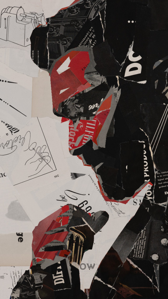
#twedit#teenwolflegacy#fyteenwolf#fytwolf#derekedit#Derek Hale#Teen Wolf#edits by me#i don't actually remember when i made this but it was practice for a random ps tutorial that looked neat lol#and i think it's pretty cool now that i've found it again#fun textures and i think still recognizable#-nods-
138 notes
·
View notes
Text
hi I went a little nuts about the new marinette design and came up with like 15 alternatives.
my initial goal was to come up with a. “””better”””” design, while still adhering to what seem to be the show’s limitations.
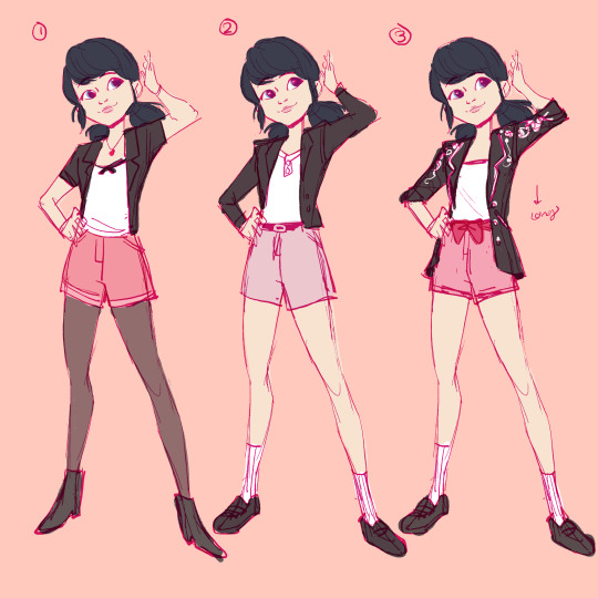

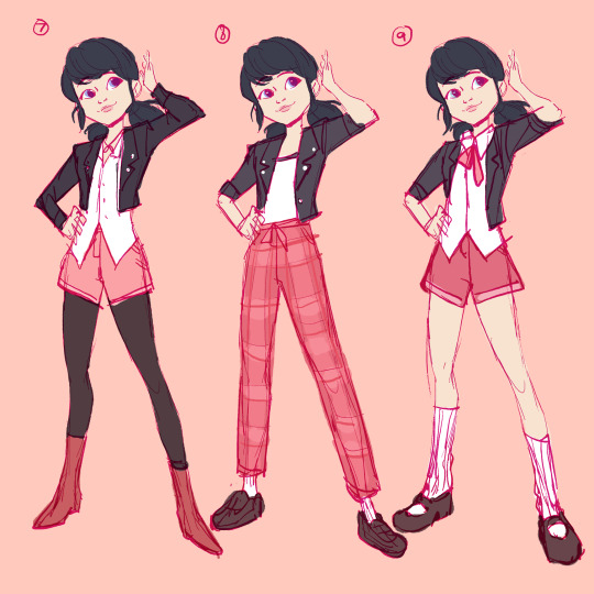

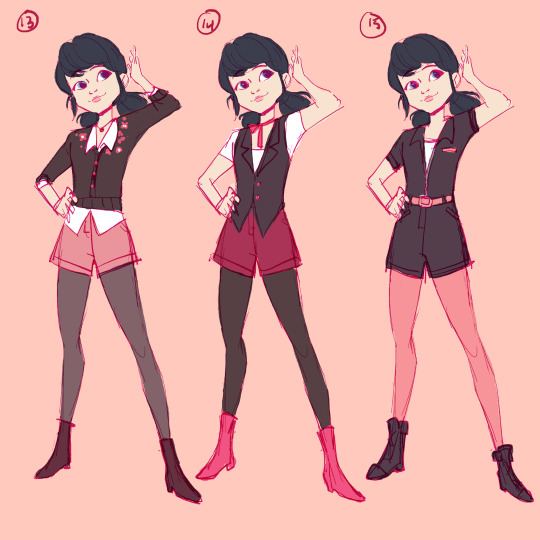
*Core Idea* Try to keep her design recognizably “Marinette” as depicted in the show. Anyway lemme know what your favs are thanks
some vague guidelines I made for myself below.
1. Black outerwear, white shirt, pink shorts/pants. (Color palette revolves around the black/pink/white palette, the new design shows her with tights of some kind so we can play with that a bit more. Shoes we can be a bit creative with.)
2. Keep it “age appropriate” per the G rating / 8-13 intended audience. This is vague but mostly just avoiding things that are too trendy or showing “too much” skin- to be clear I don’t have a personal problem with that but we’re playing by the shows rules for teens. Pretending I have an exec to pitch these to.
3. It seems like the show has pretty limited fabric sim - keeping the silhouette close to the model, can’t really have loose fabric, boxy/oversized fits or super unique/specific textures (knit vs leather can probably be implied but don’t expect too much accurate detail)
Please ignore that I drew 3 purse designs. I don't have strong feelings about them.
Some of these designs I think are pretty basic and mid, a couple I really like, and some I think are a bit unrealistic. fun exercise nonetheless.
#I could write extensive commentary but that’d take too long tbh#miraculous ladybug#marinette dupain-cheng#fashion#ml redesign
3K notes
·
View notes
Text
random assorted headcanons for Turbo because I like thinking and having fun !!!! 🎉

Read More to Find Out...or are you too scared?... i bet ur too scared ahaha youre too scared Lol! Hahaahaaa!!!
The steering wheel of his kart is covered in bite marks, similar to how one would bite their favorite pencil. he bites things to mark his territory because Nobody is gonna touch that unless they want all of his diseases (150+).
i just know he was fighting to restrain himself not to chew on any of the candy civilians
when it comes to music, he doesn't see the point of listening to it. he doesn't have enough patience to really take it in; to him, it's just a thing that exists and not much more than that ¯\_( ∵ )_/¯
adding onto that point, this guy listens to metal clanking sounds and loud engine roaring for entertainment because he likes things that would overstimulate any normal person. turbo is incredibly sensory-seeking and will do anything for The Sensations
someone should take him to a heavy rock concert i think it would change him a little. keep that thang on a leash
related to being sensory-seeking, i think he would absolutely love running his hands over random textures. if anyone has run their hands along a wall while walking alongside it...He does that...If u know u know... he is SO stimmy its unbelievable. Unreal.
very pain-tolerant. he'll whine and complain about it for attention, but physical hurt really doesnt bother him much until it gets in the way of what he wants to do.
funnily enough, he is very picky when it comes to temperature. he can handle getting ran over but if its 1° too hot or cold he'll start nagging and nagging for it to go back to normal. turbo really needs his own enclosure i think it'd do him a lot of good
this is a more popular headcanon and its canon-leaning, but he's an artist :-] he usually sticks to graffiti art because its generally considered more "rebellious and cool" but he also sketches cars, design decals, and other stuff when hes alone!
i would love to see his process of character designing king candy because i dont think he really knew what he was doing
he was just like "ok what does a generic king look like. uhhhhh.... 1, old and jolly like santa claus.... 2.... uhh crown..... 3......... purple.... FUCK YEAH im so good at this!!!!🔥🔥🔥"
i just noticed how his design has like 0 actual candy motifs aside from his bow being a candy wrapper and his shoes having those little gumdrop end pieces. what was he THINKING
while King Candy has a lisp, i think it's a coverup for his actual voice because of how goofy and recognizable it is. Overall its the same as his regular voice, he just gets silly with it. i noticed that he still does retain some of his lisp when hes screaming his lungs out at Vanellope, however, so maybe he genuinely does have a lisp that makes itself known when furious :3
another thing i noticed is how he hisses his S's. very cool very cool the reptilian
@/tasticturbo made a post abt how he has tinnitus from the constant noise in his game and i couldnt agree more
AND THE PRESCRIPTION GLASSES. where did he get those...he needs to See
side note, the aforementioned account has made so many interesting analyses on turbo and theyre all so insightful. i recommend u check them out
i think he gets migraines from stress. constant buzzing or pain flood his head but hes like "IDGAF i need to DO something at ALL TIMES no matter what"
hes like a shark in that way. if hes not moving he'll die instantly. idk a lot about sharks or if thats how it works srry but im going off of what the Worms are saying to me and i dont have much to work with
i think a really big contributer as to why he lacks in the self care department is because he fails to notice that something in his body is wrong. hes far too distracted on something he thinks is more important than remembering to Eat Food or Drink Water or Wash Himself or
he's like "WHY DO I FEEL LIKE SHIT ALL OF THE TIME!!! I HATE MY LIFE" and he hasn't slept in 4 days
hes so me. Sorry.
i dont think turbo is necessarily suicidal, but the way he behaves shows a clear disregard for his own safety and wellbeing. he thinks that he knows what he needs but he really doesnt :-[ i think he has some kind of immortality complex, feeling untouchable and like nothing could get to him. as scared as he was when ralph was about to turn him into sloppy mush, he didnt take the threat very seriously. like it was some kind of joke
his kart regenerates every time his game starts up, so what if he smashed it into buildings for fun. He's the number one fan of car accidents. he is all about that shit
i think his living space would literally be a garage btw. its a place to sleep and a space for his car all in one!! he thinks its very convenient and awesome but i think he is coping. he has some old dingy stained sheetless mattress that he has never washed in his life and its covered in dirt and smoke particles. no wonder he has such heavy eye bags Dude Please
the turbo twins have a garage used in a similar way, and while its still pretty shitty, they still at least TRY to maintain it. they just fight a lot over who has to care of it. nobody taught them how to take turns ever
but this aint about them. maybe another day
i think that turbo would find comfort in garbage and keeping it around because its familiar to him. a big clean empty space would make him so mad and if anyone moves even an inch of scrap off to the side he will throw a fit. he generally doesnt pay attention to his surroundings but when its his personal space he is 1093 times more neurotic
i think the big empty castle he stole wouldve been a big transition for him. maybe it helped him clear his mind a little more to practice his tricky schemes...it helped him get more subtle
thats all i have for nowww ty for reading ^_^ if anyone else has any wacky ideas pleeeease tell me i would love to hear them!!
#tw suicide mention#its very brief but still#also little edit but i changed my mind a little on the music thing...he listens to it sometimes just not actively --#-- he needs stuff that immediately hooks his attention and relates to his interests#side note i really want to talk about the turbo twins bec i fuckin love them but then i remember they have no personality in the movie--#--so id be making analyses on other peoples interpretations of them HAHA. EVERYONE STOP BEING CREATIVE NOWWWE!!!!#turbo wir#turbo#king candy wir#king candy#headcanon#analysis#<- ??#wat ever#i like little details that dont impact the story at all whatsoever. it just makes the characters feel so much more lively#like i could have full conversations with this guy in my head (normal)#love for ever#wreck it ralph
93 notes
·
View notes
Note
could you review some of the neopets as animals outfits, like the fennec kacheek, red panda vandagyre, and cockatiel pteri? (those are examples, choose whichever you like!) thank you <3
(Note: I included a random selection of outfits in this post, but feel free to send in asks if anyone wants to see a specific outfit I didn't cover.)
I'll be honest, I'm personally not super big on the "outfit that resembles a real-world animal" trend. First, I play Neopets for the cool fantasy creatures; even the most true-to-life Neopets species have some pretty fantastical colors. I feel like making pets just look exactly like actual animals kind of defeats the purpose of them being Neopets. I get why people would like it and I'm not saying it's bad; it's just not my thing.


Also, the other reason I'm not always big on these outfits is that a lot of Neopets have colours that already resemble real animal patterns. Not only do the outfits blur the colour/customization line quite a bit, but usually I like the colour ones much more, as they keep the actual design of the Neopets in place and just change the patterns and colors, rather than covering up the fun fantasy elements. This also helps them avoid the uncanny valley effect, which I talk about more below.
Also I might be over thinking this but who is making these outfits. None of these animals seem to exist in-universe as far as we're aware. what are the shopkeepers basing these off of. the colours at least have a magic as an excuse
Examples that I think are okay:

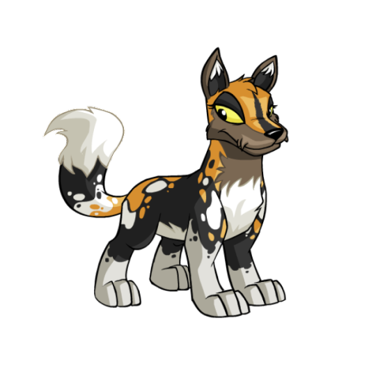
Feathery Pteri Outfit: This one's nice! I like the layered patterning on the wings and the high-contrast colors. Most, though, I like that this sticks fairly close to the actual pet, mostly just changing up the tail shape. This almost could've been a paintbrush colour, but then again what colour is up in the air.
(Side note: the eye clipping over the beak is a rendering issue? I think?)
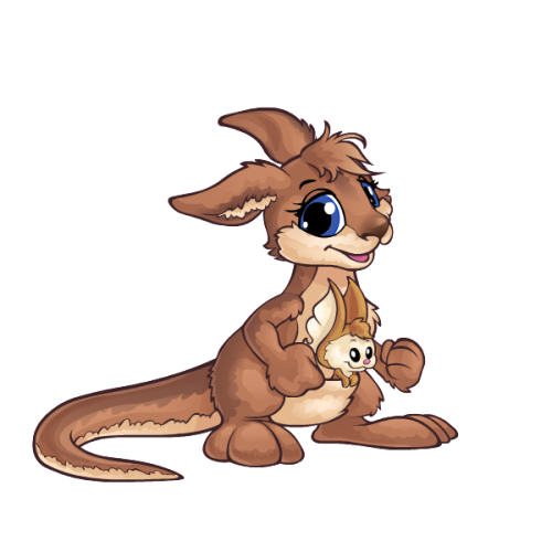
Bouncing Zafara: This one definitely strays farther from the actual pet than the Pteri, but it's a fitting animal choice and it doesn't fall into the uncanny valley, which is all I care about. The body is still somewhat recognizable as a Zafara in terms of shape, and the Miamouse as the joey is super cute.
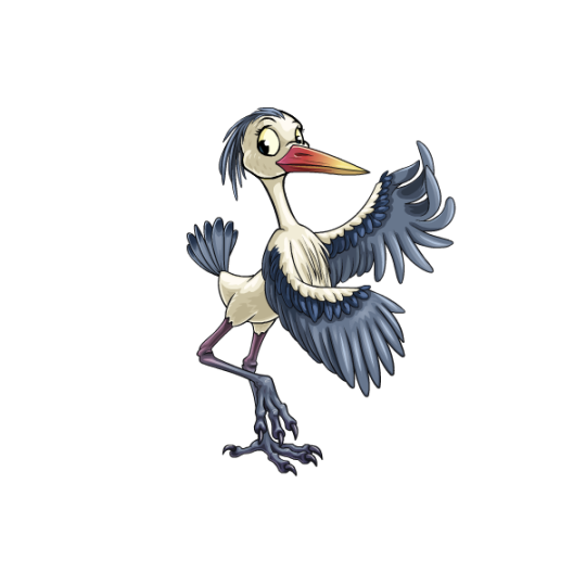
Freshwater Lenny: Kind of the same case as the Zafara; not super one-to-one with the actual pet, but it's still recognizable as a Lenny and isn't too uncanny. The legs are a particularly nice touch, actually changing the pose to look more heron-like (though they are also the part that strays dangerously into being too detailed).
Please don't:

Adorable Kacheek: Sorry to the fans of this one, but this outfit just resides deep within the uncanny valley to me—like it's a mascot suit instead of just a normal pet. The artstyle is way off from Neopets, looking much more Subeta-ish (except Subeta's art usually isn't so off putting). It's not a bad artstyle, mind you, it's just not very Neopets-ish. I also feel like a fennec fox was also a bad pick for this one, as it's basically unrecognizable as a Kacheek at all.
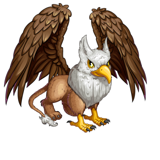
Feathered Eyrie: Speaking of the uncanny valley, this is another pet that lands squarely there due to having entirely too much detail in the shading and weirdly realistic fur textures. It also just doesn't look very good aesthetically—the beak doesn't fit the face, and the wings are an absolute trainwreck (not only is the perspective wrong, but the left wing is coming from the middle of its back!). On the plus side, you'd be hard pressed to not recognize this as an Eyrie, and it's a fantasy creature instead of a regular animal, so I guess that's something?

Furry Meerca: Hmm... no. This one also suffers from an overly-detailed artstyle and way too much realism, which is especially jarring when placed on top of the Meerca's heavily stylized body shape, resulting in a perfectly round animal with hyper-realistic animal eyes. It's also particularly bothersome because we already had a chipmunk Meerca design in the form of the striped Meerca colour, which is just this but less soul-haunting:
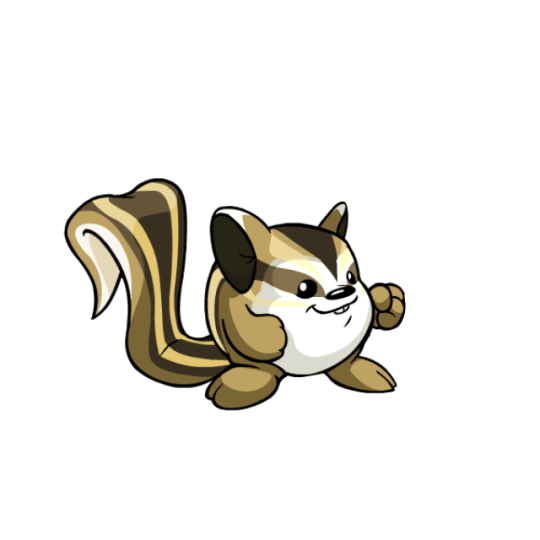
Which is what I meant at the beginning when I was talking about colours vs outfits. The colour is a Meerca that looks like a chipmunk; the outfit is a chipmunk that looks like a Meerca. Big difference.
49 notes
·
View notes
Text
well, time to break stuff down bc i was encouraged after making this post >:)
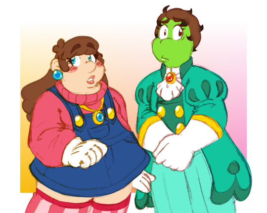
alt version of this art without the overlay effects for more visual clarity
first up, the big pictures! mainverse!Olive and Podrey's styles mostly take after their mom and pops', respectively, so I decided to keep that true in Swapstar also! of course, they still both have touches of their dads in there, they just manifest a little differently.
their patterns are swapped around!

Olive usually has dots, while Podrey usually has stripes. there's no real "meaning" to this swap, as they aren't swapped with each other or anything, I just thought it'd be fun an make things feel a bit more "off" with them.
the touches of each other's colour are also gone, signifying how their bond is... nowhere near as strong in Swapstar. I considered either swapping around their signature colours or making them pink and orange instead, but I felt like making them recognizably "them" but disconnected from each other worked better.
in addition, I thought it'd be a fun inversion to make Podrey actually wear her fancy coat, as opposed to either tying it around her waist or ditching it entirely.
ultimately, Olive is mostly the same, and I could easily see her mainverse self wearing something like this outfit... Podrey, however.

given her... EXTREMELY different circumstances in Swapstar (up to and including the fact she likely wouldn't exist at all), things are Up with her. mainverse!Podrey tries to be like Peasley, but given how things are in Swapstar... yeah. the fact she's even beanish at all is a sore spot for her.
bleaching her hair blonde, or keeping it long enough that the texture becomes obvious are big "no"s, and you can ABSOLUTELY forget about any swordplay. she has to fit perfectly into whatever role people want of her, because people absolutely don't want her to be anything like him.
unfortunately, his influence comes through, whether she likes it or not. Swap!Peasley's sharper curls, uneven eyes, and even taste in long gloves and tall boots (not pictured) are all present in her to some extent, not to mention... well... mainverse!Podrey inherited the Thunderhand. I think it's safe to say something even more powerful might "stick" a little harder than that.
old art jumpscare
so that's reflected in the blackened tips of her hair and the red glint in her eyes, weehee. >:) I wouldn't be surprised if there's some blackening on the tips of her fingers and such too, contributing to why she covers up more than her mainverse counterpart.
#feat. the return of my colour-coded text! i don't know if it makes things any clearer but i think it's fun#Rambles Into The Void#Vesper's OCs#Olive#Podrey#Swapstar Saga#sorta. it's fine
7 notes
·
View notes
Note
Bit sketchy? Even on big paintings there are still some sketchy parts.
Shading and coloring does not fully stay in the lines?
Lines are not connected always? Little gaps between them?
Rough textured lines (brush)
Big painted art has smooth/ blended shading? Not the same for small sketches.
Feels very… free? Not constrained?
Less focus on backgrounds?
The lines are a bit rounded, even in more shape-y designs?
There’s something that makes your art instantly recognizable as yours to me, so you clearly have an art style, it’s just a bit hard to pin down.
(For the evil art style challenge)
(This is not meant as criticism or anything negative to be clear!!! Just me trying to figure out the traits that make your art recognizable!!!)
woah this is awesome!
this helps so much thank you! this is a great for a new perspective on my art <3
i love experimenting my my art style i think this challenge will be super fun! cant wait to start it
22 notes
·
View notes
Photo

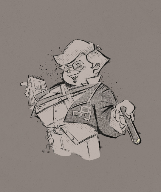
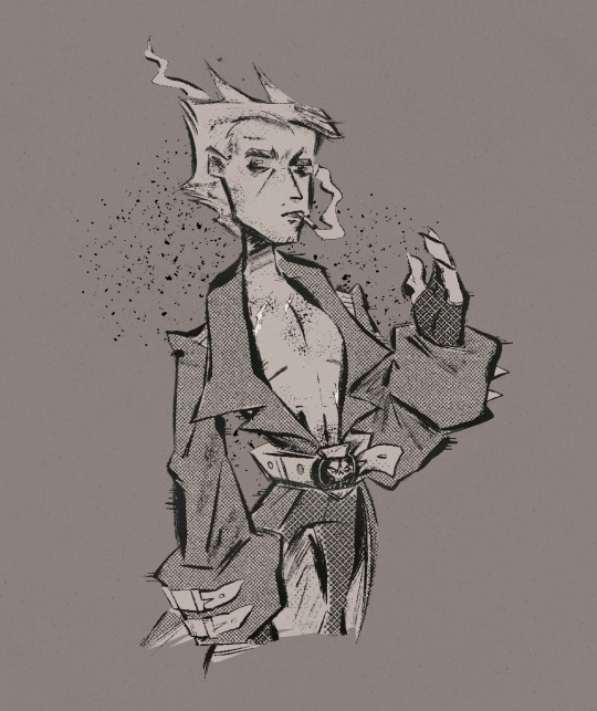

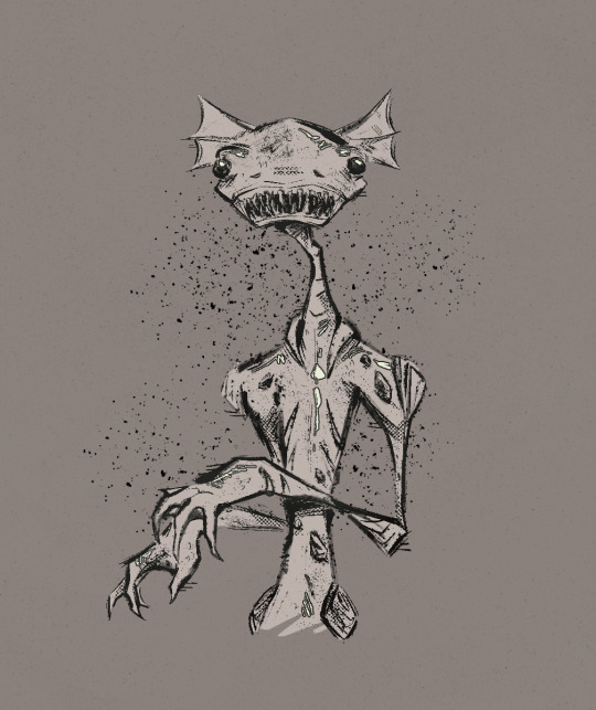
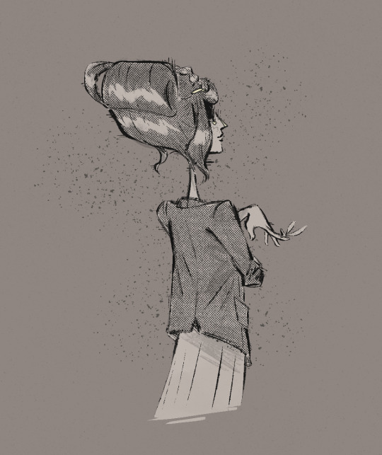

Blog update: “About” and “Characters” pages rewrite
First of, happy new year everyone! Hoping this one doesn’t end me for good haha.
As stated above, “About” and “Characters” pages have been updated with new info, character description, sheets and art (which you see in this post). You’ll need to open the blog in browser in order to view these pages. Keep in mind that it’s all subject to change given that the story is still in early development (I wrote down 1/4 of the script plan so far) and I might get rid of things I feel I can’t utilize properly.
I’m also opening the ask box again, so if the text inspires you or makes you wonder certain things, you can drop your message there :) I can’t promise I’ll be quick to answer and I probably won’t be able to answer all of your asks but I’ll do my best to read through them all.
Under the cut is rest of the concept art (and some of my rambling) so I don’t make the post too bloated to scroll through:
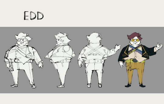

Edd’s style is still considered “weird” but in a more obnoxious and bold way. It’s screaming “Look at me! Look at me! I’ll have you look my way like it or not!”. I like the silly thought of him coming to embrace larger suits thanks to his sire. It is comfortable! And one of the kind - if you were wondering for what purpose Edd needs sewing skills, that’s the answer :)
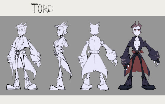
Tord lost his iconic sweater and scarf. I gotta say I wasn’t sure if bare chest idea would work out but I’m glad I tried it cuz heck yeah it did. Love it or hate it Tord doesn’t give a damn 😎 His fake horns are now slicked back which makes him look like a disgruntled kitten lol And I added a belt buckle, it’s a skull being crushed by a hammer (roughly designed after thor’s hammer as a nod to his origin); it carries a certain personal significance too
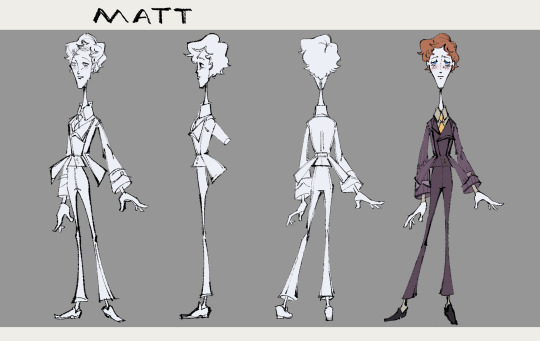
Matt style is still inspired by vintage suits and illustrations but customized for personal taste. Like the vest being asymmetrical, or the suit being more “flappy” and with a big cutout on the back. It’s sort of a way of saying “I might be playing by the rules but I do it my own way”. He is ultimate bishounen now and his power is mesmerizing enemies with that iconic anime stare and sound effects (this is a joke, but a joke I love)

Tom had it worst XD but also I had the most fun with him. The pale yellow parts on his body are supposed to be bone and um...shell...thing...you know when something spends a lot of time in the water in the open sea and you get it out and it’s covered in those THINGS yeah I can’t find the word but hopefully you got my point hahaha. It was hard to keep him as monstrous as possible but also recognizable but I think giving him the monster tom color palette did the job. Also yes he got scales. And the texture I did on his skin is supposed to be semi-transparent...like jello maybe? he’s hideous and a pain to color and i love him lol


I also did this little relationship chart to explain changes in the well relationships in-group!
148 notes
·
View notes
Note
Okay, so I just tell my story, right? I don’t really know where to start. Well, I guess this is as good a place as any… My name is Emily. My story's about.... A meat van that came into my neighborhood. I live in a nondescript town smack in the middle of Texas. Everything you’re thinking is probably true - Miles upon miles of sprawling suburbia across the flat, boring earth. There wasn’t much around save for a few churches and parks that could barely be called more than an empty lot. Oh, and it was hot as all hell. You could trip and fall on the asphalt and get second degree burns, they say.
There was something… odd about it, though. We were so familiar with it that it was almost a constant, but we all still knew it was odd. A filthy white van, windowless and plain save for the words “meat van” spray painted across the side in sickly dark red. Never liked that red - My housemate Cass used to joke it was blood, hah… Anyway, the van would drive through the neighborhood, and every now and then drop off a slab of meat on people’s doorsteps. There was no consistent time - sometimes it’d be late afternoon, sometimes 1:13 in the morning. The meat was… Rancid. I mean, any meat would be after sitting out in the baking Texas sun for more than an hour, but this was different. It was sickly gray, spongy and slick, and oozed a dark yellow liquid when poked. Reeked like hell too. One thing I always thought was odd is that, although it was always very clearly meat, it didn’t seem to be any recognizable cut, or from any animal I had seen before. The shape, color, and texture was different every time, but always just as weird. It was a sickly humid Tuesday when Cass came home from work to what vaguely resembled a ribeye staining our doormat and decided we ought to figure out once and for all where it came from.
“C’mon, Em!” They bubbled up in that ever-enthusiastic voice, their brown eyes sparkling with a feverish excitement. “There’s GOT to be some messed up stuff on the other end of this. We could be the ones to finally bring back the answers!”
I wasn’t so sure. I knew they were right about it being messed up, but that wasn’t the incentive they thought it was, and I did my best to get my worries across. “You sure you’re not gonna just get us both kidnapped and made into meat?” I smiled as I said it, but hoped my genuine concern got through to them. They didn’t seem to notice or care, eyes focused rather on whatever image was playing in their mind.
“It’ll be fun! I mean, hey, we’ve been looking for things to do lately, right? Top ten bonding activities for the besties, as it were.” With that they bumped my shoulder with theirs, and I couldn’t say no to that. I couldn’t say no to that smile. I should’ve said no to that smile.
That weekend, we sat in our car, waiting anxiously for the van to appear. It took hours, but we finally saw it around 6:40 PM, casting heavy shadows in the golden light of the not quite setting sun. Cass nearly slammed on the gas as it drove by, and we must’ve tailed it for hours. Well, it felt like hours. It couldn’t have been, as I don’t recall it getting any darker until I drove home that night. Finally getting a good look at the back, we noticed a few things for the first time. For one, the van had no license plate, no way of possibly identifying it. Just another white van. And two, while the entire van was discolored, the bottom was much more heavily stained than the rest, and oozed a steady drip of that rancid yellow liquid all throughout the drive. Gross.
Finally, we arrived at its destination. A warehouse, miles away from any human life. The parking lot outside it was almost too large, filled to capacity with identical plain white vans. The building itself looked like any other warehouse - but more dingy, run-down… and covered in smears of rotten brown. The area was swimming with people in stained gray clothes pushing large piles of meat out of the building on rusty metal carts and piling it into the vans. I had frozen in fear, but they didn’t seem to notice us. I turned to Cass, and their eyes were sparkling with awe. I grabbed their hand, ready to urge them to turn away, but they turned to me, trembling with excitement.
“We’re going in.” Their voice came out as a manic hiss of a whisper.
I was in shock, frozen and at a loss for words.
“Wh- No!” I choked out. “Cass, no. This is stupid. We saw what we saw, and now we need to turn back and leave before… Before anything happens!”
But they were already stepping out of the car, eyes fixed unwaveringly on the building before us. I got up after them, of course, but my footsteps halted as they entered right through the door alongside one of the many gray-clad strangers. I didn’t know what to do, I couldn’t just go in after them, but I couldn’t just leave them there either. I’m not proud of it, but I sort of just… Stood there for a while, mind dimly buzzing with futile strings of thought that I knew wouldn’t go anywhere.
Finally, I mustered up the courage to go peek through the door, to check if they were… alive, or trapped, or… I don’t know. I crept up to the building, still unnoticed by the… people around me, and edged along the wall until I reached the entrance. Even then, it took me a few more moments before I could will myself to look in.
What I saw… wasn’t possible. I don’t know how to describe it, but the single room of the warehouse was occupied solely by a vast pile of meat, easily two hundred feet long and just as wide, and towering far higher than the building’s height should allow. Every time I thought I could see the top of the mound, it only seemed to stretch higher and higher, the ceiling somehow still visible despite impossibly accommodating a pile of seemingly infinite proportions. The chunks of meat were all diseased, much like the ones we had received on our doorstep, but they seemed to be in varying stages of sickness, some corpse-gray and oozing yellow fluid while others still weakly clung on to the pink tint of flesh. And it was… I don’t know how to describe it, but it was breathing. The mass of meat faintly pulsed in a languid, uneven rhythm, juxtaposed against the skittery movements of the workers in their stained gray aprons frantically taking slabs of meat away from the edges and piling them onto carts. And right there, gazing upon it all, was Cass.
They were still. Petrified, but not with horror. What I saw in them wasn’t horror, but rather fascination. Their eyes were vast and staring, drinking in the sight of the pile in its wholeness. I called out to them, shouted “Cass, what the hell are you doing!?”, but I knew the words wouldn’t reach them. And so I stood there, frozen to the spot, as the puddle of ooze that seeped from the pile licked their feet, and the meat pile slowly grew outwards. I’m not sure if the meat was multiplying or expanding somehow, but the edges of the pile were swelling, throbbing, reaching out farther and farther by the second.
Cass’ feet were caught. For a horrible moment, they seemed to finally realize the danger they were in, shuffling and struggling to free themself from the meat swamp growing higher, up to their shins, their knees… But the tide rose too fast, and as it receded, it pulled them back with it. I remember every moment of their struggle - thrashing, choking, battling for every movement, every chance they could get to pull themself free of the flesh swamp. Its pull was stronger, though. And so the last I saw of them was a screaming mouth and an outstretched arm that soon disappeared altogether into the mountain of fleshy pulp.
I left then. It was horrible, of course, I know that. It felt so deeply wrong to leave without Cass, but I knew in my heart of hearts that at that point there was nothing I could do. Maybe they were doomed from the second they entered the warehouse. I don’t remember much about the drive home, or the rest of the day… Until early that next morning, when I received a fresh slab of meat on my doorstep.
It wasn’t like the others. It wasn’t gray, or slimy, or stinking. It looked… Healthy. Tender and red, its only smell being that of fresh blood. Ironically, that terrified me more than any of the off-meat ever did, and my heart froze in my chest as I stared down at it, unsure of what to do. I buried it. It was difficult, sure, and certainly would’ve looked weird and probably suspicious to any passerby there might’ve been, but it felt right.
And that’s it. That’s all I have to say, really. I’ve been living on my own since then. The meat still shows up, and I toss it out just as I always have. I haven’t been eating meat lately, as you can probably guess. I haven’t been eating much at all. I should feel sad, or terrified, but it’s all just numb, like everything that happened was just a strange dream, or like Cass never existed in the first place. I know it happened, but… maybe it’s better to think of it as a dream. It makes it easier to get through the days, I guess. But I get violently jarred back into reality every time a slab of meat shows up on my doorstep. I think I'll move. It'll be easier to pretend that way.
Eugh...thank you for your statement, no matter how...viscerally unpleasant it may be.
Matters of flesh have always been one of my least favorite topics - it is truly one of the most...primal feeling fears; animal and buried deep within the human psyche.
I did attempt some follow up research on this, though there is not much to go off of...I was unable to to find a specific missing person's report for anyone named "Cass" or variants thereof in central Texas, but that is hardly surprising - besides the likelihood of pseudonyms or non-legal names being used, a report would only exist if it was ever filed, which I am assuming it was not.
I did, however, find an interesting report from the area from 2010...

I cannot help but think the two accounts are...related. Something about a health inspector going missing in mysterious circumstances, the viscera of it all...
The gift to the family of the missing did not escape me...75 pounds...34 kg...or...the approximate amount of harvestable meat off a human corpse.
I am terribly sorry for your loss, Emily, but you did well to avoid the hunger of your own curiosity.
I recommend jackfruit as a vegetarian alternative to Texas BBQ.
#[submitted statement]#another archive#tma#tma podcast#somewhere else#the magnus archives#tma rp blog
7 notes
·
View notes
Text
No update today -- next chapter's cover has had a good chunk of progress made on it, but I'm too busy tomorrow to get it finished up to post at a reasonable time. (This works out well anyhow, as I'll be moving back down for college next week, so if the current page wasn't partially finished already I may have not had the time to complete an update.) In the meantime, finally getting around to posting ask responses (below the cut)!

I'm really glad to hear you're liking it! Life's been a little crazy lately, so updates have been more scattered than I'd like, but I'm still thoroughly enjoying making this comic, so I'm you're enjoying reading it!

Looking at the timestamps, the first page was released on December 12th, 2020. So we’re just past 2 and a half years now!
The actual “development” of the story technically goes a bit further back to the time around the 1.4 update release, as I was getting really into the game lore and wrote up some worldbuilding ideas. Then in late November of 2020 I started planning a fanfic based on that, did a short 2-page comic set in that AU for fun, and then ended up expanding that original fanfic into the current, longer comic!

I’m gonna tentatively say yes! At least, one per Andrew and the Clothier each. There wouldn’t really have been a reason to make more than one of Andrew. There technically could’ve been more made of the Clothier, but one was all that was really needed.

Fortunately this current set of backgrounds outside of the dungeon is relatively simple, as I reuse the base coloring for the columns and adjust the perspective/lighting as necessary (each column is actually two pieces -- one “flat” side and one “angled” side).
I have a pretty limited capacity for doing backgrounds, so I tend to use tricks like this to reuse them where I can, haha. The first few backgrounds for an area tend to be harder, as I need to make assets and figure out how I want lighting and so on to work, but from there it usually gets easier.
It's still dependent on the background's design, of course -- backgrounds that are painted (usually outdoors) are a much different experience to work with than areas with detailed lineart and textured surfaces, such as the tavern and Andrew's kitchen. I'm slowly getting used to the perspective tools in Clip Studio Paint, though, which is helping a lot with drawing indoor spaces!

In all honesty, I was mostly focused on making it immediately recognizable even in silhouette, and that it fit well on the page, rather than focusing on making it perfectly to scale or the likes, haha.
Design-wise I find the Wall of Flesh to be super interesting -- it visually ties the “first” boss of progression (EoC) in with the last boss (Moonlord). And it’s overall very jarring, in that it’s easy to accidentally summon and turns the Underworld into an inescapable auto scroller in a way none of the other bosses do. And of course the story/lore significance, etc. etc. etc.
So when the time comes, I hope I can do it justice!

Honestly, I’m not sure! I still haven’t totally decided how that whole sequence of events will go -- some parts of it are very clearly planned out, others not so much. In a general sense, I do think that Chris’ reaction could vary significantly with the circumstances -- how much of a shock it is, and if he understands the significance of it -- but generally wouldn’t be good, in a horrified/panicking sense.
At the current point in the comic, Chris *does* have a general idea that something weird is up with Andrew, just based on what Heather/Malik/Becca were saying (including Heather’s mention of “burns”), plus Andrew leaving in a hurry that morning and brushing it off when asked about it. He doesn’t believe that Andrew is evil, of course, just that he’s dealing with some things, and Chris is appropriately concerned.
So- yeah, finding a doll of Andrew in the Underworld- honestly, there are a lot of ways for him to take it badly.
But hey, once he has the doll, Hardmode won’t be far away, and that’ll bring a whole new host of problems for him to focus on instead!
33 notes
·
View notes
Text
I was thinking about what if they redesigned Hoodude for g3. I imagine that they would probably change his name and backstory, which got me thinking...
He loves jazz and scat singing, loves dancing, and is obviously supernatural in creation. if they were to give him more of a Louisiana/New Orleans slant, it would be pretty easy to make him into a Mardi Gras doll. Generally, these dolls are depicted as porcelain faced jesters and clowns (examples pictured below - sources in picture). (These are basically the same thing as porcelain clown dolls, as far as I can tell - think the Small but Knowing Clown doll that was popular a few years back - though I could be mistaken). I think an overall jester/clown look would fit him personality-wise. He wouldn't necessarily have to be from New Gorleans or even Louisiana (Lou-eek-siana? Boosiana? Depends on your pronunciation, I guess...), but considering his love of singing and dancing that we saw in G1, I think it would fit him wonderfully.


As for his name, if they made him a Mardi Gras doll, I came up with two names. The first one, and my preferred one, requires a little bit of backstory; my mom, as well as her entire family, are all from Louisiana, specifically the NOLA region. Though my family doesn't live there, we visited frequently, especially when I was younger. I loved going to the French Quarter and my parents would always buy me Mardi Gras dolls per trip! I have a sizable collection, probably over 20. Thing is, for my entire life until, well, probably last year: I always knew them as Good Luck Dolls. That was what my parents called them, what I called them, and even what most of the vendors at the French Quarter had them labelled as. Funny enough, I don't see them called that online. I guess it's a regional thing.
With that story out of the way, the two names I came up with for him: Lucky Gooddoll is the first (this one is my preference, and I think sounds the best - Gooddoll is a reference to Goodall, and Lucky is a real name/nickname. This name relates to the Good Luck Doll name of those dolls), and Mardi/Marti/Marty Grasdoll is the second (this one relates, of course, to the Mardi Gras doll name for the dolls. Marty is a real name, but I think it would be better to name him Mardi, but then that's not as easily recognizable as a name... I could go in circles. But it also, imo, doesn't flow as well, since it would have to be Grasdoll instead of Gooddoll).
His personality wouldn't really have to change much; he could still love dancing and singing, still be clumsy (and perhaps that could be his schtick - to avoid cracking his porcelain, people often try to prevent him from hurting himself, which ends up hurting them - similar to the pins from G1), still be a hopeless romantic, etc etc.
I can imagine pretty clearly him wearing a set of fun patterned overalls, similar to what the Mardi Gras/Good Luck dolls often wear (though they wear something more similar to a kigurumi. He could wear that, too, but I think overalls offer more chances for fashion). Although these type of dolls often don't have hair, instead having a cap permanently attached to their heads, or else have kind of crazy, fluffy hair (similar to the texture of cheap faux fur) I think it would be okay if they actually redesigned his G1 hairstyle but gave him something more similar to braids. They could even put beads on the ends that could clack as he walks. Or, if they wanted to lean a little into the jester hat imagery of the doll, they could possibly put bells on the ends, and then he would have music wherever he goes? Idk about that, but still. For his face, he could of course either have it painted like the dolls, or else have new makeup every day in styles similar to the painted faces of the dolls.
Not really sure where I got the idea for this honestly. It just randomly popped into my head while I was scrolling the tag. But I think it would be cute!
5 notes
·
View notes
Text
Presenting the project that made me heterophobic:

Yep! I am the dork that painted the masks of our current five boys over the course of three-four days (easier to space than six would be and lets face it, I do not care for kurlzz). I chose the Notes from the Underground masks because I've realized that it's the album that most of my favorite songs thus far come from. I quickly began regretting my decision at the point where I realized exactly how limited my paint options were and how many cool colors I would need. More details for each mask below (going bottom to top).
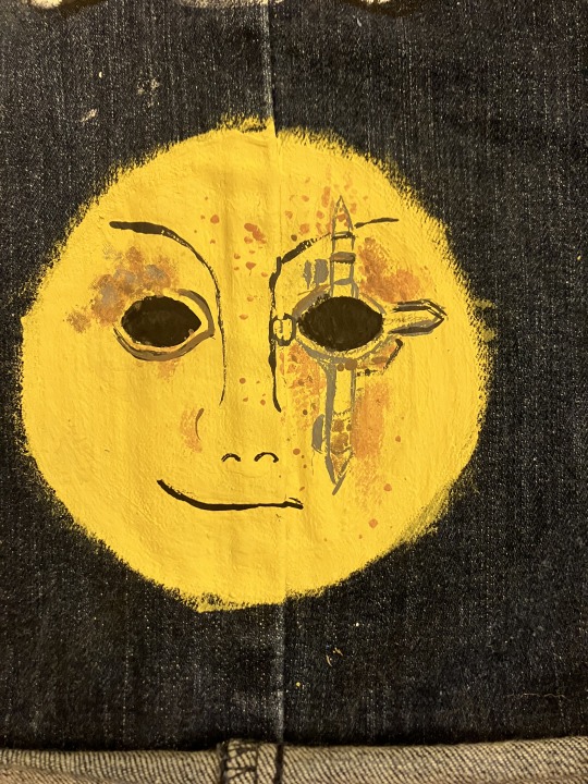
Danny's mask looks almost nothing like the actual one mostly because I painted the circles first and did not realize the mask was more angular than I initially thought. I also had no gold, so we've got a lovely yellow mixed with tan for the base color. The bullets are rough but also smaller than you'd think and a basic brush set from Michaels does not, as I have learned, have super tiny brushes, so I did the best I could on the casings. I am proud of the fact that I tried to make the rust work as best as I could, and if you look really closely, you can even see the mesh in the eyes (looks a little clearer on the left eye). The smirk is present on the right side and I do think it's decently recognizable.
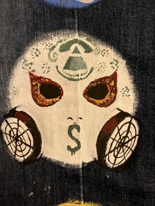
This one made me cry. Any criticism of the fire around the eyes will be met with the response to suck dick because, to be quite frank, I challenge anyone to do better at 1 am and remain disturbingly proud of them. I'm kinda sad that my green (mixed from blue and yellow, because my budget is two pennies and all previous supplies) dried up early cause I was hoping to get more of the Louis Vuitton-style details, but still pretty damn good. I think the pyramid and the canisters turned out nice. Also, a little bit of a cat-eye shape for the eyeholes and the fire, but that was deliberate and I will not be ashamed of it in my moment of pride (I will undoubtedly feel the shame within five minutes of posting, but that is a problem for future me).

A fun an interesting fact is that this is the second time I've done this particular mask of J3T, and both times I have realized I love doing the butterfly. It's super fun because as long as we get the basic swirls in, it's alright if they don't match length perfectly. The cracks are slightly off because the very first ones were free-handed, but I did my best to get the rest of them proper, and they even work to form the nose. Apparently the orange looks more yellow than I thought.
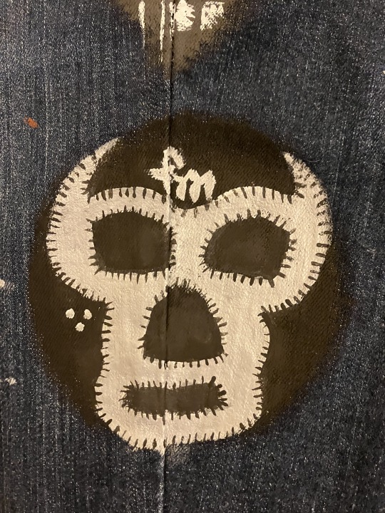
This one was a welcome relief after crying over the detailing of J-Dog's mask. Again, no metallic colors, so our silver is grey. The little black lines are there to add texture to the edges (as it turns out, none of my brushes added it in a sufficiently noticeable way), and this one looks the cleanest imo.

Last but not least, Charlie's bandanna (sunglasses painted over because, as it turns out, I continue to suck at painting and drawing glasses). The buildings are likely not accurate to the actual picture, but my reference photo did not show the actual city on the bandana so I just did some buildings, a fancy lil' LA and we're calling it an artistic interpretation. Also, check out that S. Coolest S I will ever draw in my life, got it right on the first try.
Anyways sorry that I didn't post this sooner cause I technically finished all of this yesterday evening, I have a flight soon so I am typing this up at 4:30 am at the airport.
(Tagging @vampswillhurtyou and @cutelittlenightmarethings cause both of you said you were interested and I have no idea whether or not this will show up in the main tags.)

Final pic to show what it looks like at a slight distance and with other object to provide scale. Note the paint palette thingy having 3 shades of grey in it because, again, shoestring budget and persistence substitute everything for us.
#anachronistic falsehood/whiskey you follow me so I'm assuming you'll see this drift on your dash without me tagging you#hollywood undead#danny (hu)#jdog#johnny 3 tears#j3t#funnyman#funny man#fm#charlie scene#I will continue to remain overly proud of this for a while#wearing these jeans at the airport rn btw#I am so tired and so awake I slept 2 hours and I have a production meeting tomorrow
13 notes
·
View notes
Note
Do you have a favorite color combo? Any art styles that particularly inspire you?
Hmmm idk if i have any fave color combos or color palettes, pink is my fav color so ones with it are maybe more likely to catch my eye, but i like all color palettes id say :]
As for art styles, i absolutely have some that inspire me a lot! Ive got a pinterest board of pieces I've collected that I think have some really nice things about their various styles
https://pin.it/4KlUb96
Things like thin lines, interesting face proportions, fun uses of shape n anatomy, color, and shading, can all really make me enjoy the art style
Heres some of my fave artists on tumblr n why ^^
@pedromirfilho lovely fun and wacky animations with great use of shapes and colors! Plus i like the absurd themes
@anticmiscellaney simply wonderful style, anaptomy, color, everything is so on point and cohesive, i just love it
@vivtanner just! So good! The pastels and amazing lineart with the soft and lovely themes, just so amazing and relaxing, and amazing and pure art style
@jmfenner91 god so coooool! Such popping colors immediately grab your attention, and the composition and themes of the pieces are just so interesting, i spend i long time looking at them, theyre so cool
@ozomilk lOVE! their art! So good! Anatomy is spot on, the poses are always so dynamic, their OCs are interesting l, and most catching to me i think is incredible and fun use of shading and highlights! Just so damn good ive followed them probably the longest
@notmusa UGH! YEAS! LoVE the way they play with anatomy and poses, and the faces of the people they draw, i aspire for their art style its so skrungy and yet so well put together i love it a lot
@namelyjamie does such a good comic-book-esque style with the use of dots for shading, it amazes me every time i see their art bc like wow i dont think i could ever do that! Its so good, and they capture peoples faces really well (they often make fanart of tua, and the actors are very recognizable in their style)
@sumpfbold love their style and use of anatomy and line, plus the colors are just *mwah!* Lol the themes they go with too i love, trans art and angelic beings, absolutely splendid things!
@vanessagillings so soft and sweet and lovely and relaxing, in theme, color, and use of lines. Absolutely beautiful artwork that makes me happy, and such a beautifully simple style that still includes great amounts of detail and texture
@k-eke so fun! Lovvve the colors and the pixel art and especially the animation, their animal animations never fail to make me smile
@kailysander love their art with their use of shapely anatomy, especially in the faces, and their use of color and line, just ugh so so good!
#answered asks#asks#my ask box is open#art#art styles#my inspiration#people i follow#beautiful art styles#people you should follow#artists you should follow
8 notes
·
View notes
Photo
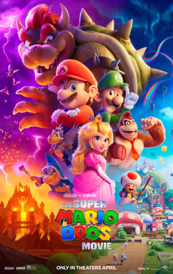
The Super Mario Bros. Movie
“The Super Mario Bros. Movie” is vibrant and a whole lot of fun.
Mario and Luigi are two brothers, living in Brooklyn, who are starting up their own plumbing business. With everyone around them doubting them, the brothers want to make a name for themselves by fixing a city-wide manhole leak. This leads them to a mysterious pipe that transports them into a foreign world. The brothers get separated and it’s up to Mario to save his brother.
I wasn’t someone who played a lot of Mario games growing up. I’ve played some of the staples, but I was more interested in Pokémon. Still, I’ve always appreciated the iconography and incredible music of the Mario franchise. I also think I know more about the Mario franchise than the average viewer. All of this could have contributed to my bias toward this movie, but I wanted to disclose that before I got into my review. For starters, I love the character designs of this movie. They’re extremely expressive in a way that the video games couldn’t make. They’re familiar enough to be instantly recognizable, but also different enough to have their own identity. Second, the voice acting was my biggest fear going into this movie. When the cast was announced, people were laughing at the choices, saying that each choice gets more and more outlandish as the announcement video went on. I’m happy to say, the performances weren’t as distracting as I thought they’d be. Jack Black as Bowser was the stand-out performance for me. Keegan-Michael Key as Toad was also really great in my opinion. Voices like Chris Pratt, Charlie Day, and Anya Taylor-Joy are too recognizable for me, so it was hard to distinguish the character from the actor initially, but after a while, I stopped noticing. The only real voice actor I had a problem with was Fred Armisen as Cranky Kong. I thought the voice didn’t fit the character at all. The score is probably one of the biggest highlights of this movie... when it’s Nintendo music rather than licensed music. The orchestral renditions of classic Mario music were an absolute treat to listen to, but they were mixed in with generic licensed music that barely fit the tone of the scene. I don’t understand why the introduction of Donkey Kong Island had to be supplemented with “Take On Me” by A-ha. Another big highlight was the vibrant look of the movie paired with its extremely crisp resolution. This movie is just a visual treat. It’s exactly how colorful a Mario movie should be. The quality was so crisp that I could see individual hairs on the characters and even the texture of their clothing. The action set pieces were also really fun. There were lots of fight moves that were ripped straight out of the games. It’s all fast-paced, but still had a level of visual clarity that I could understand exactly what was going on at all times. Finally, the jokes were surprisingly decent. I thought this movie was going to cater to an extremely young demographic, but there were a lot of jokes that got a genuine laugh out of me. I know a lot of people felt like Luigi was sidelined and that the movie should’ve been about the Mario Brothers instead of Mario and Donkey Kong, but I understand why they made the decision. Some people also think that turning Princess Peach from a damsel in distress to a warrior princess was a bad decision in favor of appealing to the feminists. I don’t see it that way. The decision is pretty simple if you think about it. Mario is the audience surrogate. He’s the vehicle in which the audience learns about this new world. He’s the main character, so he needs to have some stake, which would be to rescue his brother. If Mario was with Luigi throughout this movie, I think their main objective would be to find a way back home instead of fighting a war for a kingdom of people he just met. Plus, it gives more screen time to Mario and Peach as a pair, which could also lead to their iconic romance in future installments. I do, however, understand the criticism that the writers basically came up with a bunch of references and wrote a loose plot around them. I can see why some people would be upset with that, but I thought the movie still worked. All in all, I think this is a movie for lifelong Mario fans and newcomers alike. It’s just a fun time and I’m looking forward to seeing more from this new movie franchise.
★★★★
Watched on April 8th, 2023
#The Super Mario Bros. Movie#April#2023#Animation#Comedy#Romance#Adventure#Science Fiction#Fantasy#Family#PG#Aaron Horvath#Michael Jelenic#April 2023#4 stars
6 notes
·
View notes
Note
YOU ENDED UP GETTING ME INTO NEOPETS NOW SO WHAT R UR THOUGHTS ON JETSAM(S)? IM A SUCKER FOR SHARKS LOL SO IM RLY HOPING TO GET ONE AT SOME POINT

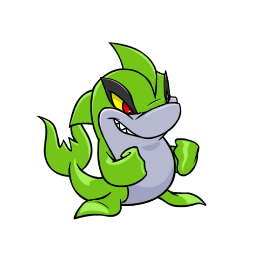


Jetsams are sharks, and are meant to be kind of a counterpart/natural predator to the dolphin-like Flotsam; to the point where the two looked near-identical. Nowadays there are more differences, with the Jetsam sporting two fins, sharp teeth, slightly different markings, and an upright posture. Personally, I like to think of these two as a case of mimicry, with the Jetsam having evolved to trick Flotsam from a distance.

Visually, the Jetsam has a nice tough look to it that gives it a lot of personality, and the way it sits upright plus the two fins gives it a bit more uniqueness so it isn't just a normal shark. My only issue with it is that the gray underbelly is a bit too dark and low-contrast. Gray as the accent color is fine; it just needed to be a lighter tint.
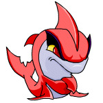
The Jetsam benefited quite a bit from customization, as its old art was starting to get very dated and needed a redraw anyway. The new Jetsam looks a little less tough, but the smile is nice as it shows off their teeth, and it gives them a fun kind of mischievous look. The overall look didn't change much, but the head has been changed significantly to have a much better, less wonky shape to it, and the markings now stop above the mouth instead of near the eyebrow. The shape of the hind fins have also been improved, and they're one of the only pets who can make the customization fists look good.
Favorite Colours:
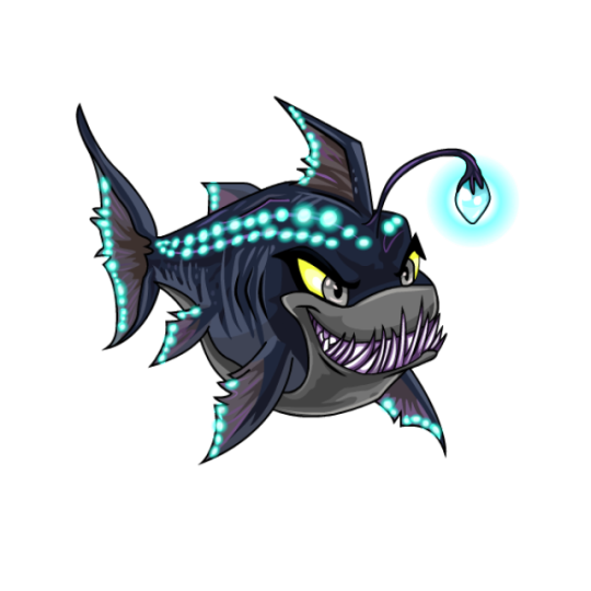
Maraquan: How do you make an underwater version of something that already lives in the water? Make it into a deep-sea fish, obviously! The overall design is easily recognizable as a Jetsam, but its been given a horizontal posture with bioluminescence and an angler fish light/teeth. The palette is great, using neutral browns and greys for the body and bright neon blues for the accent color. My only nitpick with it is that the teeth feel a bit busy and don't quite make sense if you look at them too long, but overall, this is a great design.

Pastel: The pastel Jetsam is just plain pretty, using a soft pink and turquoise palette. What really makes it work is that instead of using flat colors, it employs subtle gradients so the turquoise becomes blue in areas and the pink gets some subtle highlights. On top of that, it's also given a sunlight-under-water ripple texture, with a few small speckles on areas like the eyebrows and tail. A lot of effort went into this design compared to your standard pastel pet, and it really paid off.
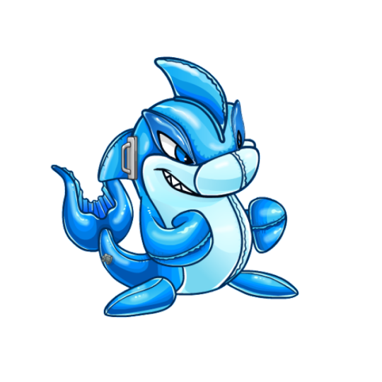
Toy: Alright yeah, this one's just fun. The pool floatie idea is a great concept that works perfectly for the colour, and the execution is also really solid, including lots of raised plastic ridges, seams, and plenty of highlights to give it that plastic look.
My only issue with it is that weird handle on the side of the head. I guess some shark toys have these, but I've never seen one personally and it honestly just looks distracting and kind of out of place. Also, I do wish it was semi-transparent (think like the good Jelly-coloured pets), but that's not a big deal. Still a really good colour regardless.


BONUS: The robot Jetsam has a mostly red and white palette with a few black accents, and it works really well for this pet. I love the visor, and the patterning on the fins is really neat. Both versions are fine; the UC/styled version looks a bit more robotic, but the customized version reads a bit better overall.
27 notes
·
View notes
Text
#9: 3D Modeling

While my class won’t be including 3D modeling for our overall project anymore, I was really interested in this specific aspect of the project to create a model of one of the most recognizable structures in ancestral Maya archaeological sites: the Hieroglyphic Stairway at Copán in Honduras. It would have been quite difficult considering I’ve never been there before, but there’s a multitude of images circulating that I would have put my best efforts into capturing the glyphs and how it would look like for others who can’t necessarily visit �� or at the very least, how many stairs there would be, what it would look like during different times of the day, where you could walk around or in, etc.
This might still be something I want to do one day, so in order to see the different ways to model, I looked at a few 3D modeling projects for reference. For this post, at least, I’ll be talking about this medieval city project, this interior scene of an abandoned warehouse, and this VR of a street after rainfall. I looked at these projects in particular because the medieval city would kind of be like 3D modeling an archaeological site/city, and for the warehouse, it would be like the inside of a structure, and lastly, the VR of the street could detail different structures in relation to each other, while also detailing the option of a different time of the day, all of which I’d want to take into consideration with my own project.

For the medieval city, it’s incredibly detailed! The water that surrounds the city, while not moving and still pretty static, reflects the sun in the sky. There are people to illustrate that the town is lived in and can exhibit movement in some capacity. Even the areas in between the buildings have some details, like puddles or mounds of dirt! I think as a larger project, it does a good job of creating a basic city. The only downside I had to it was that the interior of the buildings was only scaffolding. I’m not sure how easy it would be to create interiors for all of them, or even just the major buildings, but it would be cool to see that kind of detailing in the project.
As for the abandoned warehouse, this is an especially detailed project, most likely because it focuses on one interior building rather than a whole city. You can see the texture of every material — even the papers on the ground! I think the only things I noticed that were a bit off were the sunspots leaking into the room, which didn’t move or exhibit different angles for the light like you would expect, but I’ve noticed in a lot of projects that light tends to be a tricky thing to capture and replicate, especially without a seen source. The second thing I noticed were the “old railways” on the floor, which I couldn’t tell if they were actual railways or markings from where the railways would be since there wasn’t any dimensionality to them.

Lastly, the VR of the street after rainfall was also incredibly detailed and textured. The only thing that ever felt off to me while looking at this project was that the water wasn’t necessarily reflective when you moved around it, but otherwise, everything else was super cool! All the objects had pretty accurate texture, and one thing I especially liked was how you could enter objects (like a barrel, a lampost, etc.) and see inside the objects. Even the interiors kept the textures they would likely have in real life, and I was surprised that the outside, as well as the inside of the lampposts were metallic!
These projects were extremely fun to look at, but also highly educating. I don’t think I’ll ever be able to fully replicate textures or objects like some of these creators have, but it all definitely gave me some things to consider and think about moving forward with my own Digital Humanities projects.
← Previous | Masterlist | Next →
0 notes
Text
aaaaand onto the steam page!!

so it appears that we end up on this planet because we areee,,, looking for suitable plants for humans to live on? and while here we are "changing what it means to be human"? are we getting a revival of the transfuser?? how much other cut content has the potential to get put in this??? CAN WE GET DRAGONFLY INTO THE GAME AT LONG LAST? KITEWING SKYRAY????
and as i mentioned the ruins before ^^ THERE ARE RUINS!! and more comments on what really strongly appears to be dna altering as a gameplay mechanic. veryy curious about base building in this one, especially seeing as how much qol improvements were made between sub1 and bz, im excited to see what more they add!! i want hanging items like ceiling plants and lights!!! i crave base customization the likes we've never seen before!!!!

BASE CUSTOMIZATION !!!!!!!!!!!!!!!!!!
these games will never convince me to build a flashlight. its a seaglide or a vehicle or i just dont see. i will never waste my materials on a flashlight ever ever. and new tools!! im telling u now one of them is 100% the transfuser they are BRINGING my baby boy back (holding out hope for the terraformer too 🥺)
i have no idea what to make of the end of that second paragraph. it almost seems like we crashed here again? that and how our ship's ai is "insisting" we "carry on the mission",,,, do we not remember what we're here for? or why?
BIOSAMPLER MAKING A MF COMEBACK!!!! EVERYONE WELCOME BACK THE BIOSAMPLER!!!! im curious into how madatory this evolving mechanic is, and how close it is exactly to the cut version from sub1. OH SHIT IS THIS GONNA BE LIKE SURVIVORS,,,,, DO WE GET SUPERPOWERS,,,,,, CAN I GLOW,,,,,,,
the final part is making fun of me specifically. IM ALWAYS SO SCARED OF THE DEEP DARK,,,, lowkey still afraid of the dark irl whyyy am i obsessed with these games that make me physically ill with fear and stress and whyyyyy am i going to keep playing them forever. THERE IS WONDER AROUND EVERY CORNER. WONDER AND BEAUTY AND AMAZEMENT AND FISHIES.

COUPLE OF SCREENSHOTS FROM THE STEAMPAGE. here's a big fish!! and a slightly updated scanner, really showing off the new game engine (LOOK AT THOSE SHADOWS AND THOSE HANDS!!!! LOOK!!!!) this looks like maybe a version of the kelp forest/twisty bridges, with more of those pink peeper replacements.

and HERE is a screenshot showing off multiplayer! and BUBBLE BOOSTERS. this appears to be either the same biome as the above screenshot, or an outer edge of it. look at hose sharks in the background! and salvage on the seafloor? :0

these look like the crab in the trailer, alongside some new fish! LOVING the inclusion of some more crustaceans, i need 4 more crabs in this game at LEAST. and a better look at the new vehicle! there appears to be geysers/thermal vents in the background too,and it looks a bit darker/murkier here, so this might be one of the deeper biomes (the 150-300 meter range, perhaps?). lookie at all those barnacles! the rock texture! the plants!!

thisss is my favorite of the screenshots so far. we're in a cave system! with lava and thermal vents! there even appears to be falling rocks i the background! the sharks here remind me of the shadow leviathan with its color palette, but its also a bit chelicerate in anatomy,,, very interesting, reallyy looking forward to seeing this guys in action. and look!! MESMERS!!!!!

another screenshot of what looks like the biome in the trailer, in some pretty shallow water! absolutely beautiful grass, scatterings of maybe eggs (or just some more plants), those ever recognizable shallows rock bridges, and these big fish that are seen in one of the above screenshots! it seems like they open up like the thermal lilies in bz.
and now, finally, the hidden time capsule screenshots!
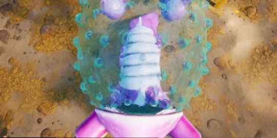
plant?? egg?? tool?? what on earth is this thing?? it looks. phallic. please tell me im not the only one who thinks that. not sure how i feel about this thing. this image makes me confused. LOOK AT THE GROUND TEXTURE!!

i think this is a plant! it also looks weird! look at that tree behind it! so many new plants! I LOVE THE PLANTS!!!!

this seems to be that weird egg thing from a different angle, or perhaps the animal itself fully grown. I believe these are iridescent fins! once again, LOOK at the water, THIS GAME LOOKS SO PRETTY!!!!!!!!!!
OK TRAILER TIME
youtube
SO PRETTY!! now, because everything in this is cinematic (and it's only a teaser), i would take basically this entire thing with a grain of salt for how accurate it will be to actual environments and gameplay. the cinematic trailers/teasers for the first two games are full of things that didn't make it in. still looks VERY GOOD and im so excited!!!!!!
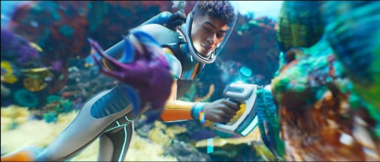
onto a few specific things, this specific area ^^ shows up in a steam screenshot (which i will get to later), and considering the high amount of light and coral, this is potentially this game's version of the safe shallows! that pink fish that swims by is also the youtube channel's current pfp, and as such is probably replacing the peeper, which was the old 'mascot' fish. this character is also using alterra tech, which i think is very interesting! are we still working for alterra, or are they just such a mega corporation that they make basically all water/space gear? the diving suit looks a bit like the stillsuit with its colors! the design itself reminds me of the cold suit,,, :o
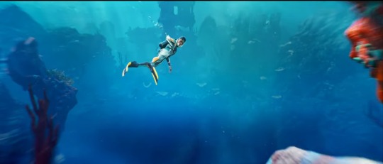
now, the thing about this scene is that it goes by pretty quick, and is supposed to draw attention to the water vortex (and won't it be fun if THAT is an actual mechanic!!! god i would be so so scared), but upon a few pauses and look arounds... there's a building! that is so clearly some old ruins!! it doesn't look anything like the usual ruins/bases we've seen before, so i would guess that these are NOT built by the architects, and instead a new alien race. the assumption is that this planet is also very much abandoned,,, which begs the question, why? not the kharra again, surely? or is it just these surface-level ruins that have been left? and if they went deeper, why? this appears to be the only screenshot/sequence that shows any of these ruins. how many more are there?? I DEMAND ANSWERS!!
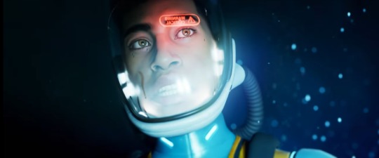
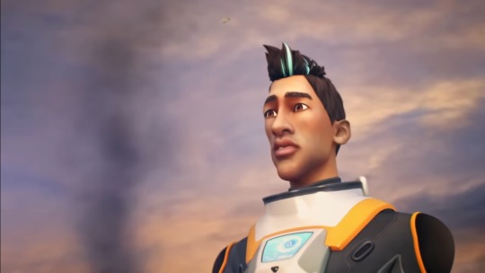
also, entirely possible im wrong, but this new character bears some resemblance to ryley, imo. the earlier scenes of him doesn't match too closely, and their hair is entirely different, but this shot specially depicts a very similar face structure, eyebrows, lips, and nose! now, this could be (and probably is) a new guy that just kinda looks like him, but if it IS ryley,,,,, what's he doin here? is he working with alterra still? is he just off exploring various ocean planets? even if this isnt him, i want to know these things. wheres my guy :(
another thing pointing at this being ryley is that this game is intended to be a direct sequel (as opposed to bz being a spin off), and if its in an entirely different environment, then it stands to reason there's a chance theres returning characters. otherwise,, this game would just also be a spin-off!
(also, would absolutely love if that oxygen warning is an actual popup ingame!)
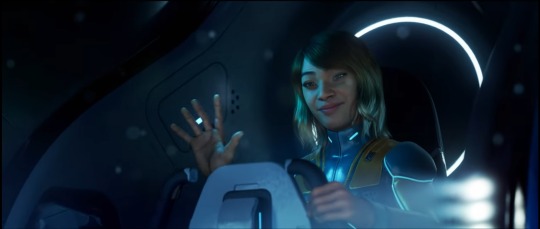
and here's the second character that pops up! the steam screenshots also only show two people in co-op so far, and i do wonder if these are two of the playable characters and not just random models/characters used for the teaser (similar to how bart is a trailer for sub1 despite not being playable, and fred in bz's trailer). this person doesn't seem to be anyone from either game (she looks a tinyyy bit like lillian, but not enough that i can say it could be her), and she's in a new vehicle! everything still looks very atlerra, though, and the two characters seem to know each other, so once again i wonder if this is a lore reason, if these ARE alterra workers, or if this is just to fit in with the aesthetic of the other games.
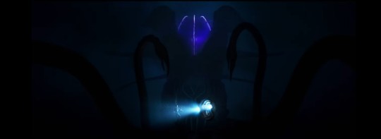
BIG FISH!!!!! BIG FISH!!!!!!! this thing looks VERY new and introduced in the teaser in a similar fashion that the sea emperor was shown in the first sub1 trailer, so im wondering if this might be THE Big Fish (or simply just one that they've finished the design for). with brightness turned way up, it appears to have a nose and mouth on level with the two humans, much below the light on its head. a similar hunting tactic to anglerfish, maybe? and so many tentacles!! and pincers! BIG FISH!!!!
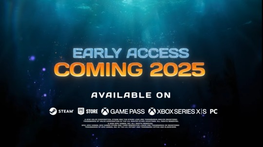
no exact date for early access, which makes me think we won't get it until spring at the earliest. however, the first two games came out in winter (december for sub1, january for bz), so its possible it will keep with that trend and be out before march. don't take my word for that, though, this is purely speculation.
with this teaser (or potentially before, i was not actively checking this LOL), there's also now a steam page up with additional ingame screenshots and description of the game with a lot of new information!! because tumblr has a screenshot limit, im going to rb this post later with all of the steampage info.
but there is a LOT of new stuff we've learned now!!! pair all of this with this article showing screenshots the devs have dropped in sub1 time capsules (which i will also talk about in the rb), and oughhhh it is a GOOD DAY to be a subnautica fan!!!!!! are we all ready to get dragged back into this fandom?? i hope ur all ready. we're gonna get water vortexed. help.
#im so excited im so exciteddddddddd#GGRRRRR BARK BARK GRRRR#sub 3 news#undescribed#long post#<- because im normal.
44 notes
·
View notes