#free colouring page
Explore tagged Tumblr posts
Text


hachune and shiteyanyo! i tried to make it look like it's from 2009! X3


you can use the blank one as a colouring page!
#hachune miku#hastune miku#miku#vocaloid#vocaloid fanart#free stuff!#free colouring page#colouring pages#aesthetic#art#2000s nostalgia#nostlagia#nostalgiacore#pixel art
43 notes
·
View notes
Text

I haven't made one of these in a while, so here is a new, completely free, and very magical colouring page for all of you!
Above, the double square with the Sun and the Moon: protection for your home, your health, and your abundance. Below, the bell: joy, happiness, protection against enemies, bringer of good news.
You can use them just to enjoy some colouring, but also as embroidery patterns, or as sigils for your BOS/journal. If you print several of them in cardstock, you can create a very nice garland for your altar. This could be a very nice and meaningful activity to do with your kids now that the weather is finally cooling.
The only rule is that this is for personal use ONLY. Enjoy, and feel free to share ❤!
0 notes
Text

Happy Sun/Moon Reveal-versary! 🎉
The 21st of September has arrived meaning it's time to grab a slice of cake and celebrate as today is Sun and Moon's Reveal-versary/Birthday! In celebration of this, today is also the day the 2024 Reveal-versary magma collab opens!
The reveal-versary collab is a week-long event featuring two magma boards artists can draw in! (Time is dated from when this is originally posted.) Biblically accurate DCA, AUs and variations are all welcome to join in the celebrations! (If you have questions about what magma is or want to see some previous examples you can check out this post!)
Like last year the reveal-versary collab is split into two boards! Though starting from this year there will now be a surprise themed board each year!
The Party room: The main board where you can join Sun and Moon to celebrate their birthday! Grab a slice of cake, bring some snacks, add some gifts they may enjoy or add balloons if you wish!
Themed board: This years themed board is a Sleepover! Join a tiny pair of familiar faces over by a collection of pillows! Would you join in any mischief, join a sunny friend in some reading or simply get cosy during the sleepover? Feel free to add blankets, pillows, beanbags and maybe even some plushies!
Before jumping in here are the rules:
No NSFW
1 Character per board (For now! This may ease later into the event, this is to give people time/space to join when they can. Keep an eye on any updates for if this changes! Small props/additions can be added freely so long as they don't take too much space.)
Merge your layers when finished! (This is important to prevent slowdowns and allow others to draw if we go near the layer limit)
Sign your work (So I can credit you when the final result is posted!)
Keep your character a reasonable size (No characters that take up a large quarter of the canvas please!)
Please try to colour and finish your character/art if you can!
✨A additional thank you to the daycare friend pick-up server mods for their support with having this event run in their discord!
Without further ado, happy doodling and happy reveal-versary! 🎉
⭐Collab boards:
⭐Casual Boards: For those who want to doodle outside of the collab!
#aqua events#events#reveal-versary 2024#reveal-versary#fnaf#dca fandom#fnaf dca#excited to see how this'll turn out have fun all!#There's still some colouring on the second page I need to go through but you're all welcome to add into there now!#Remember to respect your fellow artists!#Feel free to tag me in and parts you post!
228 notes
·
View notes
Text
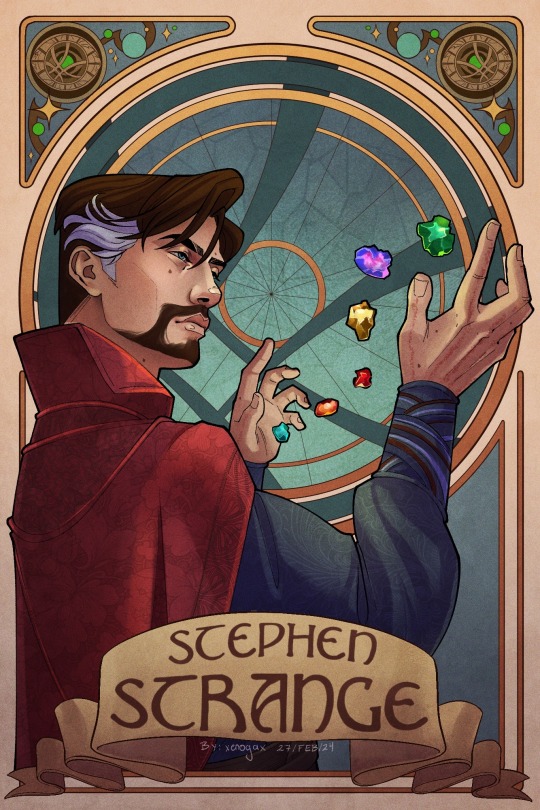
Magic man but make him art nouveau
Edit: I’m so dead I forgot his beautiful scars and moles orz added em now
#doctor strange#stephen strange#marvel#dr strange#marvel fanart#will probably add this dude to the free colouring pages#when I get the energy to sort through the layers
594 notes
·
View notes
Text
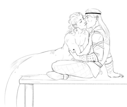
hooked and caught 🎣
#i was initially planning to colour this but it's been sitting in my WIP folder for nearly a year now#so im posting it as is#feel free to use as a [glances at google translate] colouring page? if anyone feels so inclined#gerlion#the witcher#the witcher books#geralt of rivia#dandelion#mer!dandelion#art#my art#yes it's loosely inspired by that one fic#fanart
282 notes
·
View notes
Text
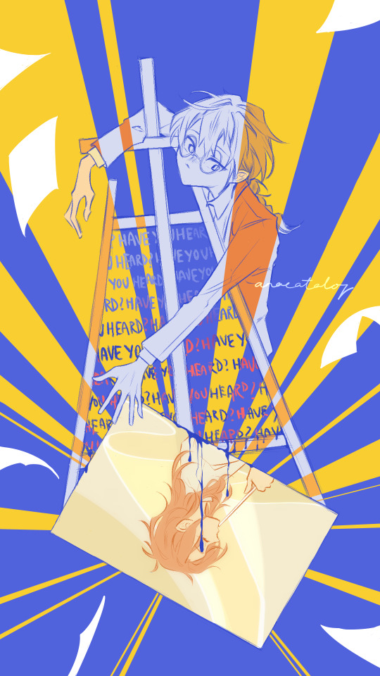
they're so, so wrong about you
no-foreground version because i'm still unsure whether it adds to the image or distracts from it:
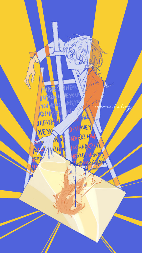
#tbhk#tbhk shijima#jshk#toilet bound hanako kun#jibaku shounen hanako kun#shijima mei#was originally going to have the easle resemble a crucifix and have the colours allude to a stained glass window#oh and the pages in the foreground were gonna be feathers but then i thought “nah that's too obvious”#and then i zoned out#so uh. yeah idk what this is now#pls feel free to share your interpretation :D#fav#milk guy art
285 notes
·
View notes
Text

Hastune Miku Colouring Page 06
Recently decided to scan in my Miku colouring book I got ages ago (as I'm rubbish at using colouring pencils).
So sad cuz this book doesn't note down the illustrator's names ( ; ω ; ), I'll have to go looking for them some other time.
↓ I've added this page's scan below the cut, if you want to colour it yourself (´ ω `♡) ↓
Enjoy!!!


#fanart#digital art#hatsune miku#colouring book#colouring page#cute#kawaii#free to use#vocaloid#artists on tumblr#illustation
20 notes
·
View notes
Text
@ The people who make colouring books where you just colour parts of the human body to study the anatomy: I want to kiss you on your mouth.
#60 seconds till mission begins rambles#I've been so deprived of drawing Medic lately I feel so bleak#I'm not a big fan of colouring but a class I'm taking this year has The human brain colouring book listed in the class literature#Immediately went to loan it at the library and scan all 300 pages; I'm going to send it around in class like a dealer#All is fair in Software Piracy and Academia; yall should have made it free and open source in the first place#For legal reasons I will add here that it makes no difference if my teacher who owns a copy made copies and distributed them in class#The neuro branch isn't even my field of specialisation but I never say no to a bit of medical knowledge#Me @ my Prof who collaborates with people doing work on Parkinsons and Alzheimer pspspsps tell me more; let me in
35 notes
·
View notes
Text
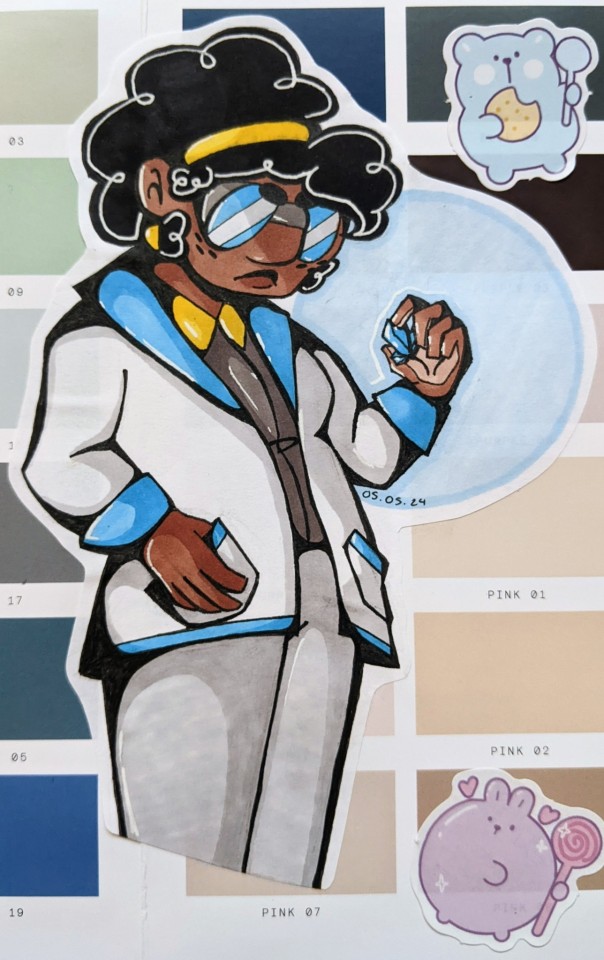
This blog is gonna end up posting purely Prism stuff at this rate ..good lord
#i was gonna add more drawings of her but uhhh ohe i don't like and another I want to do a double page spread...i have a sillay idea..#but augh once again her concept art strikes....giving her a lab coat which is more blue than yellow accented....to contrast her canon design#genuinely there's something about her which just captivates me. like idk. her and juniper are definitely my top two at this point i think#like jj is so much fun to just. fuck up I can't state that enough. i can throw 1000 headcanons at him and they all fit ok#prism i can get more nuanced and i have a whole ass narrative of her time at the agency and her friendship with reggie like. AUUUUUUGh#but yeah god i have been on my fully coloured art bullshit right now idk why. then again i did finish all my art coursework so i feel free.#i can just yearn for roxana prism literally every page<3#im sat here just so. good lord. everythung abt her good lord. i need to be sedated#tranquiliser dart might work#head in hands. wild sobs. roxana prism i wish you were real.#ieytd#[agent moose's art]#roxana prism
22 notes
·
View notes
Note
Hello to you, whom I assume to be a busy bee atm 🐝🍃
Is there any chance you might have some coloring pages you are willing to share? Aka some lineart (no matter how messy) you wouldn't mind me printing out and going wild with? The ones I have at home don't really click with my brain right now 🤔
Ahhh, of course, here we go! (And since this fits the occasion, just a heads up that it's final exam week for me from monday on (one horrible, horrible week full of exams and presentations and papers and urghh-) and I'm 100% definitely gonna be ill afterwards (I mean when am I not but then for real) so I'll probably be back in february!)
In the meanwhile, I packed some lineart under the cut (even one new lettenhove piece) - this is an open invitation for anyone to have fun with these!

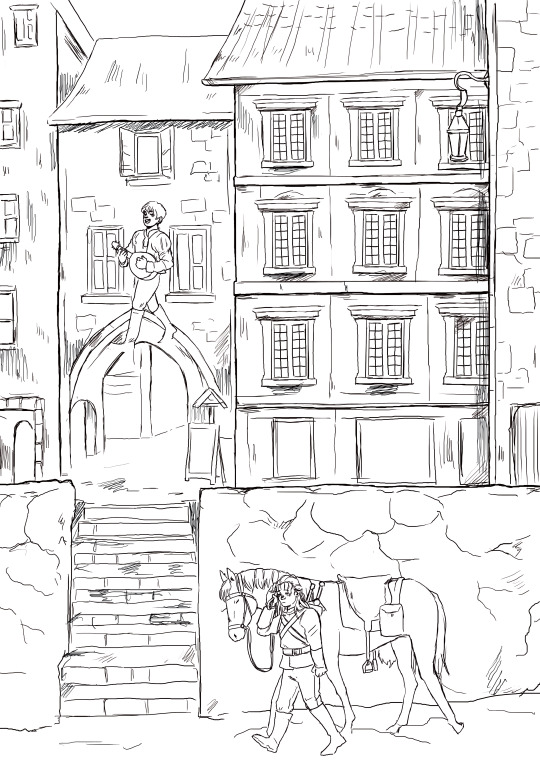


#the witcher#geraskier#colouring page#free to color#I'll be going straight from exam week to my shift the next day so it's gonna be some really exhausting 12 days of work#so I'll happily see your coloured pages#(should you do them - no pressure)!#the lettenhove one! Geralt brings Jaskier flowers to make him smile..#that thought makes me go very 🥺🥺🥺
200 notes
·
View notes
Text
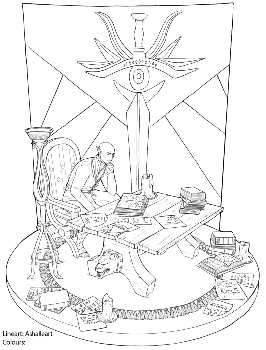
As promised: The free Solas colouring page <3
This is coming up earlier, so have fun with it! I only ask: If you do colour it, please don't post it on December 4th, don't remove the watermark, add your own name to the colours and feel free to tag me, so I can see it <3
Link over here:
PNG for colouring
#dragon age#dragon age fanart#Dragon Age inquisition#solas#solas fan art#fen'harel#colouring page#free to color
250 notes
·
View notes
Text


#colouring pages#vocaloid colouring pages#vocaloid#pjsekai colouring pages#free colouring page#free stuff
3 notes
·
View notes
Text
i promise im working on the follower celebration drawings! i just want them to be perfect for yall
#they will in fact be colouring pages#4 are sketched out!#i think im doing 5 total#im working on these any time i have a free moment#which. ill be honest is not a lot of moments but#whatever!#(i did this instead of my homework)#hartradio
7 notes
·
View notes
Note
This isn't the usual kind of ask you answer, but I've been working my way through the videopass archive sequentially and have been thinking about the historic/vintage livery that the teams are going to be using in Silverstone after the summer break quite a bit. Personally I'm very fond of the West Honda Pons' black and white livery especially with how they had the names of the riders on one side and the team name on the other, and obviously the gauloises and camel yamahas are iconic. But you've obviously watched a lot of the older seasons, so are there any liveries you'd like to see/which ones would you personally pick for the teams?
I too have been having thoughts about this! I do have some of my faves in a wee folder, and initially my picks were a bit limited in terms of range of years and teams. BUT let's do this properly. all eleven teams. my hot take for each and every one of them
CAVEAT NUMBER ONE look I don't know how 'design' or 'colour theory' or even 'taste' work. most of my reasoning doesn't extend beyond 'I thought this looks nice'
CAVEAT NUMBER TWO I also don't... quite know how this works in terms of who's allowed to use which livery? like not just the sponsor stuff, but would teams be able to use liveries from... idk, a different satellite outfit that was in the sport before they were? this ask mentions the pons liveries.... could honda teams actually use those? what if you don't have a lot of history? is anyone allowed to use mv agusta liveries? would teams go for special liveries, or just the regular ones? how strict are the rules for what you can use?
so. y'know. I'm really just guessing here what's even possible, which meant that for... uh. some of these teams. I did have to reach a bit to come up with a viable livery. let's just make clear this is all vibes and go from here
HONDA
they should have no problem with coming up with plenty of options. let's start with the west honda pons, which the ask references:
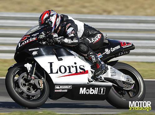
excellent pick, anon. if they can use this one, I'd very much support it! we're missing black bikes on the grid currently... this one's simple, it's classy, it's got a little bit of identity with the name written on the side. the dark red highlights work nicely. it's also a livery that, unlike some of the ones to follow, should still work well on the current bikes without losing its identity too much - though maybe you'd have to put some thought into how you'd place the actual name. should still be plenty of space though! and it'd be easily recognisable to fans who are familiar with the old livery, which I reckon is also an important metric
while we're on pons, shout out to the ducados honda pons livery:
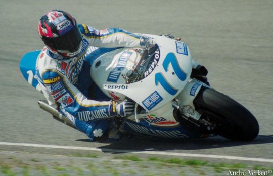
nice shade of blue! nice design of the leathers! pleasing shape of the numbers! just has a lot of character and charm to it
anyhow, let's get to the factory honda team. the VERY first pick that popped into my head was the special livery for aragon 2011:
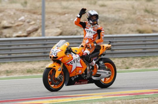
so I get that sense that plenty of people hate this livery and think it looks 'childish' and I'm sorry, but if you think that, congratulations on having bad taste. it's cute! honda barely ever has fun! look at how orange it is! look at the stars! there's a star on the leathers too! I'm fond of the way the front of the bike looks too, how the numbers are placed kinda messily on the star. this one's just, y'know, a bit more creative, something that's just different from how we usually expect liveries to look. screw classy and stylish, give me something with a bit of charm
moving back in time a little further, here's the valencia 2003 livery (valentino's last race with honda):
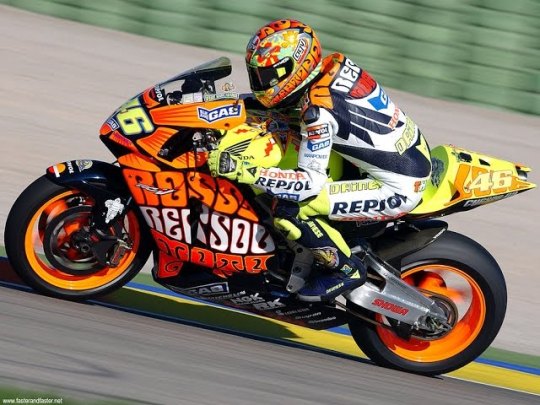
isn't she gorgeous?? I'd put that bike in my bedroom. lovely from every angle. if you look it up, you can find more photos to show it off properly - just see the sun on the top of the bike. really nice mix of the traditional repsol orange with the yellow, it all just works together. bright like the sun
and one more special livery from the early noughties (if not from the factory team), here's mugello 2001:
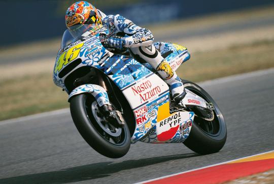
hardly a controversial choice, people love this one for a reason. it's pretty!! blue flowers!! this one should work reasonably well on the modern bikes too and obviously most fans should be able to recognise it. again, I don't know what the stance is on special liveries - but hey, it'd be fun to give a certain someone in your factory team a livery from this era
and going back further still, here's eddie lawson 1989:
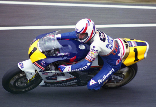
yes, it's rothmann's honda, yes, I've decided not to care. this is my personal top pick for honda. it should be recognisable even on the current bikes, it pays tribute to honda's long history by not just sticking to something from this century, and it looks cool. clean cut colours that are nicely separated out - I really like the yellow highlights on either side of the bike, plus the way the separation of the blue and white is handled on both the bike and the leathers. it's all quite clearly demarcated, but with nice details to give it character - those stripes on the front of the bike and on the the leathers. the touches of gold. the rider's name on the side of the screen. the number on the back of the bike. cool bit of history, too, like they stole that man away from yamaha and it certainly worked out for them. it's fun!
and one more jump to the past to hailwood's late sixties honda:
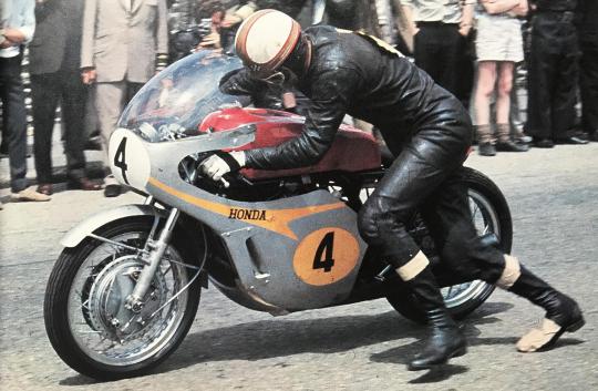
this one is proper honda #heritage and I'd totally get if they go with that. my main issue is... I'm not quite sure how it'd work on today's bike, shape-wise? like, the charm here is really the simplicity, the way the orange-gold spreads over the silver. does that work if you have all the bits sticking out everywhere? maybe somebody with a better understanding of design than me can figure it out, and I do like this one. the numbers look nice. idk. it's neat
LCR
well. I guess you'd want to go with one of the cecchinello liveries here? my problem with lcr is that they seem to generally be pretty big on their retro liveries anyway - the first one I thought of... basically looks like the 2021 lcr livery anyway? boring! done that! then there's a few years that are like... silvery, but, and I know this is an unfair way to go about this, I kind of feel I've already gone silvery with a few of my other picks and they're all nicer. so, here's my pick from 2000:
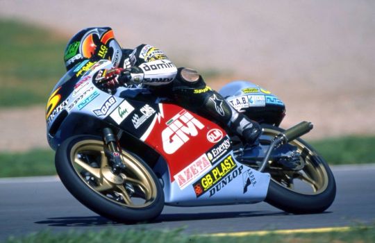
it's a bit busy, but that's kinda the fun of some of these older liveries. big chunk of red, some blue, the nice bright yellow number, even all the logos are kinda fun... I like the weird shape of the white line that separates the red and the black. I don't know, it just works for me as a complete package in a way some of the other lcr liveries don't
YAMAHA
yes, gauloises yamaha. my beloved. everyone's a fan for a reason
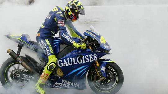
can't not mention it!! I do think valentino's version specifically works the best because of the extra bit of flare the yellow highlights provide here. but also the GO!!!!!! thing works on every version. it's fun! sometimes it's okay to go overboard with exclamation mark numbers! this one kinda hits the sweet spot as being proper classy but also joyous, enthusiastic. just overall very much a vibe
on camel yamaha, I do like the livery, but personally I do just associate it more strongly with camel honda? which was literally the same livery. that might not have been the factory team, but those were still serious frontrunners during the early noughties... and, well, it just doesn't feel specifically yamaha to me idk
okay, I'm going to restrain myself here on the valentino livery front. yes, I too liked laguna and valencia 2005. I have only 30 images to play with here and I'm not going to blow half of them on valentino special liveries, so I'm going to stick to my two faves. assen 2007 and catalunya 2008:
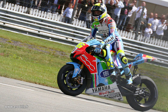
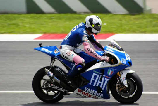
they're just! fun! when it comes to liveries in general, my basic criteria are a) can I easily figure out who's riding them, and b) do they make me smile. elegance is boring, give me something more quirky and memorable and FUN. assen is just. a lot. lots of colours, such a bright and cheerful livery that still works as a complete package. the bike's fun, the livery's fun, fabio would look fantastic in this one. and catalunya (in honour of the italian national team) is just a cool idea! the football helmet! the mock shirts! the pink sleeves! there's a real creativity and charm to this one - and at the same time, the base design of the bike is actually really lovely and stylish. also I associated both of these liveries with extremely fun valentino races that I'd definitely recommend (literally two of the top six vale/casey duels), which... well you can't say that about the two 2005 liveries I mentioned above is what I'd say
now, I know I just said forget laguna 2005, but of course laguna 2005 was in itself a reference to a past yamaha livery. so cut out 2005 and just pay direct homage to the iconic late seventies design, feat kenny roberts:
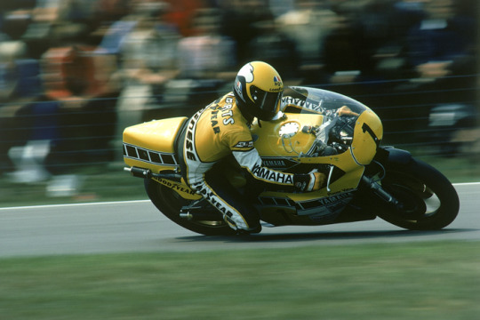
another one everyone loves for a reason! it's a nice shade of yellow, it works well with the white and black... the black dashed line thingies are of course iconic and they just make the whole thing quite dynamic and snazzy
and one more. marlboro liveries do unfortunately slap, plenty of them are fan favourites... look at this red one, feat. eddie lawson 1984:
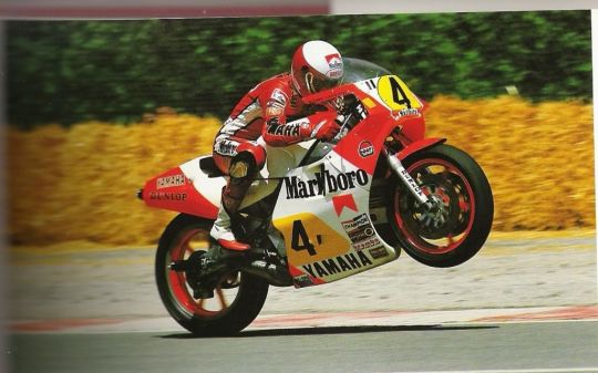
it's very. blocky. you've got the red bits the white bits the yellow bits. they have nice shapes. nice lines. the yellow bits where one's a circle type thingy and the other one's whatever you call that shape and then you've got the numbers on them. please don't read these descriptions. there's plenty of the marlboro liveries over the course of yamaha's time, but this one's my favourite. and it's the one I'd choose! I know it's super iconic but we already did a tribute to the 70s one back at laguna 2005. do this one instead! it's very yamaha but also a little more creative than the most obvious picks
DUCATI
well. if we're talking marlboro, then yes, of course the old marlboro ducati livery is very memorable:
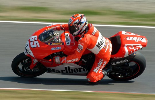
this is a bike that looks good. there's not much more to say about it (or, well, there probably is, but again it should be obvious I don't know how design works). it's a nice shade of red, I really like how the front looks... my issue with this one is that low key it is the marlboro logo that makes it particularly distinctive. kinda feels against the spirit of the whole thing, damn those tobacco companies and their lovely bike designs
here's mugello 2006, which in itself is a retro livery. I'll allow this one and I do think it's just?? very nice??
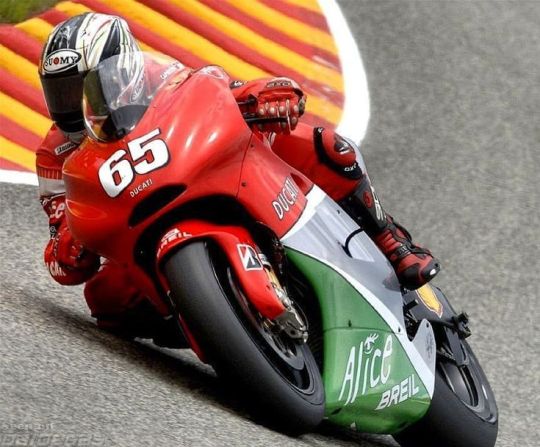
really pleasing dull colours, three shades that work together well, got something old fashioned to it. my main problem with this one is... I don't feel like it'd look as good on the current bikes? I don't know, this one works because of the kind of... soft curves of the front of the bike. I do also think quirky and a bit in your face just suit the current bikes better than trying to keep things too classy?
my general problem is that ducati history in motogp is like... we're working with a limited sample size. and when I go through the options I do find them a bit. meh. the thing is, right, the red bikes are nice, I do like the marlboro design, but it's also still essentially a red bike. and if you translate these designs to the current bike shape, it's not going to look THAT different to the bike they're riding any other week. the mugello 2006 probably does better on that account, but I don't know. I think I am kind of committed to making them all actually switch around colours here
so I was wondering if maybe you could delve into the superbikes archive? you could go for the 2001 livery, feat. bayliss (also a motogp race winner):
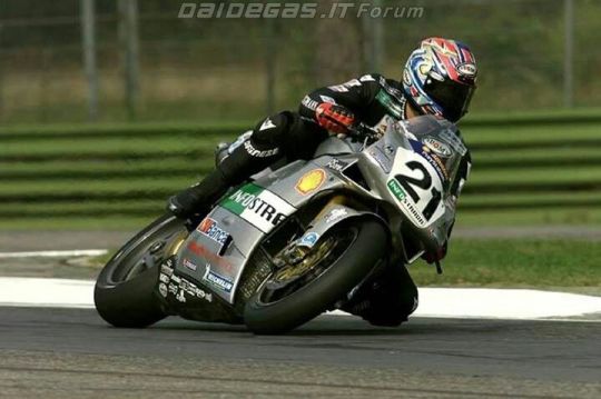
I think the silver pairs quite nicely with the black leathers... also I like it whenever the bit on the front where they put the number on has a slightly quirky shape. I'm not going to pretend like this is my all time favourite livery, but I do like it well enough! it'd translate well to the current bikes, would give us a proper switch-up, works quite nicely imo
and one more from superbikes, this from 2012:
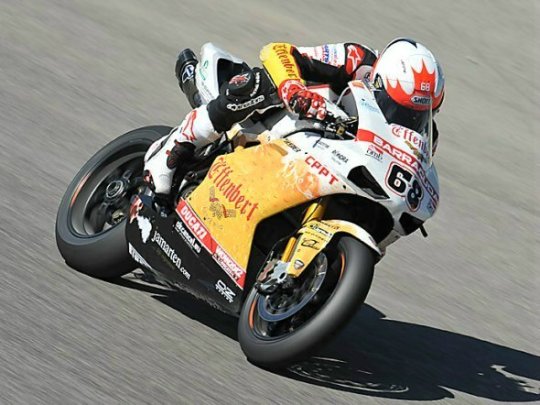
this one isn't happening for a bunch of reasons, not least because I doubt the effenbert team is one that's remembered particularly fondly by ducati. still, it passes the 'does it look distinctive' test to me, making a 'what if you threw a pint of beer over a motorcycle' livery is at the very least something different
PRAMAC
there's a few different ways you could go here, but I'd just keep it simple and go for one of the years where the pramac logo is big on one side of the bike. here's harada in 2002:
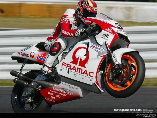
not a bad logo! you've got the arrows and everything! you've also got another more subtle silver arrow in the middle of all the white, makes the whole thing feel quite dynamic. simple colours, very pramac. bold and brash
(you could go for the 2018 mugello livery too but I philosophically reject having a 'retro' livery from 2018)
GRESINI
another satellite team that's been around for a while, and my suspicion is they'll go for one of fausto gresini's liveries. none of those... really appeal to me... so I wanted to suggest one from their telefonica movistar days back in the mid noughties. that's right: I'm talking sete's livery:
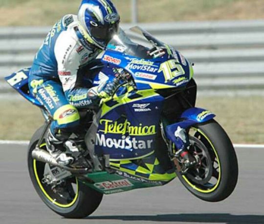
in practise, this livery does deeply annoy me in 2004 to 2005 because - despite not being in the same factories - you've somehow managed to get both title rivals in pretty damn similar liveries. like, can I tell them apart? sure. but especially with the poorer video quality, is it really necessary to make it this tricky? well! no! but also sete had this livery before his title rival switched to yamaha, so he came first. I like this one a lot! I like the way the yellow is integrated, the chequered bits around the telefonica movistar logo, good helmet too. slightly unusual patterns for the win - there's quite a lot going on with the lines on this design but it all kinda comes together. I actually think you could make this one look really good on the modern bikes, and it has a real spark and flare to it. also I would find it narratively pleasing if marc rides with sete's livery
but if gresini wants to go another way, shout out to their 2010 livery (several of the early 2010s look quite similar):
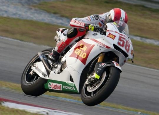
I'm not the biggest fan in the world of white liveries, but the style of this one pleases me idk. there's a slightly unusual shape on the side of this one, which I've already said I approve of. it's a nice shade of red to pair with the white. not my first pick, but I'd settle for this one
VR46
right, this is one where I really have questions. ... are they allowed to use just any of valentino's old liveries? what are the rules here? I think to maybe keep things straightforward here, I'll avoid his actual honda and yamaha liveries (those kids are not getting the gp11/12 let's be real) and stick to the lower class ones. now... those are aprilia liveries, and if aprilia wants to use some of those then please have at it. otherwise: vr46, lads, this is the way you want to go. here's 1999 (though 1998 also looks lovely):
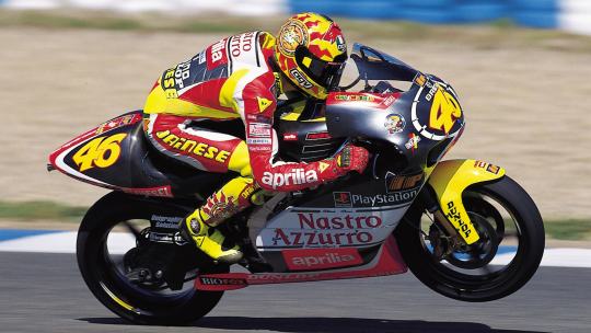
one where the leathers and helmet really feels like a part of the design, like that's the bit that really completes the look. the dark grey base tone works as something you can layer all the fun stuff on. the font of the numbers! the warm reds and yellows! the stickers! this one's just FUN, it has a real adolescent verve and joy to it
and of course there's the mugello 1999 special livery:
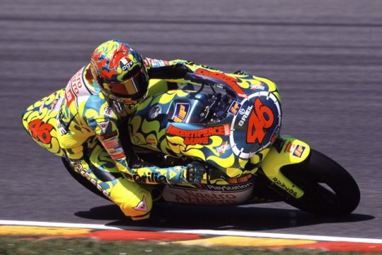
she's so pretty!! recognisable! I don't even know what to say about this one apart from. look. it's fun. just something youthful and joyous and energetic to the whole thing... keeps things pretty straightforward on the colour front, the dark orange-brown highlights really brings it all together. or something
APRILIA
so. here's another question. are we just stuck with premier class liveries here? because if so, it's pretty slim pickings... but look, thirty images, we're not getting into everything they've been up to in the lower classes
luckily, aprilia do have quite a nice 2002 entry in the premier class:
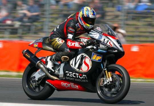
dark colours are fun sometimes!! I like the shape of the ms logo! it's a bit chaotic, but in a fun way! it feels very aprilia, somehow. this would be my pick I think, I could easily transpose this to the current bikes in my mind's eye. aprilia kinda feels like it's supposed to be a bit chaotic, all those bits sticking off. love the red sleeves of the leathers
you could also go for the 2004 livery:
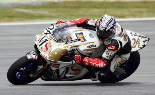
I'm not personally? super into the white and gold as a combination? definitely prefer the darker base colour of 2002. but it's quite distinctive - the red sleeves actually pop out more in this one. it's neat!
TRACKHOUSE
uh. um. uh. are they... allowed to run petronas colours? I mean it's basically still the same team? maybe they can borrow some aprilia ones? if not, then well they're the rahh rahh america team. I would ask ducati very nicely if maybe they could use this indianapolis 2009 livery in honour of the late nicky hayden:
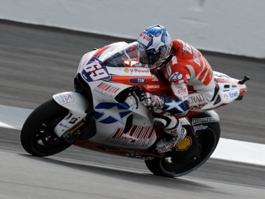
I know you probably can't do that, but well! if you could, that'd be my pick for them! I like stars, america has stars on their flags, this is very rahh rahh america. the helmet and liveries are also fun and have stars on them. that's all I've got, sorry
KTM
okay, we've got an even bigger problem than aprilia here. these guys have NOT been in motogp long enough. my idea here was... so obviously ktm just do not have a suitable back catalogue of liveries, but aren't they like basically red bull? and red bull did like. a one off partnership with suzuki for laguna 2005, and suzuki isn't even in the sport any more so it's not like there's a CLASH there. I don't know how this works! whatever. I think it's nice!
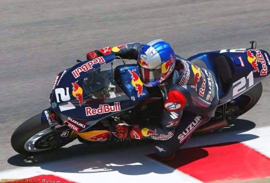
it's not the most exciting thing I've ever seen in my life, but the red bull logo works well on the black. looks classy! and if suzuki gets mad then well red bull can just chuck money at them idk
the other option is... doesn't ktm own mv agusta now? go for one of those! they look quite similar for much of a decade, so I could have included another hailwood photo here - but I'm just going to use the early seventies mv agusta instead:
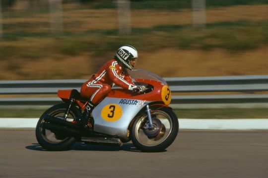
it's very simple, very basic. I'm not... sure this works on bikes these days. anyway I chose this one over its predecessor because I do like the stripes on the leathers, very adidas coded. if you can figure out how to make this whole design look good for the more complex bikes of today, then this would be a good pick imo. I like quirky shapes to put my numbers on... but sometimes circles are also good
TECH3
so. for a while, these are running the gauloises yamaha liveries, which we've already covered. maybe they could take the fortuna yamaha liveries instead that they used, especially if the factory yamaha squad doesn't want the kinda similar ones they ran at certain points. basically they're the red yamahas in the noughties. I'd go for 2004 tech3, which... y'know, the fortuna font is just quite nice, they're stylish liveries, they're just bikes you look at and go 'wow that sure is a nice bike'. and yes, we do need to at this point also mention the estoril 2004 spiderman livery
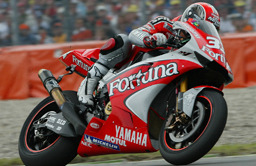
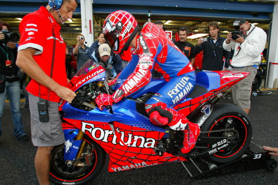
all I'm saying, if pedro acosta does not show up to silverstone on the spiderman bike. a part of me will be disappointed
otherwise, I thought the dunlops in 2007 were quite nice?
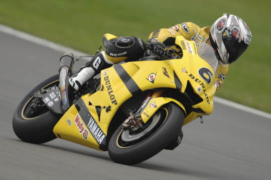
yes, yes, it's another yellow and black yamaha livery. but hey, it's a bit different from the one they referenced at laguna 2005, keeps things fresh. wouldn't mind this one
IN CONCLUSION
might add to these at some point, but those are kinda the first picks that come to mind! a lot of these are annoyingly recent, because most teams on the grid aren't that old. not quite sure what the rules of the game are here! which does mean that, as much as I enjoy the recent designs, I kinda hope honda and yamaha don't go for liveries from this century and dig a bit deeper in the archives
basically, what I'm looking for from the teams is a retro livery that a) is clearly recognisable to anyone familiar with said past livery, b) works with the actual shape of the current bike, c) looks different enough from their current livery, I want colour swaps, and d) looks cool. also, they should coordinate. istg if half of the grid shows up in white liveries... hopefully at least some of the teams will go for the fun ones!
#i don't feel like with old streams i ever SEE the liveries particularly clearly so some of them are a bit wasted on me#BUT my twitter for you page shoves like. so many photos of old liveries at me. so i've basically developed my takes through that#oh and obviously i know all the valentino ones. partly because i have my very nice reference book with very nice photos#also there's been a reddit thread on this like. once every two months for the past decade. that'll help#some of these are a REACH. ktm and trackhouse in particular but look that's all I could come up with#if ONLY suzuki were still in the sport#motogp#//#brr brr#batsplat responds#collected my photos during the race today which was nicely calming#anon icl I'm not sure there really is a type of question I usually answer. a wide range of stuff hits my inbox#I LOVE rating things even when I don't have like. sophisticated opinions. I'm just going colours pretty!!#I hate myself for this but when I saw the news I immediately went!! sete + marc livery!! gresini heritage!!#get that man in blue and yellow!!#also if anyone wants to add their own faves please feel more than free to. the thirty image limit really hurt with this one
9 notes
·
View notes
Text
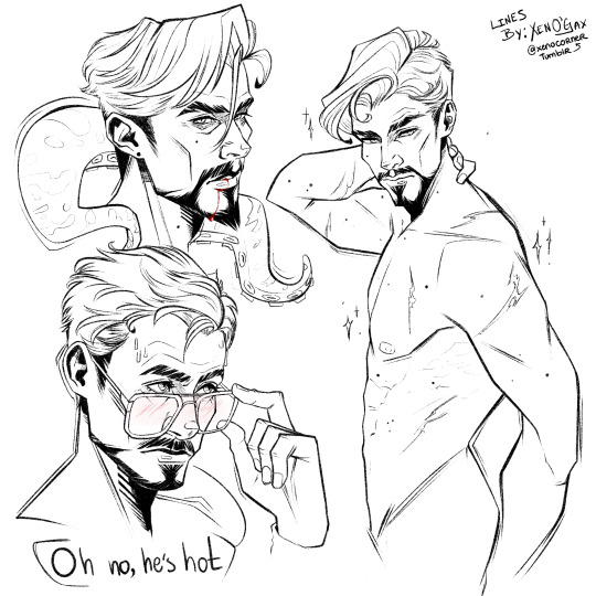
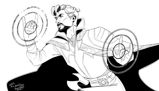
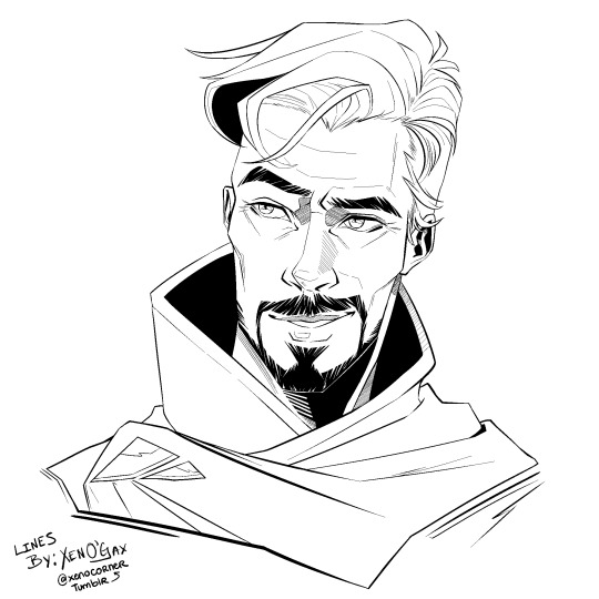
Doctor Strange Colouring Pages [F2U]
So, I have a bunch of Stephen lines that either I never coloured or that I disliked the colouring result of. So, thought I might as well upload them as colouring pages :) They're free to use, all I ask is that you don't remove my credit from them (and tag me if possible if you do colour them, I'd love to see what you make :D).
Just don't colour them with AI/feed them to AI, plz? It probably should go without saying but, just in case :'] In this post you have the previews, but you can find the files here. There's the digital PSDs and a printable PDFs available :]
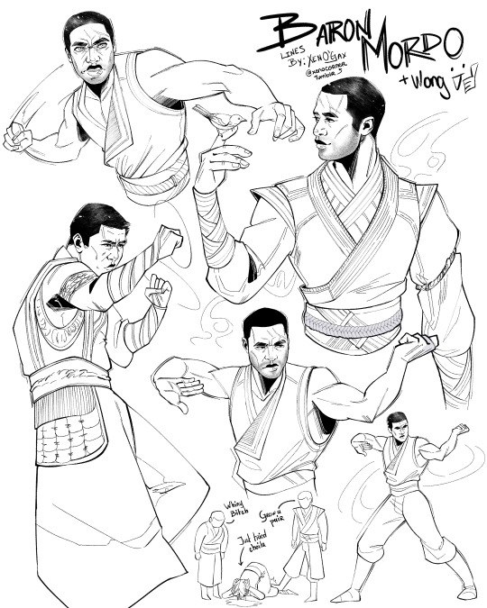
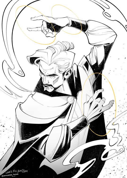
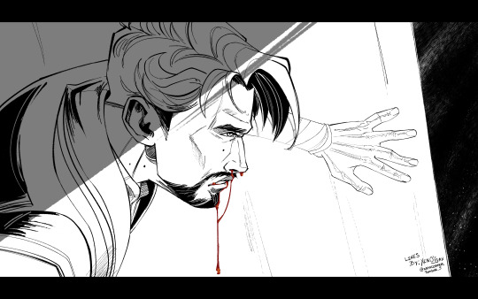


#doctor strange#dr strange#stephen strange#marvel#marvel fanart#colouring page#coloring pages#free to use#f2u
251 notes
·
View notes
