#for when I need to try out a new brush or rendering style lmao
Explore tagged Tumblr posts
Text


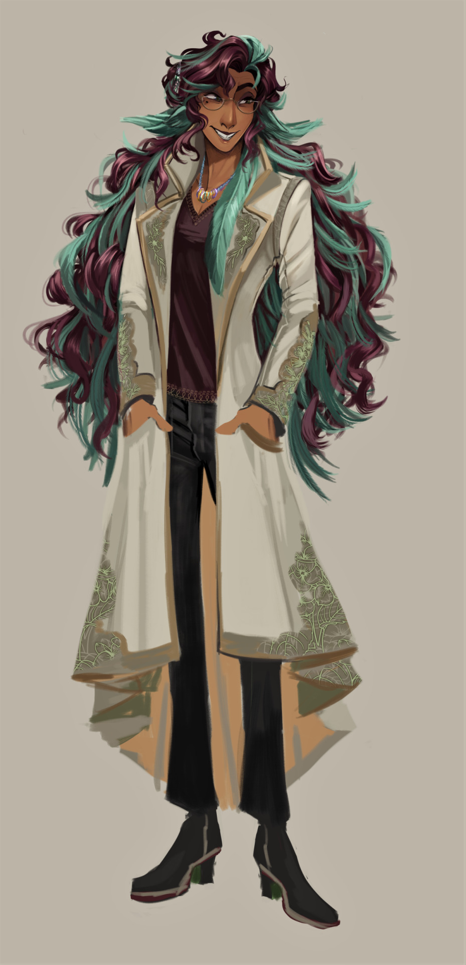
Eggy Art I done recently :)
#original art#original work#original character#sona#my art#kiti art zone#the reason I draw them sm is because they are my test subject#for when I need to try out a new brush or rendering style lmao#Anyways oc art be apon ye#egg
64 notes
·
View notes
Text
I've been slowly easing my way back into art despite my bear constant frustration and disappointment over my limitations in skills BUT! But!!!!! I am working on OVERCOMING those disappointments and frustrations and actually working through them. Like, look, my art ability is... pretty amateur at best, I fully acknowledge this. There's so very many things I need to work on - and I AM! I am dealing with the Struggle and trying to figure out how to get through it. I'm dealing with bad anatomy and trying go figure out what's off so I know how to fix it. I'm looking my ugly proportions in the face to understand WHY they're off. And MOST IMPORTANTLY I'm trying to figure out why loose, flowy, voluminous hair is so difficult for me and how to make it come out the way I want! It's so, SO hard lmao 😭 but I am TRYING
I'm trying to keep tabs of art styles I like that I feel mine is closer to so I can learn how they render out what I struggle with, so just can start to understand where and why I'm falling flat and more importantly, working something ugly until it becomes satisfactory!
Like... it will probably be a long, long while before I make things I think are good, but I'm still proud of myself! I'm proud that I'm facing my fears, I'm proud I'm not letting frustration win, I'm proud I'm making improvements however small they are 🥰
Recently I went through a couple old journals where I brush letter the day of the week (Monday, Tuesday, etc) and I was like WOW these look bad lmao my pages were experimental and largely bad lmaoooooooo but at the time they were so good!!!!! At the time I was so proud of myself for trying and learning new things and I've stuck with it so long that I don't know when the transition from rudimentary to now happened but it DID! And I keep telling myself art will be the same way. I'm gonna fumble around a lot but if I remain consistent one day I'm gonna look and go "oh, oh wow look how far you've come"
#ashlie.txt#i try so so hard to treat myself with kindness when it comes to art#to grant myself as much patience as possible#the ugly raw stages are so hard but that just what learning and skillbuilding IS#i need that muscle memory i need that confodence i need to develop and aaaahhhh#I'm very proud of myself
5 notes
·
View notes
Note
When you say hair assets do you mean 3-D models? Do you do the same for backgrounds? I totally get if you dont to share like videos or anything but after reading that last post I'm actually kinda fascinated by your process. I've been really wanting to find ways to speed up my drawing and it really sounds like you have it down to a science lmao.
Oh god I wish... I hate modeling hair, and Its so tedious I don't want to bother asking paula to do it either LOL.
Basically it depends on the style of the hair.

So, this character, for example? If I use her as an example, in this exact little sketch, what i'd do to break her hair down to make assets is I'd paint the entire back-section of her hair (or just steal it from this painting) and fill in the parts where her body was. I'd save it without the large feather in front, without the bits that hang down in front of the wing ears, and without the bangs/top of her hair. Just that big puffy soft feathery blob.
That would be what I'd start with for a single asset. The large feather is something else I'd save on its own, painted without anything hanging in front of it. Save, on its own, away from the main mass.
bangs and the general top of the head is more difficult. That's better saved as a bank. So, again with this drawing as an example, I'd isolate what i've already drawn here of her bangs and the top of her head. I'd save that for anything that's at this general angle if I wanted to save that. Any time I draw it new at another main /major angle, i'd isolate it and save that as well.
Honestly though, her bangs aren't hard to draw, and since the small feathers are done using a brush I made, they don't take long to plug back in either. But if you *did* want to save assets for a very rendered style or if the bangs were complex, that's what you could do. Eventually, you have a bank saved up, and you only have to draw it new if you want to. Between liquify and free transform, you can go a long way for putting the bulk of the back of that hair into the shape/flow it needs to be in with only some minor on-top edits to make it look right. You would just slot that main mass behind your character layer and manipulate it into shape.
To take it a step further, I could do a single clean drawing of her coat cuff details, her lapels, and her coat tails. Drawn out flat and symetrical, that could be saved and then warped into shape by inserting them into or overlaying them onto the drawing.

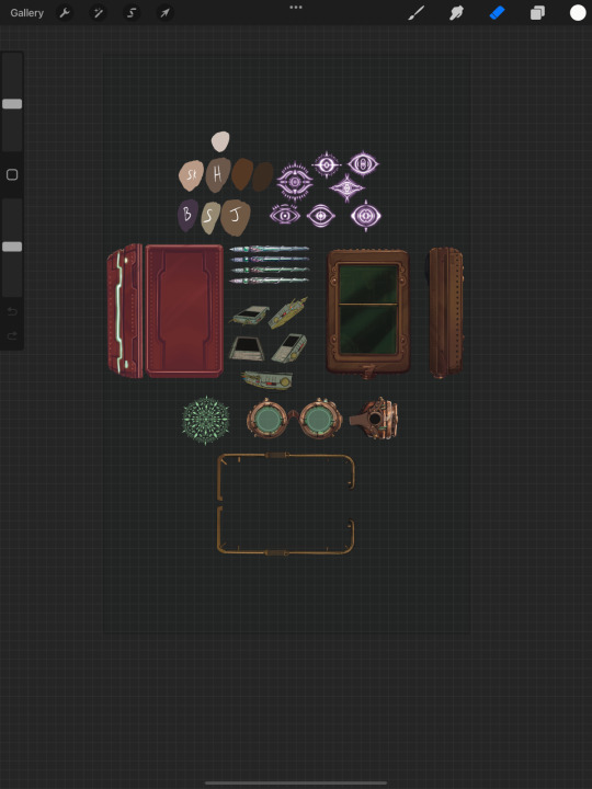
Its not hair and clothes, but it's the one I have most handy atm lol. Example of an asset sheet for a set of gadgetry (plus some glyphs.)
The only time I drew those objects by hand /individually was if they were too small on screen to bother inserting the asset (so no detail would show). Using free transform tools I could put the fully-painted/renderd gadgetry into perspective (and sometimes just a little bit of perspective fix doodled on top for overlaps) and plug it onto the character.
The acting is what matters most, so all of these little bits and bobs and details are just set-dressing. I try to always minimize time wasted on set dressing unless (it's either something I can't use a shortcut for, or frankly, if I'm just in the mood to draw the thing outright.)
I hope that helps! I'll comb thru my non-purged videos and try to find a good example of one that's not from the end of the current chapter and post that at some point.
52 notes
·
View notes
Text
Turns out its a helluva mess when i start messing beyond flat colors!! Might be a sign to not do so much again (but yet .. practice to get to where im one day happy??)
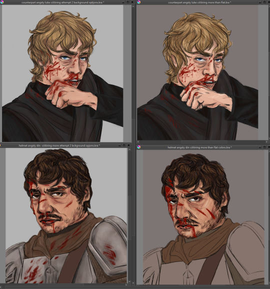
Like ive done as much as i know how to do at this point in time to the portraits (still gratuitously bloody shame on me :') ) oh except for a background bc WHAT does one DO for a character shoulders up portrait background??? Settled for now on a gradient old school photo style lmao
I like the fix it one as is, a lot (but also i liked the lineart for the portraits better i think) and idk, imngonna try give it a light bit of shadows and lights, maybe step away from a lot of blending bc i think i think thats where i went wrong on the other one
Like, they look fine, but they also look. Meh. Like ive used too much blur tool (i havent, i tried using kritas wet brush thing and it looks....ok close up but the effect is no good when zoomed out like posting size APPARENTLY) and its all noncommittally washy.
(cont'd over thinking)
Am i gonna 'render' them a third time??? Do i have the mental strength?? Bc i think maybe trying for something not so, "realistic" could do me better, like a little more cell shady. But also i dont?? I dont know how to cell shade? I dont watch anime or cartoons v much and my style isnt that cartoony or clean lined?
Maybe on the fix it i can try a more....... Conservative and less blended shade/highlights? (And if i like it/learn smth new go back and re re do the portraits same style) I also just. Idk. How does one make it not look so. Flat and meh?? Im doing basic color stuff ok i think, ive got a bit of texture but its still? Eh???
Honestly i could just post them and move on but i dunno, i have the energy to problem solve a lil bit so why not?? (Not tonight. Im gonna sleep on this all)
Why post shit im not 100% proud of? (Ngl kinda been in the mood to take down that first sketch of the fix it bc it looks nowhere near as good as what i fixed it up to but ....... Ah fuck it i was happy w it when i did it so eh)
Why why why oh why is art so hard?????????
I wanna try and become one of those cool artists who post multiple fun things yknow, like u get inspired and can draw it beginning to post in one evening! Im probably way over thinking and pushing myself to some standard of unrealistic perfection i have for myself...
(also i like thumbnail doodled out like, all these things i wanna draw for a really nice fic i read and even after editing some i have like 8 bits i wanna draw?? 4 as like a mini comic bc i havent done one since i was a child and i think itd be kinda rad if i learned to draw short comics for fic scenes i like??? But yeah basically in one inktober post there would only be 5 ideas (a lil more complicated on average i do give for granted but like. Those took me WEEKS) but yeah i just. I wanna draw them. Even if itll probably take me for fuckin ever... (And i didnt even finish off the last two inktober batches, oh. And i have a uni thesis to do ew) .... I wanna push myself to draw faster (less iterations to get it right) and so i can have rly solid and good and quickly done drawings to then color in as i learn to for future?)
Ugh man. You know what i need to do/shouldve been doing before i jumped into coloring original stuff?? I shouldve done colored studies. Like ive been drawing scenes both from reference and original on the inktobers and i think thats why my drawing/character stuff has gotten decent. I really should just whip out like prettily colored movie screencaps and work on painting studies of them. That would really fix up why i cant figure out lights and shadows and blending in coloring! No horrid tutorials just figuring out how can i make it work for me
And you know? You know what it is okay to have pieces that are from before i figured it out right? Im gonna try a slightly different thing for the fix its (if i hate it, theyre good as flat colors too) and yes they dont have a background either please love of god someone tell me how to add random backgrounds bc im not in the mood of scene building further but they float in off white space atm.
If i learn smth ground breaking and can QUICKLY do a bette rendition of the portraits, sure the perfectionist wins. But maybe just maybe. It would be fine to post them as they are. Yea, they look roughly as lifeless as my first big painting/that dinluke poster redraw. And maybe thats okay. Because hi if i do dedicate to doing like a good few color focused studies of star wars scenes as a treat i can come back stronger and have a better piece???? Its about growth babes. YEA
Alright i said to myself thats it in gonna go sleep on it and continue tomorro but. I thought id slip in here a secret surprise for anyone unfortunate enough to have clicked read more... And i got a little whiplash opening the picture bc it looks. SO WRONG but the more you look at it its like ... Fine. Ok judge for urself and tell me pls, first and second attempts at 'rendering' the portraits (the darker bground was the first attempt just going by gut, the lighter one after trying to watch like 1 tutorial and using more brushes and just generally trying rly hard!!)

yes ive clearly fixed issues in the sketch differently in both so they... look... like different expressions?? idk man idk idk idk see now this small they look differently off!! god the curse of the zoom in and out and perception.
#art woes#but make it extra long because im DISTRESSED at not being able to just whip out ideas from my brain to page and it look good in one try#long and rambly and probably doesnt make much sense no pressure or expectation for anyone to read lmao#love yall kiss kiss time for bed itll be easier after sleep#did include a pic of current progress at the v bottom eheheheh
0 notes