#for the mild chromatic aberration and such
Explore tagged Tumblr posts
Text

Moon 22 Part 2
oh, hey! it’s you!
#orange guy finally gets a name reveal: Rye <3!#clangen#wc clangen#wc#warriors#warrior cats#art#my art#aphidmoons#tw eyestrain#for the mild chromatic aberration and such
344 notes
·
View notes
Text

More clearing out the backlog. This one I decided to go ahead and finish. Also, I just learned how to do chromatic aberration, yay.
Anyway, I think it’s very interesting that Manager Magolor never made a CROWNED Magolor mask. Does he not remember or did he see too much on his journey through the timelines...?
#Kirby#Magolor#Magolor Soul#cw mild horror#cw chromatic aberration#Dess Art Post#...That's probably the crown taunting him tbh#cw scotophobia
295 notes
·
View notes
Text


Emily?
Already listened to the new episode twice it's so good i'm so excited for what's to come !!
Like my art? Consider buying me a coffee (kofi) !
#pam.draws#the grotto#the grotto podcast#the grotto pod#emily the grotto#matt the grotto#david the grotto#cw chromatic aberration#cw mild blood
65 notes
·
View notes
Text


Comic panel redraw minus text cuz I couldn't think of anything for them to be saying. Dialogue is my weakness.
click/open in new tab to see in full & better quality!
original image:

#my art#phone art#spidersona#mysterio#quentin beck#redraw#comic redraw#eyestrain#eye strain#like.. extremely mild chromatic aberration. but just in case!!
92 notes
·
View notes
Text

current location: at the foot of an incline northwest of the statue of the seven, fontaine research institute of kinetic energy engineering region, fontaine
notes: taken from the view of an energy transfer terminal
6 notes
·
View notes
Text

CW: mild blood
future leo
this will be posted as a DTIYS on insta and twt/x (crow_stare on both) with more information on there for prizes and such. if you still want to join on here tag me, i would be more than happy to see it. :)

alt. version with no chromatic aberration

alt. version with fire that i ultimately wound up not liking in the final
#rise of the tmnt#rottmnt#rise of the teenage mutant ninja turtles#rise of the tmnt movie#rottmnt movie#rottmnt fanart#rottmnt leo#rottmnt future leo#future leo#rise of the tmnt fanart#tmnt fanart#dtiys#dtiyschallenge#crowstare dtiys#fanart#digital art#my art#i've never draw fleo before#so much for drawing future donnie#i'll get to him i swear
835 notes
·
View notes
Text


More doodles of the meta voice/fail text. Torn between keeping coming up with an actually unique design for them and keeping them as a generic stick figure ghost but no mouth. Except I've been struggling with coming up with an actual design for them.
I like the latter option because it's almost... symbolic? Iconic, but also generic; emotive and witty yet unable to be seen or heard by anyone... But that's a ramble for another day.
IDs under the cut
ID: A variety of doodles of a fan-made personification of The Henry Stickmin Collection's fail text, drawn in light blue (except in one case, where they are drawn in black for easier visibility). The persona is a mouthless but otherwise generic stick figure that is free floating, as though they are a ghost or phantom. All images have a watermark for the-irken-luxray.
ID 1:
The fail screen for the wormhole rifle option from Stealing the Diamond, which reads:
"I'm surprised you weren't able to get down there with that amazing portal technology. It's pretty strange how those portal guns work. I mean it combines the top scientific processes of our time. The portal gun contains a flux quantum generator which propels energy blasts with energy volumes of 4.23 GW with an average speed of 25 m/s. this speed is most effective because it allows the energy to be conserved while still maintaining a speed that is appropriate. The external plastic coating on the portal gun is constructed of a high polymer fireproof carbon fiber. This prevents the intense energy of the portal gun from burning the hands of the user. The intense energy causes intense heat. Oh by the way if you want an achievement click here. I've heard that scientists still do not know what happens if two portals are placed on top of one another. The last time that was attempted... Well I'm sure you heard about it on the news."
Five doodles of the fail text persona surround the screenshot, meant to be the fail text at various points in time. The top left holds a hand to its chin; the top right holds up a finger with their eyes closed, as though explaining the complex topic presented in the screenshot; the mid-left lays on their stomach while kicking their legs, as though excitedly rambling the info presented in the screenshot; the mid-bottom points to the word "here" in the screenshot; and the bottom right has their eyes closed while waving a hand dismissively in the other direction.
To the right of the screenshot and five doodles is a motion-blurred sketch of Henry Stickmin (drawn in black, to distinguish him as being physically present). A speech bubble pointing to Henry contains the Bugs Bunny "For the love of god please help me" meme.
ID 2:
A fail screen for one of the timeout options in Infiltrating the Airship, showing a closed metal door. The fail text reads: "Ok, ok! No more quick time events!" and, in smaller text, "How's your head by the way?"
Two doodles of the personified fail text overlay the drawing (drawn in black instead of blue for better visibility). The first is wiping away a tear and holding their other hand to their stomach as though they were laughing hard, and the second one shows mild concern for Henry (who is unseen).
ID 3:
A screenshot from Infiltrating the Airship with Henry glaring at the camera while holding the teleporter. A doodle of the fail text persona holds out a thumbs up. Text with an arrow pointing to the doodle reads "knows there's like an 80% chance of some shit going wrong".
ID 4:
A fail screen for the G.A.B.E.N. option from Infiltrating the Airship, which reads:
"error: stack overflow
"System.IO.FileNotFoundException:
"Could not find file C:\Program Files\HL3\G.A.B.E.N..dll
"Dump cache;"
Next to the screenshot is the fail text persona, but with smaller, circular eyes that are filled with television static. The stick figure is glitched in multiple places and has a chromatic aberration/"3D glasses" effect.
ID 5:
The fail screen for the Dark Energy Bomb option in Infiltrating the Airship, which has no fail text. Two doodles of the mouthless stick figure are to the left. The first holds up a hand with a bent finger, looking distraught. The second lowers its hand while looking away, looking sympathetic as well as distraught.
Text below reads "(was going to make a joke but a 10yo's dad just fucking died)"
ID 6:
Three miscellaneous doodles of the fail text persona. The left has its hand below its chin in a thinking expression. The middle has its eyes closed and is shrugging. The right is looking downward and pointing at something beneath them.
End ID.
#the irken luxray#my art#fan art#henry stickmin#the henry stickmin collection#thsc#thsc fail text#ask to tag#doodles from the drawer
36 notes
·
View notes
Text

🕯️ Gifts for @apricitydays-lazynights ! 🕯️
—
🔔 TRANSLATION: Chromatische Afwijkingen
Ship: Astoria Greengrass/Ginny Weasley Rating: Mature Length/Medium: 9.2k words, Dutch Inspired by: Chromatic Aberrations by @apricitydays-lazynights Tags: Soulmates, Epistolary, Diary/Journal, EWE, Quidditch Player Ginny Weasley, Artist Astoria Greengrass, Astoria's Blood Curse, Color Blindness Summary:
Astoria Greengrass, an up-and-coming painter with congenital monochromia, records her days as the official portrait artist for the 2006 Quidditch World Cup Team. When she forms an unexpected connection with the star player, Ginny Weasley, her relationship to her art is changed forever. Astoria Goedleers, een kleurenblinde opkomende schilder, beschrijft haar dagen als de officiële portret schilder voor het 2006 Zwerkbal Wereldtitel Team. Wanneer ze een onverwachte connectie aangaat met Ginny Wemel, de sterspeler van het team, is haar relatie met haar kunst voorgoed verandert.
—
🔔 FIC: Some Rivalries Never Die
Ship: Cho Chang/Ginny Weasley Rating: Mature Length/Medium: 3.2k words Tags: Mild Smut, Post-Canon, Canon Divergent, Rivals, Getting Together, There Was Only One Bed, Quidditch Rivalry, Rival Relationship, Quidditch Player Ginny Weasley, Quidditch Player Cho Chang Summary:
Cho Chang might be on Ginny's team now, but she's still snobby, arrogant, insufferable. At least, that's what Ginny tells herself.
—
View all gifts on AO3! 🎶
#hss rare pairs 2024#hp rare pair#gifts#translation#hp fanfic#hp femslash#ginstoria#ginny x astoria#chinny#choginny#cho x ginny#recipient: Apricitydays
7 notes
·
View notes
Text
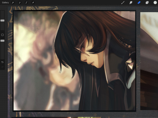
Okay! I said I'd do a quick little tut for the chromatic aberration effect to the anon who asked, so here you go. Above is the raw panel, so from here, you'll be duplicating the canvas/panel by choosing "Copy Canvas" from the wrench button. Once copied, paste it into your folder and select the layer options to turn on Clipping Mask to your base panel. If doing the whole canvas, you can just paste as-is

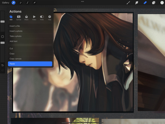
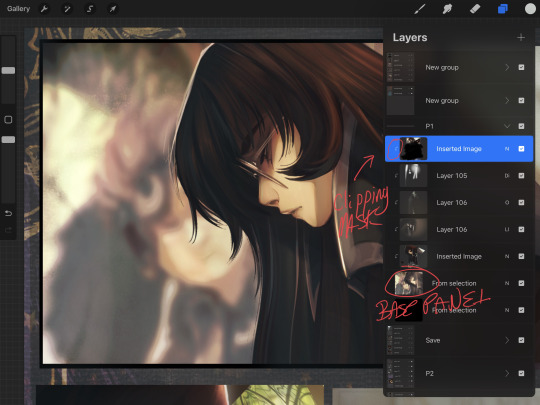

I prefer to duplicate it once in preparation and then again each time I make a change, that way the effect can be toggled on /off or have its opacity lowered to mix with a previous effect if needed. From there, select the magic wand/effects and adjustments menu and click on Add Noise. Important: Pretend I took a screenshot of the drop-down menu, because rats must keep up appearances.
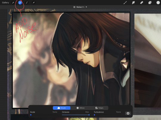
I prefer clouds with maximum octaves and low-no turbulence at a fine scale... however, play with the options and find one you like (or don't use it at all! I like the grain for a mild texture and for harmonizing the art's elements, especially on quick panels or rougher drawings.) I'm going at about 5% here. Just enough to give the desired effect, but not too much.
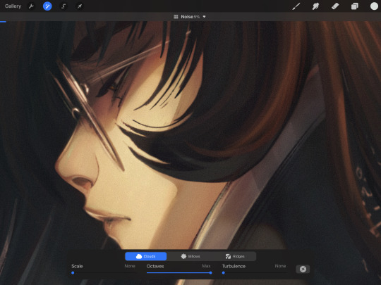
Once it's to your liking, duplicate your canvas/layer and select your new layer to work off of. On the magic wand menu again, select Chromatic Aberration.
We're working with the displace method, so select that instead of Perspective.
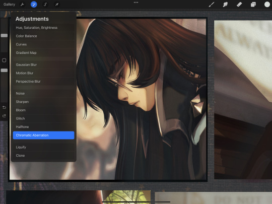

In procreate, the tool works by shifting your cursor in the direction you prefer at the distance you want. I never travel far, and I often use the warm/cold to play off of a reverse of my light source colors. I do that just to create a softened edge and a subtle color pop. Just like with the added noise, I keep the effect on a more subtle side often. Blurring at around 5 - 12 % will give your lines a soft glow and get rid of any (say, hideous pencil lines that you use as inks because you hate inking. Not that I do that. Not me.) Transparency can be bumped up or left alone, does what it says on the tin and strengthens the effect or subdues it.
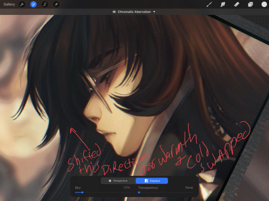
Now, you might find some important detail is now too hazy? Too blurry? Too CHROMBERRATED? If so, gently erase what you want to be crisp. For Maia here, I just erased the front hair curls and her eyelashes.
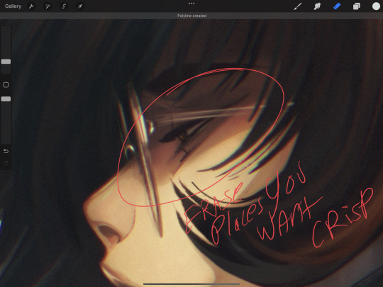
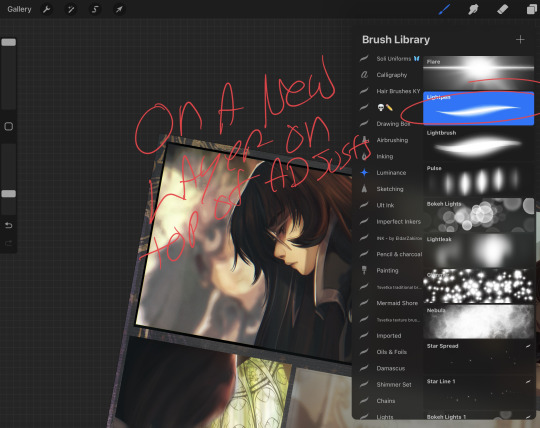
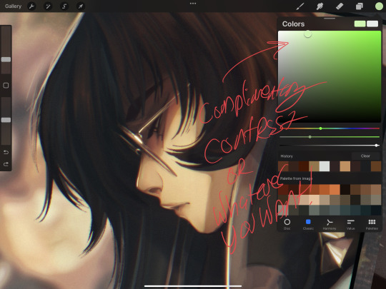
Keep it or erase it, it's up to you. Play around and see what you like. Now, once all is said and done, and you like the effect, adding a few specular pops of light on a new layer can aid with bringing back in some focal points. Eye color, rim lighting, or just a couple of little metallic flecks. I use the light pen tool for this when feeling lazy, but you can use any brush you like, either on a raw Normal layer or on any of the light adjugement style layers. I chose a pale green to compliment the warm, red hues and balance the bluish shadow in her hair. Just a tiny little speck on her glasses, lips and on the rim light of her nose just to keep the anchor points of her face clear. Don't over do it (unless you want to, in that case, by all means, the light is yours to command.)
And that's the final. Hidden in the darkest shadows of voidcraft, I applied a textured brush to my canvas on Overlay because I do that for every comic page. Except for those that I forget, may their tears one day dry.
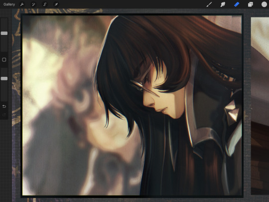
I hope that helps! The effect is subtle on this panel, but the desired effect to soften and marry the art, thus fooling the viewer's eye into thinking I super meticulously rendered this with careful prim and polish, is achieved! Hooray!
#solivaga#pu art#tutorial#art resources#art process#procreate#comic panel#digital art#artists on tumblr#art reference#mmmmmmmmaia#sorry about my handwriting
111 notes
·
View notes
Text


[ID: Nine stock photos of various locations, visually distorted. They've all been made greyscale and blurred, with a mild chromatic aberration filter applied. Any windows in the stock photos have been censored. /End ID]
oh yeah, for anyone curious, the placeholder assets i threw together for the original demos. obviously i didn't intend to keep them but i still think they look sort of cool, so, shrugs. you will look at them
#this also isnt necessarily reflective of what i plan for the final game to look like (i have yet to figure that one out. at all.)#this was just for a more serious demo i was using for Actual Writing Purposes so i needed backgrounds that... you know#existed. and didn't entirely kill the vibe
1 note
·
View note
Text
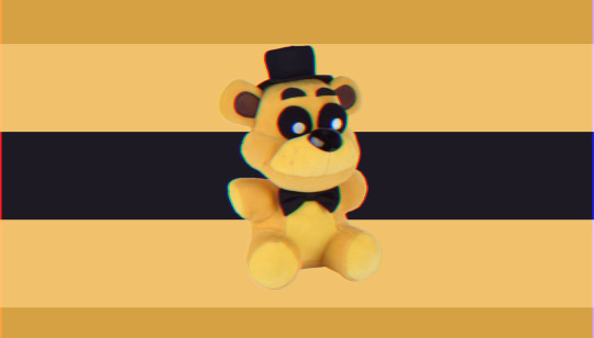
[ID: A flag with 5 horizontal stripes. The stripes from top to bottom are light brown, pale gold, black, pale gold, light brown. In the center of the flag is a Golden Fredbear plush from Five Nights at Freddy's. The entire flag is overlaid with a mild chromatic aberration.]
🧸goldenfreddycomfic 🌠
_______________________
Golden/Golden/goldenself
Bear/bears/bearself
Golden/freddy
Plush/plushs/plushself
Top/hat
Bow/tie
🧸/🧸's
🎩/🎩's
______________________
A gender that feels like or finds comfort in golden fred bear plush.
51 notes
·
View notes
Text

This man could NAIL IT as a villain if he wanted to...just saying. :D gosh darn do I dislike backgrounds!
Non-chromatic aberration vers under the cut-
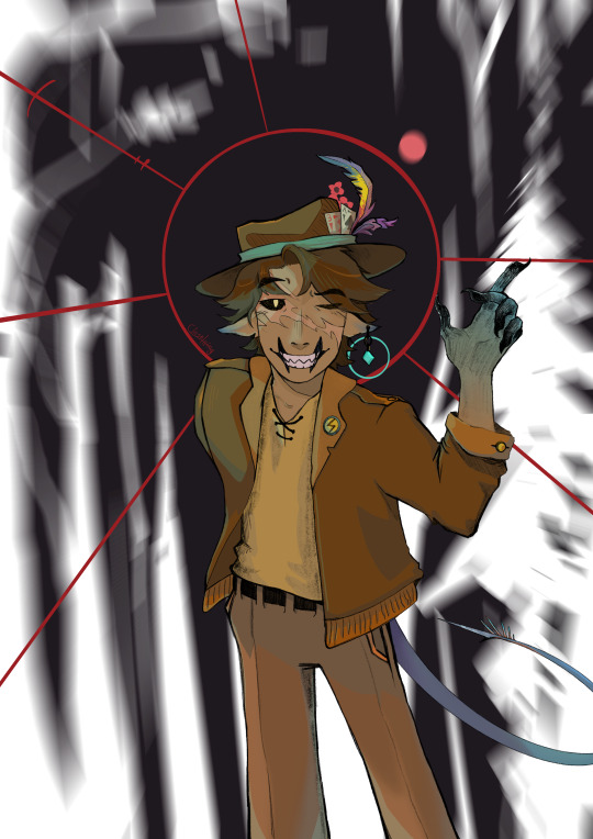
#hermitcraft#gtws#goodtimeswithscar#vex!scar#mcyt#chromatic aberration#mild eyestrain tw#where's that feather from?#closetthings
279 notes
·
View notes
Text


flower boy 💕
#sylvrn art#illust#eye strain#chromatic aberration#glitch#omori#basil#omori spoilers#only mild ones tho
641 notes
·
View notes
Photo

this was meant to be a hand practice/warmup thing but, like the bastardly fool I am, I accidentally turned it into a finished piece
#mixed martial arts and crafts#eye strain#I mean it's p mild but I usually use that tag if there's any chromatic aberration#the nature of doing art is taking edgy pics of yourself to use as reference for anatomy practice and that's just how it is#original art
104 notes
·
View notes
Photo

INFECTION
@artsydudejude ‘s goretober list is being uuuuused
#my art#my ocs#zenith#nemezen#aes#hands#veins#mild blood cw#electricity#lightning#chromatic aberration#hands good for holding I'm sure
17 notes
·
View notes
Photo

[Image description: a digital drawing of the artist. They are a chubby light skinned person with short brown hair and dark brown eyes. They are wearing a black and blue flannel and glasses. They are looking to the side.]
it me
#hey look it's a me#my art#Chromatic aberration#tho is super mild#bop#feeling a lil bit eh about myself as of lately#still trying my best to fix that
12 notes
·
View notes