#for the chromatic aberration? just in case
Explore tagged Tumblr posts
Visit Tumblr Blog
Explore Tumblr blogs with no restrictions, modern design and the best experience.
Last Seen Tumblr Blogs


Fun Fact
Mobile Tumblr US users spend an average of 4.04 minutes per session on the app.
Text

the ultimate cool’s the sound of silence
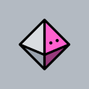
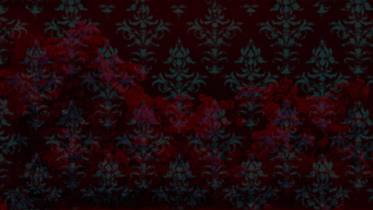
#ammonart#ocs#tstbrtho#veronica maris#eye strain cw#for the chromatic aberration? just in case#song lyric caption isn’t really topical for the piece#just needed to put something there#undescribed#i can’t wait until i actually design everybody. then i can actually draw Things From TSTBRTHO#none of the modern fashion any of these fools have been depicted in thus far is going to show up in canon. whoops
16 notes
·
View notes
Text

LINKTOBER Day 3 - Zelda
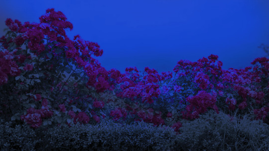
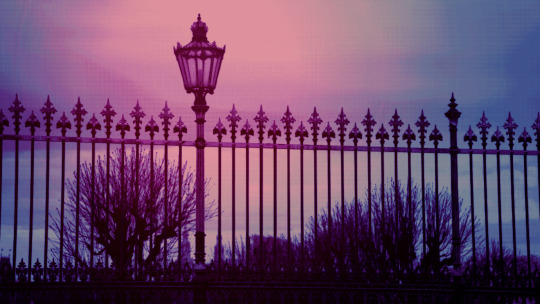
#linktober2024#linktober#legend of zelda#skyward sword#sksw zelda#zelda art#tortilla arts#no quirky caption for this one . keep trying to force perspective in my art but it's hard#chromatic aberration#tw eyestrain#mostly noticeable on the very bottom of the piece but im tagging it just in case
175 notes
·
View notes
Text

Unicorn I think
#pix doodles#unicorn#faun#hmmmm#well at least art block didn’t win today xD#fantasy doodles always go brrrr#eye strain#idk it makes me a lil dizzy because of the chromatic aberration#so just in case
124 notes
·
View notes
Text
The angel of death
#philza fanart#qsmp fanart#team bolas#team bolas rojas#qsmp purgatory#lolliputbug art#i actually don’t like this piece too much but oh well.#I wanted to draw the silly#chromatic aberration#just in case#cw eyestrain#yeah i shouldve added that one whoops
270 notes
·
View notes
Text

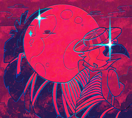
"As the being in the Underground with the highest vibe, some lesser Reapers are incapable of perceiving him. The effects of down-tuning occur because the Composer's vibe and the RG's frequency are substantially different." -Secret Report #6
I spent a ridiculous amount of time on this, wanted to make full-vibe Josh kinda hard to look at and my migraine says I suceeded
#chromatic aberration#eye strain#(figured i'd tag it just in case)#twewy#spoilers#the world ends with you
36 notes
·
View notes
Text


Comic panel redraw minus text cuz I couldn't think of anything for them to be saying. Dialogue is my weakness.
click/open in new tab to see in full & better quality!
original image:

#my art#phone art#spidersona#mysterio#quentin beck#redraw#comic redraw#eyestrain#eye strain#like.. extremely mild chromatic aberration. but just in case!!
91 notes
·
View notes
Text

old art of the masked chimes au :3 au/story/designs etc by @he1ian, @boatem and @convex-solos
#masked chimes au#goodtimeswithscar#cubfan135#gtws#gtwscar#cubfan#convex#hermitshipping#<- just in case#im not a fan of shipping and prob wont post anymore of it#i just like this au LOL#lliwless art#mcyt fanart#tw eyestrain#tw chromatic aberration
209 notes
·
View notes
Text


⟐ You are none the wiser to dance with death.⟐
askbox cleared quick post experimental folly icons
150 x 150 & free to use, credit not necessary but appreciated ^_^
#regretevator#regretevator icons#regretevator folly#folly icons#edits#icons#folly#cw eyestrain#cw chromatic aberration#<- just in case#went experimenting with this one. for fun wheeee#editing a day later because i forgot my usual icon size & credits disclaimer. oops? i was wondering why the post looked weird
29 notes
·
View notes
Text

IM A LITTLE LATE but a roxbot for the @413countdown robots prompt
her design isnt mine this is based on @w0rm-3nthus14st s art which you can look at here! GO GIVE EM SOME LOVE!!
#413countdown#homestuck#roxy lalonde#cea's art#not sure if this is properly it but considering the bright colors and chromatic aberration im tagging this#eyestrain#just in case#this style is rlly fun
43 notes
·
View notes
Text


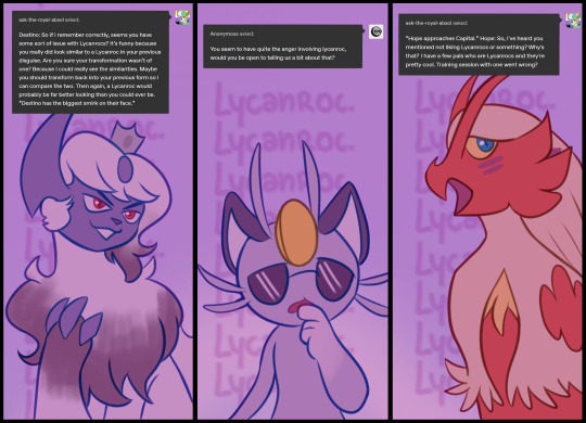
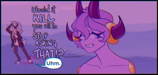
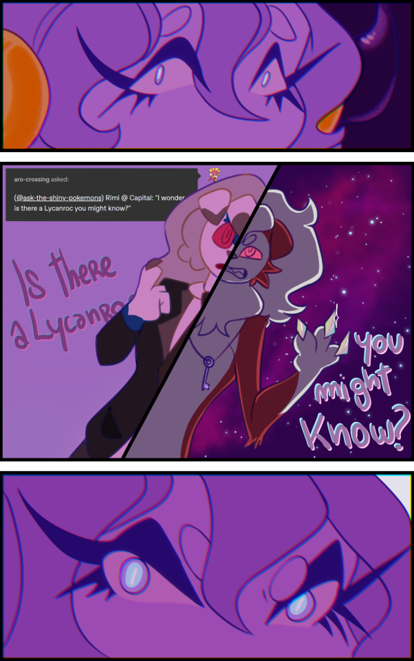


Capital is unavailable for questions.
(just for a few posts, I promise)
[ @greedentstripes / @luckystravels / @ask-meitra / @ask-the-royal-absol / @ask-the-shiny-pokemons ]
#pokemon#pokeask#ask blog#answered#ic#capital tag#charlotte tag#askcapital#chromatic aberration#ask to tag#ask box is closed too just in case
114 notes
·
View notes
Text
some oc art!! i love rendering and then killing the art with filters and effects
2 notes
·
View notes
Text
:/
#A good episode. Nice animation. It's suuuuuuch a shame things had to go downhilla right for episode 3 like... That's such an awful timing#And I'm like very evry positive I'm not making stuff up. I will let drawings quality slide since that's a matter of personal taste#But the animation is infinitely more static in ep3.#There's endless shots (that literally span for minutes. I know I've counted) where nothing happens. It's so hhhhhhhhhhhh#(Btw for anyone who forgot / wasn't there at the time: the first 3 season 5 episodes had to be ready earlier for an early screening.#That's why they had to rush to make them and the quality suffered for it in the last episode in particular.)#Sorry for being redoundant but you know how it is. I'm ss/kk-manifesto. I'll be complaining about s5ep3 till the end of Tumblr#Back to the real ep1 in question... It was so nice!!!#I take issues with the amv opening because seriously. Don't release a season if you're not ready to release a season. No one will get mad#But other than that the animation and drawings were very nice. This arc makes me a little emotional.#It's funny how you can see the anime editing staff gradually get really into chromatic aberration lol.#Like it's always been present as far as I can remember–#but it went from season 1 being used very sporadically to s5ep1 being used in every single shot lol.#It's okay tho it's not bothersome the slightest. It gives some kinf of depth to the shot I suppose.#Even funnier that Harukawa has been using it a lot in their last colour illustrations as well ahah.#Last chapter it was very noticeable both in the chapter cover and color page#Mmmmhhhh...#When Atsushi says “I know where Kamui-san is! He's in the middle of an assassination!”; isn't that a kind of plot hole?#I don't think in reality Fukuchi was killing anyone at all at that point.#And even if Ranpo says otherwise‚ looking back we can be fairly certain that Fukuchi never plotted to seriously assassinate the ada#Idk ¯\_(ツ)_/¯#There's some little lines from the manga I was missing this episode. The “I hate dealing with this decay member the most”.#The “Great! Anything you want! Just say ‘I want this case solved’ and I'll step right up and—”.#I know it's really nothing at all / perfectly understandable cuts...#But at the same time they really add to the overall pacing and make the story flow much more enjoyable for me (≧▽≦)#random rambles
3 notes
·
View notes
Text
how i do my visual novel filtered photo backgrouds
ive had some questions about this so i figured i'd put together a quick post on my process and what goes into it.
this isnt really a tutorial and instead is just a ramble of how i do stuff with a ton of examples and pictures lol
read more below. this is a long post and you probably want to be looking at these images on your computer instead of your phone
step one is that i find CC0 photos or otherwise easy licenses to use because I'm lazy and don't want to have a list of credits of random photographers caue i used one of their images but also i don't want to use stuff without crediting
because they have a general lincese that just wants you to mention the site i prefer unsplash or pixabay but there's other public domain type photo sites too obviously
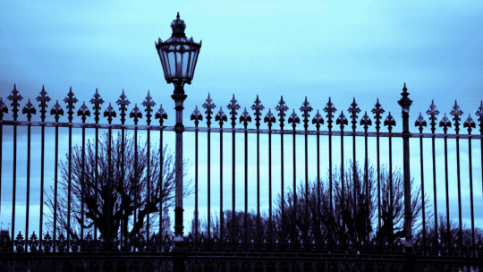
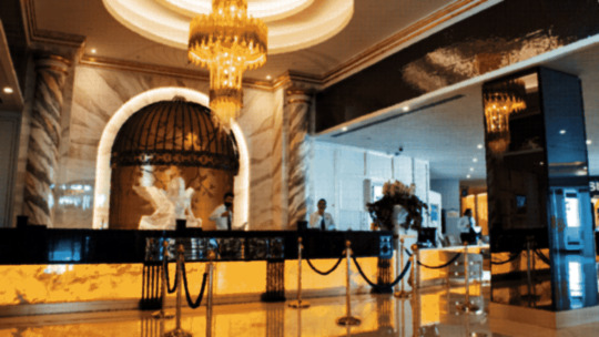
so like okay heres a random picture

i have a photoshop CS5 from 10 years ago. but these can be done with gimp or krita and whatever. theres even photopea that has photoshop in the browser
basic stuff is that i start by cropping my bg into my renpy resolution (i use 1920x1080) this is also the part where sometimes i might rotate a bg. it is a good way to add some chaos vibes to a scene
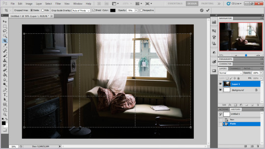
i tend to add some mild blur effect since i find that having too sharp photos as backgrounds clashes with the artstyle of my sprites. like just a couple pixels worth of blur tends to do it
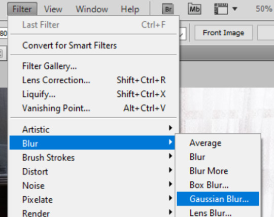
the next part is called fuck around and find out

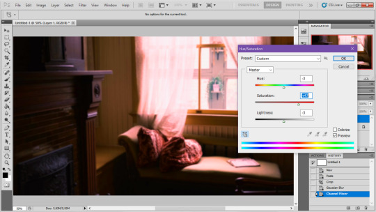
i like to play with the values to just get random results. hue/saturation for tinting the picture, messing with the curves to get some really sharp effects, or channel mixer to add more of a color
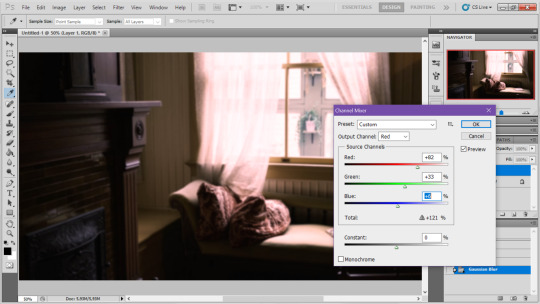
this part is just purely vibes based but i personally think reducing the colors of the background is the simplest way to create something that feels coherent. especially if you make backgrounds based on moods. like having a blue tinted bedroom vs a red tinted one really changes the atmosphere
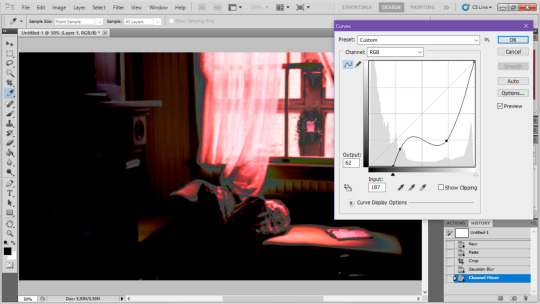
you can get some pretty intense effects but its always important to remember that its meant to be a background and there's a risk it distracts from the sprites
in this case im not including the effect for the curves. after the colours look fine the final step i tend to have is apply some sort of effect.
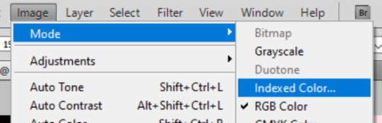
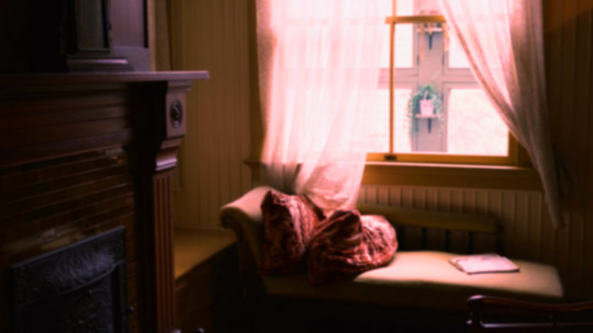
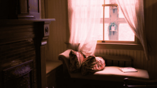
i really like changing the colour mode to indexed colour since i like crunchy pixels. (had to zoom in to 100% to show the actual effect) downside of indexed is that it doesn't look ideal unless its displayed in the exact resolution it was made in but i like it
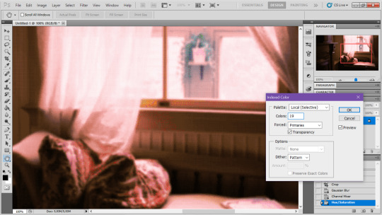
here is the images before indexed mode:
after indexed mode(i think you have to click the image and open it in full to see the actual effect):
another thing ive been playing with recently has been grain+chromatic aberration combo. it makes things feel surprisingly lively with just this simple thing so you'll probably see me overusing this effect in the future

you have to mess with the numbers to get the effect you want but for me these were the parameters I've been using
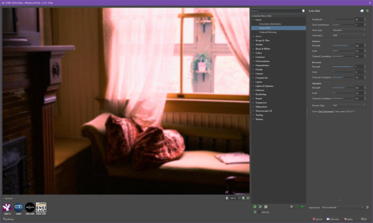

ignore the preview missing idk why it does that.
heres the image (the non indexed version) after these krita effects
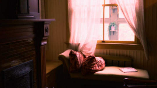
one random special mention i have is that playing with layer blend modes is great
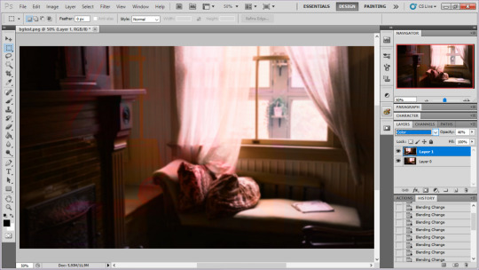
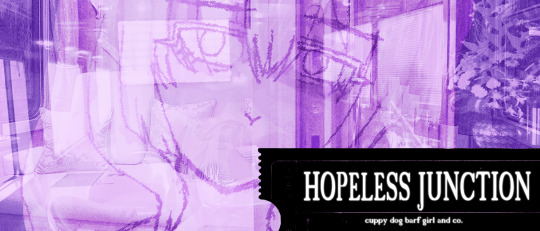
in this example i just copied the same background, mirrored it horizontally and set the layer blend mode to color and it lowered the layer opacity slightly. it just adds some.... idk what to call it visual noise? itj just fucks it up a bit. i used overlapping images and screen modes in some of the hopeless junction images i did for some pretty nice effects
i dont really know waht the blend modes do i just scroll until something looks good lmao
theres a ton you can do with these. like for example just adding a single air brush dot of a bright color on a separate layer and setting it to some blend mode to add a tint to a background
i used these both in malmaid and in the second one i just brushed on some color on a separate layer to give it a moodier vibe
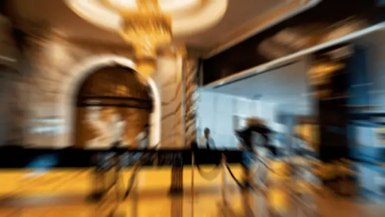
i think having variations of the same background is an extremely easy way to add some life to the bgs without having to do new stuff. like here was the hotel lobby when entering, and here is the hotel lobby when they ran away from the place. i added a radial blur with photoshop
i think theres some beaty in artifacts that come from low resolution images too. sometimes i intentionally use images that have clear compression artifacts cause i think it looks neat. i don't really worry about the details too much as the vibe is the most important thing
its honestly just a matter of knowing these tools exist and just fidgeting around with combinations to find what you want. it also helps to look at other backgrounds or images in general that you come across and just be curious. how was this done? how could i recreate it? that's the type of experimenting that has led me to these.
idk thats all i have to say. ty for reading and play malmaid on steam like and subscribe for more gay puppies
137 notes
·
View notes
Note
I've been trying 2 render lately - any advice?
have a solid, confident sketch so that you won't have to do any guesswork in the rendering process therefore making it enjoyable. the sketch doesn't have to be neat and clean, it just has to make sense to you personally
Merge layers together including the sketch layer and make duplicates of your working layer as you go for back up in case you mess something up
blending/ smudge brushes would be of great help in this stage so use those
focus on basically tidying up messy lines ( just paint over them ) and creating satisfying shapes
don't render everything (unless thats your style idk) put detail into your desired focal points and leave the rest more vibey or abstract ; let the viewer do the work
don't forget to add some post processing details like textures noise chromatic aberration ( that 3d glitch effect ) gradient maps color adjustments sharpness etc basically edit it like you'd edit a photo ( but dont overdo it,, balance is key oummmm amen )
#but i haven't drawn in like 4 months what do i know#i hate rendering actually#these are lazy artist tips ig#ask iztea
21 notes
·
View notes
Note
What is your secret image processing formula?👀
What website do you find such cool VHS effects on? Are these brushes and special textures?
A magician never reveals his secrets >:) ..... okay, I'm just kidding, I can tell how I do the effect myself! :3
These first steps I do in my drawing program after drawing and finishing my doodle (program being Clip Studio Paint in my case, though it doesn't matter much tbh what drawing program to use, jfkjklhlj):
A little bit of unsharpen mask to add some sharpness on the finished image, then a little bit of gaussian blur to soften that sharpness. Sounds silly, but somehow it works, lol
After that, slight chromatic aberration. Doesn't have to be too much, it can reduce the retro look imo if it's applied too much.
Then I add some (either monochromatic OR rainbow) noise as an overlay on top of all, which then I put to like around 10-15% opacity depending on how much noise I want on the image itself. I sometimes blur the noise a little too in the end.
Totally optional and this is just something that I like to do, but I also like to play around with different wacky colorful gradient maps, trying out different blending layer-styles and trying out different effects overall. I tend to experiment a lot sometimes, lol. Sometimes I lower the saturation a bit too.
Basically unsharp mask, light blur, noise and chromatic aberration will be your best friends whenever making the VHS effect, lol.
Then after doing all that previously told; I flatten the image, save it as a heavily compressed JPEG-file (anything below 50-60% compression is good imo), and then I open it in another program, this being a free open-source program called "ntsc-rs". It's the program I use for nearly all of my arts nowadays, since I can add the authentic VHS-look with it and it's really easy to use!
If I wanna add a CRT-look then to my arts (like eg. those PS1-styled arts I've done or models etc.), I use another free cool program called "ShaderGlass"; it's originally meant for emulating the CRT look and such for PC video games, or when emulating/playing old retro games on PC. But you can open images in it too, apply shaders to them and then save the result as PNG-files!
Of course, alongside that program, I've also used few other programs and methods of making the VHS-effect: Signal-effect for Adobe After Effects (though that one costs money). Then there's also been ntsc-qt, another free program which iirc is an older version of ntsc-rs, I used to use it but it's no longer being worked on/supported so I stopped. And then also a VHS-plugin for Blender etc.
There's a lot of ways for doing the effect, but the ntsc-rs program has been one of the best and easiest one to me so far!
Hope this helped at least a little bit! <3
21 notes
·
View notes
Text
NOVICE VP TIPS FROM A NOVICE VP-ER
So, I had a couple people mention wanting to know about my set up for that one netrunner Vaye shot, and I figured why not just throw some stuff together for that?

I'm still learning a toooooon about shooting VP. There's so much I still don't know, and I'm definitely still a novice here. This is just stuff that's worked for me so far but if it could help someone else getting started in VP, then I want to share.
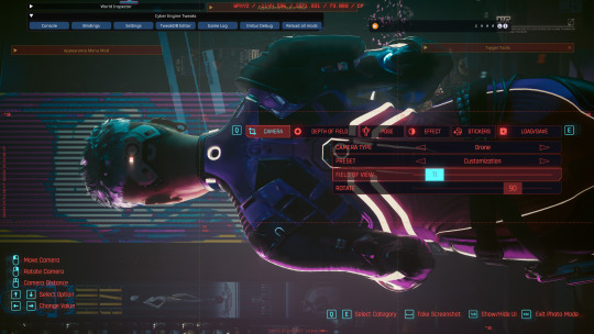
Putting it all below a cut because this is kinda long and I included screenies, as well as a list of links to mods and stuff I use.
📸I should preface that framing and composition are the best tools for taking VP, just like real world photography. Looking at movies, fashion shoots, etc for inspo/pointers is an invaluable asset. You can take amazing shots using vanilla tools alone. Also, I've seen other folks mention it in tips/tutorials, tightening your field-of-view/FOV is key.
Lighting is the second thing. Lighting techniques vary depending on what you want to achieve. In this case, I wanted nice two-toned rim lighting with a brighter (white) edge to make the character stand out from the background. For me, I'm pulling from the same pool of knowledge I use to render light in art. In general, if you're using two-tone light, images tend to benefit from contrasting/complimentary tones. Warm/cool, etc. I went with turquoise and purple here to compliment V's suit and hair and make the warm notes pop.
I'm not gonna throw down a ton of screenshots (still, there's quite a few), and recreating this was impossible, but I this is basically how I set up the lights:
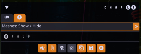
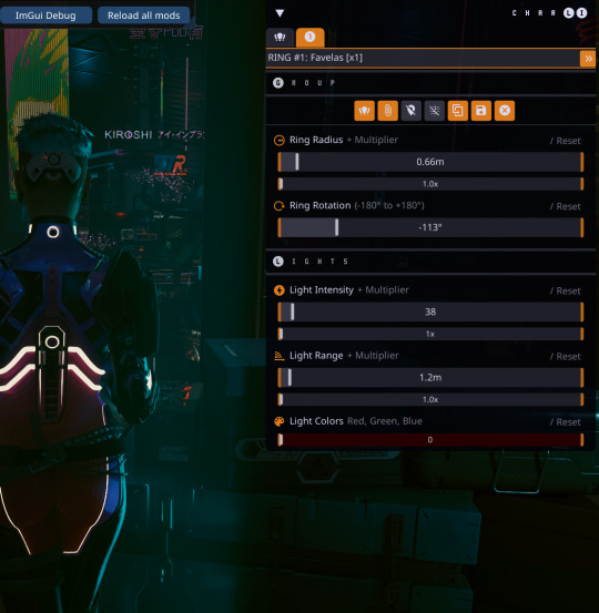
Using CharLi, spawn a favela, lower intensity + range (so I'm not staring at the sun), disable object meshes.
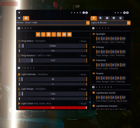
2. Fiddle with radius and rotation until it's ballpark where I want it, then tweak the color.
3. Duplicate this light, set it back to white, fiddle with position again to get white rim light.

4. Spawn a new favela and do the same process for the other side with my secondary color (pictured before I turned meshes off).
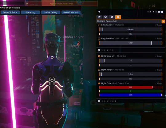
5. Lather, rinse, repeat for a secondary white rim light (I don't have that light selected in the menu here, but you can see it's active). Sometimes it's helpful to fiddle with the lights' X/Y/Z positions and scale lower in the menu as well.

6. I spawned another light for a little bit of wash lighting here because why not?

7. And then I fine tune light positions, frame my shot, and snip snap. I'm not going into ReShade or hotsampling because I'm still learning the ins and outs of those and that's a lot of personal preference stuff too.


IN-GAME STUFF:
📍Location: Regina's
🔓AMM and Photo Mode Unlocker
💡CharLi lighting - this shot used 4 or 5 "favela" lights in varying colors
📸ReShade filters
🛠️IGCS/Otis camera tools (only for slight pose tweaking on this one, I did not use the injectable camera)
👌Tight FOV (idk if that counts as an "effect" but it's a big asset)
I did not hotsample that shot but I wish I had ( ˘︹˘ )
POST-PROCESSING:
🖌️Clip Studio Paint, it's what I've got
🎚️Levels tweaking (full RGB, not by singular color)
📚Overlay copy + Add (glow) copy @ about 30%/15% respectively
⚙️Effect rendering on Overlay and Add layers (chromatic aberration, noise)
MODS:
Netrunner Suit
Netrunner Port
Tac Gear
Cyberdeck
#cyberpunk 2077#cyberpunk 2077 photomode#glitch's adventures in modding#glitch rambles#glitchcaps#idk how to tag this because it's just me info dumping on my set up#idk i hope this can benefit a few people#it's been sitting in my drafts for weeks
19 notes
·
View notes