#for further texture/styling reference i am white
Explore tagged Tumblr posts
Visit Tumblr Blog
Explore Tumblr blogs with no restrictions, modern design and the best experience.
Last Seen Tumblr Blogs


Fun Fact
Tumblr has been providing a Korean-language service since 2013.
Text
hello. reddit is unhelpful in this regard so do any of my lovely followers have recommendations for how to make thin (scalp) and fine (strands) curly hair not suck
#for further texture/styling reference i am white#i have tried like a zillion products (not at once) that are supposed to help different aspects but nothing works long-term#my hair isn't dry or damaged it's just physically thin/fine and gets greasy super fast seemingly at random#i use sulfate/silicone-free stuff. i recently bought a clarifying shampoo for use 1x a week. i don't use heat or brushes on my hair at all#what do you WANT from me hair#i'd be half-convinced it's my water at this rate except that it's been Like This the last three places i've lived
9 notes
·
View notes
Text
Nausicaä costume(s): Research
My favorite part of costuming from animation is imagining how the simple textures of animated cloth can be brought into real life. I take into account setting, especially if it’s a fantasy/historical/historical fantasy story, to determine what materials the characters would have access to before I decide what materials I will use. Certain concessions have to be made for cost/efficiency’s sake, but if something ends up taking more time in order to be cost-effective, I will usually take that route.
For Nausicaä, the princess of the Valley of the Wind, the cloth they have access to (in the logic set forth by Miyazaki in the manga) is wool woven from the hair of the goats and long-hair cattle raised in the Valley of the Wind, as well as a linen-like cloth woven from fibers raised in the valley. The manga confirms they raise these animals, and the film shows the many fields of agricultural plants.

Some observations I’ve made about outfits across kingdoms:
-There is a tank top-like foundation garment worn across kingdoms, and most outfits feature waist-fastening trousers. They fit loosely around the leg, but can be easily tucked into boots and have protective gaiters/greaves fastened over them. Materials could be different across kingdoms, but I speculate the tank/undershirt garment is linen and the trousers are undyed wool. In the photo below, the two women with Nausicaä are a Pejite citizen and the mother of the Pejite princess. Nausicaä wears the same undershirt and trouser combination as the Pejite citizen.


-The kingdom-specific variations seem to be in the cut/coloring/decoration of the tunics; neckline, pocket placement, gem embellishment, and applique/embroidery designs are examples of these variations. Below are images of Princess Kushana of Tolemekia, Princess Lastelle of Pejite, Princess Nausicaä disguised as a Pejite citizen, and finally Nausicaä in her most formal outfit we see. Headwear also varies across kingdoms; Tolemekia uses the most metal and Princess Kushana’s may show her high status as both military leader and royalty.


For the outfit I’m referring to as the “princess” outfit, or the most formal-appearing of the outfits featured in the movie, this is likely where the finest (meaning fineness of the spun thread and tightness of the weave) of the fabrics would be used. However, given that the people of the Valley of the Wind are very community-focused and their princess regularly engages directly with her people regardless of social standing, the “finest” fabric is probably available for community members to use and sew with, just dyed in different colors. Only Nausicaä wears the bright, sky-blue fabric, and her “finest” fabric version is a less-saturated hue of that sky-blue; I am going to assume this blue is reserved for members of the royal family, but not used to its full concentration/saturation capabilities since they are a fairly humble kingdom. The tunic also features pale purple trim around the neckline, sleeve cuffs, and the hemline of the skirt; a belt/sash in the same color is tied at the waist.
The trousers and boots seem to be the same as in other outfits (including the flight suit, further reinforcing my theory that these are base garments and the headwear and tunics are the variants), the same off-white of undyed wool and sturdy brown boots found across kingdoms.


In my mind’s eye, the headwear could be knit large in wool and then felted, with the gems sewn into the fabric after the fact. It could also be the same fabric as her tunic but lined/reinforced with a stiffened fabric to make it appear as a truly matching set.

Nausicaä’s flight tunic is a similar, slightly darker shade of blue than her formal tunic. It does not function as armor, but it is worn with protective gloves, protective gaiters/greaves, and a flexible head covering; the tunic itself is soft, pliable and features six cylindrical pockets for flares on its front. This flare-pocket style (in the animated film) is unique to the Valley of the Wind; Lord Yupa stores his flares in a similar manner, but that same storage is not featured on Asbel of Pejite’s tunic when he is shown in the Sea of Decay with his rifle. The neck fastening does not allow the collar (looks to me like a band collar) to close fully, but allows for it to be pulled over the head easily. I personally like the idea that this is a short length of spiral lacing (with the spiral facing towards the skin) with cord dyed to match the blue of her gloves, gaiters, and headwear.


The flight tunic is the shortest of the tunics in the movie, hitting her upper thigh. Nausicaä is proportioned like a classic shoujo heroine (in that her legs are long for her body), so some concessions may be made for people who are trying to balance screen accuracy with personal wearability. I personally will be going with personal wearability and, while my legs are long, my torso is not, so I will make adjustments in my own pattern.
Fabric-wise, wool seems most likely here (and is confirmed in a special insert to the Nausicaä manga to be specifically felted wool). The tunic skirt/flare is unlined. The whole tunic can be moved by wind, but not in a wispy way, which makes me think this is, within the logic of the manga and film, felted from a tightly-woven lightweight wool. For story accuracy, I could go with this -- but if I want to wear this tunic in daily life without looking very obviously costumed, I’ve never been a fan of felted wool on garments that aren’t coats. I plan to go with a woven wool fabric with a visible weave.

My first guess was that these gloves were wool and wet-felted directly onto a mold, but seeing the little finger seam gave me pause. The only soft, pliable material that still allows for some grip that the Valley of the Wind would have access to (that I can currently think of) would be hide/leather; blue leather dye seems hard to come by, though. The boots are also likely leather (maybe even the Valley breathing masks), though they could also be felted wool with leather/suede soles. If not made from leather, the gaiters/greaves, hat, and gloves are dyed blue would likely be felted wool.

Next is the prophecy tunic. This tunic is from the kingdom of Pejite; see one of the earlier images where the pink tunic is in the woman’s arms. It has a tall band collar that closes completely at the neck with a visible join and its most recognizable feature is the turtle-like design across the chest
It is originally pink but changes color when the blood of a baby Ohmu dyes it a dark blue. The blood also overdyes Nausicaä’s trousers a pale blue (the resulting shade is not unlike the blue of her princess outfit).

The skirt of the prophecy tunic falls below Nausicaä’s knees and is unlined. The sleeves flare somewhat over the wrist (they do not fit tightly) and a belt is worn at Nausicaä’s waist.

Based on what we know about Pejite from the manga, plus the similarities in how the center of this turtle-like design and various jewelries are shaded in the film, it is very likely that this design is beaded/beadwork and stitched/embroidered onto the garment. Given that the design is unaffected by the Ohmu’s blood when the fabric items are overdyed, they would need to be nonporous. I’m thinking carnelian and/or red jasper for the cabochon in the center (could also be made with smaller beads since finding a chunk of polished stone that size would be challenging, not to mention expensive and heavy to wear) and porcelain or white stoneware clay beads for the main portion of the design.
#Nausicaä of the Valley of the Wind#nausicaa of the valley of the wind#ghibli#studio ghibli#costume#costuming#hayao miyazaki#a salix original
23 notes
·
View notes
Text
tuesday!
hello again! another 2-weeker because I was in Washington (Da Capital) for a portion of last week for an academic conference and boy howdy did that sap my will to live/energy to post.
listening: I finished relistening to TANIS! season 5 felt completely unfamiliar so I either never actually listened to it or it was just that forgettable. which tbh, it was. very forgettable. definitely good background white noise but really nothing cooking in there. very clear to me that at the end there terry miles was way more interested in writing a book than an audio drama.
for the sake of completeness I also am relistening to the black tapes. definitely a more cohesive narrative happening there even though I know the "finale" is looming ahead. also has not generally aged super well, and some of the attempts at writing academic experts of things in make me laugh a lot, and the overlap in voice actors for side characters is also amusing. I think this universe of podcasts only work if TANIS is a fictional podcast in TBT and vice-versa but that's not news. also why did they make cuneiform on…parchment…as a plot point in s3…it's cuneiform…wouldn't it be on a slab of clay…anyways a reference to "current political discourse" in a s3 ep made me check the date and I didn't realize that this came out in 2020????? insane. way more recent than I thought (derogatory).
music-wise, saw Mahjong Crib live a few weeks ago at a local bar so I've been letting that run in the background. the bassist was incredibly high (as he should be) and very funny. the last song of the set he put the bass down and started going ham on cowbell. definitely in the family of freeform jazz which isn't normally my thing. still not sure this band is my thing, will probably not be purchasing this album for example.
reading: How Cheerleading Became So Acrobatic, Dangerous and Popular (David Gauvey Herbert): what it says on the tin. didn't realize how much of it came down to monopoly of an industry again. womp womp.
read these both on the plane back from the conference: By Proxy (Lise): mind the tags. really nailed a good dynamic between LWJ and JC imo. Wuxian The Ninth (spockandawe): was linked by the author in a server we're both in. the choice to just do the intro and finale is so incredibly valid. I should do that for my abhorsen/TLT crossover actually because I have the beginning done and definitely have a finale cooking in my head but writing all the bits in the middle seems exhausting and this has made it occur to me that I am allowed to just. skip all the shit in the middle. nothing is stopping me.
watching: fallow
playing: fallow
making: I have been speed knitting a pair of fingerless gloves for my mom! chose this pattern specifically to do them flat style because I was on the go and didn't want to think about using dpns, and I don't have the equipment for knitting in the round comfortably on that small of a scale.


finished carving the block for my holiday cards BUT printing them has proved. challenging. I have what turns out to be kinda shitty water-based ink that is a real pain in the ass to do more than one print at a time with because it dries so fast. it's also applying and printing extremely unevenly and patchy, and while I don't actually mind the texture that adds, the fact that I have to wash off my block & roller every 2-3 prints or so is really stymying my speed. I am abusing my boyfriend's amazon prime to get an oil-based printmaking ink shipped to me so I have put further printing on hold til today when that allegedly arrives. I miss living in closer proximity to a more professional art supply store :-( I've printed about 15 or 20 now and depending on how much nicer the ink looks I may restart lol… either way next year I think I will get thicker paper to mail postcard-style instead of in an envelope to save on postage and work? we'll see. I'm hand delivering around half of my cards over the course of the holidays as it is to make it simpler and cut back on the amount of envelopes and postage I'll need anyways so it's really not TOO bad…
I kind of want to carve a return label stamp as well but obviously the scale/detail of that is more challenging. the easier move is to order return label stickers obviously so maybe I will design some of those, not for this year at this time scale but y'know. I was thinking of putting up my holiday card designs on redbubble or etsy or whatever as well just for funsies.
eating: made deb smittenkitchen's lentil soup with sausage, chard and garlic! really good! my sausages are generic beef from the farmers market so I feel like I lost a little flavor in there by not using some sort of sweet or spicy sausage but it's still tasty and filling. according to comments it freezes very well so I made the full recipe and will be freezing about four servings. I am rich in frozen soups rn.
I was GOING to make her crispy cauliflower and cabbage salad as well but the half a head of cabbage I had in the fridge tragically finally went bad. so instead I did an improvization at her cauliflower with dates and pistachios salad. I did not have dates or pistachios, subbed in craisins and almond slivers, lmfao, but still tasty and has the same structure. I also got some salmon burgers from kroger that have TWENTY FIVE GRAMS of protein each and were very tasty.
misc: feeling very [horror movie scare chord] from networking at that conference. my advisor's previous student who I did not overlap with but am familiar because I have continued his work casually commented that he applied to over Four Hundred Jobs before getting the one he currently has that he. does not even like that much. (I think? unclear. he is kind of a hater at heart in the funniest possible way, bless him.) so I have the fear of god in me a little bit but it's Fine, I'm doing what I'm "supposed" to be doing that a lot of other people are not by doing extensive networking and looking for summer internships for what will hopefully be the last summer of my PhD program.
I gotta start thinking about my yearly roundup too!!! I did a bad job of keeping a spreadsheet this year for this to note everything down in an easy format so maybe I will do that in retrospect as a time-filling activity in the next few weeks…
5 notes
·
View notes
Note
ALRIGHT WASSUP I love your art style and am an art student so I know a little bit bout what makes art recognizable, (not an expert and definitely not good at remembering terms so don't act like this is some art bible) lemme tell you what I think makes your art recognizable and "lux".
First, you got your shape language. That would be what the other person was referring to as proportions. (Since we're talking about Sora, proportions is absolutely not a wrong word to use, but I'm going to talk about shapes specifically.) The cheek? Always the exact same little curve, same spot, the forehead is the same, which creates a head shape that is incredibly recognizable as you. The hair is also always the same, which may seem weird considering your drawing hair that's pre established but you have a very unique way of doing it. The shape of his lower hair on the back of his head especially stands out to me. His body is always the same type of lanky, you draw his arms and hands a very particular type of way. Overall, very recognizable and consistent.
The colors you use. Honestly, I don't even know how to describe this, and I literally took a class on colors. The only word I can think of is "surreal". They're usually very vibrant, but destaturated at the same time? Like you're taking vibrant colors and putting desaturated ones on top? Genuinely hard to describe. It is one of the most beautiful color jobs I've ever seen tho, and I'm not exaggerating. If you could explain I'd honestly love to try (read: steal) whatever technique you use. Also very consistent, even in the black and white photos. I think it's partially lighting but I digress.
The other person brought up your eyes, and that's probably one of THE most consistent parts of your art I notice. I'm not rly gonna go into detail, cause you said you worked on eyes a lot so I'm gonna just leave you to that honestly cause the eyes you draw are iconic imo. Beautiful. Stunning. Breathtaking. No notes just keep it up 🫡
Your lines (and the texture of the drawing) are specifically sketchy, like a very specific type of sketchy. I'm guessing it's the texture of the brushes you use, and it also makes it consistent and recognizable. This is probably one of the things that makes the black and white photos more recognizable as well, since they don't technically have colors to with with and, imo, that's one of the most recognizable parts of your art. The very specific shapes you use are about on par with the colors, with everything else gradually moving down the list.
So yeah. My mini essay on your art. I hope this helps you understand cause honestly? Your art is iconic. Gorgeous. Magnificent. I dream of drawing like you. Pls keep it up cause on god it brightens my day every time I see you post, art or no
I appreciate you taking the time to write out such a long and thoughtful post~! ❤️ This was a very interesting and fun read! I am in many ways completely blind to my own work. Unlike looking at someone else's work, it's very hard to distance myself far enough from my own to see it's prominent features.
For color I can I say I am aware of color theory and mostly follow a sensible routine of cool shadows and warm light points, things that are further away seem more blue etc. etc... But at some point while drawing/painting I do usually fall into adding and prodding the colors into a more impressionistic vibe and away from realism, mostly favoring cool toned colors and adding tones to places that they realistically shouldn't be, but they aesthetically please me, so.
Thank you for all the compliments, I've re-read this quite a few times now, but don't really know what to say besides a boring thank you~! This has left me a lot to ponder, and I'm very glad for your writing..!
Hope you have a wonderful rest of your day, take care~!❤️

11 notes
·
View notes
Note
Any advice on how to draw backgrounds? Gotten to the point in my art where im semi confident in drawing poses and expressions but backgrounds?? girl help i can only somewhat draw a tree
oh hell yeah i love backgrounds, ive been working on more interiors lately (when not overburdened by sbc work lol) but im assuming you're asking about nature so that's how im going to answer it as okay so: -first of all find yourself a good TEXTURED blending/smudging brush because it will save your life. i use these rock texture brushes from This Studio Ghibli pack, it's $6 and i HIGHLY recommend the whole pack because it's the main one i use for most of my bg foliage/grass ect and i love it dearly

-find references either in irl photos or other artist's work. if using another artist's work watch their speedpaints or look at what you like about their art style and techniques and steal it. im serious. obviously don't trace it and pass it off as something of your own but look at how they do the aspects you struggle with, and try to incorporate that
for me, that struggle is forest foliage because i have a hard time filling out the spaces without everything looking like same colored blobs, so i looked at how my buddy hannah mudshadow does bgs because she's really good at filling out a scene and making it look natural, and i noticed she uses a lot of abstract shapes instead of trying to render every leaf, so rather than doing my base work for bushes/trees with a leaf brush, i use a chunky scatter brush now and it looks really good, and then i can go and add some leaf brushes on top of that for more definition in areas that might catch light ect so that will give it the thick, bushy .. bush look without looking crowded or too shaped
-nature is messy as hell and things are never going to be perfectly shaped and toned unless you're drawing perfectly managed hedges or something. got some dirt brown on your green bush? those are dead leaves now. accidental weird texture on your tree? the bark is gone there, something ate it. bushes and trees have dead branches that just hang out there in them, grass grows long and sometimes a deer or whatever doesn't eat the whole patch so there's long uneven sprigs sticking up. petals fall off flowers. trees have huge webs of branches
-don't try to detail everything. make things further away more abstract and messy to give the illusion of detail. throw a gradient over it for some slight tone variation or something so it;s not completely flat but ppl are going to look at your subject and see the rest of it with the corner of their eyes, so you don;t need to fully render every flower in the field. here's some examples of that
the cactuses in the far BG are just V and Y shapes, the joshua tree in the middle distance is dark with some light blobs right on the edge where the needles would catch light.
this is from 2021 so be nice to me but as the flowers go back in the distance, i stop rendering their petals and start doing blue dots with white dots, and then even further away i just sorta blend blue and green together to give the illusion of a field of flowers.
-i dont know what your style is, but i personally hate using a ton of layers and tend to merge them as i go, but for the most part i draw every panel of SBC bg on the same 1 layer, going back to front (start with sky, mountain, bg grass, foreground grass and cactus, then go back and scatter foliage as necessary) and it keeps my stuff loser and i tend to get less precious about making things look perfect. i also work very fast because i am unironically really lazy at art and am desperate for shortcuts.
-oh yeah one more thing. assuming you draw cats, cats are SOOOOOO small in comparison to literally everything. as warrior artists i think our perspective gets a but confused sometimes (i am certainly guilty of this too!) and there is absolutely nothing wrong with this because sometimes that's just how you have to build your scenes, but it really makes me laugh when i see scenes of like, rusty jumping off his fence to go into the woods, but the fence is only a bit taller than him. so try to remember things are huge and cats are small as hell
na'ni's a huge cat, all things considered but look at her compared to my small aloe plant

or the cedar tree in my front yard.

absolutely microscopic. don't look at my slippers.
so yeah. i hope this helps, it's not so much a tutorial because i don't think i'm the best person for tutorials because honestly i dont know much and this is all stuff i've picked up on, like i dont know shit about composition or values or color theory but this is important stuff to keep in mind about the environments themselves. don't worry too hard about colors at first because you can always change it by adjusting your curves n stuff. or slap a filter on that bad boy. or dont. also pay attention to your horizon line because it helps angle the rest of your piece. but look up tutorials for that because i only started learning about it like a week ago
55 notes
·
View notes
Text
BLACK ARTISTS OF TUMBLR!
I need your advice! I am a white artist trying to learn the best way possible to draw black people, especially hair, my style is pretty anime-cartoon esc, so I wanna know if my example here is a good way to draw black folk?

This is an oc of mine, she has a sort of category 3 hair texture and some curly bangs with a low ponytail, I gave her 2 tone full lips since I've heard that's a common black trait to include in art, is there any tips for drawing or perhaps coloring that I haven't gotten?
For further reference, this is how I draw lightskin people (the oc here is not white, shes a pale japanese person)

#art#artists#artist#tumblr#artists on tumblr#help#art help#black people#poc#poc art#black art#black artists
2 notes
·
View notes
Text
WIP blanket update 6/05/21*
*The information in this post is outdated because I typed the whole thing up, saved it to my drafts to add links… and promptly forgot to do so 😅 I’ve actually finished the ten-stitch by now, and done work on a few others as well, including my Granny Square Quilt!
Hey, y’all! It’s been about two and a half months since I did a blanket update, but I’ve been doing a lot of work on some of them lately, trying to get as much done on the ten-stitch and granny stripe specifically before I go back to work in a week! My goal is to finish the ten-stitch before the 13th of June, but… we’ll see 😅 The reason I’ve been focusing so much on those two blankets specifically is because they’re not so transportable, so, while I am able to bring projects to work with me and work on them during breaks and downtime, I can’t exactly transport an entire, massive “worked in one piece” blanket like the ten-stitch or granny stripe with me. But smaller quilt-style or pieced afghans are a lot easier to transport, because I can throw a few balls/skeins/etc of yarn into my bag for the day and make a few pieces if I have time! Thankfully, 3/5 of the blankets on my to-make list ATM are pieced blankets—you can check out my “coming soon” blanket post to see what some of those are, but two of them are also introduced in this post!
Not pictured: Granny Square Quilt, because it’s still currently on pause, although I plan to start working on it again once I go back to work; Mitered Granny and Tilt-a-Whirl because I’ve finished them both! Stay tuned for individual posts about those two FOs!

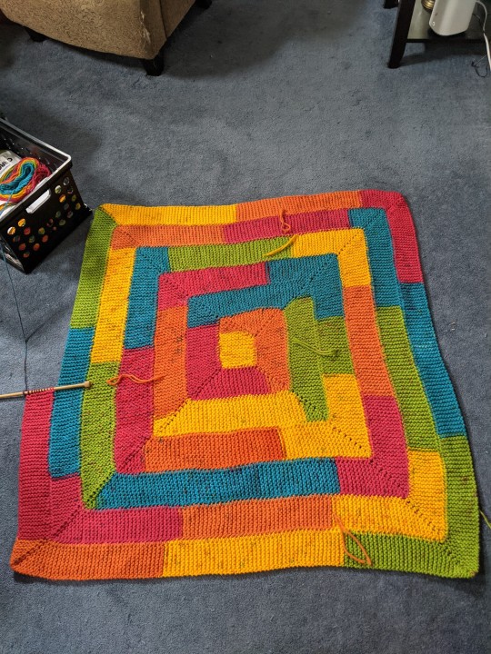
Ten-Stitch (Knit)
As of these photos, I was about halfway through this blanket—I was around halfway through cake four, and I’m planning to use eight cakes total and then use the ninth to just finish up whatever edge I run out of the eighth cake on so that I don’t have a weird chunk missing out of it! Since I took these photos about a week ago (I’ve really been procrastinating on writing this post oops—) I’ve finished the fourth cake and have only a little left of the fifth cake! So, even if I don’t finish the blanket by 6/13 like I’d like to, I should be close and can hopefully get it done before work gets crazy again. As you can see, though, my little furry lady seems to like this blanket already! She used to sleep on it a lot before I had to move all my work back up into my room when my brother moved back into the basement, so I’m sure she’s looking forward to being able to sleep on it again when it’s finished!

Floral Beauty Throw
The last time I talked about this blanket, it was in my “coming soon” post. I decided to make a few test squares before starting the blanket itself, because I wasn’t sure if I wanted to use a US H or I size hook, so I made two squares with each size. The two on the left are with the H hook, and the two on the right are with the I hook. As you can see, there isn’t really much difference between them 😂 I plan to block them (the yarn has a wool content, so I’m going to have to soak rather than steam block, which makes me a little sad because steam blocking is so much easier) to make sure, but at this point I’m planning to use the I hook, and, if I can block all four to be close enough in size, I’ll probably just include the two H hook squares in the final afghan.
On the bright side, I won’t have tons of ends to weave in for this blanket, since the yarn is self-striping!
Total pieces: 4/30 (although I may do more squares depending on how my yarn gets used)


Granny Stripe Blanket
It may not look like it, but I’ve actually done a ton of work on this blanket recently! In my last WIP post, I had about 38 rows done—as of these photos, I have about 60 done! It’s officially gotten too long to double over for photos, and the width of it makes it really difficult to take top-down photos, so it’s hard to get good pictures of, but I really love how it’s turning out so far! I also love how the color pooling has been sort of bouncing from side to side the further I go! I can’t wait to see how it turns out!
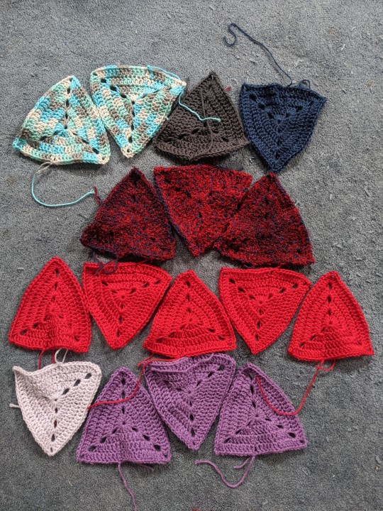
Scrap Granny Triangle Quilt
I wasn’t planning on starting this blanket just yet—it’s going to be a good one for taking back to work—but I hit a point recently where I didn’t want to work on any of my WIPs so I decided to start this instead 😅 I’m really happy with how it’s going so far! I’m using scrap and leftover yarn for the triangles, and plan to do some mixing of textures in it. You can already see a bit of that here, as I’ve used some bits of fuzzy yarn, as well as some Caron Simply Soft scraps that have different textures than the worsted yarns I’ll be using for the majority of the blanket. I already know that I’ll have to pick up a few skeins to supplement my scraps, so I think I’m going to look for more of the turquoise/grey/white variegated yarn from those two triangles at the top left, as well as some different shades of purple and blue, keeping the red for more accent triangles rather than making it a main color of the blanket. There are a few things kind of bumming me out about this blanket, though—namely that I’m going to need a lot more triangles than I realized to make the blanket as big as I’d like to… and that it looks like I’m going to have to block every. single. triangle…
I’ve also tweaked the pattern slightly (check my coming soon post to see the photo pattern I’m using for reference) because I wasn’t able to neatly work the corners the way the pattern indicated they should be work, so you can see where my rows are joined in the middle of the triangle sides. I don’t mind this too much, though, and I think once the ends are woven in, and the whole thing is pieced together, they’ll be much less noticeable. Hopefully.
Total pieces: 15/225 (approx)
#wip blankets#wip#knitting#crochet#blanket#afghan#original post#original#ten stitch blanket#floral beauty throw#granny stripes#granny triangle#scrap blanket#caron chunky cakes#caron chunky cakes rainbow jellies#caron cakes rainbow sprinkles#caron cakes yarn#caron cakes#red heart super saver stripes retro stripe#retro stripe#red heart super saver
27 notes
·
View notes
Text
most of the UK reviews i’ve read of martin eden have been a disappointment, tbh. i don’t know if this is because critics have been busy with cannes or because outlets here just don’t have the space, or because it’s kind of seen as old news. i have seen no real engagement with the politics or form beyond a couple of cursory lines, and it’s a shame because... i think it’s really rich wrt those elements?
so i am looking again at the (wonderful) review from film comment last year and it’s such a shame that it’s not available freely online. so i thought i’d post it here behind a cut. it’s long but worth it imo (and also engages really interestingly with marcello’s other films). it’s by phoebe chen.
COLLECTIVE CONSCIOUSNESS Jan 3, 2020 BY PHOEBE CHEN
EARLY IN JACK LONDON’S 1909 NOVEL MARTIN EDEN, there is a scattering of references to technical ephemera that the 20th century will promptly leave behind: “chromos and lithographs,” those early attempts at large-scale reproduction; “a vast camera obscura,” by then a centuries-old relic; a bullfight so fervid it’s like “gazing into a kinetoscope,” that proto-cinematic spectacle of cloistered motion. These objects now seem like archaic curios, not much more than the flotsam of culture from the moment it shifted gears to mass production. It’s a change in scale that also ensnares the novel’s title character, a hardy young sailor and autodidact-turned-writer-célèbre, famously an avatar of London’s own hollowing transmutation into a figure for mass consumption. But, lucky him—he remains eminent now on the other side of a century; chance still leaves a world of names and faces to gather dust. Easily the most arresting aspect of Pietro Marcello’s new adaptation is its spotlight on the peripheral: from start to end, London’s linear Künstlerroman is intercut with a dizzying range of archival footage, from a decaying nitrate strip of anarchist Errico Malatesta at a workers’ rally to home video–style super 16mm of kids jiving by an arcade game. In these ghostly interludes, Marcello reanimates the visual detritus of industrial production as a kind of archival unconscious.
This temporal remixing is central to Marcello’s work, mostly experimental documentaries that skew auto-ethnographic and use elusive, essayistic editing to constellate place and memory, but always with a clear eye to the present. Marcello’s first feature, Crossing the Line (2007), gathers footage of domestic migrant workers and the nocturnal trains that barrel them to jobs across the country, laying down a recurring fascination with infrastructure. By his second feature, The Mouth of the Wolf (2009), there is already the sense of an artist in riveting negotiation with the scope of his story and setting. Commissioned by a Jesuit foundation during Marcello’s yearlong residency in the port city of Genoa, the film ebbs between a city-symphonic array and a singular focus on the story of a trans sex worker and her formerly incarcerated lover, still together after 20-odd years and spells of separation. Their lives are bound up with a poetic figuration of the city’s making, from the mythic horizon of ancient travails, recalled in bluer-than-blue shots of the Ligurian Sea at dawn, to new-millennium enterprise in the docklands, filled with shipping crates and bulldozers busy with destruction.
Marcello brings a similar approach to Martin Eden, though its emphasis is inverted: it’s the individual narrative that telescopes a broader history of 20th-century Italy. In this pivotal move, Marcello and co-writer Maurizio Braucci shift London’s Oakland-set story to Naples, switching the cold expanse of the North Pacific for the Mediterranean and its well-traversed waters. The young century, too, is switched out for an indeterminate period with jumbled signifiers: initial clues point to a time just shy of World War II, though a television set in a working-class household soon suggests the late ’50s, and then a plastic helicopter figurine loosely yokes us to the ’70s. Even the score delights in anachronism, marked by a heavy synth bass that perforates the sacral reverb of a cappella and organ song, like a discotheque in a cathedral. And—why not?—’70s and ’80s Europop throwbacks lend archival sequences a further sense of epochal collapse. While Marcello worked with researcher Alessia Petitto for the film’s analog trove, much of its vintage stock is feigned by hand-tinting and distressing original 16mm footage. Sometimes a medium-change jolts with sudden incongruity, as in a cut to dockworkers filmed in black and white, their faces and hands painted in uncanny approximations of living complexions. Other transitions are so precisely matched to color and texture that they seem extensions of a dream.
Martin’s writer’s optimism is built on a faith in language as the site of communication and mutual recognition. So follows his tragedy.
Patchworked from the scraps of a long century, this composite view seems to bristle against a story of individual formation. It feels like a strange time for an artist’s coming-of-age tale adapted with such sincerity, especially when that central emphasis on becoming—and becoming a writer, no less—is upended by geopolitical and ecological hostility. At first, our young Martin strides on screen with all the endearing curiosity of an archetypal naïf, played by Luca Marinelli with a cannonballing force that still makes room for the gentler affects of embarrassment and first love. Like the novel, the film begins with a dockside rescue: early one morning, Martin saves a young aristocrat from a beating, for which he is rewarded with lunch at the family estate. On its storied grounds, Martin meets the stranger’s luminous sister, Elena Orsini (Jessica Cressy), a blonde-haloed and silk-bloused conduit for his twinned desires of knowledge and class transgression. In rooms of ornate stucco and gilded everything, the Orsinis parade their enthusiasm for education in a contrived show of open-mindedness, a familiar posture of well-meaning liberals who love to trumpet a certain model of education as global panacea. University-educated Elena can recite Baudelaire in French; Martin trips over simple conjugations in his mother tongue. “You need money to study,” he protests, after Elena prescribes him a back-to-school stint. “I’m sure that your family would not ignore such an important objective,” she insists (to an orphan, who first set sail at age 11).
Anyone who has ever been thrilled into critical pursuit by a single moment of understanding knows the first beat of this story. Bolting through book after book, Martin is fired by the ever-shifting measure of his knowledge. In these limitless stretches of facts to come, there’s the promised glow of sheer comprehension, the way it clarifies the world as it intoxicates: “All hidden things were laying their secrets bare. He was drunk with comprehension,” writes London. Marcello is just as attentive to how Martin understands, a process anchored to the past experiences of his working body. From his years of manual labor, he comes to knowledge in a distinctly embodied way, charming by being so literal. At lunch with the Orsinis, he offers a bread roll as a metaphor for education and gestures at the sauce on his plate as “poverty,” tearing off a piece of education and mopping up the remnants with relish. Later, in a letter to Elena, he recounts his adventures in literacy: “I note down new words, I turn them into my friends.” In these early moments, his expressions are as playful as they are trenchant, enlivened by newfound ways of articulating experience. His writer’s optimism is built on a faith in language as the site of communication and mutual recognition. So follows his tragedy.
One of Marcello’s major structural decisions admittedly makes for some final-act whiplash, when a cut elides the loaded years of Martin’s incremental success, stratospheric fame, and present fall into jaded torpor. By now, he is a bottle-blonde chain-smoker with his own palazzo and entourage, set to leave on a U.S. press tour even though he hasn’t written a thing in years. His ideas have been amplified to unprecedented reach by mass media, and his words circulate as abstract commodities for a vulturine audience. For all its emphasis on formation, Martin Eden is less a story of ebullient self-discovery than one of inhibiting self-consciousness. There is no real sense that Martin’s baseline character has changed, because it hasn’t. Even his now best-selling writing is the stuff of countless prior rejected manuscripts. From that first day at the Orsini estate, when his roughness sticks out to him as a fact, he learns about the gulf between a hardier self-image and the surface self that’s eyed by others.
WITH SUCH A DEEPLY INHABITED PERFORMANCE by Marinelli, it’s intuitive to read the film as a character study, but the lyrical interiority of London’s novel never feels like the point of Marcello’s adaptation. Archival clips—aged by time, or a colorist’s hand—often seem to illustrate episodes from Martin’s past, punctuating the visual specificity of individual memory: a tense encounter with his sister cuts to two children dancing with joyous frenzy; his failed grammar-school entrance exam finds its way to sepia-stained shots of a crippled, shoeless boy. These insertions are more affective echoes than literal ones, the store of a single life drawn from a pool of collective happening.
But, that catch: writing in the hopes of being read, as Martin does (as most do), means feeding some construct of a distinctive self. While the spotlight of celebrity singles out the destructive irony of Martin’s aggressive individualism, Marcello draws from Italy’s roiling history of anarchist and workerist movements to complicate the film’s political critique, taking an itinerant path through factions and waves from anarcho-communism in the early 1900s to the pro-strike years of autonomist Marxism in the late ’70s. In place of crystalline messaging is a structure that parallels Martin’s own desultory politics, traced in both film and novel through his commitment to liberal theorist Herbert Spencer. Early on, Martin has an epiphanic encounter with Spencer’s First Principles (a detail informed by London’s own discovery of the text as a teen), which lays out a systematic philosophy of natural laws, and offers evolution as a structuring principle for the universe—a “master-key,” London offers. Soon, Martin bellows diatribes shaped by Spencer’s more divisive, social Darwinist ideas of evolutionary justice, as though progress is only possible through cruel ambivalence. Late in the film, an image of a drunk and passed-out Martin cuts to yellowed footage of a young boy penciling his name—“Martin Eden”—over and over in an exercise book, a dream of becoming turned memory.
In Marcello’s previous feature, Lost and Beautiful (2015), memory is more explicitly staged as an attachment to landscape. Like Alice Rohrwacher’s Happy as Lazzaro, Lost and Beautiful plays as a pastoral elegy but lays out the bureaucratic inefficiency that hastens heritage loss through neglect. Rolling fields make occasional appearances in Martin Eden, but its Neapolitan surroundings evoke a different history. Far from the two oceans that inspired a North American tradition of maritime literature, the Mediterranean guards its own idiosyncrasies of promise and catastrophe. Of the Sea’s fraught function as a regional crossroads, Marcello has noted, in The Mouth of the Wolf, a braiding of fate and agency: “They are men who transmigrate,” the opening voiceover intones. “We don’t know their stories. We know they chose, found this place, not others.” Mare Nostrum—“Our Sea”—is the Roman epithet for the Mediterranean, a possessive projection that abides in current vernacular. Like so many cities that cup the sea, Naples is a site of immigrant crossing, a fact slyly addressed in Martin Eden with a fleeting long shot of black workers barreling hay in a field of slanted sun, and, at the end, a group of immigrants sitting on a beach at dusk. Brief, but enough to mark the changing conditions of a new century.
Not much is really new, however: not the perils of migration, nor the proselytizing individualists, nor the media circus, nor the classist distortions of taste, nor, blessedly, the kind of learning for learning’s sake that stokes and sustains an interest in the world. Toward the end of the film, there is a shot of our tired once-hero, slumped in the back seat of a car, that cuts to sepia stock of children laughing and running to reach the camera-as-car-window, as if peering through glass and time. It recalls a scene from Wim Wenders’s Wings of Desire, which leaps backward through a similar gaze, when the weary angel Cassiel looks out of a car window at the vista of ’80s Berlin and sees, instead, grainy footage of postwar streets strewn with rubble in fresh ruin. Where human perception is shackled to linearity, these wool-coated and scarfed seraphs—a materialization of Walter Benjamin’s “angel of history”—see all of time in a simultaneous sweep, as they wander Berlin with their palliative touch. Marcello’s Martin Eden mosaics a view less pointedly omniscient, but just as filled with a humanist commitment to the turning world, even as Martin slides into disillusion. All its faces plucked from history remind me of a line from a Pasolini poem: “Everything on that street / was human, and the people all clung / to it tightly.”
Phoebe Chen is a writer and graduate student living in New York.
13 notes
·
View notes
Text
What is Tungsten Jewelry?
What Is Tungsten Jewelry? And What Is Tungsten Carbide Jewelry?
Tungsten, also known as wolfram, refers to the chemical element, the metal itself. On the periodic table, tungsten is numbered 74 and is known for its hardness, durability, high melting point, high density and is somewhat rare. It is dark gray in color and known for being very difficult to work with. Tungsten is very brittle and not very malleable, making it hard to form into rings or other jewelry designs. As a result, it is often compounded into alloys. Tungsten carbide jewelry is created from an alloy of 80% elemental Tungsten and 20% Carbon alloyed with other metals. Tungsten is exceptionally strong, hypoallergenic, highly scratch-resistant, and tarnish-resistant with a substantial feel in weight.
Tungsten Carbide Jewelry Vs Tungsten Jewelry
The biggest and most important difference between them is that tungsten refers to the individual metal, whereas tungsten carbide is an alloy of tungsten and predominantly carbon, although nickel and titanium are among the other metals that might be used. Some websites and jewelers will use the two interchangeably. In general, Tungsten jewelry is just tungsten carbide jewelry.
Tungsten Jewelry Pros and Cons
Advantages Of Tungsten Jewelry
Tungsten carbide is the most scratch-resistant metal known to man.
Tungsten carbide jewelry is affordable and has a nice weight to it, similar to gold and platinum.
Tungsten rings are quick and easy to remove from your finger in case of a medical emergency — easier than gold.
Tungsten does not bend out of shape due to its hardness, so in an accident, the ring will not become deformed and injure your finger further.
People with allergies to gold jewelry can wear tungsten jewelry because it is naturally hypoallergenic.
Tungsten wedding bands come in a natural gunmetal grey color, but they can be plated in black, white, or even gold colors.
Disadvantages Of Tungsten Jewelry
Just like a diamond, tungsten is very scratch resistant and will not bend out of shape, but it will break if enough shock or pressure is applied to it.
Reputable jewelers and manufacturers will offer a lifetime warranty that covers this by providing a replacement ring in case of accidental breakage.
Due to their hardness, tungsten rings cannot be resized.
Reputable jewelers and manufacturers should provide a lifetime sizing policy to provide for ring size exchanges when your finger size changes.
Tungsten carbide is not easily turned back into cash. Gold is traded on the world’s commodities markets and is very liquid. This means anyone can change gold into cash or gold is just like cash.
Tungsten is not traded and easily valued, so if you want to pawn it someday, that will be difficult.
Tungsten RingsWhat Is A Tungsten Ring?
Tungsten carbide rings are made from the chemical compound tungsten and carbon atoms. Tungsten rings have become a popular ring of choice because of their hardness. It is much harder than diamonds and solid gold rings. It also is 10 times less likely to scratch than any other ring.
Mens Wedding Bands
Black Tungsten Wedding Rings For Men
Tungsten Wedding Bands come in many different colors and styles. Some unique styles include; comfort fit rings, two-toned rings, channel set Diamond Tungsten Bands. They also can be found in three different finishes; satin, matted or brushed finish.
Among them, Black is an excellent color choice for a Men’s Wedding Band. Black Tungsten Carbide results from Tungsten Carbides’ extreme hardness, which is the perfect base metal for physical vapor deposition.
This is the special process from which the exterior of the ring can be permanently changed. This creates a rich, luxurious Black color.
Black Tungsten rings are bold and symbolize strength, courage, and conviction. Black Wedding Bands, along with any other type of Wedding Bands symbolizes a married couple’s commitment to each other a strong bond, and everlasting love for each other.
Tungsten Rings Price And Value
How Much Do Tungsten Carbide Rings Cost?
For retailers or individual consumers, most quality tungsten rings are priced at over $50 dollars — if you are looking for a ring that is priced under $50 dollars then stainless steel or titanium bands may be a better option.
How Much Is A Tungsten Carbide Ring Worth?
Different price of the tungsten ring value introduction
Tungsten Rings Price (Dollars)Suitable Crowd/Application ScenesTungsten Rings Quality$5WholesalerThe best China jewelry manufacturer will provide you with tungsten rings of high quality and low price within your budget.$20 — $30for a daily outfit/for daily useMost of the tungsten rings are made with jewelry grade tungsten (not industrial grade), so, you got no problem with the tungsten rings. The rings will not tarnish or blacken your fingers.$50-$60As a gift or an important ceremony giftThe seller provides a lifetime warranty for size exchange and any. If your tungsten ring is broken( the chance is slim, but it could happen) or the wrong size, you can get a free replacement. You just can contact the seller at any time.$190-$600As a wedding bandVery unique and exclusive design; Better craftsmanship; 45-day Customer Satisfaction Money-back Guarantee; Lifetime Ring Replacement Warranty; Lifetime Ring Sizing Warranty.Different prices of the tungsten ring value introduction
Why Do Tungsten Rings Vary in Price?
Main Difference Between Cheap and Expensive Tungsten Rings
Cheap tungsten rings made with Cobalt ( Industrial Grade)-Bad; Expensive Tungsten rings Made with Nickel ( Jewelry Grade)-Good
Cheaper tungsten rings made with cobalt, cobalt is a cheaper filler some ring factories use that to make tungsten rings. So, the tungsten is not jewelry grade, only reaches the industrial grade. Cheaper tungsten rings with cobalt( industrial grade) will tarnish. It will make your finger gray or black. Expensive Tungsten rings Made with Nickel( jewelry grade) Jewelry grade tungsten will NEVER tarnish or haze. So you can enjoy your rings for a long time The tungsten rings with cobalt or nickles may look the same you saw at a ring store or online. But, industrial tungsten rings would take on a dark cast and might have discolored in places after 3–6 months. Industrial tungsten is awesome for other applications, but for fashion jewelry? It isn’t a good choice. Jewelry-grade tungsten carbide rings with nickel will retain their original look and luster for a long time. Nickel might irritate your skin, but the amount of nickel in tungsten alloy is less than 1%. This means that unless you have a severe allergy to it, you wouldn’t even know that it was in there. Cobalt is the only aspect that makes it tarnish. You need something that is jewelry grade, not industrial grade. Jewelry-grade tungsten will NEVER tarnish or haze. Tungsten HAS to be an alloy, as it is far too brittle by itself. Find one with no cobalt, and you should enjoy the piece forever.
The Cost of Selling Tungsten Rings
As far as I know, 80% of tungsten rings on the market are manufactured in China. The tungsten carbide rings manufactured in the USA would cost more than rings made in China, in other words, manufacturing costs are much higher in the USA. They sell for a higher price due to the cost, such a store location, advertising cost, and other costs.
Short Time Warranty/Guarantee VS Lifetime Warranty
Suppose that you purchase a cheaper tungsten ring, but your ring breaks( the chance is slim, but could happen), the time could be a month or a year, or the plating wears off( it could happen), or any bad things that may happen, even you get the best quality of the ring. Can you return the ring? Is there someone you can call for help? Is there some warranty or guarantee? But, if you buy an expensive tungsten ring, you will get a lifetime warranty, you can replace a new one if you break it or your finger grows bigger. You have the right to replace a new tungsten ring for free.
Conclusion: The true value of a tungsten ring depends on how you use it or depends on what kind of services you want to get.
How to Tell if a Ring is a Real Tungsten?
Density Identification Method-Judge from Weight
Today Churinga will tell you some great ways to test the ring. Tungsten is a dense metal and its density is much higher than titanium, stainless steel, or other alloy rings. The very texture when wearing, also in heaving metal feeling. The weight of men’s tungsten bands is about 14g-22g. But, if you feel your tungsten ring is quite lightweight, it might be a fake tungsten ring. We used 3 same-size rings made with different metals. Here are the results.
The first one is made of stainless steel. The weight is: 4.78g
The second one is made of alloy. It is the biggest. The weight is 6.71
The third one is made of jewelry grade-tungsten. The weight is 17.24g
As you can see, rings made of tungsten carbide are much heavier than rings made of other metals. This is a very great way.
Judge from Hardness
The hardness of tungsten is between 8 and 9M( This is the international Mohs hardness standard), close to Natural diamonds( it is10 M).3 times harder than gold, 4 times harder than titanium, and 5 times harder than stainless steel.
Because of their hardness, so the tungsten rings are hardly be scratched. Only the diamond can scratch the tungsten.
Judge from Appearance
In this part, I am going to teach you how to buy a real tungsten ring by its appearance. The real tungsten carbide ring is cold silver in color. ( like a mirror, the effect of the polished surface) But after the polishing process, the tungsten ring has amazing luster and gloss, which shines as a natural diamond does. Moreover, the real tungsten ring is very smooth and flawless.
If the ring surface is a little bit dim or dark, it must not be a real tungsten ring.
Judge by Time
A real tungsten ring will not tarnish or fade and it maintains as polished as new for a long time. (The polish of a real tungsten ring is supposed to last 30 years or more, if you start to notice scratches on it then it is likely not tungsten carbide.)
Why? The tungsten carbide ring is very resistant to wear and corrosion. Daily wearing will not produce oxidation, fading, or skin allergy. If your tungsten rings blacken your finger, you probably get a fake tungsten ring or you might get a tungsten ring made with cobalt.
GradeFsss (μm)O (%) does not exceedWC101.01~1.400.15WC141.41~1.800.10WC181.81~2.400.10WC242.41~3.000.08WC303.01~4.000.08WC404.01~5.000.08WC505.01~7.000.05WC707.01~10.000.05WC10010.01~14.000.05WC14014.01~20.000.05WC20020.01~26.000.05The particle size of tungsten carbide powder
How To Clean Tungsten Rings?
To clean tungsten carbide jewelry, use a solution of warm water and detergent-free soap with a soft cloth. When not worn, store your tungsten pieces in soft cloth bags or the original box to protect them from the elements of daily exposure.
1 note
·
View note
Video
youtube
I feel like I need to say something about this, and ironically I already said what I want to say in Youtube comments, so the following has been drawn heavily from said comments.
At the timestamps of 19:26 and 19:35 of the Cynical Reviews video are two scenes that stand out from the movie, and I remember those textures from the trailer too. If you want to trigger an autistic person on any level of the spectrum, show them those scenes or even a still from the scene. I pulled up Notepad at that point to pre-write a comment and about one-third of the paused video was showing behind Notepad. Even just that much in my peripheral vision was literally making me nauseous as I worked on the comment. The busy, repeating pattern on the wall and costumes is a fucking nightmare.
Before I go any further, I'll mention where I am on the spectrum. I'm high-functioning autistic, the label formerly known as Asperger's Syndrome but I'm guessing they're trying to get rid of that label because apparently Dr. Asperger was cushy with Nazis. Oops. And if that word seems a little too flippant, understand that my seeing the relevant information on Wikipedia was devastating. I've been getting fed up lately seeing that "Aspergers is no longer a diagnosis" because I went 28 years without knowing what was different about me and why the world didn't make sense. I was about to leave a comment on another video, something along the lines of, "You can't take my diagnosis away from me, I have a label and it's mine. Not only is doing so disingenuous to me and people like me, it's disingenuous to Dr. Asperger." Before I hit submit I realized I should go google him before I said something I might regret... and staring at his wiki page, if I had a proper desk close enough to use, I would have been head-desking so hard. I really don't know how to properly put in words how I feel about the whole situation now... though the phrase "this is why we can't have nice things" comes to mind.
Back on the Sia topic and review, after I'd finished composing that bit of comment and watched a few more minutes of the review, I was feeling more and more like I'd been hit by motion sickness. Some of the footage after the timestamps probably didn't help, but my gods... "you haven't even watched my film" = "I DIDN'T EVEN SHOW IT TO ANYONE ON THE SPECTRUM OR THEY WOULD HAVE BARFED." Maybe I'm a little more sensitive than some in the motion sickness / visual trigger department, but come on. That is some horribly tone-deaf cinematography, and that's not even getting into the portrayal of the autistic character.
One of the first things I thought about Maddie's interpretation of autism, is that it's closer to something like Down Syndrome, but I had a Down Syndrome aunt and the comparison still makes me want to throw up a little. Closer does not mean accurate... but, yeah. That was my observation. Cynical's mention of Maddie drawing character ideas from a DiCaprio character with some other type of developmental disorder explains so much now. And I don't blame Maddie for what she was involved in, because it's clear she has an abuser controlling her life. There really isn't any flowery way to say that. It is what it is.
Sigh. What the hell do I even do with this? I love(d) Sia's music, and her episode of Carpool Karaoke was probably one of the most fun things I'd ever watched on Youtube. My favorite Pandora station is based off her song Chandelier, a station I've affectionately referred to as "Dying Cat Radio" due to the sound style of a lot of songs that play on it. Now... I think I'm going to have to delete the station and try to rebuild it via Aurora and similar artists. I do not do well with associations, and I was already on the fence after watching the Music trailer recently. After this review? It's over. And it's another nail in the coffin of "having real people as heroes," especially celebrity figures. Other nails for me have been Mel Gibson, Bruce Willis, and Vin Diesel... and I wonder at what point these people either became so disconnected from reality they lost their "souls," or if they were always like that and we just couldn't see it yet.
As for the associations thing and a big reason why I can’t really separate artist from art, I've only ever seen it addressed once by someone else, in the book Red Dragon by Thomas Harris. In the book, the author briefly describes his character Will Graham as such:
“Graham had a lot of trouble with taste. Often his thoughts were not tasty. There were no effective partitions in his mind. What he saw and learned touched everything else he knew. Some of the combinations were hard to live with. But he could not anticipate them, could not block and repress. His learned values of decency and propriety tagged along, shocked at his associations, appalled at his dreams; sorry that in the bone arena of his skull there were no forts for what he loved. His associations came at the speed of light. His value judgments were at the pace of a responsive reading. They could never keep up and direct his thinking. He viewed his own mentality as grotesque but useful, like a chair made of antlers. There was nothing he could do about it.”
And... I've run out of mental steam, so [insert conclusion here] because I've said what I want to say. The formal writing rules in me are cringing with a closing like that, but it can join everything else cringing over the disaster that is Music. Time to damage-control the migraine that's asking me why I'm staring at a big white thing with little black letters, and why I sat through that review when I knew the footage was not good for me, even just the clips used. "Oof" is right, Cynical Doggo... "oof" is right.
4 notes
·
View notes
Text
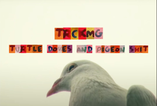
Turtle Doves And Pigeon Shit
Romanticism And James Blake`s Can`t Believe The Way We Flow
Romanticism could be argued to be outdated, but once we look beyond the clichés and grasp the ideas behind it, we become aware of its relevance today; In how we live, in what we believe in and argue about.
James Blake released the album Assume Form in 2019. He so far has released 5 Music Videos alongside it, one of which is the video for “Can`t Believe The Way We Flow” directed by none other than Frank Lebon. Frank`s approach to his videos and work so far has been a lush and somewhat wild mixture of techniques and media, leaving him with a massive pot of footage and tools for the hours he spends editing. To some degree even this approach of mixed media is in a sense very true to the fashion, believe and tradition of romanticism. This and many other aspects of the video, is what I hope to discuss and further investigate in the following TRCKMG entry.

Still 01, Can`t Believe The Way We Flow, 2019.
A Short Introduction To Romanticism
Romanticism. I am not referring to roses, boxes of chocolates and the numerous red silk bows we see on valentine`s day. I hereby am referring to an epoch also known as the romantic period. Speaking roughly of romanticism we think of a time between the end of the 18th towards the end of the 19th century. This slice of our history is marked by many very major political and cultural events across Europe and the globe. Some worth mentioning here would be the French revolution (which is often believed to be a starting point of the French romanticist movement) and the industrialization, marked by heavy machinery, steam engines, factories and therefore factory labour. We do, however, believe that the origin of romanticism as a term and way of thinking lies in Germany. Friedrich Schlegel, a German philosopher, author and poet first used the term “romantisch” believed to be in reference to the word “Roman” which is German for novel. Romantic therefore being “novel-like”.
From there on romanticism spread fast across Europe supported by the events described earlier. More than just a fashion moment, romanticism describes a different way of thinking in direct contrast (and perhaps in protest) to the inhumane labour happening in factories caused by the industrial revolution. People needed to believe in something, in more relevant things, in nature, in purity, in emotion and in beauty. So not surprisingly romanticism manoeuvred like a wave, spreading across fine art, literature, poetry and even medicine. What we can see in many paintings of that time, are vast and lush landscapes. Nature at its most triumphant, often alongside a tiny human figurine, humbled by mother nature, reminding the human of his place and scale in this world. This emphasized by the Lyrics in the song: “I`m finding I`m a smaller piece than I thought. Oh no I really am”. Even back then, the immediate threat facing the natural world was carefully depicted in William Wordsworth`s poetry with the arrival of factory buildings and nearby compounds of living quarters for the workers.

Painting by Hans Gude, “Fra Hardanger”, 1847.
With this surface level introduction to romanticism, we now can take a closer look at the actual Music Video for “Can`t Believe The Way We Flow”:
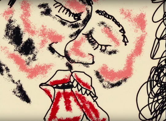
Act One: Red Lit Couples

Still 02, Can`t Believe The Way We Flow, 2019.
The Video starts off with a zoom into a mirror. The reflective image reveals James sitting on a bench. The continuation of the zoom is made with invisible cuts while dark silhouettes pass by, covering James for a mere flash of a blacked out frame. He appears closer and closer after each such black-out. Meanwhile you can hear the pigeons take flight, signalling a start to the song and video - take off. And with the first pigeon shit landing on James` cheek, it`s clear the video with its main plot now begins and the subjects appear.
The 2nd time we hear Can`t Believe The Way We Flow in the Lyrics, the lips of the red lit couples meet. The images flashing by are fragments of their lives in relationships. We aren`t meant to immediately understand who they are, where they`re coming from and maybe more importantly what exactly they`re up to. We only see aspects that should be familiar to anyone who`s ever been in a relationship. For instance, being the most intimate during breakfast where spontaneous conversations can leave you happy as ever or absolutely gutted and devastated, maybe also depending on what occured the night before.
Another place where we find a kind of intimacy where the shared space really gets noticeable to us as lovers, is the bathroom. Apart from the hints of breakfast scattered throughout the video there`s also the toilet. Waste. The toilet which stereotypically always seems to spark arguments. Flush the damn thing, put the seat down, put it up and then down. But it`s also the same space in which we share our toothpaste, standing in front of the mirror before bed. Leading conversations whilst getting ready to go out together. The point being, these images are highly familiar and highly emotional to us. The small window in which Frank lets these images flash across our screens is enough for us to recognize and connect. These are couples in their banalities. We aren`t meant to understand how they got there and where they`re going. We`re supposed to draw from our own experiences, our own relationships when seeing these fragments and glimpses into their lives. It`s a reflection. We still are looking into that same mirror from the first shot of the video, remember?
Still 03, Can`t Believe The Way We Flow, 2019.
Cut between the kisses is a 2D animated kiss, in the same style as the quick drawing we saw flash by on a table earlier. It might be a glimpse into the Storyboard for the video, adding another layer and texture to the visuals. This approach alone can also be read as a nod to romanticism as there was a high exchange between different media and artists. Poets and painters, novelists and sculptor. All echoing and responding to eachother`s work.
Throughout all of this we see James remain seated on that same bench, from the very first frame of the video. An observer. In romanticism, as a response to the capitalist mentality, the flâneur describes a person seen wandering around with nowhere to be or go. Observant, most likely unemployed, playful and sensitive to his surroundings. James is very likely maintaining this role in the video. The careful bystander, observing the beauty around him. Beauty that lies hidden for most others in their hectic lives.
Act Two: Pigeons, Cupid and a Gun
Still 04, Can`t Believe The Way We Flow, 2019.
A culmination of shots of pigeons (and some seagulls) in flight. Close-up of a pigeon`s face, slowly revealed to be sitting on someone`s head. This someone is Frank Lebon`s dad, photographer Mark Lebon. Here he`s also cupid. A cupid who has aged and traded his bow and arrow off for a knotted sniper gun.
Cupid is often described as a winged, nude, young boy armed with bow and arrow. He`s usually depicted as somewhat cruel and mischievous, very aware of what emotional turmoil he can cause in people. Cupid as a figure derives from roman mythology and is considered to be the god of love, or rather the god of being in love. The roman cupid is also understood to be somewhat based on the Greek god Eros, who some believe was a son to the goddess Venus. Eros and Cupid can`t be defeated, any- and everyone falls victim to them and their power. In the following painting, artist Julius Kronberg captured Cupid in his full demeanour in 1885, so towards the end of classic romanticism:
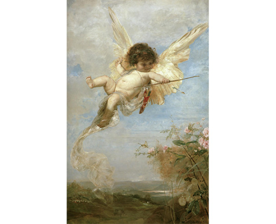
Painting by Julius Kronberg, Cupid, 1885.
Now in comparison to Frank`s take on Cupid we immediately notice the age difference. The world in many ways has become what romanticists had feared; Industrial, concrete, consumerist. Perhaps Cupid had to adjust to survive? Lose his wings and grow up. Wrapped in what seems to be a pvc jacket, not unlike the medical protective suits we currently see a lot. His outfit also contains sketches and scribbles of genitalia. Colours white and red, famously used in the medical field, also symbolizing purity, lust, sin and romance. He`s also wearing red earrings and cufflinks decorated with a more traditional depiction of cupid.
The gun on the other hand, knotted, could also be a nod to the Non-Violance sculpture by Carl Fredrik Reuterswärd, which is in New York. Perhaps a rather twisted musical reference, as that sculpture was made in remembrance of John Lennon. The seemingly unusable gun however, does hold a heart shaped scope through which the absent minded and complacent looking Cupid is aiming to find his next victims.
Enrolling the pigeons to take over the flying and firing arrows part, they soon after take flight once again and a montage of numerous pigeon shit landings are shown, including another drawn Animation of the pigeons` droppings turning into a falling human figurine. Perhaps falling, as in falling in Love, falling for you. Cupid bringing or rather dropping this person into your life. This sequence is concluded by acts of violence followed by tenderness. A slap, a hit, like when love “hits” you. Shortly followed by a gentle caress of the cheek, as though nothing ever happened. So in love that you`re not aware of the violence and force it potentially holds. Another short Animation, single flower turns into a tree, which transforms into a couple in love, a heart in the middle.
Act Three:
Cut to seagulls instead of doves above James. Perhaps accentuating him to be different from all others around him, once again emphasizing his role as flâneur? Or maybe it`s just a subtle teaser for his following music video for I`ll Come Too, which was the next release, featuring a penguin and an albatross.
The couples, still lit in red are holding hands, and then facing the camera. Every individual on their own, staring into the lens, or at their partner. Keeping the mirror in mind from the beginning, this is another very common way for cinema, film and video to become reflexive (film with self-awareness) challenging the viewer in their passiveness and voyeurism.
Still 05, Can`t Believe The Way We Flow, 2019.
The doves once again present by appearing as illustrations on the cushions of one couple. All the people involved appear in lettering over the faces of the couples, including a cameo by the director. Another beautifully added layer to this multimedia approach that lends it`s charm and texture to the entire complex romantic experience.
There`s so much more to see and discover in the video than what I have tried to contain in this analysis. I do hope you`ll go on a search yourselves. The video for James Blake`s song Cant Believe The Way We Flow is linked below:
youtube
#james blake#frank lebon#romantic#romanticism#romanticist painting#music analysis#music video#trckmg#taylor joe#editing#doves#pigeon#cupid#assume form#pitchfork#nme magazine#flaneur#cant believe the way we flow#retrograde#travis scott#rosalia#wilhelm screa#you're too precious#valentines day#valentine#roses#chocolate#long reads#music blog#musicvideo
20 notes
·
View notes
Text
Week 8
Andrew Simpson Video -
The model making process is shown in the video as an invaluable way to explore multiple different avenues of product development. Andrew mentions how different ways of modelling can be used to test different factors, for example 3d printed models may show size, scale and the feel in hand in regard to shape but are not accurate for weight and grip. 3d models are however very easy to do as they just require the 3d computer model. This means that model making allows for such an array of different testing when done thoroughly through different methods.
The mention of low fidelity vs high fidelity is the difference between investment into the model. For general shape a quick model from foam may be able to be used as weight and texture may not matter, making it low fidelity. This would be good for quick checks of ideas and drawings. A high fidelity model would be far more developed and usually later on in the design process, it requires more investment but would give more detailed feedback for things such as grip, weight and true hand feel in regard to the razor handle.

Image 0.5
I was lucky to have a symmetrical (in most senses) and square bottle. This meant to take the photos I used my cutting mat and lined up the bottle along the lines and used a grid on the camera up which I then also lined up with the cutting mat grid, the bottle sat at the centre point.
For a more complex design a jig likely would have suited best.
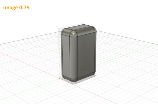
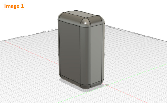
Image 0.75 + 1
Although the method of tracing shown in the video seemed to work quite well for that style of bottle, I decided instead to use the canvas as a reference for how to chamfer my corners. All of my chamfers I wanted to be matching around the bulk of the bottle so I only had to use the top view and ended up with a 10mm fillet which I then extruded up to match the full height.
I then filleted the remaining edges and used the second canvas I had as a check. Being symmetrical I realised the third view would have done the same job as this one.
I enjoyed this process of matching the design to the canvas in a 3d program as you can both tweak it in a reductive way as well as a constructive way, something that is much harder in the physical realm of model making.

Image 2
I created my cut-out for the bottle by making it as a separate piece and putting it in place and used the combine tool to cut it out of the body of the bottle. The canvases again came in helpful here as a reference however I used the measurements off my physical model also. Its helpful having different references to use as the static canvases are quick and easy to either show, hide and trace but the physical model allows for measurements to be taken and plotted straight into fusion.
I also added a slight chamfer to an edge which I had in my initial drawings but was too fine to do well on the foam model.

Image 3
I added an extruded circle to create a cylindrical neck and followed the instructions plus some extra googling on forums to create a thread, a task that would be very time consuming for a physical model.

Image 4
The lid I created did not match the week 5 lid as I wanted to take measurements from my foam model and create a lid with some subtle chamfers to make it slightly more separated from the bottle. I used the hole tool and thread tool to create a matching female thread. Whilst research further on creating matching threads I came across many mentions of providing tolerances also, something that many videos didn’t elaborate on but something id like to further explore.
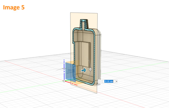

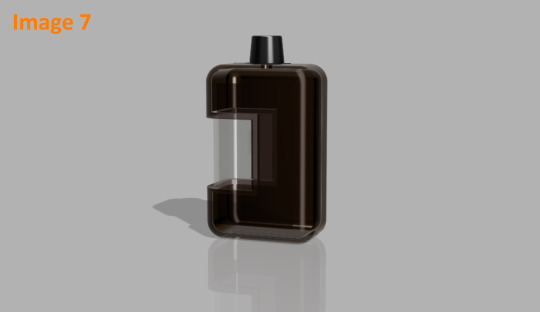
Image 5 + 6 + 7
The final model im quite happy with. After I shelled the model (near impossible to do with a foam model), I rendered it in a translucent brown plastic with a clear window as I had more envisioned it originally. I also included a version in solid white plastic both with and without the lid as well as a section view to show it off in different ways.
I enjoyed this 3d modelling process as it allows for flexibility. Being able to try something out and simply go back or delete a part if it doesn’t turn out is something that I find relaxing in comparison to physical reduction methods. Having the physical model on hand however was extremely helpful as a reference as well as of course having it in the program as a canvas. It did have frustrating moments but the overall process was somewhat of a relaxing puzzle.
There were two main negatives I had with this process. The first being that the program can only be as good as I am at using it. As im quite new to 3d modelling and to this program it meant my speed at it was slowed and my ability to even search or ask questions is limited by the knowledge I have and by my ability to describe an issue. The other thing I found which will likely not be an issue as I progress is that when I created the clear window for the render it left some clear artefacts showing through from certain angles. The only way I could find to fix this was really to start the model again and create the window as a separate component. Something which is possible but quite time consuming. It also only became an issue in the final stages and so it made me realise that for this process we are at the mercy of the technologies capabilities also, some of these limits are hard to notice until too late in the process.
Overall im looking forward to progressing my skills at 3d modelling both the physical forms and digital.
**forgot 2 screenshots hence 0.5 and 0.75**
8 notes
·
View notes
Text
ART EVALUATION - MULTIVERSE ASSIGNMENT
themes of the assignment
The multiverse assignment took us through a variety of artistic styles, drawing, printmaking, typography and collage, but there was also a narrative element introduced through the penguin book, we were tasked several times to draw inspiration from narrative elements from the book, or to depict scenes from it, this I felt was similar to fine art, however while on the computers we worked on 'postcards' (personally though I always felt their purpose was more like covers for our books), which again had inspiration taken from the book, this reminded me of graphic design; we were attempting to express a product through a visual means.
the three ‘postcards’ that had text added to them, overall i find that the first one below is my favorite, the central image i feel is a strongly emotive one, figures shrouded in darkness, almost in solidarity over some tragedy, which is why i annotated it “a reminder of better days”, as a reference to how i felt the image was tragic.

this image i annotated it with words associated with god, the drawing i used because i wanted it to resemble an old medieval representation of an angel, which i feels far more visually interesting, and below it is the shattered sky and broken buildings, riven by strange flames, all part of the ‘wrath’ and ‘profound fear’.

here was see the hand receiving what should cause ‘the rapture’ i used the sun as the object because i felt as though the sun’s connection to the heavens, and it being unreachable was going to add to the piece. i also inverted the colours of each of the annotations, to draw contrast between the statements.
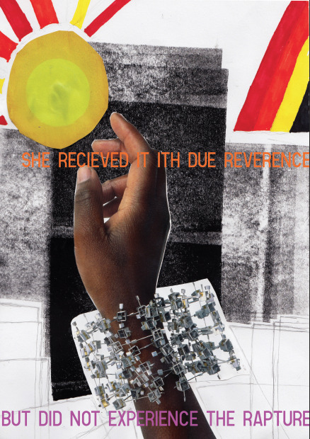
This all being said I'm confused over how the multiverse plays into this, the assignment was about creating art based around a narrative, not around other universes.
Two artists I felt influenced the art I made during the assignment were Brooks salzwedel and pokras lampras, Brooks' art I have already examined, still, he depicts floating land masses, and strange forested scenes obscured by mist, while pokras lampras is an asemic writing artist, his particular
Brooks salzwedel
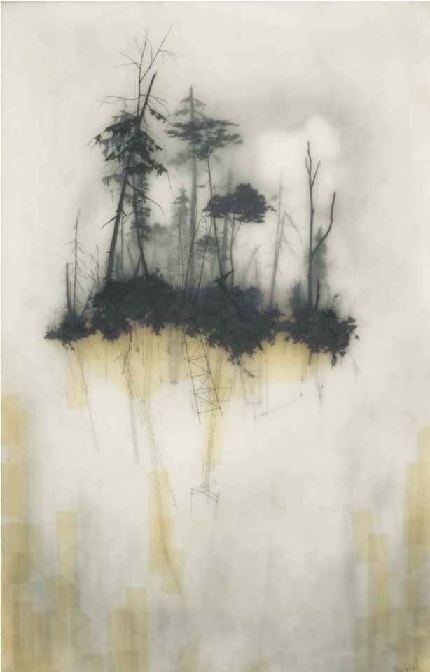
style was structured and merged aspects of Cyrillic, English, Greek and Arabic creating an interesting visual style.
Pokras lampras

What did we learn in lesson
This assignment did not focus on new artisic methods (in comparison to the last unit we learnt screenrinting, intaglio, chalk, graphite etc.) but rather ways to express ideas through it, in this case through the aforementioned narrative.
Animation:
animation is relatively simple, animations are composed of several frames, then the amount of frames per second will determine how the animation plays put, generally the higher frame rates are used for smoother, more high effort animations, 24 fps (Frames Per Second) is industry standard.
In a programme the last frame can be viewed to better let the animator decide where they want to go with the animation.
Light box art:
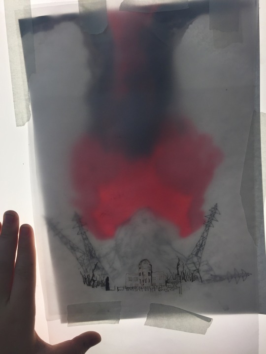
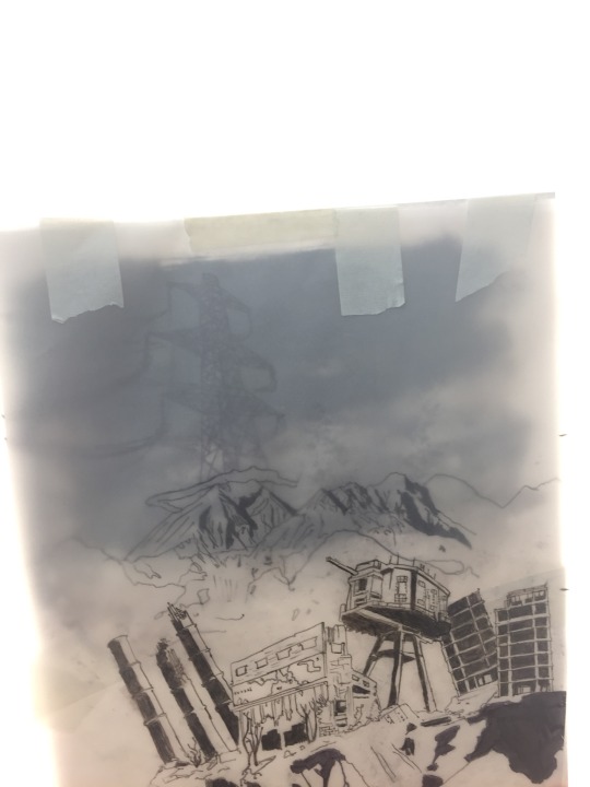
our light box art used tracing paper, each piece of paper was drawn on, the penned, the most 'misted' paper would be at the back, giving an impression of dictance, the paper in fromt would similarly appear closer to the veiwer.
Though as for what we used, screen printing, digital, painting, drawing were all used, of note was the continued use of animations in digital atr.
the use of light boxe was interesting particularly the use of layered tracing paper to create a obfuscated image, though I personally wonder how I could use them in my own art.
Out of lesson
digital art became my focus, I've found my transition from traditional methods difficult, lines are less stable, and dealing with confusing interfaces has proven itself difficult.
The quality of my artwork has been reduced as a result, but this is expected when moving to a new, unfamiliar medium.
Though digital art has allowed me to use colours freely, which again is difficult, as I never developed any real sense over how to use colours using traditional drawing methods.
Inspiration
Additionally I asked each individual artist the same three questions about their work, which were
what is your source of inspiration? (meaning what initially inspired you and what continues to)
how did you start? (what did you draw initailly, when?)
what processes and materials do you use?
void_illustration - Richard Saunders Illustration
Richards art either is obviously biological, where a creature is depicted, or has a distinctly biological edge to it, metals seem to bend,twist and stretch like flesh, nothing seems to be truly just a machine or device, rather every ridge, bulge and groove hints at a more organic truth to his figures and objects.
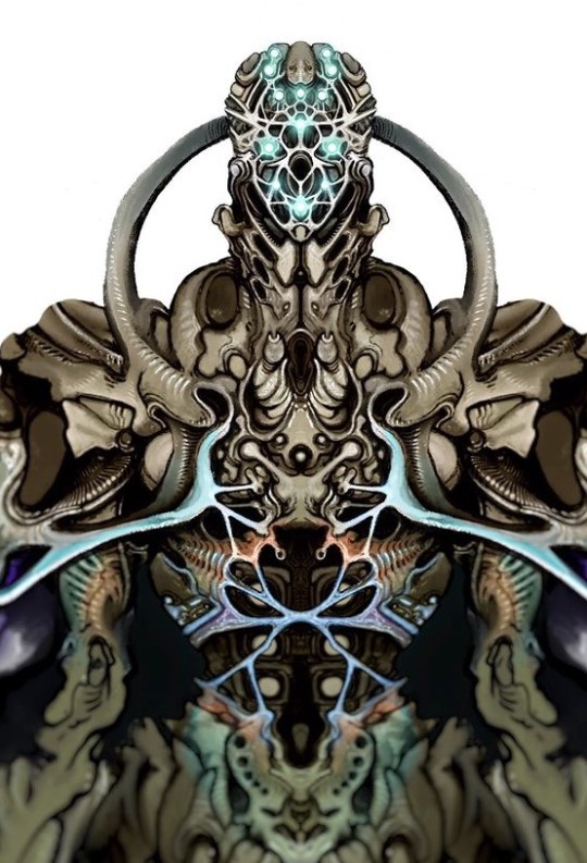
1. im inspired by so many things, its good to pull from a wide range of inspirations.
2. Ive been drawing for a long time, im not professional but im hoping to change that, most of my work forms into narrative universes and then develops on from there.
3. For materials I use a range. My 'bio warrior' series is mainly pencil sketches with marker colours and white paint pen highlights. My brown paper dragons are watercolour on strathmore toned tan paper, lined digitally, though I will layer them up further with paint and markers.
Fuelstains - Nikolay Georgiev
His work similarly to Richard's trends to directly be a creature or rather, monster, these organism often have strongly textured skin, often appearing to have many grooves, showing the musculature underneath, then there are his mechanical pieces, either directly depicting a machine of some kind, such as a robot, or depicting a human who has been massively altered by technological augmentations.
1.I was initially inspired by comics, as a kid, stuff like spiderman, bat man and transformers, but later on it could be anything that inspires me.
2.I started in primary school and it was mostly superheros or stuff from movies.
3.Pencil, ink fineliner, brushpen, watercolour, ballpoint pen, digital.
Milesr.art – Miles R art
miles' art focuses on creature drawings, particularly drawings of alien life, creating some truly bizarrely fascinating, most bearing little resemblance to earth organisms, if any. Another aspect of Miles' work that I appreciate is that it seems grounded, the animals, in spite of their bizzarreness still seem like they could exist.
1.some of my biggest sources of inspiration:
- C.M koseman, Brynn metheny, and dougal dixon are some of my most inspiring artists
-just thinking about the natural world in general like on our planet
2.what initially inspired me to draw and that goes into number 2) in kindergarten I saw some kid drawing a honey comb pattern with neon markers and was like huh okay im going to do that but better.
And I always drew monsters and characters, always becoming more based on science overtime, and here I am now.
3.Now I exclusively make finished things digitally with my ipad pro and apple pencil using procreate, but I often make sketches on post it notes with just regular pencil. In terms of processes I feel like I just do what I do it, its hard to define ones process.
1 note
·
View note
Text
Typography workshop
Today we worked at expanding our knowledge of type and how we can use our choices in font design to communicate what the word means without needing to read it. To do this we researched the history of type and how different parts of history have change the way letters look, for example adding serifs to your type makes it have a more olden days theme to it due to serifs being much more common hundreds of years ago. We also used collaging to further communicate the word chosen.
The history of type
Type is constantly changing but has developed a lot since the beginning of the practise of reading and writing as now we have may different fonts and styles of writing, even down to us now having vast more variety in colour of ink and more access to them.
The creator of the first typeface was Johannes Gutenberg, and it was based on the scribes that the monks would write by hand, as before printing, the monks would have the job of scribing everything, which obviously wasn’t very time efficient and would cost a lot of money. The type was called “blackletter” and had very thick vertical lines paired with very thin horizontal lines, which worked very well when the monks scribed it but worked bad when printed due to the extreme contrasts between the thicknesses.

A fix for this was created by Nicholas Jenson, with the creation of “roman type”. The name and design of this typeface was inspired by the writing he would see on ancient Roman buildings, with the basis being straight lines and regular curves. It is extremely legible when printed and therefore worked well in replacement of blackletter, and had huge success at the end of the Renaissance.

After roman type, Aldus and Manutius created “Italics” at the end of the 15th century, a stylised of roman type with slanted letters. When it was first invented it was as a means to fit more letter onto a page and save money, but now they are used as a way to create emphasis as they are used sparingly within normal roman type.

Not a lot changed for a couple hundred years until the 18th century when William Caslon created “old style” a style of type with fixed serifs and low contrast between thick and thin lines, making it a new standard for the legibility of type. A serif is a small line at the end of the major lines on a letter used on all lettering in the early days of printing and writing but isn’t as common nowadays, despite still being used in most publications and a lot of fonts.

Following old style, Baskerville made what is now referred to as “Transitional” typeface, which has thinner serifs and more contrasts in comparison to old style. Didot and Bodoni soon after made “Modern”, which contains extremely thin serifs and the highest contrast out of the 3 typefaces. These are now the three categories in which most serif typefaces will fit.


Eventually the serifs were removed by William Caslon’s great grandson, creating “sans serif”. This is very common now and is the type of typeface I am using right now, but it didn’t catch on at first, despite finally gaining traction during the 2nd industrial revolution, which was a big turning point within the growth of type. During this time sans serif fonts were used a lot on billboards as they are so bold and easy to read. This led to a lot of experimentation with serifs and the creation of “slab serif”, which had very thick serifs, perfect for titling.


As a backlash to 19th century typefaces, in the early 20th century Paul Renner made “futura”, a simple sans serif font based around geometric shapes, therefore nicknamed “geometric sans”. Other sans serif fonts similar to this were created following futura, the first of which being “gill sans” made by and named after Eric Gill. It is a version of futura with more natural and less harsh curves, and therefore is commonly referred to as the humanist sans. Finally there is Helvetica, made in 1957, containing simple curves and being available in many different lines weights, this type is deemed “the world‘s favourite”.


The introduction of the computer was the final big step in the development of type, with the first type on a computer being pixel type, a very crude and rather ugly form of type which directly reflects the quality of the computers at the time. As technology got more complex, they became an aid to create new typefaces, not a hinderance, and now we have a vast variety of typefaces available to us at the click of a button.

After researching the history of type I thought about how I could use this information in my own work. The direct link between pixel type and computers could work well in my own work as most articles I chose concern technology. If I did want to include serifs in my work I would use slab serifs as they are a more modern take on serifs. I will avoid serifs similar to those seen in blackletter and roman type as they aren’t very modern and therefore could communicate the wrong message within my work since the technology discussed in the articles I have chosen is very new. On the other hand, serifs like these could work well when representing the articles about mammoths and the CIA fly spy from the 70s as they are both about thing which are from a longer time ago and these typefaces could represent that.
Inspiration
When thinking about the second element of my typography work where I would be creating collaged elements to my type, I wanted to find a piece to take inspiration from, so I went to Pinterest and found this piece. I really like the simplicity of it and how it only contains a couple different photographs spliced together as I think it is very effective in corresponding visually with the word which is displayed in a ransom note style at the bottom of the piece.

There could be many meanings of this piece and multiple ways to interpret what her crisis could be, the first idea I had related to mental illness, the blue sky being clouded represents her state of mind being dull and depressed, and the mushroom cloud being in the middle could be a visual communication of being in a state of panic. The other idea I had could be that the crisis is a war, as the vintage style of the collage is similar old war propaganda posters, and the mushroom cloud could be the worry she is having concerning the war or even just something she has seen and is having a crisis about.
I also really like how there is a minimal colour palette due to the muted tone of every colour used and the block colour of the negative. This makes me consider how much the colour I use in the negative space should inform the decisions I make for the rest of the colours I use. Overall this piece has inspired me to take a more minimal approach to my collages.
My Typography
When beginning my type I wanted to consider what I had learned from my previous research. For my first piece I chose to make it in a pixel like font as this style can directly link to the technology aspect of my articles as it was made on computers. I made it distorted so as to replicate glitching you could possibly experience if you had been hacked and I think it works well to represent the word because it is simple enough to easily get the point across.
I chose the word “hacked” to relate to my story concerning a brain chip to connect people to social media, as a big flaw in that product was how easily people would be able to hack into peoples brains with it. I added binary code coming off the word to relate to this further as if the coding is breaking.

If I was to fix some elements of this, I would use a rule to make sure the letters are straighter to emphasise the uniformity that is being broken by the hacking. I would also use a black pen instead of graphite as it is very faint in areas and is not a consistent tone which is not what I wanted, although it could be said to add to the glitchiness. I do think this piece was successful in representing the word but it isn’t to the standard I would’ve liked.
For my second piece I chose the article I have about botox curing depression. I chose the word “botox” as I felt I could effectively represent this visually with needles and clean lines, making it look precise and surgical. I chose to keep it mainly black and white with one element of colour as hospitals and medical places have to be very sterile and bright white can remind people of cleanliness. The orange I added to the middle needle reminds me of David Foldvari’s work and the way that he will only add one colour and I think it looks very striking, working to break up the monotonous black and white.

I chose a sans serif type as they look very sleek and modern and therefore I believe they work well for the subject matter. I also like the simplicity of the needles and how they are the same thickness as the lines in the letters, making them work very well in place of the lines I made them replace. If I was going to improve upon this I would maybe add more elements to the negative space that relate to botox, I could also have mad some of the letters look like distorted faces to show the aftermath of modifications.
When beginning my collages I wanted to take into consideration how simple I would keep it, so for my first collage I only used a few different images. The first image was of a woman who’s face I cut out to replace with metal imagery to make her part robot. This relates to the same article as I chose for the “hacked” type as the idea of adding an implant to someone’s head could make them into a part robot part human being: a cyborg.
I really like how the face looks and I think it works well along with the word I chose. The darkness of the background makes the metal texture of the word “cyborg” really stand out and the warm yellow tones contrast the cool grey. For the word I collaged some metal pipes I found in a magazine together and I think they work very well although if i was to change anything about this I would maybe draw more parallels to the human side of cyborgs due to that being slightly lacking in this in my opinion. To do this I would maybe make half of the word flesh coloured to display that a cyborg is a mixture of both.
For my final collage I used the collaging aspect to make the break up the white in the background. I chose black and grey as this piece was based around a cure for blindness and the darkness could be representative of what blind people see. I then wanted to add different textures to this piece, so to begin with I closed my eyes and wrote “blind” with an oil pastel to create a rough texture in my work whilst also still relating to my chosen article by how I chose to write.

I also added some braille to further tie in to the idea of blindness a this is the form of alphabet that blind people read in. I don’t like the uniform letters I added over top of the crude oil pastel writing and if I was to change any part of that area in this piece I wouldn’t have added that as I don’t think it particularly links to the word. I also don’t like the ransom not style word towards the bottom of the piece for the same reason. I do like how it looks however, and it reminds me of the piece I found to take inspiration from off Pinterest.
I really like the contrast of the white eyes on the black part of the the piece and the style of type I chose to put in the eyes, as it has slab serifs so still looks modern and can relate to new technology despite having serifs. Overall I somewhat like how this turned out although I should’ve been more considerate when adding certain elements and thought more about how they would further portray the narrative I was creating.
1 note
·
View note
Text
𝑮𝒓𝒐𝒖𝒑 𝑾𝒐𝒓𝒌 - 𝑯𝒐𝒓𝒔𝒆 𝑹𝒐𝒕𝒐𝒔𝒄𝒐𝒑𝒆 𝑨𝒏𝒊𝒎𝒂𝒕𝒊𝒐𝒏
Wednesday 16th October 2019
𝑴𝒂𝒕𝒆𝒓𝒊𝒂𝒍𝒔:
Water-colours \ Water-colour Pencils
Ink
Graphite
Crayons
Coloured Pencils
𝑰𝒎𝒑𝒐𝒓𝒕𝒂𝒏𝒕 𝒌𝒆𝒚𝒘𝒐𝒓𝒅𝒔:
𝑴𝒆𝒅𝒊𝒖𝒎 - Refers to the materials that are used to create a work of art. The plural of medium is media.
Today we were working on a project as a group. Our aim for this session was to complete Muybridge’s Horse rotoscope animation. It needed to loop and each frame had to be different than the last, meaning we had to be mindful of what the rest of our teammates were doing so that our frames wouldn’t look too similar. Before now we were only working individually, so it was a good change to feel like you were contributing to a team. After being split into small groups of 4’s, our job was to draw our own frames of Muybridge’s horse galloping, keeping in mind texture, tone and shape in order to make sure that, when it comes together, it’ll look as sporadic as possible. None of the frames will look smooth together because we had to work with different materials and colours. At this early stage in learning animation, we were embracing ‘chattering’, (which is inconsistent, jittery animation.)

This was the first time I had used so many different mediums in one animation. The results of this project were satisfying to see, because when you’re drawing the frames, it it difficult to image it all coming together. This animation is the most jittery one we have made so far. I think this is because of all the different mediums we used. By using such different materials which give very different results and effects in every frame the focus of the animation isn’t looking at the movement of the horse anymore but watching the fast-moving contrast in textures and tones.  The fact that different people made the different frames made the animation even more sporadic because we all have different ideas of what we want to focus on in each drawing. Some of us put more effort into the colouring and others into black-and-white tonal values.
This style of animation has taught me that it is possible to make a fluid illusion of movement by using different forms of materials together. Before the session I didn’t realise it was possible to make an animation using lots of different materials and textures and colours and yet still make it look smooth and professional. In my next animations I will make I want to incorporate the same style of different frames of texture and tone put together. Something that I could do to push myself in the future is to draw and add things on outside of the character I am tracing over in the frames and also play around with negative space instead of focusing primarily on the silhouette of the character.  


𝑫𝒊𝒔𝒄𝒐 - 𝑹𝒂𝒍𝒇 𝑯𝒊𝒍𝒅𝒆𝒏𝒃𝒆𝒖𝒕𝒆𝒍
Upon further research into this style of animation I came across an artist Who worked on something very similar using The same techniques as we did. He filmed a dancer and then drew over every single individual frame in different mediums. The video spans over two minutes long and apparently has around 1,200 individually drawn frames. Despite the messy look of each frame on their own the frames put together actually emphasise the dancers movements, more so than they would be in real life. 
This artist has inspired me to make something similar in my future animations for this project. I think I will do this by using post-it notes watercolour and ink. Since I really like the idea of a dancing rotoscoping animation and I really like drawing the human form, I think this will be enjoyable. It will also be interesting to play around with tone, texture and making myself loosen up in my artworks.


42 notes
·
View notes
Photo


,the end is where we beginWeek 1 of 7
This is the first week of a small project that I am doing for my Graphic Design degree. The project being an online journal of designs I have made per week to develop skills in areas of interest, This task gives me the opportunity to focus upon more personal areas of interest and to develop my skills and awareness in an area of the design world on a weekly bases with no focus on a final product.
For this week I tried focusing on Minimalism and the extended use of white space. As a designer I tend to try and fill as much space as I can, white space normally being covered up in some way by either colour, illustrations, text or a texture.
I had previously come up with a fake band before this academic year started which was called “Fatal tree” after a rather strange spelling error in a message to a friend. The 6th picture down is the original logo concept for the fake band however it wasn't built upon further than a quick development to get an idea down on paper.
I tend not to do Minimalism as I previously said, so I looked at some album covers I knew for inspiration. The first album cover is from the band Starset and their third album “DIVISIONS” which is very different from their previous two albums being far more graphical. The next album cover’s I looked at are from the band Bring Me The Horizon that have consistently used a more minimalist almost icon style for their covers. The last album I mainly looked at was by the band Thousand foot krutch and their album “the end is where we begin” using a graphic icon as the main focal point. But I also looked at some of Ed Sheeran’s album’s as well as two from the band Three Days Grace, being their “One-X” and “Outsider” albums respectively.
The last four images are some experimentation work I did. I mainly focused on just the petal image. I had always imagined a more elaborate image for a Fatal tree album cover, a big cherry blossom tree in the middle of a clearing, dark colours and very detailed, inspiration from that was an album cover by a band called Get Scared and their album “everyone’s out to get me”. So I wanted to focus on the petal of a cherry blossom which I thought would be an interesting link to my original ideas as well as the logo I had made. After showing it to a few people including one of my teachers I came to the decision I should change my though’s on it. I had an idea of the more paper cutting/layering ideas shown in the Starset album design as well as maybe not focusing only on the petal. I brought the outline’s of the logo in as well as multiplying the petal so it wasn't just singular. Originally I had planned to have 3, in a 3 sided yin yang symbol configuration giving reference to where cherry blossoms are famously known for, Japan. I then tried a four sided design but decided that it had to be an odd number to look right and ended up with 5 petals.
Adding a small title of the band in the gap of the squared outline it was done. I made two versions, one with a lot of textural noise but sticking with a second without it to try and stay with the lighter minimalist target I set out to achieve.
This has been a learning experience to try and understand a form of style I tend not to use very often and to really limit myself on how I created something with only two colours which originally wasn't the intention.
1 note
·
View note