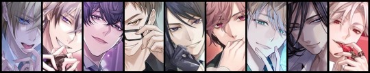
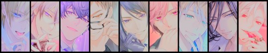
#for characters i don't know i just take the first image from google and crop it
Explore tagged Tumblr posts
Visit Tumblr Blog
Explore Tumblr blogs with no restrictions, modern design and the best experience.
Last Seen Tumblr Blogs


Fun Fact
The total number of visits Tumblr.com received during January 2021 is 327 million.
Text
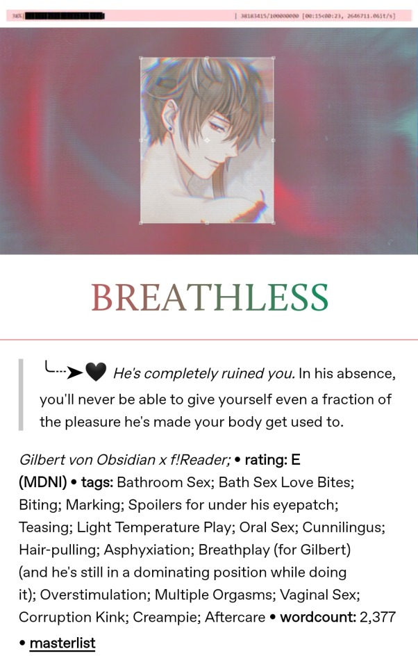
MO'S FANFIC BEAUTYFYING MASTERCLASS!👩🏫
So it seems like you guys like how I do my banners and layouts on @xxsycamore ! I wanted to share a few tips about making similar ones, along with some of my observations on their importance! Be warned, some of the screenshots I'll use to illustrate my point will be of my smut fics! This post is intended for the ikemen series community. While the tips could be found useful for other fandoms as well, it's important to note that it's only this fandom that I've taken into account and because of that my observations could be unreliable if you chose to follow my advice outside of the fandom!
The importance
First of all, a good layout is a subjective term. Second, a "good" layout is not guaranteed to boost your fic's popularity. Not all of us are able to put the time and effort into fancy banners and dividers, but the good news is, you don't really need them! You should always strive to do only as much as you can without straining yourself. Here you can see a minimal effort fic layout vs one that took 30~ minutes to put together, both posted around the same time, both having a similar reception when it comes to notes! Keep in mind that a layout is just one of the many factors to take into account for your fic's popularity status, and you shouldn't obsess with it either way.
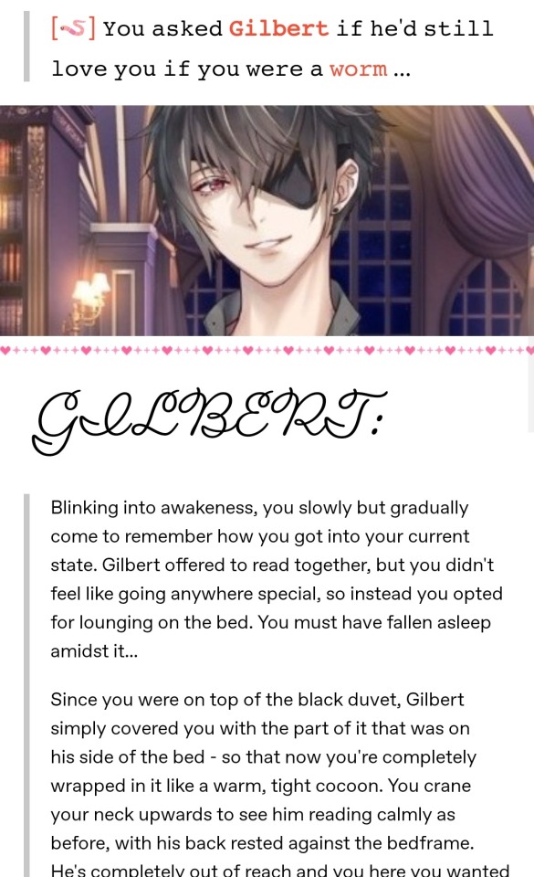
2. The minimum: Banner + Title
Not everyone checks out every single post on their dash while they scroll! I follow around 1100 people and while not all of them are active, it's easy to miss a post that could as well have been the best thing I'd see that day. Your brain recognizes what a typical fanfiction post looks like - a rectangular picture with a title above/underneath, followed by text. As long as you scroll past a post with a similar construction and you're interested, you might want to scroll back and check it out.
3. Banners
The information that you get from a banner is typically about the character(s) featured in the fic. Using the example above, you'll see that a simple cropped picture of the character gets the job done! (an in-game sprite at that, not a fancy card photo)
If you decide to use a card, you can browse google for a good one of your character(s). I try to select a card that depicts something similar to what's happening in my fic, either the action or the "vibes" (daytime or nighttime, outside or indoors, canon or modern, etc.), but sometimes it's better to choose the one that will look good instead of the one that's more fitting.
Finding cards of good quality is also challenging, and I'd advise you to avoid blurry/low-quality banners even if those would be best fitting.
Stick to the rectangular horizontal format if possible. I like square banners sometimes, but it's better when you can see the whole layout at once!
4. Editing the banners & photo coloring
If you decide you want to go out all, you'll need a photo editing app or a program. I use one called Snow which is mainly for selfies but gets the job done. It has many filters to choose from, but inputting text there could be a hassle sometimes. Another one I use is Pixlr. Yeah, I couldn't let it go ever since the days it was just a website...it's been about 10 years but I still rely on it (now as an app) for some stuff, like cropping down images with very big height to width ratio (like thin strips for dividers). In very rare instances I use my (paid) art program, Clip Studio Paint. I know that many people use Canva for their banners but I can't get used to it, I guess it's not my thing, haha. That's why you should see what works for you. I prefer a certain amount of limitation, like having filters to choose from, simply because I don't want to think too much about it and to be able to spend too much time on it (I'm a perfectionist)...
Maybe you just want to give your picture some nice coloring, nothing too much, just a slight change of tone that it's noticeable but not in a screaming way. There are still some things to avoid, mainly old-looking filters. I'm talking about the ones that were mainstream on Instagram during the last decade, the pinkish sepia one for instance. Ones that have too high exposure value and make the bright parts practically glow are not a good look either, same for the too dark ones. Making the character unrecognizable is also not good, and some filters can do that, especially in the case where they have fair hair and the filter makes it appear as another color. Again, those examples are bad only in my own opinion and could look good in certain circumstances or if it's a desired look!
Here's the collage for the banner used for my fic Nine Nights (MDNI) before the filter (first picture), a variation I did but scrapped (second pic) and the one I went with in the end (third pic). While the bottom pic is in contrast with what I said about making characters unrecognizable, here I rely on the fact that it's enough that it's obvious this will feature all of the Crown members just by looking at the bunch of them. I liked how the colors pop up, almost as if each one gets assigned a theme color (interestingly I didn't pick the cards for that purpose), and it's just a pretty coloring in my opinion as a whole. I achieved this by tweaking the RGB values from the "Curves" tool in Snow.
Another cool thing to do with your banner is adding transparent elements in it, like how I did with this one (see it from the link below, it's not depicted here on the pics). The thing is, this could be very energy-consuming, you'll need an app/program that can do that as not all of them work with transparent images, and in the end, it could be just barely noticeable. But it can be fun from time to time.
5. Titles
A title is the other main element of your fic's layout and it should stand out. If you hate coming up with titles (understandable...) you can just put a "(character) x reader fluff", for instance. If you look at the example in point 1, I simply used the character's name in place of a title! It doesn't have to be a stressful aspect of putting your fic out there. As a side note, you can try centering your title simply by putting some spaces at the front, but leaving it aligned to the right could be a stylistic choice.
6. Colored text
This one is very optional but good if you want to fancy it up. Tumblr already gives you a bunch of colors to pick from and you can make use of them if they fit the style of your fic, but they're very limited. Luckily we can use just any color we want. (This only works on the fonts tumblr supports! The ones you can choose from when you highlight a text) Unfortunately, the way to do this will make you work with the HTML editor which you can access at the top right corner of your post editing screen (from desktop, click the settings, scroll down to Post editor) and things might seem pretty scary if this is your first time looking there. It's not too hard! You need to use a site that takes your desired piece of text, lets you select colors, and then gives you a code that once pasted in the HTML editor will make it colored when switching back to the Rich text editor. Here's the one I use because it also allows me to blend colors. At the bottom right of the page, I put the text in the first box, select the colors, and upon clicking Run it gives me the code in the bottom box. I use colored text for my title, and sometimes for my information tags.
7. Information tags
This is how I refer to the part of your layout dedicated to showing the pairings, genre, content warnings and wordcount of your fic. This is all optional even to add in the first place. I personally don't bother too much with beautifying that part, but a good tip is using some kind of symbol to separate these pieces of information if they're all in the same paragraph (I use big dots), or to place in front of them if they're in different rows (like bullet points). This gives a lot of creative freedom for text art, you should explore it if that's your thing!
8. Fonts & font size
You can experiment with Tumblr's fonts, or you can look for more fonts online - here's a handy site. It's good to find one that is legible enough. 𝐓𝐡𝐢𝐬 𝐨𝐧𝐞 𝐢𝐬 𝐚 𝐟𝐚𝐯𝐨𝐫𝐢𝐭𝐞 𝐨𝐟 𝐦𝐢𝐧𝐞. Again, be warned, those fonts that are outside of tumblr's post editor cannot be colored (as far as I'm aware of)
You can spell your title in all caps if you deem that's a good look for your fic.
Play around with bolds and italics instead of making everything a different font.
The "Biggest" font option here on the editor is not the best one to use as it's simply too big. Big title fonts should be avoided if your title doesn't fit in a single row.
Having different font sizes for different things in your layout can be eye-catching! Besides the obvious upscaling of the title, you can also upscale your information tags. Using small text is also nice and prevents your post from getting too long, but this should only be done for the part of the fic that is not the fic itself. Small text could be harsh on the eyes if it's in big quantities.
9. Dividers
Dividers are another crucial part of a fancy layout! They divide different parts of your layout, like the information tags and the fic's body. There are tons of styles to choose from. Some people like to use dividers that spell out something, like a "minors DNI" warning, a "support your creatives" reminder, the name of the character featured in the fic... You can make your own set of dividers for repeated use. I like to use very thin lines which I color differently according to the fic's theme colors. I also find dividers online, mostly here on tumblr, as there are tons of them if you look them up. It's important to use dividers which are marked free to use, or to otherwise credit their creators.
10. Additional tips
Use gifs. Everything that moves is eye-catching. But don't go overboard with it - one or two moving objects on your layout is plenty. They shouldn't be put too close to the fic's body too, as people might find it distracting. Avoid flashing and glitching gifs, or if you use those and you deem it necessary, tag the post with an epilepsy warning. You can make your banners into gifs by putting a moving filter on them, making it into a video, and turning the video into a gif (the site I use for this is called ezgif and it has plenty of other options for working with gifs and videos), and you can also make or find gif dividers.
Banner themes are nice, but they don't always look good. I'm talking about making a series of banners (like for a bunch of fics made for the same creative challenge) look the same, with the same coloring and filters. I used to make all my banners purple to follow my blog's tumblr theme but I realized not everyone looks good in purple...
Try adding a synopsis for your fic! I know, this is worse than coming up with a title, but we love flipping the book over to look at the synopsis before jumping into it. Keep it very short and try beautifying it with symbols or fancy quotation marks.
Use the "intended" font from the tumblr post editor to make your information tags or synopsis stand out and shrink the overall length of the post!
Put the body of your fic under a "read more" (the last option when you hit a new row in the post editor). This is very important, especially if you're writing smut - you wouldn't want to make people scroll through all of that if they're not in the mood for it. Putting your whole fic on the dash doesn't make it more likely for people to stop and read it, or at least that's just how I see it.
Use emojis! Emojis stand out!
Take inspiration from other people. Get out of your bubble and look at how other fandoms do it, but obviously don't steal.
11. Final thoughts
Making this post felt weird to me! I was motivated by my mutuals complimenting my layouts but also because some of them said "they can't do that" and I wanted to show them it's easy. I also wanted to show them it's not that important and that they shouldn't stress over it at all! At the end of the day it's your fic that matters, not how pretty you can make it work. But instead of simplifying it, I ended up with this massive post of 11 parts, and now it looks scarily big. It's not, okay! I went too much into detail at times, and I want to stress once again that it's all optional anyway. I, personally, don't follow all of this advice. I don't go through the 10 steps of constructing my layout every time I'm about to post a fic. I typically post my fics just before going to bed, and 99% of the time I need it to happen ASAP because it's that late in the night. It's a way to beat my perfectionism, really, and I find it to work for me. I also already have these steps tested and memorized so it all happens quickly and mechanically for me. Making the layout is extremely fun for me and this is my sole driving force for putting in the effort. At the same time, I remind myself not to go overboard because it's stupid to focus on it more than on the fic itself. I love ao3 because everything looks equal on there, but I also love tumblr because I can unleash my creativity in one additional way.
In the process of making this post, I started to wonder if it seems like I'm making this out to be way more important and difficult than it really is, and I want to assure you that this is not my intention at all!
My only hope is that this proves to be helpful for whoever feels like they can use some of the information above. If it leads to just 1 additional note to those criminally underrated fics I see, then I'd be beyond happy!
Have fun posting your fics :)
#ikemen series#ikeseries#ikemen vampire#ikemen villains#ikemen sengoku#ikemen prince#ikemen fanfci#ikemen fanfiction
57 notes
·
View notes
Text
Stem's Thoughts on Harvest Moon 64
(that other title's too long so i'm cutting it down now)
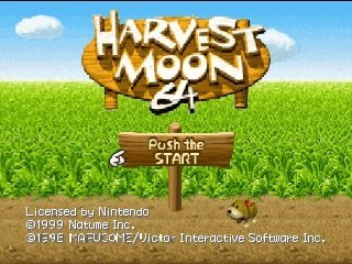
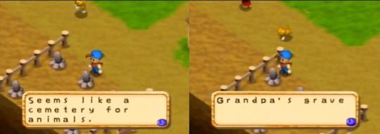
Harvest Moon 64 opens on a scene of your character walking around the street, speaking to everyone in the village who’s come to the event. You quickly piece together that this event in question is actually your grandfather’s funeral, the same grandfather who’s farm you’re about to take over. This little scene beautifully sets up both the tone of the game, and immediately shows the player that this iteration is far more focused on the story and characters. HM64 tells a story about the lives of many people in a small, dying town. It is a story about life, and it is a story about death.
A short disclaimer before we dig in: I played this game before the idea to write these essays cropped up, and have not replayed it since then, so this will be mostly vibes. I will try to do my research to make sure I’m not straight up lying though. (Also all of the images in this one are from google because I don't have a means of getting images from my N64 other than photographing the tv screen and I'm not doing that.)
What’s new!
HM64, also called Harvest Moon 2 by HMGB2 and nothing else I’ve ever seen, is the direct sequel to HM SNES. It’s not a sequel in the usual way sequels are, where you’re continuing where you left off with the same character, but in that every main character is the descendant of their equivalent in the previous game. It’s not important to the story, in fact if you don’t already know this, you probably wouldn’t notice anything past some similarities. I played this game before I tried out SNES and it still took me a minute, plus having it directly pointed out to me to get it. Maybe I’m oblivious, who knows.
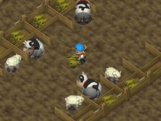
Gameplay-wise, this iteration is home of a few series firsts: For one, your house can be upgraded to have a kitchen! You can't cook though, only collect recipes. You can also get a greenhouse where you can grow crops year-round. Sheep are introduced as barn animals that produce wool. You receive a fishing rod you can use whenever you want, but as far as I understand, the timing is nigh impossible unless you’re playing on a CRT (I am not, and never managed to catch a single fish). There’s a mine you can access in winter for something to do while you can’t grow crops (there are fall crops, but not winter) where you can find about two key items and garbage otherwise. Tool upgrades are no longer done by magic, but by leveling them up through use! Which I think is very neat and feels very natural, like you’ve just become more proficient with them as a farmer through practice. Characters can now come to visit you on the farm at random times, for either special story events or just to say hi! Your farmer can get sick from working too hard in bad weather, just like your animals, and there’s now medicine for that, just like your animals. And there’s inventory menus that I'll discuss at better length later.
What’s the same is��� Most things in a basic sense. You’re on a farm with a dog, planting crops, raising livestock. You can make friends with folks in town by talking to them and giving them gifts. The livestock mechanics, as far as I could see and as far as I’ve been able to understand from online forums, are exactly the same as they were in SNES, the exception being there’s no wild beasts that can kill your animals but they’ll still get sick if they aren’t fenced overnight– and they’re not going to eat any grass unless they’re out overnight anyways.
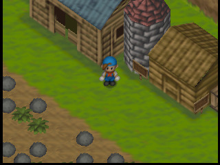
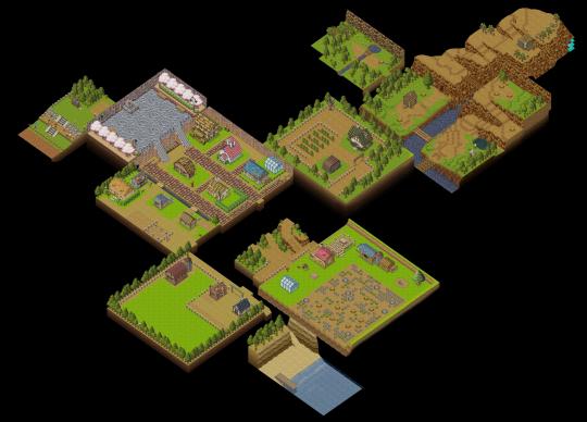
As for your farm, you’re set up with the usual: a small house, a barn, coop, and fodder silo, a wood bin to store debris cleared off your farm, and a big messy field that you have to clean up before you can properly use it. It starts with three new additions though; a doghouse, a bowl that you can feed your dog with by putting edible items in there, and a mailbox that you’ll occasionally receive letters and notices in! They’re small additions, but very, very charming. The one thing that’s been removed is the toolshed, now replaced by a tiny toolbox by your house.
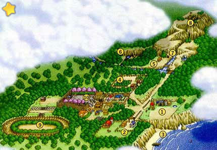
The world outside your farm is like an enhanced version of the SNES map. Imagine the town and forest now have one or two extra sections tacked onto them, one in the town for some extra housing, and a couple in the forest to let you explore the mountain more and get you deeper into the woods. The mountain still has a cave in it (this time with Harvest Sprites, who have been removed from your farm) and a summit you can climb to for certain events, but it has been upgraded with little wild animals that wander around and can be picked up and shown to people for a few friendship points, if they like the animal. (This applies to your dog too, there’s a well known exploit to max out Karen’s friendship in one day by repeatedly showing it to her in the bar where time is stopped.) The crossroads zone is also expanded by having three new areas you can travel to– the ranch that you buy animals at, a vineyard that’s more of a story-area, and a beach that mostly comes into play for a couple of summer festivals!
On the visual side, this game is the series’ first venture into the new frontier of 3d graphics… kind of. The artstyle is made of isometric 3D models that are rendered into flat sprites and then projected onto the TV as if that’s not what’s happening. The game even lets you turn your farm around in 3D to face different directions, but it’s locked to only let you play in specific angles. Changing the direction made me forget where everything was and get lost on my own tiny farm, so I never touched that mechanic.
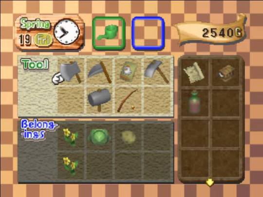
Due to the dramatic artstyle shift– not only being in 3D but also presented at a 45 degree angle, the game becomes a fair bit harder to play than either of its 2D predecessors. The controls are just a little clunky, and the bizarre shape of the N64 controller really doesn’t help. This makes the tedium of farming a little irritating to do, since it requires pretty precise inputs done over and over for every extra thing you’re trying to grow. Fortunately, you're not on the hook to ship everything before 5PM comes around like in SNES, so you get to move a little bit slower. The fickle farming experience also gets a little help from the new inventory menu that can be accessed anywhere and any time. It has multiple inventory slots for both tools and items, each type having a dedicated section so there’s no need to prioritize carrying tools versus turnips. Unfortunately, this actually ends up being a little more cumbersome than useful, as the menu takes a little longer than is comfortable to open and is pretty clunky to use. I mostly avoided it unless I was bringing gifts to people. But the addition of an inventory opens up the opportunity for something else which defines this entire game...
Key items– a set of unique, unsellable items –are most frequently found in random, secret places around the farm and town, and they give you a reason to scour every inch of the place. They can also be given to you by NPCs when you gain relationships with them, which is convenient because their entire purpose is to help you get even better relationships with each of them, and maybe even unlock little stories with characters. For example, there’s a music box you can dig up in your field that can be given to any of the girls for a decently sized relationship bump. There’s also an old weathervane in the shape of a chicken that you can find in the little mine. If you give it to Rick, he’ll tell you that it was a precious thing that belonged to his grandmother as a cute scene to deepen the town’s lore and connect it to the first game. Key items quickly become the most important and sought after things in the game because they act as a vessel to deliver that which the game is all about: stories.
Lots of people in a little town
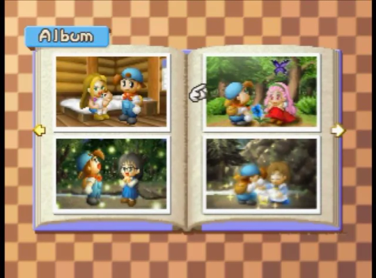
The narrative premise is exceedingly simple: you need to fix up your grandfather’s ruined farm and make a new life for yourself in this town within a certain amount of time, just like its predecessors. Except, this game is a lot bigger than either of them, and it didn’t fill all the extra space with new things to grow on your farm. In my entry on the SNES game, I mentioned that the introspective style of writing turned the repetitive farming gameplay into something more like meditation on things going on in the town. This game takes that idea and runs with it! The town in this game may only be slightly bigger than it was before, but it has a lot more people in it, and every single one of them has a lot more to say, more to do, more festivals to go to, and more story events to take part in. There's even a new photo album that fills in with images for reaching special events or succeeding at certain festivals! Your given goal may be to successfully revitalize your farm, but that rapidly stops being the reason why you want to play. Farming is only a means to further the narrative of the town.
Story events are no longer a reward for reaching the highest heart level with a girl, but instead something that happens naturally in the world as you make better friends with people, or if you just happen to be in the right place at the right time. The world doesn’t only consist of you living it and things happening to you. Instead, you end up being a fly on the wall to other people’s conversations and life events, and you get to see how those events change the people around you. People will begin to say different things, go different places, live different lives without your input at all– often much better lives, as everyone in the town is pretty deeply troubled, whether they seem like it or not.
There’s an added depth, too. While the characters in this series have always been defined by their conflicts (in the first game, every big cutscene with each girl was exclusively about their major life conflicts), this game takes it further in multiple ways. Characters have conflicts with their families: you as the player have a conflict with your parents who can take you home if you fail to farm well, Lillia and Basil have conflict over their marriage and the fact that Basil leaves for half the year, and Karen’s family situation is…. A lot. Then, there are characters at conflict with things much more nebulous, like the Mayor who tells you that the town is going to die out but he can’t find any way to save it, or like the young boy Kent who wants to be a farmer just like you, but through a series of events is forced to learn that life isn’t so simple, people can’t just do whatever they would like, and it takes very hard work to get to do the things you dream of. And then there are conflicts that aren’t even necessarily conflicts unless they run into your long-term plans.
Instead of only having a bunch of girls in town who exist only as your prospective marriage candidates, there are also five boys in the town who will marry those girls instead of you, if given the chance. Like in SNES, there are 5 levels of hearts that the girls can have for you. Unlike SNES, each one of these hearts has a corresponding event you can have with the girl where there’s a chance of her liking you more afterwards, if you say the right things. In addition to that though, there are just as many events coming from the other side of the story, rival events that trigger if you happen to be good friends with the boys.
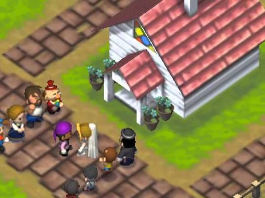
My favorite story by far is that of Harris the mailman who falls in love with the librarian, Maria, from just seeing her handwriting on the outside of all the letters that she would write. I frequently saw him in the bar at the end of the day and he would tell me the woes of his love, saying that he just needed to work up the courage to finally speak to her. Then one day, I happened to be outside of the library when he and Maria met face to face and she handed over a letter addressed to him. No longer did he sit in the bar forlorn every night, instead all he would do was excitedly tell me about Maria, and then when I visited the library, Maria would tell me about Harris!
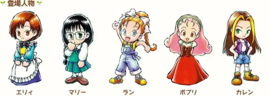
While I’m on the subject of these characters, I think it’s worth going in a little more depth on who these people are past the grandchildren of the characters from the last game. See, you may be familiar with names like Karen and Kai and Gray, etc., etc. from a little recently remade game called Story of Seasons: Friends of Mineral Town, which is a modern version of Friends of Mineral Town on the GameBoy Advance, which is a port of Back to Nature on the PlayStation. These are not those characters. At all. While the basic elements of these characters are intact– Popuri is cute and childish, Ann is a workaholic, Maria is shy and a little oblivious –nothing else is the same. They all work different jobs and marry different people than they are paired with in later entries, and in my humble opinion, it all works WAY better in this game, probably because of the fact that these characters were designed for this specific context!
As an example, Popuri’s exasperated mother, Lillia, runs the flower shop and Popuri was named by her father, Basil, who loves plants. She’s childish and sweet and loves flowers, but can also be a complete brat. She eventually marries Gray, Ann’s brother, who lives on the ranch run by his father, Doug, who struggles to understand his children. Gray is an angry young man who seems to have a particular dislike for you, but you don’t learn why until you discover he was a promising young jockey until he got a bad injury and had to give up the sport.
Am I gushing a bit and letting the game design part fall to the wayside? Sure probably, but I can only gush because the game does a brilliant job of making a cast of characters who, while simple on their own, have interconnected lives that come together to give every one of them so much more depth than they would have otherwise. It all builds a narrative, and while narrative design is definitely something different than game design on its own, this game is far more about the narrative so it’s impossible to not focus on.
The problems
The trouble with these events is that I nearly missed the chance to see that letter be exchanged. You have some control over the progression of the events, because you have to be decent friends with the boys in order for them to trigger at all, but unlike the girls who have a handy visual signal of how much they like you, the boys have no such thing, so you can’t really know if a new event is ready to fire off. There’s no way of knowing where or when they’ll happen either unless you look it up, and even then you have to get lucky because sometimes they just don’t trigger when you want them to. I had a lovely moment in my game where I managed to accidentally catch a cold from working too hard in the snow and lost a day to being bedridden, followed by the New Years celebration which takes a day away from you, then followed by Kai and Karen’s wedding– something that I had missed multiple events for and therefore had no idea was coming, which also took a day from me. After that three day chain of no work, I think I was extremely lucky my animals didn’t get sick and die.
This chain of events led directly to me never speaking to Gray again, even though he was the boy I was most interested in, because I wanted to marry Popuri and there was too much risk of him getting to her before I could. The reason why I didn’t go into more detail about the relationship between those two when I was talking about them earlier is because I straight up don’t know it, I couldn’t risk giving them a chance to get together.
The thing is, even if I hadn’t forced Gray and Popuri’s cutscenes to stop, I still wouldn’t actually know what their relationship is like, because I have not beaten this game. I know what the ending entails and I can reasonably expect I probably would not have gotten an excellent one, but I’m sure it still would have been fine. I stopped playing the game entirely before I even managed to get married. Why? Because I couldn’t get any of Popuri’s heart events to trigger. I had her hearts maxed out and had a blue feather ready to go in my pocket, so I could turn on the game and marry her right away anytime I wanted to. But I wanted to trigger the little events, even if they’re just a couple seconds of some pixels talking to me on a screen. They’re cute. And it made me sad that I couldn’t see them for some imperceptible reason. So I stopped playing and didn’t pick the game back up.
I don’t remember how close I was to the end of the game, I know I was at least in year 2, but I don’t even remember how much longer the game is after that. Probably a good amount. I had definitely gotten most of the events you could get at this point, since multiple other characters had gotten married, and the farming wasn’t something I really enjoyed so I can’t say I wasn’t at least a little bored by this point, but I wasn’t frustrated with the general mechanics of the game. The days were long enough, but not too long, that I had just enough time to go anywhere I wanted and do what I needed before night came. I could still talk to characters and go to festivals and play minigames. But I didn’t want to, because the game wasn’t doing what it seemed like it was supposed to for some arbitrary reason and that frustrated me enough to make me stop. When the fun of a game is found more in experiencing special events rather than anything else, the player feels cheated out of their good time when those events are too hard to find or can be missed outright, and that’s exactly what I experienced.
Parting Thoughts
The ending, according to what I've read, is very similar to the SNES endings, in that you’ll get different results based on all of the different things you’ve done. Whether you’re married, how many crops you shipped, how many animals you have, how well liked you are by the town… I imagine it’s not quite the victory lap that SNES’s ending was with its little cutscenes, since apparently all you get are comments on how well you performed by various people in the town, but it still seems nice and rewarding! At least like more of a reward than whatever the hell GB1 was trying to do. It seems like a perfectly good ending that it would be nice to see myself someday.
Despite all my troubles with this game, I believe HM64 is still the best one out there– at least that I’ve played yet. The events are plentiful and the content is meaty. The repetitive day to day dialogue still has the simple breath of life that SNES did, that manages to make the most out of a small amount. Don’t get me wrong, this game came out in 1999, I’m giving it a lot of praise but the characters still repeat the same line to you every day, and they still freeze in place until you leave the room. It’s revolutionary, but this is comparing it to a game on the literal Super Nintendo. Absolutely pick up this game to try it out, but keep those expectations tempered. That said, I never picked up this game nor knew a thing about it until I was well into my 20’s, but the moment I started playing, it hit me with a wave of nostalgia as if I’d known this game my whole life. At least to me, the look and feel of the game were like coming home to a childhood I never had.
Will I pick up this game again with the intent to beat it? Maybe! Hard to say for sure when I’m trying to play decades worth of games and write about them at a comprehensive level. What I do know is that this is exactly what I want more farming games to be. It’s a game that has thoughts about life, and about death, both good and bad. And I think this is the perfect context to share those thoughts.
58 notes
·
View notes
Text
Hi! I might be late to this, but i'd really like to contribute a little bit to a certain situation happening around the analog horror community:
ALEX KISTER's allegations: the copying fetish
___________________________________________
This post refers to only that one aspect, since that's the one i can confidently talk about, and i'd like to spread awareness about the whole thing somehow.
___________________________________________
How did this come to be?
___________________________________________
On March 12, 2024, twitter user STIRRINGJUICE posted a google document, which consisted of mainly relationship problems and grooming allegations against Alex Kister, creator of The Mandela Catalogue, although there was another aspect of it which people were posting more and more about: Alex Kister made Mandela Catalogue around his fetish about impersonating people.
To be more clear, this meant that the creator got off to/felt aroused by the act or impersonating others and 'becoming' them.
However, this was mostly a misinterpretation from the community, since the only text on the og document i could find was this:
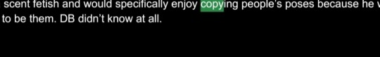
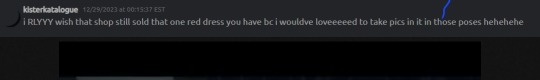
I think the first image is cropped, so i'll post the text: "Alex has a scent fetish and would specifically enjoy copying people’s poses because he wanted to pretend to be them. DB didn’t know at all."
We can point out two things about this:
- The only thing being called a fetish is the scent, only saying that he enjoys copying people's poses and pretend to be them.
- In the discord message, Alex only mentions that he would have loved taking pictures in those poses, which was only a vague example (A bad use and lack of evidence imo).
So far, this is the only text that addresses this at all, the rest are just: 60% accuser's shitty relationship, and 40% the grooming allegations.
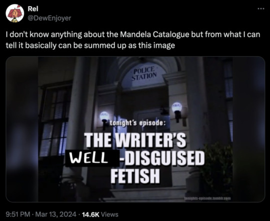
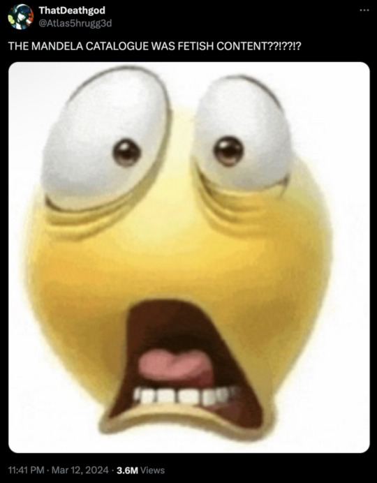
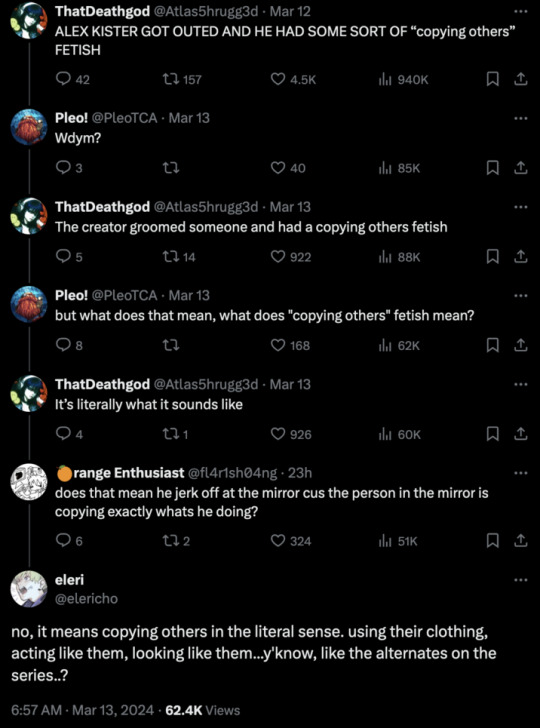
Now, i'd like to imagine that users mixed scent fetish, with copying people, and got the "Copying fetish", like in these posts:
(Don't send hate to anyone here, i will erase names if asked!)
We can agree that this is a misinterpretation of the document, because of users assuming that, if Alex Kister has a copying fetish, then TMC must be a fantasy about it! (And i don't blame them, it's logical with the main themes being that demons copy people).
When i saw this, i immediately called bs, and this is the point of the post:
The Mandela Catalogue doesn't exhibit any trait of fetish work.
Why? Simple!
A very common thing in fetish work, are these two things.
Romanticize the fetish: especially for weird, and straight up illegal fetishes! They might downplay the severity, and play the scene as something normal, TMC never does this, it portrays the Alternates as terrifying because of their abilities to kill without even harming the victim physically, and their near-immortality.
In Made in Abyss, the weird scenes where the kids speak about sexual stuff is shown as a normal scene, like if it was something kids normally talk about.
Using the fetish as the main thing: this means focusing on the fetish itself and giving them too much screentime, to show them in a good light. The fetish specifically means copying another, and most of the alternates never quite copy other people perfectly, the most infamous ones are deformed, non-human appearing and most don't even copy a character we've already seen, and viceversa, we don't see much of the alternate version after we've know about the real person. (Caesar Torres and his alternate, Preacher, the scary hallway guy, and the archangel Gabriel and his Alternate, to name a few)
You might expect the fetish content focusing only on the act that involves the fetish, which leads me to my last point.
They never show an alternate actually changing into somebody else, morphing their features to look like the exact person, a fetish scene might be where the alternate is slowly morphing their features in front of the other person, to the exact same traits in front of them.
A few more points:
Mark Heathcliff, the character interpreted by Alex Kister himself, doesn't really have it's own Alternate, 'Caesar' only becoming him after Mark dies, and only like a frame, i feel like someone with that fetish would insert themselves more? I'm not sure how to explain.
If the story was about the fetish, i don't think the series would even have the biblical references.
To back up my previous point, the inspiration of Mandela Catalogue is about the creator's existential crisis with Christianity, Covid, Local58, and the Walten Files, cited by both Wikpedia and an interview.

(So sorry for taking a photo, i really struggle with my phone)
And that's all i have! If you have any more evidence or points, feel free to know and i'll add them! Any criticism is welcomed, since this is my first post and i'm not an english speaker! I know it might be weird since i'm never active and i don't post about TMC, but i just had to support this thing somehow, thank you!
#alex kister#the mandela catalogue#alex kister drama#alex kister callout#tmc#analog horror#analog#mandela catalogue#drama
39 notes
·
View notes
Note
(How do you make your icons? Do you have any tips for beginners? What program do you use?)
@honkai-star-fun
First off hello! For once I can put my icon knowledge to use lol. But my icon process on how I do them is probably a bit more time consuming than it needs to be just from the sheer amount of steps there are but I'm too set in my ways to change.
First I'll take crops from the actual caps of whatever I want to make icons of, then I use a free program called Photoscape to resize the icons down to the standard 100x100 size that all my icons are (I know that I'm able to do that step in Photoshop but I never learned how and again too stubborn to change my work process lol). Then I go over to Photoshop to clean up all the icons (things like sharpening the image, cleaning up any backgrounds, tweaking lighting to the icon is more visible, things like that. Then the final step for me is actually putting my PSD over the icon I'm making (if it's not an icon for someone else that may or may not be edited with a border or overlay on top).
I premake all my borders ahead of time so when it comes time for the editing process I just slap them right on top of the icon and adjust the image as necessary so it's centered and make sure everything looks good. You can find pirated versions of Photoshop out there if you look enough I'm sure, but I personally just pay for an Adobe subscription every month so the software gets updates and I just do any icon work I can to justify the cost, whether it's just making a bunch for myself or making icons for friends who ask me to. But there's also free online alternatives to Photoshop that I've had to use in a pinch in the past. For me they're not the greatest for doing icons in bulk simply because I don't think you can mass upload files like you could on a legit version of Photoshop, but if you're really desperate it can get the job done. You'd just have to Google search like 'free online photoshop' or something along those lines to find a webpage for one.
As for the caps themselves that I use, a friend of mine does all my capping for me in exchange for me making icons for her own use because I've never been able to get the hang of using capping software, but if you search around on Tumblr and Google for caps blogs you can find a lot of free to use caps to make icons and graphics from or find people that do commissions for caps. It's also possible to find free to use premade icons if you search around Google enough (search things like 'Honkai rp icons' and you'll often find Tumblr posts that have free to use icons for the general public, or you'll find people that have some available for purchase through a commission like I do.
My biggest tip for a beginner is there's no shame in using free for public use icons if you just don't have the time to make your own from scratch. Do what you have time to do. I personally have been making my own rp icons from scratch for over 10 years now, but that's purely a personal preference of wanting complete control over how they're cropped and how they look and I'm willing to put in the time to make them look exactly how I want. Icon making can be really time consuming if you're making a lot of them or are icon'ing a character that shows up in a lot of their source material, so it's totally fine to do what you can to try and get through the process faster. And if you think just commissioning someone for icons to save yourself stress is a better way to go, it's totally fine to just spend a bit of money if you have the disposable income.
Anyway hope all that helped and if you have any more questions don't hesitate to ask!
#ooc#I still take icon commissions sometimes when they come in#usually from returning customers who know I do them in the first place#I just don't openly advertise doing them anymore bc I don't want to do manga icons anymore LOL#but I've seen plenty of icon commissioners around the rp sphere before
4 notes
·
View notes
Text
Don't mind me, just trying to conceptualize a look for Claire Redfield in hopes of manifesting a Code Veronica remake. Feel free to ignore I'm just writing another essay it's not that interesting.
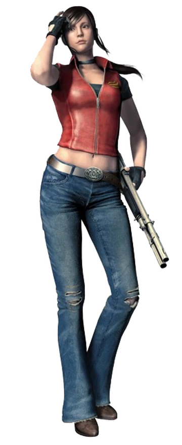
Starting off with a complaint because duh all I ever do is bitch and moan about everything. This is quite a big gripe I've had that's only gotten worse over the last two weeks. In Claire and Jill's redesigns, yes we know they're kind of twinning with the layered tanktops, skinny jeans and boots. But the bigger problem for me is they don't really give the 90s vibes I'm looking for. There's a nostalgia factor I'm missing here. And I figured out the problem. The skinny jeans, bitch. They go in and out of style quite a lot and unfortunately for Capcom, they were out in the 90s. I did a google search as well as sought first-hand accounts. My mother said absolutely not, and she knows a bit about the fashion trends after her traumatic experience with a pair of green flared trousers back in the 80s. What gets my goat a little is it seems whoever was in charge of these character designs didn't really account for the era or that there would be a miserable bitch nitpicking over something so inconsequential. As a consumer I often want my sweet sweet vibes. My excitement seeing Ashley Graham's pink flip phone in the 4 remake is unmatched and I love to see it. I think it was a prime missed opportunity because at this time the 90s trends are back in. I could go into how confusing it is to see how cyclical the fashions are, not to humble brag but I got super into tie-dye just before it was back in style. Another minor brag that actually annoyed me is I spent hours cutting up and shredding a knitted jumper back in February only to find pre-shredded jumpers are coming into stores now. And those are the only times I've been at least within the current trends, otherwise I don't know what's going on.
But TLDR: Factually Claire and Jill's redesigns aren't giving 1998 and I'm butthurt about it.
Now lets get Claire's original CV look out of the way, will be short because I don't really have anything negative to say about them.
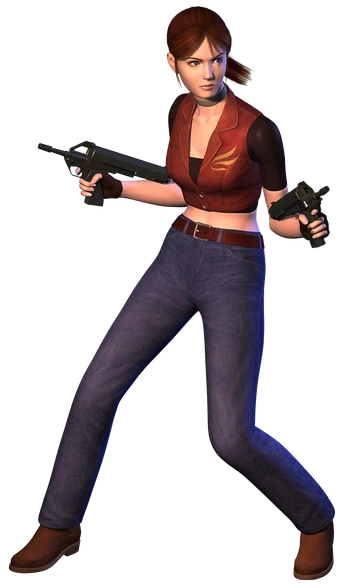
These are among my favourite Claire looks, which isn't hard considering the decade of outfit repeating going on. I just think they're neat. And they actually give 90s. Peep the jeans, we've got the original with straight-leg, and the DSC version has a bootcut fit, both of which were the style. We've got cropped torso pieces which, again, very 90s. We can see differences in the two looks, but overall they're the same framework. Love them, cherish them, praying Capcom doesn't bastardise them. These are good templates for recreations and honestly you could take them in a few directions while still maintaining the spirit of the original.
While we're still on our 90s bullshit lets maybe go into some inspo. Won't do too much with this because I shouldn't really be listened to when it comes to being stylish.
Got a little annoyed trying to find pictures of actual 90s fashions. It's all moodboards and the current trends I was ready to call it a day. Whatever. I wholeheartedly believe Claire would suit the 90s grunge style. Perfect fit for a college student who rides her motorcycle around town picking up chicks. A lot of the vibes I gleamed from the google is the styles tended to be comfortable, casual, and there was an emphasis on layering. Flannel was also a big thing, and I'm not just saying that to project my lesbian headcanon onto everyone else. A more simple-minded reason is Claire's main colour is red and you see a lot of flannel in red. I'm pretty sure there was also a lot of band tees going on, and as we know Claire has a lot of Queen references going on. Food for thought. Also found another image that makes me more upset at her remake design.
Imagine if we got something more similar to this. This might be unpopular and a little bit controversial to say but I wouldn't have minded Claire having a simple red leather jacket and the made in heaven decal on her shirt as a band tee of sorts. That way her jacketless outfit would still maintain her vibes. Just a throwaway thought. This is more my realism brain wanting to overcorrect what I can't unsee as implausible with her managing to have a customised leather jacket, and having a second one too?? Gee, bill! How come your mom lets you eat two wieners? See me complaining and saying a look is pedestrian and basic yet something actually unique I'm like no absolutely not. At least I'm self aware enough to say the two thoughts don't coincide.
Now I'm ready and willing to talk about more specifics.
One of my only problems with the original CV looks are they aren't the most appropriate Weather attire. Allegedly Claire's adventure continues three months after Raccoon City goes boom boom. That would mean it was the end of December when Claire was doing her thing in Paris. Europe gets cold af during Fall and Winter so wtf is she doing wearing short sleeves with her midriff out? Maybe she's autistic like me and doesn't know how to dress for the weather, but I'm not willing to accept that until further assessment of her brain. This is where layering comes in clutch.
This amazing design by (90% sure) Jaeon009 on twitter is essentially the blueprint for what I would like to see. The button-up really adds to the look. For the purposes of Claire not freezing to death I would go for a long-sleeve, maybe a thicker material for extra warmth. Could talk about how great this redesign is but I don't have time or the ability to form words when I'm focussed on something else. Let's just remember where we are in the world at what time and that her OG look wouldn't fare well in a Wintery Paris, let alone when she ends up in the Antarctic.
Next bit is more for me needing to know exactly what's going on, just being a nosy bitch. It will go into her clothes but at this moment I'm wondering what she was doing in those three months. We know at some point Leon told her to fuck off and find her brother, unless the remake canon would change that. My concerns for her safety are would she have been able to go back to where she was living? Would she have kept a low profile in case nasty bitches were after her? In that case would she have gone back to her college or wherever she lived to get a change of clothes? It literally doesn't matter whatsoever but I'd like to know, plus these factors could/should affect the look she's giving us. Perhaps she had to thrift her clothing and she put together what we end up seeing in a hopeful CV remake? Yes, I know I get stuck in the smallest of details. We could scrap this entire section and nothing would change but sometimes I need to get it all out.
I've played around with redesigning Claire (as well as other characters) on the sims 4 that I may post at some point but even with cc it's kind of limited for what I'm trying to convey. Don't draw anymore so that's not happening. I'd love to find some other way of getting what's in the brain put into physical form. That's probably why I feel the need to make long essays overexplaining everything. I really should learn to draw again it would make life so much easier.
Bonus concept art from way back when the original RE2 was in development. Perhaps Capcom should go back through all their old concepts to get some valuable inspo.
#resident evil#claire redfield#the unqualified fashion expert strikes again#maybe one day I should look into being a bitch about the way video game characters are designed
2 notes
·
View notes
Text
SEPTEMBER 24TH
I almost lost my concentration today. I'm glad I managed to get my act together.
Since I started using Yahoo! Japan, I suddenly noticed how better it was than the international version. I can't say much right now. But it's definitely the better alternative to Google. (They even managed to keep the Yahoo! logo after 20 years! Unlike the minimalistic design of its international cousin...)
In Pokémon Violet, I managed to escape the cave and fly back to Moussi Town.

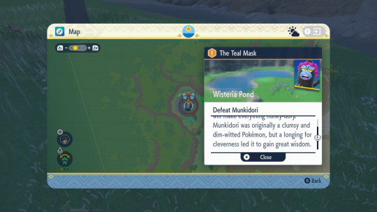
Kieran and Carmine's family must be rich if they have so many nuggets behind their grandparents' house. What's not so rich is that Kieran ran off with the Teal Mask. So I went off to find him.
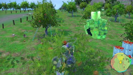
Do the farmers in this area know that giant crystal caverns with dangerous Pokémon grow in their crops overnight? I don't think the ogre is the only thing they should be worried about.
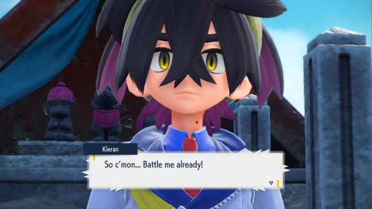
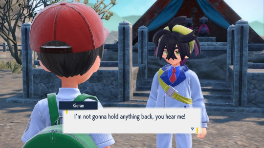
After I found Kieran, he challenged me to a battle and wasn't taking it as lightly as he did before.

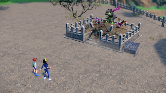
After I beat him, he punched the shrine. And I WISH I managed to get a screenshot of that. (It probably isn't as cool as Dr. Eggman punching a crater into a wall of ice.) That punch didn't just look strong but was enough to reawaken the legendary Pokémon.

That's the thing I'd least expect a Pokémon like that to say.
After that, they all ran off to the festival site. I could've chased them down. But my study time was in a few hours. So, I stopped for the day. I expected Nurse Joy to say her usual lines. But she instead gave me a new pose.

This has to be the dumbest pose I've ever seen... I still had some time left. So, I participated in a few wonder trades. It was a good thing I did because I actually got something good out of it.
A shiny Pokémon that was obtained legitimately. Most of the ones I get in wonder trades (that aren't done in Pokémon HOME or Pokémon Brilliant Diamond) are always hacked by some website. I'm glad this one was the real deal. Goes to show that these wonder trades ARE worth it.
SEPTEMBER 26TH
I finally managed to redesign an old character of mine! The new changes to his design and personality should really win over some new fans. I should work on the other character first, though...
Aside from that, I finished working on a new page for my website! The only thing it needs now is a header image.
In Pokémon Violet, I sat back and relished in the townspeople's stupidity for nurturing the legendary Pokémon to full health.
I chased after them and had to fight against Munkidori.

It was a good thing I used Braixen for this fight because Munkidori helped improve her Special Attack.
Soon after the others had caught up with me, I was told to head back to town to gain information on the legendary Pokémon. I also gained the ability to walk Ogerpon and any other Pokémon.
I set up a picnic to feed Ogerpon after the nasty encounter she had a few minutes ago.
But she doesn't join you for picnics... (She also seems to prefer watching me battle from the sidelines.)
SEPTEMBER 27TH
I'm trying to practice with a specific program so I can better understand one of my classes. I'd say I'm doing a great job so far. (I just wish some of the stuff from the later chapters were put into the one I'm reading. They seem very simple compared to the things I'm learning right now.)
Besides that, I'm also getting back to doing more things with Pokémon Stadium 2. I'm mostly messing around in Earl's Pokémon Academy so I can increase my understanding of Pokémon battles. (Or, at least, the battle mechanics of the GS series.)
Even though Naomi says she'll start off with Murkrow before using Ghost Pokémon, there may be a chance she'll use Magcargo instead. (You can see it for yourself here.) A cunning way to embrace players for the real world of Pokémon battling.
I didn't actually get to do that much in Pokémon Violet today since I was too occupied with schoolwork. But that didn't mean I didn't run into any interesting stuff.
After discovering the legendary Pokémon's whereabouts, I was forced to meet with Ogerpon on the outskirts of town.
Considering she's been out in the open for so long, it's a miracle nothing bad happened to her. I chose Munkidori as my first target since I needed a stat boost for Braixen.
There is no way a creature like that can be so wise.
#pokémon#Pokemon Violet#Pokemon Stadium 2#Swinub#Johto#Shiny Pokemon#Munkidori#Okidogi#Fezandipiti#Ogerpon#Legendary Pokemon#Kieran#Carmine#Nintendo Switch#Nintendo 64#screenshots#gameplay#Nintendo#Game Freak#Creatures Inc.#hal laboratory#personal
4 notes
·
View notes
Note
Hello! I was wondering if u wouldn’t mind sharing a tutorial on how u making ur icons?
Hi sure thing! This is long and screenshot heavy so the tutorial is below the cut :)
First I find a shot of the character I want for the icon and take a screenshot of it. Typically I look for shots where the character isn't obstructed by anything/anyone and make sure nothing is cut off in the cap
Then I put the screencap into this website and it removes the background for me. This works pretty well for most images :)
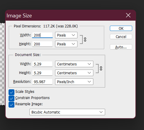
Then I open the image with the removed background into photoshop and crop it into a square.
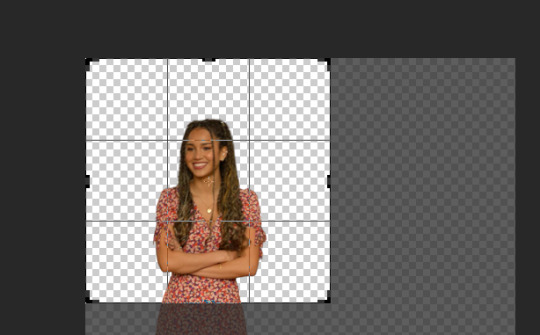
after cropping I resize the square to 200 x 200 pixels
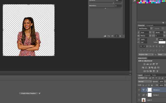
after resizing I run my sharpening on the image so it becomes clearer.

After sharpening, I colour the image with curves and vibrance (as per my basic gif tutorial)
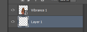
I then select all the layers and Convert to a Smart Object - this step isn't necessary but I just find it is easier for me.

After that I create a new layer underneath for the background and I use the gradient tool to add the background in.

^ that is the gradient tool - if you can't find it right click on the paint bucket and you should be able to switch to it.
The settings for the gradient look like this. To change the colour click on the coloured gradient bar.

After clicking the gradient you will get a dialog box like this:

basically just click on the little colour tabs on the gradient bar to change your colour. Typically with my icons I like to go from the colour to black or white.
For this icon I am doing pink :)
After you have picked your colour click the ok button
To draw you gradient click and drag a line on your canvas

This gives you comething like this:

I prefer the dark spot to be on the bottom of the icon so I'm going to redraw over it in the opposite direction

this gives us something that looks like this:
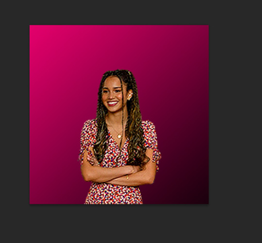
did it a couple of times to end up with this:

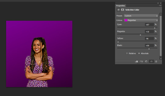
I like the colour background of my icon to match the clothes (I just think it's cute). So I'm going to use a bit of selective colour to make Gina's dress more pink.

So I create a selective colour layer (the one I've hovered over with the two triangles).

After making the layer I right click on it and select "Create Clipping Mask" so that the layer only changes the colours on Gina and not the background. Yow will know this has worked because there will be a little arrow pointing down.

Given Gina's dress is red I will be changing the reds in this image. When changing reds and yellow you have to be careful because they are the undertones of skin tones (why I chose this one as an example). As you can see below Gina's skin has changed with the dress and we obviously don't want that.

To fix this we use a layer mask so only the dress changes colour. The layer mask is the white square that shows up next to the layer name Selective Colour. We basically just grab a black paint brush and draw over the parts we don't want changed on the selective colour layer.

Then basically the icon is ready to be saved as a png for use!
If you want to make different colour versions of the same icon what I like to do is add another selective colour layer on top (no clipping mask this time) and change the colours again :)
So for example to turn this icon purple I adjusted the Magentas in the image like so:
To turn it more of a blue-purple I added another Selective Colour on top and adjusted the Magentas again like so:

and basically I just play around until I get the colours I like :)
You can also add textures on top of the background if you like - typically I will just google something like "grunge icon texture" or "cute icon doodles" or whatever I might want to put on top and find one I like and use it.
So I copy and paste it and put it on top of our gradient layer and adjust the blending mode of the layer as I see fit. This is the texture on top without the blend mode adjusted.

Here I've changed it to Exclusion, which I like - but usually I just play around with the blend modes until I find one that looks good

Here's a heart one I found and put on. For this one I used the magic wand tool to remove the white bits of the background and then set it to Exclusion.

And that's my basic process - I hope it makes sense :)
#asks#resources#ps help#usergif#allresources#yeahps#completeresources#resourcemarket#dailyresources#tutorials#photoshop tutorial#*mine#ok hope this helps :)
58 notes
·
View notes
Note
Carrot! I’m in existential identity crisis, and have no idea what i want to study in future, considering that i’m supposed to apply for university in a few month. I was thinking a lot about choosing programming study program, and i wanted to ask you, how did you get started coding novels? Can you tell me some advices about where to start, video lessons, how to understand code, some programs to use? Any of that would be really helpful! Thank you!!
Oh, gosh! I'm so sorry that you're going through such a tough and confusing time. I was similar when I was in school and ended up changing majors multiple times and even going back to get a second BA (and also even now the work I do has nothing to do with what I got my degrees in... lol). It feels so impossible trying to figuring out what you want to do in life (and it can change so often...) 💦
Mmmm. I didn't have much coding knowledge at all before I started working on OW. (I also don't think it requires much knowledge just to start doing simple stuff in it—and I still don't think I have much knowledge even now LOL). I remember it felt really overwhelming and confusing at first, so I kinda took it slow and did a lot of my initial attempts in steps?? And from there slowly started to get more familiar with it and learn more and more. Let me try to explain:
The first thing I did before coding anything was write the script. I had about half of Arc 1 finished before I even thought about making it into a game, so I just had it written in my writing software.
I decided to see how it would look in a very simple VN format using Ren'Py. To learn how to start using Ren'Py, I played through the tutorial game included in Ren'Py that teaches you a lot of the basic functions. I remember this was really overwhelming because it teaches you quite a lot of things quite quickly—and when you don't know anything at all, it's so much to take in. So I tried to start simply using ONLY THE VERY BASIC STUFF:
My initial prototype only included text, backgrounds, music, and sound effects. So I only focused on the code required for those things, so basically, the code for displaying an image (defining it using image then showing it using show), for showing text on the screen (I just defined a single "actor" with basic formatting and used that for all the text), and for playing music and sound effects (the play music and play sound commands).
By only focusing on these bits, I was able to simplify it enough that I could understand it. And so then I began copy-pasting my script in line by line while creating basic BGs using royalty free photos, finding royalty free sound effects, and adding the music (I already had a collection of royalty free music I'd found for the game).
As I worked on it, I got more familiar with it and began to understand how different bits of it worked, learning new things such as pauses, screen shakes, etc., that I could also add in. Whenever there was something I didn't know how to do (for instance, zooming/cropping an image, creating variables for keeping track of player choices, etc., I would just look up on Google and could usually find something in the LemmaSoft forums).
Once this initial prototype was made and I was loving how it looked, I decided to go all-in on the game and actually start creating art for it! This was when I started drawing the character sprites, CGs, etc. Because I already was familiar with the basic coding stuff, it wasn't hard for me to then apply what I knew to making the sprites and CGs appear on screen (since it's all just using the image and show commands, and maybe moving them around using stuff like ease).
Only once I had made a lot of progress on art and more writing and scripting did I even think about tackling things like the GUI, since that requires some more advanced coding stuff. I remember the video tutorial I used to start figuring out how to do the title screen for instance was this one: https://www.youtube.com/watch?v=_zq3V28qp2w&ab_channel=ZeilLearnings
That took me pretty much to the release of Arc 1! Then as I kept working on subsequent arcs, I kept getting even more familiar with things, and would also try out new things I could do to create various scene effects.
Then when Spooktober came around for some reason I decided to try a ton of different things and really go wild. I definitely learned the most during that month LOL However, it was all built on skills I'd slooooooowly been building basically throughout the course of the whole year. Even doing research itself is a skill tbh. Like being able to figure out kind of in your head what you need to do something to locate what it is you don't know, then knowing how to research that thing and parse out the solution so it will work in your version of the code, etc. And I was only comfortable handling that for more advanced stuff because I'd done it so many times before just figuring out more simple stuff.
Tbh tho literally none of what I have in any of my games is very advanced, it's all just a ton of things moving on the screen in different ways and at different times
Hmmm I have no idea if that long rambly thing I just wrote is very helpful LOL Those were all the resources I used tho: the tutorial game in Ren'Py, that video I shared for the title screen, tons and tons of Google searches and the LemmaSoft forums.
But I really feel like the biggest thing that helped and made things manageable for me was breaking it down. Like, I don't know if I would have managed it if I'd tried to start right away with art and sprites and do everything all at once. I needed to start with that very simple prototype with only a few necessary commands so I could get familiar with it first, and only after that, start working on art and add it in. Breaking it down into small simple pieces really helped my brain so much! (And also was more motivating, as I could create the prototype quite quickly and already get really excited by how it looked even with just BGs and music, which inspired and motivated me to keep working. Whereas if I'd had to wait and take all the energy to draw all the art first, too, I might have gotten overwhelmed and demotivated.)
Those are all the things I PERSONALLY did to learn how to code my game. However, since I began, even more resources have become available that will probably help even more and be a lot more accessible. The biggest one I can think of is Vimi's YouTube channel, which has a ton of very basic tutorials for getting started in Ren'Py and just a ton of stuff about making and coding VNs in general. I feel like this could be super helpful for you!! https://www.youtube.com/@vimi
There are also other programs for creating visual novels, for instance, Naninovel allows you to create VNs in Unity, though since Unity uses C#, you will need to learn some of that I think?? Ren'Py uses Python, though for basic scripting it's not really actual Python and more just very basic Ren'Py script or something. You will need Python though to get into some of the more advanced stuff you can do with the GUI and menus and such though (or if you want to do anything much more advanced like add mini games).
I hope this helps you at least a bit! But if you have any questions about anything specific, don't hesitate to ask!!!
18 notes
·
View notes
Text
(NSFW) Clearing my Rep
Normally speaking, I wouldn't do one of these, but in this instance, I don't think I have much of a choice. Please be warned, the contents contained are not for the Under-18 groupings. You have been warned.
So, this all started with a recent posting on my player's main account on FurAffinity....

There we a few comments - mostly positive. One person asked if I thought it was a good idea to post such a thing... and that screen cap is where things get interesting....

You see that part where a bunch of links were added by Your's Truly? An artist saw the journal and asked if there were references for said character of "Icarus". The first link goes to the character's master sheet link....

Please take a note of one important part - the posting date: 5 years ago now. So said artist now has the original character sheet model, links to various pictures that have been done before, the character's F-List account... hell, even opening my gallery would show images of Icarus in 5 of the first 7 images, clearly named as well.
So why were those posts removed by the owner...? Because I saw that they had posted a picture of Icarus in... how can I best put this? "180-Degrees turned-around from what was wanted in the journal, and certainly nothing even CLOSE to his character's posted personality. They didn't contact me about it, didn't clear the image's content, and didn't credit Icarus to me.. which is a double-edged sword. a portion of the image is posted here, cropped, to show the direct character similarity....

It is obvious and clear that the helmet design is CLEARLY Icarus'/mine. That is simply fact. Once I saw the image, I sent a private note to the artist, so as not to cause a massive stir with their followers....

Clearly stating that the content / context of their posted image of Icarus was counter to the intention. I didn't demand anything at this point, expecting that the artist would be understanding, pull it, and find out what happened. The note reply was... curious...

So... HUH. Not exactly the reaction I was expecting. So, I answered to better clarify myself...

So, I clarified - let them know what was wrong with the content / context, and asked for the piece taken down... but do notice, I recognized work went into this piece. I didn't want Icarus as the character here - but meaning, though I didn't explicitly say it, if they changed out the main character to NOT be Icarus, hey! That would be fine.
The reply was.... uhm...

"Wait is this your character?" (O_o) I mean.. the references were asked for, he's in my gallery, his creation info was in the first link.... and it was obvious that the helmet design was taken directly from the character reference sheet showing he is mine for the last 5 year... references they specifically asked for. So saying that they "Googled" for Icarus and "found its[sic] a[sic] actual MLP character" is just untrue. There are, if memory serves, 2 "actual" batponies in MLP Canon and they pulled Princess Luna's chariot for Nightmare Night.
So, no.... Googling for "Icarus" in conjunction with MLP would bring up 90+% information for me / my postings.
I started a reply to explain what I said before - You did hard work, change the character to Not-Icarus and work it however you like. The note couldn't go through because I was blocked. But I received a follow-up right after....

So, I was being an asshole about it? I don't honestly see how; my character was used in a way counter to his personality and the posted want. I asked for it to be removed and changed to Not-Be-Him.
Oh, but the fun didn't stop there. As a consolation gift, they posted the following journal of their own....

Didn't know if the character was mine or not? You used his exact helmet design from a reference 5 years old that you specifically asked for. So if you didn't know who the character belonged to, why not find out so you could at least credit them? But if the exact character design was used, how could the ownership be in any question....?
Do I follow their account? Well, yes; or at least I had. That will be changing as soon as I post this. BUT....
Considering what happened with this, and since I am disallowed from linking to this posting from within FurAffinity due to Code of Conduct regs, I would ask you folks who might know, who have accounts there, to consider what's happened here and to really wonder, "Is what everyone says really real?"
I don't need to be mad about this; since I know I wasn't in the wrong.
3 notes
·
View notes