#font-size: 70%;
Explore tagged Tumblr posts
Visit Tumblr Blog
Explore Tumblr blogs with no restrictions, modern design and the best experience.
Last Seen Tumblr Blogs


Fun Fact
When “GIF” was named word of the year in 2012, Oxford Dictionaries U.S.A. credited Tumblr for pushing the word.
Text
discussion response posts should be fucking illegal. especially for STEM class ones where the initial prompt is just "dryly state a collection of facts to us"
#they're always bad but i've been doing too poorly lately to not want to explode into a million pieces of defeat about it rn#this week for our networking class it was just straight up ''post some of your network stats'' (not in those words but you get it)#what the FUCK am i supposed to write 2-3 paragraphs of a response about for that#i can think of FIVE WORDS: ''haha wow! mine was different''#also something possesses ~70% of my classmates in any given class to change the default font to a bad one and shrink it to like 6pt size#WHY??????????????????????????? IS THERE A GUN TO YOUR HEAD#hush me#schoolblog#also i want a medal for always going out of my way to make mine more interesting/giving more to remark on
0 notes
Text

I got a couple of asks on how I did the text transition in this set. I'm going to explain as best as I can (with image references).
*Disclaimer: this assumes you have a basic understanding of giffing with video timeline, and keyframes. If you're new to keyframes, check out this tutorial by @userpeggycarter before proceeding.
Step 1: Go through, make your gif, color and all that jazz. if you're not familiar with giffing and need a guide, check this one out by @cal-kestis. Be mindful of the number of frames you have, as it is extremely important when keyframing begins. Make sure you have an even number of frames, or you will have an uneven transition. For this gif I'm at 60 frames total, and I'd be careful exceeding 70, as if you need to go back and delete... It just sucks, so be mindful! You'll see my gif and coloring under a group I titled "base" - and I highly recommend putting your gif/coloring/etc. into groups, as it will make the timeline a bit cleaner, and it's a little easier to find everything you need. But when you're done, you should be here:

*Quick note 1: Make sure your gif is in 8-bit mode. If you aren't familiar with bit modes, that is a tutorial for another time. For now, you can change it here:

Step 2.1: Pick your font/placement/etc. I really recommend being 100% on whatever you pick, along with the size. I've encountered problems when I move the font after the fact with alignment, so it's best to look your gif over to ensure you're satisfied. For this set, I went with Figtree, placed dead center.
I want to add to this by saying, thus far, I have found that white is the only color that works for this. I'm playing around with some other options, but black is 100% a no go. If you find a way to get that working, let me know. I'll amend this tutorial.
Photo of text settings, along with where you should be now.

Step 2.2: Since we're transitioning into a new set of words/text, you need to get that text ready as well. Shorten the length of time the first piece of text runs to halfway (I have 60 frames, so I cut it to 30).

Step 2.3: Duplicate your text layer, type your other text. The two texts should show for length of time, as you have an even number of frames, meaning you can divide by 2. Move it over to the end of where the previous text ends. If that makes no sense, it should look like the below: (again, folder for the typography to know where to reference. I have a small organization addiction so.. creator's choice)

*Quick note 2: I do not recommend changing to a new font or size with this, it won't look quite right. Of course, experiment away! This is just a small caution based on my own experimentation.
Now, to get to the actual fun part...
Step 3.1: Duplicate the first text layer. For this gif, it's the one that says "it didn't change anything". Once you duplicate it, you'll be turning it into a smart object. This is so the filter we apply works. Repeat for the second text layer. Lil gif below:

Quick note 3: I recommend going one text bit at a time, and also would tell you to put each typography layer into its own folder. This is really important for later, so doing it earlier is better.
Step 3.2: We will now apply the filter. To do this, you're going to click the smart object version of our text, then go to Filter → Stylize → Wind. For the gifset I made, I used Method → Blast and Direction → From the Right. Click "OK" and the filter will apply. Duplicate this for the other text layer.

Step 4: We now begin the keyframing. I highly recommend the rule of 0.3, which is when your transitions are over the span of multiples of 3 (i.e. if you start at frame 1 with 100% opacity, frame 3 will be at 0%). We'll be doing 6 frames from 100% to 0%, and vice versa, for this transition. This was the best time I found for this transition, but it's a matter of preference. Just follow that rule of 3.
Step 4.1: Click the smart layer of the text we made on the timeline, then click the little arrow on the left of the name of the layer. You'll see this:

See the little clock next to Opacity? Click it, and you get this lovely little yellow diamond. This is how we control the visibility of the Wind layer. It will start at 100%, keep it there.

Click the arrow on the right of the play button 6 times (aka get to the 6th frame), click the stopwatch again. While on this frame, and the yellow diamond clicked, change the opacity of the Wind layer to 0% It'll look like this:


You will repeat this, in reverse, at the end of the text layer.
Quick note 4: Sometimes, Photoshop is moody. To get the diamond on frame 30 (or whatever frame # the end of your text layer is), put it on the frame prior. You can then nudge that diamond over 1 frame. See below:


Repeat the process for the other text layer.
Step 5: We're basically done! Change your gif from video timeline to frames, maybe do a quick play through to make sure all is well.
Quick note 4 (it's the last one I promise): I have heard from many that when they work with keyframes, they end up with duplicate frames. I, personally, have not encountered this issue. I do not know if it is because of the version of Photoshop others are using, PC vs. Mac, or some other secret third thing. I recommend that, when you check your gif, verify if there are duplicate frames. The keyframe tutorial I linked earlier goes into further detail, and here is another lovely explanation from Nik, the master of all things keyframe transitions.
Step 5.1: Export, and give yourself a high five because you deserve it.
If you have any questions, don't hesitate to reach out! I'll try to clarify anything if needed. Happy giffing!
#*tutorial#c*#*ps#tutorial#userchibi#usertj#uservivaldi#userbuckleys#usertina#userroza#usershreyu#usersole#useralien#userabs#userrainbow#quicklings#userbambie#useraljoscha#userzal#userbess#userfern#tuserhol#usernolan#usermagic#userhallie#usershale#userholloway#tusermels#usergif#we will absolutely not be discussing that fact that i have been awake since 630 am
191 notes
·
View notes
Note
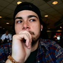
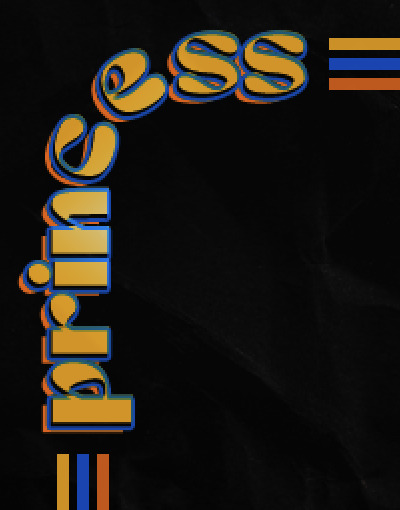
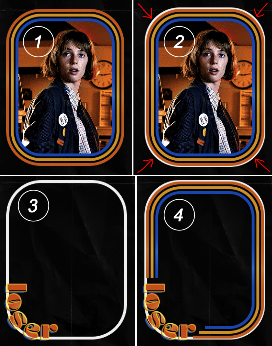
hello! I love your edits and I wanted to know, for the "Steve Robin and Nancy" Gif you posted.. How would I go about doing something like that? More specificly, the bottom two where it says "Height Difference" and where it labels them as "Princess, Jock and Loser"
Thank you! Sorry this took a while to answer. I finally had time to sit down and write this. Link to original post.

Quick notes: I'm using Photoshop 2021 on Mac and working in video timeline. Must have basic gifmaking skills and know how to use layer masks. This is primarily a gif layout and text tutorial.
Fonts used in first gif:
Pea Wolfe Tracks — link here
King & Queen — link here
Fonts used in second gif:
Kiera — link here
Post — link here
Ellianarelle's Path — link here
Heina's hurry — link here
I used a light leaks/film texture, ripped paper textures, folded paper textures, and transparent pngs (arrows + post-it notes + smiley face).
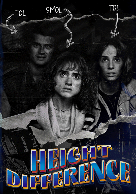
We'll start with this gif.
Make your gif! The gif here is 540x600px. I color and sharpen it to my liking. Go to image > canvas size > change height from 600 to 770px. I left the anchor in the middle, though it doesn't really matter.
I drag and drop my folded paper texture and change the layer order so it's under my gif. Then I change the blending mode on my gif to Screen so the texture shows through the gif, but I keep the texture at 100% Opacity and Fill.
Now I move my gif around and add my ripped paper textures. I wanted to give it a sort of poster-like feel to it, so I made more room on the bottom for my main text and ended up with something like this. Blending mode is set to Lighten for the ripped paper textures.
I then use layer masks to hide what I don't want shown and add my light leaks/film texture. Blending mode on light leaks/film texture set to Pin Light, Opacity: 50%, Fill: 70%.
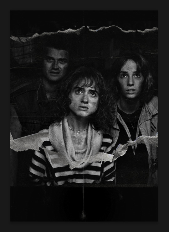
I use Levels and Brightness/Contrast adjustment layers to darken the gif up a bit more, then I add a patterned paper texture. Blending mode for patterned paper texture set to Lighten, Opacity: 100%, Fill: 75%. Result:
Now on to the text!
I'm going to be honest here, a lot of this was clicking around until I settled on something I liked. There's three layers to create this text effect. The font used here is King & Queen.
For the first text layer, the font color is set to black (#000000), font size: 87 pt, leading: 80 pt, tracking: 25.
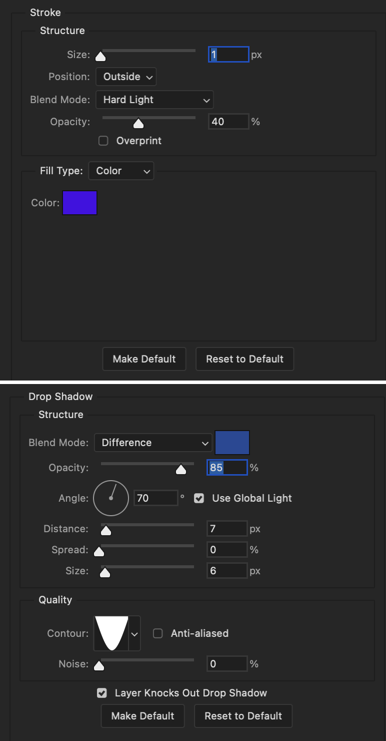
Layer styles used here are stroke and drop shadow.
Text Layer 1
Stroke settings:
Size: 1px
Position: Outside
Blend Mode: Hard Light
Opacity: 40%
Overprint: unchecked
Fill Type: Color
Color: #5911ed
Drop Shadow settings:
Blend Mode: Difference
Color: #2d5ba8
Opacity: 85%
Angle: 70°
Use Global Light: checked
Distance: 7px
Spread: 0%
Size: 6px
Contour: Cone - Inverted
Anti-aliased: unchecked
Noise: 0%
Layer Knocks Out Drop Shadow: checked
Blending mode for text layer set to Overlay, Opacity: 100%, Fill: 85%.
Warp text settings:
Style: Wave
Horizontal: checked
Bend: +60%
Horizontal Distortion: +10%
Vertical Distortion: 0%
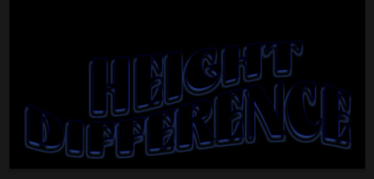
With all those settings applied, the first text layer looks like this:
Duplicate the layer, clear all layer styles, and change the color for the second text layer to white (#ffffff). All other text settings (including warp settings) should stay the same. The only layer style then applied to this text layer is stroke.
Text Layer 2
Stroke settings:
Size: 1px
Position: Outside
Blend Mode: Difference
Opacity: 100%
Overprint: unchecked
Fill Type: Color
Color: #d48f16

Blending mode for the second text layer is set to Difference, Opacity: 90%, Fill: 100%. Nudge the second text layer a bit so the first text layer is a little more visible or move to your liking.
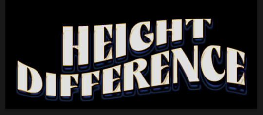
With both those layers active, it looks like this:
Duplicate the second text layer, clear layer styles, and change the color of this third text layer to a dark grey (#1a1919). Again, all other text (and warp) settings should stay the same.
Layer styles applied to this layer are stroke and gradient overlay.
Text Layer 3
Stroke settings:
Size: 1px
Position: Outside
Blend Mode: Difference
Opacity: 100%
Overprint: unchecked
Fill Type: Color
Color: #d48f16
Gradient Overlay settings:
Blend Mode: Difference
Dither: unchecked
Opacity: 100%
Gradient: #cd3f00 > #ffdb5d
Reverse: unchecked
Style: Reflected
Align with Layer: checked
Angle: 90°
Scale: 100%

Blending mode for the third text layer set to Exclusion, Opacity: 100%, Fill: 100%. I also moved the third text layer around, down and to the right a few pixels to give it that 3-D Word Art effect.
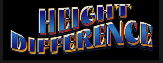
With all three text layers active:
Next are the arrows.
Take your transparent pngs and place them to your liking. Blending mode for these is set to Difference, Opacity: 100%, Fill: 100%.
Command + click on an arrow thumbnail to select all the pixels in that layer. This is why the image must be transparent!
With that selection made and on a new blank layer, right click the selection and click on stroke. Settings for that are width: 2px, color: white, location: center. Move that a couple of pixels over.
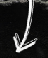
Do this for all arrows for a total of 6 layers for arrows. I group them together to keep my workspace clean, then I duplicate my arrows group with no further changes made to the second group to get what you see in the final gif.
Next is the smaller text. It's three separate text layers for each word, so I can move each of them around to my liking.
Font used is Pea Wolfe Tracks, font color: white (#ffffff), font size: 24 pt, leading: 6 pt, tracking: 25. Bold and italic options checked. I set the blending mode to Difference, Opacity: 100%, Fill: 100%.
And that's it! That concludes the tutorial for this gif!
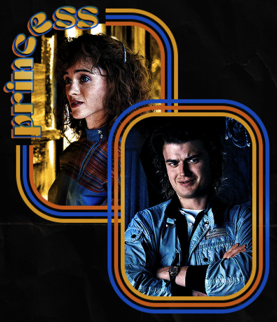
Now on to this gif.
We'll start with the background gif. There are three separate gifs. You could make them one gif, but I wanted the option to order them differently if I needed to.
All gifs in the background are the size of the canvas: 540x770px. Color and sharpen to your liking, but keep them all black and white. To get the blurry effect go to filter > blur > guassian blur. Set radius to 7.0 pixels. Add this to all three gifs.
Then I add two folded paper textures. Blending mode for one set to Lighten, Opacity: 60%, Fill: 100%. The other set to Screen, Opacity: 70%, Fill: 90%.
I found this tutorial a while back for a halftone effect. They include links to the halftone pattern used here as well as textures and gradient maps not used here.
I'm only using the halftone pattern here.
Pattern fill settings:
Angle: 66°
Scale: 8%
Link with Layer: checked
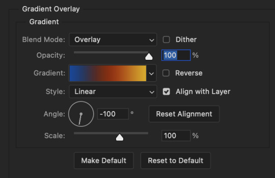
I also added a gradient overlay layer style to the halftone pattern which gives the gifs the color you see above.
Gradient Overlay settings:
Blend Mode: Overlay
Dither: unchecked
Opacity: 100%
Gradient: #0059ac > #a33600 > #e6b801
Reverse: unchecked
Style: Linear
Align with Layer: checked
Angle: -100°
Scale: 100%
Now on to the square shapes with rounded corners. In the interest of keeping this tutorial short(er), I found this tutorial on youtube that explains how to make squares with rounded corners.
I set my stroke size to 6px, stroke color to white (#ffffff), and fill to no color. I don't use the stroke layer style to make the borders of the shape like in the video! I'm only linking the video to show how to curve corners with square shapes.
Note: Be sure you know how big or small you want these to be and how they're going to fit on your canvas in order to make all the shapes and edit them. It can be tedious to change the settings.
Duplicate and resize to your liking.
In this instance, I wanted to make three squares total, so I had to duplicate twice and resize until I had something I liked.
Settings for the shapes used here are:
Innermost shape: W: 200px, H: 280px, corners: 50px
Middle shape: W: 220px, H: 300px, corners: 60px
Outer shape: W: 240px, H: 320px, corners: 70px
Once I have the size I want for all three shapes, I group them together to make a set and duplicate that group twice, then adjust each set on the canvas for my layout.
What the sets look like all together:
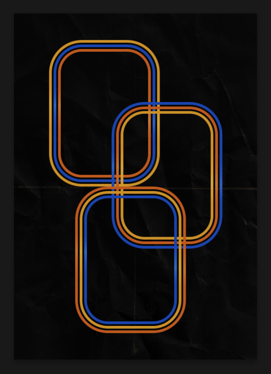
Colors used: orange #e47100, blue #0062d1, yellow #ecac00
To add color to the shapes, either change the color of the shape itself or use layer styles. I used layer styles.
Note: I didn't add the colors until the end after I knew what gifs went where and what color scheme I wanted, but I don't want to add more images than I need to here.
To keep this short, I found this tutorial on youtube that explains how to wrap text around a shape. However, I wanted the text to align on the outside where the white line is and not the green line (left image):
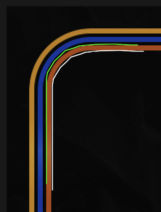
So I created another shape just inside the innermost square and used that as a path for my text (right image). Adjust the text to your liking until you have your text where you want it. Refer to the video tutorial if you need help moving the text along the path!
You don't need the shape path once you have your text where you want it, so use the layer visibility tool to hide it. You can hide your other shapes too so you can work with your text.
Do not delete your shape path!
I duplicate it once I start working with my "jock" text since all the sets are the same size. The "loser" text has to be worked a little differently, but we'll get to that later.
For the princess, jock, and loser text, there are two text layers to create the overall effect. For both layers, font used is Kiera, font color set to white (#ffffff), font size: 60 pt, blending mode set to Normal.
I added a gradient overlay layer style to the first text layer which I'll call the base layer. Opacity for this layer is 100%, Fill: 100%.
Base Layer
Gradient Overlay settings:
Blend Mode: Normal
Dither: unchecked
Opacity: 100%
Gradient: #f0b002 > #e7f0fd
Reverse: checked
Style: Diamond
Align with Layer: checked
Angle: 90°
Scale: 100%
The second text layer is your stroke and drop shadow layer. For this layer, opacity is set to 100%, Fill: 0%.
Stroke and Drop Shadow Layer
Stroke settings:
Size: 2px
Position: Outside
Blend Mode: Linear Light
Opacity: 100%
Overprint: unchecked
Fill Type: Color
Color: #0064cb
Drop Shadow settings:
Blend Mode: Difference
Color: #fb7c00
Opacity: 100%
Angle: 30°
Use Global Light: checked
Distance: 5px
Spread: 0%
Size: 0px
Contour: Linear
Anti-aliased: unchecked
Noise: 0%
Layer Knocks Out Drop Shadow: checked
End result looks like this:

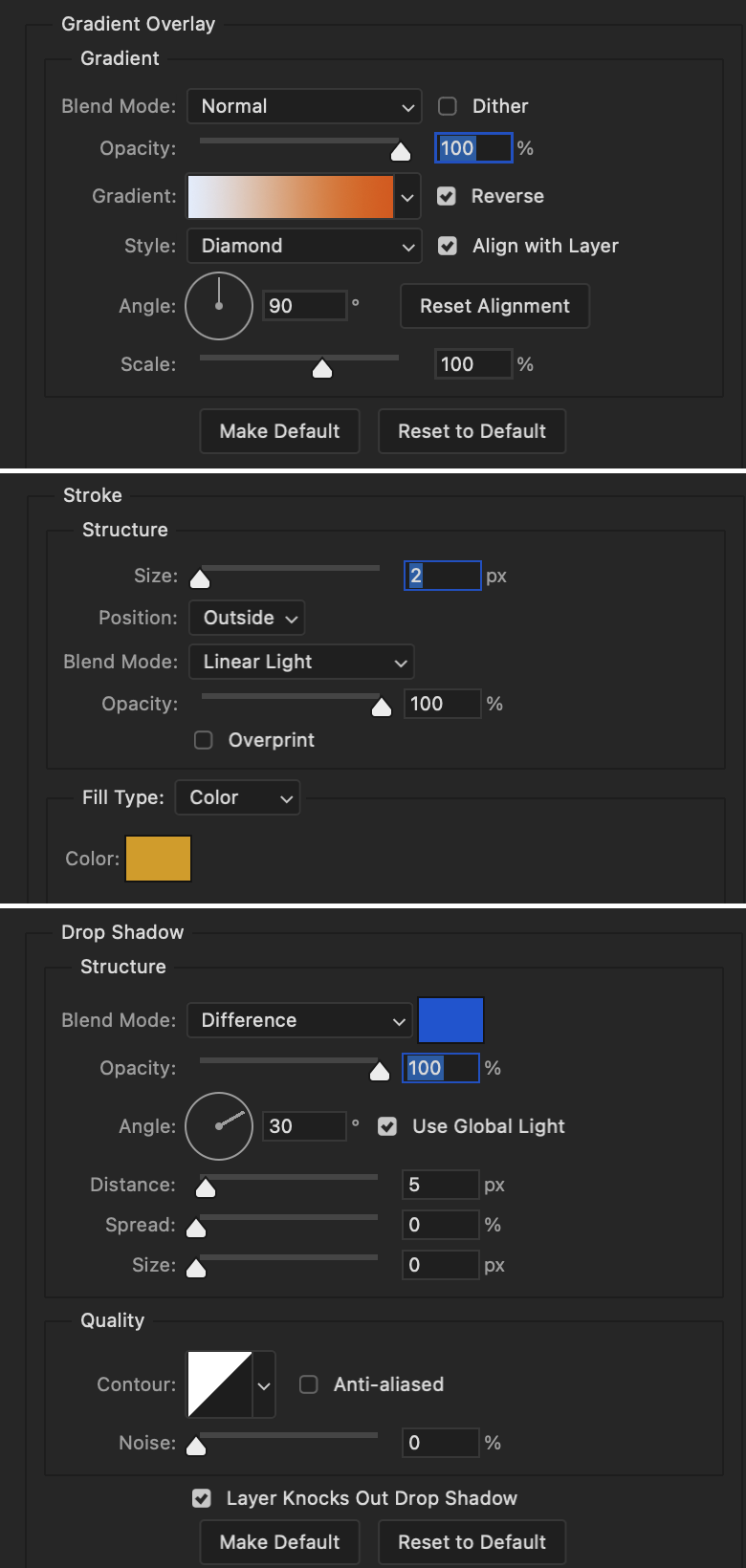
When I make my shapes visible again (minus the one I used as a path), I get this:
The shapes are clearly in the way of the text, whether they're above my shapes layer or under it. I use layer masks to hide what I want, so the text is legible. It looks cleaner this way and I wanted the text to be a part of the shape itself. I do that for each rounded square.
Now on to my smaller gifs. I like to crop, resize, sharpen, and color separately because my laptop and Photoshop would kill me if I tried to do it all on one canvas. I use the size of the middle shape for my gifs (220x300px), so I can have a little wiggle room when adjusting. I then use a layer mask to hide the parts of the gif that are outside of the shape.
A quick way to do this is to command + click on the thumbnail of the innermost square. With that selection made, I got to my gif layer and add a layer mask. Sometimes you need to invert it. Use command + i with the layer mask selected (not the gif) to invert the layer mask.
I repeat this process with my Steve and Robin gifs. I have to go back and forth with all the layer masks to hide parts of the gif/shapes I don't want for each set. It's kind of a long process, but not all that difficult. I label and group my layers together as I work to keep things clean and it helps me keep track of what I edited and what needs to be edited when it comes to things like this.
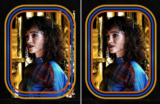
The picture below shows where I hid the bottom right corner of Nancy as well as the shapes that make up her set using layer masks. I also did this with the Steve and Robin sets, hiding the bottom left corner of Steve.

Similar text settings used for jock. The gradient overlay layer style for this base layer is different than that of princess because of the positioning of the text. Again, same as princess, two text layers are used here. Blending mode, opacity, and fill for both are the same as the princess text layers as mentioned before.
Base Layer
Gradient Overlay settings:
Blend Mode: Normal
Dither: unchecked
Opacity: 100%
Gradient: #007aec > move bottom middle dot to 80% > #e7f0fd
Reverse: checked
Style: Diamond
Align with Layer: checked
Angle: -140°
Scale: 100%
Stroke and Drop Shadow Layer
Stroke settings:
Size: 2px
Position: Outside
Blend Mode: Linear Light
Opacity: 100%
Overprint: unchecked
Fill Type: Color
Color: #a05700
Drop Shadow settings:
Blend Mode: Difference
Color: #ffba00
Opacity: 100%
Angle: 30°
Use Global Light: checked
Distance: 5px
Spread: 0%
Size: 0px
Contour: Linear
Anti-aliased: unchecked
Noise: 0%
Layer Knocks Out Drop Shadow: checked
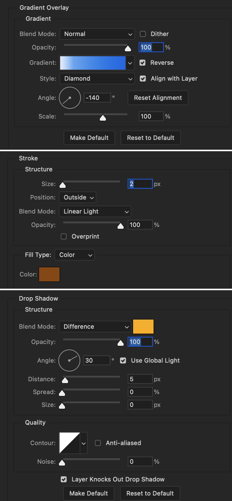
Image 1: We start with Robin.
Image 2: To make the loser text, I had to create a new path.
Image 3: I make it so the text is on the inside of the path instead of the outside. (Hint: Refer to video tutorial if you don't know how to do that.) I then adjusted the tracking between the letters in the word "loser" so they didn't look so squished together.
Image 4: Then I use layer masks to hide the parts of the shape I don't want shown.
You can then hide the path or delete it. You only need it if you want to adjust the placement of the text. I keep it (hidden) just in case.
Text settings for loser are just like those for princess. Blending mode, opacity, and fill are also the same.
Base Layer
Gradient Overlay settings:
Blend Mode: Normal
Dither: unchecked
Opacity: 100%
Gradient: #eb6400 > #e7f0fd
Reverse: checked
Style: Diamond
Align with Layer: checked
Angle: 90°
Scale: 100%
Stroke and Drop Shadow Layer
Stroke settings:
Size: 2px
Position: Outside
Blend Mode: Linear Light
Opacity: 100%
Overprint: unchecked
Fill Type: Color
Color: #e1a900
Drop Shadow settings:
Blend Mode: Difference
Color: #0068de
Opacity: 100%
Angle: 30°
Use Global Light: checked
Distance: 5px
Spread: 0%
Size: 0px
Contour: Linear
Anti-aliased: unchecked
Noise: 0%
Layer Knocks Out Drop Shadow: checked
Next are the post-it notes! This is probably the easiest part of making this gif. You just have to repeat this process for however many post-it notes you're making.
Image 1: To start, place your transparent post-it note where you want it. You can also rotate it if you'd like.
Image 2: Then create a text layer and write what you want. Font used here is Post. I wanted this text underlined to give emphasis, so I click on the underline option. I also adjusted the leading because I wanted more space between the word and the line. Rotate the text so it looks like it's written on the post-it note. Note: It looks better if you choose a font that looks handwritten.
Image 3: I wanted another line to give emphasis to the "Dingus!!" text and make it seem more handwritten. I use the line tool to create another line.
Image 4: Then I adjust that line to my liking.

Fonts used for notes: Post, Ellianarelle's Path, and Heina's hurry
Repeat this process for all post-it notes!
That finishes the tutorial! (And I hit the 30 image limit lol.) I hope this helps. If you have any further questions, feel free to send an ask or IM and I'll try to answer to the best of my ability.
Happy photoshopping!
#ask#pcocana#photoshop#photoshop tutorial#tutorials#*tutorials#userchibi#userbunneis#uservivaldi#userriel#userabs#usertiny#useralien#useraljoscha#userfanni#userraffa#tusermona#userbess#userrobin#userroza#quicklings#janielook#usernaureen#userrlorelei#tsusermels#tusermimi#userelio#usertj#userbarrow#usernolan
265 notes
·
View notes
Text
hc:
As an apology for ruining Zane’s original pink apron, the ninja all independently decided that they were gonna buy him a bunch more various pink aprons. After that hilarious coincidence, they ended up making it a tradition. it’s become a thing they do during the holidays, and they’ve even started (trying) to make em themselves, eventually making it a contest to see who can find the silliest/best/coolest apron.
so far he has:
- a classic “kiss the chef” apron
- a bunch of actually normal ones the ninja got him before they started competing
- “this machine kills fascists”
- a bootleg apron with a funny typo
- “I <3 NNC” (he got this one some time after season 2)
- a really, really ugly one from the 70s/80s. like an ugly christmas sweater but an apron. it has garland
- one with a fake tuxedo printed on it
- “autism be damned, my boy can work a grill”
- “I died and all I got was this lousy apron”
- “I died twice and all I got was this lousy apron”
- “I died three times and all I got was this lousy apron”
(After this, they just decided to keep a tally and add new deaths in sharpie.)
- one that’s just COMPLETELY bedazzled
- “Why do they call it oven when you of in the cold food of out hot eat the food”
Some additional things i thought up:
One year, he got a ridiculously complex smart apron made by Nya and Jay. It connects to him via bluetooth and has a built in timer, a thermometer, a pH probe, multiple headphone jacks, a disc drive, a screen display, and more. (Jay used that display to play Bad Apple, once. And yes, it can also connect to Zane and run doom.)
Kai and Cole made him one poorly put together out of quilt patches. The front of it had his name in a different font and size for each letter, as though Kai and Cole had just grabbed whatever they could. Somehow, it came together really well, and they won the competition that year.
Lloyd once gave him a normal white apron, in which he hid a bit of red dye. Lloyd forgot to mention that it needed to be washed alone. Insert Pink Gi Part 2
Wu gave him a magical apron that can never get dirty. *With his permission this time,* Zane and the others tested it out. They ran over it with their vehicles, used kai’s power to light it on fire, and reenacted their food fight scene (this time with the leftovers from the last time Cole tried to cook.) It never got dirty. Wu was so smug about it.
#ninjago#lego ninjago#zane julien#this was a draft from awhile back but screw it it’s christmas#ninjaposting
235 notes
·
View notes
Text
Thank you!
A big thank you to everyone who got a copy of Mostly (h)Armless! I think that for an obscure little fancomic it did really well! About 30 copies have gone where none can ever take them away again. I've also finally received my own version and I am happy about the quality.
I've now unpublished it but turns out you can never entirely take a book off the store once published. You can't edit it to be something else either. (which is what I had hoped to do, I have a bunch of unpublished original comics lying around). So it's just kinda going to sit there for all eternity, unavailable for sale. I sincerely hope it won't give me problems later on.
Anyway, if anyone is curious about one day printing their own comics, here are a few things I have noticed that I will definitely remember for my future printing endeavors:
Most glow and blending effects like Lighten, Color dodge, Hard Light, Linear dodge (add), etc don't look that nice in print despite looking awesome in digital.
Make your line art thick enough.
soft shading looks bad, cell shading looks good. (But it's better to fully fill shapes with a contrasting color rather than doing fancy lighting.)
Consider shading in black rather than color. (optional)
Details and soft lines are usually lost and a waste of time (Mostly in case of a colored book. Black and white may be different)
Keep panels spaced far enough apart.
Draw big panels. Small panels aren't as nice to look at and the eyes are naturally drawn to the larger panels.
Gradients don't look very nice either. Unless they have a light color.
Vintage comic textures and effects actually looks nicer in print than digital (which surprised me).
In dark scenes, rim lights are essential to make the character pop out. M(h)A would've looked like ass if I hadn't added those.
Stay away from the borders of your page, especially the left and right ones. Not just for the text but for the drawings too.
Keep track of which side of your page will be closest to the spine, keep a distance from that side especially. Because your book will be folded and part of the page will be hidden (the thicker your book, the more will be lost).
fancy panel compositions are cooler in digital...
contrast contrast contrast...
Don't be afraid to use pure black a lot.
Don't be afraid to use white a lot.
The 3D shake effect is also not that cool on print. But looks gorgeous on digital.
To myself… keep the font size consistent…
If text is outside a text bubble, it should have a high contrast stroke
Text should always be high contrast in general.
Motion blur is really cool in digital but not so much on print.
Keep black silhouettes black, avoid adding any kind of subtle glow or texture.
Text bubbles can have color but they should be light (again high contrast) watch out for saturated green or blue or red. Test in greyscale. Contrast should be more than 70%.
Line art should not be colored. Keep it black for print.
Hard borders are better than soft borders. On everything.
white panel borders are better than black panel borders.
But white borders with a black stroke are probably the best (cause more contrast).
Again light colors are better than dark colors. To do dark scenes it might be better to just use black and contrast with a lighter color.
Line art perfection is not that interesting, especially in regards to hard surface shapes like robots. (Might be personal taste though. I enjoyed looking at robots with messier line art more than those where I did perfect brush strokes.)
Beware dark blue and purple...
Compositions and colors of both the left and right page should always fit together. I think I did that pretty well here at least.
If possible make your total amount of comic pages devisable by 4. (so 24 pages total, or 28, or 96, you get the idea) not including the cover and back. Or else add a little extra drawing to fill the remaining pages.
I think that's about everything I can see based on my own print. I'm sure that a fair few of the things that I found looking worse in print than digital could be resolved by just being... better at converting your files. There's the whole CMYK color mode thing but in my personal experience that has been such a pain to work with, and each time my prints looked worse attempting to convert the file rather than had I just left it in RBG and let the printer do the guessing work for me.
So if you're like me and you're hopeless at this technical mumbo jumbo printing stuff, I think just avoiding the things I mentioned while drawing should get you well under way to having a nice print. The most important thing to remember is that digital and physical media are two entirely different beasts and if you are interested in getting your comics printed it's easier to adapt your workflow to that from the start rather than going back and altering. A lot of the mistakes I made here are rookie ones and I should have known better. But it's very easy to get lost in the process once you've started. I hope to improve my next print significantly. Once I can make RBG look good, I might try CMYK again.... Maybe. Potentially. No.
Hope these tips can be of service to somebody. They'll be a useful archive for myself in any case. If anyone wants me to elaborate more on a specific point, I'm happy to explain.
41 notes
·
View notes
Text


🌈 Rainbow Theme 🌈
Well, it took a year, but I finally ported the Rainbow Page Theme over to Tumblr due to popular demand. It's based on Gilbert Baker's rainbow flag from the 70's. Happy pride, everyone!
Features:
500px posts
Pride flag theme toggler
Optional jukebox/badges boxes
Custom audio player for posts
Customizable title + title font size
Support for additional pages
User can add a link to any song for jukebox
Optional links 4 + 5
Optional background image or color
Semi-transparent posts
Custom permalink icon + favicon
Notes:
The badges section was created with 80x15 web badges in mind, which you can find places like here. The theme also supports more traditional 88x31 buttons, which are definitely more abundant. There is a pride button collection here if you're feeling festive.
You can also make your own web badge here or an 88x31 button here if you can't find any you like.
For the jukebox...it can currently only support one song. If you want to use it, you'll have to upload your song somewhere like Dropbox and then add the link.
🍃 live preview + code 🍃
66 notes
·
View notes
Note
Hey! I was wondering where I can find that drive for CaffeinatedFlumadiddle fics? I've been looking for a fic for about a year now and thought I was going insane, I just learned about the situation, it's so awful.
Hey anon!!!
First off, I'm SOOOOOO EXTREMELY SORRY for replying to this so ABSURDLY late -
I never imagined someone would send in an ask - to me, of all people! Because I've only ever seen Important People on Tumblr being sent asks, and I'm definitely not one of them!
So, uh - I actually made a detailed post with all the links to the now deleted fics, which you can find here,
But in case Tumblr messes up, and the link doesn't work, lemme copy-paste the contents of that post below:
1) Son of Sea Foam, originally published on Ao3
SoSF Google Doc Part 1 | Part 2
SoSF in pdf format
2) Descendants of Olympus, originally published on Ao3
DoD Google Doc Part 1 | Part 2
3) Highway To Hell (fic)
4) Hello Ocean, My Old Friend (fic)
5) Fishing in Alaska (epub) | archived Ao3 site
6) Stealing Shells (fic)
7) Google Drive folder of a bunch of fics and one-shots |
8) Another mini-google-drive backup of a few fics
9) Even more fics (there’s 70 of them here)
10) Almost all PJO and Merlin fics in epub format! Estelle series has series order in metadata.
To read epubs, good apps are Moon+ reader for Android and Calibre for PC. epub is a reflowable format that allows changing the font size, background, margins etc, and has title/author/series into embedded and sortable.
11) Roman Percy | V2
12) A bunch of archived Tumblr posts
13) The entire tumblr (but on the archive website)
14) OneDrive link to download PJO & Merlin fics.
Once again, my HEARTFELT APOLOGIES for not seeing this sooner!
Edit: @cmxlkaze brought it to my notice that the link to “Descendants of Olympus” Part 2 had been broken It's fixed now, though it took me a bit – sorry about that! If any of the other links get taken down or appear broken, do let me know, and I shall fix them immediately.
216 notes
·
View notes
Text
Gone to HELL in a Handbasket - 18+ Interactive Fiction (wip) - by glucosify

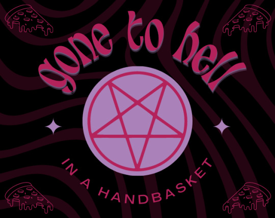
tags : urban fantasy (inspired by late 70s / early 80s), romance, supernatural, mystery, satanic and occult themes, cults, 18+ rating for violence, sexual content, mental illness and more
A simple pizza delivery turns sinister when you find yourself trapped with 5 other strangers in a decaying place that hides a dark history and darker secrets.
Demo here on itch.io ⋄ last update: May 2023 ⋄ word count : ~7,400 (~13,100 with code)
Only the prologue is available for now, you won't play as the main character until chapter 1 :^)

Features :
a story that (loosely) takes place in the late 70s, in NYC
custom made UI : dark, light and retro themes, mobile friendly, adjustable fonts, font sizes and weights
customizable MC : play as male, female, non-binary, touch starved, touch averse.. and choose your appearance and personality
figure out the secrets left behind and find a way out - one way or another
choose to forsake an imminent evil or become part of something greater
decide if your companions are trustworthy or simply useful for your own goal
five gender selectable romantic options (male, female, non-binary) - choose their pronouns and appearances separately / romance is optional but will most likely be a big part of the story

Romantic Options :
Mahalia / Marlon / Mars "MOONLANDER" Harris : a sarcastic and pragmatic computer operator; they’re an arcade, tech and sci-fi lover through and through
Amélie / Alexandre / Astin "ACE" Beaulieu : a college athlete with a sunny disposition who's currently feeling lost and going through a difficult time
Gina / Gil / Gera "GUMDROP" Fernández Alfonso : charismatic and resourceful, this social work student's desire to help others always seems to break through their fear of letting people get too close
Ilona / István / Írisz "IRIS" Juhász : though they lack in life experiences due to a sheltered upbringing, they possess a gentle thoughtfulness and vivid imagination
Kat / Kit / Ky "KILLJOY" Miller : a reckless straight-edge hardcore punk with a sharp tongue and an honest heart

LINKS : FAQ ⋄ TAGLIST ⋄ MASTERLIST ⋄ GOOGLE FORM (feedback & bug report) ⋄ DISCORD (TBA) ⋄ PINTEREST (TBA)
This blog will be used to post updates and anything related to the IF - answered asks, scenarios, headcanons, short drabbles etc..
started in december 2022 - first update in may 2023 - b&w image from untermyergardens.
#interactive fiction#interactive story#twine wip#twine game#if wip#interactive novel#mystery#supernatural#horror#romance#wip
328 notes
·
View notes
Text
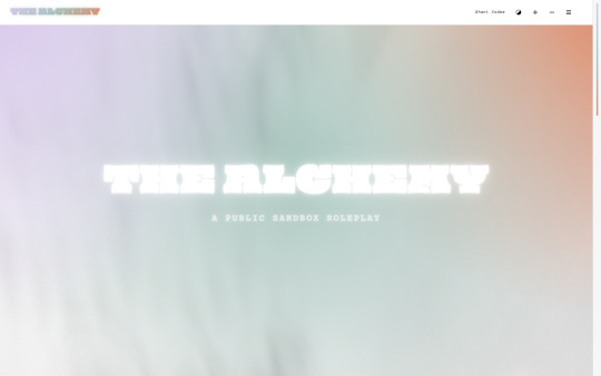
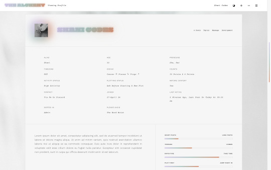
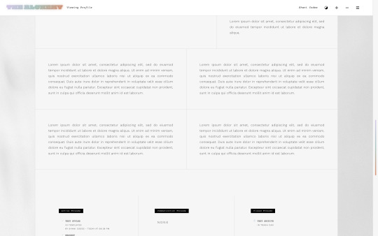
Alchemy Skin ($70, Unlimited) by Shani Codes
ALCHEMY is a responsive skin for JCINK forums coded specifically for Sandbox RPs and is optimized for Google Chrome. If you have questions about the skin, or seeing a full preview, feel free to join my support discord: discord[DOT]gg/G9zb4sQxdp
SKIN INCLUDES:
Two versions: One with pre-made Custom Profile Fields for plug-and-go usage and one with the option to add your own Profile Fields,
Character info replacement BBCode AND Avatar replacement code with either a single image OR a 4-image moodboard,
A main profile with sections for information about the writer, including preference sliders, and FizzyElf's automatic thread tracker,
A light/dark mode toggle and font size toggle,
Pop-out with navigation, updates, welcome section, and user links,
Full responsiveness for various screen resolutions, supporting both mobile and smaller screens,
Easy to edit member group variables,
CSS variables for fonts, colors, sizes, etc. for easy customization,
A filterable, searchable, and sortable isotope member list with counts,
And an included installation guide PDF with comprehensive instructions.
PURCHASE LINK: ko-fi[DOT]com/s/c2324c8862
36 notes
·
View notes
Text
LOONY PARTY MANICFESTO 2024 SUMMARY
[not a pejorative, party founder Screaming Lord Sutch was himself bipolar]
tdlr: “we are fighting this election on the basis of CHANGE… LOOSE CHANGE as this is all we’ll have left under a labour/conservative government”
💷ECONOMY
reduce taxes to 5%
get rid of value-added tax as it adds no value
ban the tipping of flies
convert number 10 and number 11 into a hairdressers called Government Cuts
abolish stamp duty because stamps are too expensive
fit airbags to the stock exchange, ready for the next crash
halve dole queues by making jobseekers stand two-by-two
improve quitters’ self-esteem by encouraging them not to start in the first place
🏥PUBLIC SERVICES
employ 80.00 teachers, police officers and nhs staff
reduce pregnancy from nine to seven months
reduce hospital waiting lists by using a smaller font
reduce class sizes by shrinking desks and making students sit closer together
glue unruly pupils together because if you can’t beat them, join them
give pensioners an ice lolly allowance when temperatures exceed 70°
🏠HOUSING
build five million new homes
aid “levelling up” by providing free spirit levels
🚄TRANSPORT
fill five million potholes
introduce an ROT to make sure all roads are carworthy
fit vehicles with a bungy rope to save fuel on the return journey
save money on paint by painting double-yellow lines where you CAN park rather than where you can’t
create the world’s biggest carwash by punching holes in the channel tunnel
👮FORCE
send all MPs who misbehave to rwanda
reduce net migration by making sure all nets are secured firmly to the ground
make terrorists wear little bells so we know where they are
replace border guards with GP receptionists to stop anyone getting in
introduce a court of human lefts
reduce prison overcrowding by releasing innocent prisoners
oppose capital punishment as it is not fair to londoners
🌱CLIMATE
wind farms to be constructed across the country where all will be encouraged to break wind
get more green cars on the road, with politicians having fluorescent green so everyone can see them coming
paint the grey squirrels red
greyhound racing will be banned to stop the country going to the dogs
puddles deeper than 7cm will be marked with a plastic duck
🗳️DEMOCRACY
MPs will have to sit in stocks during surgeries while constituents throw custard pies at them. companies to be encouraged to design new stocks, to be sold at the stock exchange
introduce a “cooling-off period” to allow voters to change their mind
replace the foreign secretary with a UK one
19 notes
·
View notes
Text


𖥨 ̟⊹♡ a / s / l ?
wake up , babe ! a new gordonramsei page just dropped ! introducing a / s / l ? a javascript - free faq page ! the page is designed to be compact but still aesthetically pleasing with it's monospace font and script pairing ! there is unlimited space in the question container to fill with as much content as u desire ! i hope u all think she's as cute as i do ! as always , if u encounter any issue within the code , pls let me know and i will troubleshoot asap !
if u intend on using this theme or just want to be a supportive hottie , please give this post a like and a reblog ! stay hydrated and be sure to pet a cute animal today ! mwuah ! 🤍 🤍 🤍

ⅰ. PAGE FEATURES .
x. this page is 100% javascript - free x. full - height accent line on left side x. scrolling container for ur questions w/ aesthetically pleasing q & a formatting x. single icon sized at 70 x 70 px x. page must be edited in the html x. for a more detailed compilation of credits and features , please see the google doc containing the code

𖥨 ̟⊹♡ this page is a patreon exclusive : want access ? consider signing up to join the fam - a - lam to get ur hands on this page as well as my entire coding catalogue . click here to learn more !
source link directs to a live preview of a / s / l !

#rph#rpt#indie rp theme#rp theme#tumblr themes#supportcontentcreators#fyeahpoc#mine#rec#for patreons#for patrons
39 notes
·
View notes
Text
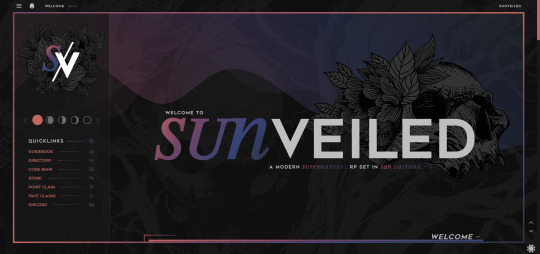
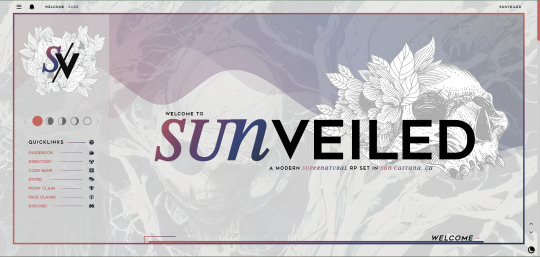
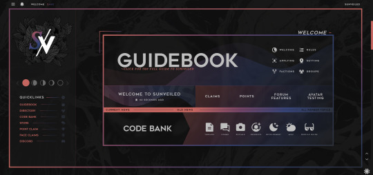
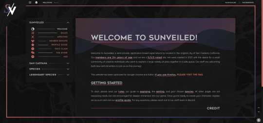
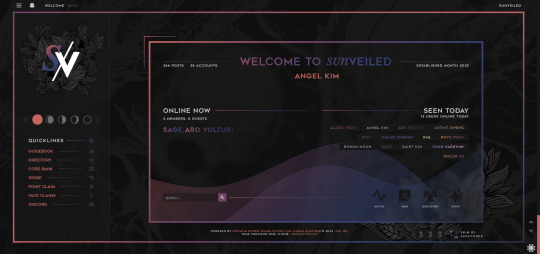
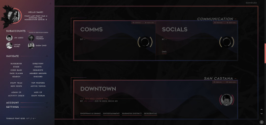
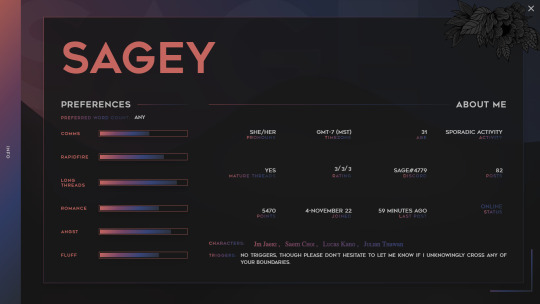
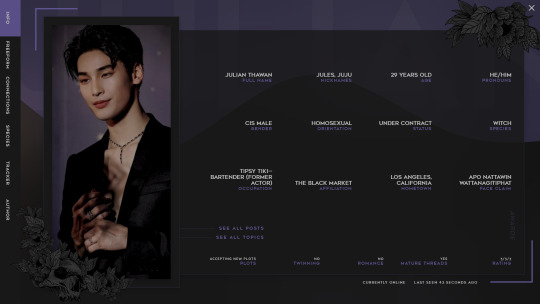
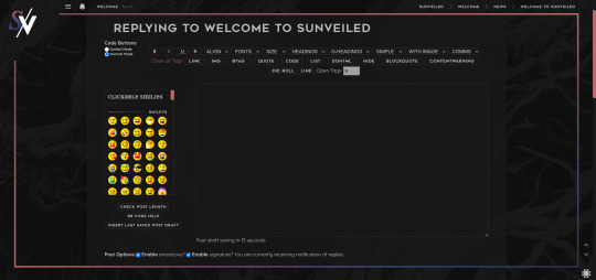
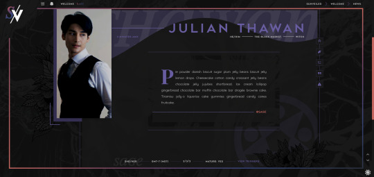
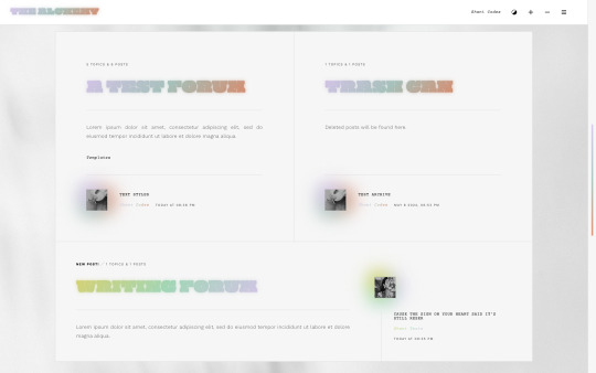
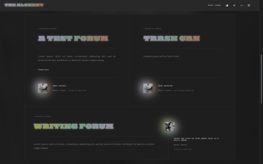
Hey sunlings! We're here with a skin preview!! Our skin was designed by the staff team here at Sunveiled and developed by Sage (@sagecodex). We've been working for months to get it perfect for you, so please bask in its glory as this is the first time we're showing it to the public!
Beneath the cut is the full list of our features. But some of our coolest features can't be captured by static pictures. So stay tuned for a video walkthrough with Sage to see some of our more dynamic details!
Forum features:
light/dark mode toggle;
scroll top/bottom;
adjustable font sizes;
forum colors change with the logged-in membergroup;
alert menu toggle;
popout side navigation;
subaccount switcher (with icons);
automatic thread trackers;
custom emoji;
an ever-growing amount of profile badges;
auto claims;
filterable member list;
linkable guidebook tabs;
recently active topics list;
different ic and ooc profiles;
autofill ooc profile fields from parent account;
popout profiles;
dynamic profile fields;
over 70 profile layouts to choose from;
over 110 posting templates to choose from;
over 90 of those templates available in bbcode menus;
topic tags (for cw's, mature content, open threads, rapidfire, etc.);
keyboard shortcuts for bold, italic, and underline;
99.9% mobile-friendly.
We fully expect our members to find bugs while we go through our initial opening, so please be patient as we work to fix any minor functionality issues.
#sunveiled rp#previews#skin preview#jcink#jcink skin#jcink coding#sagecodex#jcink rp#jcink roleplay#semi-private jcink#jcink forum#jcink buzz#jcink premium#site buzz#semi private rp
94 notes
·
View notes
Photo

003. PERFECTLY WRETCHED. rp icon & assorted use template. four options included, but completely customizable. simple and easy to edit. room for muse name, URL, or short quote, as well as muse initials. room to add small aesthetic images. compatible with gifs.
$4 or 320 points — available on payhip & deviantart ! ( contact me to purchase file directly if needed ! ) Fonts used — • black light ( best used in lowercase letters. ) • laurens ( best used in lowercase letters. ) • kannada sangam mn regular ( best used in uppercase letters. ) — should be included in PS, but linked just in case!
included is: 70 x 70, 50 x 50, double 50 x 50, & 100 x 50. • icon base and borders are completely adjustable. smaller and larger layout options provided to help keep proportions even when icon sizes vary, but are also adjustable!
- coloring psd is not included. - do not claim as your own or redistribute. - personal use only. do not use in commissions. - credit is mandatory and extremely appreciated! - canvas size is 540px width and varied height. - please consider reblogging or liking to help support my work!
don’t hesitate to reach out with any questions! thank you so much !
interested in custom work? I offer commissions !
140 notes
·
View notes
Text
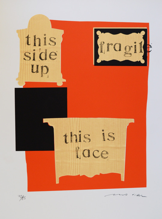
Forniture by Marcos Vidal Font
Silkscreen printed on cotton paper 70 x 50 cms (print size 51 x 37 cms) edition signed and numbered (55/85, 64/85, 66/85, 72-77/85, 79-83/85 and 85/85), 1997
View On WordPress
32 notes
·
View notes
Text
Hello everyone happy Monday. Your assignment for this week is to write an essay analyzing the classic movie Pat Garrett and Billy the Kid (1973). Minimum of two pages, single spaced, size 12 Times New Roman font, MLA format. You will be graded based on how closely your opinions match with mine. A score of less than 70% will get you softblocked.
15 notes
·
View notes
Text
I have this tiny sliver of hope that anytime I make a post painting Hathaway in a positive light I get put on Reddit with a title that reads something like "Gundam Tumblr having a normal one".
Because the average Reddit user fails to see any form of nuance within his character:
"He kills people who aren't soldiers and thus he's completely evil"
While missing the I don't even know how to describe it, the text stating in bold letters, italics, 70 font sizes bigger than every other piece of writing, that the federation is just evil.
Like that's it, they're exploiting people, they're killing whoever they just don't like, they're torturing people, they want to genocide all newtypes, they want complete and total control, they're destroying the earth and are turning it into their own private golf club.
But at least they aren't using mobile suits in pop-
Oh wait they did that in the movie, twice.
But sure Hathaway is completely deranged for being a human, for wanting vindication against those who are holding humanity and the earth back.
Anyway rant post over, please please please go read the novels they're amazing
3 notes
·
View notes