#finally photoshop is working again
Explore tagged Tumblr posts
Text

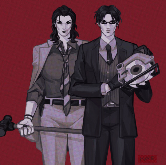
ok i might've polished that sketch a bit..... but here are jaden and @kavalyera's vivienne, your demolition crew ready to tear down walls violent i mean ventruestyle ^o^
(fullview recommended ough tumblr killed the quality </3)
#i tried. doing something in photoshop it didnt work. i think tunglr hates the halftone filter more than usual. explodes#anyways greyscale practice waa this was fun.... thank u for letting me snatch viv and make him the subject of this LOL#classes for this semester r over im finally enjoying drawing again and like the results ToT#vtm#vampire the masquerade#ventrue#vtm oc#my art#psychicism#jaden blackwood#wouldve added a bloody version but i cannot draw blood splatters correctly at this moment. screams.
93 notes
·
View notes
Text

79 notes
·
View notes
Text
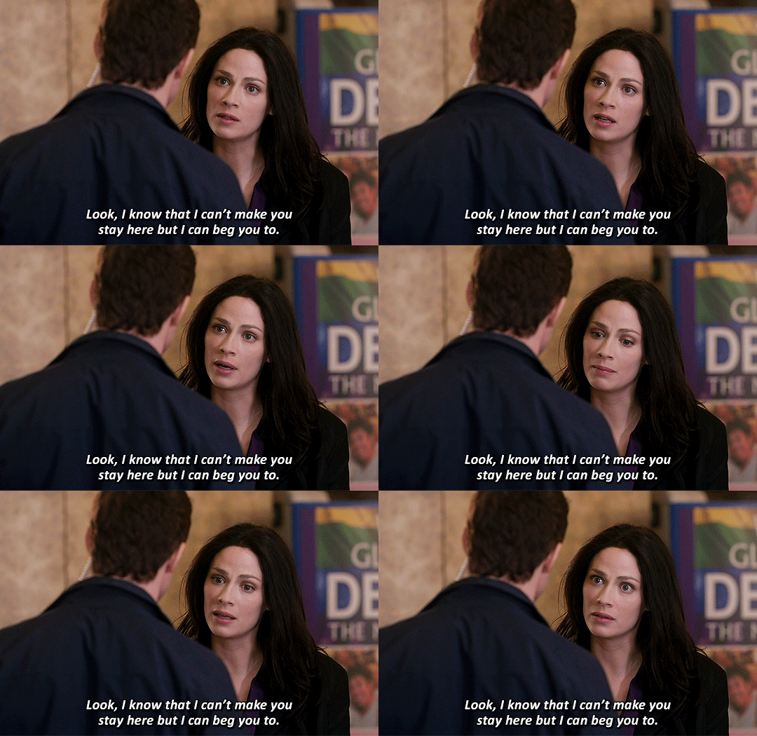


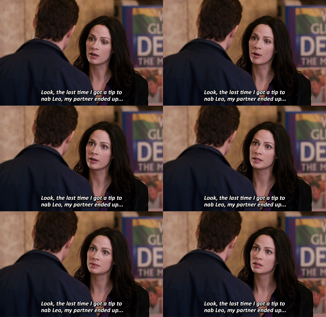
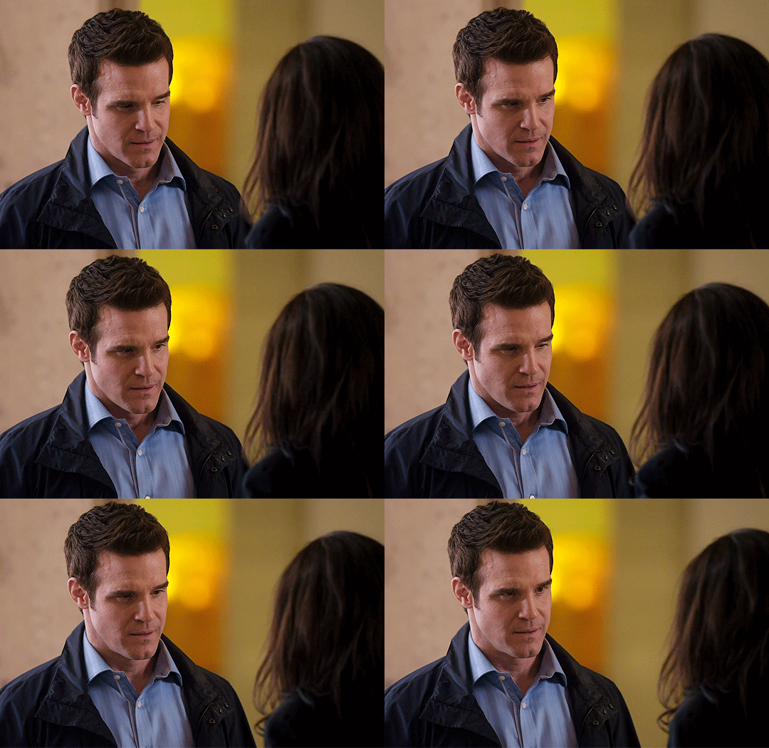

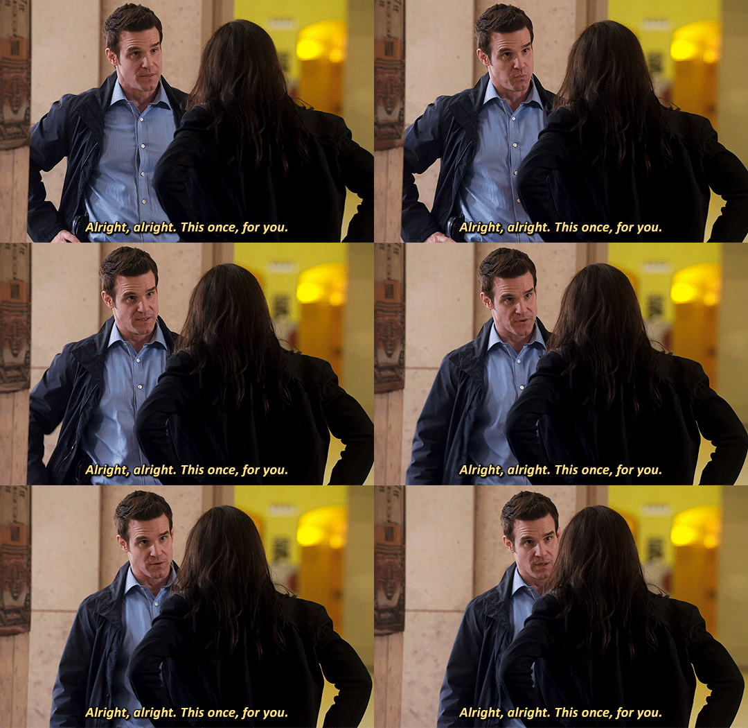
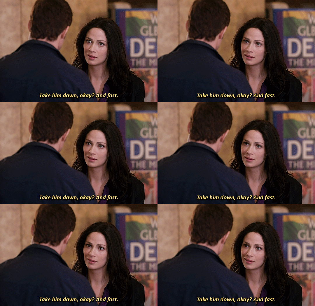
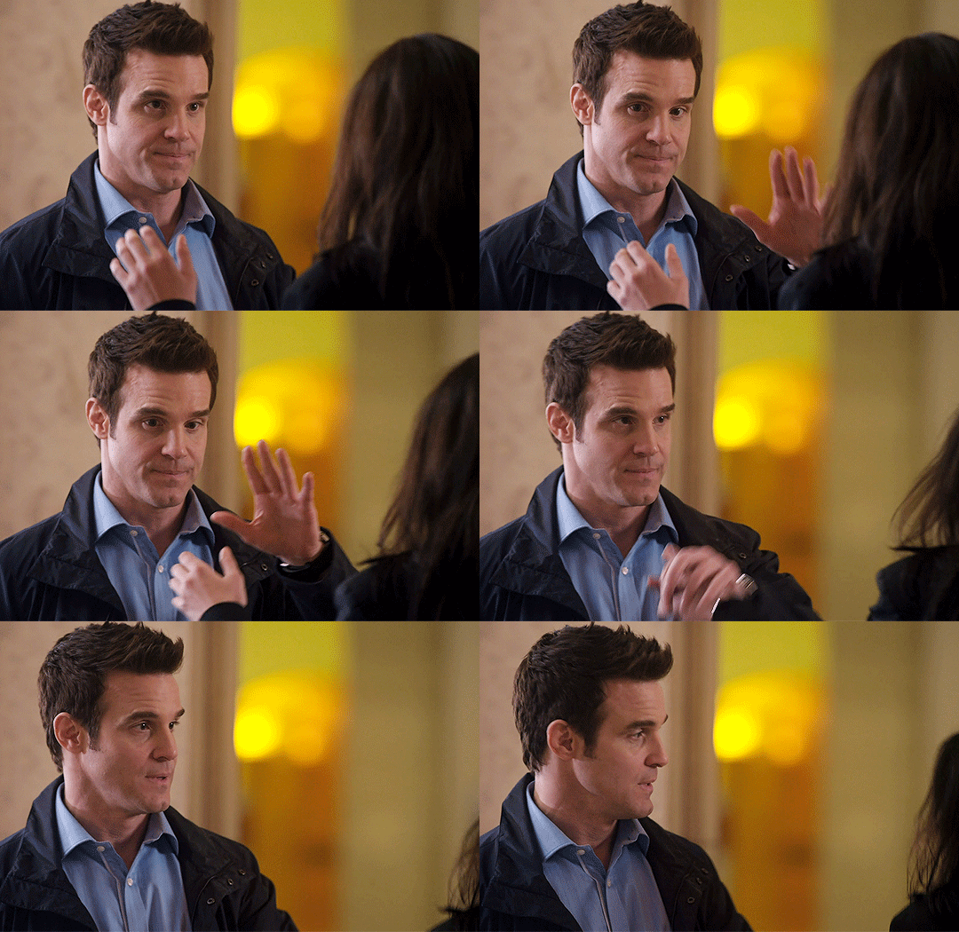
Pete, I need you to stay here.
#warehouse 13#wh13edit#past imperfect#mine:photoset#myka bering#pete lattimer#HELLO..... CAN ANYBODY HEAR ME...... FOR THE LOVE OF GOD HELLO..............#this episode possessed me so thoroughly that i had to open photoshop for the first time since december#i promise i will get a new computer someday so i can make gifs more regularly again (i made this on my work computer don't tell IT)#but HELLO............ WAAAAUGH#god. fuck. they love and trust each other so much. i'm chomping at the fucking walls over this#myka has so much trauma over this case and pete's the nicest guy in the world about it.........#but myka doesn't even let that stop her!! she's like no fuck that i WILL take this guy down for real#and she DOES#and pete's standing by her side the entire time providing support and helping but also not taking control since myka needs to do this#on her own and for herself in order to finally get closure#for this case that's been haunting her since literally episode one............#pete's like no you can absolutely be emotional. you have every right. so this time I'll be the observant one and help you where you need it#god.#anyway hi wh13 tag i am watching this show for the first time and i am Going Through It#since i know you all seem to be myka/HG stans can i officially claim pete as mine. would anyone mind. can i have him
165 notes
·
View notes
Text

Anakin vs. Obi-Wan and moments before sudden doom
Please click for better quality!!
#sw#star wars#my art#artists on tumblr#star wars fanart#anakin skywalker#obi wan kenobi#anakin vs obiwan#revenge of the sith#star wars prequels#hayden christensen#ewan mcgregor#fan art#digital art#art#digital painting#hiii i got a new computer so arting finally works again!!#welcome to my 2025 challenge where i try to finish 2 pieces off my to draw list per month lets see how well this goes#bc i did also get a new job sooo#well see#anyways new computer means going crazy downloading new brushes on photoshop and experimenting with background!!!#so im hoping to get more of those in this year! :)#yayayay and this piece turned out so well experimenting was so fun#like always click for better quality bc i watched tumblr crunch it before my eyes and theres so many fun details#insta gets the zoomed in versions but those are on my phone and i didnt feel like zooming in again#and reblog to support artists!#that's it! commentary out mwah to anyone who reads these
135 notes
·
View notes
Text
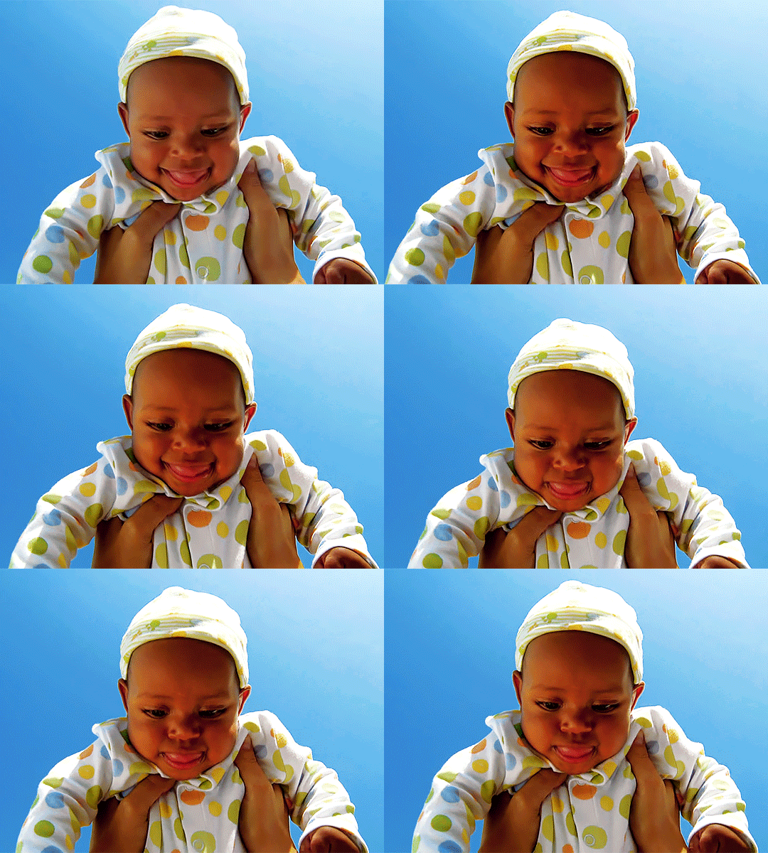
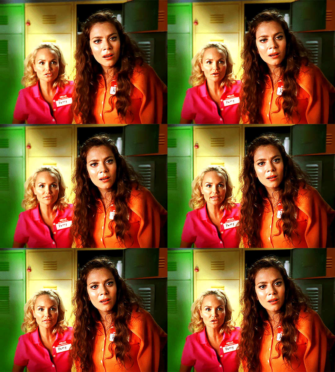
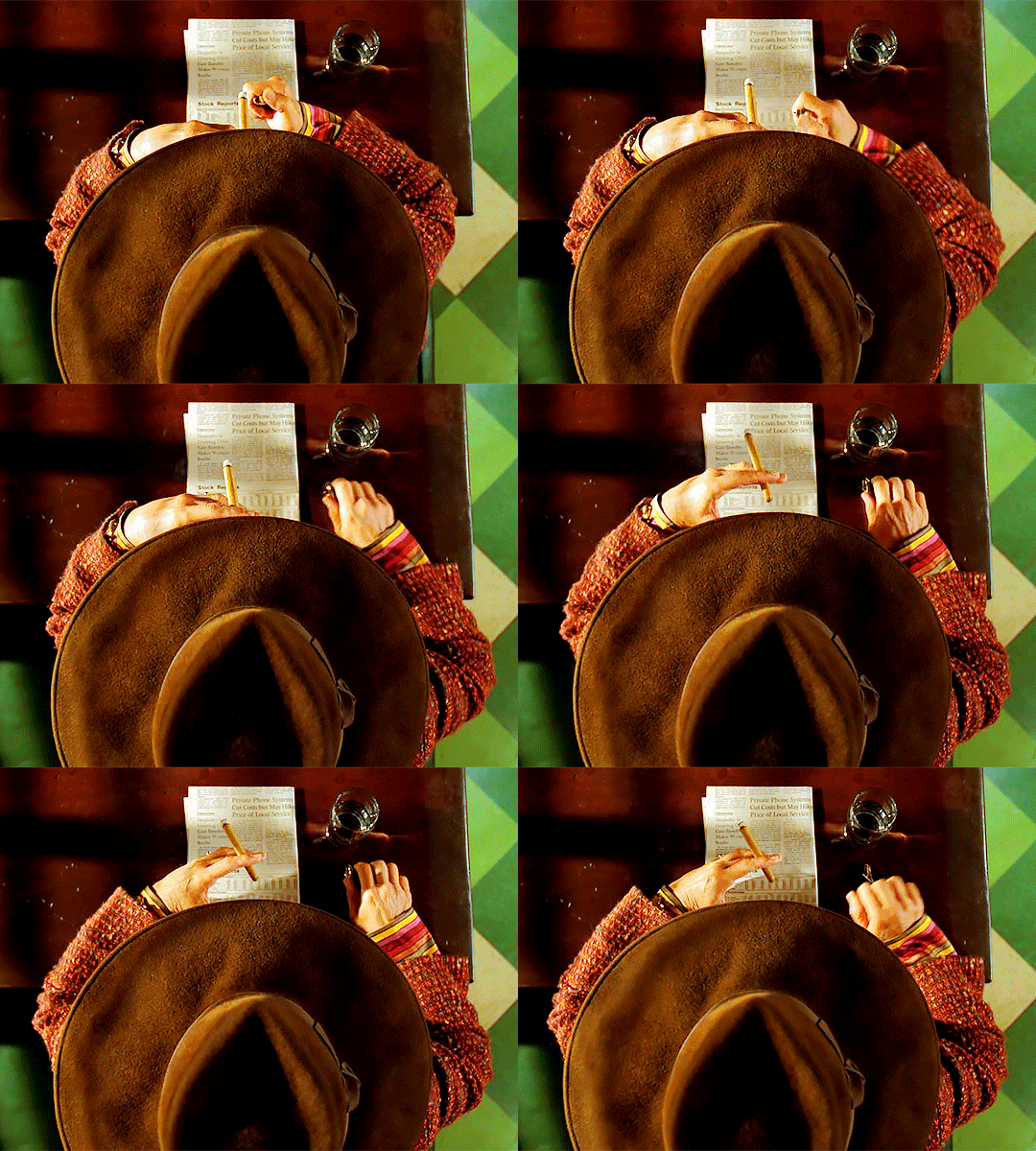
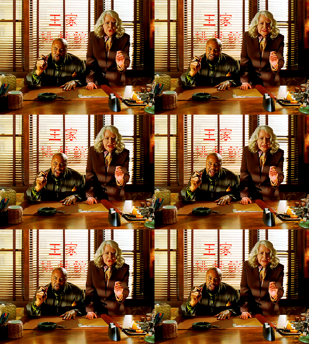
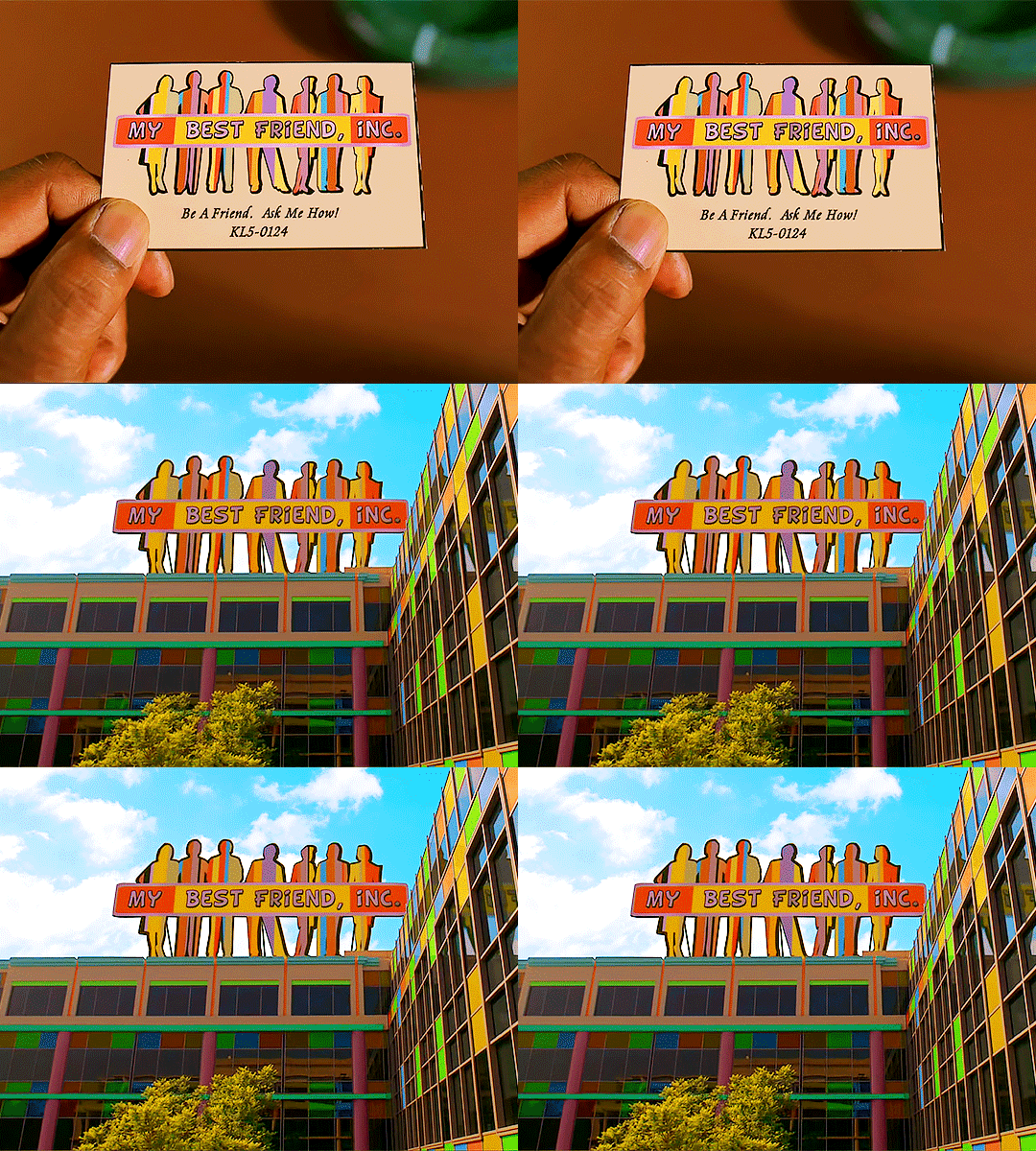
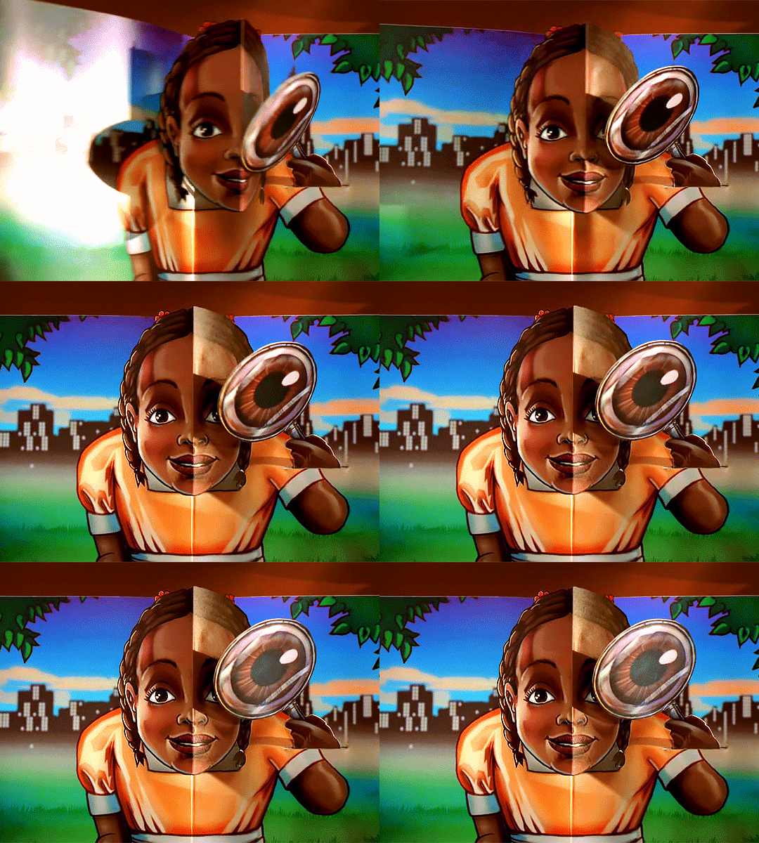
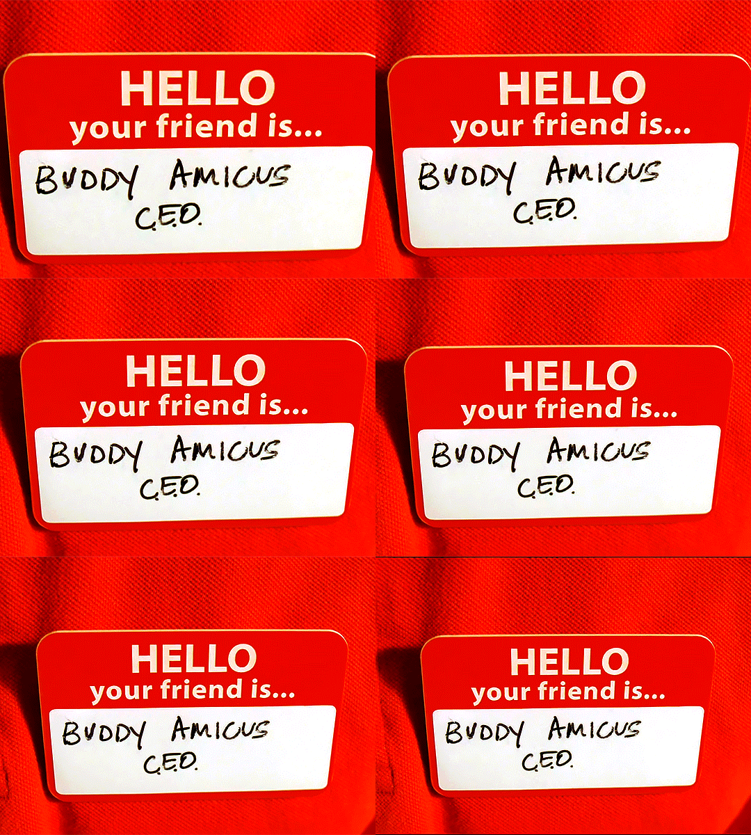
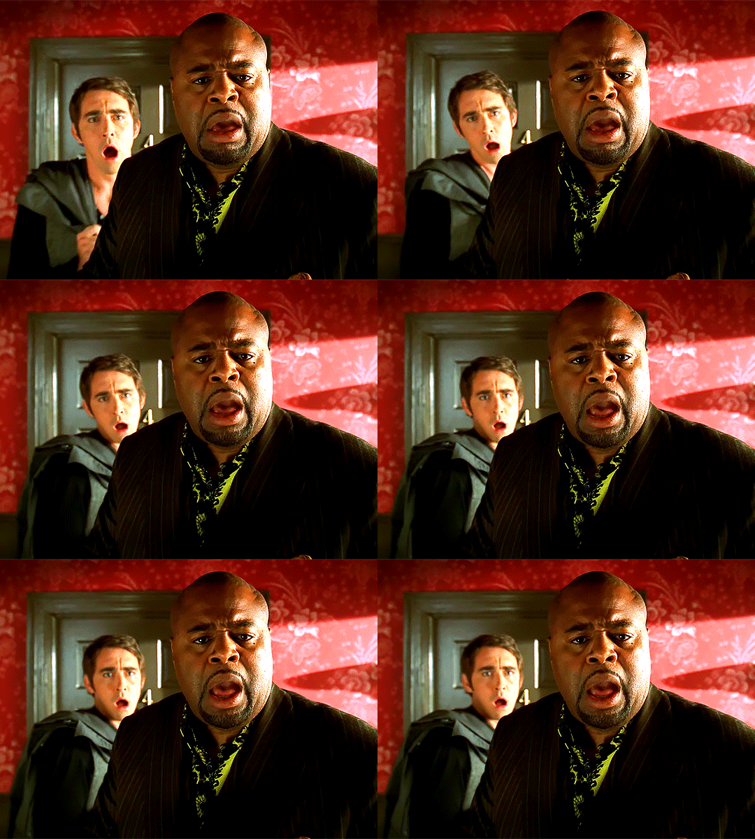
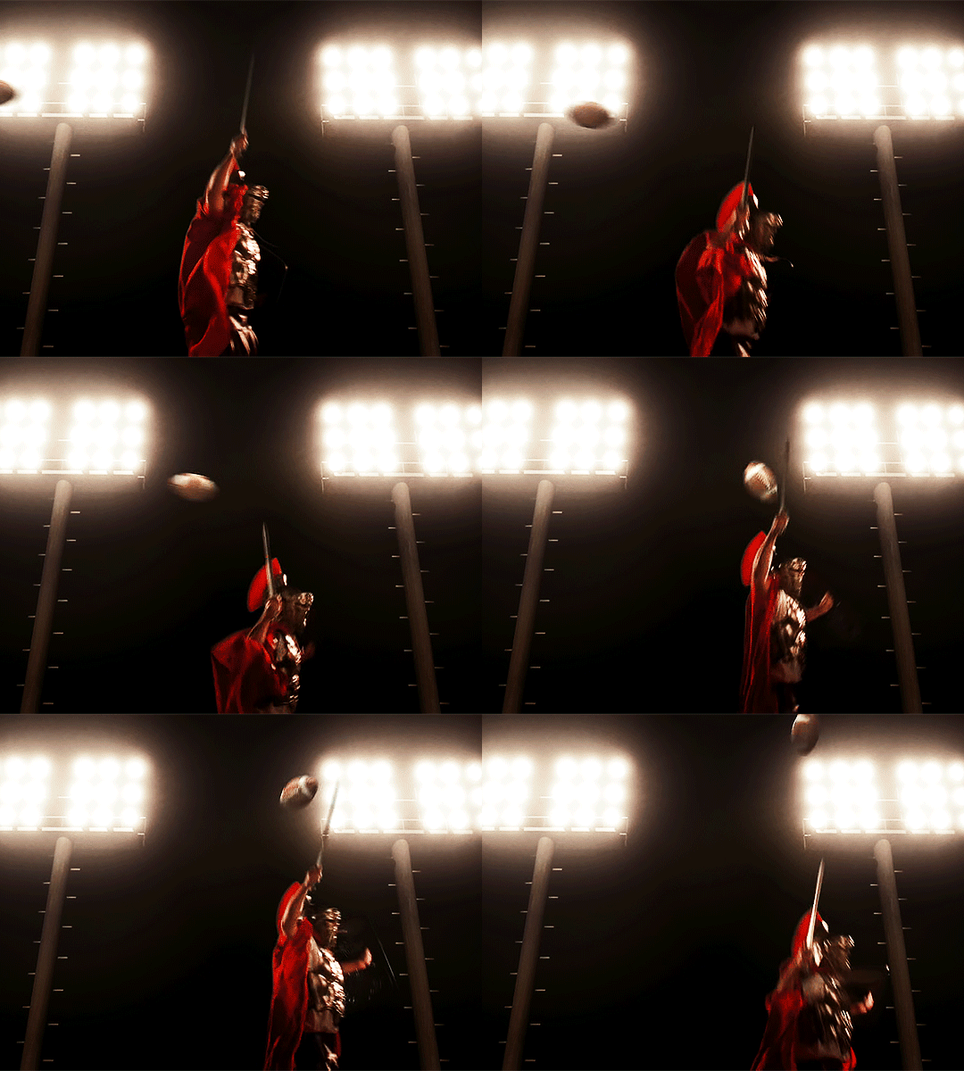
pushing daisies season 2 episode 4 – frescorts
what makes me unique has brought every person i love into my life.
#pushing daisies#pushing daisies edit#pushingdaisiesedit#tvedit#mine#not sh*#suuuper delayed i watched the episode on saturday but i've been struggling to get photoshop to work again (fuck adobe)#but finally succeeded yesterday 😌#also give lee pace an emmy for his little :o face i love it every time he does it aksmdsakd
161 notes
·
View notes
Text
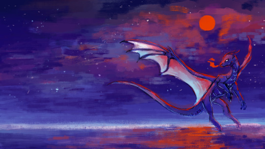
finally finished(?) this one
#affinity photo 2 is so good you guys#its basically like photoshop in terms of the work flow and the brushes i have access to its like having CS6 again my beloved#finally#at long last#farewell autodesk#art#dragon#dragon art#dragons#artistsoftumblr#digital art#my art#artists on tumblr#illustration#artistsontumblr#artist#artwork#illustration art#affinity photo#digital artist#digital illustration
83 notes
·
View notes
Text
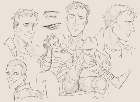
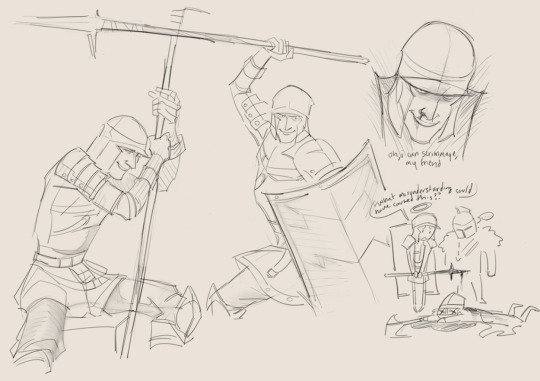
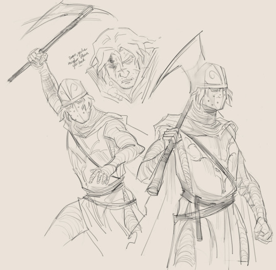


some more pates and crates :,)
#p8cr8#mild mannered pate#creighton the wanderer#dark souls#dark souls 2#me in the tags of every p/c post: ok truthfully im drawing someone else after this (they said lyingly)#no but this time fr (...)#finally got my main computer working again w/ a new monitor so my lines don't look god awful anymore...thank god#did u know that photoshop actively punishes you for having a 4k monitor and requires you have a worse one. well now you do.#art
312 notes
·
View notes
Text
Di Angelo Siblings
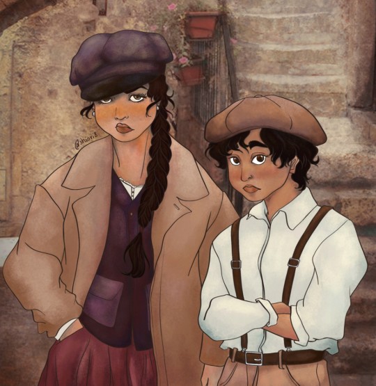
Sooo, to absolutely no one's surprise the new Percy Jackson reboot kicked me into full-blown pjo brainrot mode again lol. I saw these super cute fits and some vintage photos of Venice alleyways floating around on Pinterest and was consumed with the need to draw the Di Angelo siblings in them (it's probably wildly "historically and geographically" inaccurate for them, but we're just going to have to deal with the fact that I'm dumb and uncultured xD It's the vibes™ that count, okay!)
Psst, wanna see something cringe😂? Found this old sketch of them from one of my first forays into digital art years ago:

And to quote past-me "I can barely look at the old one, but at least that means I improved, aye?"😂
#pjo#percy jackson#percy jackson and the olympians#pjo series#pjo show#shioris_art#fanart#digital art#pjo fanart#nico di angelo#bianca di angelo#di angelo siblings#well if there is one thing I certainly haven't improved on it's being able to make people actually look the ages they're supposed to be#they both still look a bit too old; they also look like they're judging your entire existance but that's probably fair for Hades' kids lol#proportions and colours are still a little off too; but hey this piece had a very complicated history ok xD??#ok so to go on a bit of a semi-personal rant (scroll away now if you don't wanna see woe-is-me-artist ramblings xD):#I've finally made a veeery old dream of mine come true and got myself a graphic tablet with a display 🥺 fancy glove and all XD#my ratty old wacom has served me well but it really makes such a difference to be able to see wtf you're doing when you move the pen xD#so this is my first piece to celebrate the occasion and oh my goodness...#digital art is hard 😭😭#I'm studying to become a textile designer I have used Photoshop extensively for almost the last 6 years#*slaps roof of my brain* this bad boy can fit so many shortcuts and encyclopedic knowledge of all its features in it#I know this godforsaken program inside out but goddamn it have I never felt so dumb before lmao#wow so shocking who knew that designing patterns and making fanart with like sketching and anatomy and shit would be completely different🤪?#but it really is so different I seriously felt so dumb and like I had to learn how to use photoshop completely from scratch again xD#I did all of my other digital works on my tiny ass phone (Ibis Paint my beloved♡) and Ive had years to kinda establish an ok workflow there#in a weird way having more tools and options at my disposal hindered my workflow so much more because I would get into analysis paralysis#over every brush stroke; every colour selection; brightness adjustion etc.#idk it's kinda weird I wonder if people can relate
52 notes
·
View notes
Text
hi besties! does anyone have an extension to download their videos to make gifs? I reallllyyy don’t want to have to get a v*pn
3 notes
·
View notes
Note
mini sm au abt chronically online yn at the aus gp? 👀 ik the camera panned to her when lewis said leave me to it please on the radio and she was like 🤠
WAKING UP IN VEGAS MELBOURNE
summary: yn is a lewis hamilton stan first and his fiancée second.
same universe as not a chill girl! <3
────── ⋆⋅☼⋅⋆ ──────


liked by iwantuyn, lewishamilton and 1,029,938 others
yourusername: SCUDERIA FERRARI YAYYYY
view all comments
user1: girl omg not u being bilingual. u speak spanish too?
— yourusername: MI GENTO LATINO!!!
user2: welcome to suffering girl.
— yourusername: im always suffering babe. my man loves the job more than spending time with me 😓
— yourusername: lewis has told me that i have to clarify this as he spent 18 hours with me yesterday but that’s literally a whole 6 hours he wasn’t with me and that? that is neglect.
— user3: you’re so me.
— user4: cause what is more important than the LOVE OF HIS LIFE??? 🤨
user5: miss seeing u at grand prixs queen!! the look ate today.
— user6: she looks so good in red.
alexandrasaintmleux: love u 🤍
— yourusername: virtual kisses 4 u and leo <3
user7: do u like australia yn?
— yourusername: saw a kangaroo and cried. cause why does it look like that i’m scared. but!! the sun is lovely. my tan is gorgeous 😜
user8: her and alex literally napping on each other yesterday? they’re so cute wtf?
— user9: MY fav wags.
— user10: hottest on the grid IDGAF!
user11: did u have a hand in lewis’ black outfit today? it was sexy. (sorry i have to be honest 😓).
— yourusername: honestly? no. although i am a stylist, i tend to dress women more often then men. he has his own very distinctive style and i recommend things but never put a look together for him. but!! i do have veto power.
— yourusername: call lewis sexy all u want babe it’s objectively true. i don’t get offended 😛
user12: this race was so bad. ferrari need help.
— user13: need a ferrari lewis win so idgaf. i will manifest this. he will!!! get his 8th championship.
— yourusername: girl I WAS CHEERING. I WAS SCREAMING. I WAS CRYING. and then I checked the final standings and realized I hallucinated a podium.
— user14: not u being delusional….
— yourusername: you must be new to my page xx
user15: did u at least get a good pic with him today?
— yourusername: yes but he blinked. but i looked really hot, my hair was so good. so now I have to photoshop his eyes open. again.
user16: YN i saw the broadcast. why were you biting your nails like a mother at a talent show
— yourusername: bc my fiancé was out there risking his LIFE and also because i may or may not have had $20 riding on him winning.
user16: not you repping ferrari like lewis didn’t just get P10
— yourusername: i was trying to manifest greatness with the red. didn’t work. real embarrassed rn.
user17: are you okay???
— yourusername: emotionally? no. physically? also no. i wore so kates.
user18: i saw you arguing with a ferrari fan in the paddock??
— yourusername: she said leclerc was hotter than lewis. so i naturally had to defend my man’s honor. sorry alex xoxo
user19: where do we apply to be like you and have this relationship.
— yourusername: step 1: delusion. step 2: good lighting (most important). step 3: never be normal. delusion is just manifestation in heels, believe in yourself baby. i do.
────── ⋆⋅☼⋅⋆ ──────
#mini smaus <3#aus#formula one x reader#formula 1 x reader#f1 x reader#f1 imagine#formula 1 x y/n#f1 smau#f1 scenario#formula 1 x you#formula one imagine#formula one x female reader#formula one x you#formula one smau#formula 1 smau#lewis hamilton smau#lewis hamilton social media au#lewis hamilton x you#lewis hamilton x reader#lewis hamilton fanfic#lh44 smau#lh44 imagine#lh44 x reader
2K notes
·
View notes
Text
Crazy Shit Y/N Wayne Has Done: PART 2!!!!
a definitive but not exhaustive list

Pairings: Batfam x Batsis!reader batsis!reader centred fic!
Content: Swearing, crack yet again
A/N: Lots of people wanted part 2 to this! I'm so glad so many divas like my work omfg!! Link to Part 1: Crazy Shit Y/N Wayne Has Done

Fine Shyt I need to tag: @inejinn , @softieekayy & @ilona2nerrie


1 - Took the BatMobile into a StarBucks drive thru with Damian and Titus in the passenger and backseat.
(Claimed it was an "eco-friendly carpool" was supported by Cass & Steph)

2 - Created a fake cult around Juice Cleanses to see which Gotham Moms would join in.
(Called it "Blessed and Pressed")

3 - Tried to crowd-surf at a Gotham Charity Event
(Key Word: Tried Nobody caught her and Tim made a TikTok out of it)

4 - Replaced every official Wayne Family Portrait with her face photoshopped into them, then made it her LinkedIn banner.
(Including ones prior to her birth, confused Damian for a looong time)

5 - Got kicked out of Gotham Prep School for starting a betting pool on which teacher would snap first (She won the pool, making Jason very proud) ("Mr. Callahan German suplexed a lit student, even though he teaches French.")

6 - Changed the BatComputer's voice to say "Slay Queens" every time a case gets solved. (Drove Bruce up the wall)

7 - Made fake love letters “from Nightwing” and left them in the manor to make Dick paranoid.
(They were written in glitter pen). (“Your arms are so strong. So emotionally unavailable. Marry me?”) (Dick started sleeping with his door locked.)

8 - Made a bingo board titled “Things Bruce Wayne Ignores” and crossed off squares in the middle of a press conference.
(Squares included: “Personal boundaries”, “Any child under 25” &“The concept of rest”)

9 - Ran a lemonade stand in front of Wayne Enterprises and charged $50 a cup.
(People paid for it.) (“I called it ‘Traumaade™ – tastes like spite and unresolved issues”)

And finally
10 - Texted the family group chat “He’s gone 😔” and went offline for like 5 hours.
(Came back with: “Turns out Alfred just went to Costco.”)(Everyone cried a little.)

LMFAO I HOPE YOU ALL ENJOYED THISSSS!!!! Likes, comments, reblogs and requests are highly appreciated! Requests are open!
Sources! -
Header - Pinterest
Bat dividers - @sister-lucifer
Grey dividers - @cursed-carmine
Bow Divider - @dollywons

This post is property of suigenerisisadiva
#dc#dc comics#batfam#batfamily#batman#batboys x reader#batfam x batsis#batfam x reader#batsis!reader#batboys x batsis#bruce wayne#dc batman#batman comics#bruce wayne x reader#dick grayson#batman x reader#dick grayson x reader#nightwing#nightwing x reader#jason todd#jason todd x reader#red hood#red hood x reader#tim drake#dc robin#red robin#damian wayne x reader#damian wayne#damian al ghul#cassandra cain
759 notes
·
View notes
Text
A process video... of some sort! I had so much material for this from the 9 months I worked on it, I couldn't not make something with it. 🔹 Finished animation here 🔹 1440p version on YouTube 🔹 Additional notes under the cut
It was drawn frame by frame, in Photoshop. I sculpted and rigged a 3D model for the griffin lady, that's what I used to make an animation mockup with. It's somewhat rotoscoped from that. I used a HDRI as a base for the background, but added the details in 2D. The start sequence was longer at some point, but I ditched half of it. The end sequence on the other hand was shorter than the final version. The falling scene was from a different angle initially, but I didn't like it. I wanted no cuts in this animation, but I had to add one before that scene when I changed it. I got some invaluable feedback from @/Sarspax, including about how the close-up slowmo is wrapped up, so that scene was tweaked too. Photoshop could not export the final as a video (CTD), so I had to put it together again in DaVinci Resolve. But at least this means an 1440p version can now exist. 🔹 Context: The characters are an immortal shapeshifter couple, Griffin (dude) and Phoenix (the griffin lady). They are part of a world I'm developing, called Tetra. She dislikes combat, but he loves it. Challenging fights especially. She wanted to do something nice for him, so here we are - a friendly duel to the "death" 🔹 Character & creature design 🔹 Additional process breakdown 🔹 Action plan animation on a loop 🔹 Ladygriffin 3D model 🔹 Aftermath 🔹 The sketch that started all this
#Tetra#Griffin#animation#process video#took a while to make this bc an RMA process held my new CPU hostage
1K notes
·
View notes
Text
Outer Banks Cast Reveals Uncomfortable Truths in the Hot Seat | Vanity Fair
Pairing: Drew Starkey x fem!reader.
Masterlist | Who am i? | REQUESTS ARE OPEN!
a/n: Been working pretty consistently on these so i thought i could spare some extra fics this week! I'm also working on other interviews you guys requested so here goes a quick one b4 it's requested 🙂
Genre: Fluff
Warnings: none
Word count: 0.5k
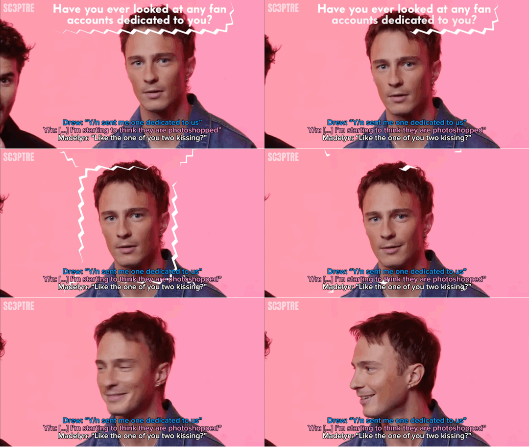
“Have you ever used your fame to get a dinner reservation?” the interviewer asked, panning the camera across the cast until it landed on you.
You nodded sheepishly. “Yes…but on accident.”
Laughter erupted around the room.
“What do you mean ‘on accident’?” Carlacia leaned in, eyebrows raised in disbelief.
“I actually tried to get her to do it for me on purpose once, it didn’t happen,” JD chimed in, pointing at you with a grin.
You nodded, ready to tell the story. “Okay, so I was on the phone talking to the very sweet young lady to make a reservation. I was meant to give a fake name, privacy and all that but I was just walking around the house, doing…whatever, obviously distracted and when she asked for my name, I totally blanked and gave her my real one.”
“You didn’t realize until she repeated it twice” Drew added, shaking his head with a smirk.
“Yeah…” you laughed. “She goes, ‘Y/n Y/l/n?’ and i’m like ‘Yup, that’s me.’ Then she says it again, like slower and I look over and Drew– I was with Drew –was just staring at me wide-eyed, silently mouthing, ‘Hang up the phone. Now.’ So, yeah…We ordered in and called it a day.”
“Attached at the hip,” Rudy muttered, barely above a whisper, making Chase burst out laughing.
—
“Have you ever looked at any fan accounts dedicated to you?” the interviewer asked next as the camera panned again, this time landing on Drew.
Drew reapplied without hesitation. “Yes, I've definitely looked at fan accounts dedicated to me. A hundred percent…I think we all have. Y/n sent me one dedicated to us,” he added, gesturing toward you.
“Listen, I don't know how they do it. They find pictures of us that I didn't even know existed! I’m starting to think they are photoshopped–”
“Like the one of you two kiss–” Madelyn started before dissolving into laughter with the rest of the cast.
You smiled, a little flustered. “I don’t know about that one…”
“We hate paparazzi in this house,” Madison declared matter-of-factly.
“That we do,” Drew mumbled, eyes cast down with a chuckle.
—
After a few more lighthearted questions for the others, the final one landed on you. “What is the most high-maintenance about you?”
“Oh, you picked the wrong person,” JD said immediately, making everyone crack up.
You glanced at Drew. “I don’t know…I feel like Drew would know better than I would.”
“Makes sense. You two spend a lot of ‘friendly’ time together,” Chase teased, emphasizing the word and sending the cast into another fit of laughter.
Drew shrugged. “Honestly? I’d argue you’re not high-maintenance at all.”
“There’s gotta be something,” you countered.
He thought for a moment. “Your meals, maybe?”
“Yup,” Madelyn chimed in. “That’s it.”
“Oh yeah! The make-it-from-scratch queen,” Rudy teased.
You laughed. “Okay, yeah. I have this thing where I crave food i’ve never had before or cooked and I’ll just decide to cook it or I get these really specific cravings days in advance. Like this morning, I had waffles but that decision was made–”
“Last week” Drew finished. The whole cast cracked again.
“It just had to happen,” you shrugged with a grin.
#drew starkey imagine#drew starkey one shot#drew starkey fluff#drew starkey x female reader#drew starkey x y/n#drew starkey x you#drew starkey x reader#drew starkey#rafe cameron x reader#rafe x reader#rafe cameron fanfiction#rafe cameron fic#rafe outer banks#outerbanks rafe#drew starkey fanfiction#rafe cameron fluff#obx cast
620 notes
·
View notes
Note
PLS PLS PLS MAKE A MEETING SHOTOS FAMILY FIC I NEVER SEE ANY OF THEM 🙏
I literally love the way u write Shoto
him ->🧍
Meeting Shoto’s family | prohero!shoto x gn!reader
tags : pro hero shoto x gn!reader, mostly fuyumi and natsuo, fluff, shoto is very aloof but we love that, new years dinner, not proof read
word count : 1.8k
a.n : i had fun with this one lol so thank you so much for your request !!


shoto didn’t want to make his relationship public, so except his closest of friends, no one really knew you or even knew he had a partner.
that was sure annoying at times since shoto doesn’t get a hint when someone is flirting with him and usually doesn’t end the conversation, but you knew he did that for your own safety from all the medias.
so it was only when he took a very awkward selfie of the two of you— an almost constipated expression on his face, holding his phone with both hands like a father taking a picture, and sent it to his sister asking if you could join on their new year’s celebration— that his family finally learned about your existence.
shoto’s phone was blowing up the next 40 minutes or so, mostly his sister asking about you, your favorite food and dessert… you were nervous, sure, but fuyumi’s enthusiasm was definitely helping, you knew the rest of his family wasn’t like that but you still hoped somehow endeavor would be secretly chill.
still, when the day finally came and you were standing in front of the todoroki household—gift bag in hand, dressed in something that screamed “respectable but please still like me”—you couldn’t help the nerves climbing up your spine.
“last chance to pretend you forgot me at home,” you whispered. shoto glanced down at you, completely unfazed. “too late. fuyumi’s watching from the window.”
he wasn’t wrong. the door opened before either of you could even knock.
“YOU MUST BE Y/N!!” fuyumi beamed, launching forward to engulf you in a hug so sudden it nearly knocked the gift bag out of your hands. “i’m so glad you came! oh my god. you’re real. you know for a second a thought shoto photoshopped you in the picture.”
“why would i do that” he furrowed his brows,stepping into his home and taking his shoes off. you followed his actions a bit overwhelmed but still trying to keep up the polite and respectful act.
te house smelled like grilled meat and expensive furniture. it was quiet, warm, and intimidating in a subtle, rich-people way.
you barely had time to take your shoes off before someone else appeared around the corner—tall, broad-shouldered, and immediately recognizable.
endeavor.
your body tensed involuntarily, like your survival instincts kicked in. he nodded stiffly.
“welcome.” shoto didn’t say anything, just stepped a little closer behind you, like his presence would shield you from any lingering tension in the room.
“hi… thank you for having me,” you managed politely, though you weren’t totally sure your voice came out.
endeavor nodded again. the silence that followed was suffocating. you could feel Shoto regretting everything.
“anyway!” fuyumi saved the moment with a clapping gesture. “dinner’s almost ready, you can go sit in the dining room !”

dinner was… surprisingly normal. since his father left due to a work related emergency, the discussion seemed to be much more open.
at one point, fuyumi leaned over with a warm smile and asked how you two met. you blinked and said, “oh, at a coffee shop actually.”
“she yelled at me,” shoto added, like he was just stating the weather. “i did not yell at you,” you said immediately, glaring at him with no real heat.
natsuo raised an eyebrow. “this sounds promising.”
“she cut the line,” shoto continued, between two bites. you turned to him, raising your eyebrows “okay, wow. no that wasn’t it” he looked at you, calm as ever.
“there was a clear order. you broke it.”
“i was literally just going to grab a straw.”
“you had intent in your posture.” natsuo laughed while his sister clapped her hands like this was the best dinner she’d ever seen.
you rolled your eyes but couldn’t help smiling. “anyway, he accused me of cutting, i told him to mind his business, and then five minutes later he offered to pay for my drink because he ‘felt bad about the misunderstanding.’”
“i did,” shoto said, already sipping his tea like none of this was unusual. “you were wearing a shirt that said ‘caffeine and violence.’”
“…and?”
“i was scared.” he went back to eating as if he didn’t just admit that.
after dinner, you all insisted everyone help clean up, which turned into shoto getting kicked out of the kitchen for trying to load the dishwasher wrong.
“how do you even mess it up that bad?” natsuo muttered, yanking a plate out. “you put a bowl in the plate rack.”
“It fit,” shoto replied simply, as if that were the only criteria.
you were drying dishes nearby, biting your lip to stop yourself from laughing. honestly, it was endearing. shoto could calculate the trajectory of an ice attack down to the centimeter but apparently couldn’t grasp modern appliances.
eventually, you were shooed into the living room with a mug of tea, tucked beside shoto on the couch while fuyumi and natsuo bickered over whether or not anyone wanted dessert.
the tv was on in the background playing some new year’s countdown show, all loud music and glittery stage lights. you leaned into Shoto a little, warm and full and weirdly at peace for being in the house of japan’s most emotionally complex family.
“they like you,” he whispered, you turned to him. “yeah?”he nodded “i can tell. fuyumi didn’t start stress-cleaning, and natsuo only insulted me twice.”
you laughed and leaned your head on his shoulder. “I like them too, they’re nice.”
there was a pause.
“…did you really tell fuyumi my favorite food?”
shoto didn’t answer right away. then: “i made a powerpoint.” you blinked. “you what?”
“for her,” he added casually,his eyes on the tv. “so she’d be prepared. she asked for a list of things you like, so I made one. it had slides.”
you stared at him. “you powerpointed me.” he nodded, entirely calm. “It had transitions.”
youwould’ve teased him, but honestly, your chest just swelled with affection so fast it kind of short-circuited your brain.
the countdown on the tv hit ten. fuyumi ran back into the room, waving sparkling cider and glasses, while natsuo complained about missing the remote.
everyone gathered around for the final countdown, and when it hit midnight, the room filled with cheers, clinks of glass, and confetti from god knows where (you suspected fuyumi).
shoto turned to you, eyes soft, and asked—completely monotone—“would it be appropriate to kiss now?”
“let’s not do that here yeah ?” you smiled at him as he nodded not really trying to understand why but he accepted it.
#my hero academia#bnha#mha#bnha x reader#mha x reader#bnha fanfiction#mha fanfiction#shoto fluff#shoto x you#shoto x reader#shoto todoroki#mha shoto#todoroki x reader#enji todoroki#todoroki family
395 notes
·
View notes
Text
red velvet hair | criminal minds


summary: in which the bau is never fully prepared for the disturbing stories of one of their assistant agents who never fails to leave them absolutely speechless.
pairing: criminal minds x catvalentine!reader
word count: 1.5k
warning: this is so stupid. mentions of blood and mental illness because cat valentine. ♥︎ this is truly the stupidest thing i have ever written and willingly posted. im sorry in advance to whoever has the misfortune of coming across this.
masterlist
author's note: this is honestly for doodoos and giggles. i just like the idea of having a ditzy reader like cat valentines absolutely traumatize the already traumatize. also, i know i should be posting about my hot!diva!reader but a girl can get distracted :( also i just love victorious and i might do her helping out spencer with his addiction because cat was addicted to bibble.
The BAU wasn't really sure how you got hired as a apart of the behavioral analysis unit since they were not sure how you passed the psychological evaluation or written tests. You were what the FBI considered a special exception, just like Spencer Reid since you were extrodinary in passing the phsyical tests and using unique ways to solve problems. You also were very charming towards your instructors and Strauss. It weren't even the little things that led them to question how your mind worked, it was the things you'd say and do outright that you considered to be normal; today was one of those days that Hotch made another mental note to get you drug tested later on.
You and Penelope gathered around Spencer's desk to see the photo that Penelope had printed out. You leaned on Spencer's chair while Penelope leaned on top of the desk as you all stared in shock.
"It's remarkable. Something like this makes you questioned everything you thought you knew." Spencer stated, shaking his head at Emily's photo as you nodded in agreement.
"Yeah, it's like the monolith in 2001." The computer tech commented, a teasing tone in her voice as she eyed Emily who sat not too far away.
"So there was actually a time when something like this was socially acceptable?"
Penelope sighed at Spencer's inquiry, "You and [Name] are young. 80s left a lot of people confused. This is erm... especially sad."
"Alright. Very funny guys. Very funny." Emily finally spoke out in a dry tone, snatching the paper out of Penelope's hand. "What'd you do to it?"
"Do?" Garcia hid a laugh.
"You obviously altered it in photoshop or something — that hair." Emily scoffed, as she showed the photo towards them, not believing it was ever her.
"Oh— no pussycat, that is— that's all you. Garfield High, class of '89."
Emily peered down back at the photo, a new frown appearing in her face, "You really didn't change anything?"
"I hacked it as is. You're really trying to tell me you don't remember rocking that look."
"Perhaps your lack of recognition stems from a dissociative fugue suffered from an adolescence. Say it a Siouxsie and the Banshees concert." Spencer joked which caused penelope to giggle but you were very confused.
"Who?"
"You don't know Sioxsie and the — nevermind" Emily cut herself off, sighing. It was already terrible that she graduated in the 80s and she did not need to be reminded of her age yet again.
"Well whoever they are, they must be pretty cool. I think you looked really cool in your yearbook photo, Emily." you said with such sincere and genuiness that the receiver of the compliment's heart warm.
"You think I looked cool?"
"Yeah! We could've maybe had been friends had we gone to school together. But, what happened to the coolness now?" you tilted your head. You asked the question without any hint of malicious intent, and full of genuine curiosity. You like when people dressed goth or alternative. You never were one for status quos and your entire high school was filled with people of that nature.
Spencer and Penelope stifled a laugh as Emily stared out into space, questioning where her life went wrong to have such a backhanded compliment by a girl who used to skip the number three when counting. They learned that habit was fixed during your FBI academy days.
"What are we talking about?" Morgan had joined the group, a cup of coffee in his hand. "Woah! Prentiss, that's you? Oh my that is, something!"
"What is going on?" Rossi followed behind Morgan, the same suprise is evident on his face. "Oh! That is a... lovely photo."
"You know what, what did you guys look like in high school because I am positive we all went through a phase." Emily asked, defensiveness clear in her tone.
"Well fear not because I had time this morning for another hacking of a fellow agent, Miss [Surname], and let's just say that I have never felt more jealous of a life lived than yours my dear."
"Oooo I haven't seen this picture in a while!" you squealed, excited to see how you were at one of the happiest times in your life. Penelope brought out the photo and everybody gathered around, curious as to what era of you they would see.
They always knew that you were a sort of special type of person but they had only met you in this era of your life. The you they know and love is somebody who is undeniably herself and a sweetheart who gives everybody her love unconditionally.
They never would've expected for Penelope to pull up a photo of an alternative fairy-like girl. You looked into the camera with the smile of a model in the perfect position that caught you from all the good angles. Your head perfectly tilted just a teensy bit down, your smile not quite reaching your eyes but offering a sense of lightheartedness and mischief, and your eyes captured this sort of fun youthfulness. You also wore a hot pink off the shoulder shirt with cybersigilism prints and many metal necklaces. But what caught the other agent's eyes the most was your red hair.
"Did you get your photo professionally taken?" Spencer inquired, his mouth still slightly agape.
"You barely aged! What year did you graduate?" Rossi asked, although he wasn't quite sure he wanted to hear the answer at his old age.
"Hollywood Arts, class of 2002." It had been six years since then but still at 24 years old, you barely changed in terms of style from your high school self.
"You went to an arts school?" Emily asked and you enthusiastically nodded.
"Who would've guessed I would've joined the FBI?" you laughed, reflecting on how much life had changed since then, "One time, I performed in a play as this spy who used bananas as a gun and now I get to use a real one. How crazy is that?"
"More concerning than crazy." Spencer muttered under his breath.
"What's with the red hair?" Morgan was still fixated on your dyed hair which sort of did make sense from how much you already express yourself through your clothing and personality like Penelope had.
"I had red hair for I think six years, but my hair wasn't exactly the healthiest so now it's natural, but i loved it so much." you shared with them.
"Why did you choose red?" Penelope questioned and you laughed because to you, the background behind the decision was one you could look back and find humor in.
At that moment, Hotch and JJ quickly made their way towards the bullpen area to inform the rest of the new case that had landed onto them that needed their utmost attention.
"That's actually a really fun story. In my freshmen year—" Hotch and JJ knew better than to interupt your while you are sharing a story because it could either truly be a fun story, or a disturbing one that they would later bookmark to discuss with you later. "I snuck out of my house to hang with my friends and when I tried sneaking back inside— my brother thought i was an intruder—"
The entire group could imagine where this story was going because any mention of your older brother never involved anything good nor legal, but none of them could have expected the full story. Except Doctor Reid, who quickly tied together the red hair connection to the scared brother.
"And so he took a vase and smashed it over my head. I was like knocked down for a few seconds but when I pulled myself up, I looked in the mirror and the blood had stained my hair since I had blonde highlights and I thought— wow, I look amazing with it! So later that week, I dyed it red. I also just really love red velvet cupcakes."
You innocently looked at the reactions of your fellow agents and none of them could speak. Emily opened then closed her mouth. Spencer couldn't even muster up any words for the first time in forever as you left his mouth slightly agape once again. He had predicted the story's route but even as he did, he is never prepared for you to actually say it. Sometimes he sort of hopes he is wrong, but on the off chance that he is, the story is always weirder or more disturbing than he imagined.
JJ and Penelope just locked eyes and couldn't move. Hotch blinked at you with the same stare of, 'We will call the counselor again'. Rossi learned to stop getting suprise and just offered you an encouraging smile and thankfully, he broke the silence.
"Red velvet cupcakes do look scrumptious. The red hair suited you."
You had an innocent laugh, "Right? When me and my friends performed a food song to little kids, I even dressed as a red velvet cupcakes. I had this whipped cream hat and everything."
"Um, I think Hotch and JJ have a case." Spencer stated and everybody did their best to snap out of their daze and direct their attention towards what should be more important.
"[Surname], can you please get the preparations ready for the trip." Hotch stated. You were the assistant of the group and part of your job involved getting traveling arrangements ready and helping JJ communicate with people.
"On it, sir!" You walked away without a care in the world as the rest of the agents made their way to the briefing room.
"Hotch." Morgan stated his superior's name with loud concern.
"I know Morgan."
#criminal minds#spencer reid#criminal minds x reader#criminal minds fluff#criminal minds fanfic#spencer reid x reader#criminal minds x reader fluff#criminal minds crackfic#emily prentiss x reader#spencer reid fluff#spencer reid x catvalentine!reader
831 notes
·
View notes
Text
BREATHLESS ON THE BEDROOM FLOOR
Billie took you to the photoshoot for her new perfume and put on a show for you, only to find herself naked on her bedroom floor just a few hours later, shaking and writhing underneath you.
Wrote this super quickly but I had to do something about the way this video made me feel
————————————————————————————
You stared in disbelief, constantly swallowing to fight the endless river of saliva flowing into your mouth. The way she was crawling around the mirrored floor, her own body reflecting back at her in her all white lingerie dress, left you choking down your need.
When she casually asked you to come with her to a quick photoshop you happily agreed. You’d gone to many before to keep your sweet girlfriend company. You always ended up getting turned on, and secretly Billie loved watching you as you thought you did a great job hiding it. She loved acting casual when you got home and waiting as your neediness grew, before finally fucking you senseless.
This time was different though. This wasn’t a slight flutter you could laugh away. This was an almost crippling hunger and you were struggling to keep your composure from. The more you watched her the more it hurt you not having her immediately.
Billie knew exactly what she was doing, and she was having quite a bit of fun with it. Over and over again she would lock eyes with you, a glint of desire sparkling in her eyes, as she crawled towards you, arching her back and bringing her head closer to the floor.
Your legs squeezed shut subconsciously and you almost groaned at the slight relief of built up pressure. But it wasn’t what you wanted, it wasn’t what you needed.
As she continued dancing seductively, she found herself getting more and more turned on too. Her eyes became glued to her own reflection. The sight made her cheeks flush and her eyes glow brighter. The way her cleavage spilled out from the vintage looking bra was making the blood rush to her center. She was feeling the power of herself, of her raw sexual energy and breathtaking beauty.
When her eyes caught yours again she could feel the tension growing within you. She couldn’t help but giggle at the way you were struggling to keep still, to keep your breath steady and act natural.
By the time you were home the pool inside of your lace thong was impossible to ignore, as was the intense chemicals flooding your brain, leaving you consumed by images of her underneath you on her bedroom floor, moving just as she did a mere hour ago in front of all those cameras.
The walk from the front door to her room was a blur, all you could remember was the way your fingers felt laced between hers as you pulled her along, and the way her soft giggles danced between the walls.
You both could feel the heat taking over the entire room as you carefully brought her down to the floor. Your eyes met hers and a million conversations happened all at once. Your expression wasn’t one she was used to. You were looking at her with pure hunger, ready to consume every inch of her. The roles were reversed and she loved it, loved how wanted she felt.
You wanted so badly to rip off all her clothes and devour her but you refused to give in. You needed to match the slow seductiveness she teased you with earlier. When your lips connected passionately your hands worked to find their way under her shirt and the moment they delicately grazed her side her gasp echoed through your lips.
By the time she was naked her own desire was palpable, letting out light whines and subtly writhing underneath you. You leaned back, marveling at the sight beneath you, finally getting her exactly how you needed her the moment you saw her at the shoot, rolling naked across the floor, eyes closed and skin flushed from the arousal coursing through her veins.
You pulled your phone from your pocket and opened the camera, whispering her name and silently asking her permission before taking her photos. She smirked when she saw you, loving how mesmerized you were at the sight of her. Her legs moved side to side as she swayed and wiggled underneath you, occasionally looking directly into the camera with pleading doey eyes. Her hands grabbed her boobs, kneading and toying with her nipples as you switched to video, recording this private moment to watch later.
Her hand began sliding down her stomach and traveling to her core as you gawked at the image being recorded on your phone. She stared into the lens and moaned the second her fingers connected with her core, moving around her wetness before finding her clit and circling it gently. You recorded for just a minute longer before you could no longer keep your hands to yourself.
The phone hit the floor next to you as you moved above her, grabbing her wrists and bringing them above her head as she giggled beneath you. She groaned at the interrupted pleasure but you cut her off “need my hands all over you, need to feel you so bad, need to please you so bad” as your words came to a stop your lips landed on her neck and you felt her throat muscles tighten as she moaned with need.
Your hands left her wrists to grab at her body, everywhere and anywhere you could reach as you sucked and kissed sloppily across her neck and chest.
By the time your fingers slid between her folds they were soaked and so sensitive to your touch. You weren’t ready to give her what she wanted just yet, but you couldn’t resist the desire to touch her all together. Instead, your palm pushed firmly against her clit, loving the way it made her back arch slightly and lips part as she took in a gasp of air.
She was completely hypnotized by the way you were touching her, toying with her, taking her in whatever ways you pleased. You were totally consumed by lust, so aroused by the way she looked underneath you. Her breathing was heavy and an occasional whine slipped from her lips as you continued planting wet kisses all over her naked body.
When your fingers finally began moving against her clit you were getting yourself comfortable between her thighs. Her quiet moans were now freely flowing out of her as you circled her sensitive bud and kissed the soft milky skin of her inner thighs. You took a moment to admire the way you had her pussy dripping before you could no longer resist the urge to please her, to hear her screaming your name.
You slid your tongue gently between her folds and groaned at her sweetness, kitten licking her juices for a moment and taking in the way her wet lips felt in your mouth. At the first moan of your name you dove in, passionately slurping her up and devouring her completely.
Her fingers found their way to your hair immediately as she began grinding her hips up against your face. She was a mess, drunk off the way you were pleasing her so well. soft whispers of expletives and sweet cries of pleasure poured from her lips as you continued to eat her out. The sweet taste of her cunt lit up your brain and traveled back down to your own center, throbbing at the scene taking place in front of you.
Her hands held your head closer and she thrusted her hips against your tongue, loudly moaning out your name. the way her thighs slammed against your neck made you see stars but you refused to stop until her cum was dripping onto the floor.
You continued your intricate movements for a while, with your eyes closed and a soft hum vibrating through your lips every so often, showing just how much you loved what you were doing.
“baby oh, oh my god baby you’re gunna make me cum! gunna cum all over your pretty face mama”
It was the last thing you heard before her loud cries filled the room, howling out your name as her legs violently shook and her body thrashed against you. Her hands pushed your face tighter into her cunt as she came hard, gushing onto your tongue and down your chin.
Your own thighs squeezed together as tightly as they could as you continued sucking her clit, refusing to stop until she made you. Your ongoing acts stretched out her orgasm and the sweet songs of her pleasure became more and more high pitched as your tongue collected all her cum.
Finally, she pushed your head away as she gasped for air. When you pulled away and sat up, you grew breathless at the sight in front of you. If you thought the photoshoot was sexy, you didn’t know what to do with this. Her pink flushed skin glistened with a layer of sweat as her chest rose and fell intensely, working hard to catch her breath after her powerful high. Her dark nipples were stiff from all the erotic touch and her boobs were covered in small bruises from your kisses. Her face was rosy and her eyes looked blissfully and playfully at you with her bottom lip pulled tightly between her teeth.
“Fuck, if that photoshoot made you fuck me like this, I can’t wait to see what you do when you get the pictures and videos from it,” She giggled out playfully. Her words displayed how much she loved what just happened, and it only made you want it all again.
When you fell forward and planted your hands on either side of her head she gasped with a mischievous smile. “fuck you’re so cute, I’m not done with you yet, need to please you again” You spoke your words into her neck as you planted soft kisses on her skin. you giggled with her as she squirmed under you, fully ready for you to fuck her one more time. Or two. or three.
#billie eilish#billie eilish fanfiction#billie eilish smut#billie eilish x reader#billie eilish x y/n#billie eilish x you#billie x reader#wlw post#wlw smut#billie eilish x smut
450 notes
·
View notes