#figured out how to draw faces from that funky angle
Explore tagged Tumblr posts
Text

I'm in dire need of Shiba content. Decided to draw a fanart myself
#Shiba#kagurabachi#figured out how to draw faces from that funky angle#brown eyed and blonde shiba is my headcanon#lowkey felt like a clown while drawing this but the sparks of inspiration don't choose who to bless😔#struggling with the desire to give up on drawing at all#everytime saying myself 'this is gonna be the last one for sure' and some time later i wake up and think 'i need to draw my babygirl'#im done venting bye :P
24 notes
·
View notes
Note
how does your blindness impact your art? I would have thought that it would be impossible for a blind person to work in a purely visual medium like you do, but clearly that's not the case. do you use adaptive tech or specific styles/techniques?
(I apologize if this question is ableist. I would like to know more about your experiences, but I don't have a great grasp of what's appropriate to ask and what isn't. I am not trying to be rude.)
Oooh thank you for asking! :) For the record, I’m pretty chill, I know there aren’t exactly a ton of us blindies out there, so feel free to ask questions with the language you have. :)
Haha oh man, my blindness has impacted my art from the very first thing I drew at age 4. I have a small amount of vision in my left eye; no depth perception, no peripheral vision, no distance, pretty good colors though. Life to me is basically a smear of nonsense colors that I put meaning to through context and location. The closest thing to seeing anything clearly I’ve ever gotten was watching cartoons, which I did obsessively as a kid. So first and foremost, I don’t and can’t draw from life, it makes no sense to me. The bold, simple actions of animation and the heavy stylization has taught me a ton.
Over the years my style has become very much about being high contrast, high visibility. But it also tangles with my love of doing pretty intricate detail work (it’s soothing, what can I say XD). In the past I was strictly a traditional media artist and I drew with what I had on hand. Growing up in poverty, what I had was the pens I used to write with in school and the paper I scrounged out of recycling bins. I basically mashed my face on the paper and worked in light angled over my shoulder that wasn’t too bright. I clipped paper to clip boards so I’d always have something lightweight enough to hold in one hand while I drew with the other. I’d sketch in pencil and ink using my very beefy prescription reading glasses, and everything I do had to be self taught. Life drawing class just doesn’t do anything for the dude who can’t see the model. :D
In 2019 a botched cataract surgery cost me most of my functional vision. I can no longer read print for any length of time, I don’t watch tv, and increasingly I just forget to look at most things with my eyes. But! I have an iPad. :D It took a few years and finding a pair of beefy store bought readers so I can focus enough to draw, but using Procrate and zooming down to the pixel as well as sketching on a black background makes the art still possile. I still draw mostly the same way I did with traditional media. I know brushes could probably be used to make some things easier, but I don’t have the spoons or visual stamina to figure out how to use them except for making quick backgrounds (pro tip: never have your character or object floating in a white void, even a single line to ground them will make your work better).
Color of late has been an interesting thing because I literally do not understand how light and shadow really works. I’ve read up on it but there’s only so much anyone can do when they just can’t see the thing. I like to ink the best and color is just an experiment I’m trying every time I do it heh. I make up little rules of style for myself and do a lot of guesswork based on the full shape I think a thing or character has, if that makes sense. I don’t know how a lot of things work visually so I will make stuff up, guess, or you’ll see some funky style things that happen because I read a medical paper once and just like drawing the holes in an iris (that’s what the lines in characters’ eyes are heh).
I’ll have to make a video sometime. Some of this stuff probably makes more sense in action.
Tl,dr: I mash my face onto an iPad and use 35-ish years of drawing experience to guess at what leoks right. :D I don’t think I would have become an artist if I wasn’t blind, I would have had more to look at to distract me. XD
#blind#blindness#blind artist#haha okay it wasn’t a medical paper I learned about iris holes from#I have half an MA in teaching the blind#and a long standing interest in eyes partly from having to learn enough to explain mine to teachers as a smol Razz#so I know a lot about eyeball anatomy :D#but seriously look up highly magnified scientific pics of eyes it’s rad!
6 notes
·
View notes
Note
Saw u were asking for asks so i was wondering what was the process in designing Tys character :)
Tagging @fox-faced as they had sent a fairly similar ask to @swindle-comic and I felt it would be more effective to kill two birds with one stone.
I am honestly so sorry for taking so long to answer this. This is going to be a fairly long post!
So, as far as designing Ty goes, it was mostly a process of learning how to draw bears. Specifically Disney bears.
When it came time to design Ty, I was definitely not practiced in the art of drawing cartoon bears. In fact, I was mostly doing Moomin fanart at this point, and was still trying to figure out how I wanted to draw DT17 characters in a way that wasn't just the style of the show. Ty's design hasn't changed much, conceptually, but instead has been heavily tweaked and refined as I simply got better and more used to drawing bears.
As Ty was, at the time of his creation, so derivative of Kit, my plan of attack was pretty much just "figure out how to draw a bear cub in the DT17 style" using Kit's design as a reference for drawing a Disney bear cub to begin with. Lolly had been the one to choose which species of bear Ty was, so I was trying to focus instead on his general aesthetic while translating the proper features over. Once again, I used Kit as a reference - or rather, his athleticism - and pushed it to the point where Ty looked very jock-ish (though you can blame my love for letterman jackets on that).
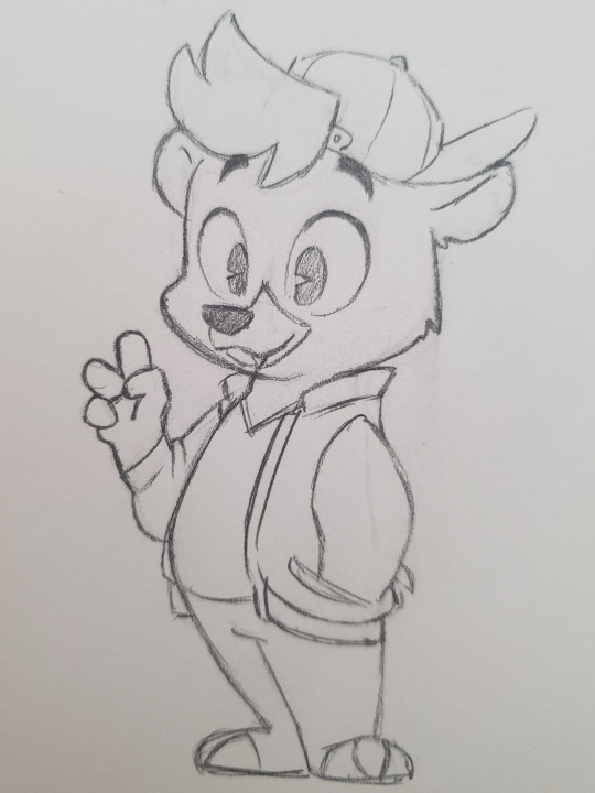
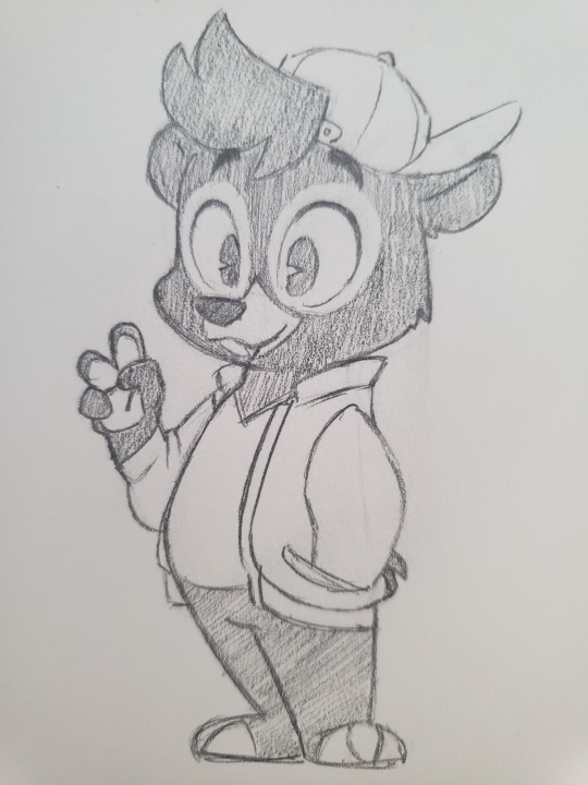
You can tell in a lot of my older drawings of Ty that I really hadn't actually gotten used to or properly figured this bear thing out, yet. His face, especially, looks extra blocky and awkward. However, these early drawings were where I quickly decided to make Ty fairly large and thick as a teenager. This was before I had really considered the idea that he grew up underfed, it was more just "I want to play around with this body-type".


Among these earliest drawings was also one of Ty and Louie as adults, where, again, you can tell that I hadn't quite gotten the hang of drawing bears, but you can see that from the very beginning I had wanted him to be a more top-heavy adult (mostly just to allow for some variety between him, Kit, and Baloo. As much as I do love Kit's adult design, Disney has a bad habit of copypasting character designs from parents to their children, and I really wasn't interested on continuing that trend).
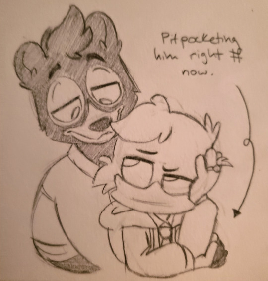
I wasn't super confident on how I was going to properly refine this design, so his adult design ended up taking a back-seat for a while as I instead focused on getting better at drawing his teen design.
This was pretty much accomplished simply by drawing him more, and lord knows I was hyperfixated as FUCK on this funky little bear cub, so drawing him a ton was not hard to do. I think what really helped me figure him out were these drawings, here, where I had to really think about what angles I had him posed at, and how his features would properly look in a more 3D or dynamic space. This was also where I started looking at any details I wanted to add to his design (the stripes on his collar were introduced to his design at this point, for instance).
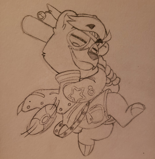

At a point, I felt as though I had gotten good enough to at least create some proper "stock" images of the boy to properly solidify his desgin and all the little tweaks I made. I think the differences between this and his very first drawings are more subtle, but you can DEFINITELY tell the difference between these drawings and my other early Ty drawings.

And interesting fact was that I hadn't been drawing early Llewerius art with the idea that Ty had gone through a growth spurt before they started dating, so you end up with sketches like this:

PART 1 OF 2 BECAUSE TUMBLR SUCKS AND WON'T LET ME UPLOAD MORE THAT 10 PICTURES EVEN THOUGH THIS TECHNICALLY QUALIFIES AS A TEXT POST (as it, for whatever reason, decided to switch to mobile mode even though I'm literally on a desktop computer, I hate this broken-ass website)
89 notes
·
View notes
Note
Do you have any tips for drawing bodies from multiple angles?
WROTE A LOT SORRY its under a cut!
honestly i dont have the most practice with it since a good 70% of what i draw is characters wait up standing looking 3/4s left or right orz BUT some things that helped with the few interesting poses i draw once every fiscal quarter IS.....life drawing orz
specifically life drawing sessions where you do a bunch of quick gestural figures (like a 60 second timer each pose) at the beginning and then slowly increase the time for later poses, like 2 minutes, then five, where you slowly increase the amount of detail and rendering each pose, and then one or two long 10 minute ones where you go all out. i think that kinda structure helps a lot to 1) warm you up and get loosey goosey with ur lines and 2) get in the zone to think about how bodies work without overwhelming urself - like in the 1 minute sketches you could basically only get a weird stick figure, in the 2 minute ones maybe you might get a little more definition in the sillhouette, at the 5 minute poses you got some folds of the flesh implied with a few lines and a bit of hatching, and by the 10 minute ones ur really thinking about how the different parts of the body all interact because you already did some practice (the previous poses) if that makes sense?
ALAS we are in a world situation where cramming 40 people in a room to silently draw one naked person for three hours is not......happening (at least not where i live) so for the past couple years ive had to make do with online resources, which arent half bad! theyre not quite the same, for me at least (i think in person i can see more interesting angles) but they do the job! here's some I've used:
http://reference.sketchdaily.net/en
https://line-of-action.com/practice-tools/figure-drawing
https://quickposes.com/en
https://youtu.be/mNNSwITdPIM (linking this channels clothed references so no one gets a surprise titty in the face but normally i personally use nude references) (although recently ive been using some clothed references as well just because i realized im so out of practice drawing clothes hsjlkfBJKLFJSFKLD)
figure drawing and life drawing and especially gesture drawing is also something thats kinda tricky to learn if no one ever taught you (and honestly its tricky if someone DID teach you lol) so maybe someday i'll get around to trying to explain what ive learned myself if that could help someone
ive tried using 3d models but ive never foudn them that useful, probably for the same reason i prefer irl models to pictures (easier to see whats goin on) BUT sometimes it can help as a rough guideline if ur doing a weird angle youve never done before!!
SPEAKING of guidelines. guidelines are ur friend. guidelines r ur lifeblood. guidelines will always help even if u dont follow half of them they are SO helpful - I OFTEN find myself kinda skipping them, like you can see here in this drawing i havent erased the sketch from yet that i drew a circle and then a line for shoulders and gave up (probably impatient lol):

BUT guidelines can help so much~ when im drawing a full pose i'll usually have guidelines that really are no more than stick figures like basically like:

stick figures with dots for joints and maybe some rough lines here and there like it doesnt need to be nice or perfect since its just gonna get erased anyway~ it helps me keep track of how bones work hjfsdskjvfdfs
OH and artist mannequins.....like 3d models theyve also never done me any good like those wooden ones? I hate em theyre so stiff and i dunno what to do with them BUT.....okay...action figures? not bad....like maybe not so much with anatomy but if you have a doll or action figure with good articulation you can kinda use that to help out with funky poses sometimes!! like i have this one gundam and honestly....even though its a mecha with a giant mecha dong or whatevers going down there its like....not a horrible mannequin for poses jfksdlfjrfkehjklsd
WITH REGARDS TO foreshortening.......................................we are all on our own with that one orz LIKE i have tried every trick in the book, every funky tip and method and technique and none have worked for me so i just wing it jhkDmFJKDLS WELL actually having like a page of really sloppy loose stick figure sketches where you experiment with proportions helps a lot!! i do that with weird poses or angles, like dont worry about about how it looks HELL unfocus ur eyes. unfocus ur eyes. i do that all the time while drawing and its great it helps you see the big picture and the silhouette without focusing too much on one thing~
anyway yeah i dunno i guess a lot is just experimentation but hopefully some of these resources might be useful!!
19 notes
·
View notes
Text
How I Made My EVA Foam TV Head
(A Long-Winded and Rambly Tutorial by Me)
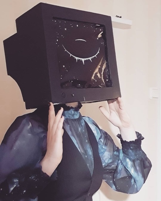
NOTE (1 June 2020): This tutorial is outdated - I plan to update it with new photos as well as improved techniques from my later builds soon!
I’ve had quite a few people ask me how I made my TV head lately, so I figured I should put together some kind of tutorial! Sadly, since I am Not A Smart Person, I lost most pictures of the crafting process while clearing out my camera roll, which means I’ll have to supplement the few I have with some drawings of my own.
Please keep in mind that I’ve only ever made this one head—my techniques may not be optimal. I had to figure more or less all of it out on my own, since I couldn’t find any decent preexisting tutorials.
Without further ado, let’s get into it!
[EDIT: I’m a fool that doesn’t know how to use readmores, sorry for spamming everyone’s dashes y’all]
Materials Used:
Paper
Masking tape
Sharpie
White 6mm-thick EVA foam
Hot glue (lots of it)
Fabric/felt/something to make a simple hinge out of
Acrylic paint
Solar film
Posca pen
LED light, AA battery x2, on/off switch, wires
Tools:
Ruler
Box cutter
Scissors
Glue gun
Hole punch pliers
Step 1: Design/Planning
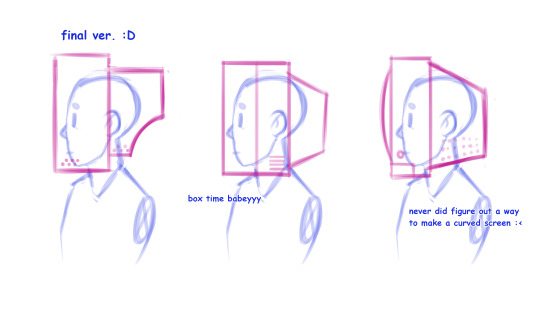
It’s important to have a clear vision of what you want to make before you actually start crafting —it’ll save you a lot of time and materials. I started by sketching out a few potential designs in profile, both to see which one I liked the most and to see how feasible they’d be to actually make as a mask without looking completely oversized.
Once you’ve settled on a design, I recommend drawing it from as many different angles as you think you’ll need for the next step:
Step 2: Paper Prototype
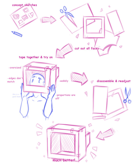
(I could have sworn I kept some pictures of this step? But apparently not so my scribbles will have to do)
Based on my sketches, I then made a prototype of the head out of decently sturdy paper, to serve as a template for the final foam head. I cut out the shape of every face of the head and taped them together to see how it all looked. You’ll most likely not get it right the first time around, so simply disassemble the head again, make any necessary adjustments to the measurements, re-tape and check again. Repeat this process until you are satisfied—it’s much easier to fix issues with the design in this stage rather than when making the actual mask.
There will probably always be a slight wobbliness to the prototype since it’s made of paper, but a good design will feel mostly sturdy. It’s pretty hard to mess up what is essentially a glorified box imo
I recommend labelling the faces and writing down all measurements to more easily keep track of them.
Step 3: Craft Foam Cutting
The head is made out of 6mm EVA foam I bought at my local crafts store. (This specific brand was called dekorgummi “decoration rubber/funky foam”. I’m unsure if it’s available outside of Sweden, but if I’ve understood correctly it’s basically the same thing as EVA foam.) The material came in 30x46 cm sheets and is, quite frankly, amazing — it’s cheap, lightweight and bendable, yet sturdy enough not to be floppy at all, and can be cut, textured, hand-sewn, hot-glued and painted with ease. Seriously I love this stuff So Much I could probably make an entire post just singing its praises aaaaa
I disassembled the paper prototype again. Using the pieces as a template, I then traced the shapes onto the craft foam and cut them out with a box cutter and scissors. You’ll need to adjust the measurements accommodate to for the thickness of the foam—much like the prototype, I taped all the pieces of foam together to check what parts needed adjustments in order to work. Labelling all faces will also come in handy once you start glueing.
Step 4: Ventilation
The air intake holes on the mask aren’t just for decoration; a foam head WILL get very hot unless properly ventilated, especially if the screen is made of a solid material instead of mesh. Using hole punch pliers, I put holes on the sides and all along the top of the head. Don’t hesitate to make lots of holes—you’ll probably need them. My screen still gets uncomfortably hot and foggy if I wear it indoors for extended periods of time without taking it off.
While I haven’t had the chance to try it out myself, it should be possible to make slit-style air intakes using a box cutter, if you’d rather not have small round ones.
Step 5: Gluing
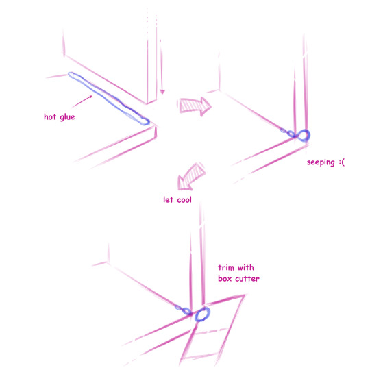
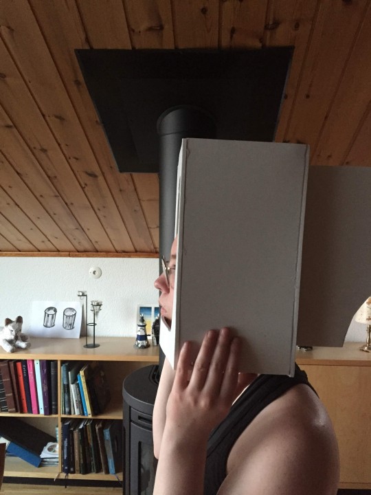
Working my way from the front face of the screen to the back, I then hot-glued all the pieces of foam together. The only part I didn’t glue was the frontal underside part of the screen, to which I’ll soon add the hole for my neck.
Don’t worry if your glueing doesn’t turn out perfect! If any glue wells out at the side when you join two pieces, it can easily be trimmed with a box cutter once it’s cooled. This step is also a good time for trimming any uneven/frayed foam. If you find that the foam frayed a bit when you cut it out, running an iron over it on low heat can help smooth it out.
Part 6: Neck hole
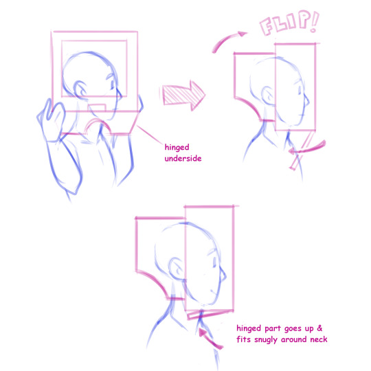
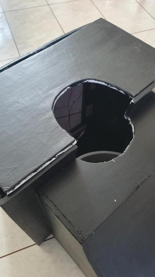
Before this step, I hadn’t made any accommodations for my neck—all I had was a plain piece of foam that wasn’t attached to the rest of the mask, and a big rectangular hole at the underside of the head.
I carefully cut out a hole on the underside of the head, most of which was located on the soon-to-be-hinged part of loose foam. Be careful not to make the hole too big! It’s better to remove too little than too much. Make sure that it fits in such a way that there’s some space between your face and where the screen will go—my first attempts had my nose poking out the front, which looked more than a little bit silly!
Once I was satisfied with the neck hole, I glued two pieces of felt between the inside of the screen and the bottom part so that it hinges forwards. When I put the mask on I simply open the hinged underside, put the whole mask on sideways, turn it around correctly and flip the hinged part back up. The hinged underside fits snugly enough that it doesn’t need anything keeping it in place, and it takes some vigorous headbanging for it to open by mistake (don’t ask me how I know that)
Part 7: Painting
The interior of the head is painted with a coat of black acrylic paint —I’ll get into the reason for this later. Work your way from the back of the head to the front, covering all surfaces of the inside. It doesn’t have to be perfect as long as most of it is black.
The outside of the head is painted with ~5 coats of dark blue acrylic paint. Keep in mind that the foam will absorb some of the paint—you’ll need at least a few coats to get a dark, uniform colour. I had some trouble with the brush strokes being too visible for my taste, but this was fixed by mixing the paint with some water and using a finer brush. This issue could possibly be avoided altogether by spray painting the head instead.
Part 8: Headband/Suspension
You’ll need to make sure that the mask sits properly on your head so that it follows your movements and doesn’t slide around/wobble. The way my screen's shaped, I could simply attach two strips of leftover foam to the inside in such a way that they form a sort of headband that goes around and over my head, but this is probably not the best or most comfortable solution, and may not work with all screen shapes. Some other ideas I considered were using the inside of an old bicycle helmet or hardhat, or perhaps just glueing a whole-ass snapback cap to the inside lmao
Part 9: Screen
My original plans were to have a screen made out of fine black mesh fabric. The idea is that as long as the inside of the mask is darkened, you can see out of it without being seen yourself. It seems like you could even paint a design onto the mesh as long as you’re careful not to block the holes. Sadly, the seller didn’t ship to Sweden :<
Instead, the screen of my head is made out of black window film (the kind of stuff meant to be put on car windows), which still works in more or less the same way. It does give the screen a shinier look, which could be nice, but unlike mesh, it’s not breathable and fogs up quite easily if not ventilated properly.
I cut out a square a few centimetres wider than the actual screen and drew the eye design onto it with a Posca pen, but you could probably use acrylics as well. I recommend keeping the design simple as to not obstruct your vision too much.
I attached the film to the inside of the front face using hot glue. It took a few tries to get it right, and I’m actually planning on re-doing it as it’s still somewhat floppy.
Part 10: Details
This is where I’d attach any antennas/lights/other decorative stuff, but of course, that might depend on exactly what you’re doing. My head has a LED light that runs on two AA batteries, connected to an on/off button—I had to make the holes for the light and button before painting. The whole thing is simply taped to the inside of the mask to allow for easy repairs/replacing!
Part 11: Done!
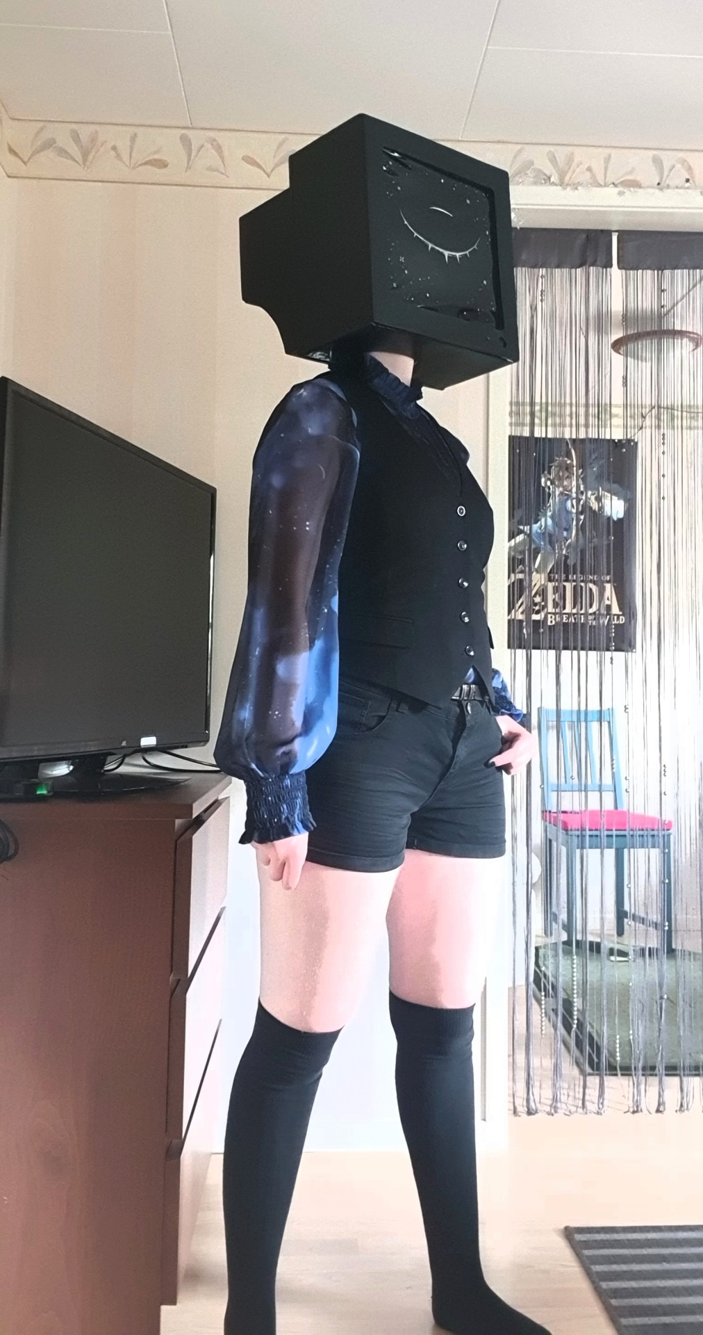
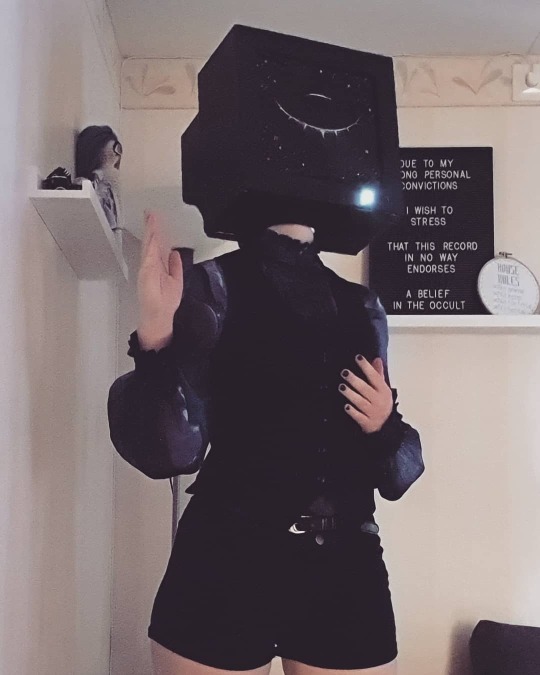
...Aaaand would you look at that, you’ve got yourself a TV head! Assemble yourself a funky outfit out of stuff from your wardrobe and go weird out people at a party! Post pics and get that internet clout! Wear it to IKEA! (Don’t, Actually.) Chill with it at home, secure in the knowledge that you’re 200% cooler than everyone else because your head is now a goddamn TV how sick is that shit
Thank you so much for reading my probably-entirely-too-long-and-wordy tutorial! Hopefully I’ve been able to make myself understood despite my less-than-perfect english. If you have any further questions, don’t hesitate to shoot me an ask, and if you do use this to make your own TV head, feel free to show me the result—it’d mean the world to me!
#object head#tv head#computer head#object head cosplay#tv head cosplay#computer head cosplay#cosplay#costume#cosplay tutorial#eva foam#fashion#cyberpunk#robot#tutorial#long post
576 notes
·
View notes
Note
Oh my gosh I absolutely adore your art - I'm trying to learn how to draw and everything you make looks so great! I wanted to ask how long you've been drawing for and how did you start? Do you have any tips?
i started in the second/third grade by trying to draw animals out of encyclopedias and books. i never traced, but i would have my paper next to the picture and try to make the same kind of shapes yknow? i would also watch stuff like Danny Phantom and My Life As A Teenage Robot and pause it so i could draw the characters in the same kind of way. fifth grade i figured out what livejournal and deviantart was and started trying to do that kind of anime chibi style but it was sort of awkward learning how arms and faces worked? most of what i freehanded was like. zombie unicorns and dragons. typical fifth grade fare
i didnt get my tablet until like sixth grade when i started doing Homestuck and MLP fanart and posting it online. i dont think i got more than like 40 likes but i remember this one i did of karkat and eridan went up to 3k in prime homestuck fandom days, and thats kind of what kept me drawing and making more art was seeing how much other people liked it.
im pretty sure it was freshman year of high school that i started askmarshandbroflovski with nadia and that was when i got REALLY into art. im sure if you look back through the blog its obvious when my art style started to actually Happen because i would sit down and draw maybe six things a day. i did livestreams back then too, which got me drawing stuff faster and faster. i got burnout pretty bad (thats also when i got an RSI so TAKE BREAKS OFTEN) but im thankful for all of that cause it was a huge art-type learning experience.
now i still try to pay attention to shapes and contrast, but lately ive been stuck between what amount of cartoony or anatomically correct i want? i tend to overthink things especially when i draw so ive found myself spending more time on my art (and its ended up much more Stiff than it used to be)
my best tips if youre drawing on paper? dont worry about the paper. just draw tons of stuff. fill up pages completely with random stuff. practice fast sketches, big shapes, and dont get bogged down with detail until youre sure. just go through an entire pack of copy paper (thats what i used to do to the point where i would get one for christmas) and draw Often. if youre using a tablet, find an art program that you can customize brushes on (sai is good for simple applications and clip studio paint has Really detailed brushes and lots of photoshop-type options) and go absolutely NUTS on a canvas. flip your canvas a lot to make sure the angles arent getting awkward, but dont let it discourage you from drawing loose or funky art. experiment with colors and simple figures, too. when it comes to inspiration art, figure out what stuff you just like to look at and what stuff you would like to actually make. your style will develop overtime and sometimes Drastically, so looking back on your old stuff is helpful.
my favorite art advice comes from Matt Groening, who said to draw your characters with recognizable silhouettes and shapes unique to them, so they can be more easily known. shapes are important!
18 notes
·
View notes
Text




saturday morning was cloudy. the whole day was cloudy, but to start, i woke up to a sunrise that didn’t exist. so i ate breakfast and went back to sleep (if i had to define what a vacation was, it would have to include that activity: going back to sleep). then i went to meet nadège, jenn, and haidee at their flat.
i’ve always stayed in a hotel when i’ve visited, specifically the hotel. part of it is because i know how the hotel works, and i heavily weight the value of the familiar. it also was part of the rewards program with sas. it isn’t anymore, and i think they’re going to be doing construction next year, so i’m starting to consider different options for stays for my next trip. i’ll probably stick to a hotel because i heavily weight the existence of room service too, but now it doesn’t have to be the radisson blu. i’ve ridden that elevator enough times.
but uh, the point of this consideration is because they were staying in a really nice flat, which was like an extended stay suite but through airbnb. i was super anxious about using airbnb last summer because it was someone’s home, but this flat was not that, which was appealing to me. i would have to pack much less if i were to go the walk-up route though. um, so i met them there and we walked to get kabobs. jenn had to catch a flight that afternoon but she hadn’t gotten her kabob fix yet, so it was a necessary spot. we met jenni’s group there and then walked down to the river for a moment to eat and chat. nadège and i kept walking along the river since we weren’t eating, and we had a chance to talk through some of the stuff that was bothering me from the day before.
it was really helpful to have that chance, both to let me express myself as well as hear her perspective. most of the time, even though i’m constantly keeping up with people on my dashboard, i’m still very much in my own head about it all. i’m not using a soundboard, just letting my own opinion boil up until it causes problems, spilling negativity into other people’s lives. this has been happening more often, probably because i’m talking to fewer and fewer people as the fandom shrinks and i get more stubborn, so i really appreciated this chance to both be very much in the fandom (in oslo, with human beings) as well as take a step back from it. i still need to work on how i balance my sense of self that i get from the internet with how i express myself in person, and it seems like that just means i need to take a walk and talk to someone. like, every day.
anyway, that’s what we did, going down to the dick swan and back, visiting the barely-canon tree and syng. when we got back to the girls we figured out where we were going next, and we broke up for the afternoon.
a couple of days ago jasmine and silvia had mentioned the nrk studio tour as a thing to do, and i impulse bought (is there any other way?) a ticket for saturday. nadège and haidee were interested in going, so we decided to press our luck and head over to the office to see if we could squeeze two more people onto the tour (it was listed as sold out for saturday when they checked). taru gave us helpful tips for getting to the office but between my struggle with google maps and the front door, we were still too late. the guide was nice enough to come to the front and answer some questions though, so we just went back to the website and bought tickets for sunday instead.
by then the clouds were releasing a week’s worth of weather, and we were all the way out in marienlyst with a couple of hours to kill. so we went through our lists of things we wanted to see, if there were any sites left that hadn’t been toured even though we’ve all been to oslo a few times at this point. and there were! we were actually kind of close to the university campus where parts of “all stories are echoes” are set, so nadège wanted to find an important statue from the fic. she and haidee had read it, and while we walked to campus they did a recap for me, so i would understand the significance of the statue.
at that point it was raining heavily and we were lost but i didn’t really mind it because we were just walking and talking. there was a general goal that we were trying to achieve, but it felt very relaxed, and it was fun listening to all of the things that really excited them about the stories they read. after all this time i don’t think i ever did that, like really find out what attracted them to this fandom, so it was a fun and enlightening conversation. it also passed the time well, as we were walking through the campus and then trying to find a bus back to sentrum.
oh wait, not sentrum. next we looked up kjærlighetskarusellen, because that post about it from the header had recently circulated, and it was another canon detail that sort of defined these trips that we take. we come to oslo because we are fans of a show that is set here, and we love it so much that we seek out every little detail in appreciation. that love has grown to encompass the whole city, so we were looking for this show detail as well as monument to the city’s history and its relationship with homosexuality. we lingered outside of it for a bit, because there was a man actually using it as a urinal, and then we snapped our photos once the coast was clear. now i am no stranger to being creepy but that was probably a top five moment for me, taking a picture of a public urinal. i loudly talked about how it was a cultural heritage site as if that would convince random people passing by that i was truly interested in the city’s sanitation efforts instead of, like, men peeing. for the record i’m not particularly interested in either.
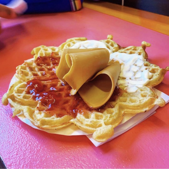
then we went back to the flat for a bathroom break, and on to eat waffles. oh boy! i was excited because i had never had one before. i was still shy in terms of trying one, and chose the nugatti topping instead of the jam & brown cheese classic (pictured is haidee’s waffle). mine was super sweet and...gummy? like the hazelnut paste and the soft waffle was just cement in my mouth, and i got a work out just trying to clean off my teeth with my tongue. but it was delicious. i’d probably eat one every day if i had daily access to haralds.
after our waffle we went to meet jasmine and silvia. we shared a pizza for a late lunch/early dinner, and then went back to the hotel so i could change out of my wet clothes. we recapped each other’s dramas and activities from earlier in the day, and talked about fandom and the internet and how people change, if they do. at this point we’ve known each other for at least a year, if not longer, and it’s interesting to see how we, and the rest of the fandom, have evolved as the show has faded into the distance.
some of the stuff we talked about got intense, or we got wrapped up in drama (what else is new), and we had to take a break by watching the bloopers. that was an instant mood lift, and fun to do with people in the same room. everything was a little bit funnier or cuter or sillier when i could hear everyone else laughing at the show too. someday i’d love to rent out a cinema theatre and project season three for a marathon viewing (with bathroom breaks) for a group of fans. maybe for a seven-year anniversary, when you could time it so it would play on a friday evening, and at exactly 21:21 in real time you’d watch isak walk across the courtyard at school to save the man of his dreams.
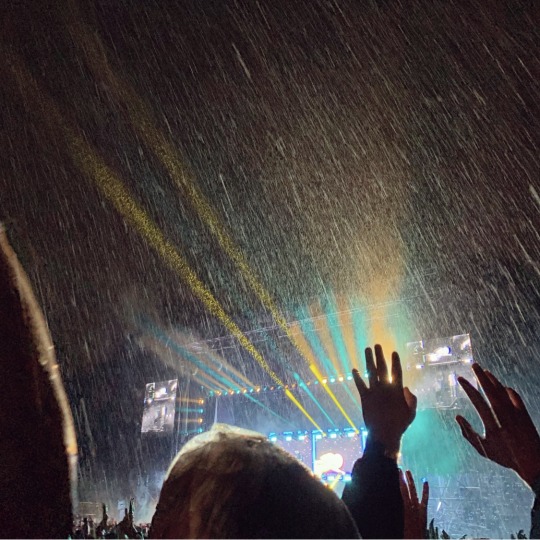
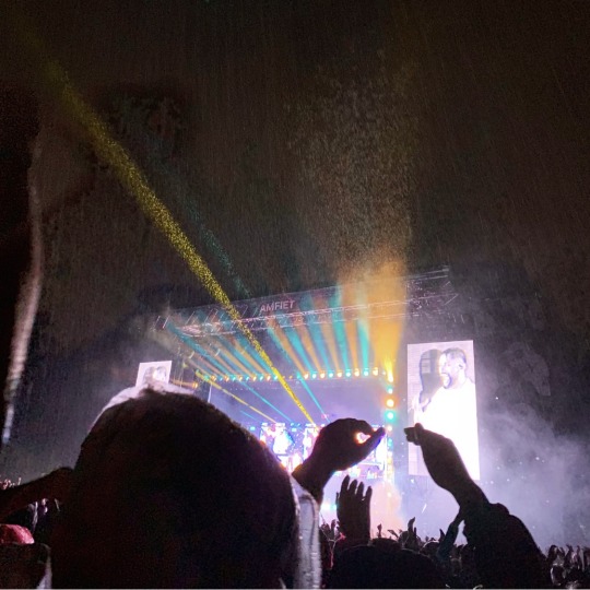
but back to saturday. it wasn’t raining, but we took the metro to the park next (baby’s first metro trip!). we were going to meet jenni, taru, and kati, and figure out a good place for jasmine and silvia to hang out outside to listen to karpe. we said our goodbyes at the gate and shifted to the other friend group. i think we were kind of early but there was already a decent crowd going in, and going right for the main stage. i don’t think we bothered with food or drink this time around, mostly because we’d just eaten and it was starting to drizzle, which meant everything would get wet anyway.
jenn mentioned a few times that it was a shame there wasn’t any festival merch to purchase while we were walking around, because we kept seeing all of the volunteers with their t-shirts and bags from previous years. it felt like a missed opportunity. i wondered if it was on purpose, to give more weight to the merch that the volunteers got, as a draw for them to sign up and return to work. limited merch would make that experience more special. but i was wrong, because after jenn had left we finally found out that there was a merch tent with apparel for sale; we just hadn’t found it. so before we joined the crowd for karpe we went up the hill and bought tote bags and socks. i’ll deliver jenn’s tote to her on friday, at the sigrid show. i’m mostly mentioning that here so i don’t forget. i was so excited to find socks because i’m getting used to wearing more funky options (mostly due to haidee’s lovely gifts!) but also because they were um, featured on the festival issue of natt & dag.
we moved closer to the stage, but it was actually the farthest we’d been from it the whole week, simply because the crowd was already packed in. while we waited ronny from nrk p3 walked past, and that was my only celebrity sighting at the whole festival. on thursday i thought i saw axel bøyum walk in front of me, but i’m not sure. it was fast, and i thought i noticed his sharply-angled face and deep eyes, but he was also wearing a hood so i didn’t have much else to compare. he was short though, which also made him stand out to me. anyway, that was the extent of my sightings: 1.5 people. there were others there, of course, because i saw their instagram posts, but i either wasn’t paying attention or wasn’t in the right places to see them. since i myself prefer not to be seen, i tend to treat everyone else the same (at least not on the internet), so i default to ignoring the people around me unless they acknowledge me first. i need your explicit consent before i let myself stare at you.
here’s a brief pause to note how sad i am about heimebane. aaaaaand moving on!
the karpe crowd was huge and...different. saturday had a different vibe in general because it was the weekend, and if someone was going to just pick one day to go to øya this would be that day. also it was raining, so there was this anticipatory buzz that was like, 80% for the show and 20% for getting dry again in a couple of hours. our group kind of slowly shifted and morphed as we were pushed closer to the stage and trying not to lose our footing on the sloped ground. but then the show started and the crowd exploded and you just had to fuckin’ roll with it.
i had to read up on the show afterward to understand some of what magdi and chirag were talking and singing about. despite talking about it with fryd months ago, i didn’t get into their new album like i’d wanted to. so i didn’t understand most of the message in the moment; i was just enjoying the beats and the intensity of everyone else. there was a group of younger guys in front of us who sang every damn word and it was just a really...fulfilling thing to witness? norway came out for norway, and the crowd was exactly what karpe deserved for the show they put on. the guys chatted with nadège and sang at me to get us hyped, and i still felt slightly removed from the crowd but that was okay. i enjoyed this outsider place. i didn’t have to understand or be part of it because it was big enough on its own. i could simply bask in the overflow and dance in the rain.
i knew one song from when i had it on repeat summer 2017, the result of following ashley’s obsession with karpe on tumblr. i also still connected it to skam, from when i was more passionately following the actors’ lives and seeing them go to their concert in oslo, which i think cengiz was also dancing for? these are very weak links but links nonetheless, and it still felt like i was ticking off boxes on my unwritten “experience skam” list. it’s also a testament to how far i’ll twist something to justify it, make it fit my personal narrative. i must still feel guilty about my trips to oslo.
(side note: i’ve been meaning to look this up but i am fascinated by their use of the sas brand in their album and shows, like...they are aggressively shaping the brand and i’m curious as to whether they have permission to do it or if they don’t need it or what level of control the brand has over its use. the relationship between a brand and an artist these days is fucking fascinating, and i’m sort of aware of the rules that we need in america but is it different in other countries? i’m already a fan of sas, in that it’s my airline for my trips to oslo, but would i have been influenced more toward or against it if i were approaching it from a karpe angle, if the duo were introducing me to it? anyway, just some mind wanderings there.)
at the end the crowd was lighting up their cups again. we were surrounded by different people than how we started and couldn’t find the ones we knew. we made the same walk away from the stage, bouncing along with the flow, until we got to the festival sign to catch up with everyone. we took a group pic and said goodnight, not entirely sure what the next day would bring but quite satisfied with the one that had just ended. it was funny how used to the exit walk i’d become, after just a few days, and i felt a little nostalgic about even that, as we did it for the last time. and even though we were all soaked and exhausted, i didn’t feel a particular rush to leave. but it was over. just like that. the volunteers were collecting cups from the crowd as we went, but i took mine home.
#this took way too long to write and now i’m so behind it doesn’t matter anymore#i’ve queued it for a random dag in october#who knows if i’ll be back or still on lockdown#kerryinoslo
9 notes
·
View notes
Link
Umbra sends Noctis way, waaaaay into the past and into Somnus' own bed. Well, the second part he did himself.
Pairing: Noctis/Somnus Rating: Explicit
The Royal Lucian genes are a helluva thing.
When Regis once remarked how similar his son looked to his father Mors, Noctis thought it was pretty common and definitely nothing out of the ordinary. If his biology classes taught him anything, it was that grandchildren can bear a striking resemblance to their grandparents compared to their parents. Noctis had only seen Mors through news articles and the grand portrait adorning the Hall of Kings, its walls dedicated solely to the everlasting frames of royals past. He couldn't really see how a gray-haired man could look so close to 15-year old him, but when he Moogled a younger snapshot of Mors he almost mistook the old photo as himself.
There were definite similarities in bone structure and hell, even that tiny mole near the corner of their mouths.
But this? This is like staring into a straight-up reflection.
He’s literally looking up, eyes half-lidded and face twisted in pleasure with a touch of pain, but through the haze of heat lighting up his body and mind, Noctis can’t help but think of the irony and plot twist and —
“You’re thinking again,” Somnus reprimands, voice just a mark away from a growl, “of something other than me.”
As if in punishment, the man digs his fingers into Noctis’ thighs — just another set of marks to add to the blooming bruises along his wrists and the curious rough circles on his collarbones and neck — and hoists his hips up into a better angle to slam himself into.
It does the trick. Something like fire and lightning, something like magic hits Noctis in all the worst and best ways, and he scrambles for purchase, hands flinging up to claw at the pillows as he arches his back and keens.
He’s learned that Somnus can be gentle in his own ways, if one overlooks the narcissism that veils his true heart — a heart that, beyond blood and family and love, treasures his people and will tread through fire and sacrifices if (when) necessary. But the young king makes for a rough and merciless lover. With every brutal thrust, he draws out a sob and smiles ever the wider for it, Noctis’ wanton cries a sweet music to his ears. He only slows when he has Noctis babbling his name in an incoherent string of stammers and gasps, rewarding him with a soft kiss to his temple before he picks up the unrelenting pace again. “Much better,” he purrs, watching the way his near-copy writhes and sings with a gaze that scorches.
Noctis will admit, that fucking his great-great-great-great-whatever grandfather was never on his agenda; though given the many generations separating their blood, they were probably just as related, if not less, as he would be to Ignis or Gladio, considering how their families were borne out of the Caelum line to begin with. Hell, being transported all the way to this ancient Lucian era was a minor surprise to this fork in the road. The night before they set off for Ardyn and Insomnia, to reclaim the throne and bring back the light, he asked Umbra for a last trip down memory lane, only for the dog to throw him ages further and in free fall thousands of feet up. Good thing he was used to falling by now, and he was never more thankful to still have his warping powers and the Armiger.
Except, he sort of screwed himself over by warping right in front of Somnus Fucking Lucis Caelum.
‘Shiva’s tits, ’ he couldn’t help but think, not out of fear or anxiety but because Somnus looked exactly like he did when he was still twenty. He thought he must have landed in a time before all that… shit went down between the two, before Ardyn turned saint turned martyr trying to foolishly save the world one person at a time. Before Somnus went with the ‘go big or go home’ method and burned down anything that did so much as cough.
Before their clashing ideologies led them to clashing swords.
He never really thought he’d be grateful for being stuck in the purgatory known as the Crystal, but it’s a perk to see their ancient history play across his eyelids like a giant home theater.
Somnus probably shared similar thoughts at seeing his living reflection, considering the bulging eyes and the white cast across his face — which, really, would have been rather comical in any other circumstances — but it wasn’t until later when Noctis was one hundred percent sure that had been the reason, when he looked in the mirror and realized he was smaller and younger and twenty again. Because while Noctis thought he was looking at a past version of himself, Somnus was looking at a near replica of his own. Age and all, minus the hairstyle.
Without revealing his true origins and the outcome of the future, Noctis had to think on the fly, and he still curses himself for not having the same quick mind that Ignis does (Did? Would? Time travel is weird).
“I’m a Messenger,” he said a second too fast, internally beating himself up for being so godsdamn stupid. “I didn’t have a physical form, so I took on the first one I saw. You.”
It worked out in his favor that Somnus was never a god-fearing man, a downright heretic compared to Ardyn, but that explanation was enough to satisfy him. And his ego, probably, that a demigod would choose to liken himself to Somnus’ visage. Oh, and that he currently has said demigod moaning and flushed beneath him, pliant and desperate and sobbing with ecstasy.
“Somnus, ” Noctis cries out, hands moving from the pillow to grab at the man’s arms, blunt nails leaving pink trails in their wake.
Somnus smiles at that, wicked and slow despite the exertion that sweats down his skin and brow. He recognizes the sudden tightness around his cock, of Noctis clenching around him and his stomach straining its muscles, as well as the swell that coils within his own.
“Hold on, pretty thing,” Somnus purrs, moving one hand from Noctis’ thigh to his cock, keeping a grip just a hair from pain but miles away from release. “Together we go.”
‘Arrogant prick, ’ Noctis thinks, despite the frustration and heat haze of pleasure filling his mind to the brim. Somnus may as well stand in front of a mirror and flirt with himself if he’s going to continue spewing words like that at someone who looks exactly like him. But he’s teetering on the edge, held back by a cruel hand and a vicious pace, and he’s desperate enough to even meet Somnus’ thrusts by rocking his own hips in conjunction.
It’s not long until Somnus gives out, and Noctis thinks he blanks out for a moment when all he sees is white, when that same exhilaration runs through his nerves and spine and taps into something deeper than a great orgasm ever could.
Their first time together, Noctis was stuck between fear and wonder when he came to the realization that his magic, as faint as it is ever since it had been culled by that Marilith attack, was reaching out toward Somnus’ own and that — yeah. That’s kinda weird.
He’s had sex with others before, men and women alike, some ending poorly and others fan-fucking-tastic. But that whole magic thing? Still virgin territory. The side-effects of fucking another Caelum, he now knows. He still hasn’t hashed out the details of it, though Somnus is becoming ever the wiser about it, who first chalked it up to the benefit of fucking a so-called Messenger but now has his own suspicions. A matter of time before the ruse is up and Noctis has to come clean about it all like, “Hey! I’m actually from the future and your great-times-a-hundred-somethin’-grandson. The future’s shit, by the way, cause Bahamut and all of you are dumbasses!”
But for now, Somnus cleans them up with nary a fuss about dirtying his dainty royal hands as he wipes them both down with a wet cloth, which is surprisingly soft and fluffy for their time period. Sure, he could be a dick and a half when it came to his personality, but Noctis likes to think of him as a prissy cat that actually loves cuddles and attention. Especially when Somnus drapes an arm around him and practically buries his face into the crook of Noctis’ neck, breathing in their combined scents of each other and their aftermath.
Noctis gently rakes his fingers through the man’s scalp and stares at the ceiling of the canopy bed, wondering how exactly his new ‘future’ will play out. He doesn’t know if or when Umbra will return to take him to the present — he turns his head at every faint bark he hears, and Somnus teases him for it relentlessly — and he damn well doesn’t know if anything he does here will change the timeline anyway. But he likes to believe and hope that he can do at least something, anything to lessen the blows of tragedy when they come.
“You’re thinking again,” Somnus sighs, though his tone is less out of irritation and more of concern. Noctis has figured out how to read these tiny differences, like how those brows like to just slightly crease when worried or how he sets his jaw when angered. His eyebrows are lowered, barely, as his gaze searches for the cracks of truth hidden beneath Noctis’ true face. Too bad he won’t be getting them, not now. “After such a rousing time, even.”
“Messenger problems.” Noctis turns his head to return the gaze, but less inquisitive and more secretive.
“Then tell me, dear night.”
Noctis feels something funky in his chest. Which he’s quick to ignore because he definitely does not want to admit what it is. He lightly taps his forehead against Somnus’ own, craning his neck slightly to meet each other, and does his damned hardest to look at him with as much feigned honesty as he can muster. It’s gotten easier lately, to lie and twist half-truths, but not without effort.
“One day. When you’re ready.”
‘When I’m ready, ’ he means instead. He wants to trust Somnus, but he won’t be ready for the backlash if the worst case scenario happens.
Somnus stares back, lips working themselves into a retort and Noctis expects an argument or a demand to know now. It wouldn’t be the first they clashed with words, Somnus standing on his pedestal and believing his birthright and lineage granted him the secret musings of the gods with Noctis standing just as stalwart and refusing to budge. But tonight instead, he harrumphs and concedes to their middle ground, closing his eyes and burying his face further into the crease between Noctis and the pillows to murmur, “It best be soon, Noctis. I am not known for my patience, unlike my long-suffering brother.”
Noctis only manages a hum, pushing back the anxieties and what-if’s should that time come. When it comes, he corrects. He knows it’s inevitable, that the truth will rear its head one way or another. But it’s up to him on how it’ll all play out and if the results will end up in fortune or disaster.
Right now, though, he’s exhausted — the good kind, not the fatigue that makes his bones ache and his muscles quiver — and Somnus is true to his name, pulling Noctis into sleep with his warmth and soft breath ghosting across skin. He’ll put more thought into it in the morning, come up with a more serious plan rather than half-ass snippets. Sooner rather than later, because Noctis isn’t known for his patience either.
“Goodnight,” Somnus manages through the lethargy in his voice.
“Good… sleep.” Noctis glances down in hopes of catching a reaction to his pun.
And he does, when Somnus opens his eyes for just a moment to make sure the other catches his definite eye roll. Noctis smiles at that, and he takes that image with him into his dreams.
5 notes
·
View notes
Text
“Do I need to even?” UFC 229 Preview
Joey
September 30th
Oh boy oh boy. We've somehow someway made it here and I feel like we deserve some credit here. If you've survived 90% of 2018 then you've earned this one. If you survived UFC 228, UFC 224, the messy FS1 cards ravaged by injury and waking up early for Asian FP cards? You've earned this one. We've got a very solid card with matching lightweight fights of the highest quality. The co-main event pits Anthony Pettis vs the returning Tony Ferguson in one of the best LW fights you could put together for action quality while the main event is the best fight. Period. Conor McGregor is truly underrated at this point in his career; a dominant fighter who has one blemish on his record which he avenged. He is a genuine two weight class champion (lack of defenses be damned) with wins over the likes of Chad Mendes, Jose Aldo, Max Holloway, Eddie Alvarez and Dustin Poirier. Khabib Nurmagomedov's resume speaks for itself; undefeated in the UFC expanding beyond six years now with wins over some really good competition in Michael Johnson, Al Iaquinta and Edson Barboza. It's the striker vs grappler match up and the man with the one hitter quitter vs an endless torrent of takedowns and ground and pound. There's very few fights ever I'm as excited about as this one. Those two fights on their own? Pretty good. The rest of the card? Pretty decent actually! The UFC absolutely took perhaps a step too many in loading up this show. Being honest, the sixth best fight on this card (Michelle Waterson vs Felice Herrig) could've headlined the Moncton FS1 show. Let's just have a damn good time here and enjoy THIS one for once.
Debuts: Jalin Turner
Fight Changes/Injury Cancellations: 0
Headliners (fighters who have either main evented or co-main evented shows in the UFC): 13 (Conor McGregor, Tony Ferguson, Khabib Nurmagomedov, Anthony Pettis, Felice Herrig, Michelle Waterson, Ovince St. Preux, Alexander Volkov, Gray Maynard, Derrick Lewis, Sergio Pettis, Yana Kunitskaya, Ryan LaFlare)
Fighters On Losing Streaks in the UFC:
Fighters On Winning Streaks in the UFC: (Conor McGregor, Tony Ferguson, Khabib Nurmagomedov, Derrick Lewis, Sean O'Malley, Alexander Volkov, Vicente Luque, Jussier Formiga, Jose Quinonez, Scott Holtzman, Alan Patrick)
Main Card Record Since Jan 1st 2016 (in the UFC): 37-13
Conor McGregor- 2-1 Khabib Nurmagomedov- 4-0 Tony Ferguson- 3-0 Anthony Pettis- 3-4 Ovince St. Preux- 5-4 Dominick Reyes- 3-0 Derrick Lewis- 7-1 (!) Alexander Volkov- 4-0 Michelle Waterson- 2-2 Felice Herrig- 4-1
Divisional Breakdown:
Lightweight- 4 Women's bantamweight- 2 Welterweight- 2 Bantamweight- 1 (?) Women's strawweight- 1 Flyweight- 1 Heavyweight-1 Light Heavyweight- 1
Too Low- Vicente Luque vs Jalin Turner
Most of this card is honestly fine and I get why Michelle Waterson is on the main card. Having said that, I think that fight is a bit too....blegh (on paper) for a show like this. I'd use Waterson vs Herrig to try and draw some eyeballs to this FS1 slate and instead push a guaranteed burner in Turner vs Luque. Vicente Luque has finished every one of his wins and he's taken decision losses vs stalling wrestler types. At the same time, Jalin Turner had some of the freakiest striking chops on the second DWTCS run. This should be a superb striking battle.
Too High Up- Aspen Ladd vs Tanya Evinger
Ehhh......I don't know if this is going to be a fight worthy of having on FS1. Ladd still seems really raw and we haven't seen Evinger in over a year in a lopsided loss vs Cyborg. This is Fight Pass quality. Waterson vs Herrig on the PPV isn't great shakes BUT both have fan bases that will probably-ish tune in. Probably. Not that this card should NEED any of that.
Stat Monitor for 2018:
Debuting Fighters (Current number: 27-32-1): Jalin Turner
Short Notice Fighters (Current number: 26-19):
Second Fight (Current number: 34-27): Aspen Ladd, Tonya Evinger, Yanit Kunitskaya
Cage Corrosion (Current number: 19-28): Conor McGregor, Gray Maynard, Tonya Evinger (If this show happens a day later, Tony Ferguson)
Undefeated Fighters (Current number: 26-21-1): Khabib Nurmagomedov Aspen Ladd, Dominick Reyes
Keeping An Eye On But Not Really:
The UFC Win Check Test The records of fighters who have 4 or more UFC fights (or three full calendar years in the organization) but 0 wins against people still in the UFC:
Twenty Precarious Ponderings
(We're doing TWENTY for a show like this, y'all. In truth, I just wanted to talk more and more about Khabib and Conor)
1- I just don't have enough time or energy to detail ALL of the intricacies of this lightweight title fight. The simplistic view is "wrestler vs striker" but that belittles the things both guys do so so so so well that in turn makes them special. Has Khabib Nurmagomedov ever faced a guy with Conor's length and timing? Even if we acknowledge that Conor McGregor is basically a one armed fighter (Conor's left hand is the best singular weapon in MMA), he has not just insane timing on it but the ability to throw it whenever he wants. One of the concepts of baseball is that "He throws hard!" eventually isn't enough and you need something off-speed to shake it off. Conor's different in that he can probably throw his left from any angle with any sort of heat and any sort of pacing offset by his kicks and his jab. Conversely Khabib "as a wrestler" is just a really unfair attempt to simplify a very good all around fighter. His control is A+, he threatens with submissions enough to keep fighters honest on the ground and he has a tremendous understanding of chaining attempts together with different techniques. How often do you see Khabib Nurmagomedov get stuck (look at Eryk Anders vs Thiago Santos) or forced to make a bad shot (look at some of Josh Koscheck's prime for desperation TDs)? On the feet, Khabib doesn't have a wealth of weaponry but he has a good jab and dude just seems to hit hard.
2- One of the things AntiCool speaks of so much that I truly believe in is fighters being unwilling to concede a single measure in fights where they need to pull off the upset. He uses Alexander Gustafsson vs Jon Jones and Daniel Cormier as good examples of a fighter who doesn't give up any avenue of the fight where they felt they couldn't win. The reason I bring this up is because I genuinely believe Conor McGregor is ballsy enough to believe he can absolutely if he has to compete with Khabib on the ground. I bet he believes that even if it's not the gameplan.
3- Jose Aldo and Khabib have some similarities in their dominance. Both were so neutralizing that they completely shut down fighters at the base of their respective games and forced them to adapt, often times doing that while basically sleepwalking through fights. That said, they also are similar in their relative levels of inactivity heading into the Conor fights. Conor McGregor and Khabib fought on the same card in 2016 and since that point? Khabib's fought just twice. Not exactly blazing a track of activity probably compounded by Khabib taking time off for Ramadan. Also both Aldo and Khabib were known as cold calculated fighters who were surgical but never emotional. That changed vs McGregor for Aldo----soooo is Khabib going to come out emotional?
4- What are the odds of a double retirement after this fight?
5- Does this PPV find a way to crack the 2 million buy mark?
6- One of the weirder thing is how assured we are of Khabib's dominance while also acknowledging how so-so his resume is overall. We've seen Conor's resume at 145 lbs and while his resume at 155 lbs is thin, it IS worth noting that he dominated Eddie Alvarez in his one foray there. Conversely Khabib's resume is really just two guys unless you take a ton out of the Al Iaquinta fight (it didn't show me anything about him from a skills POV but it showed me everything I need to know about his mental toughness as an athlete). There's a lot more we need to know about Khabib than there is to figure out about Conor.
7- Tony Ferguson is one of my favorite fighters and in a lot of ways, the El Cucuy stuff writes itself. Tony Ferguson (like Yoel Romero and the Diaz Brothers) has this unique borderline inhuman ability to outweird the world's weirdest spot. He lives the weirdest life, chases the weirdest thrills and could only exist in a sport like this one. Ferguson's 2017 was a mess; a complete collapse of a fight with Khabib, an eventual interim title win vs Kevin Lee leading to a 2018 where a blown out knee seemed set to rob him of his 2018. Because he's Tony Ferguson, he's out here fighting Anthony Pettis in October. Whether Ferguson can still do the things that made him special (be funky, awkward, outhustle dudes in key positions, challenge with submissions from any situation, throw a variety of kicks from any situation) after a bad knee injury and another year on the wrong side of 30 remains to be seen. I'm left to hope so since a winning Tony Ferguson is a fun Tony Ferguson.
8- Anthony Pettis has been pretty bad for the majority of the last three years but perhaps things are going to turn around now. Pettis' second round win over Michael Chiesa felt like a combination of some of the best of Anthony Pettis (quick counter striking, aggressive and opportunistic grappling) with some of his worst of Anthony Pettis. The road has been rough for Showtime but we're talking about a Tony Ferguson who is coming off a knee surgery and pushing 35. If there was EVER a chance for Anthony Pettis to figure this out, THIS is the guy to do it against.
9- Could Pettis beating Ferguson jump him over the winner of Nate/Poirier?
10- I know some of my fellas on here might disagree with the idea of OSP vs Dominick Reyes but at this point, I'm with it. There's not a long list of guys at 205 lbs who can act as the buffer between "proven to be good" and "ready to be great" so it falls on OSP. Reyes is arguably the most unique prospect at 205 lbs and this is without question an aggressive step up. It is worth pointing out that OSP was losing before he won vs Tyson Pedro and so they might be gambling on a decline. For me, I'm mostly concerned that Reyes is going to be shellshocked by the difference in strength between he and OSP.
11- Speaking of too soon, allow me to present to you Aspen Ladd vs Tonya Evinger!
12- I feel as though a big problem with Michelle Waterson is her inability to handle strength at the POA vs bigger fighters, a natural issue since everyone at 115 lbs is bigger tha her. Not sure why the idea of her vs Felice Herrig seemed appealing to the UFC. I could not think of a WORSE match up for her.
13- Dude let's talk right quick about Anthony Pettis' last ten fights including T-Ferg:
Tony Ferguson Michael Chiesa Dustin Poirier Jim Miller Max Holloway Charles Oliveira Edson Barboza Eddie Alvarez Rafael Dos Anjos Gilbert Melendez
I mean the WORST fighter in that grouping is who? Gil Melendez? I think we could argue Gil is at least average right? Oliveira and Chiesa are solid fighters and Barboza is a great kickboxer at least. Jim Miller?
14- Kudos to Gray Maynard still out here being relevant after being written off as cooked back in 2013. Your fav could never.
15- Even if it's just an exciting throw together brawl? Vicente Luque vs Jalin Turner is going to be exceptionally violent.
16- Is Aspen Ladd our best chance at finding a relevant exciting new 135 lber?
17- Very few divisions ever truly need an interim title---but this Volkov vs Lewis fight COULD have been an interim title fight. Put it this way, DC vs Brock is scheduled tentatively for post February 2019, right? What's the likelihood that the winner of that fight fights again? Brock probably dips out, DC probably retires and so then you're left with....anybody? This card doesn't need a second card BUT if the UFC title picture is in a messy state of being in 2019, we could just go and look back at this fight.
18- Sergio Pettis vs Jussier Formiga was a title contender fight then Cejudo went and ruined everything for them. It's still a fantastic fight at a division that's got some juice in it and I for one am excited to see if Pettis can put together what he did well against a prolific spoiler in Formiga.
19- You can't tell me this is the first time Nik Lentz and Gray Maynard have fought one another. I refuse to buy into such a lie.
20- It's been a long time since we've had a fight like THIS. Not since July of 2017 if you wanna stretch it that far with DC vs Jones II. Enjoy this. These are special moments.
9 notes
·
View notes
Note
10 facts about Ianry that have NOTHING to do with any of the other idiots!
Ianry sleeps sometimes, despite not having to. it’s usually when he’s in a bad mood/having a bad day so he can “skip ahead” to next morning and maybe feel better. the first time he fell asleep was after he’d had Hilla stay over a couple of times. he couldn’t quite figure out how to turn his brain off the right way the first few times he tried, but one evening he managed to fall asleep and freaked the fuck out about it when he woke up a few hours later.
he’s had scales for a century and then some by now, and even on a really bad day they don’t bother him at all at this point, but when he was in his 20s and 30s he absolutely hated them most of the time. he was distraught when they started showing up on his face when he was in his mid-20s, not out of vanity but because he still felt like he was in the middle of figuring out what was happening to him and suddenly everyone could just see it whether he wanted them to or not. one of the scales near his right elbow sticks out a bit and is at a weird angle, he ripped it off when it first started growing in, but then a new one came back all funky and he decided not to do that anymore.
his favourite colour is yellow, but you wouldn’t know it unless he told you, because he doesn’t own a single thing in that colour.
one thing he misses about living at home with his parents in Holly Hill is being able to go for a horseback ride whenever he feels like it. when he still lived there they had two horses, and he liked getting out of the house to either just spend time taking care of them, or taking one of them out for a few hours. he’s been around horses and done plenty of horseback riding since then, but it was never quite the same.
he has frustratingly average math skills. it’s mostly a pride thing, he feels like he should be better at it and he’s frustrated that he’s not.
he’s a fairly good artist. he started out taking “visual notes” and copying down things he could see to remember for later, and developed his skills from there. he still draws what he can see most of the time, but he’s branched out to draw from imagination or memory sometimes in the last few years. he’s shaky on colours and he doesn’t know shit about fuck when it comes to any sort of painting, but his pencil/charcoal/chalk/ink stuff is solid.
he’s read almost every book he’s ever read at least twice, unless he hated it or it proved to be useless/boring. his reading speed and comprehension is quite a bit above average.
meeting Titian and Cupcake has brought Ianry down to earth a little bit when it comes to dragons. he always wants to have theoretical and practical knowledge of everything as far as that’s possible, but the way dragons work in practice has made him rethink a lot of the theoretical stuff that he’s been obsessing over for like a century. so while he’s still extremely excited to meet more dragons, hopefully, in the Cinderfells, right now he feels like he doesn’t know what to expect and it’s making him feel worried and uncomfortable and he doesn’t like that much!
he’s the tallest member of his family, and while the others are by no means short, he has at least a couple of inches on most of them. the only one who’s almost as tall as he is is his older brother Sarvil.
he can count on one hand how many times he’s been magically exhausted in his life, mostly because he tries very hard to avoid it. it’s terrifying and uncomfortable every time it happens, it usually leaves him feeling nauseous and weak, and though he suspects it’s mostly in his head he always feels like it takes forever to “recharge”. it’s just not a good time.
3 notes
·
View notes
Text
A Drawing Tutorial
I thought maybe there would be some of you who might appreciate seeing some of my artistic processes. So this is a quick tutorial about digital art! This is how I do a single-layer picture, and I’ll also be discussing composition a little.
First! doesn’t matter what program you use or what size your canvas is or what tools you use, that’s all personal preference. Experiment with different brushes and brush settings until you’ve figured out what you like best.
I have recently started thinking of a digital canvas as being just as much a part of the artwork as the subject itself. This is something that holds true in any art form. If you think of the surface you create on as being another art tool, it can really help you create nice compositions and use the space effectively!
so, with that in mind my first step is to tone my “paper” so the colors I’m going to use for the main subject will have a nice backdrop to contrast against. I toss down a few soft colors and blend them out so they cover the whole canvas
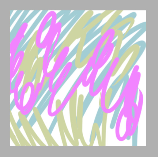

If you vary the colors, it also gives a nice ambient lighting feel. So now comes the base colors, this when I make my gesture sketch. A gesture is important because it is the blueprint for the whole drawing! Gestures are not just for people, but can also include any objects in a picture! I pick a color that stands out from the background without being too high in contrast and lay down a solid gesture with a big blendy type brush so it has a softer edge. This helps it look like it really belongs here. I’m also thinking about how I want the composition to look, and usually I do this all in one go, never lifting my stylus, so I better be committed to it because if I hit the undo button it’s all gone. I’ll be drawing my oc Kouto Loryck, who is in fact an art model.
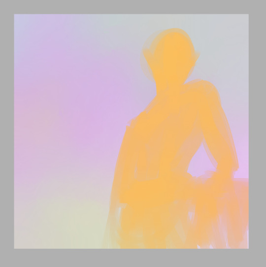
it’s important to be committed to every stroke, be bold and confident with your art. Even if it doesn’t turn out the way you want, you should at least be able to say that you were committed to it. Don’t worry about mistakes, thinking too much will only keep you stuck on one little part when you could be working on the whole thing. I had another drawing here about composition but I accidentally saved over it so I had to move that explanation to a different step haha
Next I lay out the highlights to pull out the details of the subject. I used the same brush for most of this drawing, just changing the size to accommodate what I was using it for. Since the base color is orange, I used a really pale icy blue to highlight, and the blending quality of the brush I used kept it toned down properly so it didn’t look psychedelic. There is nothing wrong with psychedelic coloring, I think it’s really fun, but it’s not the look I wanted this time.
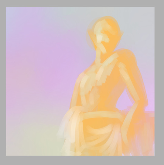
Now let me talk about the composition a bit. The most common composition tool is triangles. Triangles make for really pleasing compositions. And composition is all about balancing the positive and negative space in your picture, as well as creating a pathway for the viewer’s eye to follow. b

I kept this one super simple. Two main triangles in opposing directions, the eye is drawn to the head of the subject and follows the body down to the bottom of the page. Plain, simple, aesthetically pleasing. Keeping a small negative space on the other side of the subject and making a small negative space within the subject also adds a little extra variety to it. One surefire way to make an interesting composition is to place the subject off-center, because it varies the weight of the picture and makes it feel more dynamic, even if it’s a really boring pose like this one; he’s just leaning against some vague object behind him. But I’ve got him off-center and at an angle to the viewer, so it adds interest to the composition.
Once I’ve got highlights done, I go in and add shadows, and then I blend things smooth.
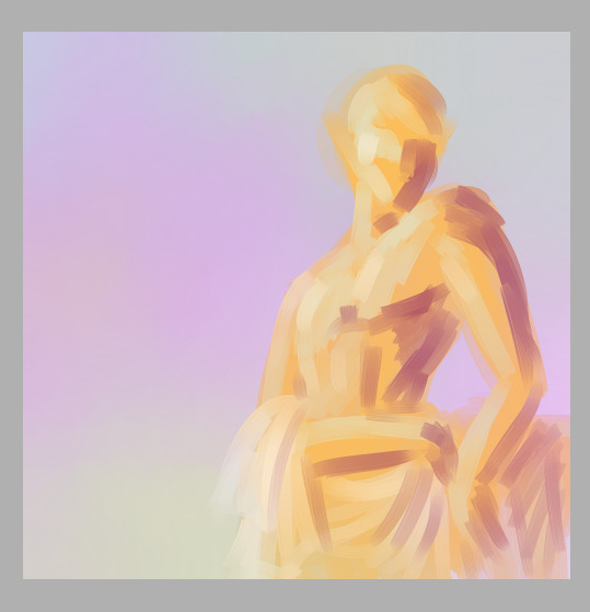
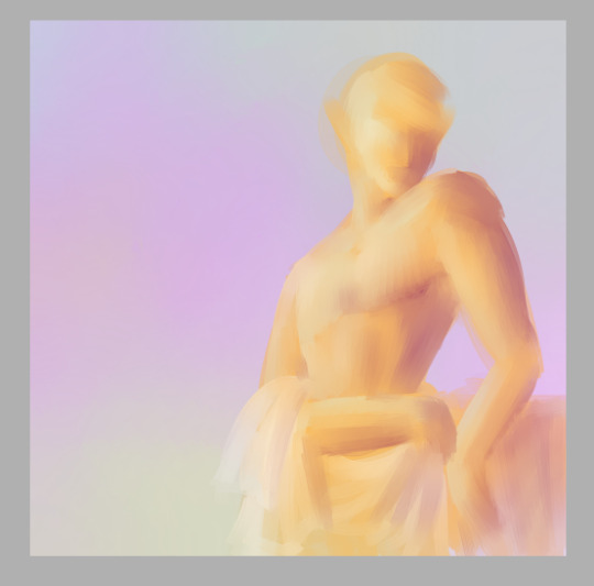
It’s important to use just a few colors to keep things simple. They should be colors that compliment each other in some way. Unless you want the color contrast to look discordant, of course. But even when you’re intentionally using colors that don’t blend nice, make sure you have some neutrals to balance with.
Now it’s really easy for me to decide exactly what I want to do with this, so I lay out a line layer on top to plan my next steps.
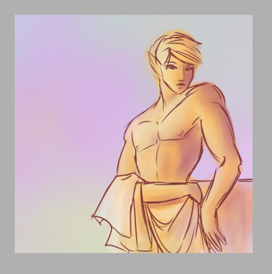
This helps me figure out if there’s anything that needs to be adjusted, see if I’ve got my proportions how I want them, etc. I can then use this as a reference later to keep everything in line with my plan. Now I can go in with a smaller brush and add in any extra colors to help separate the different parts of the drawing.
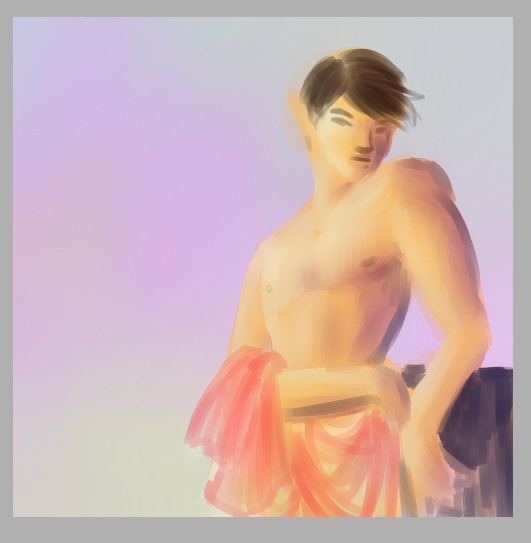
And I add in extra shading to bring out the details here
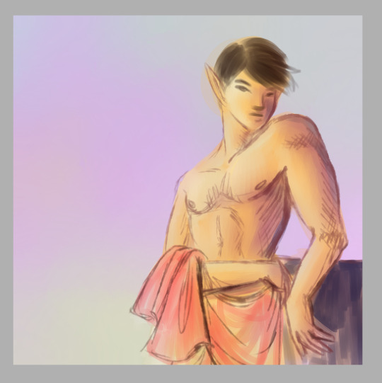
Blend, redraw, add color as necessary until it looks good.
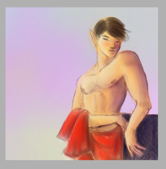
And at this point I can call it a finished drawing if I want. Or I can keep lining and shading and detailing until I think it’s really done.
I’ll just zoom in on the face area now to discuss detailing. I have some specific brush settings I like to use for details like hair. And with the hair I draw layers of a dark shade, the color of course depends on the hair. Draw the hair in layers, first laying down a solid color a college art teacher of mine called “the hair helmet” and then go on top of that with a thin, non-blendy brush to give it the look of lots of individual strands. A brush that already has the look of multiple strands is best because you don’t have to do as many strokes.
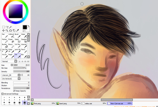
and then I go back over it with my softer brush in the main hair color, do a few more strand layers on top of that, and this time add highlights in a few places, then blend all of that very gently so it still looks like hair.
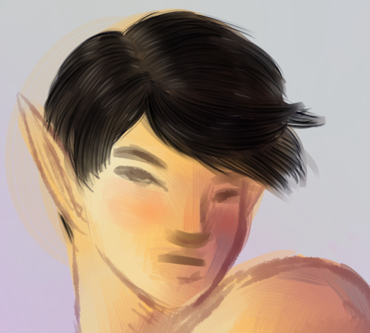
Next is the eyes! I use a pencil type brush to bring out the lash lines and eyebrows. For the eyes themselves I layer in pale yellows, pinks, and white highlights, leaving a little of the skintone near the upper part of the eye to blend into a shadow.
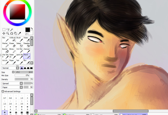
Time to color in the eyes! I start with a dark circle in each eye, depending on the eye color. the iris is a funky little shallow bowl in the eye, curving inwards so actually the light hits it on the opposite side from what you might expect. But the shiny white highlight is on the same side as the rest of the lighting because over the iris is a clear dome that curves outward, giving the eye two layers to highlight on different sides.The upper part of the iris is also usually in shadow because of the eyelashes
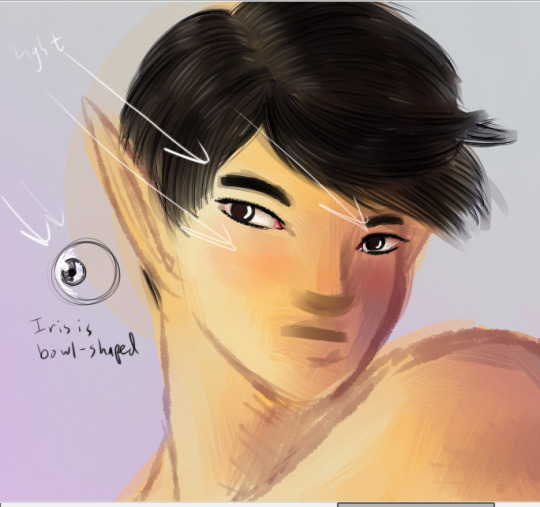
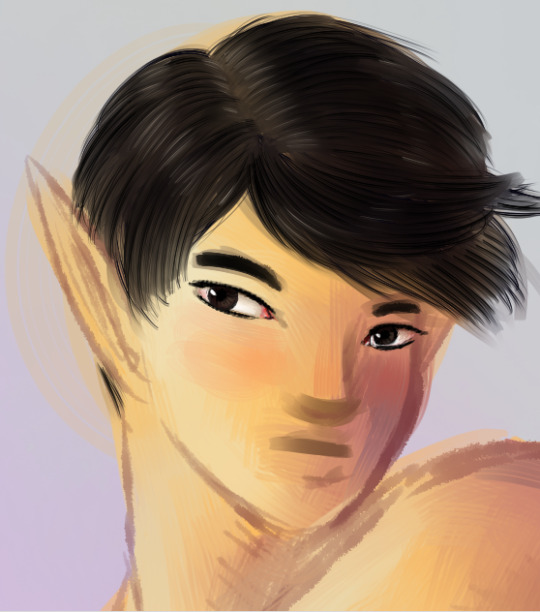
Draw in the pupils, add a few dark lines radiating out from it to give the eyes that realistic texture, and then toss on that nice bright highlight.
Next, I detail the rest of the face with extra highlights and shadows. Here I’ve mapped out where the main lights and shadows would fall.

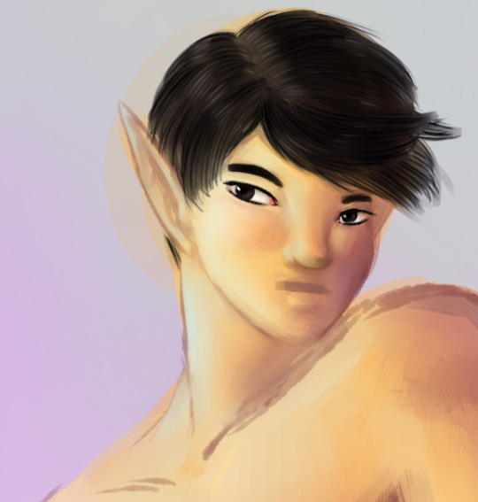
And finally I add in extra outlines on the nose, mouth, and ears, as well as the darkest side of the face and anywhere else that might need it
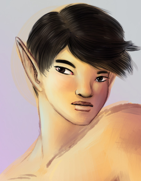
I ended up adjusting his lips quite a bit to make them the right width and shape. The upper lip is always darker than the lower lip because of the way light falls on faces. Except perhaps in cases where all the light is coming from below.
But anyway, that is my basic digital painting tutorial! Hope you found it useful!
7 notes
·
View notes
Text
EVOLVE 93 Live Review.
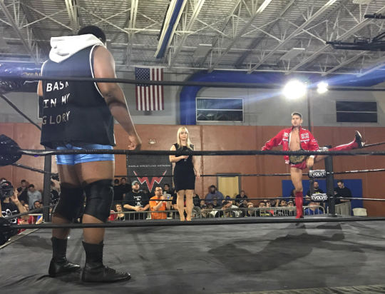
MATCH RATINGS: -Cedric/Yehi 3.5 -Yehi/??? NR -Henry/Kincaid 3.75 -Drake/Theory 2.75 -Freelance 4-way 3 -DJZ/Darby 3.75 -TrollBoyz/Workhorsemen 2.25 -ZSJ/Lee 4+ -Riddle/Tracy 4.25 -The venue was great. Plentiful free parking, air conditioning (on a 90+ degree day), plenty of concessions (including good, cheap pizza), alcohol, clean and spacious bathrooms. Zero complaints about that building. A comfortable fan experience if I've ever had one.
-Zack Sabre Jr. is the most naturally over babyface the Evolve roster has. The ovation he received from the Summit crowd was loud and sustained, different from the reactions received by Keith Lee and Riddle. It's not easy to describe, but ZSJ got everybody on their feet the most of anybody, while guys like Lee and Riddle received louder chants from the audience. Then again, "Ooh, Zack Sabre, Jr." is always a hit among the live crowd.
-DJZ and Darby Allin had one of the most fun, succinct matches I have seen in a hot minute. Both are criminally underrated and linger in that "we'll do anything to put on a good match" territory -- including Darby diving from the corner post to a seated DJZ on the floor. Nuts! These two need more bookings elsewhere. I'd love to see Darby in AAW -- maybe a rematch of this one?
-Matthew Riddle is the best wrestler in the world when it comes to fan interaction. He is second to none in this regard. I could write a fucking novel about the ways he has gone above and beyond for me, including naming his finishing move after me. Yes, he has a move called "The Derek," and he uses it to close matches. Exclusively. Nobody has kicked out of it yet. (That I have a finish named after me, that I gave to a wrestler who is my favorite, that is protected to this degree -- that Matt even points at the move's rightful owner before he hits it... come on. What the fuck is even going on?)
-I felt the Freelance showcase was a little rushed, like the guys were trying hard to impress, which led to a little sloppiness. Matt Knicks slipped off the top rope and nearly ended himself right in front of me. I didn't need to see that. Beyond that, this was a fun match that got the crowd going. Lots of "Free-lance Wrest-ling" chants. I saw people buying Stevie Fierce shirts and Freelance merch, and honestly, isn't that what it's all about?
-I laughed at the antics of the #TrollBoyz, but they looked extremely... how do I say this? Checked out? They're clearly unhappy in Evolve, and they wear it on their faces. Maybe run the next Evolve show in the Knights of Columbus in Hamilton, ON and these guys will perk up a bit, I don't know. Beyond the Yehi squash, the tag title match was my least favorite of the evening.
-Seeing Cedric Alexander was a treat, but something about his appearance felt a little off. Maybe it was because it was for the live audience only, maybe it was because it opened the show. The match was one of the best of the night, but people were still filing into the building and a number of them missed this match. I think offering an exclusive match at the start of the show, when you open doors only a half-hour early, is a bit silly. Open doors at 7, do the show at 8. What's difficult about that? Gives people more time to give you their money.
-Fred Yehi is a treasure. An over-the-top nice person and a heck of a wrestler to boot. Big personality. Fred needs more bookings.
-Anthony Henry is a bona fide star in the making, and the match he got out of Jason Kincaid was wonderful. I phrase it like that because Kincaid's style of offense is so much lighter and he can't take that huge beating you like to see out of a guy. But he meshed extremely well with Henry here, and this match really helped shape the beginning of the show for me. I think I liked this more than Cedric/Fred.
-If I never have to see Jarek 1:20 ever again, that will be too soon. I got up to take a leak and talk to Shigehiro Irie during his segment.
-I was not impressed by James Drake and his high-waisted trunks. Austin Theory is jacked beyond belief at like, 19 years old, and I'm afraid to see what he's going to look like when he's my age (for numerous reasons). I just wasn't a fan of this match. Priscilla Kelly is always nice to have around, but she didn't add much to this one. Not a bad match, don't get me wrong, but it didn't burn down the house.
-It was fancy seeing Dominic Garrini in Evolve as Stokely Hathaway's enforcer. I think if they play up that angle -- that he is Stokely's protection from guys like Riddle -- that would be for the best. Dom more than looks the part, and he kills it in the ring, so this was a good call. Love me some Dom.
-ZSJ and Keith Lee was some hot soup, though! I went four stars-plus on that, because I'm a sap who does star ratings, quarter-star ratings and all that other stupid Meltzer-like stuff. Lee dominated throughout the 18 minutes, flattening Zack with chops and elbow strikes, with Zack selling like a bastard. The finish was a bit rushed, and I honestly wanted to see Zack win by blunt force as opposed to a lucky flash pin, but I'm also an idiot. (Yes, Derek, ZSJ winning via five straight penalty kicks is great business!) Good pacing, much different from the match that followed.
-Apparently to the viewer at home, Keith Lee's consistent attention he gave the guys seated right behind me played into the match, and led to Lee getting pinned at the end. From a live viewership perspective, this flowed completely organically. I thought Keith was legitimately upset with these legitimate jerks behind me, so he kept staring over at my side of the arena. But he kept doing it. It was weird, a bit, just how distracted by these guys he was, at one point jawing at them that what he was about to do to Zack was because of them. Brilliant move that it tied into the rest of the match, but again, from my perspective seated in the front row, I thought it was just crowd interaction.
-My match of the night was Bro vs. Sauce in anything goes. There were restrictions they had to work around here, due to the building -- for example, they couldn't use the crowd chairs the way they wanted, and they couldn't do anything with tables since they were plastic. They wanted to do more but what they delivered was nevertheless creative and inspired and left fans wanting more. There were some funky-looking spots in this one, don't get me wrong. A Bro-buster on the apron, a tombstone on an open folding chair, and a Van Daminator from Riddle to Tracy, but using Riddle's knee. A respectable blow off match. Now, leave it at that. Don't pull an Ego/Darby and keep it going.
-Chicago crowd was hot all night. The draw was great. I would say there were maybe 250 there? Maybe 300? I am bad with numbers, but I had joked about the potential for a bad draw going into this show, and Evolve well surpassed my wildest dreams. I give them credit. They delivered on their promises and I don't think anybody went home unhappy. A return date should be announced sometime in the next calendar year. I think the Detroit/Chicago loop is lucrative and will work well in Evolve's current show rotation.
-Finally, I just wanted to say I got zero beef with Gabe or anybody. I respect the booker man and I had a nice chat with him after the show last night. I was hesitant to approach him, because of the whole "Derek trolls people online sometimes with his criticisms" thing, but fuck it, we're just people. And Gabe is a nice enough guy to me, has always been decent to me. WWN and Evolve get a lot of trash, but personally speaking, I still dig them and they will have a customer in me going forward. (There is no Bullet Club-style finger gun to my head as I say this.)
Fun night. I'm still beaming. Check out a show if you can.
2 notes
·
View notes
Text
CSSSA Application Critiques
Bear with me, this might be long and I don’t want you to feel like your application was so bad that there are a million things wrong with it. There are a lot of things admissions considers and I want to help you be very prepared to reapply.
Part A: This piece lacks lighting and the perspective is off. darken or ad highlights to parts of your trees to give them dimension (think lighting cylinders, can be simplified but there has to be lighting) and to put the viewer’s focus on your characters. You would be better off not using a pen on something like this. The detail on your rock path is nice, but the lowest surface (area that is not rock) would be darker. More importantly, while you were creating your pattern you lost perspective. The whole road seems slanted up on the left. At night, you’re going to use darker colors for everything, unless you have street lights or lanterns or something that light the area in a specific way. Finally, your characters are quite stiff. Note how their. arms are very straight and their posture is right up. The half goat should be crouching just a little. I’m having trouble with the legs, they might look better if the road was flat but also consider how you would make it appear to be more in motion with a stronger bend in the planted foot or the other leg reaching forward just a little more. A big thing to consider throughout your application is that animation is strongest when you can convey movement and emotion in your still frames.
Part B: Did you provide an explanation? The image alone doesn’t, but doesn’t need to, suggest a specific thought or interest or memory. It seems like a self portrait. Lighting and perspective is much better on this one! The trees are very flat, you just need to darken them on the side further from the path, it’ll give it even better depth. You can get funky with proportions and stuff with cartoons obviously but watch that left hand, it almost looks like a right hand facing down (angled towards the camera). And the big one! Rick and Morty is a great show, and that might be your favorite shirt (idk if it’s real) but DO NOT PUT THAT IN YOUR APP. If your character is wearing a graphic tee, make your own graphic to put on your shirt (not even an interpretation of an existing character). Admissions sees a lack of creativity in this. But I think the most important part of this is that the assignment can be about you, but make it about a memory. I’m totally guessing and this might be off base, but it seems like your description included your interest in Rick and Morty, clothing, color, and fantasy. They don’t want to read a bio about you, it may come off as more self-interested than interested in art of whatever subject you were going for. They want to see you tell a story.
Part C: Your technical stuff is totally fine. Your realistic stuff would be better suited for a Visual Arts app, not that you shouldn’t include them. Do more figure drawings. Your figures are pretty good, they just want to see that you’re familiar with doing it and familiar with body proportions. Don’t leave out hands and feet! they can be hard, but practice and at least try. Leaving them out is common with beginners but an effort is better than nothing. Your figures are good though, keep doing them and they’ll be even better! Another side note, these look like they’re from an actual session but I’ve seen a lot of people submit small gestures and figures from websites and the images are pretty instantly recognizable. Not too sure what’s going on with the painting, but it’s good that you submitted one. Seeing students use different mediums is important because your try a lot of different things at CSSSA.
Part D: If you only submit 2 or 3 animations but they are very strong, they’ll enjoy it much more than a bunch of okay animations. You don’t need to know how to animate to get into CSSSA, they just want to see that you understand the process. A few fluid animations is enough.
Part E: This can be a big deciding factor. If you can show them you are committed to working your ass off for a month and you love animation (go beyond loving animated shows and movies), they might let you in even if you’re lacking technically because they know they will be able to teach you.
I hope that helps. I know I wrote a lot but if you think about these things you’ll be very successful next year. I didn’t get in my first time either and I remember how clear my mistakes were after going through it again. Applying alone is an incredibly helpful experience, you achieved a lot just be submitting this! Best of luck next year!
MY RESPONSE:
Thank you very much!! This is very helpful and I will keep it in mind for next year and all future applications. A lot of the things you pointed out I had noticed as well. Once again thank you so much for taking the time to write such a thoughtful critique. :)
2 notes
·
View notes
Note
Yes! The ways Fairy tail does anatomy wrong! Thank you :3 ( Sorry about that, I'm really nervous D: )
its ok!! im glad to be able to help out with this kind of stuff
this got pretty lengthy so its gonna be under cut! heres some links that may also help, i dont think i forgot anything super important?
i have a general art ref tag on my main , general arm references
how to draw breasts video (nsfwish of course) , foreshortening
figure drawing tips
hands for drawing (3d models of hands you can play around with (warning it greets u with a torso model that has a ding dong out))
how to connect legs to the torso (highly stylized,but good things to keep in mind)
while some things can vary from style to style, i bolded the basic rules of anatomy if you dont wanna stick to just realism. mashimas style is actually closer to realism than a cartoon, most exaggerated things arent style but anatomy problems. things of his that are stylized for example are the eyes. he actually has really got down how to make eyes bigger than usual and not have it look wrong/bad.
first and foremost, the most noticeable thing in many ft drawings is the boobs.
boobs are not perfect circles for one. an important thing to remember when drawing boobs is that gravity affects them. when standing upwards, boobs will be pulled downwards and a fold against the skin is noticeable. this of course changed depending on the pose of the character, such as if they are lying down they will lean more towards the sides.
the best thing to coach yourself on making sure the boobs arent too big is to make sure they are not bigger than the head.
while boobs do jiggle during many forms of exercise, having a female character not have good support for their breasts is very... unrealistic, as most ppl with boobs tend to get aches from this sort of thing. different support can do different things though. sports bras typically keep The JiggleTM to a low, while there are special bras for pushing up your breasts to make them look bigger & cleavage more noticeable.
other factors to take into account: boobs are attached to skin that go up to the arm pit, so if the arm is more upwards this can affect where the boob is as skin is tightening. boobs are soft, but not jelly.
boobs arent smack dab on the chest unless the before mentioned push up bras are in play. they hang about, but also dont go on the abdomen, they basically dont go over the rib cage.
also, nipples come in all different kinds of sizes & placements but are typically 2 head lengths down and the angle is outwards.
the torso
hips & waist are big issues in ft. hips typically shouldnt be bigger than shoulders unless part of character design/body type
waists shouldnt be too much smaller than ribcage. a good thing to remember is that your character is supposed to have organs in there. unless they are meant to be malnourished or have a very skinny body type, avoid it. looking up diagrams of muscles & organs around there helps me define how big this portion should be.
there are all kinds of body shapes, especially with feminine characters. typical ones are hour glass (small waist), diamond (large waist & hips, sometimes actually bigger than shoulders), rectangle (hips, shoulders, and waist are basically the same shape), triangle (small hips & waist, big shoulders, the common body type for guys), inverted triangle/pear (small shoulders & waist, big hips)... the list goes on and on, really.
even when you have abs, when you bend over your skin folds/rolls up. its natural!
male & female musculature isnt really much different from one another. what differs is the bones & fat placements.
since you have stuff in ur tummy, i wouldnt say it bulges out but its certainly not just a straight line. its more noticeable if theres tight clothes involved, the area is showing, or its a side view.
legs/thighs
thighs gaps are not as common as you think. thighs support much of our body and are meant to be big as theres lots of muscle & fat.
you cant really have big thighs & big thigh gaps like mashima makes it. sometimes it kinda looks like he gives them hip dyspepsia honestly. basically, you either have skinny thighs & a gap, or thick thighs & no gap. while some ppl may be uncomfy with this part, its also important that you know how to define the crotch, gap or not. this is much easier with vaginas than penises though and vaginas you can get away with just a V between the thighs.
the thickness of the thighs affect how big the ass will be (thicker thighs = bigger butt).
half of body is legs while the other half is torso & head.
knee placement varies & depends on body type, but is normally about in the middle of the leggo.
other notes
an easy way to make sure the size of your hands are right is to compare it to the characters face. when putting the beginning of the palm on the beginning of the face/chin, fingers end a bit above eyes or eyebrows. this is something that can vary as well, such as if you want a character to look creepy you typically give them longer fingers.
necks are meant to support the head. while drawing them smaller than usual is a common part of lots of peoples drawings, you want to at least make sure your character has a neck that wont easily snap. necks are about the size of your head, as if you feel up it it stops at your ear. there are only certain types of bodies this can go well with, pearl from SU being a good example because she overall has a very small body type.
theres a difference between flexible & wrong anatomy. someone may have a back that can easily bend certain ways, but there are limits. bones & muscles will limit you.
fairy tail has odd ear placements in which they tend to go above the eye even in face-forward views- avoid that. putting ears around the same place as the nose tends to do the trick, with ears ending around eye level.
if you want to intentionally give a character supper skinny arms like mashima does, this has to go with the body type, and it also affects how visible the collarbone is.
ft has a really weird habit of making reeaallly angled collarbones. collarbones start a bit below the neck (neck muscles coming down to them), and go to the shoulder. collarbone visibility depends on body type as mentioned before, and the pose of the character. you wont see the collarbone of a character with an arm reaching up. often times when the characters posed is relaxed, the collarbone will actually just look like a straight line.
not sure if this really counts as anatomy but mashima makes hair look like ribbons at times when they are 2 completely different textures & materials. hair goes all about, not just one solid direction.
the lower the eyes are, the younger the character looks. placement of eyes is actually really important when it comes to age.
when drawing a character with muscle, make sure you think of weight & depth! dont just give them lines where muscles should be, or you get.....Noodlebuster. muscles are heavy & defined.
arms typically stop at hips (when saying arms i am excluding hands). this can be a very hard thing to maintain when having your character do dynamic poses, so the foreshortening video linked above should help with that.
unless its part of your style, legs that look like straight lines are gonna look funky (when looking at a skeleton you see the bones are more curved)
mashima tends to make the back of the head wayy too big, and this really makes his neck problem evident.
i really wish i could make diagrams & drawings of my own to help get the point across better but its late, so if you want me too i can put that on my to-do list!
20 notes
·
View notes
Text
Post G: Initial Ideas.
My initial ideas for this film will consist of the following components:
Narrative:
The idea of this film revolves around slightly 'off' happenings. Things that aren't particularly outrageous or obscene but, aren't things that one would see on a daily basis such as: perhaps starting small fires randomly and dancing around them, as if a part of some cult, maybe accidentally presenting knife collections or even going exploring in places one would not want to explore, like abandoned buildings and such. The comedy will lie in the fact that the protagonist is, internally, oblivious to the way common western societies work. Whilst knowing what is considered right and wrong or common and uncommon for 'normal' people, the character tries to convince the viewer that they, too, are a completely normal person who likes to do normal things. That, is what will help the protagonist gain acceptance from society (which, the character seeks out but, even they don't know about it) which leads me onto the point of the fact that the protagonist, struggles with social skills and communication so, they communicate with their own mind and almost live in their own world which they are comfortable and happy within.
What will be displayed on the screen is what the protagonist doesn't want you to see which, will be the slightly 'off' things as discussed earlier. The protagonist will discuss their life in the film: what their occupation is and things they like to do in their spare time.The protagonist will discuss the things they have learnt is considered normal in society like perhaps: bird watching, fishing, sewing, cooking, maybe a casual walk on the beach and other safe, common activities of that sort. Whilst these things are being discussed, what will be projected on the screen will be very different at times and it will be made obvious that the protagonist clearly didn't want the viewer to see that part of them.
Themes:
In my textual analysis, I briefly discussed the theme of Man vs. Himself in the sense that the protagonist, for each film that I studied (Grand Budapest Hotel and The Family) was in a constant battle between good and bad within themselves. I plan to recreate this theme in my own film by making sure that it is clear that the protagonist is having this internal battle between wanting to be accepted by society and wanting to do the things that make them happy.
Representation:
Originally, I was planning on having my main character be a middle-aged or even old-aged man however, I thought it would be an interesting concept if switched the stereotype of a slightly quirky, strange character always being a middle-aged or old man, to a teenage girl. I thought it would be an interesting play on character stereotypes if my protagonist was the exact opposite of what one would expect this type of character to be therefore, in my film I will be representing a female teenager.
Messages and values:
Despite this film being a comedy, I believe that it will hold some strong messages which will revolve around the concept of not worrying about what others may think of you because, you can be your own friend.
The message of not spending your life worrying about others will also be something that I can communicate, hopefully, as if you spend your whole life worrying about X,Y and Z your never going to end up doing anything.
Style:
As my textual analysis was based on the macro concept of style, it is important that I accurately replicate the things I was planning to take inspiration from in my own film, this are the ideas that I have:
I would like to replicate the idea of realism in terms of mise en scene in my film so, everything in the shot will be quite realistic yet organised. In terms of cinematography, I plan to take inspiration from Wes Anderson’s trademark style of filming, primarily done through camera movement. This will include:
whip pans – one of the most distinctive camera moves known from Anderson films. Commonly used to change the view form one character to another however, as mentioned, I will only have one character in my film so I plan to use this technique to almost find the character as, at some point they will be lost.
extreme zooms will be used in order to bring the audience right into action, even if what is happening isn't particularly eventful.
Sideway dollies – oftentimes the character on screen is followed by the camera sideways.
tilts coupled with wide angle lens it creates an extreme change in perspective.
All of these different camera movement techniques, I plan to recreate somehow, in my own film.
I would also like to recreate the colour scheme that I discussed in my textual analysis, which will consist of:

yellow and blue contrasts, which will be used in order to communicate the, again, internal conflict that the protagonist is having within.
Yellow which will represent wisdom, knowledge and happiness, almost contradictory to the characters young age.
Green the character is going to be wearing a green coat which will represent self awareness and youth.
White will be used to represent the characters purity.
Black The character is going to be wearing a black turtle neck, representing what would be the old soul inside her (it is a stereotype that the older someone gets the less resistant to cold weather they get) but also representing sophistication within the character.
These colours were all used in both of the films I had studied and represented very similar things.
*note* whilst watching The grand Budapest Hotel, I noticed an aspect ratio change.


I may try and play with the idea of this but it is unlikely.
Authorship:
In regards to authorship, Believe that I will draw more inspiration from Wes Anderson (Grand Budapest) rather than Luc Besson (The family) purely because I like the style of that film much more and I think it would be a lot more interesting visually to shoot it in that style rather than, the more common or universal style of Luc Besson. Despite this, I plan to still incorporate some lighting techniques that i have discussed in my textual analysis and colours from The family
Cinematography:
Both of the films are typically lit with high-key lighting more often than not. Which tends to create more of a realistic look as, typically, daylight is the most realistic light setting to the human eye. I plan to recreate this using day light and overhead lights typically found in a home to recreate the brightness of the lighting throughout both of the films that i had studied. In some scenes in both of the films, low-key lighting was used.


As mentioned in my textual analysis, I plan to recreate this lighting that will only reach half of the face and it will represent the internal conflict between good and bad within the protagonist.
Lastly, I should probably mention that I will try to recreate a Wes Anderson type of approach to filming. This could prove difficult as, the only equipment I will be using to help camera stability will be a tripod and slider. I will need to make sure to keep a very steady hand during filming as all camera movement in Anderson’s films is very smooth.
Mise en scene:
Costume: As mentioned, my character will be wearing blue baggy jeans that are slightly too big to represent, again the wisdom that the character possesses as they are wearing bottoms that someone much older would typically wear. A black turtle neck to symbolise maturity, despite the characters young age. and a green, long coat which will represent self awareness.
Location: There will be several different locations that I will be filming at which may include:
My home
The actors home
The streets of Hull
The sea side of Hull (also known as Foreshore)
Some abandoned remains of buildings
Colour design:
As previously mentioned, I will take colour inspiration from Wes Anderson’s films so, quite muted yet, bright colours.
Sound:
I plan to use a voice-over over the majority of the film, which will discuss the protagonist’s lifestyle but I plan to leave some synchronous, diegetic sounds that the character makes or says, in the film
Music: may include some funky and slow jazz, depending on what scene is playing. I thought that would really add to the Crime of this genre as in many crime movies that is commonly the choice of music.
Editing:
I plan to use some cross-cutting editing which will hopefully communicate that the character is slightly lost.
I will also enhance some tones and colours in the film to either be brighter or more subtle, depending on what that particular shot needs.
In my short film research, I briefly touched upon how in ‘Scene of the Crime’, in order to communicate the fact that the character had just appeared in that particular situation, two seperate scenes were filmed where there was nobody in the scene and then the character just appeared which was done through, then, filming the protagonist fall into the middle of the shot. Then, that was taken and stuck together into one shot.


I plan to incorporate this technique, in my own film.
Synopsis:
A protagonist, slightly strange in the head, attempts to convince the viewer that, they are a completely normal human being who, likes to do normal things.
What will actually be projected on the screen will be the things the protagonist does not want you to see. Which may involve the strange circumstances and actions discussed earlier.
I am yet to figure out a working title, but it will probably be the characters name.
Character profile:
The majority of the character profile, I have already discussed but, to put in briefly the protagonist will be slightly ‘off’ in the sense that they have social issues so they just live in their own world. This results in the character doing strange things but trying to convince the viewer that they are normal.
Notes:
Shots may include: sat on couch and looks directly into the camera
washing dishes/hovering,
reading a paper whilst on a toilet-
dancing around a fire
knife collection
As mentioned, I am working with the crime/comedy genre, but I don't plan for this film to be at all hard-hitting or to involve some common iconography such as blood or guns, but, instead, I plan for this to be a quite, light hearted film (since it can only last 2 minutes) which, will still include some common iconography and conventions such as, weapons and fire.
Suggestive drugs may also be used but, I am unsure about the idea.
0 notes