#feel free to crop as needed/ change bg
Explore tagged Tumblr posts
Text
i did a joseph redesign (scarred plus unscarred plus uncropped below read more)


#this was supposed to just be a Thing so someone could have a good design / image for joseph so they could use it#but i went overboard#and had fun with it#but to the Person who needed this (don’t know if u wanna be named) here you go#feel free to crop as needed/ change bg#anyway#so#the design#i assosicate purple with constantine bc i add a shit ton of purple on his EOD design…. for no reason….#but i assosicate red with maugris. so um. take that as you will#i like the jewelry — the main necklace piece is meant to resemble a collar and the rest are purely for aesthetic#it’s a very simple design#but that’s all really i just like the way his face looks#and i made him look more like an actual mage#the whole robe thing was supposed to be more purple but the colors got fucked up on my tablet#so it’s red#so fuck me and my symbolism ig#magisterium#the magisterium#master joseph#joseph walther
7 notes
·
View notes
Text
how i make scripts aesthetic on google docs (on pc) <33
Part One - Images
! Due to Tumblr's 30 image limit, I'll have to make this in parts. This one revolves around how I sort pictures to make them look aesthetic or just more organised in my script. + I'm not the best at organising tutorials sometimes but I'm trying to not make this confusing <//3
Ignore any typos and errors, thankyou. If you need me to re-explain anything, please feel free to ask. I feel like I haven't explained properly but, idk what else to do, lol :,)
Page isn't broken, to avoid messing up the way images are organised.




— ◦◦◦
What do I use?
Other than Google Docs (obviously), — Fontspace | A background remover [my mains: 1, 2] | Pinterest/WeHeartIt/Google search, and other sources for pretty pictures, pngs, etc. 🤍🌙

bundling images
Using the different text wrapping options, I found that it helped a lot more to "bundle" images together, so that things look prettier + more organised.
! example

This is pretty simple, honestly; Fontspace provides font text as pictures, transparent bg and not, — so organising the text from it will fall under the tut for this bit.

^ These are the text wrapping options. The first one is the default and limits text placement/movement, the other four allow you to move text where-ever on the document (especially if print view is off) but each do different things.
In order of settings, examples (press images to see properly):
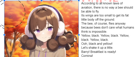


! tip : If you're bundling images that "overlap" too much, make sure to crop at least one (or however many needed) past its actual size so that it won't be a pain in the ass moving them later on.
- You may also use "behind text" for one of them, if it helps, so that it's easier to select the images, this also applies to using image over text (examples in each image).
what I mean:


Using these features, I'll—as per the aesthetic of my script—sort things accordingly. Get creative with the way you're doing this, and keep experimenting 'till you're able to make stuff look the way you want, lol.
"BuT DaRLIng wHaT Do I dO wItH ThIS iNFo??!?!?" bitch idk find an aesthetic 💀💀
like those 2016 fashion sticker books or smthn, idk- whatever u like-
Going into the aesthetics more ;; I usually pick diff aesthetics for each script and refuse to script until I find a pretty one LMFOAOAO- But I especially go for inspiration from (Korean?) bullet journal aesthetics which include lots of image bundling and customised tables.
Why korean ones specifically? Idk the difference, but using "Korean" as a keyword gets the stuff I'm looking for. 💀 But I also search for little pngs I want to add to my script; and if it's a false transparent png or has any background, I use my background removers to make it an actual transparent png.
And, sometimes, I like to search for colours then use my snip tool to screenshot them really thin, like those brown-beige borders you see in all my posts, then use them in my script like highlighter lines, like-

That's pretty much it, really.
! examples from two of my scripts


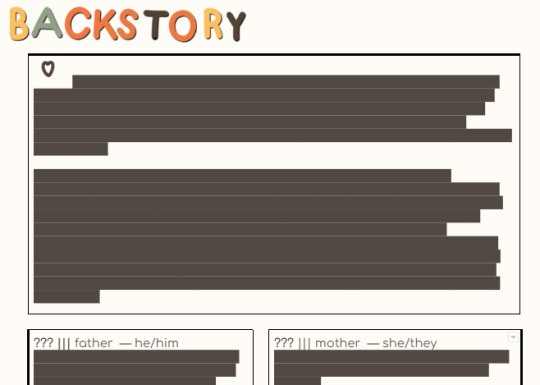
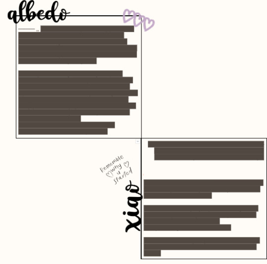
Fontspace fonts apply as well. One thing about Fontspace is that, you can change the colour of the text ;; as well as the background.
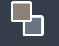
The brown colour is the text's colour, the blue one is the background's colour. You can of course choose to have no background, but it's there as an option.

I don't know of any features where you can save a colour but that's maybe me being dumb ;; but what I do is set a certain colour (i.e. blue) then use the colour adjustment in google docs to change it to black, red, or whatever over colours r in the script.
i.e.:


Anyways I'm p close to the image limit, so that's it for this post.
I hope this makes sense bc explaining this was harder than I thought. 💀💀 Once again I can clear anything up if needed

! tips
Keywords you can use for tiny decorations, are "clipart", "[aethetic name] clipart transparent png", "[aesthetic name] sticker png transparent", etc.
You can have a look at the aesthetics wiki for ideas for your script
Fotor is what I use to crop images into different shapes, and it is how I got the circle/heart shaped pictures in my documents ^-^*
...I'll add more when I remember them.
next up ··· customising tables ✿
#—DARLINQ'S DOMAIN🤍🌙#reality shifting#reality shifting script#shifting script#shifting realities#shiftblr#respawning#idk what else to put#im just using tags bc itll probably help ppl#i feel so shy posting bear w me 😔❗❗❗
116 notes
·
View notes
Photo
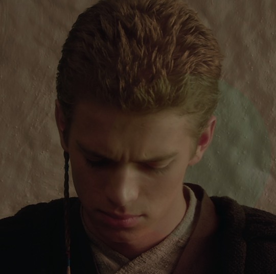
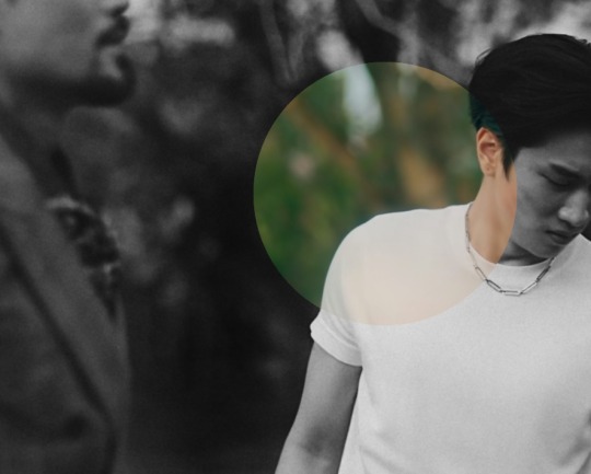

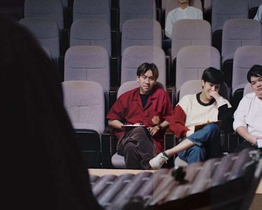
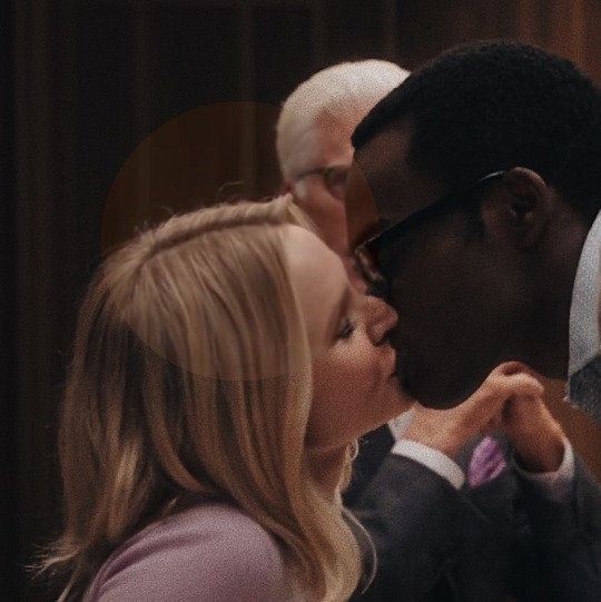
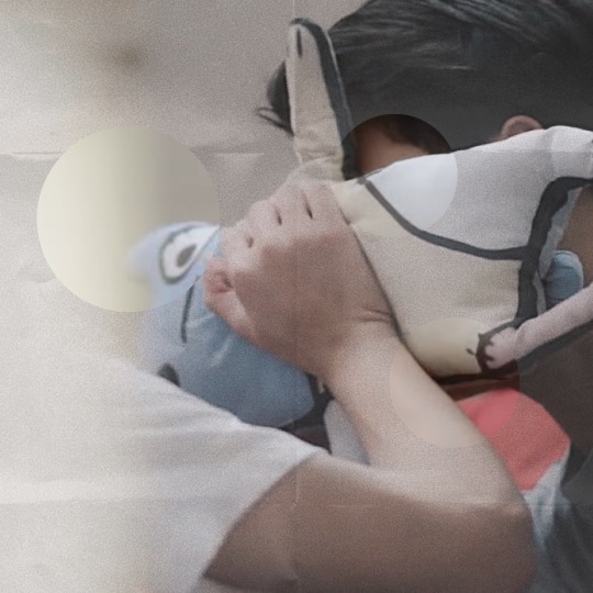
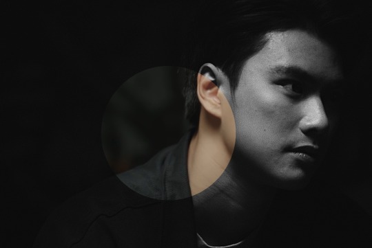
Show Your Coloring Before & After
was tagged by @rose-nebulijia + @laowen ♥ thank u babes
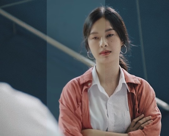
As previously mentioned, all edits are done on mobile apps. Here, I specifically wanted to focus on the raw export onto my computer before sizing/fonts are applied. SW and MARVEL caps typically have screencap galleries in 2160p, while most BL’s I cap myself are required to be 1080p or more. And the most important thing I look for, before editing, is a cap that already shows good lighting and composition. That way, the editing elevates the image.
I won’t go into detail for each edit, but I can touch on my common adjustments and then call out what additional work needed to be achieved for the final edit.
VSCO is my main app for coloring. In addition to having a better quality camera than the built-in one I have, the presets and adjustments achieve better results than other apps I used for IG. I gravitate towards exposure, white balance, vignette, and grain (rip grain 2020-2022, nothing happened but im still bitter its now a subscription feature).
At this point, I am very in tune with what I look for in my edits, so I know how to measure my adjustments and the number range for each (ex: grain ranged between 2.8 to 4.1 depending on the resolution). I now rely on Snapseed for Grain, which is under Grainy Film.
Snapseed is also my go-to app for my most recent editing style — the scratchy or film clip borders (Frames) and then the borders (Expand). If there’s a dusty film look or blurred text, they were overlays (Double Exposure). I’ve also used Perspective, Selective, and Lens Blur in past edits. And of course, text is available here but there’s a limited selection.
When I have made all the necessary adjustments, I specifically save as an Export (not Save or Save a Copy) with the final changes. I find that the Exported images from Snapseed (VSCO too) size down better than the Saved versions.
Size matters, in regards to these edits. Why? I manipulate the size down (commonly from ~1500px+ width to less than 900px), so that the grain is accentuated (and looks sharper). In the end, coloring does skew slightly underneath the grain, which gives off that photograph look moreso than the raw export. Feel free to click on the images to enlarge and see the differences close up. I didn’t mess with the sizing, so it should look slightly different than the post
Additional work for the selected edits are below the cut -
Random BB Screen Cap #12 (Frame 5) - very minimal adjustments, exposure and grain did most of the work
Anakin from Ep VI (Frame 1) - also very minimum, before the additional frame and border; white balance leans heavily on the red side of the spectrum (I think it was above 3.0) before adjusting the saturation down a smidge.
KinnPorsche/War of the Foxes (Frame 4) - I use the B5 preset for all b/w edits in VSCO; image was very mid in coloring, so I used Brush in Snapseed to “burn” the bg
Weeping Angels Set (Frame 12) - very little adjustments needed; white balance leaned more yellow for warmth, in order to work cohesively with the surrounding images;
BB/Jane Eyre (Frame 2) - again, very little need to be adjusted; the seat lean more pink, but I needed the set to match the purple in Frame 3; white balance leans more blue
The Good Place (Frame 3) - similar to all above statements with adjustments; the additional ’scratches’ come from Unfold, another app I use frequently for this affect and others; I believe this can be found under Journals(?); I export the template and then go back to Snapseed to crop out the excess
BB Top 3 Eps (Frame 2) - Unfold again, but this is under the Paper series; if I want variety in the “folds”, I would flip the image upside down
BB Film Noir #2 (Frame 1) - the only time I used contrast and exposure to its extremes; also heavily relies on using Double Exposure in Snapseed to add in the old film effects and blurred text
Feel free to reach out if you want to know some specifics or if you want to just learn how to apps work. Will also add this to the q&a section.
tagging @mrdumpling @actually-yikes @pranpats @taeminie @loversmore @liyazaki @dingyuxi (no pressure if you’ve already done it or whatnot, i just adore you guys okay)
#bad buddy#vishingwell#mjtag#usernuria#userkit#usertaeminie#usermor#samblr#badbuddyedit#tagged#not sure how this needs to be tagged lmao#vish i am very much like you and need to keep my space organized#i delete almost everything off my computer and phone when i am done with an edit#so too am surprised when i found the og images still on my phone#and i am very much like mj in that when use mobile for editing#gotta make due with the limitations of what's available on the apps#but i mainly add text and post on desktop#i didn't want to go into using Preview as my final step because it did nothing for Coloring so#thanks for tagging me !!
31 notes
·
View notes
Photo

not sure how to make an introduction for this tutorial. i might have gone too extra because it’s so long...but this is highly requested and i said i would do this as detailed as possible, so here we go!

adobe photoshop 2018 (ahoy, matey!)
topaz lens effects (just for grain)
srwe (sometimes, but not for this tutorial)
reshade (i dont use a specific preset)
drawing tablet (wacom intuos art)
macbook pro mid-2015 (but bootcamp)

//part one
grab a screenshot from your own lovely screenshot folder! mine is straight from my reshade screenie folder. then crop it how you like it! my original screenshot size is 2560 x 1600, and i almost always cut the background out. this is how i do it:
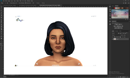
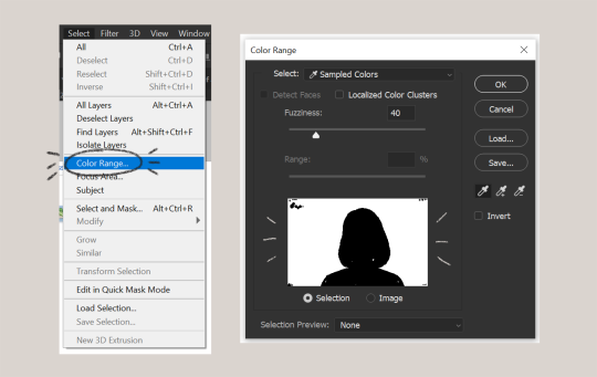
click color range, then click on the background of your sim. the little screen above will look like that. the background should be white. it’s easier when it’s a fully solid color. those are my settings above. click ok! the selected area will have those teeny tiny marching ants.
click quick selection tool, then select and mask...
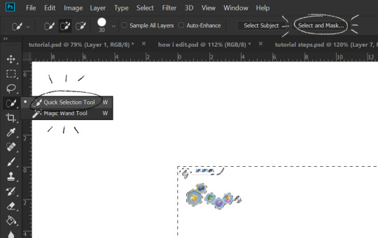
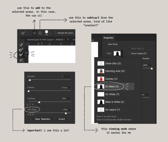
i drew over these circled areas using the “add brush” i showed above. use “on black” viewing mode, then make sure that the sim is completely filled black (it’s the unselected area). use shift edge so there wouldn’t be any of the original bg left over. my settings are shown above. then click ok if you’re all done. press delete and then ctrl + D to unselect. the marching ants should be gone. go ahead and crop it!
after cropping, i resize the width of the photo to 1280px! always!
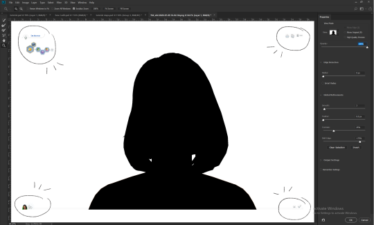
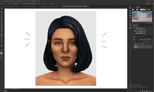
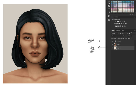
i create a new layer for my background, then add in the psd that i use for my edits. (i hide my psd layer while drawing)
sometimes i also use liquify to edit things like this:

//part two
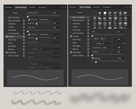
i use a soft round brush to do everything! it’s literally from adobe, but i changed a few things like the flow jitter in transfer.
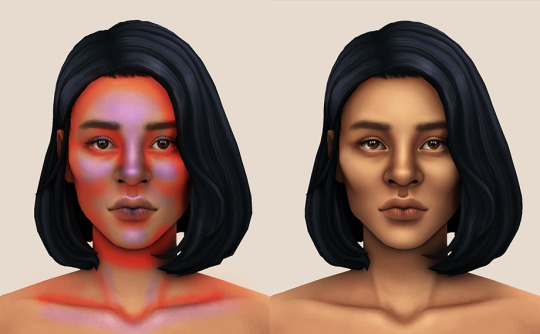
red areas are usually where i put the shadows, purple areas are usually where i put the highlights
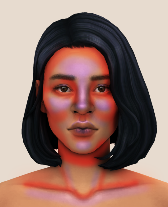
i usually do the shadows before anything else! it’s pretty simple. using the brush i showed above, i create a new layer.
use the eyedropper tool on her skin, then pick a slightly darker shade. change the blending mode of the layer to multiply, then draw the shadows.
right click on the layer, then select “create clipping mask” to make your life a little bit easier. an arrow will appear beside your layer.
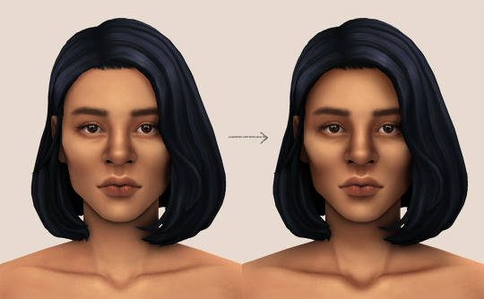
//part three
this is where i draw over the features. let’s look at her face. these are basically what i think it needs:
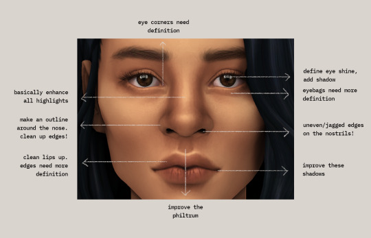
pay close attention to the imperfections and clean it up! that’s what makes it “sharper” in my opinion. small brushes will do the job! something like this:
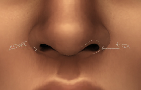
define the edges!!! define!! zoom in and take a look!! even though these are tiny little details, it makes a whole lot of difference! the eyedropper tool is your best friend!
i start with a big brush and then i use smaller and smaller ones as i go, which creates the sharpness. go a little darker as well! im not very skillful with my graphic tablet, so i add stuff bit by bit since it tends to become too harsh when i just go for it! im not as talented as some of u here ;-; i just wing it and pray it doesnt look too bad. half of the time im just experimenting since i literally do not know where some shading goes
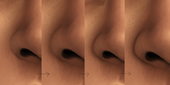
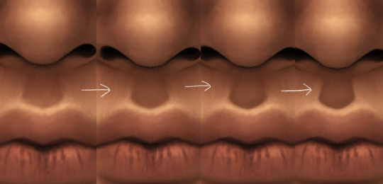
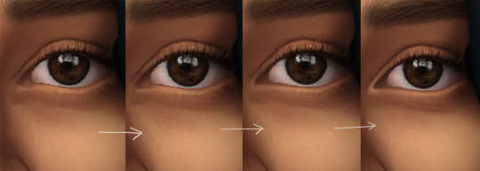
i wont be showing every single thing, but basically that’s the idea! i’ll add in the stuff i pointed out above and more shadows. sometimes i might turn down the opacity of some layers if they look a bit too much. here’s what we got so far:
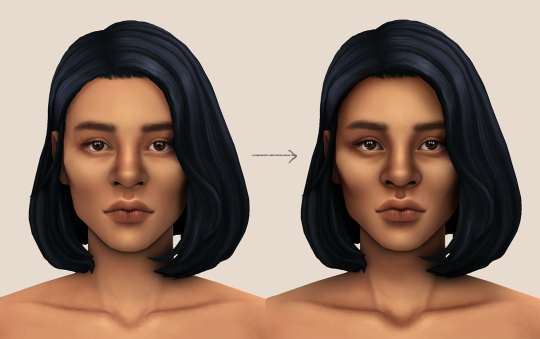
i also like adding some face pores using this amazing “skin texture 1″ brush from this brush pack!
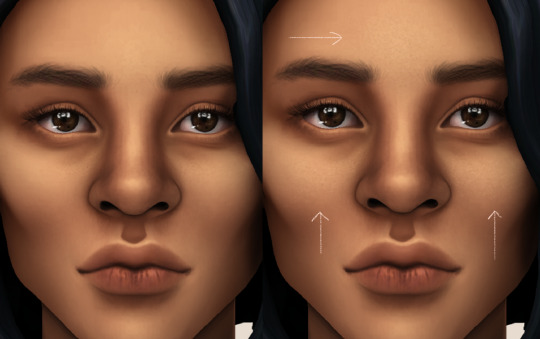
//part four
for the highlight layer, i change the blending mode to either overlay or soft light. use a slightly bigger brush for the bigger areas. use the eyedropper tool on her skin, and instead, pick a lighter shade.
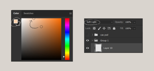
let’s start adding highlight to the purple areas i marked above!
try to enhance the highlight on tiny details too such as the eye corners! if you want something more dramatic, create a new layer and do an overlay layer this time! don’t be afraid to add some on the hair, eyes, lips etc.
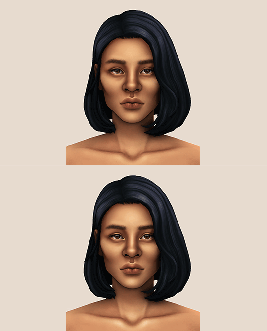
//part five
ok lets add some not decent looking hair strands. i almost always avoid this part because i literally have 0 idea on how to draw hair. i use the “hair base” brush from the same brush pack i linked to above and also have smoothing on to about 35%! the eyedropper tool is still your best friend! just follow the flow of the hair and i guess you’ll be fine ???
i’ll also fill in the annoying gaps beside her neck
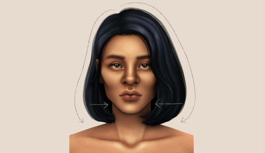
unhide your psd layer and wooowweee
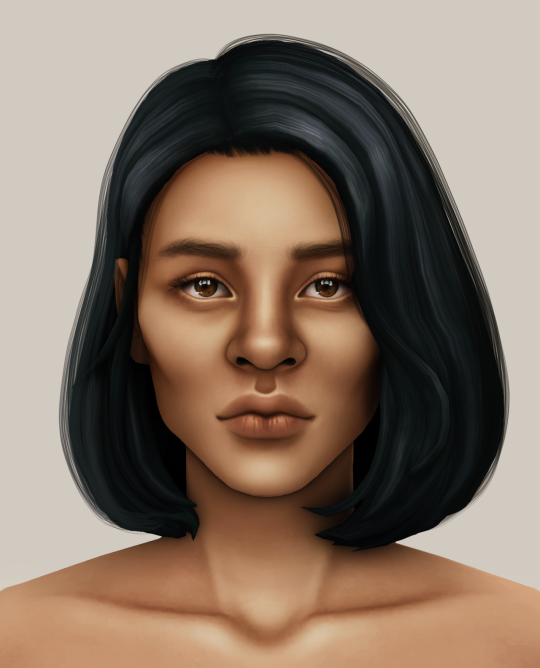
//part six
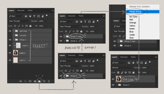
select all the layers, then click create a new group!
select the new group, then hit ctrl + J or right-click the new group, then click duplicate group
right-click the duplicated group, then click merge group!
i do this so i have a backup of the collapsed layers and can make changes anytime.
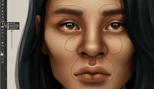
i use the sharpen brush on small details i circled below. i used to do stylize > oil paint or topaz clean before, but since the personal action that i use blur things a lot, i try to keep small details visible and sharp.
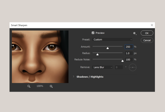
next is smart sharpen, my settings are below. sometimes i go for a smaller radius, but it looks like this most of the time.
my personal action set consists of this:
duplicate the layer that you just used smart sharpen on, then click lens blur!
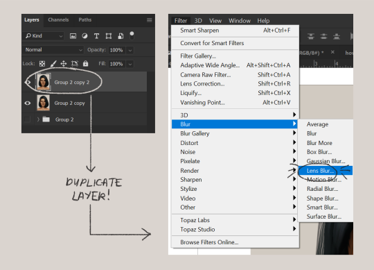
below are my lens blur settings
turn the opacity of the layer (that you just put the lens blur on) to 40%
select both layers, right-click then merge layers!
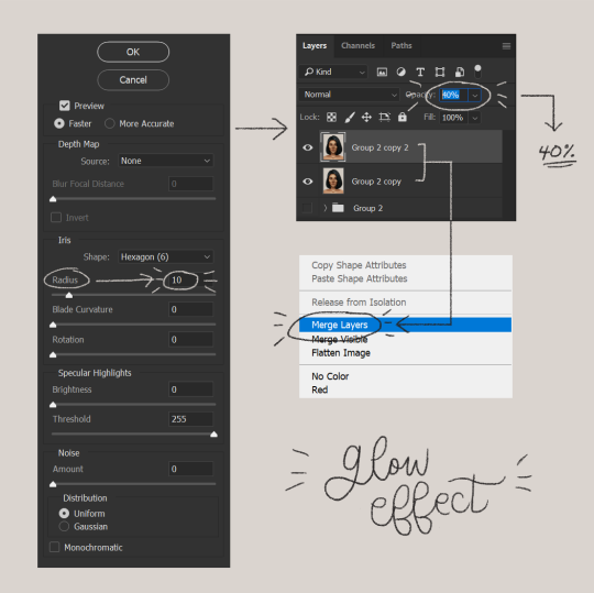
duplicate the layer again (yes, again) then right-click, choose blending options.
uncheck the R located on the “channels” under “advance blending” then click ok.
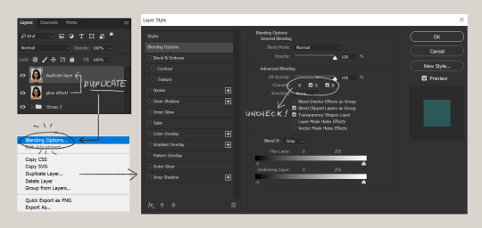
an icon will appear on that layer!
make sure you have that layer selected, then click the Move tool
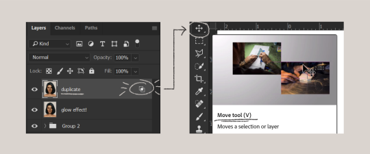
then hit your arrow left/right key once or twice! i do it once because i only want a subtle 3d effect! go ahead and merge those layers!
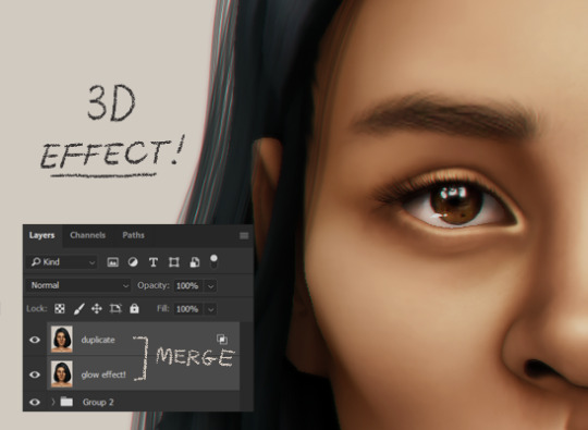
last step is the grain effect. i use topaz labs > topaz lens effects. if you don’t have this, you can also use filter > noise > add noise that photoshop has.
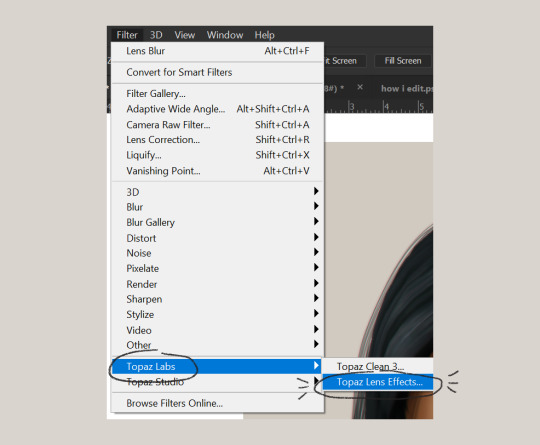
these are my settings:
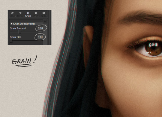
//final look!
here’s a before and after gif! (here’s the finished edit) i hope everything’s clear! i’m really bad at explaining things (っ˘̩╭╮˘̩)っ
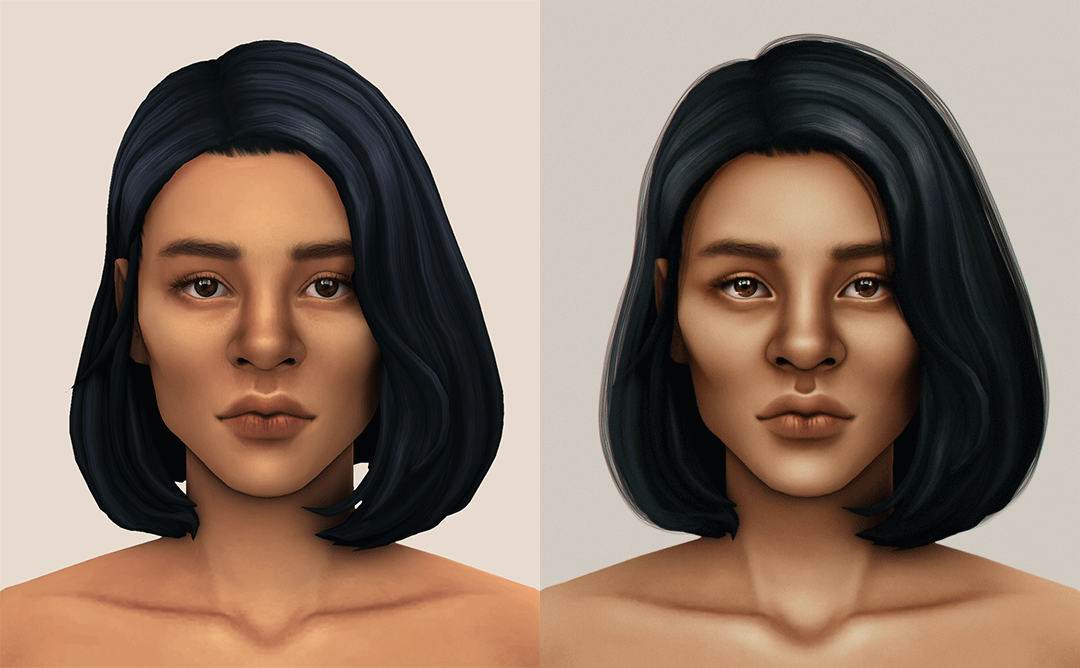
feel free to tag me when you use this tutorial for an edit!! i would like to see it! i hope this helps! ♡\( ̄▽ ̄)/♡
2K notes
·
View notes
Note
pls talk about your thoughts about chanhee and also the other concepts!! I always have such a hard time interpreting music and videos but i love to read about it
“bestie pls share ur thoughts on make your own concepts specifically chanhee’s but any others that are ur fave too 🎤- mar”
omg mar thank you for enabling me all day today 😭🥺🧡 thenks bestie ily :,)) and thank you too anon ! i should preface that T-T i have not read any other theories or analyses so these are just my opinions / impressions but i hope it’s entertaining to read about haha :p ! (feel free @ anyone to add on or share your thoughts too ! :,))
HYUNJAE - okay so audio cues... if you listen to the beginning there’s a sound of a bomb going off before the music starts ? and that ties into the dystopian / cyborg aesthetics that jump out at me of course, but what i immediately thought of was their no air perfo ? like we know hyunjae in the no air mv got that shot where he’s laying in the bathtub filled with water but also their kingdom performance with it also had those underwater shots ! so i think it ties into that... i feel like we saw in gen z, he’s a very straightforward person he says things on his mind which can come off as blunt but he thinks it’s better than not saying it ? which is interesting bc i think that speaks to his self- determined personality, he’s much more inclined to do whatever it takes to get something done, which i think falls perfectly in line with the “make your own air” phrase that he gets, if it’s something he needs he makes it himself, in a situational sense methinks u.u
JUYEON - JUYEON’S DJSKHDG i’m waiting for dri’s essay but in essence we see the gen z “juyeon is not such a good boy” shot and these text bubbles that pop up that say “sexy” “you so hot” “such a bad boy” and tbh i like this ‘concept’ ? for him better than his gen z one ? it’s not bc of the concept itself but i like the idea that he can “make your own character” as in he has the capability and power to be whoever he wants to ! you see him throwing white paint at the gen z canvas and i think ?! that’s symbolic of like a fresh canvas ! of remaking himself to whatever he wants bc the canvas is now blank again thanks to the white paint and flowers usually indicate spring ? so renewal and stuff like that ! i really like his, it’s also fun word play on “character” which has been juyeon’s intro in tbz (bc his name sounds like main character in korean) but yea :o ! i really love his the idea he can just repaint / paint over a literal image of him gives it the possibility of becoming smth new and that’s so so cool
CHANGMIN - SCREEEEECH okie um oh boy um *windows shutting down noises* this was so so so very different from his gen z stuff but i actually think BOTH are equally perfect for him ? the way that he set up the sparklers and neon lights on this very obviously trashy and kind of rundown rooftop with the cityline behind him is so ?!?!? LITERALLY making his own stage as his tagline goes, sort of like how the physical stage itself does not matter but rather it’s changmin himself that makes the stage special ! i talked about this in gabi’s set that i rbed ;-;/ but changmin puts a lot A LOT of stake in his position as a dancer it means almost everything to him as a form of expression from what i can see ? so he’s always trying his best to put forward the best performance possible and seeing this segment makes me feel like he’s doing just that ! pouring himself into it to make his stage pls i care him
HAKNYEON - god i’m a jusadan but just u.u rest in peace me, i’ll ... T_T be kind of honest this one confuses me a little ? i have assumptions and i feel like i know ... quite a bit about haknyeon (LMAO) my best guess is it has smth to do with self assurance ...? the way he’s framed and the fact that he’s sitting on a bed in the middle of a church surrounded by candles gives me christ figure symbolism (where my ap english takers at :/) and the light that perfectly frames him in a halo gives me angel vibes too, but the tagline of “make your own romance” paired with him kissing his reflection makes me think it’s about self love ;;;; from what i can tell haknyeon has always been someone who really likes feeling validated and praised for the stuff he does well, which he does for himself a lot of the times too ! but sometimes i think the self assurances he compliments himself with is more for reassuring himself rather than bragging (which i think people misinterpret) so it’s more about becoming the person he wants to fully love and being happie with himself which *tears* i might be reading too much into who knows i just love him ok ... U.U
KEBINNN - i know !!! dri mentioned this in my gifset tags but ! kev on kpop daebak (? was it) or smth mentioned how he strives to keep a childlike wonderment for the world around him, which is a reason why i think he loves drawing and sound / music production, he talked in a fancafe post once about an artist who turned mediocre everyday objects into art and he said he really loves that sense of wonderment so peter pan who “never grows up” is actually perfect for his worldview ahhhh T^T also kev really likes disney lmao, the way he’s doing this outside in this “neverland” garden on a balcony which is a part of this very typical apartment backed by a typical city bg also i believe ties into this turning a mediocre everyday thing into smth wonderful through his sense of childlike wonderment and his tagline of “make your own fantasy” (i also care him a lot this concept >>>>>>) and keeps to his referencing movie plotlines like he did in gen z jddkfj
SUNWOO - i also mentioned this in my tags on sunu’s set but this gives me 100 degrees vibes which i still to this day think is one of the most “sunwoo” vibe things ever, it’s a lot of him having fun and doing his own thing, and mixes both more mature and youthful aspects together in a way that i’d only ever describe as sunwoo vibes LMAO like the roller skating around and all the soap bubbles ! cute and youthful ! the crop top and celine wasitband (don’t laugh at me we all noticed) more mature and a callback to his gen z look methinks U.u, think sunwoo has always been a more go-with-the-flow or do whatever he feels like doing sort of person and so “make your own vibe” fits well with him in that sense to me
SANGYEON - .... *silence* *more windows shutting down noises* *jess.exe has stopped working* OKAY i feel like ! sangyeon’s is also more self explanatory :p i love the juxtaposition of boxing AND the arcade type fighter games ?? like both require very different sets of skills i feel like one is more physical the other is more mental ? but both require adapting to changes whether in the game or the boxing ring which as leader sangyeon would know a lot about, esp being flexible and quick to respond to different situations, and the “make your own glory” i feel is maybe more on the nose, but tbz are this man’s pride and joy you can see it literally anywhere and for him, as leader, to have made it this far with tbz, winning rtk and building their popularity through their hard work and efforts really is building his own glory and i just HHHHHHHHHH
YES EYYSFDHSHF CHANHEE YES - i said it in the tags of my srb before deleting it so i’ll just repeat it here but CHOI CHANHEE !!!!! this detail i didn’t quite process first watch was the continuous flashing of lights in all his scenes, like ... from the shots and the set it looks REALLY empty ?? but the flashing seems to indicate cameras and photos being taken of him despite there being no people we can really see in any of the shots ? WHICH IS SO COOL i think the implication is like “all eyes on him” type which SO TRU i love that idea, like i said the walking past the wedding dresses ? v heavily implies fashion designer which i think you mentioned mar :o ! and i see it in the sense of his tagline “make your own stereotype” bc white wedding dresses are the very traditional / typical choice and obviously feminine in stereotypes, whereas chanhee is wearing a SUIT which is all black in a very clean b/w set with no color which i feel is very stereotypically MASCULINE and the glasses too, it’s such an interesting contrast of his “stereotypically feminine” features (in my view) with very masculine symbols, like glasses we usually associate with more soft hearted / meek stereotypes ? but the geometric shape of the windows and again his suit seems to indicate the very opposite ? it’s a mixing of stereotypes which i think is the point, by putting those together he quite literally makes his own stereotype and puts on the crown while the cameras continue flashing while pointed at him AHHHHHHHHHHHHH
YOUNGHOON - okie might have less to say about this one :o i feel like both hak’s and younghoon’s i don’t see the connections quite as readily but ! i think it’s interesting that his tagline is “make your own classic” but then in the scenes itself he has a flip phone ??? with an antenna (okay boomer /j JDHFKFG JK PLS) and a teddy bear while in PERIOD stylized clothing and setting where those two things are more modern / contemporary in origin (but also not modern enough bc ,,, it’s a flip phone LOL) like 90s kid vibes ? you know but as an emperor in the joseon era haha :p while eating shrimp chips and reading a (comic ?) book, like idk too much of what it means but it’s a cool dichotomy LOL, think it might also tie into actor ! hoon bc it’s make your own classic and i think acting has become a very important aspect to him :o after seeing what he’s capable of in love revolution and his atbz video so it’s interesting u.u (need help w/ this one)
JACOB - think my explanation in han’s set’s tags didn’t really make sense so lemme ... reexplain LOL,,, so ! similar to his gen z video ? like he’s talked about how difficult it is to open up about his own feelings etc. and he said it’s less bc he realizes he needs to but rather just to make other people feel more comfortable when it comes to understanding him, and like the whole breaking the mirror with his reflection in the wanna be angry jacob, it’s about freeing himself to the point he can express the emotions he wants to ! in gen z it was about being able to be angry when he felt that way instead of being tied by his image of being just nice ? and in the video with his pilot uniform not only does he control the ride but he also rides on it himself ! quite literally making his own freedom (symbolically), a sort of realizing he can free himself ? from what’s been tying him down and i think the really big smile he has while riding it just comes to show how he wants to feel :,))) (jacob bae i care you)
ERIC - last one :p AHHH this is one of my favs too, the quite literal “make your own pride” I LOVE IT ! sooo i think the biggest takeaway i got was that of course in this video his “pride” is symbolized by the hot pink car (that he’s going to pick up his christmassy date in of course u.u if he has a license which he does n- his driver’s license in this was literally his aaa / boy version of reveal photo which in no dmv anywhere would a license picture be allowed to look that good-) and LITERALLY when he finished and takes it for a joy ride while sitting on the roof he’s STILL covered in the dirt and grime stains ! from working on it ! which i think is so symbolic ! it’s my favorite detail actually, he literally put sweat into this car which is his pride and now that he’s finally riding around in it, it feels accomplishing ! his pride ! love that, also when he’s grabbing a stub from that flyer i noticed he chose “youth” over the others (which was like .... ca$h, beauty, ice cream, hamburger...) which i think also just indicates that despite all this hard work he put in he still cherishes his youth and still lets that be a huge part of who he is (i mean pink car so of course) so idk i think it’s very neat go bestie mwah
#sunnew#anon#asks#not tbz#jess.replies#be your own king analysis#I WROTE SO MUCH PLS#even more than my gen z analysis i think#anyway if anyone reads all of this oof thank you#HHHEEELP#i just did all of them ....#my weakest ones are def hak sunwoo yh#idk but i like what i came up with for the others ! ^^#i've seen a few twt threads but haven't read any lol#wrote the most about chanhee but no one is surprised of course
8 notes
·
View notes
Text

hi! ill be showing how i (mod cherry blossom) make aesthetics! i know this isnt the most efficient way maybe, but as someone whos kinda dense and doesnt have photoshop this is how ive learned to do it quickly n get the job done! i also personally have trouble with directions via words so ive inccluded lots of pictures! if you have any questions feel free to ask! for this ill be using: photojoiner . net , pizap . com, google, and ms paint!
first ill open up photojoiner, and select the “8 photos” button

i scroll to the button until i find this base:

which looks like this:

im only going to be focusing on the first two columns right now (i also set the border size to 0)
to find what im looking for for pictures, i use google because i um..am not very creative. for this example ill be using cherry blossom cookie !
typically ill start by a color associated with the character, and in this case its pink. so ill start with a basic search like “tumblr pink aesthetic” . “tumblr __ aesthetic” is my go-to search.

itll give me lots of pictures, but not all of them are what i want. so ill try lots of different searches within that blank such as “tumblr cherry blossom aesthetic” i find 8 images id like to use, but sometimes they need to be edited! so ill bring it into pizap for an example on how to change the color of an image ill use this one as example: (make sure you save the picture!!)


when you go to the website choose these options on the homepage. clicking the first one leads to the second one
upload your photo and youll get this

youll want to pay attention to the sliders here on the side

since our image is pink, lets say i wanna make it blue.

slide the button over until its the shade you want, itll look like this:

you can also play around with the other sliders to make it less blurry (soften), or change the saturation and brightness, which i usually do if an image is low-quality. so lets say we have all our pictures, time to upload them! (ill be using my pictures from my adventurer cookie post)
on photojoiner itll show up here:

drag and drop the images in the boxes you want. click on it to get the option to flip it, zoom in, or delete it

dont fill the ones on the side. click the “save” button up top , it wont download, just change the page so you can copy or save it when you have the image copied to your clipboard open ol reliable ms paint and paste it

but before you start changing anything else open photojoiner again to get the right side of the picture choose this button, its up diagonally from the last one

drag the pictures wherever you want and ignore the middle and left side slots

then click save again to open the picture to copy then go back to ms paint. for this i changed the white in the bg to purple so i can see the excess photo fuzz and crop it out

i zoom in and use the select tool in square, and get the width of it then scroll down to the bottom of the fuzz and delete it. then you can select the picture and move it over to the rest of it

like this! crop the image so the extra space is gone and youre done! wow!

itll look like this! and thats it! i hope this helped , im not great at giving instructions. pizap is very very handy and i use it a lot to upgrade photo quality on almost all my posts. all the resources i used are free of course ! i hope you guys find it useful! -mod cherry blossom
44 notes
·
View notes
Text
Ts3 vs Ts4 Base Game Gameplay
Basic gameplay. This is a big, broad category consisting of things I’ve noticed in each game during gameplay. This is only base game. Next up is a comparison of each expansion, game, and stuff pack up to Jungle adventure- I’ll stop comparing ts3 packs to ts4 packs by date, to keep things fair. On to the review!
Ts3 Pros:
-Town exploration. Climb the mountains, fish the rivers, harvest all the plants. The awesome feeling of being able to walk off of your lot and have the whole world at your feet is awesome.
-Robust community. There are tons of things to do in town, and different traits effect gameplay.
- Families! Baby sims are teeny little larva shaped bundles of adorable, and feel like sims from the get go. This only gets better with ep’s. Toddlers were included at launch, and are adorable. Traits can be chosen from the start, and it’s so rewarding to watch your pixel little ones grow up.
-Baby bellies. It’s a little detail that I love- watching your sims’ belly gradually grow.
-sunrise and sunset. The gradual change of the lighting as the day moves on is really lovely. Seeing the dappled light from the trees, being able to point the camera up at the sky and watch the sun creep along...I’m a sucker for details. (This bit may be biased by a lighting mod, I do apologize, it’s hard to separate all the details sometimes. I’m pretty sure this is BG friendly though.)
-World design. Ts3 has a much more open feel, because..it is. I appreciate the world design greatly for this, because it’s not just set dressing. Every hill is a /place/ you can be. The rivers can be fished, and you can visit your passed loved ones in the cemetery. The place you work takes up physical space in the world. I really like that, and miss it in ts4.
-Small variation in coloration. I like seeing different hair colors and eye colors float around town. The rather infamous “cheese hair” is avoided.
-different trait combinations creating genuinely different sims. I love meeting that lucky klepto neighbor with a fondness for cats and a huge hoard of my newspapers in his foyer.
-Mixed race babies. It sounds strange, but the skin genetics in ts3 are so charming. I love to see two differently skinned parents with children that are a mix of the two. The skin ramps allow for a wide range that’s just cool to see.
-generational gardening. Growing a crop over several generations improves it, and a prizewinning garden takes real work.
-Bug catching! I’m a nature buff (can you tell?) and I love sending my sims out to see the world and study it.
Ts3 Cons:
-Lag. There can be a serious lag issue with the game if you don’t have a beefy pc. Mods are absolutely mandatory for a smooth running game if you have any expansions installed.
-Empty worlds. Sometimes that big beautiful open map can feel lonely.
Ts4 Pros:
-Multitasking. This is a really cool addition! I really enjoy having it in ts4, and it generally feels seamless.
-beautiful pixar like graphics. I absolutely adore ts4′s beautiful style. It’s a very peaceful, pretty game looks wise, and it’s very easy to feel charmed.
-Growing flowers. I always wanted to grow flowers in ts3, and never could. Needless to say I have flowers sprouting on every lot in ts4.
-Crowded venues. Sans mods, ts3′s venues could feel empty at times. In ts4, they’re usually packed, which is really nice. It’s easy to meet people, and have a good time right off the bat, no invites needed.
Ts4 Cons:
-Babies are objects. Literally. Objects. Ugly, poorly rendered objects. I really, really dislike them, and always age them up right away. It’s a total shame.
-Child and toddler sims don’t have traits. They are given a few stereotypical personality types to pursue, and I dislike the way it’s done.
-Cheese hair. That yellow color is just...damn bad. Mods are needed, in my opinion.
-Closed off feeling in the world. It bothers me that the towns are 90% set dressing. I don’t like looking around with my sim and thinking “I would love to go there, but it’s just an object off in the distance.” I totally understand (and appreciate) the attempt at optimization with the way the map loading is handled; I don’t mind short loading screens at all if the world runs well. But did the worlds have to be so tiny?
-Teeny maps. There’s like, 12 lots per map in ts4. It’s a far, far cry from ts3. It’s very, very creatively restrictive.
-Emotions system. Now, I’m not at all opposed to the emotions system in and of itself- I think it’s a great take on how sims function. However...It falls flat for me. I think they used the emotions system to handicap the traits in the game. And really...there’s very few. I don’t feel like the traits make a genuine difference in the game, because the emotional system is so powerful. And sims generally react the same way to the same situations, so it ends up feeling repetitive. I feel the Moodlet system in ts3 was more successful. It’s a shame that a major selling point of the base game adds up to so little.
I’m sure there’s a ton more, but these for me are what I notice most often. Feel free to chip in! I’d love to hear your thoughts.
7 notes
·
View notes
Note
hi!! i absolutely love your icons and was wondering if you'd be willing to explain how you made your icons with the border slightly rounded? have a nice day
hi friend !! the borders and legitimately everything in my icons are my own from scratch so it means a lot you like ‘em !!
okay okay so border style. we’re gonna go from this :

to this :

THINGS NEEDED :
photoshop ( i’m p sure any version will work ?? )
a psd
time and patience
here is your tiny tutorial with additional screencaps below the cut :
okay so for my example, i’m going to use erin here with a screencap from 1.16 of g.otham here we go. * takes a breath *
open your screencap in ps ( i’m using cs6 portable i believe. ):

secondly, you’ll want to unlock it from the bg if you need to in order to resize it. i usually resize mine from image > image size > 500x281 px to start off with.
next you’ll want to crop it from image > canvas size > and i chose… i think 70x70 PIXELS ( change the converter from centimeters or whatever to pixels ) for that specific style of icon whether you like them large, small, etc :

so here is where you want to really begin. group EVERYTHING together. if you’d like, go ahead and put your psd on it and all your snazzy stuff to make it jazzier. here i’ll be using my own psd:

you can group everything together by highlighting your psd / textures AND your icon. once you do, the shortcut is ctrl+g. it should look like this :

now you can put a layer mask on that group that will come in handy later. if you don’t know where it is, here’s a shot of it :

now it’ll look like this in the layers panel :

NOW WE GET TO MAKE THE BORDERS. head over to the shape tool found on the left side :

mine is already set in the rounded rectangle shape but if it’s not, click and select rounded rectangle. after you’ve got your shape into the rounded rectangle, click on the middle of your icon. a window should pop up. now we set our canvas to 70x70 px’s so we can’t go any larger than that but we can go smaller which is what we want for breathing room when you add the extra borders. i have my preferences set at 60x60 in the window that pops up here :

you want the slightly rounded corners so the exact number i used was 8 px’s but depending on if you want it less noticeable, decrease the number. increasing it makes it look more rectangle-ish.
click ok.
now adjust your now shaped rectangle to the middle if it already is not. ( you can do this by using the mouse tool ). :

you notice how it’s black ? that’s OKAY. we’re fixing to make the shape fit into the group with your icon / psd.
reselect your shape tool. before you do anything else, add a layer mask to it like you did for the group !! :

after you’ve done that, right click on the shape tool on your icon and click MAKE SELECTION. :

in the make selection box that pops up, just click OK. now there should be like moving lines around the shape — that’s good, that’s what you want. now you’ll have to select the inverse parts. all you do there is go to SELECT > INVERSE but make SURE your layer mask for the rectangle is selected in your layers panel or it will not work.

now just find the delete button on your keyboard and press it ( or go to cut ). you’ll notice a difference in your layer mask in your panel for the rectangle :

you can deselect if you need to by going back to SELECT > DESELECT. once you do that, it looks the same, right ? you’ll need to DRAG the rectangle’s layer mask to your group’s layer mask :

in the replace layer mask option, select yes. now you can delete the black rounded rectangle layer as it is no longer necessary. once you do that, you will see your icon into your shape you created !

you can readjust your icon if you need to but ! if you want the OTHER parts of the border, this part is a breeze.
go back to the SHAPE tool. use the EXACT same measurements you used to make the original shape. go ahead and make two like so :

for rectangle 1, we’re going to make this the white part of the border. select the layer in the panel while still remaining in the shape tool. you’ll see options above and this is where you’re gonna change it from black to a white border. we’re gonna mess with the fill, stroke and pt.

^^ here is how mine looks like. we’re gonna change the fill from black to transparent :

now switch over to stroke and do the opposite. change it from transparent to white with a 2 pt instead of 3 :

now you’ll want to select the OTHER rectangle in your layer and repeat the same steps but instead of making the white border, you’ll be making the grey ( for my grey, i chose 15% but you can choose whichever you like best akjdslk ) at 1 pt :

and that’s all there is to it for that style of border !! here is the final product in screencap view and actual icon :

icon :

if i need to make anything clearer or you’re having trouble in some area, feel free to visit my inbox either on anon or off, i truly do not mind ; whatever makes you comfortable and i’ll you help if i can !! xox
#Anonymous#icon tutorial#photoshop help#icon psd#i have no idea what else to tag this as#but feel free to reblog this friends !!#spread it 2 help your fellow rpc out !!#i had to learn by myself how to do the the borders and let me tell you i felt like a DUMMY when i figured it out#i didn't know if the anon knew how to do the rest or not so i just did a full tutorial.#i. one half of the hurricane twins. / ᵒᵘᵗ ᵒᶠ ᶜʰᵃʳᵃᶜᵗᵉʳˑ#i. xbox is better than playstation. not even sorry. / ᵃᶰˢʷᵉʳᵉᵈˑ#i. offline. / ᵠᵘᵉᵘᵉˑ
94 notes
·
View notes
Photo


@canuckerrant gave my commissions post a much-needed facelift! now with legible fonts and sleek backgrounds!
♥ The lineart style is still new to me; I might change some things up as I go. Consider it experimental. ♥ I can draw humanoid, animal, and furry characters, including canon characters, fancharacters, and general OCs! I’m comfortable working from visual or written reference. ♥ A “simple” $20 background has shallow depth, few objects, and/or minimal architecture. If you want something more complex, we can discuss it! Otherwise, I’ll go for simple gradients or shapes (feel free to specify a color even if you don’t want a full BG!) ♥ More is more! There’s no such thing as too much reference. If you want something more complex than a standard bust, talk to me about it! If you give me a little bit of symbolism to work with I’m happy to run with it- Even if you don’t know precisely what you want visually, if you come to me with a concept I can work it out with you. ✧Click me✧ for an example; ✧Click me✧ too! ♥ Very complex designs, armors, bouquets, etc may be subject to an additional charge! ♥ If you need your piece at a certain size for printing or otherwise, let me know before I start! Otherwise I crop to nonstandard sizes to suit the piece and save at resolutions best suited for digital viewing. ♥ Payment is processed via Paypal! ♥
characters belong to: x x x x
59 notes
·
View notes
Video
youtube
transparent render tutorial/process vid, v2: beginners’ edition! (written walkthrough under the cut)
yeah okay the last video was really only helpful if you already know the basics of making caps, so here’s another manga panel rendering tutorial for anyone who’s never made a cap in their life, complete with drop-down menus instead of keyboard shortcuts! I tried to be pretty explicit, keeping in mind what things I had to figure out myself when I was learning... still, steps are under the cut!
oh, and bonus: watch me do this at 1500% speed
final product:

Note: i’ve changed a few of my keyboard shortcuts, so yours might not be identical; as such, I tried to avoid them as much as possible!
first of all, useful GIMP navigation shortcuts:
ctrl+R = reset view
scroll wheel = scroll up/down
shift+scroll wheel = scroll left/right
ctrl+scroll wheel = zoom in/out
and tools we’re gonna use:
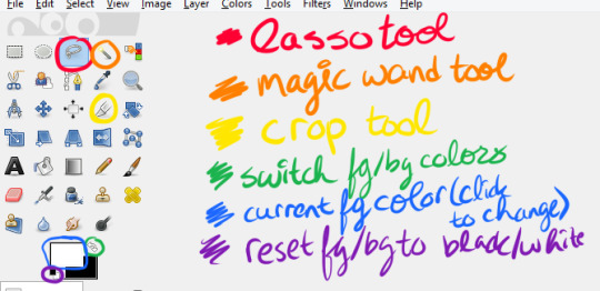
and finally, the how to:
1. open the page with your panel in GIMP or copy-paste it in, and save your project
2. use the crop tool (shift+C or yellow above) to select the area around what you want to render, then click on that area to crop it
3. click your foreground color (in blue above) and change it to any color you like
4. create a new layer (either by going to Layer>New Layer or Ctrl+Shift+L), and make sure “foreground color” is selected, then click OK
5. drag your new layer below the manga panel layer on the right, then select your manga panel layer again so that it’s highlighted in blue
6. click the little squares (indicated in purple above) to reset your fg/bg colors, then the arrows (in green above) to switch them so that white is your foreground color
7. Layer>Transparency>Color to Alpha, make sure it’s set to pure white (it should be by default) and hit OK
8. Layer>Mask>Add Layer Mask, make sure “White (full opacity)” is selected and click OK! This creates a “layer mask”, which basically lets you erase without permanently erasing
(you should probably save here)
9. Click the lasso tool (in red above) and start carefully clicking points to outline the spot you want to render. You don’t have to be as precise as I am (I’m really anal about it), but notice what spots i’m cutting out:
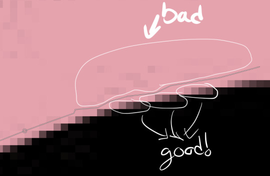
you also might need to cut out certain spots, but I’m a complete idiot and used keyboard shortcuts for this in the video so here’s how you do it:

I made a note of it in the video itself, too! Also, I don’t know if Feather Edges is on by default, but if it is, TURN IT OFF IMMEDIATELY. it’s the absolute worst just trust me
(you might wanna save again)
10. Select>Invert (Ctrl+I) and hit the DEL key, then Select>None (Ctrl+Shift+A)
11. Right click on your layer>Duplicate Layer, right click>Apply Layer mask, right click>duplicate layer (again), & hide the bottom version (the one that still has the layer mask) by clicking the eyeball- it’s just there to be a backup
12. select the top layer and then go to Layer>Transparency>Threshold Alpha, i usually set it to about 123-127 but you may want to go lower; a higher number means it’ll be sharper, but you may have holes in the outline you’ll need to fill in
13. click this little icon to lock the layer:

then Ctrl+F to fill with white, then that little icon again to unlock the layer
14. use the magic wand tool on the area that’s going to be transparent, using Add to Selection if needed, invert the selection, and Ctrl+F to fill with white (NOTE: if there are gaps you’ll need to either fill them or go back and do it again but with a lower threshold for threshold alpha. You can see me do the former in this one)
15. drag the white layer below your other visible copy, crop how you like, and you’re done! I recommend exporting two versions: one with the colored background visible, and one without it. make sure they’re .png files too!
congrats friend u just made a transparent render like a pro
that got a bit wordy but don’t worry, it’s really not that complicated! It took me longer to write this than it did to make the render pffft
feel free to ask if you have any questions!
#world trigger#wtgraphics#mangacap tutorial#graphic tutorial#gimp tutorial#this time ft izuchika#theyre rly easy!! seriously#i made this like 3 days ago and forgot to post it#cookie's edits#//emerges from the dumpster
54 notes
·
View notes
Photo


Wanna know how to make this cool cellophane effect? Read more to find out.
Things you need:
GIMP
Animstack
The original number of frames for your gif
How to install the plugin and make gifs
For this tutorial, I will show you how to make the gif as it is and in the second part, I will show you how to put it such that it looks like a graphic edit with an extended background, for those who don’t know how to do it.
1. Open your frames and sharpen and crop them as usual. You can adjust the brightness, etc if you like. This is my base gif:

2. Now, pick a frame that you want to copy. Duplicate that layer and drag it to the top of the layers tab.

3. Go to Colors > Colorize and change the hue to whatever color you want. I’m going to use cyan here. Change the mode of the blue layer to “Lighten Only”.

4. Make a new layer and put it below your blue screencap. Pick another color. Here, I’ve picked red. Add an [fg] tag behind the layer name. Change the mode of the red layer to “Color”.

Now, run Animstack by going to Filters > Animation > Process Animstack Tags. Once they’re in layer groups, go to Image > Flatten Layer Groups. You will now have one blue layer and the rest are red.

5. The last step is to put the blue layer on all the red layers. So, add an [fg] tag on the blue layer and run Animstack again. Flatten the layer groups. And your gif is done!!

6. To make this into a graphic, go to Image > Canvas Size and make the height bigger. Position your ‘gif’ accordingly in the preview.

7. Make a new layer and put it at the bottom. Name it [bg]. You can fill it with whatever color you want. I’m going to use black.


8. Chain all the gif layers by holding down Shift and clicking on the icon beside eye icon. Don’t include the bg layer in the chain!

After you’ve done that, go to Layer > Group > Pack Linked Layers.

9. Create a new layer and drag it to the top. Name it mask[bg][;opacity:0]. Use a white soft brush and pain over the parts you want to keep. Rename your gif layer group to [;mask:1][roll]. Lastly, make another layer and name it [*X] where X is the number of frames you have for you gif. Drag this layer to the top.
So overall, you would have something like this:
- [*X]
- Mask [bg][;opacity:0]
- Gif layer group [;mask:1][roll]
- Background layer [bg]

Run Animstack. Flatten the layer groups. And you’re done.

You can add texts to it too. Just add an [fg] tag behind the text layer and run Animstack.
Feel free to ask for more cool tutorials!
36 notes
·
View notes
Note
Yeah, I kinda need the alone time. Specially because I'm feeling like crap because of school. // btw, how do you make gifs? and icons? and headers? Like, I've been wanting to give it a try but PS is super expensive for me and well, what if I buy it and don't really use it? sigh -the scar fansite
oh, hopefully you feel better ♡
i learned to make gifs from looking at different tutorials. completeresources, itsphotoshop, yeahps, and ohyeahpsd have lots of tutorials for lots of things. they also have free downloads for ps, that’s where i got mine but i can’t remember which one i specifically downloaded since it was a long while ago.
basically what i do to make gifs is i just cut the video to the moment i want to gif, import video frames to layers, delete any frames i don’t want/don’t need, change the delay time, crop and resize the gif, sharpen and then add my base psd i made for gifs and adjust it a bit and then save it
as for icons and headers, i don’t really do much. i just remove the background and change it with a solid color, crop it and resize it, sharpen it and then add my base psd i made for icons and save it. i learned how to remove the bg well with this tutorial
6 notes
·
View notes
Text
Thecs - Portfolio WordPress Theme
https://opix.pk/blog/thecs-portfolio-wordpress-theme/ Thecs - Portfolio WordPress Theme https://opix.pk/blog/thecs-portfolio-wordpress-theme/ Opix.pk LIVE PREVIEWBUY FOR $39 Thecs – Portfolio WordPress Theme is well suitable for any types of Portfolio, Photography and Design Agency Sites. Clean and Special design, very easy to use. See below features: FEATURES: ONE CLICK INSTALL You can install the demo only via one click! HORIZONTAL SCROLLING Horizontal theme layout achieves a truly unique look and feel. LIGHT / DARK STYLE You can select Light or Dark style with only one click. AJAX DRIVEN FOR PICTURES AJAX driven enables vistors can quickly enter your site without waiting for a long time. SHORTCODE QUICK EDIT 5 Shortcodes provided and Powerful Generator included. No need to deal with codes, all these can be done just via Shortcode-Generator (supports Insert, Modify and Preview). LOTS OF OPTIONS There are a lot of options for changing Style, Color, Background image, Font-size, Alignment, etc. Friendly backend controls provided! CONVENIENT TOOLKITS Icon selector & Google-Font (700+ Fonts) selector included, they provide an easy way to select icon/font without editing any codes. WOOCOMMERCE SUPPORT WooCommerce is a free eCommerce plugin that allows you to sell anything, beautifully. MORE RTL Support Contact Form 7 Support Fully Responsive Retina Ready And much more… PAGE TEMPLATES: Portfolio (2 styles and many options for customization) Gallery (2 styles and many options for customization) Shop (2 styles and many options for customization) Blog (2 styles) Shortcode Modules (6 modules) SHORTCODE MODULES: Mix Box Slider Pricing Table Image List Contact Form Google Map You can check the online Documentation here. How to update: check it here. Updates: V1.2.4 [06 Jun, 2019]: 1. Improved image SEO (output tag). V1.2.3 [27 May, 2019]: 1. Fixed a bug which may cause the popup video had no sound. 2. Fixed a style problem of the sumit button of contact form. V1.2.2 [27 Mar, 2019]: 1. Added an option "Data source type" to Blog and Portfolio template, now you can show some specified posts/projects by id or even enter your custom query rules. 2. Added an ability of adding custom icon to site socials & post share. 3. Added a shortcode "Custom HTML" for adding your own html code. 4. Fixed a bug which caused the Image Manager out of work when using Gutenberg editor. 5. Fixed some minor bugs. V1.2.1 [18 Feb, 2019]: 1. Added Dribbble icon to site socials. 2. Added custom preloader to page & image. 3. Added an option "Autoplay" for single header when banner type is Image. 4. Added a feature to let you add note to each shortcode item, it's useful when you have lots of shortcode items in a page. 5. Fixed some style bugs. V1.2.0 [15 Jan, 2019]: 1. Fixed a bug which caused horizontal scrolling couldn't work on some touch-screen devices (like Surface Pro). V1.1.9 [10 Jan, 2019]: 1. Added zoom feature to the images of lightbox when on mobile. 2. Fixed a bug which caused the body text to be cropped when on mobile. 3. Fixed a layout problem of fixed menu. 4. Fixed some style problems of Contact7 form. 5. Fixed some minor issues. V1.1.8 [23 Nov, 2018]: 1. Added an option for enabling the menu of mobile version to be fixed. 2. Improved the title of Extra gallery to make it work with HTML tag, so that you can add link to it. 3. Enabled the theme to be compatible with WP5.0. 4. Fixed a bug which hid the editor of Events Calendar plugin. 5. Fixed some minor issues. V1.1.7 [23 Jul, 2018]: 1. Fixed & Improved: make the Theme Options be compatible with WPML. 2. Fixed a bug of image menu. V1.1.6 [27 Jun, 2018]: 1. Fixed a bug which would cause site crashed when footer was disabled. 2. Fixed a minor bug of Mix-Box module. V1.1.5 [15 Jun, 2018]: 1. Improved Video Player to make it be compatible with the Autoplay Policy changed by Google & Safari. 2. Fixed a bug of search icon. 3. Fixed a bug of the marker of Google map. V1.1.4 [28 Apr, 2018]: 1. Added a "fullscreen" option for Slider (only available when on mobile). 2. Fixed a minor bug of Video Player. V1.1.3 [21 Apr, 2018]: 1. Added a class option for each shortcode so that you can add some CSS according to this class name. 2. Enabled adding shortcode to the intro of mix-box, for example, now you can embed facebook-feed into mix-box. 3. Fixed some minor issues. V1.1.2 [29 Mar, 2018]: 1. Added feature: enabled uploading custom font. 2. Added an option for changing the text height of Mix-Box module. 3. Fixed a bug of slider which would cause the video stoped when another slider was working. 4. Fixed a bug which caused the site frozen when using "mailto:", "sms:" and "tel:" to tag. 5. Fixed a bug of footer. V1.1.1 [18 Mar, 2018]: 1. Improved the experience of scrolling when using trackpad. 2. Fixed some issues of Shop. V1.1.0 [05 Mar, 2018]: 1. Added a "Pricing table" shortcode. 2. Added an option "Autoplay video" to Slider shortcode. 3. Compatible with WPML. 4. Supported RTL. 5. Fixed some minor issues. V1.0.4 [15 Feb, 2018]: 1. Enabled adding Shortcode modules to post/project (only available for horizontal layout). 2. Added lightbox to blog & portfolio list. The data of lightbox come from the Extra Gallery of post/project. 3. Upgraded WooCommerce to the latest version. 4. Fixed a bug of Image manager when using Firefox. V1.0.3 [09 Feb, 2018]: 1. Fixed a bug of Mix-Box module which might cause image to be hidden. V1.0.2 [09 Feb, 2018]: 1. Added an option (transition mode) to Slider module. 2. Removed the cart icon when not use WooCommerce. 3. Improved the experience of horizontal scrolling, expecially when using trackpad. 4. Improved the menu when on mobile/tablet. 5. Improved the layout of product single when on tablet. 6. Fixed a layout problem of footer. V1.0.1 [03 Feb, 2018]: 1. Improved Font-selector. 2. Added some theme options (disable hidden-menu, disable footer, modify bg-color of footer). 3. Fixed some minor bugs. Initial released! Source
0 notes
Link
via RSS feed - SEOCheckOut Hello Buyer, I am an experienced Graphic Designer. I do any work related to Photoshop. I always try to achieve customer satisfaction and good quality work. service: Creat Clipping path Background Changing Background Removing (Transparent Background) Remove Objects from Images Any simple editing of 1 image PHOTOSHOP services in brief: Photo editing and enhancing: Background removal- white/ transparent/ change bg, Enhance/ adjust color, contrast, lighting, resize/ crop, effects adding Please Message me first If the Images needs complex background removing like man, car, chains, small parts ant, etc Note: if any requirement doesn't match with you please feel free to ask. Regards, Thank you. by: muhammadmim Created: -- Category: Art & Design Viewed: 12
http://bit.ly/2IxBzGj
0 notes
Link
Hey guys, we just put together is guide on image sizes for each social network, thought the community here at /r/entrepreneur would get some use out of it. Apologies if the formatting isn't great, you can view the full post with the free downloads right here: Your Comprehensive Social Media Sizes Cheat Sheet for 2017Unless you work with social networks on a daily basis, more than likely you don’t have the creative specs for each network memorized. We don’t blame you – there are a lot of them.We’ve been using these reference files and PSD templates for quite some time here at GoDesignerGo and we thought we’d share them with you!This comprehensive guide to social media sizes should serve as a good starting point for those looking to keep their social media branding consistent and attractive across all platforms. We designed the content of this post to be as scannable and usable as possible, so if you want to skip to a particular section you can do so by clicking here:Cover Images & Header ImagesProfile ImagesImages within the contentShared ImagesIn this guide, we have included eight of the most popular social networks. That means Facebook, Instagram, Twitter, YouTube, Medium, LinkedIn, Pinterest and Google +. Oh, and one with Tumblr!The sections below are divided into image types, with each heading offering a breakdown of resolutions for each individual network.This guide includes both resolution infographics as well as individual PSD files for each and every network. We are really happy with how it turned out and we hope you find it useful!Cover Images and Header ImagesThe cover or header image is one of the first and largest images people see when visiting your profile. Because of its size and presence on your profile page (especially on sites like Twitter and Facebook), the header image is a massive opportunity for branding. Essentially, these networks have provided you with billboard space for you to use however you wish.Something we see our customers requesting constantly is a cover image promoting an upcoming event, conference or speaking engagement. This can be an incredibly effective way to quickly focus attention on a single, important action point.Just because it is a good spot to highlight a promotion, however, doesn’t mean that there aren’t a few best practices to follow when creating your image. Basically, follow these and you won’t end up on /r/crappydesign.Always make sure to keep your image as simple as possible. People aren’t going to be look at it for more than a second or two at most. Basically, don’t bombard them with text.Keep your text centered both horizontally and vertically. You can get away with not doing this, but for the sake of this post we’d suggest just keeping it centered.NetworkResolutionFacebook828px x 465pxTwitter1500px x 500pxLinkedIn (banner image – business)646px x 220pxLinkedIn (cover photo)974px x 330pxLinkedIn (bg photo)1400px x 425pxYouTube2560px x 1440px on desktopGoogle+1080px x 608pxMedium1400px x 1120pxTumblr3000px x 1055pxPinterest (board image)800px x 800px*Profile ImagesYour tiny square in which you need to showcase an image of yourself that is both funny, impressive, professional and witty all at once. Or you can just use a photo of yourself in a Tigger costume. We’re looking at you Robert Downey Jr. Some of us may think we’re rich, but we’re not Tigger costume profile photo rich.But in reality, your profile photo needs to convey whatever message you want. This one is pretty easy, as most people will use a photo of themselves (shocking I know). Or you can be like me and just use a boring ol’ selfie.The best practices here are to make sure your photo focuses on your face (crop out everything but shoulders up) and depicts you in whatever way you want to be depicted. If that means a suit, put on a suit. If that means shirtless, go right ahead. Alright, alright, alright.NetworkResolutionPinterest150px X 150pxLinkedIn400px x 400pxFacebook170px x 170pxYouTube800px x 800px**Google+250px x 250pxMedium400px x 400pxInstagram110px x 110pxTumblr128px x 128pxTwitter400px x 400pxImages within the contentWhat we’re talking about here is images within the post, tweet, whatever. These can vary greatly between networks and the device on which you are viewing the content. The sizes below should get you fairly close, but you should definitely do a test post before sending anything out on your main account. A good ol’ fashioned check 1,2.As with cover and header images, make sure to keep the content relatively centered and maintain a healthy ratio of background to content. In less fancy terms, make sure you can read it on your phone. Which, apparently, 75% of Americans are cool with doing while on the toilet. Finding that statistic for this article did no favors to my Google search history, by the way.NetworkResolutionMediumWill pull story header or profile imageYouTube (thumbnail)1280px x 720pxInstagram (thumbnails)161px x 161pxPinterest192px x scaled height (Pin Preview); 222px x 150px (Board Display)LinkedIn (thumbnail)150px x 80pxFacebook1200px x 627pxGoogle+150px x 150pxTwitter520px x 254pxShared imagesShared images can also be tricky. Sites like Facebook will often automatically pull in an image from your blog post or other piece of content. And, unfortunately, this image isn’t always the best image to showcase your content. Detailing how to adjust which image Facebook pulls in is a bit beyond the scope of this post, you can read this fairly comprehensive post by KissMetrics that should help you get started.One of the main concerns with shared images is to make sure the aspect ratio is correct. Far too often the network will automatically pull in images that are the wrong size and try to auto-adjust them accordingly. Cute on a baby, not cute on your blog post you worked on for hours and hours.If the network allows, upload your own thumbnail/shared image using the resolutions provided below. If not, you may want to look further up the process to see if there are changes you can make to your blog that will help make things look better when you share.This is by far the trickiest one for us to handle and help you with, but hopefully the sizes below will be a good starting point.NetworkResolutionLinkedIn550px x 375pxTumblr500px x 750pxInstagram1080px x 1080pxPinterest600px x scaled height (Expanded Pin)Twitter440px x 220pxYouTube1280px x 720pxMedium900px wide by any heightGoogle+497px x 373px up to 2048px x 2048pxFacebook1200px x 630pxWrapping Up I hope you enjoyed this guide and got some use out of it - it was a lot of work to put together but we had a lot of fun making it. If you have any questions feel free to PM me here or via my email [email protected] PSD templates for each and every size listed here are available for free on the actual post link at the top of the post (we can't post download links here unfortunately).If you need graphic design for your business, we offer unlimited graphic design for $299 per month ($199 per month if you are a Redditor). Email me.Thanks guys :)
0 notes
Photo


will I ever make a halfway appealing commission sheet? no
updated! prices! and a new option, drawings with lineart! I’m still getting sort of... used to drawing that way after years of painting pretty exclusively, so there may be some changes in my style and the way I go about it as I practice up. :v But it is a lower cost alternative than a painted piece and might be a good option for couple pieces!
♥ I can draw humanoid, animal, and furry characters, including canon characters, fancharacters, and general OCs! I’m comfortable working from visual or written reference. ♥ A “simple” $20 background has shallow depth, few objects, and/or minimal architecture. If you want something more complex, we can discuss it! Otherwise, I’ll go for simple gradients or shapes (feel free to specify a color even if you don’t want a full BG!) ♥ More is more! There’s no such thing as too much reference. If you want something more complex than a standard bust, talk to me about it! If you give me a little bit of symbolism to work with I’m happy to run with it- Even if you don’t know precisely what you want visually, if you come to me with a concept I can work it out with you. ✧Click me✧ for an example; ✧Click me✧ too! ♥ Very complex designs, armors, bouquets, etc may be subject to an additional charge! ♥ If you need your piece at a certain size for printing or otherwise, let me know before I start! Otherwise I crop to nonstandard sizes to suit the piece and save at resolutions best suited for digital viewing. ♥ Payment is processed via Paypal! ♥
characters belong to: x x x x
#commission#commissions#please boost even if you arent Down For Art#im like.. just on the cusp of bein able to move into the house i found if it works out#and i want it so bad
77 notes
·
View notes