#experimented with the lineart a bit which was a lot of fun actually
Explore tagged Tumblr posts
Visit Tumblr Blog
Explore Tumblr blogs with no restrictions, modern design and the best experience.
Last Seen Tumblr Blogs


Fun Fact
Tumblr’s website traffic is steadily declining.
Note
A bit of a strange question, but if there were any of your videos you were to "remake" today for any reason (ex: you feel like you misrepresented the original text or spread misinformation), which would it be and why? None of them is a perfectly valid answer
Again: bit of a strange question, but I've been thinking about my own creations and how I could have done so much better with some of them, but I also know that is a sign of my growth and constantly chasing "what if I did this instead" isn't always healthy for nurturing a creative mindset, and I was wondering what your opinion might be as a Creator of Things with a bit more experience than I
There's been a few trope talks where I've thought later of other angles I could've explored that might warrant sequels or part 2s, but I don't dislike any of the summaries enough to justify a rework.
I always find "I could've done this better if I made it now" to be a bit of a fallacy. I'm only better at making things now because I made all those earlier things. If I knew everything I'd learn from making a project before I started the project, it wouldn't come out the same.
I think when it comes to the "rework remake perfect" instinct, it helps to zero in on what the impulse is really grounded in. In my experience, more often than not, it's not actually about making the art better, except incidentally. It's usually about showing that you are better. It's demonstrating your competence and your higher standards and your skills, and more importantly it's overwriting the proof that you were once less than perfect. If people look at your old work and think that's all you're capable of, they'll be judging you poorly!
If that's the motivator, it's a very unhelpful one. You can't control for being harshly or incorrectly judged. It's a fruitless effort to stave off potentially upsetting outdated criticism, and it's not even going to work. Fear of critique is an unreliable and untrustworthy motivator.
If it really is about making the art itself better, perfecting your magnum opus with your newly leveled-up skills, that's a little more solid. But from where I'm standing, it's always better to use those skills to make something new instead of polishing something old. The older, unpolished work has already acquired its audience that finds it appealing for reasons that might never occur to you. Trying to bury or overwrite it just deprives that audience of the thing they like, and maybe makes them feel bad for having liked it in the first place. Also, usually when you look back on the older work, you'll conclude that the problem is everything and it'll need to be torn down and started from scratch. I know when I revisited the first three chapters of the comic, when I let my critic brain spin up, it wasn't shading or lineart I wanted to fix - it was panel composition, overall pacing, the entire structure of the chapters as a whole. I would've had to make them all over again to be happy with them, and they wouldn't be the same story by the end.
I've been thinking a lot about the Discworld through this lens lately. It ended up over 40 books long, but everyone agrees that the first two are not what you should start with, because they're the worst ones. They're entirely parodic, purely referential of at-the-time major fantasy series, and borderline mean-spirited in places. If you haven't read Fafhrd and the Gray Mouser and Dragonriders of Pern, you're not gonna understand like a full 50% of The Colour Of Magic.
It's clear that when he started in on them, Pratchett was entirely focused on taking the piss out of a genre he found mostly shallow and unimpressive. But the Discworld wouldn't leave his head, and everything he made fun of he clearly eventually found himself overthinking. He'd make little one-off jokes in the early books about Dwarves having no women and a hundred words for gold, and then twenty books later he'd have a Dwarf gender revolution make waves across the Disc, and then he'd write Thud!, a book that delves deeper into the nuances of Dwarf societal structure than Tolkien ever did.
If you look for them, there are continuity errors everywhere in Discworld. In his introductory book, Carrot defused a dwarf bar full of rowdy brawlers by guilting them all into writing to their poor lonely mothers back home. Shortly thereafter, Carrot will be outraged at the mere concept of an openly female dwarf. Pratchett even eventually wrote Thief of Time, a book that loosely explains that the Disc makes no sense because history has been broken and put back together incorrectly twice, and therefore any continuity errors are because of that.
He's the writer. He could've gone back and fixed it, edited the reprints to be less disruptively discontinuous with the later books. Instead he continuously moved forward and allowed the world he made to grow without cutting it off from its roots. And because he didn't bury his older, far worse work, we have the privilege of following the Disc's evolution from the very start, and seeing how this shallow, stock fantasy world parody became something incredibly rich and complex without ever pretending like its early installments never happened.
Anyway, that's why I think it's better to move forward. You make more good stuff that way.
492 notes
·
View notes
Note
could you show a little bit of your art progression over the years? your style is absolutely magnificent btwbtw!!
sure ! i've done a similar post, but that was focused on shape language and didn't go over all of my art progression. i'll link it at the end of this post!
anyway, i started digital art around 7 years ago, but all of the art from that period is essentially lost. at that time, it was just deviantart bases and various furry/warrior cats fanart made in MS paint. while i'm not a fan of vivziepop anymore, she was a big inspiration at that time, as well as a handful of popular animation meme artists at the time. around 2019, i started making art in krita using a mouse. and later that year, i started making art in ibispaint (mostly skullgirls fanart). unfortunately, practically everything from before 2020 is lost because it was on reddit accounts that i had deleted out of cringe. don't delete your old art ever!!! i do have this piece though, made in 2020 on krita with a mouse. my main inspirations were invader zim and other cartoons.
my artstyle took a lot of dips and turns around this time. i got back into anime, and it influenced my style in a way that i think made it really ugly and bad looking. i also refused to ever flip my canvas. i think this era actually held me back. here's an example.
anyway, by 2021, i had gotten into more anime that influenced my style in a different way. i forget the exact ones, but i did watch a lot of stuff from trigger (like BNA and LWA) at the time, and also got into enstars which influenced my compositions a lot. it's also around the time that nova in her current "space astronaut bunny" concept was born. i started experimenting with backgrounds, color palletes, and colored lines, which was crucial. i look back at this era pretty fondly. though i still refused to flip my canvas :D

by 2022, my artstyle looked like this -
(this is actually from dec 2021 but like. it's still what my artstyle looked like)
i had played world's end club and rewatched panty and stocking, and it changed my brain chemistry. i decided that my artstyle would be "60% anime, 40% western cartoon", and despite some shortlived phases where i'd go for a slightly different style, i still kept it up. looking at least year's art summary, though, you can see that i broke away from that style for something more anime. and also, i hardly ever experimented with colors anymore because i was focused on character design. i'm gonna be real i think everything after july looks like absolute bootycheeks. i hate this weird single tiny dot reflection style i had going on it looks like dogwater.
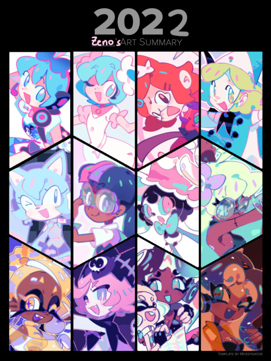
after 2022, my art was in a miserable transitional period where i had zero clue what direction i wanted to go in. but despite all that, this piece in particular is crucial. because i used halftones in the background. it's foreshadowing!!!

i continued like this for a while, until the time where i decided to play around with shapes with those vocaloid big 8 drawings. people really liked the shapes that i used in that one, and i found them fun to draw. so i started exaggerating more, and after i rewatched panty and stocking for the 307492020506th time, as well as invader zim for the 2nd time, my cartoony roots came back.


and then, when my art was already steadily improving, across the spiderverse dropped, and i watched it. funnily enough afterwards i had a big art block because i was just thinking, "you need to draw if you want to work on something as big as that! improve!!!!" which kind of held me back. but after all that, i decided to take a note out of ATSV (and comic books in general)'s book and start using halftones in my work. as well as that, i started focusing on lineart way more, and tried to play around with lineweight. which brings us to present day, where my latest art pieces look like this :


i still think that my artstyle needs a lot of work. even these pieces have issues when it comes to symmetry, values, and the like. but nowadays, though my art takes far longer now (as i've abandoned special pens and just do lineart with the hard dip pen in a kind of tedious way), i'm having more fun with it than i have in years. i think halftones fit my artstyle really well, and they're a unique way to "fill up" areas. now that i pay attention to lineart, i think it makes my art feel 'fuller', at least with more depth. did i mention my inspirations for this current 'phase' of my art? :0 i've been playing a lot of muse dash lately, and my pinterest boards are always full of stuff from TWEWY and megaman. there's far more than that, but in short, i want a sharp and striking style with bright colors. i know that you said a little bit of my progression and i basically dropped a whole essay 😭 ,,, but i really like talking about art in general even if i'm not very good at it. i hope this was interesting at the very least! here's the other post also:
#ask zeno#zeno's art#long post#VERY long post#i reallly wish i had my old art to show you guys but oh well#i think my art is improving maybe
55 notes
·
View notes
Text
6AM thoughts.
When it comes to PB's art direction, I hate how long it takes. It's such a simple style, but I always want to give my all when it comes to coloring and backgrounds. Even if it makes things look a little cluttered (which I'm not happy about.)
I feel pressure to be picky with it. Maybe not full-on perfection (I think it looking homemade can offer some extra charm!) but I ALWAYS need it to look high-quality. Even if it means taking literal ages to release the next part; because I keep sketching, re-inking, making corrections, going a different direction, etc., over and over again. I don't know a lot about marketing. But everyone knows that people like pretty things.
PB is mainly for the disabled community. People who maybe won't care as much, for one reason or another. I've seen disabled cartoonists with much simpler styles, some of which are even beginner artists, getting a bunch of love from their communities. And a lot more traction! And it's all extremely deserved, may I add. I want that ALLLLL up in my feed!
I think what makes me think differently about my work, though, is that it's an actual narrative; most comics about disability I see are more... I don't want to say infomercial-ish(?), because they're actually fun. But I guess they're more focused on education; getting information straight to you, instead of whisking you off into a whole new place. The dialogue does a lot of the heavy-lifting; makes whatever the point is clear and concise. It's about learning and, sometimes, a little bit of silly relatability.
Mine has long-term story-arcs; deep dives on a lot of different characters; I always try to think about it as if it were an actual animated series somewhere. A serialized one, at that. There's a big world, here!
So I want the story to also appeal to abled people; especially those who haven't heard much about ableism before. People who, because of ableism (or just plain snobbism?) WON'T look into a narrative like this if it has more amateur lineart. Or less carefully chosen colors. Less detailed backgrounds. Etc.
So I can't just draw however. I need to push myself, experiment, and hold myself to higher standards than I normally do. And I'm happy to do it! Ot always pans out worth my while. But it's also tiring, constantly checking my work and wondering "Okay, that'll draw people in, right?" Especially since I don't exactly live in a household that's easy to concentrate in.
With that being said, I really like how the next part has been coming along. Stay tuned, PB Nation.
#paperboy pb#paperboy#disabled artist#original characters#original stoty#disability#disabled#disabled writer#webtoon canvas creator
2 notes
·
View notes
Note
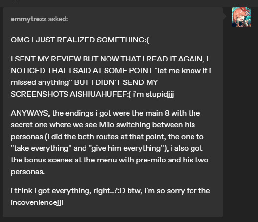
(i'm so sorry, i'm not sure if you accept reviews or not so feel free to ignore this)
Helloo!! I'm brazilian and i'm still learning english so forgive me for any grammar mistakes. I've gotten all endings (i guess- please let me know if i missed anything!) so here's my review of Perfect Love! ♥
I loved this game sooo much! I never played an visual novel with a mean main character and it was just amazing. The trope of ''us'' being the actual villains is very interesting and it made the game super unique! It's also pretty obvious the amount of effort and hard work that's in the game, I was impressed by the quality of it all.
The music and sound effects are pretty good, I loved it all! The artstyle is very pleasing to look at and the black/white/grey contrast with Milo's blue/red eyes are such a nice touch too. I also loved the amount of easter eggs (you couldn't imagine the face I made when I named myself 'Ren') and secret endings/scenes.
Fortunately, when I first played, I knew nothing about the game nor about Milo (which I believe made the experience better since everything turned out to be surprising) and the endings were really good. Through the gameplay, I've encontered one grammar mistake (which I forgot to screenshot it, sorry) and one sprite glitch but nothing that made me annoyed.
After finishing the 8 main endings, I decided it was time to look a little bit on the official Tumblr's page of the VN and that's when I decided to test out all of the easter eggs and that's when I discovered the secret scenes.
So, to summary it all: absolutely 10/10! I can't remember the last time I had so much fun playing a game and being so invested in unlocking all of it's content! I was flabbergasted when I lost all of my endings heh
Please let me know if I missed anything- I'd be more than happy to clear the game entirely.
Hello there! I love reviews. On my other blog I always write recommendations/reviews for other vns, so I'm always open to seeing what people like and dislike about the game. I hope you don't mind that I'm just gonna mash these two asks into one ask.
Thank you! I also think that a lot of vns don't always focus on being the bad guy in the story and those that do I usually enjoy quite a lot! I'm glad you like the quality of it, it was a lot of fighting renpy and it's UI because I have a one sided rivalry with the base renpy UI. I tried to make it look good though I think I maybe should have attempted to redraw some of the sprites for Milo (for like the third time).
For the art style itself, I actually did it in black and white because it was originally for the 2023 yanjam and I wanted to make a style that wouldn't be extremely tiring for me, and I really like lineart so I made everything in black and white (and also because I'm lazy, I say as I animate half of my assets). The red and blue really make it pop at the end since it's one of the few time color is used in the game. I love when people put easter eggs in their game and I know of a lot of yandere vns so I wanted to put in a ton! I'll probably put in even more in the update when I get all of the extra stories done because putting easter eggs like that is very fun.
Having no knowledge of a game is always a good way to be surprised about the premise and I think it definitely was something good in your case too! For the grammer/ sprite errors if you do ever play or remember what they were, please let me know. I'll try to fix it in the next update if possible.
It's always so nice seeing that people like my game though! I tried my hardest to make it a worthwhile experience and considering it's (technically) my first game, it really makes me happy to see that people really like it! Hopefully it doesn't have too much of the first game amatureness that tends to come (nothing wrong with it, but I hopefully have showcased I kind of know what I'm doing, I say, sweating profusely) .
Yup! That is all of the scenes in the game so far. At least that you can access. If you look inside of the code, I actually have two scenes that I put in there. One of them is pretty much a test scene featuring the character from the next game I'm making, and the other is a special scene where you go to Milo's apartment. You can't access those in the main game, but you can play them if you edit the code a bit.
Basically (for those who don't know), all you have to do is put "jump" and then the name of the label afterwards (so for instance if the label is "rabbit" you would put "jump rabbit") after label start in the code. The two scenes that are not accessable in the game are the last two scenes in the script.rpy file just to make it easier for you. (I put a note that says like "#I'm very dedicated to my craft I say as I disect Milo and then beat him with a stick" because I'm sorry Milo, you deserve better)
But yes, thank you for taking your time and writing your long review! I love it so much.
16 notes
·
View notes
Text
October wrap-up
So! October is at an end! And I have not finished Spocktober/Trektober. Let's see how I did!
My goals for the month were:
To have fun :3
To get used to finishing drawings
To get used to posting them, too!
To have fun :3
To improve my sketching and lineart skills
To end up with a bunch of finished drawings (of Spock!!!) :3
To let go of a bit of my perfectionism
TO HAVE FUN :3
So how do I think I did?
Having fun:
I had a lot of fun with it this year! In previous years, I've pretty much immediately devolved into an anxious mess because there were too many options and I bit off more than I could chew. This time around, thanks to my guidelines (only inking, not spending too much time on each day, sketching and thumbnailing in advance), it was a lot easier to let loose and have fun thinking up ideas and enjoying the process. Plus, I let my friends know I was doing it this time around and got encouragement and support, which was lovely.
Getting used to finishing drawings:
I did better at this than I thought I would! There are several drawings I've finished this month that I would have given up on if not for this goal. Do I think they were all my best work? No. Did I learn from the process? Yes! And some of the ones that have gotten the most notes were ones I thought no-one would like and struggled to finish. So! I also figured out new ways of motivating myself to finish things, which is also very helpful.
Getting used to posting things:
Also went better than I thought! Although I didn't manage to maintain a cushion of queued posts like I wanted to, the response I've gotten from actually posting my art has been amazing! I've gained several new followers (hello!!) and gotten so many nice comments, and went from being afraid of posting anything to tentatively looking forward to people's reactions, which is a huge improvement for me. Getting that accountability of posting publicly also helped keep me going when I felt like giving up - seeing my friends laugh when I showed them my silly comics or getting nice comments really made me feel like sharing my art is worthwhile. So thank you to everyone who reblogged my art, commented, liked, etc. I'm glad you did!
Improving sketching and lineart:
I definitely think I improved my art skills. Getting into the habit of thumbnailing really helped take the pressure off the sketching phase, and trying so many different ideas pushed me out of my comfort zone and forced me to try drawing things I wasn't so confident on - look how many hands I drew!!!! As for the lineart, I think I've gained a bit more experience in using pens, although I did buy a whole new set of them halfway through the month which put me on a new learning curve. Lineart's never been a huge favourite of mine, and I do miss using my tablet to do lineless art, but the nature of the challenge did help me to loosen up and experiment to keep my mind engaged the whole time.
To end up with a bunch of finished drawings of Spock:
Check! I have 14 finished drawings, with another four sketched and needing inking, plus a whole load of thumbnails to work from in future. I may go back and add colour to some of the days for funsies, but there's several that I can just put on my wall as-is and be proud :)
To let go of a bit of my perfectionism:
I definitely did! Like I said, there's a few of the ones I've posted that I'm not too proud of and know I could do better on, but I've spent all month purposely smacking my hand away from perfectionism, and I know I've tried my best given my limitations. I'm still proud of myself for getting this far, and for posting when I was anxious, and for improving my skills, and now I get to stick up my art on my wall and be proud of it! I'm not magically cured by any means, but I do have a bit more evidence that perfection is not a good goal to pursue, so I'm going to keep this experience in mind for the future.
So what now?
I do have thumbnails for almost all of the rest of the prompts. I am doing NaNoWriMo this month, and I have a digital piece that I want to finish for the 5th (holy shit. three years.) So I think I'll take a little pause on these prompts, but I don't want to stop. I'll keep coming back to them, and keep posting them, until I run out of prompts or motivation, whichever comes first. I've really enjoyed seeing people's reactions to my Star Trek art, especially the comics! I also have a backlog of SPN fanart I want to post, so I'll probably queue some of that to come out soon.
TL;DR: Watch this space!
And if you've been following along/commenting on/reblogging my art this month (or anytime), thank you so much! It's folks like you that make sharing art worthwhile!
#original poast#artie talks#i am feeling so much more positive than any of my previous attempts at an inktober style challenge!#this has genuinely been so much fun and it's so nice to feel like part of a community#i'm sad I didn't get to any of the suptober prompts#cause I had some ideas for those too#but given various life stuff and also my very last minute decision to even attempt it this year i think i did excellently#and I am going to record the fact that I am proud of myself for future-me to look back on#also. uh. the askbox is open if anyone would like to send prompts. i can't make any promises but if something catches my imagination#i may doodle a little thing for you!#chatting is also encouraged! i like making new friends :)
2 notes
·
View notes
Text
This Week In "Time & Again" #28: The Work, And The Characters! and Further Ruminations on Lothar And Myself
Howdy peeps 👋
I started writing this blog post exactly a week after the previous one has been published. But as per usual, somewhere along the way I got so carried away by the work itself that, of course, I simply didn't publish this new post on time. In fact, as I am writing these very lines right now, I don't even feel like writing. Instead, I just wanna keep working on the lineart for Chapter 6. It's so exciting! 🔥🔥🔥 I'M ON FIRE, MAN! 🔥🔥🔥 But alas, being a responsible adult, I must stop for a moment and blog a bit. That's what all the responsible adults do: they know when to take a break from the most fun activities in order to do important things ☝. Doesn't mean that the latter cannot be fun... But in my case, writing this blog post is not nearly as fun as working on Chapter 6. So what I was trying to say all along is the following: Imma finish writing this dog-damned blog post asap and get back to work! 😠 Schnell, schnell!
Therefore let's get straight to the point! There's actually 2 points:
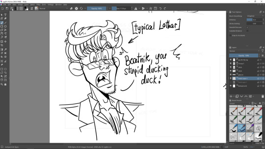
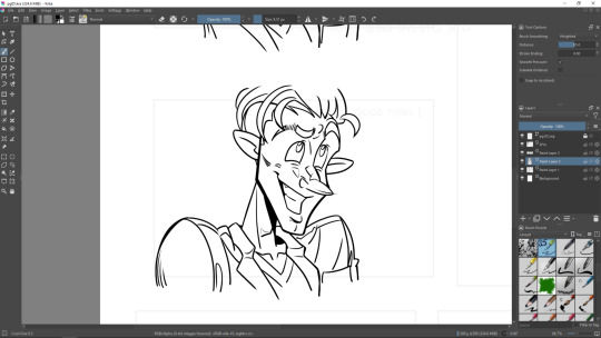
I have finally completed an artwork featuring Beatnik that I started to work on a month or two ago (unfortunately, somehow Windows decided to trick me and changed the creation date info... 🤔 so now I cannot remember when exactly I started to work on it originally), and I will make it public shortly;
I did quite a bit of work on Chapter 6 for the lineart, wheeeeee-heeeeee!!! (and, as indicated above, I had a lot of fun!!!)
About the point number one: I've been thinking about finishing up that artwork long ago. Now, since the beginning of Chapter 6 is very Beatnik-saturated, I got to complete that piece. Finally. I'm very proud of myself. At this point of time, I've completed the lineart for all the pages in the chapter that will directly feature Beatnik (meaning the ones that will feature him visually, not just the "blind" voice lines over Lothario's walkie-talkie). So the work on Beatnik for the chapter is done 100%. I must admit, I really like Beatnik. He's a nice and... quirky character with a rather complicated backstory. I'm gonna miss him!.. for now. Until the Colouring Stage is on, because then I'll see him again 🙃. ... I still keep listening to a lot of vaporwave though. In fact, way too much, perhaps. I cannot tell why vaporwave makes me so happy. The obvious reason to guess would be the feeling of nostalgia - but I'm pretty sure in my case that's not right. The distorted and chopped vocals and odd, slowed down sounds are somehow comforting to me. Weird?.. Weird!!! My favourite vaporwave pieces and artists so far are Floral Shoppe, Chuck Person's Eccojams Vol.1 and the most stuff by 猫 シ Corp. Some of this stuff I just listen over and over again. Coming from a person who sometimes listens to Skinny Puppy on repeat while working on her graphic narrative, deeply enjoys those horrors and finds them oddly homey and endearing, that's probably an expected sentiment. Coming from a person who loves Unloved, Unhinged, and Golden Light, that is probably not surprising at all. I'm no stranger to surrealistically disturbing artistic experiences, which I find fascinatingly entertaining in a gloomy, eerie way.
But I digress; let's get back to the main topic.
I think I enjoy drawing Beatnik much more than I enjoy drawing Lothar right now.
Even Lothar's shirtlessness doesn't help in this situation. What a weird surprise, indeed 😱 (because usually drawing shirtless people takes significantly less time than drawing fully clothed ones, and therefore it's more satisfying and fun - but apparently, not right now).
I already briefly mentioned in one of the older posts that lately I have concerns about the lack of endearment I experience towards Lothar - who is, supposedly, the main character of "Time & Again". Perhaps - and quite possibly - that is as simple as the feel of the chapter captivated me very well that it makes me estranged towards him... Because that's basically what Lothar himself does, too: he doesn't feel that he belongs and intentionally distances himself from virtually everyone (Beatnik inclusive... which is sad, because I think those two would've been absolutely hilarious, were they brotatoes... but maybe someday somebody will write a fanfic about them, preferably not BL tho, because that's waaaay outside the canon, lol). Remember my method of writing and my understanding of how to create a good piece of art? Deep diving. That's what I'm talking about.
However, regarding Lothar and his disgusting tendencies, there's one more point I cannot avoid mentioning; something that hit me hard immediately as I started to work on Chapter 6, and I cannot unsee it about him. Lothar is uncomfortably scary. He's frightening. Right from the start of the chapter, he's nothing but a lump of anger and hatred. Pathetic or not, right from the first pages of Chapter 6 he already had a few moments. Blegh, Lothar. Just put yourself together already, stop being a huffy-puffy porcupine (although I must admit porcupines are much cuter than Lothar in general, and they certainly make much cuter sounds, too).
Anyways... I've started a thread on Krita forum that has a small *so far* collection of WIP screenshots of Chapter 6. It can be viewed 👉HERE👈. Check back often, for I'll be updating it regularly from now on, asynchronously from posting new stuff here.
And that's gonna be a very long thread [that I will promise to try very very very hard to keep updating, please please pleeeeease believe me, I'm trying, ok?! if anything happens, please give me a kick😖]. Obviously, so far it only has black and white lineart, for I work in stages (as previously indicated in this post and in this post, and in the numerous other posts all over my blog). For a right-off-the-bat treat/teaser, I'll post a couple screenshots below:
Now, as for how the process itself is going... I'll refer to that very same older post yet again that talks about my idea to skip the sketching phase entirely (or almost). And you know what? It's going darn well so far. I hope I'll be able to keep it up, and if not - then I simply must git gud. Right?! I think that is right!!! Drawing without a sketch doesn't sound like a bad idea at all. I think I simply don't have a luxury of time to sketch first and then inking on top of the sketches anymore; mind you, I don't even think I want to sketch first anyway. It's also a good practice and one to get rid of unnecessary perfectionism. And perfectionism, in my experience, is almost always unnecessary. So, in short: hooray for terrible art!!! Brace yourselves! 🤣🤣🤣 Ok, ok, I already said that that's not gonna happen in my situation, and I'm quite certain of that 🙃
But again, I quickly sketch the backgrounds and I definitely make sketches when a panel has complex structure to it or the characters are interacting.
It might sound a bit abrupt, but that's enough for today. I'll continue my narrative full of thoughts in the next posts, and now it's time to wrap it up. See y'all soon! 👋
0 notes
Note
hihi arte! 3, 17, 19, & 24 for the artist ask game?
hihihi ruya webe been on a call which is silly but i hope youre doing well rn !!
3. your favorite piece(s)?
as of now, my most favorite piece, off the top my head, is the greyscale thing i drew of lucia from tmk. i was messing around with brushes i had saved but never really used and the textures came out nice. i like the work i did on that canvas in general, i felt i got a good hold on her character. i tend to be happy with full body colored stuff i do of characters as of recent. most things i crank up the warmness on for a character and then slap a square bg on i tend to be more than satisfied with. same goes with playing around with brushes. fuuta trash and trash was a fun dabble in trying to recreate another style, and la maine de gloire i like for similar reasons. i hold a fondness for my deep cover william wisp redraw and we outta lightbulbs though that may just stem from a lot of attention on a pice that took a lot of effort
17. what is something youre confident about in your art?
uhhhhhhhhhhhhh i suppose my color choices and stylization. i like toning up the warmness + saturation and lowering the brightness of my art for a cozier feel and i like how it turns out. whenever i do contrast checks (literally just turning a piece to black and white to see if my values are good) the results are pretty good. i think most of the reason why im confident in my stylization is i just kinda like how it looks. some amount of the time i just do doodles that are just linework so i feel like ive gotten comfortable in how i translate things and i also tend to work from references. also ive been told my art style is quite unique and i feel that is the root of it
19. where do you find inspiration?
inspiration! this one is fun! at least for some amount of how i do(/did) eyes and how i color i draw from lavendertowne! her art is very cozy and nice looking, its cartoony but you can see anime influences in it. i think that's probably my main one. i also look up to drawing wiff waffles, she was the first artist i ever really became a fan of! whenever i do pick up alcohol markers (not much nowadays) i make sure to use a colored pencil for sketching. she's prolly also the reason i make sure to carry a kneaded eraser for traditional art. i like watching scott christian sava's videos. being an older artist with more life experience makes him sorta feel like the most mentor-y to me. also he's very nice and some amount active here. yunayuispink is who i mainly use for tutorials. their art style is simple but that is not to say its bad! the colors are nice and the linework is nice. i also like marikyuun's art. her use of linewidth and colored lines makes her work very merchandise-esque as she says. i own a couple studio ghibli art books that i should probably be busting out more for references. their films are very pretty. i also like to take bits and bobs from my moots' art styles that i think are cool. for instance, i think the main reason i tend to gravitate toward thin messy lineart is @/not scorb on here. though i think mine tends to lean messier (or maybe moreso them doing it gave me the confidence to post art like that.) i also take influences from other anime/manga, vaguely, often to the point where i just kinda forget the names. there's probably more but this list is very long already so ill stop
24. whats a compliment about your art that has always stuck with you?
hm. im not really sure. it might be from my bad memory in all honesty but i feel like most of the compliments ive gotten recently just tend to be a "great work!" which i dont mind or take for granted but its not really that descriptive, yknow? actually i remembered one. one time i drew different characters from a thing in chairs i thought suited them (lore rise) sitting based upon their character and i remember someone told me i was talented from the way i portrayed my personalities from how they sit. it really stuck for some reason, i dont know why actually. also being told my art is unique when i was asking my sib to describe my art style bcuz i didnt really know how. it just felt nice to know it was really something that felt like mine !
thank you for the ask !! have a nice rest of your whatever
1 note
·
View note
Photo

hush hush
#art#my art#artist#artist on tumblr#original art#original character#atlas#tcd#tss?#tcd????#I need a name for this duology god dammit#anyway hi hello here is atlas (?) I drew this. mm. a while ago#a month? tempted to say a month ago ngl#I was like 'oh yeah I need to actually draw atlas digitally again I haven't done that in AGES so gave it a shot and failed but I had fun#and then I was like 'oh no this is spoilers I can never post this' and then put it on my instagram without hesitation#and THEN then remembered oh yeah I've posted other WAY spoiler-y pictures before this is F i n e#it's clear spoilers in my head cause I know the context. you don't know context! you! tag reader!!!!! 's just atlas to you innit!#experimented with the lineart a bit which was a lot of fun actually#lineart is boring except when you add Spice so I added spice (roughness)#excuse the lazy background I am lazy and it is a background which is more than I had to work with#yknow they actually do kinda suit the colour yellow ngl#greeny-yellows work for them. autumn colours. nice.#I also have. crow comics. looked at that again and went 'yo I should just put this somewhere'#it's not very good and I did that almost a year and a half ago but if I don't do anything with it then it'll just gather dust in my computer#may as well put it somewhere if only as an archive#ok bye I gotta get ready for w o r k
21 notes
·
View notes
Text
FINALLY I'M DONE! Experience the beautiful Delphoxes that I spent way too long drawing (4.5 hours). I was honestly a little bit nervous going into this one, since Delphox has such thin lineart, which is a style I am not particularly used to. I think they actually turned out really nice, and now I'm going to try using thin lineart more often, it works pretty well with my style.
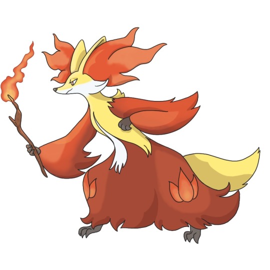
The first one, obviously, is my version of the classic, fire type Delphox. I decided to play with this one's design a little more than I had with the previous two fire types, just messing with some gradients and shading/lighting to look a little bit more of my style and aesthetic. You have absolutely no idea how much I love this one, it just turned out so cute and I love it so much.
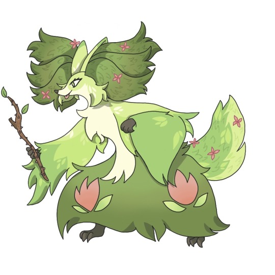
Next up, as always, is grass type Delphox. I wanted this one to look really fluffy and unkempt, like a shrub thats overgrown. To really give it a final feeling, I added little flowers on the ear fluffs and tail, finishing the blossom cycle I had tried to bring out in the previous two evolutions. Instead of the flame patterns on the legs, I went with little flower decals, making sure to match the aesthetic of the original flame shapes. For the wand, I went with a thorny rose branch, just to bring out the grass type feeling.
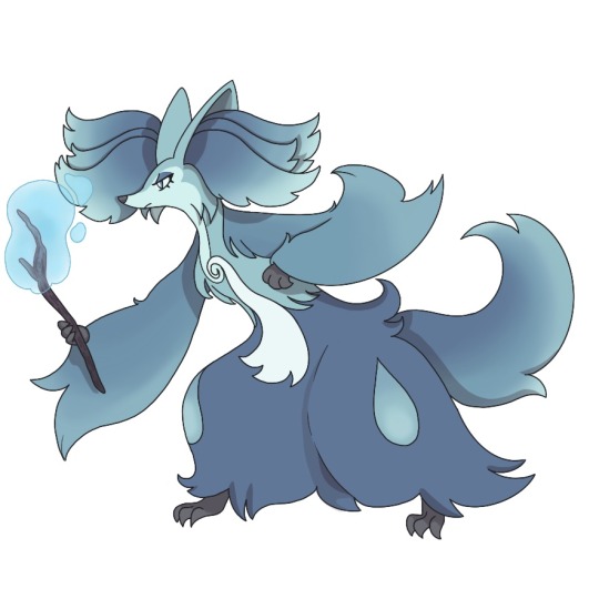
Finally, my precious baby, water type Delphox. I wanted to make this one feel like a splashing wave, or like ocean currents, which I think came out somewhat in the design. I went with a raindrop shape for the decoration on the legs, making sure to match the aesthetic to the original flame design. For the wand, I went with a dark purple color for the wood, which I hoped would look a little bit like a waterlogged branch. I also gave it a water bubble on top, just to bring out the water type vibes.
I have no idea what Pokémon I'm gonna do next, but I've been having a lot of fun with this. Whatever catches my fancy, I guess.
13 notes
·
View notes
Note
14 15 16 ^^ (artist ask game)
14. Any favorite motifs FLOWER LANGUAGE. i put it EVERYWHERE it's so fun!!! I've done some stuff relating to alternate selves/time/different endings as well, and that's ALWAYS fun! I love putting in little details, it's fun! i've done this a lot with COEtober (LOTS of symbolism in some of those ehehe) I've drawn a lot of flower crowns and such too, so anytime that happens? that's SYMBOLISM BABYYYY Lately I've been wanting to incorporate some more meta aspects into my work too... I think it'd be neat to do something using the medium itself, like incorporating CSP windows into the art, or tearing a painting physically and IN the painting itself.
15. *Where* do you draw (don't drop your ip address this just means do you doodle at a park or smth) Mostly at home! my tablet is too big to carry onto campus now (screen tablet) So i draw at my desk, which is in our living room!
16. Something you are good at but don't really have fun doing I have fun with all of the art process! the closest thing to it though... probably lineart ^^; I have very clean lines, but they are SUCH a sticking point for me sometimes... they take so much time rip That's actually why i've been doing more painting-heavy stuff lately! I'm experimenting with it a bit
#aria answers#artist ask game#aria rambles#anon#i want to incorporate more motifs into my art actually#ive done a few with time and sand and stuff#those are fun
2 notes
·
View notes
Note
do you have any advice on how to develop your line art style to a newbie? (if its not a rude question)
Oh, definitely! I actually used to be very insecure about my lineart 😅 I always saw other artists doing their lines in clean strokes, but I never had the patience to do the “stroke, ctrl z, stroke, ctrl z” thing that they always do. I got it in my head that that was the only way to do lineart, because it’s what everyone did! I stuck with only digital paintings for a super long time just to avoid doing lines at all.
But eventually I realized that I don’t have to mimic other artists! As long as it looks good in the end, it doesn’t matter how I do it. I draw all my lines slowly, and sketch them in with small strokes. It takes a lot longer than the “stroke, ctrl z” method, but speed comes with practice!
My advice is just to find whatever method is the most comfortable and fun for you, and stick with that. That could mean sketching loosely and then erasing the extra bits to clean it up (which I’ve seen others do), or drawing your lines with a different tool that feels more comfortable, or whatever you like! You could even just leave it as a sketch, which is also totally acceptable. Art doesn’t have to just look one way! It can be absolutely anything. Just experiment until you find your method 😁 I hope that helps! 💛
32 notes
·
View notes
Note
any tips for regaining confidence in your art/overcoming art block and improving?
tbh.... i dont have a consistent way of dealing w/ art block myself lol. which is valid, i think! ppl become artblocked for different reasons, and everybodys experience with this Very Vague concept are gonna be different. i do have a couple of suggestions, but please keep in mind that i myself have no idea what im doing 99% of the time, so my advice might be Bad actually, and my confidence in.. well, pretty much anything, is oftentimes low as u can probably tell sudfgsduf
-the most common tip is, of course, try to keep drawing. doesnt really matter what-- any little doodle still counts and might end up being a catalyst for you!
-if youre dead set on improving your art skills, then you could do some studies! figure drawing, sketching, painting, etc etc.. theres a lot to pick from, and it can be quite overwhelming, so dont forget to take it easy and take one step at a time. learning anything takes a lot of time and effort, but even if you dont see any immediate progress, remember that its not in vain: your understanding of certain subjects improves with every little sketch, and so does your muscle memory/general art skills. you could also try watching/reading some tutorials on topics youre interested in
-try new things!! coloring, shading, lineart, art styles.... in my experience, its usually really fun to experiment w/ that kinda stuff. try picking smth that you think you would enjoy doing!! and dont be afraid to be messy, or ‘lazy’, or weird w/ your art in that moment. just try to have fun :]
(additionally, i’d recommend trying out new things when youre not artblocked too obvs, cuz then you can discover funky new techniques outside of your comfort zone more easily)
-if youre particularly frustrated/are running low on energy/nothing else seems to help, then consider taking a break? idk if it works for everyone, but sometimes im just able to like.. wait out an art block. and like, duh. sometimes thats all it takes! burnout is a rather common problem, and its healthy & encouraged to take breaks when you need to
(if youre afraid that the break will end up being way too long or will kill your motivation/want to draw, then at least try to like.. ease into drawing again. draw smth youre good at drawing! doodle smth you Really enjoy doodling! do smth that will remind you of what youre good at already. pushing yourself out of your comfort zone is good for improvement (which is important, so dont forget abt it), but when youre running on fumes, so to speak, being extra self-indulgent might be what will reignite that artistic spark of yours!!)
oh and watch kikis delivery service. /hj sdhfuisdhf.... when im going through an especially nasty art block i come back to it cuz its got a nice message abt this kinda stuff, among other things. plus its a feel-good ghibli movie, so it might cheer you up idk <:]
hope this helps at least a little bit!!!!
#val.txt#most of my tips are more abt how you can like.. get through an art block#instead of actually Overcoming it if that makes sense#cuz thats how i tend to deal w/ them 😔#Anonymous
42 notes
·
View notes
Photo
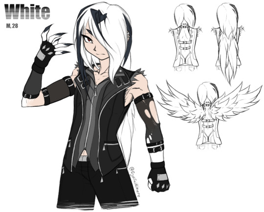
Haha hey remember that post I made awhile back, speculating on what a bad idea it might be to fuse dead things in the godless Frankenstein fossil machine
Meet White. He is a reanimated corpse. Two of them, actually. Or more like 1.5. [And I whipped up this half-assed partial reference sheet in one night instead of sleeping, so don’t look too hard at the chickenscratch lineart and visible guidelines, and kindly ignore the total lack of shading as well as any other messy jankiness.]
White is a product of me wondering not only about what happens if you NecroFuse a human with a Pokemon, but also what happens if you make it even worse and specifically fuse that human with a Pokemon capable of mega evolution. Because canon seems to imply that mega evolving is at best deeply uncomfortable -- and at worst outright agonizing -- for whatever creature is going through it.
Character Lore under the cut. Lots of text:
White is one of actually multiple undead guys who got mashed together with bits of dead Pokemon. They’re science experiments, so they've got the dex numbers of the Pokemon they're spliced with tattooed on the backs of their necks, and those numbers were treated as their names In The Evil Science Lab.
In his Original Life, White [and some of his buddies] got gored to death by some escaped Horrible Fucking Monsters that were accidentally [...and then not-so-accidentally] created via Two Pokemon At Once In A Fossil Resurrection Machine, because hey, it is SUPER easy to think you got Just One Thing's Bones from an excavation dig but then later you realize that Some Of Those Bones were from something TOTALLY different that just died in the same place. It happens. So, some Fossil Scientist People accidentally resurrected an Abomination, realized they fucked up pretty fast...and then started wondering if they REALLY fucked up or if this is Cool, Actually. And then the team of Science People split into two Morality Factions, with one half being like “This is unethical as shit, we need to make sure this doesn't happen again because it's not natural so who knows how this poor fucked up creature is suffering” and the other, cooler half being like “WE NEED TO DO THIS AGAIN RIGHT NOW BECAUSE SCIENCE. IMAGINE THE POSSIBILITIES HOLY SHIT.”
Cooler group splits off from the Horrified Group With Morals, and they promptly use their Science Knowledge to Construct More Machines and Make More Monsters. Doesn't take too long for them to realize, however, that Abomination Pokemon are stupidly hard to control, because not only are they suffering, their masters obviously don't care for their wellbeing, so Revolt Inevitably Occurs and they escape to wreak havoc upon the nearest congregation of townspeople. They promptly maul some people to death at a nearby local rock concert, scientists chase after them to clean up the mess, realize “Oh Shit, Manslaughter Charges Impending”, and then realize...
Science Guy 1: “...Hey, what happens if you put a dead person in the fossil machine?”
Science Guy 2: “Hey, people probably listen better than Pokemon. We can, like, TALK to people.”
Science Guy 3: “Lads, I got a stellar idea just now. And we got plenty of Dead Guys to start with right here! Great way to hide the bodies too, probably.”
This goes approximately as well as you would expect, and precisely as ethically. A smashing success!
However, because they Fucking Died, the reanimated Newly-Monsterized dudes do not remember shit about who they were pre-resurrection. They're not technically even the same people, they’re more like clones. They've been remade. So, all they know now is Science Lab Life, and they have no initial attachment to eachother aside from "that other guy is also a Science Experiment Person just like me, so Same Hat @ Labrat Neighbour ig", in spite of several having been friends or even family prior to death. They also just...don’t know/remember things in general. They are fresh blank slates. And to a morally-bankrupt team of scientists, that’s perfect! They can train these guys to behave however they please!
...However, people might be People Instead Of Animals, meaning they can be Reasoned With And Manipulated And Coerced far better than animals due to their far better communication abilities with the Science People, but...there is Still A Problem in the sense that Holy Shit, A Person Can Only Take So Much. You can only treat someone as "Experiment [number]" for so long, blatantly putting no value on their life outside of The Value Of Scientific Research, in spite of literally basically needing to raise them like a normal child due to the Lack Of Memories issue. Eventually they're not gonna be able to take that anymore and they are gonna Fucking Leave, too. And they’re gonna be much harder to track down than the rampaging Pokemon were. Impossible, actually, once they’ve ripped out their tracking chips.
So then there's just these monster dudes, who don't actually know what they are because they weren't ever told anything more than necessary to get them to cooperate with Tests And Experiments, just Escaped Into Civilization and having NO idea how Anything works. Fun! Especially considering how, at first glance, these just look like Normal Dudes. Their monster bits either aren't apparent or just look like funky body modifications.
They've also got Science Things in them and they Don't Know What The Fuck Those Things Even Are. They've just got these little Devices in/on their chests, and they were never informed of the exact functions of them because there's no reason to explain to the experiment What Is Happening, just that the experiment needs to Hold Still and Cooperate and Now Do This, Now Do This, Now Do That, Good Job That's Enough For Today, etc.
Those devices contain both key stones and mega stones.
If you were a Mad Pokemon Scientist, you would most certainly be interested in the mega evolution phenomenon. What would YOU do if some of your Undead Fusion Experiments happened to be spliced with bits of Pokemon known to be capable of mega evolving? You’d kill two birds with one enigmatic set of stones, that’s what you’d do. Your Frankenstein Experiments can even TALK to you and tell you exactly what they are experiencing when you run tests on them! It’s perfect!
So, if a rock-bearing monster’s heart rate goes too high, part of the little device, which is a barrier between one type of rock and the other, opens up and Exposes One Rock To The Other Rock. Which exposes the monster to the Rock Energy Reaction. The greater the stress, the higher the dose. And I’m sure you can see the snowball effect that’s gonna create, at least the first time or two.
They were INTENDED to eventually be made to Physically Fight With Eachother to gauge the effects of The Rocks™️ when the Guys With The Rocks are under Stress and need to Do Some Self-Defense. The Science Squad was basically trying to suss out the Actual Purpose of mega evolution. Because mega evolution is weird -- it puts ENORMOUS stress on the body of whatever is undergoing it, so the hypothesis was that its true power is probably drawn out best via a perceived life-threatening situation, like it’s a type of hysterical strength, because what else would cause a need for that kind of ability. And aren’t ethics a bit overrated?
So, there’s our premise. White is just wandering around without any particular purpose outside of never ever going back to Science Hell, and he has no clue what the funny little doohickey buried in his chest does until it activates one day and absolutely fucks him up [...as well as everyone around him. Mega Absol radiate an Aura Of Sheer Terror that can literally scare people with weak hearts to death if they’re not careful.]
And now, some Miscellaneous Character Info:
The bit about Lots Of Death happening at a rock concert specifically was important. White was actually the vocalist of the band that was playing. He doesn’t remember that now, but he still loves music and has the same strong vocal cords. And THAT is important because White is partially an Absol now and Absol naturally learns Perish Song. These Fusion Monsters are absolutely capable of using Pokemon moves, though whether they’re aware of this is a different matter entirely. Imagine what happens when they end up tapping into those abilities accidentally.
That band was a relatively-unknown little local band. White was by no means anywhere near famous. Very few people even realized he was gone, and most of the ones who would have noticed also ended up Equally Unalive.
That black stuff between the belts on White’s arms is mesh. Like, stocking mesh. It gets Ripped The Fuck Apart when he goes Mega Mode and his arm fur gets Extra Spiky. Hence one stocking being a bit tattered in that reference pic. He frequently has to replace those things, they are fragile.
“How did White get his name if he doesn’t remember his original name and didn’t have a real name in the lab” I am glad you asked! Post-escape, he eventually encountered a situation where someone asked him what his name was, he bluntly told them “I don’t have one. I am #359.”, they said “Well That Is Not A Name, I need something proper to call you”, and he was just...Super Apathetic. So, the other person picked out the name “White” just based on the fact that White’s hair is white, and he just shrugged and rolled with it.
As you can see in my Incredibly Quick And Rough Sketches, the backs of White’s shirts are open to accommodate that huge amount of fur that bristles out into false wings when he goes Mega Mode. Because his Actual Normal Hair is relatively long and overlaps with that fur, it blends in with his Actual Normal Hair and doesn’t look too odd [when it’s down]. Probably mostly because nobody’s expecting it to be anything OTHER than Perfectly Normal Hair That Just Happens To Be Very Long.
White does not particularly like violence. White does not want to beat you up. He will, though, without a bit of hesitation, if there’s some logical reason he feels like it’s the most practical course of action. Being essentially raised by Cold, Emotionally-Sterile Scientists With No Care For The Wellbeing Other Living Beings uh, tends to affect a guy a little bit. White has a bit of an internal dilemma regarding “It would be efficient for me to just Harm This Other Person to defuse the current situation, because attempting nonviolence will be overall more risky somehow” vs. “Holy shit it feels bad when I hurt people. Why does it feel bad when I hurt people. Is it...SUPPOSED to feel bad when I hurt people?? No one ever felt bad for hurting me.” He Figures Out How Empathy Works Eventually. He is a good guy at heart. He is a Monotone Snarker, but not actually Cold or Malicious at all.
If an Absol can do it, White can probably do it. He has incredibly keen senses and a STRONG ability to Detect Impending Doom. He has exactly the amount of Supernatural Absol Powers you would expect. He is also stupidly physically strong, way more so than he appears to be.
White can’t punch people. Look at the fist he’s making in the pic, he’s doing it wrong. If you punch someone like that, you WILL break your own thumb. That’s not a Revving Up To Sock Someone pose, he’s just tense. He’s using his thumb as a buffer between his long-ass Sharp As Fuck claws and the flesh of his palm. If White tries to punch anybody, or just makes a proper fist at all, he will impale his own hand on his nails. Like, all the way through. He CAN slash straight through things like metal and bone with those claws, though.
White...is unsettling. Completely accidentally, and unknowingly. He just radiates an Aura Of Intimidation [...or Pressure], even when not in Mega Mode, that scales depending on his mood. Just being near him tends to put people and Pokemon on edge. Thus, he’s generally avoided.
The latter point is especially unfortunate, because White’s preferred method of Socializing and Bonding is to just kind of quietly hang out in the same room as whoever he is trying to Socialize and Bond with. He just wants to, like...chill out Near A Buddy and watch a movie and share a bag of chips or something. His social skills are predictably not good.
#DO YOU LIKE MY TOTALLY NORMAL GUY#HE SUFFERS#He's pretty though and that's what actually matters here right#I need to draw the other Totally Normal Guys sometime too. White is Part Of A Set.#Pokemon#CK's art#OCs#I have Long Pointy Fingernails myself can you tell
12 notes
·
View notes
Note
Do you have any medibang paint advice? It's what I use and I struggle making it look expressive sometimes
I don't think the program you use would make much difference.
just generally practicing expressions like using expression memes and such to study and all would help with making faces look more expressive.
if it's poses and all, I honestly struggle with posing myself, but there's lots of tutorials that can help with figuring out how to many dynamic poses that add more life to the piece than just making it look like a stiff doll of sorts.
I recommend LavenderTowne & Mohammed Agbadi on youtube for some of their videos when it comes to genuinely helpful advice with art that, to me, really doesn't sound condescending or pretentious(?) when explaining things.
[Mohammed Agbadi] works in a more painterly style compared to the other suggestion who is more lineart based and has a far more cartoony style. He has a nice voice which makes listening pleasant and goes in depth with being clear on what is actual good advice and what isn't and how that affects your art. His videos are also entertaining with a bit of very lighthearted humor here and there so it doesn't feel like the videos are too serious. Art is supposed to be fun.
Here's two video I recommend from him to check out [vid 1] & [vid 2] which are pretty great for a place to start! He makes really great points and explanations.
[LavenderTowne] has some great little art tips and advice videos that are quite fun to watch because of her art style and soft voice. She definitely makes some great points when talking about her experiences with art and what works and doesn't in making your art look or feel nicer.
I would def recommend [this video] by her as well, especially, because of some points she makes regarding lineart and anatomy!
Good luck to you, though, Anon, in making your art! <3
6 notes
·
View notes
Photo


Cuz people said yes, here’s the sketch, thumbnail and an alternate thumbnail for the title page! (as well as it feat: the old words and no lighting or background)
First picture is the sketch, second is the thumbnail, third is the alternate and fourth is added bonus uwu
I loooveee talking about the process of things, and seeing others talk about their process. It’s so much fun seeing how something was made!!!
Rambling about my experience/process below the cut!!
I knew since the comics gonna be about Future Hilda and, well, the Time worm of course, that I wanted the page to be around them as a main focus. I had a few ideas and, originally did the alternate thumbnail. I wanted her to maybe be on the timeworm and be nervous because heck timeworm. But I wasn’t liking how the pose felt, it felt stiff and like there wasn’t as much stakes sorta thing
So then I started thinking about the moment in the show where Hilda is being chased through all the different time portals by the worm. And I added the other two hildas (added being theyre stick figures JHASDHJDAS)
I liked this one the most and went with it, starting to do the sketches themselves! Figuring out the placements for the rest of the worm was hard and I did have a few hidden layers of messing around to see what worked and what didnt - this was a problem that bugged me even into lineart. But I do like what I settled on. Could I have done better? Probably, but I did like it Tildy was a late addition cuz of how I was struggling with the worms jhasdjhdas
Lineart was really fun, and wasn’t too difficult - I struggled a bit with future hilda and had to redo some bits like the eyes to make them look right, but honestly?? It was jolly fun XD
I actually found out as I was tryna get a colour reference for the time worm, that it hecking changes colour. Like. It goes from white and blue and sorta gradients into this red and sorta light yellow-orange colour. WHICH IS REALLY COOL IMO but it also made it a lil more difficult cuz I had to figure out what colours to do where and all, and I could only do the gradient once. I fiddled with the gradients and the colours a LOT, trying out different colours, even going darker then what they were in the show at one stage.
Then came. *hisses* the portals. Goodness gracious figuring out how to make them look right was a right job and a half. I started at around 4 am (I’m on night shift so my wake/sleep cycle is reverse don’t worry I didn’t pull an allnighter-) and had finished them by around... 10 am? Judging from my discord messages asking one of my friends for opinions JSAHDHJDAS.
I fiddled around with them a LOT and tried a lot of different things, many of which ended up being deleted becuz I had to try and keep my layer count down so it wasn’t too cluttered/confusing. I do really like the way they turned out in the end, and I got into a decent method for doing them, but goodness gracious it was a difficult one to figure out. I did like a different layer for each colour - one for the light colour inside, one with low opacity for the inside, the white outside, the glow, then a colour on top to make sure it gave off a specific colour light. As well as that I had to make a seperate layer for the parts of the worm interacting with the portals so that I could smoothly make it look like it was inside of them - that was also kinda difficult
THEN CAME LIGHTING! This part was FUN. For everything I covered it in a very dark purple turned down to I believe 66% opacity, since everything would be mostly shadows - I then went through and erased where I felt light would probably hit. I used a smoother brush for the worm, since it was bigger and moved further away so the light wouldnt be as hard on it. And it looked nice jhashjsd.
Then, using another clipping mask layer, I individually added a small gradient of the portal colour - so it seemed more believable that that was what was giving out the light. It was a really nice finishing touch honeslty
So, while I know theres a lot I probably could’ve done better, I honestly had a blast and I’m gonna be starting on sketching out the first page to figure that out. I’ve only been thumbnailing things recently, maybe a month??? Or so??? I’m not sure, but I can definitely reccomend it - it helps with figuring out the poses without ruining a well done sketch, and definitely helped me out with this a lot.
Honestly I’d say at the end of the day, have fun, try and experiment, and use references!!! I had a whole folder of files with references up, from Future Hilda to Tildy to the Time Worm to the portals themselves, each of which I had at least 2-3 references for. It helps a lottttt
Uh if you read this far then thanks!! Sorry bout the rambling ^^’‘
#hope you like it uwu#i really like seeing peoples processes and rambling about mine#especially sketches#idk why but i love sketches a lot#its so fun seeing how ideas came to be and all#hilda and the lost future#randy's art#my art#hilda (hilda)#hilda netflix
30 notes
·
View notes
Photo
Progress gif of this: “Would you still recognize me?”
The quality isn’t the best possible, but hopefully you get the idea how things evolved... It’s made from “the preview pics” that I saved in this painting’s draft/wip folder whenever I took a break or wanted to compare/remember something special - and also so that I’d know where I left things and wouldn’t have to open the actual psd file every time, lol. To make the gif size smaller and to have it flow better (and be less eye-hurting), I left some of the frames out.
I admit it, it’s quite fascinating to watch now after everything :D *pats myself on the back*
So that the post doesn’t become too long on the dash, I put some additional notes under the cut, mainly about the refs and wips if you want to take a look! Please, do not repost elsewhere :)
(Btw, you can just read the bolded parts if you want a quick version or get tired of the rambling.)
I want to point out that the main work always happens underneath all kinds of adjustment layers because I like to test things a lot during the process before sticking on something if I don’t quite know yet what I want. Like the colour scheme or where the light comes (or if there are multiple light sources) or if something needs more contrast etc. So I paint with simpler colours first, but already have some ideas/adjustment layers over them, but hidden and waiting until the basics are done. Then I merge things and continue to paint with the “new” colour palette.
I also often test filters to have more texture or bring out some things better - or just to find something interesting to incorporate! Accented edges, crosshatch and watercolor are things that I often test in some way over my sketches and wips at some point when the basics are done or when I need/want some kind of further effect/texture or just something to knit them together better and for balance. And also just for fun!
Then I flatten the things I like (or I am “certain about” at that point) and continue painting over that ...aaaand end up testing something else, keep different versions or parts of things on separate layer groups (to compare or to bring back some earlier things that I liked or alternative lighting solution or object/body part placement, or...) and so on...seriously it’s always a mess controlled chaos! aahahahaha *face palm*
But mainly the things keep building on top of each other instead of having neat groups for sketch, lineart, colours, lighting etc. I mean, I always try to start with that but never have been able to actually keep it very long... And on the other hand I’m too nervous and indecisive to paint with only single layer/canvas from the beginning with (like a traditional painting would be painted). Or with just a few layers for background, character(s), effects on their own and so on... So I have this chaos that swirls towards that something that I had preplanned or wanted to achieve/practise until I’m happy with it.
ANYWAY, BACK TO THE ACTUAL ART :
The original “spark” for this work was Flint at the end of the episode 1 with his bloody face and white shirt, and that nice splash of light, which made me think about the aftermath and him cleaning himself in the privacy of his cabin with some nice morning light painting his beard fiery and him lost in thoughts :) At some point that made me think of Henri de Toulouse-Lautrec’s beautiful painting “The Laundress” which I have liked since I was a kid, so I started to steer towards it.
See the resemblance? (˵ ͡~ ͜ʖ ͡°˵)ノ ✧*:・゚✧
Some of the refs for the bowl and Flint. The angle/posture ended up being a bit different and I had more refs for Flint’s face and shirt and hand etc.

Some wips:
1) basically the idea and items that I wanted to include.
2) after a break (weeks? months?) and after I had searched some more references to help. The eyes were at this point (accidentally) absolutely awful so I censored them for the sake of my own peace of mind here, lol (not sorry!)

More wips along the way, although not much difference can be seen as the pics are quite small.. :
3) I mirrored/flipped the painting constantly, to see the mistakes and also because I couldn’t decide which way I wanted him to be! This stage was aaalmost ready but I got stuck and forgot let it be for several months doing other stuff again.
4) I continued it, fixed lots of things with fresh eyes and experimented more with lighting and texture but nothing too drastic stuck in the end. I have two monitors and either (or both...) are calibrated a bit off atm, so it was quite frustrating to navigate and to know which one had the right colours that I was after... and I still don’t know but it looks nice on both screens so ¯\_(ツ)_/¯ At this stage things were basically nitpicking and a bit too much honing.

The finished piece:
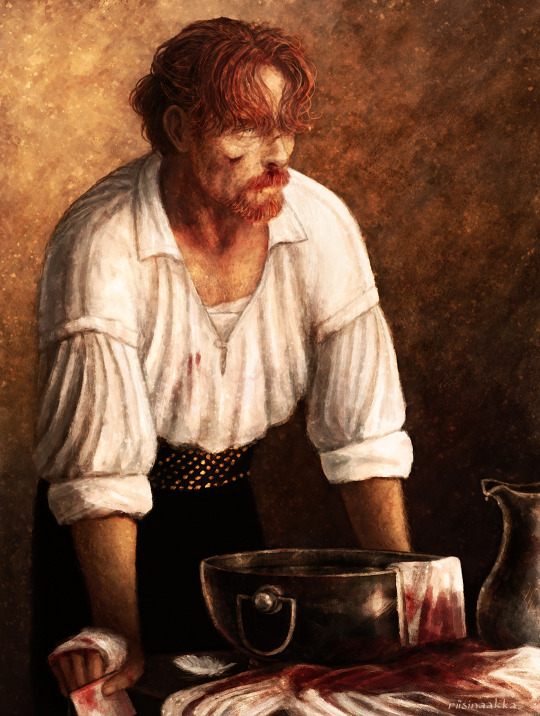
In the end I lost some of the things I actually liked more in the earlier versions (for example some had more of a dreamy feeling or better texture or more emotions/wearyness/anger showing that didn’t quite reach the end result again) and I overworked some other things, but nevertheless! I’m very pleased how this turned out! I reached the vision I wanted and learned a lot again :D
Thanks for reading <3
#black sails#captain flint#tw blood#flashing gif#tw flashing gif#progress gif#or is it process gif?#anyway. here's some notes and refs and ideas again#the gif shows more than the small pics later#but I wanted to point out some things from along the way#ask away if you want to know something specific#OH yeah btw this one sparked 'the first mo(u)rning in Nassau' painting with Flint and Miranda!#that I drew a while ago and finished before this#atleast I have a vague memory that these were connected#and also the one where mr Gates is patching up Flint with dr Howell xD#which I privately call 'HURGH' (because of Flint's reaction lmao)#so you see#it's dangerous to start new things because they end up multiplying and then u end up with shitton of wips#that are like 70-90% ready but just.can't.finish.nggggghhhhhh#at least some of them finally saw the light of day...#also I forgot to draw his collarbones again lol#let's pretend there's enough meat to hide them ;)
99 notes
·
View notes