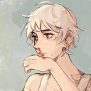
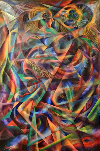
#experimental greyscale to colour practice
Explore tagged Tumblr posts
Visit Tumblr Blog
Explore Tumblr blogs with no restrictions, modern design and the best experience.
Last Seen Tumblr Blogs


Fun Fact
The Tumblr app for Google Glass was released on May 16, 2013.
Text

homunculus
#A.B.A#A.B.A gg#A.B.A guilty gear#guilty gear#guilty gear strive#GGST#art#illustration#experimental greyscale to colour practice#i had fun drawing this#i will definitely draw in this style again#13thvalentine art
107 notes
·
View notes
Note
I love your art and I'm studying art at college. I just want to ask how do you get your colours? Like how to you get the pink tint with not only base colours but the shadows as well? How did you get the blues and green tints with your recent post? Is it practice or is there something I can use?
first off thank you 😭💕glad you like my work!!
my go-to hack for putting a specific colored hue across all my layers would be having the top layer set to ‘screen’ (with that pink you mentioned) for softer colors! makes line art look a bit more fun and makes even simpler shading more colorful
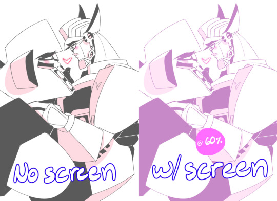
Here’s a quick visual :D I’ve found this works well too with not only plain doodles, but colored ones as well! mmm very soft colors all around
Also setting that top layer to ‘overlay’ instead and messing w the color and opacity of said layer often gives nice look to your work too
As for my last piece though with the greens and blues you mentioned, I’ve been using the trick that’s starting out with having all flats be in greyscale, then from there I use layer settings or filters to work the colors in (via overlays, screens, color burns, sometimes gradient maps too)
basically that doodle above^^is near the method of starting from greyscale
This post has a nice visual for coloring from greyscale!! Really emphasizes experimentation with different layer combinations
Going from a greyscale to color that way I’ve seen takes a whole lot of time out of trying to match hues manually :/
(One of my fav layer settings I’ve recently discovered if this is old news my bad then is throwing a top layer set to ‘lighten’ with any color really will cast color on pretty much only the darkest part of your piece (like the lineart) it’s BEAUTIFUL!!! Pls give it a whirl it’s a good time)
#and you’re in art college oh that must be a BLAST I hope you’re having fun!!!#hope this kinda helps 😬😬#unfortunately much of my process is like me trying combinations a million times before smth looks right. filters are my best friend#trial and error trial and error#but it’s worth it and after a time you learn which layer settings work best for which moods or character palettes!#asks#helpful
122 notes
·
View notes
Text
Thresholds, Online Exhibition Review
@ MIMA, Middlesbrough Institute of Modern Art
At the start of the year we were fresh-faced, coming into a new decade our planners were full and the air was ripe with potential. Then we entered the period of uneasiness, stuck at home not knowing what was going to happen next, our plans stifled; the places we once went for enjoyment and culture were shut and at risk of closing for good. In this period of uncertainty, we connected to the outside world via our screens, seeing family and friends in unfocused zoom calls and trying to figure out the best impromptu office space to work from home in. We spent more time in our domestic spaces, saw into the domestic worlds of our peers, lines were crossed as our domestic spaces became where we entertained friends, where we worked and where we also relaxed on top of everything. Our relationships with our homes we re-written as we adapted to our new way of living through a pandemic.
Throughout lockdown, art spaces jumped to create online exhibitions right away and created a plethora of virtual exhibits some newly made others pre-planned exhibits put into a computer manufactured gallery space or a video tour like Tate Modern’s Andy Warhol exhibit. Comparatively, Thresholds curator Adian Moesby, who is currently working as MIMA’s associate curator during his residency, took time to reflect on the changes made to our relationship with home during lockdown and the easing of restrictions which is where this current virtual exhibition is born out of. Moesbys practice is ‘under pinned through conversation’ (Adian Moesby – About, 2020) which he utilises in the curation of this exhibit through in-depth conversations he had with Sonia Boué, Lindsey Duncanson and Catriona Gallagher, the three artists that make up Thresholds. The exhibit connects these artists together through a mix of photography and film to communicate their personal stories and experiences with lockdown and the impact Covid-19 had on their relationship to home. Made at a time of easing restrictions Thresholds asks us to evaluate our feelings and connections towards our homes and the places we inhabit at a time where restrictions are tightening up once again and we will inevitably be spending more time there.
Clicking through to the exhibit PDF you are confronted with a low-res still from Catriona Gallagher's ‘Video Villanelle (for distance)’ (2020), a twilight sky setting up the transient mood that prevails throughout the exhibit. Scrolling down you are introduced to Sonias Boué’s ‘Safe as Houses’ (2020) 12 photos documenting her move to her new studio space which she moved into during the transitional period of lockdown. Set against a white backdrop each new photo exists on its own page and explores a plethora of objects which Boué takes with her for each new move; from childhood items such as a rocking horse to an exhaust pipe situated on its own rickety looking chair, these hold a personal connection to the artist. ‘Safe as Houses’ shares a close relationship to much of Boué’s practice where she ‘explores home and the domestic as metaphors for exile and displacement’ (Sonia Boue, 2020) with much of her work focusing on post-memory the idea of connection to the past and the generational trauma that continues to affect the lives of future generations seen most clearly in her work responding to the Spanish Civil war. Boué presents this within Thresholds in the specifically tailored striped pyjamas featured in a quarter of the photographs that connect not only to the new casualwear of lockdown but is reminiscent of the clothes her grandparents were forced to wear during their time in concentration camps. In one they sit folded on a wooden chair set to the right of the frame; the room dim with a square of light reflected in from a window in the empty space. Boués photos mark the space of time from childhood to adulthood and the period of moving. The photographs and the diverse objects we see serve as an exploration into what home means to us, the things we carry through with us through childhood into our adult lives and how we make a space a home.
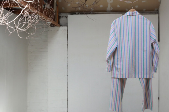
Sonia Boué, 'Safe as Houses', 2020.
Where Sonia Boué travels through memories and explores the past, Lindsey Duncansons piece ‘Brief loss’ (2020) studies the repetitive stagnation of life during lockdown. The three greyscale film vignettes feature next to each through a triptych; filmed within Duncanson's own flat it reveals a very personal side to the artist and invites us into her own domestic space that she shares with her family. The film is notably different from the rest of Duncanson's work which usually feature sublime picturesque outdoor scenes with plenty of colour whereas in this piece she has swapped out the rolling hills of the moors of Stanhope for the cosy interiors of home. This reversal exemplifies the loss, change and confinement that lockdown brought, Duncanson can no longer explore the landscapes around Newcastle upon Tyne and so she has adapted to her new situation and uses her home as a landscape to explore instead. Titled ‘Brief Loss’ the piece carries with the emotional effects of lockdown and displays the monotonous nature of life that occurred when we could no longer go out to experience life outside our homes. Within the scene Duncanson sits crouched in the centre of the triptych, walled in by a row of plants and a bookcase she’s seemingly lost in thought, occasionally picking a book out and flipping through it before resuming her previous position, there is a quiet comforting presence to the piece, on either side of Duncanson her partner, in the left-hand panel, and son, in the right, sit in their own respective rooms, her partner rests comfortably on an armchair occasionally living his mug while her son sits at his desk drawing while a screen flickers out of signal next to him. The whole scene has a dreamlike quality to it with the comfortable atmosphere alongside the ambient sound and the black and white filter and in each doorway behind the subjects exists projections of the outside, with pond skaters skipping over water, the ripples and reflections of clouds, and star-like moving foam. Duncanson combines the domestic with the outside showing our dreams of being free once again and escape this monotony that we’ve fallen into.
The final piece of Thresholds isn’t confined to the comforts of home or one space instead it travels through memories, moments and landscapes. Home isn’t one pace for most of us but for Catriona Gallagher she works and lives between Northumberland and Athens ana through ‘Video Villanelle (for distance)’ (2020) she ‘explores her sense of dislocation’ (MIMA-Thresholds-Exhibition.pdf, 2020) from being stuck in England while trying to navigate the travel restrictions throughout summer to return to Greece. The aptly named 17-minute film follows the a, b rhyme structure -like that of a traditional villanelle poem- comprised of short snippets of footage with repeating motifs not too different from the structure of a stanza. The footage feels as though you are being invited into Gallagher's life, it’s a documentation of scenes with friends, with so warm sparkling candles on a birthday cake and to late-night bicycle rides, to rain pouring outside of a window and Gallagher's reflection in the window of a train the landscape rushing by while you hear mindless chatter in the background. Sound plays an interesting role in this film with most of it coming from the footage though you can hear music from Magic Arm ebbing and flowing through that perfectly ties the clips together. There is a sense of reminiscing over what life used to be with clips featuring a close-knit group of people and scene of the Greece coastline this is starkly contrasted to the reality of uncertainty as to when life will return to normal. The film is set in portrait mode with a somewhat low-quality feel to it due to the footage being taken entirely from existing videos from Gallagher's phone archive. It comprises of videos sent to friends or keepsakes as Jade French puts it ‘this footage was never intended to be art’ (French, 2020) which give it an intensely personal feel as if we are walking through her memories. ‘Video Villanelle’ focuses on the small moments, the subtle experiences in life and though the footage is fragmented it still carries the same focus on overlooked details in our physical spaces and ambient wistful nature that Gallagher's work holds. Gallagher uses this piece to reflect on their experience of lockdown and looks at how our phones connect while improvising with the limited tools she had available as she did with ‘They met under the ceiling of sky’ (2020) which then went on to the official selection in the Laterale Film Festival in 2020.
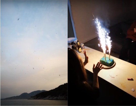
Catriona Gallagher, Stills from ‘Video Villanelle (for distance)’, 2020
Over the summer we have been overrun with the many virtual exhibits and Thresholds taking place after utilises the online space to its best potential. Having been commissioned to be a virtual exhibition it uses photography and film which are familiar to the online space rather than creating pieces tailored to a physical space. Through working online there’s a variety of different experimental formats to use over a simple pdf format however this way it encourages a non-art audience to take part through being simple, it becomes relatable for a wider range of people which Moseby advocates for having curated public events to specifically engage those audiences.
Thresholds subliminally speaks on the visibility of the disabled community in the art world. Curator Aidan Moseby closely works within the disability and diversity sector having been commissioned by and worked for companies such as Disability Arts Online and DASH which this exhibition is partnered with. The setup and extra care with subtitled and audio described versions for each film make this exhibition more accessible the usual cases. Where other galleries are immediately setting up shop in their physical spaces' as lockdown eased Thresholds doesn’t, it makes a statement that we can’t forget that the move to virtual during lockdown made art spaces more accessible to the disabled community. Art spaces have long been exclusive and inaccessible but with the lockdown when non-disabled people no longer had the means to visit gallery spaces that suddenly changed. It showed that galleries had little excuse for doing this before with the ease and speed in which they transferred their exhibitions online. Even having a virtual floor plan makes it more accessible as they ‘act as a helpful tool to plan trips and relieve anxiety for disabled art audiences’ (Kroese, 2020) referencing 3d art space floor plans.’. Thresholds subliminally makes a statement through being set after many galleries have shut their online exhibits and have opened their doors again through quietly having accessible versions of artworks. There is much change that needs to happen in the art world in making it more accessible to a wider range of people and lockdown has presented these options that we can and should learn from to aid us in the future.
Thresholds invades your domestic space as you visit it through the comforts of your own home through the ambient sound of Gallagher's work and personal memorabilia of Boués photographs. It looks at how the pandemic has changed our relationship to our domestic spaces, how confined we've become and how the virtual space can connect us. As lockdown has pushed and eased our homes have become multi-functional places, we continue to reflect on the change our lives have gone through and think about our connection to the people we surround ourselves with. Though through this we need to see the visibility of disabled people in the arts and how the small start that was ignited during lockdown needs to continue to help keep places accessible to the many rather than the few.
Thresholds can be found here.
Bibliography
Mima.art. 2020. MIMA-Thresholds-Exhibition.Pdf. [online] Available at: <https://mima.art/wp-content/themes/mima-wp/media/MIMA-Thresholds-Exhibition.pdf> [Accessed 21 October 2020].
French, J., 2020. Thresholds. [online] Corridor8. Available at: < https://corridor8.co.uk/article/thresholds/ > [Accessed 22 October 2020].
Aidan Moseby. 2020. About. [online] Available at <https://www.aidanmoesby.co.uk/contact-us/ > [Accessed 22 October 2020]
Duncanson, L (2020) ‘Quarry’, Blue Topgraphy, 27 January. Available at: < https://bluetopography.blogspot.com/2020/01/quarry.html> (Accessed 23 October 2020)
Kroese, I., 2020. Emerging Accessibility: Post-viral programming and disabled audiences. [online] Corridor8. Available at: < https://corridor8.co.uk/article/emerging-accessibility-post-viral-programming-and-disabled-audiences/> [Accessed 23 October 2020]video
#thresholds#MIMA#Aidan Moseby#Catriona Gallagher#Sonia boue#Lindsey Duncanson#Lockdown#Exhibition Review#Review#Art#home#disability arts#accessibility#art spaces
3 notes
·
View notes
Text
A Review of three works from the ‘Shape and Form’ Exhibition at @heartofthetribe Gallery, Glastonbury
As our final assignment for our Art History module for @strodefad we were required to write an essay discussing eithere an art history movement or a recent exhibition visited. Always up for a challenge i chose to write about the brief opportunity I got to see an art gallery between lockdowns in the new gallery that i am fortunate to have just a few minutes walk from my home here in Glastonbury.
What made it a really special experience was that i managed to contact two of the three artist I chose to include in the essay and they very generously answered my questions about their exhibit pieces to give me some context and process insights as first-hand accounts and it was wonderful to be able to ask the creators quesitons about their work and how they made it. The exhibition had high quality contributions from over 30 Somerset artists, so it was hard to select just 3 works, but I managed and got the essay completed in time.
This is an analysis of three selected works from the ‘Shape and Form’ exhibition at the Heart of the Tribe Gallery in Glastonbury. The gallery only opened in September 2020 and despite the restrictions caused by the COVID pandemic, this was the third exhibition that the gallery has managed to stage since then.
Following a core artist group launch exhibition ‘Diversity’, and solo exhibition ‘Beauty and Truth’ by John Minshull, this exhibition was a collation of works submitted by 30 Somerset artists following an open call for contributions from the gallery core artists and online directory members.
Curated by gallery manager Kim von Coels (aka artist ‘The Krumble Empire’), the aim of the exhibition was ‘to explore the fundamental building blocks of visual art, both geometric and organic’. The exhibition was open from 3rd December -26th January and I managed to see it twice before lockdown restrictions came into force. A virtual tour (1) is also available here
1. Millie Gleeson: ‘All We’ll Know’
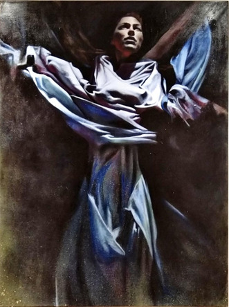
The Painting was displayed in a prominent position on the last wall as you exit the exhibition, directly opposite a canvas featuring an abstract female form in greyscale graphite, and the scale of this canvas (60 x 48 inches) made it really stand out.
I saw Millie’s solo show also entitled ‘All We’ll Know’ at the Red Brick Building in June 2019. She uses reference photographs to help with composition and is heavily influenced by her time in Berlin and Mexico.
Many of her works feature masks painted on the (mostly nude) female subjects, so what I found fascinating about this piece was that the face was illuminated and prominent and she is swathed in billowing robes.
I contacted the artist for more information on the context and process of the painting.
She told me this is a self-portrait, painted from a 'still' of the artist performing in a music video her friends (the Hics) produced, also called "All We'll Know"( 2 )
Gleeson started began painting this in 2014, but it was put into storage until she revisited to complete it in 2019.
She commented ‘it was a huge time of transformation and the end of an era and perhaps I had to return to the painting when I felt I'd fully transformed.’
The Painting has lots of movement, which is representative of the video it is sourced from, the performers are in an industrial setting and are either submerged under water, or as captured in this image, rising up and breaking free. The robes are flowing and there is a sense of movement in the arms and legs. Her website (3) describes how the work was developed as part of a series developed during an Artist Residency at Arquetopia in Mexico.“The residency applied Levanasian ethics to the artistic process, teaching to respect the integrity of differences and question the desire for totalisation. Questioning whether you can truly know the other and if you only know the self, how can you respect the space between?” “Any creative project I have embarked on at the core has revolved around the topic of identity or identification. Following the residency lectures my project became entirely introspective, leading me on a journey of self-discovery. I began to look at my own shadow, distortions, fractions, mirror images, deep and dark aspects of myself. Using the vibrant colours that surrounded me I began to explore my own conflicts and duality through a series of self-portraits, in an exploration to “All we’ll know.”I really resonated with this piece as it reminded me of the Salvador Dali painting ' Christ of St John of the Cross’ I saw at the Glasgow Kelvingrove museum. Light comes from above and the arms are widely placed. The pale blue colour palette and rich drapery in the dress against the dark background is similar to that shown in ‘The Countess of Southampton’ ( 4) (Anthony Van Dyck 1599-1641), seen at the Cambridge Fitzwilliam museum.
Ruary is an Edinburgh-born artist who has lived and worked all over the world and is a gallery core artist working in an attic studio above.
He is inspired by nature and psychedelic culture (6) and another of his works ‘Sacred Chaos’ was chosen as the exhibition feature image.
I interviewed the artist to learn more about the context and process behind these works. Ruary explained that “Trap Dance was a process-oriented piece, created as an experiment using masking tape to create random abstract geometric forms”.
The piece depicts two females and a male dancing, with Cubist and Italian futurists-influenced segmentation and distortion of the figures. The artist noted that the title ‘Trap Dance’ is a pun, as the two female figures appear to be being pressed together by the male dancer (Allen quipped it should have been called ‘Tape Dance’). The experimental process with repeated randomly placed masking tape and paint until the forms emerged, resulted in an abstract image.
The artist saw the forms of the dancers appearing and added them at late stages of development. It is more narrative in comparison with the cover piece ‘Sacred Chaos’; which was another process oriented, straight-edged construction using platonic forms, mathematical constructions, intersecting circles and combining them to make a striking abstract image. The artist has a lifelong interest in Alchemy in art and alchemical symbolism, and this is evident in the works presented here (7).
The colour palette is cooler at top and has more vibrant and darker tones at bottom, with a spotlight in the top left corner, which the artist suggests is reminiscent of a stage or nightclub scene. There is lots of movement as the figures are interweaved amongst the abstract shapes.
This painting is hung in a long narrow corridoor directly opposite the toilets (another ‘trap’ reference?) and adjacent to the exit door to the garden space. The works surrounding the piece are smaller in scale and have less visual impact, and I think that having to stand so close to it makes it more of an experience as the viewer is drawn into the movement and abstract forms on the canvas. There is no opportunity to stand back and see the work in a wider context so one is trapped like the dancers in the image.
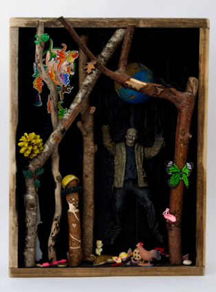
3. ‘Lost Toys’ by Julie Ackerman .
This is an installation assemblage sculpture piece selected from a collection of 10 museum themed boxes. (8). The work is inspired by the ‘cabinets of curiosities’ or ‘Wunderkammer’ (as described by Anastasiya Gutnic from the Metropolitan museum of art here with an example from the German artist Nicolaus I Kolb) (9).
The cabinet is displayed with a second piece called and ‘Science Lab’ and both are relatively small in scale requiring the viewer to lean in close to see the details.
Key elements of a Wunderkammer are:
· Naturalia (natural, found objects),
· Artificialia/Artifacta (mand-made, abstract objects), and
· Scientifica (scientific instruments and technological items)
The cabinet contents are carefully considered to reflect the message that the artist is trying to express, and fits the categories described above.
I chose this piece as the lockdown period has made many of us question what is important to us and question our consumerism and its’ environmental impact.Using upcycled packaging and materials has been a theme of my own creative practice this year.
The artist states on her biography (8)
“I was compelled to take on the challenge of using unwanted objects and materials as an art medium. Raising awareness of a world in crisis through art is paramount in my work. By transforming waste into beautiful works of art, I hope to inspire and encourage the 'Art of Recycling' turning a negative situation into a positive one.”
The artist goes on to state “The impact of overpopulation means greater demand on natural resources and an escalating waste problem. We need nature to thrive by reducing our demand for new materials, leaving nature intact.”
In the ‘Lost Toys’ cabinet a collection of sticks and a pine-cone (Naturalia) are surrounded by a plastic ‘monster’ (Artificialia) and assorted toy animals. A green butterfly rests on a branch with a wooden ’tribal style’ peg and a ‘protective’ dragon flying overhead and a lurking toy hairbrush in the background.
The second cabinet has scientific paraphernalia (Scientifica) and a skull with glasses, references to the impact of sanitary waste and plastic pollution on marine life. There are also humorous touches, like the small creature and drawing pin on top of the skull.
This fits with the exhibition theme as it invites the viewer to examine how the items relate to each other and to our own experiences. Viewers will respond to the individual elements and interpret their relationships differently.
The placing of the cabinets in a transition space between two rooms containing large paintings is also an interesting variation in form and requires a different type of interaction by the viewer.
Summary
The aim of the exhibition was to explore the fundamental building blocks of visual art, both geometric and organic, and the curator has selected a broad range of 2D, and 3D exhibits to really allow this theme to be represented. I found it quite difficult to select only three works for this essay as there was such a high quality to choose from.
These three selected artists have interpreted the theme in quite different ways, but one gets a sense of shape and form from all of their works shown.
References
1. Shape and Form Exhibition Virtual tour: https://www.infohost360.com/heart12/
2. Millie Gleeson – The Hics reference video "All We'll Know" https://youtu.be/RB2MweTwfQY.
3. Millie Gleeson website: https://milliegleeson.co.uk/all-well-know
4. Van Dyck Image reference found in Fitzwilliam Museum Cambridge guide, p37. 2016 ISBN: 978-0-9574434-9-5
5. Image sourced from https://artuk.org/discover/artworks/rachel-de-ruvigny-countess-of-southampton-as-fortune-5613
6. Ruary Allen Artist Bio: https://heartofthetribe.com/portfolio_page/ruary-allan/
7. Ruary Allen Artist website: https://artalchemist.com/
8. Julie Ackerman Artist Bio: https://heartofthetribe.com/artist-directory-view-by-artist/user/77/
9. Cabinet of Curiosities reference video: https://youtu.be/j6q10euArks Nicolaus I Kolb (German, 1582–1621). Apothecary Cart, 1617–18. Veneer: ebonized pearwood (Pyrus communis), ebony, partially gilded silver; carcass: conifer; interior: protective quilted cushion covered in red silk, drawers and chest lined with red silk velvet; gold, trimming; mounts and fittings: brass, partially gilded; thirty-two (32) vessels and utensils: glass, partially gilded silver, low carbon steel, leather, 11 x 11 x 9 1/16 in. (28 x 28 x 23 cm). The Metropolitan Museum of Art, New York, Purchase, Anna-Maria, and Stephen Kellen Acquisitions Fund, 2019 (2019.229.1a–c–.32a, b)
10. Cabinet of Curiosities reference description: https://en.wikipedia.org/wiki/Cabinet_of_curiosities
11. Dr. Beth Harris and Dr. Steven Zucker, "How to do visual (formal) analysis," in Smarthistory, September 18, 2017, accessed January 28, 2021, https://smarthistory.org/visual-analysis/.
#artists on tumblr#art history#glastonbury#ruary allen#millie gleeson#julie ackerman#heart of the tribe#strodecollegeartdepartment#anniesartthings#anndimentartist#artalchemist#the hics#wunderkammer#all we know#local gallery#shape and form#ual art and design
1 note
·
View note
Text
Text for the Kisterem solo show (2018) written by Dávid Fehér
Picture Formulas Buzzwords and fragmentary remarks on the new series of Gergő Szinyova
1. Colour dimension (cut, paste, print, paint) Colour in most cases is the subject of deprivation in the painting of Gergő Szinyova. Decolourization and turning towards monochrome are defining characteristics of his artistic practice. He converted the coloured series of paintings into greyscale and painted it in that manner in his previous exhibition, Imaginary Viaduct. The gesture of decolourization has its roots in the practice of grisaille, which was the means of illusionism in the Trecento and in Early Netherlandish painting. The grey-white illusory architectures and painted stone statues framed the painted picture and tricked the viewers’ gaze. Modern variations of grisaille are the greyscale snapshots of analogue photography and printed products, books, and grey surfaces of prints. Dirty greys of home printed picture files. By depriving colour, Szinyova pictured the process of reproduction, thematised the erosion of painting in the time of mechanical multiplication. As the next phase of decolourization he deprived colour completely from another series of paintings: he painted black on black, evoking old topoi of monochrome painting, thematising minimal differences of colouring matters and pigments, nuances and gleams. In his latest series monochromy turns into loud polychromy. In the first experimental pieces of the series the brushstrokes of the base colour mix as if they were made on a painter’s palette. In the newer pictures there are no strokes anymore, only colour fields touching with each other, sometimes sharply separated, in other cases sliding into each other, overlapping, or diverging, seemingly floating or stick closely to the surface of the painting. The colour patches sometimes counterpoint, other times intensify each other. Colour dynamics or colour dimension might be mentioned. Not only because of the sense of depth, distances and closeness but also because this time polychromy appears as the counterpoint of the monochrome used by Szinyova, referring by this to historical dimensions of painting, the traditions of monochrome painting, and the end of painting announced by Alexander Rodchenko. The pieces of the series can be considered to be the dialectical opposite of the former black paintings: colourlessness is replaced by coloured, angular by roundish, regular shapes by amorphous – at times “pixelised – forms. Szinyova, however, does not give up monochromy entirely, because in his new paintings all colour fields are monochrome. The painting is a polychrome collage of monochrome pictures. Collage must not be understood literally as in the case of Henri Matisse’s cut-outs. We see paintings that recall non-painterly processes: primarily cut-outs and printing. The commands “cut”, “paste”, and “print” are merged into one: “paint.” From the beginning (the grisaille) monochromy and colourlessness refer to the peripheries, boundaries, if you like, the utmost limits of panting. In this manner the monochromy of Szinyova that becomes polychromy can be described as the figuration of the endless end.
2. Print – repetition The paintings not only cite collages but prints, as well: primarily risograph prints; the aesthetics of slipping colour surfaces printed on each other; the beauty lying in mistakes; the particular revolutionism of the more and more upvalued “low tech” in the age of digital image flow, manual multiplication methods and “retro”; the paradox of risography; the contradiction that all copies produced by the copier are unique. Szinyova’s motives, forms, shapes are repeated yet unique. Dialectical pairs, peculiar “clones”, variants of each other. They seem to be prints. They appear as reproductions but in reality they cannot be reproduced. They create pseudo-reliefs, ornaments based on fine transitions, contrasts and harmonies. They refer to the painterly dilemmas of repeatability and unrepeatability.
3. Formats – patterns Pseudo-reliefs and ornaments, an imaginary puzzle’s – almost perfectly fitting – pieces, open structures constituted of closed elements might be found. Szinyova has been applying basic formats in his works for a long time: well-known proportions of A/2, A/3, A/4, A/5 sheets. The papers with length and width dividing into halves are basic modules that occur like ghosts. Pictures composed into pictures. In this sense the picture field is just like a radically enlarged, imaginary paper surface that just came out of a risograph. The emphasis being on “just like” and “as if.” While Wade Guyton turned printing into painting, Szinyova turns painting into printing, by projecting visuality of digital images, “low tech” multiplication and traditional easel painting on one another. His recurring forms, basic modules are frequently based on vector graphics, have digital origins, yet in the paintings they become open to pictorial depths. They look like prints (trompe l’oeil-like) but the end result is sensual painting based on the fine visual play of surfaces.
4. Painting and sampling Concepts of sampling, remake, and remix are used as clichés in the context of contemporary art. In recent years (soon decades) instead of the postmodern culture of quoting it is general that the reference is the inordinate system of digital links resembling to the thick network of rhizomes described by Gilles Deleuze and Félix Guattari. Each painterly gesture evokes another painterly gesture. As once Imre Bak cited Peter Weibel, “behind every picture there is another picture.” The painter works with a compley network of references, even if he is not aware of it. Szinyova evokes and co-ordinates different layers and references of the slightly more than a hundred years old history of abstraction, while in his vibrant colour-fields reminiscences of digital images, productions of the printing industry, design elements, and fanzine pages occur. The titles of the new series are not abstract codes reminding of automatically generated digital file names, but abstract notions indicating mysterious narratives, words and compounds filled with hints (Momentary Situation, Short song, Unknown, Comfortless, Comfort, Half). Beside the colour fields projected on one another, Szinyova creates particular interferences of codes projected on one another and code systems, questioning the dialectical relationship of technology and picture. He does not eliminate monochromy but builds polychromy of it. Pointing beyond painting from this side of it.
Dávid Fehér
2 notes
·
View notes
Text
13th principle- thumbnails
Going on my ‘principle’ of experimentation and the fact the motif is a ball I just started sketching out the first ideas that came into my head....

All of them started on the basis of a ball bounce as that's how lots of animators started practicing and then each one somehow evolves into something else.
Idea one:
- ball bounces onto screen and then when it hits the ground it splats and then rises up and has transformed into an egg that starts to sizzle and cook then in comes a hand with a spatula to flick it off screen.
- reasoning- thinking about the start of things the most common argument is what came first the chicken or the egg, and I’ve ways been on the side of the egg hence that and then I wanted to add in some form of human representation as my animation at uni started from practicing ball bounces to walk cycles, character animations etc. So it kind of shows my progression and experimentation.
Idea 2:
- the ball is a little stylised face that squashes and stretches and mouth, eyes nose etc is getting pulled back by the wind like a sky divers, then he hits the floor in a bloody gruesome impact which knocks out a tooth and leaves him a bloody bruised mess on the floor then he coughs up a ball that rolls out, transforms into a UFO and then beams him up and flies away.
- reasoning- there really is no reasoning other than its just stupid and I like gruesome things and I wanted the chance to practice bruised characters etc,,, But then I realised it would all be in greyscale so I’m kind of sad about that or I would have gone with this idea.
idea 3:
- a ball bounces down while transforming into a squidgy ball, teleports through the floor, then comes back up as a floating head and then opens its disgusting mouth and eats the camera. - If I was to do this I really want to make it super stylised and almost ‘bad’ looking, bight colours and contrasting ones would really be fun to use with this but unfortunately we are really limited with the colour scheme.
reasoning- Again there's not really much reasoning behind it- other than trying to show experimentation through the transforming ball in weird trippy styles like the other ones.
0 notes
Text
Evaluation
Within this project my aim was to use my own primary research of looking at the landscapes around me, public transport and commuting as a whole to experiment with different techniques and processes including weave, embroidery, print, mark making, collaging, and creative textiles. Once I had some samples I was then to look into the variations and compare my everyday moments throughout as I progressed through the module, showing my findings in my sketchbook and discussing them on my blog. I believe that I have achieved this as I took an extensive range of different primary photographs looking at both the Bromsgrove and Birmingham sides of my journey to start with. I then went on to attend all workshops enabling me to use my primary research as inspiration when experimenting with new textile skills and processes. From there I was then able to go back into workshops to work into samples created in other sessions to get the most out of my samples and to fully show my narrative throughout my work. I’ve then gone on to display my samples in my sketchbook and have discussed them on my blog.
I began my research by going out into my local area and I began taking photographs of the countryside around me, focusing on the farmland that the public footpath goes through near to my house. I took many photographs including the tree, telegraph pole and barbed wire fence pictures that I have used repeatedly throughout this project. Then once we started face to face lectures at university I was then able to broaden my primary research by taking photographs and a video along every step of my journey from getting to the train station, being on the train, arriving in Birmingham, and walking through the centre of Birmingham to get to the university. I have used the picture of the train at the platform and urban landscape shots from around Birmingham frequently throughout this module to add comparison.
My primary photographs are so different to one another, this has been a real help in being able to fully explore and experiment within the workshops as I have had plenty to choose from, for example in the first mark making session I focused my samples on the primary photographs taken within the countryside, creating many drawings inspired by the barbed wire fence photo. Whereas, in my first time in the print workshop I focussed my first few prints on the basic greyscale skyline associated with the buildings in the later part of my primary research. Having such a diverse range of primary research has really helped me to explore within the textiles workshops as I haven’t felt restricted at any point as there has always been at least one photo that would work well with the sample that I was going to produce.
However, finding the balance has been hard to achieve throughout this module as I went through waves of only looking at nature or buildings for a few weeks at a time with no cross over or comparison. This has made it difficult to fully achieve the brief as a whole as different areas of my primary research were looked at in different workshops making it difficult to compare the two. This is reflected in my final piece where I decided to focus all of my samples on just one element of my everyday journey, the countryside. This is because I felt that I had created the best samples when looking into the finer details of the nature around us, with my procion dye leaf prints for example I was able to add in all of the discolouration and vein detail which is very different to plain skyline screen print sample that I created earlier. However I did feel that I was able to fully achieve my brief whilst in the digital sublimation print workshop as I was able to overlap images from the different sides of my primary research and print them together enabling me to have the full comparison just on one textiles sample.
In almost every workshop I have made the most of my time in there and have tried to base every one of my samples on one of my primary photographs, linking each sample to my narrative along the way when discussing my samples on my blog. For example, in my first workshop in the embroidery room when we looked at pleats and pin tucks, I didn’t have a direct link to my narrative with the samples that I had made. I found this frustrating and set myself a challenge of always having a clear link to my primary research with every sample before rushing in to complete the sample without thinking clearly. I feel like I have followed this plan and have gone into each workshop with a few ideas already in my head of what I will be focusing my sample on that day. In regard to my pin tuck sample, after thinking it through I was able to relate my sample to the building structures near the university and developed this idea further by creating another pin tuck sample with reverse appliqué to fully show the similarities within the structure and the sample.
When I first started this course, I had some experience with some of the textile’s skills and techniques but the majority I hadn’t done for years. Weave was completely new to me and I embraced the challenge of learning a new skill. I took to weaving really quickly and needed my loom turning forward several times on the first mornings session. Despite some of the issues with the loom colours and broken shafts, overall, I believe that I created some of my best samples in the weave workshop as I was able to create weaves relative to my narrative with the broad array of yarns provided and also through experimentation of weaving through different objects such as rope and a cut up screen print.
A skill that I believe I have been able to develop over the weeks is print. In my first time in the print workshop I created very basic shapes with the screen printing, all of which needed working into further to make them usable within my sketchbook. But then as I progressed through print into the second week with procion and disperse dye and then lastly with the digital printing I was really able to push myself to create detailed samples with a clear link to my narrative. As I previously mentioned the prints that I created in the digital print workshop, for me are the samples that clearly show my narrative in the way that I wanted to in this project with a comparison of the different landscapes.
The hand textiles workshops were different to the workshops for the other processes as we were able to go at our own pace and have complete control over what it was that we were trying to create. I’ve always believed that I’d never be able to knit after being shown how to do it many times over the years and having no success. So, to be able to persevere and learn a new skill in the session, I was really proud of myself of what I had been able to achieve. I think I will have to continue knitting to ensure that I remember how to do it and to improve my samples from this technique as I am still merely a beginner still trying to understand the basics. The creative embellishment and hand stitching that we did in this workshop was much harder than it looked, and I have been trying to fathom out how to do a French knot for weeks. Despite having finally managed a few to go onto my final piece, French knots and hand embellishment in general is definitely something that I need to improve and develop my skills on.
I really enjoyed experimenting with design and using my mark making samples to create fashion illustrations. However, my illustrations need a lot of work, especially as I plan on progressing onto the design course next year. Over the next few months I need to ensure that I am finding time to practice my fashion illustrations, paying close attention to the detailing of hands and feet especially.
I believe that my experimentation was successful because I made the most of every workshop and created as many samples as I possibly could in the time. Despite having plenty of samples to work with I can’t help but think that perhaps I gave myself too much to work with and too many ideas were across the different samples confusing the layout overall due to the narrative being too broad. If I was to carry out a project similar to this one again, I would definitely refine everything. I would begin by focusing on just one element for my narrative, such as the countryside for example. I am happy with my samples and what I have been able to achieve with my current narrative, but it opened up too many pathways to different ideas and interpretations of the narrative and what could be accomplished. By having just one main focus for the narrative I would then be able to focus all of the experiments within the workshops around the same idea which would then help me to create similar samples that complement one another.
From the very beginning of this project I have been forward thinking and planning my next step before even completing the last few. I write lists and then I also do smaller lists for the bigger main list. This usually works well for me, but I can’t help but wonder what went wrong this time round as I sit here on the morning of the deadline completing my evaluation. I believe that I am a good planner, but I think this time round I just gave myself too much to do and expected too much of myself. I gave myself unrealistic and unachievable targets which has unfortunately reflected in the later parts of my blog and in the quality finish of my final piece. Towards the end of the module I just had too much still to complete with not enough time to do it in. With this being the first module I’m not going to be too hard on myself and instead I’m going to use this experience as a learning curve to hopefully put me in the right direction for the next module.
Overall, I am extremely happy with what I have been able to achieve and the work that I have produced over the past eight weeks. I have learnt new skills and developed old ones to. I have also tried to problem solve to the best of my ability, for example with the loom in weave that didn’t match my colour scheme, I was able to go away and think about it and found a link enabling me to be able to use the sample in my sketchbook. I also had to do a lot of unpicking in the embroidery workshop, rather than wasting the samples I just thought of new ways to use them or work into them to cover the mistakes and make it a useable sample. I always work big and fill a space, therefore where I feel that I didn’t problem solve well is within my sketchbook as I was unable to use the rule of third when sticking down my samples. I also wasn’t able to put my samples alongside supportive primary photographs which is what I had originally planned to do. If I’d thought it through initially, and knowing what scale I usually work with I should have thought about getting an A2 sketchbook to display my work in as this would have created the needed negative space on the page and it would have also enabled me to put pictures alongside my samples to clearly show the progression of my narrative throughout.
0 notes
Text
Digital Walkthrough – Dragon Thrall
From April 2007. Nowadays I tend to completely work in Photoshop CS, but many of the techniques are the same no matter the software. This is a fairly rambly post as it's taken from notes I made while painting. This is NOT the way I work for client work!!!!! This was a personal face study that I built a painting around. I now plan things!
This painting was completely unplanned. It started out as a gothic vampire piece… ended up something completely different! These are some of the notes I posted to LiveJournal while painting, and subsequently featured in February 2008’s EMG-Zine.
Normally it’s a good idea to plan a painting. You should work out your composition details, color schemes, lighting sources and other technical details, but sometimes it’s more fun just to get in there and paint! Some of my best paintings have been the result spontaneity, experimentation and sheer desperation to fix a mistake! It started out as an exercise in skin tones, turned into a modern vampire piece and ended up having dragons! Hopefully you’ll learn a few things about why planning can be useful, as well as why it can also be fun to follow the rambling path your muse sets you on!
A few thoughts on digital art and painting software:
There is a plethora of information on digital art available online. This article isn’t a basic A+B=C tutorial. It’s more a discussion on the creative process I employ while painting digitally. For this article you will need a basic understanding of Adobe Photoshop or similar software and have access to a digital graphics tablet (or be really good with a mouse!). Access to Corel Painter would be handy too, however you can get similar effects in Photoshop with a bit of experimentation and practice.
I use Photoshop and Painter together. I’m not going to argue about which one’s better – because frankly it’s like comparing a banana with a pineapple! They’re both graphic software programs, however they’re designed for completely different purposes. Photoshop is an editing tool which you can paint with. Painter is purely designed for painting, with a few editing tools thrown in. With each new incarnation the blurring of these definitions decreases. I’m sure that if you experimented enough, you could probably get the result you want in either software.
Setting up the canvas
I started the painting as an exercise in skin tones. I hadn’t worked in Painter for a while and thought it was time to flex those painting muscles again. Unfortunately some versions of Painter can cause files to corrupt in native Painter file format (pre-version 5), so I recommend that you either create your file in Photoshop first, or save the files in Photoshop format (*.PSD extension)
Just like painting on paper or canvas, a blank canvas can be very intimidating. I always lay down a color of some type on the background layer just because it’s something to start with. When you plan a painting it’s a good idea to think about the lighting in regards to the background. If you are painting a scene which is sunny, then a warm yellow or warm blue might be a good choice. If you’re thinking about a night scene then start with a dark indigo or a cool blue. If it’s in a forest you may want to think about a green, while a snow-filled landscape may require a pale lavender-blue color.
As I said, this was a practice for skin tones so I decided on a dark maroon to pick up the dark tones in the hair (I’d planned on painting a redhead). Most of the time I apply a lighting filter, or a gradient to make it more interesting – kind of give it a focal point.
The first character I sketch on a separate layer to the background/ canvas. When painting directly onto the computer with a graphics tablet I generally start with a few lines to work out the placement of the head, eyes, mouth, nose and ears. I then work out a few ‘base’ colors that I will use for the skin. I place ‘dabs’ of the color I use regularly somewhere on the canvas:
A mid pinky-brown color – the base color
A pale yellow/ pink color for highlights
A redder tone of the base color used for cheeks and nose area
A purple version of the base color for shadowing
A darker brown-pink for the deep shadows
A light pink-purple (not shown) for blending in areas where the skin is fine and the veins show through.
In later versions of Painter you get a tool called a ‘mixer’ where you can place dabs of colour and create variants using the mixing tools. If you are having difficulties with colours try using the colour picker on real photographs and see what ‘real’ skin colours look like. You’ll probably be quite surprised!
Once I have the colours and some lines down I begin to paint. For this face I used Painter’s digital Airbrush set at about set at about 10% opacity, 100% Resat, 0% bleed and 0% jitter. I vary the brush size from about 150, right down to 2 or 3. I spent about 2 hours to get to this stage.
A few notes on skin tones:
Every person has a different skin tone and texture – we’re not all a standard ‘flesh tone’, straight from the tube
Men and women also have slight variations in colouring
Different nationalities have different skin tones. Some have ruddy complexions, others a yellow undertone, while some have dark skin. Study photographs, place them next to each other and note the differences
Skin tones reflect the colours around them. If you are wearing a purple shirt, you will get some reflection under your chin depending on the lighting. If you are standing next to a yellow wall, the side facing the wall will reflect the yellow.
The colour of the lighting impacts on skin highlights and shadows. If you use a yellow light, the shadows of the skin are generally the complementary colour (in this case purple).
One thing I remember reading (Don Seegmiller in his book Digital Character Design and Painting) was the fact that the strip across the nose section of the face is pinker than the rest, while under the eyes should be purplish-blue as the skin is so delicate here. I recommend his book for color theory, regardless of the painting medium! In fantasy art, the ability to create convincing skin tones in important, particularly if painting something like a Drow, or even an alien with blue skin
Adding the hair
Hair is basically made from 4 colours which I vary the opacity and size of the bush. The illustration below shows the four colours and the way I build up the hair.
A mid tone
A light tone
A dark tone
A very light tone for the highlights
Why having no ‘theme’ for a painting can be a problem!
Like most sketches where I don’t think about anything much except picking up the ‘paintbrush’, I get to a point where I start wondering about things like ‘does she want straight or wavy hair’, ‘does she wear modern or old fashioned clothes?’, ‘what the heck do I do with the background?’.
At this point I was listening to rock music and it was about midnight so I decided it should be a vampire/ gothic piece. Originally it was just going to be a strapless dress but it ‘felt’ wrong. I added a leather jacket and a cameo choker. I planned on having a night sky, maybe the silhouette of a building. This means that dark blue is going to have to replace the maroon canvas colour. A guy is going to be behind her, all ‘vampy’ and hopefully pretty good looking! I took a break and came back to the painting after some food. I’d been working for about two or three hours and realised that I’d changed the angle of her torso mid painting which is why it is looking odd. This is why it’s a good idea to plan your painting before you begin! You can waste a lot of time working on something, only to realise there is an inherent flaw in the drawing. So I really had a think about where the painting was going… which was feeling like the great digital dustbin in the sky!
Unfortunately I only had a clear picture of the character’s faces so I was basically very aimless when painting. I get bored with details so I moved onto the male character. I knew I’d have to revisit the female character but something was really bothering me about her and I didn’t want to think about it too deeply. I spent about 2 hours working on the guy. Notice that his skin base is slightly more yellow. Guys’ faces are also more angular than females (generally) so I painted in a more aggressive manner, not blending as smoothly as for the female. I also added in some texturing with a ‘captured bristle’ brush.
A note on photo-references:
When I work from photo references I try to avoid working directly from one reference for copyright reasons. Each painting I’ll often work from at least half a dozen images (which I normally collect AFTER I’ve made the initial sketch). I also have a huge collection of images that I’ve harvested from the net, reference books/ CDs, personal photo references.
I also like working with greyscale images and using small images so I can’t rely upon them too heavily. This way I can make the colour up on the fly. I also find that it helps to practice sketching in greyscale. You focus on rendering the form rather than colours, which teaches you a lot about volume, lighting and texture.
Back to the painting
I spent another 2 hours on this (up to about 10-12 hours now). I kind of became obsessed with finishing his face. I put him in a leather jacket and white shirt and played around with where his arm should go, ultimately deleting it. I changed the background colour to a near black colour while I was playing with things. I’m still not convinced about what’s going on in the painting. But I’m happy to let my mood decide what’s going to happen. I enjoy these kinds of paintings because I just let the paintbrush take me where it wills. However it’s getting to the stage where I will need to decide if I’m going to do something with this painting, or just file it as an experiment.
I’ve got more details to do… tidying up his eyebrows, giving his skin some texture around the jaw line, finalising his nose and lips, and one of his eyes is slightly off (shadowing and shape’s wrong… but I’ll fix that up later.)
Vampire goes Renaissance?
I’m heavily influenced by music. When I paint I listen to a variety of music, and often it can influence what I paint. I stopped listening to my Dishwalla album and put on Medieaval Baebes… at which time I thought to myself ‘this is just two people standing together, there’s no fantasy here’. So the painting went Venetian 16th century!
I’ve obsessed over historical costume for as long as I can remember and one of my favourite paintings is Rafael’s La Donna Velata. I deleted the leather jacket and replaced it with a front-laced bodice over a creamy chemise. This costume was popular with working classes as it was comfortable and didn’t get caught up while working. I think it is important to think about the clothes you put your characters in… it is part of their story. It can suggest what they do and their status in society, it can also indicate if they’re light and fluffy, or rigidly straight-laced.
A few hours work went into the dress. It’s not finished yet. This is only the basic form. I’m debating about patterns and colours. The more elaborate fabrics tended to be used a few decades after this dress style was popular, and only by the wealthy, but it’s fantasy so I guess I can do what I like!
Working out the background:
I have decided a night sky doesn’t suit the lighting of the characters, so I’ll do a dawn/ dusk sky. I flicked through some reference shots of skies and started laying down some colours in Photoshop with a large airbrush tool. Not much I can say about skies except for the light will reflect on the characters, which is why it’s not a strong sunlit scene. In this low light there won’t be much reflection or shadow.
I’m still playing around with the idea of having a column behind the male character. The sky’s getting close to being completed. I’ll start looking at the lighting in the painting later on… normally that’s something I do in the planning stages for a *proper* painting. It’s up to about 200MB… time to save a new copy and collapse a few layers I think.
On a side note, I’m not happy with the poses or placement of the characters. They’re too rigid. There’s no connection between them, I need to bring them together somehow. I’ve started to realise the girl’s body looks too small and much too straight on for her head. I’m going to have to repaint whole chunks which will be a lot of extra work. You can do this with digital, however if I’d planned the painting I wouldn’t have to be ‘fixing mistakes’ at this late stage!
I added some columns and moved the characters closer together. Each character is on a separate layer and I often take a copy of a layer to do the modifications (in case I muck it up!) I also do iterative saves… I have 7 versions of this file from various ‘major’ points from within the painting.
I like the placement better than the previous version, but I know that I’m going to have difficulties with his arm placement. I also don’t like her headpiece. I haven’t spent much time on it, but it just looks wrong – far too elaborate. I’ve got a feeling that she’s not the kind of girl to wear masses of jewellery! The pose is still disjointed. Why is she moving away from him? It doesn’t exactly look like a comfortable pose. Is he trying to put on her cloak, take it off, or strangle her? When you paint, you have to think about how the painting could be interpreted.
The home stretch
Unfortunately I sat down and painted in one marathon session (without taking saves part ways through). Inspiration struck and all at once I knew exactly how the painting had to look. All the missing elements fell into place. I had the narrative that went with the painting, I knew why they were standing together. The pose was vital to the scene. I think it is important to know ‘why’ things are the way they are. Sometimes it can be as simple as ‘because it looked right’ or ‘because I want the viewer to feel scared’, but with more narrative pieces, the ones that work best tend to make every piece of the painting into something vital to understanding the whole piece… like clues in a mystery novel.
I ended up moving her directly under his chin and slightly curved into his body and moved his arm so he’s supporting her, rather than embracing her. The sky remained unchanged however the bottom needed a focal point – it was too empty. The forest and cliffs are a scene I’ve used in numerous paintings… they are like an old friend – something quick and easy.The lake came next, and the glow lights (which have no real meaning, but they ‘fit’ with the mood of ‘magic in the air’). It still was looking empty. In the story in my head the character’s connection is through dragons. I’d already planned on giving the female character a dragon necklace and the male character golden eyes, however I think a more ‘literal’ representation of the dragon was needed. The placement was deliberate in that I wanted the viewer to follow the motion from the dragon to the characters and back around.
Often when I’m working without reference (like I did for their poses, I try to work out their bodies in their entirety. Even though it still looks a little ‘wrong’, because of the angle of his body, his shoulder is right behind her hair. I tried extending his shoulder but it didn’t look right either.
I added an Overlay layer to do some lighting along the side of the girl’s head and the columns. There are 13 layers in the final version (after I collapsed the multiple character layers from the previous version).
I thought I was finished. I posted it online, added it to a few galleries, but something was still a little unrefined. So I stepped away from it for a week or two (see further down for the revised version).
Some notes on Composition
I like working with the Golden Mean (also called the Golden Section/ ratio/ proportion/ The Divine Proportion). It’s a way of dividing up a painting so that the image is artistically and geometrically pleasing. It’s based on mathematical principles and can be seen in nature in such shapes as nautilus shells. Below I’ve added guidelines in pale blue that divides the painting into thirds. Notice how the parts of the painting that your eyes are drawn to tend to fall along the lines, with the light in the forest being at a ‘focal point’, where the lines intersect.
The painting’s composition loosely fits into what is called the ‘L’ Composition
It could also fit in with ‘V’ or ‘triangular composition.
The trick is to try and get the viewer’s eye to follow the movement from one point of the painting to the next
Final Piece:
I went back and refined it a little… just added a few more details to the hair, fixed the column and tidied up the tree-line. There are still aspects I’m not entirely happy with, but I’ve spent enough time on this painting… I don’t want to overwork it.
So 20 or so hours later, here’s the final piece and the story that goes along with it:
Text I wrote to go with the painting
The dragon-thrall caught her, its silken threads binding her mind to the golden dragon completely. Kara and the great beast launched upwards as one, pushed from powerful back legs. Muscles flexed as the wings extended fully, capturing the wind and propelling them higher still. Freedom! She threw back her head and laughed, the rumble echoing from the surrounding cliffs. The sun and sky called to her, daring her to fly higher and faster than she could ever dream.
She wheeled to the right as she caught movement in the valley below. Ruby eyes fixed on the deer. Tucking her wings to her side, she dove towards the earth, pulling up just above the forest, the trees bending then snapping back in her wake. Kara could taste the hot, sweetness of the blood. She wanted it, lusted for it, she had to have it. It was a burning pain that drove her.
Something yanked at her. Whipping her head around in annoyance she couldn’t see a rider. Focusing on the deer again she snarled as the strong will commanded her to stop. The hunger tore at her, but still he cajoled her, coaxed her, and compelled her. Snarling and baring her teeth she snapped at the unseen force. Finally he dominated, wrestling control from her. Emotions flitted across her mind – fury, hatred, pain, desire. And then she was in her own body again.
Rhys caught Kara as the dragon-thrall released her. He’d been with her throughout the flight, his golden eyes seeing just as the dragon had.
“Now do you understand?” he murmured, his breathing still ragged from the clash of wills. She shuddered, glad to still be in his steadying embrace.
“It helped, but I don’t think I’ll ever understand them, not the way you do.”
Prints and products are available here from RedBubble , painting can be found in the Dragon Fae Oracle as the Lovers card.
1 note
·
View note
Text
Reflection
What Primary and Secondary research did I do?
For my primary and secondary research, I focused on reviewing and playing online multiplayer games that offer a variety of designs and characters. I also looked over articles, books and interviewed the game design students about their designing process.
How did my research help me to develop ideas?
My research helped me plan out my process and give me inspiration for my own set of characters. The research also helped me on how I should go about the designing process and how to make my designs fit the role that they were given.
What games have I looked at?
The games I focused on were massively multiplayer online (MMO) games as they have multiple characters to choose from unlike regular single player games. For example, League of legends has over 134 (dated in march 2017) characters and even more designs in the form of “skins” (When you can change the outfit or appearance of a specific character). I have also looked at a designer by the name of Fumito Ueda, due to his designs being almost revolutionary in the gaming industry.
How did they inspire and influence my work?
Fumito Ueda inspired me to be a little bit more unique with my work, despite wanting to keep my designs simple. Fortnite inspired me to keep my characters in a human form instead of experimenting with different creatures.
What were my initial ideas?
My initial ideas were to have four characters, one for each class in a classic MMO games. I had a basic idea of having two male and two female characters so a can explore more with the different genders. Each character was given a basic description for me to follow while designing.
How have I developed those ideas?
My ideas for my characters developed throughout the whole designing process. For example, I wanted one of my characters to be draped in an Ox skin, but later changed it to a wolf for practical reasons. I have also changed my outcome, from being posters for the game to prints of the characters to show them off in a dramatic way. Instead of doing four prints, I decided to do only three as I was running short on time for the project.
What materials and techniques have I used?
For my prints, I used both digital and traditional techniques to create the finished outcomes. All my line art and sketches were done in pen and ink while I coloured and edited the pieces in photoshop for the finished outcome. I have also experimented with different materials and other multi medias. For example, I embodied one of my prints and stuck it in my sketchbook as an example of my experimentation with materials and different techniques.
Which materials and techniques were the most successful?
I found that my pencil and ink sketches were the most successful as they helped me shape my characters into what I wanted them to look like in certain poses and facial expressions. Editing in photoshop also really transformed my prints from a drawing into a quality print with dramatic lighting and a serious mood to the image. I also added shading and depth into my prints while using photoshop to help create the mood.
How/ why did I choose the techniques and materials for my final outcome?
I chose to mix digital and traditional techniques of drawing to bring more variety and originality in my prints instead of just doing all of it in photoshop or illustrator. This gave the line art more texture as well as the texture of the paper showing up in the final piece. I find this more aesthetically pleasing instead of having just a clean cut print which would not suit any of my rugged, feral, boisterous characters.
Do my final outcomes communicate my intended messages?
My final outcomes main purpose was to show off my characters in a certain way to portray their personality through the way they were drawn. For example, My two moody characters had a greyscale styled print, while my brave and heroic character, Odin, had a vibrant watercolour base.
Did I make any changes in my design development that altered my final outcomes? Why?
I made many but small design changes to each of my characters to either make them look more appealing or to be practical for their role. For example, I changed Ocolotts race from Asian to African American. I also changed Odin’s hair from a dusty brown to pure white. These design alts were for aesthetic only. Some, however, were to make their appearance more fitting for their role. For example, Frida wears pants instead of a skirt so she has more mobility. Willow keeps her hair short so she can’t be grabbed and it wont get in her face.
Are my final outcomes successful? How/Why? Why not?
I believe my final outcomes are successful because each one of my characters have a unique aspect to them, which make them no normal human character. The prints are also drawn and portrayed in a dramatic light, to give the characters more of a serious feel. I also used one of my prints for colour experimentation and used watercolours for a base.
What new skills, knowledge, techniques and processes have I learned?
My skills on photoshop have improved due to the editing on my prints. I have learnt new tools on photoshop that I can use in the future for other projects to produce more high quality outcomes. I have also improved in painting with watercolour and human anatomy drawing. My artstyle changed dramatically because of this project, so I am able to draw humans more accurately and confidently. I have also learnt of embroidery and how you can use it to turn a plain drawing into something unique and interesting to look at.
Is there anything I could have done differently to make my project more successful?
I would have done more quality prints for each of my characters. Due to lack of time, I was only able to do three prints instead of four, one for each character. I would have also liked to be more wild with my designs by making non human characters but following the classic MMO games, a large amount of their characters are human or have very human-like features.
Did I meet the requirements of the project brief?
I believe I met all the requirements to this projects brief. I designed four original characters, completed my research and created 3 prints to show off my designs. I also dedicated multiple pages to each character to experiment with their designs.
0 notes
Text
Post-Production
Sound Design
I re-recorded my audio for the quote. It’s more of a quality upgrade than anything else, I did try changing the emphasis on certain words and leaving longer pauses to try and stretch it out over more of the animation but it never felt right. Since it only lasts for 10 seconds of the total 20 second animation I sourced some free-use sound effects to use as ambient noise in the lead up to, background of and post-quote.
I used this website for the sound effects and ended up using this one for the city noise and this one for the forest noises. I then edited them all in Adobe Audition, trimming them down where necessary and adding eases so there were no abrupt starts or ends to the sounds. I then just exported them as WAV files and brought them into After Effects where I layered them over one another to fill the full run time of the animation. This is my submission for the Alternative Guide to Animation.
youtube
Experimentation Reel
I edited together all of my Passes and Blendshape tests into an Experimentation Reel.
youtube
Evaluation
I am relatively pleased with how this project turned out. I tried to keep it simple from the initial conception to avoid being overly ambitious and running out of time to finish. I was able to get to a state of completion but I feel it is very evident there is still work that could be done. I wasn’t able to get a good rig until quite late in the process which limited the time I had for character animation. I would have liked to have been able to iterate on my Building/Tree animation but due to other projects eating into my time I had to just run with the first versions of each. I hated the colour limitation at every stage of the project. Having to use block colours ultimately just makes the end result ugly to look. I couldn’t even diversify the forest that much because I had used all 4 colours and ended up having to leave my character greyscale because neither red nor green was an appealing look on him. I don’t think it was so much an issue with colour selection, more so that there are limited tools within Maya for blending colours and it’s very time consuming do to which wasn’t practical for such a short project. All that being said, I am happy I could get the effect I wanted with the transforming city and the spinning camera. It wasn’t quite the style I wanted but I am glad that it’s finished.
0 notes