#anniesartthings
Explore tagged Tumblr posts
Visit Tumblr Blog
Explore Tumblr blogs with no restrictions, modern design and the best experience.
Last Seen Tumblr Blogs


Fun Fact
Tumblr has 4 main sources of revenue.
Text
Week #7 Message #1
This week we looked at the hierarchy of ‘importance’ of art styles as defined by the 17th Century rules and are tasked with examining this perception and looking at how contemporary values may challenge these ‘rules’.
Our task was to look at a contemporary artwork and critique it according to the 17th Century rules.
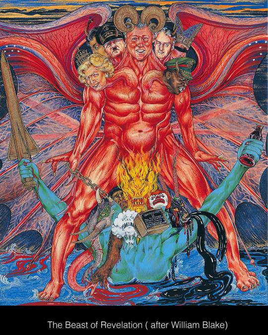
I have chosen a piece by the Singh Twins as I recently discovered their work and love how they entwine historical references, multiculturalism, humour and social justice messaging in their richly detailed illustrative work.
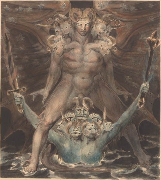
Here is a quote from their Facebook page explaining their latest piece, celebrating the 18th Century British Artist, Poet and Satirist, William Blake, a local hero here in my home town of Glastonbury.
Today we celebrate the birth in 1757 of the brilliant British painter and poet William Blake whose political, symbolic and satirical art has inspired our own practice. Our painting ‘Beast of Revelation’ pays tribute to Blake’s work by the same title. Blake’s work illustrates the Biblical account of St John’s vision of the seven headed Red Dragon bestowing power on a Blue Beast rising from the sea. Within early Christian tradition this account was popularly regarded as symbolising the partnership between evil earthly rulers and Satan’s servant or the Antichrist which would lead to the temporary stronghold of Satan over the world before his final defeat in the ultimate battle of good over evil at the second coming of Christ.
First here is Blake’s original image- ‘The Great Red Dragon and the Beast from the Sea’ which was one of a series of watercolors which portray the artists interpretation of Biblical images from the Book of Revelation. Note that the heads of ‘the beast’ are anthropomorphised, and could relate to figures from the artist’s time? (Image source https://www.nga.gov/collection/art-object-page.11499.html).
And here is the Singh Twins modern interpretation and a very insightful quote from their page explaining why they chose to create their work this way .
They explain the Religious iconography and symbolism used in both images. There are modern historical references and satirical portraiture, and they have enriched the quite muted tones used in Blake’s original painting with vibrent reds and blues, perhaps a nod to the blood spilled by British and American leaders in the image? The Muted blue-green of the beast emerging from the sea is like the Statue of Liberty, and I love their final question, provoking the viewer to think about who they might include as a head of the beast! :
‘Our artwork explores the universal and contemporary relevance of this specifically Christian theme. Satan’s reign on earth is translated as the very real evils of this world which have manifest themselves throughout history in the horrors of war and the atrocity of slavery; in the gluttony that has made species extinct and laid waste to natural environments; in the moral and spiritual decline of an increasingly individualistic, consumer society controlled by market forces and political agendas and in the self-serving interests of irresponsible and corrupt political and religious leadership..It's a timeless message.
If we were to create this same artwork today, it would look like the second image. Who would you add?’
3 notes
·
View notes
Photo

Saw this Periodic table of the emotions for sale on a social workers resource site and thought it was a great way to help us identify how we are feeling. Found it Interesting how the different emotions are colour coded- this is something I have been exploring in my sketchbooks for my #strodefad #summerproject
Blue is traditionally associated with feeling low or sad,
Red is associated with anger and yellow with happiness/joy.
Green for disgust/envy is also quite common.
Not to sure about the purple for fear though? I would associate darker colours- black maybe? Guess that might not work on a poster though :)
Note that Red is also used for Love- but a ‘pinker’ version, interesting that the same colour evokes quite opposing emotional responses.
#emotions#colour theory#be kind to your mind#strodefad#artstudent#anniesartthings exploringcolour summerproject
3 notes
·
View notes
Photo

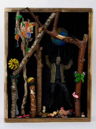
AND BREATHE!! Here is my Tree of Mythological Life. A world of it's own where mythological and legendary creatures and characters can live peacfully. All done now and in the lap of the gods, and examiner's. 🤞🤞 Went in for a brief touch up this morning 🌄 I can't believe this is end to my hectic year as a mature art student. The course, the tutors and my fellow students have done so much for me this past year. I am ending this course with more self confidence and more opportunities than i could ever have imagined. Thank to you all!! @brokensharkcage @anniesartthings @lowish.art @ironic_idoms_of_icarus @strodecollegeart @petrina.rochester @spacebirdrobin_arts And sooooo many more.!!! ❤❤ #strodecollegeartdepartment #maturestudent #artcollege #strodeartfad #sculpture #characterdesign #worldbuilding #escapefromreality #mythology #myth #magic #fairytales #treeoflife #painting #cardboard #digitalart #aboniablesnowman #thegreenman #loveart #lovemycollege #collegeisawesome (at Street, Somerset) https://www.instagram.com/p/CPQHWYXM9qi/?utm_medium=tumblr
#strodecollegeartdepartment#maturestudent#artcollege#strodeartfad#sculpture#characterdesign#worldbuilding#escapefromreality#mythology#myth#magic#fairytales#treeoflife#painting#cardboard#digitalart#aboniablesnowman#thegreenman#loveart#lovemycollege#collegeisawesome
6 notes
·
View notes
Text
Art Is Essential!
#ThursdayThoughts as followers of this page may know, I am also a #creativewellbeing practitioner. #WorkSafeandWell is about promoting #creativeleadership to make our workplaces more inclusive and #CompassionateCommunities. An essential part of building these is supporting the creative arts in all forms as both participatory and observational tools.
As artist @anniesartthings I use my #creativepractice to support my own mental health and start conversations about #Stigma and how creativity can support better #mentalwellness. This afternoon I attended an inspirational campaign launch by the #artisessential campaign organised by #ContemporaryVisualArtsNetwork and hundreds of other #creativeprofessionals supported this view. We heard from a host of brilliant speakers including @matthewburrows, @laurasillars-blog, Sheryll Catto from Action Space, and directors of #MIMA, #theBaltic, #CHEAD and #VASW
As we move towards the first full year of this lockdown, we have been deprived of access to creative spaces and experiences that we all took for granted, and this has impacted so many people.
Art and Creativity play a crucial part in the #wholepersonwholelife model for wellbeing, and we must ensure that employers, educators, funding bodies and policymakers remember this. You can learn more about this campagn here: https://www.artisessential.art/about

#artisessential#cvan#strodecollegeartdepartment#anndimentartist#artists on tumblr#artistnetwork#mima#thebaltic#sw art#glastonburyartist#vasw#actionspace#chead
2 notes
·
View notes
Text
Week #3 Paint

This week’s theme is about the use of Paint in Art throughout history and I have chosen an image by Andy Warhol entitled ‘Marilyn Diptych’ as it relates to my pathway project theme #adistanceformasaroundourbodies too. See my @anniesartthings blog for posts relating to that. htis iconic image has ben considered one of the top10 most influential pieces of modern art by critics and is currently owned by the Tate.
Formed of 2 separate canvases underpainted in bright bold acrylic colours and multiple repeated silkscreen prints with black acrylic paint, they were created just weeks after the death by overdose of the iconic Hollywood actress #MarilynMonroe.
It is reported that his original intention was not to present them as a diptych, but Warhol did so on the suggestion of visiting art collectors who saw the works when they visited him. Diptychs were traditionally used in religious iconography so by combining the 2 works, Warhol is commenting on fame and how we worship public figures.
Together the paintings reflect the two sides of famous people- the bright flashy colourful public persona, and the blurred, greyscale private individual that is behind the public mask.
The fading and blurring of the images on the right canvas (created by differentially applying pressure when placing the paint through the screen) is a reference to her fading and passing, and the choice of source image used- from a publicity poster for the 1953 movie ‘Niagara’ is symbolising Marilyn at her brightest point.
In terms of scale- Warhol cropped the image to make her face larger than life and repeated it multple times (50 in rows 10 x 5) on large scale canvases over 2m x 1.5 m size to represent the public commodity that she became. Each reproduction of her image is similar but not identical and the ‘pop art’ colour pallette on the left canvas makes the left canvas seem like the movie posters you would see plastered on walls (or in modern times on advertising screens). The use of screenprinting to reproduce the face also
In the context of the time this piece was made, colour Television was still relatively new in the 1960′s, and the ultra-white teeth and bright yellow hair are in a way a social commentary of the perfectionism that Marilyn struggled to cope with and ultimately died because of. This is sadly still relevant today with Social media and press images of ‘perfect’ looks.
#popart#andy warhol#strodefad#art history#strodecollegeartdepartment#paint#marilyn monroe#screenprinting#acrylicpainting#anniesartthings
5 notes
·
View notes
Text
Week #8 Message#2
For this blog we looked at 3 images that challenged the stereotypes on different cultures and discussed the social messaging the artists were trying to convey. The images we considered were:
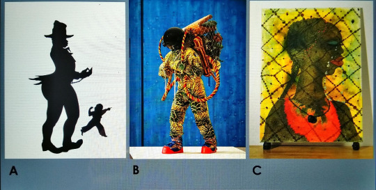
A: Emancipation Anticipation, by Kara Walker (2000). Screenprint on paper.
B: Refugee Astronaut, by Yinka Shonibare (2016) (mixed media sculpture).
C: No Woman, No Cry, by Chris Ofili (1998) (mixed media on Canvas and Elephant dung).
We were then tasked to select an artwork that challenges prejudice and explore how it has effectively communicated the message.
Challenging mental health stigma is something I feel passionate about and use my art practice and other work to start conversations about this issue (see this Blog post)
I have chosen Photographer Edward Honaker, who at just 21years-old began experiencing depression and anxiety, which he described as feeling like 'being at war with his brain'.
To cope, he turned to his camera to create a series of self-portraits to reflect his own experience of depression. The images he created are evocative and challenge the stereotypical views on mental illness, whilst retaining the essential emotional response of feeling isolated and trapped by the illness, and are a powerful reminder that, while each individual's experience with depression is personal, the feelings can be globally identifiable.
As the artist says in his interview with the Huffington post:
"I think a really helpful way to end the stigma surrounding mental illness is to be there for others who might be suffering,"
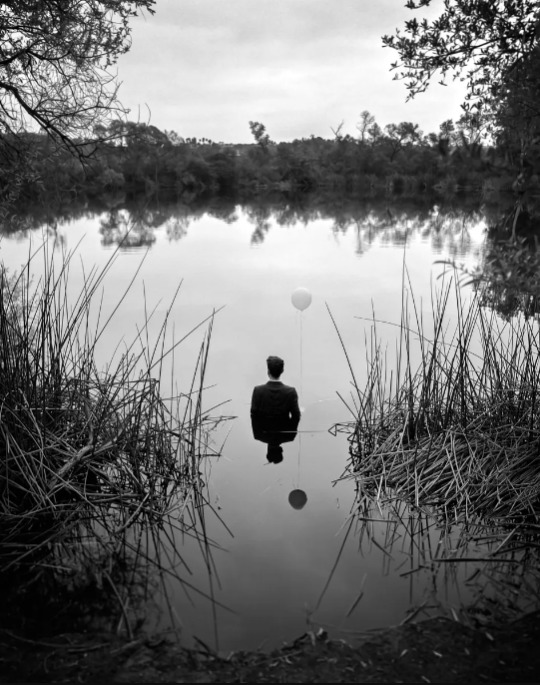
What is so wonderful about his photographs is that he is inviting Men to talk about their mental health challenges and portrays men in ‘power suits’ distorted in some way, to reflect how mental illness can affect anyone. The figures are placed in domestic settings or with props such as baloons (I believe as a metaphor for ‘getting out of your head’) and the image above with the figure half submerged in the water and their reflection is a small fraction of their real self speaks to me of how crippling anxiety and depression can be- on the outside the smart suit and ‘mask’ appear fully functional, but internally the mind is taken over by the illness. Other images in this collection comment on family dynamics and fitting in with society .
I think this quote from the artist is a good summmary of how we should respond to his work, and in general as a society:
"You never really know what others may be going through so all you can really do is be kind and nonjudgemental."
Quotes and images sourced from <https://www.huffingtonpost.co.uk/entry/edward-honaker-photography-mental-illness_n_55f0759ce4b03784e2777fbb
Images original source from: http://www.edwardhonaker.com/booktwo
#art history#strodefad#edward honaker#mentalheathawareness#photography#mensmentalhealth#challenging stigma#anniesartthings#timetochange
2 notes
·
View notes
Text
A Review of three works from the ‘Shape and Form’ Exhibition at @heartofthetribe Gallery, Glastonbury
As our final assignment for our Art History module for @strodefad we were required to write an essay discussing eithere an art history movement or a recent exhibition visited. Always up for a challenge i chose to write about the brief opportunity I got to see an art gallery between lockdowns in the new gallery that i am fortunate to have just a few minutes walk from my home here in Glastonbury.
What made it a really special experience was that i managed to contact two of the three artist I chose to include in the essay and they very generously answered my questions about their exhibit pieces to give me some context and process insights as first-hand accounts and it was wonderful to be able to ask the creators quesitons about their work and how they made it. The exhibition had high quality contributions from over 30 Somerset artists, so it was hard to select just 3 works, but I managed and got the essay completed in time.
This is an analysis of three selected works from the ‘Shape and Form’ exhibition at the Heart of the Tribe Gallery in Glastonbury. The gallery only opened in September 2020 and despite the restrictions caused by the COVID pandemic, this was the third exhibition that the gallery has managed to stage since then.
Following a core artist group launch exhibition ‘Diversity’, and solo exhibition ‘Beauty and Truth’ by John Minshull, this exhibition was a collation of works submitted by 30 Somerset artists following an open call for contributions from the gallery core artists and online directory members.
Curated by gallery manager Kim von Coels (aka artist ‘The Krumble Empire’), the aim of the exhibition was ‘to explore the fundamental building blocks of visual art, both geometric and organic’. The exhibition was open from 3rd December -26th January and I managed to see it twice before lockdown restrictions came into force. A virtual tour (1) is also available here
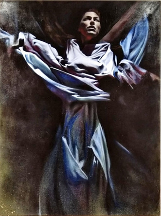
1. Millie Gleeson: ‘All We’ll Know’
The Painting was displayed in a prominent position on the last wall as you exit the exhibition, directly opposite a canvas featuring an abstract female form in greyscale graphite, and the scale of this canvas (60 x 48 inches) made it really stand out.
I saw Millie’s solo show also entitled ‘All We’ll Know’ at the Red Brick Building in June 2019. She uses reference photographs to help with composition and is heavily influenced by her time in Berlin and Mexico.
Many of her works feature masks painted on the (mostly nude) female subjects, so what I found fascinating about this piece was that the face was illuminated and prominent and she is swathed in billowing robes.
I contacted the artist for more information on the context and process of the painting.
She told me this is a self-portrait, painted from a 'still' of the artist performing in a music video her friends (the Hics) produced, also called "All We'll Know"( 2 )
Gleeson started began painting this in 2014, but it was put into storage until she revisited to complete it in 2019.
She commented ‘it was a huge time of transformation and the end of an era and perhaps I had to return to the painting when I felt I'd fully transformed.’
The Painting has lots of movement, which is representative of the video it is sourced from, the performers are in an industrial setting and are either submerged under water, or as captured in this image, rising up and breaking free. The robes are flowing and there is a sense of movement in the arms and legs. Her website (3) describes how the work was developed as part of a series developed during an Artist Residency at Arquetopia in Mexico.“The residency applied Levanasian ethics to the artistic process, teaching to respect the integrity of differences and question the desire for totalisation. Questioning whether you can truly know the other and if you only know the self, how can you respect the space between?” “Any creative project I have embarked on at the core has revolved around the topic of identity or identification. Following the residency lectures my project became entirely introspective, leading me on a journey of self-discovery. I began to look at my own shadow, distortions, fractions, mirror images, deep and dark aspects of myself. Using the vibrant colours that surrounded me I began to explore my own conflicts and duality through a series of self-portraits, in an exploration to “All we’ll know.”I really resonated with this piece as it reminded me of the Salvador Dali painting ' Christ of St John of the Cross’ I saw at the Glasgow Kelvingrove museum. Light comes from above and the arms are widely placed. The pale blue colour palette and rich drapery in the dress against the dark background is similar to that shown in ‘The Countess of Southampton’ ( 4) (Anthony Van Dyck 1599-1641), seen at the Cambridge Fitzwilliam museum.
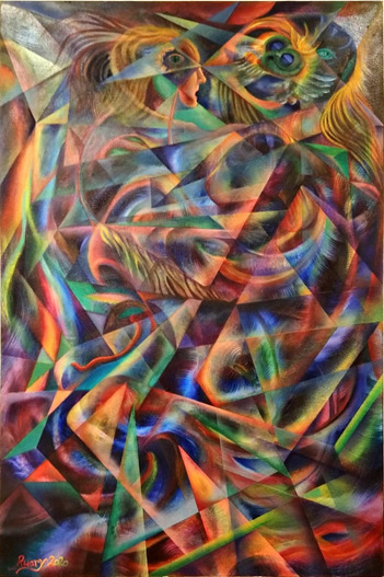
Ruary is an Edinburgh-born artist who has lived and worked all over the world and is a gallery core artist working in an attic studio above.
He is inspired by nature and psychedelic culture (6) and another of his works ‘Sacred Chaos’ was chosen as the exhibition feature image.
I interviewed the artist to learn more about the context and process behind these works. Ruary explained that “Trap Dance was a process-oriented piece, created as an experiment using masking tape to create random abstract geometric forms”.
The piece depicts two females and a male dancing, with Cubist and Italian futurists-influenced segmentation and distortion of the figures. The artist noted that the title ‘Trap Dance’ is a pun, as the two female figures appear to be being pressed together by the male dancer (Allen quipped it should have been called ‘Tape Dance’). The experimental process with repeated randomly placed masking tape and paint until the forms emerged, resulted in an abstract image.
The artist saw the forms of the dancers appearing and added them at late stages of development. It is more narrative in comparison with the cover piece ‘Sacred Chaos’; which was another process oriented, straight-edged construction using platonic forms, mathematical constructions, intersecting circles and combining them to make a striking abstract image. The artist has a lifelong interest in Alchemy in art and alchemical symbolism, and this is evident in the works presented here (7).
The colour palette is cooler at top and has more vibrant and darker tones at bottom, with a spotlight in the top left corner, which the artist suggests is reminiscent of a stage or nightclub scene. There is lots of movement as the figures are interweaved amongst the abstract shapes.
This painting is hung in a long narrow corridoor directly opposite the toilets (another ‘trap’ reference?) and adjacent to the exit door to the garden space. The works surrounding the piece are smaller in scale and have less visual impact, and I think that having to stand so close to it makes it more of an experience as the viewer is drawn into the movement and abstract forms on the canvas. There is no opportunity to stand back and see the work in a wider context so one is trapped like the dancers in the image.
3. ‘Lost Toys’ by Julie Ackerman .
This is an installation assemblage sculpture piece selected from a collection of 10 museum themed boxes. (8). The work is inspired by the ‘cabinets of curiosities’ or ‘Wunderkammer’ (as described by Anastasiya Gutnic from the Metropolitan museum of art here with an example from the German artist Nicolaus I Kolb) (9).
The cabinet is displayed with a second piece called and ‘Science Lab’ and both are relatively small in scale requiring the viewer to lean in close to see the details.
Key elements of a Wunderkammer are:
· Naturalia (natural, found objects),
· Artificialia/Artifacta (mand-made, abstract objects), and
· Scientifica (scientific instruments and technological items)
The cabinet contents are carefully considered to reflect the message that the artist is trying to express, and fits the categories described above.
I chose this piece as the lockdown period has made many of us question what is important to us and question our consumerism and its’ environmental impact.Using upcycled packaging and materials has been a theme of my own creative practice this year.
The artist states on her biography (8)
“I was compelled to take on the challenge of using unwanted objects and materials as an art medium. Raising awareness of a world in crisis through art is paramount in my work. By transforming waste into beautiful works of art, I hope to inspire and encourage the 'Art of Recycling' turning a negative situation into a positive one.”
The artist goes on to state “The impact of overpopulation means greater demand on natural resources and an escalating waste problem. We need nature to thrive by reducing our demand for new materials, leaving nature intact.”
In the ‘Lost Toys’ cabinet a collection of sticks and a pine-cone (Naturalia) are surrounded by a plastic ‘monster’ (Artificialia) and assorted toy animals. A green butterfly rests on a branch with a wooden ’tribal style’ peg and a ‘protective’ dragon flying overhead and a lurking toy hairbrush in the background.
The second cabinet has scientific paraphernalia (Scientifica) and a skull with glasses, references to the impact of sanitary waste and plastic pollution on marine life. There are also humorous touches, like the small creature and drawing pin on top of the skull.
This fits with the exhibition theme as it invites the viewer to examine how the items relate to each other and to our own experiences. Viewers will respond to the individual elements and interpret their relationships differently.
The placing of the cabinets in a transition space between two rooms containing large paintings is also an interesting variation in form and requires a different type of interaction by the viewer.
Summary
The aim of the exhibition was to explore the fundamental building blocks of visual art, both geometric and organic, and the curator has selected a broad range of 2D, and 3D exhibits to really allow this theme to be represented. I found it quite difficult to select only three works for this essay as there was such a high quality to choose from.
These three selected artists have interpreted the theme in quite different ways, but one gets a sense of shape and form from all of their works shown.
References
1. Shape and Form Exhibition Virtual tour: https://www.infohost360.com/heart12/
2. Millie Gleeson – The Hics reference video "All We'll Know" https://youtu.be/RB2MweTwfQY.
3. Millie Gleeson website: https://milliegleeson.co.uk/all-well-know
4. Van Dyck Image reference found in Fitzwilliam Museum Cambridge guide, p37. 2016 ISBN: 978-0-9574434-9-5
5. Image sourced from https://artuk.org/discover/artworks/rachel-de-ruvigny-countess-of-southampton-as-fortune-5613
6. Ruary Allen Artist Bio: https://heartofthetribe.com/portfolio_page/ruary-allan/
7. Ruary Allen Artist website: https://artalchemist.com/
8. Julie Ackerman Artist Bio: https://heartofthetribe.com/artist-directory-view-by-artist/user/77/
9. Cabinet of Curiosities reference video: https://youtu.be/j6q10euArks Nicolaus I Kolb (German, 1582–1621). Apothecary Cart, 1617–18. Veneer: ebonized pearwood (Pyrus communis), ebony, partially gilded silver; carcass: conifer; interior: protective quilted cushion covered in red silk, drawers and chest lined with red silk velvet; gold, trimming; mounts and fittings: brass, partially gilded; thirty-two (32) vessels and utensils: glass, partially gilded silver, low carbon steel, leather, 11 x 11 x 9 1/16 in. (28 x 28 x 23 cm). The Metropolitan Museum of Art, New York, Purchase, Anna-Maria, and Stephen Kellen Acquisitions Fund, 2019 (2019.229.1a–c–.32a, b)
10. Cabinet of Curiosities reference description: https://en.wikipedia.org/wiki/Cabinet_of_curiosities
11. Dr. Beth Harris and Dr. Steven Zucker, "How to do visual (formal) analysis," in Smarthistory, September 18, 2017, accessed January 28, 2021, https://smarthistory.org/visual-analysis/.
#artists on tumblr#art history#glastonbury#ruary allen#millie gleeson#julie ackerman#heart of the tribe#strodecollegeartdepartment#anniesartthings#anndimentartist#artalchemist#the hics#wunderkammer#all we know#local gallery#shape and form#ual art and design
1 note
·
View note
Text
#5- Installation and Performance Art
This week we looked at three pieces of #installationart and #performanceart:
1. Balkan Baroque (1997) by Marina Abramovic
2. Cold Dark Matter: An Exploded View (1991) by Cornelia Parker
3. Seizure (2008) by Roger Hirons.
and our task was to comment on something in this genre that we found interesting. As an artist and performer I have a keen interest in this area and found it difficult to choose just one piece for this blog post!
I settled on writing a few thoughts about my experience of visiting the Olafur Eliasson ‘In Real Life’ exhibition at the @tatemodernuk last December. I had watched a documentary programme about this prolific artist, architect and activist before starting on the @strodefad course and was thrilled when we had the opportunity to visit this exhibition on a college trip. It contained a retrospective of the Artist’s work including a series of installations where the visitor became part of the art and thus part of the performance as we interacted with each installation and responded to the spaces created throughout the exhibition rooms.
I love this quote from the artist, (which ties nicely into our next pathway project ‘then and now’)

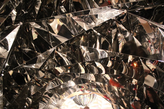
Several of the installations in the exhibition make us reflect on time and space perception, whether it is the bright strobe effect lights projected onto a wall and capturing silhouettes of visitors as a brief stop-motion type freeze-frame (Your Uncertain Shadow, 2010) , or the tunnel lined with mirrored geometric forms that distort the inhabitants view of their surroundings from all angles above , below and around as they walk throught the space (Your spiral view, 2002) , I emerged from this exhibition with mind expanded about the possibilities of how an artist can get an audience to interact with their work.
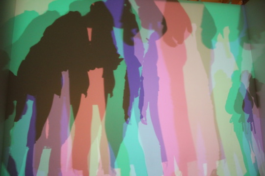
Your Uncertain Shadow, 2010 (images taken by Ann Diment Dec 2019)


‘Your Spiral View’ Olafur Eliasson 2002 (Image taken by Ann Diment 2019.
#tatemodern#olafur eliasson#strodecollegeartdepartment#glastonburyartist#anniesartthings#installationart#modernart#sculptureart#art history
2 notes
·
View notes
Photo

If anyone had asked me five years ago if I would have thought it likely that in the same week on top of doing several P/T jobs I would have been promoting an album (featuring my artwork on the cover), watching a film preview of a play I had acted in, signing a 'brand ambasssador contract' for a global self-development brand, and exhibiting in multiple public art exhibitions, as well as applying for funding for a business network I had helped set up, I would have laughed at them and said I could never cope with all of that! Many of my social media followers only see the positive side of me, and may not realise that my PTSD caused crippling anxiety, depression, self-doubt, and fear of criticism for many years until I found ways to recover and effectively manage them. My journey as an artist has been one of discovering how to express myself without fear about what others may think of it. Today I took the plunge and launched a Patreon account to take me on the next stage of my journey. My biggest struggle has beeen juggling too many plates with multiple part-time jobs to fund my creative projects and feling frustrated and exhausted by not getting everything I want to do done. I now want to be able to get all those community art projects going so I can help others benefit from the healing power of creativity. If anyone is able to support the page by becoming a patron then here is the link, even if you are not personally able to support it I would appreciate it if you could share it? Many thanks Ann xx https://www.patreon.com/anniesartthings https://www.instagram.com/p/CC3RFNClbOK/?igshid=1mxdyxgr61uh9
0 notes