#every once in a while i will try out overlays and adding stuff
Explore tagged Tumblr posts
Visit Tumblr Blog
Explore Tumblr blogs with no restrictions, modern design and the best experience.
Last Seen Tumblr Blogs


Fun Fact
Tumblr has been banned in Indonesia for providing people with access to pornographic content.
Text
i could edit other characters but why would i want to when jenny green is right in front of me ykwim
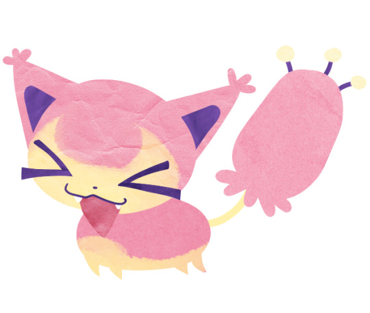
#idk what it is but#there’s just something about her that makes her so much fun to edit#and i had a lot of fun with this one#every once in a while i will try out overlays and adding stuff#idk if i like it too much#but i don’t mind it#dead boy detective agency#dead boy detective netflix#dead boy detectives#jenny green#jenny the butcher
24 notes
·
View notes
Text
net ramble
every once in a while i download a fresh browser and don't install any addons just to see what the raw internet is like, and whoo boy, it's rough out there.
this time i installed fresh google chrome since i haven't used it in forever. i played their little game and setup their built-in privacy settings, and even flipped on their ad personalization and preference switches. i raw-dogged it like that for a few hours, then installed a manifest v3-compliant ad-blocker to see how those are progressing.
impressions after a few hours:
— chrome's ad privacy options and all that jazz actually do seem to cater a lot of ads to stuff i'd actually want to see. doesn't help the websites that completely fill your screen up with ads and overlays, though.
— on that note, holy shit. banners on top of banners with videos in the corner and newsletter signup requests sliding down from the top of the screen... are there really still people who browse the web like this? when i see a site that has basic little ads in non-intrusive spaces, i almost feel bad because they're trying to do it right, and getting their ad revenue cut by the ad-blockers people always have on to cut out all the insane stuff other sites do.
— youtube is... strange. i get ads on the front page, but haven't gotten a single in-video ad yet. i don't know if there's some sort of grace period on a new install, or if they serve you less ads if you're using chrome. even after installing an ad-blocker, i left it disabled on youtube just to see how long it would be until i got an in-video ad, and still haven't gotten one after hours of auto-play in the background. for comparison, i booted up edge and got an in-video ad about three videos in. strange.
— the manifest v3 version of ublock origin (ubo lite) seems to work pretty well, even on basic settings. using it in edge, it seems to work for youtube as well, though you have to crank the slider all the way to the right and give it the extra permissions. the only thing missing is the element zapper - not sure if that will ever be doable in mv3. there seem to be less filter lists to choose from than in normal ubo, but i haven't noticed anything slipping by lite's filters. i did maybe notice some differences in cosmetic filtering (like when it removes the blank space where an ad would be) but i don't know if that's another mv3 limitation, or was just because i was mostly using the "basic" filtering setting for most sites.
*******
trailing off...
i've been using firefox for a while now and i almost hate how snappy chrome seems in comparison. i had to fiddle with about:config in firefox forever just to get scrolling to feel good, and even more to "soup it up" to the point where it was fully taking advantage of my rig. in chrome i can flip a few flags in chrome://flags and achieve similar results in less than 5 minutes.
the difference in loading times on youtube have been noticeable - i'm not sure if the conspiracy that google is slowing things down for other browsers is true, or if it's a firefox issue, or a little bit of both. i did notice a slight stutter when loading videos in edge, but it's also getting bloated as hell at this point, and still wasn't as noticeable as firefox.
digressing way off the original point of the post... it just makes me clench my fist that the only major alternative browser outside of the chromium-based monopoly still seems behind. i respect the firefox devs but man, i wish there was more real competition besides them, if for no other reason than to foster innovation through competition.
i'll likely keep using firefox on principle for the time being, but i'll be keeping an eye on how things go as the manifest v3 transition keeps going along. it's already tempting to just pick up a de-googled chromium build from woolyss, but i've already put so much time into tweaking firefox that i might as well stick with it for a bit longer.
if the best ad-blocking and privacy extensions are able to keep their efficacy as mv3 settles in... i dunno. right now, it feels like a lot of people have over-estimated the doom and gloom surrounding mv3, but we'll really just have to wait until the dust settles and see how much security and privacy is really lost once the ol' reliable extensions make the migration (or refuse to, or are unable to)
1 note
·
View note
Note
alright! here's a more detailed post. you're going to need any digital art program that has two things: 1. layers, and 2. layer effects. being able to apply drop shadows to layers helps a lot, but when i started, i didn't use that and just faked the shadows using multiply layers.
my friend skitty is going to be helping me out. i use the same ol copy of paint tool sai ive been using since 2012, and i do some post-processing stuff in photoshop.
using this sketch, i start off with lineless art with each individual piece of it on a different layer. lineless art's not as scary as it seems! i use my sketch as the lineart & just delete it later. keep depth in mind when you're arranging your layers. things further in the back are going to be towards the bottom, while things closer to the viewer are going to be towards the top. you can draw on details with any traditional brush you'd like.
version with & without sketch for reference. here's what my layers look like. i tried to name them to make them easier to parse!
(that last one is supposed to read "inside of ears + line that connects dots to tail.) the locked layers are from where i drew on details that wouldn't need separate layers - mostly adding the yellow to the head + body.
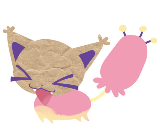
next, you're going to need pictures of paper. you can find some online, or you can take photos yourself. i switch between stock photos of paper textures and pictures i took of crumpled up paper with my phone camera. you don't need anything too fancy.
here's the stock photo i'm going to use for my example. i use a different picture for every layer to give it more depth & intrigue - if you reuse the same picture over and over, your brain starts to connect that there's a repeating pattern and it can look a little "off".
i'll copy and paste this on top of a layer and apply a layer clip/layer mask. this is called different things in different programs, but if you see it, i'm sure you know what i mean.
i set the layer mode to "overlay", which gives me this:
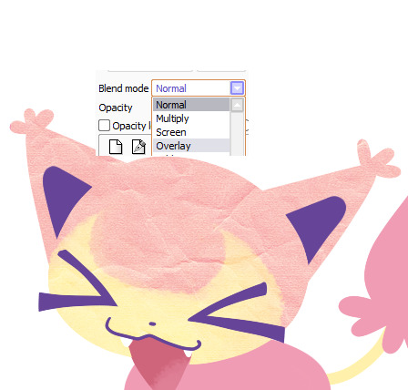
it changed the color a little bit, so i'll adjust the colors to make it grayscale + a little darker.

(comparing adjusted colors with & without the overlay setting)
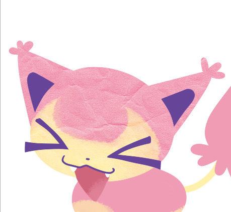
then repeat this process for every layer.
ta-da! we have textures! i recommend anyone trying this to have fun with this step. try out layering multiple textures over one part. try out different types of paper. you dont even need to use just paper! what about cardboard? plastic? go nuts!
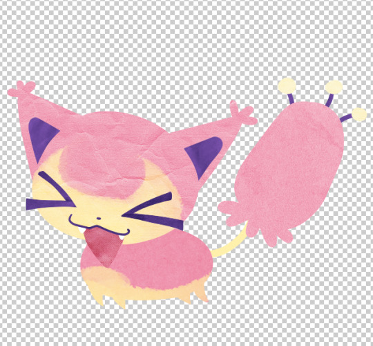
at this point, i save the file as a .psd and migrate over to photoshop. transparency!
in photoshop, i start applying drop shadows to each layer's layer style. double-clicking each layer, i get to select:
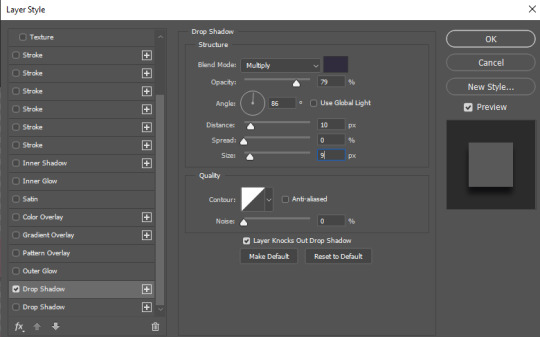
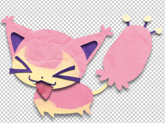
repeat for every layer. you can adjust the settings of every drop shadow to get different depths. i mostly change two settings, distance & size:
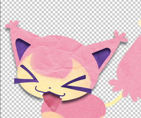
a large distance with a large size will make a layer look like it's coming forward more, while a small distance with a small size will look like it's closer to the layers underneath it. compare the head (distance 10, size 9) with the details on the face (distance 3, size 2):

repeat for every layer, and we get:
yay! yippee!
at this point, i start doing post-processing stuff. adjusting colors, contrast, etc. once that's over, i'm all done! ta-daaaa!
hi your paper cutout art style has fundamentally changed my brain chemistry ever since i saw it(like 5 seconds ago) and now the wizards in my brain are melting everything rapidly. can i ask you how you achieve such an edible and fantastic effect
thank you so much! the tl;dr is that it's a basic lineless art style with texture overlays + drop shadows but i can make a more in depth post to explain it more ^_^
240 notes
·
View notes
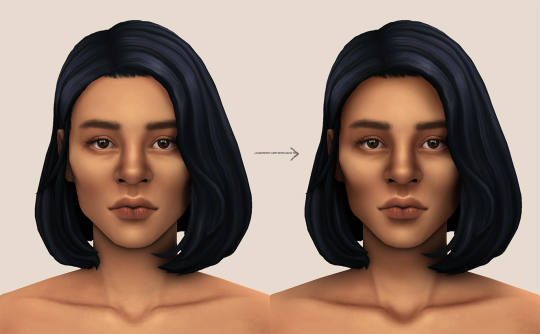
Photo

not sure how to make an introduction for this tutorial. i might have gone too extra because it’s so long...but this is highly requested and i said i would do this as detailed as possible, so here we go!

adobe photoshop 2018 (ahoy, matey!)
topaz lens effects (just for grain)
srwe (sometimes, but not for this tutorial)
reshade (i dont use a specific preset)
drawing tablet (wacom intuos art)
macbook pro mid-2015 (but bootcamp)

//part one
grab a screenshot from your own lovely screenshot folder! mine is straight from my reshade screenie folder. then crop it how you like it! my original screenshot size is 2560 x 1600, and i almost always cut the background out. this is how i do it:
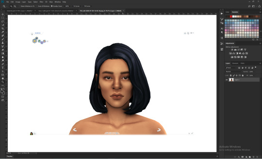
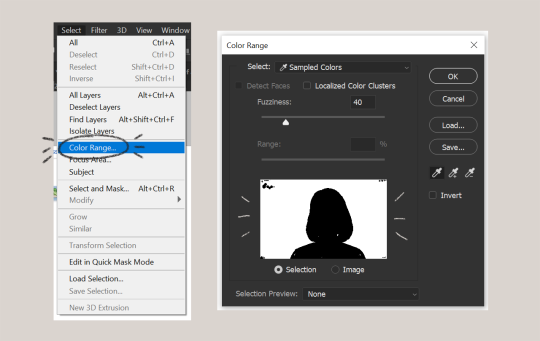
click color range, then click on the background of your sim. the little screen above will look like that. the background should be white. it’s easier when it’s a fully solid color. those are my settings above. click ok! the selected area will have those teeny tiny marching ants.
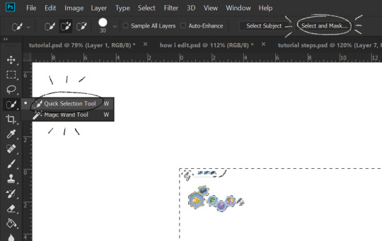
click quick selection tool, then select and mask...
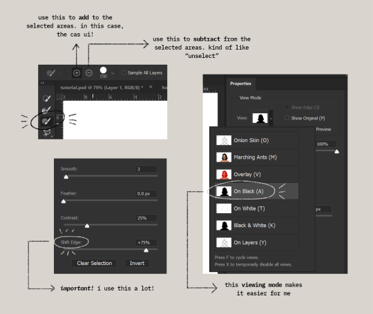
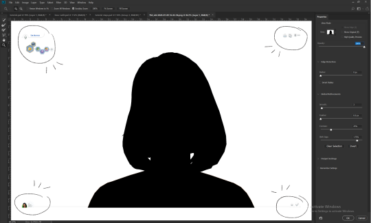
i drew over these circled areas using the “add brush” i showed above. use “on black” viewing mode, then make sure that the sim is completely filled black (it’s the unselected area). use shift edge so there wouldn’t be any of the original bg left over. my settings are shown above. then click ok if you’re all done. press delete and then ctrl + D to unselect. the marching ants should be gone. go ahead and crop it!
after cropping, i resize the width of the photo to 1280px! always!
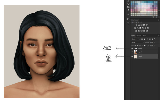
i create a new layer for my background, then add in the psd that i use for my edits. (i hide my psd layer while drawing)
sometimes i also use liquify to edit things like this:

//part two
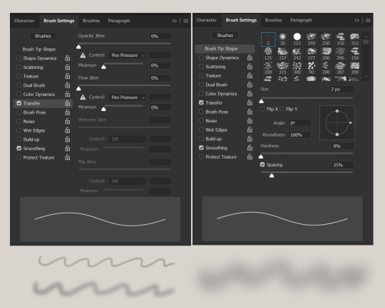
i use a soft round brush to do everything! it’s literally from adobe, but i changed a few things like the flow jitter in transfer.
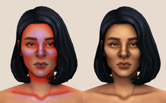
red areas are usually where i put the shadows, purple areas are usually where i put the highlights
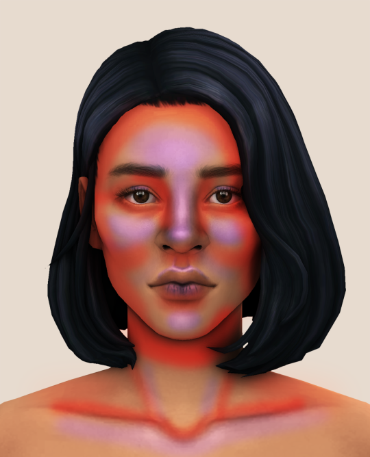
i usually do the shadows before anything else! it’s pretty simple. using the brush i showed above, i create a new layer.
use the eyedropper tool on her skin, then pick a slightly darker shade. change the blending mode of the layer to multiply, then draw the shadows.
right click on the layer, then select “create clipping mask” to make your life a little bit easier. an arrow will appear beside your layer.
//part three
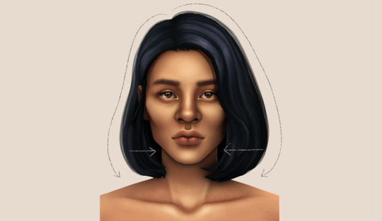
this is where i draw over the features. let’s look at her face. these are basically what i think it needs:
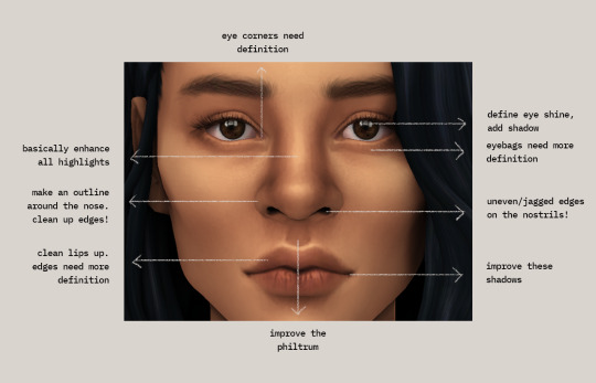
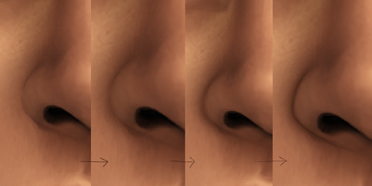
pay close attention to the imperfections and clean it up! that’s what makes it “sharper” in my opinion. small brushes will do the job! something like this:
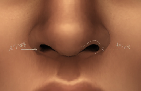
define the edges!!! define!! zoom in and take a look!! even though these are tiny little details, it makes a whole lot of difference! the eyedropper tool is your best friend!
i start with a big brush and then i use smaller and smaller ones as i go, which creates the sharpness. go a little darker as well! im not very skillful with my graphic tablet, so i add stuff bit by bit since it tends to become too harsh when i just go for it! im not as talented as some of u here ;-; i just wing it and pray it doesnt look too bad. half of the time im just experimenting since i literally do not know where some shading goes
i wont be showing every single thing, but basically that’s the idea! i’ll add in the stuff i pointed out above and more shadows. sometimes i might turn down the opacity of some layers if they look a bit too much. here’s what we got so far:
i also like adding some face pores using this amazing “skin texture 1″ brush from this brush pack!
//part four
for the highlight layer, i change the blending mode to either overlay or soft light. use a slightly bigger brush for the bigger areas. use the eyedropper tool on her skin, and instead, pick a lighter shade.
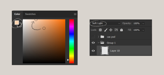
let’s start adding highlight to the purple areas i marked above!
try to enhance the highlight on tiny details too such as the eye corners! if you want something more dramatic, create a new layer and do an overlay layer this time! don’t be afraid to add some on the hair, eyes, lips etc.
//part five
ok lets add some not decent looking hair strands. i almost always avoid this part because i literally have 0 idea on how to draw hair. i use the “hair base” brush from the same brush pack i linked to above and also have smoothing on to about 35%! the eyedropper tool is still your best friend! just follow the flow of the hair and i guess you’ll be fine ???
i’ll also fill in the annoying gaps beside her neck
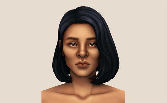
unhide your psd layer and wooowweee
//part six
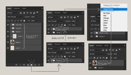
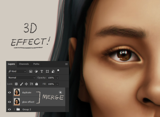
select all the layers, then click create a new group!
select the new group, then hit ctrl + J or right-click the new group, then click duplicate group
right-click the duplicated group, then click merge group!
i do this so i have a backup of the collapsed layers and can make changes anytime.
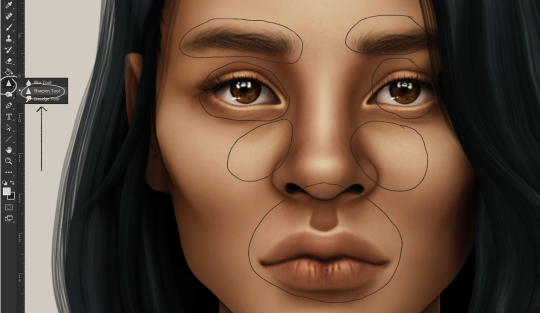
i use the sharpen brush on small details i circled below. i used to do stylize > oil paint or topaz clean before, but since the personal action that i use blur things a lot, i try to keep small details visible and sharp.
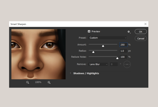
next is smart sharpen, my settings are below. sometimes i go for a smaller radius, but it looks like this most of the time.
my personal action set consists of this:
duplicate the layer that you just used smart sharpen on, then click lens blur!
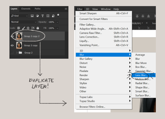
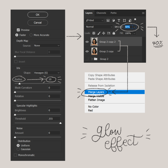
below are my lens blur settings
turn the opacity of the layer (that you just put the lens blur on) to 40%
select both layers, right-click then merge layers!
duplicate the layer again (yes, again) then right-click, choose blending options.
uncheck the R located on the “channels” under “advance blending” then click ok.
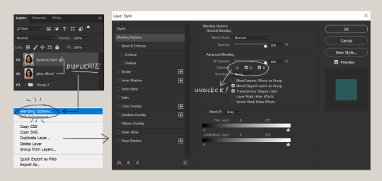
an icon will appear on that layer!
make sure you have that layer selected, then click the Move tool
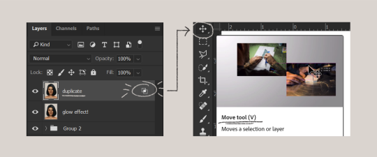
then hit your arrow left/right key once or twice! i do it once because i only want a subtle 3d effect! go ahead and merge those layers!
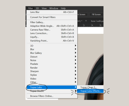
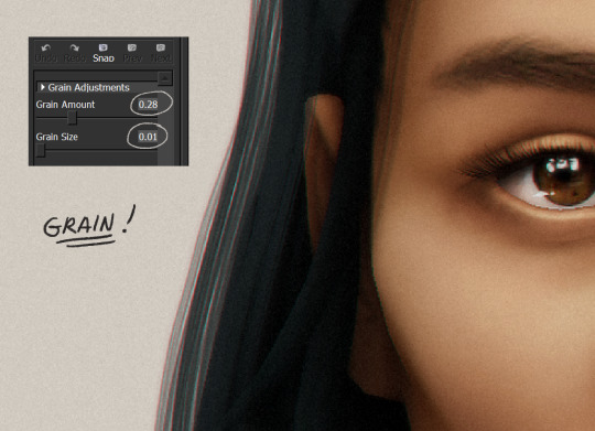
last step is the grain effect. i use topaz labs > topaz lens effects. if you don’t have this, you can also use filter > noise > add noise that photoshop has.
these are my settings:
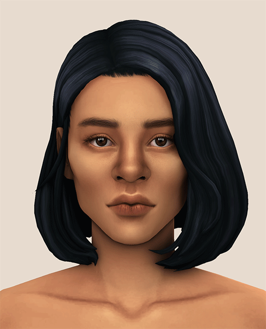
//final look!
here’s a before and after gif! (here’s the finished edit) i hope everything’s clear! i’m really bad at explaining things (っ˘̩╭╮˘̩)っ
feel free to tag me when you use this tutorial for an edit!! i would like to see it! i hope this helps! ♡\( ̄▽ ̄)/♡
2K notes
·
View notes
Text
(You can find the set that this gif belongs to here 💙)
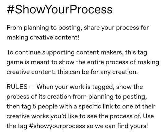
From planning to posting, share your process for making creative content!
To continue supporting content makers, this tag game is meant to show the entire process of making creative content: this can be for any creation.
RULES: When your work is tagged, show the process of its creation from planning to posting, then tag 5 people with a specific link to one of their creative works you’d like to see the process of. Use the tag #showyourprocess so we can find yours
I was tagged by @aheartfullofjolllly. thank you so much Pat! it was really fun to reflect about my own process 💗 You can find her post here and @lan-xichens' post that started it all here :)
Also thank you @huigusu 🥰 (who tagged me for my nie brothers set) I'll get to that one in a few days!
Now Pat gave me two sets to chose from to show my process, so obviously I chose the more complicated one :P
I only work in Photoshop CC 2018. I know that there are programs out there for easier cutting and sharpening but I have only just figured out how to do that in PS and I am too lazy to figure out any other programs right now xD
1. Idea and Planning
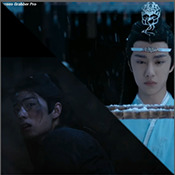
This set, like most of my sets with lyrics started with me reading the poem, clutching my heart and going "oh shit this fits my favourite characters!!". The idea actually started with me thinking that the first stanza of the poem would go really well with wwx during the burial mounds arc. Then I realized that the last stanza fits lwj better than him and from there came the idea to contrast the both of them next to each other. This is when I realized I wanted to do a dark-light contrast set, though I did not know that I would go with red and blue at that time. My idea in the beginning was just to do a black and white set
I was really impressed by how Pat said that she plans her sets around exact timestamps. Because I don't do that at all ^^ I just get ideas for which scenes would fit (in this case the wwx burial mounds scenes and lwj's kneeling and punishments scene) and then I watch the scenes to narrow them down.
Back when I made this set, I still used a screenrecorder (AceThinker Screen Grabber Pro to be precise. They have a test version that allows you to record up to 3 minutes) and recorded the scenes I needed from Netflix. This worked well enough but now I have the entire show saved on an external drive and it makes a world of difference when it comes to gif sharpness
Now, in this case I had to repeat this step once because when I was almost finished, I realized that I wanted a gif for the lwj corner but let's pretend I didn't do that and that's the way this gif was always going to look because otherwise this post will be way too long ^^
2. Creation
Short disclaimer: The creation process for this gifset was anything but linear. Multiple effects I used here were things I had never tried before. I just had a vague idea and tried to realize it through trial and error. So whenever I say "then I did xyz", it is implied that I ultimately went back to that step several times and changed stuff ^^
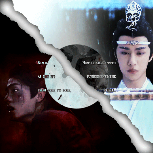
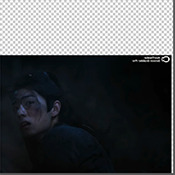
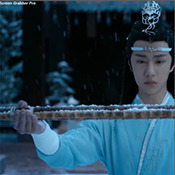
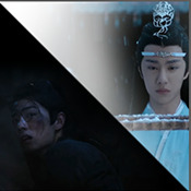
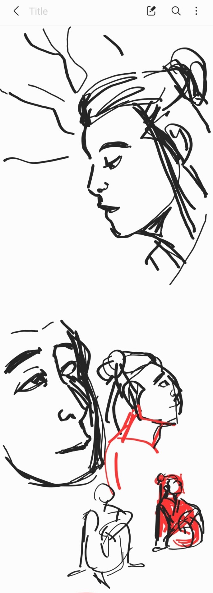
I started with the Wei Wuxian part of the gif. I usually use a frame rate of 0,06 (with some variation depending on gif length and size). I work in timeline so I converted all the layers to a smart layer. Then I resized the gif into a square, leaving big chunks of the gif empty (as can be seen below.) I flipped the gif horizontally, so he is looking inwards. This was simple because I felt it fitted the composition better. Then I imported the Lan Wangji part of the gif, again with a frame rate of 0,06. (Image 2)
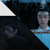
After that I created a layer for masking in a separate PS document by rotating a square until it was point down (is that a rhombus?). I sized it to match my gif (540x540 pxl) and copied it over. (Image 3) a bit of masking magic and ta da! There's the basic layout (Image 4)
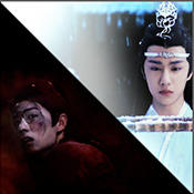
I put a layer of solid black behind wwx to get rid of the transparent bits (Image 5) and then started adding more white and black to both sides by adding solid whit and black layers that i put masks on and changed the opacity as i needed (Image 6)

("reading" direction: from the upper left to the lower right corner)
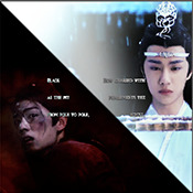
Then I fiddled with the colours a bit. The first thing I always do is using the curves layer to get more contrast. Then I use the colour balance tool and the selective colouring tool to get rid of that cql-typical cyan tint after that it's just trying to have it look "natural" while the colours still fit the overall scheme. This was difficult here because wei Wuxian’s side of the gif was very dark and when i turned up the saturation to see which colour dominated it was a very weird mixture of multiple colours. That's when i decided that I'd just go with red on his side, since lwj's side was already so blue and those to look great as contrasts.
After that just came a lot of fiddling with selective colour layers and brightness and contrast unti I has happy. There really wasn't much to it ^^. (Image 1)
After that I added the text. I knew I wanted the two lines to for a square of some kind. So I tried different fonds until I arrived at the one below. The two lines are in seperate layers so I could move them around and change the spacing between the letters until I was happy with the layout. I also changed the layer mode for the text to "difference" (is that what it's called in english? my PS is set to german sorry ^^), keeping their colour white. (Image 2)
I originally hadn't planned adding anything else but I felt like the gifs (plural because I switched between the gifs of this set) was still kind of empty and lacking, so I added the tear down the middle (a tutorial for that is either coming up later or already posted. I recently got an ask for this :)) (Image 3)
It still felt empty after that, so I tried different overlays. Okay no, first I wasted a lot of time on different free image sides but then I tried out different ones until I chose the one you can see in the finished gif. I liked that one because a) I felt the round shape was a nice contrast to all the straight lines already there and b) because once I applied a black and white filter to it and switched the layer setting to "difference" (again, i hope this is the correct translation) it looked a bit like a moon. (Gif at the top)
("reading" direction: from left to right)
And that's it! :)
Although in general, these gifs took so much fiddling! I went back and forth between them a lot and sometimes almost redid the entire thing because I had no idea what I was doing in the beginning and by the time I noticed an error, the only way to fix it was ti redo everything. So yeah, this set definitely is the the one that took me the longest out of all the ones I've posted so far.
3. Posting
I save all my gifs to my drafts first to see what they look like put together and to check if they look any different on mobile. Usually i do this several times and change stuff until I'm happd enough with it to hit post. Once i am happy enough, i can't hold back. Doesn't matter if it's at a time when nobody is online, i hit post 😅
And that's it!
Tagging:
@lanwuxiann for this gifset (I adore it so much. I've looked at it and read it severat times since you posted it and the poem just kills me every time!)
@suibianjie for this gifset (The combination of static images and gifs in your gifs is always absolutely perfect! This one is only my favourite of yours because the light coming from behind wwx is just so pretty!!! ^^)
@sweetlittlevampire for this piece (It was soooo hard to pick a piece of yours because I have so many favourites! But this one is just so out if this world, I want to know how you worked that magic :D)
@wei-gege for this set (sparkling shijie! 😭 that set is so incredibly beautiful! I love how you matched the colour of the overlay with her dress!)
@purplexedhuman for this set (your gifs are always incredible! I chise this one because it showcases both your colouring skills and some really intricate effects)
If any of you have already been tagged or don't have the time or energy for this, obviously no pressure to do this at all! 🥰
(btw, I originally tried to place the actual text of this under a "read more" cut but somehow it always messed with the order of the images, so this ended up as a rather long post. sorry!)
39 notes
·
View notes
Note
omg pls do. girl help we're dying out here

THE LADIES HAVE SPOKEN
huge disclaimer: i am barely qualified to make a tutorial, i have not actually made that many gifs using blending so i don’t know if this is the right way but! it’s giffing! there hardly is a right way and i am simply going through my process.
so i’m just gonna explain how i’m creating his gif:
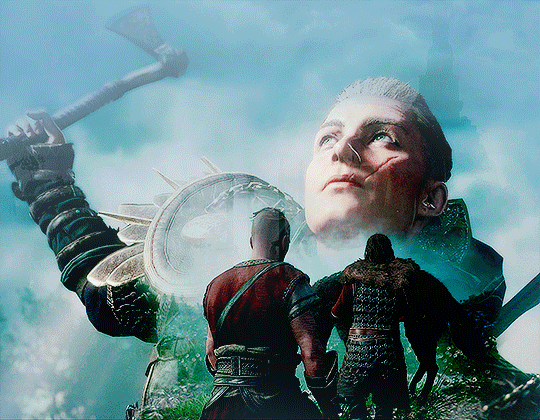
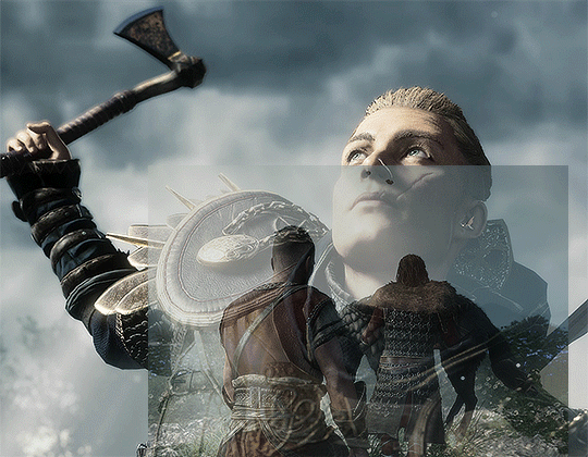
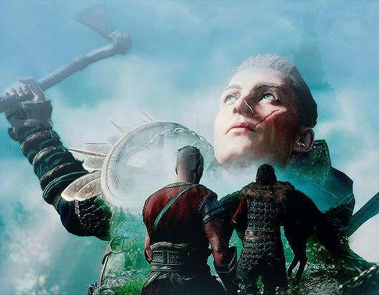
1. first of all, i made the two primary gifs i was going to use for this:
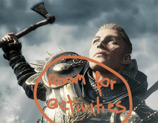
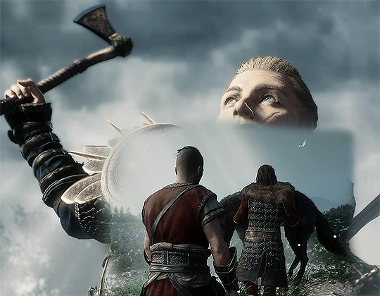
^this is important. it’s so much easier to make gifs like these when you plan them out according to the scenes you intend to choose. make sure there is room for you to insert the second gif and decide what part of the gif can be covered. i chose this shot of havi cause i mostly wanted her face and her axe to be visible, her armor i can do without! so that was the section i decided to place the second gif.
2. next, i’m adding the second gif to the psd, selecting “add vector mask” below the layers menu, and resizing it, which is much easier to do if you set the opacity lower so that you can get a better idea of what it’s going to look like.
3. TIME TO ERASE! when i start to blend, the first thing i do is get rid of the hard edges. it’s honestly embarrassing how many times i’ve completed a gif like this only to realize i did not... get rid... of the hard edge. as in, the straight line from the second gif was there the whole time! so i just select the default soft brush, about 60%-70% and go in over the edges of the second gif.
4. now, this is my favorite part. the rest of the blending i prefer to do by using art brushes at low opacity (20%-30%), because it gives them a much more textured, artistic look. i use this set of free brushes and i usually don’t use the same ones, but this particular gif was made using the sampled brush 10.
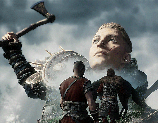
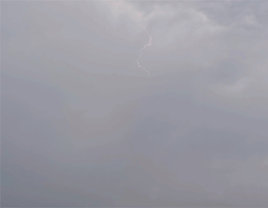
5. you can definitely stop there but i didn’t! o shit let’s add another gif! i just wanted this one to be an overlay of sorts, so i just used a random scenic shot of asgard from the same scene.
6. i added it on top of the other smart objects, set it to screen and left it at 39% opacity. after this i also added the coloring. you can stop here! but i’m just gonna go across the additional steps i went through to make the final product.
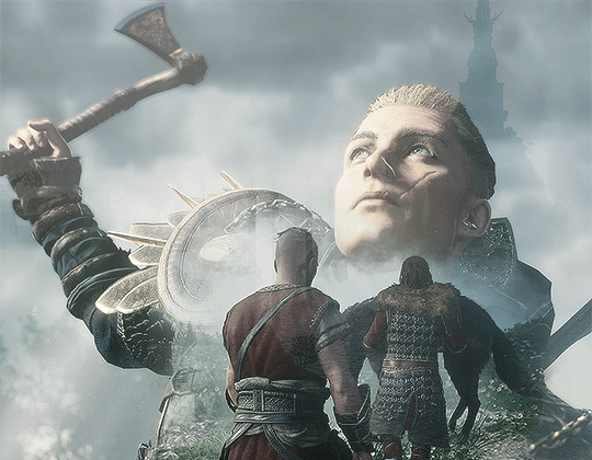
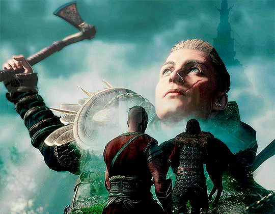
6. oh no more gifs!! this is completely unnecessary, but i did not care <3 i wanted there to be some more clouds and lighting in the background (i thought it was gonna be a motiv throughout the gifset. it was not), so i downloaded footage from pexels (you can find good footage there and it’s copyright free so we can all sleep at night <3)
7. again. i added it on top of the smart objects, set it to overlay, 100% opacity.
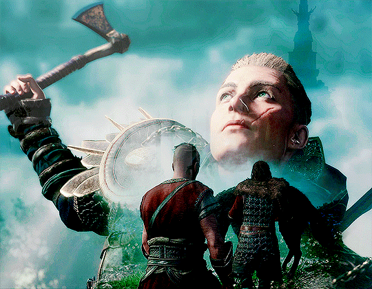
8. this is completely just a coloring issue and not a blending one, but i didn’t like how dark the clouds in the upper part of the gif were, so i duplicated the layer of the lightning gif, set it to normal, 100% opacity, used a hue/saturation layer to make it more blue and went in an erased most of it so only the upper part was left. i’m guessing this sounds really complicated at this point jgflgf but what i did was just take the clouds from the lightning gif to cover the top of the psd!
some other additions:
step 1 is not always necessary. planning the gifs on a certain layout is very helpful but you can blend two scenes together without organizing it this way.
remember that you can use the brush to restore the layer mask, don’t hesitate to use it if you feel like you’ve erased too much. it’s a lot of trial and error.
it helps every once in a while to check the icon of the layer mask in the layers menu.

it seems insignificant but it can help you spot hard edges or other stuff that might need to be fixed!
this really goes for giffing in general, but don’t hesitate to scrap everything and start from the beginning. if you feel there’s no way to blend two scenes successfully, scrap it and try again, maybe with different scenes, different resolutions, different blending techniques. that’s all ♡♡♡
#this took way longer than expected dfghdfkj g i'm sorry#ps help#there's other content creators here who make crazier shit but i hope i helped a bit ♡♡♡#asks#eivor-basim
49 notes
·
View notes
Text
Where You Belong: Chapter 2
A/N: Hey folks, this is a day late from my posting on AO3, mostly due to tiredness/travel, but here it is! I'm not sure how quickly I'll be able to put out the next chapter (In addition to being mostly dialogue, it's also a mess,) but I'll try.
Read it now on AO3
Chapter 2:
“Nope, nope, nope.”
In the realm of the dead, there was no night. No dark reprieve from the inescapable glow. A state that wore on eye and mind alike in its obstinate refusal to diminish or fade.
This did not mean the Zone was without its own sort of cycles, however.
Every seven hours, perhaps eight, the thin, omnipresent mists scattered throughout the air would begin to thicken, coalescing into a deep, impenetrable fog that stuck to every surface with a viscosity not unlike that of cold soup. It's brightness, too would gradually increase until the traveler was left all but blinded for the unending wall of light now spread on all sides before them.
Navigation in such conditions was impossible, and even ghosts seemed to prefer squirreling themselves away during these hours of fugue than to brave the blind depths the mists made of the world around them.
It was really nothing like night, but for conveniences sake, Valerie had taken to calling it as such.
It was now well into what she liked to consider “evening.” The mists had already weltered up, thickening strands not yet impermeable to the naked eye, weaving themselves into fantastic shapes ever larger across the atmosphere of the zone. Soon to merge, but not now, not yet.
While she normally preferred to travel as long as she could safely dare, Valerie had opted to settle down early that evening, using the extra time to sort through the goods held in the bug ghost's many sacks instead.
“Nope, nope, nope, weird, gross, and oh--hell no!”
Valerie yanked her hand free, shaking off the clear slime that coated her fingers as she threw the parcel and all its contents, still squirming, over the ledge of the small outcropping that served as her latest campsite.
If she were ever forced to say one nice thing about the Ghost Zone, Valerie would admit, grudgingly, that it did make a remarkably good garbage bin.
She sighed, allowed herself to stretch out and rest after yet another day of continuous exertion. One would not think riding on her sled for hours on end would tire her so, but it did. And when she added the additional effort of chasing down and interrogating that ghost--She grimaced, still unsure it had been wise to let the creature scamper free, in the end.
There had just been something in the way it had begged, had cried and whimpered as it carried out her every command with that slump of abject surrender that had just made finishing it off seem so, so...Dirty. As though she would be in the wrong, somehow, for doing it. It gave her such a sense of frustration. She couldn't help but wish that ghosts were precisely the emotionless hulls the Fentons believed them to be.
Oh, ghosts were essentially selfish, no doubt about it, narcissistic chunks of ectoplasm that only rarely empathized with their own kind, and never with humans, but they did feel.
Phantom, the bug, even Plasmius, in his own, twisted way, it was no longer something she could reject.
A part of her hated them all the more just for that, as though it made her life better, somehow, to know.
Couldn't she just have this one thing? After all the shit she went through, all the misery she bore, couldn't this one thing be something simple?
Goddamn ghosts, ruining her life, her stuff, and now her morals, too.How was she supposed to be the hero here? how was she supposed to save anyone, much less Elle, if she couldn't crush one goddamn dirty bug?
“Shit.”
Valerie flopped down on her back, staring into the viridian heavens with bitter eyes. The sky could not be bothered to stare back, rolling over in a cloud of mist instead.
“Shit,shit,shit!”
She tried to breath, but it caught in lungs suddenly shriveled against a breast-bone to tight for air.she clenched her fists, fingers squeezed into a shape fit for violence. Her body trembled, her hidden heart beat staccato as something hard and hot and sour twisted through her very soul.
“Stupid ghosts.” She whispered.Her eyes were cold marbles, but deep within her chest, she was still burning.
Valerie grabbed a stone laying loose on the ground beside her, pushed herself back up, and lobbed it with all her strength at the offending universe.
“You won't win!”
She picked up another rock, tossed it even further.
“I won't let you!”
She threw another rock, then another, as fast as her arms could reach them, intent on stoning the high green heavens for all the wrongs it had ever wrought against her. Each projectile went higher and farther into the encroaching mists, which swallowed them whole.
“You hear me! Not now, not ever!”
Even her screams were muffled, now, pressed against her ears by the haze. The stones made even less a mark, vanishing into clouds unrippled by their passing, engulfed the sound of their landing, if, indeed, they landed at all.Her chest heaved, her arm ached, but still her emotions threatened spillage. She felt at once utterly drained and full to bursting, squeezed of all verve even as her heart simmered still in some vague malcontent.
She flopped back to the ground, tired, but too troubled for rest.It wasn't all hopeless, she knew. She had an idea of where to go now, closer than she'd dared to hope, if the directions of the bug she'd captured earlier were to be believed.
And even if it was a lie, she'd still managed to buy herself some time.
She reached over to her right, where she'd piled everything of use from the insect's many stores. It was a pitiful stack, a single bag of food plastic wrapped or canned, adorned in letters and signs utterly foreign. But food it was, enough to keep her going a few days more.
She had set her stolen boot next to the parcel, and, resting just beside it, a crumpled polaroid weighed down by a worn leather fold.
She brought her hand down, shimmied the picture out from under its makeshift paperweight. Her other hand rose to brush across it, one last attempt, gentle, futile, at smoothing out the damage littering every aspect of its face.
It was fruitless, of course, but even broken beyond all repair, even with all the bitterness that lingered from the loss, the photo still soothed her, touching something deeper, more tenderly, than any hard flung stone.
She reached into the depths of her mind, grasping for those parts of the huntress that were always with her, woven in electric tapestry with the living currents of her brain.
Graphical Storage and Processing:Status: Active:
Recall request: Confirmed.
Data: Available, reporting 100% recall.
Overlay Request: Confirmed.
Initiating Command: Overlay:
Processing...
The change took place in the space of a moment. Emerald fragments reformed into broad leaves struck through with sunshine. Golden light struck their rays through the gaps where shadows fluttered down across the youthful oak that cast them, springing proud and slender from a meadow thick with blooms.
Beneath the shade of the tree, nestled between the long grass arches, there was a family.
They were at a picnic, the three of them, quilt littered with the remains of their meal. Cold chicken and half eaten corn cobs peeked out from broad folds of cloth, plastic water bottles refracted the scattered sunlight in their crumpled facets, where it danced across the surface of what liquid yet remained.
The man of the family sat beside a big wicker basket, arm resting over the thickly woven lip of its hatch. His face not yet wearied, his mustache quirked in a second smile as he looked into the long vanished camera with an expression of shy delight.Her father, Damian Grey.
A young Valerie could be seen sitting just in front of him, clutching a rubber ball nearly half her size. Grass stains streaked the young child's face, grin bold as she hoisted her rubber prize high above her head.
Besides the child, shoulders leaned in close press to the man beside her, knelt a woman. Acorn brown and satin soft, head tossed back in jubilation bold as summer. Her heat dewed neck curved swanlike above shoulders hunched up in mirth.
Valerie traced the outlines of the woman's face, slowly, ignoring—refusing—the ragged edges that brushed against her thumb as she outlined the vanished forms of her lips, her cheekbones, her chin, alight with a youth yet lingering even as the glow of motherhood softened the hard angles of ignorant adolescence.
A beautiful woman, vibrantly, vivaciously alive.
You would never know, looking at her, just how fast it would all drain out, her every pore a sieve for the good health she would never more contain.
But Valerie wasn't thinking about that, now, just as she wasn't thinking about the photograph or the damage it sustained.
Just for the moment, she allowed herself to focus only on the memory of a memory before her. If she imagined hard enough, she could almost see that sparkling smile turn, eyes opal dark and glimmering in delight at the chance to see her one and only daughter once again.
“Hey ma.” She said by way of reply. “Long time no see.”
13 notes
·
View notes
Text
the always wonderful shelley @shanheling tagged me to do this thank u so much!! i think that everyone i wanted to tag has already been tagged to do this but if you feel like doing this feel free to consider urself tagged by me!! im putting this under a readmore bc its long and i ramble a lot
the piece i was tagged to explain my process on is this oc piece! unfortunately i have a habit of deleting my original clip studio file once ive finished my art and saved it as a new png file, so i dont have the file to show the sketch and different stages of this piece. but I still can go through my general process and talk about how i did that piece!
1. planning
honestly i think about the art that i want to do a lot, and in this last year or so ive thought about the art i want to do more than ive been able to actually create and finish that art that i want to do. for my planning i tend to do a lot of different thumbnail sketches for the art im thinking of
these are some examples of thumbnails, a lot of times ill do thumbnails just on pencil and paper and with some of these theyre done quickly with my fingers on my phone note function on a day where i was feeling too bad to get up and draw on paper but still wanted to get the thumbnail ideas down. two of these are for the same songxiao piece that i still havent finished and i have more thumbnails digitally on clip studio for the same piece, i do a lot more thumbnails when a piece isnt working the way i want it to and theres times where ill completely scratch a thumbnail or a sketch and start over in order to do more thumbnails because i dont feel happy with some aspect of it.
two of these are small gouche painting thumbnails for two pieces i did maybe a month or so ago, i did the thumbnails and then tried to expand on them digitally and im wanting to do more thumbnail paintings like this in the future because it was fun
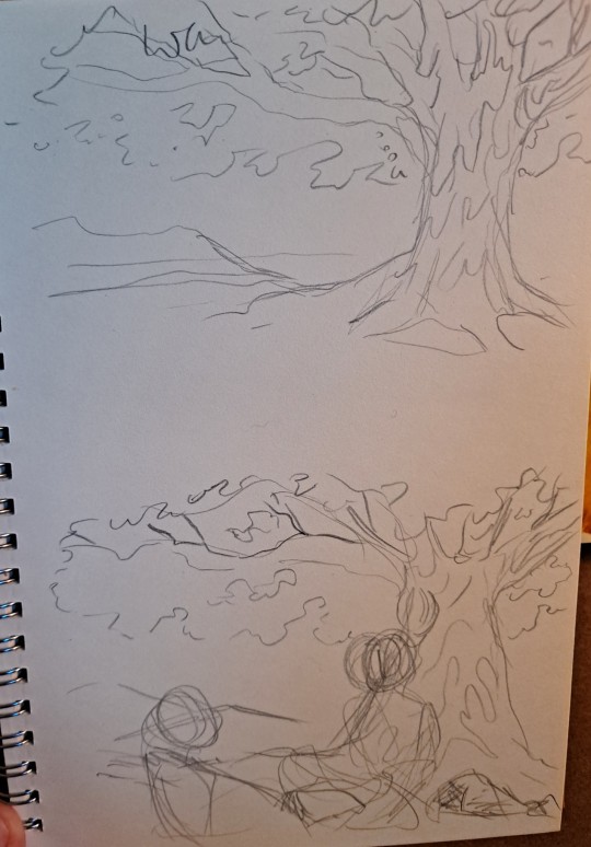
for the piece of my oc trio it was based off a series of ask prompts i got for a few different outfit prompt memes i had reblogged, so i based their outfits on the ones in the meme. when im drawing figures i tend to try and get the movement down in the poses when im sketching, i do several rough sketches of the pose before beginning to start setting down lines (if im doing lineart at all because sometimes i dont like doing lineart and do a more lineless painting kind of style). i really try to get my art to convey some kind of emotion, in the oc piece i wanted it to feel fun and like youre seeing three best friends while theyre out on the town having a fun night
2. creating
this is the only real example i have of a piece in the middle of being filled in and created, this piece is one that im really not very happy with & have had lying around for a while and ill probably scrap it and try to come at it from a different perspective at some point. but anyway it still shows what i do, i lay down a kind of neutral gray color underneath my final sketch/lineart if im doing lineart in that piece and then i start picking out the colors that i want for the piece and kind of setting out a pallette for myself. i dont do this color pallette thing 100% of the time but i do it really often, especially if im working on a commission or a larger piece where i know theres going to be a lot of colors or if its a piece where im not sure exactly what color scheme i want so laying out the colors together helps me kind of decide what kind of scheme i want. i am sooooo picky about my colors in my art i am genuinely obsessed with colors in art and there are times where i really have to stop myself from working on something forever just constantly adding more colors or putting little tiny changes and gradients in the colors.
after ive got the colors i want down i tend to try and block out parts of the piece with the base color for that section, and then i start to paint with the colors that i want to go on top of that base color from there.
once im satisfied with the colors/shading/rendering and everything ill go back and look over things and will fix things that look off or sometimes completely redo segments if they dont look right to me. when i was younger and mainly doing digital art using my phone and my fingers i would use a lot of filters and overlays on top of my art once i was done, and honestly im glad to not be doing that anymore because i dont think it made my art look any better. i do color adjustments and sometimes will put on a color overlay or a layer to emphasize the shadows and the light in the piece, but i try to keep those layers to a minimum and like i said before i have a tendency to obsess over the colors and ill spend a good amount of time in the color adjustment tool of clip studio and then ill just decide "actually it looks fine as it is" so yeah!
3. posting
i feel like i dont have a lot to say here gbfm i mean i honestly have a lot of thoughts about the relationship between artists and social media and how social media changes our views on art including our own art and how we can feel like we constantly need to be posting new art and just become content machines churning out new stuff. but ill save that rant for another time. i used to be really concerned about how many notes my art would get when i was younger, and i dont at all blame anyone who still is very concerned about that bc it sucks when u work hard on something youve created and then you dont get a lot of recognition for it, but honestly within the last two years or so i feel like ive begun to have a lot healthier relationship with posting my art. i really just post my art on my art blog, reblog it to my main blog, and then thats that yknow! i do really appreciate any and all support people give me, it means the world to me, but for me having the mentality where i dont need to post all the art i make and i dont need to be posting every day or every week or every month even has been a lot healthier for me because then im not constantly asking myself why didnt this get notes is my art awful??? and yeah i just kind of post it and my brain goes okay were done with that art we gotta make more
ive honestly been struggling a lot with art thru the pandemic and if youre reading this and have been struggling with creating in any way recently or even before the pandemic, please know theres no shame in having trouble creating and it doesnt make you bad at whatever it is u create!
thank you for reading this, feel free to consider urself tagged by me again if u want to do this!! love u all
6 notes
·
View notes
Text
i wrote down some art-related thoughts and tips, inspired by people i follow who occasionally say the sort of things that they wish they were better at drawing but don't really know where to go with it, not like i'm much of an authority or anything and nobody's asked my opinion but, if this is helpful for someone out there, then it's worth writing!
- examine other people's art, especially those that you like, and study which things you actually like about it. you shouldn't directly copy someone else's art, but what you can do is take inspiration or study the details that you enjoy and adapt them into your own style. for practice it's fine to copy someone else, but if you post the final piece, you should mention whose art you referenced in it. also, do the same with art that you find yourself not particularly liking! think about the things that don't make it very good in your opinion and see if you can learn something from that. if you don't like your own art, you can even study what makes it disappointing to yourself. process it a little instead of just going "wow i suck at drawing" and moving on, even if it feels difficult.
- also related to the above: widen your view of how art can be done in the first place, and if you find that you're always drawing one and the same thing, maybe try something different every once in a while. and by this i don't really mean the actual subject matter but small things like, do you always use a black lineart brush? try using colours instead. do you reference fanart from official art? try making your own version instead or reference the style of some other series, go a little crazy with it. do you have a particular style of drawing eyes, or faces in general? play around with shapes and see how it turns out, go more realistic or more cartoony. i sometimes draw noses on characters and sometimes i don't, just kind of depending how it looks like to myself, and i don't draw nostrils because i don't really like the look of two holes in the face. you don't have to stick to just one "truth" with art. (of course it's totally fine to want to draw realistic humans and not the kind of anime stuff i personally do, these are just examples from me and you should focus on the things you like yourself)
- pay attention to shapes, and the fact that sometimes simple is better than adding too much detail. or if you like adding tons of details, then it may be better for the base drawing (e.g. the character under all that detail) to be extremely simple in contrast so that it doesn't look too busy for the eye. when i draw faces, i only really put details in the eyes because i like pretty eyes a lot but leave the rest of the face very simple, which makes the eyes stand out more. again, you don’t need to do that, but it’s something to think about when doing art. there are so many details to every single thing ever and it’s generally better to choose which ones you want to emphasise in art.
- a thing i see relatively often is that people draw in black and white, maybe with pencil on paper, and then lament that their art doesn’t get enough attention. the thing is, making b&w art interesting is much harder than giving it personality with colour, because it won't catch people's eye the same way. to me personally, an artist's use of colour is one of the things that draws me into their stuff (actually even the main thing in most cases), so while black&white art can be really beautiful as well and it's totally fine to want to pursue a b&w art style, i'd still encourage people to learn to use colours. it's much easier to give your drawings character with colours, and if you honestly want more attention (which is a valid thing to want), then i'd especially encourage it. it takes more time, so you may need to get used to the fact that finishing a fairly simple drawing can take 8 hours instead of one, though. at least if you're a slow ass person like me
- and as an addition to the former, there are so many different ways to use colour, so don't limit yourself by thinking there's only one way. you can even make art that's primarily black&white but add an accent colour or two in there and it already changes the feeling of the image completely (i do this sometimes and like that style a lot). or you can have a style that only includes flat colours and no shading or anything at all, you don't need to become a master painter with realistic shadows everywhere if you don’t want to. (if you do want to, then my best advice would be to study photos and paint using them as reference.)
- if you find yourself going, "this artist's colours are so good! i wish mine were like this!" -- why not use similar palettes with that artist then? think about what kind of colours you like and what kind of mood you want to convey in your drawing, bright hues will look completely different from darker or duller ones, blues will look cold and reds warm, some colours pop out more when placed next to another. don’t shade with grey or a darker hue of the exact same colour to make it look more interesting. look up palette websites, or study the colour wheel and pick colours from the opposite or adjacent sides for ideas of colours that go well together. this is the stuff that a lot of tutorials mean by colour theory, and it's not rocket science but actually rather simple when you take a look at the colour wheel. if you don't like how the colours turn out, play around with the hue, saturation, brightness and contrast settings all you want. most of the actual magic you see in a lot of digital art is adding layers with a multiply, overlay etc setting on top, so find those in your drawing software and go crazy with it. (they take a while to learn to use, i have plenty of drawings where i've used them badly, but that's just how learning anything is)
- youtube is full of videos of people doing complete drawings from sketch to finish. they can be a bit much for beginners (sometimes for me as well tbh) but give a good idea of the overall process of creating a full-colour illustration and what phases go into it. to me it's crazy that there's artists who put in the colours first and then do a lineart on top but that's just one simple example of how there's not just one way of doing art.
and just one practical thing that goes into doing digital art, you'll find that there are a million different brushes everywhere and every artist seems to have a “brush set” for different things and you’re supposed to know how to pick which to use yourself. if it's any consolation, i use exactly one (1) brush ever on clip studio paint and draw every single thing with just that one brush. because fuck that noise i don't care
#really just my number one tip is looking at art you like#and if you're like#i wish i was drawing like this person instead of how i draw!#then start drawing more like that person#there's no art police that comes to your door like sir you drew differently from before
6 notes
·
View notes
Link
I’ve been doing a lot of reading recently; between the @bannedtogetherbingo2020 kerfluffle and the BLM protests
(one thing that I’ve been doing recently that seems to annoy the living SHIT out of my fellow White People is correcting “riots” to “protests.”
“Were you near the riots --” “I did not attend the protests, but I did donate to the medical fund for the man who was injured by removal of the statue on High Street.”
This seems to drive people absolutely batshit, and I will continue to do it. These are not riots and if they have similar characteristics with riots it’s because cops are treating everyone not even like criminals, but like hostile enemy forces.)
Mostly what I’ve been reading about is the difficulty that POC fans have in getting their voices heard in fandom. That the history of fandom is primarily the history of White Fandom.
(this is long, so there’s more under the cut - I also tell stories A LOT so brace for personal experience asides)
I’ve been thinking about comments I’ve seen by black and brown fans about trying to get away from racist stories on A03. And trying to figure out if there’s a way to give people what they want -- a way to tag posts/topics/writers/ships on a permanent block list. I know I’ve spoken with several fans who have extensive filter scripts when they go looking for a new read and that shit is EXHAUSTING and doesn’t work necessarily on mobile devices.
I, for instance, have QUITE A LOT of stuff blacklisted on tumblr because I find P*nnyW*se the Creepy Teeth Demon to be horrific and I do not want him on my screen. And the movie’s name is IT for fuck’s sake. I can’t blacklist the word “It” and still expect to see any content at all. So, thinking about how much trouble I had keeping PWCTD off my screen gives me some sympathy to how hard it’s got to be to filter out something that people aren’t even tagging!
I mean, honestly, most of the time that people tag a fic TW: racist, they already KNOW the character is acting in a racist manner and they’re condemning it. When people don’t realize the character is racist, or a word, or a trope is racist (mystical black character, for instance) they don’t tag it as racist because they either don’t know, are unconscious of their own bias, of they don’t care that it’s racist.
In the same manner, Person A who’s writing fic they know is dub-con will tag it, and Person B who thinks stalking someone and climbing in their window at night is romantic will NOT tag the same scenes as dub-con.
Which doesn’t make it any less jarring when I suddenly run into a fic that I would absolutely count as noncon/dubcon that’s not tagged for it. The intentions of the author don’t matter TO ME at that moment, what matters to me is that I’m trying to breathe while the romantic interest on my eReader is saying “aw, that’s so sweet.”
So, there’s multiple questions that come up for me -- I’m not a computer person, so while the A03 code is available for use, I wouldn’t know what to do with it if I tried.
Is there a way to tag something from the outside? An overlay or side program (like an Xkit for A03) that would allow people to permanently blacklist certain tags or authors, tropes, etc? I know there are some hosting sites (unfortunately with ads) that basically funnel stuff from A03 to a reader. There was a big kerfluffle about it at the beginning of the year because OMG, someone is making money off my fanfic! protip, no, they weren’t. they were making money off someone else’s desire for a custom skin. The material itself was never leaving A03, it wasn’t stored anywhere else. A03 does not currently have a phone app and they don’t plan to have a phone app.
So, would it be possible for someone to write a phone-app that did a custom filter for the material. Blacklists are certainly possible, right?
Because here’s the thing; a lot of people who are racist don’t know that they are. Or they don’t care that they are. I have personally had a couple of hard conversations about racism (I’m not even going to call it “unconscious racism” because I am a grown-ass adult capable of reading, so if I act in a racist manner, I’m going to fucking own it. And apologize for it. And try to do better.) in my own work -- whitewashing a character at one point, using a quote from a black woman as a title for a story about Wanda. I’m still not entirely convinced that a Jewish/Romani woman is “white” in any sort of traditional sense. That said, I’m not a POC and I’m going to listen to the person who’s upset because of my usage and not my own feeling of “I don’t really think Wanda counts as white.” This may be partially because WANDA is whitewashed as shit in the MCU and a lot of people in the fandom do not read comics.
That further said, I made the changes as requested and apologized for it in the work/notes. And felt very uncomfortable when some of my white friends said “I’m sorry you had to deal with that.” I’m not sorry I had to deal with it. I wish I hadn’t DONE it, but I am glad that people felt comfortable enough with me to call my on my bullshit and I was able to make corrections and amends.
Still-- All of this boils down to: People are not going to, in good faith, tag their own fic as “don’t read this, I am racist.”
Everything that gets done on A03 -- which is an Archive -- is voluntary by the author. A03′s policies are pretty much “tag to warn” or “tag that you’re NOT tagging to warn.” The only action A03 takes for inappropriate tagging is to ask the author to update the Warning to match, or choose not to warn. If there’s no compliance, A03 will assign the fic “choose not to warn.” But that’s the extend of their policies.
We all know this history; no censorship. Censorship is a slope that leads to fanwork disappearing. Because here’s another fact: it doesn’t matter what the intention is of censoring a story; that censorship is going to be applied badly.
So, if A03 was going to ban racist fic, how long do you think it would take before the reporting system was flooded? Even legit reports of racism are going to take a while to read through, judge, contact the author, wait for possibly updates or retractions, and then removal.
A03′s staff are volunteers, and I understand there aren’t very many of them. There are six MILLION works on A03. No one could hope to read them all with a careful enough eye to catch all instances of harmful texts.
And we all know what’s going to happen: it’s easier to delete all stories that get complaints, rather than read them.
So, Fan A gets Fan C’s fic taken down for racial stereotyping and Fan C tells all of her friends, who go on a crusade to report every single one of Fan Q’s fics in retaliation (not because Fan Q did anything “wrong” but because they happened to post a blog about racial stereotyping in fandom) And we’re right back to strikethru.
Yet, censorship is one of those things that makes me very, very nervous. Do I think a white boy who writes a self-insert rape fantasy novella about violating and murdering Zoe Quinn should be allowed a platform? No, I don’t. (And neither did Amazon, who took it down fairly quickly once it was brought to their attention. But that’s only one case, where there are probably thousands of books that are personal attacks and are left merrily alone.)
There are a lot of books on the banned book list. If people thought they could get away with it, those books would be unpublished, unpersoned, black bagged.
We all know that the rules get applied badly, by the people with the biggest mouths and the loudest complaints. So banning content on A03 does not seem to be the solution.
(Personal story time again, just skip this if you want.)
I came into fandom backward; I was a traditionally published erotica / romance writer first and moved into fandom after the collapse of several small publishing houses for various scandals that I won’t bore you with but you can look here if you want more information.
Several years ago, I was in an anthology that i was Very Proud of, and I really like the editor I worked with, wanted to work with her again. She sent me a premise for submission that left me cold. Which is to say, she wanted to publish cuckolding stories.
[x] <-- warning, that link is REALLY harsh and filled with some real WTF moments, from someone who’s pointing out the racism inherent in the system.
Especially when you consider the Mandingo aspects of the fantasy, it’s easy to see why just the existence of it is repulsive.
I declined the invitation to participate because I was deeply uncomfortable with the subject matter.
I’m not saying that to get praise for my behavior.
Because when the subject came up again about two or three years ago in some fandom discourse, I sided with my friends who were defending “no censorship, no matter what.”
(End of personal aside.)
Despite my personal feelings about the issue (ew, this is icky and racist and horrible and I would never write it) I still believe that I don’t have the right to say what someone else can write, read, or enjoy.
I’m trying to find the path between “this sort of reading material is harmful and I don’t think it should have a platform,” “this should be heavily tagged to avoid upsetting people,” and “there are people who feel that way about gay, non-christian stories as well.” And what’s more, I’m trying to find it in a way that doesn’t stifle authors’ voices.
Even with my idea of an overlay, that’s putting the burden on the people most affected-- someone would have to rate stories as “racist” or “not racist” (and even then, it’s seldom that clear cut. Microaggressions abound.) and the people best capable of doing that would be readers of color. Which hardly seems productive. Or fair.
“Don’t like; don’t read” is often the calling card of fandom writers. I’ve said it myself. That’s what the fucking back button is for. But when I say it, I mean “I don’t want to hear your wank about Tony Stark in my inbox” not “I don’t want to be called out for racism when I wrote a story.”
https://ggmadeit.com/blog/why-i-cant-just-knit-the-story-of-a-black-knitter-during-civil-unrest/ -- I’m including this link because this piece really made me think. I can’t ever put down being a woman. I can’t read or watch horribly misogynistic work without being upset, and I have trouble sitting in the room with my male friends who insist on watching it and want to say “it’s only a movie.”
Being black is part of someone’s life. It can’t be erased just because it’s not convenient. Just because it interrupts your good time. It shouldn’t be put aside because “it’s just a story.”
As fans, we have to do better.
We all know what it’s like to be pushed out, to be made second best, to be asked when we’re going to get a real hobby, when are you going to grow up, why did you spend money on that merch? So we need to reach further.
I don’t have answers. And even if I did, I’m not the one who needs to give them. What I need to do is listen to the people who have answers and HELP THEM get what they need.
We need to do better. We need to BE better.
30 notes
·
View notes
Note
hello, i hope you're having a good day!! i was wondering, do you have any tips for making amvs? like, what programmes you use, how you handle the timing, etc. thank you for all the fun edits you make!!
hi!! sorry for the delay in answering this, i just wanted to take the time to answer it thoroughly and i kept forgetting lol & thank you! i already typed this once and tumblr made it disappear so i apologize if anything i say comes out short ‘cause i’m just trying to remember all that i typed before lol
ok so ill just go through my general editing process in Vegas, i dont know any other program well enough to talk about it at length:
(disclaimer: this is just how i do it, i dont watch tutorials and my editing friends and i don’t watch each other edit often so i would assume that my way is very different from other ways you’ve probably seen! i might even do something in a very stupidly hard way, please feel free to tell me if theres an easier way to do anything lol)
1. Song: So skipping past the “choosing song and ship/character/show” theme, I’ll dive straight into CUTTING THE SONG! I’m not about that Editing The Entire Song life, and neither is most of the editing community anymore, so I cut it up into a shorter thing that I’m better equipped to edit to. I’m just using a random example but here I’ve taken this long ass song and turned it into this:
(the next step just kind of depends on my mood, or ill do both, doesnt matter)
2-A. Subclips: if im making a shorter video or a video where i’m not 100% super familiar with the footage, i will immediately start making subclips using the episodes ive already pulled into the project. if it’s a ship/character that i’ve edited before, i’ll just go to Import->Media from Project and import the subclips i made previously. either way, subclips are there!
2-B. Sheets: for ships that i know very well/have a lot of footage/im concerned about potentially repeating something, i will go to Google Sheets/Excel and take the lyrics im editing to and put them in column A, separating by pauses in the singing. then i put corresponding footage i think will go well in column B! im often not super specific because i know the beats are gonna be different than i remember, so i usually stick to referencing whole scenes instead of specifics moments. here’s an example:
3. Clip placement: Then I start placing clips down! Below is how I organize my timeline tho I know a lot of editors who put the music on top, this is just how I like it. I also keep a single muted audio layer in between for the video footage’s audio and then I’ll delete that layer when I’m done (or sometimes I don’t, it doesn’t really matter)
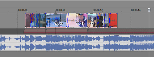
I think it’s good to hit the beats as much as possible, it makes for a more dynamic audio-visual experience! In general I try to make my videos so that, if I didn’t add any zooms or typography or coloring, it would still be a good amv. And don’t limit yourself to just one layer, you can have as many layers as you’d like and put clips on top of each other (cookie cutter/changing the layer to dodge or add or screen or whatever) is a good way to mix things up
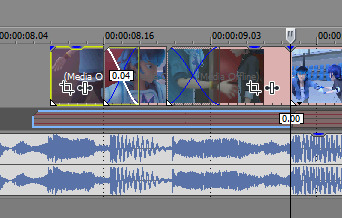
when I zoom in you can see I’ve got some variety already in my transitions, I know I use that motion-blur-zoom a lot these days but I still try to mix it up and keep my brain invested
4. Typography: After all the clips have been placed (or most of the clips, ofc sometimes I’ll want to add more later) I move on to typography! I’m lazy so the first thing I’ll do it just put down unedited text where I think I’ll want it to go. It just helps me organize myself. Then I’ll pretty up the text afterwards.
Typography isn’t necessary for a good AMV, but really nice typography can really spruce things up. I’ve only very recently gotten confident in my text editing skills, and I just kept watching typography done by editors I really like until I figured out what they were doing. My recommendation is to just KEEP ADDING EFFECTS! Convolution kernel, gaussian blur, mask the text so it appears from angles that the transitions wouldn’t be able to do - of course there’s gotta be a limit for taste, but just add stuff until you like how it looks. Also changing the blending style of the text layer is good, dodge and difference are my go-tos for typography layers.
5. Transitions: I don’t go crazy with transitions, but it’s fun to mess around with them. You don’t want too many crazy/different transitions, you want them to match the mood of the song and the type of beat you’re hitting. I usually ensure that all similar beats in the song have the same transition type on them, bbbbbbut that’s cuz I’m overly obsessed with parallel structure. There’s plenty of fantastic AMVs where they just go ham and do whatever types of transitions they want to in each part of the song and they make it work just fine
(next step, once again, kind of depends on my mood lol)
6-A. Zooms: Time for zooms! I usually just use the pan/crop for zooming, but often I’ll incorporate Sapphire FX BlurMoCurves or NewBlue AutoPan, especially if I’m trying to zoom typography with the footage at the same rate. I try to keep my zooms short and slower, I mean obv it just depends on the song but yeah. There’s a lot of different ways to do zooms so I recommend experimenting and just playing around with different effects
6-B. Zooms...but different: Another way that I’ll do zooms which is definitely pretty different (but this is what I do for crossovers like 95% of the time because I am laaaaaaaaaaazy) is I’ll drag the project into a new project timeline and start editing it there. It’s similar to how After Effects works and it makes it easier to put effects overtop of multiple layers without having to pre-render anything.
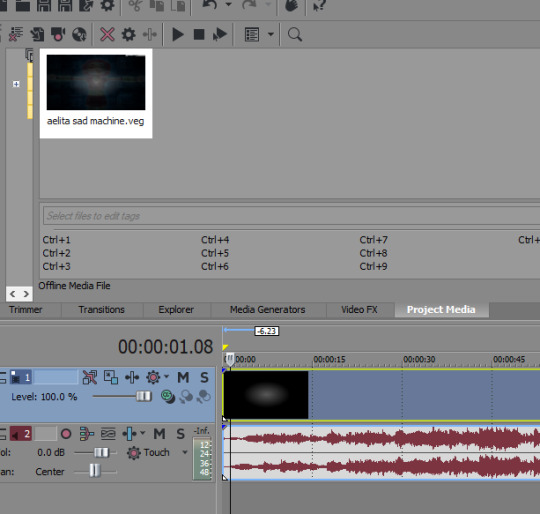
So you can see I’ve just pulled in the .VEG file and popped it in the timeline! So this way I can add zooms and transitions without worrying about layers. And if I see a mistake I need to fix, I can just go back into the original .VEG file and edit it, and it’ll be edited when I come back here. So it’s much easier than pre-rendering or trying to do zooms on a lot of layers. To be clear tho, this doesn’t work well if you have a lot of fade transitions, it’s best for sharp transitions and it’s great when you’re using Sapphire FX BlurMoCurves a lot.
7. Overlays: After that I’ll add more typography (or if you didn’t add any earlier, you can add some here overtop of the new project file) that kind of goes on top of everything. And then I’ll add any overlays or objects or whatever else I wanna add! I’m not someone who uses a lot of backgrounds cuz I don’t have a background-creative-brain so I stick to simple overlays at the most.
8. Coloring!!! This is very sad but I only JUST learned a few weeks ago that you can add coloring/effects to your entire video with this button here, so in case anyone else hates watching tutorials as much as I do here’s where I’m talking about:
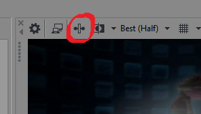
This shit would’ve made my life so much easier throughout the years lol But alas. Anyway so for coloring there are some effects that are popular for any colorings you’ll find on YT (but you can certainly just download some, Riverdale editors in particular share a lot of really great colorings but you’ll find them anywhere in the live action editing community):
Channel Blend, Color Curves, Color Blend, Color Balance, Convolution Kernel (best for live action footage or footage that isnt very crisp), Color Corrector Secondary
These are all just fun to mess with. Channel Blend in particular is something of a mystery for me, I haven’t studied it fully to understand what I’m doing so I mostly just mess with it randomly until I like what I see lol
9. Render time! First render, anyway. Usually there’ll be some random problem in the footage or something and I’ll have to either go back into the project and fix it OR if I’m feeling particularly sour (or maybe if I’ve rendered like 3-4 times already) I will just take the finished render and manually remove any errors, stretching out the good footage to cover my tracks. You’d be surprised how often I end up doing that lol
And then it’s good to post! I primarily render as .WMV but I also go for .MP4s every once in a while. If I want to upload it to Twitter I’ll do an .MP4 but it’s a new thing for me so I’m still stuck on .WMV mostly.
Anyway I hope this answered your question at least a little bit, I can go into more detail about certain parts of this if you’d like!
8 notes
·
View notes
Text
153. pigs is pigs (1937)
release date: january 30th, 1937
series: merrie melodies
director: friz freleng
starring: martha wentworth (mrs. hamhock), berneice hansell (piggy, children), billy bletcher (mad scientist)

one of friz’s most iconic cartoons during this time period, and the first to debut his favorite “hold the onions!” gag. also the second (and final) appearance of piggy hamhock and co. all disobedient piggy wants to do is sit inside and eat all day, and it seems his dream comes true—but when a mad scientist gets involved, his appetite is quickly ruined.
an underscore of “when my dream boat comes home” opens the cartoon, a score that would be occasionally used by stalling (featured prominently in porky’s badtime story and later tick tock tuckered). in the quaint countryside resides a warm, happy home, a family of pigs dancing in circles and laughing. everyone is happy and content—except for one. piggy hamhock strolls around the yard, with visions of hotdogs (questionable for a pig), turkeys, pies, corn, and watermelons dance in his head, sighing cravingly. he parks himself on a bench just outside the house, licking his lips as he imagines the food he can’t have.

just then, fortune strikes. mrs. hamhock dotingly places two pies on the open windowsill to cool, and, of course, the fresh, inviting fumes waft straight into piggy’s trajectory. such a lovely detail as piggy’s eyes grow wider and wider with each eager sniff—food! even better is the animation as he snags one of the pies from the windowsill, spins it around on his finger, and devours the edges as it spins around, reducing it to nothing, popping the “core” of the pie in his mouth last. piggy reaches for the other pie, preparing to dive in, but finds himself feasting on pork instead as he bites his own hands, the pie snagged out of his grip from an offscreen mrs. hamhock.
mrs. hamhock is devastated, lecturing “my nice, fresh pies! look what you have done to them! and i’ve worked so hard all day over a hot stove. can’t you wait until dinner?” while mrs. hamhock goes on and on, piggy’s mind wanders to the imaginary meal once more, completely drowning out his mother’s words.
to quote billy bletcher from porky’s romance, time munches on and mrs. hamhock rings the telltale dinner bell, summoning her children to eat (with an underscore of “puppchen” as mrs. hamhock’s theme). the children frolicking in the yard happily flock to the house. piggy also catches wind of the dinner bell, and barrels over his siblings in the process as he rushes to be the first inside. mrs. hamhock braces herself against the draft left behind from piggy’s speed.
eager to get a headstart, piggy licks his lips and rubs his hands together, reaching into the fruit bowl on the table, but is quickly smacked by his mother, glaring daggers at him as she positions herself at the table. the rest of the hamhocks pour into the dining room. with that, mrs. hamhock instructs her children to say grace. a hilarious decision on friz’s part to have a cacophony of dissonant mumbling as everyone incomprehensibly says grace, with a rolling pan sweeping down the table. the pan stops at piggy, who audibly asks “and please, could we have lots of ice cream tonight?”

suddenly, an idea hatches. before each little piglet is a bowl of noodles just waiting to be devoured. piggy grabs one of his noodles and a noodle from the plate next to him and ties it together. he slips under the table (good decision with the lighting!) and makes his rounds from each plate, trying together every noodle he sees into one interminable rope. every noodle covered, piggy leaps back into his seat, innocently giving an “amen!”
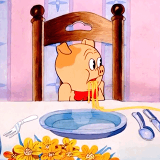
“und now, commence!” with mrs. hamhock’s permission, piggy stuffs a wad of noodles in his mouth. i just love the animation of him sucking his face in to slurp up the noodles, it’s certainly tactile and you can just feel the breathless effort he’s exerting. all according to plan as the hamhocks ogle at their magically disappearing noodles. mrs. hamhock takes notice and scolds piggy, warning him that this is the straw that broke the camel’s “hümp”. piggy’s face is priceless as he stares at his mother, mouth agape, noodles still suspended in his open mouth. he tunes out his mother’s lecture, head in hand as he shoots angry side glances at his mother.

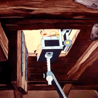
night must fall, and all of the hamhock children are asleep. that is, with one exception. a certain hungry piggy still fantasizes about his hearty hors d'oeuvres, various foods surrounding him. as piggy sighs longingly, his surroundings melt around him, and instead of in his bed he’s perched on a wooden bench outside of a cottage. there’s a large, green door just outside to match the ivy creeping up on the exterior. piggy wanders around, spellbound, when the door opens to reveal a strange, balding, yellow man with rubber gloves who urges him to come on. as i’ll discuss soon, simpsons creator matt groening as expressed his love for this cartoon. yellow skin... hmmmmmm. 🤔

the scientist ushers piggy along in his cottage, which is revealed to be a laboratory. a tasteful array of beakers and solutions overlay the scene as piggy makes his way in—ulcer tablets, gastritis pills, neon coils... the scientist hiccups as he croons to piggy, “hungry, my little man? have some nice pies, cakes, ice cream, pickles...” i love the extraneous “pickles” to juxtapose with the other sweet, enticing desserts.
an enraptured piggy dashed up to a table stocked to the brim with all the food he could imagine. a bottle in the foreground reads “VOD”, the rest of the lettering torn off. a vodka gag slipped under the hayes office! piggy’s delight shines brighter as the scientist urges him to help himself, offering him a seat in a large, floral, cushioned seat. piggy obliges, but suddenly grows anxious when the scientist shoved the table away. the floral covering on the chair is pulled away to reveal a metal chair, strapping piggy in with a belt and prying his snout open.
also, an interesting note—there’s a smear in this scene as the scientist whips away to grin at piggy. chuck jones defined what a smear was with the dover boys at pimento university, and thusly they became much more popularized after, but it’s so interesting to see little breakout attempts. of course you have dry brushing as well, but i believe this is the first true “smear”, so to speak, that we’ve seen. i’m sure you know already, but if you don’t: smears are physical distortions of the body to convey a sense of movement and urgency. by spreading the entire body across a frame, it conveys a faster, less convoluted sense of movement, and also saves costs and drawings. there is a reason behind them, and yes, animators were paid to draw them, they knew what they were doing, as opposed to all those posts ridiculing animators and being like “why would they draw this 😂😂😂😂”. simple stuff, but there are people out there who believe otherwise.
now the villain launches into the trademark Billy Bletcher Bellow®️, reassuring piggy that he’ll get plenty of food. there’s an intriguing, almost tashlin-esque camera angle as a trap door opens beneath the floor, piggy’s chair toting him down below into the scientist’s lab. another tilted, warped angle as the scientist rushes to his post, a separate landing with a big, metal machine positioned on it. i love the subtle tilt of the angle, it really conveys how warped the scene is and how askew the mood is. things aren’t right, and piggy is actively aware of this. “so,” the villain coos, “you love food, eh?” another villainous laugh as he goes wild on all the levers and buttons and contraptions on his big metal machine.
i bet you if this was made just 6 years later, powerhouse would have been the underscore for this scene. porky pig’s feat gets the honor of the first cartoon to debut the iconic raymond scott score. an assortment of canned soups churn down an assembly line, pouring into one giant bowl. piggy is force fed the disgusting, purple amalgamation of soups as a wheel of spoons paddle it down his throat like a waterwheel. the chair then moves beneath a banana peeling station, mechanical arms sliding bananas into piggy’s gullet. the mad scientist observes in evil glee, laughing at the misfortune he has created.

a clever gag of a gumball machine spitting olives into piggy’s mouth as a mechanical hand feeds pennies into the slot. next, as displayed on this cartoon’s lobby card, a bellows pushes a number of ice cream cones down piggy’s throat. this entire sequence serves as the inspiration behind a number of cartoons. it served as a foundation for dick lundy’s apple andy at walter lantz in 1946. yet perhaps it is most well known as serving as the basis for a scene in the simpsons episode treehouse of horror iv, where homer sits in the same chair piggy sits in, being force fed donuts—and of course enjoying it, the scene much more comical than portrayed here. so, good on friz!

the next torturous piece of food spawns friz freleng’s favorite “hold the onions!” gag. mechanical arms prepare a giant sandwich, the bread suspended by hooks. peppers and mustard garnish the spliced open hotdog (again adding to the morbid nature of the scene—being force fed your own kin!). just as a bowl of onions prepares to topple over, a robotic arm juts out a sign that reads HOLD THE ONIONS!
phil monroe is responsible for the gag. later on, he’d tell michael barrier “for instance, i first worked for friz in the middle '30s, and he had this one picture, i forget what the name of it is, but it was a mechanical machine that made a sandwich; the old cartoons used to do that all the time, use a gag like that. it was a rube goldberg machine that made a sandwich. i stuck in the gag ‘hold the onions’—a sign comes out and stops the machine and says, ‘hold the onions.’ well, the only thing you remember about that cartoon is that one gag. he used that damned thing for years.” he most certainly DID use that damned thing for years, featured in (but not limited to) cartoons such as jungle jitters, the fighting 69th 1/2, the gay anties, and used by other directors such as jones, mckimson, and tashlin. the gag even managed to creep across studios, appearing in the 1951 tom and jerry short his mouse friday. thank you, phil!
piggy is then force fed the giant sandwich, attacking it like a lawn mower in neat rows, the chair reversing and accelerating as he eats. next spawns the “PIE-A-TROPE”, piggy devouring rapidly spinning pies from the outside in, just like how he was doing beforehand, spinning the pie on his finger and eating the outside.
more tashlin-esque camera angles as we get a series of overlayed and reused footage, underscored by the maniacal laughter of the scientist. eventually, we find the end result: piggy is full to bursting in his chair, the scientist poking him with twisted glee. “have enough, my boy?” piggy stammers (another friz freleng stuttering pig!) “y-y-yessir!” the scientist frees piggy from his restraints, insisting he’s not half full. hilarious animation as the rotund piggy waddles across the room and past a buffet table.

just then, a delicious turkey leg catches his attention. piggy can’t resist. i just absolutely love this—the whole time, he’s been tortured, force fed, what have you, the mood so dark and twisted and askew. piggy had been visibly upset and anxious the entire time, and now here he is helping himself VOLUNTARILY with a hungry grin on his face! what a great detail. piggy devours the turkey leg, and promptly explodes.
fade out to piggy screaming, lumps underneath his blanket writhing as he pops his head out, unscathed, his normal self in his own normal bed in his own normal home. he collects himself, breathing a sigh of sweet relief and wiping his brow. mrs. hamhock’s voice calls from downstairs “wake up, sonny! it’s time for breakfast!” (which i believe in hindsight is reused from toy town hall)
piggy demonstrates that he has dutifully learned a solemn lesson as he rushes downstairs and gorges himself in breakfast, devouring as fast as he can and displaying no table manners whatsoever. iris out.
one of friz’s first classics, and rightfully so. it’s a great cartoon with drastic changes in mood. the cartoon starts and ends in the same notion: lightheartedly. this cartoon reminds me a lot of baby bottleneck in terms of notoriety, both famous for their “factory” scenes, if you will, and serving as a foundation for a number of references. i adore how moody this cartoon is, and how stark the contrast is. you have the lighthearted sympathy of watching piggy lust over food, getting scolded by his mother, and then you’re diving head first into such a twisted, morbid torture scene where you as the audience member also feel captive. and then, in true looney fashion, piggy demonstrates that he learned absolutely nothing whatsoever from his nightmare and is tickled pink with his gluttony. the animation is great, and the colors and backgrounds are beautiful and inviting. you absolutely need to watch this one! if anything, do it for historical significance. first “hold the onions” gag, and it was referenced by the simpsons! go watch it!
link!
16 notes
·
View notes
Text
A Somewhat Comprehensive List of Good Old-School FPS Games, Where To Get Them, & How To Get Them Working
I love old FPS games. The action is fast, the levels are explorable, the guns are powerful. Whether you’re tired of modern FPS games or just waiting for some new hotness to come out, there’s a lot of these old games you can play! This list will cover a lot of the old classics and how to get them running on modern hardware (assuming you’re on Windows. Some of these work on Mac/Linux though).
Of course, what defines an “old-school” game from something more recent? Well the way I see it, there are FPS games before Halo, and FPS games after Halo. Halo was such a landmark game that it shifted the entire genre, hell even the entire video game industry. So I’m going to keep this list to pre-2001 games for the most part.
STUFF TO KNOW
Before going into this wholesale, I need to say a couple of things. These game are old. They are most likely not going to work out of the box and will need some tweaking on your part. Most of the non-3D games on Steam and GOG come with DOSBox wrappers. This can be fine for some games, but often times fans have created patches and their own engines/source ports for these games that work better than DOSBox emulation.
PC Gaming Wiki is an invaluable resource when it comes to finding patches and fixes to common problems. I will also point out any fan patches or source ports for the games as I go. On Steam, the curator page Sector Effectors has brief overviews on the functionality of games so you know what you might need before you buy.
A lot of games on Steam and GOG come in bundles that have the entire series in one at a markdown price, so it’s usually cheaper to just buy an entire series than each individual game. I can link to bundles on Steam but not on GOG; those bundles will be on the sidebar underneath the button to buy the game. In the case of games (like Doom on Steam), you have to buy the bundle to get the mission packs, whereas stuff like this is typically included with the game already on GOG.
Make sure you check through the options menu of each game and make sure everything’s set up to your liking, whether it’s video options or your actual controls. The default settings for this kind of stuff in these games are tend to be really weird and outdated, so it’s something you need to check every single time.
Most if not all of these games include various difficulty modes, so whether you’re a badass coolguy like me or someone fairly new to PC shooter games, you’ll be able to play these games.
id SOFTWARE
While they didn’t invent first-person shooter games, it’s undeniable that id Software made the genre as popular as it is today with the games they made.
WOLFENSTEIN (1992/1993/2001)
Wolfenstein was originally an adventure game for the Apple II, but the boys at id wanted to put their own spin on it. What we got was intensely fast Nazi slaughtering action, chock full of gore to spill and gold to swipe. You play as B.J. Blazkowicz, a POW hellbent on escaping Castle Wolfenstein and blasting any Nazi who gets in your way.

Wolfenstein 3D - GOG / Steam Wolfenstein 3D: Spear of Destiny - GOG / Steam Return to Castle Wolfenstein - GOG / Steam Steam Bundle
Wolf3D has a source port called ECWolf, which natively supports most popular OS’s, has widescreen support, and adds an auto-map feature which is immensely helpful for getting through the maze-like levels. At full speed, Wolf3D might make you motion sick, just a word of warning.
Return to Castle Wolfenstein has a 1.42d fanpatch (second from bottom) that adds proper widescreen support. This game has some weird difficulty spikes. Grey Matter Studios, the team that made RtCW, were later absorbed into Treyarch, who later went on to make Call of Duty: World at War and most of the other good CoD games.
Call Apogee, Say “Aardwolf”!
DOOM (1993/1994/1996)
This just might be the best game ever made, though I may be a little biased. Doom was a landmark title in the video game industry, to the point that FPS games were all called “Doom clones” for a while. The last alive in your squad of space marines, it’s you versus the legions of Hell as they take over Mars and invade Earth. Try to make it out alive!
Ultimate Doom - GOG / Steam Doom II: Hell on Earth - GOG / Steam Final Doom - GOG / Steam Steam Bundle (includes Master Levels for Doom II)
Doom has a huge number of source ports, but the most notable ones as of right now (in my opinion) are GZDoom (modern features + mod support), prboom+ (vanilla-style with modern features), and Chocolate Doom (vanilla-accurate). There’s many more though, which I’ve written about extensively here. Disregard Doom 3: BFG Edition, it edits the base data files and makes them incompatible with a lot of custom content.
If you play with a gameplay mod before you’ve beaten the games, I’ll slap you.
Eat leaden death, demon.
QUAKE (1996/1997/1999)
Wolf3D and Doom were pioneers for their own reasons, and Quake’s claim to fame was its fast 3D graphics, full use of the mouse to look up, down, and all around, and intense deathmatch multiplayer. Whether you’re battling it out with Lovecraftian monsters in Gothic castles, waging war against the alien Strogg, or simply blasting opponents in the Arena Eternal, there’s intense action to be had.

Quake - GOG / Steam Quake II - GOG / Steam Quake III Arena - GOG / Steam Steam Bundle
Quake 1 has a few notable source ports. For singleplayer, Quakespasm (John Romero approved!) and Darkplaces (not updated anymore but still works great) are the go-to. I don’t really play Q1 multiplayer so I can’t recommend anything on that end. This Steam guide has some good info on Quake source ports regardless.
Another thing of note with Q1 is that the Steam version does not come with the CD audio. Short of putting a Quake disc in your computer to get that CD audio, you can download this ZIP file I put together. This page has more info about the Quake 1 soundtrack. The GOG version comes with the CD audio, but in the format of a disk image, which can be a pain to get working.
Quake II has an unofficial 3.24 patch (third from bottom) as well as source ports like Yamagi and kmquake2 (top one). Q2 also has the same problem Q1 has, in that the Steam version doesn’t have the rockin’ CD soundtrack. I put together a download for the Quake 2 soundtrack here.
Quake III Arena should just work out of install, though on Steam you might need to disable Steam Overlay as it can screw up the visuals. Outside of that though, there’s a 1.32e fanpatch and the ioquake3 source port. Unlike the previous two games, Q3A is primarily a multiplayer game, though it does have a botmatch campaign that’s fairly fun. The music should work in this one.
Shub-Niggurath awaits you...
RAVEN SOFTWARE
For a while, Raven were kind of a sister studio to id. A lot of Raven’s early games are on id Software game engines. Luckily, this means some of these games can work on source ports for the games listed above!
HERETIC & HEXEN (1994/1995/1997)
Heretic and Hexen run on the Doom engine, and actually added features that Doom originally didn’t have, like being able to look up and down, having an inventory system, having a class system, and being able to jump. Hexen itself plays fairly different from Doom, with much more focus on exploration, puzzle solving, and melee combat, with the ability to backtrack between levels.

Heretic: Shadow of the Serpent Riders - Steam HeXen: Beyond Heretic - Steam HeXen II - Steam Steam Bundle
Being Doom engine games, Heretic/Hexen can be played using source ports like GZDoom and Chocolate Doom with little to no extra hassle. Hexen actually has a CD soundtrack much like Quake, but without a CD you get the MIDI versions of the music instead, which is fine by me since the MIDI tracks are great. If you want the CD music, you can run this WAD when you run Hexen. Check my Doom guide for info on how to do that.
The version of Hexen: Deathkings of the Dark Citadel on Steam is actually the original buggy version with no music. Download this version of it instead for working music.
Hexen II uses the Quake 1 engine, but has it’s own source port called Hammer of Thyrion. Unfortunately, like Quake 1, the Steam version does not include the CD audio. You can download the soundtrack here. Hexen II on Steam also does not include the Portal of Praevus mission pack; you can download that here.
There is actually a Heretic II but it’s third-person and not sold on digital stores due to licensing issues. It’s okay, and more of an early look at a much bigger game Raven Software would make four years later.
Evil grows darkest in the shadow.
APOGEE SOFTWARE/3D REALMS
Apogee was both a developer and publisher for PC games, popularizing the “shareware” model of distribution where a sizable portion of the game would be put out for free, and people could pay for the rest of the game. Wolf3D was actually published under Apogee, but id went solo when they made Doom. Regardless, they made some very notable FPS games.
RISE OF THE TRIAD (1994)
Made on a heavily modified Wolf3D engine, Rise of the Triad was made after Tom Hall left id since Doom’s development went in a direction he wasn’t interested in. It’s much less technically impressive than Doom, though you can choose one of five characters to play as, as well as look up and down and even bounce off of bounce pads.
Rise of the Triad: Dark War - GOG / Steam
There is one RotT source port called WinRott (and a more modern version called WinRottAPI). However, it has numerous problems and frequently crashes, making the standard DOSBox version you get with GOG and Steam the more appealing option.
Ludicrous gibs!
DUKE NUKEM 3D (1996)
The first of the Big Build Engine Three, Duke Nukem 3D is the third game in the series, the previous two being sidescrolling shooters. Alien bastards have invaded Earth once again, and Duke Nukem takes it upon himself to blast their asses out of the galaxy, cracking one-liners along the way.

Duke Nukem 3D: 20th Anniversary World Tour - Steam
Atomic Edition is the original “all-in-one” package that includes bonus campaigns which was sold on GOG, and Megaton Edition was a modern rerelease of Atomic Edition on Steam. However, these versions of the game were ripped off of digital storefronts due to Gearbox Software acquiring the Duke IP. The only version of Duke3D to buy right now on digital stores is World Tour. It does not include the original bonus campaigns, but it has an all-new 5th episode where Duke Nukem says “Bazinga”.
Honestly, just have Atomic Edition. This is the version I had before it was taken off GOG. I don’t care. Don’t give Randy Pitchford your money.
The most notable Duke3D source port is eduke32, which adds a lot of modern bells and whistles as well as some fancy new visuals. I’m not sure it’s compatible with World Tour though.
Those alien bastards are gonna pay for shooting up my ride!
SHADOW WARRIOR (1997)
The second big Build Engine game, Shadow Warrior is fairly similar to Duke3D, albeit with a (slightly racially insensitive) Asian theme. You play as Lo Wang, chopping and blasting your way through demons and monsters to stop a corporate overlord from taking over Japan, cracking bad puns along the way.

Shadow Warrior Classic (1997) - GOG / Steam (free!) Shadow Warrior Redux - GOG / Steam
The Classic version of Shadow Warrior is just the original game running in DOSBox. It works pretty well, and for the low price of free it’s worth a play! The Redux version is essentially an official source port, like what Megaton Edition was with Duke3D. It does cost money, but it runs great.
There were a couple of source ports, but the Redux version basically invalidates them.
Who want some Wang??
BLOOD (1997)
The third big Build Engine game. Blood was made by Monolith, more well known these days for F.E.A.R. and Shadow of Mordor. Blood’s a bit of a weird one compared to Duke and Shadow Warrior; its setting is ambiguous and your main melee weapon of choice is a pitchfork. Caleb is an undead gunslinger who’s on a revenge quest, slaughtering cultists and monsters along the way while cracking snide comments.

Blood: One Whole Unit Blood - GOG / Steam
Blood is in a weird situation, where it likely would have had a rerelease similar to Duke3D Megaton or Shadow Warrior Redux, but Atari has a stranglehold on the rights and refuses to do anything with it, even release the source code.
Despite that, Blood does have a couple of source ports of sorts, the standout being BloodGDX. It’s a bizarre reverse-engineered piece of work that runs in Java, but it’s probably the most accurate version of Blood you can play besides the DOSBox version. On the downside, it doesn’t display the pre-rendered cutscenes. The alternative is BloodCM, which is based on eduke32.
There is a Blood II but it’s poopy.
I live... again!
BUNGIE
A lot of people forget Bungie made games before Halo existed. This is because most of the games they made before Halo were for the Macintosh. While Doom dominated the IBM PC market, Bungie decided to carve out a niche on a competing platform, and it worked.
MARATHON (1994/1995/1996)
The guys at Bungie thought Wolf3D and Doom were pretty cool, and they wanted to put their own spin on it. The pace is a bit slower than it’s contemporaries, but Marathon’s focus is instead on exploration and story, which is told through computer terminals. Aliens attack your colony ship, and the onboard AI start to go a little haywire. It’s up to you, a lone security officer, to beat back the Pfhor and prevent Durandal from... oh never mind, there he goes.

Marathon - Free Download Marathon 2: Durandal - Free Download Marathon Infinity - Free Download
The Marathon Trilogy in it’s entirety was put up for free by Bungie, source code and all. The main source port for it is Aleph One. It should just work after install, though you might need to fiddle with the in-game options to get it to how you want it.
All three games come with hi-res texture packs that are based on the Xbox Live Arcade version of Marathon 2, and they kinda don’t look so good sometimes. You can turn them off in the Plugins menu under Environment options to get the authentic aesthetics. The Field of View of the Marathon games is a little low by default, but you can copypaste a script from the PC Gaming Wiki page to remedy that. I played with 100 FOV personally.
Make liberal use of your automap, but conservative use of your ammo. You can only save at designated save stations. Marathon 1 has background music but the other two games don’t. Marathon Infinity’s plot includes timeline hopping. Have fun!
Frog blast the vent core!
EPIC MEGAGAMES & DIGITAL EXTREMES
Before Fortnite, before Warframe, before Gears of War, there was Unreal. Epic Games is most known for the Unreal Engine these days, but there’s a game series behind that name, and it used to be Quake’s biggest competitor.
UNREAL (1998/1999)
Like most games here, Unreal was made to be a technical showcase for the engine it’s running on. This is important because visual fidelity was pretty much the game’s main selling point, and it worked. People were really impressed with how it looked at the time. You play as a escaped convict from a prison ship that crash-landed on a mysterious alien planet, simply trying to find a way to escape.
Unreal Gold - GOG / Steam Unreal Tournament GOTY - GOG / Steam Steam Bundle (includes later Unreal games)
These games should just work out of the box, but you can install the Oldunreal fanpatch to make them more compatible with modern systems and resolutions. Make sure you download the one for Unreal Gold, otherwise it won’t let you play the expansion. Unreal Tournament has a couple of patches that are needed if you want to play it online these days, as well as this fix for sound and some of the graphics.
There is an Unreal II but it wasn’t made by Epic or Digital Extremes, and it’s kind of poopy.
From where many have died, you have escaped.
VALVE SOFTWARE
Before the rise of Steam, Valve used to make games. While they don’t really do that anymore, their back catalog of developed games is impressive and impacted the industry in more ways than one.
HALF-LIFE (1998/1999/2001)
Valve’s aim with Half-Life was to make an immersive world that told a story, while also having Quake-style action as it’s main gameplay. Half-Life got a lot of praise for not only telling a decent little story, but for letting players keep control the entire time and never forcing people to watch a single cutscene. A research facility accidentally opens a portal to a border dimension, from which an alien invasion pours out. It’s up to Dr. Freeman to fight for his survival, as an all-out war commences.

Half-Life - Steam Half-Life: Opposing Force - Steam Half-Life: Blue Shift - Steam Steam Bundle (also includes Team Fortress Classic)
Half-Life is still somewhat regularly updated by Valve to keep it compatible with modern systems, so the game should just work after install. That being said, Xash3D is a reverse engineered version of GoldSrc that aims to remove some limitations and restored cut features from the original engine, though it’s not necessary to play Half-Life or it’s expansions.
There exists Half-Life: Source, which is HL1 straight ported to the HL2 engine, but it sucks. It was so bad, fans created Black Mesa, a full HL1 remaster for the HL2 engine. Black Mesa is great, but don’t play it until you’ve played the original.
They’re waiting for you, Gordon. In the test chamber...
COUNTER-STRIKE & TEAM FORTRESS
While these are strictly multiplayer-only games, I would be remiss to not include them. Counter-Strike and Team Fortress’s impacts on the world of competitive multiplayer gaming is extremely important and is worth checking out at least once.

Counter-Strike - Steam Team Fortress Classic - Steam
The original Counter-Strike should work out of the box and is still actively played by quite a number of people today. Team Fortress Classic still has a playerbase, but not as much as CS. The newest versions of these games, Counter-Strike: Global Offensive and Team Fortress 2, are still incredibly popular to this day.
Enemy spotted.
LOOKING GLASS STUDIOS
I personally don’t have much experience with Looking Glass and their legacy of games, but it just wouldn’t be right to not mention them considering how important they were to the growth of the first-person genre of games. Not strictly shooters like Doom or Quake, these games pioneered the “immersive sim” subgenre with heavy focus on exploration and story over blast-up-your-ass gunplay. If you prefer a slower pace and some actual story to sink your teeth into, look no further. Though, be prepared to wrestle with some of the controls.
ULTIMA UNDERWORLD (1992/1993)
Ultima was primarily a top-down RPG series, but Underworld takes that formula and puts it in the first-person perspective. The game pioneered many advanced features not seen before in video games, and heavily inspired games like The Elder Scrolls, Bioshock, and even Wolfenstein 3D. You play once again as The Avatar, thrown into the Great Stygian Abyss to look for an ungrateful baron’s kidnapped daughter.

Ultima Underworld: The Stygian Abyss - GOG Ultima Underworld II: Labyrinth of Worlds - GOG
There does not exist any source ports or fan patches for this game, so DOSBox is all you get. It seems that the GOG versions has a few issues, but they have fixes.
You see a rat. You see a rat. You see a rat. You see a rat. You...
SYSTEM SHOCK (1994/1999)
Video game stories about AIs going rouge and wanting to become gods seems to be a common theme in 1994. System Shock 1 and 2 are considered masterpieces by classic PC game enthusiasts. You play a cyber-hacker in the future and some corporate executive guy asks you to hack his space station’s AI to give him full control over it, in exchange for cyber implants. You agree, you do it, and as you wake from the implanting operation, the AI has pretty much killed everyone aboard and is planning on blasting major cities on on Earth with the station’s mining laser.
System Shock: Enhanced Edition - GOG / Steam System Shock 2 - GOG / Steam Steam Bundle
Enhanced Edition, much like some of the rereleases for the Build Engine games, is geared to make the game playable on modern systems, in more ways than one. For instance, in the original game, you cannot use the mouse to look around. Enhanced Edition lets you do so. It also comes with the original version of System Shock running in DOSBox, if you’re so inclined to play it.
System Shock 2 has a whole slew of mods and patches, too many for me to discern and sort through. Maybe I’ll update this once I actually play the game so I can put up only the worthwhile fixes and mods.
Look at you, hacker. A pathetic creature of meat and bone. Panting and sweating as you run through my corridors. How can you challenge a perfect immortal machine?
THIEF (1998/2000)
A bit of a departure from most of the games on this list, even other Looking Glass games, Thief is primarily a stealth game, focusing on moving quietly and discreetly while swiping rare artifacts and precious heirlooms. Though Garrett, the player character, often finds himself in much darker conspiracies throughout his adventures.
Thief: Gold - GOG / Steam Thief II: The Metal Age - GOG / Steam Steam Bundle (includes Thief 3 and the crappy Thief reboot)
Thief Gold has a patch called TFix that helps the game run on modern systems. Thief II has a similar patch called Tafferpatcher. Both games use the same engine, which was also used for System Shock 2.
Some people in The City are too rich for their own good. Lucky they have me to give them a hand.
ION STORM
Ion Storm is kind of weird to look back on in hindsight. John Romero was essentially forced out of id Software after Quake came out because he spent too much time goofing around and not actually working, so he got back with his buddy Tom Hall, and they formed Ion Storm. They managed to bring in Warren Spector and some other talent from Looking Glass as well.
DAIKATANA (2000)
Okay, I’ll be honest, this is not that good of a game, but it has historical significance so I’m including it. Mr. Romero was feeling a bit big in his britches and wanted to make the best game ever. This game would be Daikatana, featuring quite possibly the most infamous and aggressive marketing campaign in gaming history. You play as Hiro, and along with your allies Superfly and Mikiko, you must fix the timeline and prevent the evil Mishima from rewriting history and becoming ruler of the world.

Daikatana - GOG / Steam
Daikatana runs on the Quake 2 engine, which is fairly flexible and should run out of the box. Romero put out the source code for the game a year after release, and from that we got the 1.3 patch, which is still being maintained by the few fans this game has.
John Romero’s about to make you his bitch.
DEUS EX (2000)
While the Dallas studio was plagued with problems of ego, Ion Storm Austin diligently worked with Warren Spector to create the cyberpunk Deus Ex. The themes and topics in this game are honestly more relevant today than they were when the game released. You play as JC Denton, a cybernetically enhanced anti-terrorist agent who gets caught up in a web of conspiracies involving organizations like the Illuminati.
Deus Ex: Game of the Year Edition - GOG / Steam
Deus Ex runs on the Unreal engine, so it should just work. The Steam version has a bug where music is accidentally omitted from a level, but this is fixed in the GOG version. There are some fanpatches as well, though I dunno which ones are good or necessary.
There’s a Deus Ex 2 but it’s poopy.
My vision is augmented.
OTHER NOTABLE GAMES
There’s still a lot more old-school goodness to play, even though they may not be as big as the ones listed above. They may also deviate a little from definition of “old-school FPS”.
STRIFE (1996)
Even the Doom engine got an immersive sim game. Strife is a fantasy-based adventure FPS where you work with rebels to overthrow The Order. Not to be confused with Strife, the MOBA.

The Original Strife: Veteran Edition - GOG / Steam
This game was in abandonware status for the longest time before Night Dive Studios managed to find the licenses and release this modern version. It uses a fork of GZDoom and comes with a whole host of snazzy features like bloom and anti-aliasing. It even comes with the original files if you just want to play using Chocolate Doom or whatever.
DARK FORCES (1995/1997/1998)
LucasArts were famous for their adventure games, but they wanted a piece of that FPS pie too. Star Wars was and still is the hottest series in sci-fi, so it’s no surprise it had its share of games. The Dark Forces games haven’t aged quite as well as most other games on the list, but if you’re looking for that Star Wars flavor, this is it. You play as Kyle Katarn, an Imperial-turned-mercenary working for whoever forks over the most cash. The cowards at Disney retconned these games with Rogue One.

STAR WARS Dark Forces - GOG / Steam STAR WARS Jedi Knight: Dark Forces II - GOG / Steam Steam Bundle (includes the Jedi Knight games below)
The Steam versions of these games are outdated and many aspects of them just don’t work, like the music. The GOG versions are leagues more functional. Jedi Knight comes with Mysteries of the Sith, which runs on the same engine.
There are no fixes or patches for Dark Forces. XL Engine is the only source port that exists but development on it has been seemingly abandoned, and it remains buggy and unfinished. I can’t even find a proper link to a download, everything keeps 404ing.
Dark Forces II has an unofficial patch and a laundry list of various fixes on its PC Gaming Wiki page. Mysteries of the Sith is much of the same.
JEDI KNIGHT (2002/2003)
Made by Raven Software, who previously made Heretic/Hexen, Jedi Knight continues the adventures of Kyle Katarn, as he obtains the powers of the Force and wields a lightsaber. Shooting sections are in first person, but lightsaber combat is in third person.

STAR WARS Jedi Knight II: Jedi Outcast - GOG / Steam STAR WARS Jedi Knight III: Jedi Academy - GOG / Steam Steam Bundle (includes the Dark Forces games above)
Both games run on the Quake 3 engine, so they should just work fresh from install, though you might need to mess with config files to get proper widescreen resolutions. Jedi Academy still has an active playerbase for its multiplayer!
DESCENT (1995/1996/1999)
Are you sick of being limited to running around on the ground? Then Descent might be for you! Piloting a space ship, you’re given “six degrees of freedom” to bob and weave your way around enemies! You play as a merc hired by a mining corporation to investigate and destroy a computer virus that’s hijacking their mining robots.

Descent - GOG / Steam Descent II - GOG / Steam Descent 3 - GOG / Steam
There are a couple of source ports for Descent. DXX-Rebirth seems focused on maintaining the vanilla feel of the original, and D2X-XL is more focused on adding modern features, like OpenGL rendering. Both of these should work for Descent and Descent II.
Descent 3 does not have any source ports and might require some work to get running.
REDNECK RAMPAGE (1997/1998)
While Duke, Wang, and Caleb stole the show with the Build Engine, Redneck Rampage is still a favorite among some fans. Includes a booze-o-meter!

Redneck Rampage Collection - GOG / Steam
The collection includes all three games in one package. Redneck Rampage is also on Steam but the quality of that version is so poor that you’d be better off just buying the GOG version. One source port exists but is extremely buggy, so you’re better off just playing it with DOSBox.
TUROK (1997/1999)
Most commonly thought of as Nintendo 64 games, Turok did make its way to PC. Turok is a little more arcade-y than most other games of its time, using a checkpoint save system and lives instead of just restarting the level over again like other games. Commit dinozoid genocide as Turok, Son of Stone!

Turok: Dinosaur Hunter - GOG / Steam Turok 2: Seeds of Evil - GOG / Steam
These versions of Turok are remasters done by Night Dive Studios, so they should just work with no issues. N64 soundtrack best soundtrack. They’re drum-tastic!
SERIOUS SAM (2001/2002)
Out of Croatia comes Serious Sam. Including Serious Sam as an “old-school” FPS is pushing it, considering the series was actually made as a throwback to old-school FPS. At this point, it’s done its best to keep old-school traditions alive, so it deserves inclusion. You play as “Serious” Sam Stone, traveling through time to thwart the evil alien Mental.
Serious Sam: The First Encounter - GOG / Steam Serious Sam: The Second Encounter - GOG / Steam
Serious Sam HD: The First Encounter - Steam Serious Sam HD: The Second Encounter - Steam
Croteam remade TFE and TSE in a newer version of their Serious Engine, and while the HD versions are the ones I’d personally recommend, the original versions still work great and some people still swear by them over the HD versions. It’s up to you and your preferences.
LET’S WRAP THIS UP
Obviously this list is not the end-all-be-all of EVERY first-person shooter that’s considered “old-school”. There’s pre-Wolf3D stuff like Hovertank 3D and Catacomb 3D. There’s stuff during the mid-late 90s like Blake Stone, Soldier of Fortune, SiN, and Tribes. Hell, there’s even stuff like Rainbow Six and Medal of Honor: Allied Assault, which paved the way for Call of Duty and the rise of modern military FPS. I never promised a full comprehensive list, just stuff I think is notable and fun. Though if you think there’s something vital that’s missing, let me know and I might add it!
If you need help getting some of this stuff to run, I will help if you shoot me a message, but please actually Google your problems before coming to me. Other people have this stuff figured out pretty well, and I will pretty much Google your problem if it’s something I don’t know.
Regardless, please check out these games and have fun! Each one has its own quirks. And remember:
465 notes
·
View notes
Note
Do you have a tutorial or guide or anything on how you do colors because all of your pieces have such nice colors and lighting Seriously, the use of colors in your art isn’t something I’ve seen very often; I was wondering how you choose them & how you get those effects with the software? Thanks so much is advance if you choose to answer this :)
Thank you ;;;_;;;!! I do, but I think it needs a revamp.
I’m going on a very long ramble.

(Heads up! I’m not professionally trained, I have just watched and read a lot of tutorials and deviated from there with my own thing. Unless it has something to do with color blending modes, there is a good chance that I am using a silly fake term for many of these concepts. Also, I use Krita, but everything here should also be done possible on Photoshop, Medibang, GIMP, and I believe Clip Studio Paint. Autodesk Sketchbook and MyPaint don’t have filters like color balance, sharpening, etc. and I don’t know of an easy way of changing the saturation of a painting on SAI and FireAlpaca easily since I’ve never used SAI, I’ve only used FireAlpaca once in a blue moon, and searching for either doesn’t give a “one click” option that doesn’t require undos... but everything about color choices/lighting/color filters/blending-modes-that-aren’t-saturation should stay the same.)
There’s as many ways for things to be beautiful as there are birds in the world. But that’s too many birds, so its good to have a process that you try to follow. This is kind of an ideal setup, but I think this is how streamlined I wished I paint. (I usually bop between consolidating colors and adding detail, continuously, for all eternity until i give up and smash that post button blindfolded. I’ll explain what this means.)
So color wise, I try aim for two things: good value blocks and balance (cohesion), and interesting hue variation (jitter).
------
Setting the Ringabel painting with the saturation at 0%/setting the colors on grayscale, then simplified:


These blocks of different colors both provide structure to the painting, and also add to the composition. The thing I want people to notice most - Ringabel’s beautiful, luscious hair that he lovingly tends to every morning (and his face I guess) - is the area with the most contrast. There are logical-ish subdivisions between each part of the painting and I want to preserve these chunks of logical blocks throughout the painting process, or swap them out for Even Better Blocks.
Even then, I want there to be visual interest and a balance of values around the entire piece, which is why I added lighter glitter around areas that aren’t interesting enough to have real detail. No one is going to stare at that area too hard, but without it, this dynamic painting feels too empty.
Also, if I were to do the painting from the ground up again from this thumbnail, I’d also include gradients, to aid in carrying the eye to the focus having a better base to build on.
This also makes it easier to play with the lighting before getting to the meat of the work!

----
If we take Ringabel to max saturation, you can still see a bit of the value blocks, but there’s just a lot of colors slapped around everywhere:

I like this effect because it squeezes the maximum amount of visible interest out of a block of color as possible while still keeping the cohesion. And it’s not too hard to do - when you shade your painting, use two different colors instead of just one. When you add lighting, use two different colors. When you have a blob of color, slap some random color on that blob using a softlight blending mode.
If there’s a concentration of color around an area and there’s an unbalance, add that color on the other side of the painting, to balance.
I like to call this jitter.
----
Let’s talk about cheating really quick:
“I kinda want mess up the colors but in a way thats kinda consistent”
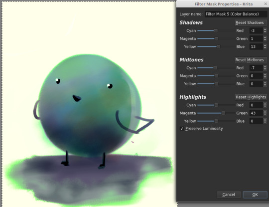
“This is too bright.“
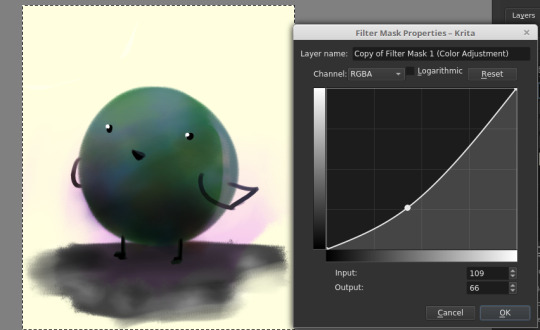
“This is too dark.“

“There’s not enough contrast!! >:(“
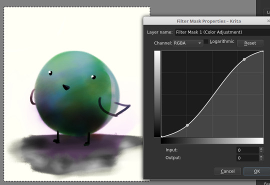
“Too much !!!! Contrast!!!!“

“THIS IMAGE WAS SUPPOSED TO BE PURPLE“
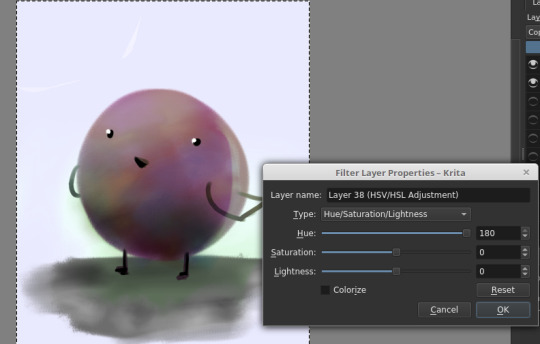
There is magic in the filter list. Jump in and have fun! (And fix your stuff.)
----
And.... that’s the philosophy.
Keep big chunks to stay organized
But have randomness to be fabulous
No shame in fixing mistakes.
----
So from that, actual painting process for Ringabel on a Horse (clop clop). Here’s the thumbnail, which I drew before I knew how horses worked:
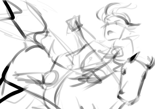
Then we choose hues. This will change over the course of the painting; I ended up with Green, then Red, then Yellow, then blue?
Then, allocate the colors in this way -
Dominant Lighting, Secondary Shading
Secondary Lighting, Dominant Shading
Rim light, another light source
Random random pops of color. because why not.
And pop them in this order:
Base/lineart
Initial color
Random colors (literally any color on the wheel) - Softlight/overlay - introduce jitter
Area Light 1 - (1) - Softlight/overlay - cohesive light
General shading - (2) - Multiply - cohesive shading
Detail shading - (1) - Multiply - jittery shading
Rim light - (3) - jitter - Softlight/overlay/COLOR DODGE - cohesive, out of left field light
Area light 2 - (1) -Softlight/overlay/COLOR DODGE - cohesive light
Detail - ;;_;; - FIX YOUR MISTAKES, C L E A N
Consolidate - (All 4) again to fix colors from the detail portion
GLITTER - (All 4) - jitter, glitter
Filtering - :D
The idea for 4-9 is that we have a balance of detail (jitter) and cohesion that we need to upkeep, and we need to strike a balance between adding cohesion and removing detail, and vice versa. Usually, I repeat those steps over and over and over and over, trying to get it just right. I tried to keep it simple here for the sake of the tutorial and my own sanity.
And now we do the thing.


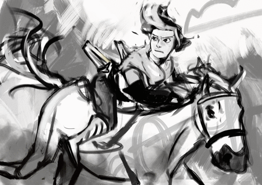
Thanks for sticking around, and have a fantastic day!
#tutorial#art tutorial#digital painting tutorial#painting tutorial#sorry this took so long#thank you for the request#and have a good night!#hotvivitea
19 notes
·
View notes
Text
My Friend has been Falsely Accused of Tracing So I Will Defend Him
Okay I accidentally deleted the blog I posted this one because I’m a dumbass, so I’ll just repost it here even though I don’t use this blog anymore, but apparently I still have followers. Bless caches because I was able to get this back from google caches so I don’t have to retype everything. I added further evidence and refutes to claims that were not in my original post btw.
Anyways, I am making this post to help out my good friend @5ru9 aka Falco who has been recently accused of tracing/copy pasting other people’s / official art!
I’ve known Falco for over 3 years, and we’ve grown as artists together. Once in a while we give each other advice on art (thanks for the mech and armor advice and teaching me how you line and color!), but most of the time we just meme each other.
Anyways, a lot of people have pointed out that they’ve seen him livestream before, and he’s already posted some of his block outs and other wips as proof that he does not trace in his post here:
http://5ru9.tumblr.com/post/168277137427/hello-i-have-been-informed-about-a-callout-post
To further prove his claim with solid evidence, I shall present to you!
Times he’s asked for advice on his art, or I randomly decided to mention things I notice in his WIPs!
Exhibit A-1:
A Tenkai Knight he made up! I pointed out a few things I thought were awkward about the perspective in his WIP.
Exhibit A-2:
He started working on this way back in July and didn’t finish it until much later because he was working on several other pieces at the same time. I suggested lowering the eyebrows and drawing the eyes a bit narrower to get more of the playful expression he was aiming for. In his final piece here, you can see that Falco continued to refine the piece.
By the way! The reason he sometimes posts a lot of detailed artworks one shortly after the other is because he sometimes works on multiple pieces at once! And then finishes coloring them around the same time.
Exhibit A-3
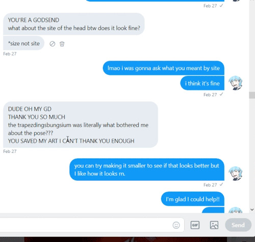
Falco and I spent good time trying to figure out why he felt like something was wrong with his sketch! I thought maybe it was the trapezius and I decided to red line (or blue line i guess) it so it’d be easier for him to see approximately where i thought the line should go to fix it.
Exhibit A-4:
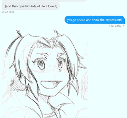
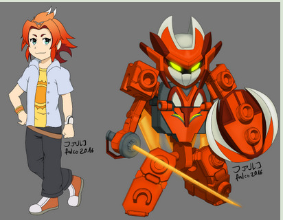
The gif-ing process turned white bg into blue… anyways! Falco showed me an early version of his Tenkai Knights OC that he eventually used in an April Fool’s joke to pass off as a new character in the series. He mastered the tenkai style enough that at first glance, people really did believe it was official! Like you had to get a good look to realize Shiyu was not really a real new character! Btw I had to go into my old twitter acc to find this…. (Edit: the gif wasn’t working bc it was too big so i had to make it smaller… and choppier and stuff to fit the mb max)
Well now that brings us into!!!
Exhibit B
Some of his old art!! (I’m so sorry falco i’ll be exposing your ancient art to ppl now)
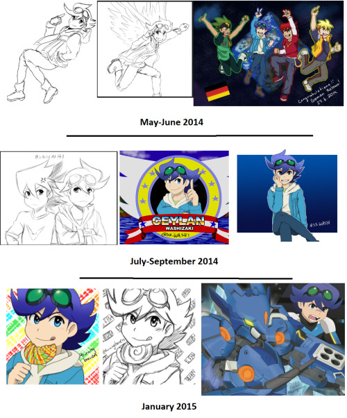
Here you can see his progress from 2014 Tenkai fan art to early 2015! It starts looking more and more like the official art, which is what he was going for.
For reference, here’s what the character Ceylan Jones/Washizaki looks like:
I blocked out fan art by everyone except falco (which i marked) that shows up in this google search. Everything else is official art. The two fan arts by falco you see here are more recent, the angel one being from 2016 and the chicken one from 2017 (i think he also made a version with sonic instead of the chicken? lol). They’re both on his dA accounts btw! The 2017 one really looks like official art, doesn’t it? But it’s his artwork! He practiced a LOT to reach that point, and I hope the earlier arts I showed above this one are enough to convince you in his art progression! Side note: i only used images w/ceylan because 1. i’m biased because ceylan is my favorite character and 2. he drew ceylan a lot because ceylan is his favorite character Also you can see his handle change from s3iwashi to burningbraven. 5ru9 is is a pretty recent handle.
ANYONE WHO HAS BEEN IN THE TENKAI FANDOM FOR A WHILE CAN VOUCH FOR HIM!!!!!
And now for the last one,
Exhibit C
WHAT? WHO IS THIS???
This is my favorite character from a Chinese series called AOTU World! His name is Grey, or 格瑞。I commissioned Falco to draw Grey for me, and let me tell you it would be IMPOSSIBLE for him to have copied any of this. Why? Because the donghua is 3D and the manhua’s art is very inconsistent!
Let me show you the reference pictures I gave him to work with!
They’re all in my gdrive folder here: https://drive.google.com/open?id=1CqwH5KS-pHX0ZqLHQpoIZBi6W-gsU_Tz
This is all official art from the manhua, except the 3D model is from the donghua. Look at how inconsistent the references are! There’s no way he could have copy and pasted or traced this! Grey doesn’t even do this particular pose anywhere. lol. I told Falco “give him a cool sword pose”. (I’m sorry for being so vague, Falco! But it turned out great!!) The style he ended up drawing in was a mixture of all of them.
Btw!! here’s the blockout and the sketch he sent me before I sent my payment for the commission!! You can see his construction in the block out!! The arm construction and leg construction is light, but it’s there. You can also see the block out below the sketch. Notice he actually fixed the leg length from block out -> sketch?
ARGUMENTS AGAINST SPECIFIC ACCUSATIONS
LOOK, thte actual drawing doesn’t even match the sprites that closely. Pay attention to the collar especially. The whole frankensteining the image and then painting over it thing is just way more effort than drawing it himself. They don’t even match that well in the overlays. Like wow it’s such a crime to try and stay on model.
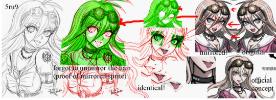
WHO WOULD EVEN NEED TO TRACE A MOUTH LIKE THAT? IT’S SO EASY TO DRAW. I CAN DRAW IT PERFECTLY JUST BY LOOKING AT IT. (well i AM an animator so I also do style mimicking)
Doesn’t the fact that you have to edit the sprites to match his artwork prove that you’re just a tryhard in making up fake evidence and not a tryhard enough at art since you think it’s so impossible for people to draw characters on model?
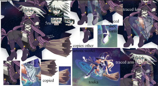
Yes he referenced the broom and possibly the heels from this image, but your overlays for the leg and arms are disingenuous and you know it. The leg positions are different, and the overlay doesn’t even match up. Face tracing also makes no sense. You literally stretched the mouth to try and make it fit but it still doesn’t fit. Do you really think it’s that hard to draw mouths and eyes in the DR style? DR faces are really simple to emulate. Also you fool, if you follow Falco’s artwork enough, you’d realize the way he draws bodies is actually rather consistent even as he does different styles. Especially when it comes to hands. His way of drawing hands is how I recognize his art and know right away it’s his art and not official art or a trace (also his coloring style). The heels he drew are also reminiscient of how he typically draws shoes/feet. he draws them bulkier. The other art has dainty heels. At most he referenced how backside works because he’s used to drawing sneakers.
Also come on, if all you referenced from an image was a broom because you liked the style (his is also clearly drawn by himself since you can’t overlay it on the other one. like i said he mostly used the style as a reference for how-to-broom) and you referenced pieces from many other images, are you going to list every single thing you referenced? While yeah it’d be nice to, it’s a little ridiculous to expect all 5-20 references whenever they post the image. It’s a thing where, if someone asks, you’d tell them, but it’s too much to list all of it. This isn’t a 20 page thesis.
If it’s such a crime, then holy shit sue all those people who parody other people’s comics and sue everyone who dares!!! to ever draw something remotely similar to someone else. Dang.
Art doesn’t live in a vacuum.
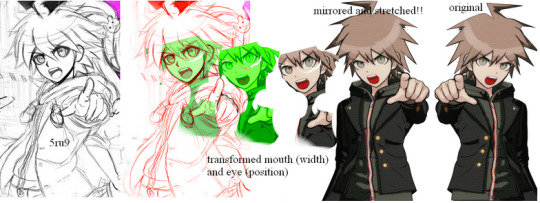
Okay, this one is just plain stupid. You distorted the sprite to match it up with his, but what would be the point for him to distort it just to trace? Also if he traced, can you explain the rest of the fingers that are drawn nicely but clearly different from the sprite? Also the thumbs don’t even match up. His faces more downward while the sprite is facing more forward. Also explain the turned body in Falco’s sketch, then!! And the hair! OH WAIT YOU CAN’T EXPLAIN IT BY ANY OTHER WAY THAN HE DREW IT HIMSELF!!! BECAUSE NO SPRITES MATCH IT AND YOU CAN’T FIND ANY SPRITES TO DISTORT ENOUGH TO EVEN GET CLOSE TO MAKING FAKE EVIDENCE FOR IT.
By the way, the style he drew it in is closer to the drv3 than this sprite. while it’s pretty much the same style as the older games, drv3′s art is more refined than the older games. Falco’s art is also more refined as you can see. (wow not only did falco’s art improved from back when we first met; even professional artists improve. shocker. /s)
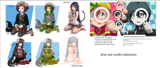
Dude what the hell? The overlays don’t even match up even ifi you tried to frankenstein them. And these are really common poses at really common angles, and once again, must every single thing we reference from be listed in the description of every place we post an image? Let me just list all 30 videos and 50 images i used as reference for one of my prints. jfc.
As for the saihara animation based on the digimon opening animation? It was pretty clear to everyone that it’s some kind of parody. Many people when making parody animations don’t mention the original video either?? It’s a fun thing for fans of the franchise to recognize the reference themselves. Yes he could have said it was the digimon opening on the description, but at least he didn’t say he thought of the idea himself? And if you talk to him about the animation, he will openly tell you it’s from digimon. And the fact that you think it’s a trace despite how much the overlays do NOT work out is practically proof that you’re just doing this maliciously and hoping that saying he traces enough with shoddy evidence will make people believe you.
ALSO PEOPLE LITERALLY TRACE ANIMATIONS TO MAKE PARODIES OF, DOWN THE STYLE WHERE ALL THEY CHANGE IS THE HAIR AND OUTFIT, AND YET SOMETHING WITH DIFFERENCES EVEN DOWN TO THE STYLE LIKE THIS IS SOMETHING YOU THINK IS A TRACE? Do you need a new pair of glasses?
I was gonna ignore this one because it was the same as a lot of the others, but you literally erased Falco’s face line so it would match the sprite, and you covered the bigger boobs Falco gave her, and totally ignored that the angle doesn’t even match properly. Like you covered parts of his sketch in your overlay just to make it look more like it matches, but if you actually fucking overlayed it correctly, even with squashing it, it won’t fit. (Also sorry to point this out Falco, but the circles on your goggle lenses are too small compared to the sprite; Maybe if you actually traced like this person claims you’re doing, they’d be perfectly like the sprite. OH BUT WAIT YOU DREW IT YOURSELF SO OF COURSE THERE’S SOME DIFFERENCES. JUST LIKE HOW EVEN THOUGH ALL YOUR OTHER WORKS ARE REALLY CLOSE TO THE STYLE AND PRETTY MUCH ON MODEL, THEY’RE NOT EXACTLY THE SAME WITH THE SPRITES! SHOCKER...!)
HOLY FUCK. I already pointed out and gave evidence that Falco started on the Nier Automata drawing waaaaaaay before he posted the actual picture. The 2 sketches are sketches! They don’t take a super long time. I busted out 10 inktobers in 1 day. (thumbnails of my artwork below)
Look I even even lined and colored 5 fairly detailed chibis in 1 day (i did the sketches earlier though. btw i hand drew the plaid on ray. it was annoying)
At the moment I have 5 wips. They’ll likely all be done around the same time. I know Falco often has multiple wips as well, and sometimes he also finishes some of them close to each other. Some artists (like my friend Fish) can pump out extremely detailed paintings in less than a day. WOW some artists can draw at a fairly fast rate. WHO KNEW? (manga artists in weekly magazines pump out 15-20 pages of manga in a week)
He’s still developing a style; he’s mostly doing style mimics of series he likes in the mean time.
At the moment he’s mostly experimenting with the drv3 style, but he was practicing p5 earlier. By the way, he DESIGNED a phantom outfit for mishima. Who the heck would he copy that from? He made it up because he loved mishima and wanted to make him part of the gang in some AU fan art. Mishima doesn’t have artwork like this for him to trace, so it should be obvious it’s his own work.
And the pokemon and crash bandicoot ones are actually not that close. The pokemon one looks like a good attempt at imitating the pokemon style, but since he hasn’t practiced it enough, you can tell it’s a little off model because, well, he drew it himself and doesn’t practice the pokemon style a lot. Same with the crash one. Had it been a trace, with his level of control over his lines (which you can’t refute), it would have been much closer.
And you act like it’s a crime to imitate others’ art style. It’s really not. What is wrong with you? Do you want to slow down animation production by only letting the character designer draw everything? Or do you want animation where the art has 0 semblance of consistency because all the artists draw in vastly different styles? lol. What do you have against artists that try to stay on model?
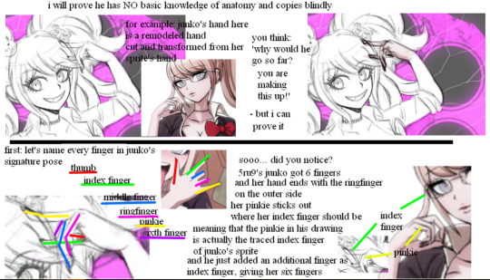
LOL THIS IS ONE IS SO STUPID WHERE DO I EVEN START?
Oh, I KNOW. Why don’t I do that same pose with my own hands?
IT’S A MIDDLE FINGER, YOU IDIOT.
Just because YOU don’t know basic anatomy and can’t tell a middle finger from a pinky, doesn’t mean everyone else is as incompetent as you. He wasn’t doing the rock-on hand pose (sry idk if that pose actually has a name lol), and he’s drawn the rock-on hand pose properly before.
Closing statement
I believe I covered a lot of things and provided a lot of evidence here that Falco and his other friends did not cover in his defense against the false accusations.
I even added more counter arguments in this repost because apparently my original post wasn’t enough to convince people.
Perhaps the person calling him out meant well (no, I doubt it because they made a new side blog just to diss him because they knew if they did it on their actual blog, they’d be called out for being a jerk), but they did not do enough digging to find out if their claims were true or not (and they probably know well enough that they MADE UP THEIR EVIDENCE).
If you’re going to make a call out post, please make triple sure sure of everything before you accuse people. Talk to them first. Talk to those who know them too.
Many jobs require you to be able to draw characters exactly in the style given. Animators for example! There are multiple animators working on one series, and they all need the skill to draw consistently! Some games also have teams that need to be able to draw in the same style so they don’t have to leave everything up to one person. Comic artists often have assistants that help them draw background characters, but those background characters can’t be too different from the main style either.
As for the people who believed the call out post before, it’s perfectly understandable. I am also guilty of falling for similar posts in the past. Due to that, I decided it was best to double check before retweeting (i say retweet because i use twitter far more than tumblr these days. heck i almost never post anything on this blog) things, and if i wasn’t sure, I would just leave it be.
I hope my post was able to convince you on Falco’s innocence and all his hard work. And if you already believed him but checked out this post anyways… Thanks! ObligatoryPleaseWatchAotuWorld.
And again:
Art does NOT exist in a vacuum. All artists are influenced by each other and MANY artists, especially professionals, use a lot of references, whether it be from photographers, their own pictures, others’ artwork, life, or whatever. We all use many different resources. If you’re going to say that’s wrong, you just dismissed millions of artists in the world.
51 notes
·
View notes
Note
I watched this Youtube video today regarding the topic “Anime That Made Me Who I Am” which turned out to be intriguing. At first, I immediately thought he was going to speak only about early 90s classic anime, then he mentioned some that I watched only in my teenage years and it kind of dawned on me..how other people view anime. What anime says about them that influenced their ideals of who they are today. What are yours?
Interesting. What video was it, out of curiosity? And what youtuber?
This was sort of tough because I resonated with so many superb animes over the years. Hm. I’ll give it a shot though.
These aren’t in order of best/better or anything.
1. Inuyasha
As a child this was the very first anime that I watched, loved and kept up with. I remember setting my alarm clock to wake up at 4:30am to watch it on adult swim and I would sit so close to my television because the volume was on low and I didn’t want to get in trouble. Inuyasha was an obsession, I was drawn to the ideals of Naraku, I was invested in the time Inuyasha spent with Kagome and I was enamored with the humor mixed with surreal themes throughout the show. As a child I didn’t understand Kagura’s rebellion and I didn’t care about Kana’s devotion. I was intrigued by Sesshomaru’s determination though and Rin’s ability to humanize a demon. As a child this anime was my entire world because it opened my eyes to wanting more of it. I wanted to see more anime like Inuyasha. I have to also add that being as young as I was, Inuyasha for many people like myself was the first anime we all probably understood. It was simplistic and it tackled the audience in a damn good way of who was watching.Inuyasha was also my very first surreal disappointment of a bad ending though. The love and obsession for the show as a whole doesn’t reconcile the pain and agony I felt after that anticlimactic ending.
2. Clannad After Story
Clannad was one of the animes I watched out of sheer boredom. Yes, I heard the sob stories for years and no that isn’t what intrigued me to watch this anime. Believe it or not, I used to be interested in romance animes, I kind of was drawn to how the boring every day school life could be riddled with romance, something I lacked throughout my entire school life. Diving into Clannad you’re not really expecting what comes next to happen..well, next. The anime does a damn good job of execution and plot twists where your attention can focus on multiple things going on and still have an overlaying theme that’s going to hit you like a boulder at the end. It did really well distracting you from the moments where you knew you were crying but you couldn’t hold back smiling either. It knew all too well that you were invested for the characters..the story though, is what damn near killed me. Not just once though, fucking twice. This was the first anime that I actively cried in. That I actively couldn’t believe happened. So let me tell you something—it wasn’t just what happened that made me cry, it was the dialogue given and portrayed that really resonated with me. There’s a crucial scene of Tomoya speaking to his father and if you’ve watched the anime you’re aware of the relationship they had during his childhood and after Tomoya’s tragedy, it is mirrored (fucking PERFECTLY) what his father went through during Tomoya’s childhood that as an adult he faces the same situation in..this scene had me on the floor balling my eyes out because my father and I have the same relationship and it..tore me in half to know after all those years, Tomoya’s father lived FOR Tomoya. And Tomoya damn near ended his life knowing he too had someone he needed to live for. The flashbacks, the music, the dialogue, EVERYTHING about that scene tore me to pieces. It was the way Tomoya said “I’m so sorry, dad” by the way he said “Take care of yourself.” It was the way “Goodbye” wasn’t a goodbye, it was a “Good luck.” It was the way Tomoya had to find it in his cold, angry and distraught heart that he had to realize he was not the only one who was allowed to suffer and be in pain, and that he was selfish as a child to ignoring his father’s pain and dismissing him as a drunk, not as a recovering sudden single parent. That scene is the epitome of brilliance. I watched that anime during a critical time in my life and even while thinking about it I’m reminded of the moments I couldn’t stop crying. It helped me speak to my dad in a different way. It helped me understand him as a person, not only as a parent.
3. Fruits Baskets
I watched this anime as a child, early teenage years and it could not have been at a better time in my life. Getting older this anime actually remains in my top 5 animes to ever exist in my book and I wish more people knew about it, talked about it. Fruits Baskets was the second anime that made me cry. But not just one episode, through most of the damn season. Whether it was a background story or sheer brilliant dialogue delivery and emotion from characters—this show hit on every single milestone as a teenager growing up in the world of misfortunes. The second main character not only is believable in his disdain towards the rest of the cast, but the humor doesn’t take his anger away from him as a character. One of the characters does so well at being his polar opposite, it’s damn near hard to believe he was the reason behind the second main persons demise and embarrassment. The entire cast of characters have unique quirks, they aren’t downplayed and they aren’t over shadowed. As a teenager growing up, there was one episode that changed how I am today. I used to believe there was nothing special or unique about me, I believed I was just on this earth to outlive my parents and that was it. One episode was the true embodiment (to me) of living for the sake of yourself because you owe yourself that, to make something of yourself while you’re here. This episode to this day remains in my top 3 nest executed episodes to date by far, I haven’t seen such a brilliant scene that comes close to it in my twenty one years of a lifespan thus far. This anime changed the way I viewed others, viewed myself and how I became of age. It’s very, very dear to me.
4. Assassination Classroom
I regret not finding this anime sooner. I regret not being obsessed with this anime during my earlier years of high school or later years of middle school. I regret it so much.This anime changed my entire world, from the way others see me up to the very aspect of my being. The character that resonated with me far better than anyone was Karma Akabane. It was the way he was introduced as an antagonist and ended up being the exact direction the show needed to mold around. Karma’s character struck me as interesting from the second he appeared on screen, but it wasn’t his appearance or sinister personality. It was how real Karma was and how afraid he internally was as well. Every obstacle Karma faced and overcame was due to his over confidence that he was just GOOD at everything he tried and does. When he failed the one thing he was confident about, it wasn’t just a strike to his ego, it was his entire nature as a person. The reason I loved his character so much was because life was just life to him, he wasn’t really interested in the outcome, barely even the trail and error. He just wanted results and he didn’t do anything to better them, he knew he was good. When I watched this anime during the year that I did I was at a loss of..direction. I didn’t have motivation and it seemed like life couldn’t hand me a single..reward for all of my wasted effort I was putting into everything. This anime changed my life because it gave me the hope I needed and it helped me understand myself so much more. This show is littered with humour but behind every single smile on the show there were cruel lessons that I just wish could’ve been driven into my head at a younger age than when I stumbled upon it.
5. Naruto
I thought I’d regret adding this to my list but I think in all fairness it deserves to be here. Everyone knows the disastrous ending this anime had and we could debate for another ten years, it won’t change the lessons it taught us that we embodied and will carry with us throughout our life spans.When I stumbled on this anime I wasn’t even in middle school yet. As a child, it seemed like something an average person could enjoy and achieve. I bought naruto stuff, even the book of hand signs and I sat in my room learning the fire style technique hand signs to show off to my brothers for weeks. This was just something as a child I do not regret diving into. It taught my harsh lessons regarding friendships and it taught me lessons regarding hardships and endurance. I was at an age where I wasn’t really appreciative of very many things and as a young kid becoming a teenager, there weren’t many lessons a parent could teach a child without saying “I’ve been there, I know what I’m talking about” because as true as that was, it didn’t help being a child and feeling like your parents were trying to keep you from maturing into your own being with your own views and opinions. Naruto as a child helped me embody those morals and helped give light to what was important throughout life and a massive theme was friendship.As an adult and looking back on those friendships, I’ve learned some of them were one sided and overall toxic but I still don’t regret having them, otherwise I wouldn’t appreciate the ones I have now thanks to knowing what to avoid. Naruto was the anime that drove home “No matter who you are or where you come from, always believe in yourself. And never let friends down.” You’d play the naruto battle theme song while walking to class in middle school and it still probably wouldn’t resonate with you in this day and age how important those lessons were and still are.It had a terrible cluster fuck of an ending but it still remains of the animes that undoubtedly changed my entire life and made me who I definitely am to this day.
11 notes
·
View notes