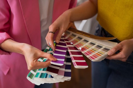
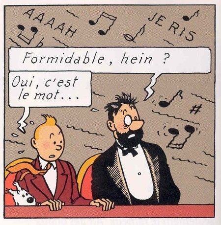
#even their blue yellow and black color palettes complement each other
Explore tagged Tumblr posts
Visit Tumblr Blog
Explore Tumblr blogs with no restrictions, modern design and the best experience.
Last Seen Tumblr Blogs


Fun Fact
Tumblr has been providing a Korean-language service since 2013.
Text
i'm sooooo convinced (from a twt thread i read) that law and bepo will be found by the revolutionary army (my sabolaw heart!), making them a part of it.
law being a revolutionary fits him sm. his motive to find the meaning of "the will of D" might be more tangible when he sides with a faction that directly challenges the world government.
+ sabolaw might (WILL) get closer because of their shared trauma for what the government has done to rob a part of their childhood (and of course, luffy). and sabo can share to law what he learned when he was studying to be a noble... like kind of piecing together more things about world history and politics that might be relevant to law's goals
#peak oda writing if this happens honestly#PLEASE MAKE THIS HAPPEN#they're meant for each other#even their blue yellow and black color palettes complement each other#sabo#law#trafalgar law#sabolaw#one piece#revolutionary army#op#one piece character analysis
37 notes
·
View notes
Note
Certainly, it seems like the show's creators used color coordination in the characters' outfits to convey subtle messaging about their relationships. In episode 418, the color choices of Jordan, Layla and Simone’s clothing appear to reflect the dynamics between them.
In the first scene at the beach house, Jordan's dark blue shirt and Layla's light blue outfit may symbolize their budding connection and the calmness of their relationship. The contrast between Jordan's dark blue and Simone's white outfit could signify the emotional distance between Jordan and Simone at that point.
At Spencer's apparel launch, Jordan's white shirt with black designs could represent his growth and change, while Layla's all-white attire could symbolize a fresh start. Simone's mostly black outfit might imply tension or a darker aspect in her connection with Jordan.
The fact that Layla's outfit color is closer to Jordan's in both scenes could indeed reflect their stronger bond and growing closeness. The shift in Layla's and Jordan's outfits complementing each other more by season 5 could signify their evolving relationship and alignment on a deeper level.
Overall, the color choices in their outfits seem to serve as a visual metaphor, subtly expressing the characters' emotions and relationships as they develop throughout the show. It's a clever way to convey narrative details without explicitly spelling them out in the dialogue.
Can you go into more detail about other things you noticed about their outfit choices?
Yes?!?! I just ask that you please please please share more of your own observations about outfit choices as well!!
I had a discussion with a friend about this months ago and went through all their scenes and discovered how much they really did match or coordinate. I won't go quite as granular as I did, but sometimes I can't help myself. It's too fun.
I mean, you got the biggest callback to their moments in 2x10 with Jordan's suit in 5x04. And then Layla's yellow dress in both 3x18 and 5x04.
Layla and Jordan are much more coordinated in 3x07 than he Simone are. Layla's also in white, and Jordan's talking about her dad and throwing the word "endgame" around. Spencer is in much darker colors.
And in season 3, Simone and Layla keep wearing opposite, coordinating colors. Like, during their plan to set up the boys, they're in similar cut outfits, but Simone's in light red, and Layla's in light blue. And even during their PE class, they're in opposite gym outfits.
But outfit coordination really picks up steam in s4. In their first scene together, jordayla is in cream/white. Which makes me think of your point... new beginnings? In 4x06, they're in muted grayish/blue tones. And obv in 4x07, they're both in shades of pink. They look like they planned to go to prom together. Actually, all the teen couples match at prom: jordayla, spelivias in black, jasher are both in ties, and catience is in orange.
4x08, they're both in florals briefly. 4x12, Jordan's collar matches the exact shade of green of Layla's outfit. They're both in yellowish beige in 4x13. They're both in blue in 4x14. Then in 4x16, the white under his jacket matches her white throughout the ep. They're both in blue/gray tones in 4x17. And then the lovely 4x18 outfits for all three that you laid out.
4x19, they're in orange and black, the classic Halloween colors. And again, to your thoughts about color, perhaps they're on differing color palettes because they were opposing each other all episode? And for the first kiss, they are both bright, bright, bright.
For 5x01, Jordan's undershirt matches Layla's dress when we get our first scene, and even her lipstick matches his button up. Simone and Layla are in red and green at the party... the two sides of the triangle.
5x02 has them in reds/pinks. 5x03, Jordan manipulated for them to coordinate. They looked fantastic together. 5x04, They're in white and black. And I can't help but wonder if Jordan's in white bc he wants to be open about their relationship while Layla wants to keep it hidden.
5x05, they're in Valentine colors. Jordan's in red and white, and Layla's in white. And then in hc 2x07, Simone's in dark brown, Layla's in a mixture of beige/light brown. And their most prevalent coordination to me was seeing them both in really pretty jewel toned blouses in a deep purple and hot pink.
5x08 has jordayla in multicolor with earth tones. Plus the white accents in Jordan's tracksuit matches Layla's tracksuit, and they're in white and black at the end. 5x11, the black in her dress/accessories matches his black. They're both in gray at GW's.
They're both in gray/silver in 5x13. This was pointed out before, but all the couples at the end of the ep were coordinated with jordayla in gray, spelivia in black and white, and jasher in red and beige. They're in dark colors in the fridge scene in 5x14 and then they're in pinks/reds in the ily scene.
In 5x15, her top matches his pants perfectly. And that's a weird color to match. 5x18 shows them in light colors up front and the end. And the black accents in her jacket matches his black outfit in 5x20.
I mean, some of these might be coincidental, but there is quite a pattern of them matching/coordinating, especially the closer they became to each other.
Anon, please expand on any of these I mentioned or throw in new ones of your own if you'd like. I really loved your color analysis. <3
6 notes
·
View notes
Text
What Is My Colour Palette? Discovering Your Unique Aesthetic
In a world filled with colors, identifying your personal colour palette can be an empowering and enlightening experience. Your colour palette is more than just a selection of hues; it reflects your personality, influences your mood, and can even affect the perception others have of you. In this article, we’ll explore what is my colour palette is, how to determine your own, and how to use it in various aspects of your life, from fashion to home decor.
Understanding Colour Palettes
A colour palette is a collection of colors that work harmoniously together. These colors can evoke specific feelings, represent different aspects of your personality, and create a cohesive aesthetic in various applications. Colour palettes are often used in art, design, branding, and personal styling, allowing individuals to convey their message or emotions effectively.
The Psychology of Colour
Different colors can elicit distinct emotional responses. Here’s a brief overview of how certain colors are perceived:
Red: Passion, energy, and excitement.
Blue: Calmness, trust, and serenity.
Green: Growth, renewal, and harmony.
Yellow: Happiness, optimism, and creativity.
Purple: Luxury, mystery, and spirituality.
Black: Elegance, sophistication, and power.
White: Purity, simplicity, and innocence.
Understanding the psychology of color can help you choose shades that resonate with your personality and desired image.
Finding Your Colour Palette
Identifying your unique colour palette involves a few key steps:
Self-Reflection
Consider what colors you naturally gravitate towards and which ones make you feel good. Do you feel more comfortable in warm tones like reds and yellows, or do you prefer cooler shades like blues and greens? Think about your favorite clothing items, artwork, and even the colors in your home.
Skin Tone Analysis
Your skin tone plays a significant role in determining the colors that complement you. Generally, skin tones fall into three categories:
Warm: Yellow, peach, or golden undertones. Look for colors like warm reds, oranges, yellows, and earthy tones.
Cool: Pink, blue, or purple undertones. Favor colors like blues, greens, purples, and jewel tones.
Neutral: A mix of both warm and cool undertones. You can wear a wider range of colors, including pastels and muted tones.
Seasonal Color Analysis
Another popular method for determining your colour palette is the seasonal color analysis, which categorizes people into four seasons—Spring, Summer, Autumn, and Winter—based on their skin tone, hair color, and eye color. Each season has its corresponding color palette:
Spring: Light, bright, and warm colors like coral, peach, and light greens.
Summer: Soft, muted, and cool colors like pastels, soft blues, and lavenders.
Autumn: Rich, earthy tones like burnt orange, mustard yellow, and deep reds.
Winter: Bold, vibrant colors like emerald green, royal blue, and pure white.
Create a Colour Mood Board
To visualize your palette, consider creating a mood board. Gather images, fabric swatches, and color samples that resonate with you. This will help you see which colors work well together and reflect your personal style.
Using Your Colour Palette
Once you’ve identified your colour palette, it’s time to apply it in various areas of your life:
Fashion
Incorporate your colors into your wardrobe. Choose clothing items, accessories, and makeup that align with your palette. This will create a cohesive and flattering look that boosts your confidence.
Home Decor
Use your colour palette to guide your home decor choices. Whether you’re painting walls, selecting furniture, or choosing decorative accents, having a consistent color scheme will create a harmonious environment.
Branding
If you own a business or are involved in creative projects, your colour palette can play a crucial role in your branding. Consistent colors across your logo, website, and marketing materials can enhance brand recognition and convey your values.
Art and Design
For artists and designers, understanding your colour palette can help you create works that resonate with your intended audience. Experiment with different combinations to find what best represents your artistic vision.
Conclusion
what is my colour palette is a journey of self-exploration and creativity. By understanding the psychology of color, analyzing your skin tone, and using tools like seasonal color analysis and mood boards, you can curate a palette that reflects your personality and enhances your life. Whether in fashion, home decor, or branding, a well-chosen colour palette can empower you to express yourself authentically and beautifully. So, embrace the world of color, and let your palette shine!
1 note
·
View note
Text
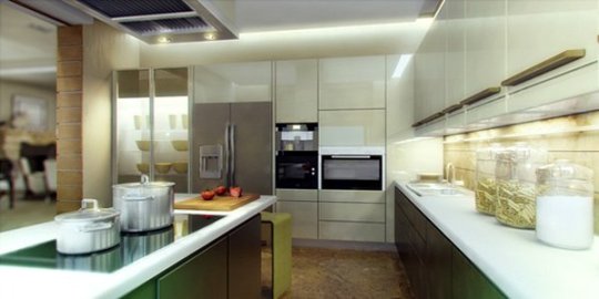
How to Choose the Perfect Color Scheme for Your San Jose Kitchen Renovation
Renovating your kitchen is one of the most exciting and rewarding home improvement projects. It gives you the chance to breathe new life into your space, improve functionality, and, of course, add a personal touch. But with so many options out there, choosing the perfect color scheme can feel overwhelming. Especially in a city like home remodeling san jose, where modern trends meet cozy suburban charm, the choice becomes even more impactful. So, how do you choose a color scheme that works for both style and practicality? Let's walk through some tips to help you make that decision easier.

1. Consider Your Kitchen's Natural Light
San Jose enjoys plenty of sunshine, but how much light your kitchen receives should influence your color choices. Natural light can make your kitchen appear brighter and more spacious, allowing you to play with darker hues like navy blue, charcoal, or forest green without making the room feel cramped. On the other hand, if your kitchen is on the darker side, you’ll want to opt for lighter tones like white, cream, or light pastels to brighten up the space.
2. Match the Color with Your Home’s Overall Theme
Since San Jose features a mix of architectural styles, from modern minimalist to Spanish-style homes, it’s essential to keep your kitchen in sync with the rest of your house. For modern homes, neutral palettes like gray, white, or black paired with metallic accents can create a sleek look. If you’re renovating a Spanish-style kitchen, warm colors like terracotta, mustard yellow, and rich browns will complement the home’s earthy charm.
3. Focus on Functionality
Kitchens are high-traffic areas, so your color scheme should be as practical as it is beautiful. Lighter colors may create a clean and airy vibe, but they can show stains and wear more quickly. For example, if you love the look of white cabinets, consider using a more durable, easy-to-clean finish. Darker shades are more forgiving and can hide smudges, but they can also make the space feel smaller, so balance them out with lighter countertops or backsplashes.
4. Complement Your Cabinets and Countertops
Your cabinets and countertops are major focal points in your kitchen, and they will largely determine how your color scheme comes together. If you’re installing new cabinets, you have more flexibility in choosing a color scheme, but if you're working with existing cabinetry, make sure the colors you choose complement each other. For example, white cabinets with gray or blue undertones pair well with dark granite countertops. If your cabinets are a wood tone, look for colors that bring out the natural beauty of the wood, such as warm whites or olive greens.
5. Take Inspiration from San Jose’s Natural Beauty
San Jose's scenic views and lush landscapes can serve as great inspiration for your color scheme. Earthy tones like sandy beige, leafy green, or sky blue can bring the outdoors inside and create a tranquil kitchen atmosphere. Pair these natural hues with materials like stone countertops, wooden floors, or tile backsplashes for an organic and welcoming feel.
6. Go Bold with an Accent Wall or Island
If you're hesitant about committing to a bold color for the entire kitchen, why not test it out with an accent wall or island? These smaller areas allow you to play with bright or dark colors without overwhelming the space. A deep teal or emerald green island, for example, can be a striking feature in an otherwise neutral kitchen. Similarly, a bold backsplash or wall behind the stove can add a pop of personality while keeping the overall look cohesive.
7. Think About Your Future
While it's tempting to go for trendy colors, you also want to ensure your kitchen’s color scheme remains appealing for years to come. Neutral and timeless colors tend to have better longevity and resale value. Whites, grays, and soft blues are great for creating a classic look that won’t go out of style. That said, if you’re planning on staying in your home long-term, don’t be afraid to add some personal flair—just balance it with neutral elements to ensure the room doesn’t feel too trendy.
8. Use a 60-30-10 Rule
When choosing your color scheme, consider following the 60-30-10 rule: 60% of your kitchen’s color should come from your walls and cabinets, 30% from your flooring and countertops, and 10% from accents like decor, lighting fixtures, and bar stools. This rule helps create balance while giving your space a cohesive yet dynamic feel. For example, you might choose white or cream for your walls and cabinets (60%), light gray for your countertops and floors (30%), and add a splash of color with yellow or teal accents (10%).
9. Get Samples and Test Before Committing
Before making any final decisions, it's always a good idea to get paint samples and test them on different walls in your kitchen. Colors can look drastically different depending on the lighting and time of day. You can also get samples of tiles, countertops, and flooring to see how everything works together. Taking the time to test before you commit can save you from costly mistakes down the line.
10. Consult with a Professional
If you’re feeling stuck or overwhelmed, don’t hesitate to consult with a professional interior designer or contractor. Many San Jose-based contractors have years of experience designing kitchens and can help you choose the best color scheme to match your style, budget, and the unique features of your home.
Choosing the perfect color scheme for your Kitchen Remodeling Contractor San Jose can seem daunting, but with a little thought and planning, you can create a space that’s beautiful, functional, and uniquely yours. By considering factors like natural light, home architecture, and personal style, you can achieve a balanced, timeless look that’ll make your San Jose kitchen the heart of your home.
0 notes
Text
Paint Darker Without Using Black Paint: Achieve Deeper Shades with Alternative Techniques
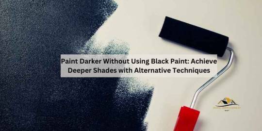
To darken paint without using black, mix complementary colors or the darkest hue of the color with its complementary color. This creates a darker shade without adding black paint. When it comes to painting, achieving the desired darkness without using black paint can be a challenge. Whether you're looking to intensify a color or avoid a dull appearance, there are various methods to deepen paint tones without resorting to black. By strategically mixing colors, artists can generate rich, darker hues that maintain vibrancy and depth. This article will explore alternative techniques such as using complementary colors, combining the darkest hues with their complements, and understanding the color wheel to achieve darker shades without incorporating black paint. Additionally, the article will provide insights into the benefits of avoiding black paint and the impact it can have on the overall visual appeal of the artwork.
Mixing Opposite Colors
When it comes to darkening paint without black, mixing opposite colors is a creative alternative. By blending complementary colors strategically, you can achieve deeper tones without relying on black pigment. Using The Color Wheel One effective technique for darkening paint is by utilizing the color wheel. Opposite colors on the wheel, also known as complementary colors, can be combined to create darker shades. This method offers a natural and harmonious way to deepen your paint colors. Creating Black With Complementary Colors If you want to avoid using black paint, consider mixing complementary colors to achieve a black-like shade. For instance, combining red and green, blue and orange, or yellow and purple can result in a deep, dark color resembling black. Experimenting with these color combinations can lead to unique and rich tones in your artwork.
Utilizing Umber
Utilizing Umber is an effective technique to paint darker without relying on black pigment. Understanding the properties of Umber pigment and its varied hues provides artists with a versatile tool for creating depth and richness in their artwork. Understanding Umber Pigment Umber is a natural brown pigment extracted from clay containing iron, manganese, and hydroxides. It offers diverse hues, ranging from yellow-brown to reddish-brown and even green-brown, depending on the proportions of its components. Utilizing umbers can help create a spectrum of dark shades without resorting to black paint, allowing for more nuanced and dynamic color depth in paintings. Varied Hues Of Umber There are varied hues of Umber pigment, each with unique properties that lend themselves to different artistic applications. By understanding and leveraging the distinct characteristics of these varied umbers, artists can expand their color palettes and achieve rich, deep tones without the use of black pigment. https://www.youtube.com/watch?v=3V0O_0LgX5M
Mixing Dark Hues
When it comes to painting, achieving depth and richness in colors is essential. While black paint is commonly used to darken colors, there are alternative methods to create darker hues without the use of black paint. By understanding the concept of complementary colors and knowing how to achieve intensity, you can achieve stunning results in your artwork. Using Complementary Colors Complementary colors are pairs of colors that are opposite to each other on the color wheel. When mixed together, they create a neutral gray or brown tone that can be used to darken other colors. For example, to darken an orange tone, you can mix it with a small amount of its complementary color, which is blue. Similarly, if you want to darken a green shade, mix it with a complementary color such as red. Achieving Intensity The key to achieving intensity in your colors is to start with the darkest hue of your desired color and then mix it with its complementary color. For example, if you want to darken a purple shade, mix it with a small amount of its complementary color, which is yellow. This combination will create a deep and vibrant shade of purple, without the need for black paint. By understanding how complementary colors interact with each other, you can create a wide range of dark hues that will add depth and dimension to your artwork. Experiment with different combinations and proportions to achieve the desired darkness and intensity in your colors.
Avoiding Black Paint
When it comes to painting, avoiding the use of black paint can lead to more vibrant and lively results. Many artists seek to paint darker tones without resorting to black, as it can have negative effects on the overall composition and color vibrancy. Negative Effects Of Using Black Adding black to achieve darker shades in a painting can often lead to a flat and lifeless appearance. Black pigment tends to overpower other colors, muting their vibrancy and depth. This can result in a dull and monotonous color palette, lacking the dynamic qualities that can be achieved through the use of alternative methods. Preserving Color Vibrancy Preserving the vibrancy of colors is crucial for creating captivating artworks. Avoiding black paint allows artists to maintain the depth and richness of their chosen color palette. By utilizing alternative techniques and pigments, such as mixing complementary colors or using dark earth tones like burnt umber, artists can achieve darker shades while preserving the luminosity and complexity of their compositions. Furthermore, by preserving color vibrancy, artists can create more visually engaging and harmonious artworks that captivate the viewer's attention and convey a sense of depth and luminosity. This approach to painting darker without black offers a unique opportunity for artists to expand their creative repertoire and explore the diverse range of colors and pigments at their disposal.
Artistic Techniques
Enhancing your paintings by making them darker without using black paint can bring a unique depth to your artwork. By exploring various artistic techniques, you can create rich shadows and tones that add complexity and visual interest to your work. Creating Depth And Shadows - Utilize shading techniques to create depth in your paintings. - Experiment with different levels of contrast to enhance shadows. - Blend colors strategically to achieve a darker hue while maintaining vibrancy. Exploring Different Tones - Mix complementary colors to achieve darker tones without black. - Consider using earth tones such as umber, which can provide deep, rich color without black pigment. - Explore color combinations on the opposite ends of the color wheel to achieve darker shades.
Maintaining Color Integrity
Achieve a darker paint color without using black paint by blending complementary colors or mixing the most dark hue of your chosen color with its complementary. This approach allows you to maintain color integrity and experiment with different shades. Enhancing Richness Without Black Explore various color combinations to deepen hues without resorting to black paint. Utilize complementary colors to add depth and richness to your palette. Balancing Darkness And Hue Find harmony between darkness and color intensity by experimenting with different shades and tones. Avoid the flatness that black can bring and opt for a more vibrant mix of hues.
Frequently Asked Questions
How Do You Darken Paint Without Black? To darken paint without using black, you can mix equal parts of red, blue, and yellow paint to create a dark shade similar to black. Alternatively, you can mix opposite colors on the color wheel, such as red and green, blue and orange, or yellow and purple. Another option is to mix blue and brown together. Umber, a brown pigment extracted from clay, can also be used to darken paint. How Do You Make Black Paint If You Don't Have Black? You can make black paint by mixing equal parts of red, blue, and yellow paint. Alternatively, mix opposite colors on the wheel, such as red and green, blue and orange, or yellow and purple. Another way is to mix blue and brown together. What To Use Instead Of Black In Painting? To darken paint without black, mix equal parts red, blue, and yellow paint or opposite colors on the wheel like red and green. Blue and brown also create black. How Do You Darken A Paint Color? To darken a paint color, mix it with its darkest hue or complementary color for a richer tone.
Conclusion
There are several effective methods for darkening paint without using black. By strategically mixing complementary colors or incorporating dark hues from the same color family, artists can achieve richer and darker tones. Additionally, exploring the use of natural pigments like umber can contribute to creating depth and shadow in artwork. Embracing these alternative approaches offers a versatile and dynamic palette for artistic expression. Read the full article
0 notes
Text
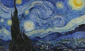
Van Gogh never used real colors. On the contrary, he used colors that could affect the audience’s emotions.
He first used dark colors such as olive green, raw sienna and raw umber. Then he added bright colors to the color palette of his paintings. Colors such as yellow, orange, red, blue and green.
In fact, in Van Gogh’s paintings, yellow ocher, chrome yellow, cadmium yellow, chrome orange, vermilion, Prussian blue, ultramarine, lead white, zinc white, emerald green, red lake, red ocher, raw sienna, and black can be found.
The choice of his colors depended on his mood. Indeed, he sometimes uses complementary colors to brighten and create contrast in his painting. Sometimes, like a sunflowers painting, he limited his palette to a color that was yellow in this example.
As I said, Van Gogh, like other Dutch painters, initially used dark colors for his paintings.
Because he was curious about colors. He read books on color theory and became acquainted with complementary colors. He actually found that yellow and purple, blue and orange, red and green intensified each other.
So, after moving to Paris, he learned how to use colors. Gradually, light colors replaced dark colors in his paintings.
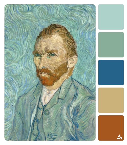
Like the Self-portrait painting that Van Gogh painted. Indeed, if you pay attention to it, the color of her hair, beard and mustache is orange and the color of her clothes is blue. This is an example of the use of complementary colors.
Van gogh color symbolism
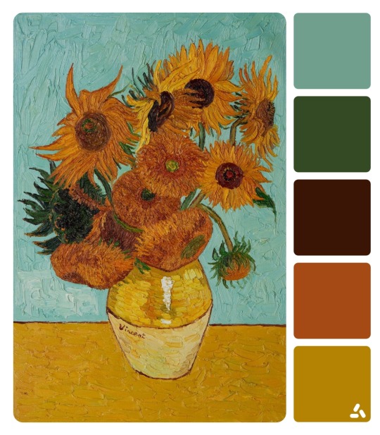
I want to start by painting Van Gogh sunflowers. So, he painted this painting with almost no shadows or complementary colors, and the most used color is yellow.
Yellow is the color of the sun and is also a symbol of life, energy, happiness and hope.
How wonderful yellow is. It stands for the sun.”
Vincent Van Gogh
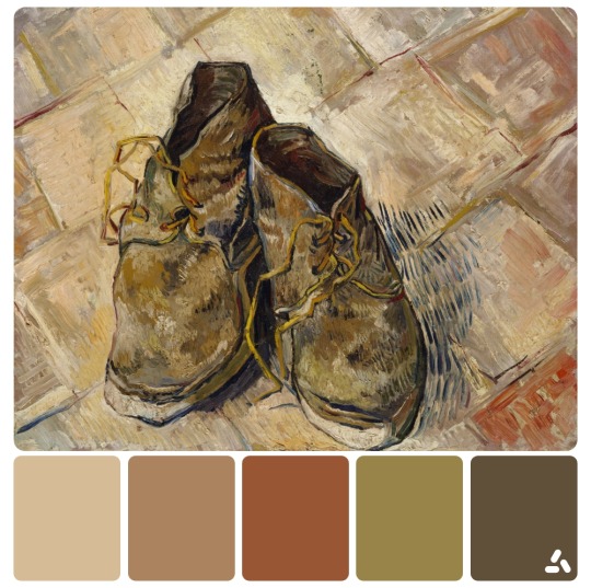
Van Gogh’s painting “Shoes”, in which he used a lot of brown and khaki colors. Brown is the color of earth and wood. It is, in fact, a symbol of virtue. By turning these shoes brown, Van Gogh wanted to show the hard life and humility of the shoe owner.
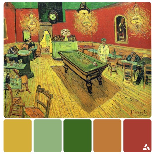
In the painting of the night cafe, according to Van Gogh himself, he wanted to depict the horrible human emotions with the two colors red and its complement green.
https://colors.dopely.top/inside-colors/van-gogh-and-his-strange-play-with-colors/
The work of Vincent van Gogh makes extraordinary use of the impasto technique.
The Dutch postimpressionist was famous for his bold experiments with paint. Impasto allowed him to concentrate vibrant colors and add emotion and movement to his paintings.
His painting techniques even revealed something about his mood. “Violent” moods, he wrote to his brother, required more impasto. When he felt calmer, his paint was not as thick.
https://www.getty.edu/news/impasto-paint-how-to-van-gogh-art-style-technique/
Optical mixing, also known as partitive color, is the perception of color resulting from the combination of adjacent colors. In other words, when color is mixed optically, the blending occurs perceptually, and takes place between our eyes and our brain. The perceived blending of color increases with distance.
https://alvalyn.com/optical-color-mixing/#:~:text=Optical%20mixing%2C%20also%20known%20as%20partitive%20color%2C%20is%20the%20perception,of%20color%20increases%20with%20distance.
https://heritagesciencejournal.springeropen.com/articles/10.1186/s40494-018-0181-6
https://www.vangoghmuseum.nl/en/art-and-stories/art/vincent-van-gogh
https://www.britannica.com/biography/Vincent-van-Gogh
0 notes
Text
Limestone Paving Slabs
Paveworld has long been synonymous with quality and innovation in the realm of landscaping and outdoor design. Among their diverse range of products, natural paving stones like rainbow sandstone paving and limestone, along with exquisite wall cladding options, stand out as timeless choices for creating stunning outdoor spaces. the unique qualities and versatile applications of sandstone paving, natural limestone paving, and wall cladding offered by Paveworld, exploring how these materials elevate the aesthetics and functionality of chivas rainbow paving slabs for outdoor environments.
indian sandstone rainbow, a sedimentary rock composed of sand-sized grains of mineral, has captivated architects and designers for centuries. Paveworld sources premium quality chivas rainbow sandstone paving from reputable quarries, ensuring durability and authenticity. The diverse range of colors, including warm beige, cool gray, and vibrant red, allows for endless design possibilities.
Indian sandstone paving is celebrated for its natural, earthy tones that seamlessly blend with various landscapes. The distinctive textures and patterns inherent in each stone create a visually appealing surface that exudes elegance. Whether used in traditional or contemporary settings, chivas caramel buff sandstone adds a touch of sophistication to outdoor spaces.
Paveworld's commitment to quality ensures that their caramel buff sandstone is not only aesthetically pleasing but also durable and sustainable. caramel buff sandstone paving is resistant to weathering, ensuring longevity in outdoor applications.
chivas caramel buff smooth sandstone is incredibly versatile, suitable for a myriad of applications. From patios and pathways to driveways and pool surrounds, the adaptability of Ivory natural sandstone makes it a preferred choice for both residential and commercial projects. Its non-slip surface is particularly advantageous in areas prone to moisture.
grey limestone paving, another sedimentary rock, boasts a timeless charm that transcends design trends. Paveworld carefully selects grey limestone paving slabs from quarries with rich geological histories, ensuring each piece tells a unique story through its texture and color variations.
ash grey limestone subtle color palette, ranging from creamy whites to muted grays, imparts a sense of timeless elegance to any outdoor space. The smooth surface of limestone paving provides a sleek finish, making it ideal for areas where a refined aesthetic is desired.
Paveworld's kotah blue limestone paving is not just a visual delight; it is also a practical choice for high-traffic areas. The inherent durability of blue limestone ensures resistance to wear and tear, maintaining its polished appearance even in demanding environments. Its ability to withstand varying weather conditions makes it an excellent investment for outdoor projects.
kota blue limestone versatility extends beyond paving to various landscaping applications, including garden walls, steps, and decorative elements. The adaptability of blue limestone paving allows for cohesive design schemes, where different elements seamlessly complement each other, creating a harmonious outdoor experience.
Paveworld's commitment to enhancing outdoor aesthetics extends to vertical spaces through their exquisite premium jak black slate wall cladding panel options. Whether used to accentuate garden walls, create stunning façades, or add character to outdoor structures, the wall cladding collection reflects a dedication to craftsmanship and design.
Paveworld's black slate wall cladding range includes a diverse selection of materials, each with its own unique character. From the warm and rustic appeal of sandstone to the timeless elegance of yellow limestone paving, the collection offers architects and designers the freedom to express their creativity and bring visions to life.
One of the key design principles behind Paveworld's black wall cladding collection is the seamless integration of outdoor spaces with nature. The textures and colors mimic the organic beauty found in wall cladding panels landscapes, creating a harmonious connection between built structures and the surrounding environment.
Understanding that each project is unique, Paveworld provides customization options for their wall cladding panel products. This allows designers to tailor the appearance of vertical surfaces to meet specific aesthetic and functional requirements, ensuring a personalized touch that resonates with the project's overall design concept. In the world of outdoor design, Paveworld's dedication to quality and innovation shines through its offerings of sandstone paving, limestone, and slate wall cladding. These natural materials not only stand the test of time in terms of durability but also contribute to the creation of outdoor spaces that exude elegance and sophistication. As we celebrate Paveworld's commitment to excellence on its 1-year anniversary, it is evident that the allure of these natural paving stones and slate cladding options will continue to shape breathtaking landscapes for years to come.
#natural stone#porcelain paving#vitrified porcelain paving in uk#natural stone supplier in uk#vitrified porcelain paving
0 notes
Text
The 5 Biggest Mistakes People Make When Choosing Paint Colors for their Home
Picking the perfect colour palette is a daunting task for any homeowner. Whether you've just purchased a new home and can't wait to start painting or you're simply looking for inspiration, it's important to remember that paint does more than just cover up walls.
When it comes to painting your home, there are a lot of things to consider. One of the biggest decisions you'll make is what color to choose for your walls. Unfortunately, many people end up making common mistakes that can really affect the look and feel of their home.
Here are the 5 biggest mistakes people make when choosing paint colors for their home.
1. Choosing the wrong undertones
When thinking about colour, many people think in terms of neutrals -- white, off-white, grey and black are all considered neutral colours because they're easy to match with other shades.
But what most homeowners don't realise is that choosing one shade isn't enough.
"Colour experts recommend choosing two or three major shades," says interior designer Kirsten Grove from Colour by Design.
"Harmonising the undertones of these colours will help to tie them together."
For example, if you're choosing warm neutral colours like red and orange, make sure your yellows are also warm to give your space definition.
If you choose cool neutrals like blue and grey, make sure your purples are also cool for maximum impact.
2. Not taking into account existing elements
Once you've chosen a few major shades for your walls, it's time to think about what else is already in the room -- lighting fixtures, flooring, furniture etc.
"Don't forget that other elements in the room should be part of the decision-making process," says Grove.
"If you have an older home with floral wallpaper, for instance, it's important to choose colours that complement the existing pieces.
The same goes for carpeting, floorboards and even artwork."
According to Grove, homeowners should always consider how their colour choices will influence the overall ambience of their home.
3. Choosing your favorite shades
There are few more universal tips than this one: don't choose only colours you like because they won't look good together at all. Unless you really know what you're doing, it's best to stick with two or three major shades in your colour palette. Of course, there are exceptions -- bold brights and deep darks can work with most colour schemes and should only be avoided if they don't fit the overall mood of your place.
4. Painting without research
It's not just your job to choose the colours you plan to paint with -- it's also important for you to learn everything you can about them first.
"It's a good idea for homeowners to familiarise themselves as much as possible with the different properties of each paint colour before making a final decision." says Grove.
This means researching which shades work best in which rooms, as well as reading up on the latest trends so that you can incorporate those into your design scheme.
5. Forgetting about light sources
The lighting and windows in each room will play an important role in determining which shades look best. "Choosing a colour that looks good under any lighting is no easy task -- it requires a bit of experimentation," says Grove. "If you plan on using the room regularly, test out each colour under all types of light so you know which shades will work best."
Avoid these costly blunders and you're sure to end up with a beautiful, cohesive color palette!
If you are ready to get started let’s connect on a complementary discovery call.
Always Haute, Always Polished
Tishelle
Visit our website at https://www.hauteandpolisheddesigns.com/
0 notes
Text
Vital Modern House Design Tips and Features to Reflect On
House design is very vital for aside from giving shelter to the homeowners, it can also help give a comfortable living.
Jesrael Rule Modern houses base their design on function. The design focuses on minimalism and technology. The use of modern technology is being incorporated in the functions of the different areas of the house. These types of houses include the use of stereotypical concrete, steel and glass looks. There are times that it has the touch of historical old houses and subtly use glass. You could also observe that modern houses usually have a smooth and streamlined look.

Rowel D. Quimosing In designing modern houses, function is the most important thing to be considered. Before you jump right away in creating a great design that will not really work for you, be sure to think of what you really need first. Your house will only be successfully designed if everything can work well according to your lifestyle, profession and taste. Everything should be as functional as possible. This is the best way to make your house, your home.

Davens07 In modern house designing, the colors used are composed of neutral colors with bright bold accents. Pastel colors are not usually used in modern decorating. Yet, you can still choose whatever color you want, you just have to make sure that they complement each other and are well-balanced. The modern or contemporary color palette is composed mainly of neutrals and is accented with bright, bold color. You can choose any colors that you like, but you will need to be careful that they are complementary and well balanced. Modern color palettes include cherry red, black, white and silver; orange, cream and brown; mocha brown and ivory; cobalt blue, slate, white and charcoal; bright yellow, white and gray; lime green, cobalt blue and white; and many others.

princessjay Modern design uses good lighting. Most of their structures have a light and almost translucent look. The use of pin lights, up lights, wall lamps, spotlights, lights with dimmers and others are common in modern design.
Nelson2011 If you want to use textures and patterns, choose those with clean lines. Ideal ones are solids, stripes, geometric patterns and abstracts. You can also use animal prints subtly on rugs and other decorative accessories. Do not use ruffles and laces for it doesn’t complement to a modern design.
Amr Metwally There are different window designs which always complement with the exterior design of the house. Most modern houses use window glasses with aluminum framings but some creatively use wood, too. You can even add some mouldings around the window to have a more appealing exterior view. You need to decide if you want more light inside your house or not. This way, the sizes of the window could be determined. But most modern houses use wide windows to allow apt amount of natural light inside the house.
Ramazan Bolov Most modern designs use unique storage areas. These will help you have a neat house for everything is well-kept. Have different storages for your hobbies, clothes, activities, important files, and others. You should even have good cabinets in your kitchen. You may use hanging cabinets to save space and let it the reach ceiling to avoid accumulation of dust on the top.
Ryan Harborth Modern houses have open spaces. Do away with crowded layouts. You can have high ceilings. Use only furniture that you need and make sure it is right for your space. Do not use large furniture if your area is small. Avoid using too small furniture if your place is so wide. Everything should match well with the space available.
renren Simple furniture is used in modern design. The usual furniture used is vinyl cushioned, plastic, and brushed metal. You may also use lacquered woods that are designed with sleek lines. Consider colors in choosing your furniture. Make sure it fits your house color. Do not use antique furniture for modern design, it wouldn’t fit in.
Pot-G In choosing your decorative accessories, make sure it uses clean lines and it is suitable to the color of your home. If you will use paintings, it should also be of modern, eclectic, avant-garde or contemporary in design. Other accessories should make use of sleek and smooth lines to make it appropriate for the house. Take note also that modern design is minimal, do not use too much accessories.
Crainelee For the dining area, you have to decide what you want first. You might opt for a simple dining area or a classier one. You might want fine dining or merely a bar. Whatever you choose, you have to make sure that you will use the kind of furniture that fits the design, color and concept of the house. You may make your dining area colorful if you want.
Matthew 10:11 Modern bathrooms are mostly vain. Personal taste and needs of the homeowner should be considered here. If the person wants a dark bedroom, you can use light colors or neutral colors inside but have dark curtains and dark fabrics. There should also be lights with dimmers, pin lights and a lampshade. Some modern bedrooms even have their own bathroom inside, or a whirpool bathtub, and spas. Even some have a swimming pool directly connected to the room. There are also bedrooms that have their own balcony or porch. Some sports equipment is also seen in some rooms. It really depends on the needs of the homeowner.
Timofei Bendyukov Know the type of layout you want for your kitchen. It could be open or close layout. Open layouts are good for entertaining and conversing with people in the other areas of the house. Consider good lighting in your kitchen including natural light. You may use recessed lighting in your kitchen which is commonly used of modern design style. Use an island, splashbacks, benchtops and drawers to keep things. Make sure they are smooth and streamlined.
Petrice Vali In a modern house, the living space should be open. The traffic should always be considered with the arrangement of furniture. You may use natural light and you can do this by having wide glass windows. This way, your open living room will be well-lighted especially in the morning. You need to consider the placement of the television. Before you start designing your living room, you have to think where you would like to position your television. It could be mounted on the wall or placed inside a concealed cabinet. Knowing the placement of the television can greatly aid in having a good design.
Read the full article
0 notes
Text
Beauty of Color
by Danielle J.
A digital drawn piece of art, representing all the colors in their own unique way. A sense of watercolors and an oil brush to create a new perspective. Expressing difference and beauty in reality as many of us see it, Elk Grove, C.A., Monday, February 20th, 2023 (Danielle J. / The CAVA Voice)
An inspiration to all, or an inspiration to none. Many different types of people throughout this world think in many different ways. But what is never changing? What is never ending to the simplicity of the universe that we live in? Nothing, everything is changing, everything is evolving. Most of the time, they evolve beautifully, like butterflies or flowers. But sometimes, things evolve differently, and in a negative way. Foods like apples or milk could turn rotten and spoiled. Which isn’t fun for anyone, for the smell, and the visual aspects of it. Most negative things attract other negative things in this world. But, that doesn’t mean that negative things can’t attract themselves to positive things as well, because in this world nothing gold stays forever.
People can see differently than others, so how about we dive into a topic that is known to all, but is differently seen? Colors would be the best topic for that. Any type of art such as poems, songs, short stories, paintings, drawings, and even sketches have unique meanings to all people. It affects influences, moods, emotions, your overall perspective of this world and many others that can come after it. The truth to evolution is never really going to be the same. Speaking of colors evolving has two different sides, the common color that never changes, usually referred to as “foundation colors” and the colors that form from the originals or “combined”. According to Rockfon , “Over 40,000 years ago, the unique combination of chalk, soil, animal fat and burnt charcoal was used by artists to form the earliest record of pigments known. This created a base of five colors which would be the foundation of art for years to come: black, white, red, yellow and brown.” So the foundation colors that we have all come used to, were from years ago from materials and tools that held and created that certain color. Now, this is different from contemporary colors, which include red and green, blue and orange, yellow and purple, yellow-green and red-purple, red-orange and blue-green. According to Tate.org.uk, “In color theory complementary colors appear opposite each other on color models such as the color wheel. The color complement of each primary color (primaries are red, yellow and blue) can be obtained by mixing the two other primary colors together. So the complementary of red is green (a mix of yellow and blue); the complementary of blue is orange (a mix of red and yellow); and the complementary of yellow is violet (a mix of red and blue).” That’s only the foundation colors and the mix of them to complete a colorful palette, but there are many others still that are being created.
There are also physiological factors in colors as well and how we may see them and what they mean to us. We are all different, which means we all think differently from each other as well. So certain colors that might bring happiness onto you, might bring sadness onto someone else. Life experiences and overall mental well-being contribute to these factors of what colors mean to people. According to Mountain Vista Psychology PLLC, “ Colors close to the red spectrum are warmer colors, including red, orange, and yellow. These warm colors evoke emotions ranging from feelings of warmth and comfort to feelings of anger and hostility. Whereas blue colors like purple and green are known for evoking feelings of calm, sadness, or indifference.” This is all in a general sense though, if we were to do research on everyone in the world, the results would have a drastic difference. For example, one might think of cool colors as blues, whites, purples, and warm colors as yellows, reds, and browns. It wouldn’t be considered weird, it would be considered unique.
Colors also have a huge effect on moods as well. Moods in the general perspective of being happy, sad, angry, or annoyed can bring out that certain response of some colors in people. According to Mountain Vista Psychology PLLC, “Color plays more of an influential role in our lives than we realize. It can affect our minds, bodies, and overall mood. How color is perceived is subjective for some, but we have colors that are widely recognized for certain things worldwide. Colors close to the red spectrum are warmer colors, including red, orange, and yellow. These warm colors evoke emotions ranging from feelings of warmth and comfort to feelings of anger and hostility. Whereas blue colors like purple and green are known for evoking feelings of calm, sadness, or indifference.” Colors like violet, people may be subject to a feeling of peace and calmness, and if anyone had dared to say no, they would be wrong. However, if anyone had dared to say that the color gray would be subject to a numb or cold feeling, they wouldn't be wrong. But overall, no one can say that our perspective of a color is wrong or right. If people were to have an argument if color had given them a different mood or emotion, we would all have a different result or a similar one. It’s basically comparing a poem or a painting and asking if people felt some way about it or not, there are no wrong answers or right answers.
To the basics of color, if we hit the simplicity of it, and relish in all its beauty, we might just unlock something new into this world. We might unlock a new color, a new hue of red, or a hue of purple. It’s possible to create another color from an existing color and we still do to this day. When we are painting a house or creating a drawing, we mix colors to create the desired color we want. If we speak of it as makeup terms, some people mix the colors of eyeshadow or lipsticks to get a desired look. If we want to create an image, we mix colors. If we spoke of it as evolution from species to species it would end up being fairly similar as well. Overall, the beauty of colors are all around us and throughout our daily lives. We should just embrace it and be inspired to make something new. What will you make today? How will you change even the simplest aspect of someone’s life in a positive way?
0 notes
Note
Now i want a post in which you talk about their design and how complementary they are.
ALRIGHT THEN
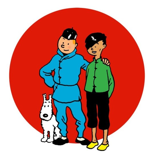
Let's take a look at their designs:
I'm going to focus on two things:
Physical traits
Color palette
Physical traits:
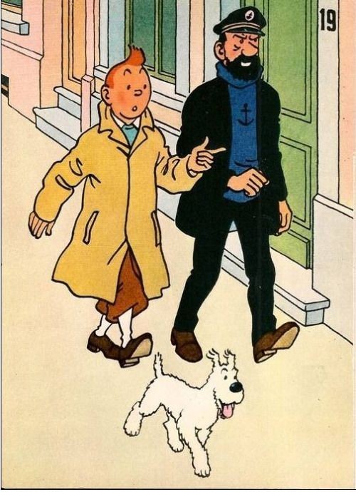
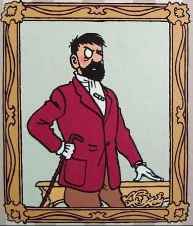
I think these are obvious so I won't stand for long. Tintin is short and thin and Haddock is tall and more built. Tintin's youth can be seen from the lack of wrinkles while Haddock's age and struggles with alcohol and his profession can be seen from his eye bags. Haddock has beard and big nose and his eyes blank dots (something that I translate to light color eyes) while Tintin has no facial hair and small nose and his eyes black dots (like most characters and I translate it to dark color eyes). They already contradict each other with their appearances but they're exactly what they lack for each other so together it's like they complete the traits that a character can have and of course the main goal that is more than successfully accomplished is that they're immediately recognisable.
The lack of many characteristics of Tintin's face is filled by Haddock's rich of characteristics face and I would take it one step farther and say that as Herge's skills developed Tintin changed too and become more human in his world, no more a symbol but just Tintin, the young journalist. In a way we can say that since he has a stable companion he gains from him a stability in their world too.
Color palette:
Tintin is usually shown in warm colors and specifically close to yellow, red and orange and some white. Haddock is mostly in his classic blue and black. We already see that the colors are the complementary ones (complementary we call the colors that they're opposite to each other in the color wheel and if you combine them you get grey aka all the colors because they complete each other). That's a usual technique for character design especially when you have a duo. You want to pass the message to the audience that they are here to work together and they're not whole without each other. And if you have a character with the complementary colors on themselves then you pass the message that this character is a whole by themselves, another character is not necessary. So if you see a character coded blue or another color wait for its complementary to show up. It always does.
But I want to stay a bit in these characters because I think it's genius how the colors work here. Before Haddock's appearance Tintin is mostly in his yellow shirt and white socks:
example from Cigarettes of the Pharaoh
But that doesn't mean he didn't wear blue even in these books:
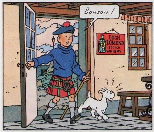
examples from The Black Island and Blue Lotus
But these were more like one time attires, to fit in the environment and circumstances. They're not exactly his choices, he happened to find them and I understand the choice because, as we said, blue is the complementary of orange (his hair) so he's more or less a stand alone character, he doesn't need another one. But actually he does because he quickly goes back to his yellow shirt and warm palette.
Since Haddock appears though the blue sweater makes more and more appearances and the yellow shirt starts to vanish with some last appearances in his first adventures with Captain.
examples from Shooting Star and The Secret of the Unicorn
The classic baby blue sweater becomes his standard attire without stopping wearing his brown-red pants and suit. That shows that not only he is affected by his companion but also that he hasn't given up his own identity. He has found a balance finally.
Meanwhile Haddock remains to his colors in most occasions but what do we see here:
example from The Seven Crystal Balls
When Haddock doesn't wear his usual attire he adopts a warm palette and it's not that he has something blue on himself to complement but we have already associated him with the color blue. That can be read in many ways: Haddock's effort to be something else from who he really is or to be closer to his companion. No matter this doesn't stay long and he goes back to his blue and black attire. But since then whenever we see him in another attire it's always in warm clothes aka his classic brown suit.
Take a closer look to these two:
examples from The Seven Crystal Balls and Calculus' Affair
The first one is from an adventure soon after Haddock becomes rich and the second after some time. You can feel the awkwardness in the duo because their palette is their usual one and especially Tintin the one he had before meeting Haddock. They are trying to close the distance between them but without accepting something from the other, afraid of opening up too much.
And then the second brings more peace in our eyes. Tintin has taken the blue from Haddock and Haddock the brown from Tintin. The kind of blue and brown is important too. Tintin wouldn't wear something too dark so the sky blue is the closest he can be to Haddock without losing himself and Haddock wouldn't wear light colors like yellow so the brown and bit of green make already the difference. They have found a balance between them.
And even when they are wearing their usual attires what connects them is the color blue. I don't think it's a random choice. Blue is a cold color, symbol of serenity and calmness. And that's exactly what both tried to reach together and found to each other and in the end bonds them.
Have I read too much on these designs? Maybe but I think when you start to notice stuff like that you can understand the work better and in a whole other level than saying things to your face. When visuals are used to tell a story are vital and necessary. When you see a color or a shape there's a reason behind it, they're here to complement the story and the words.
So in this case if you didn't understand why and how those two are grown to be an inseparable duo in your brain take a look at the visuals and you'll notice all these I mentioned and more. The designs are telling a story by themselves and it's worth to listen to them.
Bonus:
Calculus being green coded is exactly because he appeared to bring balance between the main duo and show you that he can work as their bridge but also he can stand alone but of course as trinity they bring all the colors aka characters together (and of course because green is cold color he stays with the other cold color aka Haddock but with Tintin there they all found balance).
#oh well another long post for today#thank you for asking this i hope i didn't bore you#i really like to talk about these things because they're something i have studied but also because brainrot#tintin#captain haddock#archibald haddock#professor calculus#the adventures of tintin#adventures of tintin#answered#isadenari7
163 notes
·
View notes
Text
Errands - Nanami Kento

Pairing: NanamixGN!Reader
Genre: Fluff // general summer or spring feelings // Is fashion a genre?
Summary: First dating Nanami and getting to know him better. On a bigger side note also about his clothes.
Word Count: about 1.6 k
One of the things that drew you to Nanami since the very first day of working together, was the way he dressed. Not just because he was one of the very few people at the school who didn’t wear all black uniforms but because he chose seemingly the same outfit every day. Which appeared odd to you. You wondered how his wardrobe would look like and if he really owned the same set of clothes a bunch of times to rotate them on a daily basis.
Then you started observing him a little closer and not only did you mentioned his subtle perfume but also did it come to your attention that in fact he wasn’t wearing the same clothes every day. The colours variated only in nuances and the fabric too wasn’t the same. Some shirts of his were a simple cotton blend but others were made out of a more pattern woven fabric. A lot if his shirts were in fact blue. But they tend to have all sorts of different undertones. A lot of them dipping into a grey palette.
His suits also differed and after a few weeks of subtly stalking his clothes you arrived at the conclusion that he probably owned three to four different suits. Maybe some darker ones as well since housed to be a regular salary man. The beige-ness of them wasn’t all the same either. Because his shirts - even though one doesn’t see it at first - were in fact very different in warmth of the color and texture of the fabric, he had ad least two beige coloured suits. Which he always managed to match perfectly to the dress shirts.
Nanami surely had a favourite tie. Which he wore a lot and how you later found out: Owns three of. But he had a few other choices as well which he only chose when he was tied down to his desk with paperwork and wasn’t going into the field. Just as if the yellow tie with the golden touch was his battle tie. The one that boosted his confidence. Maybe even kind of his trade mark.
After taking note of all these different things you figure that he probably had to be a man of minutest detail. Not choosing too brightly coloured shirts because different shades of blue would complemented his hair better.
And you wonder if other people paid that much attention to him as well or if it was just you.
After that thought formed in your head you realised how much you were thinking about Nanami Kento over the past few weeks and that you had - according to your data and previous crushes you had on other people - fallen for him.
Luckily Nanami was paying just as much attention to you than you were paying to him. He simply was way more discreet about it. But when he eventually was certain that asking you out was worth the trouble and pondered the emotional dividend - he did it. He asked you out. Very bluntly, very straightforward and your heart dropped to your knees. Because you secretly hoped that all your rapture would never have to be acted on.
[…]
Seeing him out of work not only made you realise how sweet of a man he is behind all those glasses, holsters, fighting and stern face, but also gave you more inside about his choice of clothes. During summery after noon dates he tend to show up in light linen shirts and slacks, a different pair of glasses than the one he wore to work. You would have never taken him for a jute bag kind of guy but he carried one of these pretty often.
When you asked him about it he only smiled softly and offered to show you. Then you got into a subway, holding on to the same pole. His arm holding on to it over your shoulder, giving you a feeling of being protected. And basically forced you to stare into his chest. As you exited the train after a rather long ride at a station you’ve never been to before, he put his hand into the smallest of your back, guiding you towards the exit and standing closely behind you on the escalator. Unwillingly your heart skipped a beat because it was the first time he physically touched you.
Stepping out of the station you looked around, shielding your eyes from the sun using your hand. Yet there was nothing to see. Where ever he brought you seemed to be just a typical area were people lived. Went to work in the morning and returned to in the evening.
“Are you disappointed?” He asked, looking at you with an amused expression on his face. You deny his question and say that you’re just really confused why he wanted to show you a a suburban area of the city you both lived in.
“You wanted to know what the bag is for. I’ll show you.” He walked a few steps, then turned around when he noticed you weren’t following him. “Come on!”
So you went. And followed him. Like a shadow, once again, slowly observing his moves and actions, how he talked to the people. How he wasn’t the nicest or most polite person at work talking to his coworkers but smiled at the owner of the book shop were he went to pick up an order. You saw his eyes wrinkle as he laughed at a joke and how his eyes light up when they talked about the development of the area for about a minute.
He put the book and the paper in his jute bag.
Then he went on to the dry cleaners, pulled out a coupon from his wallet and picked up two of shirts of his. Once again he took the time to chat with the owner. The elderly lady seemed delighted to see him and they talked just as if they have known each other for a long time. One time she looked past Nanami’s tall frame to catch a glimpse at you and asked who you might be. But he cunningly smiled and replied: “I will tell you some other time.” And winked at her and the lady giggled like a young girl. You wouldn’t trust your eyes. Nanami Kento, the grumpy guy from work was flirting with the owner from the dry cleaners. Who was this man.
By the time you got to the market, the sun had long since started to set and cast long shadows over the busy vendors.
“Would you hold this for me?” Nanami asked and handed you the shirts wrapped in plastic foil. During the past one and a half hour you barely said a word to each other. But now he asked you all kinds of questions, while also chatting with the vendors and filling the jute bag on his shoulders with fruit, vegetables and all kinds of other groceries.
“Do you like fish? Or do you prefer vegetables?”
“Is there anything you don’t like?”
“How about anchovies?”
“Oh look, they got tomatoes, don’t they look just great?”
He bought bread from a small bakery at the corner of the market, strawberries from another lady in wellies and a hooverette. When she saw you following him at every turn like a little duckling, a big smile grew on her face, making her eyes disappear in a bunch of wrinkles and she gave him some extra fruits for you to try.
[…]
“So why were you carrying that bag exactly? To run errands?” You ask him, leaning back and eyeing him from across the small table in his kitchen. He twirled the stem of the wine glass between his fingers and scoffed.
“No, honestly I wanted to take you running errands with me for while so I always took the bag in case I would manage getting you to accompany me. But the opportunity just never presented.”
The honesty of his words surprised you and caused you to raise an eyebrow. “Why did you want to run errands with me?”
“Because I am a different guy with the people of my community. Of course I could have told you but how classy is that really? Showing you would be much more impressive.”
You hold up your glass to watch the light refracting in the most different shades of red. “That’s a fair point. Laos I probably wouldn’t have believed you.” His laughter chimed through the kitchen and out the open window, where the wind got hold of it and carried it away.
“You know, people tend to mistake me for someone sort of person that I am not for most of the time.” You nod and he resumed impishly like a little boy: “On another hand I wanted to show you were I live.”
“You wanted to lure me into your place?”
“Yes.” Nanami admits and laughs. He leaned back and thrummed on the table using his thumb. After you had finished the shared dinner he prepared for you after coming home he had crossed his legs and pushed up the glasses to rest on his hair.
“What for?”
You take your eyes off the shimmering wine in your glass to search for an answer in his eyes. The flashing blue eyes, so wonderfully complemented by the shirt he chose to wear today. Narrow light blue stripes. To your surprise there was nothing to search for. Because Nanami was already spelling it out for you.
“To let you know how much I like you.”
Masterlist
@sagedevans @shampoocifer @your-consulting-fangirl
#jujutsu kaisen#jjk#jujutsu kaisen scenario#jujutsu kaisen fluff#jujutsu kaisen imagines#jujutsu kaisen imagine#jjk imagines#jjk scenarios#jjk headcanons#jjk nanami#Nanami kento#jjk imagine#jjk fluff#jjk head canon Nanami kento#nanami
54 notes
·
View notes
Text
There are few things in the design that are more important than color. Color can evoke reactions, emotions or even action all without using words. So how do we know which colors look good together? The answer is color theory in graphic design! The color theory describes the use of color in graphic design. Otherwise known as graphic design color palettes. However, it’s not only for artists as people use color theory in their everyday life as well! Whether it’s choosing an outfit or putting together a party invitation for a family members birthday color theory helps you choose a colorful graphic design!
1.The Understandings of Color Theory In Graphic Design
The biggest power behind color is their ability to evoke emotions and make people feel things, but the color meaning in graphic design can seem confusing at first as colors often have different interpretations. Let’s take a look at not only what emotions they evoke but also their symbolism!
Color Theory In Graphic Design: Red
Red is in the “Warm” color family and tends to evoke feelings of passion, both love, and hate! Proven by the fact you can see the color red used in both imagery of Cupid, an angel of love, and demons.
red
As it’s also been associated with power and imagery of fire, violence, and warfare we tend to use red as a warning of danger or even to reprimand someone, like marking things incorrect using a large red “X” mark. However, red can also be seen as a symbol of status like when used at red carpet events or it can make someone think of red rubies.
Red is best used as an accent color, as it can be overwhelming, and even harmful to the eyes if used in large amounts!
Color Theory In Graphic Design: Yellow
Yellow, also a warm color is considered to be one of the brightest and most energizing of the warm colors. It’s commonly associated with happiness and sunshine. However, it can also be used to convey a warning or caution as it’s commonly used in construction sighs.
yellow lemon quote wallpaper
Click the Image to Edit
Use yellow when you want a bright pop of happy energy or to draw immediate attention to an area. Yello is also great to use when creating more industrial or modern designs! If you find that yellow is too stark and bright, try using a more muted yellow.
yellow
Color Theory In Graphic Design: Blue
Blue is often associated with sadness however blue is also used to represent calmness and tranquility. The meaning and symbolism of blue are heavily reliant on the shade of blue. Light blues can be both refreshing and friendly while dark blues are considered stronger and reliable.blue computer science post
Click the Image to Edit
When using blue remember the exact shade of blue you select will matter most with how your design will be perceived. Light blues are often calming, bright blues can be refreshing or even energizing while dark blues, like navy, are great for corporate designs where reliability is a featuring trait.
blue
Color Theory In Graphic Design: Orange
Orange is bright and vibrant and so also gives off an energetic vibe similar to yellow, but is much more subdued in comparison. It’s commonly used in food labels or other cooking-related products (including cell phone recipe apps) as orange is said to invoke hunger in people!
While orange in its purest form is vibrant and bright, more muted forms will give off the feeling of warmth, and remind people of fall leaves. Which can be ideal for designs that want to give the feeling of being “cozy” and warm.
orange flower quote post
Click the Image to Edit
Orange can be a better warm option to use over red as it has all of the vibrancy and energy that the color red has but without the potentially aggressive symbolism.
orange
Color Theory In Graphic Design: Green
Unsurprisingly green, a cool-toned color is considered as earthy and will invoke images of nature signifying renewal and abundance. Alternatively, green can also represent envy and jealousy as seen in the phrase “green with envy”.
Going with the same theme as “abundance”, green can symbolize wealth especially in countries where their currency is green.
green christmas party invitation
Click the Image to Edit
Green has a similar calming effect as blue, but with some of the energizing tones of yellow. The brighter the green the more energizing it will be. Muted and olive greens will work best in designs of nature and the natural world while dark greens are the most stable and representative of wealth.
green
Color Theory In Graphic Design: Purple
Before modern-day dyes were created, purple dyes were hard to find and extremely expensive to make so only royals and the wealthy could afford them. Given this history, dark purples are associated with wealth and royalty.
However, lighter purples, like lavender, are typically associated with softness and a more tender romantic love, as opposed to red which ignites more passionate love.
aesthetic purple cloud wallpaper
Click the Image to Edit
When using purples in design dark purples will give a sense of wealth and luxury while light softer purples are associated with spring and romance.
purple
2. What’s the Color Terminology?
When talking about the color theory you may notice a few key terms pop up quite frequently. That is because describing color is best done by describing it’s hue, saturation, brightness or value. Let’s cover what exactly these terms mean!
Hue
Hue is one of the main properties of color and is the property of light by which the color of an object is classified as red, blue, green, or yellow in the color spectrum.
Green, orange, yellow, and blue — each of these is a hue, a color or a shade. A rainbow shows the melting of one hue into another, from red to violet, and all the shades in between. The noun hue means both a color and a shade of a color. Green is a hue, and turquoise is a hue of both green and blue!
hue
Saturation
Saturation is the intensity of a hue from a gray tone with no saturation, to pure, vivid color with high saturation. High saturation colors will come off more colorful or deep, while low saturation images will come off muted or pastel.
low and high hues
Value
Value refers to the lightness, brightness or darkness of a color. Value in the art will refer to the shadows and highlights and will give your work more dimension. It is especially important in black and white photos, design and illustration as it will separate objects from each other and their background.
saturation
Brightness
Brightness is simply both the hue of color along with the value of the color. It refers to its lightness and its ability to replicate light or reflection. This is also known as “luminance.”
value
3. Color Palette For Graphic Design
Creating a cohesive color scheme relies on one thing: knowing what colors go well together and compliment each other. Luckily there are a number of different ways to mix, match and find the perfect color scheme for you!
Color Wheel
The color wheel for graphic design is a circle with different colored sections used to show the relationship between colors. The typical color wheel includes the blue, red, and yellow primary colors. The corresponding secondary colors are then green, orange, and violet or purple.
color wheel
Secondary Color
A mentioned above, secondary colors are colors that come from mixing two primary colors. There are three secondary colors. In RGB graphic design, the secondary colors are purple made from red mixed with blue, orange made from red mixed with yellow, and green made from yellow mixed with blue.
secondary color
Complementary
Two colors that are on opposite sides of the color wheel are called complementary colors. Complementary colors of graphic designs provide high contrast and high impact color combination. When placed together or next to one another these colors will appear brighter and more vibrant.
complementary color
Split Complementary
A split complementary color scheme involves the use of three colors. Start with one color, find its complement and then use the two colors on either side of it.
complementary
Analogous
Analogous colors are among the easiest to find on the color wheel. Pick any color at any point on the wheel. Now, look at any three colors directly to the left or right of the chosen color. Together, those four are a group of analogous colors. Mixing colors that are adjacent to each other creates a colorful yet harmonious look. When using an analogous color scheme it’s best to choose one main color, using the other three as accent colors. This will help keep designs from becoming too chaotic or busy.
Triadic
Tertiary colors are colors made by combining a secondary color with a primary color. There are six colors considered tertiary. In the RYB color wheel, these tertiary colors are red-orange, yellow-orange, yellow-green, blue-green, blue-violet, and red-violet.
triadic
4. Color Sites for Graphic Design
These sites are the top free to use color guide for graphic designers giving you easy to use tools to create graphic design palettes.
COLOURlovers
COLOURlovers is a creative community where people from around the world create and share colors, palettes, and patterns, discuss the latest trends and explore colorful articles. With more than 4,682,736 palettes, 10,035,451 colors, 5,844,503 patterns in 532,217 templates you’re sure to find inspiration to kick start your creative projects.
triadic colors
Color Hunt
Color Hunt is an open collection of color palettes, created by Gal Shir. Color Hunt started as a personal small project built to share trendy color combinations between a group of designer friends. The collection scaled up and now being used daily as handy resources by thousands of people all over the world.
color hunt
Paletton
Paletton, a design tool for creating color combinations that work together well. It was formerly known as Color Scheme Designer.
paletton
5. How to Create a Graphic Design with Color Theory?
Step 1
First, you are going to fotor.com and choose your template by going to Design and choosing Poster found in the Marketing category.
Choose your template from the side panel, I will be choosing this Black Friday sale poster!
Step 2
Next, let’s customize the design!
First, the text, let’s Click on the title text and change the font face to Alibaba Sans Bold.
I will also be changing the “When” and “Where” to Alibaba Sans Bold.
Double-click on the text to change what it says, I will be changing it to “bikes and accessories”
Now onto the colors. Let’s change the yellow to a more outdoorsy green color.
Click on the yellow header, in the upper left-hand corner choose the pastel green color.
Change all yellow sections to this green color. You can even change the rippled texture in the bottom right-hand corner!
Once done, click on all the text and change them to white using the same method. In Fotor, everything is customizable by simply clicking on it, it’s that easy!
change the color
Finally, let’s use complementary colors to make the bike stand out. In this case, we have a lot of green. The complementary color of green is red! So let’s click on the bike, and choose red for our third color box, changing the frame of the boke to red.
Finish up by changing the rims of the bike to white, using the second color box.
change the color of the bicycle
Step 3
Lastly, let’s save our image by Naming out file, choosing .PNG for out the file type and then choosing High for our quality! And you are all done!
4 notes
·
View notes
Text
Popular Colour Combinations For Home Interior Painting
Your house has invariably got an image of your choices and personality. The way you can organize each and every piece of furniture and design home color interior reflects your taste. Colour combinations are beautiful color related to our moods and minds. They can entirely reflect the vibes of your room. It is good to use various different shades of home paint color for different parts of your house as a different corner of the house is relevant for different purposes.
So, here is the home décor guide; we have shared the best colour ideas for your home interior.
Deep Blue & Neutrals Wall Colors
Celebrating the natural power of individuality is flawsome. Thus, with help of shades that range from blues and deep shades, purples to pastel greens and yellows; this color palette encourages to do Do-It-Yourself experiments with Pop of color that represent personal statements. So, if you can resonate with this theme, then be sure to get as creative as possible.
Blush Pink and Mahogany Wall Colour Combinations
It is an ideal shading blend for dividers assuming you need to add stalwart tints to the style. These shades normally spread a fiery and hopeful feel to the front room. However, both the Pink shade and Mahogany are proclamation tone. They effectively mix with old fashioned furnishings and help to make incredible emphasize dividers. Go for this lobby shading mix to upgrade your parlor mind-set.
Sober Pink and Grey Buck Wall Colours
Grey and pink Walls appear to be an odd mix, to some extent on paper. In any case, these shading together make a mix that is heartfelt. Calm pink dividers sets the heartfelt mind-set, and Gray Buck offers a steady base for the entire bundle. Sheer window hangings and regular light furniture will additionally improve the mind-set. Some light-hued highlight dividers will finish the look.
Brown and Cream
Brown is another shading that is unconventional with regards to the shading the room really dividers. Yet, when it is joined with the cream, it can loan a stylish, rich look to your room. In case you are utilizing brown, be the determination at the hour of picking the shade. Converse with specialists prior to utilizing it. Likewise, try to pick the right furniture in your room to supplement it.
Berry Blue and grey Wall Color Design
The major feature of the shading conjecture is the festival of varying backgrounds, with inspiring stories woven into every class. Purpassion is an ideal for the individuals who like to end their day in a quiet climate to sense of pride and select cool blue tones mixes like this one. Shades of blue wallpaper and dim can mean energy for the reason just as harmony.
Baby Blue and Royal Red Color inspiration
To go for this delicate Blue Wall shading blend, you need risk-appetite; as a little misstep can annihilate the vibe of your room. Furthermore, what occurs if everything goes right? This seems to be the jealousy of your guests! Attempt to utilize a portion of the gem tone to carry some splendor to your room and let the differentiating Aquarium Blue quiet your faculties following a feverish day! You can even go for this mix for your bedroom Wall Paint Colours combinations.
Magenta Wall Color
Add some vibrant color punch to the design trends and décor of the living area of your house with the home colours like magenta. This colourful designs will be going to add a dramatic effect to the environment around us. If you can couple this wall paint with some complementing decorative pieces and furniture, it will become an attractive area to spend some quality time.
Light Avocado Green
Your home is the safest place across the world. The dark velvety home colour like this avocado green color bring a warm and cozy essence every home buyer seeks in their homes. This color is rich in almost all the Colour Combinations the window has. So, you can easily decorate the surroundings with anything without even worrying about whether it will go with the wall paint.
Rouge and Cream
When it comes to colour combination ideas, beige, lighter shades of Bright White accent Color shades, and cream are often popular for good reason as they help make any space appear brighter and bigger. If you are going for a creamy interior, make your living room stand out by adding red details to the space.
Add crimson wallpaper accents like side chairs, textiles, pillows, and cushions. Try to finish off with some of the cool golden details, and your living room color scheme will look luxurious, bold, and elegant.
Lime Green and Yellow Colors
Yellow has consistently been a most loved emphasize shading with regards to the shading which you ought to decide for the dividers of your room or some other room. This tone can make your room look a lot more brilliant and extensive. In the event that you are searching for the best tone for the room dividers, you can go for the shading mix of lime green with yellow to bring a piece of spring inside your room. In the event that your room is excessively little, keep the roof white.
Peach and Black
Peach is a simple, warm neutrals, adaptable and dynamic tone to combine with practically any tone, however when you pick an intense and challenging shading like dark, the outcomes are astonishing. Dark more often than not immediately adds a dash of refinement to this exquisite peach room colors which makes the highlight divider stick out and add style to the room.
Lavender and off-white
Lavender, is a wonderful shading, and the scent are quieting and known to initiate a decent night’s rest. In case you are hoping to add tones to your room divider that are asserting and assist you with loosening up, then, at that point lavender and grayish are an extraordinary shading blend. This is additionally a famous divider shading mixes for some, front rooms as well.
Crimson and Iris Colour Combinations for Walls
The mixture of Iris and Crimson helps in creating a comfortable space. Furthermore, in other words, it adds a lively feel to the living room. You may choose these hall colours to create a relaxed and peaceful ambiance. It is an ideal combo to give an edge to the look of your living room.
Orange and Neutrals
This shading mix is exceptionally enlivened by the Kolam, a South Indian custom of drawing bright plans with powder; this shading range has a zonal impact. Also, it depicts rich reds and bursting dazzling orange example holding consistent with its motivation. Mix element is a subject conceptualized for the individuals who have confidence in regarding uniqueness in a gathering.
Bottom Line
The choice of painting Colour Combinations for walls makes a major difference. It can upgrade the magnificence of the lounge’s stylistic theme. You should are extra cautious when picking the corridor inside shading mix. Ensure the choice matches the decorations and topic. Settling on a divider paint shading mix for the lounge room is an overwhelming undertaking. Thus, don’t stop for a second to face challenges with the shading plan assuming you need to upgrade your lounge’s magnificence to the most ideal degree.
1 note
·
View note
Photo
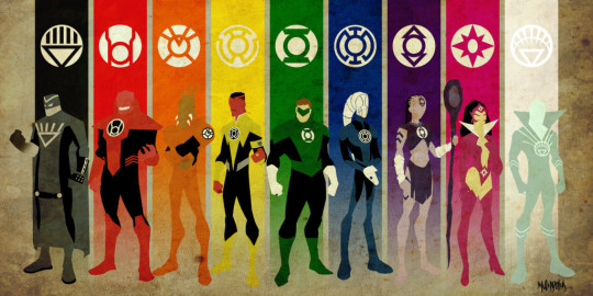
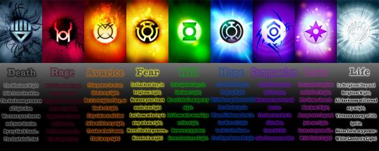
Color in DC’s Lantern Corps
The Lantern Corps are a strange corner of the DC universe. The Lantern Corps are organizations that harness the Emotional Electromagnetic Spectrum. Originally just the Green Lantern Corps, it has since expanded with the Red, Orange, Yellow, Blue, Indigo and Violet, as well as the Black and White. The Emotional Electromagnetic Spectrum is obviously based on the Visible light spectrum, it is also heavily inspired by Color Psychology. Each and every corp is centered around one color which is paired with a type of emotion or behavior a character my display. This wraps back around to my question on color about how can color be used to hint at a character’s or location’s personality and background. The Lantern Corps display the answer to question quite easily. Hal Jordan becomes the original Green Lantern as he, despite his joking outer shell of a personality, has strong will, which in the DC universe green is the psychological Hue for will power. As you can see in Hal Jordan’s suit, the green is very Saturated, symbolizing the corp’s emphasis on having a Strong will be using a strong green. Another indicator of Hal’s strong will is the use of Brightness, showing that the brighter the light that comes from the lantern ring, the more will power Hal is exerting. Now, the other corps follow a similar pattern with high saturated colors to emphasize the importance of that color to the corps and using brightness to show how much of a certain emotion a character is feeling. Lets take a look and the home worlds of the Blue and Red Corps. The Red Corp emphasize rage, as through the use of Value Similarities and Color Psychology, we can tell that the home world of the Red Lantern Corps is one of blood lust and violence. In contrast, the Blue Lantern Corp is paired with Hope, and thus through Value Similarities again, we get a more peaceful feeling with the Blue Corp home world. This all connected to Symbolism of Color as color has had been used to represent and warn us of behaviors and actions associated with those behavior we have learned through culture. Color symbolism is best seen in my opinion in the Black Lantern Corps and they are a symbol of death and eternal nothingness. Colors used this way are important to story telling and art as each color tells us a little bit about a character, even hinting at either what emotional troubles or goals a character might have or be after. The Lantern Corps execute this in concept in a very effective, although blunt, way.
Color Glossary:
Visible light spectrum is the segment of the electromagnetic spectrum that the human eye can view. This range of wavelengths is called visible light. Typically, the human eye can detect wavelengths from 380 to 700 nanometers.
Color Psychology - Color psychology is the study of the effect that colors have on emotions, behavior and feelings of people.
Color Systems:
Color systems classify color and analyse their effects.
●The additive color system is used for colors of light such as light emitted fromcomputers, phone screens, and projectors. Red, green, and blue are the primarycolors
●The subtractive color system is used for pigments such as ink, dye, and paint.Cyan, magenta, and yellow are the primary colors.
Color to Show Depth:
Change in Color is to use color to separate the foreground, midground, and background planes to create the illusion of depth and is commonly used in animation.
Color Wheel:
The color wheel, or color circle, arranges a pattern of hues around a circle. There are several versions of the color wheel or color circle. The circle connects relationships between hues to illustrate color strategies. (see 12 Chromatic Strategies) Color wheel history goes way back.
Local Color:
Local color is the natural color of an object unmodified by adding unrealistic light and shadow or any other distortion. The color that the eye observes is altered by lighting conditions such as time of day or the surrounding environment. The local color of a lemon is yellow.
Palettes:
The definition of a palette is the range of colors used in a particular composition or by any person who uses color such as an artist, house painter or interior decorator. An example of a palette is Vincent Van Gogh’s limited palette of hues in his Starry Night painting. Starry Night’s palette is a variety of blues, greens and yellows. Close up video of Starry Night lets you come closer than you could at the Museum of Modern Art.
Properties of Color:
Properties of color are hue, saturation, and brightness.The H, S, and B in the Photoshop Color Panel stand for hue, saturation, and brightness.
●Hue is the named color around the color circle such as red, orange, green,yellow, violet, and blue.
●Saturation is the intensity or purity of a hue. Fire engine red is more highly saturated than brick red or the color of red wine.
●Brightness is the perceived intensity of light coming from a source such as a screen. On a color screen, brightness is the average of the red, green and blue pixels on the screen. Brightness is important to both color perception and battery life on mobile devices. Brightness of a screen can be adjusted.
Symbolism of Color:
Symbolism of color in art and anthropology refers to the use of color as a symbol in various cultures. There is great diversity in the use of colors and their associations.Diversity in color symbolism occurs because color meanings and symbolism occur on an individual, cultural and universal basis. Color symbolism is also context-dependent and changes over time.
12 Color Strategies
1.Monochromatic means variations of a single hue such as a light blue and a dark blue or a greenish aqua blue and a lavender blue.
2.Achromatic color strategy integrates variations of black, white, gray, and a full range of neutrals.
3.Full Spectrum Strategy represents the full circle of spectral colors by incorporating at least five of the base hues.
4.In the Achromatic/Chromatic Mix strategy Achromatic colors dominate the composition with a chromatic hue accent.
5.Warm/Cool: Contrasting ‘temperatures’ of warm & cool. Cool colors appear on the green/blue/violet side of the color wheel. The colors on the red/orange/yellow side of the color wheel are called warm. Emphasis is on the contrast between warm and cool achromatics: brown - gold (warm), grays - silver (cool)
6.Saturation Similarities/Saturation Contrast
●Saturation Similarities: Hues may vary in this strategy, but all colors must have the same or very similar saturations.
●Saturation Contrast: Hues may vary but all colors must have significant contrast of saturation.
7.Value Similarities/Value Contrast
●Value Similarities: Hues may vary in this strategy, but all colors have the same or very close values.
●Value Contrast: Black (or dark desaturated hues) contrast with white (or very desaturated tints of hues). The Value Contrast strategy demonstrates strong distinction of value with the strongest example being between black and white.
8.Complementary Dyad creates a strong hue contrast. Complementary hues are located directly opposite each other on the color circle
9.Split Complementary strategies are based on two complements. To create a split complementary color strategy select one hue and contrast it with the hues on either side of its complement, such as Red & YellowGreen/BlueGreen
10.A Tetrad strategy uses four equilateral hues from the color circle, such as Red,Orange, Green, Blue.
11.A Triad strategy uses three equilaterally balanced hues from the color circle,such as primary, secondary, or tertiary.
12.Analogous strategies collect 2 or 3 neighboring hues on the color circle.
2 notes
·
View notes
Text
Lair Review for Denutena
@denu-rising
Overall, you seem to have accumulated a lovely amount of “eyeburners” and pastel dragons, sprinkled with a few surprises here and there. Before diving in too deep, I can already appreciate how fun your designs are. So let’s get to it!
Razzle

Not only is Razzle a fun name for such a fun looking dragon, but what i really enjoy about this particular eyeburner is how well you’ve matched up the blues. That azure glimmer belly with the mage, sylvan, and wooly tail is such an excellent focal point for this dragon. It just naturally lines up with the female nocturne pose, and I feel like you’ve done a great job here.
Fantasia

the color palette of Fantasia reminds me of a beautiful sunset. the yellow fading into the purples and eventually into the sliver of black you’ve incorporated into her outfit is blowing me away. I particularly enjoy her little mage hat and the black cat “familiar”. Her lore is as equally as interesting as her outfit. Dream magic is such a neat concept, and I like how you kept it light and fun at the end.
Periwinkle

I’m living for Periwinkle’s pastel witchy theme. I want to point out how great a job the accent does by lightening up that tail. Overall it lends in nicely with the sky secondary. The Pastel lace item here is PERFECT for this dragon. The pinks and purples fit exactly with his tertiary and primary, while the blue is a very close match, yet still fits in with the accent and secondary nicely.
Firefly

Firefly is such a nice warm pastel dragon, but what I really like about him the most is how you added in green as an accent color. The greens let us admire the dragon in pieces instead of getting lost in the ocean of oranges that we would otherwise be exposed to. Great work here with Firefly
Unnamed

This dragon gives me selkie or mermaid vibes. I can really appreciate your efforts here to “make it pretty”. I adore the accent you chose here as it’s matched so well with both her shades of blue. And I love how you meshed the golds of the accent in with the eerie cyan set, golden seraph items, and mane. Even the subtle greens in the horn apparel match her wind eyes! I can’t get enough of this dragon.
Hobo

Hobo is a beautiful genone. Even though the blues don’t match exactly you’ve made such a lovely gradient out of it. The nightshroud was such an excellent way to tone the more saturated blue of the glimmer down, in fact I didn’t even notice that it was an apparel item at first, I thought that the strap was a part of some kind of accent. I digress. The combination of the shroud and the glimmer give us just enough color that matches with the deep purple we see in the face of this tundra. It’s so beautiful and subtle that I could just sob. Hobo is such a perfect looking dragon.
Elysia

Elysia looks like she’s enjoying herself in a lovely celestial tea garden filled with these beautiful pastel roses and butterflies.The accent you’ve given her really makes the purple tones in her mist primary pop, and breaks up her mint wing in the loveliest way. Elysia seems so soft and gentle with this accent, it lets me play with my imagination a little, and allows for a great potential in visual storytelling
Silky

Silky takes my love of matching colors and runs away with it tbh. She’s stolen my heart. You’ve done and AMAZING job in layering the silks. And the use of the antique lace on the hip to make the upper leg seem occupied is so masterful. I enjoy how the stars on the silks match so perfectly with the lace. What a stunning pastel space themed dragon.
Flutter

Flutter has such a fun design! He looks like he’s about to attend a masquerade party where he’ll no doubt win best costume. The layering of the starsilks and jester’s gloves are a stroke of genius that I haven’t seen done before and I’m definitely taking notes. The mane helps bring the lighter pinks of his wings and blend them into the deeper purple of his glimmer. I love the use of gradients here. Flutter is definitely the life of the party. And fantastic job on finding such a perfectly matching familiar too!
Serenade

It’s no secret that I love the color leaf, and I know just how bad the struggle is for finding good apparel for said color. That being said I think you’ve done a great job with serenade. The glowing green clawtips are a great way to incorporate that green into the outfit. The accent also does a remarkable job of blending that leafy green into the robin primary. I also love how you added a visual piece to your snippet of lore by equipping her with the forejewels.
Honorable mention: Unnamed

I love this funky fairy bog mermaid. Her colors complement each other so well and the accent is such a fun addition to the dragon. The starmap gene, reedcleft resonance, and mane give this dragon such a whispy aesthetic that I just adore.
3 notes
·
View notes