#especially in realistic proportions
Explore tagged Tumblr posts
Visit Tumblr Blog
Explore Tumblr blogs with no restrictions, modern design and the best experience.
Last Seen Tumblr Blogs


Fun Fact
Tumblr is used by 21% of adults online aged 18-29 years.
Text
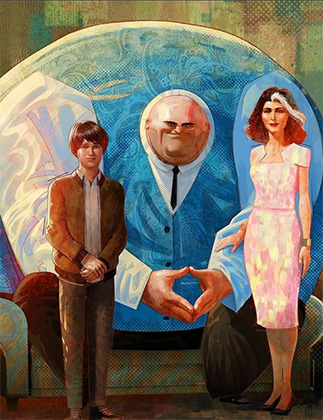
dfhdshfds I will be thinking about Mal's fanart of Gratia, Maria and Izzy depicted together all day ;-; It is all I ever wanted ;-;
#MAL TURNS DREAMS TRUE#in my defence: yes I did try to draw the same 3 times#but I never was satisfied with how Gratia was turning out so yeah..#I've been drawing very cute round cartoonish hoomans for so many years that I still struggle to draw big people#especially in realistic proportions#I should probably start with chibi stuff since it is my comfort zone and then walk from it#fandomry rambles#that fanart is just.... so good#thems... the old hunter girls
7 notes
·
View notes
Text
turns out when you decide to work on your own g6 you have to figure out how to stylize horses in a way that
keeps what YOU personally like about horses
is CUTE in a broadly appealing way
HOW BIG IS THE HEAD SUPPOSED TO BE?
#my post#this is just a fun little side project for whenever i feel like drawing a horse#bc i can appreciate how g4 stylized the horses#g5 ESPECIALLY 2d g5 owes me money#the problem is despite being a Former Horse Girl and growing up on g3#my taste in cartoon horses (visually) is more Spirit than MLP#im trying to put more realistic proportions into mlp and it's um probably not going to work#i WILL figure out this style though
10 notes
·
View notes
Text
why am i having SUCH a hard time drawing faces lately!!! what is going on honestly!
#i sketched and resketched 1 face for like 3 hours godddd#i finally got it to a decent place im going to bed#i'm just like... it's not the proportions or anything like that. i don't know how to stylize#especially eyes. the corners and the eyelashes and everything#no matter what i tried it was like too realistic or too cartoony and i just can't hit that perfect middle ground#GRRRRRRRRRRRRRRRRRRR#did i forget how to draw like lmfao
6 notes
·
View notes
Text
in a weird position where i threaten to quit art to myself every other week, but I could never do that. I'd always come back to it.
There's nothing else on this earth I'm capable of doing, why not continue it even if its bad. But it also feels weird, bc I'm doing it bc my body seems to need to, while knowing that I'll never be happy with it and that I'll never really learn what I need to learn to be happy with it. Knowing that I have no way to Learn bc its not something that can actually be learned. Im just missing what everyone else seems to have
#talkys#rollercoaster of emotions in todays posts sorry#idk. like. we've already established doing studies kinda makes my work stiffer#i only learn from copying bc i have no insps. and nobodys making the art i wanna make#but like. i dont even know what i want my art to look like which makes it harder#i draw and im like eugh these proportions are TOO realistic but these are TOO cartoony#/brain telling me the more cartoony ones are incorrect. and finally me not being able to tell what even looks good#bc it all looks bad. idk why. bc i cant find that blend. it just all looks bad.#it looks like misinformed art. like That Infamous Artist.#idk what i want it to look like all i know is it looks bad#how do you even fix that. what studies could i possibly do#especially when i dont even have a reason to draw lol....idk. idk. sucks.#long post
12 notes
·
View notes
Text
haha yeah so reminder i can do This


#ive been wanting to try to develop a style thats like. realistically proportioned but still cartoony#but i feel like im Not succeeding at that. at least not in a way im satisfied with#i just need to practice i think#anyway i think i did a REALLY good job of drawing vinny there im super happy w it#just goes to show that when i draw real people in my cartoony style it is VERY much as accurate as i can be#well except for boat. his design is pretty out there especially w the hair but it's actually not that inaccurate i think
5 notes
·
View notes
Text
actually one last thing. when I was like 16-20 I thought I was soooo cool for being able to draw faces without guidelines and it’s like. Bud. Buddy. Broski. the characters eyes are so far apart you couldn’t even tell they’re on the same face
#makes since I love code lyoko as a kid and the proportions on that show were wild#but they were pretty much consistent because the artists knew the fundamentals#they were able to have short hands because they did the work#im admittedly a lazy artist mostly because of my chronic fatigue#so shorthand’s r very important to me especially when it comes to comics n deadlines#however. one big thing abt me n my art that’s glaringly bad is#that until like last year I didn’t understand shapes and forms#I still have trouble drawing boxes#you can’t do shorthand’s that mostly require fudging with shapes and form#if u can’t do that 😭#at least for me#everyones art style has an end goal#I wanna draw comic/cartoony art with relatively realistic proportions#all of my main inspo actually comes from animated adaptions of comics#static shock btas jlu etc spiderverse does it the best but I can’t get Bruce timms style outta mine#also naruto. naruto was such a big influence for me#code lyoko for better or worse#x-men evolution probably has one of the biggest besides spiderverse#Fuck that one YouTuber kiwibyrd? I tried so hard to copy their style as a kid it never took#but now after doing fundamentals#my artstyle can kinda resemble theirs when they were the age I was when I started watching them#that was a hard sentence. my fault 😭#hell even Steven universe for its use of shapes and shit inspires mine#idk what I’m rambling abt now#but yeah so many different influences. all of these come from ppl studying and understanding fundamentals in someway#when I was younger my main fear of fundies was because I thought I was gonna lose my style. styles change#styles change. draw the fucking turnaround and consistency gets easier on god 😭
4 notes
·
View notes
Text
Uh oh boys we’re really in for it now
#I figured out a way to hypothetically do a thing I thought would be impossible for me to do#and now I’m about to look at a scene from a movie I kind of didn’t like to compare the parameter of realistic results to it#Can’t say what the thing is because I don’t run that kind of blog as a rule; but uh— 😂#Not in a weird way. I’m overly-analytical of EVERYTHING and I like making comparisons to things I’m already acquainted with#especially if the thing being compared to something familiar is something I just started learning about#To give me some insight as to proportions and averages#You have no idea what I’m talking about but Tarrie From The Future will know#Tell me Future Me: How are you enjoying your low range these days? AHEHEHEHEHEHE#she’s gonna look back and say “oh my god this child is mentally ill”#Or this could just be the post-characterization afterglow talking and I’m not actually who I think I am#Don’t worry I’m not in danger; I’m in SAFETY for once#Not having an episode even though it sounds like it; I sound like this because I’m happy about something#which I will not reveal (right now)#anyway… I shall travel eastward!#That’s a pun#[sweats nervously because I know it’s the only one of its type with uh— aHem — that I’m aware of]
0 notes
Text
I understand the disappointment, I really do, but I think people might be blowing the whole world state thing a bit out of proportion. "This is SPITTING IN THE FACE of long-time fans" no it's not Steve, calm down.
The series has always had to compromise when it comes to the state of the world because so many of the choices (especially from the end of Origins) were so wildly different that trying to build a sequel from so many conflicting factors would be more or less impossible. It's why we've never seen the Architect again, because him being alive or dead has HUGE ripple effects that are damn near impossible to write around.
Heck, it was entirely possible for Anders to die at the end of Awakening, but the writers wrote around it by saying "oh no he actually faked his death" even though logically that made very little sense because at that point he'd have absolutely no reason to do that? But Anders was in the sequel so that had to come up with something.
Basically nothing from Dragon Age 2 was important in Inquisition - Hawke siding with Mages or Templars made no difference, Anders being alive or dead made no difference, whether Carver or Bethany were dead or Wardens or whatever made no difference. We got some flavour text and that was literally it, everything else played out exactly the same.
Hell, the Temple of Sacred Ashes gets blown to bits at the beginning of Inquisition, rendering everything to do with that quest from Origins basically moot. And we've never gone back to Orzammar, and everything we have heard from it has been kept super vague, because depending on who the King is and if Branka is still alive things would look WILDLY different. Crafting a new story there would be borderline impossible because the dozen different possible world states make the foundation shaky at best.
It's why I highly doubt we'll be able to side with Solas and help him tear down the Veil because that would result in basically a whole new world being created. Imagine them trying to make Dragon Age 5 and being like "okay 50% sided with Solas and tore the Veil down and 50% kept the Veil intact....wtf now what do we do--?"
Again, I understand the disappointment, but I just hope once the dust has settled and people calm down a bit they'll see that, realistically, very little has changed. Your saves are still there, your experiences and enjoyment of the games and the characters and the story are still there, but they were always gonna have to draw the line SOMEWHERE.
And that's not to say none of our previous choices will come back - if we get another game, or a spin off or something they'll probably do what they're doing with the Inquisitor now. They're just taking what's relevant to the story they are trying to tell, and leaving what they aren’t going to use presently ambiguous.
#dragon age#dragon age the veilguard#I get the disappointment but I think some people need to take a deep breath and calm down#it's gonna be okay
548 notes
·
View notes
Note
How the hell do you manage to superimpose the hilariously exagerated proportions of the tf2 mercs into a cohesive 2d style? I always struggle SO much with like, the way the mercs' models have huge hands, the way they have relatively low-poly definition on things like arms, shoulders, and legs... and Especially the way like, the models are kinda janky when you pose them for art purposes- when using movement tools, things like armpits and seams between body parts get all deformed... Which makes the study of form and silhouette rather difficult.
I assume that a lot of your ability to translate the concept of the mercs from their original mediums into your own works of art comes to you quite naturally- through experience you have with drawing and art style stuff, as well as through intuition. I was simply wondering if I could poke at your mind and get some insight into your process, any thoughts you have about the proportions and silhouettes of the mercs, any quirks you've found while drawing the mercs, or simply what you enjoy drawing about them. Like, don't be afraid to infodump about something just because you think people wouldn't find it interesting- I am here, I am sitting, and I am listening- if you so choose to speak.
I am utterly fascinated and enraptured by the more behind-the-scenes aspect of art. The mundane things that come second nature to great artists yet seem so revolutionary to less experienced artists.
I love your work, I look forward to seeing more of it, and I hope you have a nice day :]
Sorry for the late reply! I've been a little…stuck on how to answer this but that's mainly because to me, drawing is composed of SO many different little skills - you have form, anatomy, shape language, silhouette, appeal, rhythm, acting and posing…not to mention everything AFTER your raw draughtmanship like line style, rendering and colour theory. Trying to distill a multiude of small skills into some pithy advice is overwhelming to my brain. So I'll take the invitation to ramble instead :))
I don't think I have any new or revolutionary insight into the tf2 guys specifically - more I'm using them as work horses to excercise general silhouette/posing/shape-language and further my skills when it comes to drawing characters!
I do agree though the proportions are rather silly when you stop and think about them realistically…they can be kinda tricky if you follow their 'actual' proportions. what looks great individually was maybe never meant to be directly compared (ie: Heavy's hand size against Spy's lol). It would've been funny if the TV show exsisted and we had more content to review…would the animators have had rules like Spy and Heavy can never shake hands? Would they cheated the proportions for shots? Or would they have said WHATVER it's gonna look weird and embraced it? (Like Kingpin in Spiderverse lol)
Paul Lasaine for 'Into the Spiderverse' This is AWESOME. But it's also one of the silliest designs I've ever seen comitted to screen. The varied scales of the characters work because of the unifying treatment (lighting, rendering, consistant hand anatomy, consistant clothing fold treatment etc) and because they are sort of proportional within themselves. A common mantra is that hands should be about as large as a characters face....which they all are here!
Human brains are very flexible and forgiving though. It's totally fine for you to put a character with huge hands and head next to a teeny tiny character! Vanellope and Ralph from Wreck-It Ralph look grand next to each other! And in that film you even have varying levels of stylisation sitting against each other (unified by the look dev treatment of the shaders and lighting). I think as long as the chracter is proportional within themselves it sort of works out. IE: a general rule is that a hand should be as large as the face so…you can have some large arse hands as long as their placed on a body with a big arse head. Unifying characters with the same treatment (ie: lineart brush, colouring style will also help them look cohesive next to each other :) )
I don't actually reference the 3D models/animations very much at all and instead draw their proportions based on my tastes for stylisation following their general vibes/silhouette profiles. I don't stick THAT close to their in-game looks and there are artists who do that are so so so much better than me (Creedei and Flapjack come to mind). I'm not amazing at body-type differentation and TBH they're all wearing chunky clothes all the time so I usually draw the guys as one-of-three body shapes: Heavy is the uniquely wide guy; Sniper/Scout/Spy are all tall and slim and Demo/Soldier/Medic/Engie have a little more of the generic 'hero' bodytype with varying tallness and broadness of the shoulders
Something like this! You can vary all these individual elements in terms of size, thickness, taper amount etc to create different characters. If you ARE going to reference the 3d works though you'll need to apply some anatomy knowledge to overcome the weird shoulders, armpits and knees which desperately need blendshapes to correct the 3D volumes and approach it a little more like an animation supervisor. There's a reason why you see in making-ofs and art-ofs character designers, character leads or animation supes doing drawovers of the models. These are character models that have had great effort put into their 'base' silhouette but it still needs to be reinforced in every frame for maximum appeal.
Shiyoon Kim for 'Raya' This sort of thing will occur at multiple stages during the animation process. Shiyoon Kim's notes are post final model but pre-animation. Most likely for internal rig tests, exploring what blend shapes and alt shapes are needed for the rigs etc. If your production has time, this will continue all the way to final anim. IF! But it's interesting to see how he emphasises the shapes and enhances the character acting of the 3d model.
As for 'mundane things' - I wouldn't say they're second nature! (If that makes you feel better!) I have to actively really persue certain advice and try to figure out how to best apply it. This can sometimes involve redrawing and redrawing an element of the drawing until I've grasped the nettle of whatever I'm after or…..until I get frustrated and either delete the drawing or just call it done lol
Here, I'm looking for a really specific flow of the head that sells both the acting and a subtle head tilt. I'm also trying to apply the general mantra regarding faces that converging lines (set by the eyebrows and mouth) are more appealing than parallel. It's tough! I also tend to use a drawing I've already done as a template/reference on the page too. Oh! This page is an amazing example of why I'm not an animator or storyboarder…consistancy? Who is she? 💅
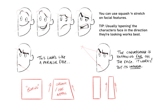
Converging lines (that form tapered shapes) are always more appealing than parallel. Using this logic you can loft the facial features across converging lines to create dynamic appealing espressions. Combining this with anatomy, perspective and rotation is the tough part though. I'm still learning o7
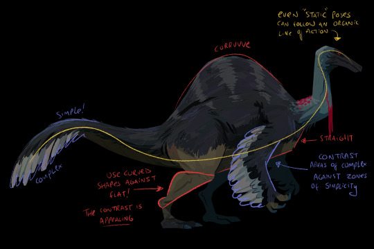
The things I probably think about MOST are always flats vs curves, simple vs complex and general line of action/flow...and then eliminting tangents. Each of these can be a dedicated visual-essay on their own - hence my stumbling as to answer your question. Anyhow, not sure if it's ever come up on this blog but I looove dinosaurs :)) so i'm using a wee piece to demostrate these ideas! (but also to demostrate these concepts apply to everything from humans characters to animals, props and background design)
Okay, I'm getting self-aware that this is getting really long :') I have a wee tutorial tag for my blog if anyone wants to comb through my garbled art-thoughts. Learning, studying, repetition and practice will always be the greatest teachers! I'm glad you like my art- thank you so much for the lovely comments - I feel like such a noob still and not qualified to give people advice but we're in it together learning! High-five! 🙌
#tutorial#asks#sorry for any spelling mistakes whoops!#hopefully...this is VAGUELY useful or interesting to people ;;#TBH I'd much rather do youtube drawovers/videos of my own or others work as that is...my job...rather than doing writeups lol#its much easier to talk and vibe about a piece of art vocally than to try and make everything uber succint in writing
451 notes
·
View notes
Text
Saw spiderverse here’s my main art related fave moments!!
The fact that Miguel’s shoulders always had a jagged cross of lineart that drifted off of his model
How in some frames you could see the internal rigging/ sketching of spot :000 just overall his design
Just everything about the watercolor bleeding effect in Gwen’s universe, the color theory stuff was cheesy but I don’t care
All of the live action integration was great, but also the integration of video games!! Very cool to see spiderman games getting recognized
Idk if this makes sense but the modeling and proportions on the designs are just soso good. It’s just all so smoothly done and it blends realistic movements (so real I thought it was mocap in some scenes!) but all with the very good proportion stylization
Everything about how spiderpunk was animated but ESPECIALLY the color blocking on his guitar
3K notes
·
View notes
Text
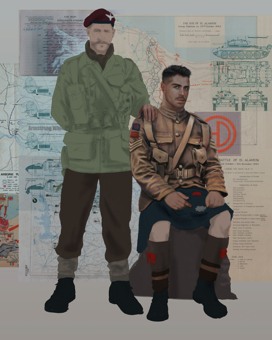
Ok! I've finally decided to put together a (somewhat) comprehensive tutorial on my latest art~
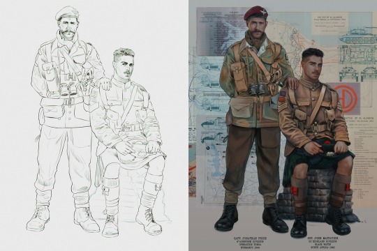
Please enjoy this little step-by-step 💁♀️
First things first--references!
Now I'm not saying you have to go overboard, but I always find that this is a crucial starting point in any art piece I intend on making. Especially if you're a detail freak like me and want to make it as realistic as possible 🙃
As such, your web browser should look like this at any given point:

Since this is a historical piece, it means hours upon hours of meaningless research just to see what color the socks are, but...again. that isn't, strictly, necessary 😅
Once I've compiled all my lovely ref pics, I usually dump them into a big-ass collage ⬇️
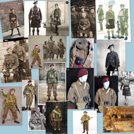
(I will end up not using half of these, alas :'D)
Another reference search for background material, and getting to showcase our models of choice for this occasion~
When picking a reference for an actor or model, the main thing I keep in mind (besides prettiness 🤭) is lighting and orientation. Because I already kinda know what pose I'm gonna go with for this piece, I can look for specific angles that might fit the criteria. I should mention that I am a reference hound, and my current COD actor ref folder looks like this:
Also keep in mind, if you're using a ref that you need to flip, make sure you adjust accordingly. This especially applies to clothing, as certain things like pants zippers and belt buckles can be quite specific ☝️
Now that we've spent countless hours googling, it's time to start with a rough sketch:
It doesn't have to be pretty, folks, just a basic guideline of where you want the figures to be.
The next step is to define it more, and I know this looks like that 'how to draw an owl' meme, but I promise--getting from the loose sketch above to below is not that difficult.
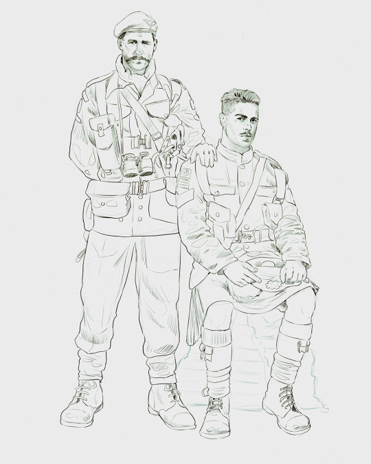
Things to keep in mind are--don't go too in-depth with the details, because things are still subject to change at this point. In terms of making a suitable anatomically-correct sketch, I would suggest lots of studying. This doesn't even have to be things like figure drawing, I genuinely look at people around me for inspiration all the time. Familiarize yourself with the human form, and things like weight, proportions, posing will seem a little more feasible.
It's also important at this stage to consider your composition. Remember to flip the canvas frequently to make sure you're not leaning to one side too often. I'm sure something can be said for the spiral fibonacci stuff, which I don't really try to do on purpose, but I think keeping things like symmetry and balance in mind is a good start ✌️
Next step is just blocking in the figures. Standard. No fuss 👍
Now onto the background!
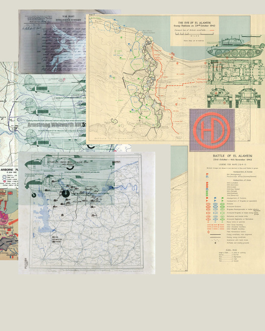
It's frankly hilarious how many people thought I was *hand-drawing* these maps and stuff 😂😂 I cannot even begin to comprehend how insanely difficult that would be. So yeah, we're just taking the lazy copy and paste way out 🤙
I almost always prepare my backgrounds first, and this is mostly to get a general color scheme off the bat. For collage work, it's really just a matter of trial and error, sticking this here, slapping this there, etc. I like to futz around with different overlay options until I've found a nice arrangement. Advice for this is just--go nuts 🤷♀️
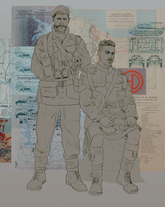
Next, I add a few color adjustments. I tend to make at least 2 colors pop in an art piece, and low and behold, they usually tend to be red and blue ❤️💙There's something about warm/cool vibes, idk man..
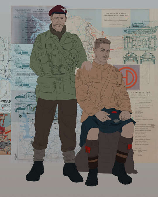
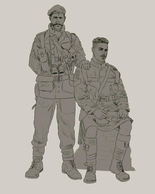
Now we move on to coloring the figures. This is just a basic block and fill, not really defining any of the details yet.
Next, we add some cursory values. Sloppy airbrush works fine, it'll look better soon I promise 🙏
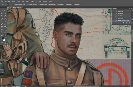
And now--rendering!
I know a lot of beginner artists are intimidated by rendering, and I can totally understand why. It's just one of those things you have to commit to 💪
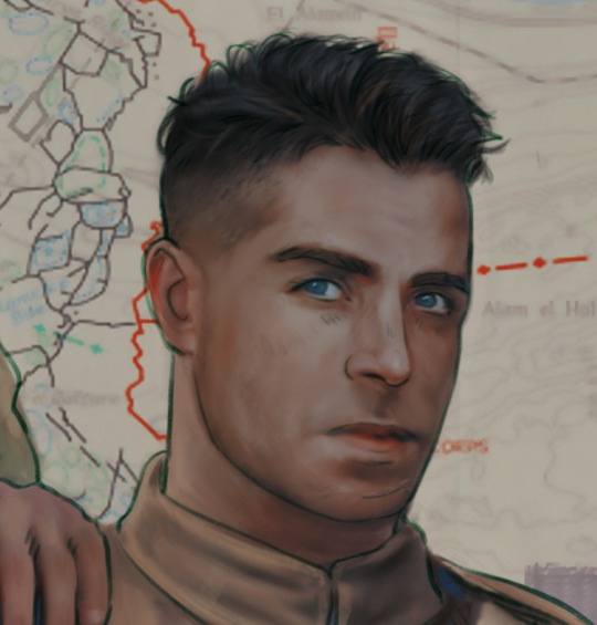
I've decided to show a brief process of rendering our dear Johnny's face here:
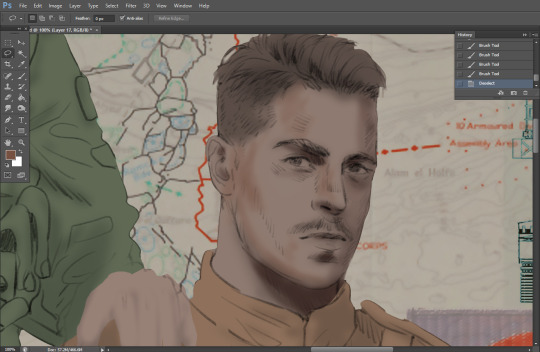
Starting off, I usually rely on the trusty airbrush just to get some color values going. Note--I've kept my sketch layer on top, but feel free to turn it on and off as you work, so as to not be too bound to the sketch. For now, it's just a guideline.
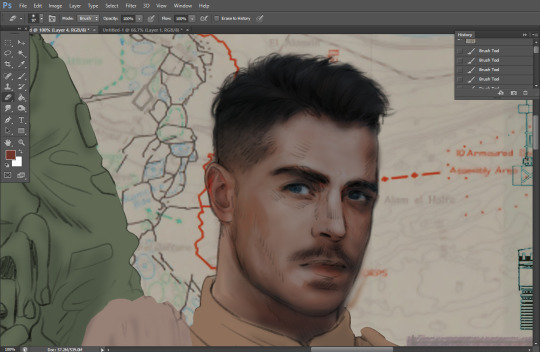
This next stage may look like a huge jump, but it's really just adding more to the foundation. I try to think of it like putting on make-up in a way~ Adding contours, accentuating highlights. This is also where I start adding in more saturation, especially around areas such as ears, nose and lips. Still a bit fuzzy at this point, but that's why we keep adding to it 💪
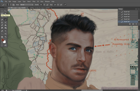
A boy has appeared! See--now I've removed most of the line layer, and it holds up on its own. I'll admit that in order to achieve this realistic style, you'll need lots and lots of practice and skill, which shouldn't be discouraging! Just motivate yourself with the prospect of getting to look at pretty men for countless hours 🙆♀️
I'll probably do a more in-depth explanation about rendering at some point, but let's keep this rolling~
Moving forward is just a process of adding to the figures bit by bit. I do lean towards filling in each section from top to bottom, but you can feel free to pop around to certain parts that appeal to you more. I almost always do the faces first though, because if they end up sucking, I feel less guilty about scrapping it 😂 But no--I think he's pretty enough to proceed 😚
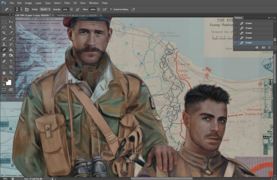
They're coming together now 🙆♀️ Another helpful tip--make sure you reuse color. By that, I mean--try to incorporate various colors throughout your piece, using the eyedropper tool to keep a consistent palette. I try to put in bits of red and blue where I can
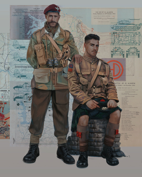
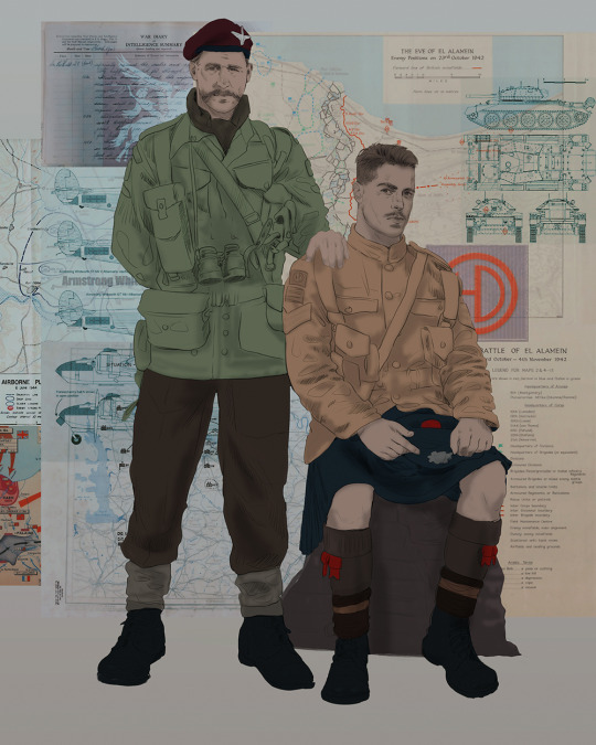
Here they are fully rendered! Notice I've made a few subtle changes from the sketch, like adjusting the belt buckles because I made a mistake 😬 Hence why you shouldn't put too much stock in your initial sketch~
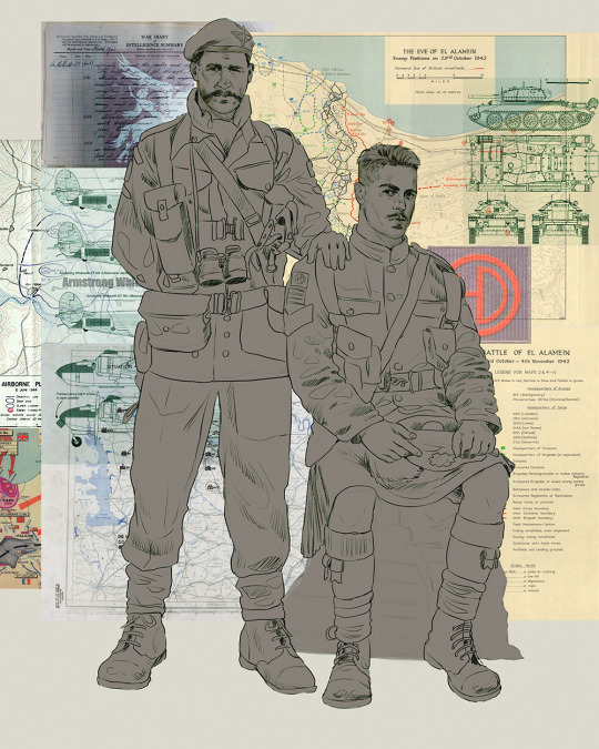
The next step is more of a stylistic choice, but I usually go over everything with an outline, typically in a bright color like green. Occasionally, I can just use my initial line layer, but for this, I've made a brand new, cleaner line 👍
And the final step is adjusting the color and adding some text:
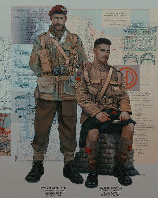
Tada!! It's done!
All in all, this took me the better part of a week, but I have a lot of free time, so yeah ✌️
I hope you appreciated that little walkthrough~ I know people have been asking me how I do my art, but the truth is--I usually have no clue how to explain myself 😅 So have this half-assed tutorial~
As a bonus, here is a cute (cursed) image of Johnny without his mustache:
A baby, a literal infant child !!! who put this wee bairn on the front lines ??! 😭
Anyway! peace out ✌️
#tutorial#my art#art tutorial#since people have been asking#I remembered to save my process from this latest work~#enjoy 🙆♀️
1K notes
·
View notes
Note
Do you have any advice with drawing boobs in general because I struggle with getting them to look right. I know how to draw fat rolls well but boob proportions confuse me. Can I see your process on drawing boobs (both bare and under a shirt, especially under a shirt that puzzles me) maybe to see where I can improve? If you're not comfortable with doing tutorials that's fine. I just want to draw bodies more like you do, our art styles are both semi-realistic so I think it would be helpful.
i can't find shirt examples
but!!! when I draw more exposed breasts I make them pointy at the tip where the nipples would be along with spacing them out because breasts carry weight to them like say, a water balloon!!! feel free to reference or trace my art!!! have a good one


168 notes
·
View notes
Note
bfr FOR REAL MS. SKYE !REALISTICALLY! biggest to smallest cock in nct dream...
OHOHOHOHIO ANON now we're talking (even tho i can't be biased, you almost forbid me to and that's a SHAME)
jeno has the biggest, i don't think i need much arguments to prove my point... he did that himself, especially these days...
jisung is the second one with an EXTRA LARGE PACKAGE!! another one that has a visible bulge (broken melodies fancam 24/7 in my mind 👅)
jaemin is another one packing. even though i don't really believe he is large, but thick. (and we all saw it on that show)
mark is my protected, this man has the biggest cock in my mind! BUT takes place in 4th bc we all know j line are the biggest (with proofs!!)
and now the smallest.... (did you hear my heart shattering?)
chenle this man, i have a lot to say (and @lyvhie knows that) i struggled to know where i'd put him, but he can't be in the biggest team, i'm sorry lele :( it's not like he's smaaall, but he's not packing either
haechan, actually chenle and him are quite similar. i can't really say he's a lot smaller than chenle, i'd say he'd be like... 4cm smaller
renjun is the smallest... my babygirl, my wife! i can't lie and say he has a big cock (especially because of his size) i don't think he's smaaaall either, but has a decent size, matching his body proportions, yk
and that's it! if you want a deeper description of neo culture cockology including the precise size and even the appearance 😝 i can make another post! (10 likes and i do it)
108 notes
·
View notes
Text
Draconic Beauty Standards
Dragon Brain is really picky about other dragons sometimes. It’s vain and judgemental and thinks there are two ideal draconic body types: its own, and what I have named the Draconic Chad, a dragon with similar proportions to myself but a thick, strong neck and barrel chest, powerful forelimbs, and a Roman nose.
It is also, unfortunately, very mean sometimes about dragons who don’t fit its ideas of what a dragon “should” look like. There comes a point at which a given dragon is so different from it that it stops registering as my kind of dragon at all and thus abruptly snaps back to “that’s fine,��� but if a dragon is similar but Not Quite Right, my draconic instincts don’t like it at all. Too thin a neck, too short a tail, too small of wings (this is a big one), too small of horns, too long or short of limbs, and my instinctive reaction is a haughty little huff of I’m prettier than you and I know it.
This is, of course, fundamentally insane of me. Which I recognize, consciously, and it takes only a split second to break up the instinctive judgement and shut it down. But here we are. It’s something that needs to be managed and shut down because it’s fucking rude to think that way about other people, especially other dragons in the community. And consciously I don’t even agree - I love seeing the variations between dragons, it’s really cool! I love seeing all the different things that "dragon" can mean! But my instincts have opinions, presumably born of survival instincts that drive my kind to find traits that speak to survival skills attractive and/or beautiful.
On the flipside, occasionally I come across a dragon clearly not of my species that Dragon Brain adores. Bright, saturated colors, large crests and wings, and confident posture are all big hits with my draconic instincts. (Hell, the color and luster of certain cars, anything that’s got a nice subsurface shimmer, happens to be very similar to my species’ scales, meaning sometimes I see a particularly nice paint job and my head snaps around for a second to admire it and imagine what that would look like on a dragon.)
It’s the weirdest thing. And I can’t decide what’s odder - the fact that Dragon Brain is so mean sometimes about dragons that are similar to me, or the fact that once another species gets a certain amount of removed from my own, it snaps back to being totally fine with it. Realistically it’s uncanny valley effect, but it’s just… odd. I never know quite what to make of it.
147 notes
·
View notes
Note
what would ur kasper/infected look like with a side part instead of a middle part in his bangs? just curious :33
Okay so it might be interesting to know that there is a reason why I don’t draw him with a side part, especially not with his design as it stands now. I’m going to take this as an opportunity to rant about my design for him, actually!

My natural assumption is that you’d probably want to see the sidepart with the bangs the length they are on my design for him, which would create that sort of emo-eye-cover hair flop for him. And while I could draw this differently, with a part on the other side- this is my muscle memory go-to hairstyle for bangs of that length.
Why?
Because I have an OC with this exact hair style, main character of my comic actually.
Pink-coded too.

When I initially got into regretevator (and became infatuated with infected as a character specifically) I was in a HEAVY art block on top of being too tired to draw/come up with a design because of work, so what did I do?


I based my initial design for him off of her. This is one of my first drawings of infected, (rough, i know- this was before I knew how to draw hats) and this is one of my panels with kitty that I drew a few months prior to that.
I based elements of my Infected design off of her in order to memorize his design in my mind quickly, and on top of that- I wanted to make an interpretation of infected that was unique to the others I was seeing around (this was before his design was updated to include the raccoon-tails that people drew him with pretty commonly)
It was by the time that I drew this skaterlight comic that I really started to get a handle on how I wanted him to look both in design and posture, and I started to get a grasp on how I personally wanted to portray him as a character.

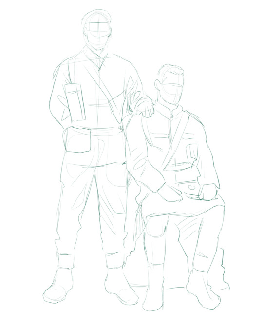
And so while I do still draw him with that round/cartoonish face (and draw him with more realistic proportions from time to time) his design has by this point become fully independent from Kitty’s.
On top of that? It’d be funny to mention that I have drawn them interacting before, lol. Kitty’s hair is different in these interactions (she is aged up as a character) but. Still. With the rp that this comes from it’s really funny that it’s come full circle.


Anyway, all that being said, here are some alternate versions of that side-part prompt. One with longer bangs that don’t cover the eye, and another where the bangs that cover his eye are fully textureless

Sorry this is probably a MUCH longer response than you expected. Hope you enjoy reading my art lore tho lol.
#ask headphones#regretevator#regretevator fanart#regretevator infected#regretevator kasper#art#infected regretevator#kasper regretevator#kitty subhuman#oc#character design#insuloposting#original character#monotoneheadphones
61 notes
·
View notes
Text
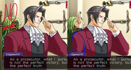
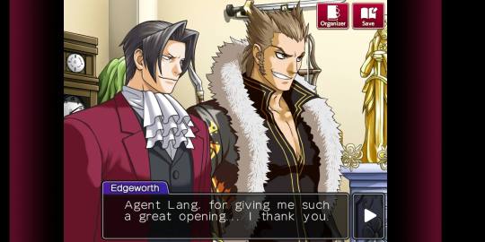
Okay, on the topic of artstyle let me say something about Ace Attorney Investigations. Edgey there looks so much prettier than in the original trilogy.

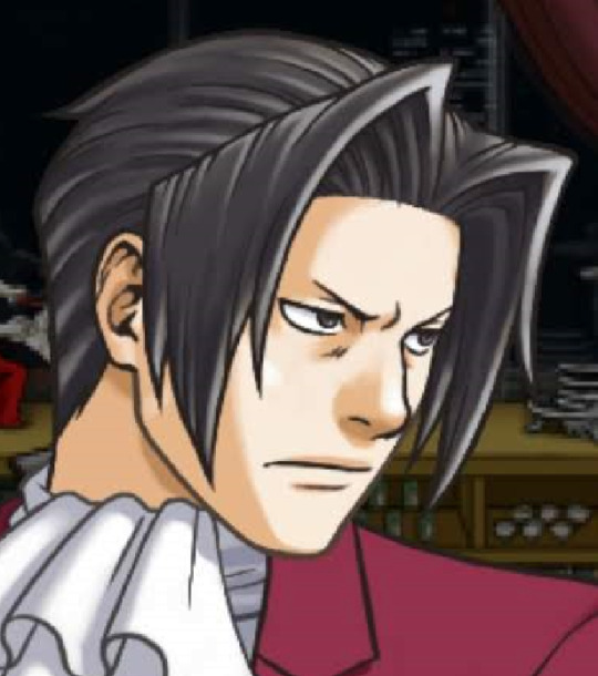
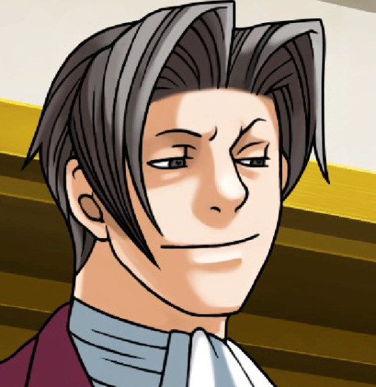

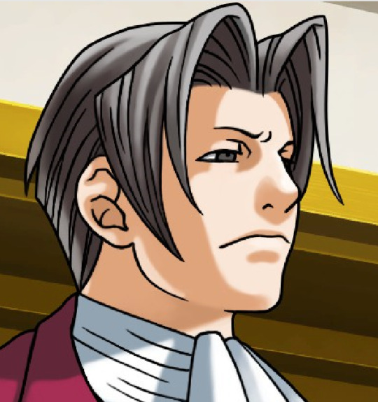

Take a look at this ugly ass ear in the original and refined pretty ear in AAI, for example, and a more precise lines for neck muscles. Nothing to say about much more competent shading and lineart.
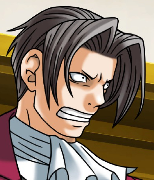

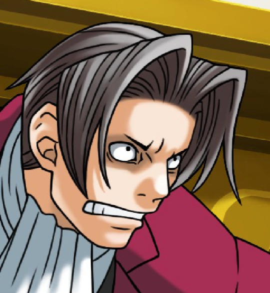

It's still cool to see how original trilogy's artstyle was clearly influenced by oldschool anime with its expressions and especially proportions.
And that's where AAI struggles the most.
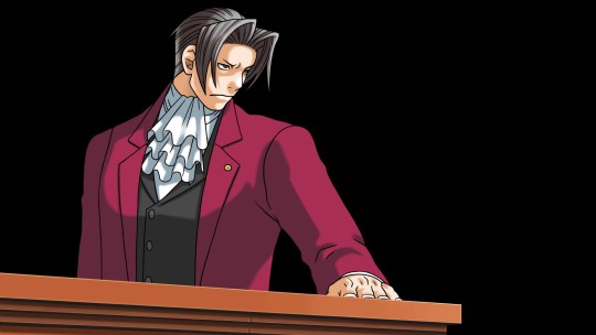
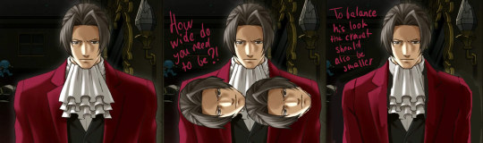
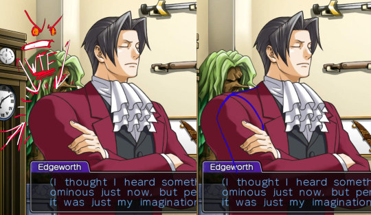
While I love Edgeworth's face in Investigations, his body proportions are killing me. Original trilogy gave him cupboard wide shoulders and yaoi shovel hands, BUT IT WORKED as Edgeworth's head was also more stylised.
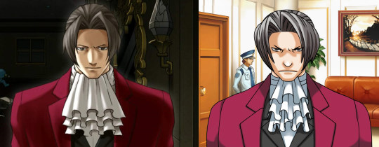
It DOESN'T WORK when you draw Edgeworth in a semi-realistic style. And as a professional artist myself I guess, that at first Edgworth's shoulders were drawn in normal human proportions until there weren't some artdirection notes to redraw them in this laughably bad way.
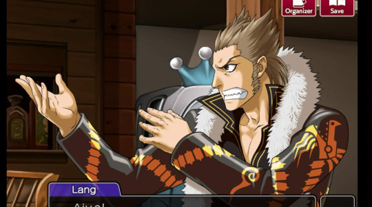
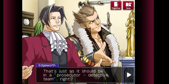
How could I know? Because the gorgeous motherflipping Lang was drawn from scratch with proportions of an athletic wide-shouldered man - and this bs wasn't happening!
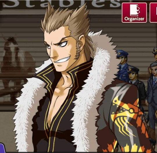
The same goes to Badd. He is very wide, but he doesn't look unnatural.
Come on, guys, Edgey already gave a flirty bottom energy near this hot mess, wider shoulders woud not help his twinkiness.
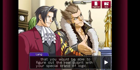
Ahem. Also, jeez, can we appreciate the way how masterful the drawings of hands are?

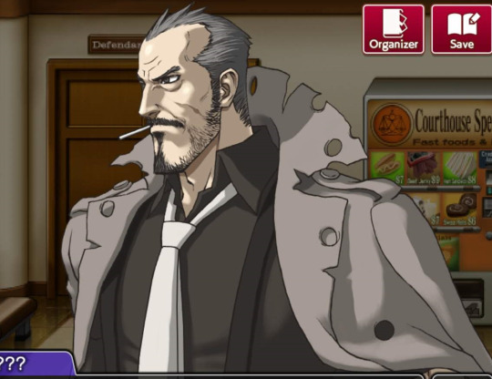
And this von Karma. Goddamit. Even if I am very vanilla, this is some hot daddy dom material. The facial structure, the precise shading, the detailes, the wrinkles, the hair, the smirk, the stare, daaaaaaaaaaamn that's a sexy drawing.
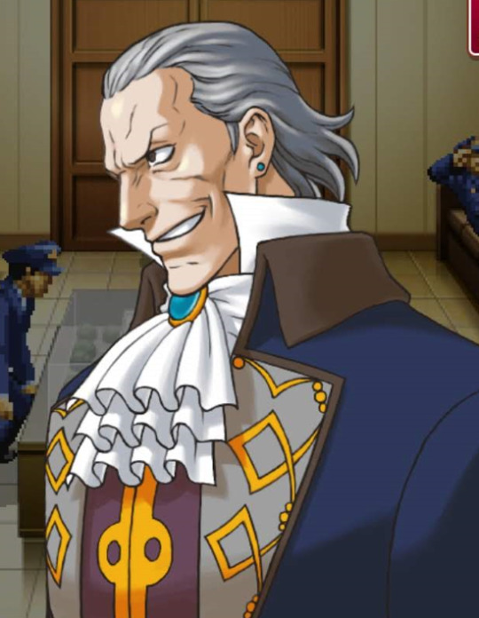
While here he looks like a f*cking toad.

That was my TED talk, thank you for reading.
#lang is... something else#am I shipping langworth? I won't tell you#ace attorney#not my art#miles edgeworth#ace attorney trilogy#ace attorney miles edgeworth#ace attorney investigations#manfred von karma#detective badd#shi long lang#tyler badd#gyakuten saiban#gyakuten kenji#mitsurugi reiji
1K notes
·
View notes