#electric chair by andy warhol
Explore tagged Tumblr posts
Text
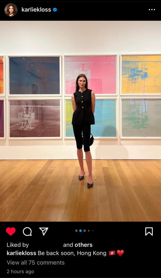
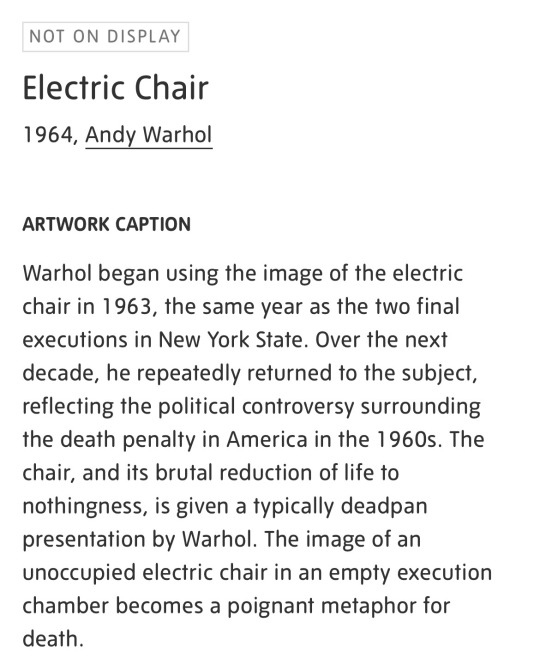
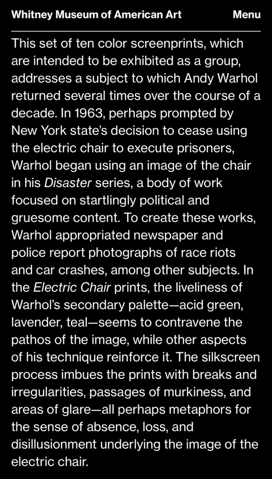
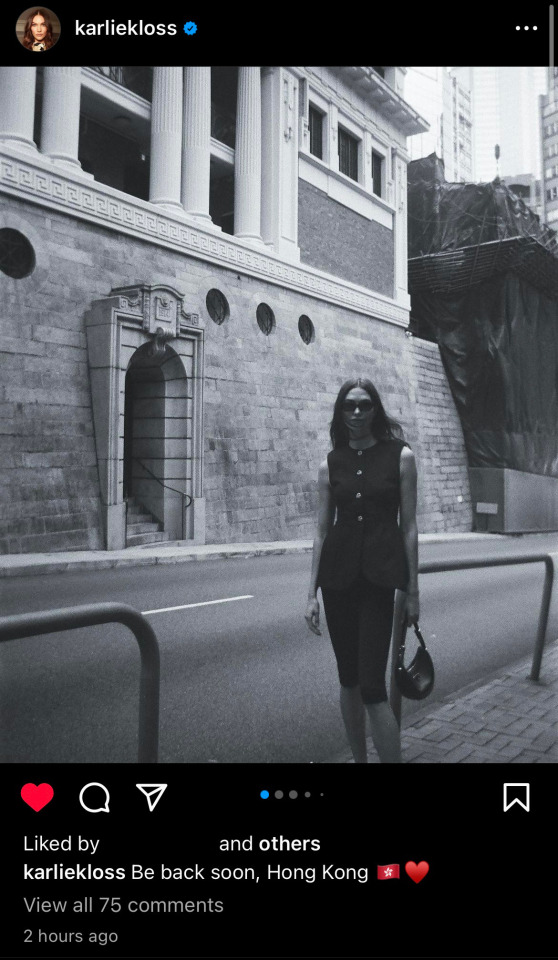
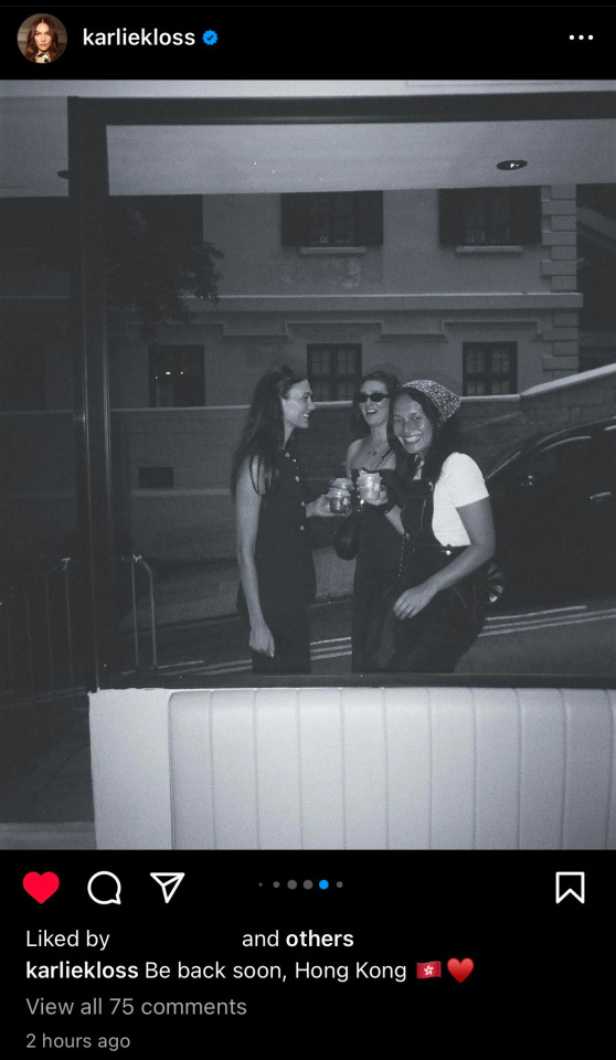
The first thing I thought when I saw this insta pic Karlie posted was “hey those kinda look like electric chairs” but I didn’t think they actually were electric chairs like WHAT 😵💫 the descriptions for the electric chair by Andy Warhol are quite sth. The fact that it’s in bright colors despite symbolizing death. Plus there are 2 ✌️ pics in this post that are in black and white.

#electric chair by andy warhol#andy warhol#gaylor#gaylor swift#kaylor#koincidences#karlie kloss#instagram
67 notes
·
View notes
Photo
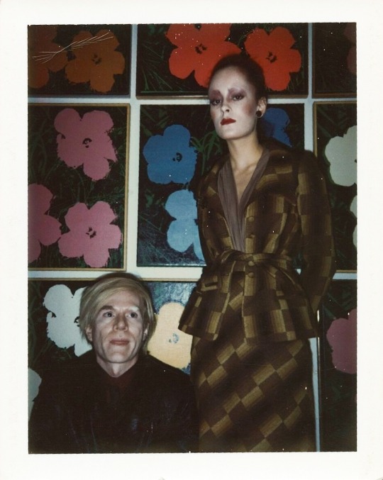
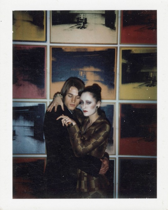

Andy Warhol with Jane Forth and Jed Johnson at his exhibit at the Tate Gallery in London, 1971.
#andy warhol#any warhol#jane forth#jed johnson#1971#1970s fashion#1970s#pop art#1970s art#tate#london#electric chair
206 notes
·
View notes
Text


Andy Warhol, Little Electric Chair, 1964-1965
Andy Warhol, Big Electric Chair, 1967-1968
#andy warhol#american artist#american art#american painter#american painting#electric chair#pop art#pop artist#death and disaster series#1960s art#the 60s#60s aesthetic#art on tumblr#modern art#art history#aesthetictumblr#tumblraesthetic#tumblrpic#tumblrpictures#tumblr art#tumblrstyle#aesthetic#beauty
31 notes
·
View notes
Photo


4 notes
·
View notes
Text

#art#artist#street art#andy warhol#pop art#warhol#nyc#new york#pittsburgh#electric chair#the factory#popular culture#warhol factory
1 note
·
View note
Text
Pop Goes the World: Warhol's Influence on Celebrity Culture
Hey there, pop culture enthusiasts! Today we're going to dive into the world of Andy Warhol and his lasting impact on celebrity culture. Yes, you heard that right. The master of Pop Art didn't just make soup cans and Marilyn Monroe portraits; he revolutionized the way we think about fame and the people who achieve it.
Now, you might be thinking, "But Warhol's art was all about commercialism and mass production. How could that have anything to do with the glitz and glam of Hollywood?" Well, my dear reader, let me enlighten you.
First of all, Warhol understood the power of repetition and image. He knew that by constantly bombarding the public with the same face or product, he could make them see it in a new and exciting way. This is the same principle that drives celebrity culture today. We can't get enough of our favorite stars, and we want to see them everywhere: on TV, in magazines, on social media. The more we see them, the more we love them.
But Warhol didn't just create art that celebrated fame; he also critiqued it. His "Death and Disaster" series, which depicted car crashes and electric chairs, was a commentary on our obsession with tragedy and spectacle. In a way, he was exposing the darker side of celebrity culture, showing us that even the most glamorous and beloved figures are not invincible.
So the next time you're scrolling through Instagram or watching a reality show, think about Warhol and his legacy. He may have passed away in 1987, but his ideas and art continue to shape our world in ways we can't even imagine. Pop goes the world, indeed.
Until next time, keep on learning from Warhol.
Best, Your favorite pop culture guru.
274 notes
·
View notes
Text

Andy Warhol, Electric Chair
3 notes
·
View notes
Photo

Andy Warhol: Electric Chair (1971) Screenprint
38 notes
·
View notes
Text
For Calvin Klein’s Spring 2018 collection, designer Raf Simons applied imagery from Andy Warhol’s “Death and Disaster” series to leather totes, tank tops, and gauzy dresses. Warhol’s source images — photographs of a lone electric chair in an empty room or a gruesome car crash, with bodies strewn among the wreckage — disarm and shock. Repeated in his screen-printed paintings, they enact the inuring effect of mass media. It is a powerful indictment of the press and its lust for tragedy. But taken out of context and printed on clothing, they register as edgy decorative motifs, in service — and thus subordinate — to Calvin Klein’s commercial agenda.
Context is a major part of what makes art art. Artworks can be many things — from found objects to performance, involving no objects at all. What distinguishes art from non-art is its intention to be understood as such. Its context helps signal that it should be seen as having meaning beyond ornament or decoration, whether that be personal expression, commentary or criticism. Recontextualization muddies this intention and risks drowning out the story an artwork tells with another story: the marketing narrative.
The biggest threat, however, is not that art is overpowered by its commercial context, but that its understanding of its own nature and purpose changes. In drawing closer to fashion, art abandons the pretense that it exists independent of commerce. Yet this pretense has historically allowed it to reject normal rules and metrics of success. The point of art has never simply been to attract an audience or accrue value. Rather, it’s seen itself as serving a unique role in culture: registering complaint, critique and protest; exploring realms of experience beyond transaction or exchange; realizing what the market could not or would never think to.
When art ties its fortunes to profitable enterprise, something vital is lost. The commercial realm is incapable of accommodating the full range of art’s potentialities — the politically sensitive and the staunchly anti-market being among them. Art must abide by the brand’s rules, and brands cannot afford to unnerve or offend consumers. What does art become when it can’t, either?
–Natasha Degen, “The Met Gala, or When Fashion Consumes Art,” The New York Times, May 1, 2023
10 notes
·
View notes
Text


Andy Warhol Exhibition, The Hugh Lane Gallery, Dublin.
During the midterm I went to Dublin to view one of my favourite print artists - Andy Warhol.
I am intrigued with the intricate precision, viewpoints, compositions and colours that he experiments with in his pop art, some of which in a humorous way.
I enjoy the photography perspective behind some of his portrait prints of himself or to set a sometimes gruesome scene hidden beneath buoyant, neon ink. eg. ‘Electric Chair’. On the contrast, his black and white silk screen prints were very impressive and I admire how they capture the subject in an ominous way.
I found this exhibition very useful to look back on for inspiration this week during the publication workshop and therefore I enjoyed experimenting with abstract shapes and bright complimentary colours.
3 notes
·
View notes
Photo

Andy Warhol Electric Chair F.S.II.81, 1971 Screenprint on paper 35 1/2 × 48 in | 90.2 × 121.9 cm Edition of 250
6 notes
·
View notes
Text
Andy Warhol, John Paonessa, the Rosenbergs and Sing Sing’s notorious death house.
So, what links the icon of pop art, the atom spies Julius and Ethel Rosenberg and an almost-forgotten murderer named John Paonessa? Simple, the electric chair. Warhol used this image to create a series of coloured screenprints. Part of his recurring fascination with life’s dark side, Old Sparky was as famous as Warhol long before the artist himself was even born. By Warhol’s birth on August 6,…

View On WordPress
#Alfred von Wolfersdorf#Andy Warhol#art#Art History#capital punishment#crime#crime and punishment#Dance Hall#death house#death penalty#death sentence#death warrant#Dutchess County#Empire State#Ethel Rosenberg#executed#execution#Federal Judge Irving Kaufman#Governor Thomas Dewey#History#John Paonessa#Joseph Francel#Joseph P Francel#Julius Rosenberg#Lonely Hearts Killers#Martha Beck#murder#old sparky#Perry Como#Pop Art
5 notes
·
View notes
Text
Find A Song that is a panic attack transformed into glorious light
Dylan Rippon - Sunburn
Dylan explains this recording as follows, “I started work on ‘Destroy The Now’ around the same time that I was asked to write the music for a new documentary about Andy Warhol called ‘The Warhol Effect’ (dir. by Paul Toogood and Lloyd Stanton). I wanted to make sound in the same way Warhol made images, at the speed of light. Andy was the first to repeat, repeat, repeat. He could paint in code. He was his own algorithm. Marshall McLuhan, my only spiritual guide, understood the digital human as a spirit, disembodied by light itself. He said, ‘everybody at the speed of light becomes a nobody’. And he knew what this separation of the body and soul would do to our lives. ‘Violence whether spiritual or physical is a quest for identity and the meaningful. The less identity, the more violence.’ I started thinking about the violence of digital life, the way it ‘destroys the now’. Warhol spent a lot of time thinking about the violence of car crashes and electric chairs, teenage kids dead on the sidewalk but all over the evening news, violence as a destiny. Maybe that’s why Valerie Solanas tried to murder him. After that, it didn’t take long for the songs to manifest themselves. It was automatic. I didn’t even have to try. ‘Listen!’ was the Universe telling me to wake up, to be aware. ‘Futurismo’ was for Antonio Sant’Elia. He imagined skyscrapers and futuristic city-scapes but was killed in the First World War before he ever saw his dreams come true. ‘Mobius Trip’ is the ‘eternal return’, Nietzsche’s horror concept that we are all destined to live our lives again, every thought, decision and action the same as the first time around. ‘Forever/Eternity Song’ is a love song. It may be the greatest love song ever written. ‘All Too Human’ borrows its title from ‘Human, All Too Human: A Book For Free Spirits’. The robots are already more human than we are. They feel, we scroll. The digital human is all too human to be real. ‘Divider’ is a song about memory, about losing love long ago when you could feel the streets and breathe the night. ‘Sunburn’ is a panic attack transformed into glorious light. ‘Momentum’ is a prayer. I mastered the album at Abbey Road. Richard Bull created a beautiful painting for the sleeve. I had the feeling that I’d made something really special.”
Added to FAS Spotify playlist alt rock.
#music#music blog#indie music#alternative music#alt rock#Dylan Rippon#Sunburn#panic attack#indie#alternative#find a song
1 note
·
View note


