#east africa fashion
Explore tagged Tumblr posts
Text

Comorian bride, from Comoros, by fathy_elegance
#comorian#comoros#africa#east africa#folk clothing#traditional clothing#traditional fashion#cultural clothing
599 notes
·
View notes
Text

#rubi rose#slim waist#black tumblr#black girl moodboard#black girl fitspo#black girls of tumblr#black magic#east africa#black beauty#black women#black woman#black is beautiful#black girl fashion#black woman appreciation#black girl magic#pretty black girls#girls of tumblr#black girls are beautiful#it girl#for you#foryou#trending#fashion shoot#birthday#birthday shoot#melanin#pretty#libra
354 notes
·
View notes
Text

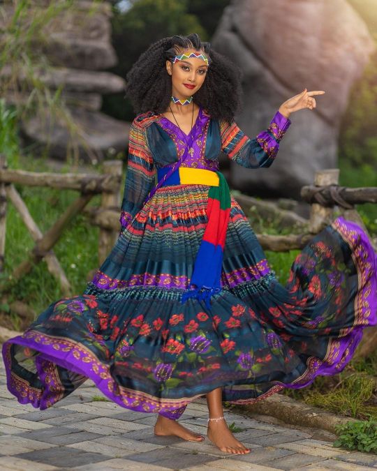

#melanin#pretty#blackgirlmagic#ethiopian#habesha#melanin poppin#african beauty#modest#modesty#womens fashion#black queen#black fashion#ebony#chocolate#brown skin#east africa#african
721 notes
·
View notes
Text

African in soft flourish colours


#african beauty#african style#african women#african fashion#dark skin beauty#afro sexy#west africa#east africa#kenyan#beautiful black women#beautiful skin#melanin
33 notes
·
View notes
Note
Hello 👋 This is Moamen and his family from Gaza. Please help us evacuate to safety, complete university studies, and find a source of income after the destruction of what we own. We live in difficult circumstances and a difficult life 🙏🏼 ❤️ Please share and spread the campaign because I urgently need help and the matter is urgent. Because the campaign is going very slowly, there is no water and little food. Please donate and share please Moamen Majed, his four brothers, and their parents ($40/$30,000) - @moamenmajed-gaza
🍉🍉🍉🍉🍉🍉🍉🍉
HELLO EVERYONE PLEASE DO PAY ATTENTION !
PLEASE TRY TO DONATE AND HELP THIS FAMILY GET SAFETY !
🔻🔻🔻
🕊🕊🕊
AT THE VERY LEAST CONSIDER A REBLOG TO SPREAD THE WORD!
REMEMBER EVERY LITTLE BIT COUNTS AND ADDS UP MORE!
🫒🫒🫒🫒🫒🫒🫒🫒
#palestine#free palestine#gaza#free gaza#current events#israel#jerusalem#tel aviv#palestinian genocide#israeli#africa#asia#middle east#america#latin#europe#vacation#books#summer#travel#fashion#anime#fandoms#dramas#donations#send help#charity#chicago#new york#london
21 notes
·
View notes
Text
Imagine being rich and paying for bland minimalist textiles and cold sterilized homes when you could be paying folk artists handsomely for handcrafted beauty and color —helping preserve honestly quite priceless artistic traditions and supporting the people who keep these legacies alive— instead.
#you have all the ability to buy pieces of art with vibrant histories and made with the worlds most skilled hands#to own something gorgeous and genuine and guarantee that these art forms survive and the people who provide them are well-cared for#and you’d rather live in a hospital and wear three colors all your life#Persian rugs?#traditional Bengali Jamdani fabrics? old school banarasi’s made by hand?#Guatemalan upholstery?#Romanian embroidered blouses?#Japanese-sourced furniture made with ancient joinery techniques?#Chinese porcelain made the old-fashioned way?#gold finery from east Africa?#Czech glass vases?#Navajo blankets?#Vietnamese embroidered thread ‘paintings’?#COME OOOOONNN#rich people learn how to spend your money or give it to me
196 notes
·
View notes
Text
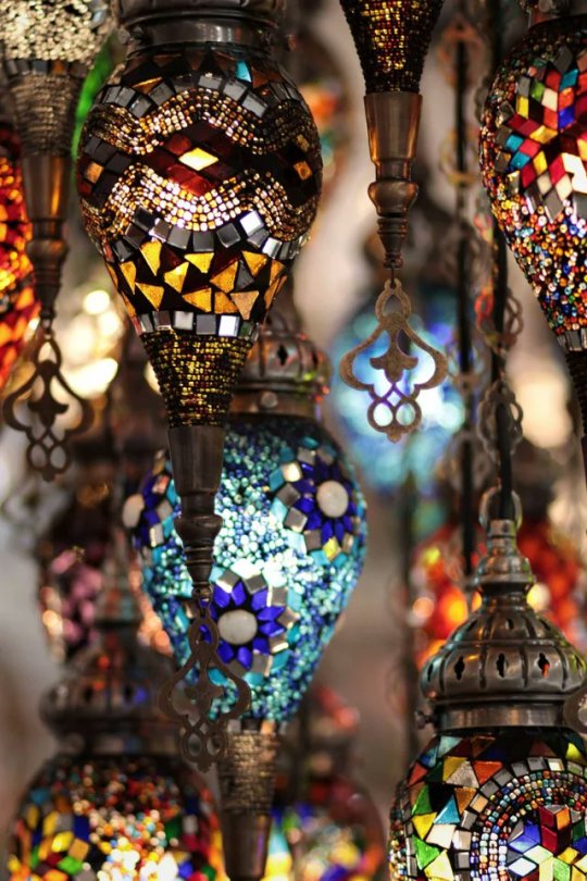
All of the lights
#toya's tales#style#fashion#toyastales#toyas tales#art#home decor#interior design#artistic#wall mounted lanterns#lanterns#bohemian#moroccan#morocco#middle east#africa#home lighting#lighting design#lighting#flashing lights#may#june#summer#spring#chill vibes#all of the lights
56 notes
·
View notes
Text
No. 36 - Riyadh Air
No, they are not changing their name to Saudi Arabian Airways, but there is a new development on the Saudi Arabian flag carrier front.

That's right, Saudia is dead, sayonara you w-
No. That isn't true, that was a joke. But what isn't a joke is that Riyadh Air is a planned second flag carrier for Saudi Arabia.
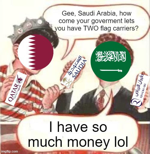
That's mostly a joke. Other countries have multiple flag carriers, though that comes with a couple caveats. Usually when this happens one is full-service and international while the other is domestic and/or low cost. The UAE has two flag carriers, but one is Dubai's and the other is Abu Dhabi's, which feels like an important distinction.
Saudi Arabia, on the other hand, just has decided they want to operate a second airline instead of doing the normal thing and putting all their resources into one really good airline. I don't understand it. The plan is to keep Saudia based in Jeddah while Riyadh Air is based in Riyadh...again, plenty of airlines have multiple hubs, so I don't see the point. They claim to be the first "digital-native airline", which is shaped like words yet means nothing (also, take that up with David Neeleman and Breeze). They've nabbed Etihad's old CEO and bought a bunch of 787s, and the stated goal is to become the largest carrier in the Gulf region at an unprecedented blistering pace in order to increase tourism. Given Emirates's numbers...well, it's probably still more likely to happen than a startup airline operating exclusively A380s managing to turn a profit, but that's not saying much.
Anyway, they've got a livery! Apparently this is the first of two, so expect a follow-up post when the second one drops, but for now there's plenty to talk about as is.
Unlike many - nay, most - of the subjects I cover, Riyadh Air has made me do absolutely zero research. You do get modern liveries like jetBlue and Lufthansa with little style guides to weakly attempt to back up their relatively mundane graphic design choices and things like condor and Icelandair's lovely little webpages, but Riyadh Air has done them all at least one if not several better by not only explaining in detail where they got their inspiration but also giving me a high-res 3D model of their airplane that I can rotate and zoom in and out on.
Take care; my computer is fairly underpowered and I do have an absurd number of tabs open most of the time, but this did crash my browser multiple times. Even just opening the main page of their website makes my CPU sound like it's spooling up for takeoff.
Okay. First I want to discuss the logo. They've got a video up on their thought process. I had transcribed it, but it looks better in motion, and thankfully they've stopped making it autoplay (presumably because, as I mentioned, this website absolutely guzzles processor as is) and in the process made it possible for me to simply left-click it off their website and into this post. Don't worry about it killing your browser. It's a normal video in a normal tumblr post without a 100 million dollar website chugging along in the background.
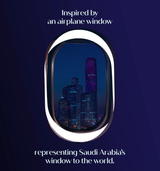
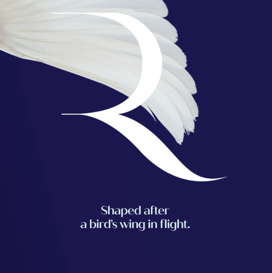
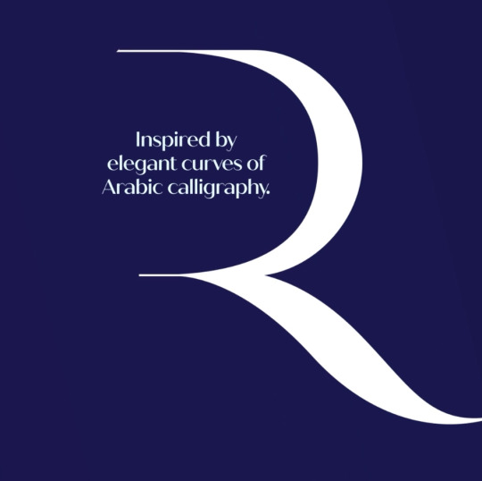
(I've taken some screenshots in case anyone does have trouble with the video.)
Now this is how you design a logo. The airplane window thing feels, in retrospect, so obvious I can't believe nobody had done it yet. I think it pairs gorgeously with the R, and I love that they chose to take inspiration from Arabic calligraphy, which is not only a massive point of pride for cultures which utilize the script but also just generally gorgeous. (It looks a bit like a stretched backwards hamza to me.) The shape of the bird's wing is the part I have the most trouble actually connecting to what I'm seeing, but sure, I'll give it to them. What the heck. This logo is nice.
I mentioned when discussing China Airlines that very few airlines use lavender as a primary color. Well, here's one that does! They actually discuss this on their website as well:
Inspired by the lavender blossoms that carpet Saudi Arabia, we've chosen this color because it symbolizes Saudi generosity and its authentic hospitality.
And this is, again, pretty fantastic. This is a thoughtful choice which isn't lazy or arbitrary. It has the potential to really pack a visual punch, and it does the thing I love when flag carriers do - references a feature of its home nation.
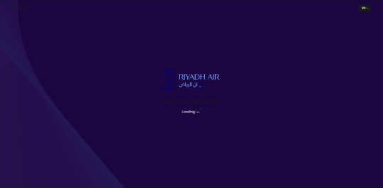
An upside to the fact that the livery page takes eons for my computer to chew on is that I get shown this lovely loading screen, which demonstrates the fantastic combination of blues and purples which make up the full scheme of this airline's colors. I love the combination of these colors. Light saturated colors are rare enough, but to see extremely dark blues and purples together like this is a rare delight. It definitely has the potential to get eyestrainy, but if done well it could look absolutely breathtaking.
But will it be done well? After all, a good idea isn't always well-implemented - see condor - and China Airlines's livery fails for me because it's barely got any lavender! So does Riyadh Air fall into the same pit? Let's check the browser-destroying 3D model they've lovingly provided us.
I love that 3D model, by the way. Instead of looking for a bunch of pictures of airplanes that happen to be in the correct lighting and at the right angle to demonstrate the exact thing I'm attempting to discuss I can just...zoom in while putting the plane at the specific angle I want. Normally I actually try not to rely too heavily on things like style guides because a piece of flat-colored concept art isn't actually going to communicate how a plane looks in motion and with light on it, but this is a really really robust model. Sure, it's not quite as maneuverable as I'd like it to be, it's still not a perfect representation of real life, but it's really well made. It even sways side to side a bit and if you zoom in close enough you can see they bothered to model the external sensors and the engines are even turning! Don't worry about the fact that if you zoom in even further you can tell the engines are just a fan suspended floating in a cowling. They even added ambient engine sounds. This model is so cool it legitimately took me several minutes of turning it around and muttering "wow..." under my breath before I realized the environment it was sitting in was just some very stretched and crunchy jpgs.
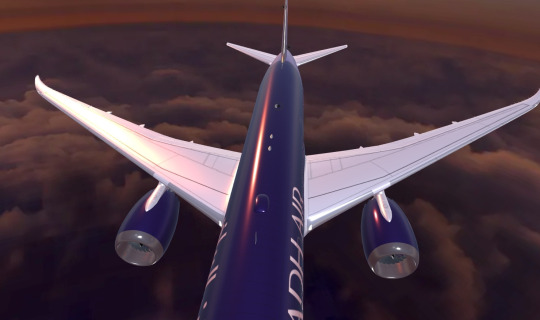
Mmm, those reflections.
To be honest, I also just enjoyed playing with this thing. It's almost like having a real model plane, but doesn't cost more money than I have! But enough of that.

So they definitely didn't chicken out when it came to the lavender. This plane is as purple as a Breeze Airways plane is blue (it is very purple). It's not just a purple tube, though. Even from a distance you can see that there's added detail here.
I love the wordmark, first off. They've really committed to the billboard look with this gigantic text in both English and Arabic. I love it. With such an overwhelming main body color it feels prudent to make sure the name is as visible as possible so it doesn't get lost in the shuffle.

And with this gigantic, recognizable logo plastered on the bottom you'd be able to identify it just as well from below (and this is zoomed out as far as the website let me!). In fact, the depth of the design really shines best from below. That's not necessarily a good thing, because your plane does have to be parked sometimes, but it's not a dealbreaker either. I just need to say that this is probably my favorite design for an engine nacelle, ever. It's gorgeous, and you can see in the first picture how well it flows into the main design. They don't go together quite as well from the bottom, and from below the plane does look a bit rear-heavy and the wordmark peering in is a bit awkward, but none of those ruin it. I would be stunned if I saw this fly overhead.
The website provides a few details about the design if you zoom in and click little black dots. It took me ages to realize this. It's neither intuitive nor accessible and I truly despise it, so I've taken the liberty of transcribing the bits that matter.
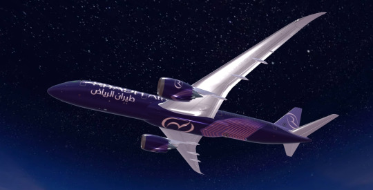
You can turn this plane in any which way you'd like, zoom in and out, and the details on the bottom never stop being beautiful and coherent. It truly does remind me of calligraphy. As they describe it:
Rooted in our Heritage The controlled, smooth linear profiles make up our signature "Canopy Twist". A perfect balance of our rich local culture and our modern global outlook, connecting the city of Riyadh to the world.
I love the name 'Canopy Twist', to be honest. And I love the design, too. My one criticism of it is the colors. They already have an established secondary shade of purple. That they used the text color for the highlights makes sense, but why couldn't they have used their lavender instead of a third shade of purple? In the quantity used for the underside it feels disconnected from the rest of the livery and they could have fixed that very easily by just...using their already existing secondary shade of purple? I think it would make for a very nice bridge to the tail as well, and it just feels like a colossal missed opportunity.
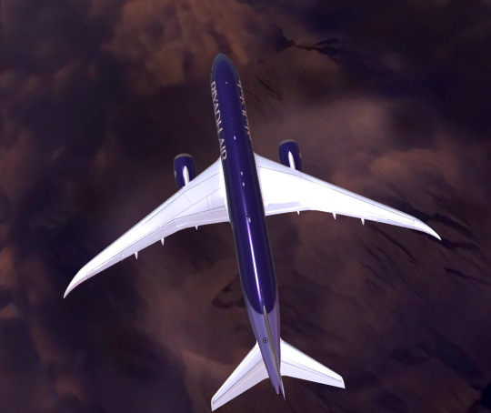
You may have noticed that the bulk of the fuselage body is a color a bit darker than what might conventionally be considered 'lavender'. This, too, is noted.
Indigo Livery Inspired by the ever-changing colors that paint the sky from dusk till dawn. A symbol of tranquility, harmony and integrity.
(This color is obviously purple, not indigo, but I will not belabor that point.)
I love the description, the idea of the transition between dusk and dawn. Much like the window as a basis for a logo, this makes me go "why in the world has nobody thought of that before? That's brilliant!"
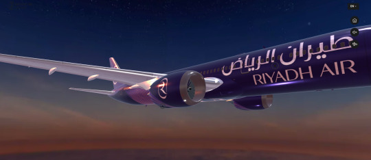
It makes me think a bit more could have been done in the details. Maybe the canopy twist could be a gradient, like the gradient of the sky while the sun is rising? Just a thought.
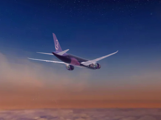
And ultimately it's the canopy twist that is my only real sticking point with this livery. It is beautiful and unique and well-designed and it is simply a color that sticks out like a sore thumb. It's the only warm thing creeping into a design otherwise full of beautiful cool tones, it has gorgeous flow within itself but breaks up the feeling of consistency through the airframe as a whole, and I just...I really wish it were lavender.
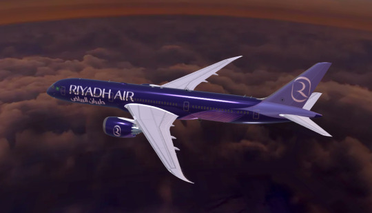
If that's my main issue you can do a lot worse. And overall I do like the Riyadh Air livery. If that one detail was changed, this would easily be an A. This review would be all but uncritical. Except for the fact that it could use a bit of canopy twist up top, too (maybe just a tiny bit on the top of the nose, flowing in the same direction) in order to make the plane feel less rear-heavy (though it already beats out the vast majority of liveries in that sense), the issue with the color is my only big criticism. But it's the main detail of the design, isn't it?
It's wild. So much of the time my reviews are "good details, bad when you step back". But this is the opposite. Fantastic, but there's that one detail that sticks with you. And the details by and large are far from bad too. I mentioned the nacelles, and I think it very elegantly transitions the tail into the body. It would be more elegant if the design on the body was the same lavender, though!

A few more nitpicks: the centering of the logo on the tailfin is a little strange, the tail would look better if it had a bit of a gradient to make it less matte-seeming, and the combined effect of those is very luxury-hotel-towel-monogram. Okay. I'm done complaining.
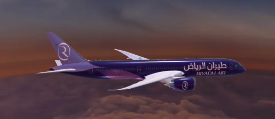
So it falls short of being one of the best I've ever reviewed, but I still really, really like it. The calligraphy inspiration creates these elegant sweeping lines that are perfectly at home on the 787. The deep purple looks luxurious despite the fact that Riyadh Air doesn't plan to offer first class. It's eyecatching. It's stylish.
And, now that I've covered all this, let's look at the colors in person! That's right, they've already had a plane delivered in full Riyadh Air colors.
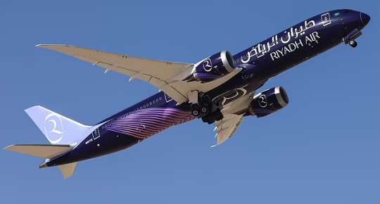
The deep purple with the lighter canopy twist, combined with the tiny white dots of the various probes and such, make this plane look like an animal camouflaging itself against the night sky in a place untouched by light pollution. The light lavender contrasts sharply in this particular image, sharply enough that it feels like a slice cut out of the plane.
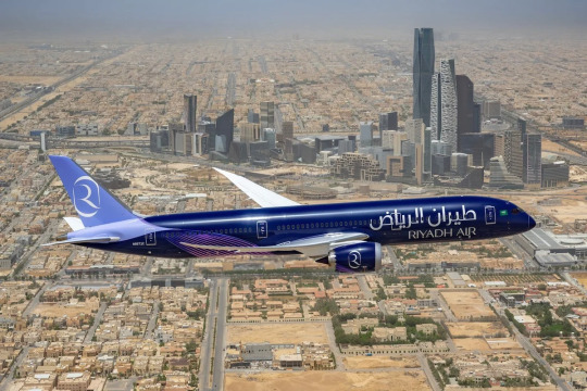
This continues to be an issue from other angles and in other lightings, but the cool-toned light makes this purple look like true indigo and the blueish cast improves the look, giving an almost fluorescent appearance to the transition between the twist and the tail. The way the light reflects off the dark paint makes it look rippling and shifting and alive in a way it never could off white.
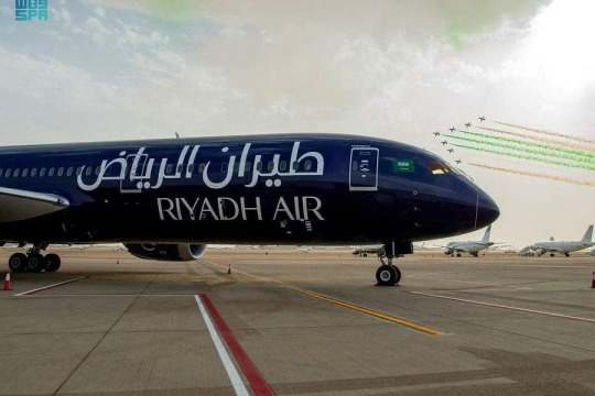

In shadow, the plane looks as dark as a city sky. In light, the vibrant purple of a fresh eggplant. This paint job adapts wonderfully to its environment. Much like Vietnam Airlines's, each light brings out a unique beauty.
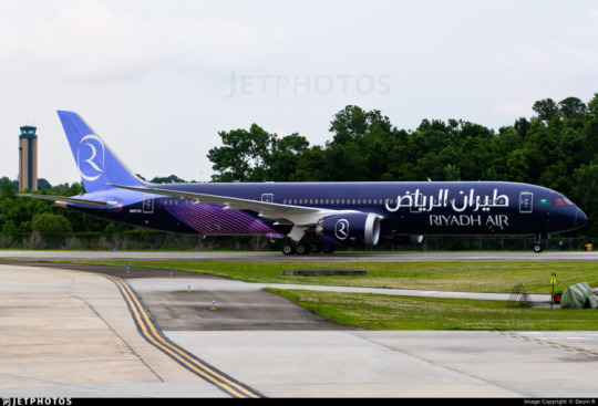
And sometimes, the tail, detached though it may look, does so in the way a shining arm of a spiral galaxy neatly transitions into the black expanse around it.
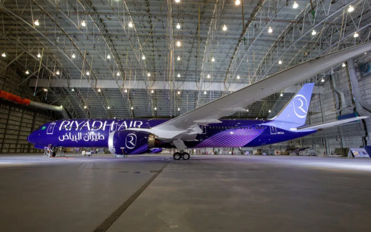
Riyadh Air's planes range from ultraviolet to supervoid, but they are never lost in their environment. The principles behind the design remain consistent, and beautiful, and alone in a sky full of planes which refuse to embrace the dark skies they fly in on red-eye journeys.
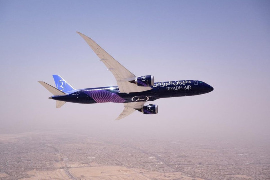
Ultimately, I think Riyadh Air's livery feels a bit overdesigned. They added one color too many, and a few decisions feel like they don't belong together in the same picture. Just think about the amount of colors here, the balance of major features, and think about Vietnam Airlines, and you'll see what I mean. I'm not a fan of minimalism, but sometimes the only way to keep a story straight is to minimize loose ends. A secret becomes exponentially more likely to be exposed with each new person who learns it.
But before I looked closer, before I zoomed in and out on a little 3D model while my computer screamed, I saw this livery for the first time and my jaw hit the floor. And the average person isn't going to think about this the way I do. Ultimately, my critical eye is usually something I defer to, but I can't argue with the fact that this livery is going to be to someone else what China Airlines is to me. And, like China Airlines, when they come back and look closer at it they'll notice it wasn't as perfect as they thought, but...we've come so far, if this is someone's China Airlines. And as much as I nitpick at details the package counts, too. If you asked me why China Airlines got a C- instead of a D+, my honest reason would be...it struck me enough that I singled it out to begin with, even though that started to fall apart when I looked closer.
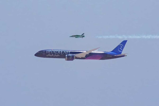
Why am I giving Riyadh Air an A- instead of a B+? Because this plane will stun people 5,000 feet below it, and they'll think to themselves that it's the prettiest plane they've ever seen.
#tarmac fashion week#era: 2020s#grade: a-#region: middle east and north africa#region: saudi arabia#riyadh air#flag carriers#at least ostensibly flag carriers.
35 notes
·
View notes
Text


issa/ciise clan
from
Ethiopia / Djibouti
2 notes
·
View notes
Text
LES AFRICAINS AU JEU
#east africa#saint icarus#2014#south africa#africa#fashion#france#cdg#comme des garçons#cdg converse#kanga#cdg play#sahara#tanzania#avant garde#2024
2 notes
·
View notes
Text

Afar dancer, Djibouti, by Nesha Humes
#afar#djibouti#africa#east africa#folk clothing#traditional clothing#traditional fashion#cultural clothing
595 notes
·
View notes
Text


He so in love he think that I do voodoo he shoulda known cuz my nickname is Juju
7 notes
·
View notes
Text

#pretty#melanin#blackgirlmagic#melanin poppin#african beauty#east africa#black queen#black fashion#beautiful skin#pretty face#muslim fashion#modest#brown skin#muslimah#modesty#black woman#black tumblr#ebony#chocolate#headwraps
617 notes
·
View notes
Text


The way of one Kenyan in pics....
#african beauty#african style#african women#african fashion#dark skin beauty#afro sexy#portrait photography#african smile#curly hair#kenyan#east africa#nairobi
4 notes
·
View notes
Photo
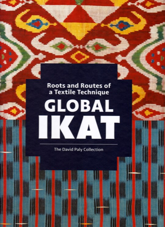



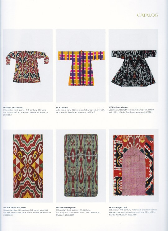


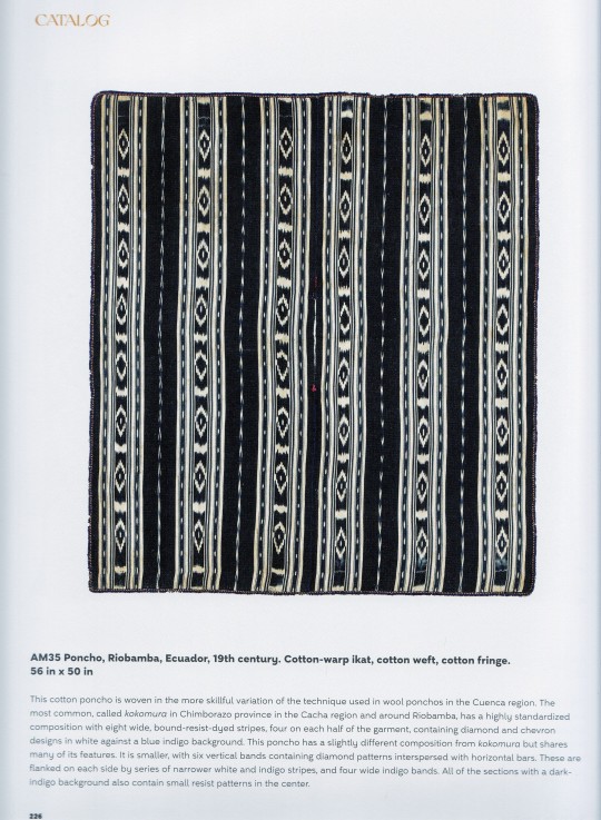
Global Ikat
Roots and Routes of a Textile Technique
The David Paly Collection
A World of Compelling Cloth
edited by Rosemary Crill
texts by Polly Barton, Sumru Belger Krody, Shelley Burian, Duncan Clarke, Rosemary Crill, Martina D’Amato, Sumru Belger Crody, Linda S. McIntosh, David Paly and Lee Talbot
The Historic Textile Research Publ. in cooperation with Hali Publications Ltd, London 2023, 240 pages, 300 color 20 b/w ill., 30 x 24,5 cm, Hardback, ISBN 9781898113904
euro 54,00
email if you want to buy [email protected]
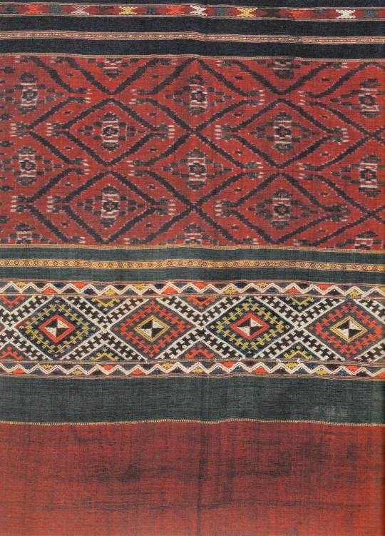
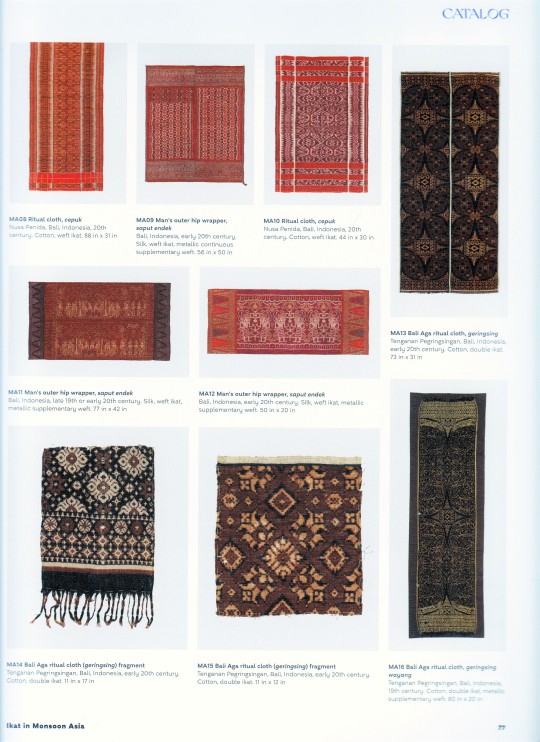
Deceptively simple or fantastically intricate, ikat technique has been used for many centuries to create extravagant costumes and cloths of deep cultural meaning. The distinctively blurred, feathered or jagged patterns of ikat-dyed textiles are found across much of the world - from Japan in the east to Central and South America in the west, with vast areas of South-east Asia, India, Central Asia and the Middle East in between. The traditional patterns still hold cultural relevance today in significant parts of the long-established ikat-weaving areas. Textile artists and fashion designers in many and varied countries have taken ikat in new directions, respecting traditional forms and palettes while creatively diverging from them.
This is the first time all the different iterations of this textile have been comprehensively brought together in one volume, drawing from the wide-ranging collection of David Paly. It is a journey across the world through the lens of ikat.
28/03/23
orders to: [email protected]
ordini a: [email protected]
twitter: @fashionbooksmi
instagram: fashionbooksmilano, designbooksmilano tumblr: fashionbooksmilano, designbooksmilano
#Ikat#Global Ikat#David Paly Collection#Historical Textile Research Publ.#Hali Publ.#South-East Asia#India#Central Asia#Middle East#Japan#Africa#Europe#textiles books#fashion books#fashionbooksmilano
12 notes
·
View notes
Text
A 𝑆𝑒𝑟𝑑𝑜𝑢𝑘 pendant from Tangier, Morocco, 20th century. Ancient eagle-shaped necklace symbolizing strength, prestige made of gold and precious stones.

#morocco#moroccan#jewellery#jewels#jewel#jewerly#gold jewelry#jewelry history#moroccan culture#moroccan history#moroccan fashion#moroccan designers#mrooccan design#moroccan art#moroccan aesthetic#north africa#moorish#moors#middle-east#mediteranean#jewelry design#jewellery history#fashion history#ethnic#moroccan clothing#moroccan costumes#moroccan wears#history of fashion#menswear#womenswear
11 notes
·
View notes