#done on clip studio paint instead of krita
Explore tagged Tumblr posts
Text

An attempt at seeing how closely I can replicate the look of a traditional animation cel using purely digital means.
Some notes:
I went ahead and used Rebelle for this experiment. Part of my thinking is that in a modern workflow, the basic framework of the animation (lines, shadow guides, etc) could be done in something like ToonBoom or Clip Studio or what have you, and then individual frames can be exported to be painted in something like Rebelle afterwards.
I used the standard ink pens for lining and the standard oil & acrylic brushes for coloring. The background made use of the Express Oils brushes. The canvas was set to plain white (because this wouldn't be done on paper, but rather a kind of clear plastic, so no paper texture)
Because of the way Rebelle works, it kind of enforces a little organic variation in the paint, creating natural little "ridges" & brush strokes. The ink also bleeds in interesting ways, especially at intersections.
I decided not to use any multiply or overlay layers to do lighting, instead forcing myself to "eyeball it" and pick colors manually.
To finish things off, I added subtle drop shadows to the lineart and the flat colors, to give the appearance of it slightly sitting on top of the background painting. Then I finally took into Krita and added RGB noise, chromatic aberration, and VHS-style color bleeding.
#glaire art#digital art#furry#digital illustration#furry art#anthro#artists on tumblr#anime art#retro anime aesthetic#retro aesthetic#90s anime#fake anime screenshot
15 notes
·
View notes
Note
That Vritra drawing looks really good tbh!! I just wanna tell you that (oh I love women...)
Also, I'm curious as well about how you would do greyscale painting. Do you have any tips/advises about it? As I'm thinking I want to practice painting with that method, too
so idk if im the BEST person to ask given this is the first time i've used greyscale in like...idk 5 years? but basically the gist of it is to paint the image in monochrome black and white so your values stay clear. the program i used is krita so i'll explain how to do it there but theres actually more guides for procreate, clip studio, photo shop etc
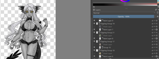
for this, in order to make sure coloring later was easier, i made each color group (skin, hair, tail+bra, tie and underskirt, gold) a different layer. i dont usually label mine because i hate myself but you may fine doing so more useful. once you've colored each layer in the correct grey value just shade it normally.
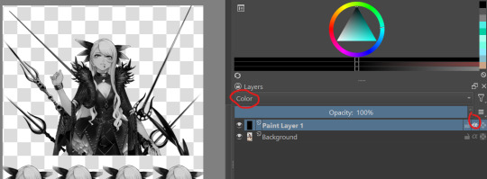
i also wanted to make sure i got the values for her skin right so i tried this trick i saw the other day on a reference image i have of her, which is to make a second layer, alpha lock it and switch the layer setting to color instead of normal. this sets the image to monochrome with very little fuss so you can easily color pick values without much issue (although you'll notice i actually lightened her hair a bit bc og vritra's is pretty close in value to her skin)
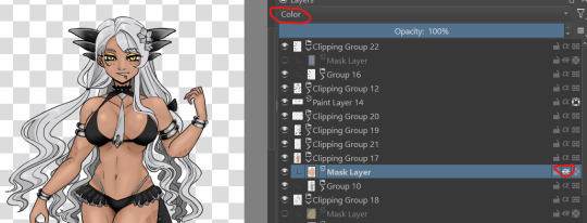
once you've colored in the values you're bascially done. just make a clipping group and set the clipping layer to 'color' and it will fill in the layer to the color you picked. you may need to adjust the layer below a bit-i ended up having to darken the tie because the green wasnt coming out the right color. the other thing is that i actually set the gold to color dodge on a dark brown because i felt that made a better gold color. realistically, you would also further tweak the image but it was pretty late last night so i called it a day
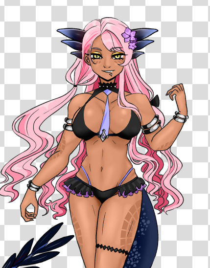
this also gives you the ability to play with the color palettes a bit although you wont be able to go beyond the base values- like in this case, i cant really make her hair or skin darker than how i already set it, so keep that in mind unless you're good with other filter settings
7 notes
·
View notes
Text
i did a very very late secret santa (which I'm not sure you can even call it that since i decided to make it New Year themed instead) for @bizarrelovesquare. It's Ladrien because they deserve everything
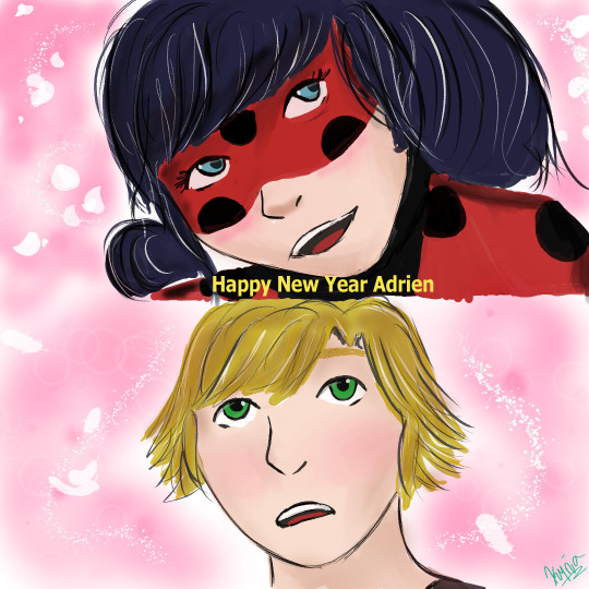
#i feel like i couldve done better#i honestly dont know how more of this i could change without making it look worse#also hey i used clip studio paint instead of krita#and honestly? its amazing#this is moi#ml fanart#miraculous ladybug#ladrien#adrien agreste#ladybug
6 notes
·
View notes
Note
do you have any advice for digital artist who is just getting started with digital? i have a cheap tablet (wacom) and i use photoshop. thank you!<3 sorry for bad english
ok first of all your english is really good, dont apologize <3 second of all yeah i can give some advice! keep in mind that i am not a professional by any means, im just a 20 y/o who's mostly self taught. took a couple of classes in high school but honestly they didnt teach me much beyond what i already knew unfortunately. still, self taught is something, and clearly my art is decent enough that people enjoy it and are coming to me for advice, so! here's a list of advice i can think of.
stop using photoshop. this might be a bold one to start out with, but don't use photoshop for drawing, man. i know how to use photoshop REALLY well, i'm like taught in it. and that program is ASS even at editing photos, much less drawing. it's outdated and overpriced and really needs to stop being an industry standard. it's one thing if that's the program you've been using for years and you're comfortable with it, but if you're just starting out? ditch that shit. i personally use both sai2 and clip studio paint, but both of those are paid programs. not that i paid for them, but yknow. if you don't want to pirate or pay, some good free programs include krita and sketchbook pro ! also most programs come with a free trial you can test out.
the deform tool is ABSOLUTELY your friend, especially in the sketching phase. the face looks a little off? adjust it a bit instead of redrawing it. make it look perfect. leg not in the proper place? grab it and move it! just keep in mind that you should generally do this before you line/paint/etc. it's best to make these adjustments to the sketch, because oftentimes deforming something will reduce the quality of it. this depends on both the program and the amount of adjustment being done, but as just a general rule best to get this out of the way early on.
flip your canvas. a lot. this will REALLY help you. say you're drawing a guy standing up straight, and you're like huh, this looks kinda weird, but i can't tell why. it just looks super off for some reason. flip the canvas, and i can promise you that that drawing will be leaning all sorts of ways that will be immediately obvious to you once you're looking at it from that angle. make it look good from that angle too and it'll look WAY better from the normal angle.
on the same note, rotate your canvas! it'll really help you out just like rotating a piece of paper when you're drawing traditionally. a lot of people seem to just... not want to do this for some reason? but it's really a big help.
using references isn't just okay, it's something you should ABSOLUTELY be doing. idk why people online used to constantly cry about how using references is cheating, but it's not. using references is a great aid and will drastically improve your art.
use clipping masks !! say, you want to put some sparkles on your character, but you only want them on the character, not the background. instead of tediously going around the character and erasing the leftover sparkles from your brush, you can just make the layer of sparkles a clipping mask above your character layer, and that's it. no cleanup necessary, it'll only be on your character. this is a HUGE help.
experiment with shit!!!! play with brush settings, layer effects, textures, anything. get to know your program, and use everything you have at your disposal. nothing worse than finding out about a feature and thinking 'awh man i wish i knew about this three year earlier' but you just never found it because you never bothered clicking on that button.
i don't have much else at the moment, but if yall have any specific questions go ahead and hit me with em i guess
17 notes
·
View notes
Photo

It’s been a long while since I’ve last practiced doing some small animation. Right now, here’s my animated progress of Ashley making her appearance. This time, I’m working on Clip Studio Paint instead of Krita. It shall be done soon, though it may take some time. Hope you like it so far.
22 notes
·
View notes
Text
How I Digitally Paint like a Scenic Artist/Designer
Aka: how I did this and put my degree to good use.
LONG POST WARNING
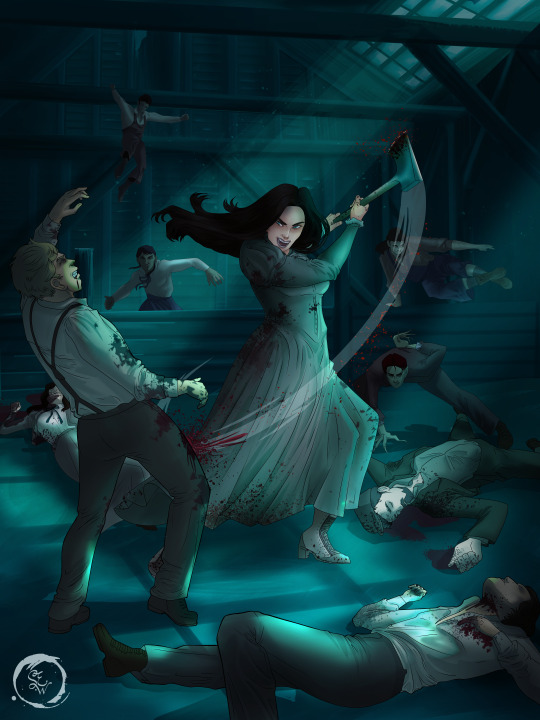
Step 1: Research.
First off, get to your image search. If you are going to be using Google, you may want to type “-pinterest” in the search to eliminate the countless boards.
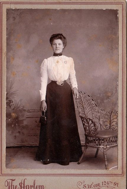
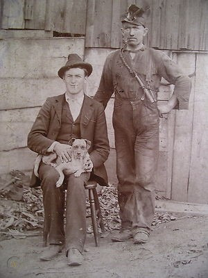
I had to figure out clothing that is vaguely late 1800s. I found a multitude of reference images that were fancier clothes- but I wanted to find images of clothing for kindred across all social classes. Photographs from the era and paintings are your friend. They will more accurately showcase what was worn.
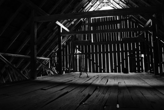
After Fashion research comes location research. The 1890s in America is known for the rapid industrialization. Factories were getting bigger and work days were getting longer. But, I wanted the moonlight to be cascading into the place, illuminating the scene. This means I needed to find a structure that had skylights or let sunlight in. And the best images I found? Slaughterhouses. Fitting, huh?
The same rule for fashion still stands- if you can find photographs or paintings from the era- they’re better. There are tons of places still standing today from the 1800s. But today, they look WAY different. Ya know, Abandoned! So just be sure to take this into consideration if you search “abandoned slaughterhouses” or go trespassing like I did.
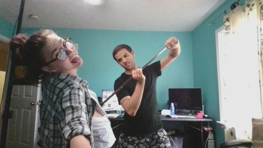
Lastly, pose research. Finding the poses for a fight scene can be tedious. So, I enlisted some help from a few fight choreographers and stunt men. You can record their fights and play them back at quarter or half speed. You can also get a mirror and flop on the floor a bunch. I did both. This lets you see the action/motion lines you are going to replicate in the drawing. Heres how we initially did fina’s pose:

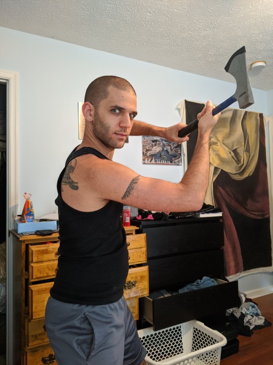
And sometimes you have to go back and get a clean shot. I ended up using this pose for the axe.
Step 2: Set up and Background!
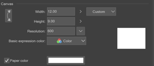
When you open a new file, set it to the dimensions and resolution you want. I was working at 600. Usually, I’m working at 300-350. You can always reduce resolution. Its hard to prevent fuzzy lines if you increase it later.
I cannot stress the following enough:
You work background to foreground. Big Shapes and areas to little shapes. Work your way forward. What this means is you need to fill in as much space as possible first. Then build your details. I prefer working as follows: Big Solid tones, Soft shadows, Dark Shadows, Highlights, then final blend. Once you finish this, put an overlay on top. This knocks everything back and helps create the illusion of depth. See this at work with the video below or here
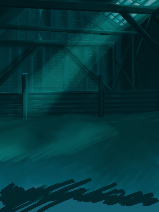
Step 3: Figure Drawings + Composition
Utilize that research and images you collected to pose your characters. I create subfolders for each set of figures. Organization is important here. This will help keep you on the right layer and prevent the eternal digital artist struggle of “Fuck that was on the wrong layer!”
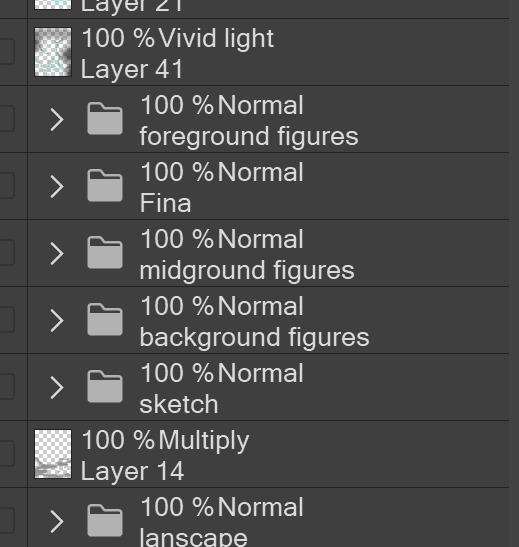
Even after you move on to lineart and shading, Keep the sketch layer as a reference. You may need to see what youre original notes/ figures looked like as you do the lineart and shade. Don’t be afraid to move them around and alter the composition rn. You want to be able to make changes. Make notes! Detail light sources!
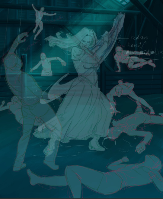
I’m about to through out some art jargon:
You want to think about asymmetric balance. The easiest way to achieve this in an eye-pleasing manner is to use the Fibonacci spiral. Yeah. This boi:

Place your figures and actions in a similar sequence to the spiral and the viewer’s eye tends to naturally follow it. This is sometimes called the Golden Ratio in the art world.
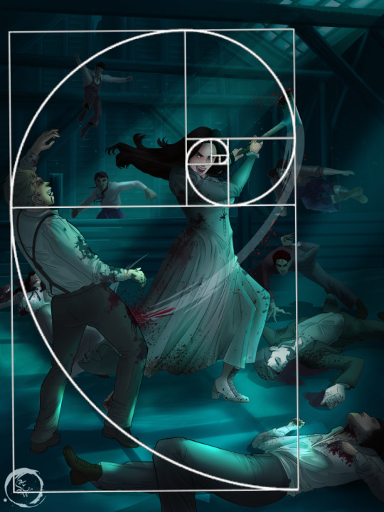
Doesn’t need to be perfectly on the spiral. You can break it- but its an excellent tool to plan how things move in the piece.
Step 4: Lineart
Once you got things sketched- its time to do the lineart. I’m using clip studio paint’s standard brushes. Nothing fancy. I often switch between the G-pen and the For Effect Liner. Mapping and Turnip are for thicker lines.

Usually I set these pens to a specific thickness depending on where I’m drawing.
My background figures are lined at 0.05 thickness, the midground is .1 to .2, Fina is .3 and the foreground is .4. I set my stabilization high to help keep my lines smooth. Stabilization 100 means there’s a significant delay between where the pen is and the cursor. I like the stabilization to be at 20 for freehanding and at 50 ish for outlining. Dont become completely reliant on the stabilization though. Good and smooth lineart is drawn from the arm not the wrist. Your range of motion is severely limited if you only move your wrist. Practice moving from your elbow and you’ll be surprised how much smoother your lines get.

Once I finish lining the figures, I usually go around it with an outline. This does three things:
1. Solidifies the figure and cleans lineart for paint bucket tool. More on that in the next step.
2. Its a stylistic choice. Helps give it that comic book feel with a heavy outline.
3. Pushes figures forward or back in the composition. Thicker outline helps denote that a figure is farther forward than another. My background figures have no outline to push them away
Step 5: Digitally coloring
For each figure you are going to select outside the lineart.
Create a new layer under the lineart
Invert the selection. Paint bucket. You should now have a solid shape of the figure under the lineart. Do not deselect.
Create a new layer above the one color. Title it solid colors. Paint in thick, solid tones. I like to use the mapping pen and turnip pen to color in my solid tones: skin, clothing, hair, etc.
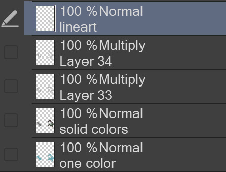
After that, deselect. Create a multiply layer if you can. If your program does not have a multiplier function, Pick a tone you want to use for shadows and lower the opacity (usually 30-40% I like to use lavenders or blue tones). It will not be as vibrant, but you can edit it in post. Select off of the solid colors layer. I like to start with skin tones. Use the airbrush tool to create soft shadows. You don’t want to create harsh lines on this layer.
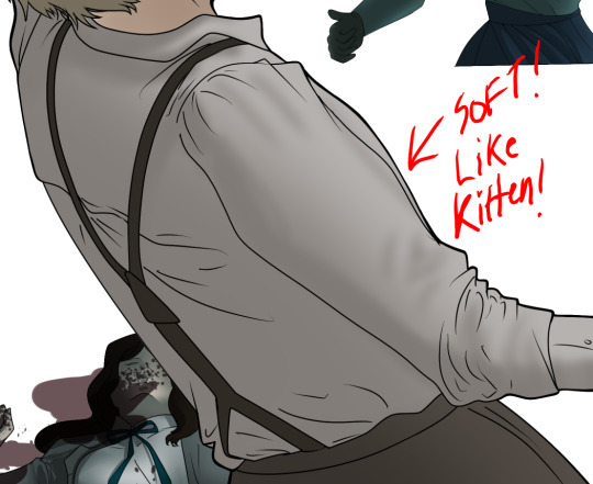
Then repeat this process with harsh lines.
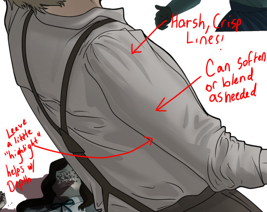
Then knock it all back with an overlay. If you dont have the ability to create an overlay, you can again drop a solid color and lower the opacity, but you’ll have to mess with the color balance/ brightness/contrast to let all the hard work come through.
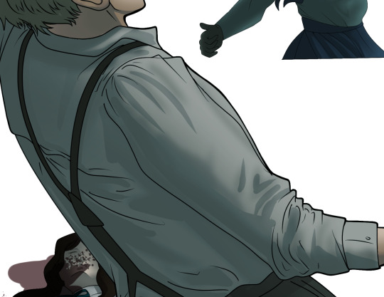
You’re going to repeat this for every single figure. Here’s a few color theory tips though.
Your overlay colors should be darker (not more vibrant) in the foreground and lighter (avoid using pure white) in the background. This helps with the depth of the piece. Things closer tend to be darker (not always true, depends on lighting)
You can choose to use color theory to aid your shadows. Instead of choosing black or grey for shadows, choose a complimentary color. I used a lot of green for this piece, I used red for really dark shadows. Its not that black drains color- its just loses some depth if not used carefully.
Keep your colors consistent. Helps unify the piece. You can strategically break the consistency to draw focus. For example, Fina is the only figure with a true blue overlay. This helps her stand out from the other figures who have reds and greens.
Step 6: Touch Ups and Final Renderings
Now comes the most tedious part. If you’re like me, your computer fans have been whirring for the last few hours trying to render this monster of a file. If you havent already, SAVE FOR THE LOVE OF ALL THINGS GOOD

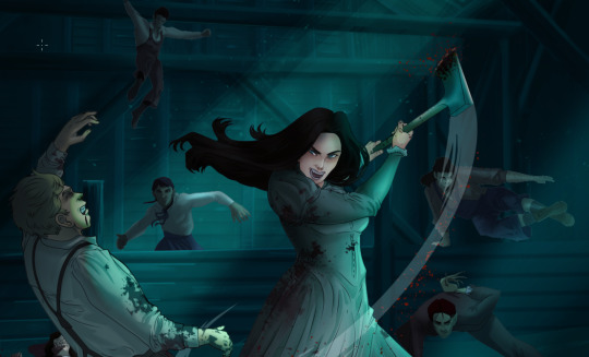
These are the last four layers I have for the entire piece. Here, I am trying to create effective and believable lighting. This kind of work I have only been able to achieve in clip studio or photoshop. You can do it with normal layers, but choose your colors CAREFULLY. Stay away from pure white. Carefully utilize your knowledge of light and shadow to create soft highlights. Harsh lines tend to be a stylistic choice for me. The final layer, subtract, dulls out harsh red tones. I used this as a final overlay to help put everyone and everything in the scene. Without it, things are a little too green and skin tones are a little too blushed for vampires.
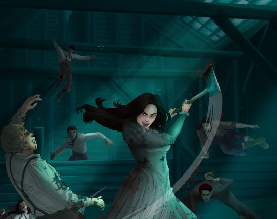
The challenge here is I want to tone down the red, but not lose the vibrancy of the blood. So, shift it to a blue. This also helped reinforce the “nighttime” effect. Its only a slight change.
Final thoughts:
Whenever you finish something, its important to reflect.
1. I am so FUCKING PROUD OF MYSELF. This is easily one of the most complicated pieces I’ve done in a while- and I’ve made 16′ tall faux stained glass. Brag. Let yourself feel awesome cuz you just made something awesome.
2. I timed myself on the piece. I could have easily spent another 7 hours on it. But its important to know when to stop messing with it. Partially for budget reasons but also when you get down to the details you can make yourself go insane. Theres also a ton of detail work I lost cuz of overlays or its just too small to notice. Fina’s face? hard to see cuz its not close enough.
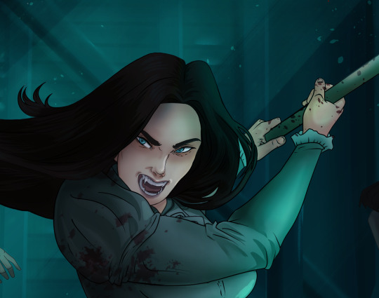
3. I needed to take frequent breaks for this piece. That was good. Resting and stretching was very important. That is one of the reasons why I was able to work so fast.
4. I started doing more digital art in April 2020. I have to say, practice makes perfect. I practice drawing and digital painting for at least 3 hours a day.
That discipline has allowed me to improve so rapidly. So- I don’t wanna hear shit about I can’t possibly get this good! Or I couldn’t even draw a stick figure! BULLSHIT. You can. Get yourself some free software like Krita or Autodesk sketchbook and start playing!
And thats what I got! Thanks for coming with me on this long post!
27 notes
·
View notes
Note
Could we please get a tutorial on how you did your latest lookbook? Ily 💌💌
ok this is gonna be a long post so under the cut is a general tutorial, i cant go step by step exactly as i did it since i didn’t save the editing file, but here’s at least my basic process i always start out with, plus how to do the silhouette effect i used in the last example!! also i’m not sure about your experience level re: image editing or digital art so i’m going to try and explain it in a way that hopefully anyone can understand but please feel free to come to me with more questions!! Also my screen res is very wide but I wanted to be able to show off where all the menus are, so clicking on the images for full view may be necessary for you.
OK so step 0 is gathering materials- you will need a photo that you want to edit plus an image editing program. You can easily get photo’s from your switch with the switch’s built in image sharing mode, either by posting them to facebook or twittter, and then saving them to your computer from there. Or if you have a computer that can read a microsd card or you have a microsd card reader you can plug into your machine, you can transfer images that way. The only other thing we need is an image editing software. I will be showing you my process by using Clip Studio Paint but you don’t need to use this specific program. I personally recommend using a program that allows for transparency even if the end result isnt transparent because it’s easier to move layers and elements around but that being said you COULD edit images with a program as simple as microsoft paint. There are free more advanced softwares out there like krita, gimp, fire alpaca, etc.
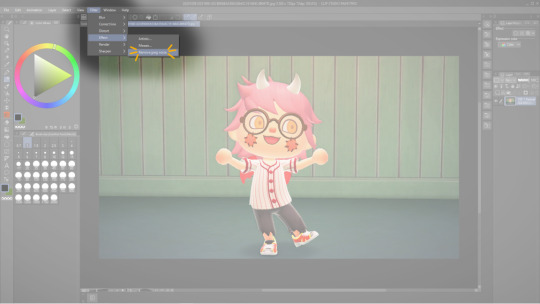
Step 1) While this step isnt necessary, I personally run my images through a filter to reduce the JPEG noise, to smooth out edges and to make the image clearer. You can also use websites or apps that do this for you like waifu2x or yome2x if you want.
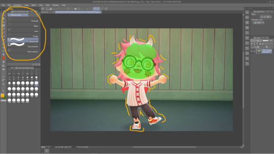
Step 2) Isolate your subject from the image’s background. You can either choose to just erase away directly on the image layer or you can use selection tools to choose the parts of the image you are going to separate first. I prefer the selection method because then I can use a masking layer which I’ll get into in the next step. You’ll want to erase or select out everything except for your character (or other photo elements you want included in there too like if you decorate a bit). There are many different ways you can use the selection tools depending on if you want to opt for speed or for the cleanest possible edges. I usually use the magic wand tool to get a good chunk of my selection and then go in with the selection brush for precision.
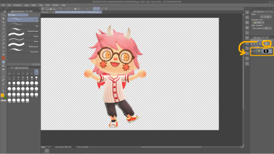
Step 2.5) If you have opted to select out your desired subject then the next step is to create a masking layer. The easiest way to do this is to finish your selection and then to hit the Quick Mask button circled in yellow, it is represented in my version of CSP as a rectangle with a dark circle inside. This will automatically create a mask including everything except your selection, making those unselected elements completely transparent. The mask if shown to the immediate right of the affected layer. The black bits are what is hidden and the white is what is shown. You can edit the mask using the brush and eraser tools- the brush will expose hidden bits of the layer and the eraser will hide. You can also create a layer mask by opening the Layer menu at the top of the window > Layer Mask> Create from Selection. This is how it works in CSP, other softwares may not make use of the eraser tool but instead only the brush tool will be needed to edit a mask. I encourage you to search the web (google, duckduckgo, etc) “masking layer + (your drawing program)” for specifics on your particular program.
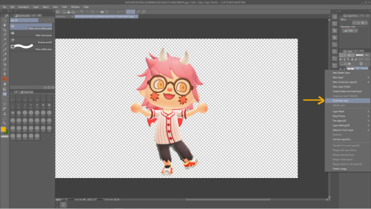
Step 4) Now comes the silhouette effect specifically from my lookbook post. Duplicate the character layer. This will create an identical layer for us to edit.

Step 5) Create a new empty layer and make sure it is on Top of yhe layer we just duplicated in the above step. Then create a Clipping Layer using the empty layer. Clipping layers will chain to the layer immediately below, and allow you to create effects that only affect the layer it is attached to. You may chain multiple clipping layers to a single layer in order to layer almost infinite effects.
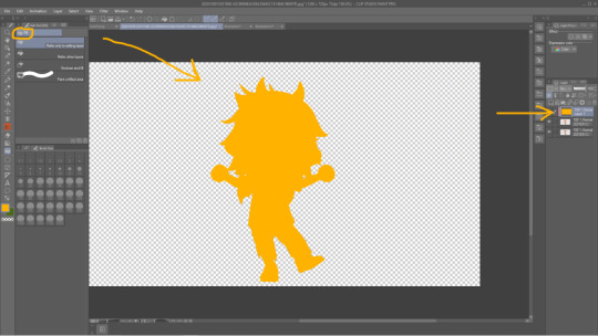
Step 6) Using the fill/Paint Bucket tool, fill the empty clipping layer with your preferred color. Notice how the layer is technically completely filled with yellow, but it only shows up in the actual image as the shape of the layer the clipping layer is attached to!

Step 7) Reorder your layers so the original layer we started with is displayed on top.

Step 8) Use the move tool to drag either the copied layer or the original layer around to a position of your liking. You can then repeat this process as many times as you want, using whatever colors or gradients or brushes or textures you like.
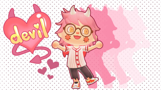
Step 9) Draw or import textures or clip art* or literally whatever to decorate your image how you like. Elements from this piece include a heart shaped brush that came with CSP for free, a polka dot screen tone brush I downloaded for free from the CSP shared asset website, and hand drawn elements and lettering done by me! *When using materials you find on the internet for your edit work please, please make sure you have permission to use it. Don’t take art from people’s art blogs and turn them into stickers or whatever unless u have permission. If you dont want to draw it out yourself i recommend searching the web for royalty free clip art or textures. Hopefully this tutorial was what you were looking for! If not you can always ask me more questions and if it’s helpful or interesting for anyone out there the next time I make a lookbook edit I can record that as a video so you can see my step by step process as I actually create the image,
18 notes
·
View notes
Text
Drawing tablet recommendation!
So a lot of you know I not only write but draw and paint as well. Digital space is my favorite to work in because it’s so forgiving, powerful, and easy to use. For a lot of people, making the move up from paper and pencil to digital is a big, scary leap that is usually also a tad expensive for most to break into.
I don’t usually post random reviews of stuff, but with the holiday season upon us and potentially having people looking for something for themselves or others and this being SUCH a good product already I had to at least drop it for anyone considering something like this. It’s a bit long, so I’ll leave the rest under the cut, but if you’re looking to gift someone the ability to draw digitally or are just trying to try it out without breaking the bank, please give this a read!
Well, good news everyone, Wacom is dead to me and let me introduce you to my new best friend the Huion H640P!
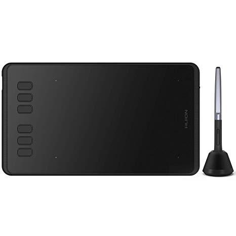
On the website it’s listed at $50, but I nabbed this buddy for $40 off of Amazon (still through the company, just in an Amazon storefront). When you compare that to the $80 Wacom’s lowest level tablet (currently Intuos, I think), it’s a clear bargain, but especially in comparison to the latest versions of the Intuos it has some major advantages!
Pen stand (you don’t know how nice this is until you don’t have it!)
4 More quick buttons than Intuos (once you get the hang of these, they’re indispensable!)
All buttons are on one side of the tablet instead of being on both sides
Android device compatible (I can’t take my laptop everywhere anymore, but now I can neatly pack this little guy and pen in my bag and draw on my phone!)
USB adapters included! (Even a Type C adapter which my phone uses!)
These alone are reasons to me to spend less and get more than going through Wacom. The active area automatically shrinks to match the ratio of the phone screen so drawing flows smoothly (this was the reason I bought it in the first place) and it requires absolutely no installation on phones - just plug and play!
On PC/Mac you will need to install the driver which will require you to go the site and select, download, and install the correct model driver to use properly, but once it’s done installing I didn’t even need to restart to be able to use it.
I have an older model of the Wacom Intuos, a Cintiq 16HD, and my first good tablet was an old Intuos model I ran into the dirt. The H640P more closely resembles the latest Inutuos model which is marketed as a beginner/hobbyist tablet, but frankly for most it’s all you’ll ever need! It draws smoothly with good pressure sensitivity and control. It’s really seamless if you already have experience using a tablet, and if it’s new to you it will take a learning curve to develop the hand-eye coordination, but this is a very friendly tablet to learn on.
If you’re concerned about the size, don’t be. Especially if you’re one to curl up with your drawing tools like I am, this fits neatly and lightly into your lap and is more than enough space to draw since it adjusts to the ratio of your computer screen after the driver is installed. You can also rotate the tablet to put the buttons on the other side if you’re left handed or if you just want to orient the tablet differently. You can use the settings to customize the function buttons, buttons on the pen, pressure sensitivity, as well as the working space.
If this tablet was available years ago I would have abandoned Wacom forever and a day ago. Competitor tablets and tablet displays from companies like Huion and XP Pen offer the same (if not better) functionality and design for literal fractions of the price now. Some people have issues with their drivers or other design choices, but frankly Wacom does not have a great track record with me, either. When all of my gear gives out I’ll be going to these companies to replace them. There’s no reason for Wacom to have such a strangle-hold on the market any more.
Bonus:
If you’re in the mood to continue saving money in terms of drawing programs my first recommendation is:
Autodesk Sketchbook
It’s a completely free program (just create a free Autodesk account) with both desktop and mobile versions, supported by Android, Windows, and IOS. You’ll get the full functionality of a paid program such as fine-tuned brush controls, custom brushes, and unlimited layers but in a layout that is easy to learn and experiment with, which for someone new to digital art can be a godsend!
There are other free programs such as IbisPaint and Krita that will work just fine, but if you’re really and truly new to this world, Sketchbook was my go-to for the longest time as a professional artist before I converted to Clip Studio Paint. I’ll always recommend CSP over anything else now because of how powerful and useful all of its tools are, but for someone just dipping their toes in on a budget, Sketchbook is your best friend.
12 notes
·
View notes
Text
TIPS FOR STARTING A POKE-ASK BLOG - MASTER POST
HEWWO THIS IS A MASTERPOST OF ASKBLOG TIPS CREATED BY SKITTY-A-DAY MOD. I HOPE YOU FIND THIS TO BE HELPFUL IN ANYWAY AND IF YOU HAVE A TIP THAT IS NOT MENTIONED ON THIS POST, FEEL FREE TO COMMENT IT AND I WILL ADD IT RIGHT AWAY. - Keep your presentation clean and professional. By this I mean do your best. Try and post finished art. Don’t leave the rough lines underneath the finished work, try to avoid quantity over quality. A tip for this is to avoid overly complicated character designs! Keep it simple and sweet, and easy to recognize. That way you can draw it over and over without stress. For digital artists, or artists learning digital art. Here are some resources for you: Free: - Paint Tool SAI (Cracked. I use this version, it should be safe to download) - FireAlpaca - Krita - Medibang (Avaliable on the App store as well) - ibisPaint (App) - Autodesk Sketchbook (App) - OpenToonz (Animation software) Not Free: - Manga Studio 5 / Clip Studio Paint (I own this, I highly recommend it) - Photoshop (There are cracked versions, but please be safe) For traditional artists, it may be a bit rougher for you because digital art tends to be a bit more eye catching. But if you can’t make the transition to digital, here is a tip. If you can, use a scanner for your work instead of a phone. If you do use a phone, use this wonderful app: Camscanner
- Choose a Pokemon that you love but is easy for you to draw. Your best choices should always have arms. I know you may adore wooper or may love dratini. But if your muse lacks arms and even legs, your ability to draw responses will become incredibly limited as your muse cannot physically pick stuff up or easily interact with the environment. Looking at you voltorb.... - Character first, Pokemon second. Don’t look at a Pokemon and simply decide you’ll make an askblog revolving the said Pokemon simply because they’re cute or popular. It’s bad practice and can lead to you losing motivation for your blog. Try to develop a character first and create a reason for their existence, develop the world around them, give them motivations and struggles. Then choose a fitting Pokemon you love. - DON’T give into impulse blogs. I know that one Pokemon is awful cute…. I know how you think it would be real cute and easy to draw everyday and that you’d figure out a plot/character later…. DON’T DO IT THAT IS THE DEVIL TALKIN’ TO YOU Plan your blogs out. Don’t impulsively start a blog that honestly means nothing to you. Trust me, you will likely drop it within a month. And if you keep changing muses/recycling the blog, people will lose interest as they can’t keep the connection to the characters up. - On a similar note, DON’T JUMP ONTO POPULAR POKEMON BANDWAGONS. Or do so if you wish, but like with the impulse blogs, try not to create a blog simply because the Pokemon is popular/new. It will lead to inactivity if you don’t really have the passion for the Pokemon and instead jumped on board for the fad. Fads fade and so may your interest for that Pokemon! - Try to not oversaturate your ask roster. Unless you have great experience with it, try and keep your ask blog to one to two muses minimum. It’s more intimate for the audience learning about one or two characters than it is trying to keep up with a large cast. - Plot based blogs are hard They can be very draining and difficult to keep up with. I’ve noticed that this is one of the number one reasons why people drop their blogs. Story board your blog first if it’s plot related, as in make sure you at least write down major story beats and details. Do not rely solely on asks to keep the plot going, you won’t always gain the necessary asks you need. Make standalone story posts / comic pages to help further serious plot points. If you want to even, follow this next advice: - Send asks to yourself. Honestly, don’t be afraid to send asks to yourself. There’s nothing shady or embarrassing about it. If you’re a new blog and can’t seem to get enough asks to reply to / garner interest to get more asks rolling. Send some anonymously to yourself! Or have a friend send them! There’s no shame in prompting yourself to give yourself a head start you need. I gave myself a couple asks when I first started! With the format of ask blogs, you do what you gotta do to keep the format going! Another reason to send yourself an ask is if no one is noticing the finer details of your plot / characters! Perhaps you want to give a subtle call out to a detail people may have missed, send yourself an ask alluding to this said detail! - Interact with the community. THIS IS THE MOST IMPORTANT TIP. Unless you happen to have some ballin’ art right off the bat (even then...) you’ll rarely gain any followers or interactions unless you give with equal parts take to the community. Send asks, reblog other’s art with your added interaction, follow others! In return you’ll gain followers from that sort of friendly exposure. Keep in mind that the community seems to run on the mutual exchange of drawing each other’s muses. It’s fine if you don’t want to draw the muses featured in asks and focus on stuff like your own characters, but know that drawing other people’s characters encourages them to do the same for you, and as a result makes your character’s design more well known and recognized. - Join Pokemon Discord servers. There are plenty of them out there! Get to know the mods of blogs personally and then you’ll be able to support each other’s work on a more intimate level! If you have a Poke Discord, feel free to comment / reblog this post with a link to it! - Be consistent. Try not to disappear for long periods of time unless you need that mental break (I’m pretty guilty of that) A lot of popular blogs tend to have an upload schedule / have a steady pace in between uploads. On the flip side, don’t be afraid to take breaks! Keeping up with your blogs and your followers is wonderful and all, but if it’s taking a toll on you, popularity means nothing when it comes to your mental health. Stock up your queue if you wish, a queue is an artists’ best friend! But please take breaks if needed. - DELETE OOC CONTENT This one is a big one. I know some people don’t want to bother with a mod blog. But trust me, keeping your blog free of unrelated content is REALLY important. Visitors who come to your blog to see your work will inevitibly be turned away if they encounter nothing but ask memes and other unrelated relogged content. I know it’s your blog and you can do what you want with it, but if you want that ease of access for your followers, be considerate and provide what they followed for. Delete ask memes when you’re done with them, and keep unrelated reblogs to a personal / mod blog. It helps a lot in the long run with maintaining a viewer’s attention and interest. - HAVE A REFERENCE OF YOUR CHARACTER LINKED ON YOUR PAGE That means find a theme that will allow you to do so. There are plenty of tutorials online on how to find a suitable theme and implement it! People responding to your ask or interacting with your character will want to have that said character’s ref available on hand. It’s considerate to have it readily available for them so that they don’t have to dig through your blog! - Tag the person who sent you the ask in the finished response! (Provided by @walking-in-a-dream) After you’ve finished an ask sent to you by someone who wasn’t anonymous, tag them in the finished work, even if you are answering them directly. Tumblr, especially as of late, rarely notifys you of these sort of things. So if you tag the person asking, it’ll give a better chance of them seeing! - Reblog the asks you sent out! (Provided by @walking-in-a-dream) On the flipside of the previous tip, reblog the finished response someone took the time to create for your ask! It’s polite and it helps out that said artist by sharing their finished work! This may conflict with the ooc content tip, but this takes priority. Help out your community and share answered asks! - Draw for yourself, not for popularity (Provided by @leilani-popplio) Do not draw for popularity or any other goal in mind other than for your own enjoyment. If you obsess over your follower count or your notes, it can lead to unneeded disappointment, jealousy, or stress. So please do yourself a favor and don’t worry about what’s ‘popular’ Everyone works at their own pace and your blog will blossom with the love and dedication you put into it! - Tag your work! (Provided by @deathbycelosia) This is very important, for two reasons. One reason is for the exposure to new followers! If you tag your work with relevant tags, new people searching through those tags will find it! Tags may include: Pokemon, [Insert specific pokemon], pokeask, and askblog! Another reason is to organize your posts for the convenience of others. When your posts are tagged by character, by plot chapter, event, etc, it gives a better ease of access for your followers to find posts with certain content! [more to be added]
#I wanted to make a formal version of this#Like a masterpost#Please feel free to add onto it!#I'll keep expanding it!#pokemon#pokeask#pokeaskblog#askblog#tips#resources#poke askblog
242 notes
·
View notes
Note
Do you have a tutorial or guide or anything on how you do colors because all of your pieces have such nice colors and lighting Seriously, the use of colors in your art isn’t something I’ve seen very often; I was wondering how you choose them & how you get those effects with the software? Thanks so much is advance if you choose to answer this :)
Thank you ;;;_;;;!! I do, but I think it needs a revamp.
I’m going on a very long ramble.

(Heads up! I’m not professionally trained, I have just watched and read a lot of tutorials and deviated from there with my own thing. Unless it has something to do with color blending modes, there is a good chance that I am using a silly fake term for many of these concepts. Also, I use Krita, but everything here should also be done possible on Photoshop, Medibang, GIMP, and I believe Clip Studio Paint. Autodesk Sketchbook and MyPaint don’t have filters like color balance, sharpening, etc. and I don’t know of an easy way of changing the saturation of a painting on SAI and FireAlpaca easily since I’ve never used SAI, I’ve only used FireAlpaca once in a blue moon, and searching for either doesn’t give a “one click” option that doesn’t require undos... but everything about color choices/lighting/color filters/blending-modes-that-aren’t-saturation should stay the same.)
There’s as many ways for things to be beautiful as there are birds in the world. But that’s too many birds, so its good to have a process that you try to follow. This is kind of an ideal setup, but I think this is how streamlined I wished I paint. (I usually bop between consolidating colors and adding detail, continuously, for all eternity until i give up and smash that post button blindfolded. I’ll explain what this means.)
So color wise, I try aim for two things: good value blocks and balance (cohesion), and interesting hue variation (jitter).
------
Setting the Ringabel painting with the saturation at 0%/setting the colors on grayscale, then simplified:


These blocks of different colors both provide structure to the painting, and also add to the composition. The thing I want people to notice most - Ringabel’s beautiful, luscious hair that he lovingly tends to every morning (and his face I guess) - is the area with the most contrast. There are logical-ish subdivisions between each part of the painting and I want to preserve these chunks of logical blocks throughout the painting process, or swap them out for Even Better Blocks.
Even then, I want there to be visual interest and a balance of values around the entire piece, which is why I added lighter glitter around areas that aren’t interesting enough to have real detail. No one is going to stare at that area too hard, but without it, this dynamic painting feels too empty.
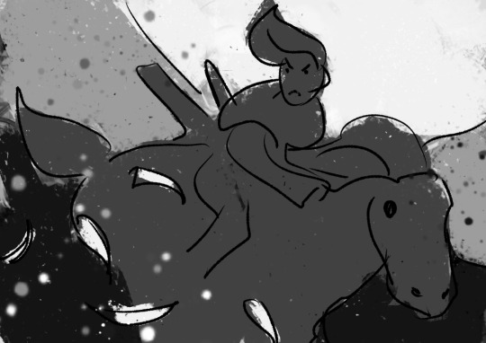
Also, if I were to do the painting from the ground up again from this thumbnail, I’d also include gradients, to aid in carrying the eye to the focus having a better base to build on.
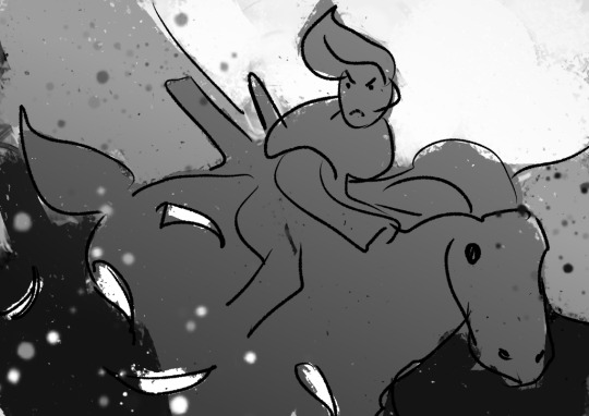
This also makes it easier to play with the lighting before getting to the meat of the work!

----
If we take Ringabel to max saturation, you can still see a bit of the value blocks, but there’s just a lot of colors slapped around everywhere:

I like this effect because it squeezes the maximum amount of visible interest out of a block of color as possible while still keeping the cohesion. And it’s not too hard to do - when you shade your painting, use two different colors instead of just one. When you add lighting, use two different colors. When you have a blob of color, slap some random color on that blob using a softlight blending mode.
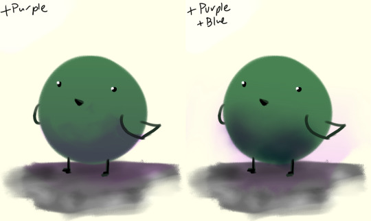
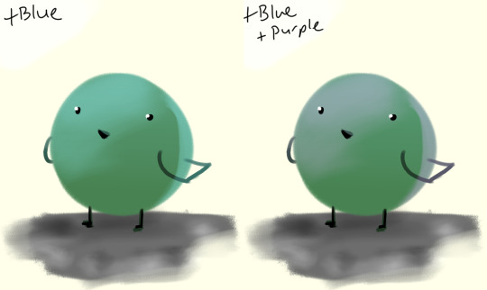
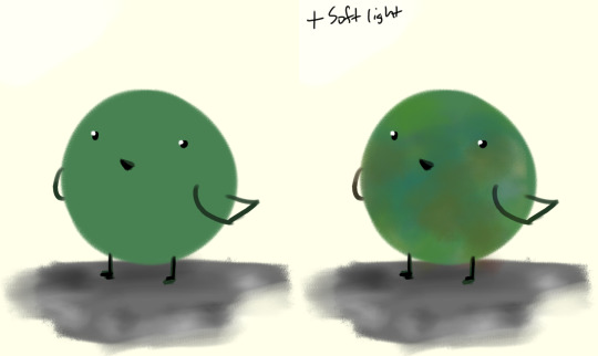
If there’s a concentration of color around an area and there’s an unbalance, add that color on the other side of the painting, to balance.
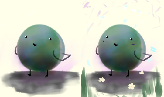
I like to call this jitter.
----
Let’s talk about cheating really quick:
“I kinda want mess up the colors but in a way thats kinda consistent”
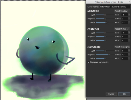
“This is too bright.“
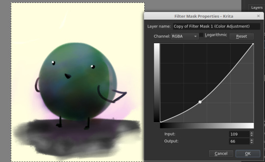
“This is too dark.“

“There’s not enough contrast!! >:(“
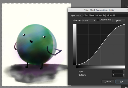
“Too much !!!! Contrast!!!!“

“THIS IMAGE WAS SUPPOSED TO BE PURPLE“
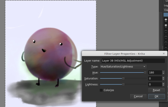
There is magic in the filter list. Jump in and have fun! (And fix your stuff.)
----
And.... that’s the philosophy.
Keep big chunks to stay organized
But have randomness to be fabulous
No shame in fixing mistakes.
----
So from that, actual painting process for Ringabel on a Horse (clop clop). Here’s the thumbnail, which I drew before I knew how horses worked:
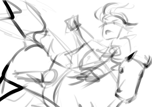
Then we choose hues. This will change over the course of the painting; I ended up with Green, then Red, then Yellow, then blue?
Then, allocate the colors in this way -
Dominant Lighting, Secondary Shading
Secondary Lighting, Dominant Shading
Rim light, another light source
Random random pops of color. because why not.
And pop them in this order:
Base/lineart
Initial color
Random colors (literally any color on the wheel) - Softlight/overlay - introduce jitter
Area Light 1 - (1) - Softlight/overlay - cohesive light
General shading - (2) - Multiply - cohesive shading
Detail shading - (1) - Multiply - jittery shading
Rim light - (3) - jitter - Softlight/overlay/COLOR DODGE - cohesive, out of left field light
Area light 2 - (1) -Softlight/overlay/COLOR DODGE - cohesive light
Detail - ;;_;; - FIX YOUR MISTAKES, C L E A N
Consolidate - (All 4) again to fix colors from the detail portion
GLITTER - (All 4) - jitter, glitter
Filtering - :D
The idea for 4-9 is that we have a balance of detail (jitter) and cohesion that we need to upkeep, and we need to strike a balance between adding cohesion and removing detail, and vice versa. Usually, I repeat those steps over and over and over and over, trying to get it just right. I tried to keep it simple here for the sake of the tutorial and my own sanity.
And now we do the thing.


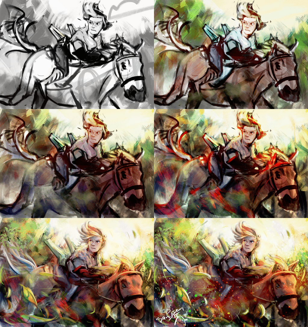
Thanks for sticking around, and have a fantastic day!
#tutorial#art tutorial#digital painting tutorial#painting tutorial#sorry this took so long#thank you for the request#and have a good night!#hotvivitea
19 notes
·
View notes
Text
Anytime someone suggests alternative software to big ass companies that have wonderful software instead of pirating I gotta wonder.
1. Is the recommendation coming from someone who has any idea if people have tried using the software?
2. Does the person realize that indie software tends to not update itself in the methods they choose and can in fact go in the same style of a giant corporation sometime?
3. Have a manual on how to operate, adjust and get comfortable with the new software?
4. Understand that a lot of people who require their school assignments done in one program cannot just use a completely different program and get away with it?
Because honestly the last point is a huge thing for a lot of people in art, animation and graphic design that are pushed to get Adobe services.
There’s places and areas where- because it is an industry standard- you can’t just use an alternative software.
And individualism and supporting other softwares are great, if you haven’t seen indie companies and designers end up in the same boat as their competitors.
Adobe went from having some free software, to a one pay use, to a full subscription. It’s steps. I remember when you could just buy the software you needed, it wasn’t that long ago. Same with Word and other services that used to be free and have since moved on.
And yeah, it sucks, a lot that you have these companies that are taking advantage of people, and are going to extreme prices, but the alternatives aren’t exactly going to stay free forever, especially things made by indie designers.
Someone who wants photoshop isn’t going to exactly like the idea of Medibang or even Paint Tool Sai, particularly if, yknow, they’re not looking for something as an artist but rather they want to do the image manipulation of photoshop.
Learning new programs is hard.
And for art I have used:
- Clip Studio Paint (A semi-favourite)
- Microsoft Paint
- Microsoft Paint 3D
- Kids Picx (? Unsure the versions)
- Paint Tool Sai
- Paint Tool Sai 2 (demo version)
- Krita
- Medibang
- Artstudio (iOS app)
- Artstudio pro (iOS app)
- Fire Alpaca
- Procreate
And I would recommend like… half of them maybe?
I haven’t even put Gimp on here because I can’t even figure out how it worked and it was a pain.
Half of these I struggled to use or dropped.
Hell, I paid for Sai. Guess what? It crashes so much I have to redownload it every month.
I’ve seen other people who swapped programs struggle immensely.
And the worst part is no, none of these are substitutions.
Pressure sensitivity is a huge tool in art, brush customization, everything is different from program to program.
Some programs aren’t accessible- keybinding remapping for people who need it.
Some are insanely hard to adjust to.
Others are insanely glitchy and unwieldy compared to others.
A great example is Google Documents vs other writing programs, there’s differences and sometimes those differences actually can make or break a program.
If given a choice, I would go back to Microsoft word, it was easier to use for me especially with writing, and had the pleasant upside of me not needing to be online to write.
Wordpad is awful, I can use it but I’d rather not. Notepad and Notepad+ I’d give up writing if I had to go to it.
And yeah, someone searching for other programs, give them the list of alternatives and let them test and try out what they enjoy.
But if someone is talking about say, wanting to pirate photoshop, stop telling them to go to another program, they never asked for it, and you’re derailing shit.
And quit bullshitting the “well this program is just as good” because you’re wrong and I haven’t found any program that works like a mirror for another one. It’s a lie and an insidious one at that.
0 notes