#does xkit even work anymore..?
Explore tagged Tumblr posts
Text
i hate how tumblr has changed.
can we not copy and paste into inboxes anymore?
11 notes
·
View notes
Text
oh my god what has happened to this place
#☼ ╱ ☽ —out of character— ☾ ╲ ☼#at least my tags work???#hello hi salutations#what the FUCK is “tumblrmart” oh my god#does xkit even work anymore#does rping even work anymore#so many questions#i appreciate that tumblr has never changed in terms of confusing me consistently for eons
4 notes
·
View notes
Text
Oh, you know, just the usual internet browsing experience in the year of 2024

Some links and explanations since I figured it might be useful to some people, and writing down stuff is nice.
First of all, get Firefox. Yes, it has apps for Android/iOS too. It allows more extensions and customization (except the iOS version), it tracks less, the company has a less shitty attitude about things. Currently all the other alternatives are variations of Chromium, which means no matter how degoogled they supposedly are, Google has almost a monopoly on web browsing and that's not great. Basically they can introduce extremely user unfriendly updates and there's nothing forcing them to not do it, and nowhere for people to escape to. Current examples of their suggested updates are disabling/severly limiting adblocks in June 2024, and this great suggestion to force sites to verify "web environment integrity" ("oh you don't run a version of chromium we approve, such as the one that runs working adblocks? no web for you.").
uBlockOrigin - barely needs any explanation but yes, it works. You can whitelist whatever you want to support through displaying ads. You can also easily "adblock" site elements that annoy you. "Please log in" notice that won't go away? Important news tm sidebar that gives you sensory overload? Bye.
Dark Reader - a site you use has no dark mode? Now it has. Fairly customizable, also has some basic options for visually impaired people.
SponsorBlock for YouTube - highlights/skips (you choose) sponsored bits in the videos based on user submissions, and a few other things people often skip ("pls like and subscribe!"). A bit more controversial than normal adblock since the creators get some decent money from this, but also a lot of the big sponsors are kinda scummy and offer inferior product for superior price (or try to sell you a star jpg land ownership in Scotland to become a lord), so hearing an ad for that for the 20th time is kinda annoying. But also some creators make their sponsored segments hilarious.
Privacy Badger (and Ghostery I suppose) - I'm not actually sure how needed these are with uBlock and Firefox set to block any tracking it can, but that's basically what it does. Find someone more educated on this topic than me for more info.
Https Everywhere - I... can't actually find the extension anymore, also Firefox has this as an option in its settings now, so this is probably obsolete, whoops.
Facebook Container - also comes with Firefox by default I think. Keeps FB from snooping around outside of FB. It does that a lot, even if you don't have an account.
WebP / Avif image converter - have you ever saved an image and then discovered you can't view it, because it's WebP/Avif? You can now save it as a jpg.
YouTube Search Fixer - have you noticed that youtube search has been even worse than usual lately, with inserting all those unrelated videos into your search results? This fixes that. Also has an option to force shorts to play in the normal video window.
Consent-O-Matic - automatically rejects cookies/gdpr consent forms. While automated, you might still get a second or two of flashing popups being yeeted.
XKit Rewritten - current most up to date "variation "fork" of XKit I think? Has settings in extension settings instead of an extra tumblr button. As long as you get over the new dash layout current tumblr is kinda fine tbh, so this isn't as important as in the past, but still nice. I mostly use it to hide some visual bloat and mark posts on the dash I've already seen.
YouTube NonStop - do you want to punch youtube every time it pauses a video to check if you're still there? This saves your fists.
uBlacklist - blacklists sites from your search results. Obviously has a lot of different uses, but I use it to hide ai generated stuff from image search results. Here's a site list for that.
Redirect AMP to HTML - redirects links from their amp version to the normal version. Amp link is a version of a site made faster and more accessible for phones by Bing/Google. Good in theory, but lets search engines prefer some pages to others (that don't have an amp version), and afaik takes traffic from the original page too. Here's some more reading about why it's an issue, I don't think I can make a good tl;dr on this.
Also since I used this in the tags, here's some reading about enshittification and why the current mainstream internet/services kinda suck.
#modern internet is great#enshittification#internet browsing#idk how to tag this#but i hope it will help someone#personal#question mark
1K notes
·
View notes
Text
What is going on with cutting posts?
You may have seen some posts floating around lately about the beta editor and trimming reblogs, and possibly found yourself extremely confused trying to figure out what this tangled web of editors, extensions, and add-ons even means. I’ve been on this site for years, and I still find the whole thing terribly confusing.
So this post is my effort to explain everything -- legacy vs beta, New XKit vs XKit Rewritten, editable reblogs vs trim reblogs -- everything. This also doubles as a tutorial for the various methods of cutting posts.
TL;DR
Tumblr is in the process of switching to a new post editor that some old users have opted into, while new users have been forced into it.
The old Editable Reblogs extension does not work with this new editor, requiring people to use a new extension called Trim Reblogs.
Trim Reblogs and Editable Reblogs are not compatible. If your partner uses Editable Reblogs, you cannot cut their posts properly using Trim Reblogs (unless you’re willing to do some tedious and frankly unreasonable workarounds).
The only way for everyone in the RPC to cut their posts properly and efficiently is if everyone moves to the new system and uses Trim Reblogs. Clinging to the old system with Editable Reblogs is actively creating issues for the people using the new system -- some of whom do not have a choice.
Cutting Posts
Cutting posts is the act of removing older replies on a thread when reblogging it. This goes by several other terms, including trimming replies/reblogs or any variation of that wording, but I will be referring to it as cutting posts to avoid confusion with the Trim Reblogs extension, which will be coming up a lot.
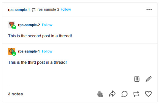
Typically, when cutting a post, you only keep your latest reply and the reply from your partner that immediately precedes it. This means that instead of a thread looking like this...

It would like this:
Or like this, depending on the method used:
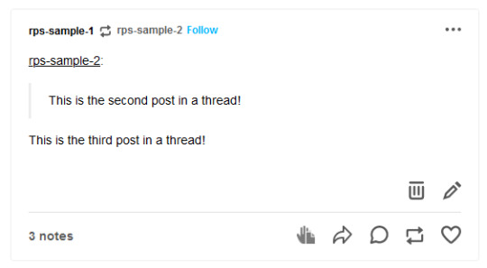
In either case, the first post is gone while the second and third post remain.
Cutting posts is done so that threads aren’t all extremely long on the dashboard. When there’s three short replies like this sample, it’s not that bad. But imagine a thread with twenty replies where each is several paragraphs long. That would require people to scroll and scroll and scroll to get past it. And since the same thread would be reblogged multiple times, your dash might become the same posts, over and over and over again, with only one new addition at the end each time.
Cutting posts is extremely common Tumblr RP etiquette. Many people won’t follow you if you don’t regularly cut replies, due to how irritating the alternative is.
Copy and Paste (Outdated)
Once upon a time, you used to be able to cut replies without any kind of extensions. Unfortunately, those days are gone.
That method worked as follows. You would go to reblog as usual...
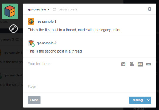
Copy and paste the last reply, putting it in a blockquote (or using any other formatting you like, really), then add your own reply underneath.
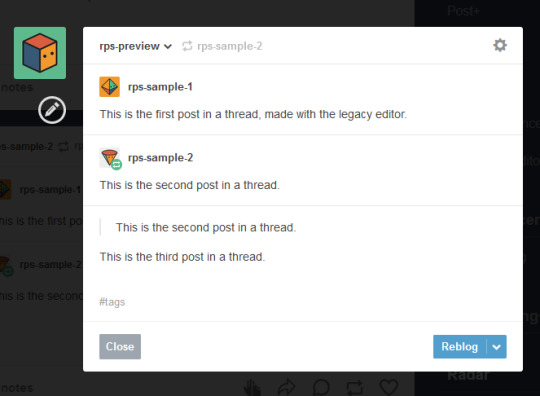
Then you can simply hover over the older replies and click the red X in order to remove them.

And this used to work. But now, the very first post in a thread cannot be deleted -- only later reblogs can. This means that the first post will always stay above the others, no matter how far along in the thread you are.
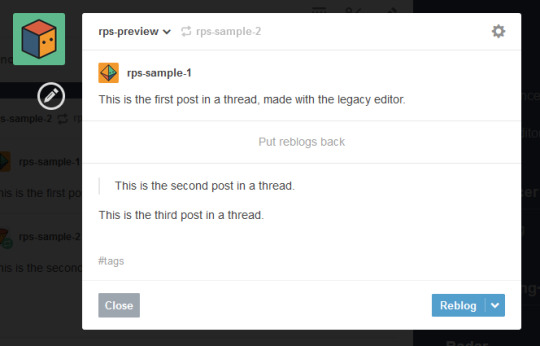
So since cutting posts can’t be done normally, we have to rely on browser extensions. This is where things get complicated. And also where I need to explain the different editors.
Legacy vs Beta Editor
Every time you make or reblog a post, you are using Tumblr’s post editor to do so. This is the area where you type up your post, add images, etc. Tumblr has been using the same editor for several years now, and it’s called the legacy editor.
However, Tumblr has been slowly rolling out a new text editor, called the beta editor. You may remember the beta editor when it was first rolled out a couple years ago as a buggy, unstable mess -- that’s not the case anymore, and it’s no more buggy than the current editor. For text posts, it’s functionally pretty similar, and even has a few features that some of you might want, such as easy colored text and the ability to make posts non-rebloggable. (Photo and other posts are fairly different, and I know gif makers have some pretty understandable reservations and complaints about it, but I won’t be covering that here.)
Older users have the option to toggle between the legacy and beta editors at will, while new users (starting around November/December 2022) are locked into the beta editor and cannot switch back to legacy.
To check which editor you have, go to make a new text post and look in the top right corner.
If you see either of these:


You are using the legacy editor, with the option to switch between the two.
If you see this:

You are using the beta editor, with the option to switch between the two.
If you don’t see anything at all, you are using the beta editor, and cannot switch.
While the text interface of the two editors isn’t terribly different for roleplay purposes, the methods by which you need to trim reblogs are entirely different. Each requires a different extension -- specifically, a different version of XKit.
XKit
XKit is a browser extension designed to add features and functionality to Tumblr. It includes many quality of life features such as a mutual checker, better tag tracking, queue improvements, ad blocking, more detailed timestamps, and so much more. (It was preceded by a similar extension called Missing E, if you’ve been here long enough to remember that.) And among all of these many features is the ability to cut replies.
The original XKit is no longer in use, having stopped updates in 2015 and being entirely unusable now. However, a few new versions of XKit have popped up throughout the years.
New XKit & Editable Reblogs
A different team created New XKit as a successor to the original, a similar extension designed to restore many of the same features.
New XKit’s feature to cut posts is called Editable Reblogs. It works by adding a pencil button to the left of the post when you reblog.

Clicking that button will break the post’s formatting -- actually changing it to how Tumblr posts used to be formatted -- but allow it to be edited however you wish.

So in this instance, I could simply select the first reply and delete it before adding my new reply underneath.
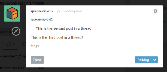
Editable Reblogs is only available if you use the legacy editor. It does not work with the beta editor and does not even appear as an option.
XKit Rewritten & Trim Reblogs
In 2020, Tumblr began to roll out its updated dashboard, which is now permanently in effect for all users. While the new interface looks very similar, the code was actually entirely redone, and behind the scenes functions very differently from the older dashboard. As a result, some of New XKit’s features no longer work as intended -- though a few still do, such as Editable Reblogs.
In response, the New XKit team decided to similarly start from scratch and created XKit Rewritten, another iteration of the add-on with similar features once more. However, not all New XKit features are available on XKit Rewritten, and vice versa. Many people are running both extensions simultaneously to take advantage of features on both.
XKit Rewritten’s feature to cut posts is called Trim Reblogs, and it works completely differently than Editable Reblogs. With this, you first need to save the thread to your drafts with your reply already written.

You’ll see a scissors icon appear along the bottom of the post. Clicking that will open the trimming options, letting you select which previous reblogs to delete.
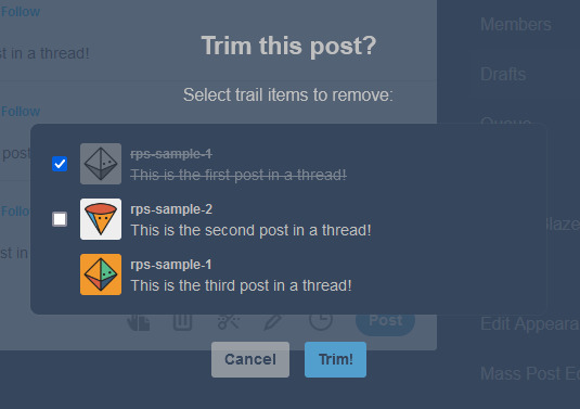
Clicking Trim will remove the selected reblogs.

You can then click post. You’ll note that this method preserves Tumblr’s formatting, as opposed to Editable Reblogs, which breaks it.
EDITED TO ADD: Apparently you don’t need to already have your reply written in your drafts anymore. You can save the post to your drafts without adding anything, use trim reblogs, then edit the post to add your reply. Either works fine.
This method does have two major issues, though. First, if the first post of a thread was created in the legacy editor, then the system gets really buggy and just doesn’t work.
This is what happened when I tried it out. Initially, it seemed to work as expected.
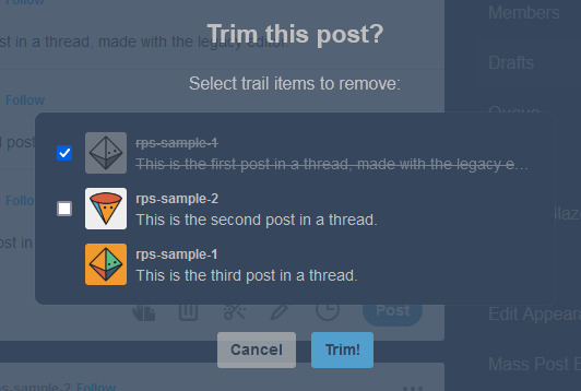

However, when I posted the reply, or simply refreshed my drafts, this happened.

Attempting to trim again simply caused this to repeat. There is no fix for this. This means that for this method to work, both you and your partners need to be using the beta editor.
EDITED TO ADD: You can fix this double posting by either using trim reblogs before adding your reply, or by adding your reply, using trim reblogs as intended, refreshing your drafts, editing the post, and clicking the red X to remove the first of the double postings. I have a better guide here.
The only other alternative is to move the thread to a fresh post when you reply, so that the new first post was made with the beta editor. Then you can cut future reblogs of the post using Trim Reblogs as normal.
However, the other major issue is that if your partner uses Editable Reblogs, you cannot use Trim Reblogs as intended. Let me show you why.
Say I want to reply to this post.

I’ll add my reply and save it to my drafts, as before.
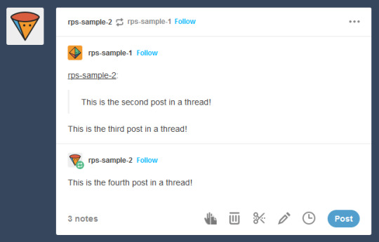
You may have spotted the issue already. The first and second replies are now “combined” so that Tumblr sees them as a single post. We want the post to be interpreted like this, so that I can remove the oldest reply while still keeping the one immediately prior to mine.
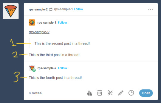
But Trim Reblogs can only see it like this.

When I go to trim reblogs, I can only remove the previous replies as an entire unit. I can’t remove just the oldest reply and keep the one immediately prior -- either it all stays or it all goes.

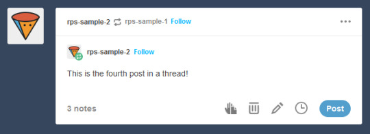
This is admittedly better than nothing. However, most people do want to keep their partner’s previous reply for reference, and just to have on their blog. This means a lot of people using Trim Reblogs simply don’t cut their partner’s posts at all.
You might be able to get around this issue by combining it with the outdated cut and paste method I described above. When saving to your drafts, paste your partner’s last reply above your own, using a blockquote or whatever formatting you like to separate the two.
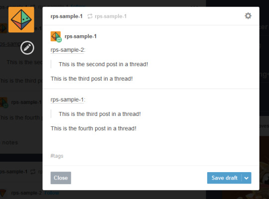
You can then use Trim Reblogs to remove the first post, leaving only your copy pasted reply. The formatting is broken, but it’s at least workable.

However, this will only work if the very first post of the thread was made with the beta editor -- since people using Editable Reblogs have to be using the legacy editor, you’re likely to still run into issues on a lot of posts. Which can again be solved by moving the thread to a fresh post made with the beta editor, but at this point we’re stacking so many issues on top of each other that I really can’t blame you if you just don’t want to bother with any of them.
All of this brings me to...
It’s time for the RPC to collectively switch to the new system
I’ve stuck to the legacy editor myself due to the issues described above -- using Trim Reblogs when everyone else still uses Editable Reblogs is an enormous pain that I don’t want to deal with. Even as I make this post advocating for people to switch, I’m dreading actually doing it, because I know that most of my partners still use the old system and I will have nothing but headaches.
But the thing is, everyone refusing to switch is what’s creating the headaches in the first place. If we all moved to the new system together, these issues would simply disappear, and we would all be able to effortlessly cut our posts using Trim Reblogs without ever having to worry about it again.
The RPC needs to collectively make the switch, for two reasons.
First, Tumblr is going to switch everyone to beta eventually. Refusing to switch now is really just delaying the inevitable -- it’s not a question of if you’re going to be forced into the new system, but when. By switching now, you can go ahead and get used to it and start giving feedback to both Tumblr and the XKit Rewritten team if you find anything buggy or broken.
Second, as I said above, new users are locked into beta, with no option to switch back to legacy. Trim Reblogs is their only option for cutting posts -- and as long as most of their partners are using Editable Reblogs instead, they cannot cut their posts properly. Their only option is to use a series of increasingly ridiculous workarounds that most people won’t understand. The fact that it took me 1500 words just to explain everything should tell you how confusing the whole thing is -- you can’t be that surprised when a lot of people, upon realizing that they can’t cut posts without a whole lot of tedium, decide to just not bother cutting them at all. The best way for everyone to be able to cut their posts properly and efficiently is for everyone to be on the same system.
Yes, the beta editor is different. It has some weird quirks. It will be a bit of a learning curve to get used to a new system of replying to threads. But this is a change that’s going to happen eventually, and is a change that needs to happen for a lot of people to able to cut their posts properly.
(It’s also worth noting that -- assuming you still have the option to switch -- you may be able to toggle between the two systems during the adjustment period. I haven’t been able to test this yet, but I see no reason it wouldn’t work. Use Trim Reblogs whenever possible, and especially for the partners that have already made the switch. But when you get to a reply that it just won’t work for, toggle back to the legacy editor and use Editable Reblogs just for that thread. It’s a bit annoying, but it could be the middle ground needed to help people start making the switch. And once the majority of the RPC is on the new system, then this won’t be an issue anymore.)
#rph#rpt#rpc#editable reblogs#trim reblogs#*my stuff#*my tutorials#this started as a tutorial for cutting posts and led into something else lmao#beta editor
2K notes
·
View notes
Text
Every so often you see a ridiculous post, usually something with sexual content presented humorously, and a reblog comment will say something to the effect of "this is why this website is unprofitable"
And while those are funny, it's just patently untrue.
Firstly, it behooves us to establish a baseline of terminology, because in current discourse there's a major disconnect between what 'unprofitable' means when used by tumblr users and when used by tumblr executives.
Unprofitable in lay use typically means 'there is a net negative cash flow for this company' while in executive terms it means something more like 'the revenue generated here is unfit for long term growth'. The key distinction is that root word profit; In reality Tumblr is profitable by the first definition but unprofitable by the second. If tumblr wasn't bringing in enough money to at least balance out operating costs it would have been gone long ago. MySpace still exists, Tumblr will likely occupy that same space until it literally can't afford to anymore. The real issue is that tumblr's business model doesn't generate its own growth, and therefore doesn't continually expand its proft above operation like every corporation expects to.
Basically when users on here talk about profits they're measuring velocity, while executives are measuring acceleration. How much will the money increase its own collection, how can we make that happen faster, and how can we maintain that acceleration curve?
Now that that's out of the way, let's look at Tumblr's actual business model. Compared to Twitter and Facebook, tumblr lacks two key things: Public acclaim, and user incentives for engagement loops.
The first part is easy. Tumblr isn't a famous platform like Facebook is or like Twitter is. Outside of Tumblr, nobody talks about Tumblr. This means it's not viewed as a strong market for advertisers, it's not generating waves of new users, and it's not gonna get attention for doing critical maintenance or breakthrough innovation because the crowds simply aren't here. There are millions of Tumblr users, but it really doesn't mean the same thing as the collective hundreds of millions of users across Facebook and Instragram that all generate tons of ad and data revenue for one corporation.
The second part is more complicated because it gets into the psychology of social media engagement, and I'm not gonna pretend to be an expert on how that works. But the crux of it is that the mechanics of engagement with Tumblr are just different from that of Twitter in a few basic ways that mean huge differences in how the space is utilized.
Firstly, Tumblr is fairly obtuse about post longevity; the halflife of a tumblr post is effectively eternal because posts from the first year the website was open for public use still circulate. Posts didn't even have dates put onto them for users to see until like two years ago, unless you modded your website layout with third party tools like Xkit. This is great if you want a website where your art can last forever, but terrible for creating large surges of engagement super quickly on hot button topics and posts. This latter model is how basically all social media operates nowadays, with posts basically dying after 48 hours. There's always a frenzy on every meme, headline, picture, thinkpiece, and political fuckup that inevitably creates micro-surges of engagement for whoever saw it. This creates vicious cycles of attention seeking in just about everyone involved, but it just doesn't work that way here. I get periodic validation from writing I've posted years ago and that gives me the feedback I'd normally have to post hourly to attain on twitter, so there's really no drive for me to constantly be posting. This lack of need to constantly generate content feeds into the first issue of public acclaim; if everyone isn't constantly posting then the content which does leak out from here isn't enough to cross most of the thresholds to motivate people to migrate to the platform and give it public acclaim.
Secondly, the people who *do* post constantly aren't rewarded for doing so in any meaningful way. People who generate tons of content for YouTube and Instagram and TikTok make actual literal money from doing so. People can use Twitter and Facebook to advertise themselves, their products, their podcasts, their personal websites, whatever. With enough of a presence on most social media, there's monetary drives involved. And this motivates some unsuccessful users to keep trying to gain personal acclaim because it's no longer a social media platform, it's a shovel salesman in a gold rush. Tumblr does not have this. Tipping was added a while back but from what I can tell it's not widely used, and even if it was that's still money coming from other users and not the platform itself. Nobody is posting on tumblr to try and make it big and get real money doing so. The people posting a lot on tumblr are people like writers posting updates for their fics, artists posting their art, sex workers promoting their OnlyFans, porn blogs, stolen meme accounts, and the odd wizard here and there. Most people here are engaging for social fulfillment, which is ironically the least profitable motive a social media platform can offer its userbase.
12 notes
·
View notes
Note
Hiya Wench! <3
It's me, the chick who always wants you to explain things xD. I have another polite request (won't be upset if you decline, but I have to try).
I had an epiphany about my posts today - I tag for other people, not myself (twitter influence). And I realized I don't even know how to quickly get to some of the older posts.
And then I remembered your page and how it's all neatly organized xD I previously haven't realized all your tags were actually separating your posts into categories and such... I love it. I had some big brain moments today xD
Would you please have any quick tips (perhaps you already do have them on your blog, I just forgot how to display the blog with the template on) for how to get started with your own template and neatly organized posts you can always find? Maybe even some template creators and such?
I used to do HTML & CSS back in the day, but it's been a long while, I don't have that much time to do trial and error anymore, and any actual coding is out of the question for me. It's gotta be user-friendly. (Free would be best, but I'm ready to reward the work done.)
I'm loving it here now and I post A LOT... I'd hate to reach a point where I don't even know what's on my page anymore.
Thanks! <3
Hi, bb! 💙
I've been asked about this a few times, and I honestly never feel I have a good answer for it, haha. I just like organizing and categorizing things, honestly. Best I can do is share my thought process and a couple of handy tools--Hopefully that'll help give you some inspiration!
My tagging habits actually come from ancient Tumblr functionality--Back in the day, the search function didn't exist as it does now (in which it will (theoretically) scan the body and tags in the post), and you could only find posts if they were tagged in a certain way. Sometimes I wanted to post about game stuff, like Dragon Age, but I didn't want my post to appear in the main tag (because of fanwank hell) BUT I also still wanted to be able to find it later because my blog is for me first and foremost.
So I started using "s: dragon age" to gather all things related to Dragon Age (in which "s" in my mind stands for "series") and "g: dao" for posts specifically about Dragon Age Origins, "g: da2" for Dragon Age II/2, and "g: dai" for Dragon Age Inquisition. And if it was a post I did want to go into the main tags, like a GIF set or fanart, I'd use both the default tags (Dragon Age, Dragon Age Inquisition) and my personal ones for my own blog cataloging.
Tumblr search hasn't worked like this in years, but by the time it changed, I was already in this habit for a while so I've just kept doing it. I do change the way I organize stuff from time to time, and there are some tools that make that easier:
Xkit Rewritten This is a life-changer and has a ton of great features to improve your Tumblring experience, but the "Tag Replacer" specifically is awesome if you realize you want to change a tag en mass.
Tumblr Tag List Generator And this is really helpful if you need to do some tag wrangling and figure out what tags you've used. I periodically run my blog through this to catch inevitable typos in tags so I can change them, and see if I can consolidate any similar tags (e.g. catch if I was using both "g: da2" and "g: da ii" so I could figure out which one I liked more.)
As far as the organization itself and how I choose the categories, it's just vibes, haha. It's just how I catalog things in my brain. Which I know is probably unhelpful. Prefixes like "inspo: ###" and "shows: ###" are pretty self-explanatory. "extras: ###" is for the random stuff that doesn't really fit anywhere else, like shitposts and cute animal pics. "topic: ###" is for more serious subjects and discussions, like LGBTQ+ issues. "mine: ###" is for the stuff I've made.
Two things I wish I had done a better job of is 1) organizing other people's OCs by fandom (if you visit me on Pillowfort, you'll notice I use tags like "other's ocs (cp77)" instead of just "other's ocs") and 2) separating my edits tag into a gifs and virtual photography tag. Calling all video game imagery "edits" is also sort of a holdover from Tumblr days of yore, but I wish I had made a distinction there. (I had never even heard the term "virtual photography" until about 2022, though, and I've been on Tumblr since 2010 so yanno. Whatever. This blog in particular is 8 years old, and I'm not sifting through thousands of posts just to amend that.)
And this is a mostly comprehensive list of all the tags I use, if you wanna see the categories and whatnot in action.
With regards to blog templates, I've actually decided to stop focusing on that here because Tumblr has increasingly become a more app-driven userbase, and the pretty blog templates are only visible on desktop. Tumblr also nuked a lot of functionality of the custom pages you can make, which is where I used to keep my tags displayed. I still have a custom theme, but it's pretty bare-bones compared to what I used to do. (Now I get my CSS fix working on my Neocities website, although that is very much still a WIP.)
But there are fortunately still a lot of folks keeping the custom Tumblr themes alive! You can browse some of my personal favorites under my tumblr: themes tag, and @theme-hunter is a fantastic resource to find free user-made templates.
Oh, and because Tumblr is pushing more for a generic and uniform app experience, you do have to opt-in to activate your custom blog. It's this option under your blog settings:

And if you want to view someone's custom blog (if they have one), you'll have use the https://fereldanwench.tumblr.com/ URL. If you want to view the dashboard-like version of their blog, you'll have to use the https://www.tumblr.com/fereldanwench URL.
Hopefully this made sense and can give you some ideas to get started!
6 notes
·
View notes
Text
How I'd Make Tumblr More Profitable
Yes, this is going to be controversial, since I know nothing about the behind-the-scenes spending, economics, and all that jazz. But I've been on Tumblr for long enough to have a rough idea of the userbase wants - which is what positions Tumblr in a niche other sites don't really utilize. Most of the points I list here are about improving the experience of existing users, as keeping users might be harder for tumblr than attracting new ones.
Please note that this posts reflects my personal opinions and some stuff I've seen people complain about it. Do not attack me over anything I've written here, it's not worth my time and I will resort to blocking if I'm being bothered. Constructive criticism is fine and encouraged!
[under the cut because this got quite long] [last updated 20th July 2023]
Features to Add
Block posts. Xkit has/had this feature, it was great. Sometimes I just don't want to see a specific post, and others probably agree with that.
Send asks and replies from sideblogs. Would literally make a lot of things easier and better.
Delete individual reblog additions from a post. Sometimes, you have a post where there is one"relevant" addition, multiple "irrelevant" additions ("yes!", "[repeated phrase in bold]", "this is a must reblog"), before there is a "relevant" addition again. But right now, you can only remove all reblog additions, not just individual ones. I feel like this would be a neat feature.
Direct blocking of anon hate which also tracks the IP and blocks the associated account(s). No rights for cowards, that's all I'll say.
Features to Bring Back
Reblog chains. Prev tags are the backbone of lots of interactions on here. If I click on someone's username in a reblog chain, I want to see that post on their blog, not their blog starting from the newest post. The loss of this feature is one of the things people constantly complain about in the replies of @changes.
Several text formatting options. As a theme maker, it would be nice to have proper preformatted text again - it makes code so much more legible. Other formatting options I miss are marked/highlighted text and text lines, which are really helpful to visually break apart passages of text.
Features to Ditch
Tumblr Live. There I've said it. If I want to see stuff like that, I have TikTok, IG Reels, Pinterest Reels, and YouTube Shorts. Twitter also has something like this. It's oversaturated, and aparently there are still enough cyber security concerns that it's not even accessible outside of the US and Canada.
Ads in lightboxes. Especially on mobile, there are already more than enough ads on the feed, no need to add more nested inside other elements.
Features that Make Money
Pay for NSFW. If this site allowed full nudity etc. again but hid it behind a paywall, we'd kill two birds with one stone: The site would probably still be allowed on the App Store, and the money influx would be huge. The userbase would also increase again.
(If Tumblr Live is kept.) Pay to snooze Tumblr Live permanently. It's the most complained about thing in changes' replies, so I feel like people would pay on a subscription base just to not see TL anymore.
Pay to increase limits. 250 posts per day is the maximum that can be posted - and there are people hitting those limits. If there was an option to buy a higher limit (500p/d, 750p/d, etc.), people might generally use it. Like those add-on charges for mobile data. Same goes for posts in the queue, posts in drafts, images in a photoset and so on.
Pay to pin posts at the top of a tag or search result. Ebay Kleinanzeigen has this neat feature where you can push your small ads to the top of a search query so that more people can see it. This could be a cool feature to try, as it would work in a more content-aware way than Blaze does.
Pay to buy inactive URLs. There are some really cool usernames on here that are taken by blogs that haven't updated for 5+ years and only have one post (or none at all), and I feel like it would be neat to be able to buy one of these cool usernames attached to an empty account. To make sure that usernames attached to redirect or something else don't get bought, tumblr should send an e-mail to the username owner - if the user doesn't react to that for 3 months, the usernames changed owners. [added 13th July 2023]
Existing Features to Improve
NPF posts. I feel like a combination of legacy and NPF would be neat. Think selecting a main element like in the legacy editor (e.g. video, image, audio) and then adding a caption that can add different content types like NPF does. Or at least create a better overview over NPF variables and release the full base code with documentation to make things easier for the web designers on here. There are more issues with the NPF format but I won't list everything people dislike about it here.
Block people. The block feature should make sure that the person being blocked doesn't see any posts made by the person they were blocked by, even if those posts were reblogged by another user. Also, like IG does, there should be an option to block either just a specific blog or the IP address attached to block side-blogs and other accounts of that user.
Color palettes. The color palette options for the dashboard are generally a nice idea but I think it would be better if there was a dropdown menu to choose a palette from rather than having to click through all the different options. For example, if I want to go from Cement (light mode) to Dark mode, I have to click through 10 options until I reach Dark again. There has to be an easier way. [added 20th July 2023]
Other Improvements Needed
Nuke spam bots. Users are reporting all the spam bots, yet, it doesn't seem like they are dwindling in numbers. Also - at least this is how it's being perceived by the userbase - tumblr isn't doing enough on their end to reduce spam bots. This is definitely something that needs to be fixed.
End hateful and criminal activities. It's the year 2023, yet there are still outright N*zis, violent tr*nsphobes, literal p*dophiles, and other people committing to the daily bit of hate speech and other illegal activities (fraud too considering all those fake GoFundMe sites) on this website. I'm not saying free speech should be banned but there is a bright red line between what is free spech and what is hate speech (or should get you jailed considering fraud and p*dophilia).
A through-out, perhaps even interactive, beginner tutorial. "The site is too complicated to use for new users!" – then explain how it works in easy terms, with examples, images, and videos. Every other application or web app has walk-throughs, just do the same here.
Improved ad relevancy. The ads I see on tumblr are usually so out-of touch with the userbase, and many of them feel like the sort of stuff you see on a spam-ridden torrenting site. I feel like increasing the relevancy of ads to what the users usually blog about would cause a higher click-rate and turn-over-rate than the current ads do.
Summary
There is probably more I could add, but that's it for now. Should I make any later additions directly to this post, I will mention it to prevent misunderstandings. If you have any ideas or constructive criticism, let me hear about it in the replies or reblogs of this post.
16 notes
·
View notes
Text
Put the icons back!!!
Does anyone know of an extension or something that I can install to put icons back to the left of posts? I've been getting a ton of updates at once and it's really stressing me out (forced new dash, beta post editor is dead, and now this). It seems so benign, but it's really fucking with my ability to scroll through my dash and tell who posted what.
I already have a dashboard unfucker via Stylus & still have a shitton of XKit stuff enabled (Idk what even works anymore or not I just don't touch it & it does its best) but I haven't seen any work-arounds for the icons yet.
#tumblr#xkit rewritten#Stylish#please I'm begging I'm just so tired at this point...#seriously considering bailing after 10 & a half years on this horrible platform#I'm having legit meltdowns over it I hate this
6 notes
·
View notes
Text

Hello! I hope everyone is having a lovely day today.
There's something we want to talk to everyone about regarding posts and replies.
It is very important that everyone read this post in full, so please do so! We'll be able to tell who has and who hasn't, and anyone we notice hasn't read it will receive a link to this post via tumblr and discord until we know it's been read. You've been warned!
As you probably know, Tumblr launched a new post editor a couple of years ago that hasn't been officially, fully implemented onto the site. Because of this, when making posts and doing replies, some of us are still able to toggle on and off between the legacy editor (the one we've been using for years now) and the new one. However, back in May, tumblr announced that they would start removing the legacy editor for some users, meaning that the eventual takeover of the new post editor is inevitable. Because of this - and a lot of reasons that we will go into further detail below - we think it's time to say goodbye to the legacy editor and only use the new post editor when posting starters and doing replies.
The thing is, as much as we love the legacy editor (RIP), you've probably noticed that sometimes using it to reply to posts that were created with the new post editor will make them a bit... wonky, to say the least. Your reply will appear twice, maybe the entire post will duplicate and then be impossible to delete (or simply require too much energy to fix). It complicates things for everyone. It's not anyone's fault! It's Tumblr's updates. It's also very hard to know when a post has been made using the legacy editor vs. the new post editor, so it's impossible to know whether a reply will work or not. To make things easier for everyone, I think it's important we all switch to the new post editor starting effective immediately.
Here's a couple of questions you might have.
Does XKit work with the new post editor?
The short answer is no. At least not the New XKit, the extension we've been using for ages now. If you've been roleplaying for a while, you probably remember there was an extension simply called XKit before New XKit came about, which was back when tumblr changed their post format the last time circa 2015. They got rid of blockquotes in reblogs! Remember? You couldn't edit your partner's reply even if you tried. And they did it again, except this time, it was a little harder to fix, so New XKit is no longer working with this new format. Reblogs using the new post editor look differently now. You can see an example of the difference below.

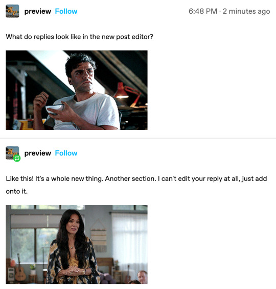
Does that mean I can't cut posts anymore?
Nope! You still can. The process is a little different, but if we're all using the new post editor, it shouldn't be very complicated.
You can use something called ✨ XKIT REWRITTEN ✨
It's another extension! (everyone say: thank you devs)
Because we are no longer allowing anyone to use the legacy editor, I would encourage everyone uninstall the New XKit extension you have and replace it with this one. It has basically the same features as the last one and is very user-friendly!
Download for Chrome
Download for Firefox
How does Trim Reblogs even work?
You can find a guide to using Trim Reblogs that explains it a million times better than I ever could right here. We'll have it linked in the resources channel on the discord as well, in case you need to check it out.
What about my current replies using the legacy editor?
Because we know you have active threads using the legacy editor, we'll allow you to play those out still using New XKit and editable reblogs, but any and all starters going forward have to be made using the new post editor. If your replies with your partner are duplicating or not working, you can either continue to write them that way, removing any duplicates if possible, or reach out to them and ask them what they want to do; try to figure something out that works for both of you.
So, TL;DR (but I DO hope everyone read this!):
Using the legacy editor will no longer be allowed in the roleplay. If you are currently using the legacy editor in replies, finish those but going forward, please post every starter and reply using the new post editor, install XKit Rewritten and toggle on Trim Reblogs to be able to cut your posts.
If you have any questions at all regarding this new rule (because we'll be adding it to the rules shortly with updated information and links to everything you'll need) please feel free to reach out to us!
To make sure everyone read this, I'm going to go very Tumblr 2012 and ask you to like this post and send me a discord message with a picture of your favorite animal. Thank you.

7 notes
·
View notes
Note
Hi, I just saw that you unfollow blogs that have been inactive for 2 months and more. How does that work? Do you check your followed blogs list every 2 months and unfollow? Or do you maybe have an app or browser extension that does it automatically for you? Please tell us!
hey thanks for the ask! no one sends me asks anymore 😭 anywayyy. on the desktop version of tumblr you can use the extension xkit and it shows which blogs are inactive. they also have an app but it's not supported anymore so it doesn't work. and honestly i'm not even sure if the desktop version still works either because i don't really use tumblr on my computer anymore. with that being said i only know if a blog is inactive if a actually go to their blog and see when they posted last 😅 so basically i don't really unfollow blogs at this particular moment in time especially in the hopes that mutuals will become active again in the future. i hope this makes sense!
5 notes
·
View notes
Text
Tumblr Clients to Use Other Than This Shitty App (but honestly thoooo...)
This is a long list and it's mostly me rambling about features that stood out to me. Also, going through these, no client here is going to completely replace the desktop or the app for most people. All of these clients have something up with them that, at least for me, hasn't made me stop using official tumblr options. Even the option I actually recommend to use is still just the official tumblr app while on desktop it's best to just use dashboard unfucker and xkit rewritten.
Think of these as companion apps for the most part.

Desktop
Washboard.ws: Browser || Free
Idk if anyone still remembers washboard?? I remember it being the first tumblr client I've seen people talk about back in the day... and, boy, does it still feel like it's back in the day.
It's a bit old feeling since it still using the older tumblr dash layout and I think some features don't work correctly like search not working and trying to reblog or like a post gives you an error. Their blog hasn't been updated in 2 years and the site feels like it hasn't been updated in 7 so while it's up and running, it's not very functional anymore. I just had to mention it because I appreciate it so much.
My Pros • Dashboard Views - List (Blockquote/Old Tumblr) • Viewable Posts - Text Only, Text w/ media, Photos, Videos, Audio • Posting - Redirects to Tumblr • Reblogging - Queue, Draft, Private, Schedule • Side Blogs - View, Reblog • Search Support - Clickable Tags Only • Messaging Support - Ask (redirects to tumblr) • Save Tags • Filter/Blacklist My Cons • Feels like 2009 bc of old dash design • Reblogging is broken • Liking is broken • No search bar


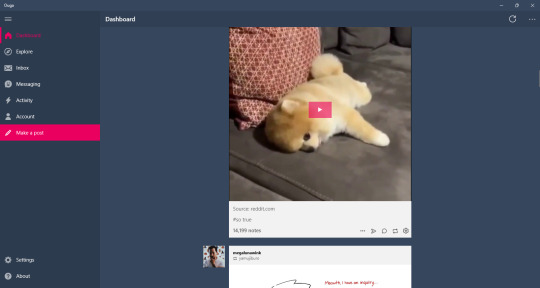
Ouga: Windows Desktop app || Free/OTP - $4.99
One of the desktop apps I've used for quite a while. It's ok, it feels better than Tumblast and 6tum (which isn't on here bc it doesn't work right and I've already made an exception for washbaord) to use but I've also had more crashes than Tumblast. Still, to me, it's the better working and easy to understand client on the windows store.
My Pros • Dashboard Views - List • Viewable Posts - Text Only, Text w/ media, Photos, Videos, Audio • Interruptions - Banner/Footer Ads • Posting - Queue, Draft, Private, Schedule • Reblogging - Queue, Draft, Private, Schedule • Side Blogs - View, Reblog, Post • Search Support - Bar, Clickable Tags • Messaging Support - Ask, IM • Download Support - Images, Videos • Filter/Blacklist • Activity Feed • Multi Account • Add Tags to Posts My Cons • Interruptions - Dashboard Tumblr Ads, Banner/Footer Ads • Crashes sometimes

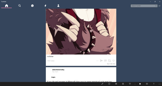
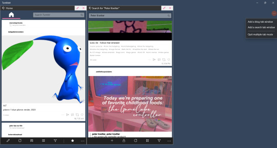
Tumblast: Windows Desktop app || Free
So/so about this one. It works enough to make a post, reblog things, like stuff, but I think it's a little bit more clunky than Ouga. I do like this one feature that let's you have multiple tabs open. It's not a well working feature that sometimes crashes the app and searching tags don't always show with this enabled, but you can do it.
My Pros • Dashboard Views - List, Blockquote • Viewable Posts - Text Only, Text w/ media, Photos, Videos, Audio • Posting - Queue, Draft, Private, Schedule • Reblogging - Queue, Draft, Private, Schedule • Side Blogs - View, Reblog, Post • Search Support - Bar, Clickable Tags • Messaging Support - Ask, IM • Download Support - Images, Videos • Filter/Blacklist • Activity Feed • Multi Tabs • Add Tags to Posts My Cons • Look/feels like it was made for windows 8 & 7 mobile.. it came out for windows 10 • Searching bugs out sometimes • Can feel clunky • Icons aren't showing right now

Tumblesocks (updated fork): Emacs app(?) || Free
.... i....... tried.
I know I put this off for most of the month bc I had a feeling it'll be a bitch in a half to do (and I was right) but I didn't know I'd spend 3 days trying to get this client to work. Emacs itself was difficult to work with even though I went the simple way and the gnu install.
I tried this out in Windows. Got frustrated. Actually fucked with Linux. Got more frustrated. I'm pretty sure Linux users are probably like "this is so easy" and that's fine but there's a reason I hate Linux and I'm not cut out to test out Emacs. I'm sorry.
If you're interested I still have the links above. Gargle's fork is probably the best to use since it's said to fix a lot of things. But I absolutely invite anybody to reblog this or send me an ask explaining how to get this shit running in the most hand holdy way.

As far I can find, there isn't a client app for macos. I closest I saw was an app called MenuTab Pro for Tumblr which everyone was saying doesn't work (anymore?). From the looks of it, it would've fallen under "viewer" for me so I most likely would've skipped it anyways.

Android
Tumblr (revanced): Android || Free
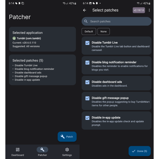
So this post was made awhile back before tumblr was supported by the revanced community. I'm excited to see that, while I was testing all these clients out, some people have made tumblr patches for revanced!
There are very little patches right now. Most importantly the tumblr live icon is now gone and ads are supposed to also be gone but that sims a bit more finicky. It only says that dashboard ads are disabled and sometimes it feels like they are but then they come back in full force so you'll have to force close the app in settings and then they're gone again for awhile. The same with blaze post as it feels like they've also been disabled until it doesn't.
Even though these are early patches, it's still the only option I would replace the original app with. It's not a client so you still have to deal with Official Tumblr App Bullshit™ but you also get all the expected or good features of the tumblr app that some of these clients don't have. I would like to see more patches like hiding the badges or fixing how the disable ads patch work but it's still better than nothing.
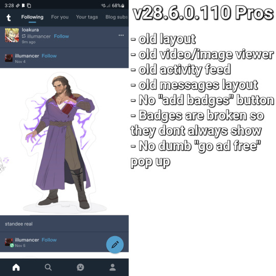
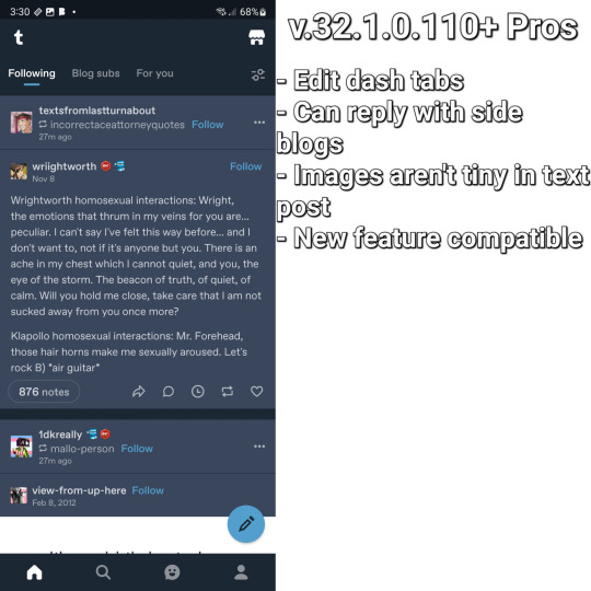
This bit is long, sorry, but I wanna add it's worth picking between 2 versions of the tumblr app depending on how you like the layout. v28.6.0.110 (the version I use) has the old layout and some problems that come will it like tiny images in text post, not being able to reply with side blogs, and sometimes some things just stop... working at times? While any version after that will have the new layout what comes with it: tumblrmart icon, changed activity feed, new video/photo view. I love the old layout over the new one so I stick with v28.
Both versions have their goods and bads and is why I have 3 versions of tumblr on my phone. Using app cloner (better options are behind an otp. don't get the sub, it's not worth it) you can install different versions and see what you want.
My Pros • It's still the Tumblr app so everything you like is all here • No ads! (sometimes) • Tumblr Live icon is gone <3 • Am able to test out newer features that are actually useful and interesting (like collections and interacting from side blogs) My Cons •Blaze posts are still present at times • It's still the Tumblr app so almost everything you hate is still here • Badges are still visible as well as version newer than v28.6.0.110 will have the "add badges" button on your blog • Annoying pop ups like going ad free or whatever are still a thing if you're using any version with the new layout • Breaks like "but wait! there is more" and "check out these x" are still here • TumblrMart icon is still at the top corner on the new layout

TeeHub: Android/iOS || Free/Sub - $1.99, $3.99, $5.99/OTP - $8.99
TeeHub is no longer on either app store. You can download the latest apk and modded apk here
While this has become my new favorite android tumblr client, the free version of this app feels so limiting and the paid version don't feel that better. I'm still happy that they added the one time payment option because I'm tried of subscriptions but stuff like not being able to see text only post at all, problems with posting, and no filter feature is so annoying to me.
Currently, TeeHub, on the tumblr side of things, feels lacking but also on the same level as Tumbletail for Android. There is an OTP of $8.99 and 3 sub options of $1.99, $3.99, and $5.99. If you like this and want to support it getting better I'd say just do the OTP because while the pro features aren't anything important, paying 9 bucks once feels more worth it than paying around 50 by the time the month is over.
TeeHub is only my favorite android client right now because it looks nice. If Tumbletail fucking updated their app so you can post in the paid version and it didn't look like shit it'd be a different story.
My Pros • Dashboard Views - List, Grid • Viewable Posts - Text w/ media, Photos, Videos • Posting - Queue, Draft, Private, Schedule • Reblogging - Instant • Side Blogs - View • Download support - Images, Videos (paid) • Multi Account (paid) My Cons • Interruptions - Popup Ads(? they said there's ads but i couldn't get them to popup even on a separate phone soooo) • Subscription • Can't view text post • Can't post/reblog to side blogs • Can't post/reblog to queue, draft, schedule, or privately • Can't add tags to post • No search function • No filter/blacklist support • Posting videos/photos aren't working right now

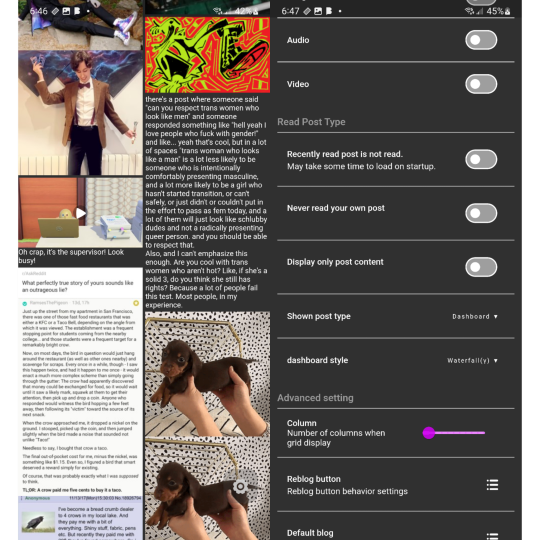
Tmdroid: Android || Free
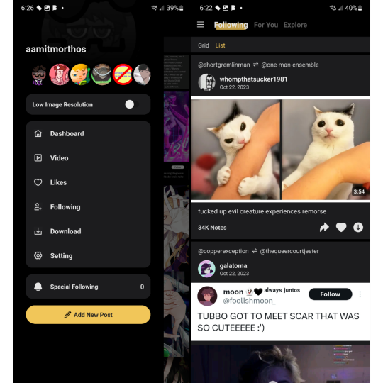
This one I love what they're trying to do I just think it needs more time in the oven. Some of my problems with this that aren't in my cons list are some of the dashboard settings in carousel view aren't available in waterfall view (the view I use in the image) and text post specifically don't have a square around them to separate them from other post. It's not that bad when it's a text post sandwiched between images but when there's text posts in a row, like in the image, it all looks like 1 text post.
They do have a blog and this app does get updates so I've been keeping an eye on this. They seem to be very open and accepting to feedback unlike someone else on this list and that's really fucking cool.
My Pros • Dashboard Views - List (Waterfall), Grid (Columns), Carousel • Viewable Posts - Text Only, Text w/ media, Photos, Videos • Reblogging - Queue • Side Blogs - Reblog • Download support - Images My Cons • Weird UI • Unresponsive UI • Limited or clunky side blog support • Can't make posts • Can't reblog to draft, schedule, privately • No search function • No filter/blacklist support

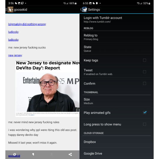
Tumbletail (Lite): Android/iOS || Free/OTP - $1.99
*screaming and crying* I feel like... a disappointed parent. Except I'm not disappointed. I'm mad.
This was my favorite client all the way back in 2012 when I was forced to use an iphone 3gs. I loved the way it looked, the text post were easy to read, it was smooth to use, it had a tag history that made reblogging & making post easy for me who ran an acnl blog, had really good settings to mess around with.... Y'all... so much of this is just not on the android version.
And it fucking pisses me off lol. There's no reason for the android version to look so ugly, to be lacking in settings & features, to not give paid uses the ability to post when you can on ios?
While the android version of this app is usable, moving from the ios app to android and seeing how lacking it was comparably and seeing people give feedback to cathand (who did have a blog) but they went unanswered while the ios version still got updates... The ios versions aren't perfect but it's a much better experience than the android apps. And I'm a bit mad about that.
My Pros • Dashboard Views - Grid, List (change thumbnail size to huge) • Viewable Posts - Text Only, Text w/ media, Photos, Videos • Reblogging - Queue, Draft • Side Blogs - View, Reblog, Post • Search Support - Bar, Clickable Tags • Download Support - Images, Videos (via video player options) • Multi Account (paid) • Tag History • Add Tags to Posts My Cons • Interruptions - Banner/Footer Ads • Can only make post in the ios app??!?!?!?!??? • Polls are viable as text posts but are broken • Looks cleaner on ios • Non photo/video post could be better formatted • Text posts contents are too large and you can't zoom out to see everything • Photos/Videos made using the new text editor (Text w/ media) are seen as text posts • ios version have more features/settings • Only posts uploaded as photo/video (not text w/ media) will have clickable tags • No filter/blacklist support
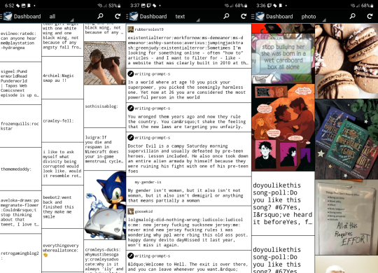

Violet: Android/iOS || OTP - $0.99
Violet is a weird on. I want to see it get better but I also don't recommended it. It did get a price cut to $1 so, ya know, but I think as a client it's not good. As a viewer, it's usable. I don't like the carousel view I'd rather have a normal dash. Stuff like posting and searching aren't a thing and reblogging isn't as featureful as I wish.
This works best in the way we heart it and instgram do, not like tumblr does.
My Pros • Dashboard Views - Carousel • Viewable Posts - Text Only, Text w/ media, Photos, Videos, Polls • Reblogging - Instant • Side Blogs - Reblog • Download support - Images My Cons • Account login troubles • Polls redirects you to tumblr • Can't make post • Can't reblog to queue, draft, schedule, or privately • No search function (tags open tumblr) • No filter/blacklist feature
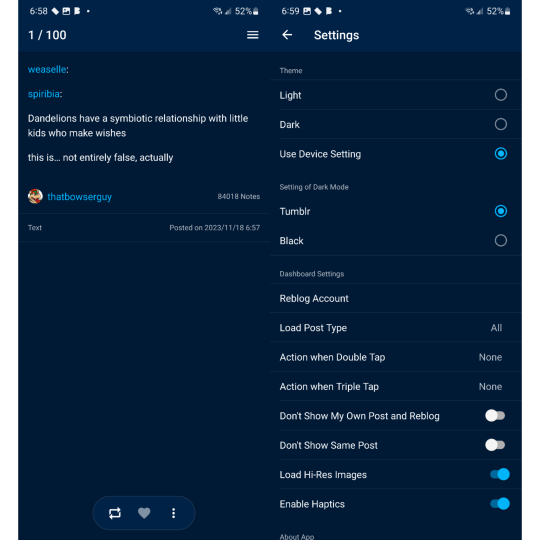

iOS (mostly the iphone bc i dont have a tablet)
Tumbletail (Lite): Android/iOS || Free/OTP - $1.99
yes we're back again bc ive been yelling about this for years but i"ll make it quick
Had this app since 2012 and I still recommended using it along side the tumblr app. Mostly because of how tumblr works today with their restrictions and inclusion of a filters list.
While text post in the dash view looks better than on android to me, open a text post the contents are so small but they fit the screen. I know the image shows that I have text size small but that's only because it doesn't change anything that I can tell so I left it alone.
My Pros • Dashboard Views - Grid, List (change thumbnail size to huge) • Viewable Posts - Text Only, Text w/ media, Photos, Videos, Audio • Posting - Queue, Draft • Reblogging - Queue, Draft • Side Blogs - View, Reblog, Post • Search Support - Bar, Clickable Tags • Download Support - Images • Multi Account (paid) • Tag History • Save Tags • Add Tags to Posts My Cons • Interruptions - Banner/Footer Ads • Polls soft crashes back to dash • Hard crashes a lot more than on android • Dash view only shows media and text post separately • Quote, Link, Chat, & Audio are sorted as Text Post since you can't view different types of posts like on android • Photos/Videos made using the new text editor (Text w/ media) are seen as text posts • Only posts uploaded as photo/video (not Text w/ media) will have clickable tags • Can't post videos • Can't download images and videos from Text w/ media post • Searching by clickable tags is broken • No filter/blacklist support
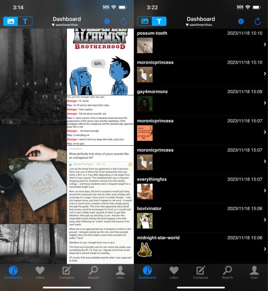
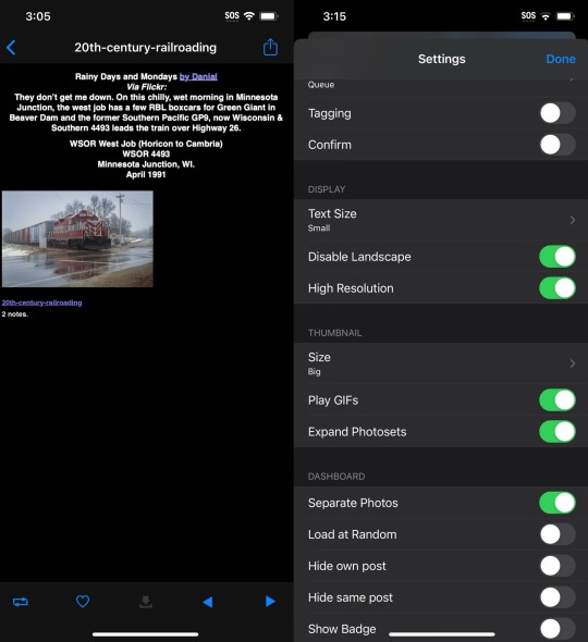

Tumbot: iOS || Free/OTP - $4.99
This is the most fine and normal client on ios so far and I honestly really love it for that. I found the only big problems I had was I couldn't post anything, you can't add tags when reblogging content, and that you couldn't reblog to queue. As a primarily queue user, that's annoying.
I think the best way to describe this app is "chill". If I was able to make post and use queue/draft this would be my replacement app.
My Pros • Dashboard Views - List • Viewable Posts - Text Only, Text w/ media, Photos, Videos, Polls • Reblogging - Instant • Search Support - Bar, Clickable Tags • Multi account support (paid) • Download support (paid) My Cons • Interruptions - Banner/Footer Ads • Dark mode paywalled • No side blog support • Can't make post • Can't reblog to queue, draft, schedule, or privately • Can't add tags to reblogs • Crashes sometimes • No filter/blacklist support
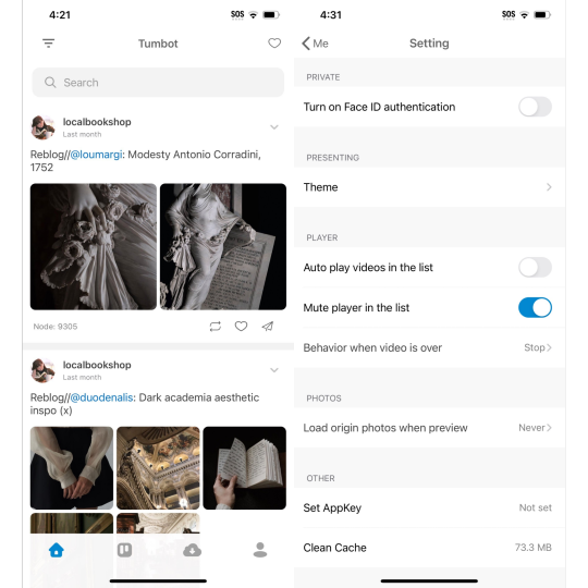

MultiTab T: iOS || Free/Sub - $2.49, $5.99
MultiTab have old pricing structure list that is still up on the apple store page but is not longer effective since the subscription model was added, sadly.
Another app I would actually buy if they didn't only have fucking subscription options.
Compared to Tumbot it kinda feels less clean to me. Idky but it looks a bit clutter or busy even if you only have one dashboard tabs open. I also think post not having a boarder or a different background from the background isn't helping either.
But the way this app handles reblogging is so good and the custom dashboards that I've been wanting on this damn site for years is here but pretty limited. I'm sad that even paid users have a pretty small limit for how many people you can add to a "feedset".
My Pros • Dashboard Views - Grid, List • Viewable Posts - Text Only, Text w/ media, Photos, Videos, Audio, Polls • Posting - Queue, Draft, Private, Schedule • Reblogging - Queue, Draft, Private, Schedule • Side Blogs - View, Reblog, Post • Search Support - Bar, Clickable Tags • Download Support - Images, Videos (paid) • The most features/settings I've seen so far • Best reblogging menu I've seen so far • Multi Account (paid) • Multi Tabs (Customizable - 5 - free | 20 - paid) • Tag History • Save Tags My Cons • Interruptions - Banner/Footer Ads, Popup Ads • Subscription • Polls are viable but can't vote • Doesn't show or explains everything a premium subs gives you • Holds to reblog doesn't show all side blogs • Dashboard Feeds are limited even if subbed • Adding blogs to custom feeds don't always work correctly • No filter/blacklist support
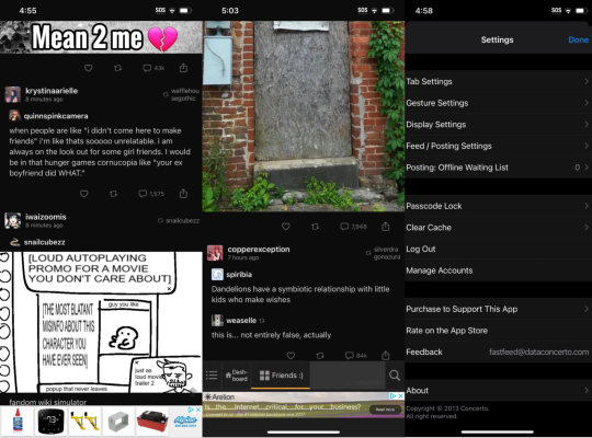
#tumblr#tumblr app#tumblr update#tumblr client#tumblr alternative#<- but not really bc it's still tumblr but ya know what i mean#washboard.ws#ouga#tumblast#tumblesocks#revanced#teehub#tmdroid#tumbletail#violet#tumbot#multitab t#fastfeed
25 notes
·
View notes
Text
update: the dashboard unfucker script is not responsible for the 'classic search' xkit unwritten feature breaking (while it worked at first without the script, now it doesn't work with or without the script), so i guess i should submit a bug report to the xkit github lmao.
however something the script definitely does break is tag tracking+ as w/ the script, the tracked tags still show up in my sidebar, but for some reason the unread count won't update when i go to the tag and look at the new posts :') i tested that w/o the script active and the unread count updated when i revisited the tag feeds.
edit: while doing some careful last minute testing before actually submitting the bug report, i actually got classic search to work both without AND with the script - using the search history instead of retyping the search anew apparently just isn't affected by classic search, and i was so tired that i had only been testing by doing that.
that still leaves the script breaking tag tracking+, but at least one problem is solved lmao. aug 17 edit: tag tracking+ is still not working quite the way it used to but i've figured out how to get it to update the unread count. meanwhile an issue where the 'restore links to individual posts in the post header' tweak reverts, but refreshing the page seems to fix it, so i just kind of expect to have to refresh my dashboard more often than i used to (rather than just clicking the home button twice because just clicking once hasn't been enough for a long time now, functional website), considering how often i use that particular tweak.
in other news, i have a whole ass essay that's been eating at me for the last 24 hrs, and i'm just dumping it here instead of making a whole post about it, because frankly i'm just whining and i don't really want to clog people's dashboards up with it.
im pretty Tired at this point and i've lost any of the remaining 'good will' i had left toward staff. while i've been at least semi-critical of a lot of their more questionable shit for years now, i'd still been trying to give them the benefit of the doubt through gritted teeth.
but this latest fiasco has really reminded me that whoever's making these decisions definitely doesn't care about what the userbase wants even a little, and they are going to prioritize their 'metrics' or wtf ever buzzword they keep using over actual human feedback every time. i have been extraordinarily naive in hoping that things wouldn't get worse, i suppose because i've really enjoyed my eleven years here until now and i wanted to believe that this site wasn't going to go the way that most other older social media is going.
i think as time goes on i'm actually more upset about staff telling us that they care about our feedback and then in spite of that, pushing an update that received a very negative reaction in testing (publicly, at least) without even the courtesy of a toggle option at least, than i am about the actual update.
while a fair amount of the userbase response has been pretty vitriolic and people have said some shit that there's not really any excuse for (threats of bodily harm over a shitty ui update are unhinged behavior - i sent feedback myself that was pretty irritated but at least i was civil comparatively, damn), i saw a few employee blog responses that were unprofessional at best, which was extremely disheartening, since, y'know, i guess i'd hoped they could be more mature than the userbase.
i don't really expect to be here anymore a year or two from now. it would be really nice if a few days from now staff prove me wrong by indicating that they've taken the user response seriously and like, idk, at least giving us an option to choose between the old ui and the new one, but at this point i'm not really getting my hopes up (esp bc there are more problems than the update - like the rumors i've been hearing about the way certain types of content on the site have been moderated).
honestly i kind of expect to just tiredly patch shit up with increasingly more extensions as the site slowly goes down in flames. ¯\_(ツ)_/¯
#personal#tumblr#it's especially funny that like. after the live w/ the ceo thing i had tentative hope that they were paying attention.#so i'd seriously considered paying for ad-free in a few weeks if they didn't immediately go back on the claims they'd made.#and then all this happened so like. yeah. no. i'm glad i waited because this would be even more infuriating.#though cancelling my ad-free in protest would have been pretty funny lmao.
0 notes
Text
for those lucky enough to have not been hit by the update yet, this is what i'm talking about:

opened the settings dropdown menu so you can see the font. now, admittedly, some things on the right like the tag replacer and tag tracking have been added with xkit, but the main issue is everything going on on the left.
again, it's not a big deal. i will inevitably get used to it just like i got used to the beta editor even though i also still hate the beta editor for making it harder to format anything, but it really makes me raise my brows that tumblr is leaning harder into looking like other social media.
i genuinely don't know what to do in this situation. leave staff feedback and low reviews on the app store? throw some money at them in case it's a money issue and they're doing this because they're dying against the competition?
kind of wish staff would be open and transparent with us about why they're making these changes so we know how to better support them so they don't have to do this. because even though tumblr says they're not going to force algorithms on us or change the chronological dash, the gradual morph into looking and behaving like other social media does not instill me with a lot of confidence.
anyway, i don't wanna clog anyone's dash with too much negativity on what is ultimately a small matter. i just gotta grimace and get the unease for tumblr's future out of my system. sad as it is to say, this is one of the very few places that i can still find some scrap of serotonin and i hate thinking about it eventually becoming unusable for the things i like using it for. never mind the fact that it's still arguably the best place for creatives to share their work. once tumblr isn't that anymore, i'm not sure where artists are supposed to go, because even the sites dedicated to sharing artwork don't have the longevity and community that tumblr does. just a bit disappointing is all.
.......why is tumblr desktop laid out like twitter now.
290 notes
·
View notes
Text
tldr: i’m back
hi everyone! sorry for my super long and unexplained absence. i feel like i have to explain myself bc i hate that it’s been so long !! this summer has been pretty hard for me. first, my 3 y/o cat died. then a month later, my dad was diagnosed with cancer. on top of that, work has been insanely busy, in fact yesterday was my first day off since july 19th. so i’ve been meaning to get back on for a bit, i’ve just lacked the energy but i miss it here so damn much.
BUT i am coming back. i’ll be focusing primarily on sandor & theon, then work my way to my multimuse. i’ll be dropping all threads on sandor except for like, one for artie, nicole, and dj each. and asks too. i desperately need a clean slate lmao. i WILL be slow to come back to full activity, mostly because next week i’ll be out of town on vacation, so don’t expect activity to be back to normal until after then. but also u guys know me i’ll probably reblog a meme after this or something lmfao
anyways i love u guys and missed u and i’m just super excited to be back
#ooc ⚔ 𝐎𝐔𝐓 𝐎𝐅 𝐂𝐇𝐈𝐂𝐊𝐄𝐍𝐒#if you wanna keep a thread let me know#also i have to get used to new dash#not so new anymore#does xkit even work anymore?#help pls
15 notes
·
View notes
Text
Can confirm - there is NO way to fix that (yet). Made a new account and fiddled; the "Manage" link on the Tab bar just goes to Tumblr Labs settings, and Tumblr Labs does not include the "reorder tabs" options that are available for older Tumblr users.
They're literally forcing algorithm-first (which is ridiculous, because their algorithm suuuuucks).
If you're new here from Reddit burning, please note that the "Following" tab is the Tumblr experience the way most of the site gets it. Especially when you turn off the "best stuff first" option in the Dashboard settings, which tries to use the (crappy) algorithm to sort your follower's posts for you.
XKit Rewritten, which is a very useful addition to your Tumblr experience (for both Firefox and the other browser), may hopefully fix this in the future - just like they've fixed a whole heap of Tumblr's other "updates" - but for now you should be aware that the machine-driven experience is actively, notably worse than having an experience you can self-curate via deciding who to put on your dashboard yourself. Trust me: use the "Following" tab as your main, even if you have to tab over to it every time. It takes a bit of time to find people to follow, but all you have to do is just find content you like and look in the notes to find people who also reblogged it. Review their posts, and if you like them - follow them. An hour or two of time and you'll have a lively dash. If you later change your mind, or don't like what they post anymore... unfollow them. Simple as that.
Remember, anything which is trying to grab your "engagement" is trying to mess with your head to keep your eyes on the screen longer. That may involve making you feel bad, intentionally pushing things you don't like at you in hopes you "engage" by raging at them, or encouraging doom-scrolling. All of that is engagement, all of that is "good" according to the algorithms running things like the "For You" tab.
Curate your experience to be something you enjoy. Use the active user-driven, user-maintained parts which still remain in Tumblr - everybody else has actively worked to strip that capability out of their social media sites as much as they can, and it is remarkably more peaceful and fulfilling and friendly when you can populate your dash with things you desire and people you want to see more of instead of whatever the computer says you should see.
okayokay i just made a new tumblr account to see what they've changed (besides the "for you" being default.), and they are totally pushing it more than an old user would realize
im logged into this account in one tab and the new one in the other and tumblr is REALLY confused and im not sure where this will post but thats besides the point.
anyways when you sign up it gives you this
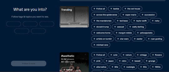
which is very comparable to sites/apps like pinterest and tiktok that have a personalized algorithm. when you scroll down its just random shit like Automobiles and Education. this is not pinterest. it censors stuff like sex but does NOT censor stuff like 'pee kink' . Notably!
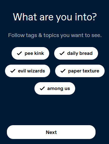
anyways i picked some very normal interests (random shit i could think of, i left pee kink because Haha Funny) .
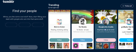
it then forces you to follow people! there is NOT a search, just a few trending users. it makes you pick 3 out of 10 users, one of them is the merch account, at least for me.
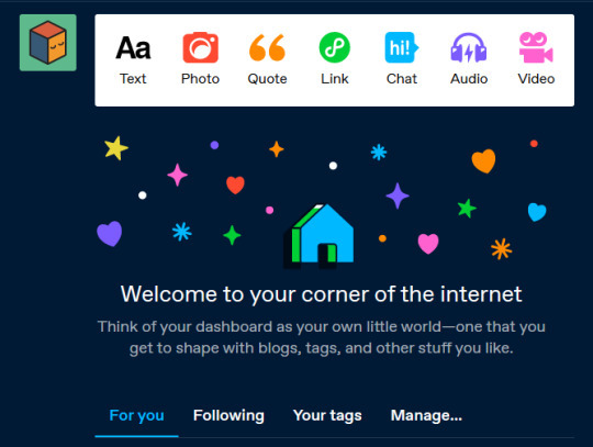
once you go into the actual website it looks like this! note 'for you' being default. there is NOT an option that i see to change this. this is what i was trying to look at before i ran into all the other shit haha.
time to go turn off tumblr live again ! ^^ ((tumblr fix your goddamn site
2K notes
·
View notes