#didn't plan on doing that but then I had made the sketch and added shadow and putting on some colour didn't sound like much more work
Explore tagged Tumblr posts
Text
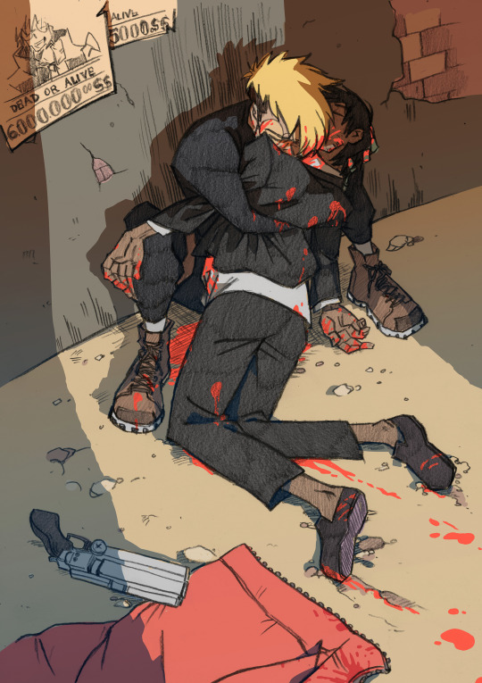
Just a normal day for us both.
#trigun#trigun stampede#fanart#vashwoood#tw blood#vash the stampede#wolfwood#nicholas d wolfwood#nicholas d. wolfwood#one of those very rare moments when I actually colour an image#didn't plan on doing that but then I had made the sketch and added shadow and putting on some colour didn't sound like much more work#yay it's some happy vashwood! just the normal trigun ship art
676 notes
·
View notes
Text
Locked in Eternal Battle

Transcript: You can do this forever...
My favorite part of my art process is the color. Color can bring a piece to life, make it feel full. But...
It's hard to do that with a character that's just black and white! Since I've been mostly drawing Siffrin, my usual coloring process has become boring. Though, on the plus side, this makes me want to experiment more. I've been messing around with the tools in my art app (Infinite Painter) during my art process recently. That's how I got this piece. I used one of the charcoal tools for the shadows. I think it's called Glazed Vine. I don't remember what tool I used for the values on the cloak. It might have been the same tool, but I think it was different.
With using absolute black for Siffrin's design and the background, I had to outline the blacks with thin white line art. Though, with the lines being so thin, they were somewhat translucent. Whenever I had to use multiple strokes for a connected line, you could see everytime I lifted up my stylus. I tried to fix this by inking the lines multiple times. That fixed the problem, but that made the lines way too bright. So I looked at one of the lines that didn't need multiple attempts of line art, and I used my color picker on the line to get a light gray. Then I used the light grey to redo the bright white line art, and viola. Problem solved!
I had difficulty figuring out the pose and anatomy for this artwork. I probably should have searched up a reference, but meh. I think it turned out pretty good, anyways. I think I struggled with making the feet look like they're touching the ground, though. I suppose there could be more anatomy mistakes, but hey! Siffrin's cloak does a fantastic job at hiding any mistakes I could've made. Speaking of the cloak, I really like how it turned out! I think I did a good job with the cloak folds.
And that's basically all I have to say about this piece. Though, I want to mention that, for some reason, it's easier for me to draw anatomy and poses on paper than on my phone. I don't really know why that is. Maybe it's because I have more surface to draw on with my sketchbook?
Anyhow, I'll go ahead and add the initial sketch and a screenshot of my artwork in the middle of the coloring process.


I was originally planning on this piece being about Siffrin sacrificing himself for their friends, but I ended up changing that. I also had to change the hands. You can see that the hand holding Siffrin's dagger is wrong.
I added the mid-color screenshot because I just think it looks cool. It kinda reminds me of something that Julia from Drawfee would paint.
#In Stars and Time#In Stars and Time Siffrin#ISAT#ISAT Siffrin#In Stars and Time Fanart#In Stars and Time Siffrin Fanart#ISAT Fanart#ISAT Siffrin Fanart#In Stars and Time Spoilers#ISAT Spoilers#Fanart#Art Practice#Art Experimentation#Art#TW Blood#CW Blood#TheMusicIntrovert
25 notes
·
View notes
Text
The Dragon Prince - Progress Shots
Thought it would be fun to show how this picture came together (since it was a little bit of a struggle)
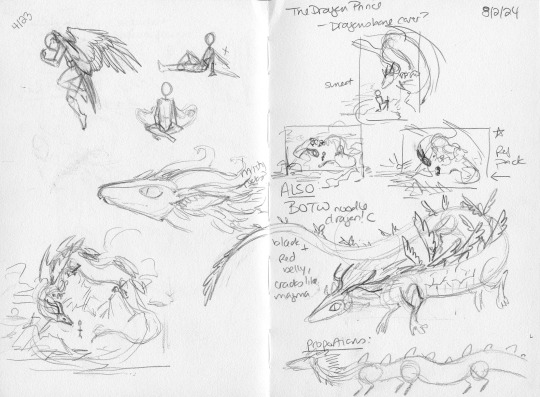
Started out doing some rough concept art and thumbnail sketches to figure out the layout. At first I was planning for a more European-style dragon until I was inspired to do something more BOTW-style.
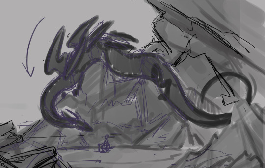
I took the thumbnail I liked best and enlarged it, and then started working on getting the basic shapes roughed in. This was actually my second attempt, I had first tried to use a reference photo of a totally different type of rocks and it just wasn't working so I scrapped it entirely. You can also see Crowley's tail changed from the original thumbnail to make the composition flow better. I had also planned him to have antlers and a fluffy mane like the BOTW dragons but it made the silhouette too hard to read so that got scrapped too.
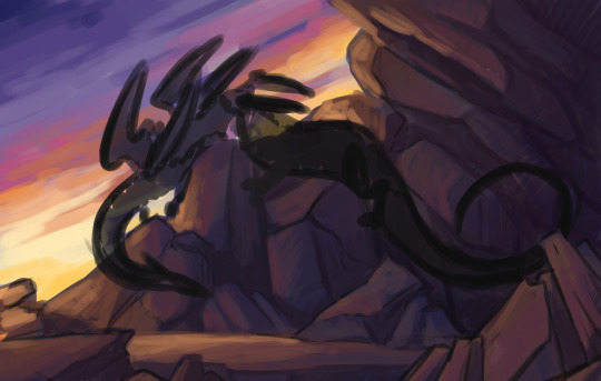
Roughing in colors and light sources as well as further refining the shapes of the rocks. The most important thing here was composition rather than realism. Colors were based off reference photos of the Grand Canyon at sunset. Geologically I don't think they're the same kind of rocks but the vibes were close enough.
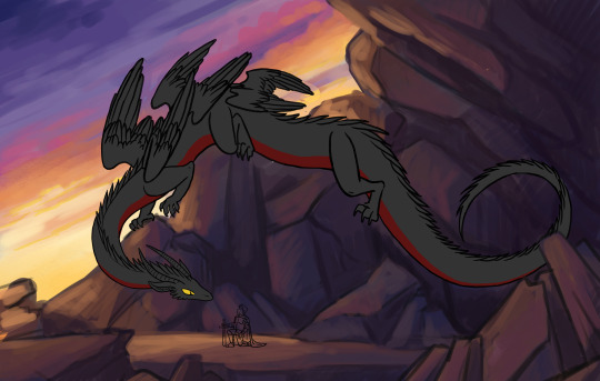
I made several attempts at refining the clouds and could not get them to work so I gave up and drew a more detailed sketch + inks for Crowley and Aziraphale instead.
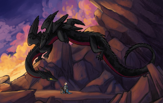
The rocks were giving me even more trouble than the clouds so besides adding in some more lighting I procrastinated on them and did the sky instead as well as roughed in shading for Crowley. X)
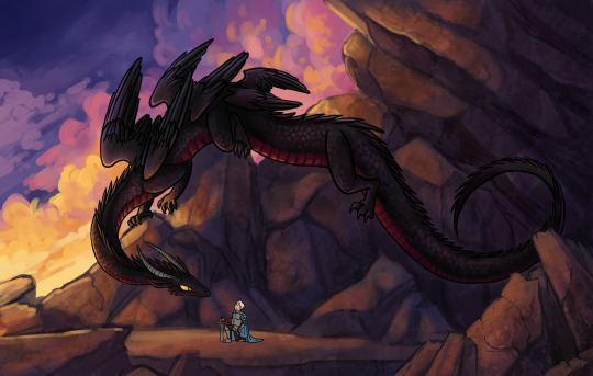
Starting in on rendering Crowley while I still tried to figure out wtf to do with the rocks, haha. I really put them off until the last minute. Eventually I basically took a large textured brush, did a neutral grey layer over the whole rock area, and then set it to Multiply. That really helped in giving the rocks texture without having to render all the details. I dug out more rock reference images and started laying in little lines for cracks based on those. Also putting more shadows under Crowley that I forgot before.
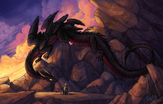
Final art! The last big step was in changing the rocks to the top right - the planes of light and shadow didn't make sense so I consolidated them to be less distracting. Still wasn't totally satisfied with the clouds, but I was running out of time and also thought my tablet had died, so I decided it was GOOD ENOUGH and that's all that matters.
#good omens#ineffable husbands#dragon crowley#art process#know that I did not know what tf I was doing with it for like 75% of the time#probably i should not have signed up for this event#i did not really have the time#and I am still recovering from burnout#but I can't regret getting a chance to draw giant noodle dragon crowley
16 notes
·
View notes
Text
Okayyy, I grabbed a bunch of this year's (plus one from December, technically two) actually like "finished drawings" and ramble abt the good, the bad, and the ugly. I just watched an artists tier their art. So yeah lol maybe I'm in the mood to ramble abt mine lol. Below the cut because...so many pictures lol.

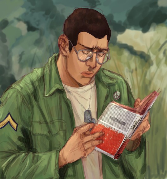
Like, don't get me wrong, I loooooove this Frances drawing, but like. It's kinda just there. Like I feel good when I see it. But I WANT IT TO FEEL MORE AAAAA. Like I'm sure abt almost all of these, I just wish I had given it an atmosphere. I actually think this has a cute light palette it actually kinda works. But I wish I had actual lighting in it <3. Where is the vibe and scene?! I think I should go old photograph. Which is what I wanted to do, but I have no idea how. I still plan on expanding out this drawing, maybe changing it slightly, so hopefully, I will do that better!! I also kinda put this Andy with it. Because I feel kinda the same abt it. I think both lack shadows too, which goes with lack of environment. But I think the soft feel of Andy's is nice! I'm glad I colored it. And actually think I like how undefined the background it on this one. It does something for me! Oh didn't mean it, but love the contrast of the complimentary book cover! Didn't intend that, just picked a book I enjoy and think Andy would enjoy. But like that affect.
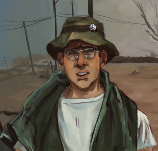
Despite really feeling like Andy is still not mixed with the background, I actually really like this one! I think toneally it has a vibe. And it's just like a portrait so I cannot complain too much!
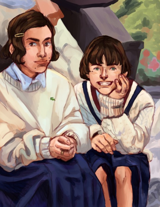

I really enjoy this Mary and Frank piece! I love the colors and like how its kinda painterly but still heavily influenced by the sketch and it can still be seen. I like that I attempted more usage of different hues, not sticking to the main color. Like Mary's sleeve? LOVE THAT. Same with the sweater detail on Frank! I put the Kik one with it because for a quick sketch turned painting I think it is good. I like the vibe. I think I should either heavily fix it or redo it. I think if I keep going at it, I can make it a piece I am really proud of!
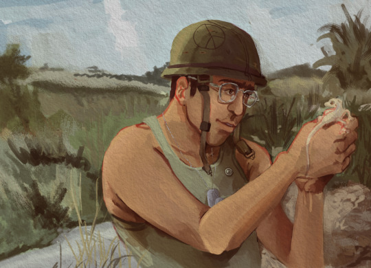
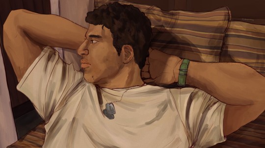
Okay, admittedly, I put these together because they're kinda the same size but lol. Andy; tried something new, think I heavily failed. But I DO like the colors and like I tried texture, though you can tell I didn't know what to do with it lol. The Lincoln, this piece is rlly old, AND IT WAS BADDDD. I think the half assed fixed version is 1000% better. It's by no means perfect. I rEALLY like the shadow of his head on the pillow. But aha, just wish there was more. But overall not terrible! I like it for what it is. And has a special place for being like my first Lincoln piece that wasn't just his fatigues one. :")
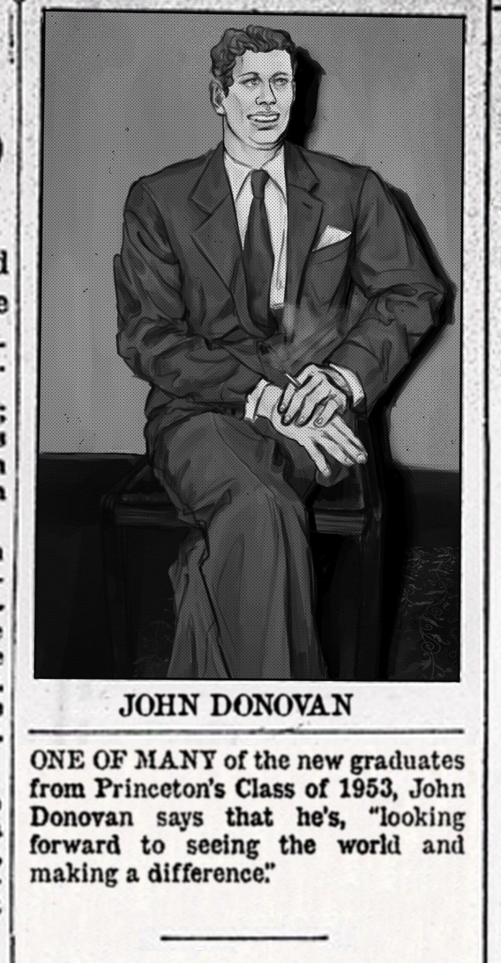
LOVE THE VIBE, I like Grayscale, like the intense shadow. I think the shadows on him could be a but nicer of course. And I do think his hair was kinda poorly done but oh well. I am not the biggest fan of his face? It's not bad, but I think I have done better John faces. I do know; I detailed his face in color and I think I like that better lol.
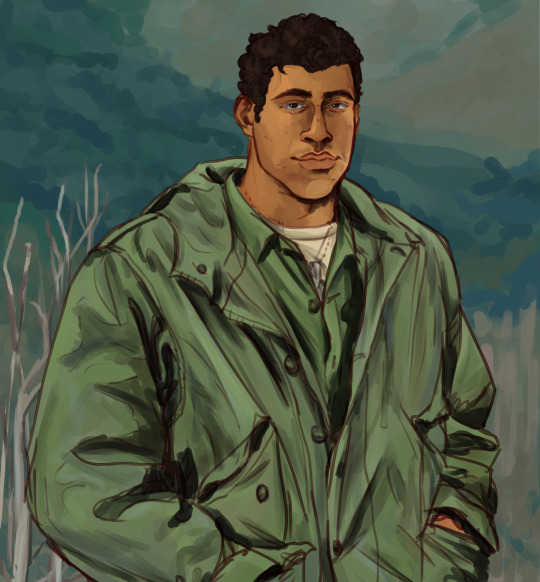
Lincoln, like, I like the face and coloring of that but it's just so meh. It's a figure like I always do. I like the coloring a lot more when I went back and added deeper shadows. But idk. It's okay </3. And oh!! I group a different Lincoln picture with this one, it has no background but the shadows on his uniform are SO good. It made me loooovve the drawing. And is still a fave. It is what inspired me to add deeper shadows here.
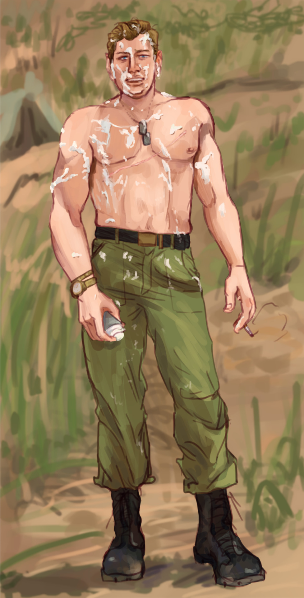
And I've never shared this version of this John drawing. It's a shaving cream prank. Dear God. Help me. I love how John's body turned out. I think his face is nice; its okay. I think I sucked at again giving him a shadow. I couldn't commit to the main shadow and I think it just kinda sucked all life from it. With the Lincoln drawing I don't like the background. With the John one I am torn. I think I should have detailed the ground more? Maybe? Idk. These two, Frank by the water and Andy reading, were all close together and done in January, and they all kinda have the same bckgrnd theme. Idk how I feel abt that choice. For the guys' anyways.
Actually seeing all of these were nice! Because I actually do like nearly all of these pieces! And I feel nervous but very inspired to keep trying to motivate myself to finally take that final step. And maybe try to play into that for the entire piece, not just adding it at the end...and not adding it. I rlly want to try to get a bit more creative too, like interesting things not just person standing there. But idk.
If you read all of this. Omg thank you sorry for rambling your ear off!!! 🫂💗
2 notes
·
View notes
Text
Painting
The Three Bed Paintings.
Outside the workshops, I've been working on a series of paintings where I explored my daily routine particularly the time I spent in bed.
I knew I wanted these paintings to be viewed as a triptych so I worked on them simultaneously.
the first painting I did was of the moment before I got into bed.

I began with a rough sketch in brown charcoal, which I knew wouldn't smudge too much with the paint. Which this drawing I wanted to emphasise the shadow behind me as I like the way it added to the composition.
For this painting, I wanted to experiment with using gouache paints, as I'd never used them before. this overall changed the way I usually paint and I found I didn't have as much colour accuracy as I usually would.

I began painting the background and the shadow first, as I knew painting myself would probably be the most difficult part.
I took time to paint the lights and shadows on my t-shirt.

When I started painting the face I realised I was going to have difficulty painting the way I usually do with acrylic paint. the colours weren't as bright and I found it difficult to create definitions. For this particular painting I was taking inspiration from Lucian Freud, who I had done my presentation on.
I was trying to use single brush strokes to create areas of definition.

When I had gotten used to the way the guache paints worked I started to improve the face, I got to a point where it felt done.
I really like how this painting came out and it made me look forward to the other two paintings I had planned for this project.
0 notes
Text
2. Curves - Homework

Plan: I moved away from a Gingerbread man and decided to create a butterfly. This butterfly is not ony homework, but also for a friend who likes butterflies. I searched google and pinterest for reference butterfly bodies and wings, the picture above I liked the wing desig in particular, and I wanted to base my design off of it. I roughly sketched out the reference drawing, and make notes of how i'd create the butterfly. 1.) Make base wing / body shape. 2.) make the wing segment designs. 3.) Add the gradients. 4.) Add details (Optional).


Main Shape: I created the main shape with the use of curved points, and broken points. And I created the body with the use of two rectangles, which I modified and a cylinder. I decided to seperate my butterfly into the sections, left wing, right wing and body so it was easier to work on piece at a time.


Details: I first worked on the left wing, and make each section at a time. I used the pathfinder tool to make each made section of the wing fit to the main wing shape perfectly. I then used the gradient tool to put a gradient into each wing section. I adjusted the gradient differently in each wing section for more detail. Each wing section has a different angle in the gradient and the grey to blue ratio is slightly different in each part of the wing sections too.


Completion: I continued the wing section process through both halves of the wings. On the outer half I did a blue to purple gradient for more colour. I also make the body of the butterfly dark grey (same grey from the wings) so that the wings fade into the body. I made the colour a dark grey and not a black because the stroke outline of everything is black, and the outline would fade away if I made the wing/body colouring black too. I have also added antenna by the use of the curved point pen, and cylinder shape.


Reflection: Overall I am quite proud of my butterfly, and my friend who I made the butterfly for loves it too. If I had to change one thing it would be to successfully darken the 2nd wing, so it appears like a shadow. The reason I didn't do this in my outcome was because my wing element would not act as one element. I need to ask Toby (or research) how to group something together so that it acts as one element. I believe I also tried merging the layers together, and I still had the same problem. SO because I couldn't make the butterfly wing be one solid element, i couldn't efficiently do the shadow technique. I also tried getting just an outline of the wings, but I accidentally lost half my outline + for some reason it would not let me fill the outline. Excluding the shadowing issues, I enjoyed this project and am proud of how it turned out considering I didn't know how to use illustrator a week ago.
0 notes
Text
I'm glad you like it! Very much enjoyed the description of your reaction! I was really pushing for poster vibes by the end of it. Getting a little inspiration vortex going would be fun.
Like with how much I talked it up, it has no right to actually live up to the praise I've given it, but it still does :) Don't know how I managed that.
That is Nyx's PAK. I didn't know what sorta damage it got so I just went like she's basically a symabolic ghost in this anyway so it should be fine to just like give it cracks and a few stray wires.
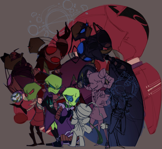
Intially the plan was to have her and Miyuki fade into the background a bit more with their glowing eyes/PAKs being the main thing to draw attention to them. With maybe legacy repeating behind the Tallest in irken a bunch. Then I wanted to add Red and Purple mostly for self indulgent reasons. Then I saw the post about Zim being responsible for Callie's death and her love for the earth and I was like this goes in too.
That was ABSOLUTELY the feeling I was going for with Zim! I'm glad it conveyed so well. Actually you pointed out all the feelings I was really going for so I must of done something right.
Miyuki's pose made thing just feel really loopsided for a while and there was nothing really infront of her, like how Zim and Nyx were infront of the Tallest. Which was definitely symbolic at that point. So couldn't just like flip them or anything to see if that would help. I struggled there for a bit.
Then I really struggled with Lard Nar. I couldn't figure out how to pose him or anything. He had a chair for a bit. But it just didn't fit and the perpective was off and I just started on the line art and colors of Callie and Laska to not deal with him.
But I was like if I'm adding Lard Nar and Zim has a planet... Why not add Vort? Red's just waving anyway and I don't even need to redraw his hand to just make it look like he's holding a planet. So I probed you and Verm about your thoughts on the planet and smashed them together with mine. Boom! Rough sketch for it.
If both Lard Nar (the designer) and Miyuki (the comissioner) are in this then the Massive is a MUST. (I shrunk it later cause I was trying to unloopsidify the drawing. This was a constant and continuing struggle throughout.)
Thyme's bow. I have a character with a ribbon as a tie and one in her hair. I have drawn her more then anything else and that is why this bow was pretty easy for me.
Laska was super easy. Easiest aside from Zim right up until I had to shade her face. Then I could not for the life of me figure it out. There was a point where I had Callie and Thyme fully lined, colored, and shaded (and had figured out what to do with Lard Nar) where her face shadows were in a totally different style cause I just couldn't.
Doing the line art in Vectors honestly was the best decision I made for all of this. Though it did make me realize that while I hadn't really used Vectors in clip before for I kept expecting to morph lines like I did in sai and was very confused for a while.
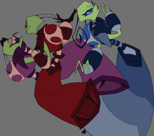
I have drawn the Tallest a few hundred times at this point. Mostly stopped myself from finishing them out right first as a reward for myself(I love them). Look at that little bitchy hand Red's got on his chest. Cocky fucker.
Moving along.
First time I actually really tried drawing Miyuki. Her head and colors was a bit of a pain, but she came out great. Just a lotta line work and I was too distracted by everything else to get her done for a while.
My favorite part with her is that arm she's snaking around her back to grab at Callie.
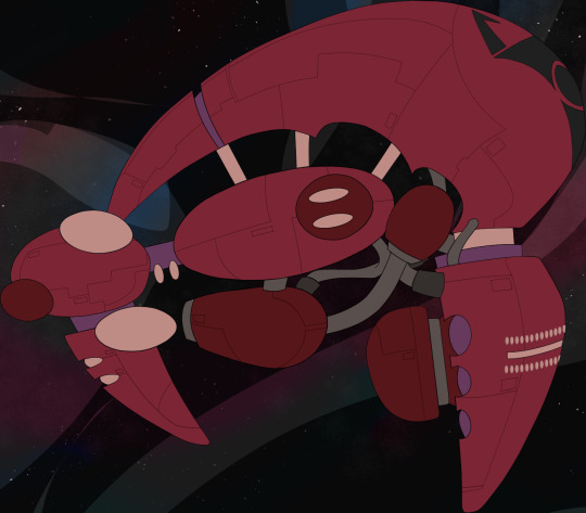
The Massive took like three(?) days. Don't normally draw props or ships it was pretty fun though. Couldn't find a ref for a full side view so I used three angles I found on google. This is only notiable cause I really really struggle getting myself to use references. I think that's been getting a bit better since I started drawing fanart, but still.
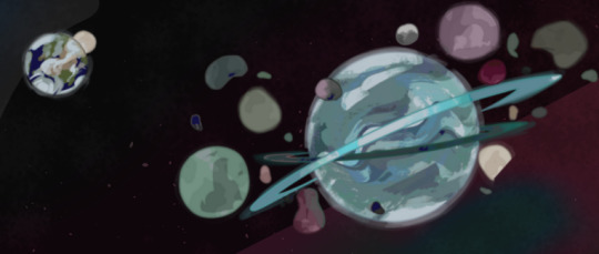
Now Vort. Very fun to do. Very much a struggle. I experimented like crazy with this planet and it's moons. And honestly I don't even know how I got the moons like that. They were green and blue. Then they were orange and purple. Then some how I got a really cool texture on the minty one after messing with posterization and I couldn't replicate it on the others. Vort still looked off.
Those three days I was working on the Massive I was still working on other parts of the drawing to just keep up progress. When I worked on Vort. I only worked on Vort. (And Zim a tiny bit cause Earth was on the same layer and I moved it and the moon so he lost his fingers at one point.) Took two(?) days.
This is around the time saving started taking a while and I was sure it I even touched clip while it was saving it would crash. And while it didn't respond a few times I didn't have to find out if that was true.
Eventually I just I think Wave Distorted it and upped the tolerence on my selection tool to block out some of the more blended colors that were bugging me. Skipping over a lot of fuckery here but yeah. It turned out well.
Used a bit of what I learned from Vort on Earth, straight up stole and rotated one of it's moons and add atmospheres to things.
Background took a bit too. I knew what I wanted out of it and didn't know how to get there. There was a lot of trial and error. So so many layers. But it turned out better then expected.
This was honestly a lot more process stuff then anything else, but still. I wanted to write it out. It was a lot of fun and I really pushed skills. Plus like I stayed focused on something for over a week with out dropping and forgetting about it. So this is kinda a huge win for me. Makes me much more confident about drawing comics in the future.
Oh, and character interaction! Another breakthrough with this piece (possible the few before it too) I've never really been able to draw characters physically interacting or like reacting to each other before. Don't know why it. I just never could seem to get over that hurdle before so this is pretty major. Not only having so many character in it, but conveying what I want them to and not looking super stiff! Fantastic!
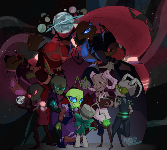
It is done! Here we got @spacegoathours Mina's ocs; Callie, Nyx, Thyme, and Laska with Lard Nar, Zim and three of the Tallest. Vort, Earth and the Massive. (I hope you like it!)
I went hard with this.
I was gonna draw 777 all week and instead I had a NEED to get this out. And it came out amazing! So thrilled! Very proud!
Imma come back and add more text later. Sleep is needed now.
#sorry for hijacking this reblog but I felt it was fitting to go on my tangents here#might not of been#but still#ghostiedoodles#refriedramblings#self notes#fav
347 notes
·
View notes
Text

Spent today drawing some Moon Knight art! Thought it'd be fun to walk through the process!
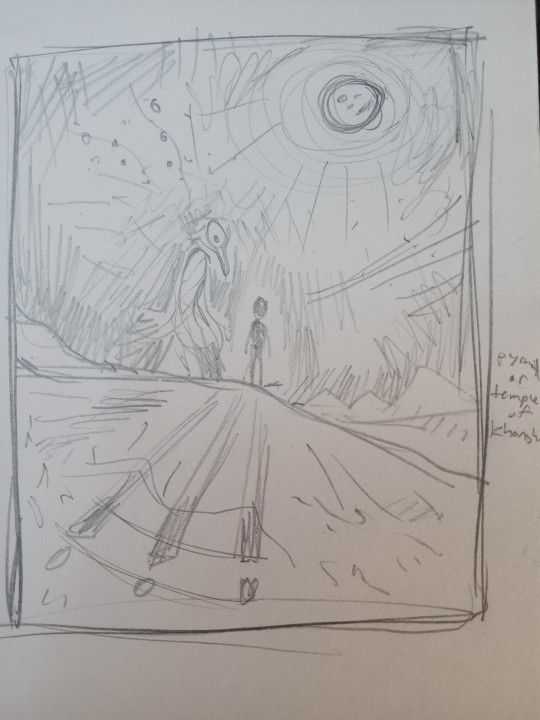
I started with a thumbnail I did in my sketchbook a few weeks ago. I did a page of six smaller thumbnails, then a larger take of my two faves, and this is the one that stuck! I redrew it from scratch on my actual paper, then masked off the edges so I'd have a nice clean picture.
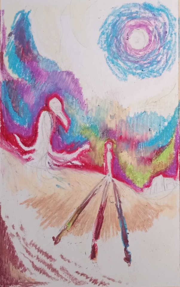
The most important step one to working with oil pastels is to lay down the base colors for any scratch board technique you're gonna wanna do at the end! You can see the faint color of the transparent pastel I layered down absolutely everywhere I thought I might want to be able see white underneath- practically the whole paper on this one, with the stars I was planning! Then I put the bright colors over top that. If you put the color directly onto the paper, that's all that will ever show through!
I like working with bright colors in all mediums, but in oil pastel I like them underneath darker colors for richness and color variety-its also cool when they show through in scratch board, though with transparent underneath I largely planned for this to be more subtle
Kept the green only on Marc's side to subtly visually separate him from Khonshu

Filling in colors! I decided to change the stroke direction of the sky and ground to separate them more
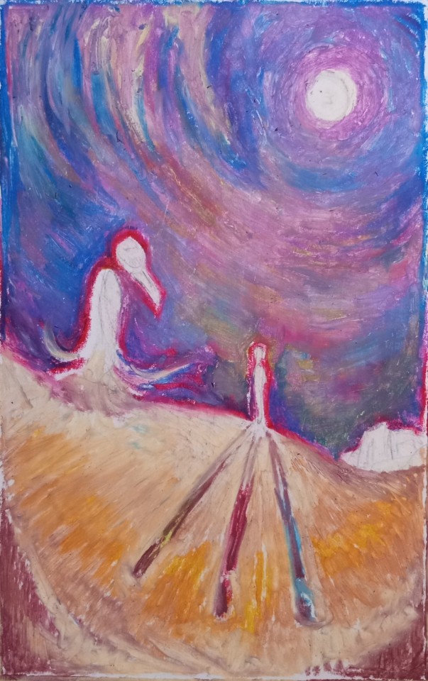
Went over the entire sky with purple and blue, and filled in the ground with a tan. This begins to mute and mix the different colors, and creates a solid layer I can smudge to get rid of any clunky white gaps. At this point I had to leave it alone for an hour or two so the pastel could solidify and wouldn't smudge wildly if I tried to add anything on top of it!

Went over the entire sky with two shades of dark blue! ...Pthalo and Prussian, apparently. This let me continue to emphasize contrast and outlines, while still keeping some richness and depth. Having good sillouhettes of the figures was important here, and you can see where I started getting rid of the clouds so they wouldn't distract from the rest of the picture

Raised the arm, not for the figure itself, but so the shadows would be more interesting to look at! Did some shading in the figures, and tested out the scratch board for the stars and the temple- it worked great, thank goodness!
For scratch board, I literally use the same mechanical pencil I use for the sketch, just without lead! I also used a bit of sponge I had lying around to brush away the oil pastel bits that got scraped up, so they didn't gunk up the rest of the picture.
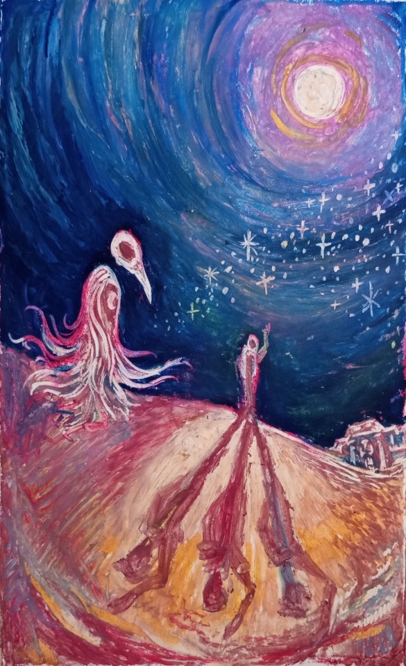
Fleshed out the foreground! At this stage, I took pictures of the drawing and put them into grayscale to make sure I was maintaining good contrast. The left side was a bit boring, so I made it darker- this works thematically for Khonshu, while also upping his visibility.
There were definitely more subtle ways I could have done Khonshu, and I struggled a bit to render without overworking, but I like where I ended up.
I also smudged out and re-scratched the temple so it would sit better!
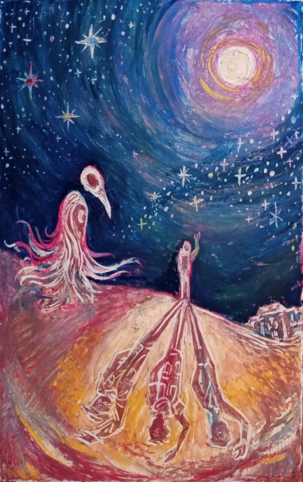
Scratch board fun!!! Because I got rid of the clouds I needed some visual interest in the sky, so I added a star for each of the three of them- they're color coded to match the shadows I detailed as well! Is the 'multiple shadows' visual inspired directly by yugioh? Yes and with no shame, someone please give me this crossover!!!
And after some tweaking, detailing, and removing the tape- tadah!!!

#moon knight#moon knight fanart#artification#traditional#oil pastel#masking off the edges made the picture look so legit and cool I am so excited by this#it was a pleasure to make some art for this thing which has been consuming my brain!!#fun fact I also have some Legit Papyrus paper sitting around and oh man I wanna do something super cool with it hahaha#oh also for this I referenced the Lemire run and also the Moon Knight t-shirt my big sis got me- thanks sis!
41 notes
·
View notes
Text
Wednesday Progress Shots:

More below the cut.
Original rough sketch.
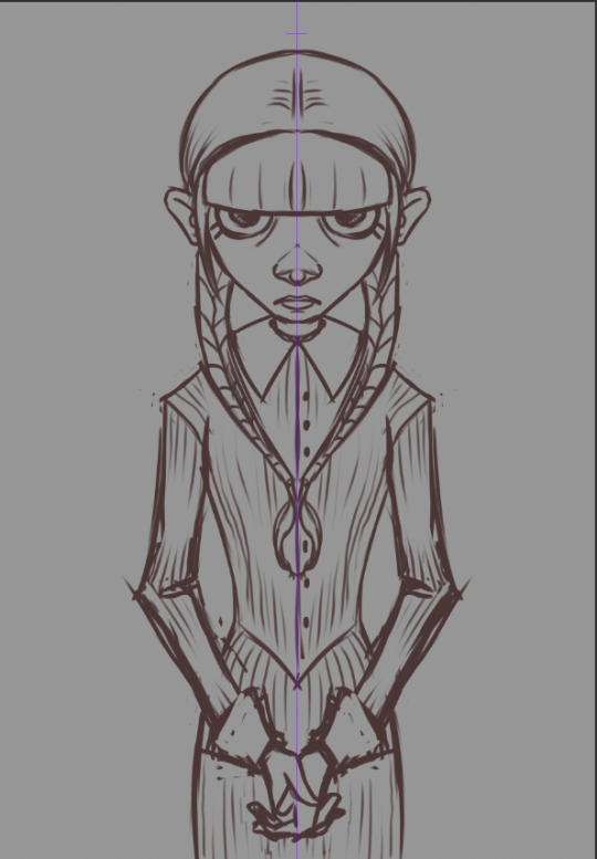
A more refined sketch; I decided I wanted it to be more like a creepy family portrait and added in her hands. I used symmetry for this one; I felt like it made it more uncanny.


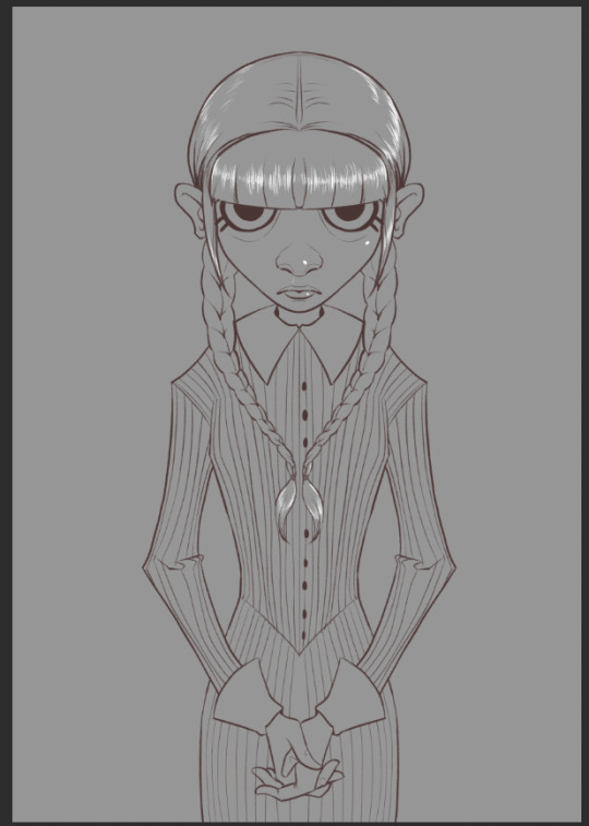
Lineart. I use a rough, pencil-like brush for my linework.

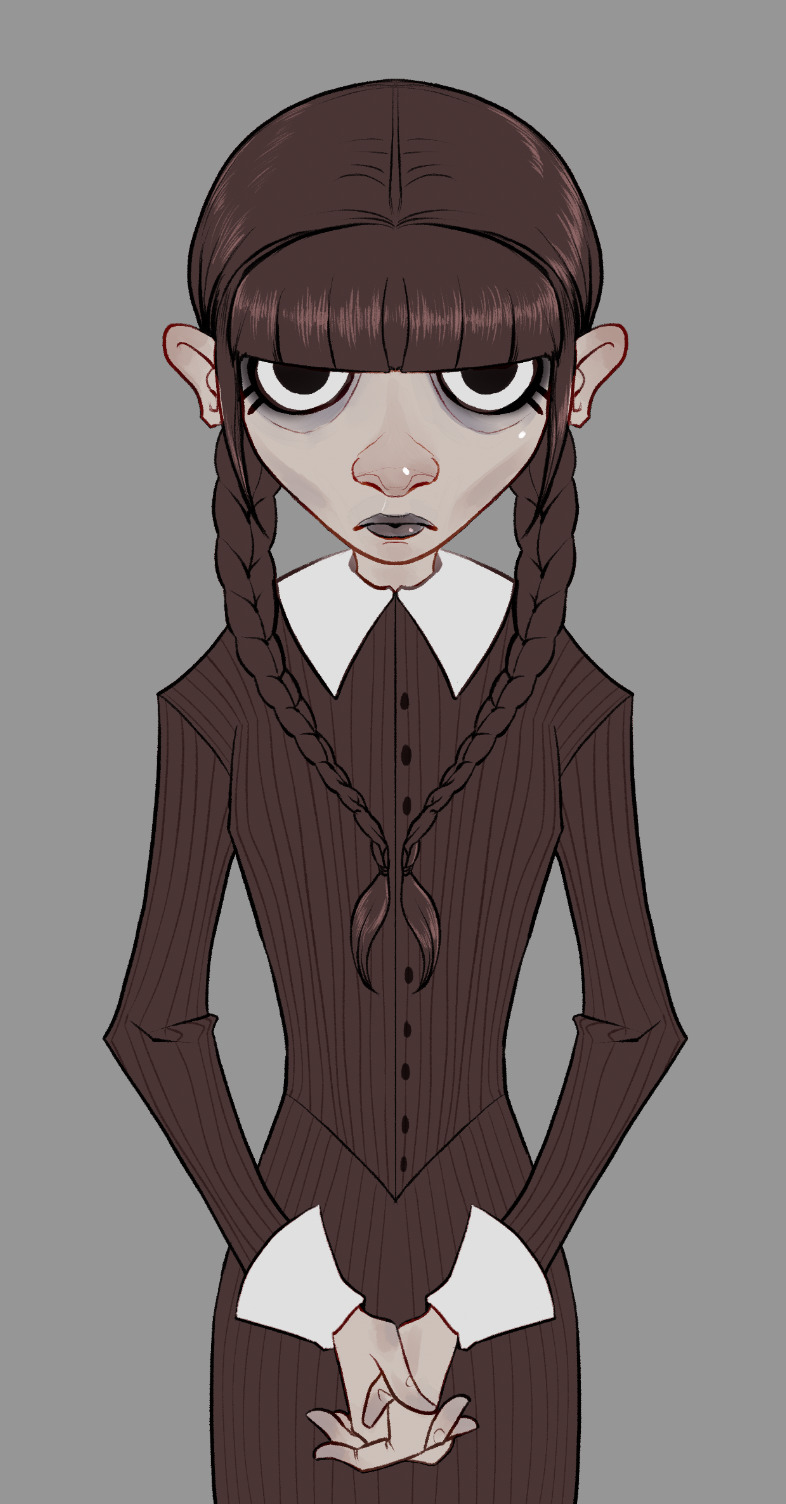
I painted in some flats. I always include a little extra color/rendering on extremities to give it a little more, er… life. x) I decided the "blacks" shoulder be the same deep maroon I used for the lineart so the lines faded at this stage. However, I go in and change them to overlay, or multiply, or color burn, depending on what looks best. :)
Flats, with lineart adjusted for overlays and color.

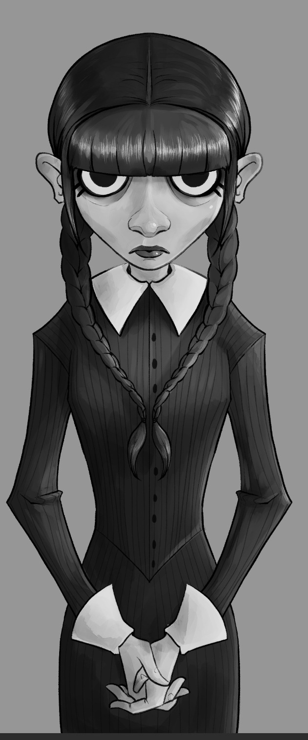
I paint in and plan an approximation of my light source(s) in grayscale.
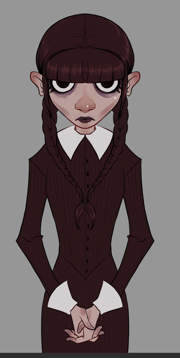
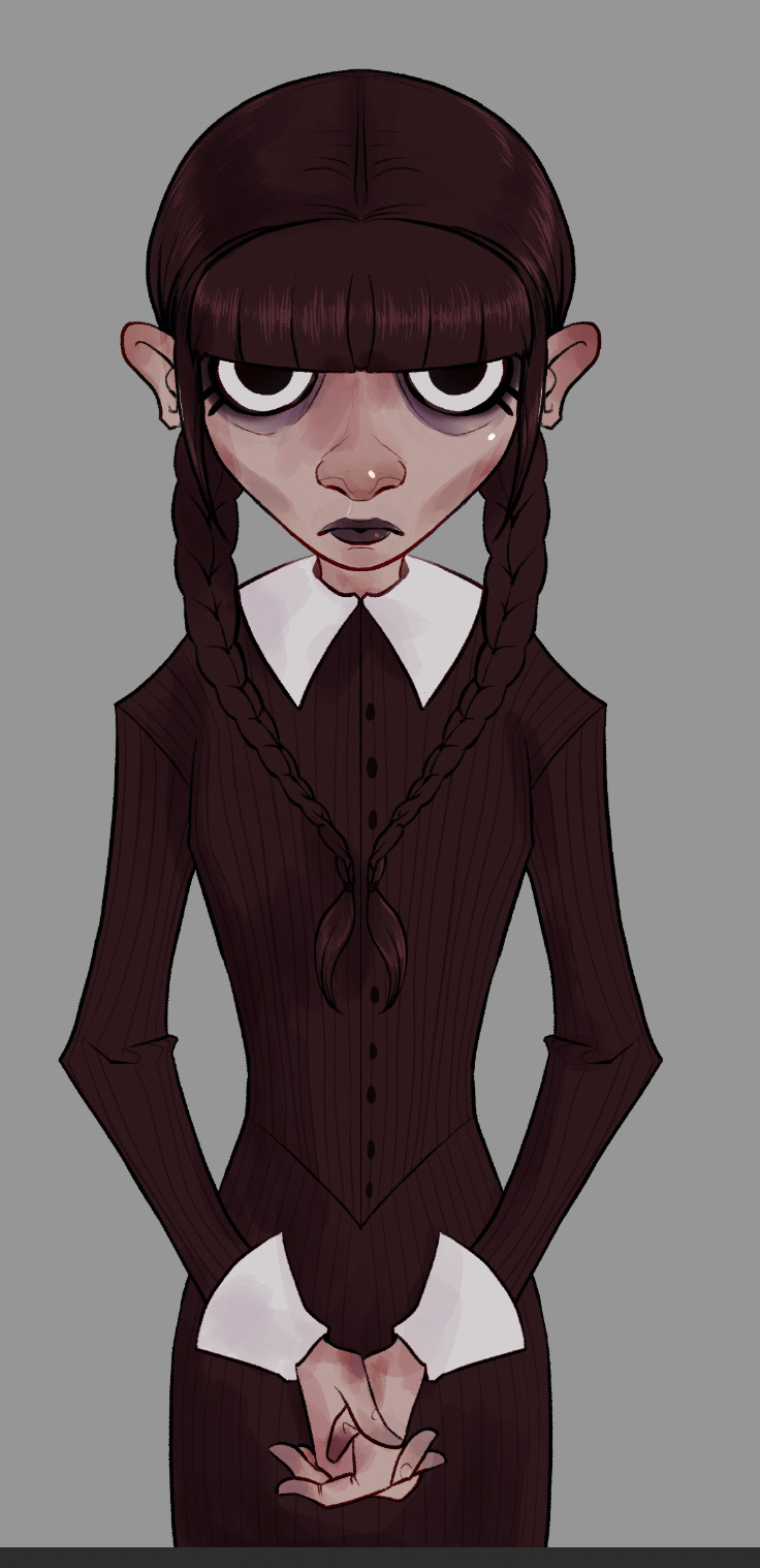
Shadows added in two layers. How much I used and how many layers varies from piece to piece. Whatever looks good and feels right to me.
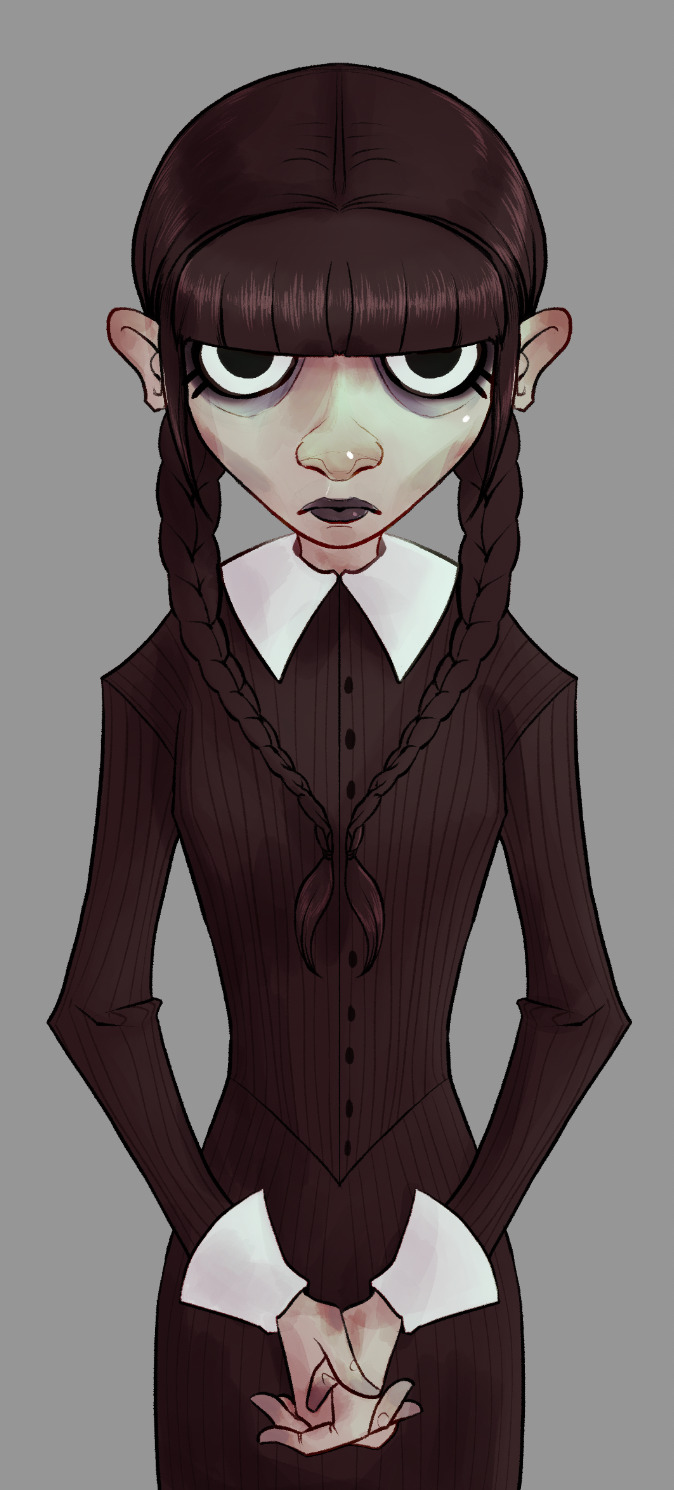
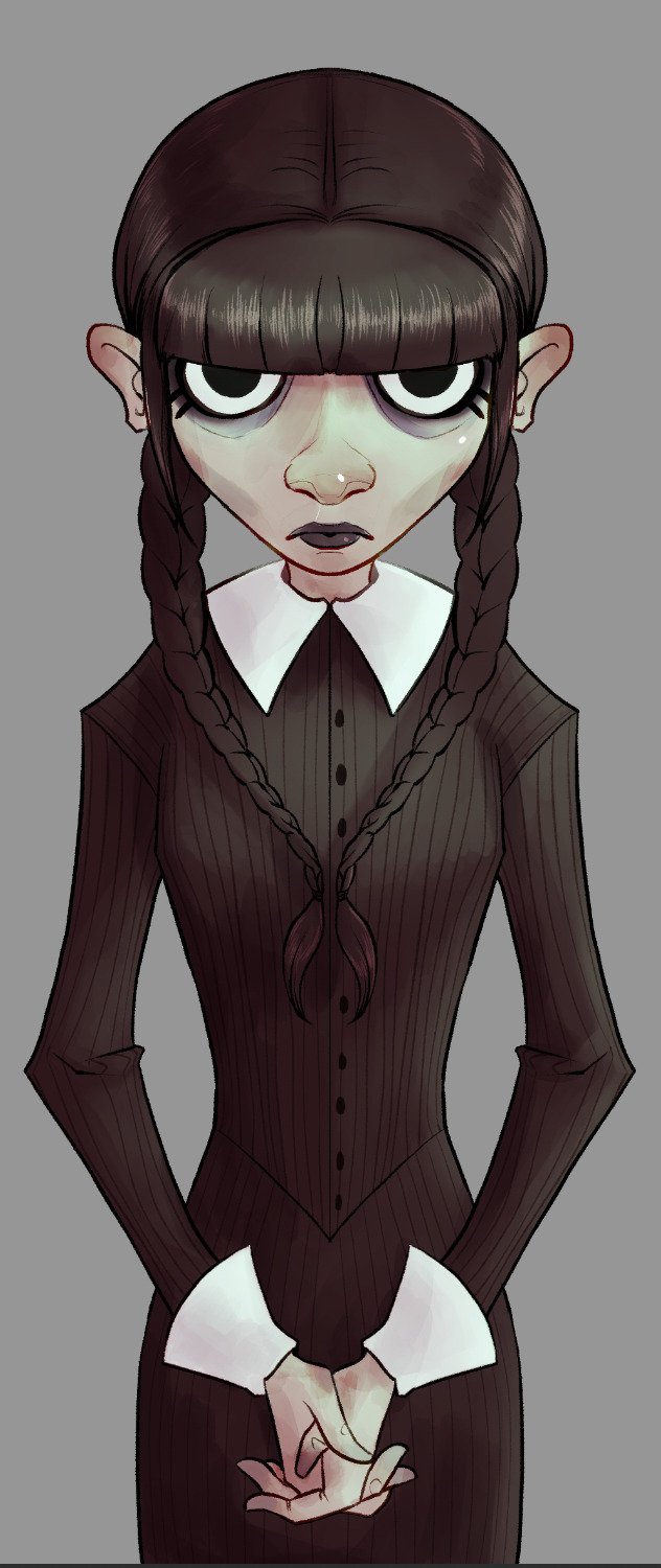

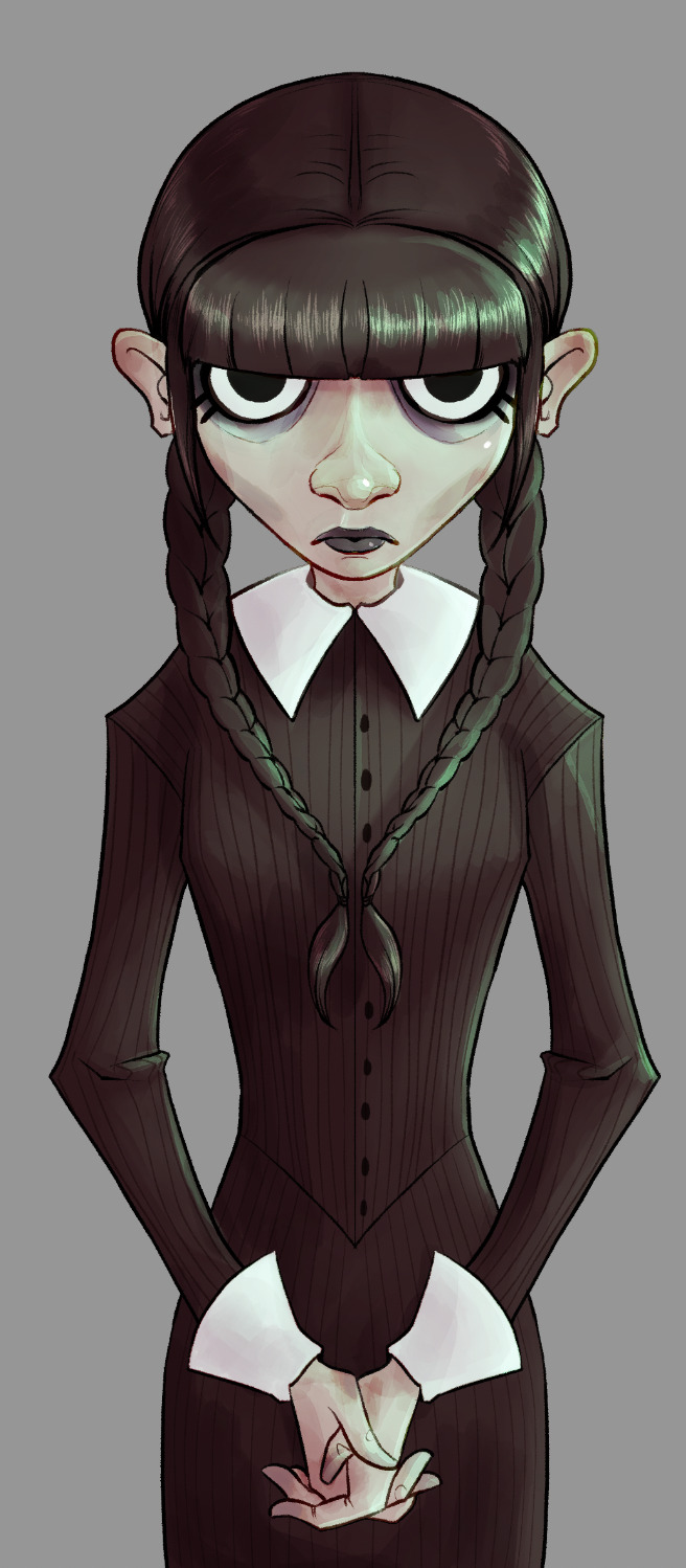

Once I've painted in my lightsource, it's just a matter of adjusting the colors until I like how they look. I went with a sickly green, cold light for this one. It wasn't bright enough originally, so I created a new layer. I continued adding details until I was happy with it.

Then I add a layer of green set on "darken." It knocks out any whites. I tend to play around with this setting on most of my pieces just to see how things look. Another thing I do frequently (that is, when I remember), is set up a layer that allows me to check my values at a glance (basically, an all-black or -white layer set to hue or color). I can make sure I don't have too many midtones and such.
Yep. She looks good like this, too. After this, and most importantly I like to let the work "breathe." Especially if I'm unsure about it. I let it sit for a day (sometimes longer, if I've got the luxury), before returning to it.


The left was what I had. Sure, she looked okay, but I decided some things were missing, and her hair was way too light to be Wednesday's sharp black. Originally when I saw the piece in my head, I planned my light source from directly above. As the piece developed it came more from the side. So I added a little shadow to her face, too. And yet, we are still not done. Umm. I like adjustment layers. I like adding a flash of unpredictability to my art. Keeps me from being too nitpicky, and forces me not to get too stuck with one version of a thing. I'm bad about things like that.
So… I smack on some curves, or adjust color balance. Sometimes I just put layers with different colors over them. In the end, though, I always add some noise, chromatic aberration, and sharpen.
…and let's not forget to sign it, either. Heh. I usually add a simple square with my real initials in it, as well as one (if not more) of my social media platforms. Anymore that tends to be my tumblr because I've taken a fancy to this place.
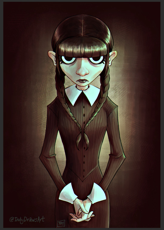
So. Yeah. A walkthrough my process that you never asked for and I didn't really plan, so there aren't any pictures of tools or anything. Umm. Questions from the class? x)
The final result:
#IndyDraws#IndyDrawsArt#my art#Wednesday Addams#Wednesday#Process#Progress#Walkthrough#i don't know how to tag this honestly#The Addams Family#fan art#csp#Clip Studio Paint#dunno if anyone would be interested in something more… official? like me actually trying to make this make more sense#i guess if ya'll would like i'd consider doing it#some of you ~cough biscia~ ~cough wizard-laundry~ have seen the shit-show my layers are lol
7 notes
·
View notes
Text
yesterday was DnD day, so I finished it today! so what went on: for the background so far I've only used the magenta and yellow bc I wanted to use the red for the dragon creature. so I mixed up some of the red and magenta and veeery roughly blocked in some shadows and "outlines", referencing the photo I took of my sketch. no regard for the vines that overlap the creature, I'll deal with that later
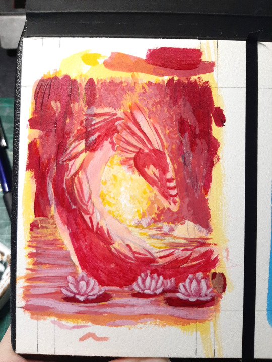
now we build up the shapes of the dragon (or whatever it is, I honestly didn't put much thought into it) by mixing some white in there and layering it up
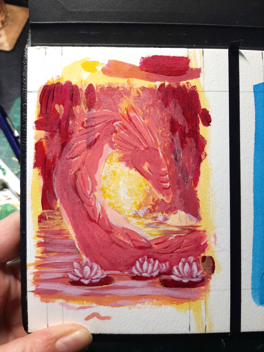
layer by layer (and no I totally didn't forget that hump in the background, what are you even talking about)
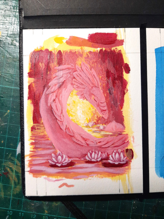
going relatively light, bc I want the dragon to read very light in the end - for sure you could've done this more efficiently if you planned it out better, but this process of "plopping down very dark shadows roughly and then building up the lights and midtones from there" works way better for my brain, so I'm doing it this way
at this point, the dragon was kinda giving axolotl (it was probably just the colour), so instead of making the... plumes? smooth like I had initially planned, I made them a little fuzzy looking
in this stage I mostly layer the lighter paint on top, but I also keep going back to my previous mixes and use them to blend out bigger areas or darken them back up when I went too light
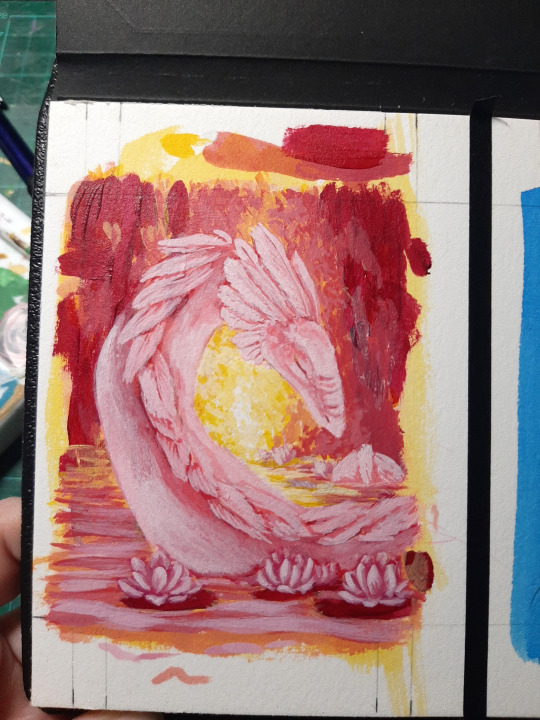
now that I'm happy with the base shape, we can slowly get into the really fun parts! fun part 1: colour details! I want the dragon to have some darker pink/red details. since the quin red I'm using is a quite transparent colour on it's own, I can just layer them on there like I'd do with watercolour without worrying about completely covering up my shading

that's two layers of quin red on there, mostly just glazed on but I went in with the light pink in some spots to make it look neater or go back if I covered too much of the area
now it's time for my favourite part: coloured light to get that ~glow~ so far I've basically used the magenta as my shadow colour and the yellow as my light to get some sort of atmosphere with this very analogous colour scheme (again, the difference between the quin red and quin magenta is much more visible in person, my phone just hates the magenta and turns it red - the colour of the petals is kiiinda close, but it's a lot more cool/purple than that in person). so I mix some of the red with yellow (and a bunch of white ofc) and add a first layer of light
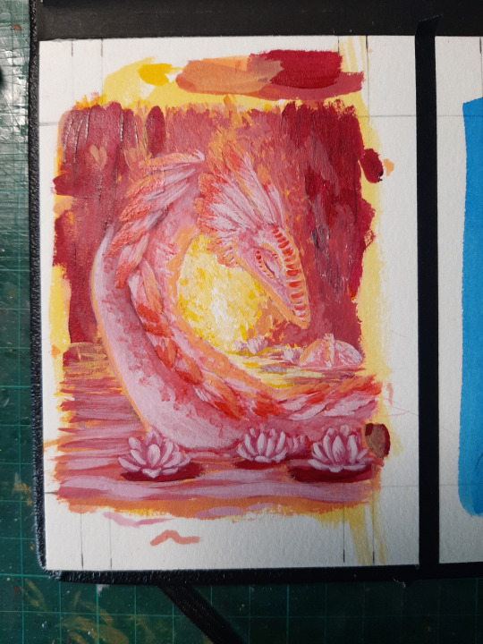
looks a bit odd now, but we gotta trust the process and add more yellow and white to the mix and add more highlights where the light from the background would hit. bc it was blending in with the background a bit, I added a very subtle orangey outline in some spots with watered down paint
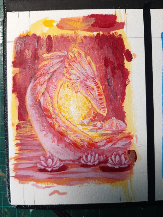
next I wanted to add some softer pink light coming from the front, but bc it is already so flooded with light and everything's so pink already, it's very subtle this time. I like doing that with a very different colour to the main light source sometimes to make dark areas read better. and just bc I think it looks very cool lol
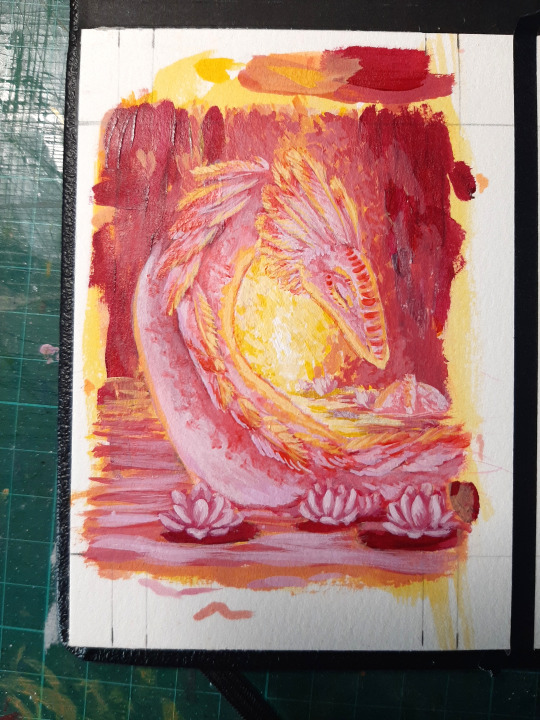
I'll add some very bright (almost) highlights later, but I like to do that at the very end. so now it's time for the vines in the foreground for some contrast! again I use my photo of the sketch as a guide and loosely draw them in with straight magenta. same goes for the lily pads
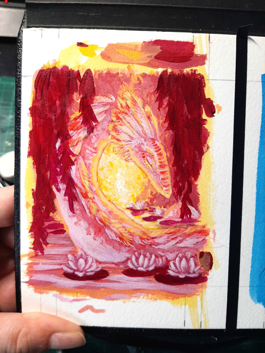
and now I mix some white in it to add just a little more detail and depth - not a lot, I don't want too much contrast there so it won't steal the show. it looks even more subtle in the photo, I swear you can see some different values there in person. when that's done I add some bright white details to my focal point, aka the head in this case
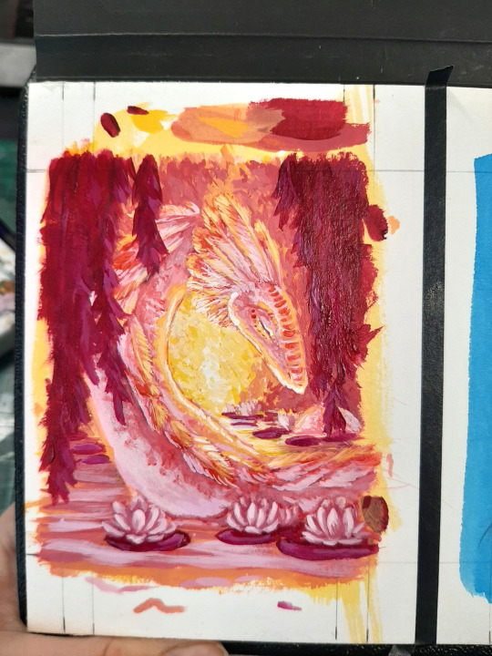
and it's done! I tried scanning it bc my photo skills are... not the greatest to put it lightly. the colours are still not 100% accurate, but I feel it's a little better than the photo

if you read this far: thanks a lot for reading! I hope this was at least a little interesting - if you're interested in something I didn't mention, just ask and I'll try to answer it :D

Ok so a friend asked about my acrylic process - and I thought it might be fun to kinda document this little painting here! Just as a disclaimer, my acrylic process is extremely chaotic and I have no idea what I'm doing, I just throw paint on there until it looks good.
So I hope I won't forget about taking photos down the line, first batch of photos and babbling under the cut!
So let's start with what I'm using, just bc I'm always interested in seeing what others use:
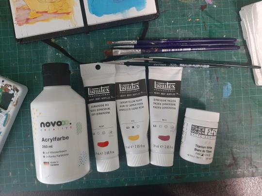
Some cheap (kinda beat up at this point) small brushes, very cheap shitty white (I like to use it to thin my paints a bit without lighting them too much), liquitex heavy body acrylics in quin red, quin magenta and cad yellow medium (only these three bc it's a three colour challenge thing) and threw in some white golden soflat to have a more opaque white (purely bc it was already sitting on my desk from something else and I'm too lazy to get up and grab a different tube)
And this is what we're working on:
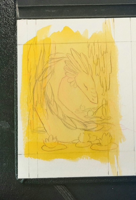
Some sort of water lily dragon, which already has a coat of very watered down yellow on it. I do that for multiple reasons: for one I just like how it looks and it feels less intimidating than white paper lol. But it also helps to hide the coloured lines from the initial sketch and I feel it's easier to judge values when starting with a non-white background
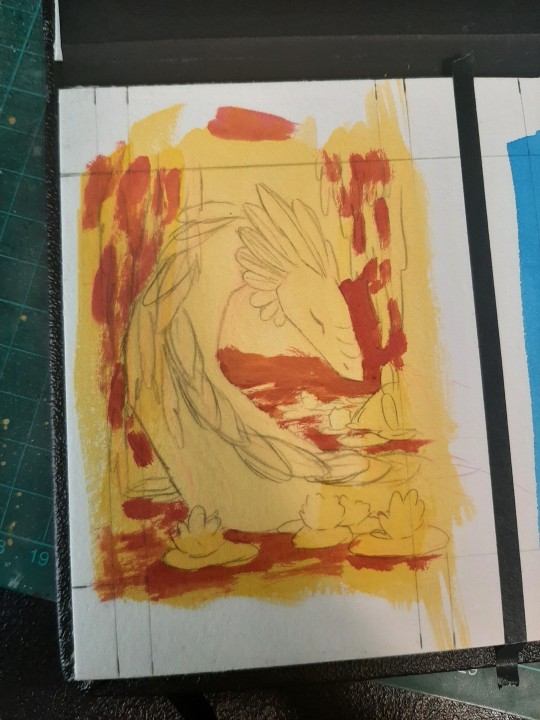
I sketched this a couple of weeks ago at this point, and had kind of forgotten what my plan for colouring was. Whoops. So I mixed up some of the yellow and magenta and started blocking in some background shapes -
But wait!
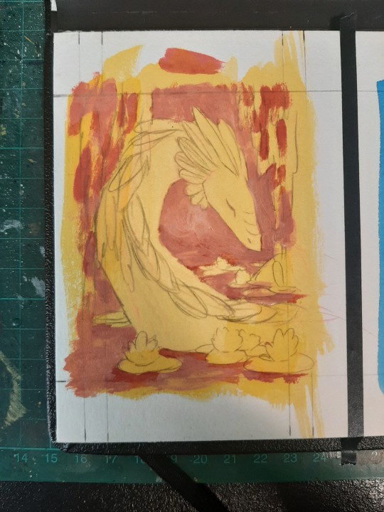
That's when I remembered that I wanted the background to be light, like the light is coming from back there, behind vines and leaves and stuff. So I started building up lighter colours with more yellow and my shitty white
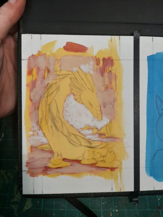
But I wasn't really getting anywhere, so I grabbed my other white and put down some really light areas. That's better - now I can start blocking in the general colours and shapes for the plants and water
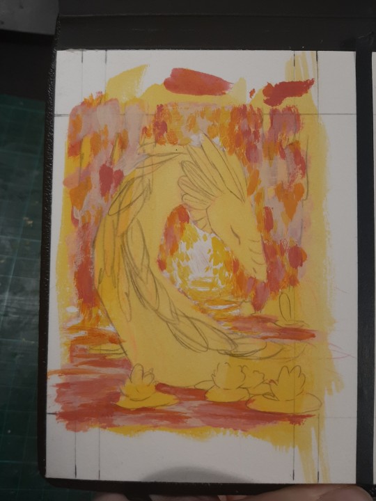
These are all different mixes of magenta, yellow and the shitty white, with one of the frayed flat brushes. I'll add details and definition later
But this felt really dark now, so I decided I had to roughly block in all the other colours too to check if it was really that dark or just looked like it next to the bright yellow
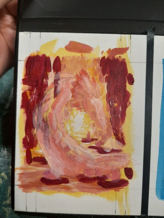
That dark colour is a very pink magenta btw, not a dark red, my phone just hates that colour. The dragon is just red + shitty white for now and wow, you can really see how transparent that white is. I'll definitely have to use more of the good white for this if I don't want to lose my mind
And that's where we're at rn! I took a break to let everything dry properly while typing this up, so it should be ready to go now - I'll report back later :D
13 notes
·
View notes
Text
Plan from September:
finish all 20 pieces I need to do for various promptlists. work on art every day for at least 3h. all non-sketch pieces need to be at least 70% good before they’re finished ✗ I did eight lol (and def not an average of 3h... ugh)
30min figure drawing at least 15/30 days✓ 19!! somehow
ACTIONABLES: revisit all head construction videos from July✗, fix tangents when I see them✓(mostly?), redo background objects if they look bad✓(mostly), use references when drawing ALL HEADS (even ones at normal angles)✗(but did use more refs, esp. for warmup sketches)
Overview of October:
Extreme Mixed Bag. Had a lot of major concentration/focus issues, but experimented with leaving the majority of detail to the inking stage so I could keep some amount of unpredictabilty (this is the only reason I finished anything this month). Grappling with the fact that my natural drawing mode is very spontaneous and that my art looks way better/lively in doodle form *because* I can make random intuitive decisions without worrying about how they fit the bigger picture.
Getting faster at 'passable' figure sketching with/without reference; naturally fitting figures to background perspective works sometimes. Tried painting over sketch lines instead of hiding them but then ran into Major Difficulties when it came to any area that wasn't the face, probably because I don't really know how to paint that stuff anyway lol
November plan:
Do DAB Lesson 5 (big chunks)
Figure drawing 30min 20/30 days
I plan to spend most of November writing, so that figure drawing is going to be the 'daily art' that keeps me somewhat sharp in the absence of everything else :)
notes and improvements from finished stuff:
urban legend: values are REALLY off (everything is too dark and goes towards black way too quickly - means that there isn't much saturation in shadows)
gothic horror: hux's face looks very... not great. mouth placement in 3d is off. eyes/eyebrow area is fucked. kylo's fingers look flat because I shaded them wrong. i was too lazy to fix the placement of that stained glass in the background and it haunts me (also the left window is really asymmetrical; should have expanded the canvas so I could draw both windows fully.) fabric creases are kinda random. kylo's hair doesn't flow well at all. poses are kinda awkward but oh well
orochimaru birthday: i didn't use reference for anything and it shows (but my brain was in such a state that i wouldn't have gotten it finished if i'd been that detail-oriented). arm/shoulder/back/neck anatomy noticeably lacking. scale on snake scales is kinda off w/ perspective. hands are REALLY halfassed. one loop of snake is thicker at one end in an unrealistic way. poses are very stiff and the hand/arm in the middle is SO boring and stiff and clearly rushed
demon: horns don't occupy 3d space properly (i did try to fix this but just couldn't get my head around it bc they curve forward/back and up/down at the same time). figures don't sit on the ground plane (and aren't in the same perspective as each other). made-up back anatomy again. kylo's sword-holding arm is too short. hux's jacket doesn't fit. more problems with value and everything being too dark. random bits of figures are cut off. kylo's sword handle looks like it's going into hux's back because they're not separated by value or anything. lighting doesn't really make sense. hux's face looks flat
ACTIONABLES: revisit all head construction videos from July, find and draw 5 shoulder/arm/neck/back focussed references, draw ground planes under 5+ minute figures, do greyscale value sketches before adding colour
0 notes