#some of you ~cough biscia~ ~cough wizard-laundry~ have seen the shit-show my layers are lol
Explore tagged Tumblr posts
Text
Wednesday Progress Shots:

More below the cut.
Original rough sketch.
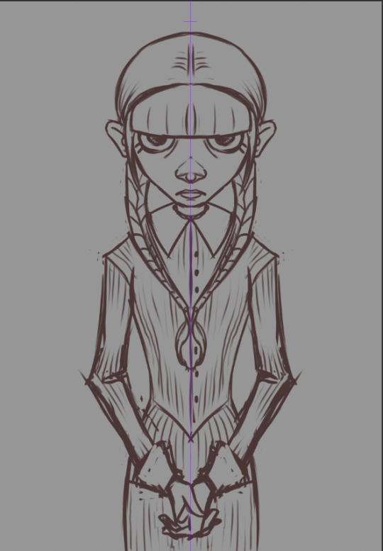
A more refined sketch; I decided I wanted it to be more like a creepy family portrait and added in her hands. I used symmetry for this one; I felt like it made it more uncanny.


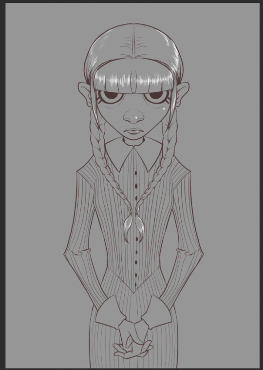
Lineart. I use a rough, pencil-like brush for my linework.

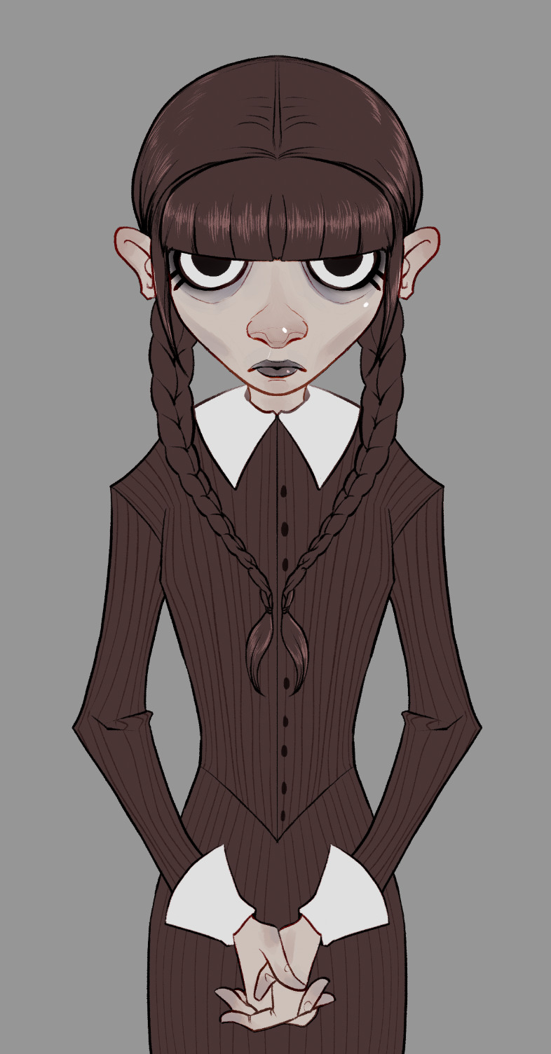
I painted in some flats. I always include a little extra color/rendering on extremities to give it a little more, er… life. x) I decided the "blacks" shoulder be the same deep maroon I used for the lineart so the lines faded at this stage. However, I go in and change them to overlay, or multiply, or color burn, depending on what looks best. :)
Flats, with lineart adjusted for overlays and color.

I paint in and plan an approximation of my light source(s) in grayscale.
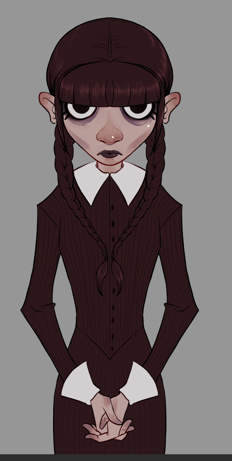
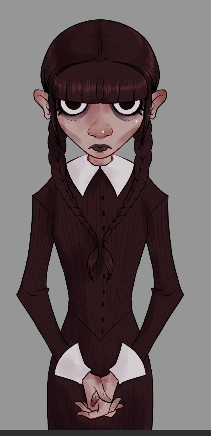
Shadows added in two layers. How much I used and how many layers varies from piece to piece. Whatever looks good and feels right to me.
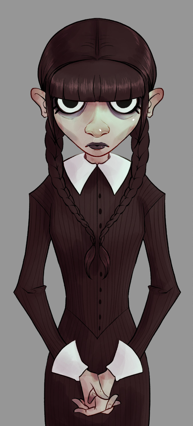
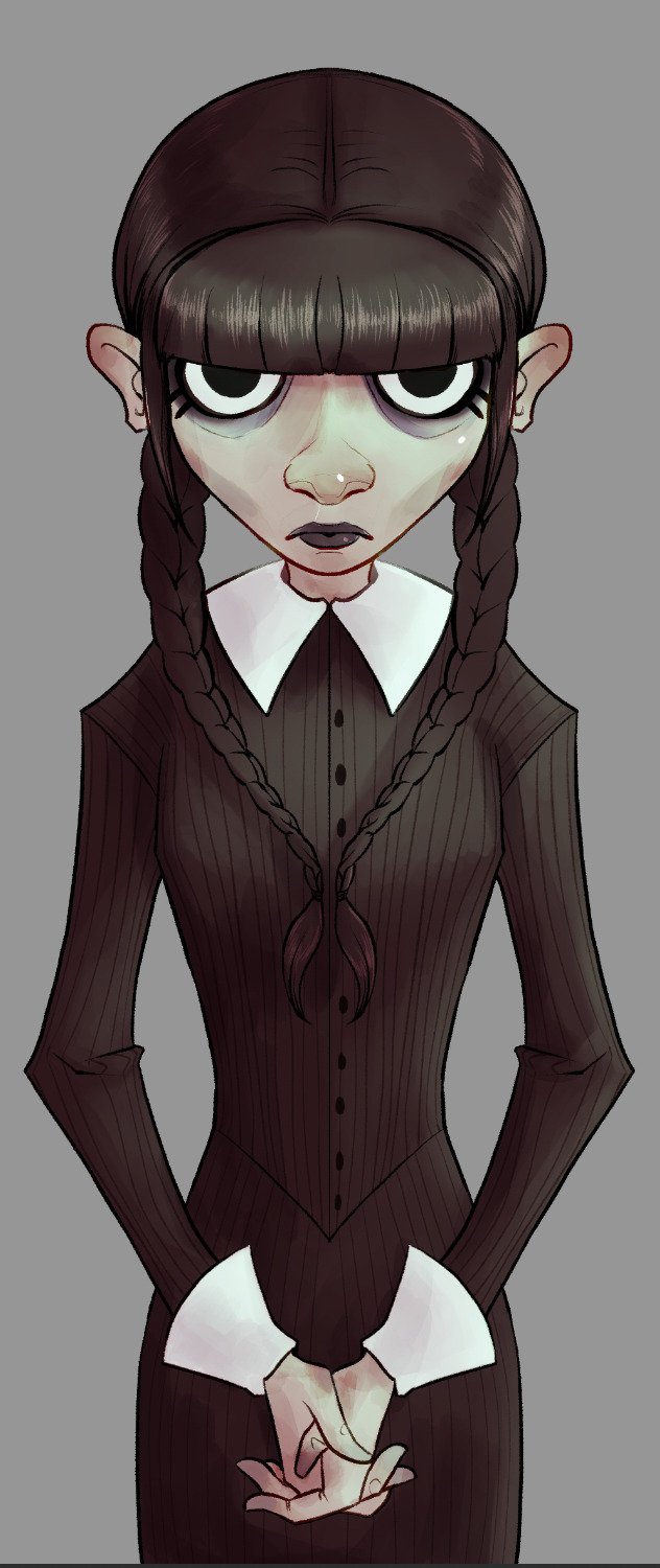

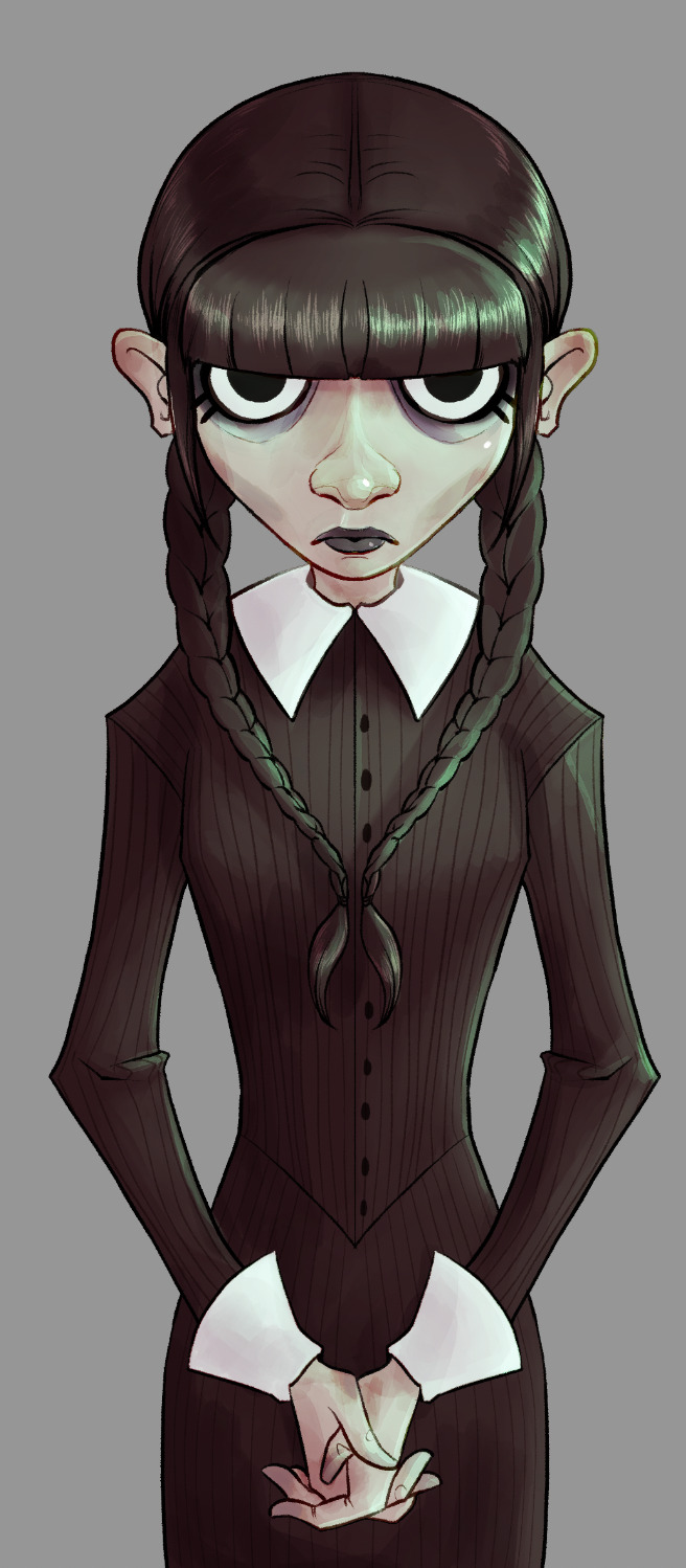

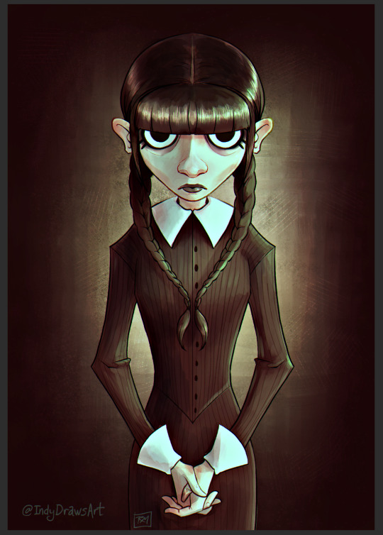
Once I've painted in my lightsource, it's just a matter of adjusting the colors until I like how they look. I went with a sickly green, cold light for this one. It wasn't bright enough originally, so I created a new layer. I continued adding details until I was happy with it.

Then I add a layer of green set on "darken." It knocks out any whites. I tend to play around with this setting on most of my pieces just to see how things look. Another thing I do frequently (that is, when I remember), is set up a layer that allows me to check my values at a glance (basically, an all-black or -white layer set to hue or color). I can make sure I don't have too many midtones and such.
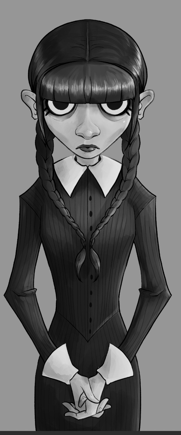
Yep. She looks good like this, too. After this, and most importantly I like to let the work "breathe." Especially if I'm unsure about it. I let it sit for a day (sometimes longer, if I've got the luxury), before returning to it.


The left was what I had. Sure, she looked okay, but I decided some things were missing, and her hair was way too light to be Wednesday's sharp black. Originally when I saw the piece in my head, I planned my light source from directly above. As the piece developed it came more from the side. So I added a little shadow to her face, too. And yet, we are still not done. Umm. I like adjustment layers. I like adding a flash of unpredictability to my art. Keeps me from being too nitpicky, and forces me not to get too stuck with one version of a thing. I'm bad about things like that.
So… I smack on some curves, or adjust color balance. Sometimes I just put layers with different colors over them. In the end, though, I always add some noise, chromatic aberration, and sharpen.
…and let's not forget to sign it, either. Heh. I usually add a simple square with my real initials in it, as well as one (if not more) of my social media platforms. Anymore that tends to be my tumblr because I've taken a fancy to this place.
So. Yeah. A walkthrough my process that you never asked for and I didn't really plan, so there aren't any pictures of tools or anything. Umm. Questions from the class? x)
The final result:
#IndyDraws#IndyDrawsArt#my art#Wednesday Addams#Wednesday#Process#Progress#Walkthrough#i don't know how to tag this honestly#The Addams Family#fan art#csp#Clip Studio Paint#dunno if anyone would be interested in something more… official? like me actually trying to make this make more sense#i guess if ya'll would like i'd consider doing it#some of you ~cough biscia~ ~cough wizard-laundry~ have seen the shit-show my layers are lol
7 notes
·
View notes