#did the illustration today in watercolour
Explore tagged Tumblr posts
Text
antelope, asleep
with all the grace the antelope lies down safe, out of sight curls up, her head on her back legs all tucked in for the night
of what you dream, oh antelope? you yearn for rain, the soft sweet grass? i hope you get all that and more watch many seasons pass

anyway here's the silly little antelope poem that fell out of my brain last year 😅
(cc @addaxbones)
#when i say fell out i do mean fell out#i literally wrote two poems plus a couple fragments in a couple days#having not written anything original for a decade#(translations and little riffs on famous poems barely count)#but i feel so embarrassed posting my stuff#did the illustration today in watercolour#it refused to scan right so the light ochre bg isn't visible but there's little i can do :/#poetry#my art
25 notes
·
View notes
Text

Chimera in red
#artists on tumblr#illustration#mixed media#watercolour#digital art#mythology#chimera#monsters#This is from an in-class assignment I did today
42 notes
·
View notes
Text

finally got around to watching next to normal
#and my aaron tveit brain rot is still going strong#so far today ive watched next to normal little shop of horros and charlie and the chocolate factory#and its a whirlind of emotions#very proud of how i did gabe#next to normal#next to normal fanart#aaron tveit#aaron tveit fanart#broadway#broadway fanart#musicals#watercolor#watercolour art#artists on tumblr#traditional illustration#musical theatre
18 notes
·
View notes
Text

Here’s a cute summer illustration of Teruteru and Hajime hanging out and enjoying a ice cream and slushy on the beach together along with their classmates.
Fun fact this artwork was supposed to be finished on last day of June since it a pride piece but I got busy and it taken till today to finish. Also happy pride uk because recently I found out, we celebrate pride in July and I went to my very first pride on Saturday. ^^
#teruteru hanamura#teruteru#hajime hinata#danganronpa#danganropa 2#teruhina#watercolour#Also sorry for practically gone for two week I been very busy and I been a bit aloof recently since a lot changing in my life lately#Also I doing artfight so I posting the illustrations as I go along#Also I have a secret project but I’ll be hush hush for now he he#I wasn’t well today but f it I wanted to paint so I did >:3
26 notes
·
View notes
Text

Day 3 of Cosytober 2024: Broom 🧹
I decided to go back to what I like best, kidlit illustrations. As much as I like the outcome of yesterday's leaf, I also really like stylised drawings like this one. While I had the intention of painting something on paper today, I found myself lacking time to really sit down with my watercolours to draw a broomstick. I still did some watercolouring, but on a different drawing I hadn't finished yet. For this one I wanted to focus on the brooms. You see, I am working on a project IRL for Halloween. I am going to make my own witch's broom soon. My two youngest boys and I already picked up twigs around the park, and my youngest found a really thick, long branch in the same park which we carried home yesterday! Now I have to find the time and energy, and I will be making a custom broom. The idea came to me when I was looking around online to find an adult sized broom. But everything was plastic, expensive and too small. So I decided to make my own instead! It will be fun to display during spooky season and the rest of autumn, but also as a prop to carry around when we celebrate Halloween! So in a way, I was practicing today, to see what kind of broom would look nice. 😄 What do you think? Which broom is the best one of these 3? As much as I love all three, I think I will stick with the first one on the left. The plain brown one, the classic broom.
Also on my blog!
See the full list here
#cosytober2024#cosytober 2024#cosytober#inktober2024#inktober 2024#inktober#kidlitart#kidlit#kidlit illustrator#kidlit art#Halloween#witch#broom#illustration#art#drawings
4 notes
·
View notes
Text
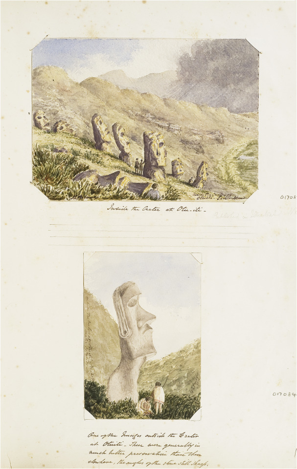
John Linton Palmer, Sketches of moai on Rapa Nui (Easter Island), Nov 1868, watercolour, Easter Island Album, F030/6 © RGS-IBG.
Above: ‘Inside the crater at Otu-iti’ (pencil annotation: ‘Published in Illustrated News’).
Below: ‘One of the images outside the Crater at Otuiti. These were generally in much better preservation than those elsewhere, the angles of the stone still sharp’.
"Linton Palmer’s later sketches indicate an enduring interest in forms of material culture, architecture and archaeology. In 1863, for example, he took leave from HMS Melville to travel for three weeks up-river from Canton with a fellow-doctor William Kane, Scots businessman James Banks Taylor, a missionary Orientalist (and the future Oxford Professor of Chinese) James Legge and his Chinese secretary Tsang Kwei-Hwan. Linton Palmer sketched Buddhist temples and pagodas along the way, although they were not included in a subsequently published account of the trip. Drawing was also to play a significant role in his later studies of the ethnology and geography of Rapa Nui, arising from HMS Topaze’s visit there in November 1868. Although he appears to have included drawings with a letter sent to England the following month, Linton Palmer’s account was published by the Ethnological Society without the drawings, as was another paper presented to the Royal Geographical Society. Nor did his sketches of the skulls (which were sent to Thomas Huxley) appear in print. At least one of his drawings from the Topaze was published in engraved form in the Illustrated London News before his return to London (20 March 1869), and other sketches may have reached wider public audiences in the same way.
...
Today Linton Palmer’s most well-known sketches are those he made on the island of Rapa Nui (Easter island) in 1868, during which one of the moai, Hoa Hakananai’a, was excavated from its underground resting place. The evidential quality of Linton Palmer’s writings on Rapa Nui have been questioned by later archaeologists, especially his supposed tendency to rely on what is regarded as hearsay rather than first-hand observation. However, his sketches of the sites of the moai and the marks upon them constitute a significant and in some respects a unique documentary record which still has value in archaeological study.
...
In view of the continuing debate amongst Rapa Nui specialists over the quality of Linton Palmer’s evidence, it is worth making two further points. The first concerns the place of accurate observation within his routine practice as a naval surgeon: it was his responsibility to observe the bodies of the crew, the condition of the ship and of the weather, and in this context precise documentation in multiple forms was essential. In a naval setting, moreover, the notion of isolated observation independent of ‘hearsay’ does not really make sense: here an observation which was not shared could not be tested or relied upon. The second point concerns Linton Palmer’s prior experience of archaeological survey which has hitherto been unknown. In fact, ten years before the Topaze voyage, Linton Palmer himself had undertaken the first field survey of the stone circle at Calanais (Callanish) in the Hebrides, just prior to its excavation..." - from Felix Driver, “Material memories of travel: the albums of a Victorian naval surgeon.” Journal of Historical Geography 69 (2020): 48.
#linton palmer#historical geography#art album#royal navy#rapa nui#moai#settler pacific#polynesia#indigenous history#british empire#academic quote#indigenous people#archaeology#archaeological survey
10 notes
·
View notes
Text
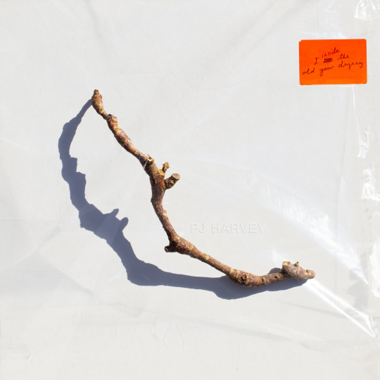
Uncovered: PJ Harvey - I Inside the Old Year Dying
We continue to delve into the detail of the creative process for some of The Best Art Vinyl 2023 shortlisted album artworks and today we take a look at this seemingly simple cover design for PJ Harvey’s tenth studio album that, in fact, couldn’t be less so. The final image is actually a result of months of preparation, awaiting perfect weather conditions and a combination of multiple photographs and techniques. We were lucky enough to get the whole story from artist Michelle Henning.
Henning’s background is in fine art, she started as a painter and installation artist. As well as being a Professor in Photography and Media in the School of the Arts at the University of Liverpool, Michelle works for PJ Harvey as art director/creative director, and as such is very much involved in decisions relating to many of the visual assets.
Michelle explained to us how the creative process starts and about her collaboration with PJ Harvey; “The way I approach the work is to listen to the music. Polly and I don’t discuss visual ideas at first, instead, she gives me everything to do with the album: recordings or demos, poems and lyrics, drawings and notes. I then immerse myself in it and try to get a feel for it and start working. I already had a way into it because I was familiar with her poetry book 'Orlam', which is connected to the album, and I had a strong sense of the world of the album. What matters most to me is trying to find a visual equivalent for the music, not to illustrate it or directly reference lyrics, but sense the atmosphere and convey that.”
Michelle elaborates, “In the case of ‘I Inside the Old Year Dying’, this album has a strange and interesting feel, on the one hand it’s about a twentieth century rural childhood, with references to Curly-Wurlys and Coca cola but also there are soldiers who appear from a much more ancient past, and there’s a strong presence of nature."
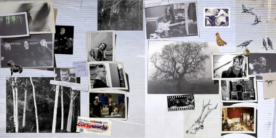
PJ Harvey, I Inside the Old Year Dying concept gatefold (Copyright © Michelle Henning, 2023) with photographs by Steve Gullick and drawings by Polly Harvey
"I started by thinking I would try to put wildlife cameras in a forest, not to capture animals but to get infra-red photos of trees. So I did that for a while but I wasn’t satisfied with the results. Then I started to paint forests, but that didn’t feel right either."
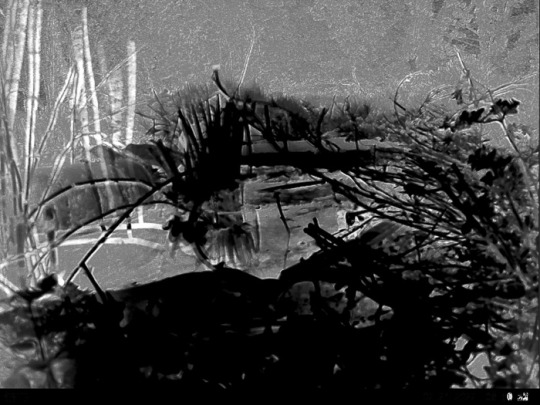
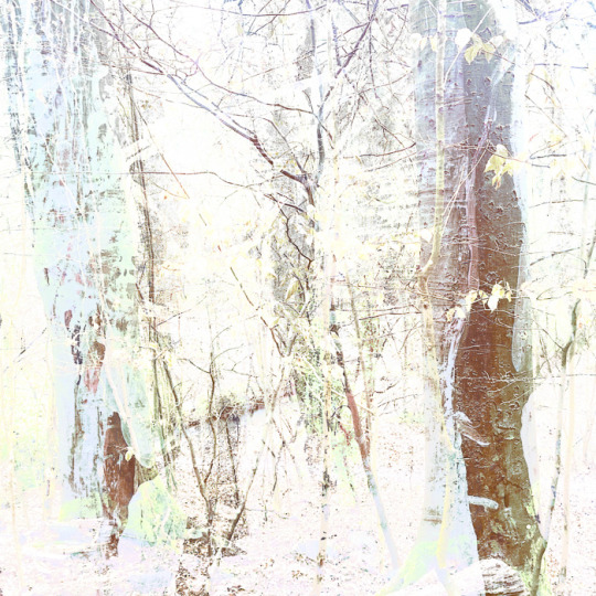
Early Forest concept ideas for PJ Harvey, I Inside the Old Year Dying (Copyright © Michelle Henning, 2023)
"I had a sudden realisation that I didn’t need a whole forest, I just needed one stick and such a simple single object would give it the feel of the classic album covers I admire. Now I realise an unconscious influence was Polly herself, because she had chosen to use drawings she had made of single twigs (“twiddicks”), to break up the sections in 'Orlam'."
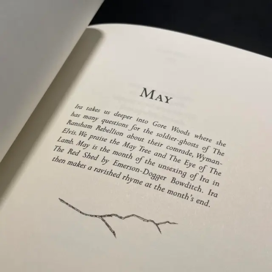
Orlam by PJ Harvey
"I think the idea of giving the stick a shadow emerged from the process of finding twigs on the ground and photographing them — the shadows seemed to bring them to life and make something very ordinary suddenly seem almost animate."

Concept ideas for PJ Harvey, I Inside the Old Year Dying (Copyright © Michelle Henning, 2023)
"The back cover is a photograph of Polly by Steve Gullick, onto which I superimposed a scan of a tissue and plastic envelope, so it has a slightly battered, used look. I chose this photo because I loved the way her legs echoed the shape of the twig, and also how it could be cropped so that it seemed as if she was almost kicking the edge of the album away."

Front and back cover artwork for PJ Harvey, I Inside the Old Year Dying (Copyright © Michelle Henning, 2023)
Michelle has produced three album covers and a number of singles for PJ Harvey as well as several for other artists, including for John Parish, Mazgani and Dot Allison. She works with a wide variety of techniques; photography, clay models, printmaking, drawing in ink and watercolour and moves between analogue and digital, with a lot of work in Adobe Photoshop, creating very complex layered files.

Michelle Henning: PJ Harvey, Let England Shake (Island Records, 2011)
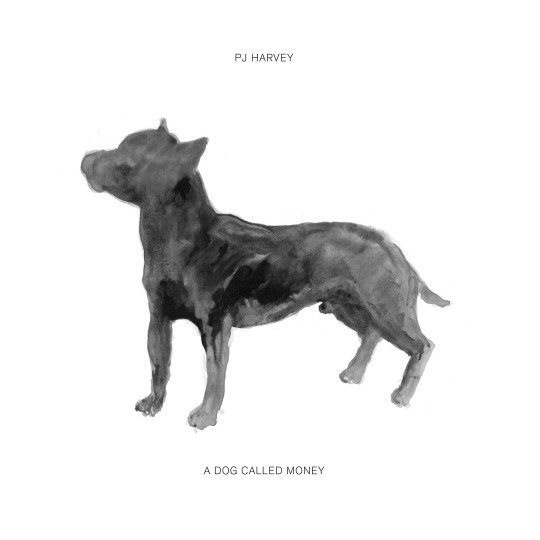
Michelle Henning: PJ Harvey, A Dog Called Money 7" Single

Centre label of Hope Six vinyl | PJ Harvey (Island Records 2016)
Expanding on her techniques for this current album cover artwork, Michelle tells us, “I photographed a lot of sticks in bright sunlight on different coloured and textured backgrounds. At a certain time in the afternoon the sun started to cast really interesting shadows. I remember Polly’s manager Sumit calling me and asking me when I would have something ready to show them, and I said I wouldn’t be ready until we had had more sunny weather. He was very patient with me but he must have wondered what on earth I was doing.”
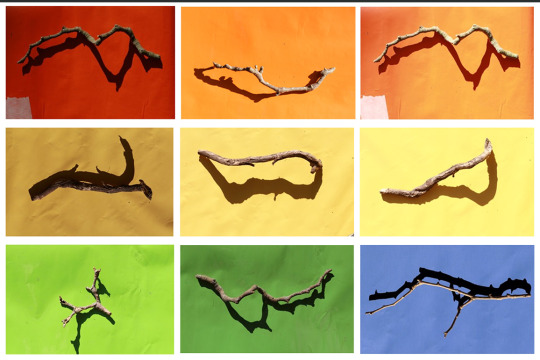
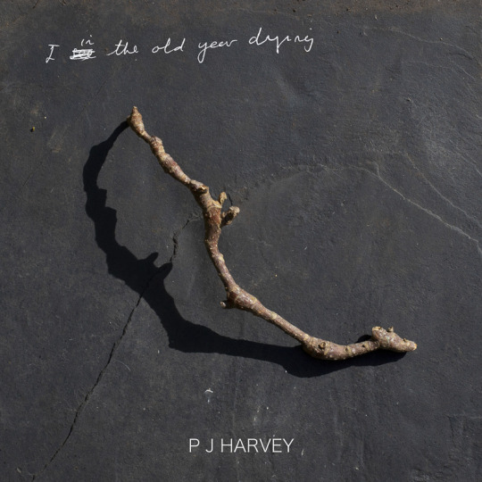
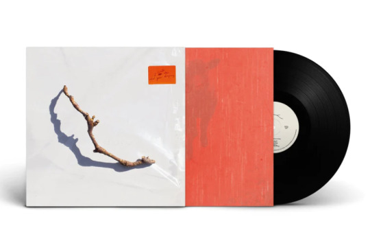
She continues, “The stick that worked best, that I felt had the most mysterious shadow, I then rephotographed under plastic. The final image is a composite of about three or maybe more photographs of this twig, both under the plastic and not. The orange sticker is based on the sticker stuck on this piece of plastic — which was a large transparent folder in which my film photographs were returned to me. I liked the way it brought a pop of colour to the cover.”
"In Photoshop, I changed the lighting on the plastic, added more layers of plastic lighting, superimposed Polly’s handwriting onto the sticker, and created the fake embossed text in the centre (which is a mixture of hand-painted ink drawing and a lot of digital editing)."
"The gatefold is a scan of a 1980s sticky photograph album complete with the blue lines of glue and the plastic layer, and the inner sleeve is based on photographs of red kitchen linoleum superimposed over photographs by Polly of a lamb and a forest. I did a rough layout for the body text and type, and then handed that over to Rob Crane of Rob Crane Design, who did a brilliant job of making the typography on the inside and back covers look elegant and balanced, and made all the files print-ready."
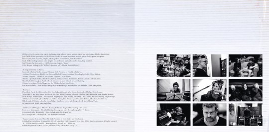
Inner gatefold for PJ Harvey, I Inside the Old Year Dying (Copyright © Michelle Henning, 2023) with typesetting by Rob Crane, and photographs by Steve Gullick gatefold pic
Michelle told us she looked at a lot of great album covers when creating this artwork and there are subtle references to some of them, both in the inner gatefold and the front cover. She says, "I love the idea that there are record cover geeks like myself who like to figure out the echoes of other designs, so I won’t say what they are!" (two iconic late 60s LP covers spring to our record cover geeky minds!)
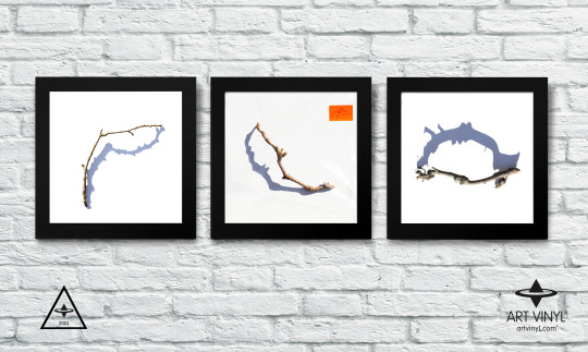
Michelle Henning: PJ Harvey, I Inside the Old Year Dying concept (Copyright © Michelle Henning, 2023)
I Inside the Old Year Dying by PJ Harvey on Partisan Records is shortlisted for the Best Art Vinyl 2023 Award. Art Director, Design and front cover photography by Michelle Henning. Additional design and typesetting by Rob Crane.
#art vinyl#record frames#play and display#best art vinyl#lp cover frame#bestartvinyl2023#contemporaryart#mixartandmusic#artanddesign#recordcoverart#albumcover#photography
8 notes
·
View notes
Note
Good morning! (here)
Sunday morning tea time. I'm a little late in sending this message. Oh, I just noticed it is the 5th of March. So perfect timing. The launch of our Book Club.

I have wanted to be a member of a book club for a while. In years past I have gotten the list from my local library and read some of the books on the list. I have never participated in the "club" part. So this is exciting for me. Thank you!
I'll return at the beginning of April with some simple/silly "Book Club" questions. Which we either will answer or ignore. No pressure.
I tried to get a hard copy of My Policeman from my local library, no luck. I did pick up DWD off of the DVD shelf. I haven't watched it yet. Maybe I'll put in on in the background today. I'll see.
I saw the watercolour flowers for your sister. They are lovely. Beautiful colour palette. Lucky sister! Asking for a friend - Do you have an "adopt-a-sister program" in your country?
Happy to report that Louis' ear is better. Still not as good as Harry's ear. Time is running out, Louis will have to live with that ear.
Hope all is well there. Still having questionable weather here. One day ice, next day nice, next day snow. It must be OK today, I can hear the birds singing.
Happy reading! Enjoy your week. W
P.S. - last page first
Hello!
Yay! Here it comes. We will do the book club thing. My dear W, thank you so much for all the hard work you made on that poster. It looks great. Please, join us in this book club if you wish. I am so looking forward to reading the book.
We can survive the wild weather with a nice book and some yummy hot beverage.
Thank you for a compliment on my botanical illustrations. I love making them.
Your adopted sister says hi from Europe!
P.S.: :D, you do you! What were the books you have read from the library list?
10 notes
·
View notes
Note
5, 8, 16, 25, & 29 for the asks, ty!!🖤
5. what's your favourite thing to draw?
lots of different things ... deer, dogs, bugs, hearts + viscera, deserts, skulls + skeletons ... if i have nothing in mind i'll usually end up drawing these in my sketchbook
8. do you draw professionally, or just for fun?
probably more on the 'just for fun side' considering illustration is like. a passive source of income for me rn ... i've done a good chunk of commissions but mostly i draw for myself as of late
16. do you draw more today than you did in the past, or do you draw less?
it sort of depends what i'd consider as 'past', as i didn't draw all that much during high school/junior high but used to draw a ton in elementary school . nowadays i'd say i generally draw a lot, both for school and for my own enjoyment - i'm a lot more productive than i was for a while, so that's nice :-)
25. do you like to draw in silence, or with music?
music, always- i think it just helps with concentrating, at least for me. sometimes i'll listen to podcasts, too, but i've got like a hundred playlists to choose between so I listen to music like 90% of the time
29. for traditional artists: how do you usually start on a big piece?
it's been a while since i've done a big piece solely in traditional mediums, as lately i'll start w/ a graphite sketch and then transfer to digital. but i always start with loose sketches to figure out composition and sometimes ill add some watercolour just to figure out colours i like, and that's about it before i get into actually working on the final version
4 notes
·
View notes
Text
Introduction of Project 2; Mood boards of chosen decade, Victorian & Edwardian Era
For this task, we had to create four different mood boards based off of our given decade/era. I was given the Victorian and Edwardian era, and so created a mood board on Victorian and Edwardian: literature, art and Art Nouveau; objects, accessories, and inventions; politics and beliefs. This task is to inspire us for our unit 2 and give us the ability to take ideas and reference from a certain decade/era.

This is a moodboard based around Victorian and Edwardian literature.
I first collected images of texts and quotes from the following authors: Charles Dickens, Jane Austen, Charlotte Brontë, C.S.Lewis, Emilt Brontë and Lewis Carol. I then printed these off and cut them out. I needed to plan where to put each of them and how they are positioned. I also wanted to paint the paper using watercolour to make the paper look old and vintage, to say the least. Once I stuck the images onto the paper, I found much unused space that needed to be filled. I decided to draw little illustrations to fill the spaces. I drew flowers, fairies, stars, teacups, a rabbit, and the Mad Hatter to link with the theme; which also includes fairytales and romance. I didn't want to outline these as it would take all the attention away from the images and title - which I did last, in cursive. To make the illustrations more visible, I painted them with watercolour paint.
I wasn't sure about what to base the moodboard on at first, I'm not interested in late 19th and early 20th century music and had already included art, architecture, and Art Nouveau as one theme and objects inventions and jewellery in another, during my planning. Politics and beliefs were my third planned theme. I finally decided upon literature as I can use quotations as either designs on garments or names.
I really like this piece as the little doodles and illustrations really tie in with the quotations to make it look magical and inviting. If I were to change and improve this moodboard, I would probably write some of the quotations instead of them all being images.

This is a moodboard based around Victorian and Edwardian art, Art Nouveau and Architecture.
I first collected images of Victorian art, Art Nouveau and Victorian, and Edwardian architecture. I then printed these off and cut them out. I also looked through a book based on Art Nouveau and photocopied some pictures of what I found interesting. I needed to plan where to put each of them and how they are positioned. Once I stuck the images onto the paper, I decided to draw little illustrations and partial outlines, similar to the previous moodboard. Finally, I drew a wreath around the title to fit with the theme and make it the needed cherry on top.
I quite admire this moodboard, as it presents the beauty of late 19th and early 20th century art and architecture, also known as Art Nouveau. There wasn't much space to have the images spread out, so I decided to layer them. If I were to change and improve this piece, I think I would paint the paper to make it appear old and worn just like the inventions and literature moodboards.

This period in history is an extreme interest of mine, and so I wanted to include politics and beliefs. This moodboard presents some of the crucial political events, movements, wars, and beliefs that affect our society today.
Just like the previous moodboards, I searched for and printed images of anything that related to the topic. For example; the last Russian tsar and the Russian revolution, suffragettes and votes for women, and the First World War. I also illustrated theme related drawings and wrote "Votes for Women" in the centre.
I do like this piece. However, it feels a little crowded and grim (serious and not lighthearted). If I were to improve this piece, again, I would make the paper look old and maybe illustrate flowers and/or stars.

My final moodboard is about inventions, objects, and accessories from the Victorian and Edwardian Eras.
I first collected images of different objects and inventions between the years 1836 and 1919. I then printed these off and cut them out. I needed to plan where to put each of them and how they are positioned. I wanted to paint the paper using watercolour just like I did in my first moodboard. Once I stuck the images onto the paper, I found much unused space that needed to be filled. I decided once again to draw little illustrations to fill the spaces. This tine however, I drew objects, flowers, and musical notes to blend together with some of the images and to get rid of the unused space. To make the illustrations more visible, I painted them with watercolour paint. I used the same technique as the first moodboard on presenting this theme.
My historical knowledge of the Victorian and Edwardian Eras is good, and I have great interest in this topic. I did this moodboard as an introduction to the second project and to be used as inspiration for future illustrations. U would say this piece is successful, and I do like it very much. The theme is very broad and so has a range of objects from corsets and jewellery to electric fans and binoculars. The only two things I would change about the moodboard is increasing the size of some (but not all) of the images and have less square and rectangular images; cutting them out around the subject of the photograph.
Bibliography:
Miller, J. (2004). Art Nouveau. London: Dorling Kindersley Ltd
Horrible Histories Songs. (2021). British Things | Horrible Histories | Vile Victorians. [Online]. . Last Updated: 17 September 2021. Available at: https://www.youtube.com/watch?v=sb56cMQEflA&pp=ygUndmljdG9yaWFuIGludmVudGlvbnMgaG9ycmlibGUgaGlzdG9ya [Accessed 26 November 2024].
Lewis Carrol. (2020). Alice's Adventures in Wonderland. London: Independently Published.
Austen, J. (1813). Pride and Prejudice. London: CreateSpace Independent Publishing Platform.
The Daily Mirror. (1917). Abduction Of The Tsar Of Russia. The Daily Mirror. 16 March 1917, p.1.
Fill in the Gap Bridge. (1919). [Film]. London: Leonard Ravenhill.
Mrs Bloomer's Own. (1898). [Film]. London: M & N Hanhart.
#victorian#victorian era#suffragettes#russian revolution#ww1#treaty of versailles#american civil war#league of nations#literature#jane austen#charles dickens#art nouveau#artwork#architecture#edwardian#edwardian era#c.s. lewis#lewis carroll#emily bronte#charlotte bronte
2 notes
·
View notes
Text
Gallery visit: AGNSW Kandinsky and Elemental exhibitions (22.11.23)
Elemental (Asian Lantern)
(Please note that some of images of the works below are my own photos while others are from the AGNSW website itself. Also note that, out of the 7 elements presented, I mistakenly did not photograph the description for one of them (air) - hence why I've omitted it from here.)
Context: This exhibition was divided into 7 areas, each dedicated to an element significant to various cultures across East, South, West, and South-East Asia. Below are some works (with info) that can be found within each area, which is accompanied by its own description regarding the cultural connections of that element.
My Reflection: I believe that humanity has always been tied to nature, and that this will continue to be the case. This is why I've always been fascinated with people's connections to nature, culture and spiritualism. Such connections can simultaneously be unique (to a specific culture) and universally-shared (across many cultures). This exhibition not only illustrates these connections, but it also highlights the personal experiences of some of the artists featured.
Wood
Element description from the exhibition:
"The scent of flowers becomes more intense as the dew gets heavier; The sound of bamboo is serene when the wind blows gently. - Feng Chengxiu, 'Couplet' (mid 1700s)
The element of wood in Chinese wuxing and related Japanese gogyo (translated as "five elements' or "five phases') is associated with trees, growth, spring, the east, blue and green. Wood is used for carvings, masks, and woodblocks for printing. It also provides a source of brushes and paper and, when burned and combined with water, wood can produce ink with which to paint, write and print. Strong as well as flexible, especially in the form of bamboo, wood requires water to thrive. While metal implements can cut down trees, it is the roots of plants that hold the earth together."


Huang Yongyu's Lotus (1981, ink painting)


Bamboo brush pot (19th-20th century, bamboo carving) and Netsuke in the form of two clam shells (19th century, polished wood carving)

Tosa School's Quails and pampas grass (18th century, painted single six-panel screen)
Water
Element description from the exhibition:
"Why did the stream dry up? I put a dam across it to have it for my use, That is why the stream dried up. - Rabindranath Tagore, 'The Gardener' (1913)
Sacred and purifying, water flows through and alters each of the other elements. It has symbolic and social significance, as well as a vital importance to life on Earth. Stories of mythical water deities from dragons to naga serpents have been told across Asia for thousands of years and are still shared today. Other tales describe the transformation of the Hindu god Vishnu into fish and turtle avatars, or Krishna's association with India's sacred Yamuna River. In the contemporary world, the sustaining power of water has been irreversibly damaged through pollution, overfishing and industrialisation. Despite this, water continues to nourish, soothe and cleanse; lotus flowers still bloom from the muddiest of swamps."


The Scent of Happiness (early to mid 1800s, hanging scroll with ink - top) and To the Sea (2009, lacquer and hemp cloth on polyurethane - bottom)


Thao Nguyen Phan's Becoming Alluvium (2019, multimedia film - first and second rows - with accompanying watercolour sketches - third row)
Fire
Element description from the exhibition:
"A hand moves, and the fire's whirling takes different shapes. Triangles, squares: all things change when we do. The first word. 'Ah' blossomed into all others. Each of them is true. - Kükai (also Köbö-Daishi), founder of Shingon Buddhism (774-835 CE)
More than any other element, fire is transformational. The most powerful agent for human manipulation of nature, fire is fundamental to all civilisations. It can engulf, embrace, devour, destroy and reinvigorate all of the other elements. It sparks awe and fear, but also shields and brings comfort; its radiance excites and nurtures renewal and growth. The symbolic meanings of fire are diverse. India's ancient Sanskritic texts compiled as the Rig Veda accord fire the power of liberation or moksha, while the Fire Sermon delivered by the historical Buddha uses burning as metaphor for the suffering caused by human attachment. In its eternal form, fire signifies continuity, vigilance, remembrance and purity."

Fire - Montien Boonma's Benediction No.2 (1991, three photographic sheets with candle burn holes and gold foil)
Earth
Element description from the exhibition:
"We are creatures of the earth, and like the earth it often takes heat and pressure to create a diamond. - Ajahn Vimalo, Buddhist monk (2022)
The earth provides the material basis for all forms of art - clay, rock, metals, gems and wood. In the Pali scriptures of Theravada Buddhism, it is the earth element (pathavi dhatu) that gives objects their solidity, their quality of hardness or softness. The earth is the substrate upon which wind and water, fire and air can manifest their actions. Human lives, too, play out on the surface of the earth, which is often described in maternal terms - as Sanskrit Bhu Devi (Earth Goddess), Malay/Indonesian Ibu Pertiwi (Mother Earth) and Chinese Queen Mother Earth. As land and territory, the earth is the manifestation of homeland and nation. It can provide a sense of national identity and belonging, while fuelling contention over boundaries."


Arita ware Kendi (c. 1660-1685, porcelain with underglaze blue decoration - left) and Elephant-shaped jar (11th-12th century, stoneware with glazed lower body and unglazed legs - right)

Montien Boonma's Perfumed paintings and stools (1995-1997, papier-mâché paintings and wooden stools - covered in plasticine with the artist's footprint - infused with perfumed herbs)
Metal
Element description from the exhibition:
"I find that using gold or silver leaf within the interiors [of the vessels], there is a sense of enlightenment when opening the lid. My intention is to enter a different world, a different place. This place has no darkness. My consciousness is veiled in bronze. - Koji Hatakeyama, artist (2014)
Metal is associated with autumn and the colour white in wuxing (translated as "five elements' or 'five phases'), the Chinese philosophical system for understanding the elements. Revered for their physical properties, gold, silver, bronze and other metals also possess symbolic meanings that transcend their material value. Notably, bronze brought power and wealth along with artistic and cultural advancements. In many Asian cultures, metals also evoke legend and faith, including the radiance emitted by Buddhas and bodhisattvas - their enlightened status often represented in gold."


Abdullah M.I. Syed's Currency of Love (2016-2021, photographic prints with hand-cut banknotes and gold leaf)


Pair of Earrings (19th-20th century, silver - left) and Pendant in a Double-axe form (taka) (19th-20th century, gold alloy - right)
Void
Element description from the exhibition:
"At the void summit resounds the unstruck note … - Kabir Das, mystic poet (c. 1440-1518)
While the elements of fire, earth and water are shared across belief systems, some categorisations also embrace 'the void'. The void is considered the primal source of possibility and potential, the origin of the universe. The Sanskrit word shunya, meaning both 'zero' and 'void', describes the source from which all things are created. In Buddhist traditions, the doctrine of shunyata (voidness) encourages selflessness while wu (non-being) in Daoism leads to the cultivation of wu-wei (absence of aggressive action), enabling instead completion and accomplishment. Understanding voidness as ultimate reality replaces egoism and aggression with benevolence and compassion."


Nam June Paik's Buddha Game (1991, television set, pages from a printed book, 2 gold-leaf wooden Buddhas, neon, antenna, 5 television monitors)
0 notes
Text
Blog Post #9 Rationales Refined
Personally, in GD portfolios, I find titles that aren’t straightforward and descriptive of the project to be very off-putting. That being said, if a portfolio is showcasing ONLY packaging design for example, less descriptive is okay, but personally I would like to see the projects named with the brand or product names for clarity. While I still want the rest of my rationales to be fairly direct and to the point, I do find it important to add a little more personality and information than simple point form. My rough rationales come across as a little dry as they are, so my goal with today’s assignment was to make them more engaging. Title: Midnight Mead Packaging
Challenge: To design a brand and cohesive labels for the debut line of products from a local meadery. These products are small batch, made with local ingredients whenever possible (which is most of the time!), and aged for a minimum of ten months for a smooth and flavorful product.
Approach: I researched existing meaderies in Canada to get a feel for the industry, and what is already out there. I also researched the rich history of the beverage. I chose the name Midnight Mead from a list of potential brand names, I wanted something that set the brand apart from the others which often focus on the honey/bees. Mead is an old beverage, and is often mentioned in stories of fantasy and whimsy. Historically, it is referred to as “the nectar of the gods”. I felt Midnight Mead captured part of the mystery and allure that makes these stories so popular.
What I Did:
Working in Adobe illustrator, I created a wordmark for the brand, and visuals for the three flavours in this line. I wanted the labels to reflect the small-town, hand-made values of the company through the use of textured labels, and hand-drawn inspired type. After many test prints to get the colours right on my chosen watercolour texture paper, I added heat activated embossing powder to add texture as well as a little celestial shine. I also printed a pattern on the back of the labels that can be seen through the lighter flavours/empty bottles, as a nod to the honeycomb that makes mead possible. Using sticker paper, I created a custom “tape” seal to further tie this to the brand.
Tools: Illustrator, textured paper, double-sided printing, embossing powder.
Title: Downtown Nanaimo Wayfinding
Challenge: To make downtown Nanaimo more inviting, and easier to navigate, while highlighting features and businesses of downtown.
Approach: Creating a cohesive brand identity highlighting the main districts, including a sign system. To start with I made a list of my favourite reasons to spend time downtown Nanaimo. I then explored downtown, making it a point to ignore what I would habitually do, and discover more of what the downtown core has to offer. I also took photos of existing signage and confusing areas. I took note of any and all frustrations I had while trying to navigate to new places in the area.
What I Did: I used Adobe Illustrator to create a logo/wordmark for downtown Nanaimo. I chose to include an icon of one of Nanaimo’s most notable landmarks, the bastion. This icon is found throughout the brand, unifying all of the separate elements. I branded each district with a distinct brand accent colour, and identifying wordmark.
Tools: Illustrator, Photoshop.
Title: EF Tours Magazine Ad Series
Challenge: To create a series of magazine ads for the same company that work as standalone ads, but can be easily recognized as a series.
Approach: My client for this project was EF Tours, advertising their tours that focus on Canadian History. Largely focused on the World Wars, these tours are primarily throughout various European locations. These trips are a great way to see parts of the world while still prioritizing your education.
What I Did: I wanted these ads to feel as exciting and engaging as the tours are. To create a sense of being transported into these images, I created masks in indesign and gave the photographs the illusion of breaking out of the articles. One challenge here was to make sure the text remained readable with the engagement from the ads. Each image features a location from a different EF Tours D-Day trip.
Tools: Photoshop, InDesign.
Title: Dear Jack Foundation Poster Series
Challenge: The Dear Jack Foundation is a non-profit providing impactful programs benefiting adolescents and young adults (AYA) diagnosed with cancer and their families to improve their quality of life from treatment to survivorship. The foundation was founded by Andrew McMahon, musician and YA Leukemia survivor. Every year on November 11, he hosts a benefit concert in support of the foundation. The challenge was to create a series of outdoor posters of varying sizes for the event.
Approach: I looked at past years poster, as well as Andrew’s ever-evolving album art. I chose to come up with one main visual that could be consistent and uniting across a smaller poster, a bus stop shelter poster, and a billboard on the side of the highway.
What I Did: I used illustrator to create a shape meant as an abstract representation of sound, using the Dear Jack Foundation brand colours. I placed these on a dark background, and started with the small poster. The small size was relatively easily scaled up to a bus stop poster, as all of the information still had enough attention in this setting to include. With such limited time to read a sign on the side of the highway, even more attention to hierarchy was required for the billboard version.
Tools: Illustrator, Procreate, Photoshop.
0 notes
Text
Face 1

Today we looked at faces and how to draw them for our catwalk collections we did this because faces we found were a weak point within my illustrations so aimed to get this stronger we aimed to just look at the face to develop our skills. We looked at 2 artists we selected and merged their faces so that we weren’t copying and out face drawing was unique to us the two illustrators i looked at were Laura Wolf and Obie Mitchell i chose these illustrators because they were very similar in colour schemes and I personally liked their style. This inspired me because it gave me a new style for the eyes on my designs. Furthermore i tried different media for this illustration such as pro-marker, inks and watercolour to see which mixed media works best for me. I found this design successful because it started to help develop my layering skills for watercolour and that I prefer brush tips for pro markers. However I would change the size of the face for this design due to me not being able to experiment as much as i like on the face due to the smaller size, so this means going forward I will be increasing the face size to experiment more.
0 notes
Photo

Here’s a cute watercolour illustration that I draw and painted today of Teruteru kissing Hajime at night in the streets near his Mama’s diner. As a way to practice my backgrounds and lighting in my watercolour illustrations. Also I used a bit of colour pencils to add some texture to the piece.
I think it turned out really nice, I really like how vibrant the dark blues and yellows and I like how I did the lighting and shading on Teruteru and Hajime. Also I just really like painting nighttime scenes and the cozy and dreamlike feel they have.
#teruteru#teruteru hanamura#Hajime Hinata#danganronpa#danganronpa 2#Teruhina#why is Teruteru kissing Hajime use your imagination#In my perspective Teruteru kissing Hajime is a thank you kiss#backgrounds are hard :’)
14 notes
·
View notes
Text
Eugenie Groh was born in what is known today as the Czech Republic. She came from an artistic family - both her parents encouraged her from childhood to express her creativity. She recalled her father buying her her first paint sets in oil and watercolours. Her mother's fashion magazines fascinated her and were her childhood inspiration. [...]
In 1943, Groh was hired to work in the art department at Prague's largest publishing house, Melantrich, where she did illustrations for fashion and women's interest articles. After the war ended, she took on the editorship of Malé Mody, a then-new monthly fashion magazine - but it was discontinued by the ruling communist party in 1948. In '49 Groh and her husband left Prague for Canada. They settling in Montreal.
Eugenie Groh began securing freelance fashion art assignments almost immediately from Ogilvy's department store and rival, T. Eaton's Co. Only six weeks after arriving in Montreal, she secured a staff position in Eaton's art department. Recalling those early days in Montreal she said she was "burdened by emotional and economic problems of a political refugee. For some time, only some of my energy could go into my work."
Be that as it may, Groh expressed great excitement at the prospect of adapting to what was for her a dramatically different culture of fashion illustration in her new home. In Prague, fashions were made to measure - everyone had a dressmaker. In Canada, the focus was on ready-to-wear, and subsequently fashion illustration reflected that marketing sensibility.
Groh said, "All the time I was learning new ways and absorbing new information." She poured through American and Canadian magazines, which were dominated by the popular "Expressionist" sketch style of Eric, Bouché and other pre-war fashion illustration giants. [...]
37 notes
·
View notes
Text

He’s selling fish. Would you buy from him?
Click for (slightly) better quality
#art#elf#illustration#drawing#elves#fish#myart#Do you trust this elf?#he’s friendly#but what are his prices like?#trying out my new watercolours#im trying the tube ones#ive been having trouble drawing recently so i wasnt going to draw today#but im glad i did#based off a sketch i drew of an elf a while ago#who wasnt going to become a new oc but now maybe i change my mind#accidentally made the background too dark#been inspired to add little coloured backgrounds after watching youtuber artists#lately ive been watching youtuber Kasey Golden#i want to get better at watercolours
1 note
·
View note