#ctec503signal
Explore tagged Tumblr posts
Text
the prototypes and inspirations
we started a prototype for our ‘point wave projection mapping’ model !! Although we have not fully decided on a model or data yet, we wanted to start off by replicating a wave like model and go from there!!
we managed to finesse our way into getting some free fabric from the textiles lab, some nylon and needles and started playing around with it!!
We were trying to replicate this project...
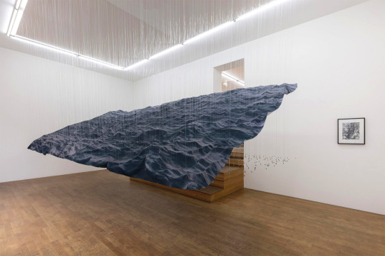


after doing this, we connected the nylon to some wooden poles and played with it like a puppet, showing changing data (or we like to think so anyway).
Afterwards we had a little chat about what we liked about it...
-We quite liked that there were poles, they perhaps could be the ones moving?
-We like the randomness of it
-We like that its kind of simple but effective!
I drew up a little sketch of what this could potentially be...

Charles was happy that we made some progress and suggested we take a look at an artist called Zimoun who creates beautiful models out of stupid everyday object like carboard boxes or cottonwool...
https://www.dezeen.com/2014/08/28/zimoun-moving-cardboard-boxes-installations/
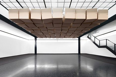
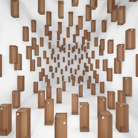
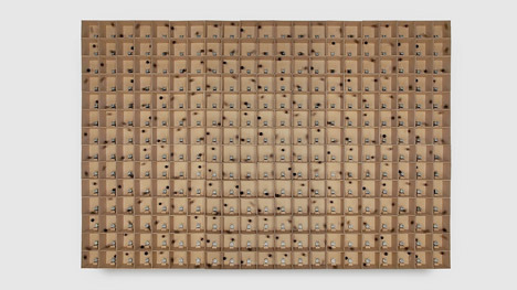
We all are very interested in this concept and are excited to develop on it further over the weekend!!!
4 notes
·
View notes
Text
Final entry - Miles Urquhart - SoundClout
The team have worked hard and all deserve a nice long break to recharge the engines! Since we came up with an idea so late in the game we were rushing to have a final product that hopefully we will still be able to present for showcase and hopefully the lecturers like it! :)
The beginning of this final assessment started off rocky. As a group we all had ideas and different fields that we wanted to explore but I think we were finding it difficult physically expressing what we wanted to do with each other. After going through periods of having ideas but never being fully certain of them, we finally managed to all find something that we were all on the same page about and were genuinely interested in looking further into. (Cunningham, Nov 1979) We looked into whether or not if the weather influences behavior in human beings and if that changes how we listen to music. Interestingly enough, even on a small scale, temperature, humidity, and wind velocity are all contributing factors as well as the amount of sunshine. Our project analyses live data taken from Spotify and from there we then compare the weather condition taken from the specific country you are looking at. Long term looking into the project, ideally we would have created a system that works hand in hand with Spotify and a weather app that automatically also works with processing to display the data and without any human involvement until the end stage, however, due to the essence of time considering we came up with our idea at a very late stage, we currently manually linked the songs with the weather which meant individually downloading songs for processing. We wanted an element of pop culture to be integrated in with our work, which is why we went the with emoji of the different weather patterns. The advantage of this, as an older generation of people watching the news will still understand the images as images like this have been displayed for years on every channel. Whereas a younger generation has been taught to identify emoji’s and is a universal language that anyone can understand.
I think something about this project that I learnt is maybe I need to be less of a yes man sometimes especially in the beginning of the project. I went along with everything generally to keep the peace and never really spoke my mind or portrayed how I was actually feeling about something but overall has been a good experience and would love to work with this group again along with other people who think different than us to have different opinions flying around the group as we all though similarly to one another!
BLOG INDEX
https://mmu-bct-blog.tumblr.com/post/179544585544/the-start-of-something-new
https://mmu-bct-blog.tumblr.com/post/179544601789/no-research-without-action-no-action-without
https://mmu-bct-blog.tumblr.com/post/179544608779/miles-the-poor-sick-boy
https://mmu-bct-blog.tumblr.com/post/179544655019/blog-post-42-final-project
https://mmu-bct-blog.tumblr.com/post/179544665814/finally-an-idea
https://mmu-bct-blog.tumblr.com/post/179544671564/a-shift-in-the-matrix
https://mmu-bct-blog.tumblr.com/post/179544678374/all-work-and-no-play
https://mmu-bct-blog.tumblr.com/post/179544804294/final-entry-miles-urquhart-soundclout
2 notes
·
View notes
Text
October 1 : Final Studio
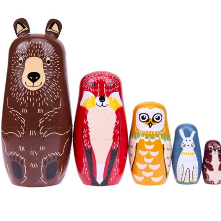
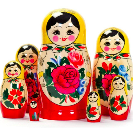
While I was home for the weekend, I thought I could use this time to find inspiration for Emergence, since everything I was doing didn’t seem to have complete direction and or purpose. I kept going back to the definition of Emergence and the idea of something becoming something larger and greater than it was before and looking around the house at objects.
It was then that I had the idea - Russian Nesting Dolls or Matryoshka. They are a set of wooden dolls decreasing in size, placed inside another. The dolls often follow a theme and for me, that would be my personal experience Emerging into the creative field.
I thought I could use paint and colour to represent the idea of becoming visible and growing. The smaller inside dolls would be darker and less detailed and the outside colourful and full of detail to show the knowledge one gains as they develop as a person. The idea of everything coming together to make the sum of all parts greater.
Each part helped create the final larger doll. Details could appear in each doll which is fully represented in the largest doll.
3 notes
·
View notes
Text
Blog Post 41 - Final Project
27/09/18
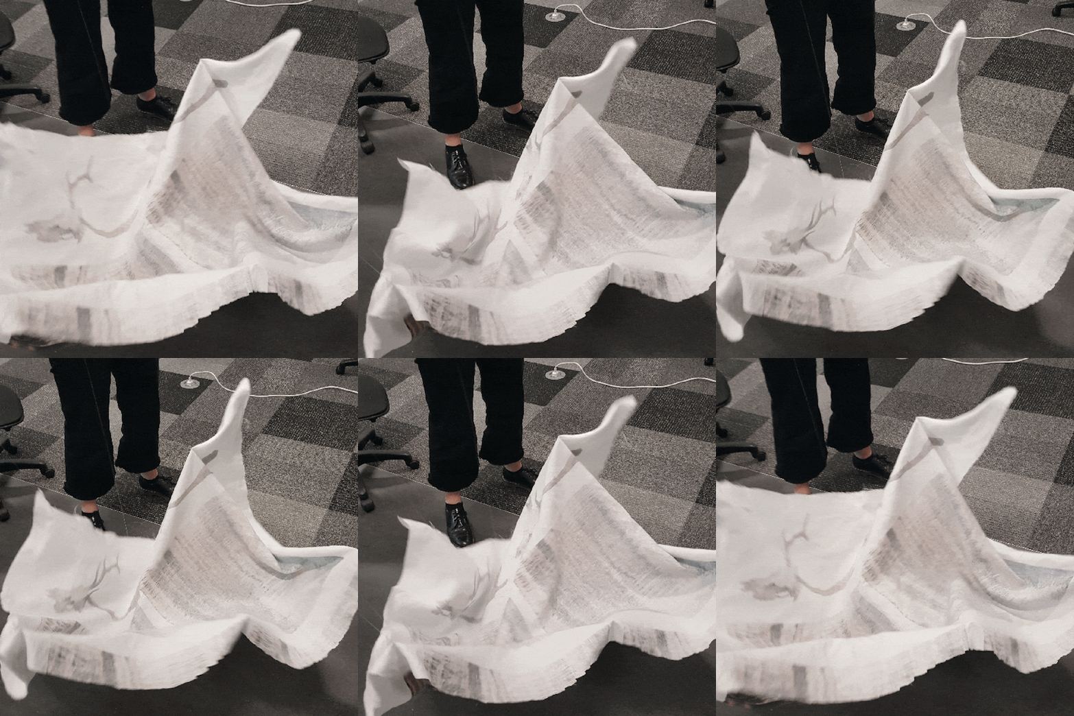
Today we began prototyping as according to Ricardos challenge. This was super helpful for our learning as we could get to know the materials we’re interested in a bit more and how they work together. We grabbed some offcuts of fabric from the textile lab, and tied to it some lengths of nylon attached to rods to create this ^^^^.
We saw this first prototype as a combination of the PointCloud and the suspended wave installation. We liked - the rolling movement - how we could control it with the rods - the simplicity
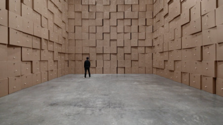
Charles told us about this Swiss artist called Zimoun who is known for his sound sculptures, sound architectures and installation art. His installations often contain little motors and really mundane everyday objects, but there are so many of them all together that they are really striking and have a lot of impact. We really like how these not only have lots of movement, but the movement also creates sound. The reason we liked this is because we had been discussing using soundscapes early on for this project.
3 notes
·
View notes
Text
Holiday work?
Project descriptions:
Short Description
Bags in Child labour is a exclusive collection of bags that each represents different aspects within child labour such as education, fashion, wages, agriculture and safety. Each representing such areas in an ironic and controversial way. There are more than 250 million child labourers around the world which accounts for 11% of the child population. The design element of each bag is deliberately made into an ironic and useless form, yet each of them are fully functional. The irony is that each bag can be ‘used’ but only a partial can be accessed, and they are not using the bags in their fullest potential. The consumer has access to only a percentage of the bag for storage, ‘freedom is constraint’, and ‘carrying unnecessary’. This is ironic as many forced child labourers don’t have these certain aspects of human rights such as freedom, support, childhood, education and so much more. Child labourers ‘carry’ extra loads and responsibilities that a normal child shouldn’t worry about.
Long Description
We have created a collection of bags that represent the different areas of child labour such as education, fashion, wages, agriculture and safety. Around the world, more than 250 million children are in child labour (which accounts for 11% of the child population in the world), with majority of them working in the fashion Industry. We wanted to create an interactive object to represent the huge scale of child labourers through an exclusive collection of bags. The design aspect is a transparent PVC bag, in different styles that each shows a perspective into child labour using different objects. Throughout our research we found out that ‘child labour’ isn’t a significant controversial topic. But the solution to some world problems could be by solving child labour. Improving the areas of ‘child labour’ could be the treatment to the cycle of poverty, sustainability, economy, societies and basic humanity all around the world. Even in New Zealand, the land that is ranked high in terms of national performance and health has child labour as well. Children doing farm work (strawberry picking), newspaper running, car washing and so much more. Although skills are important to learn for children, labour shouldn’t always be the case. Children are a vulnerable group that deserves protection and shouldn’t be exploited in labour.
Although forced child labour could be an alternative for survival for many children around the world, but this doesn’t reason the long hours for the pay of only 20 cent a day*. Many children work in hazardous conditions and for their fragile bodies which are still in the process of growth, they are victims of physical disabilities from heavy weight, mining and exposure to chemicals could create health issues long-term or even death
The conversation will be on the design element of the bag, where the bag is basically useless, yet fully functional. The size of the bag is an illusion that you can see, each bag has a different volume in which ‘items’ are put into them, things that can be seen but not ‘accessed’. The user has access to only a percentage of the bag for storage, and the rest is filled with things that represent that datasets which consumers need to carry. That idea of ‘carry’ is represented in the bags, such as popcorn, which cannot be eaten or accessed, only imagined, seen, useless, and hopeless. Our aim is to bring awareness of this topic through the collection of bags. The ‘collection of bags’ is ironic as well as it’s something that consumed by rich adolescent people who take fashion, and necessities for granted.
Fashion
Eating disorder is represented through the popcorn bag, in which popcorn is used to represent eating disorder of those in the modeling industry. 64-68% of young models claim that they have been told to ‘lose weight’ by someone in their agency. The use of popcorn is ironic because it is a ‘carb’ in which the user of the bag cannot access. The popcorn is just a desire of food, illusion, hope and irony.
Agriculture
This cotton bag represents the 20% of child labourers in the cotton industry in India. This idea was one of the original design concepts for child labour. ‘Cotton’ was used for the 1st prototype and we carried that idea into a functioning handbag. The cotton is a simple yet strong symbol of agriculture because this is the main resource of the fashion industry, the cotton could be a light and innocent plant, but the consequences of having child labourers to harvest is oppressive
Education
This bag shows the dataset of which approximately only 10% of child labourers receive education, which results in 90% of these children being deprived of education, thus most of them cannot advance to a better workforce/life. The little pocket in the bag is showing that the space is only for children who are studying, but the rest of the space are the children who are working in child labour.This bag deliberately strives to raise awareness of children in forced child labour and to bring awareness that education is currently the most powerful tool right now to mitigate child labour.
Safety
This bag is designed as a school bag which 70% are filled with objects that child labourers are deprived from such as education, simple child needs and wants, food and love. Hazardous environments could affect children physically, mentally and emotionally. Children are being deprived of education and the adolescent workforce due to the aftermath of forced child labour in hazardous environments.
Wages
This bag is about children who are underpaid, and its average monthly income for all the children was around 4,700 FCA which is about $9.25 USD. It also involves gender inequality as boys get paid more than girls. Thus, this bag is trying to display its meaning to our audience, that children are not being treated and paid well enough for their hard effort.
1 note
·
View note
Text
The final projects
Studio II ‘Signal’ : Final projects
week 1 : Reserching
After we receive the brief, i join this group that were interesting in jewelry. They have already came up with the concept suicide ring.After we brainstorming we wanted to do something that meaningful and would leave people with some feeling after they see our product. We look into the material we wanted to use as well we thinking about metal or 3D printing or clay. -We look now doing research into dataset of suicide method, the statistic of suicide and all the information about depression and things that related.
Here are some design we considering


some statistic we looking at
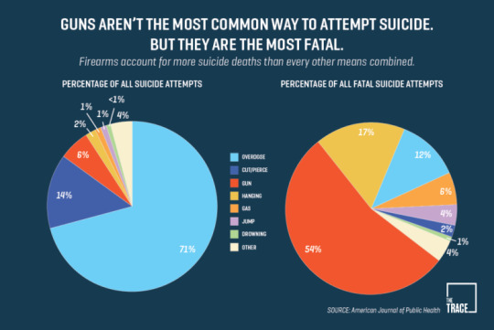

2 notes
·
View notes
Text
Studio II, Final Project, week 1 - 3
WEEK 1 Trying to choose something that really resonated with me this year was really hard. There were multiple projects that I enjoyed but never thought about deeply. The only project that I really thought about and thought through carefully was the Suicide Rings. Luckily Elias decided to create a group and carry on with the previous project. I joined Elias, Tiger and Sam to do a continuation of suicide rings.
I learned so much from the previous project. I learned that the rate of suicide is extremely high in New Zealand, males rate of suicide is higher than females and the elderly have the highest rate of suicide than any other age group. These are things that many people didn't know. When presenting the suicide rings and explaining our statistics to people, the majority of people were shocked by the results. Suicide is not seriously discussed and is mostly shrugged off by people. This is because it is indeed a difficult topic to talk about, however, it is something that needs to be addressed in New Zealand. I do feel like joining this group was the right decision because this is a topic I am passionate about.
“ New Zealand already has the second highest overall suicide rate in the developed world, with more than 600 Kiwis taking their own lives in the last year”
This week we simply explained to the other members what we did in the previous project. What dataset we used, the function of the ring, its design, structure, and its purpose. We explained the intention of inflicting pain when the ring is worn and the symbolic meaning behind the rings stamp feature.
This week was about informing the group of what the previous project was about in detail. We also discussed expanding the data sets and exploring different styles of jewellery. The team also introduced what they can each bring to the table. Sam and I can do research and design the Jewellery. Elias can build 3D models of the design and Tiger can build jewellery physically.
WEEK 2
A new member has joined us. Her name is Tamy and she can do research and 3D model designs.
We discussed the data sets we should use and that it should be from NewZealand. People would relate more to our artefact if they knew the statistics are about New Zealand. Our ideas were all over the place. There were endless possibilities to approach this project with a physical object that portrays data based on suicide. Charles came over and told us to write down any idea, thought or word that we thought related to our project and stick it on to the wall. Thus creating a sort of vision board.

We wrote down our ideas and began sticking them onto the wall. After everyone was done adding to the wall, we began sorting them out. We grouped ideas together that related to each other or sounded the same. Thus categories were created.
Emotions and touch

Colour and Material

Symbolic and hidden messages

We also included pictures of bizarre jewellery for inspiration.

Using these pictures, Tiger decided to replicate the ring with barbed wire to kick off prototyping. The prototype was not based on any data set or idea. However, personally, I believe that it can hold meaning. Personally, I think the ring is symbolic of the aftermath of suicide. When worn not only is the wearer hurt, but the sharp points at the top can hurt other people you interact with. I know this because I unintentionally poked my friend with it. The wearer is hurt, symbolising the passing of the suicide victim. The capability of hurting others symbolises those affected by suicide, example; families, friends, colleagues etc. The twist in the band could symbolise the obstacles the victims and those affected by suicide go through.

Ring made by Tiger. The material used is a metal paper clip.
We were to do research of the different types of suicide datasets in New Zealand over the weekend.
I learned that it is helpful to spill all your ideas out, even the stupid ones, before deciding they're useless. Keep all your ideas until you do research on it and determine its fate.
WEEK 3
We received feedback from the lecturers to keep the prototyping going and input data into an object as quickly as possible. This will help us think about the designs and datasets. We sent each other links in our group chat about the different datasets that are available for New Zealand. I researched and took down every sight I found,
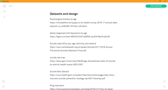
We also saved important links in our shared google doc. I placed the most relevant datasets into the group chat.
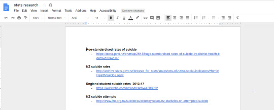
We found out that mental illness and domestic violence is deeply connected to suicide. So we did research on domestic violence and mental illness problems that resulted in suicide.
Tiger created another prototype out of little metal nails. It didn't represent any data. The ring was made to look like a birds nest. In MY OPINION, just like the last prototype, I see a lot of symbolism in this ring. A birds nest is where baby birds are born, symbolising the beginning of life. However, there are many dangers that can ruin the nest, example: weather and predators. This would symbolise the hardships the victims go through, thus resulting in suicide.In terms of appearance, the ring looks very chaotic but somehow very beautiful. This could represent a hidden message. The ring may look beautiful, but it is very chaotic if you keep analyzing its twist and turns.

We began researching for geographical mapping of deaths by suicide. Elias had the idea of designing a ring with those clusters of death on it. The ring would symbolise a map that the data can be mapped out. The mapping would be on the inside of the ring band, thus affecting its feeling when worn.
Dataset:
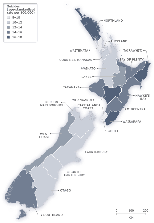
We had a discussion with Ricardo and Charles about how complex the topic of suicide is. We were told to handle this topic very carefully. We don't want to unintentionally hurt anyone with our project. We also spoke about triggers, sensitivity, mental health, and how we all view things differently. We all see things differently, thus we all see data differently. Ricardo suggested that we each put our different perspectives into the jewellery. There was a discussion about the datasets and age groups. We as young adults cannot relate to how a 40-year-old would feel. So we wanted to select our data carefully, keeping in mind the difference in age and sex.
We gave an elevator pitch about our project and received feedback from the class. Just like the discussion with Ricardo, the feedback was about how big the topic of suicide is. People are sensitive towards this topic so we do want to handle this carefully. We decided to have a disclaimer when our project is on display, that way people have a chose to view our project. The feedback was also about materials that we are going to use, such as; metal, plastic and soft materials.

Going deeper into our project, we realised how complex and overwhelming the topic of suicide really is. Suicide branches out to many problems such as; occupation, divorce, appearance and migrating. So we decided as a group to choose different categories of suicide. The topics were; deaths by suicide, those affected by suicide, survivors/attempts and depression. Each member of the group picked 1 of these subjects and based their piece of jewellery on it.
We had a discussion with Ben and Charles about the designs of our jewellery. We were struggling to find the correct data sets on the subjects of suicide. Ben suggested that the jewellery doesn't need to represent data but can be inspired by stories of suicide. This made things easier for us. We were completely set on using datasets we forgot the main focus was raising awareness.
Reference:
Prendergast, E. (2018). New Zealand's suicide rates will rise - Mike King. [online] Newshub. Available at: https://www.newshub.co.nz/home/new-zealand/2017/11/new-zealand-s-suicide-rates-will-rise-mike-king.html [Accessed 27 Oct. 2018].
Teara.govt.nz. (2018). Age-standardised rates of suicide by District Health Board, 2003–2007. [online] Available at: https://teara.govt.nz/en/map/26438/age-standardised-rates-of-suicide-by-district-health-board-2003-2007 [Accessed 27 Oct. 2018].
PREVENTING SUICIDE A RESOURCE FOR PRIMARY HEALTH CARE WORKERS. (2000). [ebook] Available at: http://www.who.int/mental_health/media/en/59.pdf [Accessed 27 Oct. 2018].
1 note
·
View note
Text
Signal - Console
Over the last couple of days I have been working on a few things.
Yesterday I compiled a list of songs which correspond to the days we will be presenting. It was interesting to see the cultural differences between countries, and how certain songs came up on certain days. Seeing these patterns makes me feel really good about our project, as it validates the concept to a certain degree. I look forward to listening to the conversations sparked by our concept.
The next thing I worked on was the physical console which will act as the interaction medium. I mocked up diagrams in Fritzing for the layout of the buttons. I then drilled holes for our buttons in the top panel of the console. Tomorrow I will solder the circuitry and complete the code for Arduino.
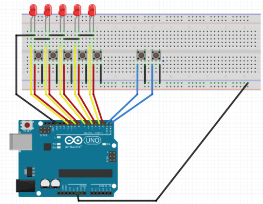
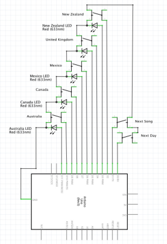
1 note
·
View note
Text
Why clothing?
In class, we did an elevator pitch activity where we had to explain our project to the class within 3 minutes and then we received feedback about it after.

Many of the feedback were positive and supportive but a lot of them also asked why we chose fashion/ clothing as a medium and if we’ve explored other ways of doing it.
Our project is a continuation of the Tangible Data Project and the rest of my group were in a group for that and they made a dress for that where directly translated the data for that onto the different sizes and textiles of the fabrics. It was an easy decision that we continue working with garments as a medium for this final project.
During our research, we discovered Yami-Kawaii and Guro-Kawaii which are fashion concepts in Japan. These aesthetics are often found in Harajuku and are closely related to the Lolita aesthetic. However, yami-kawaii and guro-kawaii have a darker concept as they involve the use of accessories that represents guns, knives, blades, blood, syringes, etc. “Yami” stands for illness, weakness or fault which they often relate to mental illness. Japanese people are known to be polite therefore they usually just keep their thoughts to themselves to avoid causing trouble with other people. Thus, if one feels mentally unstable, they often feel too embarrassed to tell someone about it as the topic of mental health is still taboo in Japan and also in many other parts of Asia.
Many who participate in the aesthetic wear it because they see it as an outlet to express the state of their mental health. Through the physical representation of their feelings through a medium which is an essential part of our lives, they are able to receive less judgement as it can be perceived as just “following the trend”. However, this may cause issues such as, are we trying to romanticise mental illness? (which is what we’re trying to avoid) it definitely helps to start conversations and making the topic less taboo.

Wearing such clothing takes a lot of courage and thus wearing it out in public already gives wearers a sense of empowerment as they are allowing themselves to kind of open up to the public. Other people who are experiencing/ have experienced a mental illness may feel inspired when they encounter someone wearing such fashion. For our garments, we want to incorporate the unconventional sense of Yami-kawaii and also making sure that it is wearable to support its normality in order to translate our message that mental health is a common, normal thing that we should be able to talk about everyday, without fear nor judgement.
1 note
·
View note
Text
final project
today i began to play with the pieces of old wood I had collected and continue to dismantle the old oak table i found I tried a bunch of ideas of things ranging from chairs desks tables and benches. I looked into using what was previously the support of the table and re use it along with the legs to see if i could change it from a square table with a round top to a rectangle table.
1 note
·
View note
Text
BCT Studio final last week (week 2) recap:
With the forming of the group and starting to gather data, and designs. As well as finishing off Integrative Practice and Physical computing assignments, I forgot to blog last week oops.we focused more on the ring designs based of Elias’ suicide ring statistic idea from the previous studio project. We printed out some aesthetically painful designs we think we can work from. From normal designs to spike-themed rings punk-rock people wear, to designs like barbed wire or the crown of thorns.
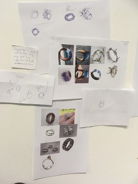
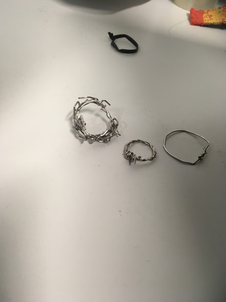
1 note
·
View note
Text
some good progress!
Over the last few days we have managed to get a good grip on the concept of our studio project which includes all the aspects we were all really interested in. YAY
This includes...
- it must be interactive
- uses live data based from peoples responses
- the data is used and shown in an interesting way
- has a ‘feel good’ aspect about it (or just not making the user feel bad about themselves)
This is what we have so far...
The brief outline
We plan on collecting data through consoles which will be arduino controlled, the data will then be represented through a soundscape loop. Depending on the outcome of each survey, the soundscape adds different sounds onto it. This will be accessible through headphones. We will then have a visual projected onto a wall that also represents this data and is also in sync with the soundscape loop so you can hear and watch the data at the same time.
The Survey
So we have our concept all sorted, but not necessarily what data we are planning on sourcing for the final showcase. We currently have a placeholder of drug types/usage. However we are hoping to achieve another interesting data concept that we can look into.
Today we discussed looking into...
- Sex ? (this was Miles’ idea...)
- How prepared are you for the future in regards to technology?
- are you ‘in the loop’ of pop culture? or do you know what is going on in the world?
Harry is currently writing up a code on processing that will be the basis of our survey structure. We are planning to have this arduino controlled (I think) and will be putting this together so it can hook up to our soundscape and visual piece.
The soundscape
Harry and Jacob are working on the soundscape together and have decided on representing different answers from the survey through nature sounds such as rain, thunder, ocean waves etc. This will be on a loop, and when data is received it will automatically form onto the next loop, and it will increase overtime. We quite like this idea specifically so once someone has contributed to the survey, they can listen to their loop and then compare it to how it sounds later on in the night!
The visuals
Gabbie and I have been tasked on the visual part of our project in which we have all agreed on focusing on light. Some initial thoughts were some sort of light show, but we have decided on testing our programming skills and actually coding something that can connect to the data.
We have been inspired by this project that was made to show different clothing brands sales as each item is sold and the amount of money each item is...
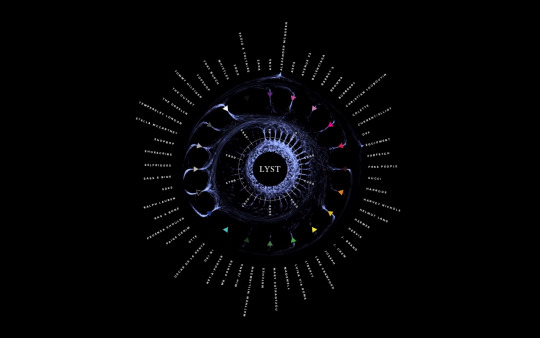
H. (n.d.). Lyst.com - big data visualisation. Retrieved from https://holition.com/portfolio/lyst-big-data-visualisation
We quite like this layout but might be moving into more of a less literal direction and will be further looking into this tomorrow.
3 notes
·
View notes
Text
Keep in Process
At this moment, we are trying to back to the data project, with showing the data on child labour. Basically, we tried to get deeper, and think about the how to present our idea through the artefact. Also, we have to think wider, then try something new.


1 note
·
View note
Text
October 19 : Final Studio
The Biggest Doll
This doll is up to interpretation and personal emergence to determine the meanings.
Firstly, all three other dolls have a pink brain on top yet this one has a half grey half pink brain which is to represent the false claim of art and science using two different sides of the brain and there being no connection or interrelationship, which is personal to something I have learned this year as this resonated with me a lot (clearly).
The idea of the dripping down could be determined as blood (which I think is awesome), yet to myself, it was more like love, passion, creativity and sometimes anger emerging together to create an unfinished masterpiece which is representational of myself and my BCT journey.
The idea of it only being half painted is to show it is not finished, emergence never is and neither is my personal emergence through BCT, creativity, art, science, design or engineering. It will be determined by my biological and cultural evolution yet is still left a mystery.
The abstractness of this doll allows the audience to understand emergence in themselves and ludic play and determine a conclusion for themselves. As humans, we do not like unsolved or unconcluded ideas yet emergence cannot be solved or determined.
The idea of the large one being personal is to show that without all the other aspects we do not have a human race. It is the three factors that create emergence and create humankind. Emergence brought humans here and in the future will whip them out.


2 notes
·
View notes
Text
Final Project - Week 2
26/09/18
This week we have been attempting to narrow down our ideas even further. After talking to Stefan he recommended that we look at this website which has been very helpful. During this time we have come up with a bunch of different ideas and found that they all carry similar elements:
Live data OR data that is collected over the course of the showcase/collected from the audience input
Interactive
A theme of “ignorance”, or an expectation vs reality kind of thing
Physical movement
Some of the data sets we have discussed using:
Deforestation
Over fishing
Sea levels
Pollution levels
Weather patterns
The mediums we have considered using to show our data:
Projection mapping onto a globe or something similar.
We saw this project called PointCloud, and thought of using a wave instead of a cloud.
We saw this project and thought it could relate quite well to over fishing.
We had been discussing plants and how their growth can be affected by lots of different variables. This one obviously relates well to most datasets.

We talked to Ricardo today to get some feedback/guidance. He started off by saying that whichever idea we choose doesn’t matter, and explained that as long as everyone in our group likes the idea we will be able to develop and execute it well. From a process of elimination the PointWave idea turned out to be everyones favourite. However our ideas so far are quite broad so we could still incorporate elements from other ideas. We had a quick look at how we could make a wave: I found this art installation by Miguel Rothschild, which is really impressive considering it’s only really made of fabric and nylon. It would be interesting to replicate this but add in movement, like these sculptures.

2 notes
·
View notes
Text
Breif
Today we came up with our brief which was “Develop the way we get physical and technological stimulation to have a equal balance of both.” in this brief we take a look at the different types of physical technology. I hope to investigate how we can get more emotion out of technology rather than just texting and face time. Today I looked some different types of products that show a balance of technology meets physical stimulation


1 note
·
View note