#css4
Text
Arlet Levandi - Grand Prix Espoo 22 - Mens SP - EST
Elements:
3A (<, 2F, fall) | 3F | CCoSp4 | 3Lz3T (niiiice) | FCS4 | StSq4 | CSS4
Program: Yumeji’s Theme, No. 6
This program for the most part, I think is a little big for Arlet’s current skating, however I really appreciate how much he went for it, especially from that combination on — because that Step Sequence was definitely unexpected, special and unique. I am honeslty so excited for Estonia becuase they have such a deep field of so many young and upcoming skaters, and this young man will certainly be one to watch as he grows and matures.
Also Holy cow I’ve found a new favorite men’s costume for the year. This is just GORGEOUS. The only thing I’d change is the fit to the sleeves, and potentially making the tunic a tucked in shirt, but it’s so pretty 🥺
Score: 72.67 into 3rd
#arlet Levandi#team estonia#Grand Prix Espoo#figure skating#grand prix figure#isu figure#mens figure skating
3 notes
·
View notes
Text
what if tma 2 is bad. plz mr jonny my mental health can’t handle being CSS4’d again
2 notes
·
View notes
Text
CSS Stylesheet
CSS is a stylesheet language used to specify the display of an HTML or XML document (including XML dialects such as SVG, MathML, or XHTML). CSS specifies how items should be shown on screen, paper, during the speech, or in other mediums.
CSS is one of the open web's basic languages, and it is standardized across Web browsers according to W3C guidelines. Previously, distinct portions of the CSS standard were developed simultaneously, allowing for the versioning of the most recent suggestions. CSS1, CSS2.1, and even CSS3 may have been mentioned to you. CSS3 and CSS4 will never exist; everything is now CSS without a version number.
0 notes
Text
Timeless Elegance: Before & After Effects with CSS

Introduction
Welcome to the world of timeless elegance in web design! In this blog post, we'll embark on a journey through the evolution of CSS and explore how it has played a pivotal role in shaping design trends. Understanding the principles of timeless design is crucial for creating websites that stand the test of time.
From classic color schemes to the subtle art of typography, we'll delve into the key elements that contribute to a timeless and sophisticated visual appeal. Join us as we showcase the transformative power of CSS with before-and-after effects, providing insights into how simple yet strategic changes can elevate the aesthetic value of any website.
Whether you're a seasoned designer or just starting, this exploration of timeless design principles and CSS techniques will inspire you to create websites that exude timeless elegance. Let's dive in!
The Evolution of CSS

The Evolution of CSS
As we trace the fascinating journey of Cascading Style Sheets (CSS), it's remarkable to witness how this fundamental technology has evolved over the years, influencing the visual aesthetics of the web. Let's embark on a brief exploration of the key milestones in the evolution of CSS.
CSS1 (1996): The journey begins with the introduction of CSS1 in 1996. This initial version laid the groundwork for styling HTML documents, allowing developers to separate content from presentation. Basic styling options, such as font properties and text alignment, marked the inception of web design customization.
CSS2 (1998): Building upon its predecessor, CSS2 emerged in 1998 with expanded capabilities. This version introduced features like absolute positioning, media types, and improved styling options. Web designers now had more tools at their disposal to create visually appealing layouts and enhance user experiences.
CSS3 (2001 - Present): The journey takes a significant leap with CSS3, a modularized version introduced in 2001. CSS3 brought a plethora of new features and modules, enabling designers to implement sophisticated styling techniques. Selectors, gradients, shadows, and transitions became integral parts of the designer's toolkit, allowing for a higher level of creativity and customization.
Responsive Design: With the proliferation of mobile devices, responsive design became a crucial aspect of CSS evolution. Media queries, introduced in CSS3, empowered designers to create layouts that adapt seamlessly to different screen sizes. This marked a paradigm shift in web design, emphasizing user experience across various devices.
Flexbox and Grid: In the quest for efficient layout systems, CSS introduced Flexbox and Grid. These layout models revolutionized how designers structure and organize content. Flexbox excels in one-dimensional layouts, while Grid provides powerful tools for two-dimensional layouts, offering unprecedented control over design structures.
The Future - CSS4: As we look ahead, discussions around CSS4 have gained momentum. While CSS3 continues to be widely used, the community anticipates new features and improvements that will further elevate the capabilities of style sheets, keeping pace with the ever-evolving landscape of web development.
From its humble beginnings to the present and the potential innovations of the future, the evolution of CSS has been instrumental in shaping the visual language of the internet. As designers continue to push the boundaries of creativity, CSS remains a cornerstone in crafting compelling and visually stunning web experiences.
Key Principles of Timeless Design
Creating timeless design involves a thoughtful blend of aesthetic appeal, usability, and a keen understanding of design principles. Let's delve into the key principles that contribute to the enduring elegance of web design.
- Simplicity: Embrace the beauty of simplicity. Clean and uncluttered designs not only enhance user experience but also stand the test of time. Strive for clarity in layout, navigation, and visual elements.
- Consistency: Establish a consistent design language across your website. Consistency in color schemes, typography, and layout fosters a cohesive and harmonious visual experience for users.
- Balance: Achieve a sense of balance in your design by distributing visual elements evenly. Whether it's text, images, or whitespace, a well-balanced composition creates a pleasing and enduring aesthetic.
- Typography: Pay special attention to typography, as it plays a crucial role in conveying information. Choose fonts that align with the tone of your content, ensuring readability and a timeless quality.
- Color Harmony: Select a timeless color palette that resonates with your brand and evokes the desired emotions. Classic color combinations endure the passage of design trends, providing a timeless appeal.
Additionally, incorporating these principles into a coherent design strategy requires a meticulous approach. Consider using a table to outline the key principles and their corresponding application in web design:
Principle
Application in Web Design
Simplicity
Minimalistic layouts, straightforward navigation
Consistency
Uniform color schemes, consistent typography
Balance
Even distribution of visual elements for a harmonious layout
Typography
Thoughtful font choices for enhanced readability
Color Harmony
Selection of classic color palettes for enduring visual appeal
By incorporating these principles into your design philosophy, you lay the foundation for a timeless aesthetic that resonates with users and withstands the ever-changing winds of design trends.
Before and After: CSS Transformations
CSS transformations have revolutionized the way we approach web design, providing a powerful toolkit to enhance the visual appeal of elements on a webpage. Let's explore how CSS transformations can take a design from ordinary to extraordinary, examining the transformative effects they offer.
1. Basic Transformations: The foundation of CSS transformations lies in basic properties like translate, rotate, scale, and skew. These properties enable designers to manipulate the position, rotation, size, and skewing of elements, respectively. Imagine a static webpage where a simple rotation or scaling can breathe life into an otherwise static layout.
2. Hover Effects: Utilizing transformations on hover events can create dynamic and interactive user experiences. For instance, a button that subtly scales or changes color upon hover not only provides visual feedback but also adds a layer of sophistication to the design.
3. Image Galleries: CSS transformations shine when applied to image galleries. Implementing effects like zoom-in on hover or creating a smooth carousel transition between images elevates the overall user engagement and aesthetics of a webpage.
4. 3D Transformations: Going beyond the 2D plane, CSS introduces 3D transformations. This opens up possibilities for creating depth and perspective in design elements. Imagine a card flip effect or a rotating carousel that adds a sense of dimensionality to the user interface.
Consider the impact of these transformations on a webpage. To illustrate, let's use a table to showcase a before-and-after comparison:
Element
Before
After (with CSS Transformations)
Button
Plain button with no hover effects
Button scales and changes color on hover
Image
Static image display
Image zooms in on hover with a smooth transition
Card
Static card display
Card flips on hover, revealing additional content
Gallery
Simple image display
Images smoothly transition in a carousel format
These transformations not only enhance the visual aesthetics but also contribute to a more engaging and user-friendly web experience. By leveraging CSS transformations judiciously, designers can create a lasting impression that transcends the boundaries of conventional web design.
Case Studies
Delving into real-world examples allows us to witness the practical application of timeless design principles and the impactful use of CSS transformations. Let's explore a few case studies that showcase how websites have successfully implemented these elements to create visually stunning and enduring user experiences.
- Example 1: E-commerce RedesignA popular e-commerce platform underwent a redesign focusing on simplicity and consistency. By implementing a clean layout with minimalistic product displays, the website embraced timeless design. CSS transformations were employed to add subtle hover effects on product images, providing an interactive touch without compromising the overall elegance.
- Example 2: Portfolio WebsiteA graphic designer's portfolio website exemplified the power of typography and color harmony. The designer opted for classic fonts and a carefully chosen color palette. CSS transformations played a role in creating an eye-catching gallery section, where images smoothly transitioned with a 3D effect on hover, leaving a lasting impression on visitors.
- Example 3: News Publication SiteA news publication site embraced timeless design by focusing on readability and balance. The use of consistent typography and a well-defined grid layout contributed to an organized and aesthetically pleasing interface. CSS transformations were subtly incorporated to enhance the visual appeal of featured articles, creating a dynamic yet timeless presentation.
To provide a clearer comparison, let's use a table to highlight key aspects of each case study:
Case Study
Design Focus
CSS Transformations
E-commerce Redesign
Minimalistic and consistent layout
Subtle hover effects on product images
Portfolio Website
Classic typography and color harmony
3D image transitions in the gallery
News Publication Site
Focus on readability and balance
Subtle CSS transformations for featured articles
These case studies exemplify how the strategic application of timeless design principles and CSS transformations can elevate the user experience and leave a lasting impact. By drawing inspiration from these examples, designers can infuse their projects with a sense of enduring elegance and modern functionality.
Mastering Classic Color Schemes
Color plays a pivotal role in creating a timeless and visually appealing design. Mastering classic color schemes involves understanding the principles of color harmony, balance, and the emotional impact of different hues. Let's explore how designers can leverage classic color schemes to achieve enduring elegance in their projects.
- Monochromatic Elegance:Opting for a monochromatic color scheme involves using different shades and tones of a single color. This creates a harmonious and sophisticated look, allowing for a visually pleasing and timeless design. For example, shades of blue can evoke a sense of calm and professionalism when applied consistently throughout a website.
- Timeless Neutrals:Neutral colors such as white, beige, gray, and black stand the test of time. These hues provide a clean and timeless canvas, allowing other design elements to shine. A classic combination of black and white, for instance, exudes a sense of simplicity and elegance that never goes out of style.
- Complementary Contrasts:Complementary color schemes involve using colors that are opposite each other on the color wheel. This creates a dynamic and visually striking contrast. When applied thoughtfully, complementary colors can add vibrancy and energy to a design while maintaining a classic appeal.
- Analogous Harmony:Analogous color schemes involve selecting colors that are adjacent to each other on the color wheel. This creates a harmonious and cohesive look, perfect for achieving a timeless design. For instance, combining shades of green and blue can create a serene and nature-inspired palette.
Let's use a table to summarize the key characteristics of classic color schemes:
Color Scheme
Description
Example
Monochromatic
Various shades of a single color
Shades of blue for a calm and cohesive look
Neutral
Classic tones of white, beige, gray, and black
Timeless combination of black and white
Complementary
Colors opposite on the color wheel
Dynamic contrast for visual impact
Analogous
Colors adjacent on the color wheel
Harmonious and cohesive color palette
Mastering classic color schemes involves a thoughtful selection and application of colors to create a timeless and visually appealing design. By understanding the nuances of different color combinations, designers can infuse their projects with a sense of enduring elegance that resonates with users across time.
Responsive Design for Timelessness
As the digital landscape continues to evolve, ensuring a seamless user experience across various devices has become paramount. Responsive design is not only a modern necessity but also a key element in achieving timeless web aesthetics. Let's explore the principles and practices of responsive design that contribute to the enduring appeal of a website.
- Fluid Grids:Responsive design begins with the implementation of fluid grids. Designers use relative units like percentages instead of fixed units like pixels to create layouts that adapt to different screen sizes. This ensures a consistent and visually pleasing experience whether the user is on a desktop, tablet, or smartphone.
- Flexible Images:Images play a crucial role in web design, and responsive design requires flexible images that can scale based on the screen size. Using CSS properties like max-width: 100%, designers can prevent images from overflowing their containers and maintain a harmonious layout across devices.
- Media Queries:Media queries allow designers to apply specific styles based on device characteristics such as screen width, height, and orientation. By tailoring styles for different breakpoints, a website can gracefully adjust its layout and presentation to accommodate varying screen sizes and resolutions.
- Mobile-First Approach:Embracing a mobile-first approach in responsive design involves designing for the smallest screens first and then progressively enhancing the layout for larger screens. This approach ensures a streamlined experience on mobile devices while providing additional enhancements for desktop users, resulting in a timeless and future-proof design strategy.
Let's use a table to summarize the key components of responsive design:
Principle
Description
Fluid Grids
Layouts based on relative units for adaptability
Flexible Images
Images that scale to fit different screen sizes
Media Queries
Styles tailored for specific device characteristics
Mobile-First Approach
Designing for small screens first and enhancing for larger screens
By incorporating responsive design principles, designers can create websites that not only adapt to the current technological landscape but also stand the test of time. A responsive and user-friendly experience across devices is a hallmark of timeless web design.
Typography: The Art of Timeless Fonts
Typography is a fundamental element in web design, and the choice of fonts can significantly impact the overall aesthetic and readability of a website. Mastering the art of timeless fonts involves understanding the principles of typography, selecting appropriate typefaces, and ensuring optimal readability. Let's delve into the key considerations and practices that contribute to achieving enduring elegance through typography.
- Classic Typefaces:Timeless fonts often include classic typefaces that have stood the test of time. Serif fonts like Times New Roman or sans-serif fonts like Helvetica are examples of versatile and enduring choices. These fonts provide a sense of familiarity and readability that transcends design trends.
- Consistent Hierarchy:Establishing a consistent typographic hierarchy is essential for guiding users through content. Bold text, italics, and varying font sizes can be used to create a clear hierarchy, emphasizing important information while maintaining a cohesive and organized visual structure.
- Whitespace Considerations:Whitespace, or negative space, is equally important in typography. Ample whitespace around text elements enhances readability and provides a sense of sophistication. Carefully managing line spacing (leading) and letter spacing (tracking) contributes to a comfortable reading experience.
- Responsive Typography:Responsive typography ensures that fonts adapt gracefully to different screen sizes. Using relative units like em or rem for font sizes allows text to scale appropriately on various devices, maintaining a harmonious and readable presentation.
Let's use a table to highlight key considerations in mastering the art of timeless fonts:
Consideration
Description
Classic Typefaces
Timeless choices like serif or sans-serif fonts
Consistent Hierarchy
Establishing a clear visual hierarchy for text elements
Whitespace Considerations
Optimal use of negative space for readability
Responsive Typography
Fonts that adapt seamlessly to different screen sizes
By meticulously considering these typography principles and practices, designers can craft websites that not only showcase timeless elegance but also provide a delightful and readable experience for users. Typography remains a powerful tool in the arsenal of design, shaping the way users interact with and perceive digital content.
Enhancing User Experience with Subtle Animations
Subtle animations have become a hallmark of modern web design, adding a layer of interactivity and visual appeal to user interfaces. When implemented thoughtfully, these animations not only catch the user's attention but also contribute to an overall enhanced user experience.
Read the full article
0 notes
Text
CSS là gì? Tại sao CSS là quan trọng trong web design?
CSS (Cascading Style Sheets) là một ngôn ngữ thiết kế web được sáng lập bởi World Wide Web Consortium (W3C) vào năm 1996. CSS đóng vai trò quan trọng trong việc định dạng và trình b��y giao diện trang web. Nó cho phép điều chỉnh màu sắc, font chữ, khoảng cách, kích thước, bố cục của các phần tử trên trang, tạo hiệu ứng độc đáo và thậm chí là tương tác động.
Mối quan hệ giữa CSS và HTML là cơ sở của việc phát triển trang web. HTML xác định cấu trúc và nội dung của trang, trong khi CSS đảm nhiệm việc định dạng và trình bày nội dung này. CSS cho phép tách biệt nội dung và giao diện, đảm bảo tính nhất quán, linh hoạt, và đáp ứng của trang web.
CSS đã trải qua nhiều phiên bản, bắt đầu từ CSS1 và tiếp tục với CSS2, CSS2.1, và CSS3. CSS3 không phải là một phiên bản cụ thể, mà là một tập hợp các modules với nhiều tính năng mới. Hiện tại, CSS4 đang được thảo luận nhưng chưa có phiên bản chính thức.
Việc sử dụng CSS giúp tách biệt cấu trúc và giao diện, đảm bảo tính nhất quán, linh hoạt và đáp ứng của trang web. CSS có thể được nhúng vào trang web thông qua các phương pháp như bên ngoài, bên trong, hoặc trong cùng trang HTML, tùy thuộc vào dự án và yêu cầu cụ thể.
Tìm hiều thêm: CSS là gì? Digitalmarketingcotam
Social media: Instagram
1 note
·
View note
Text
Unleashing the Power of Full Stack Development- Exploring Softgrid Computers' Expertise
Businesses navigating the fast-paced tech landscape must constantly search for ways to remain competitive while offering innovative solutions to customers. One approach that has gained significant traction recently is full stack development; this methodology empowers developers to work simultaneously on both front-end and back-end aspects of an application, creating an all-inclusive software development approach. We will now explore Softgrid Computers, an organization that excels in full-stack development, and learn from their expertise how this method can unleash its full power.
Understanding Full-Stack Development
Before diving deeper into Softgrid Computers' expertise, it's crucial to gain an understanding of full-stack development. A full-stack developer possesses both client-side (front end) and server-side (back end) skills needed for effective website application creation, effectively bridging design with functionality for a streamlined development process.
Full-stack development covers an expansive set of technologies and tools, such as HTML5, CSS4, JavaScript5, databases, and server frameworks, among many others. It requires in-depth knowledge of various programming languages as well as being flexible enough to adapt to rapidly changing technology trends. Softgrid Computers excels at managing this complex landscape efficiently.
Softgrid Computers Are Full-Stack Development Powerhouses
Softgrid Computers has established itself as an expert provider in full-stack development. Their focus on providing top-tier end-to-end solutions has earned them recognition within this sector. Here are a few aspects of their expertise:
Softgrid Computers boasts an exceptional team of full-stack developers with an expansive set of skills. Their specialists excel in every area imaginable, from creating intuitive user experiences to optimizing database performance; all this allows them to effortlessly handle even complex projects with ease.
Softgrid Computers's full-stack developers recognize this, which is why they employ technology agnosticism—they don't limit themselves to any particular language or framework but rather are adept in many tools like JavaScript for front-end development and Python for back-end projects based on each project's individual requirements.
Softgrid Computers' expertise lies in their seamless collaboration between front-end and back-end developers, leading to faster development cycles while guaranteeing design and functionality seamlessly align for an enhanced user experience.
Softgrid Computers places great emphasis on quality assurance during development processes for full-stack development projects, with testing and quality control at each step. Their commitment to ensuring their product not only features powerful functionality but is also reliable ensures an end product that stands the test of time.
Scalability and Future-Proofing Solutions
Softgrid Computers' expertise lies in creating long-term software development strategies and solutions designed with your business in mind. Their forward thinking ensures your application remains relevant and adaptable in light of evolving technological trends.
Benefits of Leveraging Softgrid Computer Expertise
Softgrid Computers' full-stack development services bring numerous advantages:
Efficiency: Their holistic approach accelerates development and decreases time-to-market.
Softgrid computers' flexible nature enables them to tackle projects of any size or complexity with ease, thanks to their wide skill base.
Quality: Thorough testing and quality assurance procedures ensure a superior end product.
Adaptability: Their technology-agnostic approach guarantees your project uses only the tools best suited to it.
Future-Proofing: Softgrid Computers' forward-looking strategies ensure your application remains relevant and adaptable over time.
Businesses operating in today's volatile tech landscape must utilize full stack development for survival, and Softgrid Computers stands as an ally that offers comprehensive full stack solutions that enable organizations to produce innovative web apps efficiently and cost-effectively. Their commitment to providing top-quality, adaptable, and future-proofed solutions makes Softgrid Computers an indispensable partner when it comes to full stack development; working closely together allows your organization to unlock the full potential of this powerful methodology and achieve new heights of success in business.
0 notes
Text
okay so:
a) in browser versions that support :is/:where (firefox 84+; chromium 88+), you can use multiple simple selectors in a :not, e.g. :not(.some-class, [title="some title"]). there is never a need to use :not(:is()). this is official css4 and listed on caniuse.
this is just convenient semantic shorthand—nothing too exciting, but it's nice to know about if you can assume updated browsers.
b) in the same set of browser versions, you can query parents using complex (nested) selectors in :is/:where and :not, e.g. :not(.evil-parent-class *) or :not(.evil-parent-class > *). this is also official css4 (a "selector list" includes complex selectors) even though it is in none of the documented examples, and is therefore listed on caniuse (again without a clear example).
I was not certain before I looked this up and tested about whether this worked in both browser engines, and if you told me it definitely did work now I would have incorrectly guessed it was added after :is, rather than at the same time!
this is mostly useful for :not in order to exclude a parent from a query without specifying the exact DOM structure of the parent; complex :is/:where statements are usually just equivalent to a regular descendant selector.
c) only in chromium 105+ and [some future version of firefox >115], you can query children using complex selectors in :has, e.g. :has(> .good-child-class) or :not(:has(> .evil-child-class)). you can nest one :has and one :not in either order and both of them can have complex selector lists; I just tested.
this, if I understand the way CSS works, gives you the power to quite easily make style rules that perform really badly compared to the relative extremely high performance of CSS these days, so while it's pretty slick I would avoid it in most cases. (my understanding is that performance is why firefox has not launched :has yet.)
bonus: did you know that you can use :scope in a query inside a querySelector/querySelectorAll/closest call to refer to the queried element, e.g. querySelectorAll(':scope > *') to look for direct children of the element?
0 notes
Text
CSS
CSS is the acronym for Cascading Style Sheets. The appearance of HTML elements on screens, in print, or in other media is described by CSS. The use of CSS saves a lot of time. It can control the design of multiple web pages at once.
A priority system is used to choose which style rule should be implemented when many style rules matches an element, cascading its name. There is an order of importance to it.
The addition of font and colour information to every page made the process of creating large websites time-consuming and expensive.The World Wide Web Consortium (W3C) developed CSS to address this issue. The style formatting of the HTML page was removed using CSS.
The World Wide Web Consortium oversees the CSS guidelines (W3C). The Internet media type (MIME type) text/css has been registered by RFC 2318 for use with CSS (March 1998). The W3C provides a free CSS validation service for CSS documents.
Example of <style> element:
<style>
h1 {
color: red;
}
</style>
Without requiring any explicit coding, all h1 elements in the document will then automatically turn red. A single change can be made to alter the colour of every h1 element in the page, if so desires.
Also , another advantage with CSS is that the styles can easily be added to an external CSS file.
<link href="path/to/file.css" rel="stylesheet" type="text/css">
A crucial component of CSS is inheritance, which depends on the ancestor-descendant relationship to function. Inheritance is the process by which characteristics are passed down from one element to its progeny and back again.
Levels of CSS
CSS that has been developed further improves upon earlier versions by adding functionality and improving definitions.
CSS has different profiles and levels, and they are identified as CSS 1, CSS 2, CSS 3, and CSS 4.
CSS 1
CSS level 1, which was released on December 17th, 1996, is the first CSS specification to be recognised as a W3C Recommendation. Font attributes, Color, Alignment, Images, Tables, Margin, Border, Padding, etc. are all included.
CSS 2
The W3C created the CSS level 2 specification, which was released in May 1998 as a recommendation. Many updates to CSS has been done over the years to offer new features include the concept of media types, support for auditory style sheets, absolute, relative, and fixed placement of elements, and z-index. CSS 2.1, CSS 3 and CSS 4 all are examples of this updation.
CSS 2.1
This updates CSS 2 to correct errors, removes features that aren't fully supported or compatible, and adds already-implemented browser extensions to the specification.
CSS 3
The "modules" that make up CSS 3 are a collection of distinct documents. Each module preserves backward compatibility while introducing new capabilities or extending features specified in CSS 2.
CSS 4
CSS 4 was released in December 2020. However, there isn't a single, comprehensive CSS4 specification.
0 notes
Text
Jes00s colorset

#Jes00s colorset free#
Total running time of the script: ( 0 minutes 1. text ( 1.5 + 3 * g, - 0.3, 'xkcd', ha = 'center' ) ax. Twenty Twenty-Two Paragraph hyperlink colors & Site Title color are not responsive on mobile. text ( 0.5 + 3 * g, - 0.3, 'X11/CSS4', ha = 'center' ) ax. About Press Copyright Contact us Creators Advertise Developers Terms Privacy Policy & Safety How YouTube works Test new features Press Copyright Contact us Creators. to have my boi Shi De half naked asfghjkldi jes00s his arms omg rip me. Lense Color: clear, Frame Color: shiny smokey quartz with swarovsky. hlines ( range ( n_rows ), 3 * g, 3 * g + 2.8, color = '0.7', linewidth = 1 ) ax. outfits again ik they shared patterns but i want them to share colors too. Syntax: CanvasJS.addColorSet (colorSetName, colorSetArray) Example: CanvasJS.addColorSet (customColorSet1, //colorSet Array. Color Sets added in this manner are global and they can be used by any chart in the page. Our visural identity guide includes a color palette to help our printed pieces achieve a consistent look. Ensuring that colors are accurate is critical to maintaining a strong brand. AudioGraph JSS98,Jes00,Jes01,Jes03 2 is an authoring system combining. set_title ( 'style: ', ** text_args ) for g in range ( n_groups ): ax. CanvasJS provides a way to add custom colorSet to the library. Jesuit Dallas colors are an essential component of our identity and traditions. handles several colors of writers and an eraser tool. Plus, the CSS and image files make it easy to add these colors to your website or project.Import numpy as np import matplotlib.pyplot as plt import matplotlib as mpl th = np. JumpWorld Duels played: 17: Duels won: 5: Total tried: 19: Total passed: 11: Passed: 57.89: Passed parkours of the day: 0: Total parkours of the day: 2186: Released. This handpicked collection of gradient colors offers a range of styles and colors that can be used in any project. The Gradient Colors Collection has everything you need. You might spend hours browsing through different websites or trying to create your own palette from scratch. It can be hard to find the perfect color palette that meets all of your needs. You want something that is both stylish and unique, but also versatile enough to be used in a variety of contexts. to have my boi Shi De half naked asfghjkldi jes00s his arms omg rip me. Sketch and Photoshop packs are available as well.Ĝhoosing the right color palette for your project can be difficult. outfits again ik they shared patterns but i want them to share colors too. png version of each gradient and copy their CSS3 cross-browser codes.
#Jes00s colorset free#
Looking 👀 for cool background gradients for your UI? A free collection of 200 linear gradients that you can use as content backdrops in any part of your website. 200 Beautiful Color Gradients For Your Next Design ProjectĬoolest handpicked gradient hues for your next super 👌 amazing stuff.
0 notes
Text
Sumitada Moriguchi - Japanese Nationals 22
Program: Breakthrough - Queen
Elements:
3A | 3Lz3T | FCS4 | 3F | CSS4 (?) | StSq3 | ChCoS4
THIS MAN!!!! Literally this MORNING he competed in the pairs short program and barely even 4 HOURS LATER he just laid down this clean program that just got better and better with every element!
I knew him and his partner both competed in singles, but I’ve never seen him skate on his own and that was FANTASTIC! And for a pairs skater to be *that* close to getting a level 4 in his step sequence? And to land 4 clean jumps that are all the hardest you can do that are not quads???? What an ICON he should be so PROUD!!! Even his energy, performance and commitment to the choreography was all so ON I’m just floored by this lil bean 🥺
The entire crowd rose to give him a standing ovation, and he DESERVED IT I am so emotional for Sumitada rn 🥹😭👏🏻😭
Score: 76.31 into 4th place
3 notes
·
View notes
Text
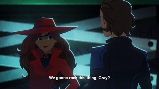
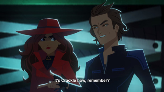
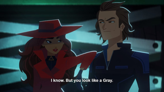
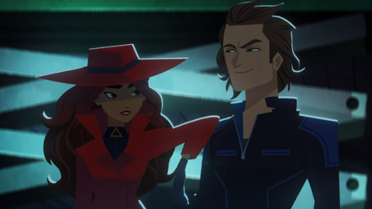
GUYS STOP FLIRTING PLS 😭😭 YOU HAVE WORK TO DO 😭😭😭😭
#carmen sandiego#css4#cs season 4#carmen x crackle#carmen x gray#carmen sandiego spoilers#carmen sandiego s4#i love them so much#red crackle
80 notes
·
View notes
Text
Player’s teacher has been making an awful lot of appearances he’s sus
#is he an operative??#not me being jumpy from all the anxiety#first the trailer now he's in that post#on the official account#cs player#carmen sandiego#css4
56 notes
·
View notes
Text
CSS 的 :has() 有新進展了
CSS 的 :has() 有新進展了
在「Using :has() as a CSS Parent Selector and much more」這邊看到 Safari 宣佈對 :has() 的支援,查了一下 Can I use… 上面的資料「:has() CSS relational pseudo-class」,看起來是從 15.4 (2022/05/14) 支援的。
隔壁 Google Chrome 將在下一個版本 105 (目前 stable channel 是 104) 支援 :has(),沒意外的話 Microsoft Edge 應該也會跟上去,看起來只剩下 Firefox 要開了。
先前在「Chromium 的 :has() 實做進展」這邊有翻一下進度,看起來 Chromium 這邊要進入收尾階段了。
等普及後一些延伸套件裡的寫法也可以用 :has() 來處理了,就不用自己在 javascript 裡面檢查半天…
View On WordPress
0 notes
Last Seen Blogs

fyeahstannis
Stannis Baratheon

oldrockhouse-blog
Old Rock House

romana-after-dark
Dark Logan Propaganda

anime-is-disgusting-blog
Fuck Anime

airamanalang
saccharine liar