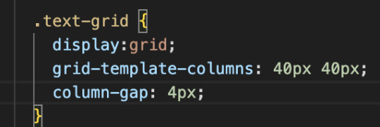
#css display grid
Explore tagged Tumblr posts
Visit Tumblr Blog
Explore Tumblr blogs with no restrictions, modern design and the best experience.
Last Seen Tumblr Blogs


Fun Fact
The most popular pages on Tumblr are about Minecraft, GIFs, and David J. Peterson.
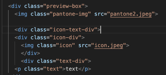
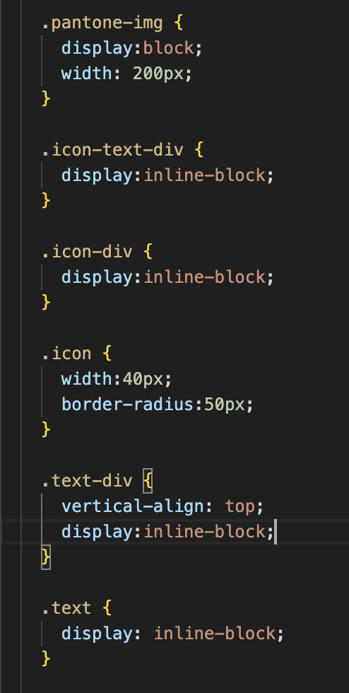
Text
Hello audience. Unfortunately, I am still on my break. However, I am happy to announce that I am still alive and kicking. In fact, I decided to make use of my unemployment and revisit HTML, CSS, and JavaScript to create... A visual novel.
Good News: code is 100% reusable because I used a JSON (i do not know how that works, someone can kindly explain to me...)
Bad News: this code sucks ass, and NOTHING works except playing the story. Transitions? Doesn't work. UI/UX? Ass. Effects? Hell no... Also, 70% of the features aren't present yet I'm gonna do it later.
Oh, this is CrossDust, if you can't tell.
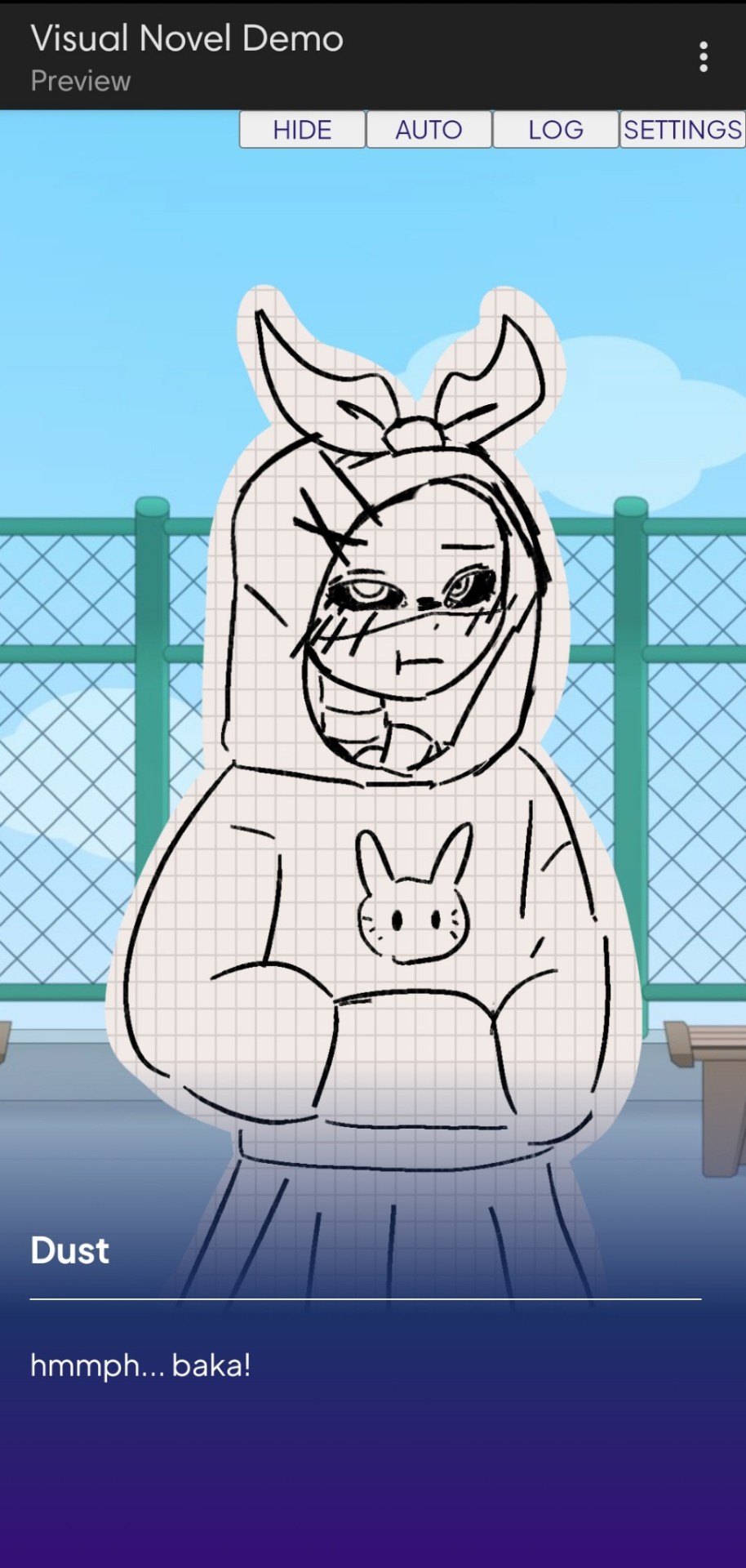
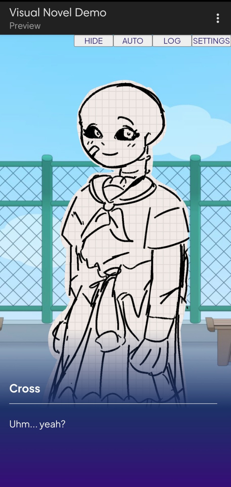
Dust Sans by Ask-Dusttale, Cross Sans by Jakei
I'm gonna respond to asks and do requests later (After my break is over). This is just a small update teehee.
#dsevalyappuccino#TIME TO GO INSANE IN THE TAGS!!#i hate css#i still hate css#css hell no#guys why is css so hard. ive literally been doing this for months and css is still hard#i was about to use css spritesheets for the sprites and emotions#but my ass gave up and instead i just use seperate images#GUYS!!! DISPLAY: FLEX 💪. DISPLAY: GRID?!?!#javascript i hate you tooq#i hate java script naurrrr#what do you mean DOM objects#what do YOU MEAN#also i do not understand error handling and JSON integrations#papaGPT doesn't explain anything#i don't know what I just wrote#coding???????????#kids don't be unemployed#actually maybe if you're unemployed but still making money that's great#also the sprites are just for testing purposes im probably gonna make new better ones if i chose to expand this into#a full blown anime high school visual novel project#i don't wanna think of all that story crap but then again i can just write the cringiest thing on earth
23 notes
·
View notes
Text
Revisiting CSS Multi-Column Layout
New Post has been published on https://thedigitalinsider.com/revisiting-css-multi-column-layout/
Revisiting CSS Multi-Column Layout
Honestly, it’s difficult for me to come to terms with, but almost 20 years have passed since I wrote my first book, Transcending CSS. In it, I explained how and why to use what was the then-emerging Multi-Column Layout module.
Hint: I published an updated version, Transcending CSS Revisited, which is free to read online.
Perhaps because, before the web, I’d worked in print, I was over-excited at the prospect of dividing content into columns without needing extra markup purely there for presentation. I’ve used Multi-Column Layout regularly ever since. Yet, CSS Columns remains one of the most underused CSS layout tools. I wonder why that is?
Holes in the specification
For a long time, there were, and still are, plenty of holes in Multi-Column Layout. As Rachel Andrew — now a specification editor — noted in her article five years ago:
“The column boxes created when you use one of the column properties can’t be targeted. You can’t address them with JavaScript, nor can you style an individual box to give it a background colour or adjust the padding and margins. All of the column boxes will be the same size. The only thing you can do is add a rule between columns.”
She’s right. And that’s still true. You can’t style columns, for example, by alternating background colours using some sort of :nth-column() pseudo-class selector. You can add a column-rule between columns using border-style values like dashed, dotted, and solid, and who can forget those evergreen groove and ridge styles? But you can’t apply border-image values to a column-rule, which seems odd as they were introduced at roughly the same time. The Multi-Column Layout is imperfect, and there’s plenty I wish it could do in the future, but that doesn’t explain why most people ignore what it can do today.
Patchy browser implementation for a long time
Legacy browsers simply ignored the column properties they couldn’t process. But, when Multi-Column Layout was first launched, most designers and developers had yet to accept that websites needn’t look the same in every browser.
Early on, support for Multi-Column Layout was patchy. However, browsers caught up over time, and although there are still discrepancies — especially in controlling content breaks — Multi-Column Layout has now been implemented widely. Yet, for some reason, many designers and developers I speak to feel that CSS Columns remain broken. Yes, there’s plenty that browser makers should do to improve their implementations, but that shouldn’t prevent people from using the solid parts today.
Readability and usability with scrolling
Maybe the main reason designers and developers haven’t embraced Multi-Column Layout as they have CSS Grid and Flexbox isn’t in the specification or its implementation but in its usability. Rachel pointed this out in her article:
“One reason we don’t see multicol used much on the web is that it would be very easy to end up with a reading experience which made the reader scroll in the block dimension. That would mean scrolling up and down vertically for those of us using English or another vertical writing mode. This is not a good reading experience!”
That’s true. No one would enjoy repeatedly scrolling up and down to read a long passage of content set in columns. She went on:
“Neither of these things is ideal, and using multicol on the web is something we need to think about very carefully in terms of the amount of content we might be aiming to flow into our columns.”
But, let’s face it, thinking very carefully is what designers and developers should always be doing.
Sure, if you’re dumb enough to dump a large amount of content into columns without thinking about its design, you’ll end up serving readers a poor experience. But why would you do that when headlines, images, and quotes can span columns and reset the column flow, instantly improving readability? Add to that container queries and newer unit values for text sizing, and there really isn’t a reason to avoid using Multi-Column Layout any longer.
A brief refresher on properties and values
Let’s run through a refresher. There are two ways to flow content into multiple columns; first, by defining the number of columns you need using the column-count property:
Second, and often best, is specifying the column width, leaving a browser to decide how many columns will fit along the inline axis. For example, I’m using column-width to specify that my columns are over 18rem. A browser creates as many 18rem columns as possible to fit and then shares any remaining space between them.
Then, there is the gutter (or column-gap) between columns, which you can specify using any length unit. I prefer using rem units to maintain the gutters’ relationship to the text size, but if your gutters need to be 1em, you can leave this out, as that’s a browser’s default gap.
The final column property is that divider (or column-rule) to the gutters, which adds visual separation between columns. Again, you can set a thickness and use border-style values like dashed, dotted, and solid.
These examples will be seen whenever you encounter a Multi-Column Layout tutorial, including CSS-Tricks’ own Almanac. The Multi-Column Layout syntax is one of the simplest in the suite of CSS layout tools, which is another reason why there are few reasons not to use it.
Multi-Column Layout is even more relevant today
When I wrote Transcending CSS and first explained the emerging Multi-Column Layout, there were no rem or viewport units, no :has() or other advanced selectors, no container queries, and no routine use of media queries because responsive design hadn’t been invented.
We didn’t have calc() or clamp() for adjusting text sizes, and there was no CSS Grid or Flexible Box Layout for precise control over a layout. Now we do, and all these properties help to make Multi-Column Layout even more relevant today.
Now, you can use rem or viewport units combined with calc() and clamp() to adapt the text size inside CSS Columns. You can use :has() to specify when columns are created, depending on the type of content they contain. Or you might use container queries to implement several columns only when a container is large enough to display them. Of course, you can also combine a Multi-Column Layout with CSS Grid or Flexible Box Layout for even more imaginative layout designs.
Using Multi-Column Layout today
Patty Meltt is an up-and-coming country music sensation. She’s not real, but the challenges of designing and developing websites like hers are.
My challenge was to implement a flexible article layout without media queries which adapts not only to screen size but also whether or not a <figure> is present. To improve the readability of running text in what would potentially be too-long lines, it should be set in columns to narrow the measure. And, as a final touch, the text size should adapt to the width of the container, not the viewport.
Article with no <figure> element. What would potentially be too-long lines of text are set in columns to improve readability by narrowing the measure.
Article containing a <figure> element. No column text is needed for this narrower measure.
The HTML for this layout is rudimentary. One <section>, one <main>, and one <figure> (or not:)
<section> <main> <h1>About Patty</h1> <p>…</p> </main> <figure> <img> </figure> </section>
I started by adding Multi-Column Layout styles to the <main> element using the column-width property to set the width of each column to 40ch (characters). The max-width and automatic inline margins reduce the content width and center it in the viewport:
main margin-inline: auto; max-width: 100ch; column-width: 40ch; column-gap: 3rem; column-rule: .5px solid #98838F;
Next, I applied a flexible box layout to the <section> only if it :has() a direct descendant which is a <figure>:
section:has(> figure) display: flex; flex-wrap: wrap; gap: 0 3rem;
This next min-width: min(100%, 30rem) — applied to both the <main> and <figure> — is a combination of the min-width property and the min() CSS function. The min() function allows you to specify two or more values, and a browser will choose the smallest value from them. This is incredibly useful for responsive layouts where you want to control the size of an element based on different conditions:
section:has(> figure) main flex: 1; margin-inline: 0; min-width: min(100%, 30rem); section:has(> figure) figure flex: 4; min-width: min(100%, 30rem);
What’s efficient about this implementation is that Multi-Column Layout styles are applied throughout, with no need for media queries to switch them on or off.
Adjusting text size in relation to column width helps improve readability. This has only recently become easy to implement with the introduction of container queries, their associated values including cqi, cqw, cqmin, and cqmax. And the clamp() function. Fortunately, you don’t have to work out these text sizes manually as ClearLeft’s Utopia will do the job for you.
My headlines and paragraph sizes are clamped to their minimum and maximum rem sizes and between them text is fluid depending on their container’s inline size:
h1 font-size: clamp(5.6526rem, 5.4068rem + 1.2288cqi, 6.3592rem); h2 font-size: clamp(1.9994rem, 1.9125rem + 0.4347cqi, 2.2493rem); p font-size: clamp(1rem, 0.9565rem + 0.2174cqi, 1.125rem);
So, to specify the <main> as the container on which those text sizes are based, I applied a container query for its inline size:
main container-type: inline-size;
Open the final result in a desktop browser, when you’re in front of one. It’s a flexible article layout without media queries which adapts to screen size and the presence of a <figure>. Multi-Column Layout sets text in columns to narrow the measure and the text size adapts to the width of its container, not the viewport.
Modern CSS is solving many prior problems
Structure content with spanning elements which will restart the flow of columns and prevent people from scrolling long distances.
Prevent figures from dividing their images and captions between columns.
Almost every article I’ve ever read about Multi-Column Layout focuses on its flaws, especially usability. CSS-Tricks’ own Geoff Graham even mentioned the scrolling up and down issue when he asked, “When Do You Use CSS Columns?”
“But an entire long-form article split into columns? I love it in newspapers but am hesitant to scroll down a webpage to read one column, only to scroll back up to do it again.”
Fortunately, the column-span property — which enables headlines, images, and quotes to span columns, resets the column flow, and instantly improves readability — now has solid support in browsers:
h1, h2, blockquote column-span: all;
But the solution to the scrolling up and down issue isn’t purely technical. It also requires content design. This means that content creators and designers must think carefully about the frequency and type of spanning elements, dividing a Multi-Column Layout into shallower sections, reducing the need to scroll and improving someone’s reading experience.
Another prior problem was preventing headlines from becoming detached from their content and figures, dividing their images and captions between columns. Thankfully, the break-after property now also has widespread support, so orphaned images and captions are now a thing of the past:
figure break-after: column;
Open this final example in a desktop browser:
You should take a fresh look at Multi-Column Layout
Multi-Column Layout isn’t a shiny new tool. In fact, it remains one of the most underused layout tools in CSS. It’s had, and still has, plenty of problems, but they haven’t reduced its usefulness or its ability to add an extra level of refinement to a product or website’s design. Whether you haven’t used Multi-Column Layout in a while or maybe have never tried it, now’s the time to take a fresh look at Multi-Column Layout.
#:has#ADD#almanac#Article#Articles#back up#background#book#box#browser#challenge#clamp#colours#columns#container#content#course#creators#CSS#CSS Grid#css-tricks#Design#designers#desktop#developers#digitalocean#display#easy#English#Explained
2 notes
·
View notes
Text
Todo sobre la Etiquet<DIV> en HTML
La etiqueta <div> es uno de los elementos más versátiles y utilizados en HTML. Se utiliza principalmente como un contenedor para otros elementos, permitiendo agruparlos y aplicarles estilos o comportamientos específicos mediante CSS y JavaScript. A continuación, te explico sus propiedades, valores y cómo se relaciona con otras propiedades. Propiedades y Valores de <div> La etiqueta <div> en sí…
#columnas#contenedor#CSS#cuadrícula#desarrollo web#diseño adaptable#diseño de página#Diseño web#display#div#elementos hijos#estilos CSS#filas#Grid#grid-template-areas#grid-template-columns#HTML#layout#responsivo
0 notes
Text
People who don't know much about web dev will go "fuck jQuery and the enshittification of the internet! Modern sites are bloated and inaccessible!" (which, to be fair, is true) and then go on to add so many unnecessary iframes to their neocities pages that the latest version of Firefox struggles to render them
#i promise using the display: grid css property will not suddenly turn you into a silicon valley corpobro#tangentially related:#i remember seeing someone boasting that their browser game was ''handcoded javascript''#ah yes i only visit websites that make use of ethically harvested small batch fair trade javascript
1 note
·
View note
Note
sorry if you’ve answered something similar before but how do you format things for your website? in the collections you have for poems
i love how it looks. the book kind of format it has
and i want to do similar/the same formatting for my own works but im really struggling…
i've been asked stuff like this a lot and i don't mind explaining it often because i want people to make websites more. i made a tutorial video at some point but it's kind of hard to make a curriculum or tutorial or whatever around this kind of thing because it's really just a self expression thing. i'll try to break down as much of my thought process as makes sense.
i design my pages in photoshop with either double/single page display in mind and then i use html to set them next to each other. most of the choice here comes down to how overwhelming i want my designs to feel. in the case of the lonely leaver page, the entire book was designed to be something that could be a physical book, and so from the getgo i made the pages in that kind of format. i previewed things in acrobat which has a booklet view mode (which singles out the front and back cover around the contents of the file) & allows you to process double page view as well. as for the actual process in photoshop before that point, i typically will open a canvas that is the size of the full 2 page spread (i.e. 8 inches wide for 2 pages which are both 4 inches wide) and i set grid lines for bleed margins and to mark the center of the page so that i can make the composition something that im comfortable with having a gap in the middle from the book folding. with lonely leaver i had to reformat about half the book at some point because i wanted to make it a larger resolution which was annoying but i just keep my guidelines for a print size in mind while im working. often if im a certain amount of time into a project that i feel like i will be spending a lot more time with i'll create a dummy psd file at this point which is devoid of content but which has all of the margins/resolution stuff set up already so i can just open that up and save a different version of it when i'm done.
my actual writing process and my design process is generally extremely intertwined, that's why things tend to be varying degrees stream of conscious in my work i think. i'll for instance, have a thought im stuck on for several days, and then open photoshop without having a poem or comic in mind, but i'll fill the canvas with some kind of color like red or yellow or a photo or whatever, and then open a text box or start drawing. telling a story through composition (i.e. page layout itself) is generally my favorite aspect of art and design because i enjoy how violent and dramatic framing angles can make the content of a piece feel so i'll try to move stuff around as much as possible in order to get my desired effect, often times using place holder shapes in lieu of finished design elements in order to get a rough blocking. as i do this i tend to react to what i'm writing/making as i'm doing it, and i do a lot of selective self editing during this part. for instance, i'll start manipulating rasterized text or cutting around images or whatever. i'll reread and look at whatever im doing for a couple of hours and then when i'm done with a spread or whatever i will save the document as a psd with a combined full spread and then each page separately as pngs or whatever (split at the middle grid line, back to the example, i'll save 2 different 4 inch wide images by changing the canvas size).
when it's time for me to put stuff on my website i then batch convert whatever pngs i exported into webp's because they load faster and take up less space on the server/my computer. you can look at my direct html/css files in your internet browser's explorer mode to see exactly what i do but essentially i just have either 1 or 2 images in a block and then a series of repeating vertical blocks containing images. i don't have an extremely efficient way of uploading pages and i'll typically just copy the same
"<p><img src="01.png"> <p><img src="02.png">"
like, 30 or 40 times or whatever into a html document. i use visual studio code for this stuff because it lets me do a bunch of stuff like having several files open at once & the navigation pane is nice & there's a live server extension that automatically refereshes the html file in my web browser on file save which is really awesome. i have a css page that i made like, 5 years ago, and i usually just link new projects to that because it has a bunch of different settings in it which i'll toggle on or off depending on the needs of whatever page or i'll add new div id's to it. it's kind of messy at this point, but it gets the job done. i use filezilla and something like bluehost or something for webhosting/file management.
i arrange and organize all of my art extremely methodically so usually in my like "<root catch all poetry folder>" inside of my "<root catch all art folder>" there will be a "<name of specific poem book>" folder which just contains the poems named by their actual name e.g. "dedication to saint eulalia 4.png" and then another folder inside of that is called "paginated" where i, using the acrobat document i arrange stuff in as reference, rename copies of my pages which i have placed in that folder to be named things like "01.png" so that i can then manually flip through it sequentially in the windows photo viewer and also just so that i don't have to go through the arduous process of renaming and tracking stuff inside of the root folder i'm containing that project's files in.
i'm 26 now and i made my first website when i was like 18, and my first zine project and i'm tired of feeling feeling around that same time, so i've got like, coming up on a decade of trial and error behind this and this is generally what has worked for me. my website isn't super complicated and mostly just gets the job done but because i try to think about style and presentation up front with whatever projects i'm doing i tend to just make plans based around that as early as it makes sense. to me having a website for art presentation has always been the Primary Method and intended landing zone for my art so it's genuinely always been a consideration in my process to try to plan around how i will put it on my website. i do this because i believe having my own curated space for containing my art allows it to exist in a context which best heightens whatever message i'm trying to convey. if there's an issues with my website right now they are that i'm very bad at mobile browser formatting & i havent updated the main look of the website in something like 4 years barely at all.
anyway, at the end of the day i think really as long as you can identify whatever your intentions are and do some planning/problem solving around that you should probably be able to find your own method which works for you better than mine might but if you do just want to copy my website the tools to do so are within your brain and internet searches and i believe in you. i think the biggest strength of my website is that it shows how easy it is to just put art big as fuck on a webpage and how effective that kind of minimalism can be. i just want my website to be like a museum's walls. and it's not super complicated to get to that level of html knowledge.
12 notes
·
View notes
Text
widowbase v3 and v4
Whooboi, there is a lot of discourse going on right now about JCINK coders. Perfect time for me to update some base skins!
For those who just want to streamline their coding process, I have updated my widowbase v3 to include a day/night theme toggle and made a few responsive tweaks to the vertical nav and sidebar. For those looking to learn how to use CSS grid and flexbox to create responsive forum designs, I added a new base, widowbase v4. This version includes some HTML templates that have a very ugly, extremely basic, but functional fluid grid layout. These templates also incorporate hidden divs (read as, display: none) that include the PHP variables frequently used inside those respective HTML templates, so you can easily delete everything I've done and start from scratch with your own. Then just delete the hidden div when you've used everything you need. Easy peasy!
For those of you just beginning your coding journey, I wish you the best of luck! It is such a fun and rewarding hobby. You are also free to rip apart any of the codes on my preview site and cobble them back together. These experiments can be a great learning tool! You are more than welcome to use any of my free resources as a base, as long as the finished product remains free. As for my actual skin bases (or template sets specifically labeled as bases), these can be used for free or paid skins. Make money or give it away, whatever works for you, just leave the credits given to resources intact so others can find out how to accomplish the same thing!
41 notes
·
View notes
Text
webdev log uhhhh... 6?
Haven't worked on my site in a bit because I think I fucked up somewhere in during the deployment phase so now it's hard to host it locally.... only the index page works and the css is half broken anyways, presumably because of laravel breeze's tailwind coming preinstalled. I DID have to jump through hoops to get it going during deployment.. just don't know which hoops so it's stuck that way >_>;; so now I can't host it locally for development......... I'll have to make things and just hope it shows up when I deploy them I think
Failed to listen on 127.0.0.1:8000 (reason: ?)
cool, cool. thanks. very helpful debugging message..
anyways, coded up a little php doohicky and updated my site! WANNA PEEK?
I wanted to migrate my fridge page (art others have done of my characters) to my site, but I didn't want to implement another table because YUCK I'm so done with that.
I wanted something more automatic because I'm lazy and I also wanted it to not look like it's from 2003 like my neocities to match with my new site. too much trouble!!!! including the stuff previously mentioned.. so I left it untouched for a while.
then I was talking with someone and wanted to try making this with php.....

it's pretty basic. finished the code for the script in like an hour maybe, and then later it was mostly just tinkering with the html/css itself to make it display all nice and grid-like.
all it does is take all images from a specified folder and spits them out.
it creates a DirectoryIterator object to iterate through the specified folder (at least, I think that's how DirectoryIterator works.... dunno) then for each individual file it checks if it's an image, gets the time the file was modified, then stores the file path and modified time in an array. then that array gets sorted via modified time (newest first), and then iterated through and BAM...
I'd prefer a better time system such as organize when the file was actually created, but if you paste a file into a new folder, "created time" gets changed to when you pasted it.. using file modified time is the only way when you aren't using a database and just want this to be all done automatically I think. unless I'M STUPID and someone has a better idea.. then please enlighten me.
ANYWAYS added The Fridge to my site using my lil code! :>

updated my About to include a link too...
also, I was looking up things and found this funny example code on stack overflow

let's all randomize our racism images.....
6 notes
·
View notes
Text
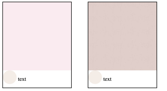
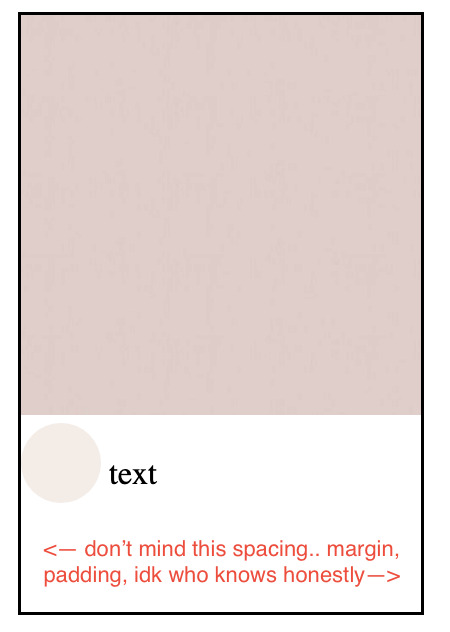
In the css mines for one million hours. Have not taken medication. have not successfully used the grid display
4 notes
·
View notes
Note
(this is specific to scripts, not styling codes which ARE creative) // this is a tangent from the og conversation but none of the styling codes on jcink are creative or original. you can't claim color codes, rounded corner radius, stackoverflow, gooey menus, display, flex, grid, svg, cutouts, clip path, or any other css element as original. some might be new or newly brought back to jcink but they are everywhere on the internet. ppl get mad about "stolen" ideas and the idea is a clip path lol
~
2 notes
·
View notes
Text
꒰ ͙ ❄ SHOW ME UR GIFFIES . ꒱
greetings , pookies ! SHOW ME UR GIFFIES is a fun , vibrant lil gem of a page to host and display all of ur beautiful gifs ! there are two versions available to download , one suited for gif icons and one suited for larger gifs . sizes were tested with 70 x 70 px icons and 268 x 150 px gifs but should be accommodating to various sizing discrepancies ! there are annotations through the page to help u get the precise look u want . as per usual , let me know if u encounter any errors and i will do my best to troubleshoot asap !
if u intend on using this theme or just want to be a supportive hottie , please give this post a like and a reblog ! stay hydrated and be sure to pet a cute animal today ! mwuah 💋 💋 💋 !

ⅰ. THEME FEATURES .
x. 100% java free x. cute , geometric grid line background x. aesthetically pleasing gradient wave header w / annotations to help change the colors + link to shade finder software to help u design ur gradient x. pill - shaped container to house ur title and other goodies x. designated area for ur description x. animated pill container to state gif count x. five links in mini nav hub ; one to redirect to ur main , one to go to ur inbox , one to link to ur main list of resources , one to direct users to ur commission info ( if applicable ) , and one to bring the user back to the dash . all of these links can be edited / deleted to ur liking x. detailed annotations to edit ur page's margins and padding x. optional ::before sector to add symbols / emojis before ur title that are customizable in the css x. links for various unicode character / emoji resources within the code to use for ur title x. for a more detailed compilation of credits and features , please see the google doc containing the code

͙ ❄ this page is a patreon exclusive : want access ? consider signing up to join the fam - a - lam to get ur hands on this theme as well as my entire coding catalogue . click here to learn more !
source link directs to a live preview of SHOW ME UR GIFFIES ! original gif icon drop of cierra ramirez can be found here .

#rph#rpt#indie rph#rp theme#rp page#gif page#mine#rec#for patreons#for patrons#round 2 bc my previous post wasn't appearing ???
22 notes
·
View notes
Note
how did you go about doing the navigation links on your neocities? it's really neat!
MY NEOCITIES... i really need to add more to that. every so often i remember it exists. anyway
the sidebar and main text, first of all, are two containers in the simplest possible flexbox container (the css for it just has 'display: flex' and nothing else). very useful, i love flexbox. if you haven't used it before, i'd recommend looking into it! loads of examples and guides out there. (there's also css grid, but i've never used it)
the navigation itself in the html is very simple, basically a list of links.. not actually a list, just separate 'paragraphs'. (which i have to update on every page every time i add/rename/remove another page..) additional thought: i think mayyybe if i used a flexbox container for the links themselves it'd be easier to make it so the navigation turns horizontal (and along the top) instead of vertical when the screen is small enough? or something with inline blocks maybe. i haven't gotten around to trying any of that though
back on topic, the symbol before each link and the translucent 'label' on hover is from the css, like this

so basically the 'label' sticking out is, like, an offset background? and also the current page link gets a custom class that gives it the same formatting as the hover text
i think that's everything, i'm not great at actually explaining how i did stuff so i hope this is helpful haha
#honestly when i was making it i... mostly just looked through the mdn web docs#and clicked on whatever interesting selectors/attributes/etc. i thought i might use#that's pretty much the main way i learn html/css.. trying out whatever might look good and learning how to use it lol
5 notes
·
View notes
Text
am i dumb
today i feel defeated because i didn't know you could put a css grid within a grid during this exercise i was doing. it wasn't shown in the tutorial and i only knew because i compared my code with the model code. so when i found out i was ike ???#%#$?^$&
i was so stuck on why this text was below a photo instead of sitting next to it and i feel like i should've known??
i'm just beating myself up at this point but i really couldn't put the pieces together and i'm sad that i'm DUM.
i mean i understand it now but AT WHAT COSTTT it felt like i was blatantly copying what the instructor put in their code even though it kinda wasn't so i feel like a fraud but a dummy at the same time bc i couldn't figure that out :(((((((((((((
this is an example of the problem i was facing:

#real #true
context: the lesson was introducing css grid and explaining how display inline blocks don't automatically apply vertical alignment so grids are better.
here is my html and css for these example i made and whatnot:
(these contain div elements using the nested layouts technique)
2. i put them in a grid and removed the inline blocks as told by the tutorial (photo is at 100% width) and the text ended up like this:
the text is below the icon now (rounded photo)

3. found out that the instructor put a grid within the text and icon and so i did the same thing and
this is the html and css + the final outcome:

skjdnwesfh;kjrbgjbfjbgkjrdngkdjtfgnjdfbgrehb
tjgnrjgnregjbr
if i couldn't figure this simple thing out on my own
how will i figure anything out on my own
rip #aminotcutoutforthis #lordsend helpkwe;l;fwef
19 notes
·
View notes
Text
La propiedad display en CSS: Desde lo básico a los diseños más avanzados.
La propiedad display determina el tipo de caja que un elemento forma y cómo se comporta dentro del flujo del documento. En otras palabras, indica si un elemento se mostrará como un bloque, una línea o si se ocultará por completo. Valores de la propiedad display La propiedad display admite varios valores, cada uno con un comportamiento específico: Valores básicos: block: Crea un bloque que…
#block#caja#contenedor#CSS#CSS3#desarrollo web frontend#Diseño web#diseño web adaptable#diseño web moderno#elemento#elementos HTML#Flexbox#flujo del documento#Grid#inline#inline-block#layout#maquetación#posicionamiento de elementos#propiedad display#responsive design#tipos de display#valor display
0 notes
Text
Learn HTML and CSS: A Comprehensive Guide for Beginners
Introduction to HTML and CSS
HTML (HyperText Markup Language) and CSS (Cascading Style Sheets) are the core technologies for creating web pages. HTML provides the structure of the page, while CSS defines its style and layout. This guide aims to equip beginners with the essential knowledge to start building and designing web pages.
Why Learn HTML and CSS?
HTML and CSS are fundamental skills for web development. Whether you're looking to create personal websites, start a career in web development, or enhance your current skill set, understanding these technologies is crucial. They form the basis for more advanced languages and frameworks like JavaScript, React, and Angular.
Getting Started with HTML and CSS
To get started, you need a text editor and a web browser. Popular text editors include Visual Studio Code, Sublime Text, and Atom. Browsers like Google Chrome, Firefox, and Safari are excellent for viewing and testing your web pages.
Basic HTML Structure
HTML documents have a basic structure composed of various elements and tags. Here’s a simple example:
html
Copy code
<!DOCTYPE html>
<html>
<head>
<title>My First Web Page</title>
<link rel="stylesheet" type="text/css" href="styles.css">
</head>
<body>
<h1>Welcome to My Web Page</h1>
<p>This is a paragraph of text on my web page.</p>
</body>
</html>
: Declares the document type and HTML version.
: The root element of an HTML page.
: Contains meta-information about the document.
: Connects the HTML to an external CSS file.
: Contains the content of the web page.
Essential HTML Tags
HTML uses various tags to define different parts of a web page:
to : Headings of different levels.
: Paragraph of text.
: Anchor tag for hyperlinks.
: Embeds images.
: Defines divisions or sections.
: Inline container for text.
Creating Your First HTML Page
Follow these steps to create a simple HTML page:
Open your text editor.
Write the basic HTML structure as shown above.
Add a heading with the tag.
Add a paragraph with the tag.
Save the file with a .html extension (e.g., index.html).
Open the file in your web browser to view your web page.
Introduction to CSS
CSS is used to style and layout HTML elements. It can be included within the HTML file using the <style> tag or in a separate .css file linked with the <link> tag.
Basic CSS Syntax
CSS consists of selectors and declarations. Here’s an example:
css
Copy code
h1 {
color: blue;
font-size: 24px;
}
Selector (h1): Specifies the HTML element to be styled.
Declaration Block: Contains one or more declarations, each consisting of a property and a value.
Styling HTML with CSS
To style your HTML elements, you can use different selectors:
Element Selector: Styles all instances of an element.
Class Selector: Styles elements with a specific class.
ID Selector: Styles a single element with a specific ID.
Example:
html
Copy code
<!DOCTYPE html>
<html>
<head>
<title>Styled Page</title>
<link rel="stylesheet" type="text/css" href="styles.css">
</head>
<body>
<h1 class="main-heading">Hello, World!</h1>
<p id="intro">This is an introduction paragraph.</p>
</body>
</html>
In the styles.css file:
css
Copy code
.main-heading {
color: green;
text-align: center;
}
#intro {
font-size: 18px;
color: grey;
}
CSS Layout Techniques
CSS provides several layout techniques to design complex web pages:
Box Model: Defines the structure of an element’s content, padding, border, and margin.
Flexbox: A layout model for arranging items within a container, making it easier to design flexible responsive layouts.
Grid Layout: A two-dimensional layout system for more complex layouts.
Example of Flexbox:
css
Copy code
.container {
display: flex;
justify-content: space-around;
}
.item {
width: 100px;
height: 100px;
background-color: lightblue;
}
Best Practices for Writing HTML and CSS
Semantic HTML: Use HTML tags that describe their meaning clearly (e.g., , , ).
Clean Code: Indent nested elements and use comments for better readability.
Validation: Use tools like the W3C Markup Validation Service to ensure your HTML and CSS are error-free and standards-compliant.
Accessibility: Make sure your website is accessible to all users, including those with disabilities, by using proper HTML tags and attributes.
Free Resources to Learn HTML and CSS
W3Schools: Comprehensive tutorials and references.
MDN Web Docs: Detailed documentation and guides for HTML, CSS, and JavaScript.
Codecademy: Interactive courses on web development.
FreeCodeCamp: Extensive curriculum covering HTML, CSS, and more.
Khan Academy: Lessons on computer programming and web development.
FAQs about Learning HTML and CSS
Q: What is HTML and CSS? A: HTML (HyperText Markup Language) structures web pages, while CSS (Cascading Style Sheets) styles and layouts the web pages.
Q: Why should I learn HTML and CSS? A: Learning HTML and CSS is essential for creating websites, understanding web development frameworks, and progressing to more advanced programming languages.
Q: Do I need prior experience to learn HTML and CSS? A: No prior experience is required. HTML and CSS are beginner-friendly and easy to learn.
Q: How long does it take to learn HTML and CSS? A: The time varies depending on your learning pace. With consistent practice, you can grasp the basics in a few weeks.
Q: Can I create a website using only HTML and CSS? A: Yes, you can create a basic website. For more complex functionality, you'll need to learn JavaScript.
Q: What tools do I need to start learning HTML and CSS? A: You need a text editor (e.g., Visual Studio Code, Sublime Text) and a web browser (e.g., Google Chrome, Firefox).
Q: Are there free resources available to learn HTML and CSS? A: Yes, there are many free resources available online, including W3Schools, MDN Web Docs, Codecademy, FreeCodeCamp, and Khan Academy.
#how to learn html and css#html & css course#html & css tutorial#html and css#html course#html css tutorial#html learn#html learn website#learn html#learn html and css#html and css course#html and css full course#html and css online course#how to learn html and css for beginners
4 notes
·
View notes
Text
Update: State of my Website
Over the last few days, I went from not having a website to having my own website, having a social wall, having a blog, and basically linking everything to everything.
I have also added a blogroll, so that people can actually leave my website following their own urge to surf the web.
But I think the most radical thing I did was take inspiration from an ebook I am currently reading: Interpassivity, by Robert Pfaller, or rather from the way it looks and reads, if this verb allows for being changed into something an object does, instead of being something done with an object you can read.
Ebooks are, similar to how apps are these days, wrapped web pages: they are basically html and css (and javacript, if you look at apps).
So I studied why I found this ebook such easily readable, and it turns out that it is for the simple fact, that, all by itself, it was set to display in Times New Roman. Should that typeface not exist, then it would be displayed in Times, and if that, too, should fail, just a Serif typeface (like I first tried with Georgia, but I really didn’t like Georgia’s bombastic medieval numerals, it felt like a winery!).
There is still some tweaking to be done (based around my knowledge of typographic detail and grids, I need to take a second look at line height and how far paragraphs are spaced out vertically), but having done this change all I can say is that I am amazed by how readable my website and my blogged articles suddenly are.
It honestly feels like doing something new, because basically everyone is doing the custom typeface, sans‑serif for everything, really, while, what I think, the eye of the reader suffers for it.
The screenshots above were made while my Dark Reader plugin was active, so don’t be surprised that the real thing looks different ;)
There is also this bonus effect of how Serifs are connected to authority, and despite what the Bauhaus nerds tell us graphic designers in a top‑down abstraction, authority is good, especially if it comes for free by increasing the readability.
#work in progress#grafikdesign#build in public#graphic design#learning design#learn design#typography#readability#times new roman#ebooks#epub#code and canvas
2 notes
·
View notes
Text
AGARTHA Aİ - DEVASA+

In today's digital age, a well-designed website is essential for success, but the cost of professional web design can often be a barrier for many businesses. Fortunately, affordable web design services have emerged as a viable solution, ensuring that everyone—from startups to established small businesses—can establish an impressive online presence without breaking the bank. This blog post will explore the various aspects of affordable web design services, highlighting what to look for in a reliable website service, the importance of responsive web design, and how budget-friendly options can specifically cater to the unique needs of small businesses.
Affordable web design services
In today’s digital landscape, affordable web design services have become essential for businesses of all sizes. With an increasing number of consumers turning to the internet for their needs, having a professional and attractive website is more critical than ever. Many small businesses and startups often worry that they cannot afford high-quality web design, but there are plenty of options available that offer both quality and cost-effectiveness.
One of the main advantages of choosing affordable web design services is the ability to find packages that fit various budgets without sacrificing quality. Many web design agencies understand the needs of small businesses and offer tailored solutions that ensure a professional presentation without overwhelming financial commitments. This is especially beneficial for startups that are eager to establish a digital presence without breaking the bank.
Moreover, many affordable web design services provide flexibility in their offerings, allowing clients to select features that meet their specific requirements. From simple informational websites to more complex e-commerce solutions, the variety available in budget-friendly web design ensures that every business can find a service that aligns with its goals and vision. Investing in affordable web design not only enhances a brand's credibility but also helps reach a wider audience effectively.
Website service
In today's digital age, having a robust website service is essential for both businesses and individuals. A well-designed website serves as the online face of a company and is often the first point of contact for potential customers. Investing in quality website service can significantly enhance your online presence and build trust with your audience.
Choosing the right website service provider is crucial. Look for companies that offer customized solutions tailored to your unique needs. This ensures that the website not only looks good but also functions effectively, providing an optimal user experience. A reliable website service provider should provide ongoing support and maintenance to keep your site running smoothly.
Moreover, an effective website service should prioritize SEO optimization, ensuring that your site ranks well in search engine results. This is vital as higher visibility leads to increased traffic and potential sales. Remember, a great website is more than just beautiful design; it's about delivering a seamless user experience
Responsive web design
Responsive web design is an essential approach to creating websites that provide an optimal viewing experience across a wide range of devices. With the increase in mobile device usage, it has become crucial for businesses to ensure that their websites function seamlessly on smartphones, tablets, and desktops. Designing with responsiveness in mind leads to a more user-friendly experience, which can significantly impact user engagement and conversion rates.
One of the key principles of responsive web design is the use of flexible layouts and grid systems. This allows elements on the page to resize and reposition themselves according to the screen size. By employing CSS media queries, designers can tailor styles for different devices, ensuring that content is displayed appropriately without compromising on aesthetics or functionality.
Moreover, implementing responsive web design is not just beneficial for users, but it also plays a vital role in search engine optimization (SEO). Search engines like Google prioritize mobile-friendly websites in their rankings. Therefore, having a site that is responsive can lead to better visibility in search results, driving more organic traffic to your website.
Affordable web design for small business
In today's digital age, every small business needs a strong online presence to compete effectively. However, finding affordable web designfor small business can be a daunting task for many entrepreneurs. It's essential to strike a balance between quality design and budget constraints.
One of the best ways to achieve this is by opting for responsive web design. This approach ensures that your website not only looks great on desktop but also provides an excellent user experience on mobile devices. Since a significant portion of web traffic comes from smartphones, investing in responsive design is crucial for small businesses seeking to maximize their reach.
There are numerous platforms offering affordable web design packages specifically tailored for small businesses. These services can help you establish a professional look without breaking the bank. By choosing the right designer, you can create a site that reflects your brand and meets your customers' needs while staying within your budget.
46 notes
·
View notes