#crayola signature brush pens
Explore tagged Tumblr posts
Text
My most used writing supplies with swatches:
Pens and sharpies:
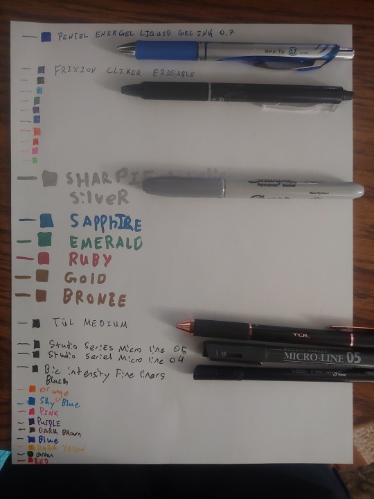
The Pentel Energel is one of the best writing experiences I've ever had with a pen! Its super smooth and nice to write with. I bought a three pack of these at Barn and Nobels, but I don't remeber the cost.
The Frixion pens are a good writing experiance as well. They aren't as smooth, but have a nice feel. The eraser works great and the click is satisfying and I would recomend these for something like notetaking where you might need to erase. I was gifted these, but you can buy them online (http://pilotpen.us/brands/frixion/frixion-ball-clicker/) they are on the expensive end for pens, but its not too rare to find them on sale in store or on Amazon.
I love the metallic sharpies! They don't bleed like normal sharpies and feel good to write with. The writing of the diffrent colours is completely diffrent because the colours have very diffrent formulas. The silver comes out thicker, the green ghosts while the others don't and the bronze smells a little odd. I got these at a local drug store on sale for 4 dollars. However they are normally around $8 (Sharpie Metallic Permanent Markers, Fine Point, Assorted Colors, 6-Count Permanent Marker (2029678) https://www.amazon.com/dp/B07DPLQJVN/ref=cm_sw_r_cp_apa_i_7TXBDb91P75EX)
The Tul medium is one I found in my house and never remebered buying. It is an adorable pen and writes amazingly and very smoothly. If you know anything about this brand please tell me!
The studio one pens are ones I got from an inking set when I was much younger. I don't know where the rest are, but these are very nice pens that I appreciate.
The bic intensity fineliners were at my local Fred Myers for $6 today and I picked them up. They are wonderful to write with and I would totally picking them up, espically if you find them on sale like I did. They make larger sets and sell smaller colour sets, but this collection was good for me, espically at the price. The red and green seem to have a diffrent formula and are more runny. (BIC Color Collection by Intensity Fineliner https://www.amazon.com/dp/B0793KHKTR/ref=cm_sw_r_cp_apa_i_XUXBDb7G3S48F)
Brush Pens
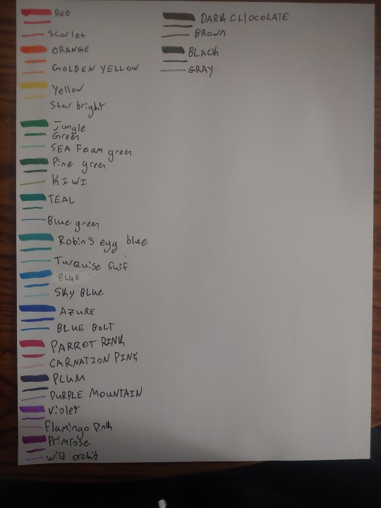
I use the crayola Singature brush pens that were fairly recently released. One end is a brush pen and the other is a detail marker. The brush and detail are not the same colour, which can be a good thing or a bad thing. I got the decorative tin box of them. They are normally about $13, but I got them on sale for closer to $8 on Amazon. (And that sale is still going on when I post this!) I do have some issues with them. They write really well out of box, but I have found that my red and black have already started to become less pigmented. I tried storing them brush tip down to see if that would help, but it did not. The labels of the colours on the pen also rub off very easily and to label the colours in my swatches I had to look at the swatches already in my bullet journal. However, if you are not using these constantly and or are a beginner they are really easy to work with and feel good. They ghost on thinner paper, but don't bleed and they didn't ghost on my thicker journal paper. In addition they come in a beautiful range of colours. (Crayola Brush Markers, Dual-Tip with Ultra Fine Marker, 32 Colors, 16Count https://www.amazon.com/dp/B0722YLZTY/ref=cm_sw_r_cp_apa_i_3LWBDbZQ0FS51)
Markers
Super tips
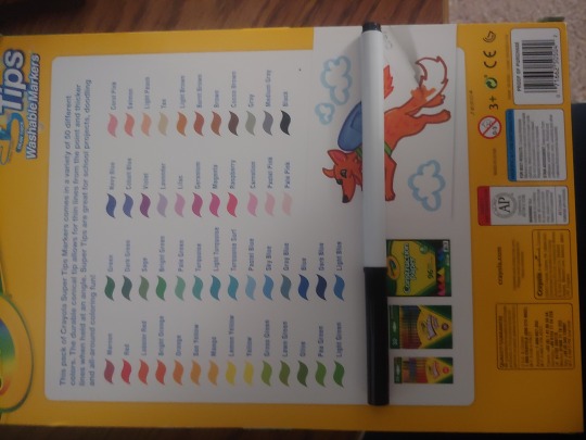
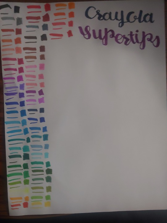
I use crayola supertips for colouring and fake calligraphy. These are very fun to play with and come in an amazing range of colours. I got lucky and found this 50 pack on sale at Fred Myers for $5. I have heard of these being used for faking calligraphy for a while and I decided to pick them up to try and I've been having a lot of fun with it! I would 100% recomend picking them up if you get the chance. They are afordable even at full price (plus you totally don't need a 50 pack, but this was about the same price as the 20 pack at the store.) I didn't label the colours on the swatches because they aren't labeled on the markers and I had tried to match the colours to the back of the box but that was too hard and I gave up. Anyways they are currently on sale for $7 on Amazon (Crayola Super Tips Washable Markers 50 Count https://www.amazon.com/dp/B00004UFOO/ref=cm_sw_r_cp_apa_i_Y6WBDbZJWSPGV)
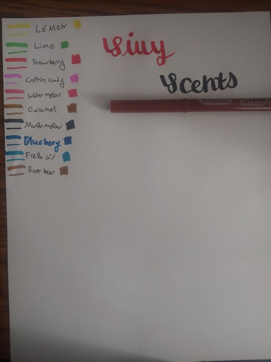
Crayola Silly Scents
These are very similar to the Crayola Supertips both in shape and formula. However, the cone comes to less of a sharp tip, which makes fake calligraphy slightly harder to do with these. The smells are enjoyable and fairly long lasting on the page. It fades, but it lasts strongly even after it drys and will be there very faintly for even longer. The markers themselves don't lose the smell either. These are really fun for colouring with and even when the scents get mixed together it doesnt get overwhelming or gross, which I find pretty common with most other scented products. I was unable to find the smaller markers on amazon, but Im sure they still exist if you dig slightly harder than me. However I did find the wide ones. These are more expensive than the normal markers, at $7.78, but still adorable. (Crayola Silly Scents Scented Markers, 12Count https://www.amazon.com/dp/B0727KVNGV/ref=cm_sw_r_cp_apa_i_wfXBDb2B2NM65)
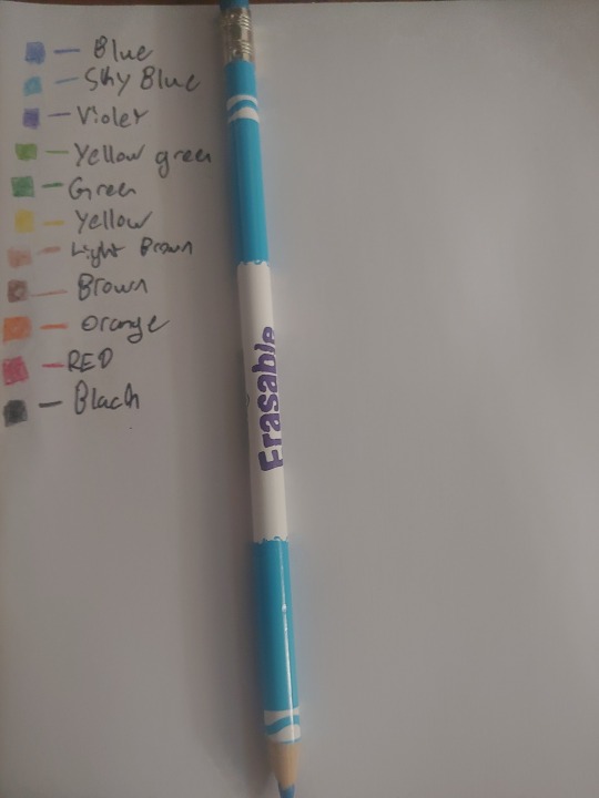
Crayola erasable coloured pencils
As you can tell I really love Crayola and these coloured pencils are no exception. These come out lighter than other coloured pencils, but I kind of like that. The lead is also softer than creates a diffrent writing experiance. They erase about the same as a regular pencil. I admitiedly dont need the erasing aspect of it very often, but its a cool thing to have. I have the 10 count for $4.20, but they have 24 and 50 counts as well. (Crayola Erasable Colored Pencils, 10 https://www.amazon.com/dp/B002IXJYNQ/ref=cm_sw_r_cp_apa_i_ioXBDbPNCYWM6)
Highlighters
Sharpie
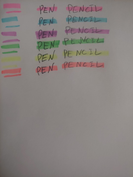
I love these! Both on pen and pencil most colours don't smear as the smear guard label on it promises. The yellow does minorly smear on top of pencil as you can tell though. However it's much better than many other highlighters. These also have these windows so you can actually see what you are highlighting while using it. The window doesn't affect the ink flow through the highlighter and they are very bright and highly pigmented. The tip also allows for both thin underlines and thick underlines. I like it much better than traditional chisel tips. I couldn't find the exact colour selection I got at Wallgreens nor do I remeber what I payed, but this three pack on amazon is $4 (which is a bit expensive, but they are wonderful) (Sharpie Clear View Highlighter Stick, Assorted, 3/Pack (1950748) https://www.amazon.com/dp/B019PGLR9M/ref=cm_sw_r_cp_apa_i_dDXBDbKVQRF2V)
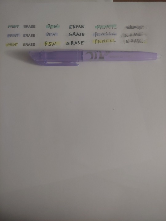
Frixion erasable highlighters
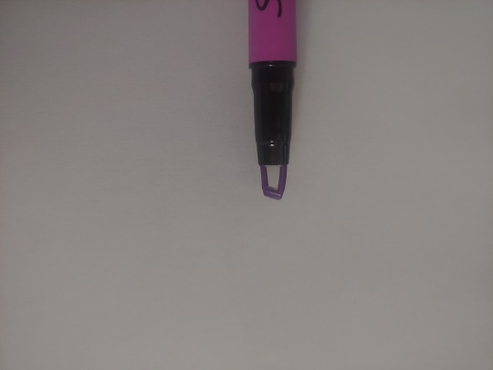
These are alright. I use them sometimes, but unlike everything else on this page I wouldn't recomend them for most people. They should not be used on top of pencil because erasing off top of pencil is pretty much imposible. Erasing off top of pen is ussually okay and erasing off top of print is fairly good. Oddly enough the yellow also smears while the other colours do not once again. I would only recomend these if you are highlighting on top of text that you own. It leaves small traces even on top of text so I would not recomened it for barrowed items. They are also fairly pricy for highlighters. (At $9.24 for 3, I got them on sale for $5 and I woipd only recomend it if you are able to get them at that price or lower.) Hopefully Poilt will make a better formula and I will be able to change my mind. However, if you just want these for on top of text and the ability to erase highlights is important for you these work well enough and have very nice colours.
(Pilot FriXion Light Pastel Collection Erasable Highlighters Chisel Tip 3-pk) https://www.amazon.com/dp/B0102OODZ6/ref=cm_sw_r_cp_apa_i_YRXBDbMXD61ME)
What are your favourites? Do you have any writing utensils you would like me to review? Tell me! I'm always looking for new supplies.
#studyblr#studyblur#organization#frixion#pilot#pilot pens#pilot frixion pen#frixion pen#frixion highlighter#stationary#stationary review#writing#colouring#crayola#crayola signature#crayola signature brush pens#crayoligraphy#calligraphy#hand lettering#notes#notetaking#long post#silly scents#markers#review#my favourites#back to school#college#highschool#school
2 notes
·
View notes
Text


People ask me allot "Skylar what do you use??"
The answers is..alot actually. I used to use pencils but I've discovered pencils hurt my poor hands so I think I need to change mediums. (Which is sad so I might give them away minus my Crayola signature. That was my last gift from my mom)
But I use water and alcohol markers (I prefer alcohol but I found Crayola has great color so I got the 100 set of the super tips and they are super cheap.)
For coloring I use copic, winsor & Newton brushmarker/promarker (tho they dry up fast..or I got bad markers for my brushes.) Sharpies, highlighters (might do a highlighter challenge) Crayola and Faber castell Pitt Artist marker. The ones I recommend is definitely copics, Crayola, highlighters and sharpie. (I have had bad luck with promarkers apparently..)
Inking I use Sharpe, Faber castell fine liners, Bic fine liners, pilot precise V5, pilot razor point, actually... writing pens like cheap ass ones and I have..one micron 08.
As for paper I like the XL canson mix media paper alot! I also have a grey tone paper but..with my new medium probably not the best.
But that's my stuff. I might get more for Christmas ♥️🎄 if I do I will show off too!
75 notes
·
View notes
Note
Your calligraphy is so good????? Like i look up to your stuff bcuz im trying to get into it. What pens do you use????
@madammarkiplier omg, thank you for liking my calligraphy!!! I use a lot of pens, actually. I use:
1) pastel tombow dual brush tips
2) crayola signature brushes
3) crayola “art with edge” markers
4) regular crayola markers
5) parallel pilot pens
I hope this helps! I wish you the best of luck with your calligraphy!
7 notes
·
View notes
Photo

Arteza Woodless Watercolor Pencil Test
Well, I was doing pretty good there and then disappeared for a week. (P.S. I hate school) Anyway; my triumphant-ish return comes with, to the surprise of no one, a supply test that I finished a couple days ago and just didn’t post for reasons. I got these pencils for my birthday, after having decided I even wanted them by having seen both woodless and watercolor pencils before and turning them down for various reasons. These satisfied both oddities in one set, so when it came time to put together a wishlist, I very quickly called to mind the video I had seen these in. Aside from life obligations, the other reason it took me a little while to test these pencils was that I had to think about the best way to do so. How do you test watercolor pencils when you don’t usually work with watercolors at all, and you still want to see how they work as Just Pencils? Obviously, I ultimately decided there needed to be two test drawings; one "dry," just using the pencils as I would any others, and one "wet," using water to see what I could get them to do. I thought about doing my regular galaxy job, but not knowing what exactly the water would do made me decide against it. Instead, I scrolled through Pinterest until I stumbled upon this picture of someone holding up a flower stem to the moon. That really inspired me, so I ran with the concept. As pencils, the first thing I noticed (aside from the packaging, but I’ll address that later) was how heavy these are. I’ve heard people talk about the Faber Castell Polychromos being heavier than Prismacolor pencils, but I didn’t really notice that much, and even holding one of each I really have to think about it to notice a difference between the two. These, however, I noticed immediately after opening them, without any other pencils at hand to compare them to. Which I attribute them essentially being pencil cores with no wood casing. Speaking of which... Now, I don’t know about you guys, but I’ve seen quite a few instances of people using various brands of woodless colored pencils (particularly Koh-i-Noor) and always walking away with at least one broken before all is said and done. Likewise, I was very nervous about these doing the same, so at first, I was skittish about putting too much pressure behind them and I still baby them when I’m moving them around since they really do appear to be just varnished watercolor pigment sticks and have no casing to protect them. But in this regard I think the extra weight ends up being helpful; it ends up accounting for that little bit I’m always holding back in terms of pressure. I did figure out that these appear to be a bit stronger than the other brands that I had seen other artists unwittingly break, so I was able to relax a little, but not by much. The other thing here is that [I am not an art scientist, but] I think because they’re watercolor pigments when you layer them they appear to darken without as much extra pressure as normal pencils. It’s hard to explain, but I guess it’s like they layer onto themselves better or something? So my precaution wasn’t as much of a hindrance as I thought it might be. Which I might as well mention here that they feel really smooth when they go down. Not soft like Prismacolors, but they do feel like they just glide around on the paper in a good way. This can feel a little odd when you’re trying to get darker pigment payoff, but not in a way that makes it impossible to work with. It's also odd because it makes them feel about as hard/firm as oil-based pencils like the Polychromos, though they otherwise behave more like wax-based pencils for the most part. I did notice a couple of the colors felt a little...dry? at first. Chalky isn’t the right word, but it’s the only one that comes to mind. But that seemed to go away after I took water to them and they were left to dry again. I think it might’ve had something to do with just the nature of them being solid watercolors in the same vein as some watercolors drying and cracking after being left untouched for months or years at a time. [Again, I'm not an art scientist, this is just speculation.] Oddly enough, they kind of reminded me of the Crayola Signature pencils I just tested in that the first couple of layers looked kind of patchy/scratchy, and you can still see that a little in the pink of the background and the moon, since they were only a few layers with lighter colors, but after that and with the darker colors, in particular, they smoothed right out. Though part of this also comes from that smooth feeling I was talking about; it makes it difficult to tell by "feeling" what the pencils are actually doing if that makes any sense. With regular pencils, usually, you can gauge what they're going to do by the resistance/texture of the paper. These just don't do that the same way. But this is one of those things that the more you use the pencils you can get used to it and work with it better. This made the moon on the “dry” picture more of a challenge, and I steered away from using the black because I was afraid I wouldn’t be able to get it to blend out fully. Also, the white was better than I expected as just a colored pencil, but it just can’t touch Prismacolor in terms of pigmentation and it didn’t blend as happily as the Polychromos one, so I had to try and supplement with my white gel pen to get certain parts of the moon as bright as I wanted. Which, I will say, for whatever reason my gel pen really did not like these pencils, as just pencils or as dried watercolor. I spent a lot of time tapping and scribbling between long strokes to quite literally get the ball rolling again. As just colored pencils, they worked okay, but with 24 pencils at $13-$17 on Amazon (the highest and lowest prices I’ve seen for them), unfortunately I have to say if you want just colored pencils, I’d still have to insist on Prismacolor, as they’re 24 for $14-$18 on Amazon and just do the job better. They're not terrible; I think I'd recommend these over those Crayola Signature pencils, they just leave a little to be desired when you know there's something better out there. However, once I added water to the equation, that story changes a bit. I’m not experienced with watercolor at all, as I already mentioned, (or most kinds of paint for that matter) so this was probably more of a challenge for me than it would be for someone who knows the medium better. I did at least use watercolor paper this time though, after learning my lesson last time, so that was one less thing to worry about. (Which is why the "wet" one is so much brighter; the watercolor paper is white instead of tan, so it doesn't naturally mute the colors.) I started by just putting down a few layers of pencil as normal, but not too many, then washed over it with water. I suppose I could’ve stopped there, but the shading on the stem went muddy and I noticed that the water really lent itself to the texture of the moon (and made what little gray I had put down almost disappear). And despite my best efforts, the sky was pretty patchy after the first pass. And so began the battle of applying water, applying color, light and then dark and then light again. The stem gave me the biggest fit as it was really difficult to apply dark or light color and blend it out without the color spreading too far and overtaking to the point of just looking like green mud. This I suspect mostly has to do with how small of an area I was working with. (To be fair, in general, I think with paint bigger areas are easier to work overall.) And for some reason, the light green brings up a considerable amount of yellow when it’s hit with water, which I hadn’t anticipated. The sky was less trouble than I thought it would be, though I did toy with the area around the moon trying to both keep the glow but darken up the sky. Ultimately I stopped messing with it and decided I’d just live with the sky being a bit pale and the glow a bit uneven. On the other hand, I was much happier using the pink as a watercolor. Picking the pigment up directly from the pencil gave me a much better color payoff, enough that I actually did a wash of water to pale it back out a bit. Also, I think the watercolor sky looks a bit more realistic because of the texture, though the color pencil texture makes the stars look better on the other one. Naturally, the pencil that suffered the most from my efforts was white. It too worked better as a watercolor than as a pencil, but because I kept painting it on and then neutralizing it, I had to overextend how much I was loading on the brush. So it has become noticeably shorter than the other pencils. (This is also how I learned that the shiny varnish on the pencils apparently doesn’t dissolve in water, or at least not very easily, and seems to have to be sharpened off, as it was a noticeable edge developing as I picked up pigment from the pencil tip). Which, I did sharpen a couple of pencils. No major issues, though I did notice you have to grip them more attentively because they don’t have the wood grain for the sharpener to grasp to help hold it steady. Also, since the shavings are just bits of pigment, I am saving them and planning to figure out something to do with them so it doesn’t go to waste. I do like the watercolor moon much better though. I ended up taking a bit of black, light blue, and purple to it since the gray in the set was looking a bit warm, and luckily the water dissolved them pretty straight away, so they blended in to cool the color down and darken it up a bit without overpowering everything. Of the two moons, likewise, the watercolor one is my favorite. Other than that, as I already mentioned my gel pen did not like going over even the dried watercolor. It kind of makes sense since I’ve tried it over acrylic before and it aggressively didn’t like that either. I guess gel pens just don’t like paint? (They don't tend to like wax-based pencils that much, but they liked the paint even less.) I definitely need more practice, but their performance with water is what convinced me these were a good investment. I’m not sure how often I’ll get to use them going forward, considering how much I like working on my gray and tan papers that aren’t watercolor friendly, but I will definitely have them on my mind just in case. Mixed media projects, anyone? Also, after using these I can’t say I understand why you would ever go for watercolor pencils with wood; it seems like it would just get in the way and slow you down. Though it does make me curious about the Derwent Inktense pencils, as they’re water-soluble and aren’t supposed to re-activate after they dry...or the Inktense blocks... No, bad Mystic, you don’t need any more pencils! Or art supplies, for that matter! There’s only one glaring issue with the Arteza pencils though that I can’t overlook though; The packaging. I try not to worry too much about the packaging on pencils. If it holds them nice and sorted just fine, then I usually write off my complaints as personal. But this is a special case. (Pun intended). The pencils come in a clear plastic blister pack, arranged in two clear plastic trays. Keyword: BLISTER. There is no neat way to cut into the thing, leaving a nasty jagged edge capable of scratching unless you sand it down, and there’s also no way to fully close it back up, so you either cut it all the way open and it’s severed forever, or you do like I did and try to only open it enough to get the pencils out, which makes getting them in and out an absolute chore. Fortunately, I had enough space in the zipper case I keep my 150 set of Prismacolors in (since I didn’t care for that packaging either) to put them in after realizing just how annoying that blister pack was, but not everyone is going to have a solution like that at the ready. It’s also kind of a shame because I actually liked the plastic trays, but it seems risky to keep them in those without a box to put the trays in. (I do have them in the back of my mind in case I come across a reasonable solution to that problem). My issue isn’t that the packaging is cheap, my issue is that it isn’t easily reusable and just feels kind of obnoxious to use, even though it does look really good as an unopened display. (But you have to open it to use the pencils, so...) This made it kind of obvious that even though on Amazon their price is comparable to Prismacolor, more of the money from Arteza went into the pencils themselves and not the packaging since the 24 set of Prismacolors comes in a nice tin that was probably more costly to manufacture. Again though, my issue isn’t that the packaging itself is cheap. Honestly, I wouldn’t have given it much of a second thought if they came in a paper/cardboard box like a ton of cheap colored pencils (classic Crayola, Rose Art, etc.) do. To be fair, I can understand if they didn’t do that because they are watercolor and were concerned about people using them with water and inadvertently getting the box wet and messing it up, but still (Crayola came out with a set of watercolor pencils and didn't worry about that, for example). Or they could’ve designed the plastic more like the way Tombow Dual Brush Pens come packaged in the 10 marker sets: it looks like a blister pack, but it has little nods at the top like a clasp, so it’s relatively easy to open and close and reuse. It is a little fiddly sometimes and the markers do jostle a bit when you open it because they aren’t fit super snuggly inside, but I’d still much prefer that to the blister pack. Heck, even the Prismacolor Scholar pencils, which are supposed to be a more budget-friendly option to the regular Prismacolors, come in a plastic pack that can double as a stand, and they're $17 on Amazon right now. And yet I have to concede that I would rather have good pencils with sucky packaging than sucky pencils with good packaging because there is always the option of just buying a better case. So while I do abhor the packaging, I will say it doesn’t mean the pencils aren’t worth buying. It just means I think you should already have another storage system in mind or ready for them before you do so. I mean, if you don’t care about keeping them sorted and would just as soon throw them all in a regular pencil zip bag, then this is very much a moot point. I’m talking to those of you like me that prefer to have them sorted so you don’t have to spend minutes pawing through them to find the one you’re looking for. My final verdict? If you’re looking for watercolor pencils, I say give them a try. I’m definitely curious to work with them more. Just make sure you’re prepared to deal with the packaging situation. Though if you’re looking for just regular pencils, sorry, but you’re better off with Prismacolor as far as I’m concerned. Next up will either be a personal piece doing a bit of experimenting or a commissioned piece; depends on which I have to motivation and time to finish first after doing my school work I may or may not have procrastinated on. Oh, and there’s a certain redesign I plan on making a journal about when I find the time...And I need to catch up on correspondence, as usual ____ Artwork (c) me, MysticSparkleWings Inspiration image found on Pinterest ____ Where to find me & my artwork: My Website | Commission Info + Prices | Ko-Fi | dA Print Shop | RedBubble | Twitter | Tumblr | Instagram
4 notes
·
View notes
Note
I'll take Sherlock and Glee for the asks game if you please.
Sherlock (2010s starring Benedict Cumberbatch)--100% of brain lights up in complete delight... until it all starts to go downhill
Firstly, as you all know, I am on the autism spectrum, and so is one of my biological parents. That is NOT an excuse for improper social behavior, but giving you the background information about possibly how and why happens (or happens to such an extent) could lend some context.
I love to create. Any kind of content. Writing, drawing, painting, photo editing, sewing, setting margins for business letters... the list could go on. It makes me so happy to take on a project that feels fun and feasible. Something I learned when I was young was, basically, if you don't have it, you don't necessarily have to buy it. Look at your materials, or at cheaper materials, and create what you want exactly the way you want it (like, if the beaded princess crown at the Busch Gardens gift shop is, in fact, too big for your head, we can hit up Walmart and get wire and beads and make a crown that fits you, in any color you want).
I've carried that attitude through most of my life. Like, nice-fitting jeans from Goodwill-- I can hem them, the length doesn't matter.
That's actually given me a lot of confidence in my abilities, and it brings out ingenuity with problem solving, especially when it's crunch time (like, signed paper needs to be delivered to the customer--whose office is in Montana--before a certain deadline in not-my-timezone? No prob. Run to my boss's office, hand him a pen, run to the fax machine, run to the phone, let the Montana contact know the doc has been sent, and bam. (Sure, the expectation may be for an engineering review, and the expected delivery method may be SharePoint link, but a signature from the maximum authority and the convenience of instant delivery? No one can complain about that.)
Things start to go south, though, when my efforts (which I consider to be "good energy," if that makes sense) don't wind up doing what I want them to do, or things turn out to be much more difficult than expected. For example, when using black paper and a white marker for a drawing, it will become clear, when one tests the quality of several white markers on a scrap paper, that some are better quality, or better suited to the tasks, than others.
But say I started with the Crayola iridescent paint marker (nice tool for outline/contrast, but not a great choice for linework or edges), and my drawing is not showing up. I must choose, then, to
1) scrap my drawing (and maybe do it again with something like a matte brush tip)
2) go over my drawing again (and again) with the Crayola in hopes of improving what I already have (though with equal probability of ruining it), or
3) become a frustrated mess of hopelessly selfish human and hide under my desk with all the dinosaurs and paper clay and other odds and ends I use for art with my kids.
More often than not, it's choice #3. I don't exactly know how to, like, have frustration for a thing, and, while still acknowledging it as important and real and meaningful (enough so that I still have desire to make the thing and make it in my own correct way), put it away in my brain's side pocket and move to perform different tasks. I tend to try and try and try to bulldoze my way through, risking breaking my supplies (because I so hate leaving projects unfinished, or with the current step/chapter unfinished), or I become sad and feel negatively about myself and my skills and the fact that I will have to put everything away in order to take a break (kids and cats, lol), then get it all out again for my next try.
Glee--cute and quirky, and then it was cutting edge, and then it was the BEST, and then it started tilting the other direction, and it ultimately fell on its own sword and became the absolute WORST
A lot of things, mostly books and classic television programs, that have been considered from, broadly, 1950 to 2020, as "things we will pass down to our grandchildren," including, but not limited to, the following:
Harry Potter-- and that's sad. That's a travesty. Some aged wine grows more precious over time. Some just goes off.
Dr. Seuss--Because he had an actual career, and writing nonsense books was only part of it. I respect that particular treasury. But he was a guy. With a life. And, in comparison, like, even if Bohemian Rhapsody is a glory film, it doesn't erase the bad choices that still stand, unchangeable, in their influence on modern history.
Mr. Rogers (ok, he helps kids learn to tie their shoes... but, I kid you not, one skit in the world of make believe had a puppet who identifies as a woman, performing in a (very fictional) talent show, during which she was dressed up as, and pretending to be, a kitten, who was singing (horrendously) an original song, in which the lyrics begged the Moon (cognizant, apparently, and generous) to give her a star as a birthday present. What the everloving fuck, here? Not to yuk anyone's yum, but... a grown man, who has created an OC 'verse for children (his main consumers) and those who watch with them. I'm seeing... possible ageplay x furry x accompanist? what accompanist? x personification of balls of rock x obvious greed and pestering as a method to be rewarded x light references to Wicca and Paganism (I don't care, but some people might. Could bring on some leading questions from the littles, too.
Magical family recipes that are actually on the back of a can of condensed soup
BMI (used as an indicator of health--Have you ever seen a male ballet dancer? Yeah, like, in jeans on the bus he just looks like a dude. In tights and a tank, he looks like Secretariat. Depending on his height, he probably weighs something like, 1.5x the expected--visually based--BMI. Put him in high-healthy, verging on overweight. He probably eats 3,000+ calories of healthy food on the daily, and regular deadlifts, eh, 100 to 130ish pound partners? See? V healthy. Chart means nothing.)
Binarily- segregated restrooms (Ok, have you seen a toilet stall in Iceland? They're mostly non-gendered, at least in big public places, like the airport. The regular stalls--usually, like, 20 of them in a row, with a couple of handicapped/accessible/baby-changing stalls on the end-- contain one regular toilet. The door and walls go from 1cm above the floor to 1cm below the ceiling. All have sliding locks that operate only from the inside, and outside hardware is barely visible; it's just the flat (no screwdriver marks) heads of the screws that brace the locks to the doors. Then there are sinks. That pour out water. And pumps. For soap. And paper towels. The entire population has a grip on what purpose bathrooms serve, as well as what people do in bathrooms, and the differentiation of both private and public spaces in order to meet most efficiently serve the population.)
Frosted Flakes is (are) the sugary sweet part(s) of a complete breakfast. (!) Conjugate that, Tony Tiger. and WTF is a "complete breakfast?"
Math problems about trains. Nobody cares about crossing paths anymore. It's all arrival time, landing time, time zone, jet lag, how late to your meeting you can be before it's considered rude (and how disheveled are you allowed to look before high fashion hits slobbiness)?
Filler foods, which is a ridiculous American ploy to short farmers and natural food producers by making those goods more expensive and then creating a "store generic brand" version of the same product that's cheaper. Yay, save 20 cents! But that packet of breakfast sausages you just put in your cart is made of mostly soy and meat... leftovers. The brand that's beside it, that has the "naturally raised" sticker on it, that one's made of humanely farmed meat and probably a few salts, spices, and safe preservatives."Far East" instant couscous? Made in America, it's heavily mixed with condensed powdered dairy and soy filler. Kosher couscous pearls, you know, from that tiny aisle with grape jelly and yummy crackers? One ingredient. One! Whole wheat. You do not need a chemistry lab to make couscous.
Why am I so passionately angry about this? I'm allergic to dairy, soy, cashews, and oats. The ONLY milk I can drink is almond. When I eat bites of oral food (usually for social fun), I have to ask for every last ingredient to make sure I will not cause myself to have an allergic reaction, which is different from a gastroparesis flare up, which need to be medically treated differently, lest further damage be caused by overtreatment or symptoms left to stew and spread. My big kid and I are also touch-sensitive to oats, so, in addition to not tolerating whole-grain bread, we cannot use many lotions and shampoos (marketed for sensitive skin, lol) because they contain colloidal oats. There are even exam gloves on the market, meant to help nurses with dry skin, which I do understand is a problem, that contain colloidal oat powder (inside) and have a regular silicone outside. There is too high a risk for touch-transfer, though, and we frequently have to ask and remind practitioners to NOT use the oat-poisoned gloves.
ADDITIONALLY, there are something like 3 or 4 types of formula in existence for sustaining us tubies that don't contain at least one of the major allergens (usually dairy or soy). Of those few, at least one has CORN SYRUP as its primary ingredient. Ok, yeah, fortify the tubies and give them easily accessible carbs to keep them running. But, um, nutrition? Like, the absolute and awful, yet hilarious, truth that pirates (yes, of the caribbean) were healthier than individuals of European military forces traveling by sea, because the pirates ate a more balanced diet--fruit, bread, alcohol (aka sanitary hydration), and the redcoats died of things like scurvy because nobody thought to bring a lemon wedge to go with their hardtack and tea... People don't subsist on corn syrup. They can't exercise. They can't gain lung capacity, the ability to walk long distances, the critical thinking to problem solve and maintain self-care and do work. There is ONE type of tubie formula our family depends on (well, 2, because there's grown-up and pediatric) on the market that is allergen-free, pea protein based, contains natural minerals, and mixes with water and other dissolvable powdered supplements. We're immensely blessed to have it. We have to bring our own if anyone's in the hospital, since it's "rare." But OMG, the stuff has saved my life.
Forgive the ranting. I like to explain myself.A lot.
0 notes
Note
your art is so good what the hEck!! i was wondering what you use to draw?
hi dear! sorry for the late reply and thank you so much as well!!! THAT’S REALLY KIND OF YOU TO SAY AHH♡♡
as i’m a mixed media artist i use a really wide range of materials so i decided to make this foolproof guide! let’s jump right in shall we!
Ink
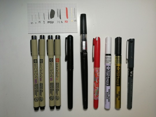
sakura pigma microns (mainly sizes 005, 01, 05 & 1)
pentel pocket brush pen
pentel colour brush
my favourite red daiso brush pen!
sakura pen touch (white/gold)
pilot hi-techpoint (black)
Pencils
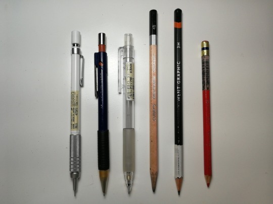
my personal favourite is muji’s 0.3 low center gravity pencil!
mainly any 0.5 led pencil (right now i use a standard staedler pencil & muji’s clear rubber grip)
i use an array of brands from derwent, curry’s & fabercastell (i usually use 2B, 4B, 6B and anywhere from 3H-6H)
for sketching/anatomy drawing, i’ll use prismacolor col erase pencils! (typically in red)
Pencil Crayons
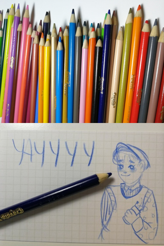
it may be a surprise but i just use any old crayolas! i’ve tried out lots of other brands including prismacolors (which do have beautiful pigmentation!) but to be honest i prefer crayola in terms of blendability. so for my signature blue sketches, i always use a plain old blue crayola pencil crayon haha
Markers
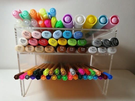
copic sketch markers
stabilo fineline markers
i also really enjoy using highlighters! i use any typical highlighters including sharpie ones as well as ones from daiso!
occasionally i’ll use paint markers from miniso but they’re often a mixed bag. when you buy them in store you really need to test them out to make sure the pigments will come out properly or else they’ll just excrete watery ink :/ if you do find ones that work, you’re good to go!!
Paint
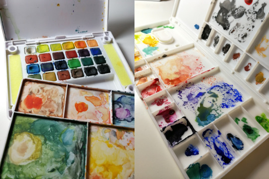
watercolour: sakura koi pocket field sketch box
gouache: reeves
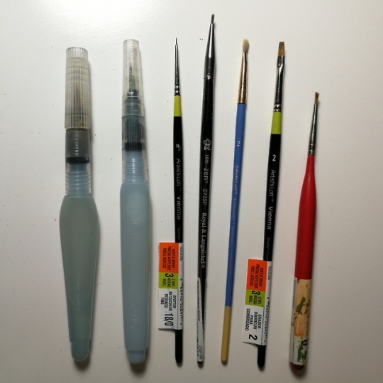
as for brushes my go to brush is always pentel’s aquash brush. time to time i’ll use a variety of brushes you can get from michael’s and some brands include artist’s loft & vienna.
Pens
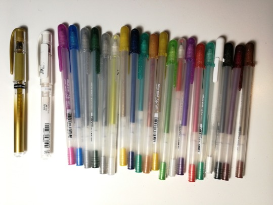
gelly roll
uniball signo (white/gold)
Erasers
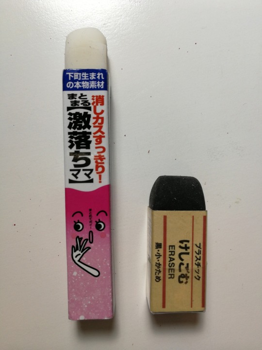
my favourites are these long thin ones from daiso! i also use muji erasers and ones from mono.
Digital
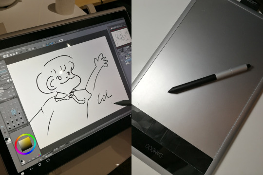
i don’t do as much digital as i’d like to but when i do, the program i use is clip studio paint! occasionally i’ll use ps cs5 for any minor edits. as for devices, i draw with a surface pro 5! if i don’t have access to it since i share it, i’ll use a wacom bamboo create tablet. (IT’S A SUPER OLD TABLET THAT I GOT IN 6TH GRADE LOL i mainly just use it for osu! nowadays ngl)
and yeah! that’s basically it! thanks for coming to my ted talk :’)
#just as an fyi: i'm really not well off or anything like that haha#this is all just stuff i've collected over the course of maybe 7 years now?#but yeah! this was really fun! thanks for asking!#replies#anonymous#zoë.txt#there's a bunch of other things i use from time to time BUT I DIDN'T WANT TO OVERLOAD YOU GUYS WITH STUFF SO#this is kinda just my necessities?#!!!UPDATED W PICS OF BRUSHES+DIGITAL#m:art
2 notes
·
View notes
Text
How Painting Supplies Can Increase Your Profit! | Painting Supplies
How Painting Supplies Can Increase Your Profit! | Painting Supplies – painting supplies | Welcome for you to my own blog, within this time I’ll explain to you regarding keyword. And from now on, here is the very first image:
The Mosaic of the Last Supper by Brooks, Robinson and Company; St Mark the Evangelist Church of England – George Street, Fitzroy – painting supplies | painting supplies
Think about picture above? is that amazing???. if you think so, I’l l provide you with several picture again beneath:
So, if you would like have these incredible images related to (How Painting Supplies Can Increase Your Profit! | Painting Supplies), click save button to save these pics in your personal pc. They’re ready for down load, if you love and want to take it, simply click save logo in the post, and it will be instantly downloaded to your laptop.} Finally if you’d like to secure new and recent graphic related to (How Painting Supplies Can Increase Your Profit! | Painting Supplies), please follow us on google plus or bookmark this website, we attempt our best to offer you regular up grade with fresh and new images. We do hope you love staying right here. For many upgrades and latest information about (How Painting Supplies Can Increase Your Profit! | Painting Supplies) graphics, please kindly follow us on tweets, path, Instagram and google plus, or you mark this page on book mark section, We attempt to offer you up grade periodically with fresh and new photos, like your exploring, and find the ideal for you.
Here you are at our site, articleabove (How Painting Supplies Can Increase Your Profit! | Painting Supplies) published . At this time we’re delighted to announce that we have discovered an incrediblyinteresting contentto be reviewed, that is (How Painting Supplies Can Increase Your Profit! | Painting Supplies) Some people trying to find details about(How Painting Supplies Can Increase Your Profit! | Painting Supplies) and definitely one of these is you, is not it?
United Art & Education – School, Teacher, & Art Supplies Store – painting supplies | painting supplies
Paint Online | UK’s Finest Art Supplies | C Art – painting supplies | painting supplies
Art Supplies – Art For Kids Hub – – painting supplies | painting supplies
US $16.16 |Washable Watercolor Pen Art Supplies for Kids Seal Office School Supplies Painting Supplies Gift for Children Art Marker|Crayons| – .. | painting supplies
Collection of art supplies icons – painting supplies | painting supplies
Oil painting supplies for beginners- 16 things you must ABSOLUTELY .. | painting supplies
Unsettled by the Dead Animals in Your Paint? Welcome to .. | painting supplies
Signature Acrylic Paint Set with Paint Brushes | Crayola | painting supplies
Fact or Myth: 4 Things to Consider Before You Purchase Oil .. | painting supplies
Hobby and arts and crafts supply stores in Geneva, Vaud, and .. | painting supplies
16 Pcs Multifunctional Nylon Paint Brushes Artist Paint Brushes Set Art Painting Supplies for Acrylic Watercolor Oil Painting – painting supplies | painting supplies
Art Supplies Vectors, Photos and PSD files | Free Download – painting supplies | painting supplies
Organizing Kids Art Supplies – painting supplies | painting supplies
No-Sew Monster Patch Jeans Painted with SoSoft® – Project .. | painting supplies
US $16.16 |LifeMaster Simbalion Soft Pastel Set Professional Chalk Pastels Art Set Painting Supplies|painting violin|painting supplies canvupplies .. | painting supplies
from WordPress https://www.bleumultimedia.com/how-painting-supplies-can-increase-your-profit-painting-supplies/
0 notes
Photo

Velvety Birthday Cake
As a little thank you for all the birthday wishes; here's some art from me to you! :3 And oh boy, was this a wild time to make! I mentioned in my 2019 Art Summary! that I wanted to do another custom Shopkin drawing to celebrate my birthday as I did with Birthday Wishes last year, and I...half-way stuck to that idea I ended up going with a Num Nom instead of a Shopkin, as just like with that other Shopkin, until now I had only ever drawn 1-2 Num Noms on a dry erase board for fun, and also looking through the different Shopkins I was considering, none of the ones I picked out felt quite right. Then it occurred to me since the Num Nomes are more strictly food (more specifically sweets) oriented than Shopkins, that to be sure there was at least one red velvet option to choose from (since once again my birthday cake is to be of the velvety and red kind ). I was right! And in fact, I had a couple of different options to choose from. I ended up going with the series 4 Num, Velvety Cake, and "borrowing" the candle from the Birthday Polish-it Nom. (Although it occurs to me just now that I kinda didn't have to "choose" between the candle and Velvety's berries because the whole point of some of the series 4 Nums is that they have holes in the top for the Polish-it Nom tops to stick out of... Lesson learned for next time?) The main customizing I did here was, naturally, the berries from Velvety's design got taken out, partially for the sake of simplicity and I thought those and the candle would be too crowded, and also because, frankly, I don't think I'd want berries on a red velvet cake. Even raspberries, and I generally really like raspberries. I'm just not much of a mix-fruits-into-baked-goods person. The other custom thing was making the...I assume cream cheese frosting because that's was everyone else and their mother pairs with red velvet...into chocolate frosting because that's what I prefer. (And highly recommend if you've never tried it! Red velvet is a derivative/cousin of chocolate cake, so the flavor profiles go together very nicely!) The thing about this drawing from start to finish that held me up the most was figuring out the mediums/textures to get and use correctly. Originally, I thought I'd use much more of the Faber Castell gelatos for this, but 1. I didn't have nearly the color selection I needed, and 2. Even if I had, the tips of them are bit chunky and difficult to get in exact spaces. I learned the latter point first-hand at the end when I went back to darken up the lines/rough edges on the chocolate frosting with one. I managed in the end, but it was much trickier than I had even imagined it would be. Speaking of those "rough edges," they're honestly where a lot of the problems came from. In addition to not having great solutions for how to get just the right texture for them (crayons ended up being my main source on that after the gelatos didn't pan out so well), I also had a hard time getting the right colors. Like I side, I don't have a huge color selection for the gelatos, and the crayons...well, despite having the full Crayola 152 set, there actually wasn't a ton of variety over there either, mostly because a lot of the crayons color out more pastel than they look, so you get a lot that look pretty same-y and too light. So I did have to supplement slightly by using color pencils in the lines too. Ten years later once I had the lines figured out though, then it was time to move out to actually coloring the thing, and this went slightly smoother since I had better-ish ideas of how I wanted to go about it. I'd decided to use a watercolor base on the body (all the pinky-red you see), then use alcohol marker as a base everywhere else, and supplement any shading as necessary with colored pencils. When I went in with the watercolor I tried to get some shading in and get a little of a "cake" texture; dots/holes. However, whatever I managed to do for texture ended up getting lost under the pencil shading later because the watercolor shading needed some serious help. Fortunately, my colored pencils were able to mostly salvage that. For some reason, the two sections farthest to the left came out slightly more pinky/purple, but there wasn't much I could do to fix that. Other than that though, after I went in with the pencils I was pretty happy with how the body was looking, if a little pink for red velvet, but in my defense, the official artwork is too. So then I did marker bases and basic shading for the candle, flame, frosting, and her eyes and mouth. The candle and her face were pretty straight-forward, aside from the mouth being simple gradients. The frosting was a bit trickier, given the way the shading goes and how I had to blend it out. Still, even that ended up working out better and more quickly than I anticipated. I did have to go back over my thick lines for the face with one of my markers to get it back to the proper hue after my colored pencils and the surrounding watercolor paled out/wore off the original lines pretty noticeably. And I was so nervous the whole time because I was using the brush tip and concerned that at any moment I might apply just a little too much pressure and ruin everything. But fortunately, that's not what happened. Then I went back to add the shine on the frosting, which took more patience. I'd put pencil on, blend it out, and repeat several times over before the shine was exactly how I wanted it. Naturally, the white accents on her eyes and a teeny tiny bit on her nose were done with white gel pen...not much else to say about that. Then it was time to do some sort of background. After some thought, I wanted to go with my PanPastels. And while I really wanted to do pink and yellow, I went in telling myself no, that it had to only be yellow because I physically can't get my pink one separated from the little tower to use it. (All five colors I have screw together into one cylinder and you unscrew the little tower to get the one you want; at some point, the pink was twisted on way too tight and now I can't get it off to save my life.) But after I did just the yellow...It was missing something. Then I got an idea and went digging through my old makeup. I ended up using a little of an old pastel pink eyeshadow and a blush, neither of which I think I've used in the last 2-3 years (and probably shouldn't at this point because makeup does expire, usually within a year or so) and blended some pink into the yellow, mostly on the corners. Which created this nice glowing effect and a really pretty shade of peach/orange. It's an unconventional "mixed media" method, but I'm so glad I tried it; makes me want to get more cheap eyeshadow & blushes just to use them as pastels! (Although I'm pretty sure for fine art/art you're seeling the original copy of that's probably not the best thing to do since it's not made for that, but if you really wanted to...!) I couldn't decide where to sign it, so I added my signature, subtlely, in-post on the computer. Which was way more difficult than it should've been because my tablet is out of commission and I'm using a completely different set up that doesn't work anywhere near as well. But it's there and it's done. (However, once I get...some solution sorted out...I may update this piece so it's all a bit nicer, we'll see.) Unfortunately, I discovered that apparently, I hit some pink/purple/dark reddish-maroon colors that my scanner (or maybe computers in general?) can't pick up accurately, much like on I'm Not Dead. And you know what the kicker is? It was on the lines and rough edges where that happened! The parts I worked the hardest on! BOO!! >:( (And the shading on the frosting wasn't quite right, but that was slightly less concerning.) I think I managed to mostly fix it with the overlay trick I used last time, but it's still not quite right. :P But hey, it's still pretty cute, it's done, and I can move on with my life now. Thank you again to anyone that's sent me birthday wishes or been kind enough to help out with the tablet situation I’ve been dealing with; it really means a lot and I can't put into words just how much I appreciate it all! You all are bright lights in a sea of darkness. ____ Artwork © me, MysticSparkleWings ____ Where to find me & my artwork: My Website | Commission Info + Prices | Ko-Fi | dA Print Shop | RedBubble | Twitter | Tumblr | Instagram
0 notes
Photo

Derwent Inktense Pencil Tests
Hope nobody thought I'd be abandoning my regular supply tests now that I have a Worksheet specifically for Colored Pencils! :D (Truth be told I got these before I finished designing the worksheet, but even so, I still think proper field tests like this are necessary to really get a feel for what pencils are like to use, so I wasn't planning on ditching them anyway; and this set I'm not sure would work well with the worksheet set up, but I do plan on trying it out to see.) So just like with the Arteza Woodless Watercolor Pencils, the nature of these pencils insisted on having separate Dry (on the left; no water) and Wet (on the right; water) tests. The Derwent Inktense, as the name might imply, are ink-based pencils and are also water-soluble (both of which are selling points). The first time I heard of these, the ink-based concept really intrigued me. Typically, pencils are wax or oil based, or they're watercolor. And then you have oddballs like the Crayola Signature Colored Pencils, which are said to be gel based. Likewise, I noticed pretty quickly once I started these tests that they are very much their own unique creature like the Crayola oddballs were. Before I get into that though, a little about the particular set I got: Fresh off some commission money, I was on eBay looking around and stumbled upon this Inktense Portable Pencil Stand, listed at $30. It came with 18 pencils, a brush, eraser, sharpener, and of course the stand/case. Even at $30, considering the regular tin with no bonuses of 24 pencils goes for around $30 on Amazon (and closer to $50 elsewhere), it seemed like a good deal. I tried to look up this specific set to compare, but miraculously it seems to have vanished from the internet save for a few blog posts. Still, taking into consideration what's here, what I know about Derwent's prices, and colored pencil set prices in general, I would guesstimate it probably sold for around $40 at least. Me being me, I took advantage of the "Make an Offer" feature and haggled the seller down to $23. After having the set in my hands, it makes more sense why it's disappeared; to my surprise, the set came with a little leaflet kind of like the Faber Castell Polychromos did that talks about the pencils and shows you all 72 colors available. The cover of said leaflet features the packaging/artwork Derwent was using years ago. In the past year or so, they've switched the packaging up from a dark blue/Peacock motif to a light blue/Underwater one, but there was a switch before that (I'm guessing at least five years ago or so) going from an indigo/flowers theme to the Peacock one. The flower packaging is what's on the pamphlet. Said paper also taught me after a little looking that this set actually has different colors than water you would find in 12 or 24 sets. If you were to purchase the 12 set in addition to this one, you'd only get one repeat color, and if you purchased the 24 set you'd have five. And yet this set manages to still have a fair color range. This impressed me. (And I'm actually thinking about getting the 12 set to expand my color choices). However, there is a bit of a downside here. Even though the set was in its case and still factory-sealed in plastic with a cardboard sleeve, it shows its age. Some of the text printed on the pencils has gone dark and is hard to see, a couple had cracks on the paint-dipped ends (and I have managed to get a noticeable chip on one as a result), and most notably of a all; the zipper on the case (which structurally reminds me a lot of the case that the Prismacolor Brush 24 & 48 marker sets come in) after a few pulls just sort of fell apart in my fingers, in no less than three pieces. I have never in my life seen such a thing happen, and I can only guess that it was just old an no longer structurally sound as a result. Fortunately, that doesn't ruin everything; the case could be held shut with something like a rubber band, and I'm very sure you could just replace the little zipper bit, as the track for it is still intact. Me personally, I'm just slipping on the cardboard sleeve since I don't really travel with my supplies and I have a dedicated place on a shelf for the set. Other than that, I do actually really like the case and it works quite well for holding everything. Plus, it has enough room for up to 36 pencils, so if I do purchase the 12 set in addition to these, I could fit them right in if I wanted to. (Or if I did want to travel with the set I have I could slip in a few other supplies to take with me.) As for working with the pencils themselves... To put it bluntly, they aren't really that impressive dry. They require quite a few layers to get smooth, rich color laydown, otherwise, they're particularly rough/scratchy looking. However they do layer up pretty nicely; I didn't really notice them eventually having that feeling of "I am not going to layer properly anymore and you can't make me," and they actually layer light colors on top of dark better than I would've expected. You can see where I layered a bit of yellow overtop of several layers of pink and purple a lot better here than I would say it normal. It's not perfectly opaque, mind you, but it did surprise me. Also, some of the colors do come out notably darker dry than when you hit them with water. For example, this set didn't come with the blackest Inktense pencil; instead, the darkest is "Sepia Ink" which is a particularly dark brown. I used that in place of black both times, and I would say it still did the job nicely both times. (Just to make sure it read as black I did go over it a bit with the dark blue on the wet version, but on the dry version even without mixing other colors in I feel like you'd never know the difference without putting it next to a true black.) Even though it does still look decent and my gel pen didn't fight me overtop of these, I was underwhelmed by using the pencils completely dry. (The white being specifically disappointing.) I think it's fairly obvious these become a little more special when you use them with water. For one thing, most of the colors become more vibrant when wet, and mixing and blending them together feels better. And yet they retain that same quality of the lighter colors going over the dark colors really well. The only thing is they don't melt down the way watercolors do; it takes more water the get the texture of the pencil to fade away and to really get them going. Or to re-activate if you didn't fully activate them the first time. (As they're supposed to dry permanent if you've fully activated them). Whether this is a good or bad thing really just depends on what you're trying to do. Fortunately for me, this strange nature lends itself to fairly nice textures for galaxies. But if you're expecting the smooth, easy texture of watercolors or watercolor pencils, you're going to be disappointed. And possibly frustrated. Although, using them wet I was able to pick up the pigment directly from the pencil tip with the brush (and I did use the one they came with; no issues there) and tip the brush to get some splattering, and I have to say that I did try just dipping the pencil tips straight in the water and it made them very temporarily really nice and creamy to lay down. And that method also made the white much more opaque and better to work with for the stars. I wasn't too surprised that my gel pen was pretty agreeable with both versions; the ink base in the pencils made me suspect they'd be compatible and get along okay, and I was right. The most important thing about the pencils, after testing, I'd have to say is all in the name: Inktense. The colors of the pencils are intense, deep colors, like what you would get out of an ink pen. Even with all 72 colors, I don't think you'd have much in terms of bright, pastel colors. to work with. They can be very vibrant, but they're very saturated colors. I think this might also be why there's only 72 to being with; there's probably a limit to what kinds and how many colors you can make with the ink base. Overall, I do like them, but I don't really recommend just using them dry with no water. They just take some getting used to since they are really different. I'm not sure I'd recommend them for beginners because of that. Still, I know I will be asking the Easter Bunny to bring me the 72 set in a few weeks. Now if you'll excuse me, I'll be waiting with bated breath for some other supplies and a book to come in the mail. ____ Artwork © me, MysticSparkleWings ____ Where to find me & my artwork: My Website | Commission Info + Prices | Ko-Fi | dA Print Shop | RedBubble | Twitter | Tumblr | Instagram
0 notes