#copperplant
Explore tagged Tumblr posts
Text
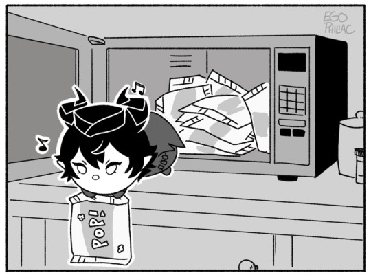

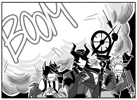
tsum events really are just the best, huh
#art#twisted wonderland#twisted wonderland spoilers#tsumsted wonderland#to be fair this is from mal's card story so it's more...event-adjacent#i-it still counts right#poor malleus tsum is having such a time#first it blows up the kitchen and then it almost gets spin-cycle'd to tsum-death#the poor little guy just wanted to help with the party! it was trying its BEST 😭#and instead it accidentally recreated every other tuesday from my college days#i am so genuinely delighted to read two entire chapters of malleus bragging about knowing how to use household appliances#(he knows what he's doing! he READ the MANUAL)#(you know that manual has copious notes covering the margins in perfect copperplate)#and the callback to his dorm ssr story. perfect.#we all knew this was going to end in malleus punching a washing machine into smithereens#i'm disappointed that the next part is probably just going to be a fun party or whatever#and not malleus showing off how close he is to finally mastering the toaster#twst please where is my spinoff game where we have to help a dragon fae prince learn how to do household tasks#i have an indescribable need to see malleus attempt to use a vacuum#he is very enthusiastic and also very stupid and we love him for it
5K notes
·
View notes
Text


Chieko Terasawa
寺澤智恵子
265 notes
·
View notes
Text
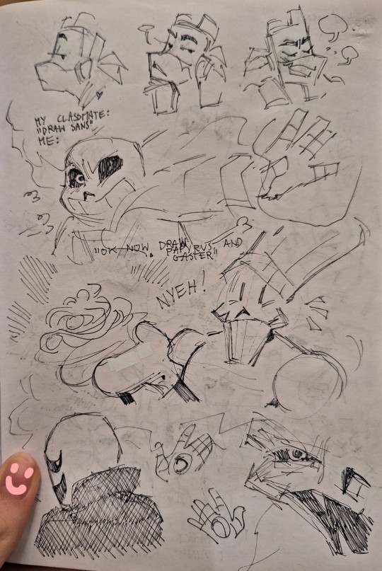
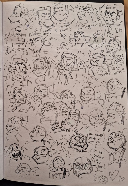
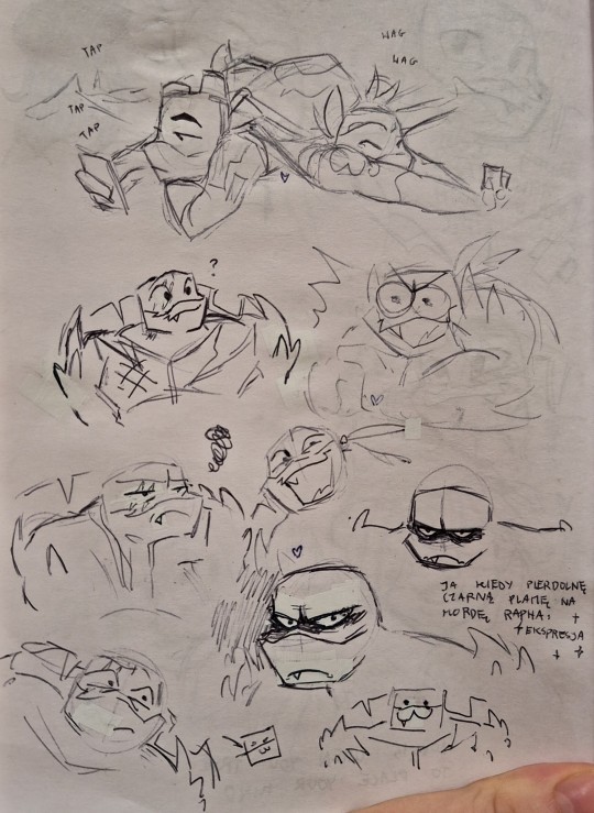
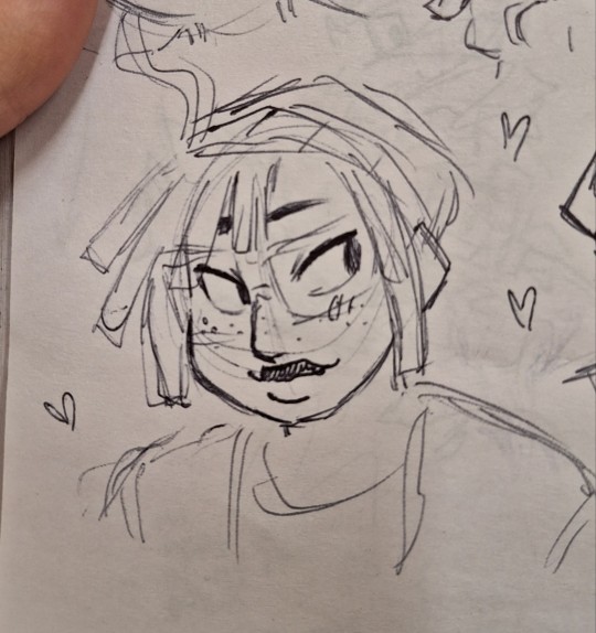

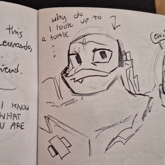
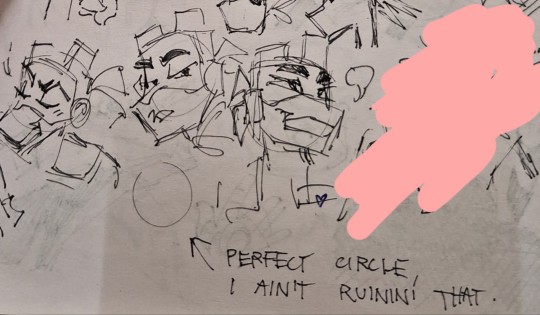
School doodles
#rottmnt#rottmnt mikey#rottmnt donnie#kawa's art tag#rottmnt raph#pbj duo#jerry copperplate#mutant mayhem#mutant mayhem april#undertale#school doodles
785 notes
·
View notes
Text

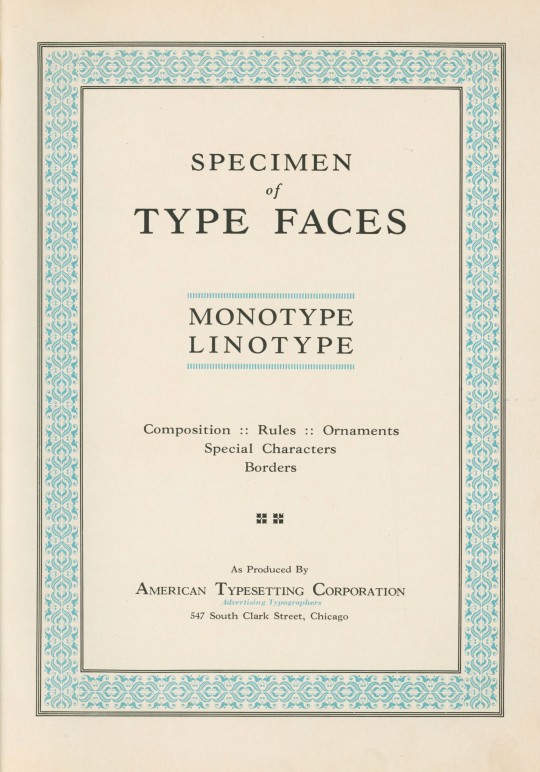
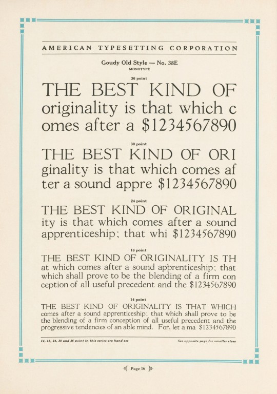


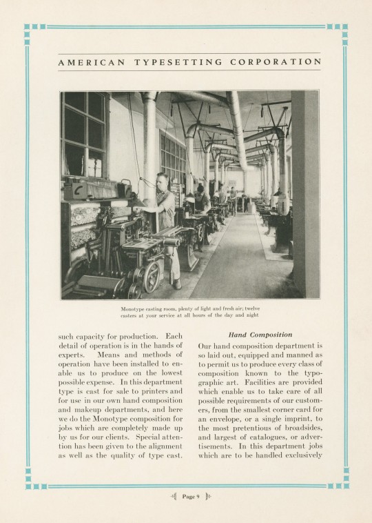
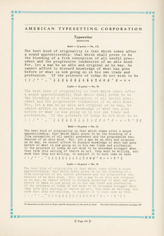


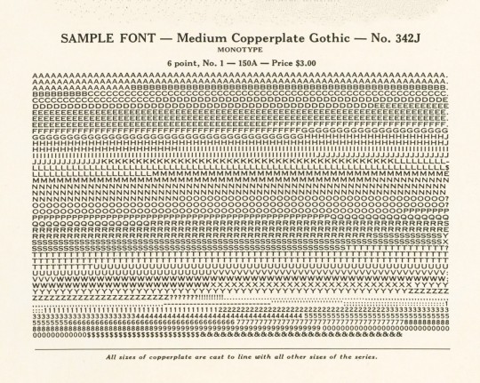
Typography Tuesday
Specimen of Type Faces Monotype Linotype was produced ca. 1930 to display the range of typefaces used at the American Typesetting Corporation of Chicago, "the largest of its kind in the world," established in 1919. The plant operated 24 hours a day, offering day and night services. Their Monotype Department boasted ten keyboards and twelve casters, and their Linotype Department operated ten machines. The typefaces shown here are Goudy Old Style, Cloister Text (a Gothic face, not the Roman Cloister designed by Benton), Typewriter, Monotype Accents, and Copperplate Gothic.
View our other Typography Tuesday posts.
#Typography Tuesday#typetuesday#monotype#linotype#American Typesetting Corporatioin#Goudy Old Style#Copperplate Gothic#Cloister#Typewriter font#type setting#type composition#20th century type
83 notes
·
View notes
Text


Working on handwriting as well as other doodles.
Idk about you guys but watching The Terror has made me try to work on my baseline more lmao it’s crazy seeing letters and other stuff with perfect baselines… I mean usually I write on lined paper but it looks way better on blank paper.
as well as I just learned how small the writing is on the Victory Point Note… I mean whoah.
#hospital waiting room uuuuuuuughggghghgh#uuuuuuuuuuuuuggggghhhhhhhhhhhgghggh#sketchbook#doodle#handwriting#copperplate font#Spencerian#artists on tumblr#fountain pen
26 notes
·
View notes
Text


Final prizes for my dtiys, once again I’m so sorry it took so long, but thank you for everyone for being patient. It means so much to me to have such encouraging people around me ❤️❤️
#sans au#utmv#my art#utmv fanart#crowbin art#copperplate#copperplate sans#cat#dragon art#dragon#cat art
43 notes
·
View notes
Text
got a mod to change the dai font to the origins font what a time to be alive
88 notes
·
View notes
Text
LIA'S RIPTIDE OC MASTERPOST :D
For those who are interested, here's some lore about my OCs! I kept everything as short and concise as possible (mostly) but it's still super long, so prepare yourself accordingly should you choose to continue on.
Esther 'Ink' Copperplate (Shadar-Kai, Paladin/Sorcerer, she/her), Captain of the Atlas Pirates.
She and her family escaped the Shadowfell and came to Mana when she was around 7. Her parents really wanted her and her brother Jasper to join the Navy so they could be 'successful'. Jasper was all for this plan, but it never really interested Esther. This created a rift in the family, Jasper being the favorite child, Esther being ignored and left to fend for herself most of the time.
Her safe place on her home island was the local tavern. She'd go there to listen to adventurers stories and daydream about getting off this island.
When she was about 12, a new pirate crew (the Merrythorne Pirates) stopped by. Their navigator, a blue tiefling named Terrance, caught Esther's attention immediately. He was working on one of his maps and it was beautiful. Terrance was happy to tell Esther about cartography, and even gave her the nickname 'Ink" because the vitiligo spots on her skin looked like the ink splotches on his own hands. He even colored in her spots with the colorful inks he used to help show her what a unique and beautiful thing they were.
Ink got very close to this pirate crew. She thought of them as family, more so than her actual blood relatives. She'd tell them about her successes, her struggles, even became Terrence's unofficial protege because she loved mapmaking so much. She often asked if she could just join their crew and get off this horrible island, but Captain Merrythorne insisted she had to finish school first. Once she was 18, she'd be allowed to join.
When Ink was 15, Jasper joined the Navy. He was always a conniving little snake, so he made his way up the ladder quickly. He'd write home about all his glorious achievements and any time he visited, he'd make sure to point out that Ink had done nothing her parents could be proud of. She couldn't wait to join Merrythorne's crew.
Almost a year before her 18th birthday, she wandered down to the tavern, hoping to see Merrythorne and his crew again. When she got there, she saw no pirates, but her brother who was wearing Terrance's pirate coat. The coat was terribly damaged, sleeves ripped off, tears in the tails, and a bloody stained bullet hole through Terrance's signature compass rose that had been embroidered on the back.
Ink immediately knew what had happened. Jasper had killed her mentor and friend. She avoided her brother like the plague, her only interaction with him before his visit ended was him giving her Terrance's coat, "So you always remember what happens to pirates in the end." (yeah Jasper's the worst-)
The next time Merrythorne and his crew came around, they let her join early. She fit in perfectly, taking Terrance's place as navigator. It took Ink a while (cause traumaaaa) but slowly, she started to notice she was happier on this ship than she'd ever been on her home island. Life felt exciting and she always looked forward to what might happen next.
Terrance's death took a toll on her though. She became obsessive about keeping her crew safe, tracking every single navy, pirate, and bounty hunter ship she found out about meticulously. She kept all this information in a ledger, and having this information actually saved them more than a few times. She ended up getting so good at this tracking ordeal that other crews asked her to go over their charted courses to make sure they wouldn't run into any trouble.
She did other little things to try to put her mind at ease as well. Terrance had shared with her his little superstition that putting a braid in someone's hair was a good luck charm. She always kept her hair braided, and did the same for any crewmate that would let her. (Basically she has ocd, and things like the braids and picking at the spots on her hands or tapping all 4 corners of a map before beginning work are her compulsions.)
Ink was living her pirate dreams, having the time of her life . . . until her 20th birthday.
Merrythorne's crew LOVED celebrating birthdays. The crew cared so deeply about each other, so getting to celebrate someone's mere existence was always a delightful event. This particular birthday, Ink received a magic ledger that never ran out of pages from her crew, and she was ecstatic. So excited, in fact that when Merrythorne said they were going to spend the day partying in Allport, Ink forgot to check if it was safe to do so.
Everything was perfect until around sunset, when Navy busted down the doors of the tavern they were in and took Ink hostage. Two crewmembers died in the scuffle, the rest escaping back to the ship.
Ink woke up in a Navy prison. Jasper was the one who had orchestrated her capture, because she'd been a massive thorn in the Navy's side for ages, and he wanted the glory. Ink had accrued a massive bounty by this point from stealing Navy information so she could warn pirates of ambushes.
There's a lot of dramatic dialogue here in her full backstory that I might post the link to when I go through and make sure it's ready, but basically Jasper tortures Ink to try and gain the location of the rest of her crew. He does this by cutting into her spots with a knife and painting them with her own blood. Jasper would often ask Ink about her visits with the pirates just so he could ridicule her, so he knew about Terrance and his efforts to show Ink she was enough. So of course, the best way to tear her down was to sour those memories.
This whole time, Ink stays silent, praying that her crew will leave her behind, because she can't take it if they go down because of her. Much to her dismay, she hears her name being called by familiar voices who are fighting their way through the prison to get to her.
The escape is a bloodbath, Navy soldiers and Ink's friends falling dead left and right. Only Ink, Merrythorne, and 2 other crewmembers make it to the lobby.
I should now mention, Ink has never been able to use ranged weapons. She's terrible at it. Can't accurately fire a gun for the life of her, so she uses a longsword instead.
Before the few survivors of the Merrythorne pirates can escape, Jasper manages to grapple the captain, holding a knife to his neck. He hesitates, having never killed someone before. His senior officer is screaming at him to finish the job, but he just can't in that moment.
In the fray, a pistol skitters to Ink's feet as she turns to see Merrythorne get captured. Having no other options, she picks it up and fires at Jasper in a desperate attempt to keep Merrythorne alive. She aims for her brother's head, and while she doesn't miss, she also doesn't hit her target. The bullet goes through Jasper's chest, and as he goes down, he slices the captains neck open. Merrythorne is dead.
Ink and her two remaining crewmates manage to escape, though her friends decide to retire not long after. Ink keeps the ship, (which I have yet to name, so if anyone has ideas, please tell me!) but has no crew. She also keeps the pistol, in hopes that one day she will be given another opportunity to confront Jasper and hit her intended target.
SO! That was incredibly long winded and crazy (apologies). I promise these next few introductions will be shorter. Now I get to tell you about the crew Ink builds so she can keep running her whole intelligence operation.
Tobias (Toby) Carlo (Half-Warforged, Artificer, he/they):
While Toby is not Ink's first mate, he is the one she found first. He is a half-warforged due to working with extremely toxic materials ruining many of his internal organs. They look like a completely normal guy on the outside, but if you get within melee range of them, you can hear all the mechanical sounds of their warforged parts.
He met Ink after his workshop exploded and she hid him from the police. He makes all sorts of devices and weapons illegally to help oppressed villages liberate themselves from the Navy. They are the crew's Master Gunner.
Levee Loch (Aasimar, Bard, she/her):
After sailing with Toby for a bit, he and Ink came across the Blue Royale casino, where they found Levee on a terrible losing streak. She's in impossible amounts of debt with no way out, so Ink smuggled her out of the casino after waking her from the trance.
Levee proved to be very adept in skills Ink lacked in, and became the First Mate. She keeps the crew (and captain) on task in return for Ink's protection from people looking to collect her debts. She doesn't make friends easily, but after a while, she becomes very close with everyone on the crew.
Jericho Sweet (Half-Elf, Fighter, he/him):
Jericho is an ex guard. Of who? I have no idea, but he realized being "well off and successful" was nowhere near as fulfilling as just having fun. Whomever he was hired by had a lot of secrets, so when someone would leave their employment, they'd have their memory wiped, just in case. He met Ink the day he had been dishonorably discharged and sentenced to imprisonment for life because he tried to steal from the treasury for some extra gold before he disappeared. She of course helped him fake his own death so he wouldn't be hunted down for memory erasing and imprisonment. He's a very positive and loving person, but in an ominous way. "You will succeed, it's written by fate!" Sort of deal. He's the Master at Arms.
Plat Slaughter (Tiefling, Cleric, they/them):
When Ink ran into Plat, she found them uncannily familiar. Turns out they're Terrance's niece, (I don't know if there's a gender neutral term, but they are more fem presenting, so I use niece.) and shared some relatively strong resemblance. Ink finds out that Terrance was the black sheep of his family, looked down on by everyone else for leaving the nice life his parents had built and joining a pirate crew. Plat loved Terrance so much, so when he left and wouldn't say his reasons for going, they started to do some digging. They found that their grandparents had built their empire on deceit and blackmail, rather than the good morals that they always said they were committed to. They abandoned their family much like Terrance, and joined Ink's crew as the Surgeon.
Alva Honeywell (Human, Wizard, she/they)
(There's more context needed to explain Alva's backstory, so bear with me.)
Ink does not have a bounty poster. This is because Jasper has sold her bounty privately to a hunter named Agate Oleander. (Jasper is also going against Navy protocol to do this and would be demoted or fired if found out.) Agate developed a very powerful spell to enslave the will of her crew, making them mindless puppets who do her bidding. This makes her deadly because her crew have no way to disobey orders because of morals or fear or anything else. (there's also cool mechanics like a shared hp pool where if you kill one they all die but I don't need to get into that now.)
Alva was one of these crewmembers. During a close call when Agate ambushed Ink, the Atlas crew managed to take captive one of Agate's hivemind. it took a long time and a lot of work, but they finally broke the spell on her and she once she'd recovered, they became the Pilot. They are a generally cold and stoic person, but they have a big soft spot for animals.
Creep (Changeling, Barbarian, he/him)
While the Atlas pirates had been at sea for a while, they found a random guy in the kitchen. No one had any clue how he got there as they had not docked for many days and there were very few places for stowaways to hide on the ship. Ink tried to talk to him, find out what he's about, but he wouldn't say a word. All he did was explore the kitchen until eventually he started pulling out cooking supplies and raising his eyebrows as if to ask for permission to use them from Ink. She let him do whatever he was doing, and he ended up cooking dinner for everyone. It was really good food, so they happily adopted him onto the crew as he didn't seem he wanted to leave. No one knows if he has a 'real name', because Levee said "what a creep," once and it stuck. Anyway, he's the Cook.
Needle Noble (Tabaxi, Monk/Warlock, she/her)
Needle is ex-navy. After she graduated training she was put under the leadership of one of the most vile and unkind admirals in the entire organization. She eventually got so sick of the terrible treatment and cruelty that she murdered the admiral in his sleep and had to flee the Navy entirely.
She didn't want to join a pirate crew, but Ink was the only one around who knew how to make someone truly disappear, so she begrudgingly became the Boatswain. Needle wasn't a team player for a long time, but Jericho made it his mission to befriend her. She and Jericho became best friends and she grew to love the rest of the crew as well.
Jasper Copperplate (Shadar-Kai, Rogue, he/him)
"Lia, why on earth is Jasper here???" you may be asking. Well, WAYYYYY later into the story, some events happen. It heavily involves @lui-del 's characters, so I won't get into too much detail as this is just about Ink and her crew.
Further into Ink's story, Jasper manages to imprison her again. Agate (the bounty hunter from earlier) gets her pay, and Jasper is left to do what he will with Ink and claim all the glory for taking down the Navy's biggest pest. Captain Maine (Lui's character), rescues Ink from her inevitable execution and takes Jasper hostage as well. The following events leave Jasper horribly injured, and instead of killing him like Ink had planned, she decides to do the unmerciful thing and forces him to join her crew as the Cooper.
He heals from all his injuries without the help of magic, which means he needs a leg brace to walk and has a lot of noticeable scars. It takes a very long time for anyone on the crew to consider Jasper a friend, however, they never leave any crewmate behind, so he's never used as bait or left behind when things get dicey.
After months, possibly years of Jasper living on Ink's ship, she finally asks him why he killed Terrance. She knew his bounty wasn't 'dead or alive', so he'd have been worth more brought in still breathing. Jasper's pretty shocked by this assumption, because he didn't kill Terrance, and he never claimed he did. All he'd done was inform her of the tiefling's death. Someone else in the crew Jasper was a part of was to blame, and Terrance had only died because of a misfire. The reason Jasper thought to bring Ink his coat was because he saw it as an opportunity to get praise from his parents for doing his job well and to make Ink feel small and worthless for the life path she'd chosen. (He was the worst brother ever guys.)
After that point, the two understood each other completely, and they start to try and mend their relationship because they finally see each other's value.
Also at some point Jasper adopts a cat named Chocolate Chip.
RAMBLE FINALLY OVER!! That's pretty much everything about Ink and her crew! If you read all this, you're insane, and I love you. I hope to sketch all of them eventually, so I'll add to this post when I do.
(also if anyone would like to draw these little guys I will be so unbelievably happy. I don't have reference for many of them, but I draw Ink a lot and post her on Twitter @ ohlookitlia)
Thanks so much for reading! :D
#lia rambles#jrwi riptide oc#captain ink copperplate#tell me all your thoughts should you have any i really wanna hear em#who knows how to effectively tag things amiright
10 notes
·
View notes
Text

With Her Own Delicate Hands, from 2021 body of work, 'The Maiden, The Witch'.
18 notes
·
View notes
Text
92 notes
·
View notes
Text

9"×12", a bit of a departure from my normal work, inspired by @theshitpostcalligrapher. Posca markers.
13 notes
·
View notes
Text

Rainy Season?☔️
Copperplate Etching with Watercolour Drops
#kimosaka#osaka#japanese girl#copperplate etching#copperplateetching#copperplate#printmaker#printmaking#etching
23 notes
·
View notes
Text


petit2
ぷちぷち
31 notes
·
View notes
Text

go
439 notes
·
View notes
Text


September 11
On this anniversary of the 9/11 tragedy, we present some original etchings and poems by Michael Kuch from the 2002 Falling to Earth, a letterpress artist's book issued in Northampton, Massachusetts by Kuch's Double Elephant Press in an edition of 110 copies. The book is a reaction to the terrifying and tragic collapse of the World Trade Center Towers and the ensuing bombing campaign by the United States. Kuch responds with fourteen poems and twenty-one intaglios. The book's imagery uses the metaphor of falling to examine the human and spiritual costs of violence. Mythological and biblical narratives are evoked in a modern framework to provide perspective on the then raw and recent events. Using the metaphor of falling to evoke the human and spiritual costs of violence, the volume is also frequented by angels, giving a vantage from above.
The copper-plate etchings were printed by Michael Kuch and by Arthur Larson under the artist's tutelage, with Larson printing the text. David Wolfe of Wolfe Editions cast and set the fourteen point Emerson type. The paper is an abaca & cotton blend handmade for this project by Shannon Brock at Carriage House Paper in Brooklyn, New York. A prototype of the binding (below) was constructed by Shoshannah Wineburg and carried out by Barry Spence for this edition. Our copy is another gift from the estate of our friend Dennis Bayuzick.

View our other 9/11 commemorative posts.
View a post on another book by Michael Kuch.
View posts on other Pioneer Valley artists.
#September 11#9/11#Michael Kuch#Double Elephant Press#Falling to Earth#Arthur Larson#David Wolfe#Wolfe Editions#Emerson type#Shannon Brock#Carriage House Paper#Shoshannah Wineburg#Barry Spence#etchings#copperplate etchings#poems#poetry#Dennis Bayuzick#Pioneer Valley School
42 notes
·
View notes
Text

PLEASR RHEHEABBAEB
125 notes
·
View notes