#conservation design
Explore tagged Tumblr posts
Text


🌿 "Branched Elephant" T-shirt 🌿
Excited to share my latest design! This T-shirt blends an elephant silhouette with vibrant leaves and birds—perfect for wildlife lovers and nature enthusiasts. Took a while to create, and I’m thrilled it’s finally here!
Let me know what you think!
#wildlife#nature#environment#tshirtdesign#t shirt#conservation design#animal lover#leaves#elephant#birds#nature art#environmental art#art
1 note
·
View note
Text
Also help raise money to fight for trans people, and get some rad games in the process!
#indie ttrpg#ttrpg#ttrpg dev#ttrpg design#fuck conservatives#trans rights#trans#fuck jkr#indie ttrpgs#the problem is capitalism
1K notes
·
View notes
Text
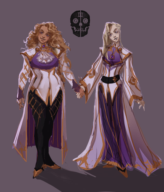
The Third House | Book One
Coronabeth Tridentarius | Ianthe Tridentarius
#I think Ianthe used to dress more conservatively before being separated from her sister#then she got that pow#I redid coronas design so this took longer#someday I’ll go back to all of these and properly render them but for now#we got this#gtn#htn#ntn#the locked tomb#gideon the ninth#harrow the ninth#nona the ninth#coronabeth tridentarius#coronabeth the third#ianthe tridentarius#ianthe the first#ianthe the third#tlt art#tlt#tlt sketch#tlt characters#character design#the third house#lyctors
6K notes
·
View notes
Text

Citizens of the USSR are obliged to protect nature, conserve its natural wealth.
USSR Constitution, Article 67 poster (1979)
#poster#ussr#soviet#nature conservation#ecosocialism#communism#art#design#artist unknown#environmentalism
571 notes
·
View notes
Text
"At HarperCollins, a lot of attention and thought is given to deciding exactly what combinations of margin measurements, font, and layout feel most appropriate for the genre, and writing style.
But in a case of do-your-part environmentalism, designers at the publishing house have now standardized a series of subtle and imperceptible alterations to normal font style, layouts, and ink that have so far removed the need for 245 million book pages, totaling 5,618 trees.
Telling the story in Fast Company, representatives from HarperCollins, one of the four largest publishing houses in the world, explained that the idea first arose in Zondervan Bibles, HarperCollins’ Christian publishing division. Being that the Bible is 2,500 pages or sometimes more, saving ink and pages was not just an environmental consideration, but one of production costs.
A new typeface called NIV Comfort Print allowed Zondervan to shave 350 pages off of every Bible, which by 2017 had amounted to 100 million pages, and which, as Fast Company points out, would be four times higher than the Empire State Building if stacked.
The production and design teams then wondered how much they could save if they applied the same concepts to other genres like romance and fiction. Aside from the invention of the eBook, publishing hasn’t changed much in the last 100 years, and the challenge was a totally novel one for the teams—to alter all their preconceived ideas and try and find a font and typeface that resulted in fewer pages without being harder to read.
They eventually standardized 14 different combinations their tests determined were the most environmentally friendly, and which delivered an unchanged reading experience.
But the challenge didn’t stop there. Printed books, one might not know, are printed in large sheets which are then folded into sections of sixteen pages, meaning that Leah Carlson-Stanisic, associate director of design at HarperCollins, has to calculate the savings of space, words, and ultimately pages with the help of her team to fall in multiples of sixteen.
Nevertheless, they have been successful with it so far, and in the recent print run of one popular book, 1 million pages (or a number near 1 million that coincides with the 16 times tables) were saved.
“We want to make sure our big titles, by prominent authors, are using these eco-fonts,” Carlson-Stanisic said. “It adds up a little bit at a time, saving more and more trees.”"
-via Good News Network, April 4, 2024
--
Note: Great! Waiting to see this on the rest of their books and at the other big publishers!
Actually, though, it's worth noting that this may not come quickly to the other large publishers, because Harper Collins almost certainly owns that font - meaning that other publishers would have to pay HarperCollins in order to use it, on an ongoing basis.
More on publishing shit and more realistic solutions here below the cut!
What I'm hoping for and think is more likely is that this will inspire the development of open source eco-friendly fonts, which would be free for anyone to use. That would make it far more likely other publishers would adopt eco-friendly fonts.
I'm also hoping it would inspire other publishers to create similar eco-friendly fonts of their own.
Ideally, there would be a whole new landscape of (hopefully mostly open source) eco-friendly fonts. And/or to see calculations of the eco-friendliness of popular existing fonts, compared to each other.
If we could have a publicly accessible list of calculations for different fonts, including fonts designed to maximize eco-friendliness, I really do think that it would affect which fonts publishers choose to use. Here's why:
Most people in publishing are on the left (notoriously, actually) and really do care about the environment
People in publishing are plenty aware of these issues re: paper and trees, I promise
Shorter books means smaller production costs - and possibly smaller shipping costs as well, over time! So it would save them money too.
Eco-friendly fonts could also be combined with other measures for greater effect, such as bamboo paper (already in use for a lot of projects where page color/quality is more flexible) and thinner paper (aka paper with a lower weight) that uses less trees.
Don't expect books to all move to just one or two different fonts, though. Publishers and typesetters and font designers will innovate to create more options instead, though it will take longer. This is because different books really do use different fonts for various different reasons - one new font to rule them all isn't really a solution here.
"Every book is in the same font" may sound like a "whatever" deal to a lot of people, but as someone who works in publishing - trust me, it would actually make your reading experience worse, even if you could never quite put your finger on why.
#publishing#books#book publishing#bookblr#harper collins#fonts#font design#eco friendly#sustainability#conservation#trees#deforestation#good news#hope
396 notes
·
View notes
Text
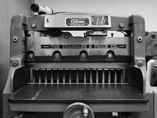
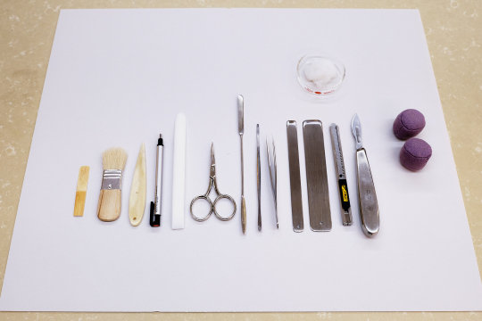
Inside the book conservation lab at the Metropolitan Museum of Art
Photos by Nicholas Calcott / New York Times
#things organized neatly#book making#books#conservation#history#museums#Metropolitan Museum#The Met#NYC#NYTimes#New York#Craftsman#Art#History#Flat lay#knolling#design#creative#graphic art#print
281 notes
·
View notes
Text

ok guys, i promise this is the last time you'll hear about the batpacks from me for a while, but our campaign ends LITERALLY tomorrow night & i wanted to plug it one last time before it ends!
as of writing, we've unlocked ALL nine batpack designs AND reached all our stretch goals!


you get free stuff by supporting the campaign now, and we also have a partnership with lubee bat conservancy where you can donate to them by purchasing this bonus sticker as an add on!


soooo yeah!! if you have the means, you can find the 🔗 to the campaign below or in the reblogs! 🦇
102 notes
·
View notes
Text
I IMPLORE you, please stop it with this kind of binding on books! As a reader I hate these, and as a bookbinder I hate these!!
The name for this nonsense is a Swiss binding, btw.

#original content#library#preservation#conservation#bookbinding#swiss binding#stupid book design#video#I have so many of these in my lab because nobody wants to shelve them as is#they get destroyed as soon as they go in the intra-library transport bins or god forbid the book drop
68 notes
·
View notes
Text


Miguel Marquez Outside, “Urban Weed Award”
#art#surreal#design#photography#funny pictures#funny#funny shit#funny pics#funnyshit#fun#installation#outdoor#michael pederson#miguel marquez outside#miniature#street art#grass#award#nature rights#conservation#urban
48 notes
·
View notes
Text
Junon and Venus: Dior's Famous Sister Gowns from 1949-50
For his 1949/1950 line, Christian Dior designed a set of sister gowns to be promotional items for the I. Magnin & Company department store in San Francisco. In the heyday of the department store, I. Magnin in San Francisco reigned supreme. What was shown in the display windows of I. Magnin dictated what high style was.


Right: Venus: Four pleats of organza line the top of the simple, strapless bodice. Bodice and skirt are made of white silk and white sequins with a simple ribbon waistband.
Left: Junon: Diaphanous layers of silk tulle, with glittering (plastic) sequin embroidery on curved, ombréed flounces are meant to evoke the feathers of the goddess Juno's favorite bird - the peacock.
The sisters live at the De Young Museum in San Francisco. Before they are shipped for exibition elsewhere, they undergo extensive evaluation by garment conservation experts. They are so fragile due to the sequins and stitching, that when they're required for an exhibition, they must be left on the maniquin to be moved, so that handling them does not disturb the fragile materials. Upon arrival at their destination, Juno and Venus are immediately put in glass cases.

Photo of Junon and Venus from the Fine Arts Museum of San Francisco

Sources:
• De Young Museum, San Francisco
• Denise Shardlow Designs
• Metropolitan Museum of Art Costume Institute
#fashion history#haute couture#dior#christian dior#vintage gowns#sister gowns - dior#venus gown#junon gown#designer gowns#fashion designer#high fashion#the resplendent outfit blog#women's fashion history#metropolitan museum of art#de young museum#garment conservation#museum clothing#historical clothing
39 notes
·
View notes
Note
I just learned that MAWS’s design for Lois is partly based off a character named Luz, from some Disney cartoon called Owl House. I find this interesting since this Luz character is supposed to be Afro-Latina, yet MAWS used her design for a Korean-American Lois. But more weirdly, Luz is a 14-year-old teenage character, and they used this as basis for a 23-year-old Lois. I think this is why MAWS Lois’s face looks weirdly young, and she’s always smaller than Clark so she looks like a teenager.
Huh so I thought this was just something the internet pointed out at large but it looks like the MAWS crew essentially lightly confirmed that Lois looks like Luz because someone who worked on the Owl House also worked on MAWS. Which is a stretch by association but also frankly, why? As you said, one is Korean American and the other is Afro Latina. I'm seeing people even say that Lois/Luz look like S5 Catra from She Ra (another show the crew are very vague about confirming character's races/ethnicities). It feels like series animation has a comfortable "ambiguously brown girl face" they like falling back on and it's really annoying! Like if we can dunk on Disney Princesses for having the same face, surely this is also worthy of criticism?
Especially in regards to Lois being the eldest character here (as a 23 year old in MAWS)- it's so unfortunate that by association and poor character design, we're not allowing her to look like a young woman. She's infantilized in both design and writing. I have no issue with her being short or generally young looking (I too am short and constantly mistaken as a teenager not just by white people), but it's clear many variables are at play in infantilizing a character historically meant to be an accomplished woman with her shit together.
I think we need to be critical of the fact white Lois is allowed to be a successful and independent career woman while the minute we get an Asian Lois outside of the comics, we get an Asian Lois who is "the worst Lois in the multiverse" and is adorkable quirky spunky girlie who needs the help of men to get hired by the Daily Planet. What does that say about what we think of Asian Women.
#askjesncin#I know Luz is a source of contention in Latine spaces so I don't want to speak over that too much. However-#I do think it's an odd pattern that whenever we have a Black mixed lead (whether that be Afro Latine or Blasian)#Black features are immediately the first to go in character design :/#jesncin talks maws#the deeper convo is that MAWS Lois is also pretty fetishized in the show but that's another uncomfy convo I'd rather not get into#MAWS Lois is peak “if you hide your conservative opinions on women in cute progressive aesthetic you'd get away with a lot”
49 notes
·
View notes
Text

Getty Conservation Institute
23 notes
·
View notes
Text
Tuesday, August 1.
Architecture.
Firmitas, utilitas, venustas.
These are the central pillars of, well, #architecture, according to Roman architect Vitruvius in the early 1st century AD. These are the principles that should guide the mind, eye, and, ultimately, the hand of the architect. The original translation would convey this as firmness, commodity, and delight. Another translation into more contemporary English would be firstly, durability: that a building should stand up robustly and remain in good condition; secondly, utility: it should be suitable for the purposes for which it is used; and finally, beauty: that it should be aesthetically pleasing.
There are many definitions, understandings, and theories of what makes architecture, or what separates it from construction. What is easily understood is that architecture is a testament to our ability to create forms and landscapes as compelling as those provided by the natural world—and that you very rarely feel as present as when you walk the streets of a new city, and marvel at the shapes, forms, and styles that surround you.
But why not leave it to the experts? Le Corbusier, a renowned 20th-century architect, once wrote: "You employ stone, wood, and concrete, and with these materials you build houses and palaces: that is construction. Ingenuity is at work. But suddenly you touch my heart, you do me good. I am happy and I say: This is beautiful. That is Architecture".
#today on tumblr#artists on tumblr#arhitecture#architecture#architettura#landscape architect#conservation architects#art deco architecture#gothic#brutalist#art#artists#land acquisition architect#interior design
391 notes
·
View notes
Text
Who wants to see the tories new poster

The car is owned by a Canadian company, the ship is Swiss, the plane is 50 years old, the football team have never won anything, the king has cancer, and the prime minister was never elected hell he was his party’s second choice after Liz truss,
also we haven’t been the second most powerful country in almost a century but even if we were the pride in the mediocrity of coming second to the USA a country teetering on the brink of Fascism, actively supporting a genocide, and which will likely not exist in its current form by the end of my life
#U.K. politics#british politics#tories out#tory party#rishi sunak#conservative party#graphic design is my passion
90 notes
·
View notes
Text

Do not destroy the landscape (ca. 1980s)
48 notes
·
View notes
Text
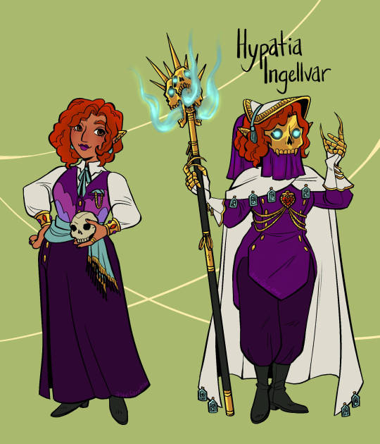
Time for my Mourn Watcher! This is Hypatia Ingellvar, I took some inspiration from the art for the Death Caller subclass for her design (mainly the hat lol). The claws on the gloves are actually retractable, but she uses them for more delicate work, especially when preparing corpses. She's kinda like if Snow White was a necromancer, extremely sweet and passionate about her work.
Some fun facts:
She is into alchemy, in particular for making her own perfumes
Since the other Watchers all have rich inner lives, with aspects of themselves outside of their duties, and she struggles to connect with people because the Mourn Watch is all she's ever known.
She's had crushes before, but has never had a relationship. Never the right place, right time, right person; she's been rejected a lot.
When she was found as a baby, she was completely covered in wisps. The Watchers theorize that is what made her hair unnaturally red. (also the wisps LOVE her. Very Disney princess in that way).
When she first joined the team, they were kinda unsure if she was even... alive?? She does have pretty much everything covered, they were honestly worried she'd take her mask and veil off and they'd see a corpse.
#datv#dragon age the veilguard#datv rook#dragon age rook#mourn watch#necromancer#character design#asheface art#I like the idea of Nevarran fashion being very conservative when it comes to covering the body#but then totally garish when it comes to accessories#also..... been having fun thinking of both Misera and Hypatia being in the story at the same time#maybe her nickname would be Bishop since the piece moves in the exact opposite way that a Rook does
17 notes
·
View notes