#colourgradation
Explore tagged Tumblr posts
Text
⟡ s1e19 × dethstars - blood ocean .

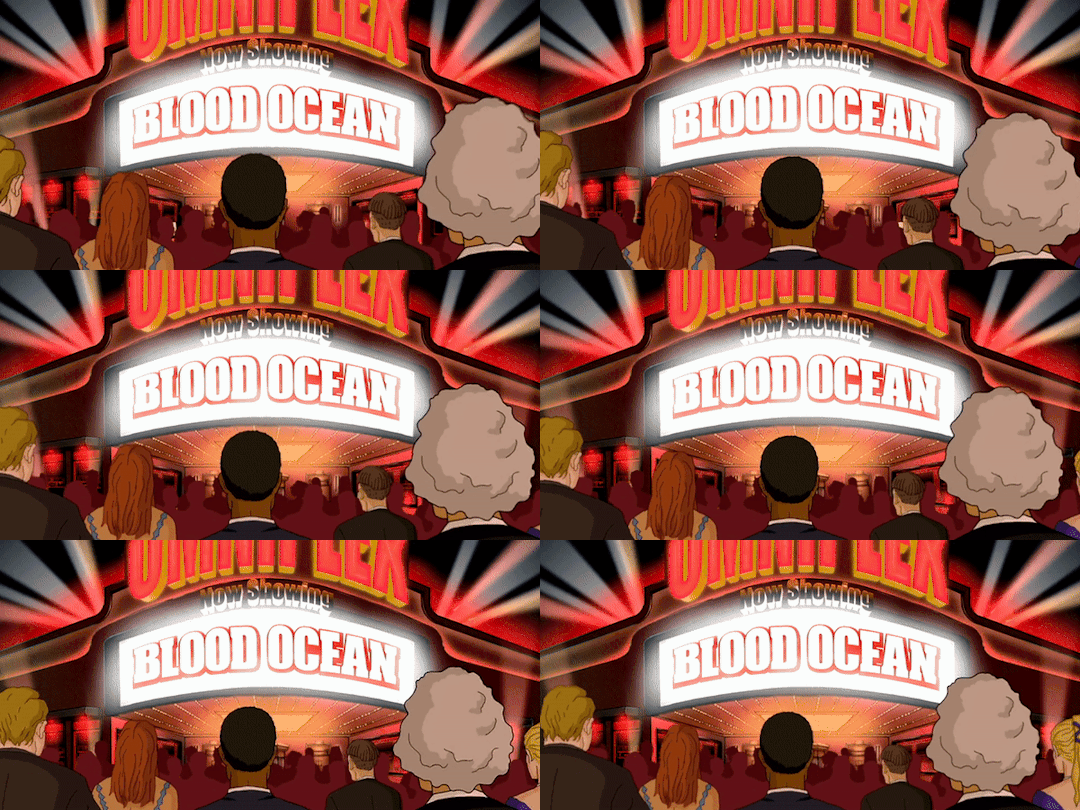


#hevstims.gif#metalocalypse#dethklok#gifs#my gifs#metalocalypse gifs#mtl#20fps#this was a nightmare to colourgrade btw#pickles the drummer#nathan explosion#william murderface#skwisgaar skwigelf#eyestrain#possibly.#flashing#(for the last one)
43 notes
·
View notes
Text
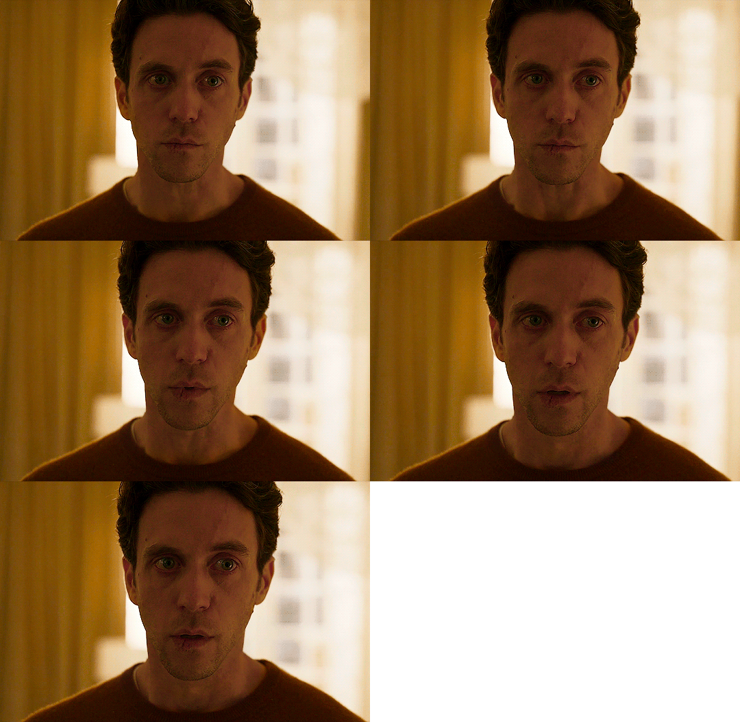
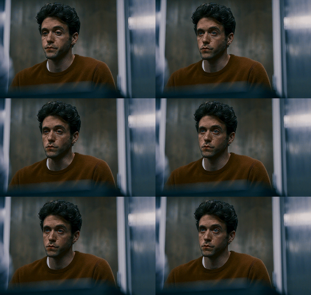

Ashley Zukerman as Keith in City on Fire
#ashley zukerman#ashleyzukermanedit#userashzuk#userbbelcher#userstream#televisiongifs#appletv#cinematv#tvandfilm#tvandmovies#city on fire#usergif#by alchemypanda#the lighting in this show is all over the place#like the police scene had such top notch lighting and colourgrading I didn't have to do much the evening house scenes? terrible#I guess they make the city so yellow orange because of the city on fire thing but it feels a bit too much sometimes#pandagifs*
54 notes
·
View notes
Text

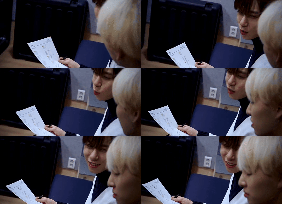


SEOHO & KEONHEE // UNLIKE (190307 US RECORD)
#foroneus#oneus#seoho#keonhee#kflops#mouseoho-gifs#babie bluetooth line <3#the lighting was weird in this one. super desaturated and cold. but fun challenge ig?#idk . i love the cover and i love keonho so <3#i need to figure out how to stop my gifs from getting desaturated i swear there was more reds in this when i was colourgrading
45 notes
·
View notes
Text

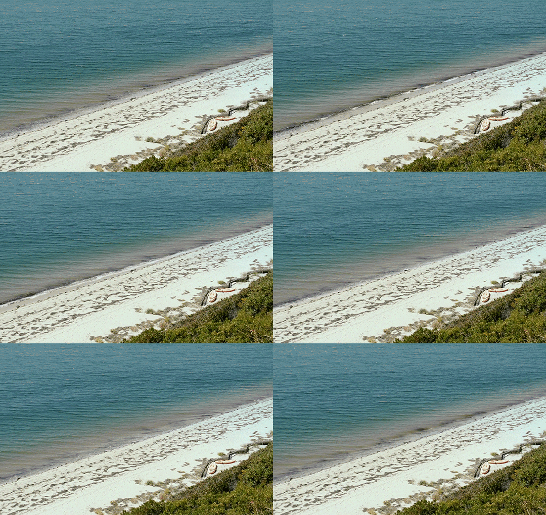

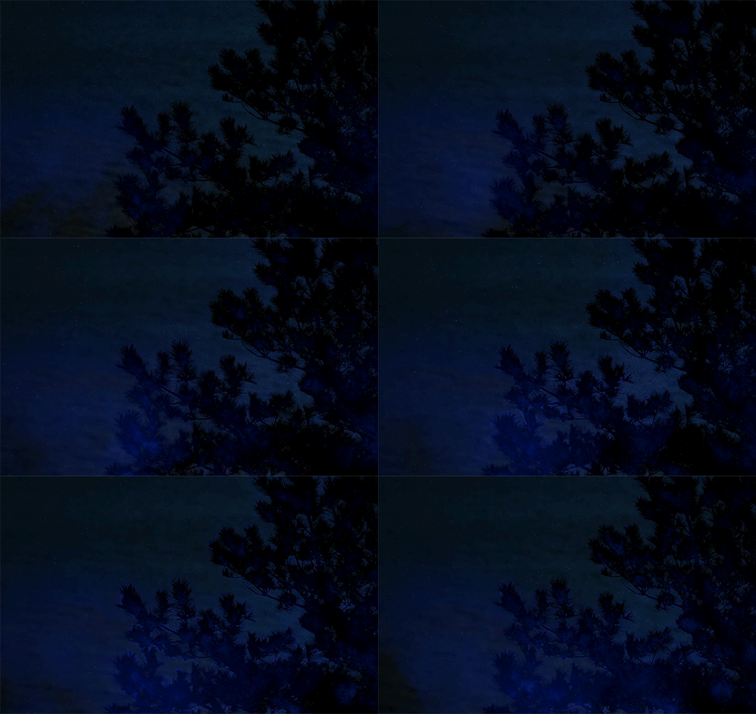

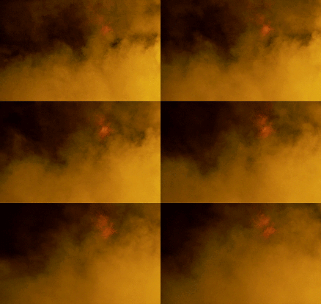
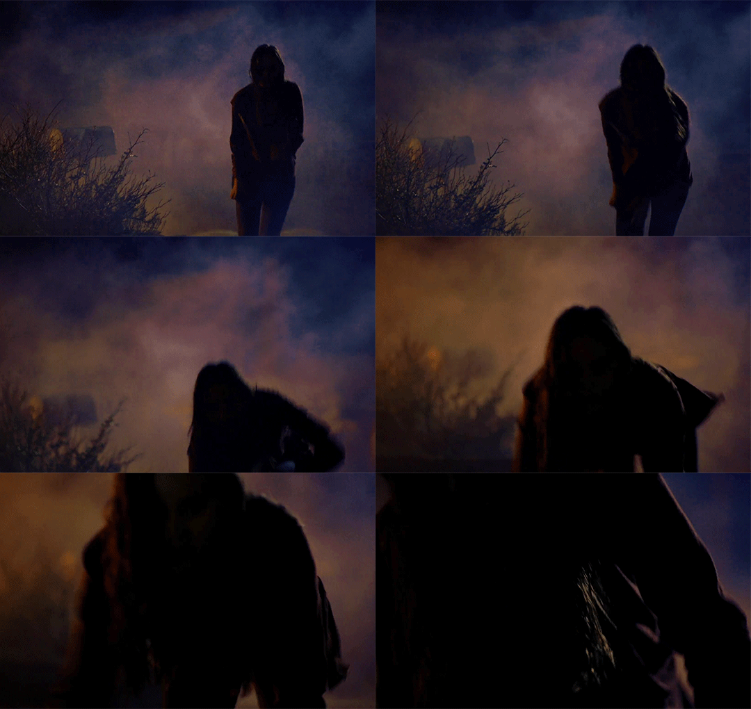
Every Film I Watch In 2023:
244. The Beach House (2019)
#the beach house#the beach house (2019)#2023filmgifs#my gifs#i. LOVED. THAT#so totally my jam#ocean eco horror#so beautifully filmed#like really look at that lighting and colourgrading#so beautifully calibrated to be neither garish nor underwhelming#i haven't seen that in a recently made film for AGES#even in the darkest scenes there was enough lighting and colour#that i could see exactly what was going on#DO YOU KNOW WHAT SWEET RELIEF THAT IS#the only gif i really changed the colouring of#is the first#everything else is pretty much exactly how it appears in the film#and i really loved the blend of scientific footage#and unabashed ImageryTM#plus excellent female protagonist#she was clever and calm#and only got super emotional when it was actually warranted#and that ending was perfection#what a goddamned gift of a film#this is why i watch so much random horror#to find gems like this#also thanks to the Letterboxd reviews that led me to it#totally checking out what else Jeffrey A Brown has done#he is now on my list of Good Filmmakers
10 notes
·
View notes
Text
रंगीलो राजस्थान💗 . Credit: @kanixhq .
#trending#trendingreels#cinematic#cinematography#explore#rajasthan#rangilorajasthan#rajasthantourism#jaipur#viral#viralreels#vntutorial#tutorial#explorepage#travelphotography#travel#instagood#instadaily#fyp#aesthetic#colourgrading
2 notes
·
View notes
Text
roma and bvb giving us production value with hq behind the scenes footage meanwhile yanited films theirs with a moldy potato
#hello pls upgrade im begging#and shoot better angles#but i still struggle to colourgrade regardless T_T#i guess its me hi im the problem its me
7 notes
·
View notes
Text
#748 - Colourgrade - Tirzah
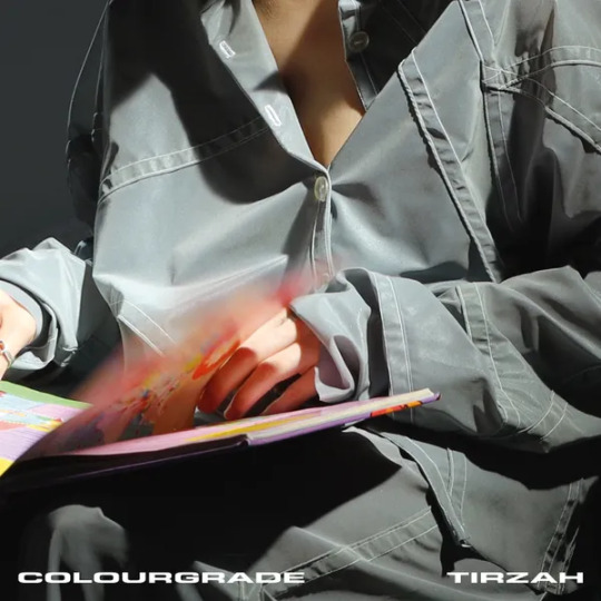
I feel even more out of touch.
37/100
3 notes
·
View notes
Text
"oh but the bending at least looks coo-" no it doesn't. It's mid at best. The animation was Lovingly crafted on actual masters of specific disciplines and It Shows.
This bending is poorly choreographed, indistinct, colourless. Every single sequence has five cuts in it just for a single exchange of blows. There's no focus on the martial arts movements. There's no choreography in space or in the camera. Consequently half the time I wouldn't know which bending discipline it is except for the actually quite convincing cgi elements added in on top.
You know. The animated bits.
I'm reveling in the live-action ATLA schadenfreude. I knew it was going to suck shit. There was literally no reason for this remake to exist in the first place.
I fucking despise the way animation gets treated like a "lesser" art form. I hate how many people refuse to watch animated shows because they're "just for kids." I hate the way some people act like remaking animation as live-action inherently makes it "better" or "more adult."
#it does NOT look good it does not look better than the animation#honestly you put something in widescreen and colourgrade it grey and the crowd goes wild#you are right and you should say it
774 notes
·
View notes
Video
youtube
Afterlife/Otherside Extreme Close-Up projection experiment # 263
#youtube#premiere#demonstration#macrophotography#luma#colourgrading#organic#photonics#orb#uap#caughtoncamera#afterlife#otherside#projection#experiment#miniature#spirits#ghost#interdimentional#lightbeings#paranormal#extraterrestrial#supernatural#short#zoom
0 notes
Text
Top 10 Color Grading Software Perfect For Video Editors & Beginners
#colour hashtag#colourgrading hashtag#maac hashtag#maackolkata hashtag#maacanimation hashtag#maacinstitute hashtag#maacinstitutekolkata hashtag#joinmaac hashtag#bestmaacinstitute hashtag#maacanimationkolkata hashtag#maacbengal hashtag#maacinbengal hashtag#maacchowringhee hashtag#maacrashbehari hashtag#maacultadanga#maacchowringhee#animationkolkata#animation#maacrashbehari#maac#maackolkata#vfx#animationinstitutekolkata#2danimation
0 notes
Text
रंगीलो राजस्थान💗 . Credit: @kanixhq .
#trending#trendingreels#cinematic#cinematography#explore#rajasthan#rangilorajasthan#rajasthantourism#jaipur#viral#viralreels#vntutorial#tutorial#explorepage#travelphotography#travel#instagood#instadaily#fyp#aesthetic#colourgrading
0 notes
Text
брат, твое время пришло!
#hustleculture#hustlergang#entepreneurship#travel#videoediting#colourgrading#videography#cinematography#russia#mamarussia🇷🇺
0 notes
Text
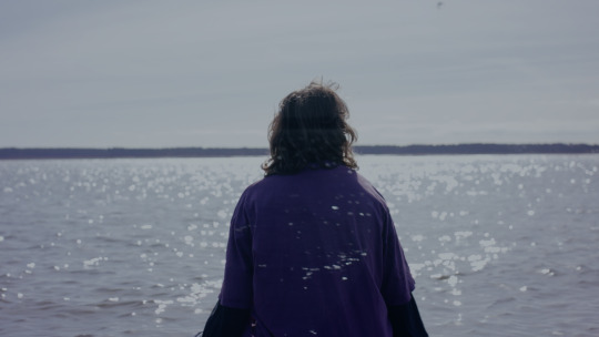
Where Currents Meet Colour Grading from Reds to Blues to Going Crazy
Colour grading is not my forte, to say the least. I had very little idea of what I was doing and I had little practice and awareness of how to do it. I usually go into it kind of figuring it out as I go and this was no different. I found this much less enjoyable than the actual filming and went quite crazy. I went for many different looks and approaches to the film over the days that I graded it, each grade had a very different feel to it and felt like a different film almost.
Bethany and I had previously talked about blue tones for the film and when I tried it in the grade I found that this was too sad for a film about romance so I went through the entire film adding a warm reddish glow to every scene. I thought it looked great, but wanted to see what Bethany thought. Bethany came in and we went back to the previous grade and went into that. She asked me to try blue and I tried this throughout and we agreed it did not work either so in the end we found a kind of medium which lay in the correct part of the graphs indicating how much of the image you are keeping whilst still going for looks that Bethany liked and that I had become happier with in time.
I found the initial scene hard to grade because the opening shot I had chosen I leaned into all of the reflections of all of my waterproof gear, because otherwise it would not have worked. But in doing this Iris looked almost like a ghost so I tried to bring her more into reality and make Kallie's single more dreamy.
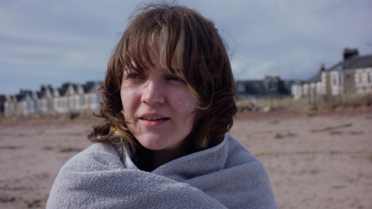
I really struggled with continuity throughout but especially in scene 2 on the beach where Kallie comes out of the water and flirts with Iris. Kallie and Iris were always lit differently due to their positioning in relation to the sun and the water. But I tried my best to make them as similar as possible. Here in the photo above I think Iris is a little too saturated and slightly cold, but this was in order to fix the sand to match Kallie's sand in her image and I think this was achieved.
The following bus scene I felt graded relatively well except for one shot of Kallie that I could not seem to desaturate in the way that I wanted to.
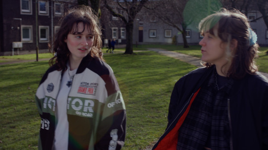
Following this I found this image above turned out too saturated and contrasted as well, but it seemed the best way to get it away from the reddish tones that I dived into all too deeply.
In the following scene where Iris trips, I feel the two shots are different to the singles and offer a slightly paler palette that I did not quite match.
I was very happy with the river scene as I felt Iris really glowed in that scene.
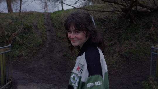
This is a shot I really like and am happy about how the grade turned out. I feel at the bridge everything had a lighter wash than in other parts of the film but I felt it matched a dreamy tone that this scene has.
The bedroom scene as I previously mentioned was a bit of a nightmare on set, but I feel it was really saved in the grade.
In what is now the final scene, as the original final scene was cut, where the girls are sitting on the shore I am overall very happy with the grade here but I feel it again does not match the rest of the film.
I do feel that my biggest mistake in the grade is the inconsistency in style. I feel every scene is almost completely different in style of grade and I hope that this won't take viewers out of the experience.
I'm not very happy with the grade overall but I am happy enough and I know I tried very hard. This is because I think I could have done better or it could be better, but with my limited knowledge I tried my best and that was all I could do. I found myself very burnt out in the grade from all the shoots and the sound design from Saint Catherines and I think this also affected what I could deliver.
What is most important, however, is that Bethany is happy and that is my goal above all else, as long as we made a film as close to what she wanted then that is what I have hoped and strived for.
0 notes
Text
hi. i did the thing again.
youtube
#myart#my music#synthesizer v#synthv#kasane teto#kasane teto ai#teto#vocaloid#vocal synth#vocasynth#rambling in tags#this one. took far longer than it should have.#gwa this was started and finished the week of finals but. i didnt have access to my computer for a month while i was on break#so I tried to finish the pv on my laptop but for some reason da vinci resolve decided to freak out and the pv was all messed up#i got back to my computer a month later and realized the mixing was Shit so i redid it and changed some things with what i learned on break#and THEN I got struck by executive dysfunction for basically another month. and by THEN our AV professor taught us how to colourgrade.#so i redid the colourgrading on the background clips. and finally fucking finished it oh my god#Youtube
1 note
·
View note
Text


i cant tell if i made it better or worse (skin-wise)
#my colourgrading is on the left#i like how the right looks#but on the left idk its too orangey for me ;; i did kinda like the red light. hm. maybe if i up the red output..?#learning to gif!
0 notes
Text
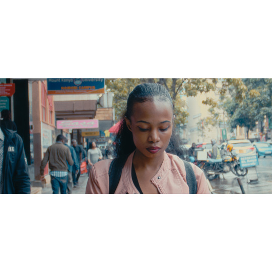
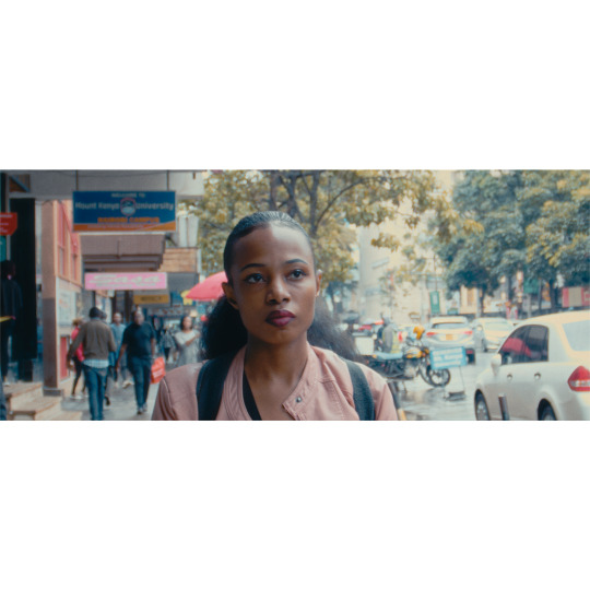
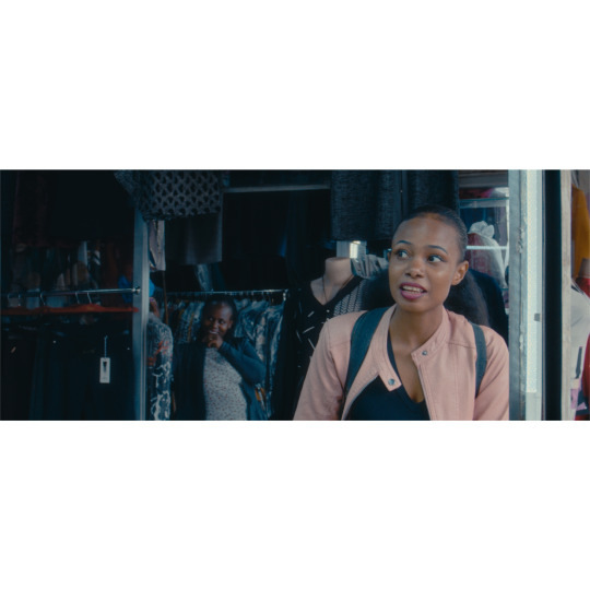
Colour Grade | Shots of me walking in Nairobi, Kenya
0 notes