#colour matching
Explore tagged Tumblr posts
Text
Since some people on Instagram found it helpful, I'm gonna share it here as well.

Vallejo Model Color Ivory is a pretty perfect match for slightly yellowed Fairyland Beautiful White.
I have yet to test if just adding some white to it will make it a match for new BW, but this is already perfect for my needs (matching my minifee Ruth from normal to white skin will be a lot easier from now on).
33 notes
·
View notes
Text
I just binge watched and finished Good Omens IM NOT OKAY!!!! feat. My room archway painted a very similar shade of yellow to Va Va Voom.
(My camera and lighting makes it look WAY too sunshine/sunflower yellow but that's okay! It's already very similar so it's fine)


If you're wondering, yes, I did do this at 3 AM impulsively. ✨
#good omens#crowley#crowley good omens#remember when Aziraphale said “but it's pretty :(” when Crowley told him to change the Bentley back to black. remember that. ugh.#aziraphale#aziraphale good omens#ineffable husbands#ineffable fandom#colour mixing#colour matching#artists#painting#am I calling this art just because I'm an artist? yes. yes i am.#david tennant#michael sheen
22 notes
·
View notes
Text
I am repairing my giant penguin plushie with some yarn I had at home that was actually a really good match for the penguins "fur"
pros of really good colour match: can't see the stitches
cons of really good colour match: can't ae my fucking stitches
6 notes
·
View notes
Text
youtube
#hand embroidery#cross stitch#embroidery#thread colour matching#colour matching#online embroidery resources#Youtube
5 notes
·
View notes
Text
i tried to find a repair i did on a pants seam to show to someone but i did such a good job colour matching and repairing it flat that i can't find it 😭😭 which proves the point i was making but i got nar evidence!!
3 notes
·
View notes
Photo


WIP Interview mit einem Vampir (Interview with a vampire)
Part I colour matching and picking materials
I admit, I’m rebinding this book partially because I really don’t like the cover of the paperback and partially because I really want to use that printed cork fabric. Finding a good colour to stand out but not too harshly was a bit of a stretch when I checked the commercial bookcloth I had. Luckily I went on bookcloth spree a few weeks back and have a few options more now. I might go back and check for a totally different colour tomorrow though. Picking endpapers that would not clash with the colours and print of the cork was difficutl too (because I tend to be very indecisive) but eventually I decided for a colour gradient. I don’t like how paperback just start with the book no warming up at all. So I added a few more to ease into the book and get a nicer transition between endpaper and (aged) text paper. Initially I had third paper there, but it did nothing for the fading so I decided against it.

#bookbinding#re-binding#paperback to hardcover#wip interview with a vampire#selfmade bookcloth#selfmade marbled paper#colour gradient#colour matching
10 notes
·
View notes
Text

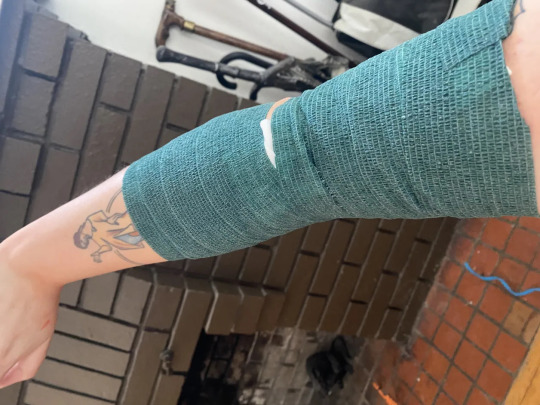
also I got a tattoo partially re-coloured today and they bandaged me in veterinary wrap like I'm a sick horse
#the original tattoo was coloured just fine!#the only problem was that one of the colours was clashing with the tattoo just above it#the neon pink fish belly didn't match well with the earthy palette of my medieval lady#so I had a guy go over it and make the fish belly bright red#(which IS a colour you see in illuminated manuscripts!)#and now I'm very happy with everything
42K notes
·
View notes
Text


newest issue of first years fashion just dropped
#my art#jujutsu kaisen#jjk#jjk fanart#yuji itadori#nobara kugisaki#fushiguro megumi#itafushikugi#jujutsu kaisen fanart#jjk art#this quickly got away from me#taking hina from 3 days ago who thought 'yeah ill do 3 outfits for each of them what's the harm' and strangling her w my bare hands#original concept fr this was drawing the kids each matching a different outfit w gojo#but i got frustrated by th heights and placement so i said no tall people allowed and scrapped gojo from plans <3#tbh it wouldnt have been /that/ much better in terms of workload but the 3 drawings it would have saved me isnt nothing#but im just complaining fr nothing atp lmao i love all of these sm i love playing dress up with my tuoys (the jjk first years)#love treating them like mannequins i love coming up w outfits layer those kids UP#nobara especially i have so much fun brainstorming she looks good in everything To Me#i dressed megumi more smart casual than normal bc he's got gojo's credit card info and if i want him in balenciagas gdi he's gna get them#also listen i love megumi we know this but fr the sake of not dressing him in solid colour slacks and sweaters 3 different ways#i gave him the workout fit. it cant b yuuji all the time ok i think we deserve megumi in a compression shirt as a treat#speaking of yuuji good god where do i start#he's definitely stylish but in a 'got dressed in the dark/threw on the first articles of clothing i saw' way and i adore him so much for it#wears things tht make him happy w no regard for how they may or may not look tgt bless his heart#also i drew th skateboard fr posing purposes entirely forgetting my prior hc that yuuji cant skate so i roughed him up fr consistency#th boy just ate concrete but is ready to get back up and try again what a champ#anyway bless this line and shading style i lov u less detailed render i love u sharp swoopy fabric lines#saved me sm time fr#also this is my application fr the mappa jjk marketing team they should hire me and let me dress the chars id be so good i promise#ill even take out the vocaloid and pop culture references i wont infringe on any ip i sweaaarr
12K notes
·
View notes
Text


Custom lip colour for Stadion runway (2025)
6 notes
·
View notes
Text


Gods of Exandria
#cael does art#critical role#critical role spoilers#cr spoilers#critical role divergence#exu spoilers#exu divergence#exu downfall#getting to work on these was great!#matching up my god art to Hannah’s character art was a fun challenge#I returned to some of my vibrant colour styles for these#what an honour to paint these in particular
5K notes
·
View notes
Text
Spent the day with trying to colour match my Luts body to the Meeksdoll head I painted.
The smart thing would've been not painting the head until I have the body and actually colour match the head to the body, but when I got these three, I just couldn't wait 😭
So i have to deal with the consequences of my actions...


Lots of trials and errors, and in the end, I just gave up with "close enough" and I hope the body blushing will hide it 😅

It's not too bad, I think... let's see tomorrow in daylight.


Also used some imperfections in the dye to give him his scars.
I'm still on the fence about these and wondering if I should add some more scars with the tissue paper method, but I'll sleep about that for now...
12 notes
·
View notes
Text


[insert poetic title here]
fun fact: this did not start out as isat fanart
(rambling in tags)
#I was actually doing some personal writing and when I read it over a few days later I could only hear it in loops voice#speaking of which#i totally recommend watching ShortOneGaming's playthrough of the game#their voices for the characters match so well in my mind i can't separate them XD#also i have no clue why but this took FOREVER#I had the thumbnailing and paneling done so quickly but my motivation to finish it just left me midway through the third page T-T#Even though this is one of the shorter comics I've made (AND NO COLOUR) it somehow took my like twice as long -3-#loop is so fun to draw!#well actually fun to colour would be more accurate lol#also did you know that a keyknife was an actual thing??#I wanted to check if their was an a visual asset of it in the game only to find out they're just everyday objects you can own???#maybe im just seriously out of the loop lol#and i know the buttons are wrong but i was already mostly finished inking by the time i realized so lets just say its a stylistic choice#isat fanart#isat spoilers#sasasaap spoilers#two hats spoilers#cw body horror#??? i think#comic#artists on tumblr#fanart#digital illustration#digital art#isat#isat siffrin#isat loop#in stars and time spoilers#my art#my comic
4K notes
·
View notes
Text


finally remembered to put these side by side!! my ptutu illusts so far 🩰 2024 & 2022 🦢 prints
#princess tutu#ahiru (princess tutu)#rue (princess tutu)#princess kraehe#mytho (princess tutu)#fakir (princess tutu)#ahiru#mytho#fakir#rue#my art#i keep making horizontal prints .. and people at cons cant see them bc horizontal prints are so hard to see high up LOL#mayhaps one day i get the idea for a vertical ptutu illust to create a sort of holy trinity but we shall see.. for now im satisfied!#ideally if i ever do a 3rd ptutu illust id like it to be vastly diff from these 2?#i designed these drawings to match with the curtain bc i was worried the rendering style would make it too different#tbh the 2022 drawing is kind of a cmyk nightmare to print. so im glad i had a different approach to the colours for the new drawing ^__T
4K notes
·
View notes
Text

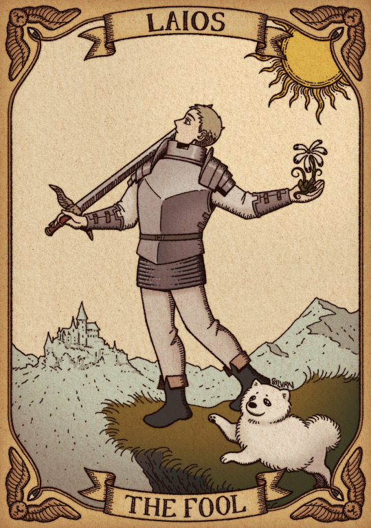
#sylvrn art#illust#dungeon meshi#dunmeshi#dunmesh#laios#laios touden#tarot aesthetic#not sure if I'm final with the colours buuut#another design that will hopefully end up printed to be sold at cons!#that is if I can muster up the strength to finish the 5 others I have planned#we'll see!#I did a bunch of research into tarot and though I didn't match the symbolism 100%#I hope tarot enthusiasts will like this as well as dunmeshi fans ( ˙꒳˙ )#I'm enjoying drawing this sort of medieval ish aesthetic!
5K notes
·
View notes
Text

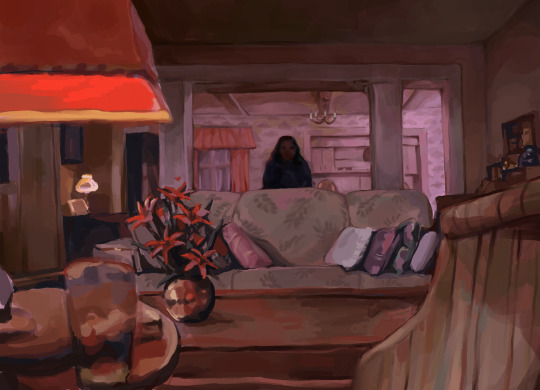
one layer twin peaks study thingy
#I’m in a painting mood rn#this was a lot of fun#just wanted to practice colour matching#fanart#art#procreate#artists on tumblr#twin peaks#twin peaks art#bob twin peaks#study#myart#horror#sceneposting
7K notes
·
View notes
Text

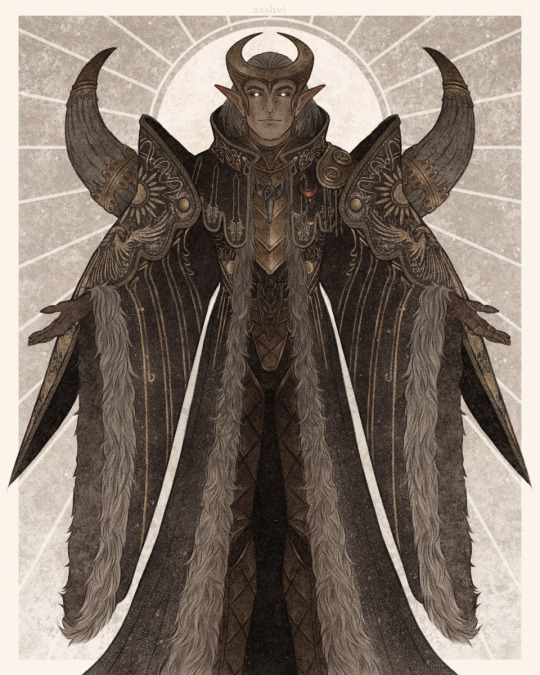
"I am Elgar'nan — First of the Firstborn, Last of the Evanuris."
#come to reign over you with fiiiine and gentle hand#my art#dragon age#dragon age the veilguard#elgar'nan#datv spoilers#(for the caption quote mostly)#so i was supposed to post this along with the ghil one but this took me WAY too much time#because the coat gives me headaches and because i've just been taking psychic damage from various other things for the past week#anyway i was going to post the two evanuris together again so i matched their colour schemes (that's why his coat is black)#but after the time this took me i'm just gonna post them seperate#i don't have the energy to do another big piece atm i'm tired
2K notes
·
View notes